Greg Goldstein's Comic Art Gallery

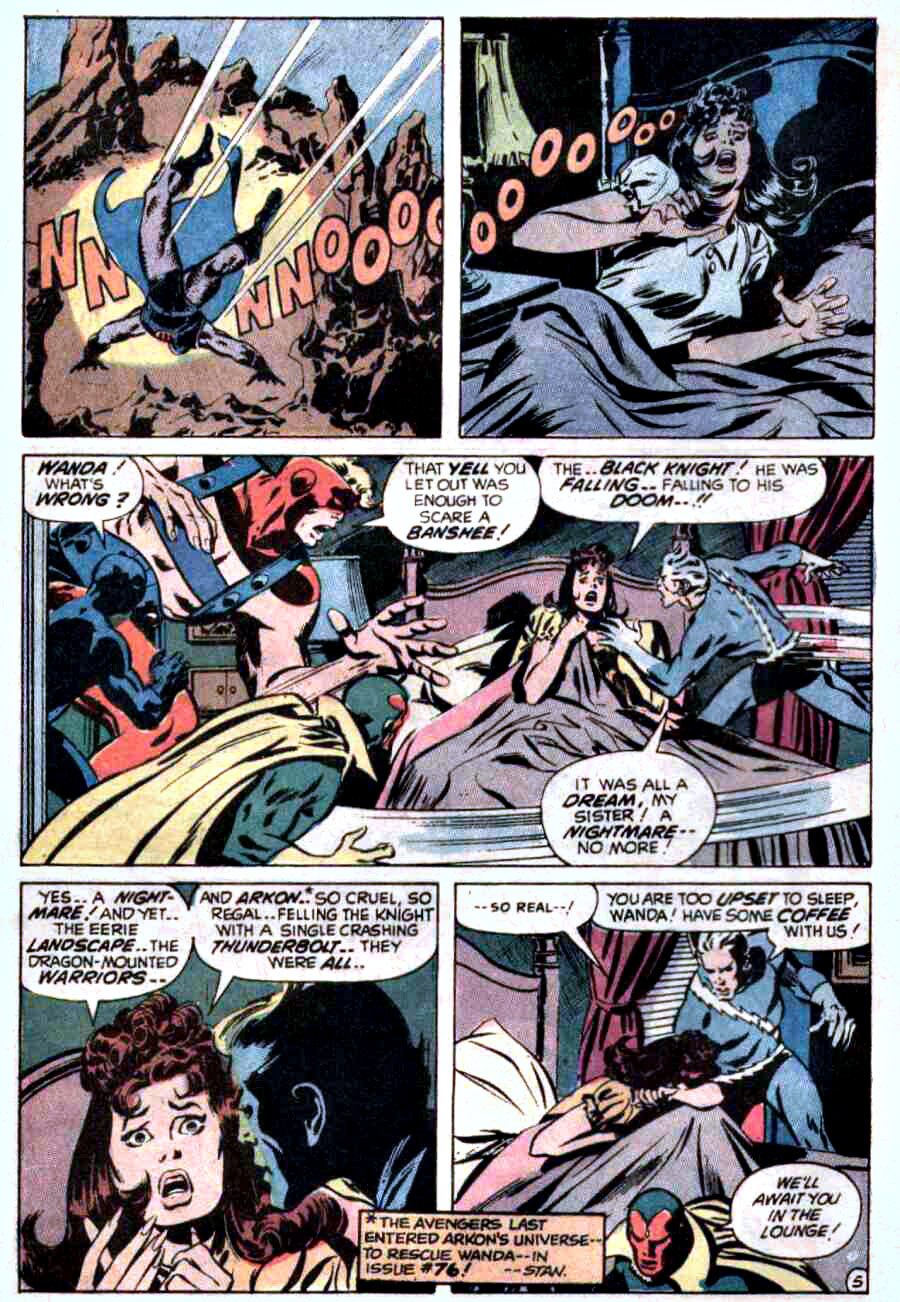
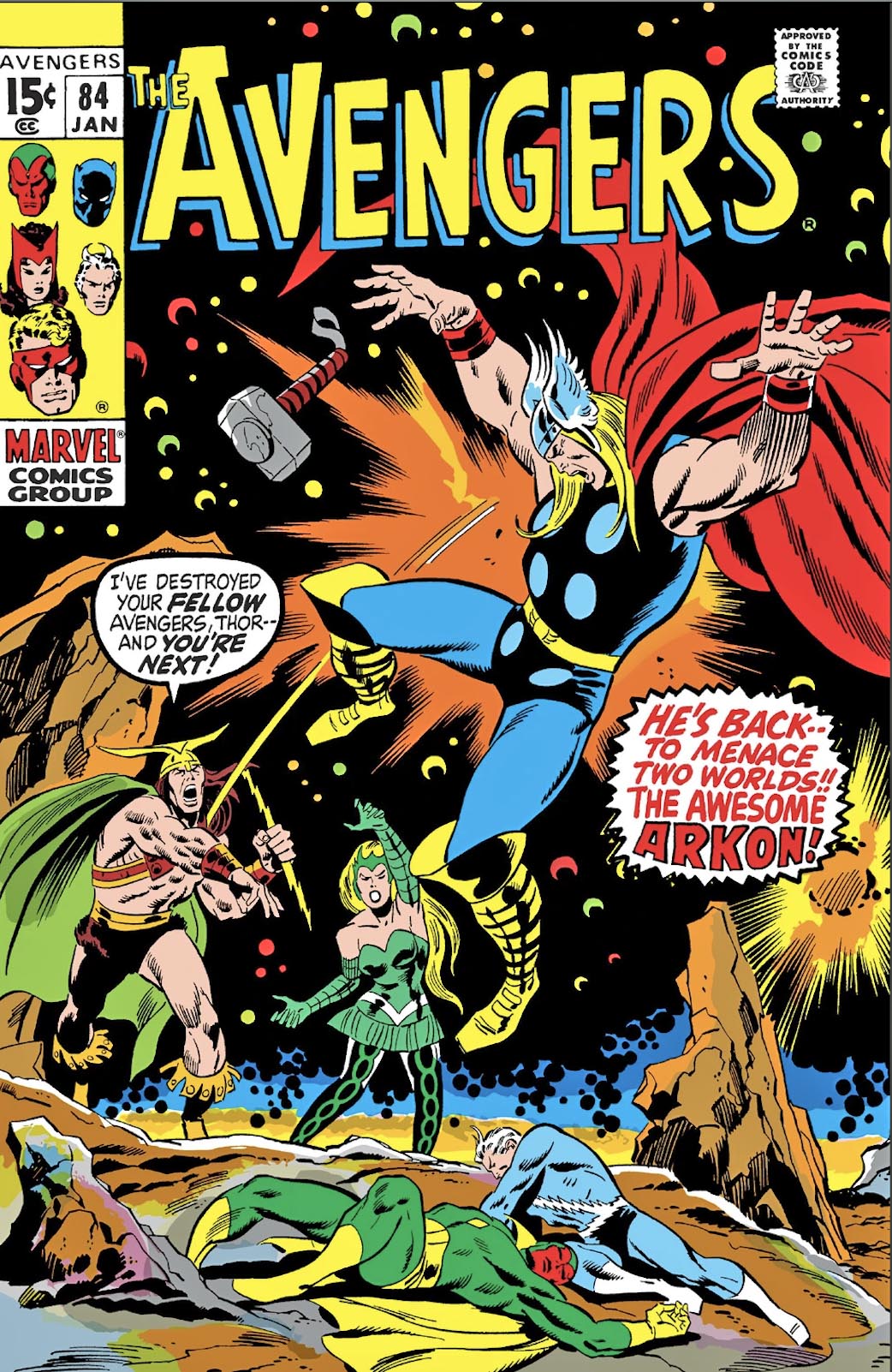
John Buscema & Tom Palmer — Avengers, Assemble

Avengers #84, January 1971

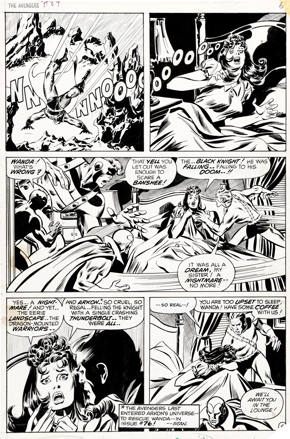
John Buscema was the Avengers artist of the late ’60s and early ’70s—despite famously claiming he didn’t much care for superheroes.

Every panel feels like it could’ve been pulled from a widescreen adventure film, even when the scene is nothing more than a nightmare and a jolting wake-up. That was his magic: Buscema could make anything feel epic.

This page shows exactly how he defined the Avengers in that era. Grace, power, and cinematic clarity are baked into every beat, transforming a bad dream into something memorable—and unmistakably Avengers.

Behind the scenes, Marvel was running hot. Kirby had just left for DC, schedules were tightening, pages were due, and assignments were shifting fast. You can feel a stronger Tom Palmer inking presence here than in some earlier issues, suggesting John may have supplied looser pencils as deadline pressure mounted and the machine kept moving.

Marvel may have been in motion, but Buscema’s vision was locked in.

Bruce Timm —High-Flying, Forever

Rocketeer Adventures #3, July 2011

If you ever wonder whether the Rocketeer can fly without Dave Stevens, Bruce Timm answers by lighting the fuse and grinning. His illustrations in IDW’s Rocketeer Adventures #3 “pulp” tale from Joe Lansdale aren’t a tribute—they’re a full-throttle spin.

Timm tears across this two-page spread with a crisp, mid-century snap that makes me think a Rocketeer animated series would be pure rocket-fueled dynamite.

Stevens built a world roomy enough for great artists to play in. He gave us pulp heroics, Hollywood glamour, and Cliff Secord—our beloved jet-propelled knucklehead who means well, screws up spectacularly, and somehow still wins the day—and Betty, too.

Stevens created a timeless hero. Timm shows why he stays timeless. He’s not preserving the legacy—he’s joyriding it.

(And yes, I would love to own that gorgeous faux pulp cover below.)

Gene Colan & Joe Sinnott— The “Superior” Captain America

Captain America #118, October 1969

This page from Captain America #118 is Gene Colan doing exactly what Gene Colan did best. From the first panel, Cap isn’t just moving—he’s practically sliding across the page like someone leaned on the fast-forward button. Colan drew superheroes like actors caught mid-scene, all shifting weight and fluid motion.

And that crowd! That outstretched arm is peak Colan—bold, intrusive, unapologetically cinematic. It shoves you right into the scene. It feels like a real city having a very weird day.

Then come those deep, moody shadows he loved so much. He could drop a black shape over half a figure and somehow make it more expressive, not less.

Colan never cared about matching the “house style,” and he certainly didn’t draw superheroes who looked like they’d just ironed their costumes. Shadows, posture, movement—those were his tools. You either vibed with it or you didn’t. I loved it. Some of my friends… not so much. (Especially when some of his other inkers couldn’t quite figure out what Gene was doing… or why.)

But even the skeptics had to admit — nobody, before or since, has drawn comics quite like Gene Colan.

Why is Cap running from the crowded thinking vindictive thoughts? I’m glad you asked. Because, thanks to the cosmic cube, the Red Skull has taken control of Cap, and things are about to take a turn…

Curt Swan & George Klein — Feats of Strength

Action Comics #304, September 1963

If you ever need proof that George Klein was Curt Swan’s best inker on the Superman books, just pull out this page from Action Comics #304. No explanations required—the art does the bragging for you.

From the first panel, Swan gives Superman that clean, honest pose only he could draw, and Klein locks it down with lines that are confident without showing off. Superman looks strong, sure—but also human. That balance? Classic Klein.

Jump to the big panel—Superman wrangling those hilariously oversized javelins—and you see the Swan/Klein team firing on all cylinders. Klein never wrestles for control; he boosts Swan, picking exactly the right details and politely ignoring the ones that don’t matter.

Across the page, the “S” shield is crisp, the cape moves like actual fabric, and the crowd reads clearly without becoming a visual traffic jam. It’s the kind of clean storytelling that looks effortless—until you see someone else try it.

And that bottom tier—Lana’s concern, Superman’s sheepish dignity—Klein hits it perfectly. Just enough warmth to make the moment feel lived-in.

Look, I love Murphy Anderson on Swan. (And pretty much everywhere else.) But the truth is simple:

George Klein doesn’t just ink Swan. He completes him.

I had my eye on this page for a while before I finally pulled the trigger — and I’m certainly glad I did.

Steve Ditko — Beware The Creeper (& DC’s Publishing Strategy)

Beware The Creeper #3, October 1968

Here’s a great Beware The Creeper page from issue #3. The Creeper (Jack Ryder) in every panel with classic Steve Ditko action and composition.

The Creeper was Ditko’s first superhero work for DC— just ahead of Hawk and Dove —and even as a kid, I recognized its offbeat genius. I had already admired Ditko’s talents from the Spider-Man reprints in Marvel Tales, and also in his Charlton work on Captain Atom, Blue Beetle, and The Question. 

But this quirky title definitely found a sweet spot for me.

In the late 60s, DC didn’t stick with any title that didn’t find an immediate audience — so naturally, it only lasted six issues. 

Sigh. 

Funny thing about this specific art page: If I recall correctly, I almost owned it about a dozen years ago in a purchase/trade that went south at the last minute.

Second time is a charm, I guess. Better late than never. (Two cliches for the price of one!)

As for DC’s publishing strategy:

I’m sure someone has compiled a comprehensive list of all the titles that DC launched in the late 1960s and early 70s and lasted less than a dozen issues.

Without thinking too hard, I came up with these:

The Spectre; Secret Six; Inferior 5; Anthro; Brother Power The Geek; Plastic Man; Hawk and Dove and Angel and The Ape.  (Not to mention Jacky Kirby’s New Gods and Forever People, et al.) And, if you include licensed books, add in Captain Action and Hot Wheels.

That was a lot of work for few, if any, meaningful results.

Good thing the Superman and Batman titles were money machines.

Joe Kubert — Sure Shot

Our Army At War #145, August 1964

Joe Kubert likely drew more pages of war combat than any other artist in the history of comics.

And you would be hard-pressed to find any of his covers or stories that glorified combat.

Gritty? Yes. Realistic? Absolutely. Action-oriented? Of course. Suspenseful? Nearly every time.

But Kubert’s stories — typically collaborating with writer Bob Kanigher — focused on the horrors and tragedies of war. And his distinctive, roughhewn art, was a perfect fit for the genre.

If anyone created a “War Artists Hall of Fame” the inaugural class would likely feature Harvey Kurtzman, Jack Davis, Wallace Wood, and Russ Heath. 

And Kubert should absolutely be at the top of that list.

Happy Veteran’s Day, 2025. 

Today sees the arrival of a new reprint series: DC Finest — War, The Big Five Arrive, joining others that include the DC War Artist’s Edition a much earlier reprint, America at War. All four volumes of a DC archive collection reprinting Sgt. Rock are long out of print, and naturally, much sought after.

Kyle Baker — Take Hulk Out OF The Ballgame

Damage Control III, #1, June 1991

Damage Control is such a fun high concept; Someone needs to clean up after a big hero and villain melee lays waste to parts of a city. Why not a murky government agency with an apparently unlimited budget? The idea so good in fact, that it’s been well incorporated into the MCU, albeit with some changes along the away. 

Kyle Baker drew (pencils and inks) the final mini-series of the original three, and his art style was a perfect fit for the quirky, humorous nature of the stories.

And the things you learn from comics: Turns out the Incredible Hulk is a Yankees fan.

The Yankees should sign him up. He’s probably the only one who could consistently give Shohei Ohtani a run for his money as the most extraordinarily dominant player in the Major Leagues.

Then again, maybe not. For all we know, Otani is a mutant. Or an alien. He’s definitely other-worldly.

Fun fact: About 25 years ago, just as realistic “destructible environments” became reality in videogames, TQ Jefferson and I passionately tried to convince our colleagues at Activision that Damage Control would be a perfectly fun way to incorporate as many Marvel characters into one game as possible. 

Alas, executive management thought we were bonkers — a story for another day.

Drew Friedman — Mars Attacks, Live, On Film

Cover, Mars Attacks #3, 1994 & Trading Card, Mars Attacks Archives, 1994

Wallace Wood. Norm Saunders. Robert Crumb. Basil Wolverton. Jack Davis. Art Spiegelman. Bill Griffith. Gil Kane. Jay Lynch. John Pound. Bob Powell. Tom Sutton. Bhob Stewart.

Topps (staff and freelance alike) artistic line-up of the late 20th century reads like an unbeatable all-star team of talent. (And that’s not even close to a complete list.)

The list of course also includes the incomprable Drew Friedman, who among other assignments, drew the hilarious Toxic High trading card series for Topps, using his trademark stipple effect.

I’ve been looking for a good Friedman original and found this great cover completely by accident browsing in a flat file at Scott Eder’s gallery in New Jersey.  It became a must -have. Scott loves it as well, so it took some heavy duty haggling to pry it away.  But…I published the damn thing, so it must have been fate. Like I said, a “must-have.”

I believe this Mars Attacks cover is the only comic book cover Drew created for us. 

Hey Scott, find out if the Hollywood mogul is based on an actual person. 

I’ll keep it between us.

(Happy Halloween, everyone!)

Jack Davis — Stage Fright

Tales From The Crypt #27, December 1951

I love dynamic panel pages like this from Tales From The Crypt and EC’s other horror titles: Dark, foreboding, and yes, murderous — but without the gore. More film noir than horror, Jack Davis once again crafts the dramatic scene with a terrific balance of shadows and light.

Since I can remember, the prolific Davis has been one of my favorite artists, and he should absolutely be on any list of best commercial illustrators of the 2nd half of the 20th Century.

Side note: As one of EC’s youngest artists, he hadn’t quite turned 27 years old when he drew this. 

New York State Of Mind, 2025 (Part 2 Of 2)

New York Comic-Con, October 9-12, 2025

Some more fun pics from this year’s NYCC…

I didn’t see half the people I wanted to see, But I was very happy to run into (rascally)Roy Thomas who I’ve known as a fan, professional and colleague the last 50 years or so, give or take. Random fun fact: About 30 years ago, Roy, Len Brown, Jim Salicrup and I went in a Topps chauffeured-driven car to grab hot dogs at Nathans in Coney Island.

Another fun fact: Nearly all of the buildings outside the convention center in the pic on the right existed 10 years ago. In some places, that’s an entire city. In New York, it’s a neighborhood.