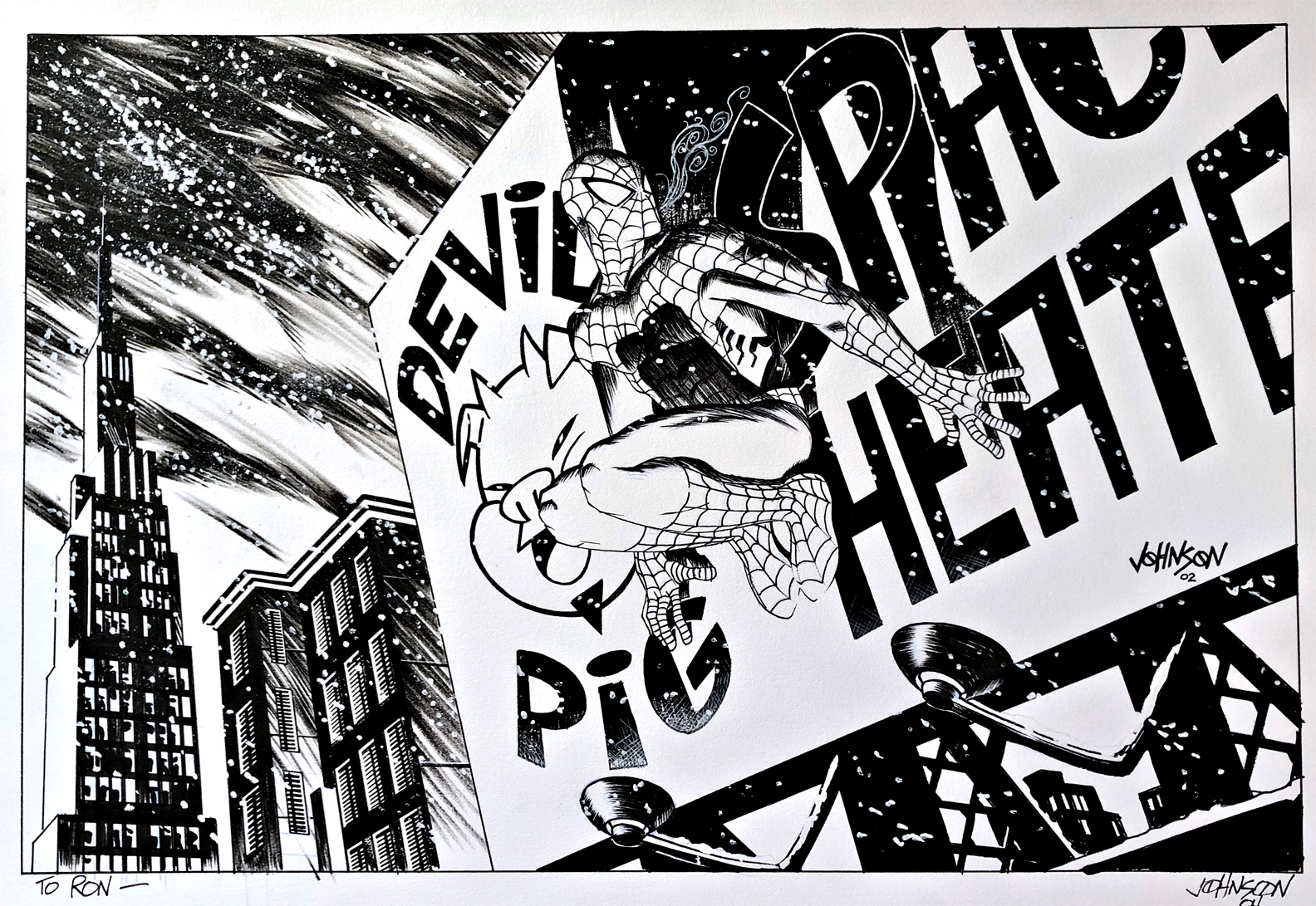
Dave Johnson — Spider-Bonus
Spider-Man DVD Special Edition, Bonus Art Gallery, 2002
With Great DVDs Come Great Bonus Features:
Remember when DVDs tried really hard?
Okay, so maybe you don’t remember DVDs at all. Sadly, in the age of streaming, that’s entirely possible.
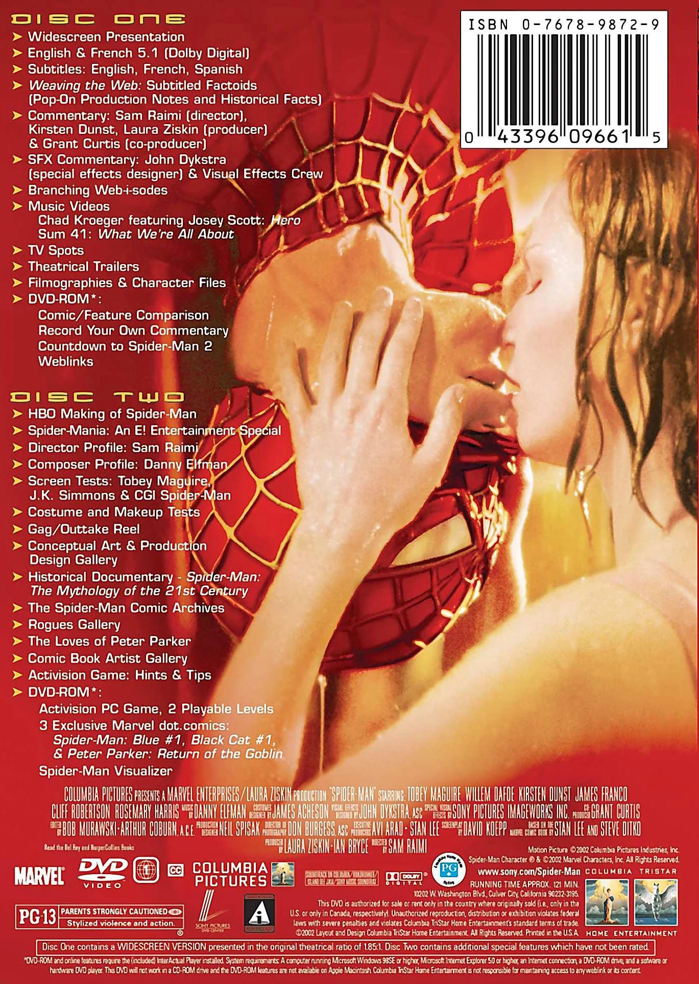
The 2002 Spider-Man Special Edition included the usual commentaries, documentaries and deleted material—but it also featured a gallery of original Spider-Man artwork by 19 different comic artists.
And it’s an impressive group: Chris Bachalo, Jae Lee, David Mack, John Cassaday, Kevin Nowlan, Sean Phillips and plenty more. There’s a complete checklist below.
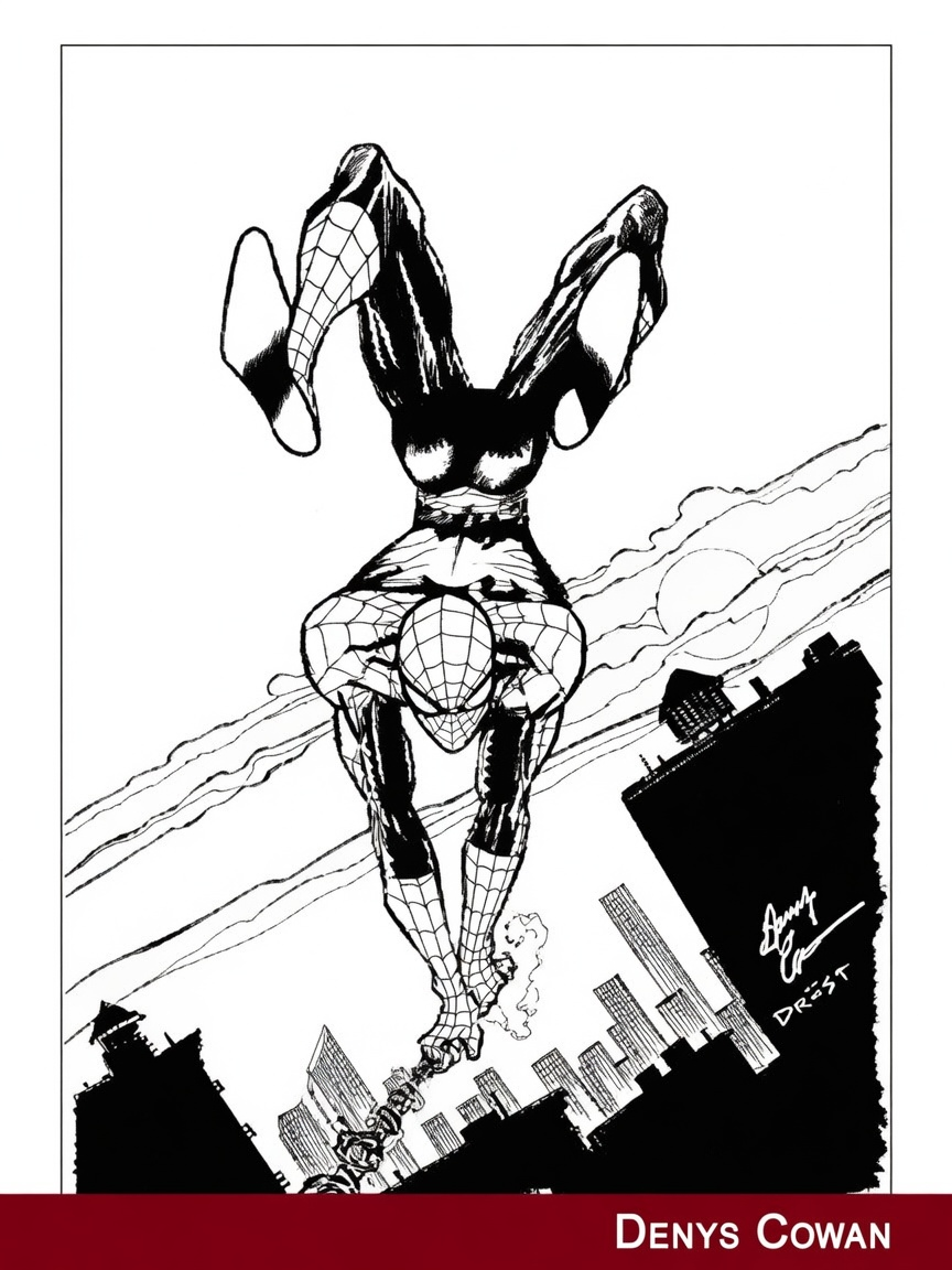
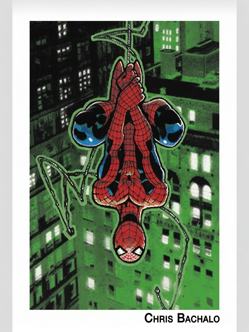
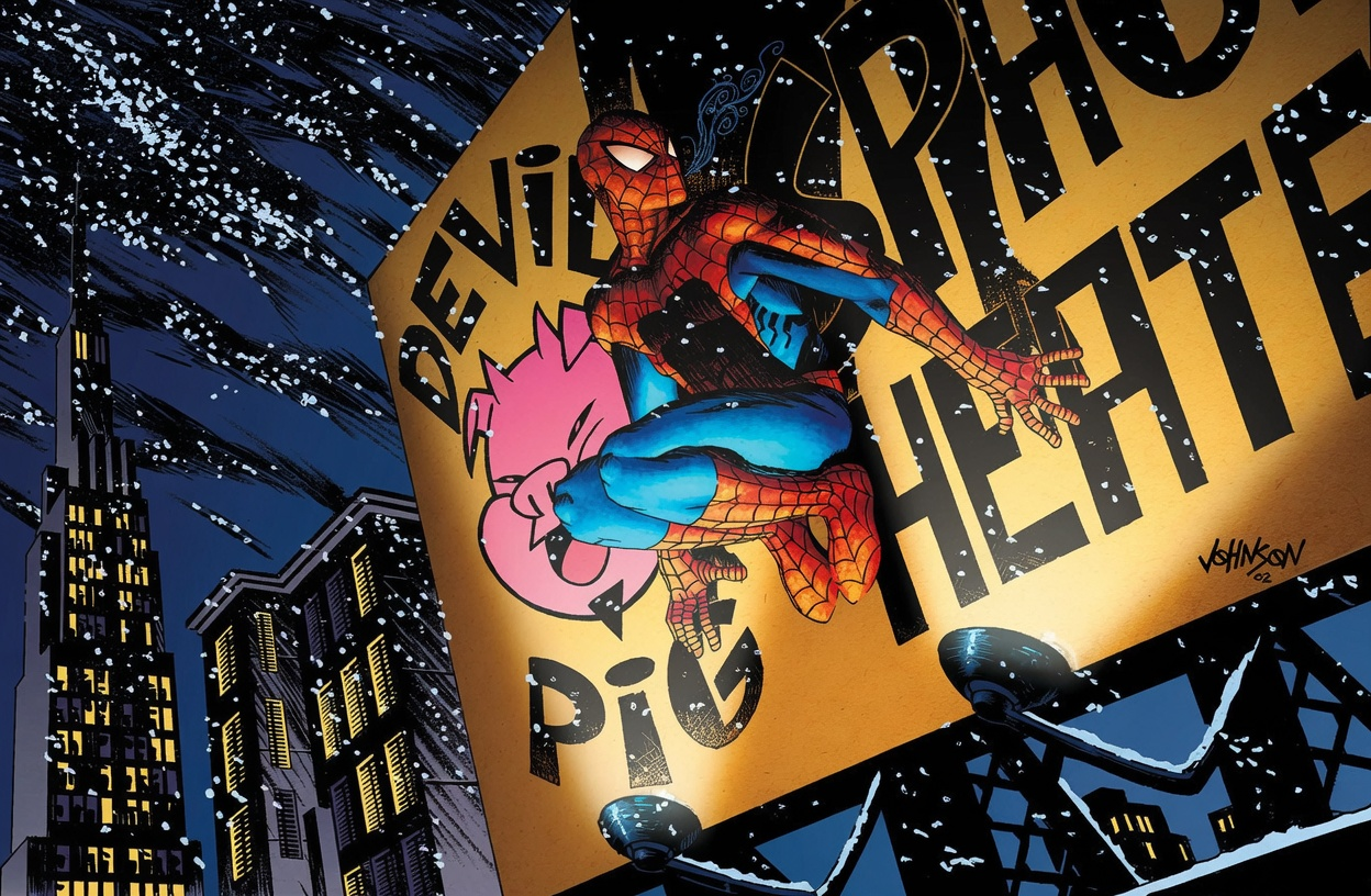
This piece by Dave Johnson is one of my favorites. Interestingly, when an artist supplied a piece in black and white, the DVD left it that way—so for original-art fans, that’s a bonus on top of a bonus. The coloring shown here was created this year by the very talented Frank Cuonzo.
Did the casual movie fan have any idea what they were looking at? That’s pretty much a rhetorical question.
These pieces were commissioned exclusively for the DVD, which means somebody had to contact the artists, negotiate fees, collect the artwork, scan everything—and then hide it several menus deep on the second disc.
That’s a lot of effort for something many viewers probably clicked through once, if at all.
Still, I love that they did it.
The feature connected the movie back to the comics and gave a wonderfully eclectic group of artists a chance to interpret Spider-Man in their own way.
Wasteful? Possibly.
But compared with today’s nearly bonus-free streaming releases, it also feels pretty terrific.
I couldn’t find a checklist of all the DVD “Bonus” Comic Art Images, so I created one. (It’s an all-star list, in order of how they appear when you click through the gallery):
Note: “Color” denotes the only pieces presented in color in the DVD gallery.
Spider-Man DVD Comic Art Gallery
| Artist | Featured Character(s) | Format |
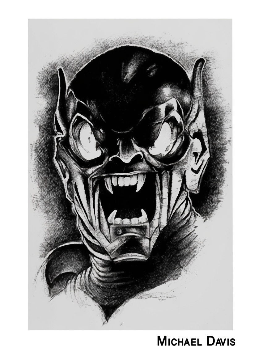
| Michael Davis | Green Goblin | — |
| Denys Cowan | Spider-Man | — |
| Chris Bachalo | Spider-Man & Green Goblin | Color |
| Jae Lee | Spider-Man | — |
| Mike Allred | Spider-Man | Color |
| David Mack | Spider-Man | Color |
| Duncan Fegredo | Spider-Man & Green Goblin | Color |
| J. G. Jones | Spider-Man & Green Goblin | — |
| Dave Johnson | Spider-Man | — |
| Frank Quitely | Spider-Man | — |
| Terry Dodson | Spider-Man | — |
| John Cassaday | Spider-Man | — |
| Sam Kieth | Spider-Man | Color |
| Sean Phillips | Spider-Man | Color |
| Michael Avon Oeming | Spider-Man | — |
| Paul Chadwick | Spider-Man | Color |
| Alex Maleev | Spider-Man | — |
| Kevin Nowlan | Spider-Man | — |
| Kevin Maguire | Spider-Man & Mary Jane | — |