Panels and Pages… Art and Artists… Creators and Conventions… Musings and Memories…
Author: Greg Goldstein
Greg Goldstein is a veteran publishing and media executive; most recently, he was the Chief Operating Officer, President and Publisher of IDW Publishing, managing all aspects of the company’s book and games business from 2008 to 2019.
Throughout his career, Greg has developed creative and profitable publishing programs for dozens of the world’s best-known entertainment brands including Star Wars, Transformers, Star Trek, James Bond, TMNT, Spider-Man, Batman and Godzilla.
In 2013, Greg led IDW’s acquisition of Top Shelf, an independent publisher best known for Congressman John Lewis’ March trilogy, which has become the most lauded non-fiction graphic novel series in the history of the medium.
In 2011, Greg won an Eisner award for his editing on the first-ever collection of Bob Montana’s Archie newspaper comic strips. (Published under IDW’s Library of American Comics imprint.)
Prior to joining IDW, Greg was VP of Entertainment and Gaming for Upper Deck, responsible for the company’s blockbuster slate of games, including Yu-Gi-Oh, World of Warcraft and The VS Superhero system. During his tenure, he created Marvel Ultimate Battles, the first-ever trading card game that focused exclusively on Marvel’s popular mass media characters.
As VP of Brand Development for Activision from 2000-2002, Greg established strategic partnerships with the largest Hollywood studios, and worked closely with Marvel Entertainment to successfully develop Spider-man into one of the biggest blockbuster licensed videogame brands in interactive history.
Greg’s career has also included a successful stint at Topps, where he helped launch and manage Topps Comics in the mid 1990s.
Additionally, Greg serves as an adviser for to the Comic Book Legal Defense Fund (CBDLF). He is also a frequent guest lecturer at San Diego Sate University and has presented at dozens of panels and conferences throughout the US.
He is also a well-known collector of original comic book art and rues the day he sold his collection the first time around in the late 1990s.
Our ode to Halloween and the creatures that often inhabit the comic book pages continues…
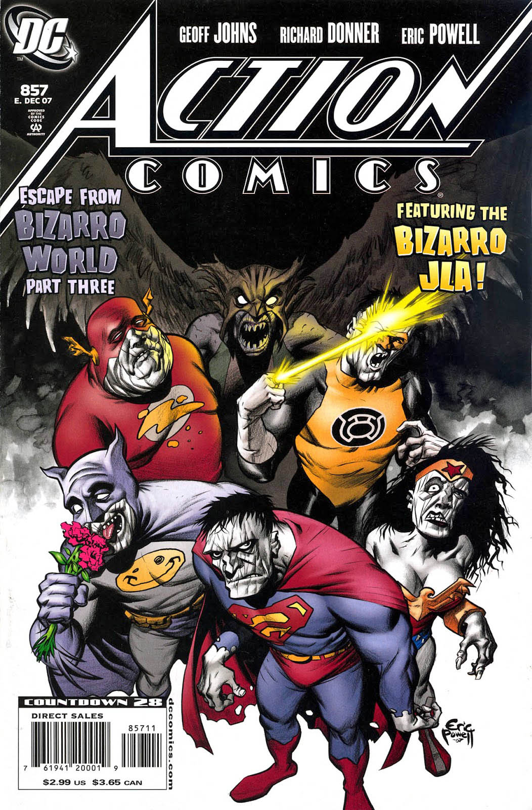
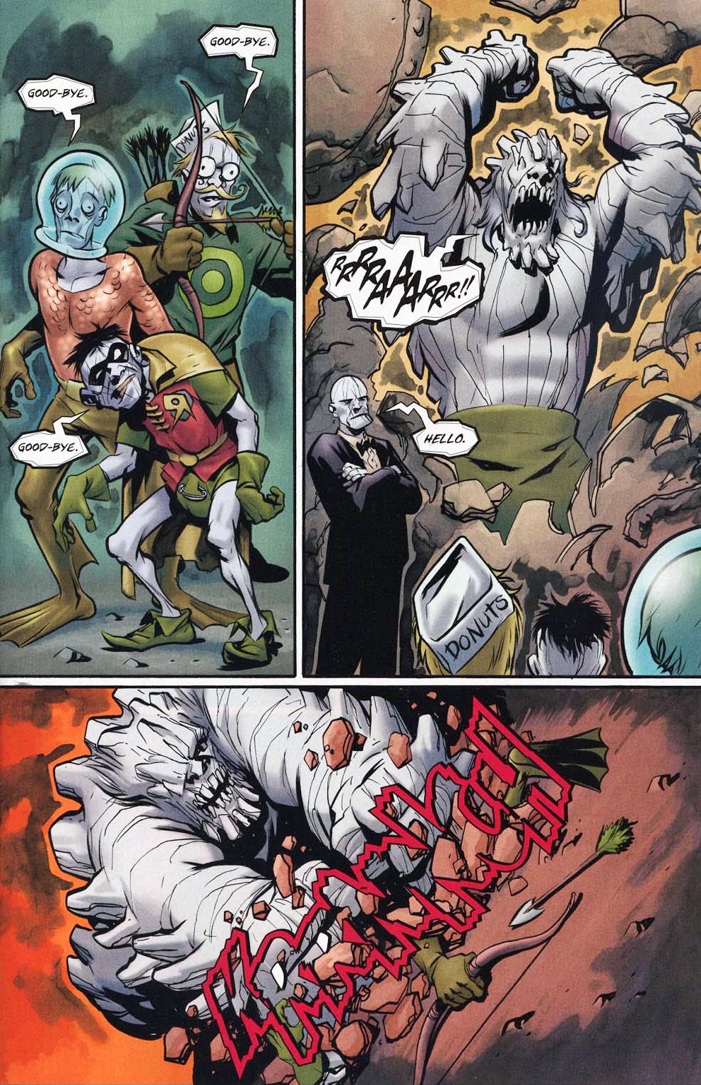
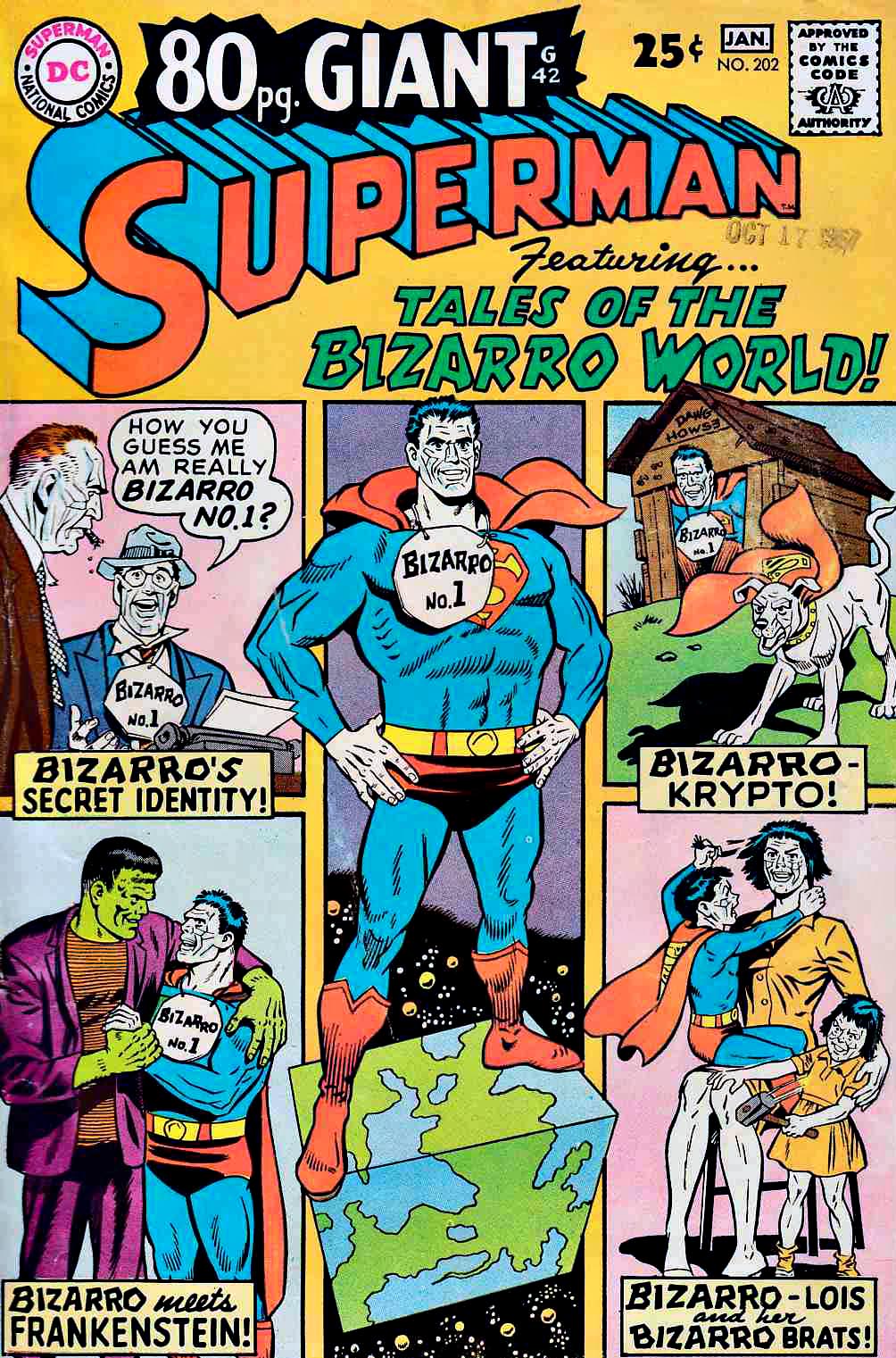
Bizarro Doomsday, at the bidding of Bizarro Lex Luthor, destroys the newly created members of the Bizarro Justice League.
Huh?
Trust me, it’s a wild ride. You just have to read it for yourself. Written by Geoff Johns and Richard Donner (Yes, that Richard Donner), the three-part story unravels (er, unfolds) in graphite, ink and wash-tone in perfect fashion by Eric Powell.
Donuts not included.
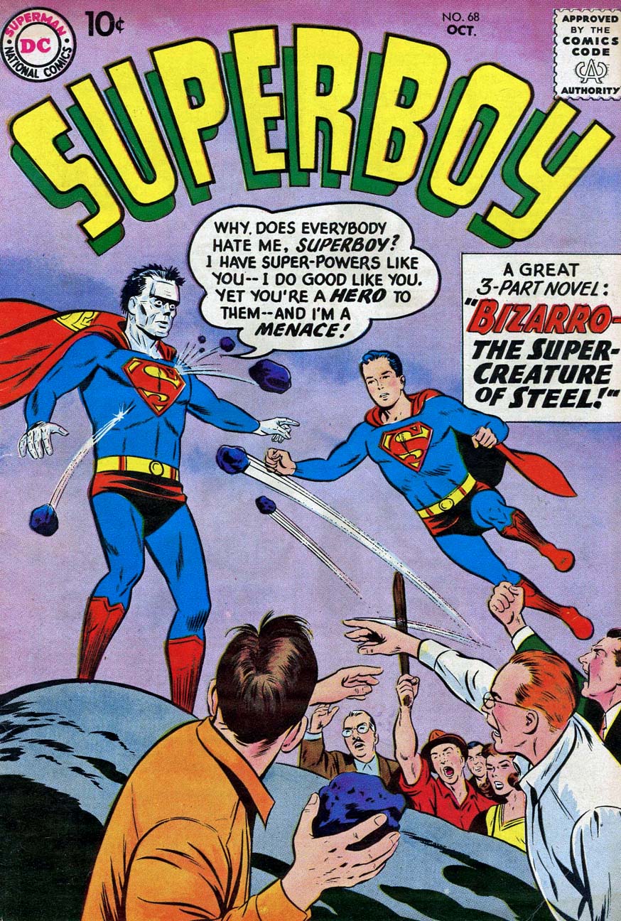
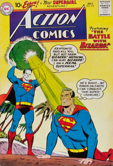
The first two appearances of Bizarro, and a collection that I re-read endlessly as a kid in 1968.
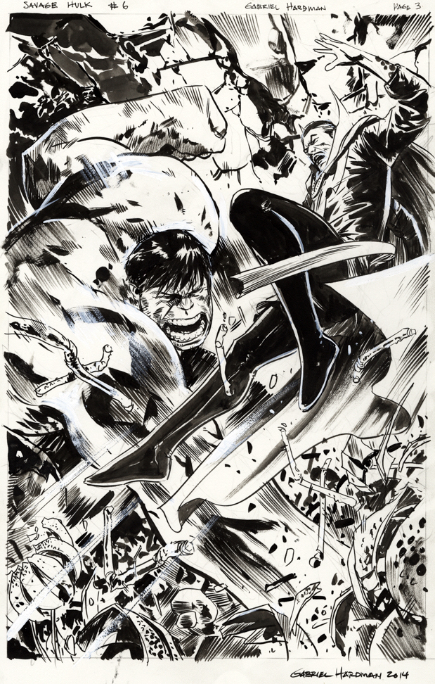
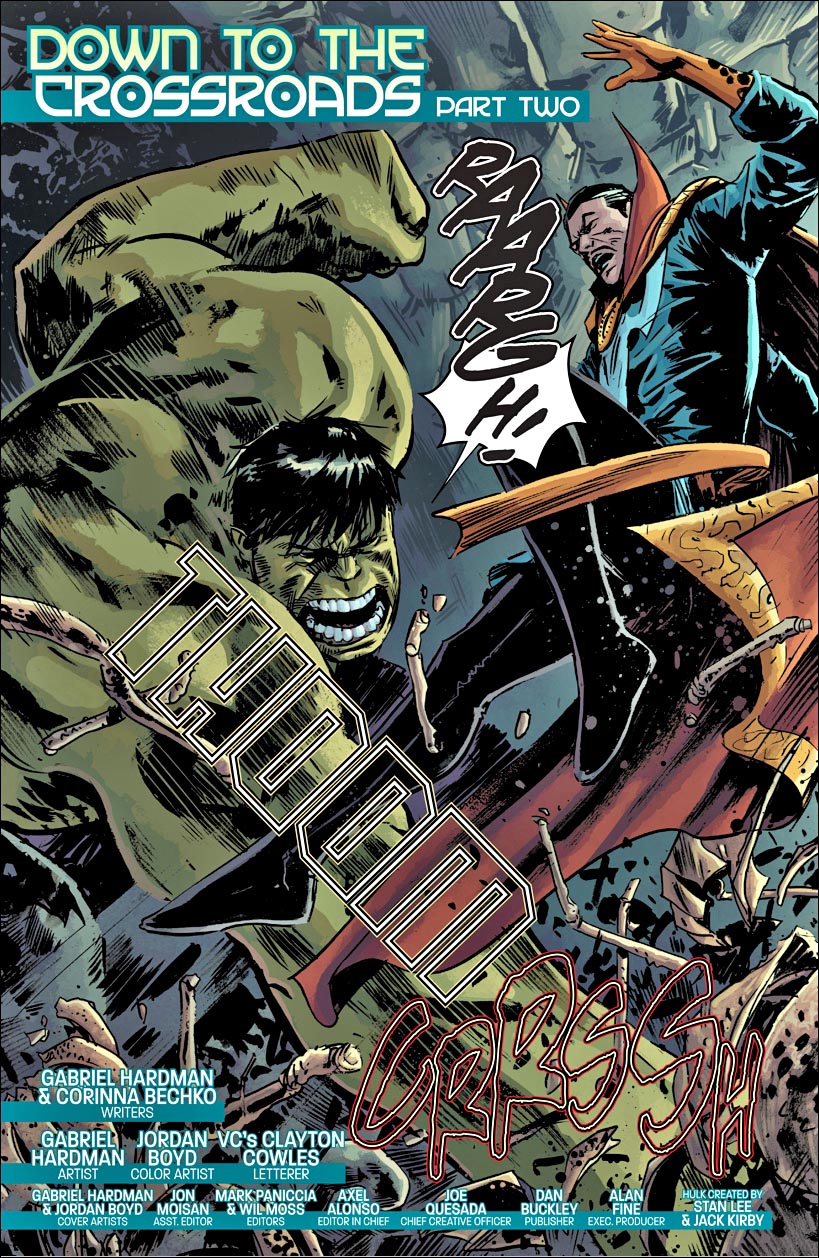
Doctor Strange battling the Hulk? Seems like a great page to kick off our 2020 Halloween salute. As suggested previously, Gabe Hardman would likely be one of the best known talents in comics — if he were a full-time comic book storyteller. His main gig, though is film storyboard artist, and his many credits include Logan, Spider-Man 3 and The Dark Knight Rises. (And many well known non- “comic book” films as well. But we digress.)
He creates his storyboards digitally, but fortunately, for us, he creates his comic book art using traditional physical methods. Something he does very well.
The story itself is co-written by Gabe and his wife, Corinna Bechko who have collaborated on a number of projects, perhaps most notably the Hugo-nominated SF series Invisible Republic.
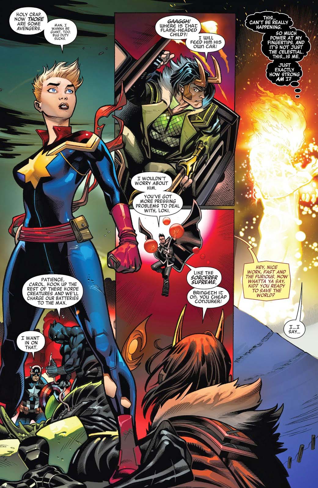
Ed McGuiness and Mark Morales provide us with an iconic image of Captain Marvel — Carol Danvers — from the latest iteration of the Avengers.
Also along for the ride on this page specifically are Captain America, Black Panther, Doctor Strange and Ghost Rider.
And of course, Loki (quite literally along for the ride) is up to his usual mischief as well.
This latest version of Avengers has been well received: Classic characters, larger than life antagonists, and lots of energy and creativity from Jason Aaron and McGuinness.
“Sometimes, the classics just work. Sure, the new thing is…new. It’s fun and exciting and different. The new thing can show you something you didn’t know you’d love but you do as much as the classics. But sometimes you just need the classics. And that’s exactly what today’s new #1 for Avengers offers...
“Superstars Jason Aaron and Ed McGuinness, accompanied by inker Mark Morales and color artist David Curiel, have done an exceptional job of returning the Marvel Trinity–Captain America, Thor, and Iron Man–to the center of the Avengers in this premiere issue, and it’s hard to argue that it doesn’t just feel right.“
Other art teams have handled some stories on this run, but Ed McGuinness… well, he’s just Ed McGuinness. And Morales fine brush work adds depth, drama and focus on a busy page.
(Ed pretty much looks like he did when I met him 25 years ago while he was working on Vampirella for Harris Comics. I wonder what kind of Dorian Gray situation he has going on in his attic… Actually Mark does too. Hmmmm.)
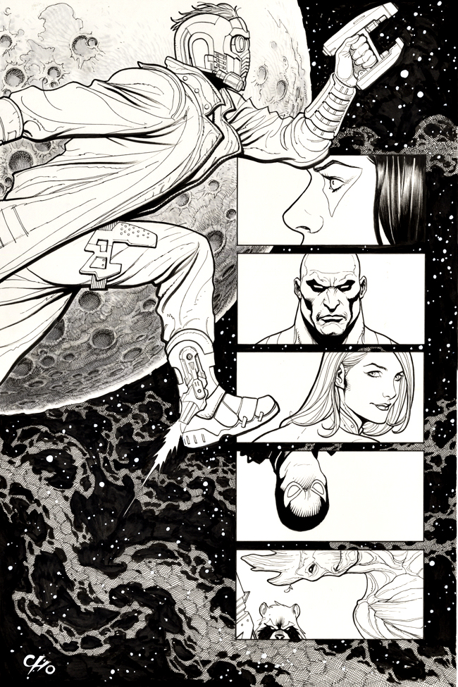
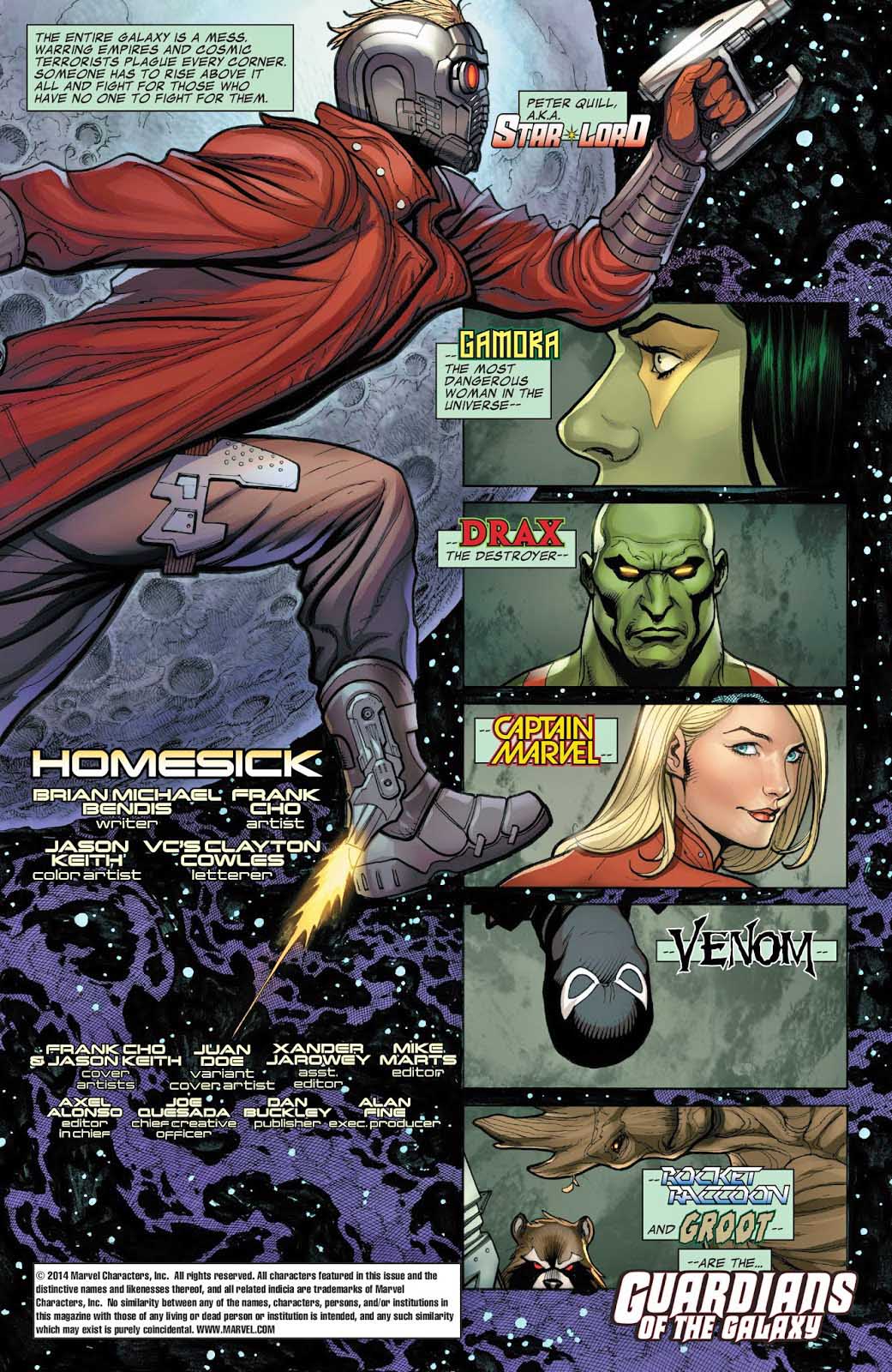
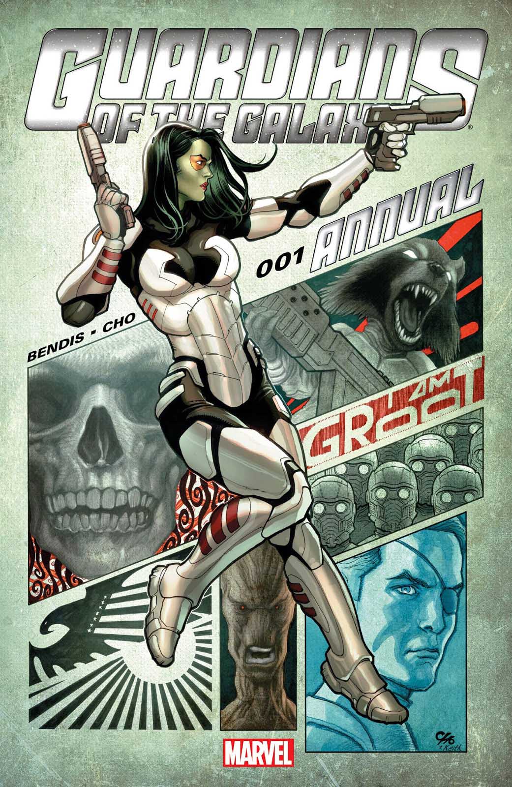
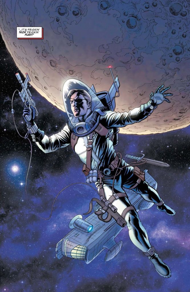
Starlord and the rest of The Guardians of The Galaxy probably never looked as good as they do in this enjoyable one-shot drawn by the incomparable Frank Cho.
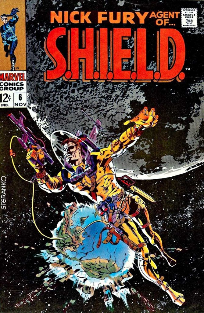
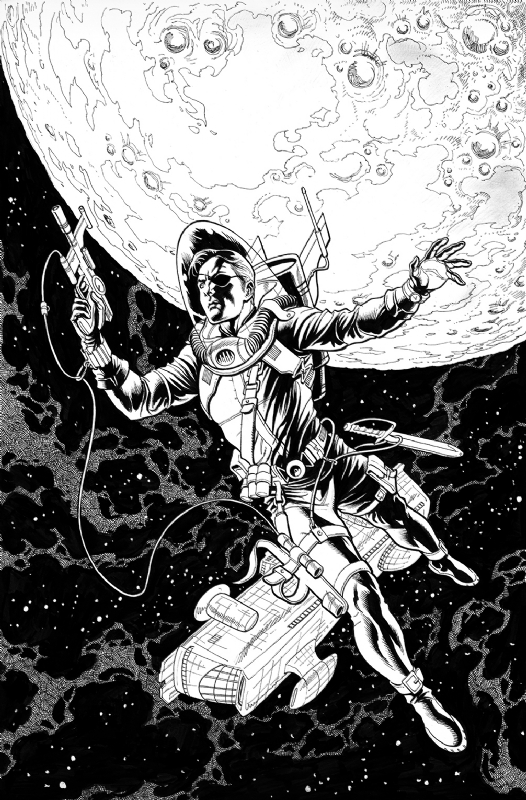
When I first saw this original title splash page offered for sale, it immediately brought to mind to Jim Steranko’s iconic cover to Nick Fury Agent of SHIELD (#6, 1968). It is Itself an homage to Wallace Wood’s classic and incomparable EC science fiction covers.
It was only after I had tracked down the actual comic itself that I realized there was even more to it. Not only had Frank subtly referenced that classic cover with this great opening splash, but he had also taken a more direct route later in the issue. (See below)
And for my two cents, that’s a fun move by Cho and writer Brian Michael Bendis.
In the MCU, Guardians and Captain Marvel both present opportunities to expand the cosmic part of the Marvel Universe. Nova? Adam Warlock? Both have been hinted at in the Guardians films, and, based on anecdotal references in Avengers Endgame, Carol Danvers has been universally occupied during the five year “blip” between the Avengers films.
That opens up all sorts of possibilities to look forward to.
Jim Steranko’s classic 1968 cover alongside Frank Cho’s version — printed page and original art.
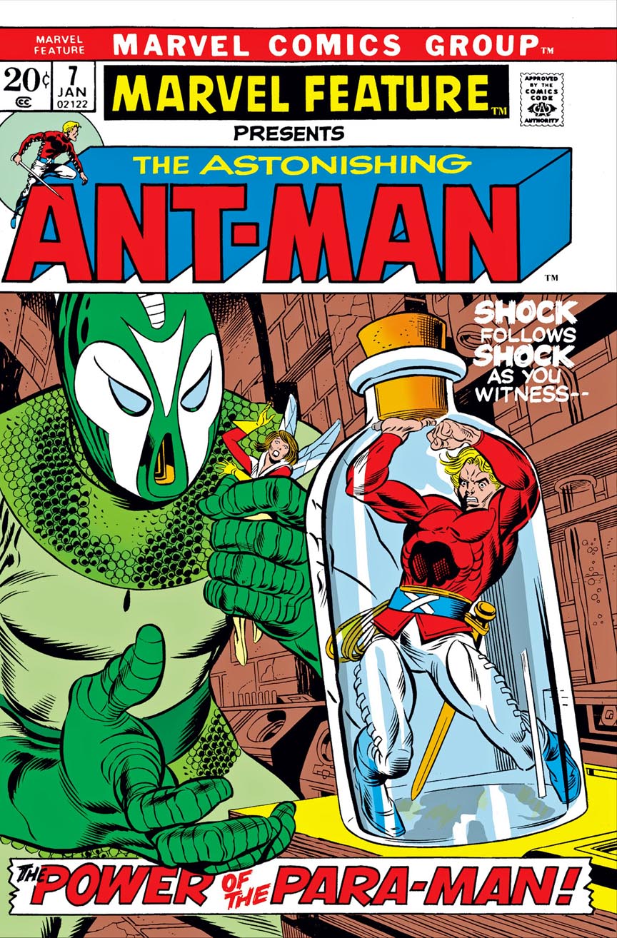
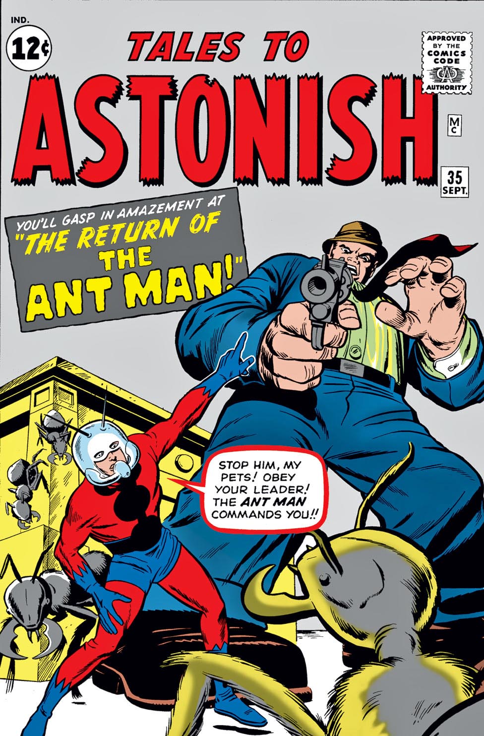
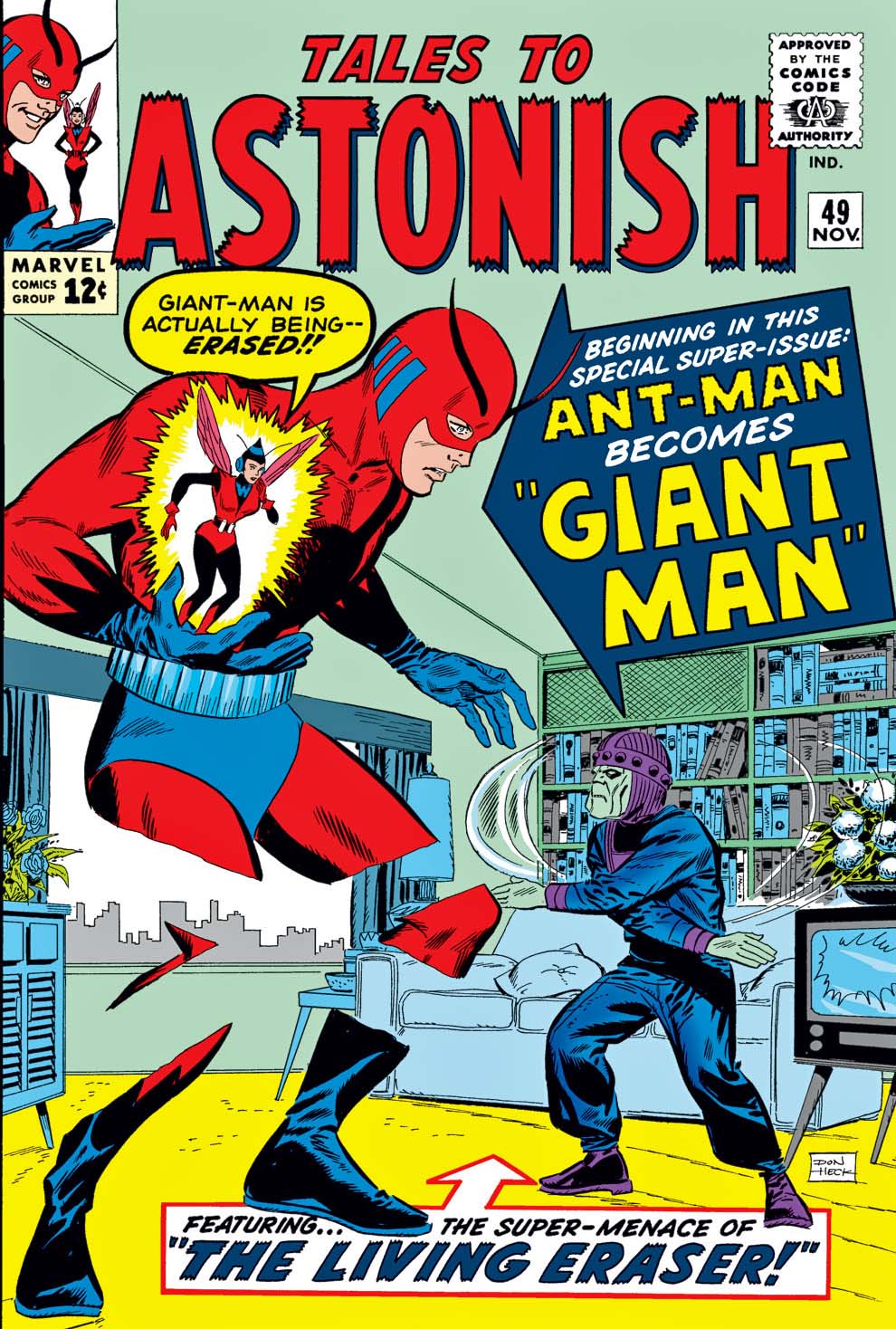
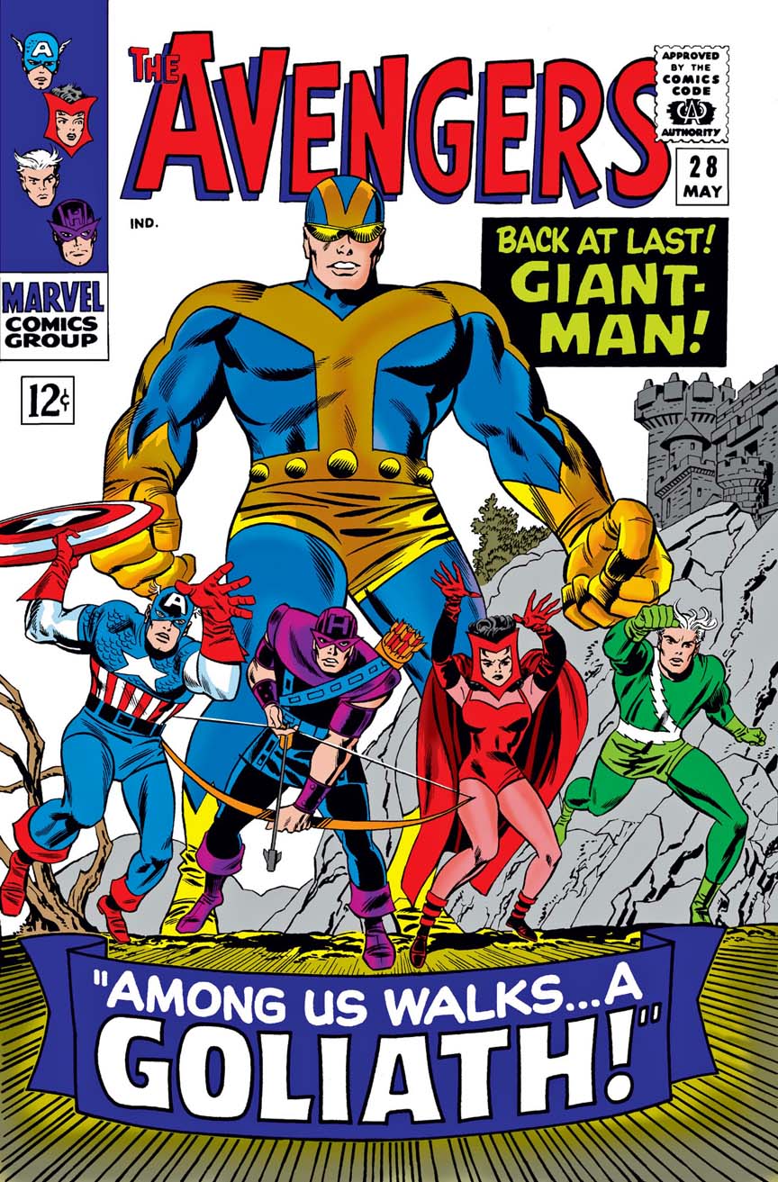
Ant–Man (no costume.) Ant-Man (costume.) Giant-Man. Goliath. Yellowjacket. Hank Pym, scientist, no alter ego.
And here, Ant-Man again.
Hank Pym was definitely having an ongoing identity crisis in his 10 years in the Marvel Universe.
Needless to say, seeing Ant-Man and Wasp as a full-length feature on the newsstands was a surprise. It lasted seven issues of Marvel Feature, before disappearing once again.
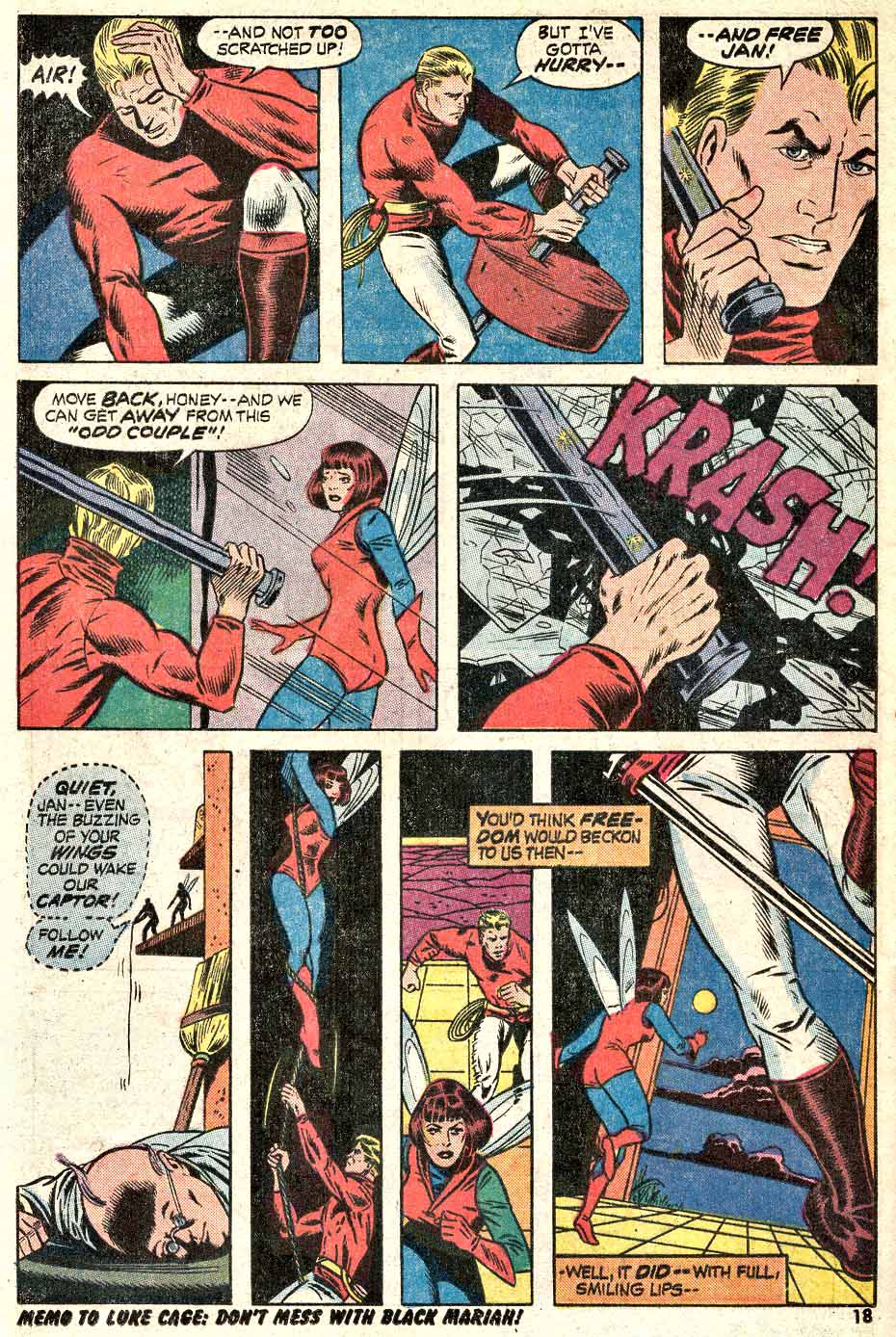
Here, P. Craig Russell and Dan Adkins present us with a nice Bronze Age action page. This is some of Russell’s earliest professional work, and his distinctive style has yet to develop.
In fact, since Craig broke in as Adkins assistant, it definitely feels much closer to Dan’s work than Craig’s.
Ina few months, Craig would take over the art chores on Killraven in Amazing adventures, and as “they” say (and I say too much) the rest is history.
As for Hank Pym, the identify crisis would continue. He returns as Yellowjacket, joins the Defenders, then rejoins the Avengers, and then… well, it actually becomes even more complicated.
But of course, Scott Lang eventually takes the role of Ant-Man, and as they say…
Hank Pym returns in his Ant-Man persona — with the lamest of reasoning — in the classic Avengers #93.
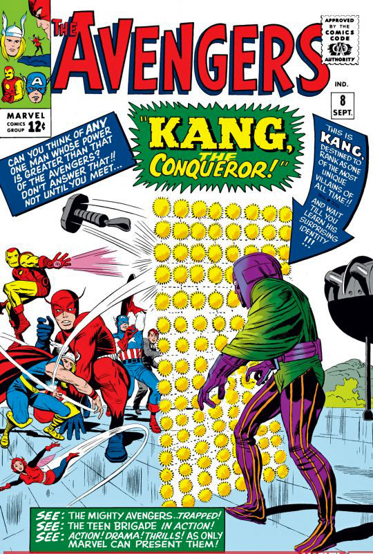
Ant-man has made much news lately with talk about the villain Kang (The Conqueror), who would be a cool choice as the next “big bad.” Time travel is his bag, and we know how that topic has already a few twists in Avengers Endgame.
Kang has given time-twisting headache to the Avengers and the Fantastic Four in the comic book pages. He could be an obvious thread to introduce the FF into the MCU.
Or not.
Marvel has no shortage of interesting antagonists.
Because I devour time travel stories, Kang was a favorite among many great villains. Even when his story was, how shall we say? A bit convoluted.
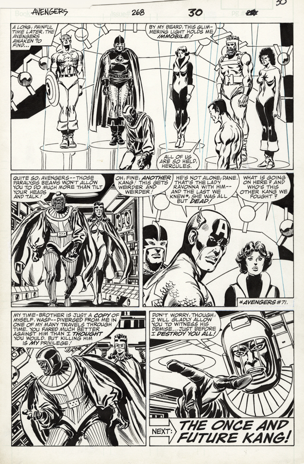
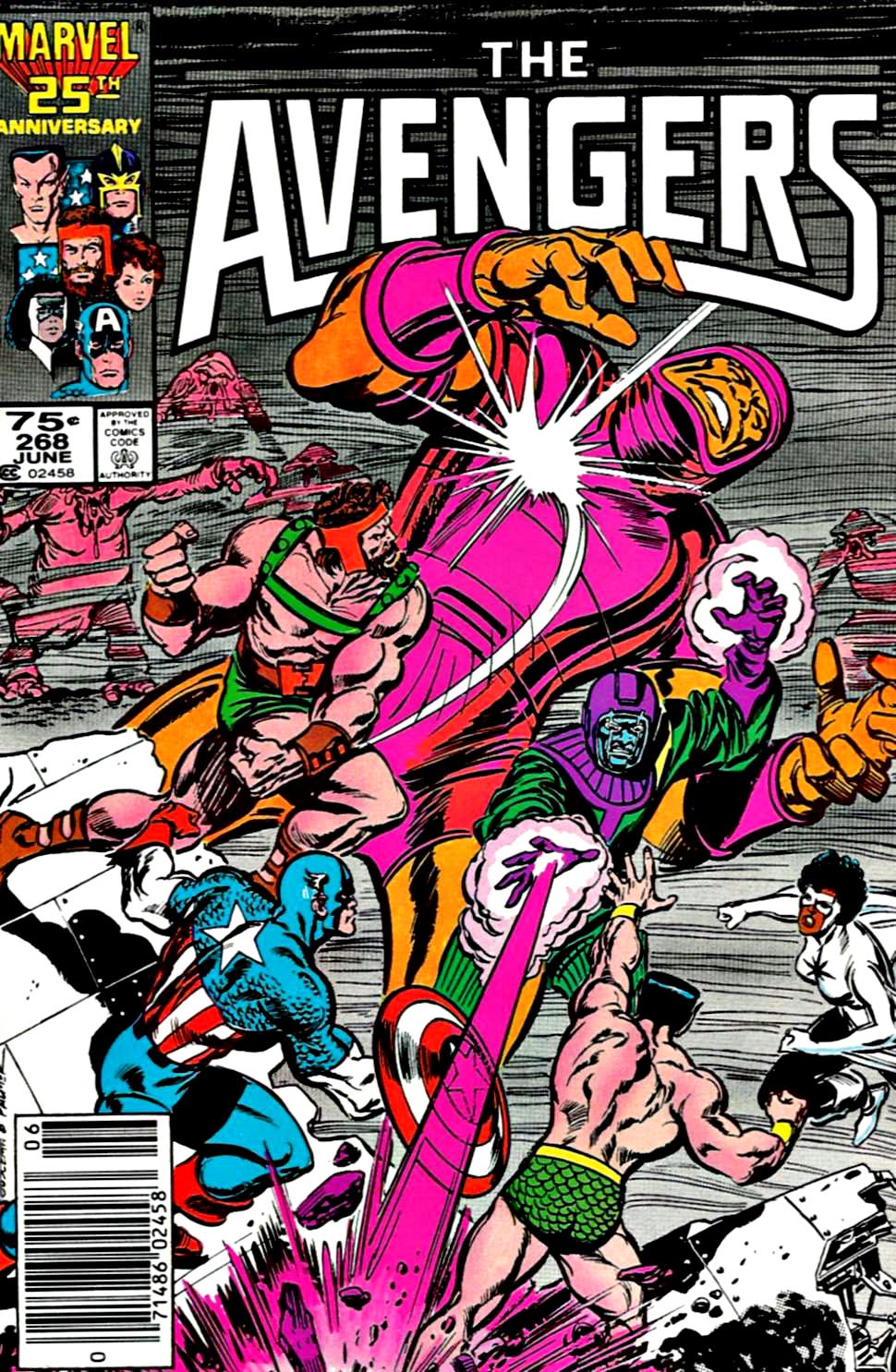
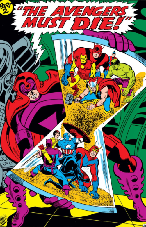
In this 1986 story arc by writer Roger Stern, The Avengers have to contend with multiple versions of Kang, because, well, you know — time travel, the multiverse, alternate realities, that sort of thing.
Legendary penciller John Buscema had returned to Avengers a few years prior, and, although he only provided breakdowns in most stories, Tom Palmer’s lush inks make this run visually compelling.
VERY compelling.
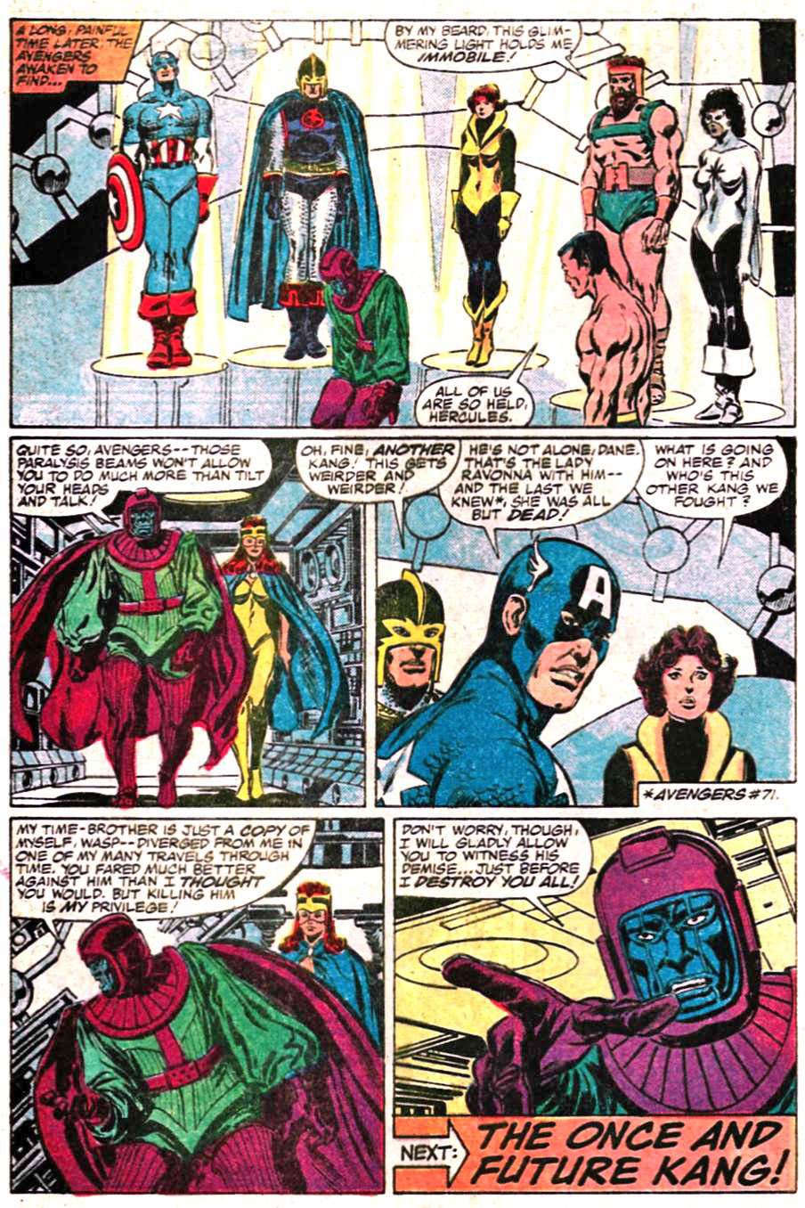
The Avengers lineup at the time includes Captain America, The Wasp, Black Knight, Captain Marvel (Monica Rambeau version) and both Sub-Mariner and Hercules, the clothing-optional pair of the Marvel Universe. They all appear on this cool end page.
Of course, that’s just the East Coast Avengers. The 1986 West Coast branch includes an ever-changing line-up featuring Hawkeye, Tigra, Iron Man, and others.
But as always, I digress.
Next up this week: Ant-Man, The Guardians of the Galaxy and Captain Marvel…
See you soon.
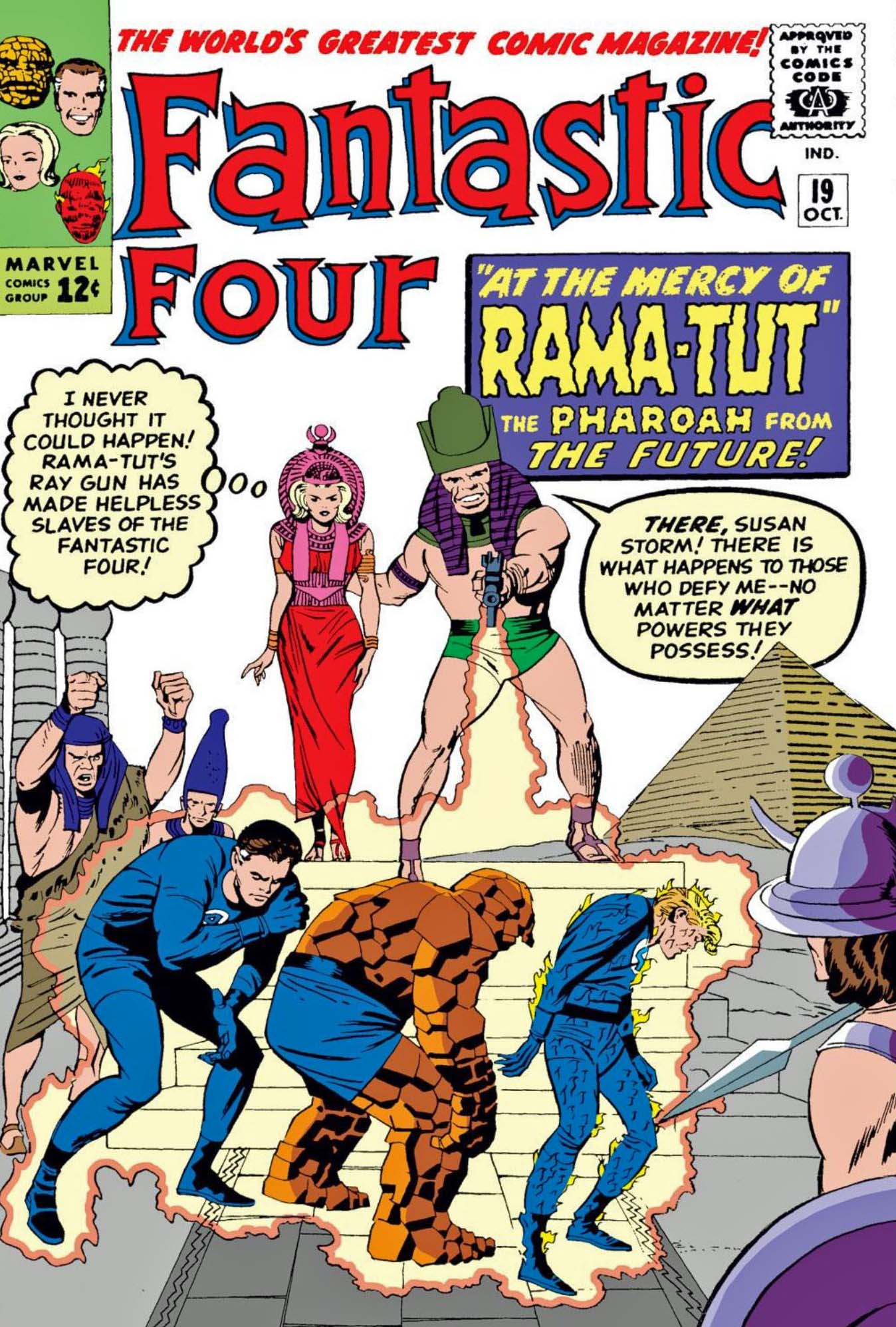
Get your scorecards out: Rama-Tut, Kang, Immortus and the Scarlet Centurion are all alternate versions of each other. Or not. Or both. You can look it up.
Sounds potentially a bit comedic. But if only “a bit”… I’m ok with that.
Thor Ragnarok mixed seriousness with humor as well. I like the film — and mass audiences responded to it very much— but it comes a bit close to camp in places.
Fingers crossed that a new film doesn’t cross that line that line completely.
I’m definitely intrigued to see Thor’s pal girlfriend Jane Foster take on the Thor role. (It’s already happened in the comics.) Might we have more than one Thor when the film ends?
Maybe. Chris Hemsworth has said he isn’t planning on going anywhere if he has anything to say about it, so who knows.
We can have more than one Thor. We have had at least a few in the main Marvel Universe. And throw in alternate realities, the multiverse, etc., and you have many, many Thors.
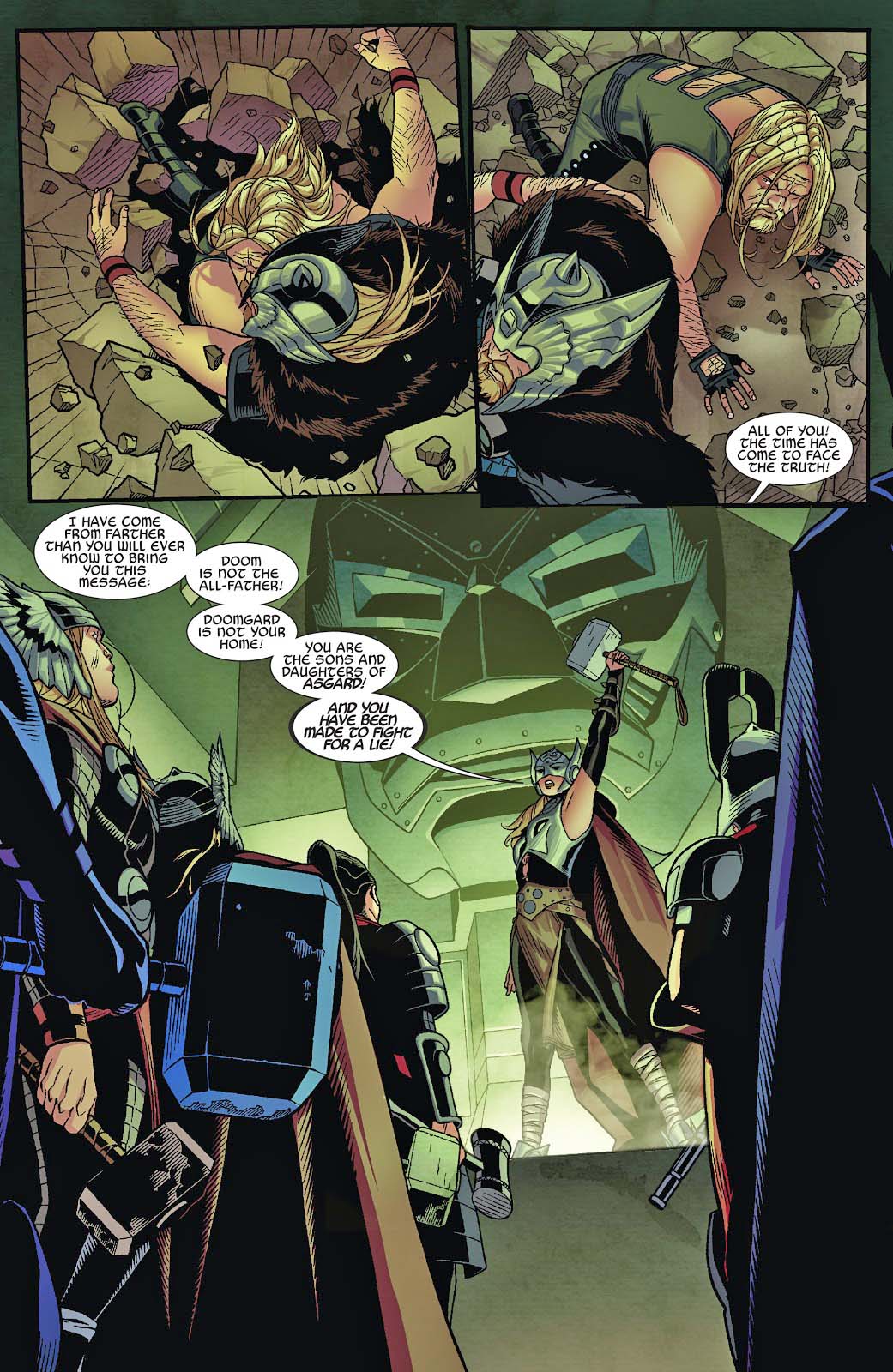
Case in point: This Secret Wars (2015) spin-off, appropriately titled Thors. The plot is too complex to cover in detail here, but in this pivotal splash on Doomgard, Jane Foster attempts to rally the other Thors to fight a common foe instead of each other.
See, she’s not only Thor — she’s now a leader among Thors.
And great art, as always, by the terrific team of Chris Sprouse and Karl Story.
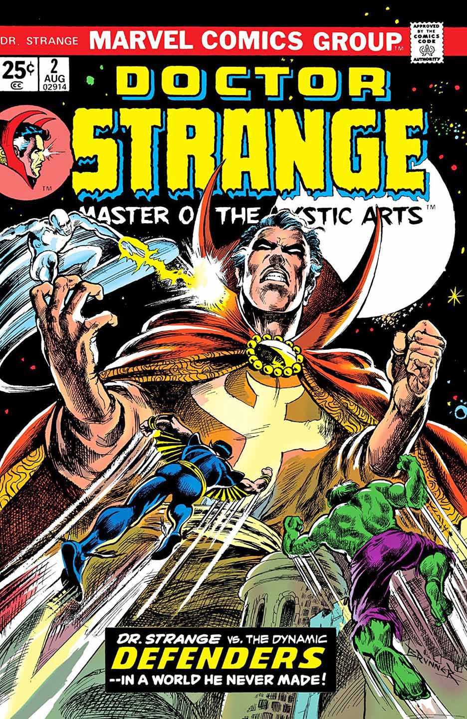
Frank Brunner’s run (with writer Steve Englehart) on Doctor Strange is among my favorites. In fact Jim Starlin and Brunner were (consciously, or otherwise) competing for the trippiest “superhero” stories published at the time. And I was the right age to eat up that stuff.
Comic book storytelling on acid. Side effects not included.
Brunner beautifully recreates his original cover for issue #2 of the 1973 series. In fact, the line work and cross-hatching appears more precise than the original. Overall impression — it is a knockout
Done correctly, Strange was always a fascinating character whose stories could combine magic, fantasy, SF and horror into a mind-bending mix.
So when I heard Sam Raimi was on tap to direct the Doctor Strange film sequel, the only word that jumped to mind?
Perfect.
Raimi is a very talented director — and good guy — who I had the pleasure of briefly working with during the filming of the original Spider-Man movie way back in 2001. As fans know, despite his Spidey pedigree, he has a love for the supernatural and the weird.
I’m really looking forward to his take on the good doctor.
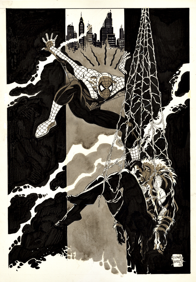
Pin-up, Rocket’s Blast and Comic Collector (RBCC) #4, 2003
Kraven the Hunter, a classic Spider-Man nemesis, is getting his own film?
Er… ok.
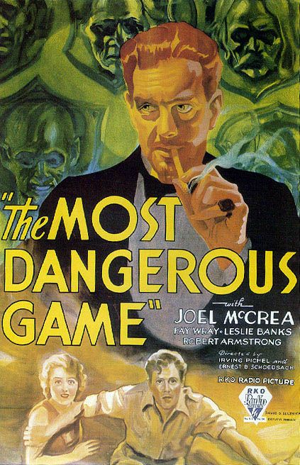
I like the character, especially since I’ve been a fan of the legendary Richard Connell short story “The Most Dangerous Game” since, well, forever.
But… Kraven without Spider-Man is useless to me. Actually all of the Spider-man villains are pointless without the main protagonist.
What, exactly, was the point of the Venom film. A bad guy we root for? Especially one who looks like a monstrous version of… Spider-Man. Huh? What? Tom Hardy was fine as Eddie Brock as the title character, and the film looks great, but it is ultimately pointless. No Spider-Man, no Venom, as far as I’m concerned.
Of course, none of this apparently bothered mass audiences whatsoever. Venom grossed more than $800 million worldwide.
And so, back to Kraven. I would love to see him, even as cameo in Spider-Man 3, before we get to a feature length Kraven film.
In the meantime, the late Eduardo Barreto delivers a terrific splash of Spider-Man capturing Kraven with terrific tonal quality throughout. It appeared in Rockets Blast and Comic Collector #4, the final issue of the short-lived revival of the famous comics zine.
The one question I have is…. Why does Spider-Man look surprised? Did another wall-crawler grab Kraven first? Is this an early and prescient look at the Spider-verse?
But I digress.
Barreto, a Uruguayan artist who passed away at the too young age of 57, was better known for some excellent work at DC (New Teen Titans, Batman, Superman, et al), but his first actual US assignment was in fact Spider-Man, inking Marvel Team-Up #88, featuring Spidey and The Invisible Girl.
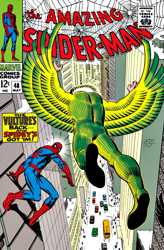
As for the actual Spider-Man 3 villains? Start with Scorpion, who is in the Easter egg at the end of Spidey 1, along with possibly the Vulture (ditto), and head down the rabbit hole from there…
And you never know… maybe Kraven after all.
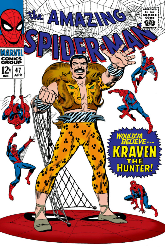
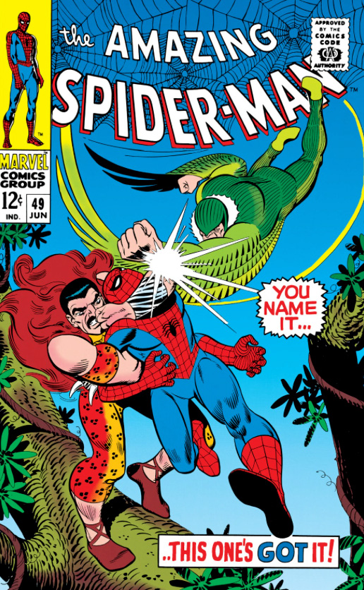
Kraven First appeared in Amazing Spider-Man #15, and returns about a month later with a few “friends” in ASM Annual #1.
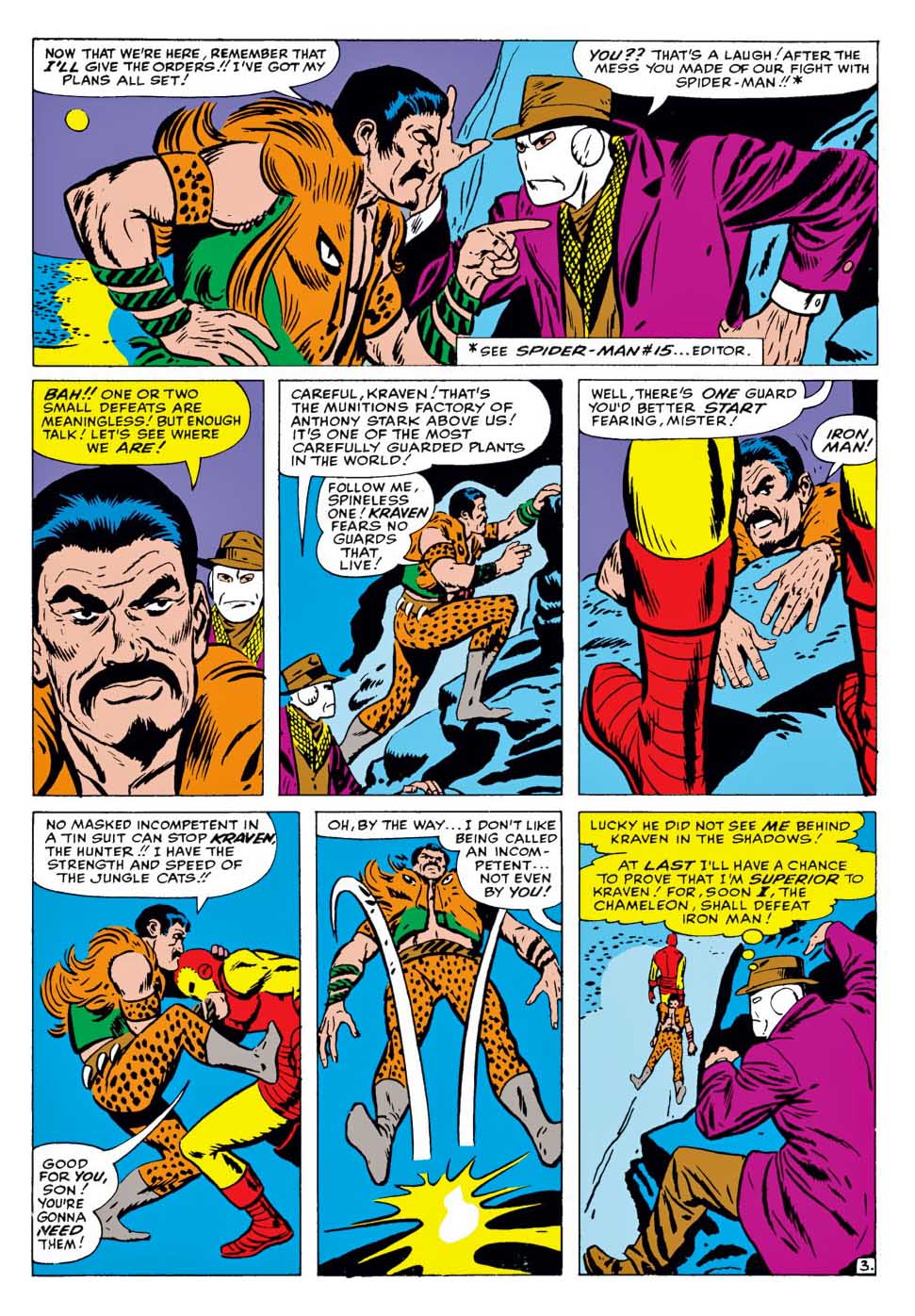
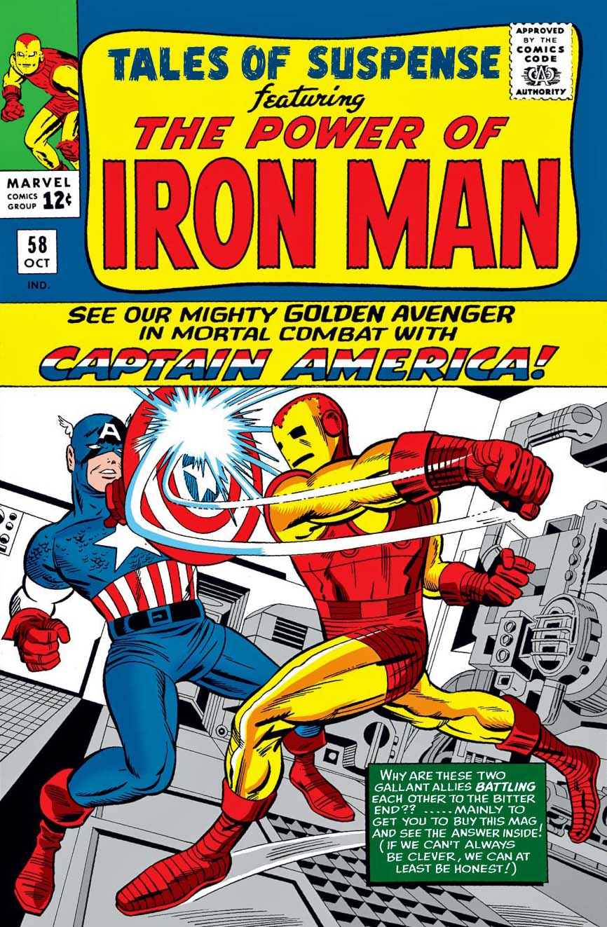
The shortest — and possibly most lopsided — hero vs. villain fight in history. Iron man takes care of Kraven in three panels to support narrative involving The Chameleon posing as Captain America. Convoluted, but hilarious.
Some of the earliest Marvel Comics I purchased at the candy store as a kid, and coincidentally about the time where John Romita comes into his own as Spider-Man’s artist. Compared to everything DC and the other companies were doing, this was heady stuff.
Kraven is the villain in one of the most beloved and critically Spider-Man stories of all time, “Kraven’s Last Hunt”. Also pictured: RBCC #4 where the Barreto pin-up appears, and the film poster for the first adaption of Most Dangerous Game, an obvious inspiration for the Kraven concept.
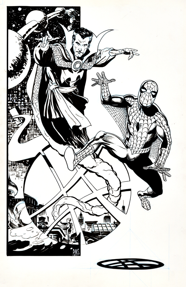
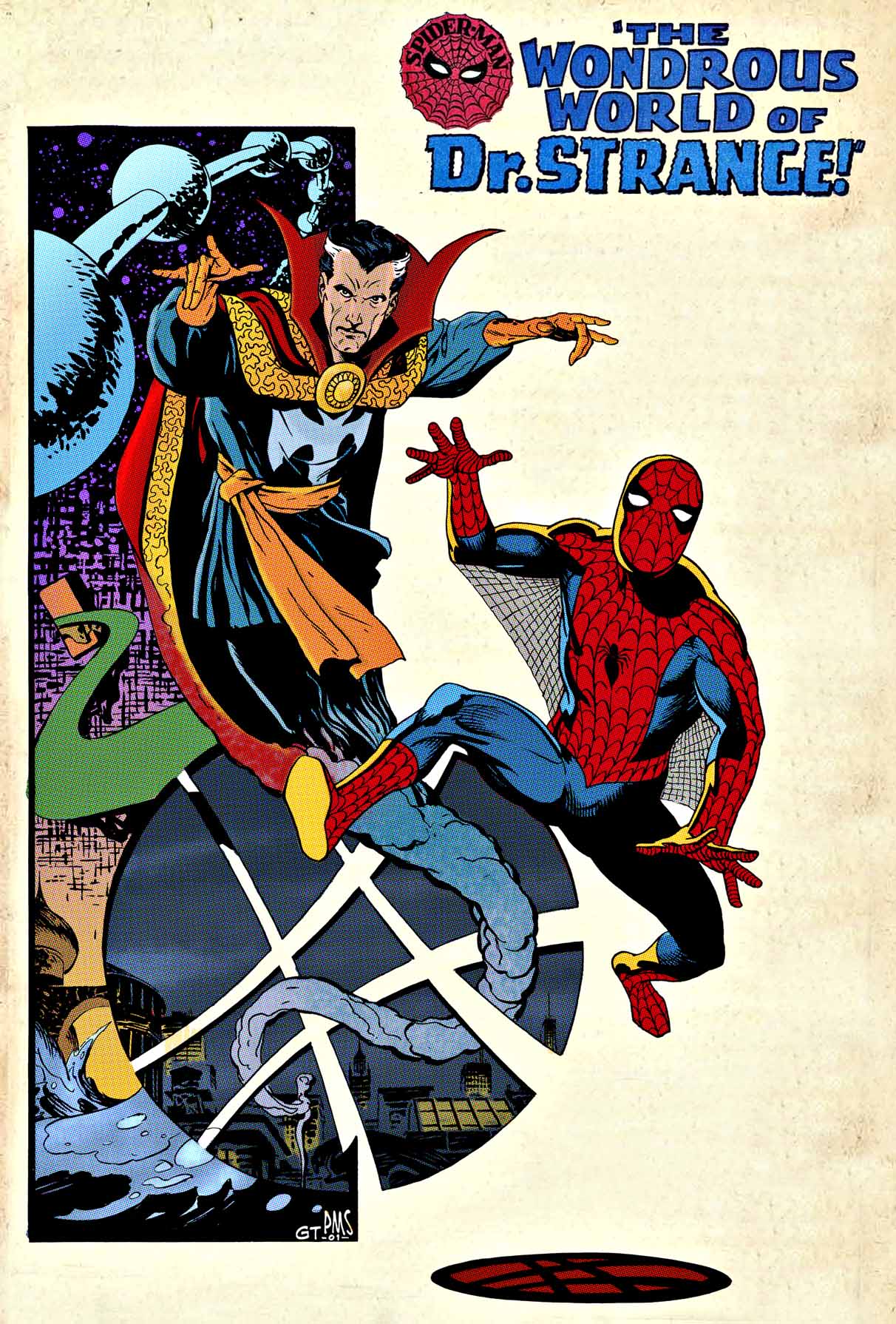
Paul Smith, Pin-up tribute to Steve Ditko, ASM Annual #2 (1965), 2001
Elegant, clean and striking: The definitive Paul Smith style captures Steve Ditko’s classic (and only) pairing of Spider-Man and Doctor Strange in Amazing Spider-man Annual #2 from September 1965.
Seeing the pairing of these now iconic Marvel cinematic characters creates some wistfulness here.
Last week, Disney postponed the feature film Black Widow once again. It’s now scheduled for May 2021, a full year behind schedule. 2020 will be the first year without a film in The MCU since 2009.
And, even when the films were less frequent in the early days, a Fox or Sony Marvel film typically filled in the gaps.
(No, I’m not going to act as if the recent New Mutants counts. More people have probably seen the officially unreleased Roger Corman Fantastic Four film than New Mutants.)
Now of course, Covid has thrown the entire upcoming film schedule into disarray. Eternals and Shang-Chi also moved, and swapped positions in the queue — for now.
After that, it’s a bit of a wild card.
The next three films should be Spider-Man 3, Doctor Strange 2, and Thor 4… but, we’ve seen differing revised release dates for those just in the last week.
Then, the schedule becomes even hazier, but let’s put off that discussion until next week.
Meanwhile, up next this coming week on the blog:
Spidey, Doc, and of course… Thor. See you soon.
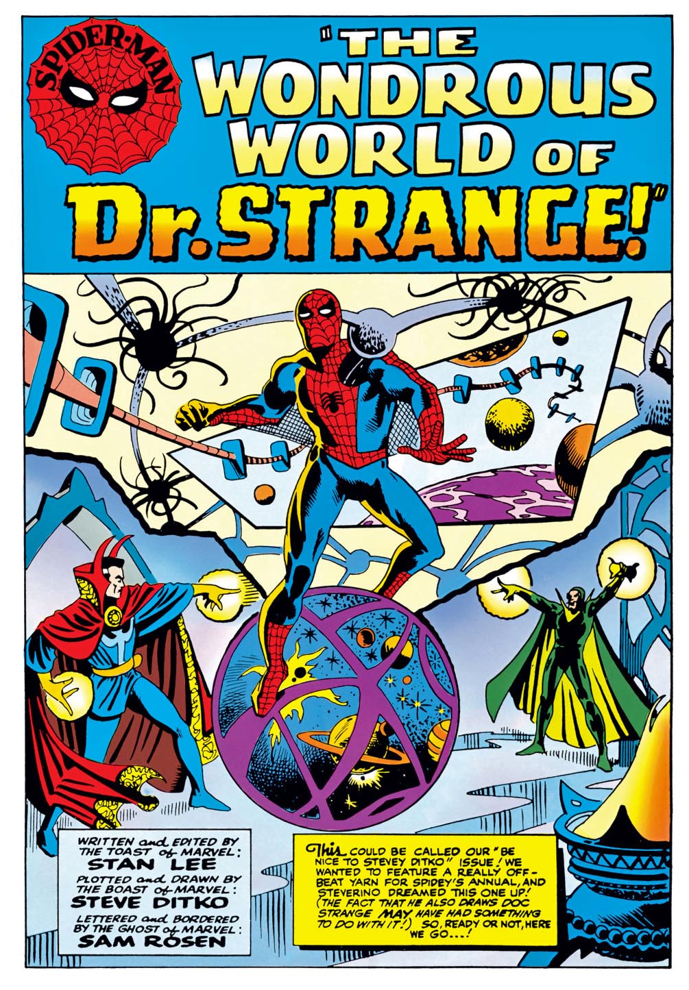
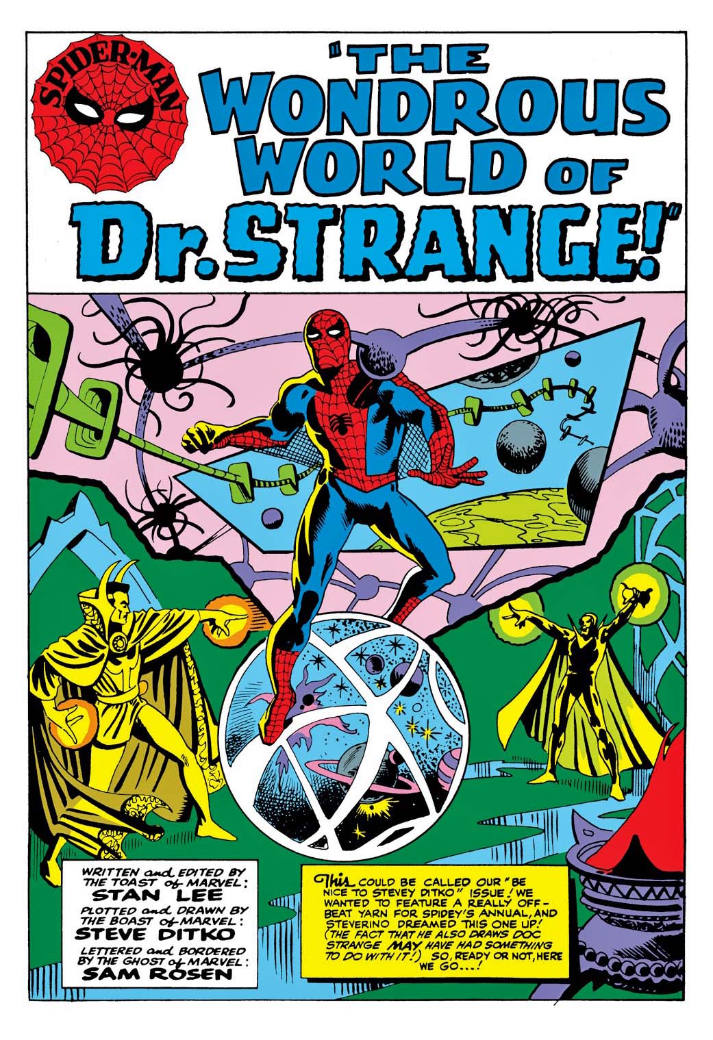
The current digital version of the original splash from Amazing Spider-Man Annual #2 in 1965.
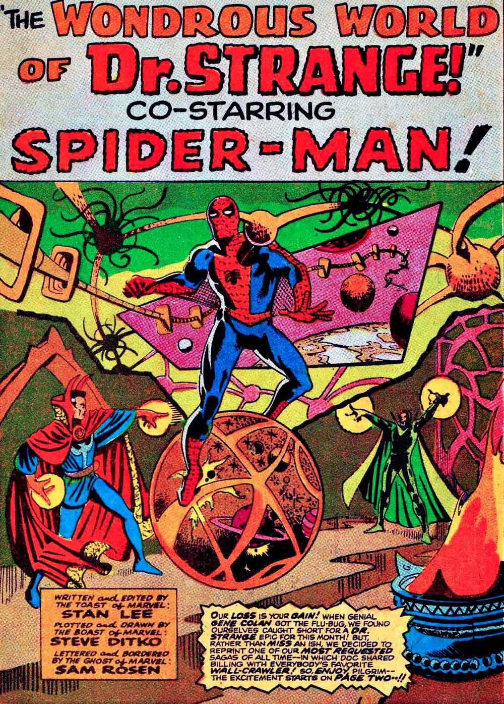
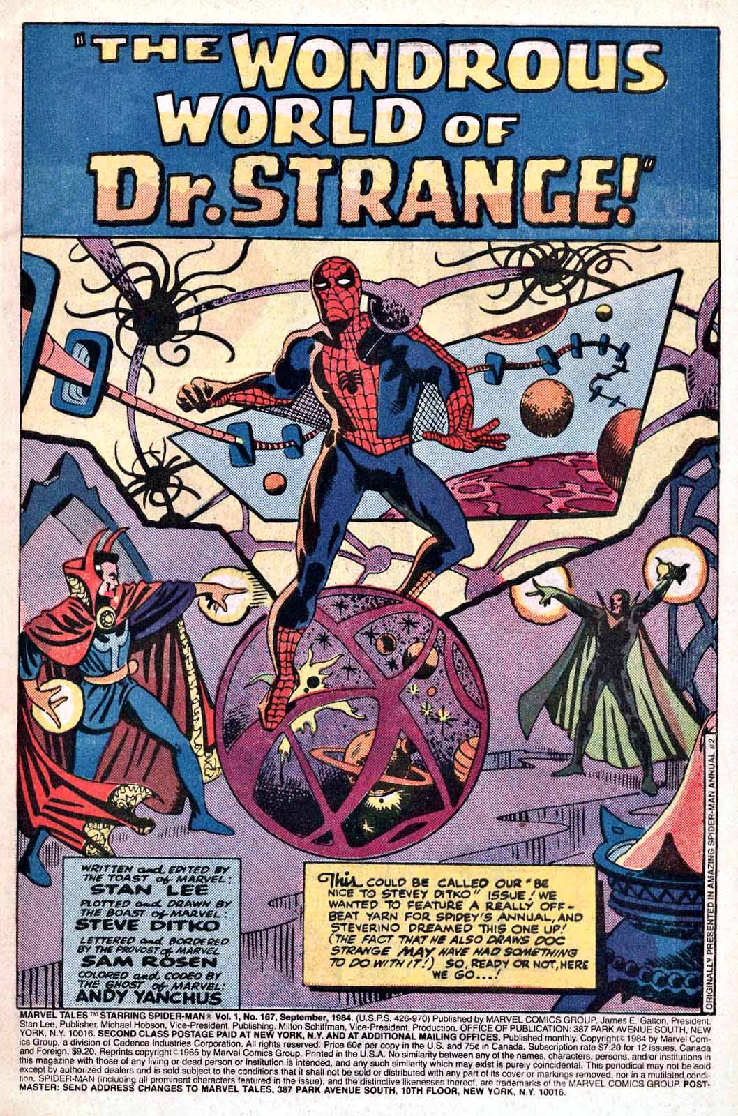
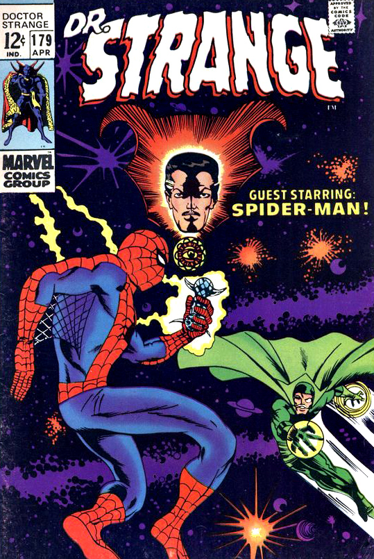
Many reprints, many colors, and a few layout and production changes, too. From left to right, the original annual coloring re-mastered for digital, the coloring and other changes from the “emergency” reprint in Doctor Strange #179, and the re-colored (again) reprint from Marvel Tales.
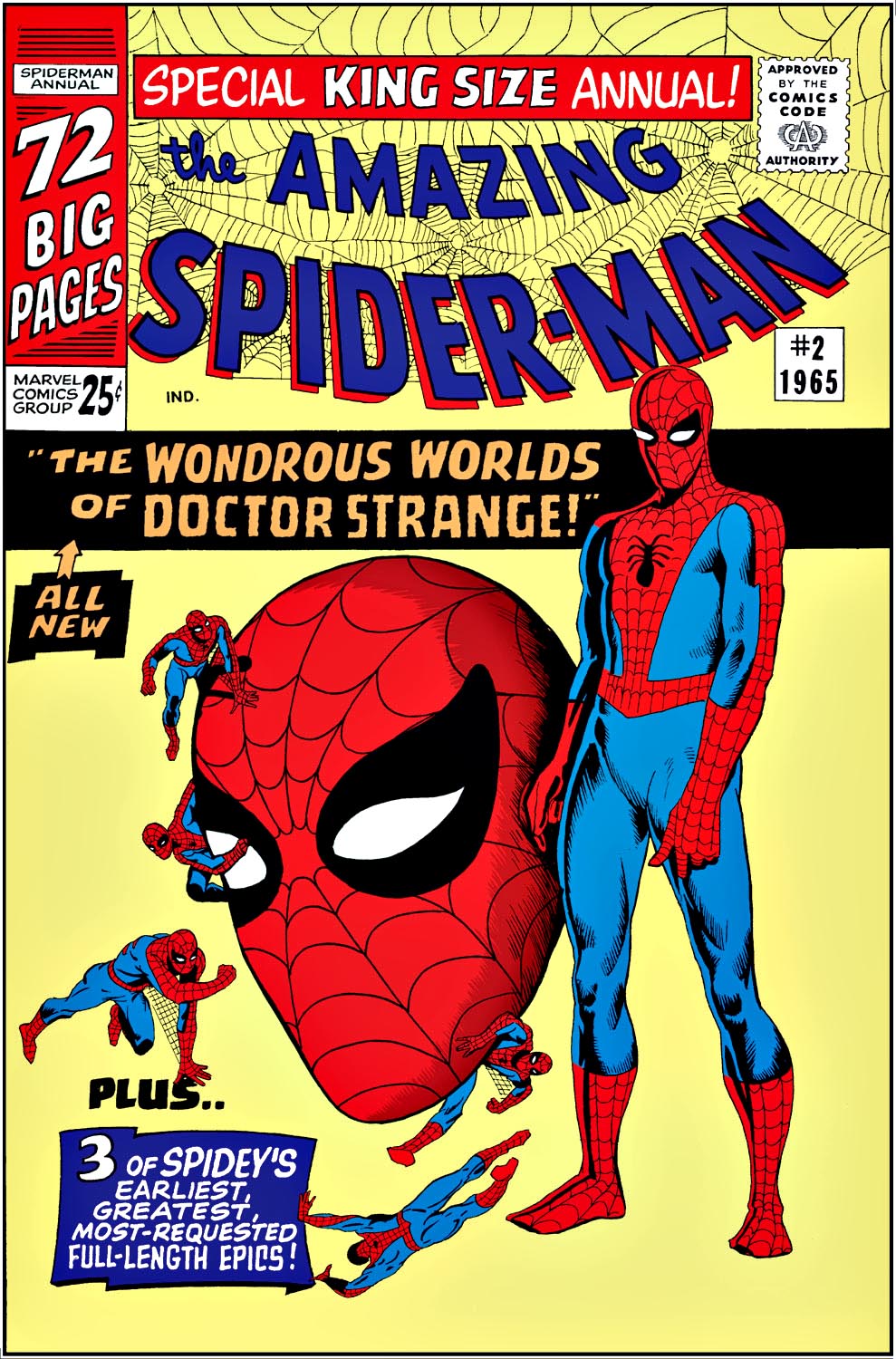
Here’s a bet: Ditko drew the cover for ASM Annual #2 well before he and Stan knew what the story would be. Otherwise… you’d probably see Doctor Strange actually on the cover. A few years later, and a deadline blown, Barry Smith was called on to provide a new cover for the story which was reprinted completely out of continuity in Doctor Strange #179.
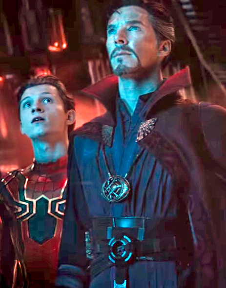
Digital colors by Gerry Turnbull, and, in the MCU, Spidey and Doc work together to try to defeat Thanos in Avengers Infinity War. It doesn’t go well… at first.