Panels and Pages… Art and Artists… Creators and Conventions… Musings and Memories…
Author: Greg Goldstein
Greg Goldstein is a veteran publishing and media executive; most recently, he was the Chief Operating Officer, President and Publisher of IDW Publishing, managing all aspects of the company’s book and games business from 2008 to 2019.
Throughout his career, Greg has developed creative and profitable publishing programs for dozens of the world’s best-known entertainment brands including Star Wars, Transformers, Star Trek, James Bond, TMNT, Spider-Man, Batman and Godzilla.
In 2013, Greg led IDW’s acquisition of Top Shelf, an independent publisher best known for Congressman John Lewis’ March trilogy, which has become the most lauded non-fiction graphic novel series in the history of the medium.
In 2011, Greg won an Eisner award for his editing on the first-ever collection of Bob Montana’s Archie newspaper comic strips. (Published under IDW’s Library of American Comics imprint.)
Prior to joining IDW, Greg was VP of Entertainment and Gaming for Upper Deck, responsible for the company’s blockbuster slate of games, including Yu-Gi-Oh, World of Warcraft and The VS Superhero system. During his tenure, he created Marvel Ultimate Battles, the first-ever trading card game that focused exclusively on Marvel’s popular mass media characters.
As VP of Brand Development for Activision from 2000-2002, Greg established strategic partnerships with the largest Hollywood studios, and worked closely with Marvel Entertainment to successfully develop Spider-man into one of the biggest blockbuster licensed videogame brands in interactive history.
Greg’s career has also included a successful stint at Topps, where he helped launch and manage Topps Comics in the mid 1990s.
Additionally, Greg serves as an adviser for to the Comic Book Legal Defense Fund (CBDLF). He is also a frequent guest lecturer at San Diego Sate University and has presented at dozens of panels and conferences throughout the US.
He is also a well-known collector of original comic book art and rues the day he sold his collection the first time around in the late 1990s.
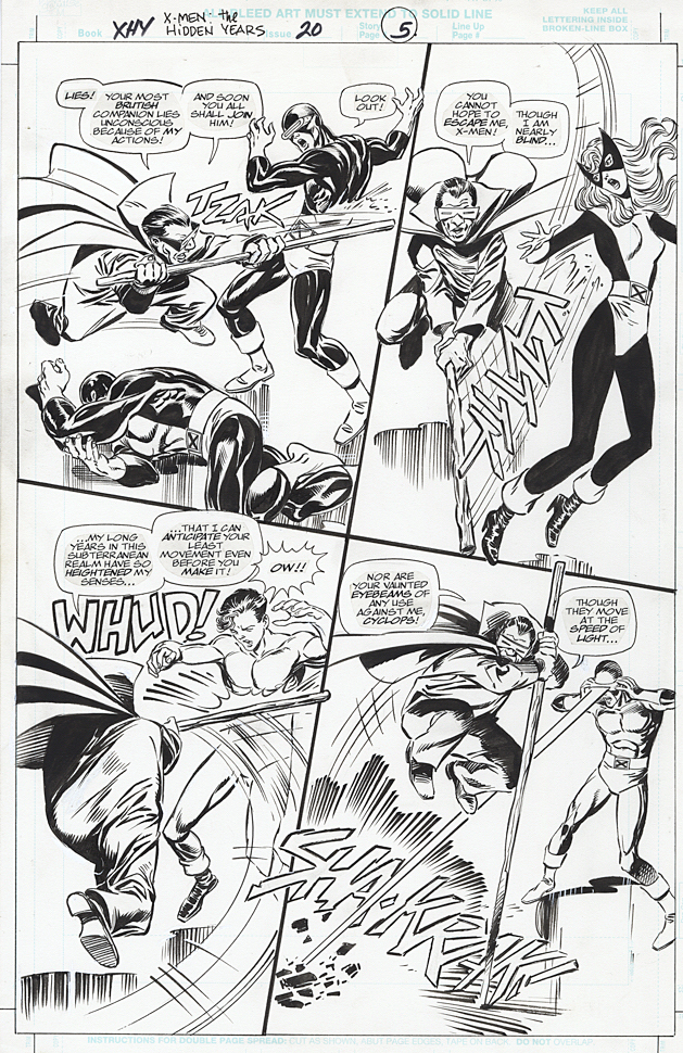
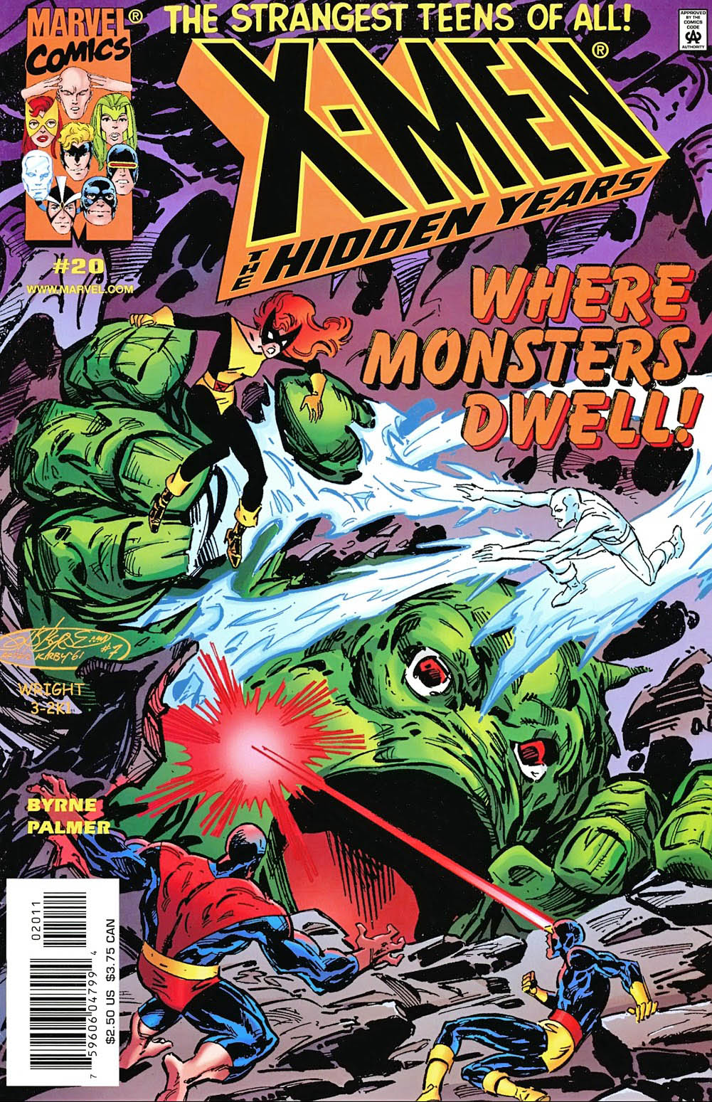
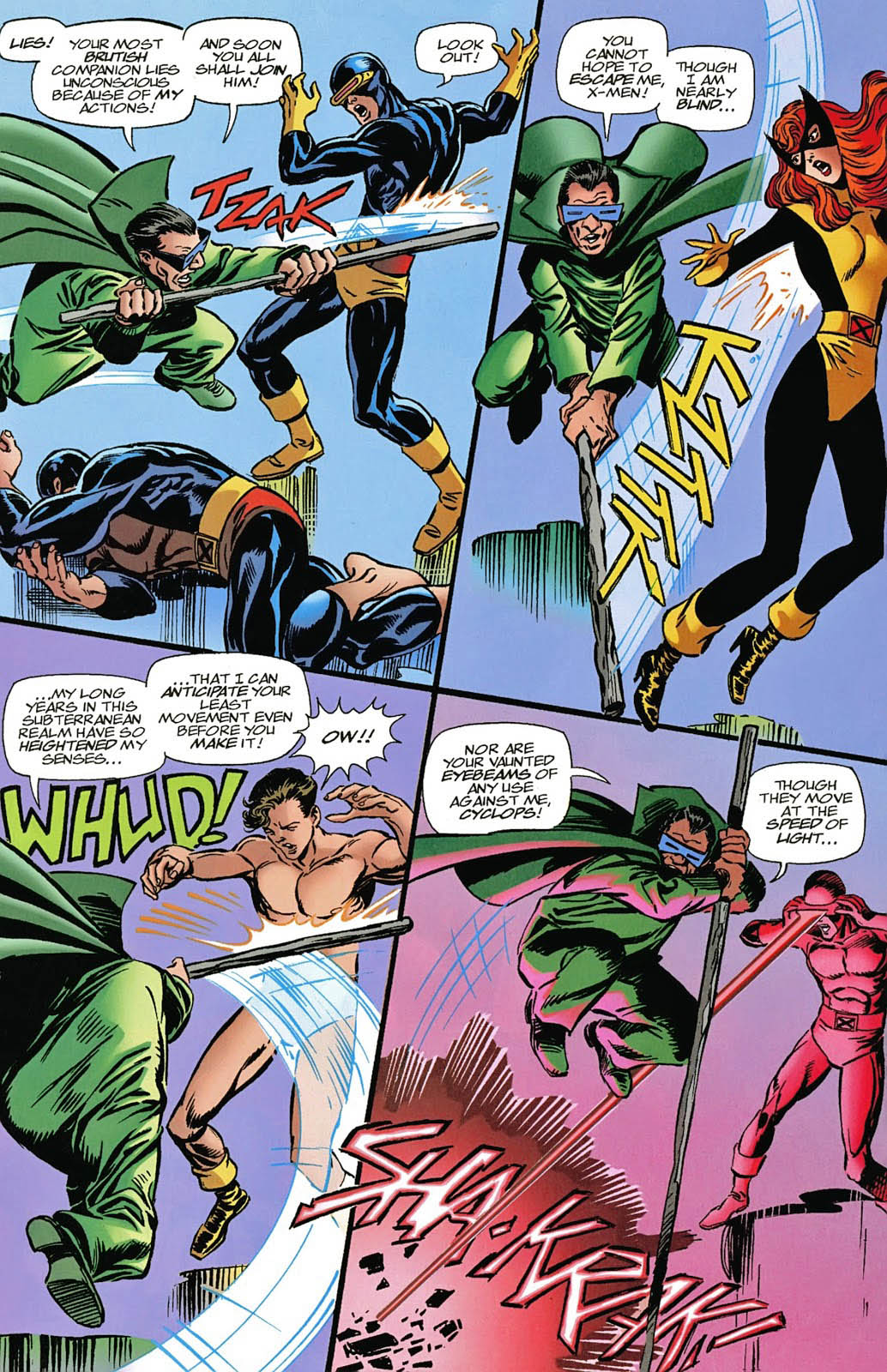
X-Men: The Hidden Years # 17, April 2001 & #20, July 2001
John Byrne returned to the X-Men in 1999. Not his beloved X-Men of Wolverine, Storm, Colossus and Phoenix, however. This time it was the “original” X-Men — in the period between their cancellation and rebirth. The “Hidden Years.”
It’s an often overlooked series and shouldn’t be. John brought great energy — and closed some outstanding story loops — in the 22-issue series.
Inks are by the terrific Tom Palmer, which gave the series a
classic look, reminiscent of those great original Neal Adams issues, while still
keeping it clearly Byrne.
Lots of fun guest appearances in the series as well, including the Fantastic Four — inked in one issue by the legendary Joe Sinnott.
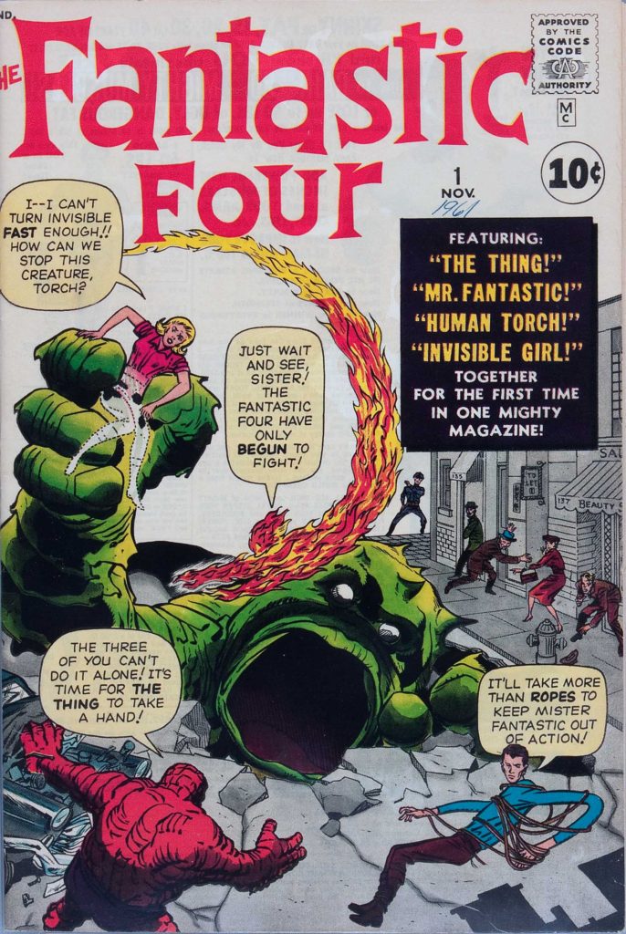
X-Men: Hidden Years #20 is a Byrne homage to Jack Kirby’s Fantastic Four #1. It was the sixth (and final) Marvel-related FF #1 homage that John drew.
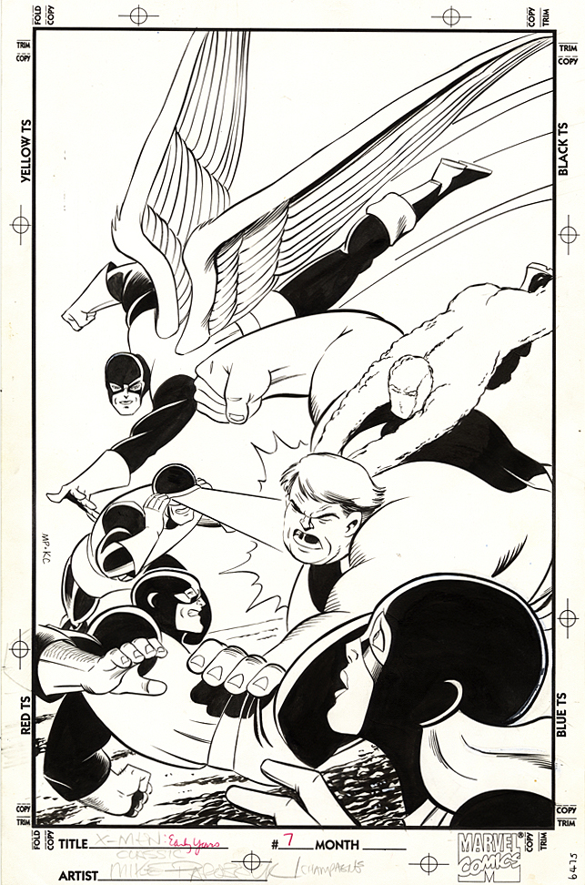
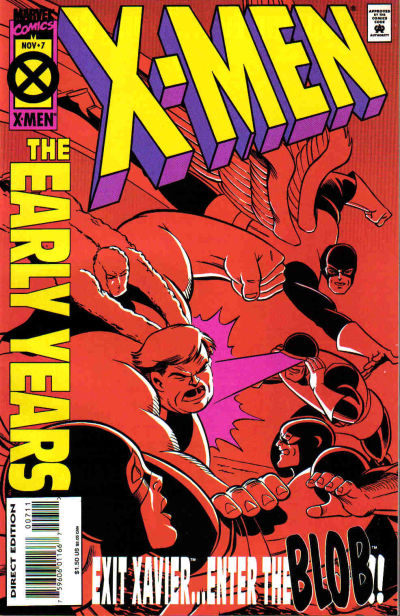
Case in point, Mike Parobeck’s cover of X-Men: Early Years #7, which reprints the original X-Men #7.
Jack’s original cover (below) is overloaded, and a composition mish-mash. Ok, I know it’s by Jack Kirby, and some fans will bristle about anything negative about the King’s work, but sorry, there’s no real comparison between the original and the reprint.
Jack’s original has way too many characters all over the map, with the X-men oddly positioned in the background and The Brotherhood of Evil Mutants voyeuristically up front, awkwardly. Are they watching from a window? Or on a TV screen? A magical portal? Why the heck are they even on this cover? This is a selling point?
Now, just to be clear, this may not be at all Jack’s fault. Maybe Stan Lee art directed it. And overwrote the cover blurbs to death. (Now, the Stan haters can come out of the woodwork.)
As I’ve said on the record many times, I’m a fan of both Stan
and Jack, so let’s all calm down. However this original cover developed, it’s simply
not a great one. Even legends drop the ball once in a while.
Mike’s solves the problem thirty years later by focusing only on the X-men coordinating — or attempting to — an attack on the Blob.
Simple. Clear. Clean. Powerful. Typical of Parobeck’s work.
But… On the published version, the trade dress is a bit
heavy handed, so some of the art is obscured — and the entire image had to be
flipped to accommodate said trade dress. And, to add to this litany, why the monochrome
coloring? Ah Hell, who knows.
Anyway, the original art is great and Mike’s Marvel work is
pretty rare; he is best known for some great looking art on the Batman Animated
comic books. I was also a big fan of his Justice Society run.
He unfortunately passed away MUCH too early at the age of 31
(from Diabetes) in 1996.
It’s the 50th anniversary of the original title’s cancellation (Issue #66). It had struggled to find consistent commercial success or creative direction for much of its original seven-year history.
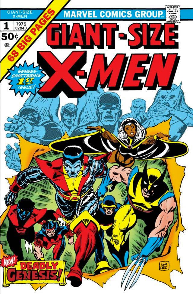
It’s the 45th anniversary of the X-Men’s
“comeback” with the launch of Giant-Size X-Men #1, possibly the greatest rags
to riches story in comics’ history. If anyone else can tell me where a book
goes from cancelled to a company’s most popular title in less than 10 years,
I’m all ears.
And, perhaps more importantly from a broader pop culture perspective, it’s the 20th anniversary of the X-Men film franchise from Fox, which concludes forever in a short while with the release of the problem-plagued New Mutants. (Postponed many times, it was most recently scheduled for an April 3 theatrical release, and has now been indefinitely delayed because of the COVID-19 outbreak.)
The first X-Men film launched 8 years ahead of the MCU, and
in my mind, established what a Marvel film could do in terms of both creativity
and commercial success. It paved the way for what was to come.
Meanwhile, we have this great commission by John Byrne.
John Byrne. X-Men. Not much to add here except a few
details.
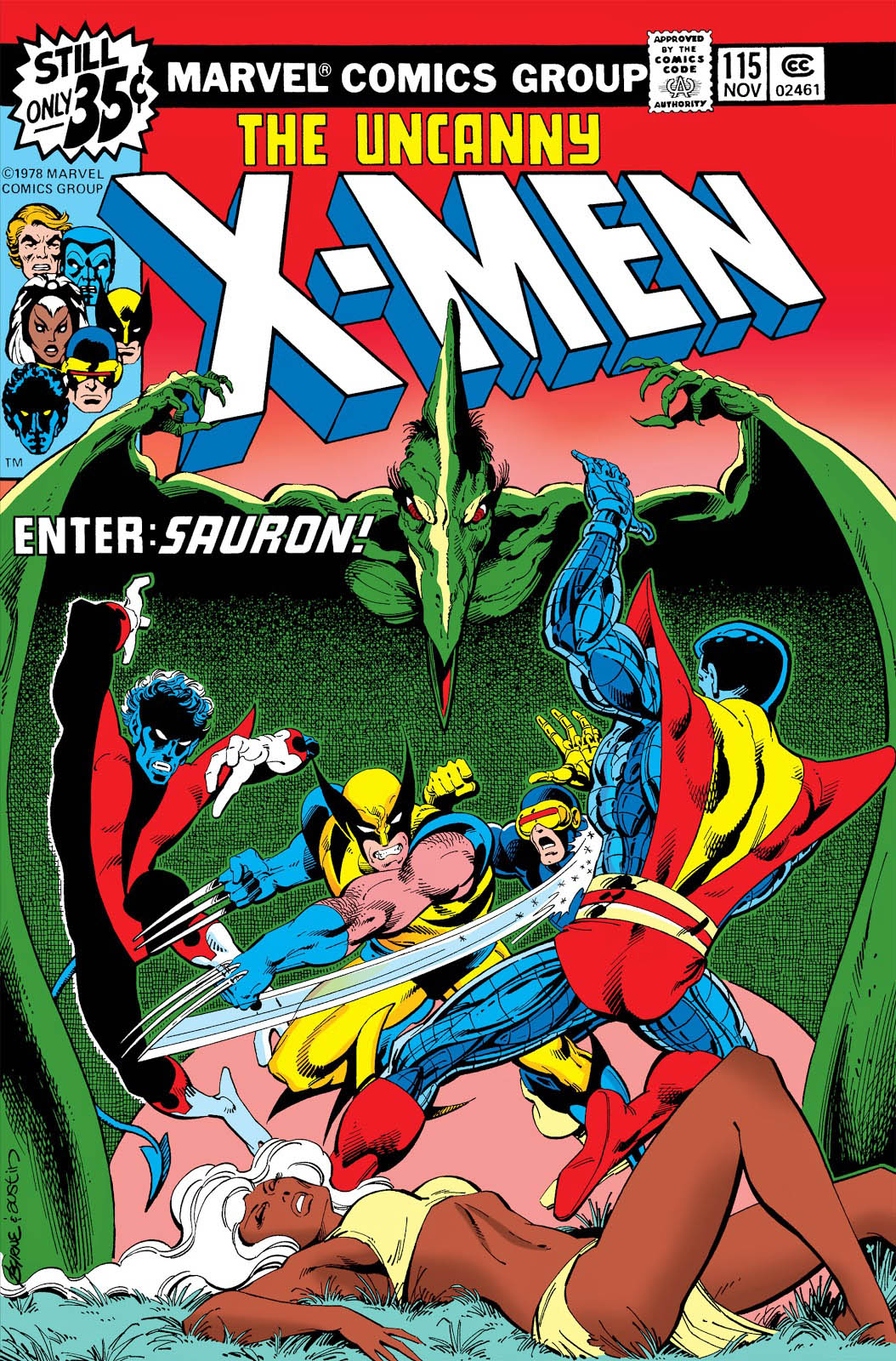
This is a Byrne re-imagination (as John calls them, I believe) of the cover of X-Men # 115 featuring the dinosaur villain Sauron. The re-imagination is more dynamic and dramatic than the original, which was only John’s third cover on the book. Dave Cockrum had a few in the can when Byrne took over art duties on issue #108.
Byrne’s commissions can be found easily through a Google
search and there a lot of great ones — at sizes up to 30x 40!
Unfortunately, John’s not doing much if any in the way of commissions right now as he is spending time on his X-Men fan fiction (his phrase) but if you want to keep fingers crossed that he will take them up again, you can contact his art representative, Jim Warden.
John’s Commission is closer in spirit to this great original double-page spread from #115.
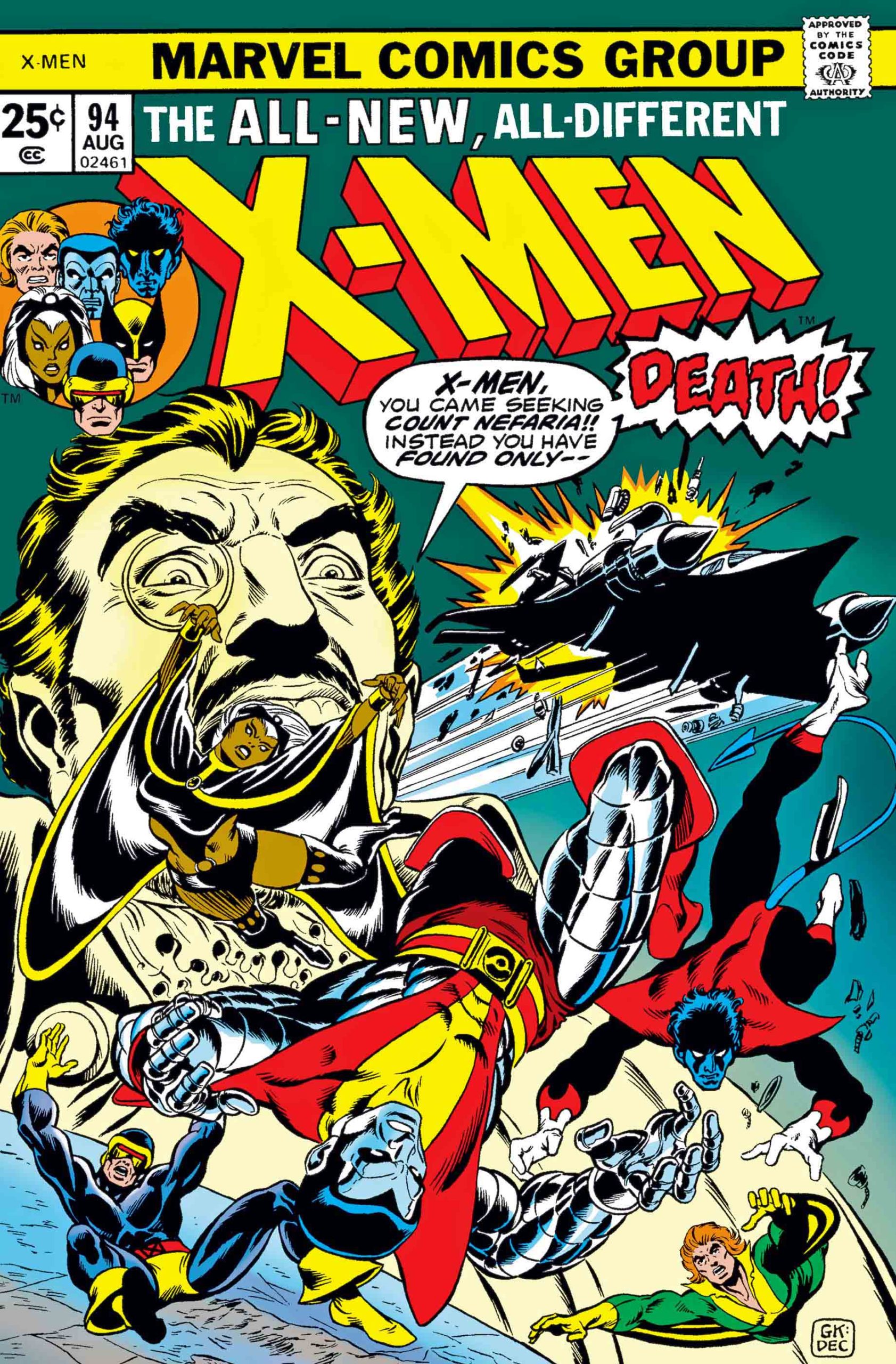
The X-Men rebirth began here in Giant-Size #1 and X-Men #94, both 1975.
Byrne’s earliest X-Men work: His first issue (#108, cover by Dave Cockrum) preceded by a guest appearance in Marvel Team-Up #53, featuring another great DPS.
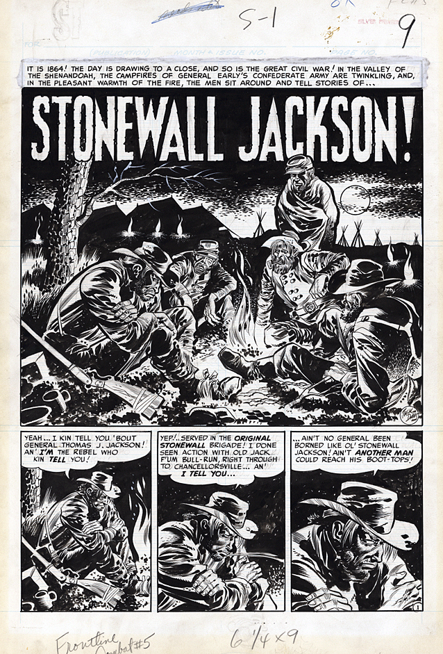
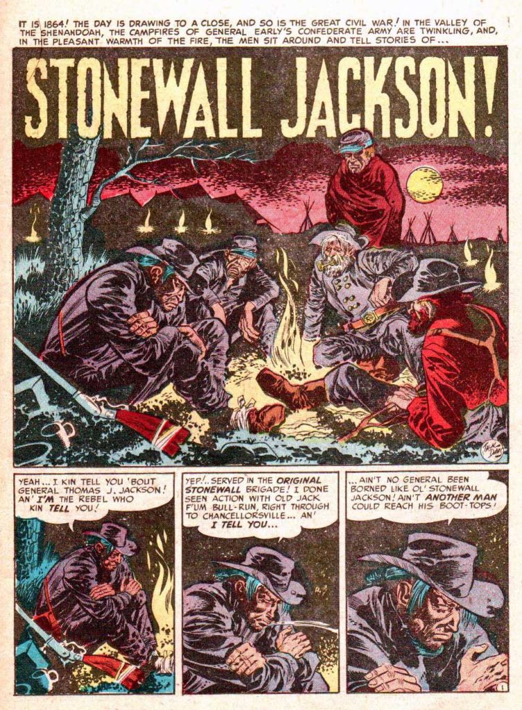
Concluding (for now) our 60th anniversary celebration of the legendary EC “New Trend” comics with another classic piece of great art from the legendary Jack Davis.
“We got into the Civil War thing. It was a favorite project of mine. We were hot to do the story of the Civil War from front to back.” — Harvey Kurtzman, 1972 EC fan convention panel.
War stories were among EC’s many strengths, and many of those, thanks to Harvey Kurtzman’s obsessive editorial attention, were accurately based on historical events.
“Stonewall Jackson!” is a perfect example. Jackson, a brilliant Confederate military tactician, was accidentally shot by his own men in a nighttime battle. This Kurtzman story retells that tale through the voice of the supposed soldier who shot him.
Lighting is an illusion created by a creative combination of black ink and negative space. On this splash, one of my personal favorites, Davis indeed creates a beautiful illusion of campfire light. There is no actual illumination here of course, but thanks to the well-crafted art, our mind’s eye sees it.
The storytelling is equally effective. The camera work closes in on one figure through multiple panels — we instinctively know that this is our narrator and his story, even without reading the dialogue.
All our stories really protested war. I don’t think we thought war was very nice generally. The whole mood of our stories was that war isn’t a good thing. You get killed. That’s the way war is; you get killed suddenly for no reason.— Harvey Kurtzman, 1972 EC fan convention panel.
The splash makes the cover of Fantagraphics collection of Kurtzman / Davis collaborations.
EC’s creators discuss the legendary Jack Davis for his profile in the 1972 EC fan convention.
In 2011, Davis told The Wall Street Journal about his early career and his breakthrough with EC:
I was about ready to give up, go home to Georgia and be either a forest ranger or a farmer. But I went down to Lafayette St., up in an old rickety elevator and through a glass door to Entertaining Comics where Al Feldstein and Bill Gaines were putting out horror comic books. They looked at my work and it was horrible and they gave me a job right away!
Every time you went in to see Bill Gaines, he would write you a check when you brought in a story. You didn’t have to put in a bill or anything. I was very, very hungry and I was thinking about getting married. So I kept the road pretty hot between home and Canal Street. I would go in for that almighty check, go home and do the work, bring it in and get another check and pick up another story. [Edit: the actual cross street to Lafayette was Spring Street, not Canal.]
Continuing our 60th anniversary celebration of the legendary EC “New Trend” comics with another classic piece of great art from the legendary Jack Davis.
This is actually the fourth issue of EC’s Two-Fisted Tales. William Gaines — and other publishers — used a variety of title and numbering gimmicks to ensure they didn’t lose a slot in the challenging newsstand system.
It’s a Korean War story — ongoing at the time of publication — and one of many published prior to the “ceasefire” that ended the war.
Davis, in one of his early war stories, does a fantastic job following — and enhancing — Harvey Kurtzman’s very specific layouts.
Very specific layouts? Kurtzman was obsessive about the storytelling and the detail. If he couldn’t draw the story himself, e wanted to ensure that the finished result would be as close to his own material as possible. Again, because this is an early Davis war story, even the art style itself is mimics Kurtzman’s in places.
Davis and Kurtzman (and others) discussed Kurtzman’s methodology at the 1972 EC fan convention, and took a question from the audience…
QUESTION: I’d like to know how the individual artists
felt working with the very strict layouts.
KURTZMAN: I’d like to hear that, too.
DAVIS: I don’t know. I think the end product came out pretty good – the detail and all. There are a lot of people that appreciate detail and there are a lot of people that don’t. Once you do something you like it to be authentic. Where doing the horror books you didn’t have to be authentic, this was something that you’d like for it to come across as true, and Harvey felt very strongly about truth – the way the weapons worked and everything. We did the best we could, and I enjoyed it. It wasn’t that bad. I’d hate to do it all the time.
Marie Severin’s caricature of Harvey Kurtzman (in the 1972 EC convention program) captures perfectly his obsessive attention to detail and accuracy, especially on his beloved war stories.
2020 is the 60th anniversary of the legendary EC “New Trend” comics. William Gaines and his masterful crew published some of the most enduring comics and stories in the medium’s history, raising the bar in all categories — humor, science fiction, war, crime, and of course, legendarily, horror.
To celebrate this anniversary, we take a look at one of EC’s
greats — Jack Davis.
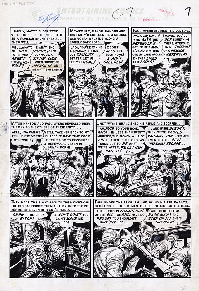
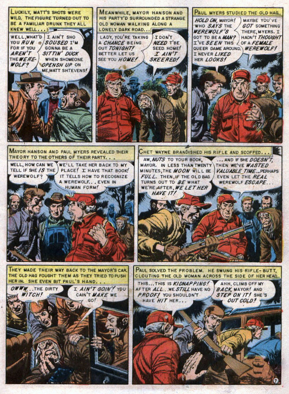
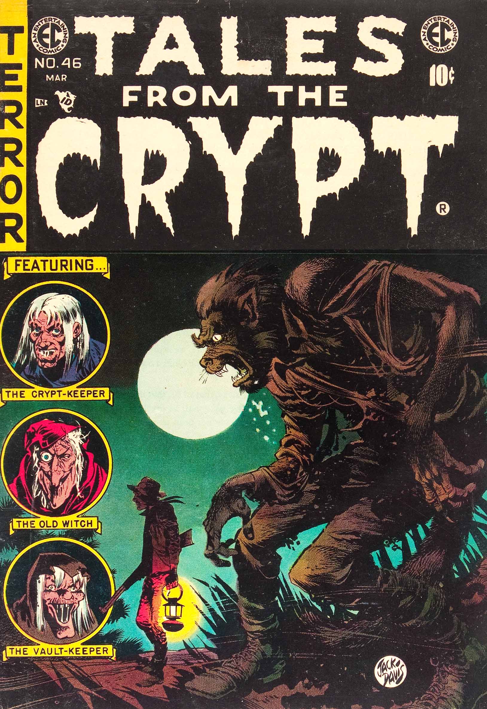
This Davis page is from Jack’s last horror story, “Upon Reflection,” from Tales From The Crypt #46, the final issue. Gaines, under censorship pressure — and unable to ensure distribution — raised the white flag and cancelled his horror and crime titles.
Davis telltale style drips all over this page. The old crone, the angry mob, and the tense claustrophobia in each panel spell out impending doom… for someone. (If we know the EC M.O., it will be a twist.)
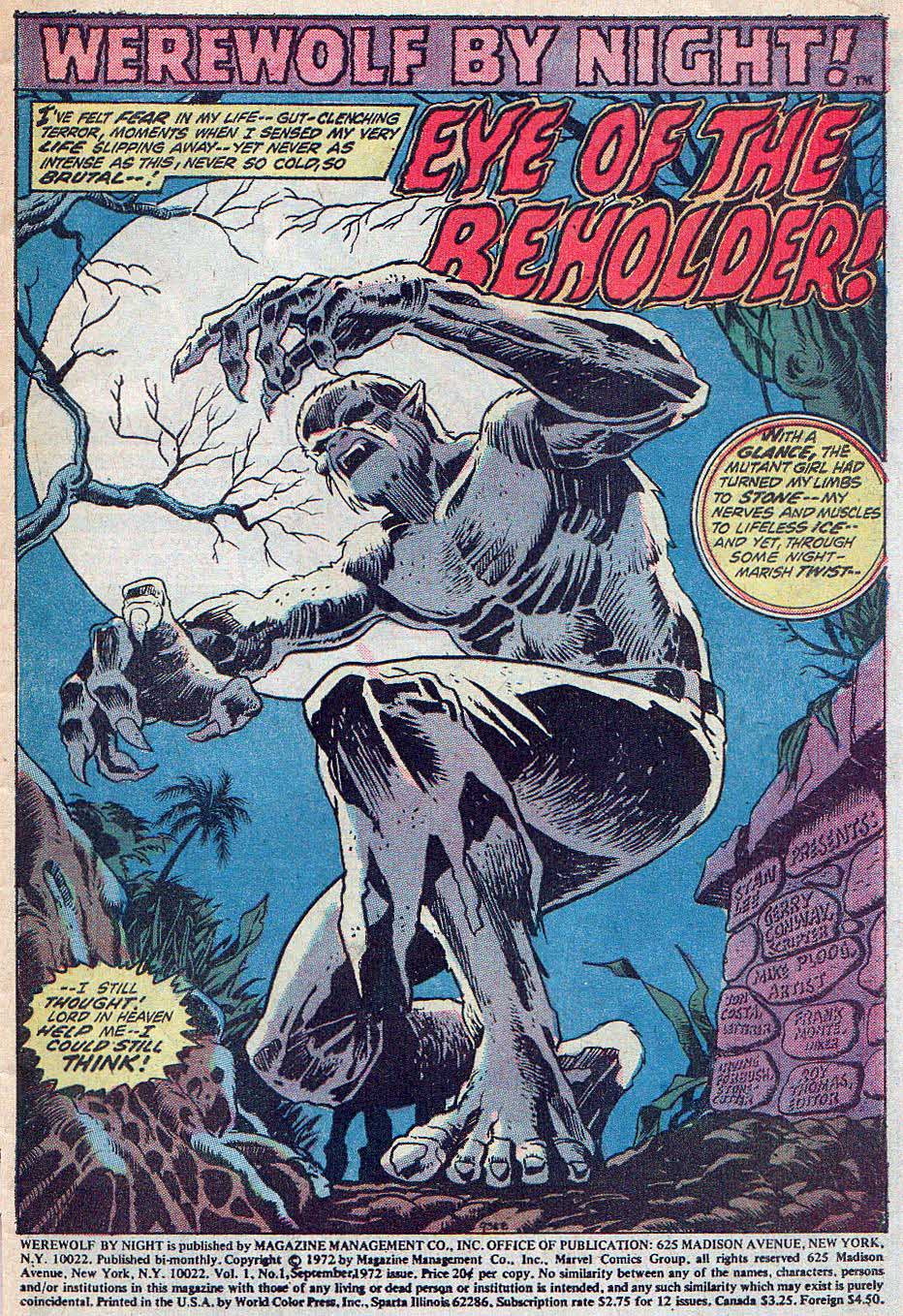
The cover from this werewolf story has become one of the most iconic in horror comics history.
By 1955, Davis had easily become one of the most important artists in the EC “bullpen.” He was unfailingly reliable, tremendously gifted, and ridiculously prolific. Under the gun, he could pencil and ink three pages in day, without taking quality shortcuts.
Gaines, Davis, and nearly all of the rest of the EC mainstays reunited at the 1972 EC fan convention, organized by fans Bruce Hershenson and Ron Barlow. At various panels throughout the event, they reminisced about EC’s halcyon days, and the two spoke about Jack’s association with horror stories:
JACK DAVIS: I enjoyed doing the horror bit and they liked it, and so I kept at it. But when I looked back on it after things began to get very ticklish with the Code and everything, I began to ask – am I doing something constructive or good. I still, I don’t know, I don’t think it’s really that bad.
WILLIAM GAINES: You have to understand Jack comes from another era, and another kind of background. Jack was, and still is, a very moral, religious person. He came up here from Georgia… [laughter]…I’m serious now…and Jack did this stuff because it was his job as an artist. Jack has always had some misgivings about it, and I respect his misgivings. Jack has been more comfortable with other types of material than horror. But the fact that he’s a real pro is evident from the fact that although he wasn’t 100% comfortable with it, you see the job he did.
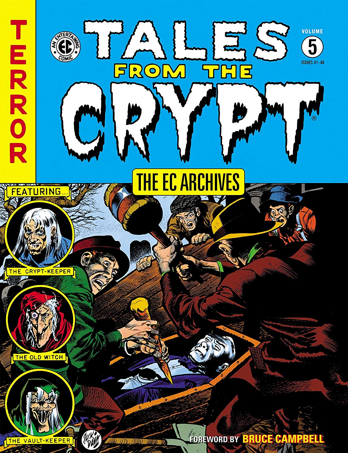
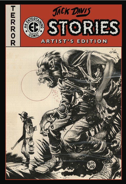
“Upon Reflection” is collected in both black and white and color versions, and the Tales From The Crypt cover adorns the Jack Davis EC Stories Artist’s Editionfrom IDW.
Three EC-related publications that warped my (very young) brain, and the rest, as they say, is history: The 1971 bio of Gaines that includes tremendous detail about EC’s rise and fall — and rise; Woody Gelman’s 1971 Nostalgia Press oversize collection of EC stories was my intro to the tales themselves; and the brilliant 1972 EC fan convention program which featured bios and caricatures of all the EC creators.EC publishes its own obituary.
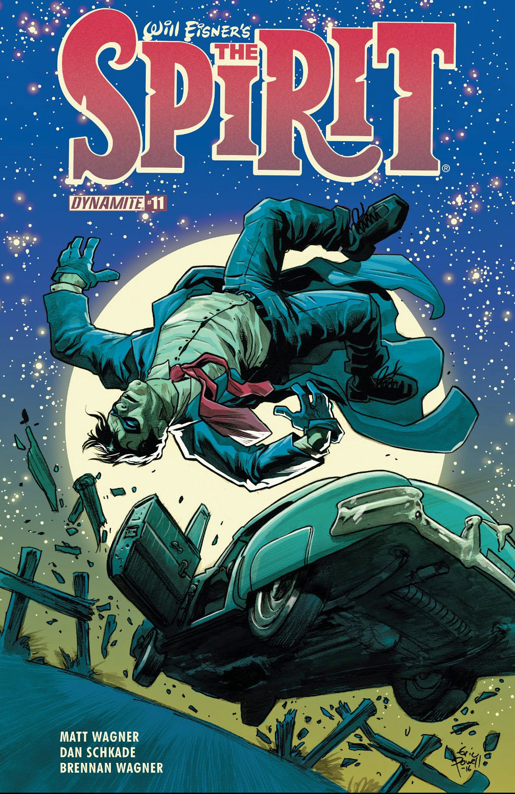
Concluding our celebration of the 80th anniversary of The Spirit, with additional creators’ takes on the beloved and influential character.
Looks like the Spirit forgot to beware the Ides of March.
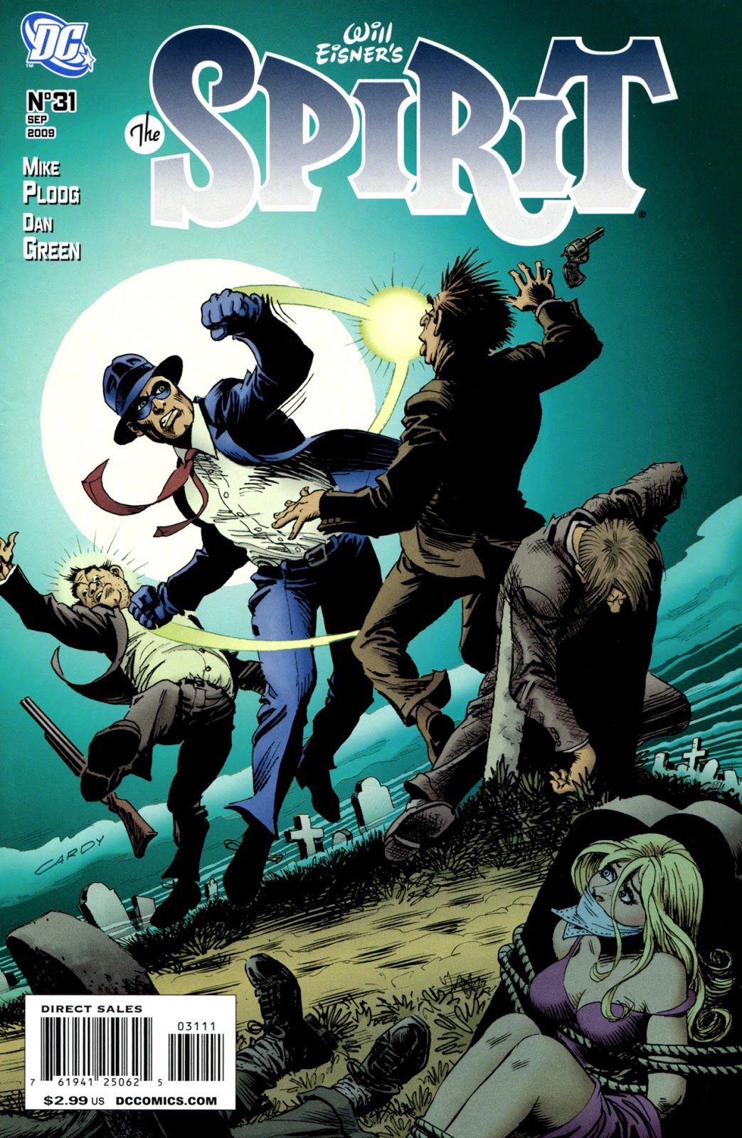
Matt Wagner brought the Spirit back to life for Dynamite in 2015 with an ongoing series. Although Matt drew the cover for the first issue, the amazing Eric Powell created many of the rest of the main covers, including this terrific one.
I first discovered The Spirit via the over-sized, black &
white reprints from Warren Publications in the mid 70s. I was bowled over by
Eisner’s artistry and sophisticated use of sequential narrative but also by the
enormous emotional punch these stories seemed to pack into a brief seven pages.
Whether it was humor, romance, pathos or irony, I found a depth of character
and resonance that seemed to be missing from the mainstream comics of the day.
I can honestly say The Spirit changed
my perceptions of a comics creator and made me consciously aware of the
artistry involved in rendering these tales. I’m a comics artist and writer
today because of Will Eisner and The Spirit.
— Matt Wagner, quoted in the Westfield Comics Blog
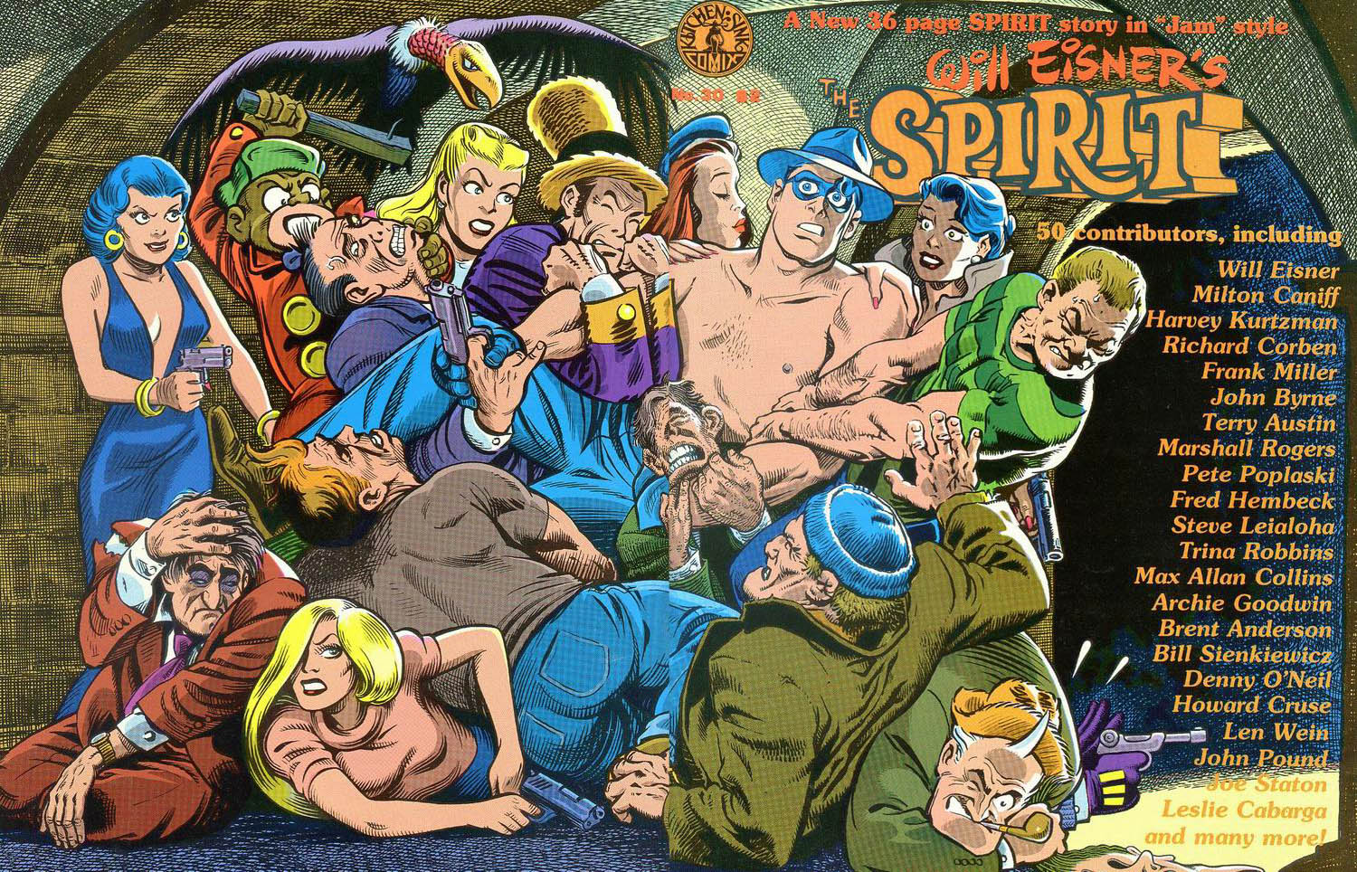
Kitchen Sink started the tradition of all-star creators working on the Spirit, a tradition that continues today…
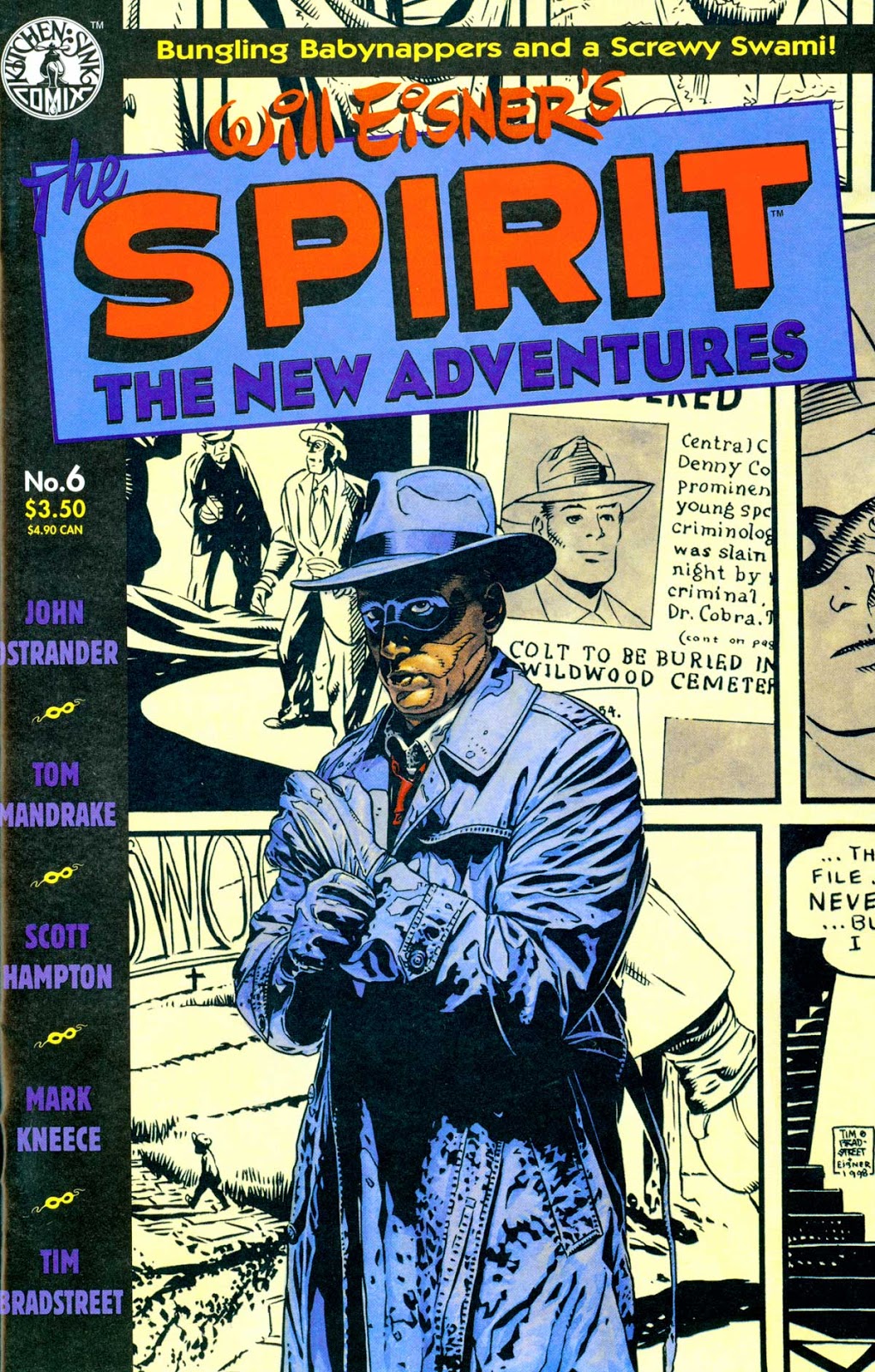
Continuing our celebration of the 80th anniversary of The Spirit, with additional creators’ takes on the beloved and influential character.
Tim Bradstreet — with Eisner’s blessing — redraws some of the Spirit’s backstory in Will’s style for the cover of The Spirit New Adventures #6.
The foreground? Bradstreet reimagines The Spirit a bit more hardboiled, a bit darker, less whimsical version of the character. And he sports possibly the greatest comic book trench coat ever.
(As you can see from the original vs. published cover, The Kitchen Sink trade design cropped much of the background.)
The complete collection of the New Adventures, which includes contributions by Neil Gaiman, Alan Moore, Dave Gibbons and others is available from Dark Horse Comics.
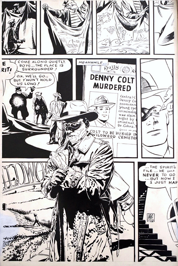
On June 2, 1940, Denny Colt made his debut… and promptly died.
Eisner
introduced his detective with jaunty body language, lots of attitude and
over-confidence, and a close relationship with Police Commissioner Dolan (and
that was all in the first half dozen panels.) The cartoonist already knew his
character well. Colt went off to capture the villainous Dr. Cobra and was found
dead, drowned in a flood of toxic chemicals. After his funeral, Colt woke from
suspended animation, dug himself out and assumed a new role as the Spirit,
haunting Wildwood cemetery and keeping his city safe with Dolan’s connivance.
— Paul Levitz, summarizing the Spirit’s origin in his book, Will Eisner: Champion of the Graphic Novel
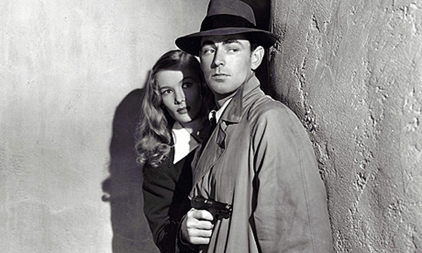
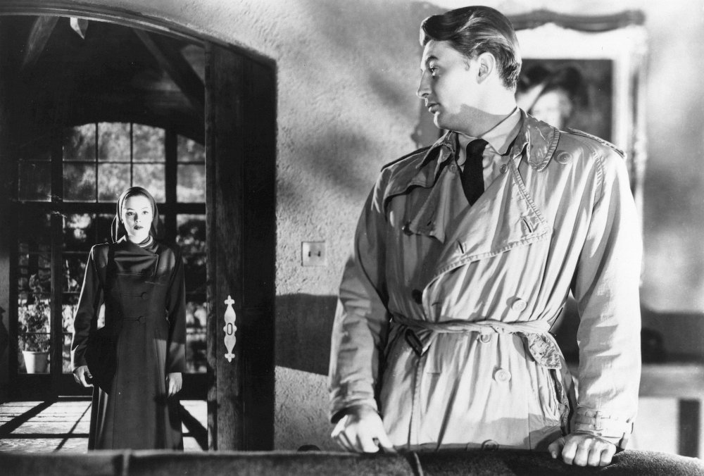
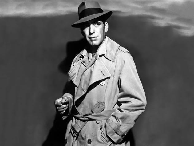
The classic film noir trench-coated detective: Alan Ladd with Veronica Lake in This Gun For Hire; Robert Mitchum (with Jane Greer) in Out of The Past; and Humphrey Bogart — in pretty much everything. (Ladd would have made an excellent Spirit back in the day.)
Continuing our celebration of the 80th anniversary of The Spirit, with additional creators’ takes on the beloved and influential character.
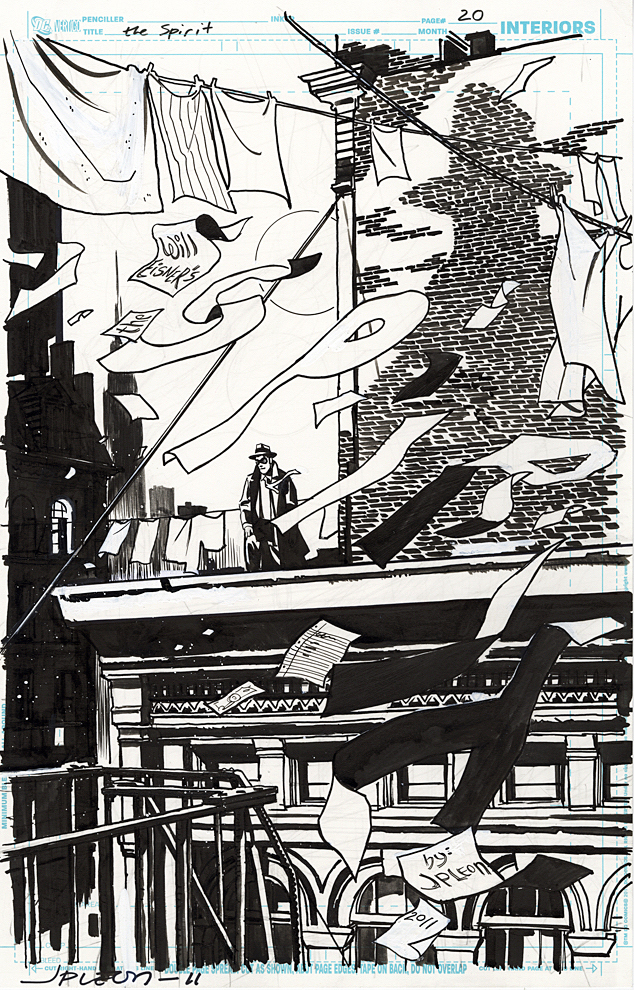
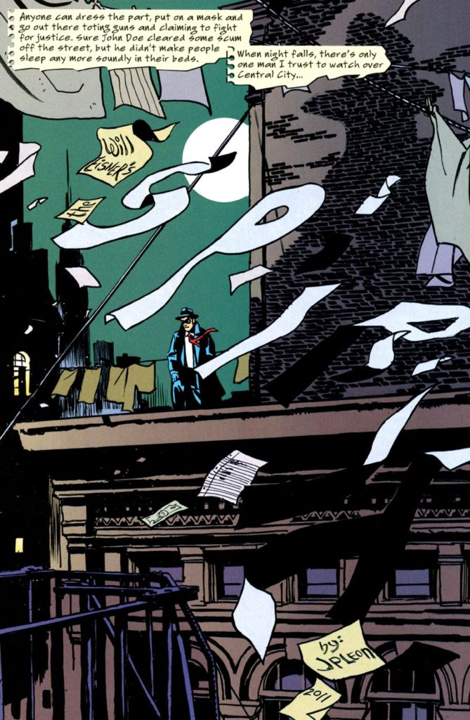
David Hine (Spider-Man Noir) authors a clever tale where pretty much every page is a splash — with the Spirit title included as part of the art. John Paul Leon hits the concept out of the park successfully homaging Will Eisner’s original brilliant splash pages with innovations of his own.
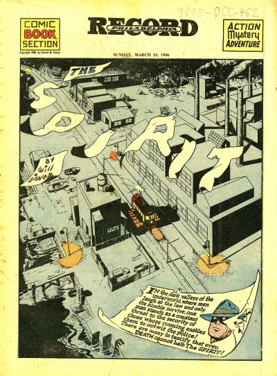
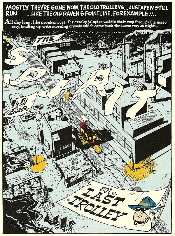
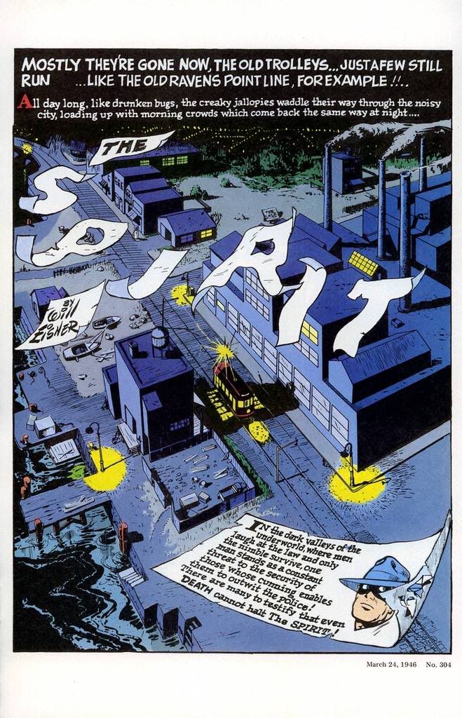
On this page, the final one of the story, Leon perhaps finds inspiration for the logo from 1946 — from the classic tale, “The Man Who Killed The Spirit” AKA “The Last Trolley.”
Fun fact: This issue — and this entire series — was edited by the ultra-talented Joey Cavalieri, a pal of mine for nearly 50 years. Joey and I first met as kids hunting down comics in the candy stores, newsstands and luncheonettes of the lovely seaside town of Long Beach, New York.
Variations on a theme: The original 1946 Spirit strip with the blowing letters — and two later (and slightly different) reprint versions.
Continuing our celebration of the 80th anniversary of The Spirit, with additional creators’ takes on the beloved and influential character.
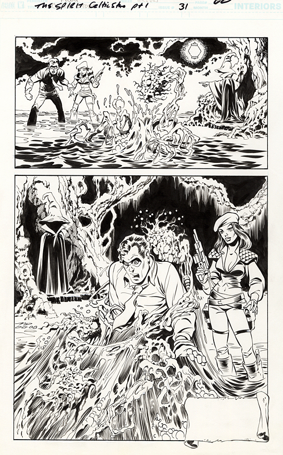
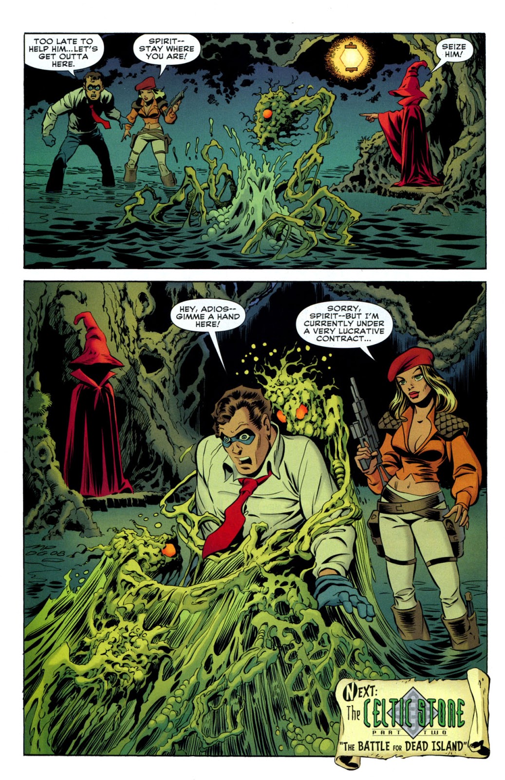
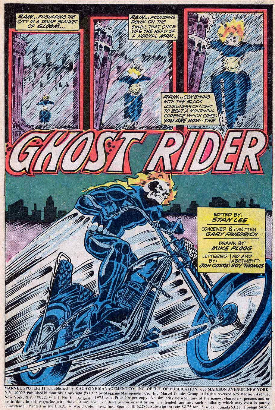
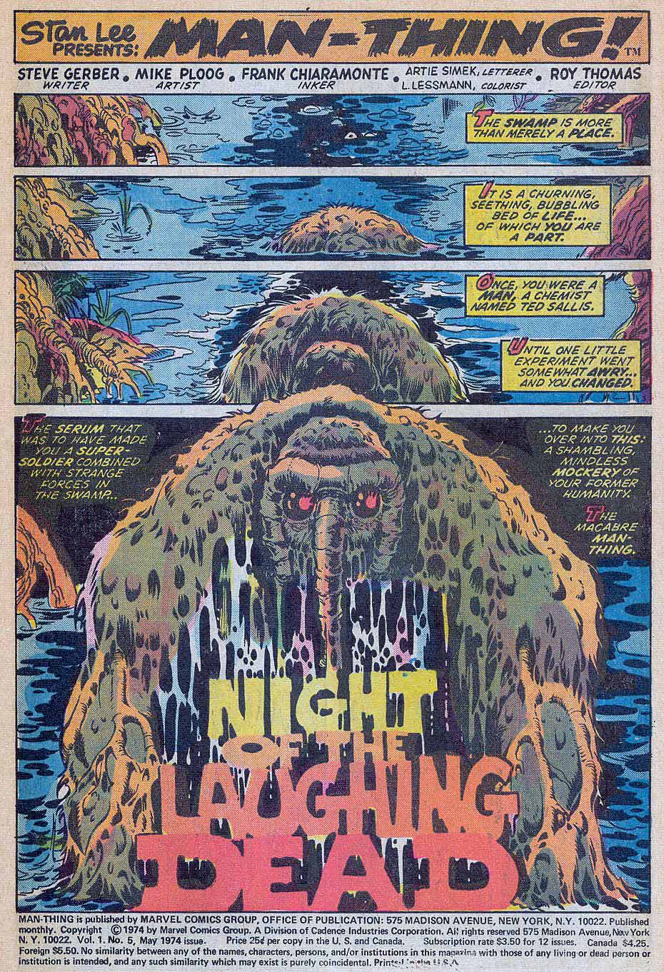
Perhaps the artist with the most specific style similarities to Will Eisner is Mike Ploog, who worked for Eisner briefly in the early 1970s, on Eisner’s PS Magazine for the military. Ploog credits his initial Eisner influence on the 10 years he himself spent in the Marines reading and copying the magazine.
Ironically, as a
kid, Ploog was not a comic book fan, so he had no idea who Eisner was, or the
history of the Spirit.
But that obviously changed as Ploog discovered Eisner, The Spirit and comics’ lore in general. On this page from 2007, Ploog, aided by inks from vet Dan Green, captures Eisner’s Spirit — and adds his own taste for a horrific milieu.
Ploog spoke with journalist Jon B. Cooke about the early part of his career in an interview for Comic Book Artist #2 in 1998. Read the full interview here.
CBA: How’d you get the call from Will? Ploog: I was working for Hanna-Barbera, and the guy in the room with me belonged to the National Cartoonist’s Society. He got a flyer Will had put out, looking for an assistant. He looked at it and said, “Ploog, this looks like your stuff.” I looked at it and said, “It is my stuff.” [laughter]. I called Will, and two days later he was in L.A. and interviewed me…the following week I went to work for him.
CBA: When you first burst upon the scene in comic books, you had a style very reminiscent of Will’s work. Did you start developing that style through osmosis, just being around him? Ploog: It was very difficult for me, because I hadn’t done that much work. I really didn’t know what a “style” meant. When Will saw my work, he said, “This guy can adapt to what I’m doing easily.” Obviously whatever I had, it was adaptable to him. I could emulate Will right down to a pinpoint on an occasion…I’m sure from working with Will, it developed in that direction…
I love Will; he’s a dear, dear old friend. He’s been an enormous influence on my work both in comics and film.
-Mike Ploog, 1998
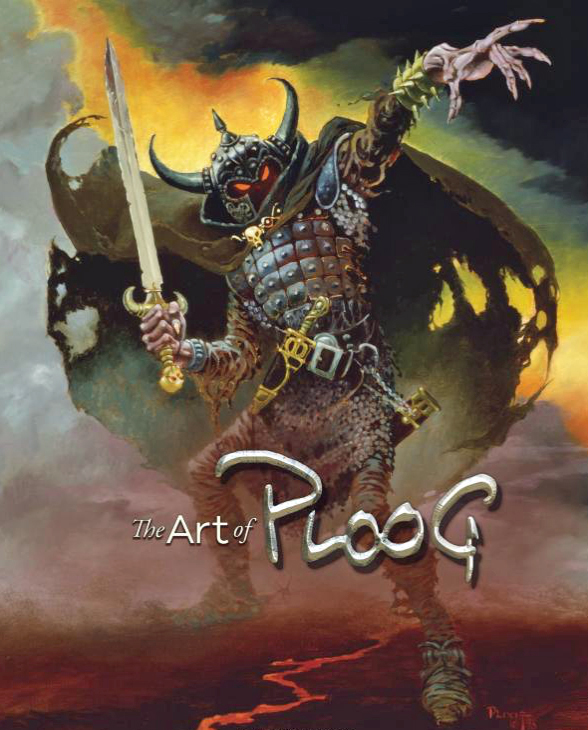
Early Ploog Marvel work — he was a breakout star from pretty much the beginning of his comics career, although he ultimately spent more of his professional life working in film.The Ploog art book is a must have for any fan of Mike’s — or simply for those who like great looking art books.