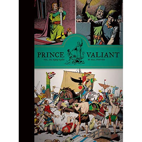
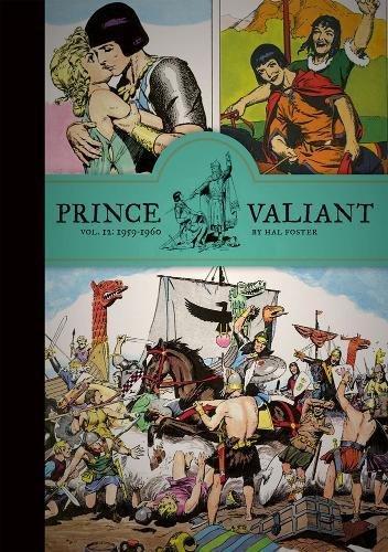
Hal Foster — Legend
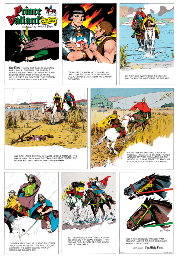
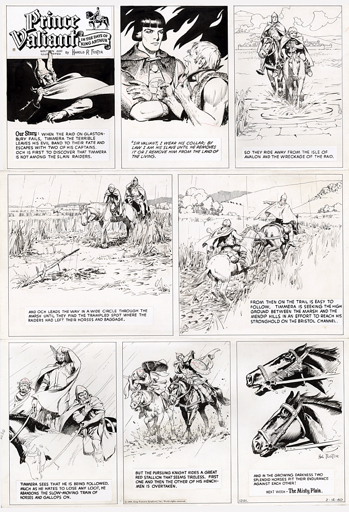
Prince Valiant, February 14, 1960
Hal Foster’s draftsmanship and vivid detail are, as the Library Journal exclaimed, “breathtaking.” He and Alex Raymond (Flash Gordon) are the two most important creators in adventure comics’ storytelling.
There is absolutely nothing — nothing! — I can add to the legend of Hal Foster that hasn’t been said before. It’s like trying to discuss the importance of Elvis Presley. Or why Ernest Hemingway is such an outstanding writer. It’s been done previously, and better.
So, instead, I’m going to let one picture do the job of a gazillion words.
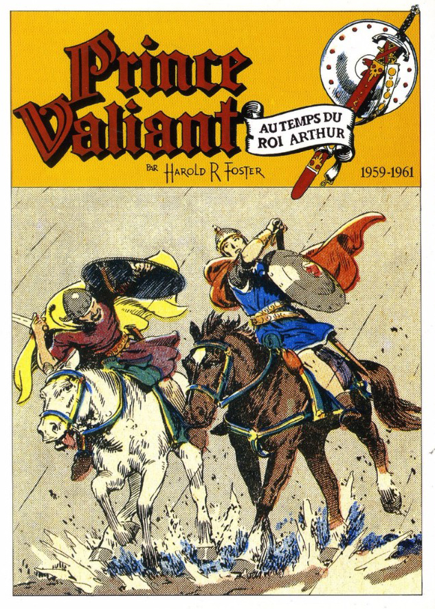
February 14, 1960. Exactly 60 years ago. The 23rd year of the strip (out of the 33 that Foster wrote and drew himself.) It’s a great example from Foster’s latter era, which focussed less on mythology and fantasy, and more on a “realistic” depiction of the Arthurian legend. The second to last panel is so near perfect in its detail, elegance and clarity, that it appeared as a full cover of a foreign book collection.
When I was a little kid, I would read The Sunday “Funnies” (as they say) each week, but I would stare endlessly at Foster’s Prince Valiant.
I still do.