Panels and Pages… Art and Artists… Creators and Conventions… Musings and Memories…
Author: Greg Goldstein
Greg Goldstein is a veteran publishing and media executive; most recently, he was the Chief Operating Officer, President and Publisher of IDW Publishing, managing all aspects of the company’s book and games business from 2008 to 2019.
Throughout his career, Greg has developed creative and profitable publishing programs for dozens of the world’s best-known entertainment brands including Star Wars, Transformers, Star Trek, James Bond, TMNT, Spider-Man, Batman and Godzilla.
In 2013, Greg led IDW’s acquisition of Top Shelf, an independent publisher best known for Congressman John Lewis’ March trilogy, which has become the most lauded non-fiction graphic novel series in the history of the medium.
In 2011, Greg won an Eisner award for his editing on the first-ever collection of Bob Montana’s Archie newspaper comic strips. (Published under IDW’s Library of American Comics imprint.)
Prior to joining IDW, Greg was VP of Entertainment and Gaming for Upper Deck, responsible for the company’s blockbuster slate of games, including Yu-Gi-Oh, World of Warcraft and The VS Superhero system. During his tenure, he created Marvel Ultimate Battles, the first-ever trading card game that focused exclusively on Marvel’s popular mass media characters.
As VP of Brand Development for Activision from 2000-2002, Greg established strategic partnerships with the largest Hollywood studios, and worked closely with Marvel Entertainment to successfully develop Spider-man into one of the biggest blockbuster licensed videogame brands in interactive history.
Greg’s career has also included a successful stint at Topps, where he helped launch and manage Topps Comics in the mid 1990s.
Additionally, Greg serves as an adviser for to the Comic Book Legal Defense Fund (CBDLF). He is also a frequent guest lecturer at San Diego Sate University and has presented at dozens of panels and conferences throughout the US.
He is also a well-known collector of original comic book art and rues the day he sold his collection the first time around in the late 1990s.
Sal Buscema celebrated his 84th birthday earlier this week — how did that happen, you ask? I don’t know either. (January, by the way, is obviously a great month for the Marvel “bullpen.”) So, we continue our better-late-than-never tribute series.
Sal, one of Marvel’s most versatile and prolific artists,
cites the Hulk as his favorite character. Nevertheless… he penciled and
(mostly) inked 100 issues of Spectacular Spider-man. (That’s 100!)
Included in that record-setting run is this dynamic page from early in his return to the title in 1988. It’s the end of black spider-suit era — pretty much the final appearance of the costume before Peter ditches it for good (mostly) a month later in Amazing Spider-Man #300. (MJ is not too happy that her husband looks like Venom when he wears it, but I digress.) I love the way the three middle panels work cinematically to show Spidey getting the upper hand on the gunmen.
Sal wanted to be an inker. He has said in various interviews (emphatically, in some cases) he prefers it. And it’s clear that it took him some time to find his own voice penciling. (In fact, if you compare his early 70s work to his late 80s work, it’s obvious that, like many great artists, his voice evolved.)
But I think we are all happy that Stan and Marvel’s editorial team pushed him into pencils. He’s anamazing a spectacular storyteller.
Sal’s first professional work for Marvel is inking over Larry Lieber on Rawhide Kid, followed soon thereafter by pencilling on Avengers.(Both 1969.)
John Romita Sr. turned 90(!) the other day, and we would be
remiss if we didn’t celebrate the amazing artist — even belatedly.
This great action page is from the one-shot Kingpin and it represents the final comic book story collaboration between Romita and Stan Lee (with help from Tom Delfaco and inker Dan Green).
What’s great about this story — and this page, specifically — is that it features three important Romita icons in one place:
Daredevil, Romita’s first pencil gig at Marvel after eight years of DC romance comics.
Spider-Man, the character that Romita will always be most associated with, and the one he brought to new heights of popularity.
Kingpin, the all-too-familiar super-villain that John co-created, and who will likely vex DD, Spidey and others for the rest of time.
This page is obviously not from the classic Romita era — in fact, it comes 30 years later, but it’s still a great example of Romita’s superb draftsmanship and storytelling.
And all it’s missing is Mary Jane Watson.
You can’t have everything.
Early key Romita comics: His first Daredevil action page (over Kirby layouts) from DD #12; the first Romita Spider-Man, crossing over with Daredevil in DD #16; and Kingpin’s first splash appearance (Amazing Spider-Man #51) from his multi-part debut.
Romita on his Spidey assignment:
“I was hoping against it, believe it or not. People laugh when I say this, but I did not want to do Spider-Man. I wanted to stay on Daredevil. The only reason I did Spider-Man was because Stan asked me and I felt that I should help out, like a good soldier. I never really felt comfortable on Spider-Man for years. … I felt obliged to [mimic] Ditko because … I was convinced, in my own mind, that he was going to come back in two or three issues. … I couldn’t believe that a guy would walk away from a successful book that was the second-highest seller at Marvel. … After six months, when I realized it wasn’t temporary, I finally stopped trying to [mimic] Ditko. … “
Tonight is the final episode of the extremely well-done Arrow, lasting eight seasons on the CW and successfully launching the “Arrowverse” which now includes Flash, Legends of Tomorrow, Supergirl and more. I doubt anyone could have predicted that these shows would create a well-crafted and (mostly) unified TV DCU, much like Marvel has created a unified film universe.
I’ve seen some (unjust) criticism that ultimately, these shows feel like any other show on the CW, just with more spandex. I think some of that criticism comes from grading these Greg Berlanti produced shows against the more mature (and expensive) shows that are running (less frequently) on premium cable and streaming services.
Its difficult to imagine something like this unified DCU coming together even just 10-years ago, and kudos off to Berlanti and company for creating quality shows with just enough (hopefully not too much) fan service. And the shows will continue on even without the launch series, and star Stephen Amell.
Matt Wagner created a terrific series of painted covers for this Brad Meltzer run of Green Arrow in 2002 and 2003, including this very dramatic portrait of Oliver Queen. (In this story arc, Ollie is dealing with a Hal Jordan (Green Lantern) sub-plot, hence the green illumination.) And speaking of Green Lantern, will he (they) crossover from the upcoming HBO Max series? Very much looking forward to seeing how this all plays out .
Conan celebrates its
50th anniversary in comics this year, and we conclude our anniversary recognition
with our final of three Conan-themed posts.
Night of the Dark Gods is a great example of Roy Thomas’
ability to adapt an Robert E Howard story without Conan, into one.
Given the artistic talent that worked on the story, clearly
some deadline problems ensued. Not surprising, since at this point in Marvel’s 70s
expansion, (comic books and “mature magazines”) deadlines were whizzing
by a the speed of light.
Neal Adams assisted Gil Kane on the pencils, and inked some
of the story as well, supported by Vince Colletta, Frank McLaughlin, and Pablo
Marcos. Marcos also provided the wash tones on the story, necessary to add
depth to a black and white, and also provide some consistency to the art style.
The inking credits are listed as Diverse Hands, and this appears to be the only time that the credit is employed, meaning it’s likely that this specific group of professionals never contributed jointly again on one story.
Neal, of course, was a pro at collaborative art creation. His “Crusty Bunkers” a group of (ever-changing) artists at his Continuity Studios, filled in many times during deadline crunches for Marvel, DC, Charlton and others during the 1970s.
It’s easy to be fondly nostalgic about something you missed entirely, but, based on everything I’ve heard, it sounds like a hoot. Stop by, ink some pages, spot some blacks, and make your deadline, head to the pub. (It was probably much more stressful than that, but I digress.)
The story is ultimately also printed in color, in a Marvel Treasury Edition, and although the coloring itself is okay, many of the inking and wash details are obscured, likely in an effort to get the job done quickly.
(And see below for the mystery of the extra face.)
Night of the Dark God, in glorious black and white, and a bit later on in color. But wait a moment…
…Where did the extra face in the color version come from? It balances the panel a bit more, I guess, but still… I wish had the time right now to compare every panel of this story to see what other “Where’s Waldo” attributes I can find.
Conan celebrates its
50th anniversary in comics this year, and we continue to celebrate the
anniversary with our second of three Conan-themed posts this week.
“This guy used to eat, sleep and breathe drawing. It didn’t matter what was going on around him. He would get bored with it and start sketching. … He just couldn’t stop drawing. [His back-of-board sketches were] better than some of the stuff that he did on the front. … He’d get a spark of inspiration and turn the page over and draw whatever was in his skull.” — Sal Buscema, speaking about his late brother John.
Roy knew that John’s artistic style and storytelling skills
(and interests) could perhaps best capture the Conan character —- and most
remind readers of the amazing eight Frank Frazetta covers that graced the
Lancer paperbacks of the last few years. Those images had helped Conan rapidly turn into
a phenomenon among fantasy readers.
But budgetary concerns forced Thomas to work with the mostly
unknown Barry Windsor Smith, and a different kind of Conan developed. Younger,
sleeker, a bit more handsome. And after a slow start, (it was nearly cancelled
after issue #7) the book caught fire, and inspired a sword and sorcery age in
comic books.
But Smith, frustrated by the deadlines of the comics periodical business, ultimately left Conan.
And so fate called again, and Roy got what he wanted the
second time around.
Under Buscema’s pencils, the burly, muscular, often-raging Conan ultimately epitomized by Arnold Schwarzenegger, emerged. This was an older Conan with more experience (and world weariness) under his belt.
Buscema has rightfully become identified with the character, rendering more than 100 stories each for both the Conan comic book and the more “mature” Savage Sword of Conan magazine.
I’ve owned and traded many Buscema Conan pages over the
years, and this splash remains one of my favorites. After a long fought series
of adventures and battles, Conan is taking a break, and celebrating his
victory.
Nothing wrong with that.
The story itself is an odd one. Michael Fleisher is the scribe, having come on board a just a few months earlier after Roy Thomas bolted for DC. Given the varying art styles of the story, the story length (46 pages) and the multiple inkers (Ernie Chan, Tom Palmer and Bob McLeod are all credited) it’s entirely possible it was originally destined to be a shorter story, and fleshed out when something else fell through.
If so, it’s a feat that John Buscema could pull off — while most others couldn’t even attempt it.
The printed page by Buscema, and the story-driven cover by Joe Jusko, who often cites Buscema as his most important influence.Had this story actually ever been reprinted in comic books, they would have added an undergarment. This was the height of risqué for Marvel at the time, although over at Warren Magazines, (partial) nudity had already crept in.
Eight images worth millions of words — the original Frank Frazetta covers on the Lancer paperback editions of Conan (starting in 1966). In a short time, both Conan and Frazetta would be embedded in the popular culture.
Conan celebrates its
50th anniversary in comics this year, and we celebrate the anniversary with
three Conan-themed posts this week.
Barry Winsdor-Smith was not the first choice to draw Conan. Legend has it that Roy Thomas knew that John Buscema was the idea artist for the job. But Publisher Martin Goodman nixed the idea, citing budget and schedule, and told Stan/Roy to find someone less expensive.
The solution? The young British-born Smith, who had been a
fill-in artist on a handful of super-hero titles with an unmistakable Kirby
influenced style, and who was both cheap — and available.
And so Barry drew Conan for 21 of the first 24 issues — and the comic book world promptly grew up.
Smith, one of the many “young guns” of similar age, and breaking in at around the same time, (Chaykin, Kaluta, Simonson, Wrightson among the many others) ultimately developed an inimitable style. Yes the Kirby influence was there, especially early on. But so is Steranko. And Alphonse Mucha, the best-known stylist of the Art Nouveau period (late 19th – early 20th century), provides much of the inspiration for the intricate designs and beautiful women that populate those early Conan stories.
Smith’s run on Conan is unlike any other in professional comics at that time. And Baby Boomers, who had grown up on the simple stories of DC, and had segued into the cosmic soap operas of Stan and Jack, were primed for these comics. The Boomers were growing older, and now, the comics were growing up with them.
Smith’s style developed rapidly over his three year run on Conan, culminating in the extraordinary “Red Nails” that first appeared in 1973/1974 in Savage Tales. And of course, the work was always best when Smith was inking himself, but both Sal Buscema and Dan Adkins did excellent work, and interestingly, both are credited on this issue. Sal is credited on this specific page, but without all 20 original pages together, it’s difficult to tell.
Either way, it’s a stunning page, and only a small harbinger of things to come.
Conan launches in comic books and the more “mature” Marvel magazines.
And early try-out story by Smith and Thomas features “Starr the Slayer,” published just a few months prior to Conan in Chamber of Darkness #4. Smith also developed a Kull Black and White proposal for a paperback graphic novel. (Similar to Gil Kane’s Blackmark) that ultimately was published (unfinished) much later in Savage Sword of Conan #3. Both prototypes look nearly identical to Smith’s Conan.
Smith’s early Marvel work on Avengers is pretty much straight from the Jack Kirby handbook — except for the wild Vision splash page (Avengers #66) which adds some Steranko and Alphonse Mucha into the mix; a sign of things to come.
Alan Moore and Dave Gibbons early concept art for Watchmen
The Price Of Greatness
Each time I consider a purchase of an original Watchmen page, the price becomes too rich for my taste and I get cold feet. And then, each succeeding time, the price is much higher. Lesson learned? Not yet.
That said, at IDW, we published a beautiful Watchmen Artifact Edition, so I did get to browse quite a few pages and see some impressive scans.
Archie’s Efforts
The MLJ/ Archie superhero universe is fascinating: Since the 80s there have been multiple attempts to launch and sustain the characters, and none have quite worked. Fingers crossed for the most recent efforts, although I’m not certain any new titles featuring the latest iterations were published last year. It’s also interesting that Archie has licensed them to DC a few times.
DC’s Appetites
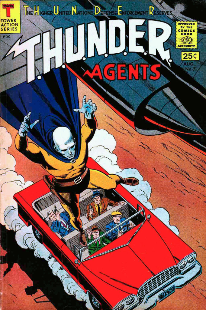
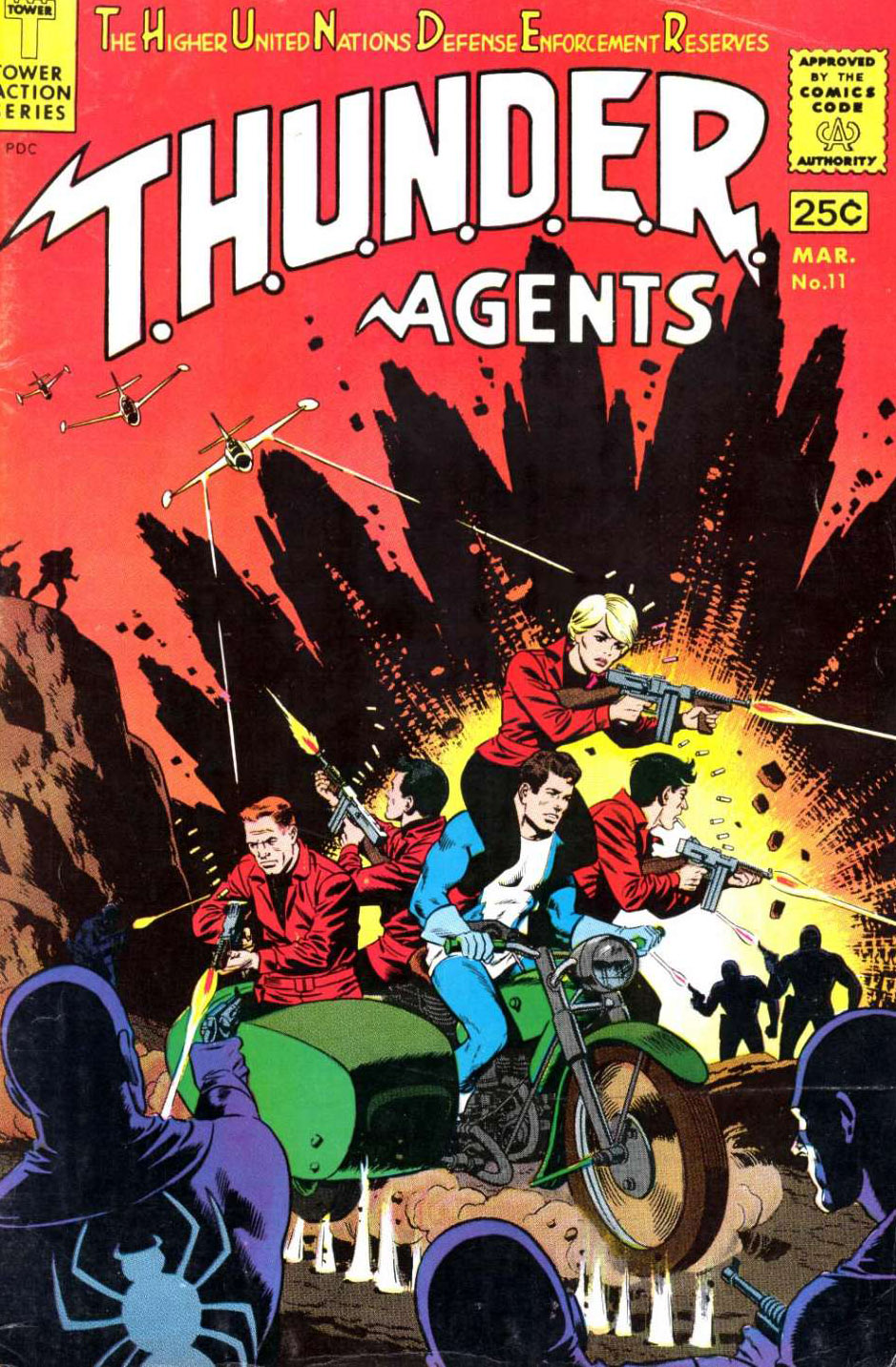
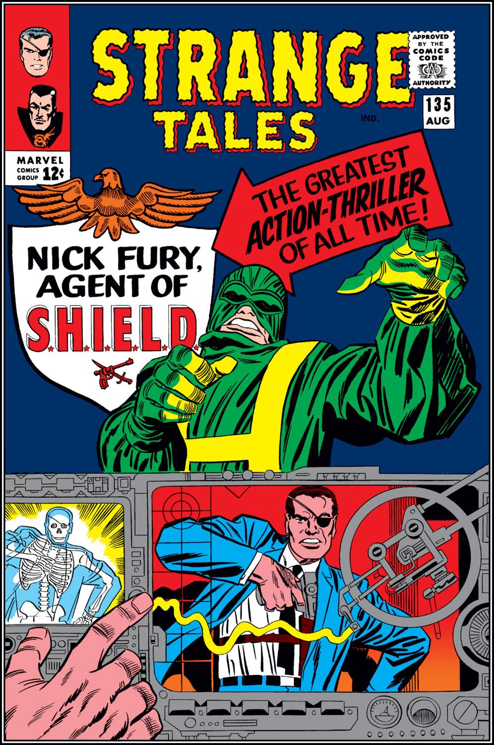
And speaking of DC, it’s fascinating to me that they would own so many superhero characters, add more, and then license even more. To wit: They purchased the Quality library, the Marvel family, The Charlton superheroes, and Wildstorm. At one point or another, they’ve licensed the Archie superheroes, The T.H.U.N.D.E.R Agents, The Spirit, The Conde Naste pulp characters and Fighting American. And a host of other ones I’m likely overlooking. Whew.
Moore’s Luck
Did Alan Moore’s familiarity with the Charlton and Archie characters come from childhood? Or later perhaps when he attends some fan gatherings/ early UK conventions? You could barely find some of those comics in New York, so it’s intriguing (and ultimately fortunate) that they made their way into the UK.
Morisi Gets His Rights
Why did Peter Cannon Thunderbolt revert back to creator Pat Morisi? Why was his deal so different than Steve Ditko’s? Or, did he manage to find a copyright loophole later on? Questions, so many questions…
Not Too Desolate:
If Bob Dylan receives a royalty for the Desolation Row lyrics included in the Watchmen comics, it’s probably the easiest and most surprising money ever. If his people took a flat fee, all I can say is… oops.
Captain Atom # 89 (1967), Re-creation By Frank McLaughlin, 2012
Concluding our series on the roots of the Watchmen characters.
Charlton’s haphazard and often erratic publishing strategy certainly didn’t help sustain its line of superheroes. (Or “Action Heroes,” since technically, superhero is a joint trademark of Marvel and DC. But I digress.) Captain Atom #89 is the final issue of that series, and within a year all of the (mostly short-lived) action heroes were toast.
They wouldn’t return until about seven years later, when Charlton deciphered the burgeoning fan market. The company endorsed the superhero-themed Charlton Bulletin in 1975, a fanzine that included among other things, Steve Ditko’s unpublished penciled story for the cancelled Captain Atom #90. They asked a young Charlton freelancer by the name of John Byrne to ink it.
Byrne is among many talents with early careers at Charlton. Others include Dick Giordano, Jose Garcia Lopez, Jim Aparo, Bob Layton, Denny O’Neill, and Mike Zeck, Also on that list: Inker (and Charlton Art Director) Frank McLaughlin, who inked Ditko’s original #89 cover and re-created this version above.
As for Captain Atom? DC purchased him and the rest of the Charlton superheroes from the financially struggling Charlton in 1983, and they made their first DC appearance in Crisis on Infinite Earths (1985). Since then, he (and the rest of the gang) ultimately lived on in the pages of DC, of course, which was the point of Editor Dick Giordano not letting Alan Moore use those exact characters for Watchmen.
Alan, as we have discussed, was not deterred, and created his own versions of the characters.
Ironic, since those original Charlton characters could barely raise an eyebrow, and yet we are still talking about Moore’s Watchmen today.
The original and published art for Captain Atom #89. Frank’s red-do is faithful, but makes a few changes.
The first and last pages of Steve Ditko’s Blue Beetle re-do, from a backup story in captain Atom Atom #83.
The introduction of Nightshade. 1966 or not, the handling of the character earns an “ouch.”
Thunderbolt makes an entrance, and exits a short time later. He precedes the re-dos of Captain Atom and Blue Beetle in 1965. (And he takes over the Son of Vulcan title, who is never truly considered part of the Charlton main superhero universe.)Meanwhile, the rights reverted back to creator Peter Morisi, and Thunderbolt now has a home at Dynamite Publishing, where he feels a lot like… Ozymandias.
The Peacemaker steps up and Captain Atom celebrates his new uniform and power abilities. And The Question makes his final appearance in Blue Beetle #5 (1968), which inexplicably appears on the newsstand nearly a year after issue # 4.
Final tally Watchman —
Nite Owl 2 – Blue Beetle 2 Silk Spectre 2 – Phantom Lady/Black Canary/Nightshade Comedian – Peacemaker/Shield Dr. Manhattan – Captain Atom Rorschach – The Question Ozymandias – Peter Cannon, Thunderbolt
Steve Rude delivers a nicely designed splash page for the one-shot Dollar Bill comic from the Before Watchmen series. Len Wein wrote the issue, and Steve penciled, inked and hand-lettered the entire issue himself, a definite rarity. It’s one of the better-looking Before Watchmen comics.
As Watchmen fans know, Dollar Bill is a member of the Golden Age Minutemen — tragically gunned down when his cape gets caught in a revolving door, as described/depicted in the comic book, film and television series.
His role in the series is pretty much limited to that one tragic moment, so this one-shot gives the creative team a nearly blank slate to flesh out his character.
Definitely a unique creation, he is sponsored and employed by a bank as an actor, and pressured by his employer to work with the Minutemen as an actual costumed crimefighter. Any derivation from an existing character would be in design only — and his costume is in fact similar to Archie’s (MLJ’s) Golden Age Captain Flag.
And Flag did reappear in the Archie superhero revival (Mighty Crusaders #4 and #5) in the 1960s, so Moore would have definitely seen him since he has already discussed his interest in those characters.
Not that aren’t enough patriotic-themed red and blue costumed superheroes to go around.
The published splash page flanked by the Rude painted cover and by a variant cover by the late, great Darwyn Cooke.
Captain Flag in three different incarnations: Golden Age introduction, Silver Age introduction, and in an ironic Modern Age introduction he stands front and center. Why ironic you ask? This 1989 version of the MLJ/Archie superheroes, despite the ad, never actually appeared. Archie’s management got cold feet over the potential mature themes conflicting with the company’s wholesome image and pulled the plug. .
Continuing our series on the roots of the Watchmen characters.
Alan Moore, on his original idea for Watchmen:
“I wanted more average super-heroes, like the Mighty Crusaders line … [the] original idea had started off with the dead body of the Shield being pulled out of a river somewhere.”
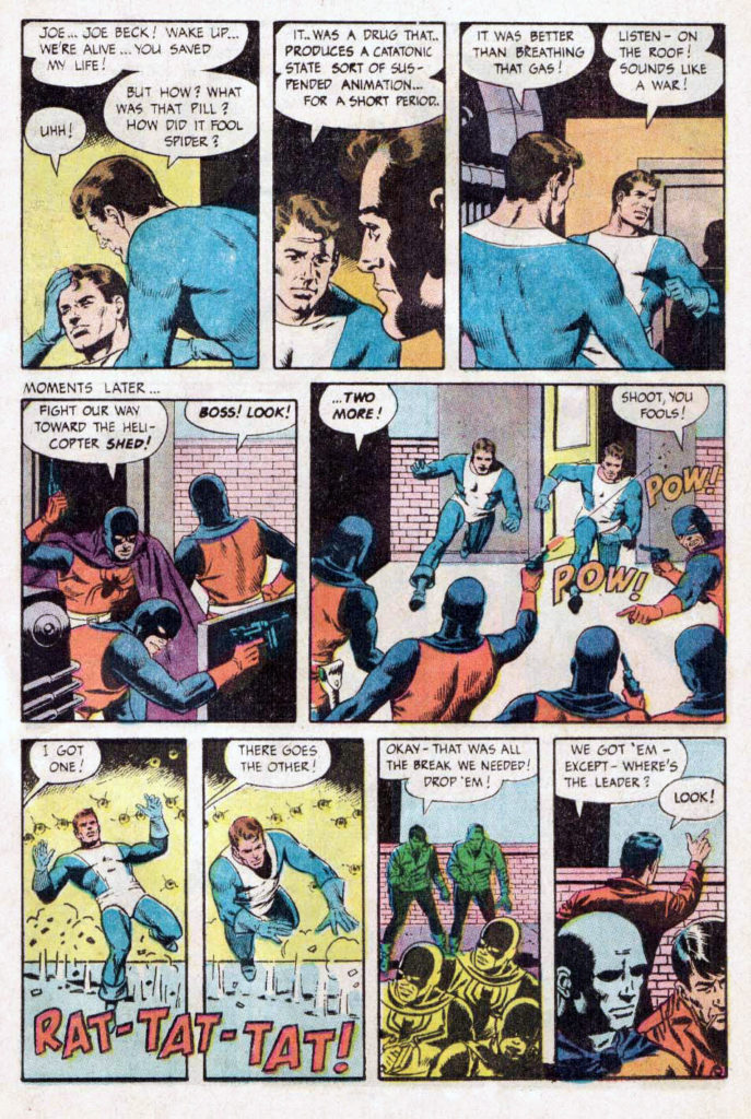
Although the Watchmen eventually morphed out of Charlton heroes instead, elements of the Crusaders and the other MLJ/Archie Superheroes found their way into Watchmen lore. Perhaps most notable is the Hangman, a Golden age Archie character who along with Black Hood, becomes the obvious inspiration for Hooded Justice, a member of the original Golden Age Minutemen in the Watchmen series. (And has a critical role in the Watchmen HBO show.)
Also notable is the Mothman, an obvious derivation of Archie’s (Simon and Kirby’s) Fly / Flyman.
The original MLJ superheroes disappeared into the mists after World War 2, which didn’t impact Archie financially as the title character and his teenage friends transformed the company, including the published actual name which changed from MLJ to Archie in 1946.
But Archie’s management seeing the giant superhero success down the road at DC and Marvel took another stab starting in 1959 with the Shield and the Fly. Ultimately, many of the golden age characters reappeared, forming a team, the Mighty Crusaders.
Superhero artist Mike Sekowsky was first a Timely (nee Marvel) staffer and then a long-time DC mainstay. He is perhaps best known for his work on Justice League of America, where he could draw almost any character.
So he is well suited to tackle the Mighty Crusaders, a team-up book developed to compete with Justice League and other superhero team books of the day.
But Jerry Siegel’s (yep, Superman’s creator) writing style had most definitely not kept up with the style of the day, and the book was cancelled after seven issues. In fact, the entire Archie superhero experiment fizzled out by late 1967.
But… not before they managed to bring together nearly all the dusty MLJ heroes and put them in one comic book. Issue #4 of Mighty Crusaders, is a goofy favorite, entitled “Too Many Heroes.”
Too many, perhaps, but certainly enough to reach into for character ideas twenty years later.
Issue #4 of the Mighty Crusaders is a… gas. Pretty much every MLJ/Archie hero (as seen twenty years later in this house ad) mysteriously reappears to apply for membership into the Crusaders. The Crusaders themselves disappear after a short-lived series in 1966, but re-emerge multiple times starting in the 80s.
The classic Minutemen team shot as drawn by Dave Gibbons and recreated by the late Darwyn Cooke 25 years later, and the nearly identical PR photos from the 2009 film and 2019 television series.
Final Scorecard — Minutemen and their original counterparts:
Silhouette = Completely unique. (Maybe an amalgam of Black Canary, Black Cat and a female version of the Fox if you want to stretch out the derivations…)
Mothman = Flyman
Dollar Bill = Captain Flag
Nite Owl 1 = Blue Beetle 1 (Dan Garrett)
Captain Metropolis = Shield (with some Steel Sterling thrown in)
Silk Spectre 1 = Phantom Lady (with some Black Canary thrown in)
Hooded Justice = Hangman (with some Black Hood thrown in)
Comedian = Peacemaker (with some Shield thrown in)