Panels and Pages… Art and Artists… Creators and Conventions… Musings and Memories…
Author: Greg Goldstein
Greg Goldstein is a veteran publishing and media executive; most recently, he was the Chief Operating Officer, President and Publisher of IDW Publishing, managing all aspects of the company’s book and games business from 2008 to 2019.
Throughout his career, Greg has developed creative and profitable publishing programs for dozens of the world’s best-known entertainment brands including Star Wars, Transformers, Star Trek, James Bond, TMNT, Spider-Man, Batman and Godzilla.
In 2013, Greg led IDW’s acquisition of Top Shelf, an independent publisher best known for Congressman John Lewis’ March trilogy, which has become the most lauded non-fiction graphic novel series in the history of the medium.
In 2011, Greg won an Eisner award for his editing on the first-ever collection of Bob Montana’s Archie newspaper comic strips. (Published under IDW’s Library of American Comics imprint.)
Prior to joining IDW, Greg was VP of Entertainment and Gaming for Upper Deck, responsible for the company’s blockbuster slate of games, including Yu-Gi-Oh, World of Warcraft and The VS Superhero system. During his tenure, he created Marvel Ultimate Battles, the first-ever trading card game that focused exclusively on Marvel’s popular mass media characters.
As VP of Brand Development for Activision from 2000-2002, Greg established strategic partnerships with the largest Hollywood studios, and worked closely with Marvel Entertainment to successfully develop Spider-man into one of the biggest blockbuster licensed videogame brands in interactive history.
Greg’s career has also included a successful stint at Topps, where he helped launch and manage Topps Comics in the mid 1990s.
Additionally, Greg serves as an adviser for to the Comic Book Legal Defense Fund (CBDLF). He is also a frequent guest lecturer at San Diego Sate University and has presented at dozens of panels and conferences throughout the US.
He is also a well-known collector of original comic book art and rues the day he sold his collection the first time around in the late 1990s.
Continuing our series celebrating Supergirl’s 5thseason premiere on the CW on Sunday,
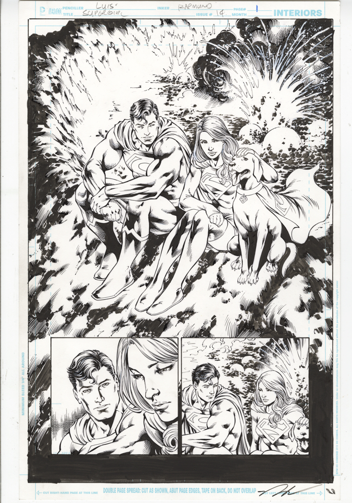
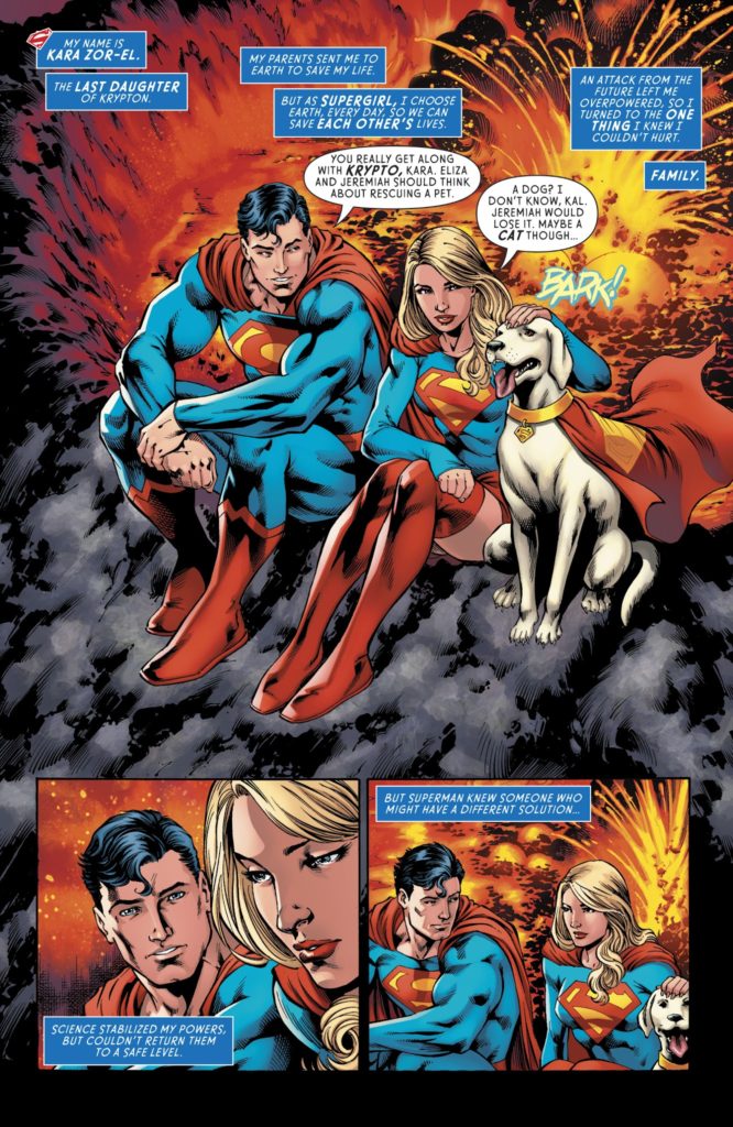
Jose Luis (not to be confused with the artist Jose Luis Garcia-Lopez) illustrates a lovely and simple moment with the super team of Superman, Supergirl, and Krypto. I can’t recall when I saw a similar published page, especially in contemporary comics, where Krypto has shifted in and out of continuity more than a few times.
Supergirl’s 5thseason premieres on the CW on Sunday, so our next few posts will take a look at the cousin of steel.
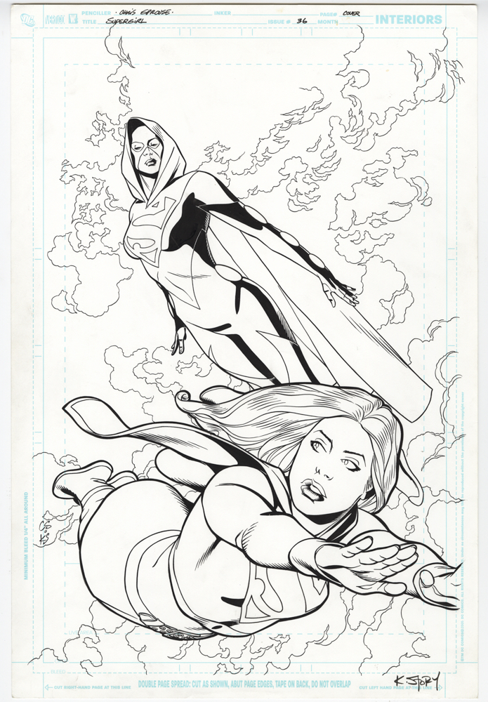
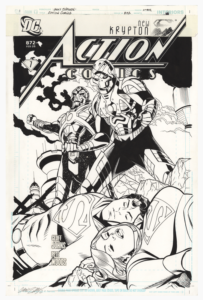
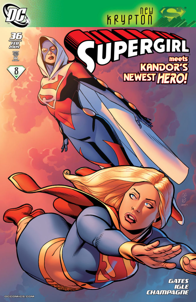
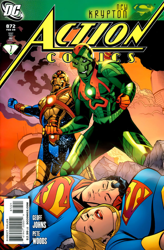
Here’s my unsolicited story idea for the terrific art team of Chris Sprouse and Karl Story: A Superman Family “Elseworlds” limited series that includes Superman, Supergirl, Lois and Jimmy, The Super Pets, The Legion of Superheroes, Kandor, Bizarro… And a full line-up of classic villains. Pretty much everyone who populated the mid 20th century Superman comics.
In other words, a longer form story that’s similar to Alan Moore’s and Curt Swan’s classic “Whatever Happened to The Man of Tomorrow,” but with —- spoiler alert — no fatal tragedies involved.
In 2020, that’s about as likely to happen as Perry White yelling “Great Caesar’s Ghost”, or Jimmy Olsen turning back into a giant turtle, but a guy can dream, can’t he?
Much like Steve Rude, Chris Samnee, and a handful of other artists, Chris and Karl take classic styling and adapt it into a modern form. It’s both retro and contemporary.
In many ways, it’s the best of both worlds. (Hey — that could be the name of the series.)
In the meantime, we have these two great covers: Supergirl and “Superwoman” (long story) gracefully flying, and Metallo and Reactron defeating the super cousins. Cyborgs rarely look this menacing on a super-hero cover.
And, if someone at DC miraculously likes my idea, and Mark Waid is tied up, it’s pretty easy to find me…
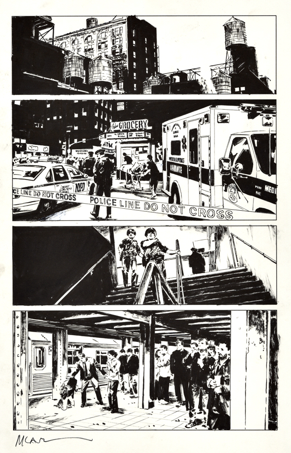
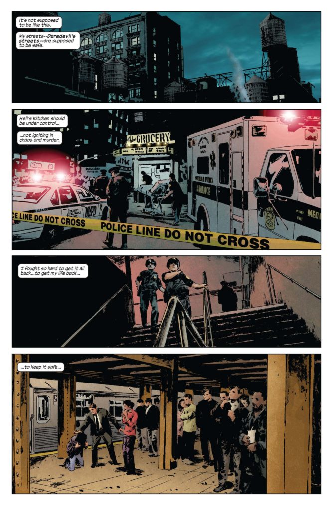
New York Comic Con takes place this week at the Jacob Javits Convention Center, located right at the southwest end of Hell’s Kitchen.
For non-New Yorkers who only know the neighborhood as grimly depicted in Daredevil (comics or the Netflix TV series) I will break it to you gently. Hell’s Kitchen ain’t what it used to be.
Sure, when I was a kid in the ‘70s, even the ‘80s, it was rough. Just walking the eight grimy blocks from Penn Station to Port Authority on the main avenue was a scary adventure. Among other lovely sights, I once witnessed an entire squad of police, in full tactical gear, clear out a tenement of drug addicts and dealers. It was not a peaceful bust. (Wish we had smartphones in those days.) I definitely received an unintended education in that part of town.
But now? Just like nearby Times Square, the neighborhood has been gentrified and scrubbed over time. That block where I saw the drug building invaded back in the day? You can find a really good hipster cookie shop there now.
And with the completion of a nearby subway extension a few years ago, real estate development is on fire. Hell’s Kitchen is — wait for it — a hot part of town.
This cool photo-realistic Daredevil page — sans Daredevil — from artist Michael Lark, isn’t that old. An artist’s rendition that’s definitely based on historic reputation rather than current reality, and a piece of art that I enjoy without any misguided nostalgia for a once crime-infested community. Maybe Daredevil needs to move to a tougher neighborhood.
Me? I’m going to walk each day to Javits during the convention. And probably stop along the way to grab a cookie.
The Flash TV series (CW) explores DC’s multiverse legacy in creative and often reverential ways. Today’s post concludes our special feature “The Flash of Two Worlds,” as well as our five-part Flash series.
I see this cool pinup and imagine a retro moment in the DC original continuity when the two Flashes have already met, worked together, and appreciate the fact that, in each of their respective multiverses, they are indeed the fastest man alive.
That said, I never asked John what he envisioned when he drew the piece. And, I don’t think I will. It’s easier to continue to imagine the backstory to fit in with my own vision of the “pre-Crisis” DC universe.
Two legends team up, and tell the tale of two legends teaming up.
This fabulous story page comes to us courtesy of DC Universe Legacies, a ten-part 2010 series written by Len Wein that provides an overview of DC history (in contemporary continuity) through the eyes and life story of a one man. The series features an all-start line-up of DC art talent including Joe Kubert, Jerry Ordway, Dan Jurgens and many others.
The page here, showing the Flashes meeting for the first time, contains retroactive continuity (retcon), as both characters exist in the same universe — which is the established “post-Crisis” narrative. Also, in the original Flash #123, the Flashes have already met and teamed up when they get to the construction worker.
Garcia Lopez and Gibbons are a terrific pairing, and I was fortunate enough to find this great page before someone else did.
In the original story (Flash #123) The two Flashes have already met — and started working together — when the construction accident happens.Flash read Flash Comics? Gardner Fox was” tuned in” to the alternate universe? Wait… What?
The Flash of Two Worlds — DC Comics Classics Library, 2009
The Flash TV series (CW) explores DC’s multiverse legacy in creative and often reverential ways. Today’s post, along with the next two, feature “The Flash of Two Worlds.”
Flash #123, “The Flash of Two Worlds” is one of the most important comic book milestones of DC’s silver age, establishing the DC multiverse and paving the way for countless crossover storylines that ultimately lead up to 1985’s Crisis on Multiple Earths. Its 1961 cover follows as one of the most iconic images of the era.
But, when DC went to reprint the earliest Flash crossover stories in a special collection, the original art and layout didn’t quite work within the new cover design.
So, the editors turned to the very talented (and very underrated) Rodney Ramos to recreate (and reconfigure) the iconic imagery, in the Infantino/ Murphy Anderson “style.”
He nails it — and you could be headed for a career in the FBI’s counterfeit investigations unit if you can immediately tell the published cover is not Infantino / Anderson.
(As seen below, the final published piece crops the image significantly, and also digitally manipulates the two Flashes even closer together.)
Apparently it all started here… and Flash #123 is actually an homage to this cover of Our Fighting Forces by Jerry Grandenetti
Following Carmine Infantino on the Flash was obviously no easy assignment to begin with, but it appears Ross Andru and Mike Esposito had the deck stacked against them.
At the starting line was a fun issue, Flash #175, the sequel race between Superman and the Flash. Shortly thereafter is Carey Bates’ offbeat tale in Flash #179 that introduces Earth “Prime” — our earth— into the DC multiverse.
But, after that… we get: Giant-headed Flash, Flash with a broken toe, Flash color-blind, etc. Plus: Flash fighting hippies, sea creatures, lizards, demons, aliens, oh my. Samurais? Seriously?
WTF? How about the rogues, who only make a handful of minor appearances during this run, with only Captain Cold, warranting a cover? Where’s Grodd? What about Flash of Earth-2? And, if you’re going to have a Green Lantern team-up (#191) how about putting him — or at least a blurb — on the cover?!
I count seven writers —seven! — during this 20-issue run. It’s no wonder the character couldn’t get any traction. As a kid, on a kid’s budget, it was difficult not to give up on everything but the 25-cent reprints at that point. My allowance screamed: Run Away!
Still, the art can transcend the material, and does so here. On this unusual page, Andru, who always had a great sense of space and time, delivers a fascinating layout as Flash races from one point to the next in Central City. (Plus, as fans of Andru’s latter Spider-Man run can confirm, Ross loved drawing buildings, and he’s definitely warming up on this page.)
It’s also a reminder of what could have been accomplished artistically with better material to work from — and less questionable editorial choices.
Special Note:
DC needs to reprint the entire Robert Kanigher/Andru/Espo Wonder Woman run — about 73 issues — in an Omnibus. Only the first dozen comics have ever appeared in color since their original publication about 60 years ago. (Also, Metal Men needs a similar treatment… But I digress.)
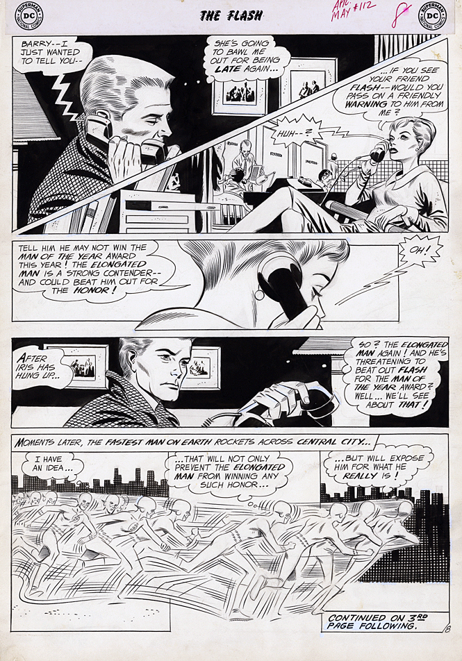
The Flash returns to THE CW shortly for its sixth TV season, so the Scarlett Speedster receives his own multi-part blog series this week.
Some of the most talented superhero storytellers in comics couldn’t figure out what to do with the narrative and exposition elements that move the story along when no one is wearing spandex or a cape.
Many comics were once filled with pages and pages of standard medium-angle shots of talking heads. Six panels per page. Rinse. Repeat.
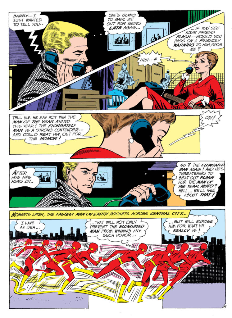
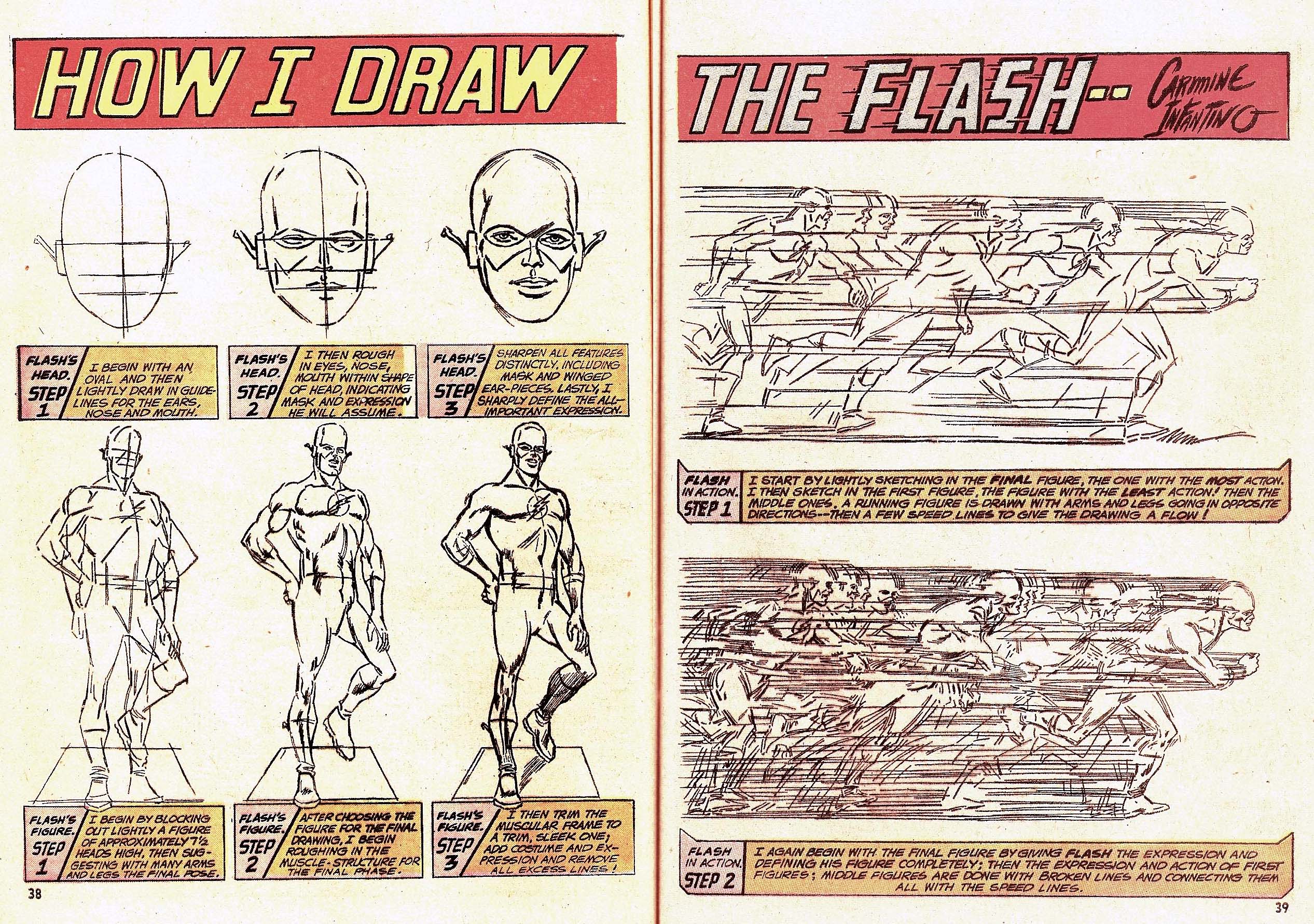
Not Carmine Infantino’s pages. His innovative sense of panel composition and design, and use of varying and dynamic camera angles, made the “yada yada” part of the story much more engaging than most of his peers.
In this very early Flash story from issue #112 (inks by Joe Giella) he even manages to innovate a phone call. We take narrow “widescreen” (horizontal) panel layouts for granted now, but in 1960? Not so much. A page design like this is revolutionary 60 years ago.
Of course, superhero comics are ultimately about conflict and action, and re-reading these early Flash stories, his innovative style really jumps out. Those crazy speed lines that help give the illusion of 3D motion in a 2D medium. That sleek space age costume… designed before the space age really began.
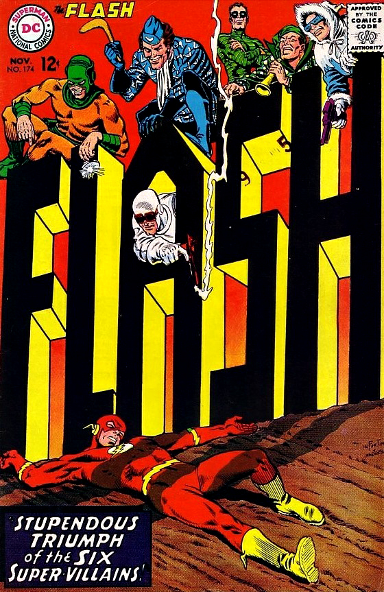
And those amazing covers? Carmine gave up pencilling The Flash when he was promoted to DC’s art director. His cover on the final full issue of his 11-year run as Flash artist blew my mind as a kid in 1967 — and still does today.
What else would you expect from the designer of the Silver Age of Comics?
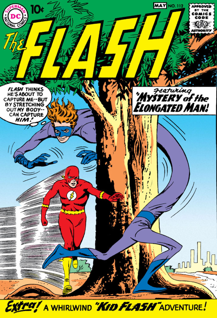
First Appearance of The Flash, Siver Age Version
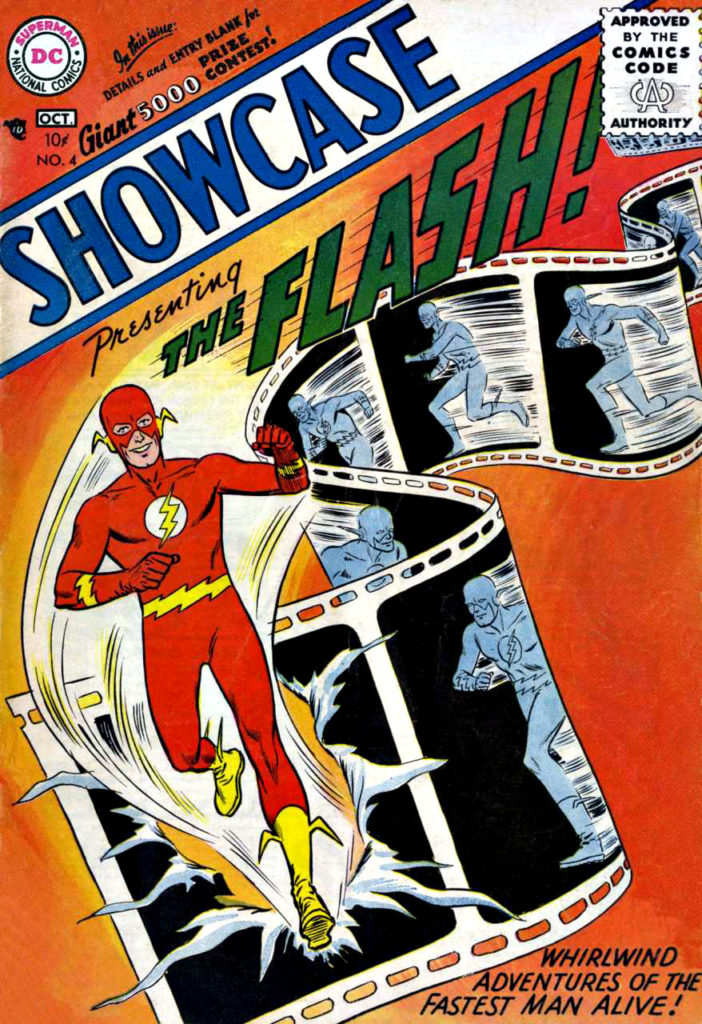
First Issue of The Flash in his own series
An exercise in futility when I tried this at home…Infantino’s final pencilled issue of the Flash ended with this show-stopping cover.
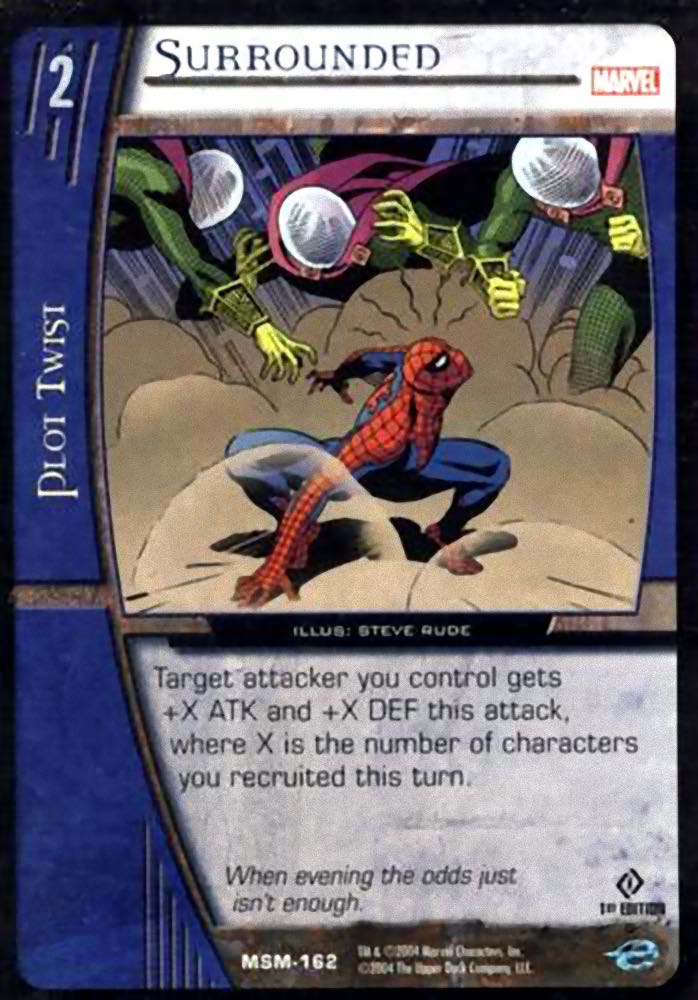
Upper Deck, Marvel VS. System TCG: Web of Spiderman, Card #162 — Surrounded, 2004
Concluding a multi-part look at Spider-Man vs. Mysterio in honor of Spider-Man: Far From Home landing on digital streaming platforms this week.
Some of the most tantalizing art ever created for Marvel and DC characters is hiding in plain sight — on trading cards… and trading card games.
In fact, the Upper Deck Vs. TCG System, started in 2004, and lasting in its original incarnation through 2009, is home to hundreds, if not thousands, of original artworks by some of the industry’s leading talents.
Except for a handful of the key art pieces, which includes illustrations by Alex Ross and Drew Struzan, all the TCG images were printed at postage stamp size only. (Some, like this one, were cropped ruthlessly to fit the printed image area.)
Sigh.
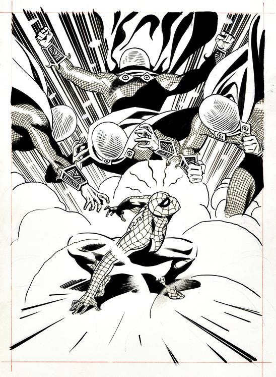
Steve “The Dude” Rude illustrated number of cards in the various VS series, and this one, featuring Spider-man vs. multiple Mysterios, is a favorite.
Steve’s clean and dynamic superhero rendering typically feels like a fascinating cross between Jack Kirby and Joe Schuster — with storytelling influences from Alex Toth , and yet here, he channels some John Romita for good measure.
Most trading card is created at a relatively small size, but fortunately this Rude original is drawn on traditional comic board, with the live image area just slightly smaller than most standard modern art.
Just enough room for all those Mysterios.
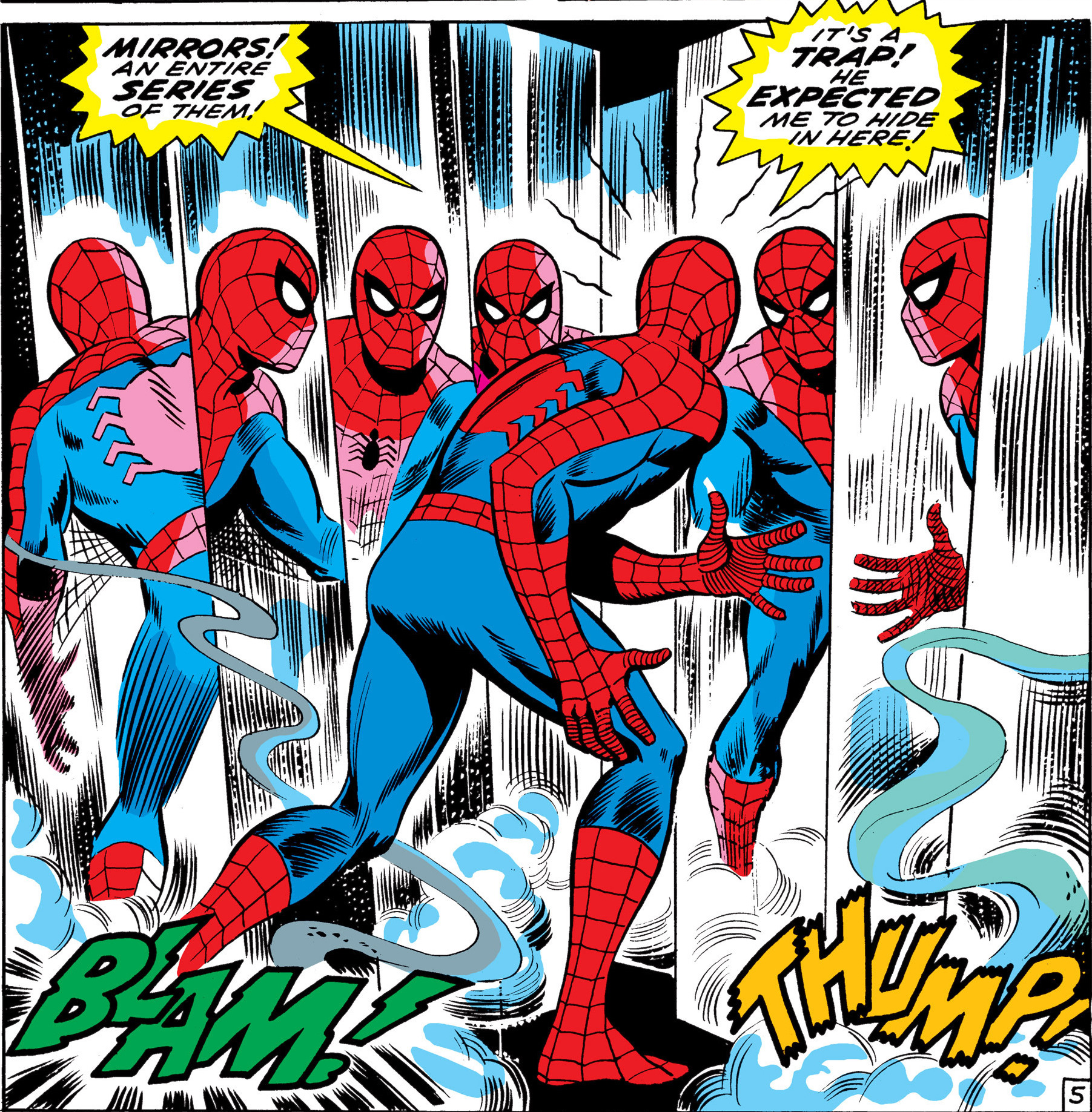
Too many Mysterios — or too much Spider-Man. Either way, Spidey is in a jam. This great panel by John Romita from ASM # 67 is a classic.
We interrupt our multi-part look at Spider-Man vs. Mysterio in honor of today’s “Batman Day” (9/21) celebration. Our regularly scheduled programming will continue tomorrow.
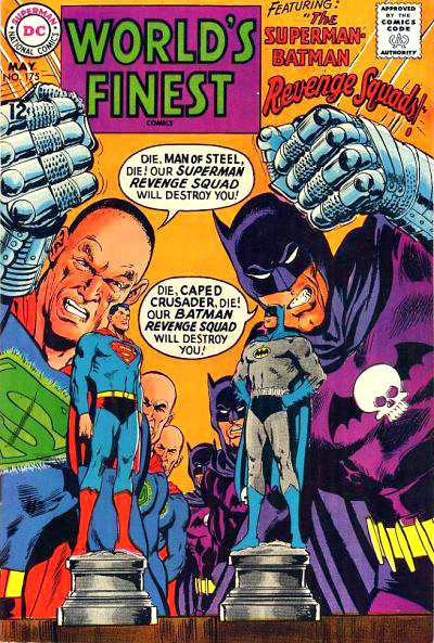
Neal Adams first Batman story appeared more than 50 years (!) ago in World’s Finest Comics #175. The art blew my mind then, and still does today. Happy Batman Day, Neal, and thanks for all of it!
Tomorrow, we conclude our multi-part look at Spider-Man vs. Mysterio with none other than “the Dude” — artist Steve Rude.