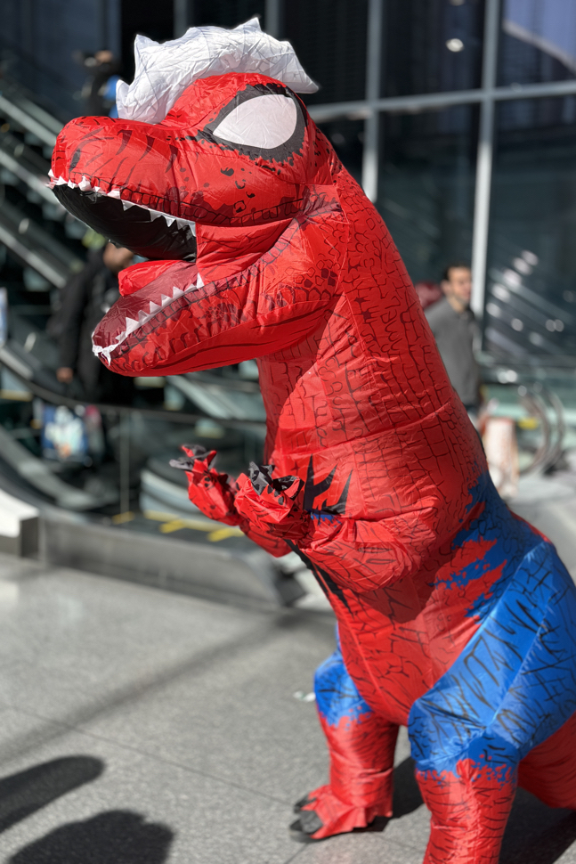
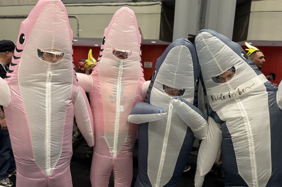
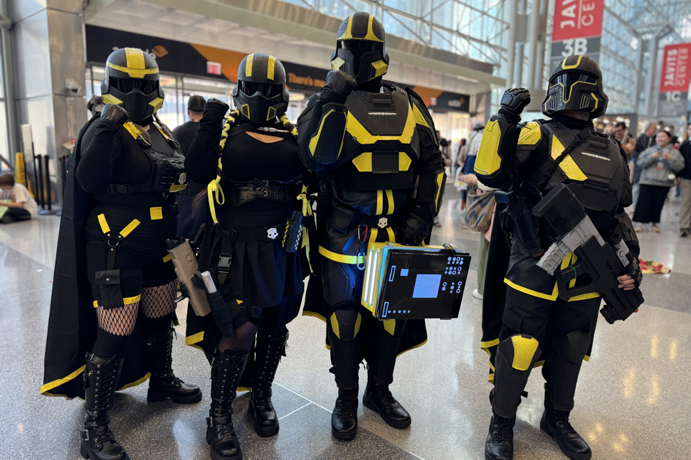
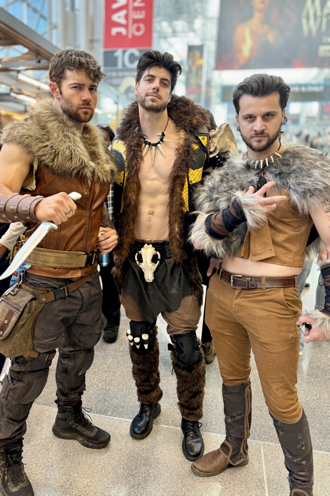
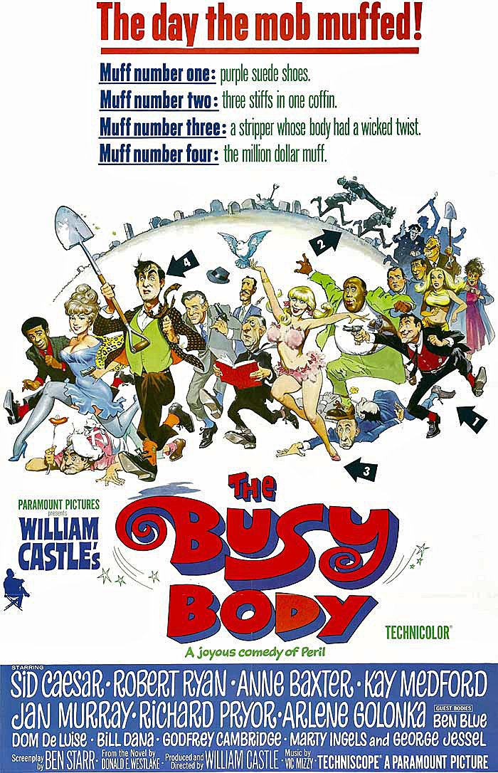
NYCC — Cosplay Galore (Part 3)
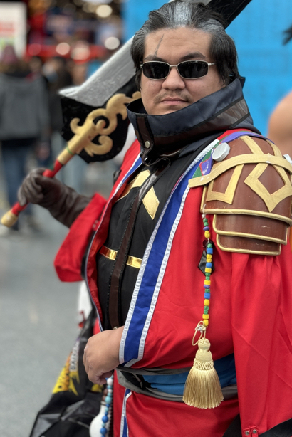
New York Comic-Con, October 17-20, 2024

Greg Goldstein's Comic Art Gallery
Panels and Pages… Art and Artists… Creators and Conventions… Musings and Memories…

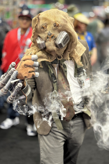
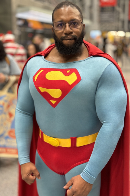
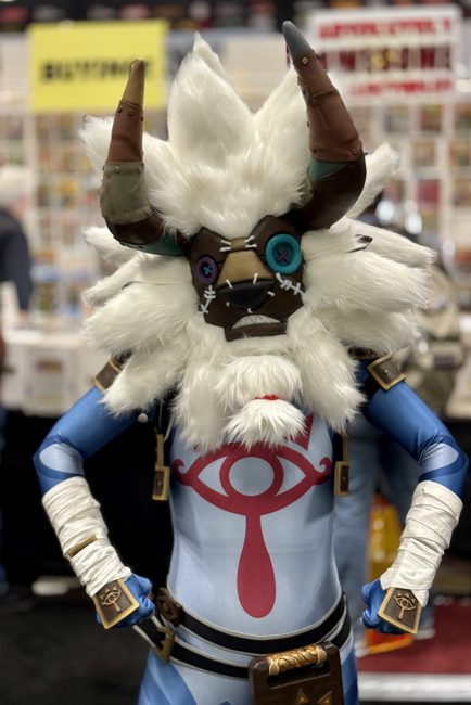
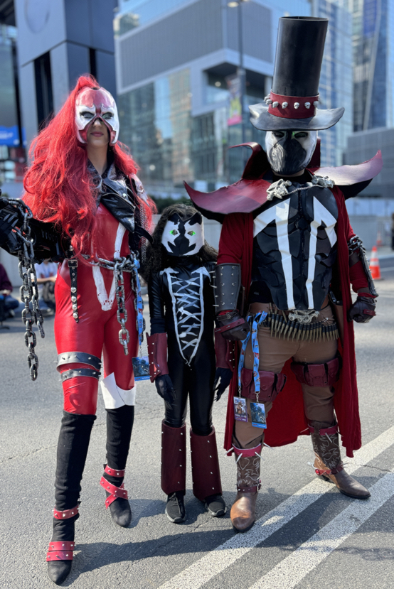
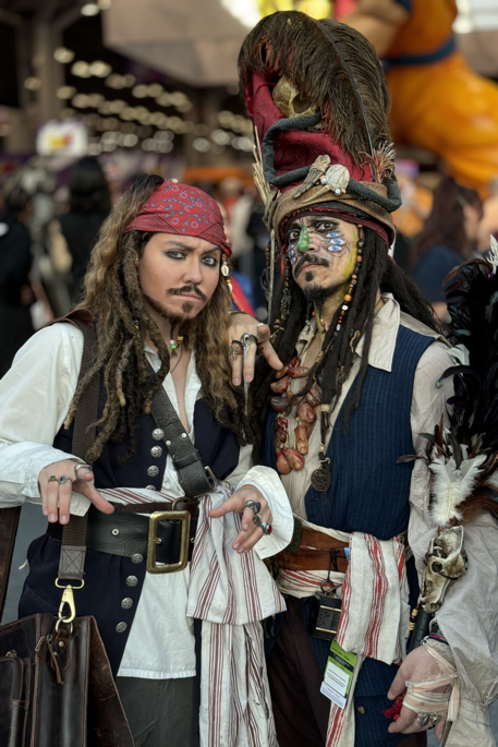
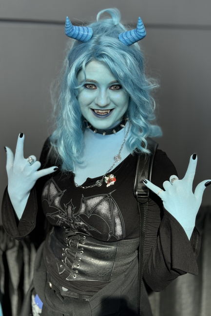
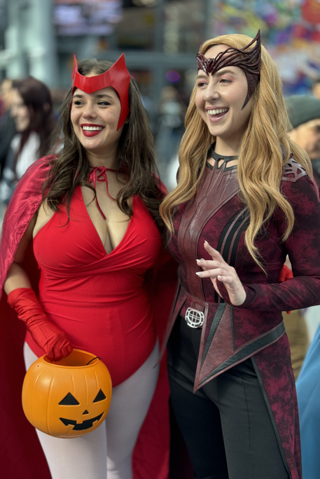
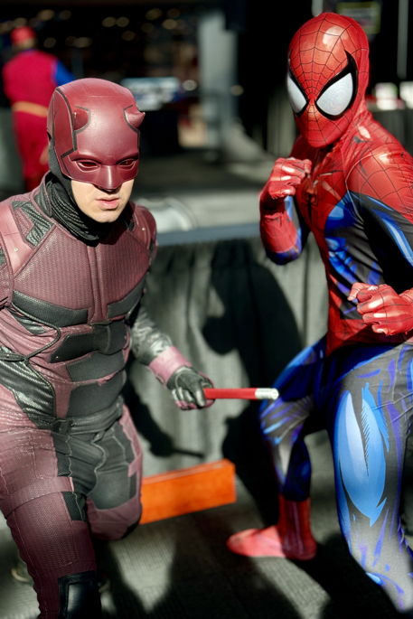
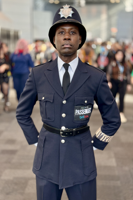
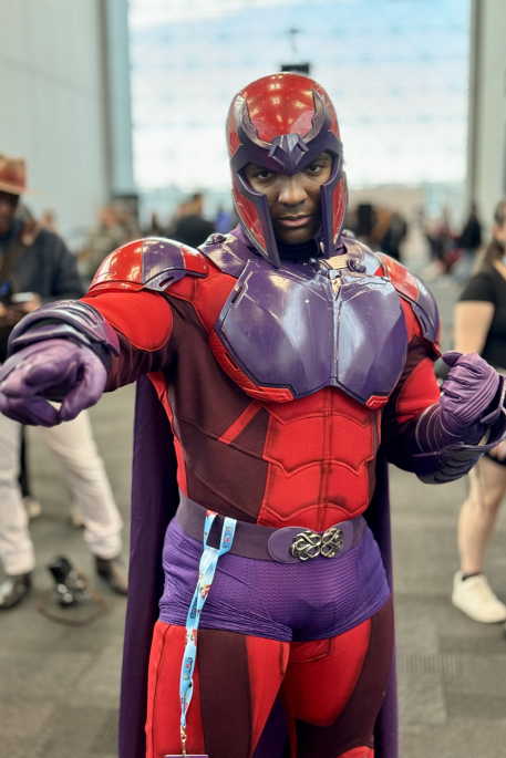
New York Comic-Con, October 17-20, 2024
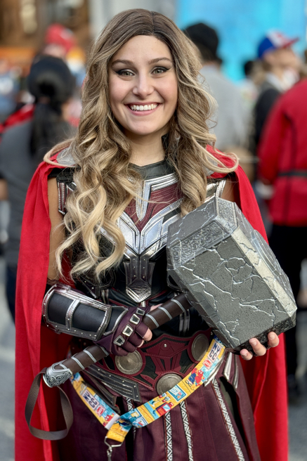
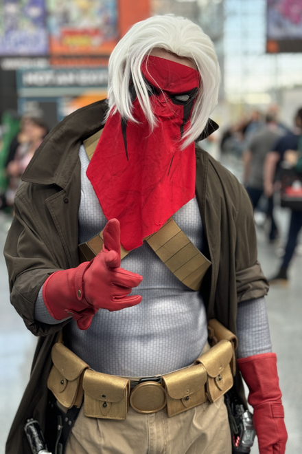
New York Comic-Con, October 17-20, 2024

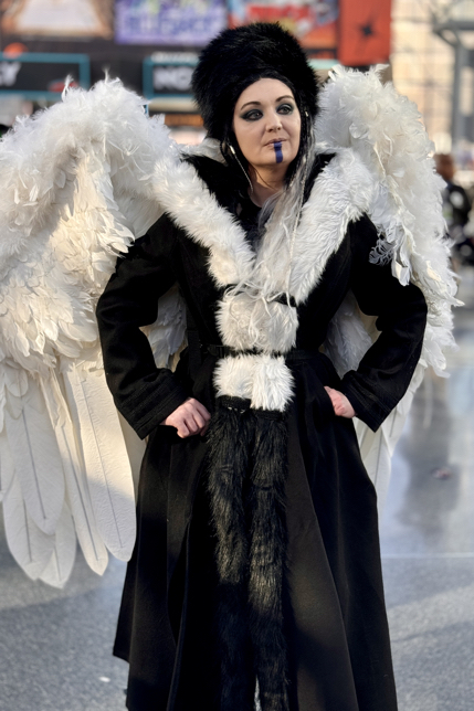
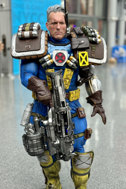
New York Comic-Con, October 17-20, 2024
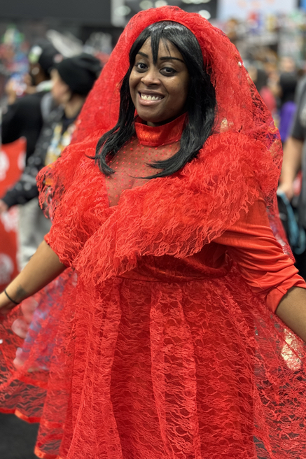
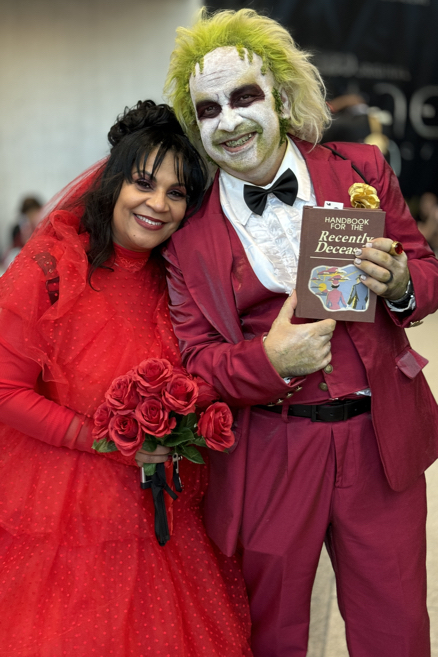
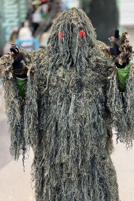
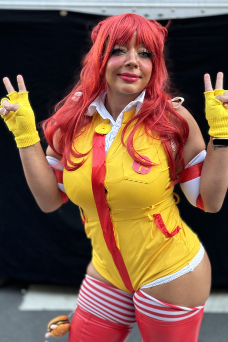
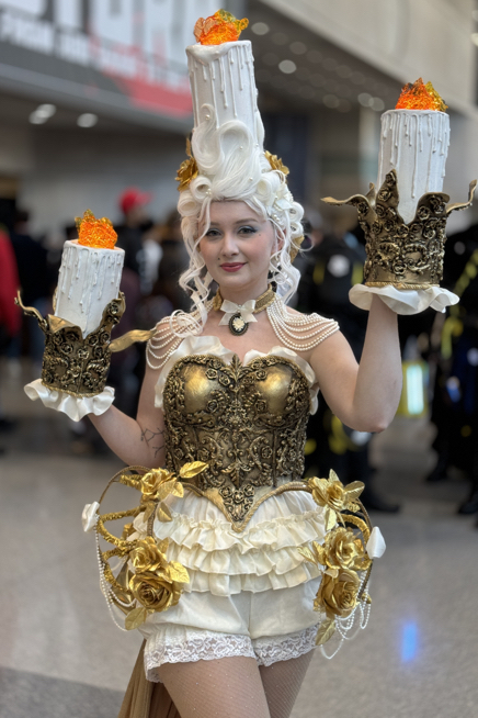
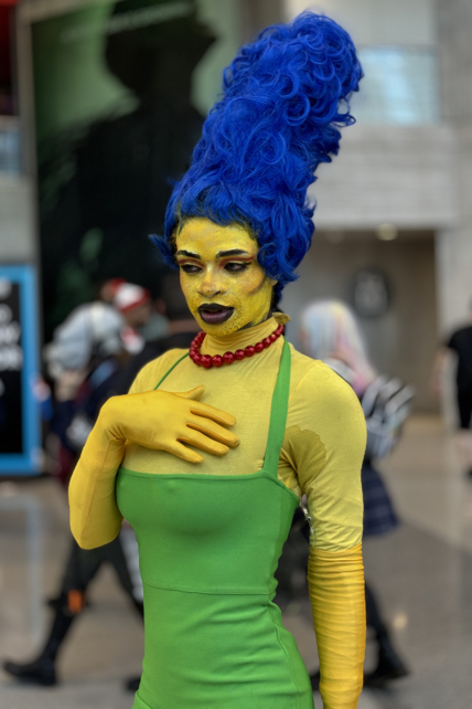
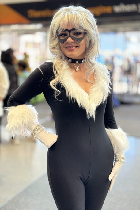
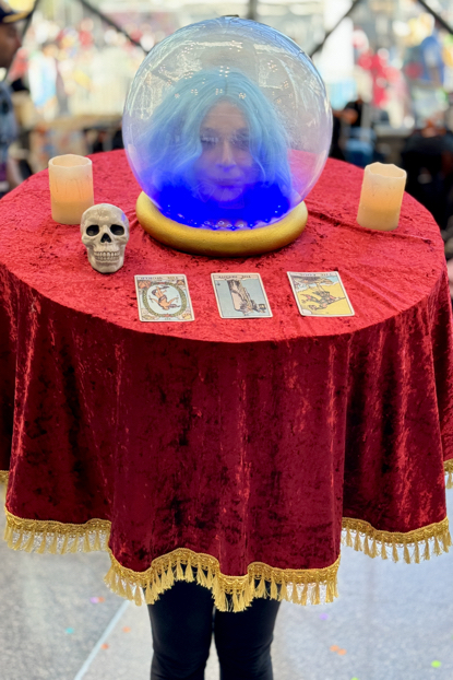
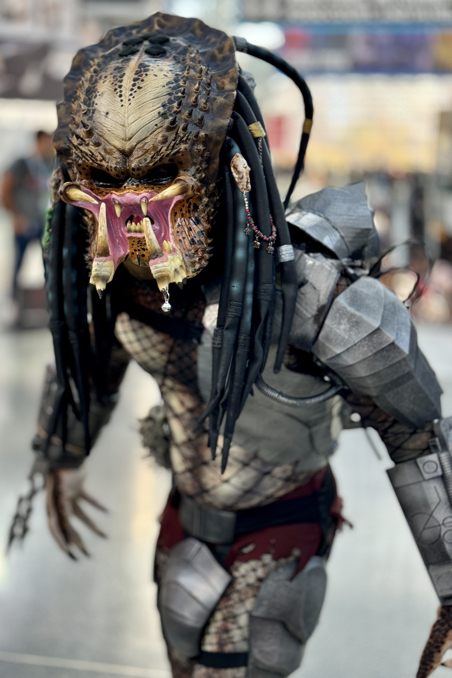
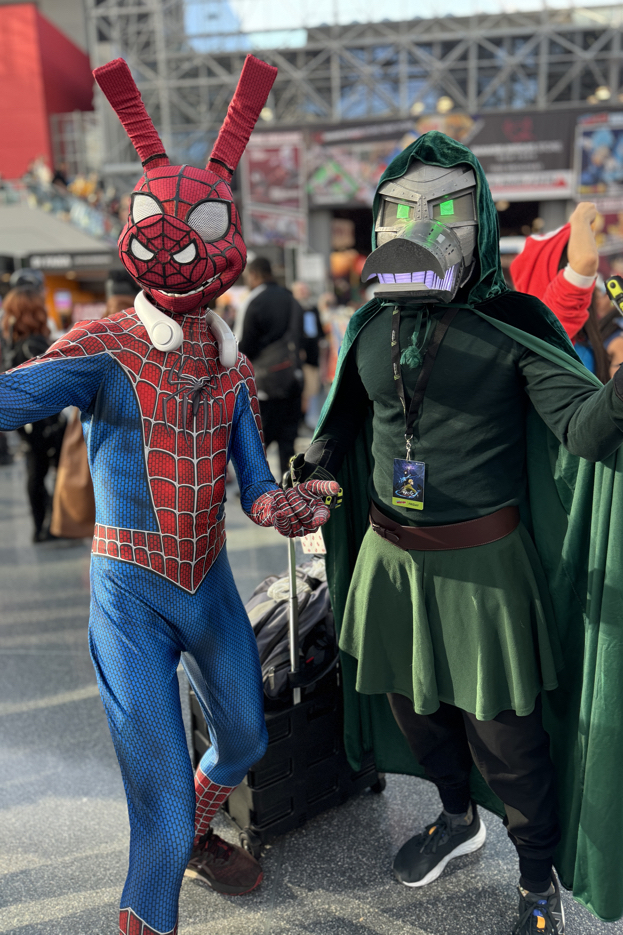
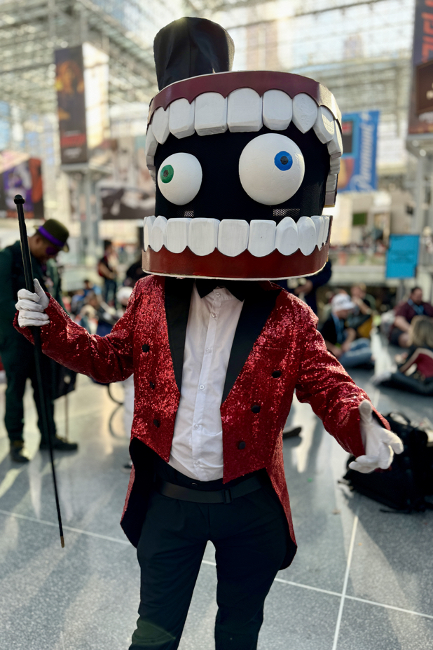
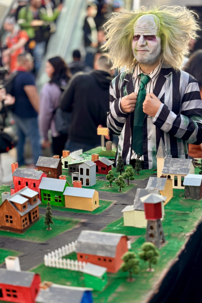
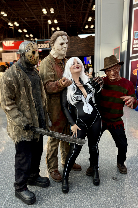
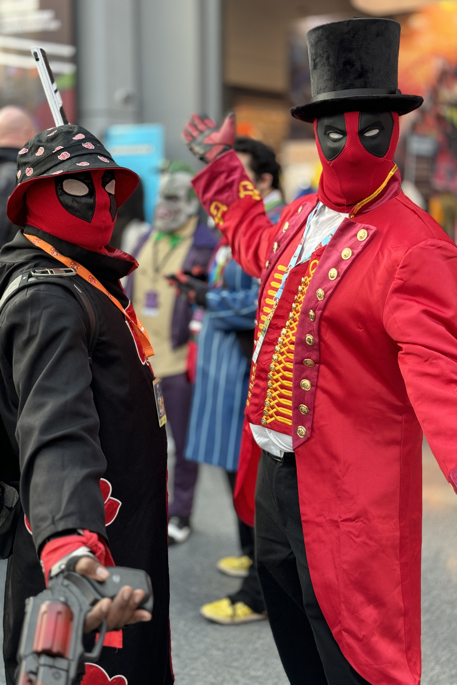
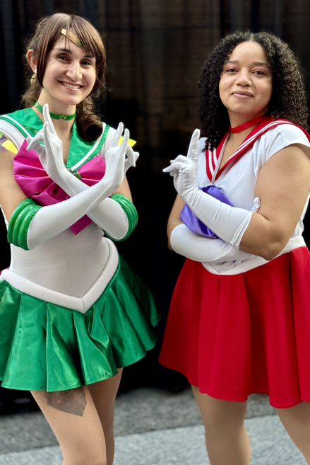
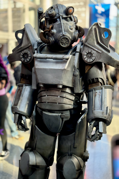
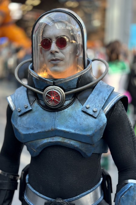
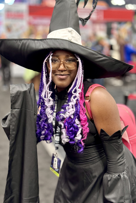
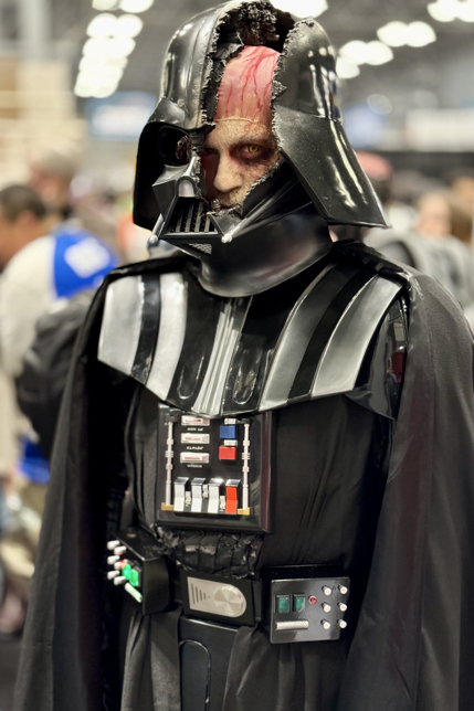
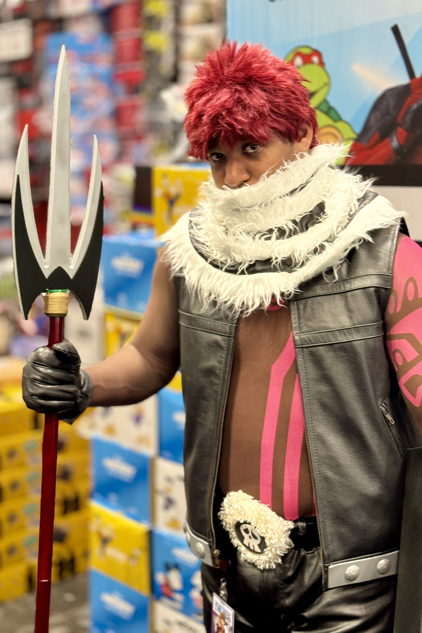
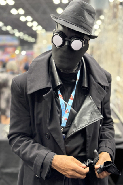
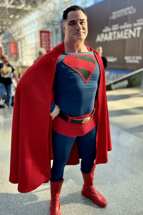
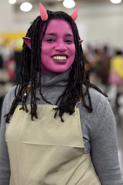
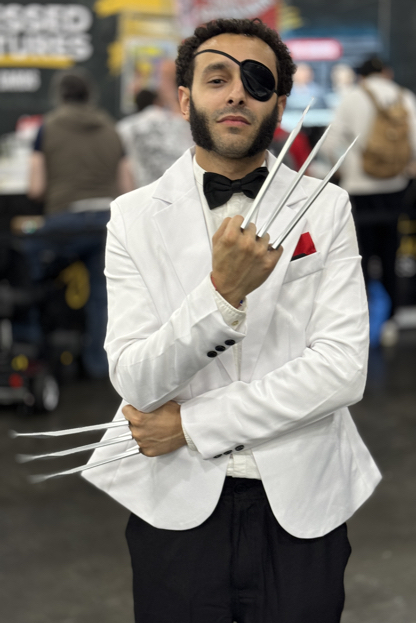
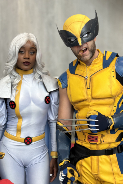
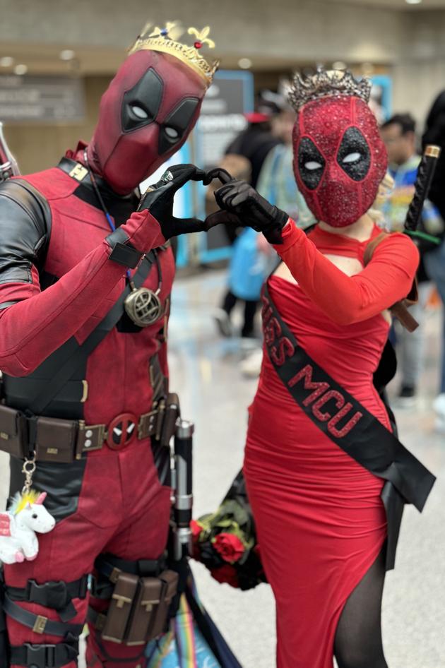
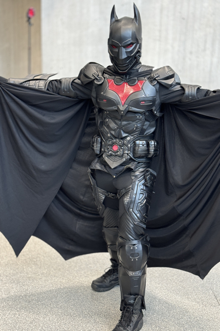
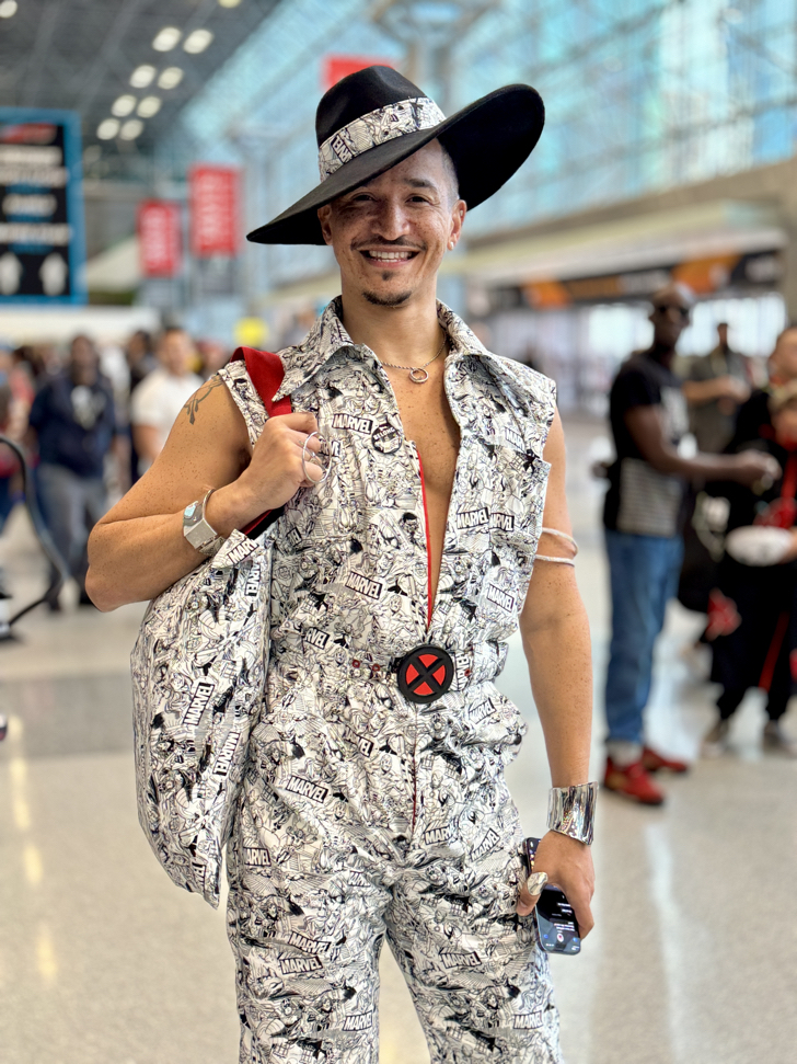
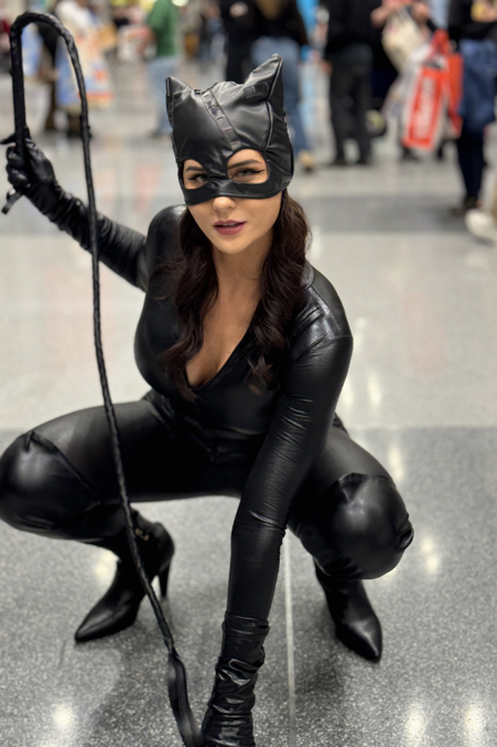
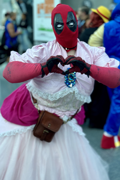
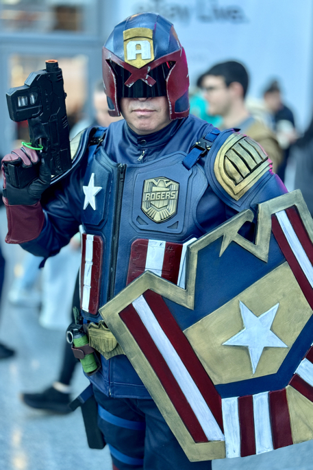
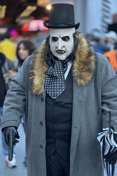
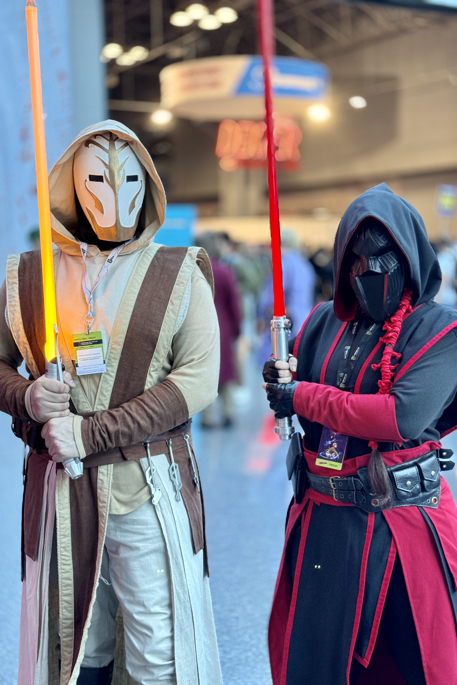
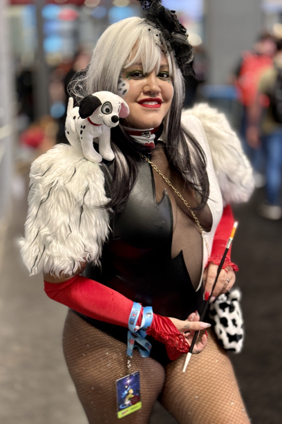
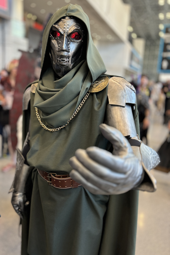
Another great (and exhausting) con, and some terrific Cosplay as well. Happy Halloween!


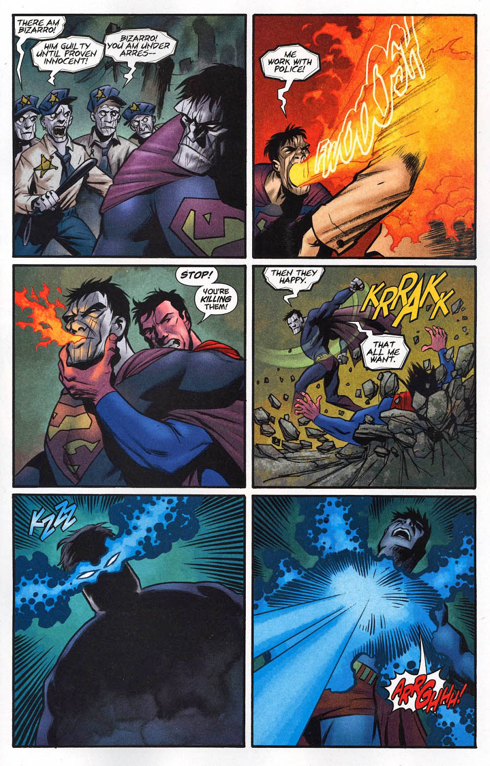
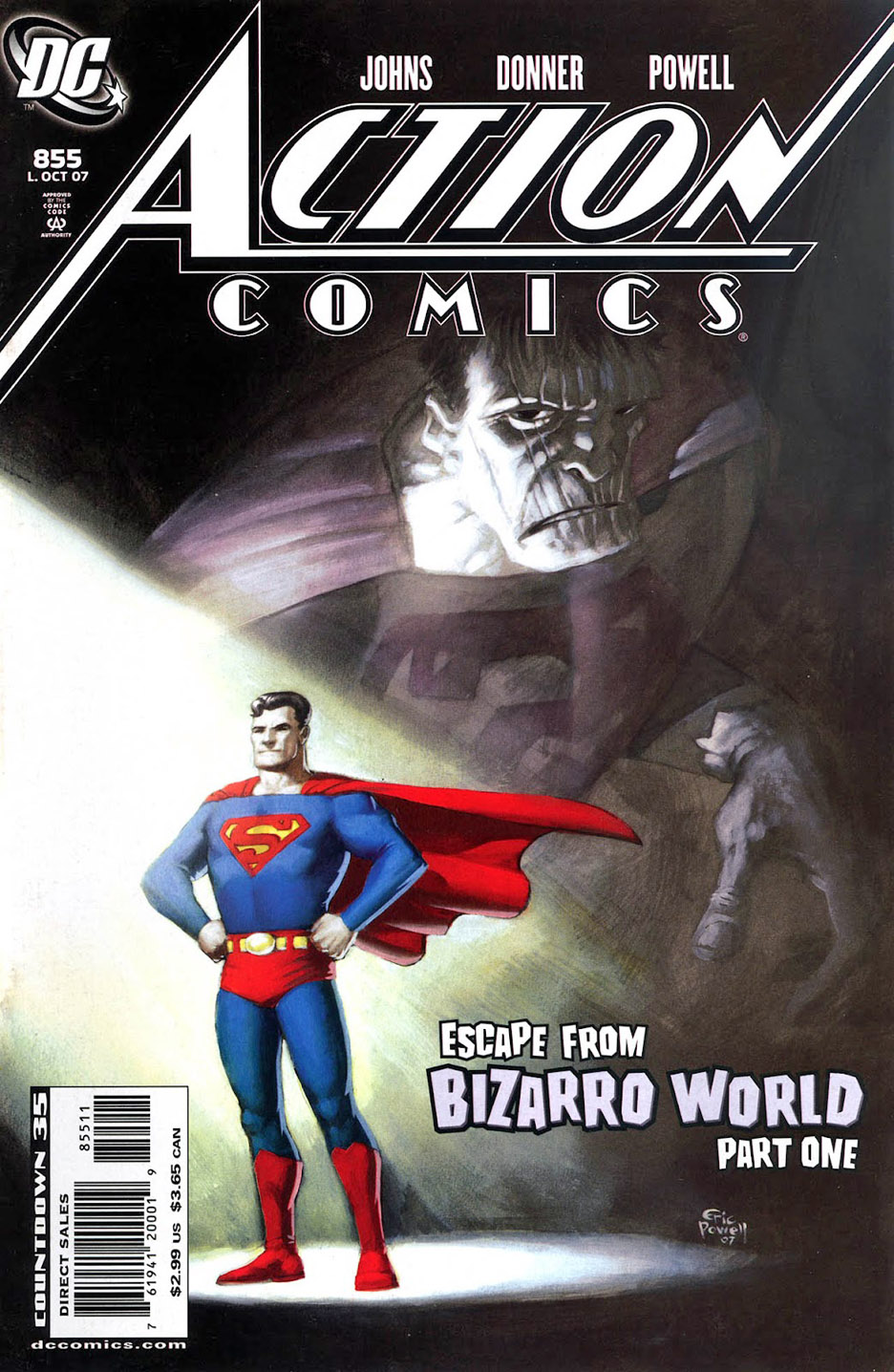
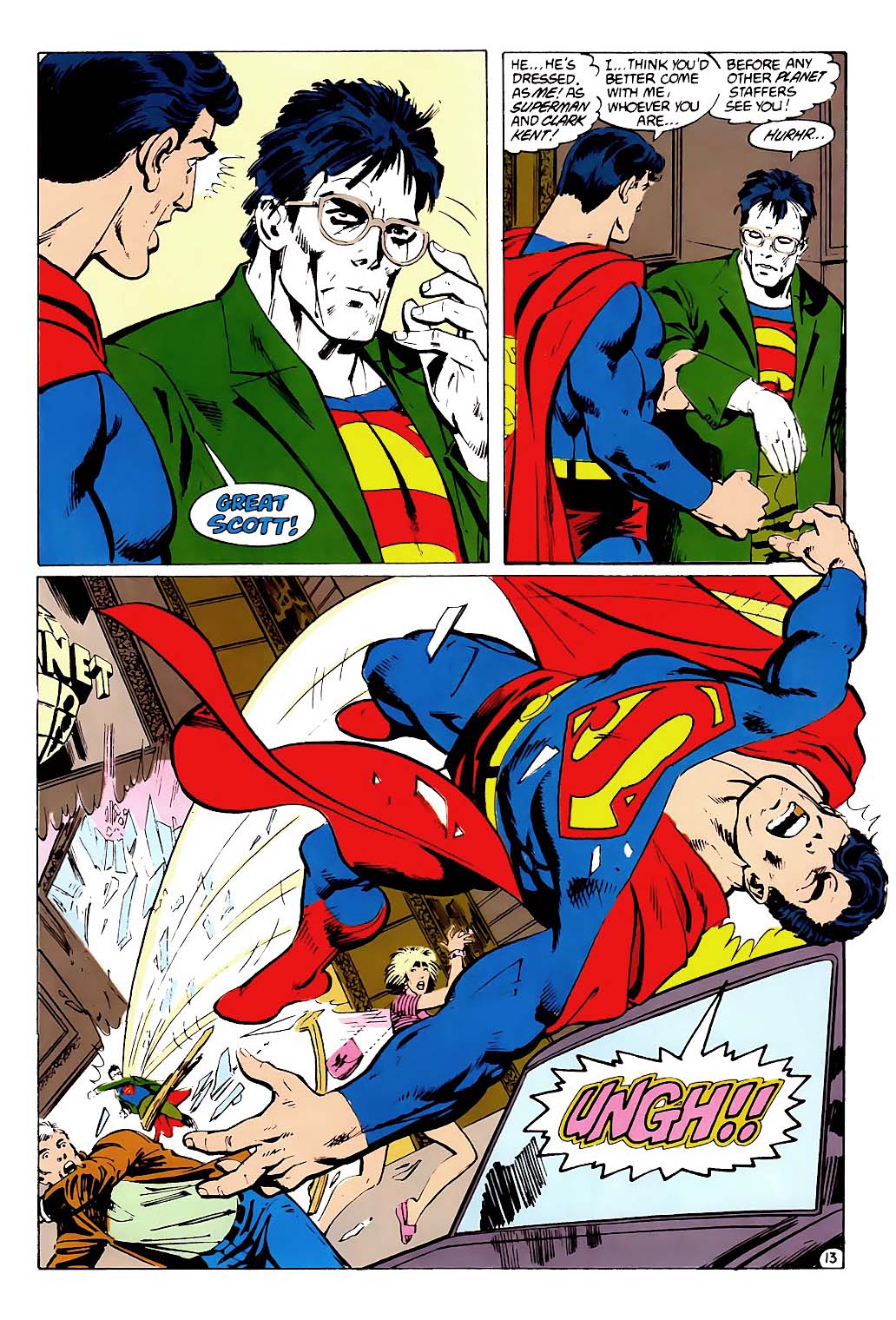
Action Comics # 855, October 2007

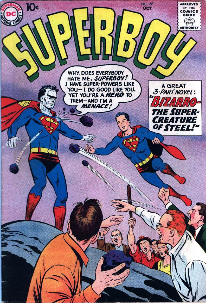
Geoff Johns, Richard Donner and Eric Powell creating a multi-part Bizarro story?
Sign me up.
Spoiler alert: It’s absolutely terrific — fun and affectionate — start to finish. Powell knocks the art out of the park. Many mainstream superhero readers tracked down Powell’s Goon series after they saw this.
You can bet the farm — Kent’s or otherwise — on that.
One final time — Happy Halloween, 2024!
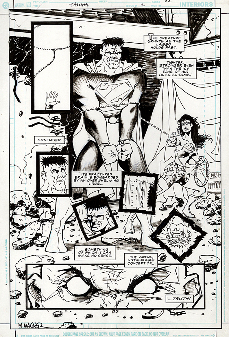
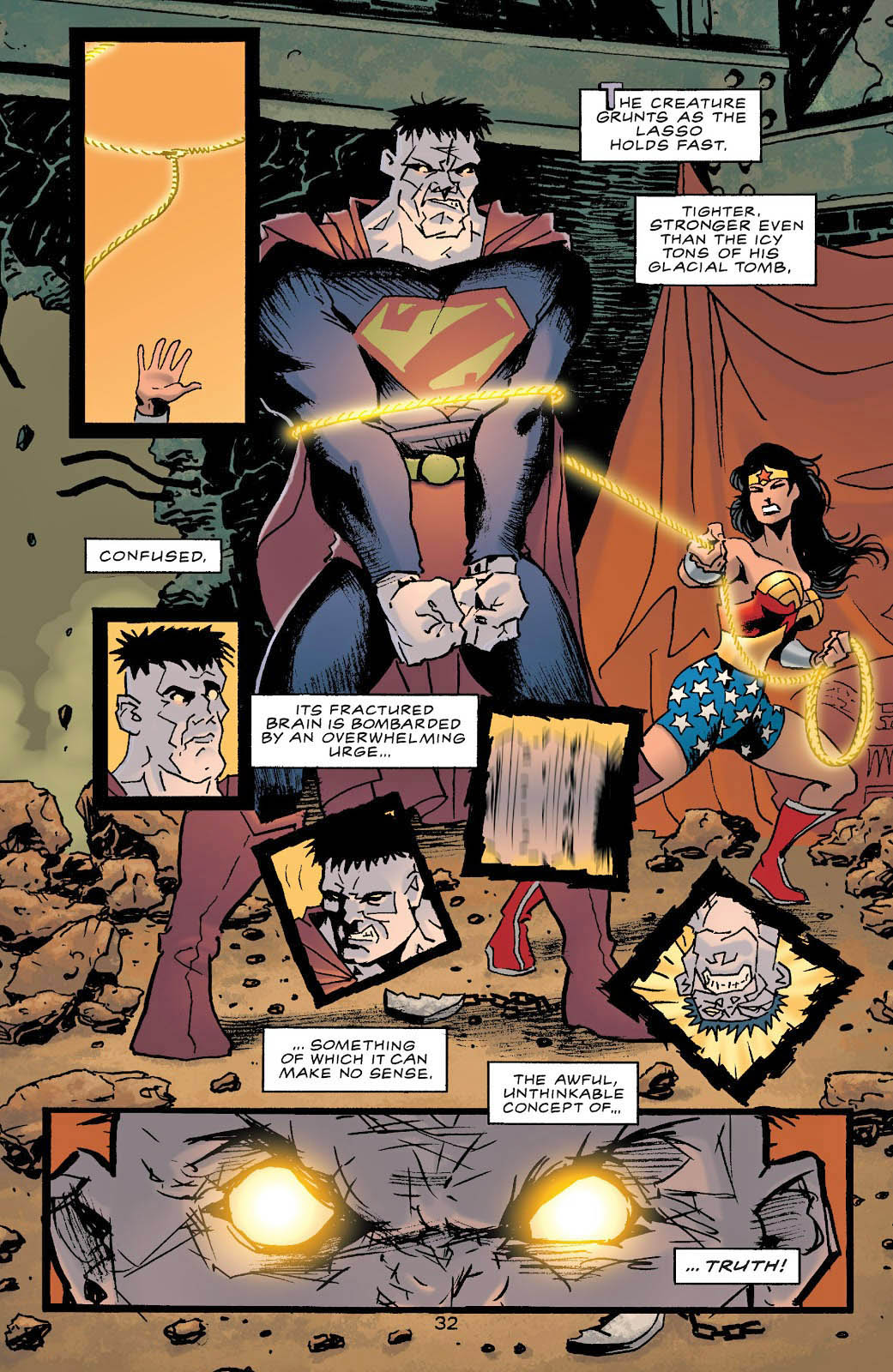
Batman / Superman / Wonder Woman: Trinity #2, September 2003
Batman / Superman / Wonder Woman: Trinity #2, 2003
Here’s a great Matt Wagner splash featuring Wonder Woman doing her best to rein in Bizarro. Spoiler alert: It doesn’t go all that well.
Wagner delivers page after page of visual dynamics and terrific storytelling in this underrated series featuring DC’s “Big Three.”
The only thing I don’t like: The “official” book title, which is a bit long and definitely not obvious. (Publishers occasionally forget that readers have to be able easily find the title at retail. Trust me on this.)
Happy Halloween —all month long!
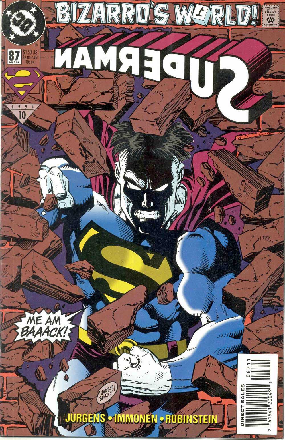
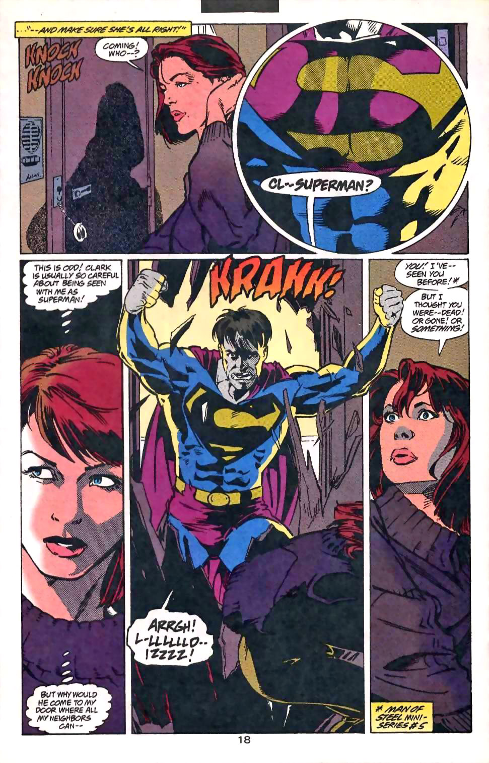
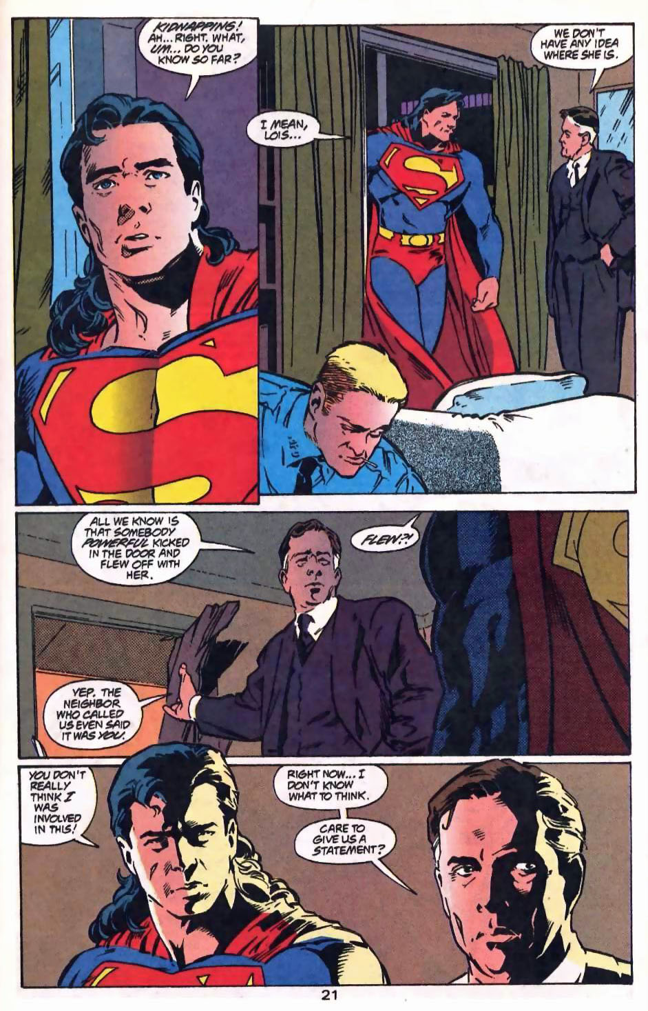
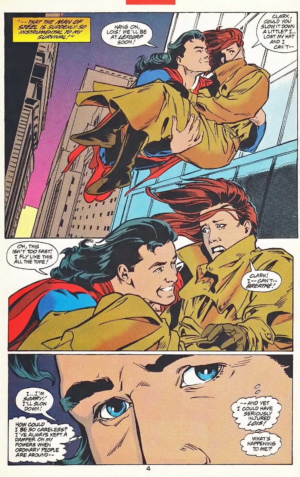
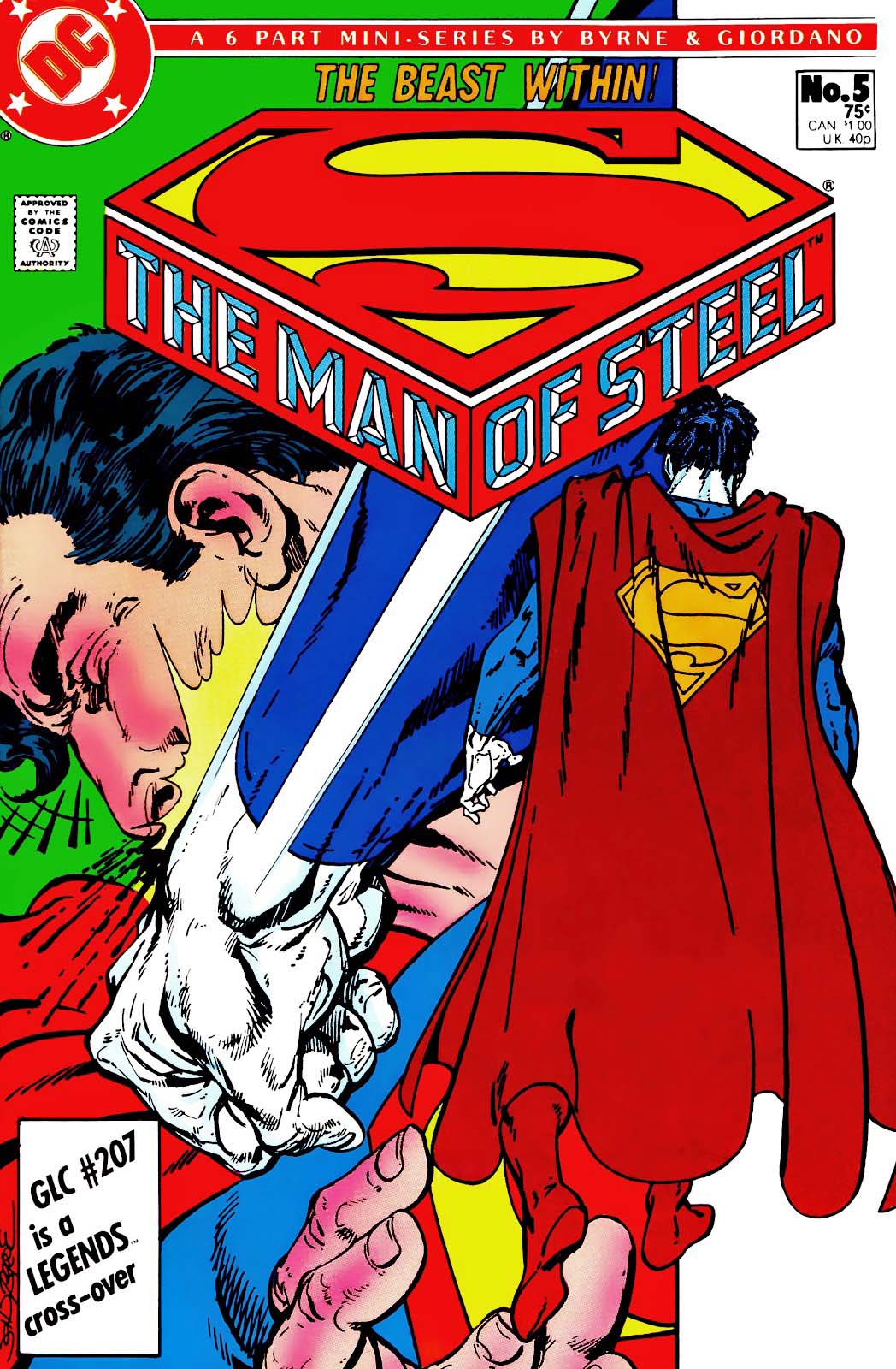
Superman #87, March 1994
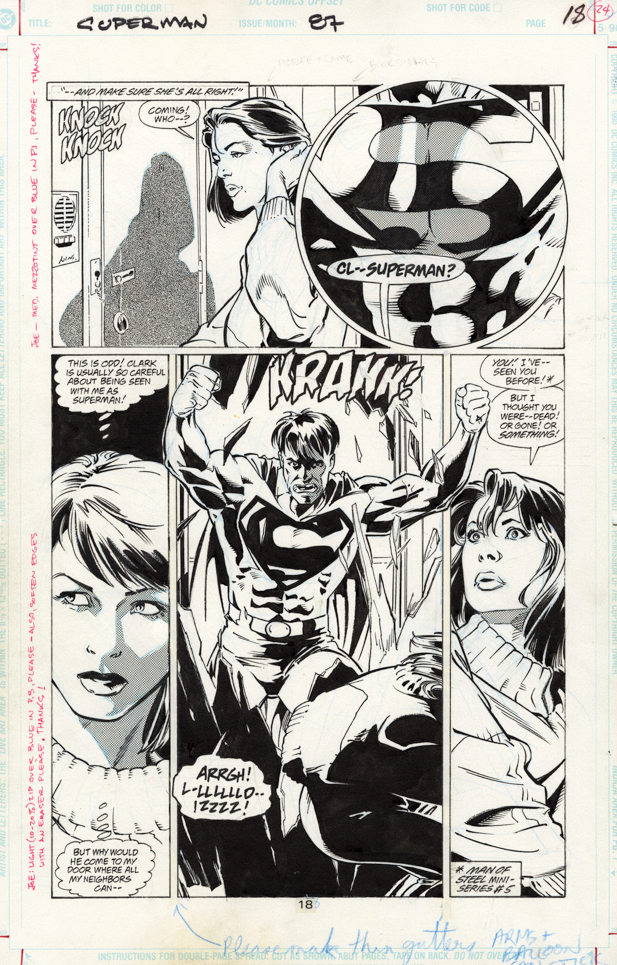
Stuart Immonen — guest penciling in Dan Jurgen’s regular slot — has some fun with Bizarro, and the rest of the Superman cast in this two-part story from 1994.
This is only the second appearance of Bizarro in the “modern” superman era. John Byrne used the character in the Man of Steel mini-series (#5) and promptly destroyed him.
Spoiler alert: Lex Luthor resurrects the Superman cloning idea in this issue, and things don’t go much better. (Although I guess Bizarro lasts two issues instead of just one this time around, so there’s that.)
I definitely dig Immonen’s art — but if you thought Jurgens drew Mr. Kent with a big mane of hair, definitely check out Stuart’s version. Superman’s hair starts big in issue #87 and might even be fuller and longer by #88.
Definitely ready for a time-travel trip to the Hyborian age.
Happy Halloween —all month long!
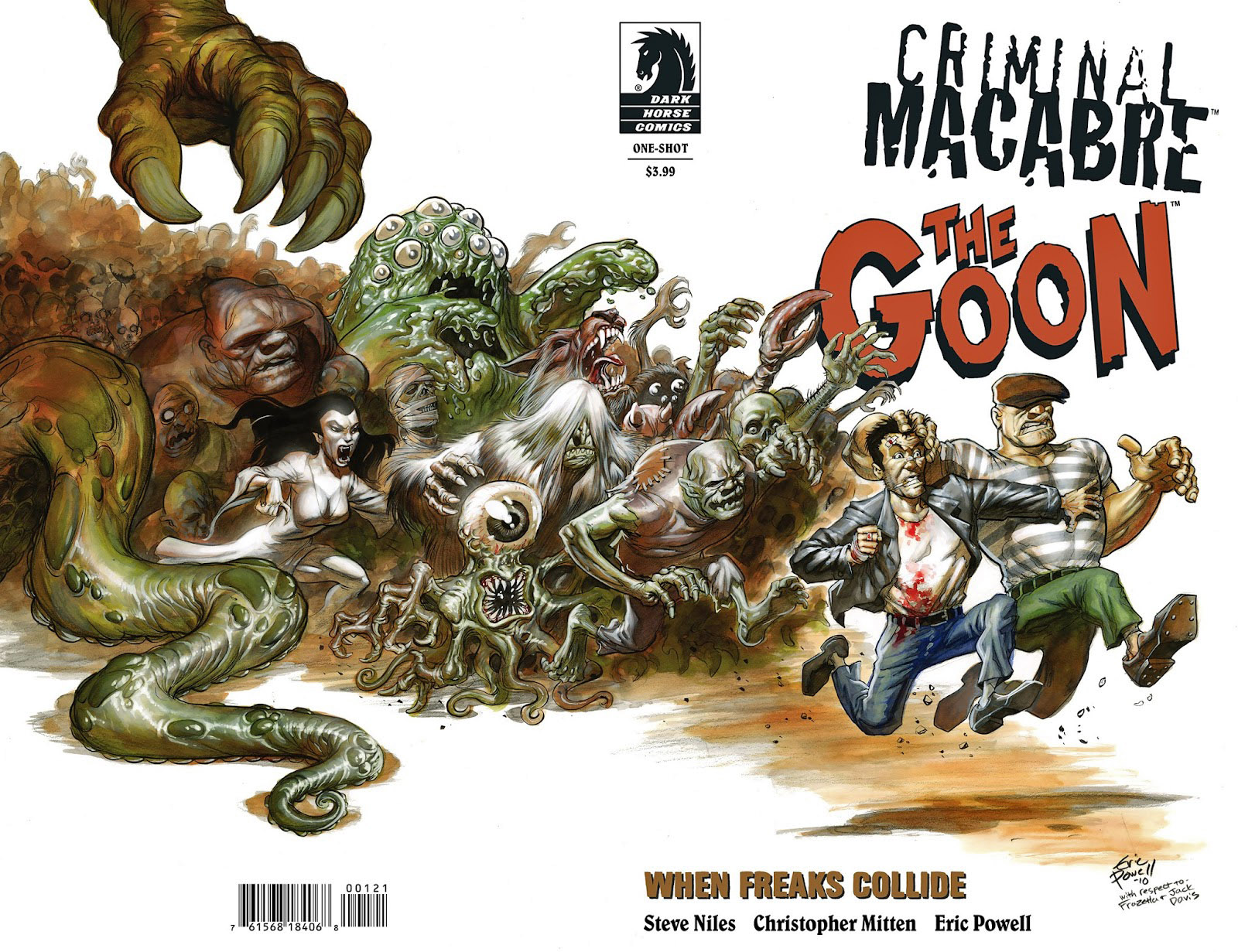
Criminal Macabre / The Goon: When Freaks Collide #1, July 2011
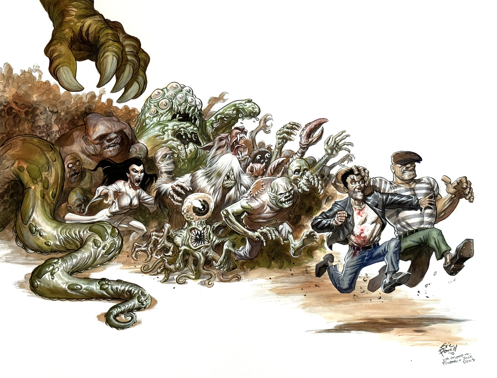
If the 60s “comic chase movie poster” can be considered its own category, Jack Davis and Frank Frazetta owned it.
Eric Powell pays a loving tribute to these classic posters — and both artists — with his terrific painted wraparound cover for the one-shot crossover, Criminal Macabre / The Goon: When Freaks Collide. (2011). (Instead of actors, we get monsters and creatures. Seems like a win.)
Davis continued to illustrate film posters using his trademark caricature style until most movie marketing materials employed photography. Frazetta though was later hired instead for his painted fantasy flair. Today, of course, illustrated poster efforts have all but disappeared. Somewhere along the way, styles changed, and the ever-frugal Hollywood execs decided that $20 million for an actor made sense, but a few thousand bucks for marketing art is a bridge too far.
Sigh. We are all poorer because of it.
Happy Halloween —all month long!
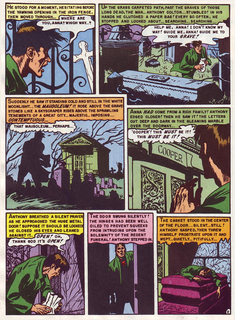
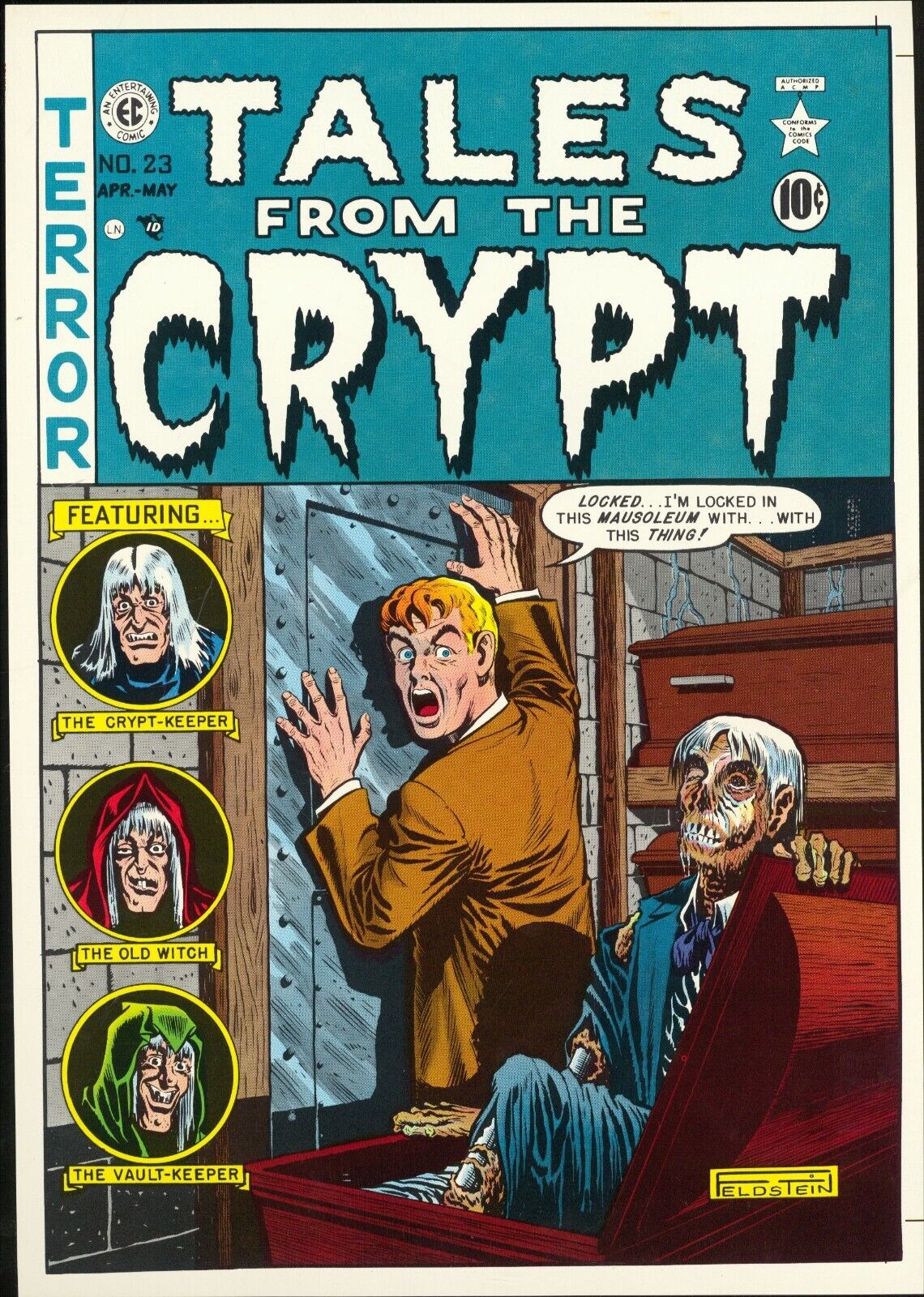
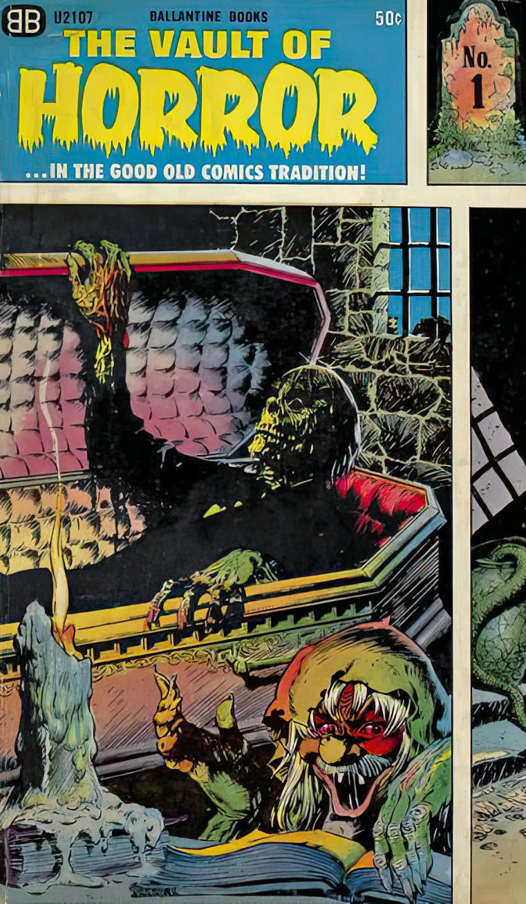
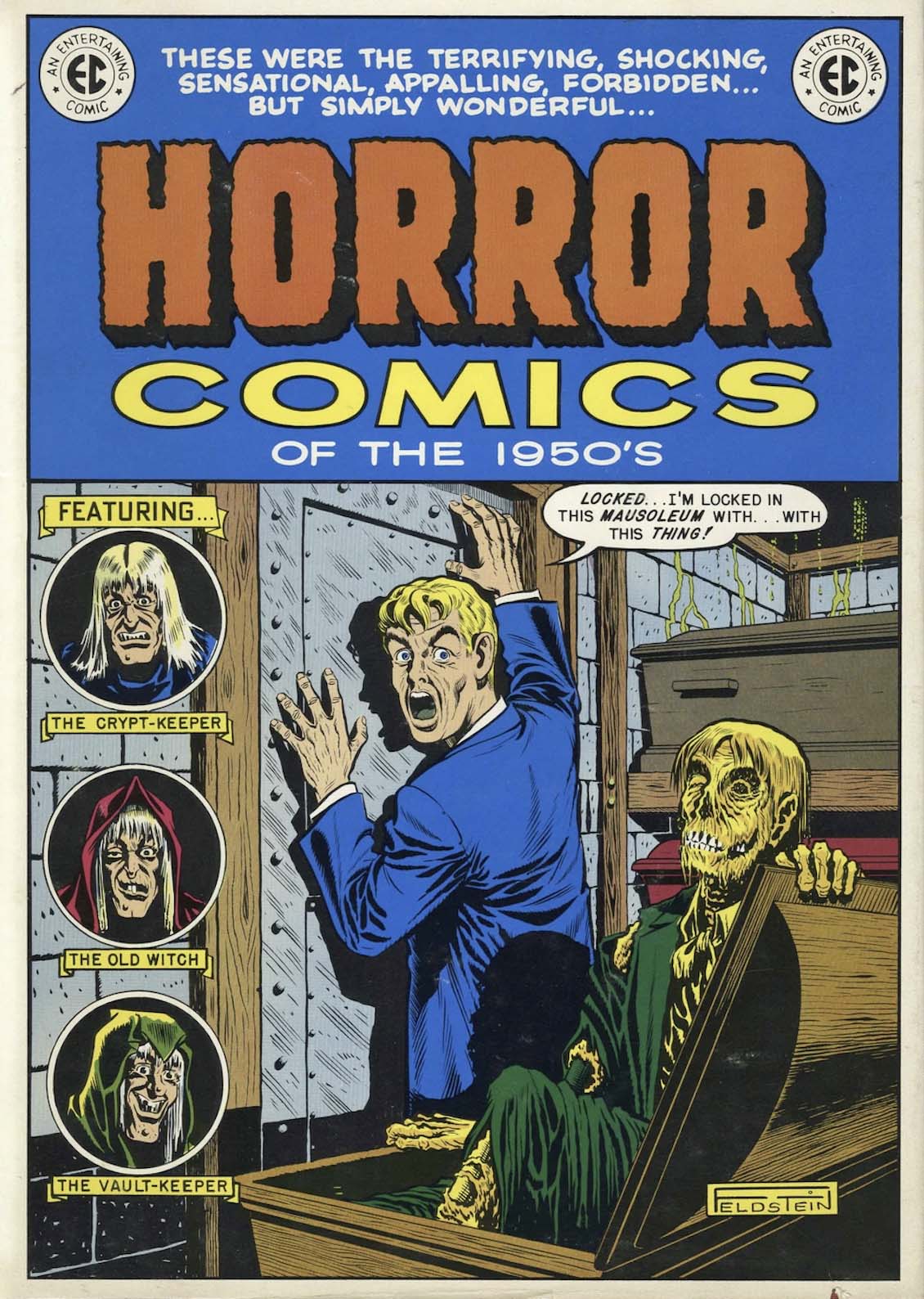
Tales From the Crypt #23, April-May, 1951
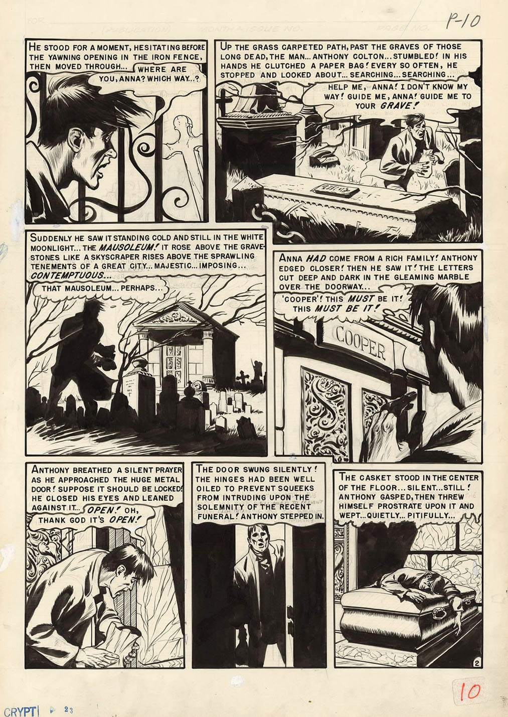
Graham (“Ghastly”) Ingels creates a fabulous story page for the classic (and unsurprisingly, horrific) EC tale, “Last Respects.” (Tales of the Crypt #23.)
I likely first ran into this specific story from the Vault of Horror reprint paperback (1965) which I grabbed at a flea market sometime the early 70s. Oddly, the Crypt cover from this story was reused as the jacket art for the amazing Nostalgia Press EC reprint collection (1971) (which hooked me into EC Comics to begin with) — but did not include the story inside!
As for Ingels himself? — He was the most prolific of the EC horror artists and in many ways, he was the most intriguing personality of the EC gang. Later in his life, he was certainly the most elusive, seemingly horrified (pun intended) by his contribution to these classic comics.
*Yes, I know it’s a mausoleum, but crypt was more fun, and appropriate.
See you next week for another taste of Halloween horror; it is October after all!
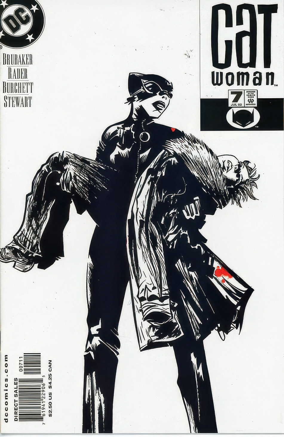
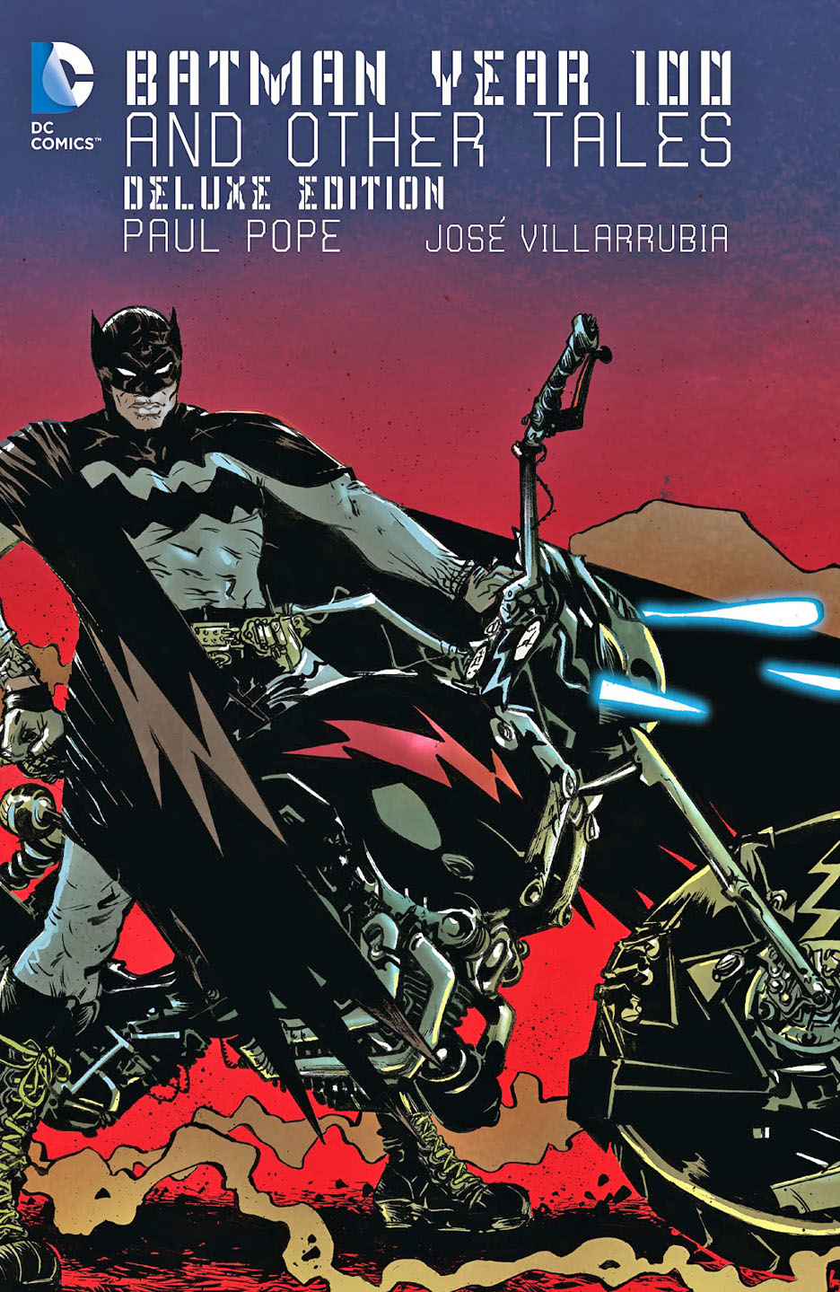
Catwoman #7, July 2002
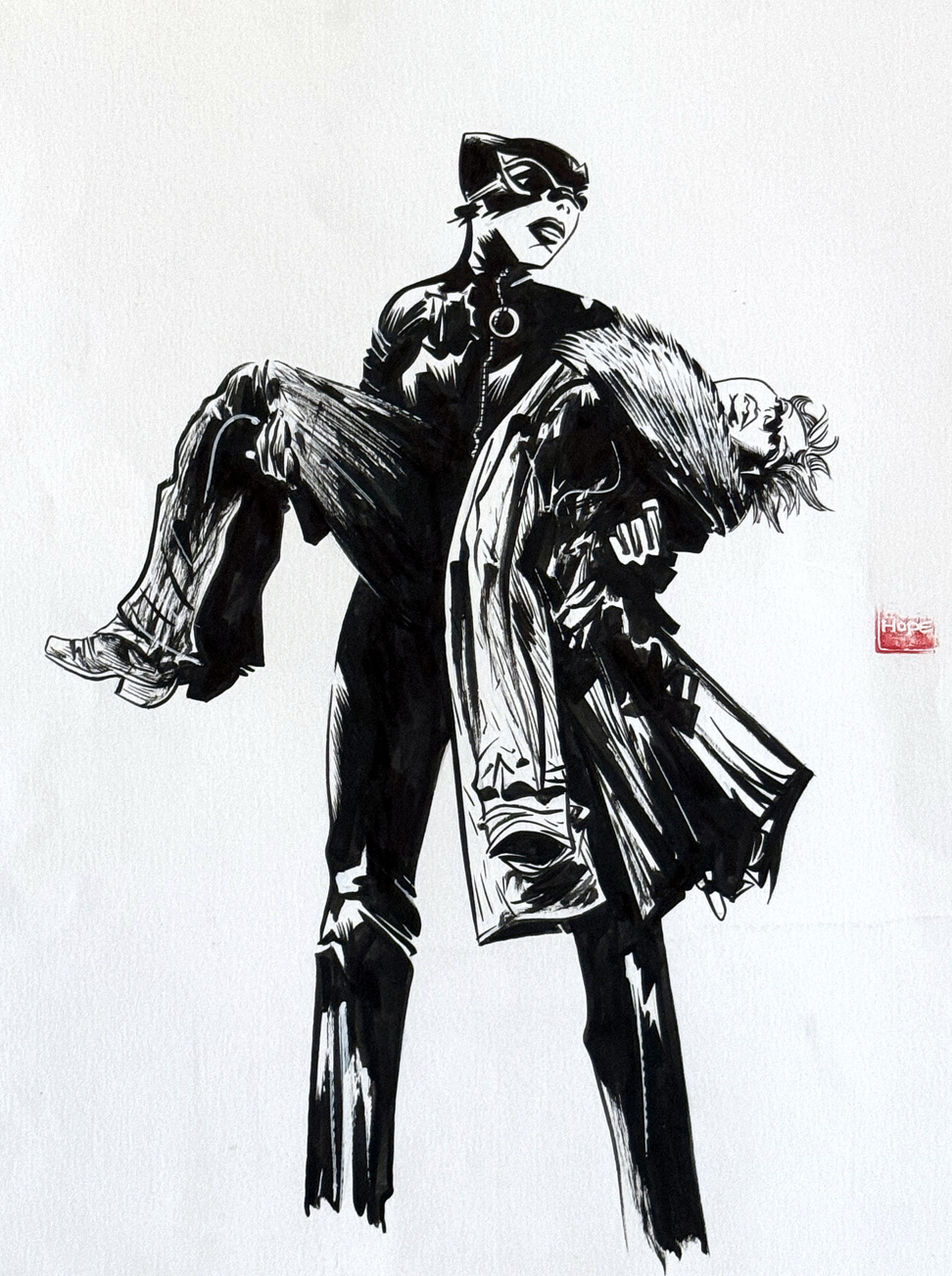
Black and white — and read all over:
Paul Pope delivers a stunning Catwoman cover for Ed Brubaker’s great run from the early aughts. Smartly, the art/editorial decision makers kept the published cover in its original black and white state, with just a hint of red color applied after the fact. (Blood, naturally.) Pope did a series of these covers for the Brubaker run — all terrific.
Pope’s best known “mainstream” comic book is Batman Year 100 (2006), a wild ride into the bat-future; it would be lovely to see him return to the character at some point.
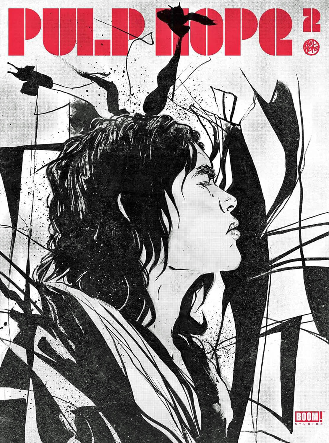
Looks like the new updated version of the out-of-print Pope art book (coming later this year from Boom!) has a cover with same black/white/red color scheme! Nice.
September 21, 2024
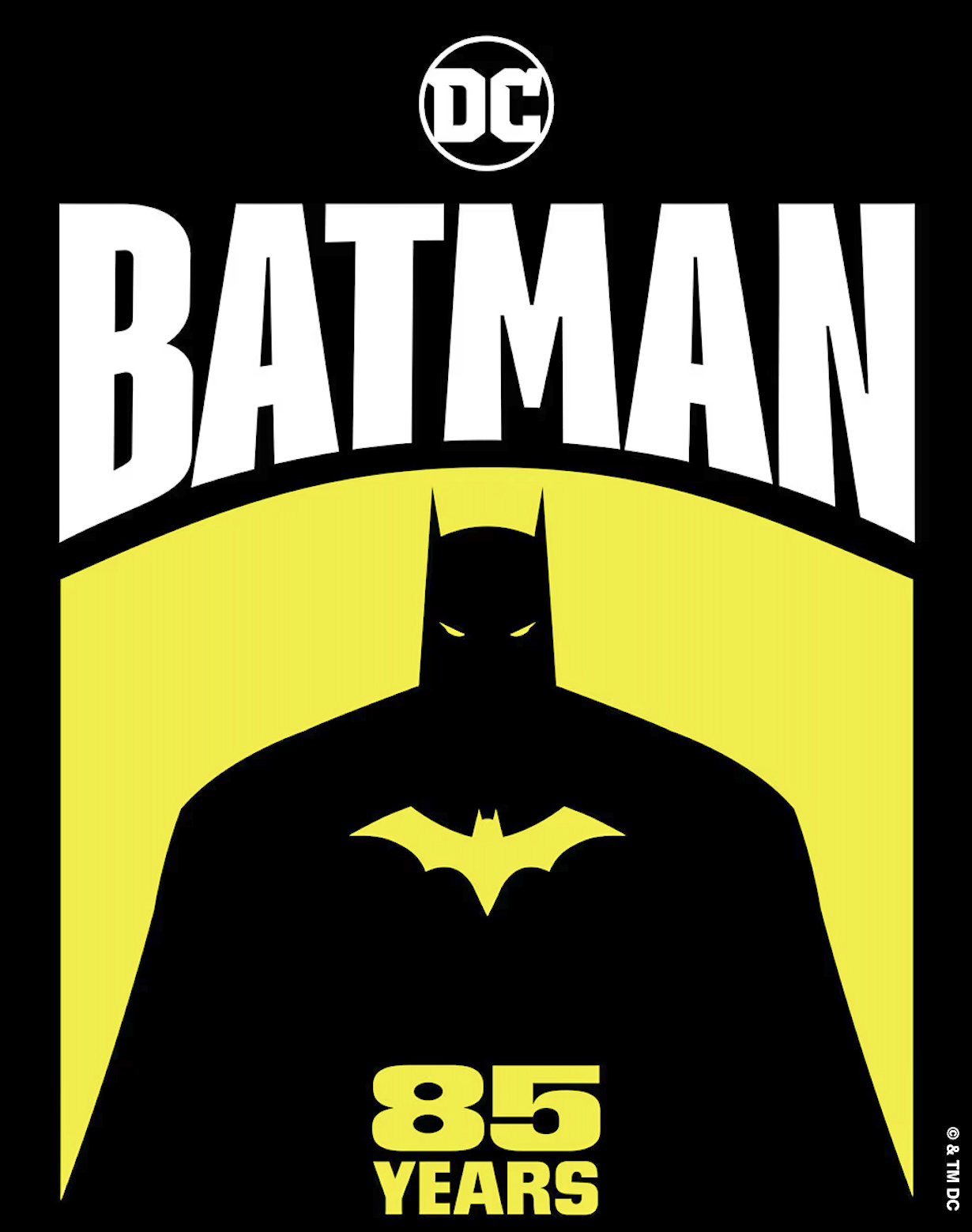
In honor of Batman Day — and the caped crusader’s 85th birthday — here’s a link to all the posts that have featured Batman and his cast of colorful allies — and even more colorful villains:
https://greggoldsteincomicartgallery.com/?s=batman
We’ve been celebrating the Dark Knight throughout the month of September; one more bat-post to load next week, and then it’s off to October and monsters and ghouls, et al.
Same bat-time, same bat-channel.