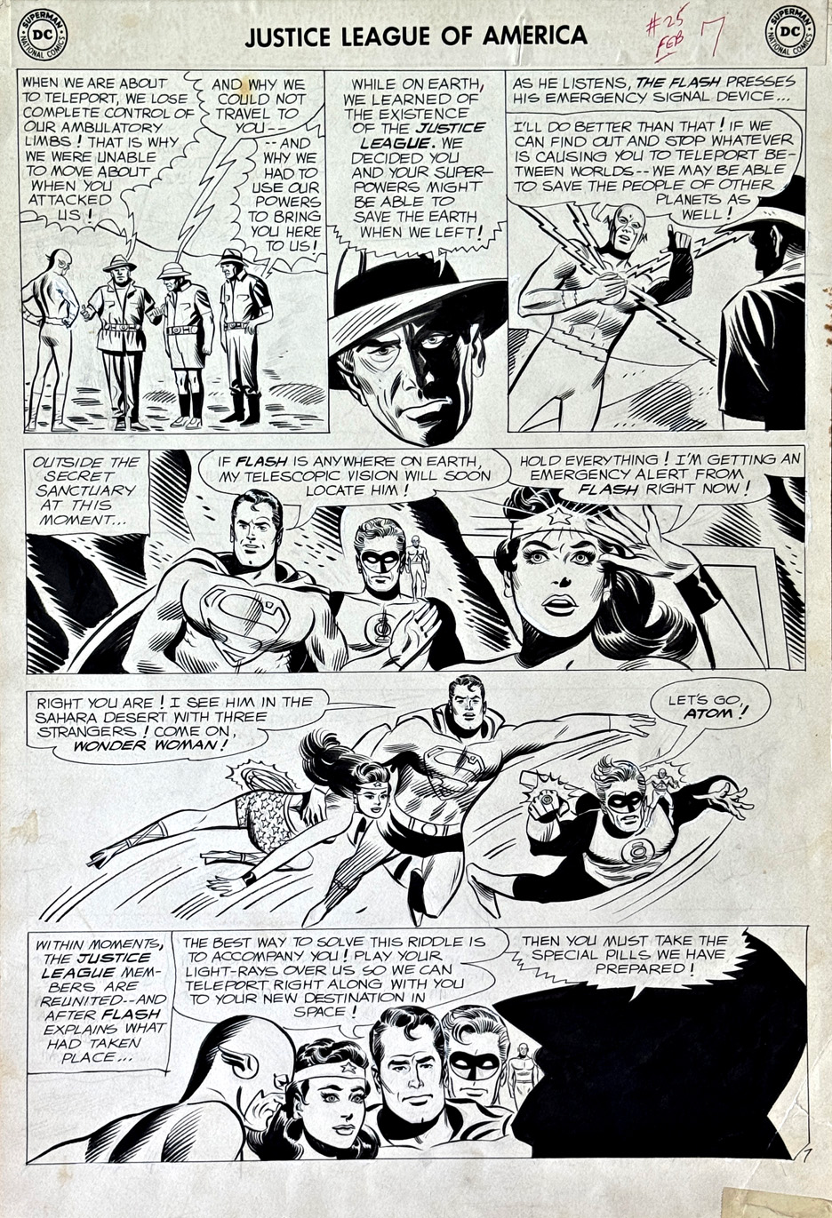
Here’s a very cool—and not all that common—page from Mike Sekowsky’s run on Justice League of America.
What jumps out right away is that you’ve got all five Leaguers from the issue sharing the same page. That wasn’t always the case—these stories often split the team into smaller groups, each getting their own chapter. So having everyone here, across multiple panels, really gives the page that full-on “team book” feel.
And then there’s Superman—front and center.
That’s actually a bit unusual in those early JLA years. He was around, sure, but often used a little more sparingly. Cover-wise, he’d only popped up a handful of times before this—and even then, kind of on the margins. Here, he feels like a real driver of the story, not just part of the roster.
This one’s from before my own newsstand era, which is part of the fun. Big, bold, early Silver Age stuff—goofy aliens, interdimensional problems, the kind of threats where you actually need a whole team. You’re not calling in the Justice League for a bank robbery.
And Sekowsky—never really labeled a top-tier stylist—but the guy could draw anything, in any situation, and keep the story moving. That’s a skill that’s easy to overlook, and shouldn’t be.
Just a great page—and a really nice slice of JLA history.
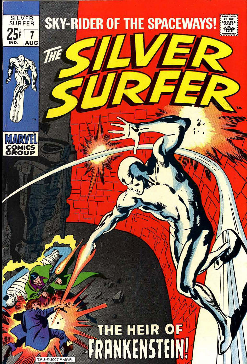
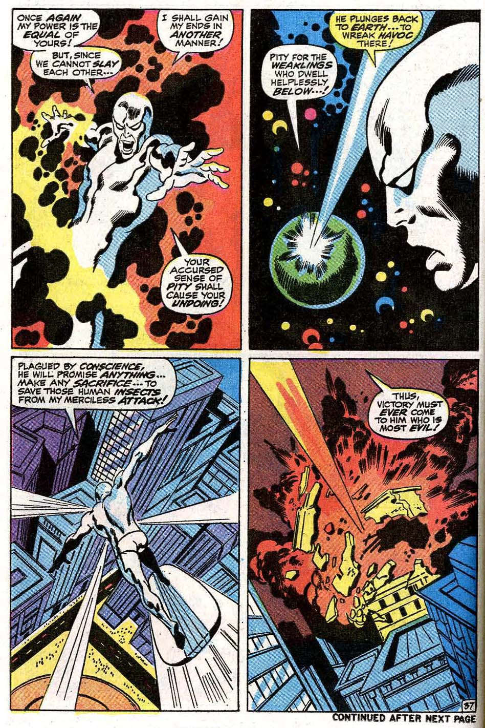
In the 1995 film Crimson Tide, there’s a loud argument between two sailors that escalates into a fight—written by Quentin Tarantino—about whether Jack Kirby’s Silver Surfer is better than Moebius’s.
It’s kind of a ludicrous debate. Not just heated—ludicrous. Because in the real world, no one ever really had that argument.
Moebius—brilliant as he was—did one relatively small graphic novel featuring the Surfer. It’s beautiful. No question. But is it influential enough to spark a barroom brawl? Probably not.
Now, a real debate? Kirby vs. John Buscema.
Buscema gave us 17 unforgettable issues of the Surfer’s original solo series. That’s a body of work you can actually argue about.
I’m not picking sides—I like both for different reasons. But here’s something that’s not up for debate:
John’s version, inked by his brother Sal Buscema, featuring the Surfer and his evil doppelgänger?
That’s pretty close to perfection.
And the Moebius reference? I still don’t quite get it.
Maybe “Buscema” was just harder to pronounce.
Or maybe the French cinema market would appreciate the reference.
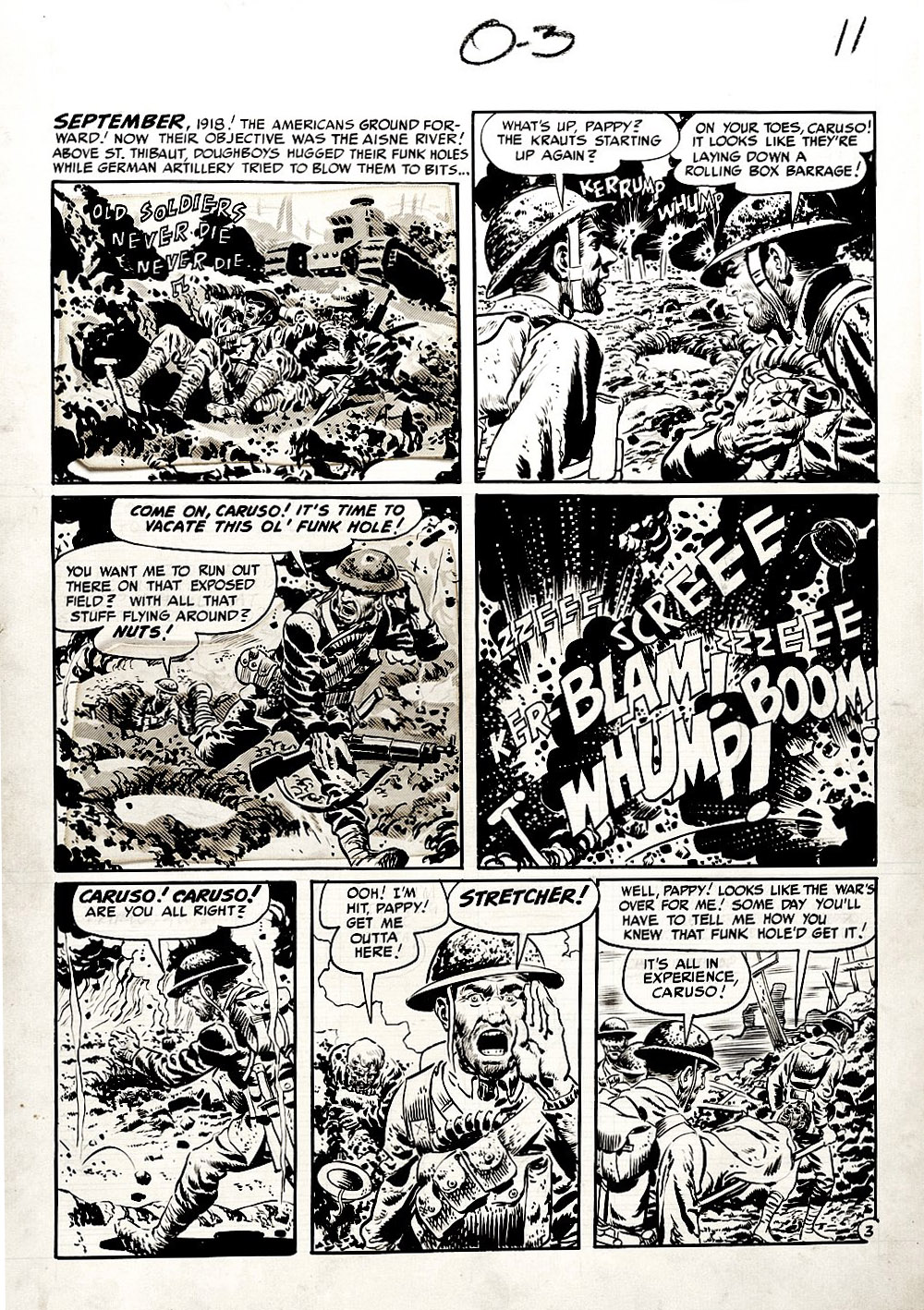
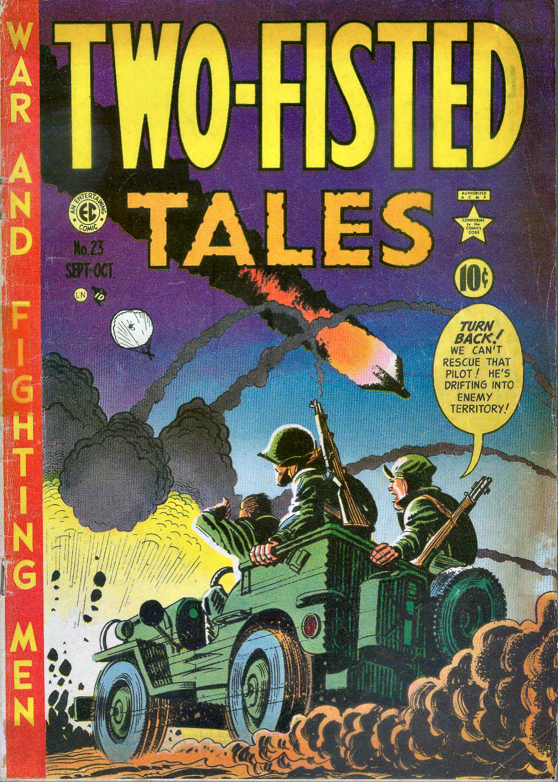
This is a great Wallace Wood war page, from the classic EC Comics WWI story: “Old Soldiers Never Die.” (Two-Fisted Tales #23.)
I first discovered EC comics in late ’71 or early ’72, thanks to the incredible oversized Nostalgia Press collection, The EC Horror Library of the 1950’s.
From that moment on, I was hooked.
Maybe surprisingly, once I got past the initial shock value of the horror books, I realized I could kind of take them or leave them. But everything else? That was a different story.
Science fiction—absolutely. Crime—of course. Humor—what was better than Mad?
And those war comics… man.
Harvey Kurtzman’s storytelling was first-rate. And unlike the Al Feldstein-driven stories in the other genres, he typically let the art—more than captions or dialogue—carry the narrative.
If you had told 12-year-old me that one day I’d own original art from artists like Wally Wood, Jack Davis, and others, I would’ve thought you were completely out of your ever-loving mind.
To say I’m grateful to be the temporary caretaker of this art… that’s the understatement of the year.
Not John Buscema. Not John Romita Sr.. Not even Jack Kirby.
When Gil’s heroes—or villains—cut loose, the poor victim didn’t just get hit. They came flying out of the panel toward you, arms and legs flailing, like they were trying (and failing) to stop themselves from being launched right out of the comic book.
A few years ago, Howard Chaykin—who got his start as Gil’s assistant—and I did a convention panel on swipes. We put together dozens of examples of Gil’s signature punch. Each one choreographed like he was inventing a brand-new dance.
Some of them were almost identical.
Sometimes in the same issue.
Sometimes on the same page.
Didn’t matter.
What mattered was this: when Gil threw a punch… it landed.
And this past Monday would have been Gil’s 100th birthday. Feels like a good time to remember how hard those punches still hit.
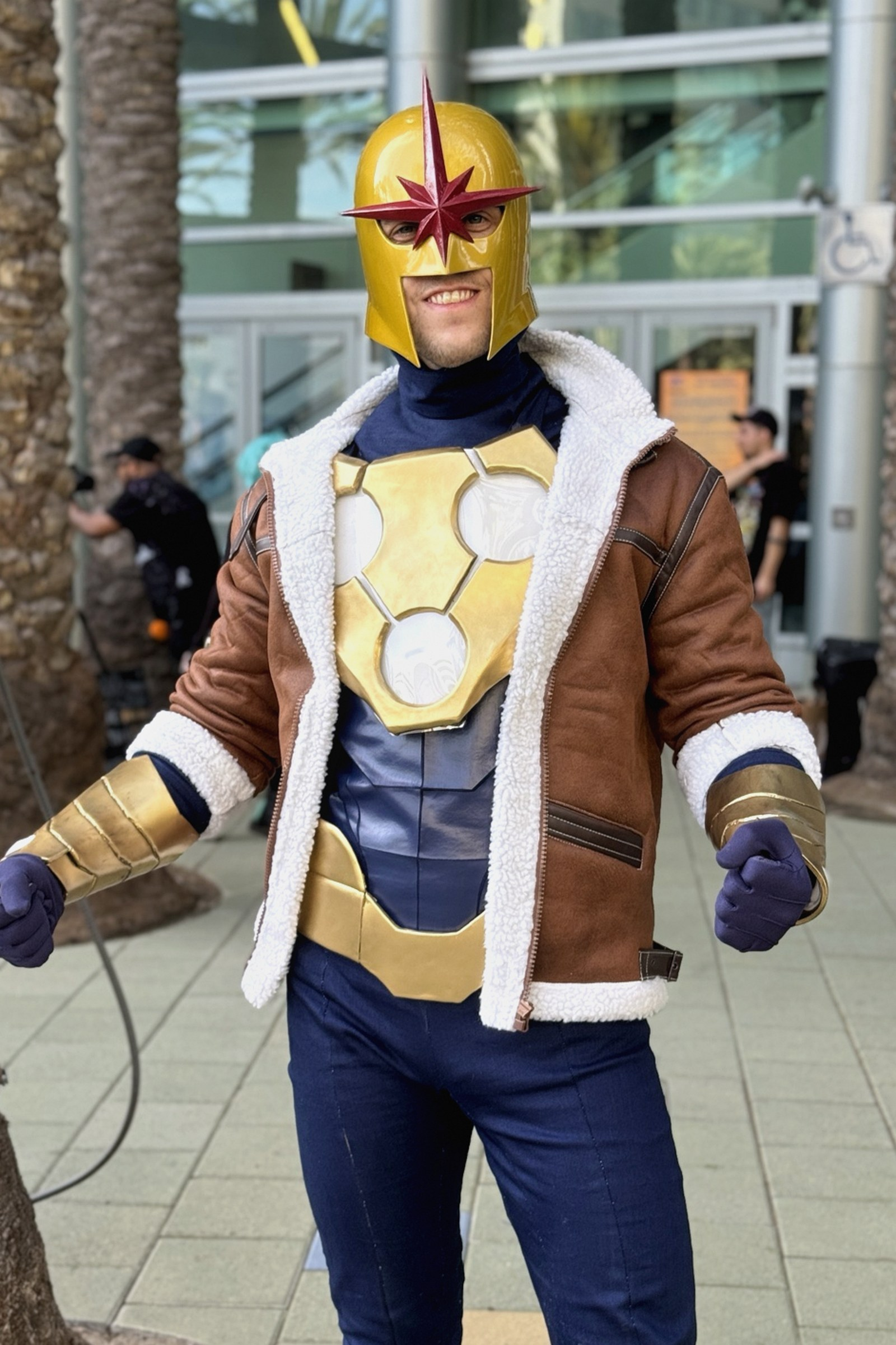
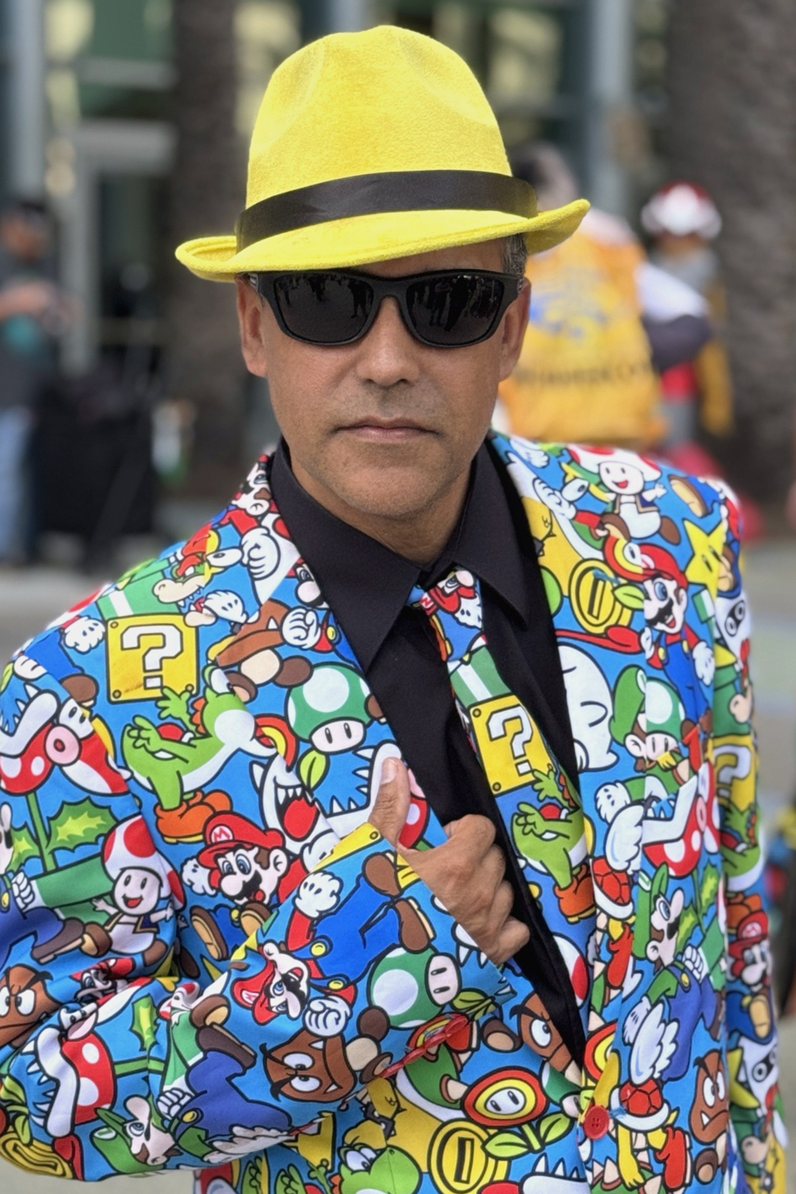
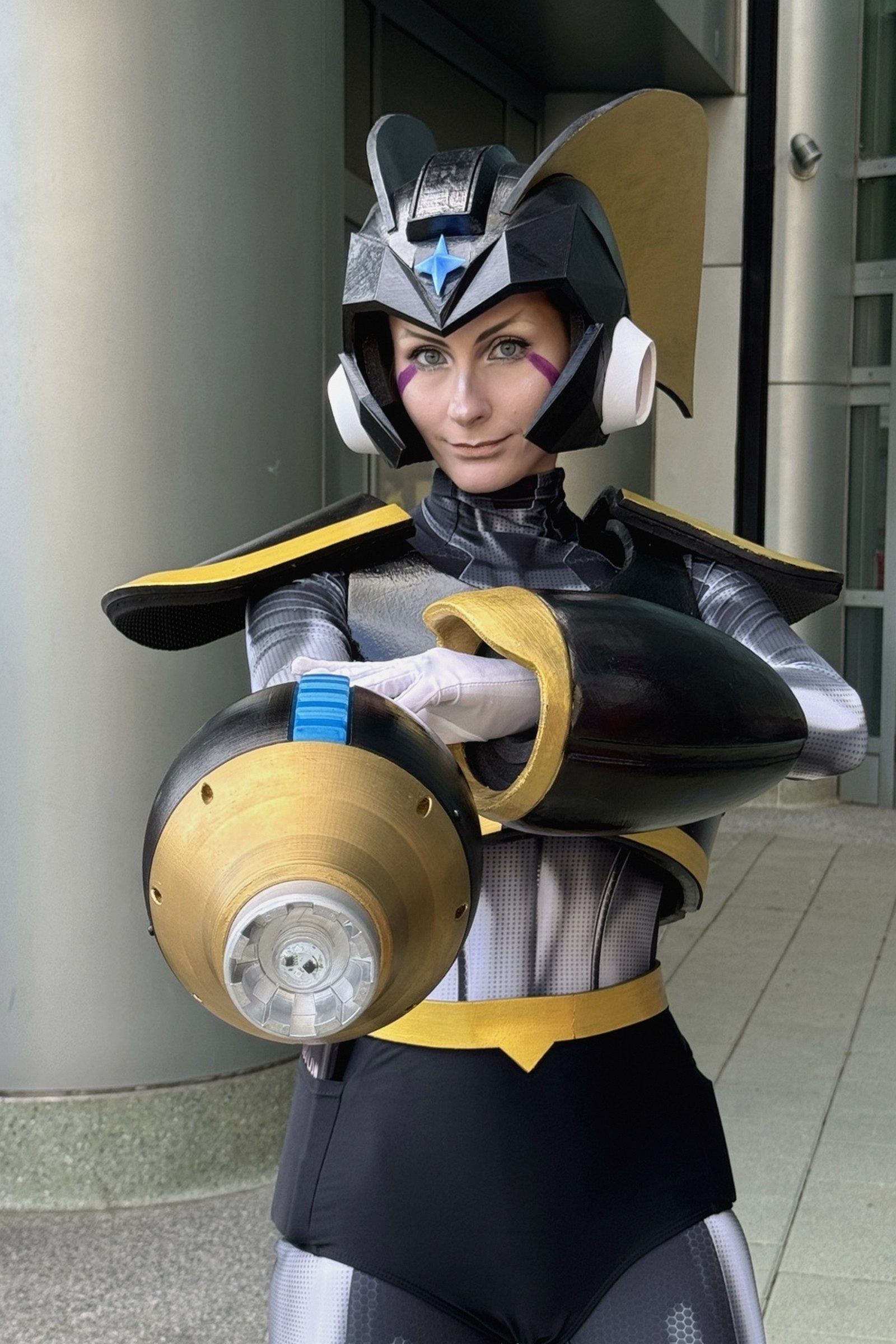
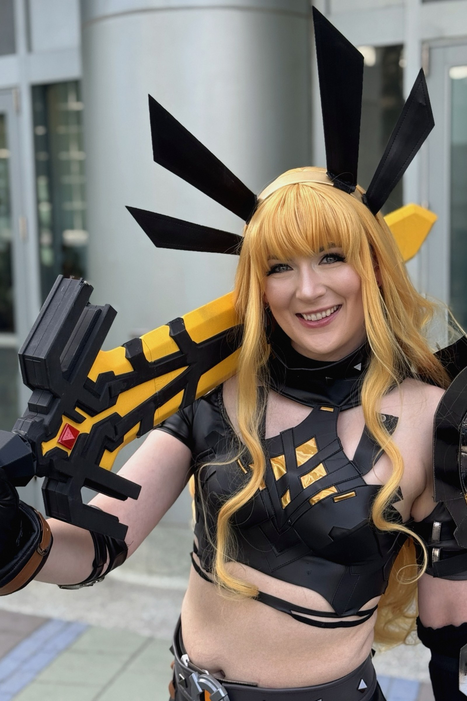
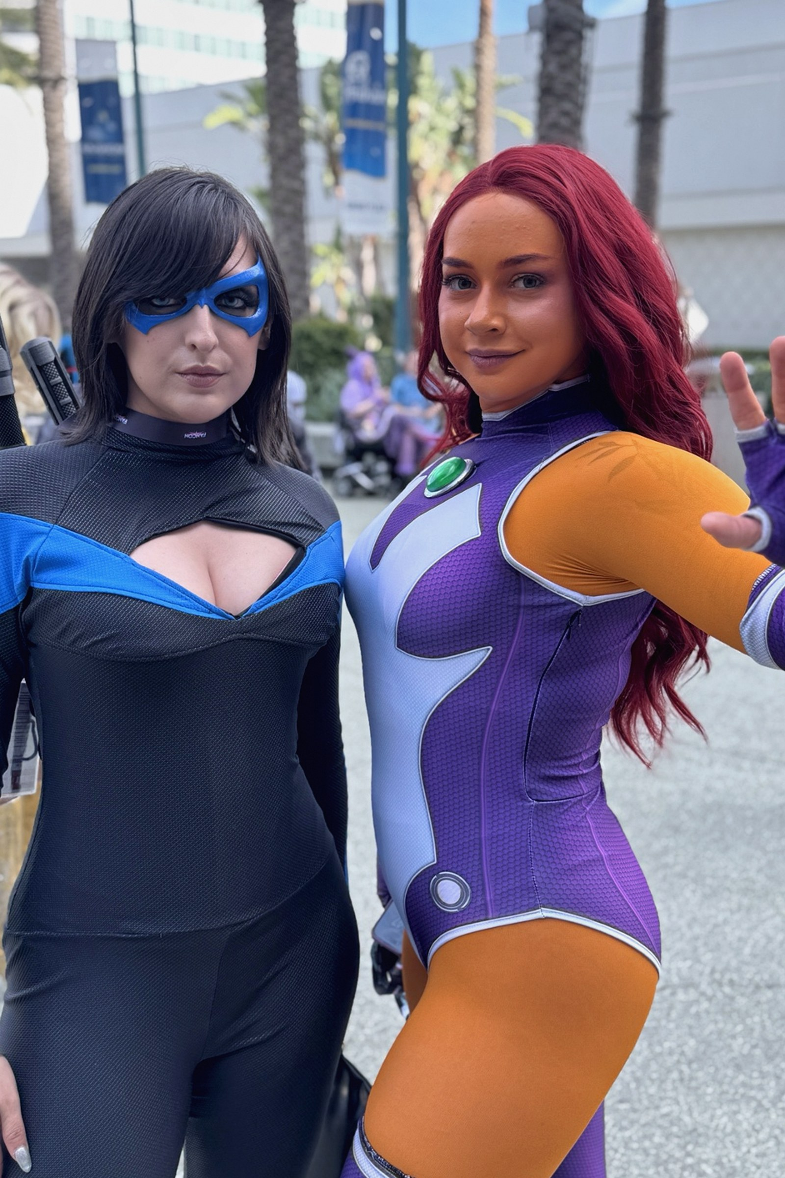
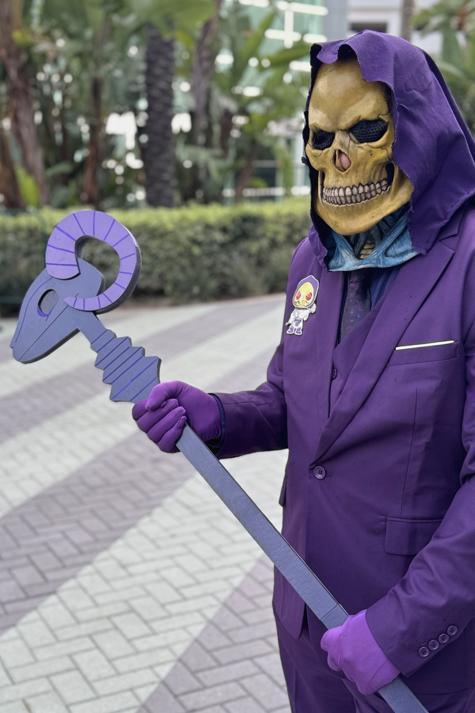
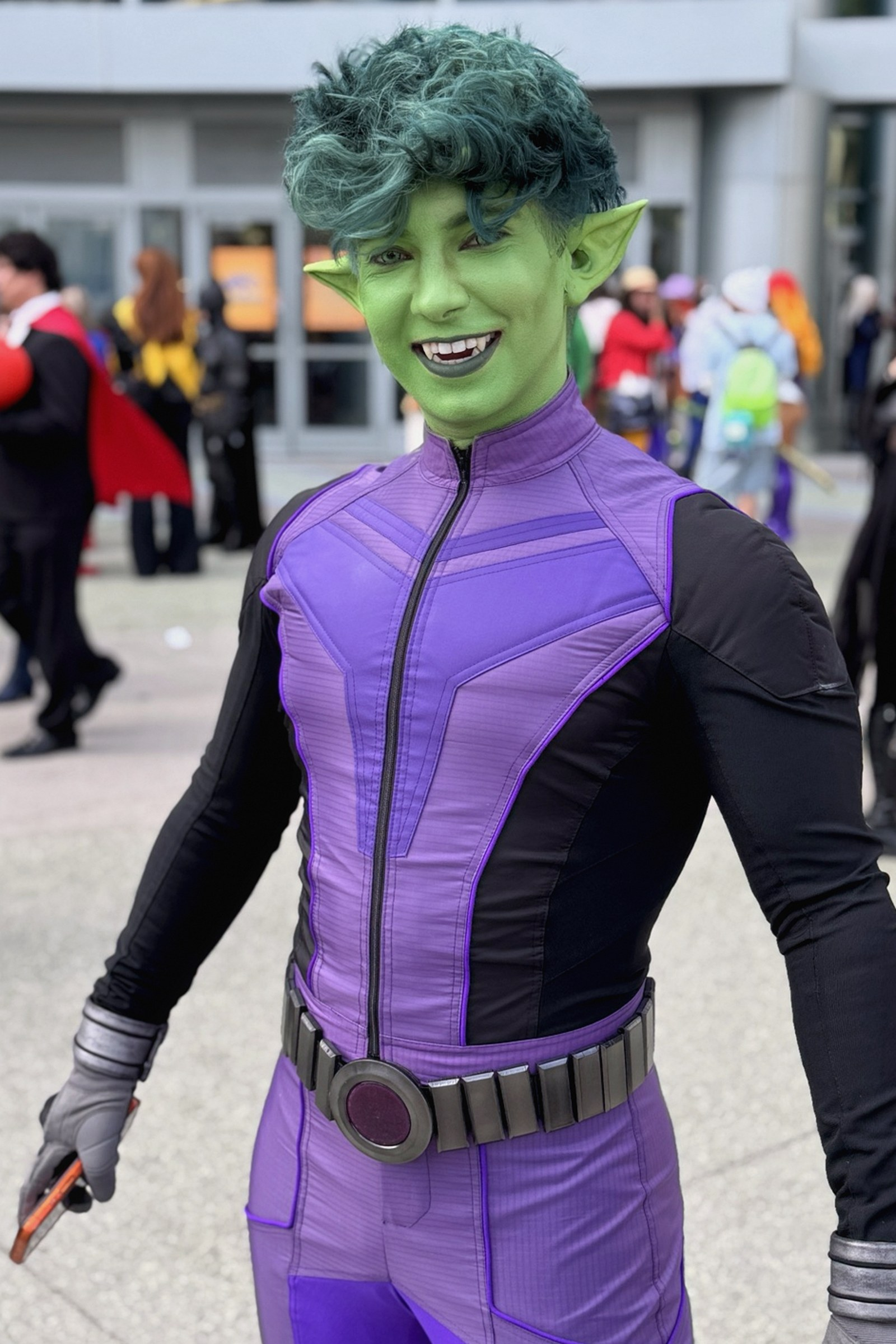
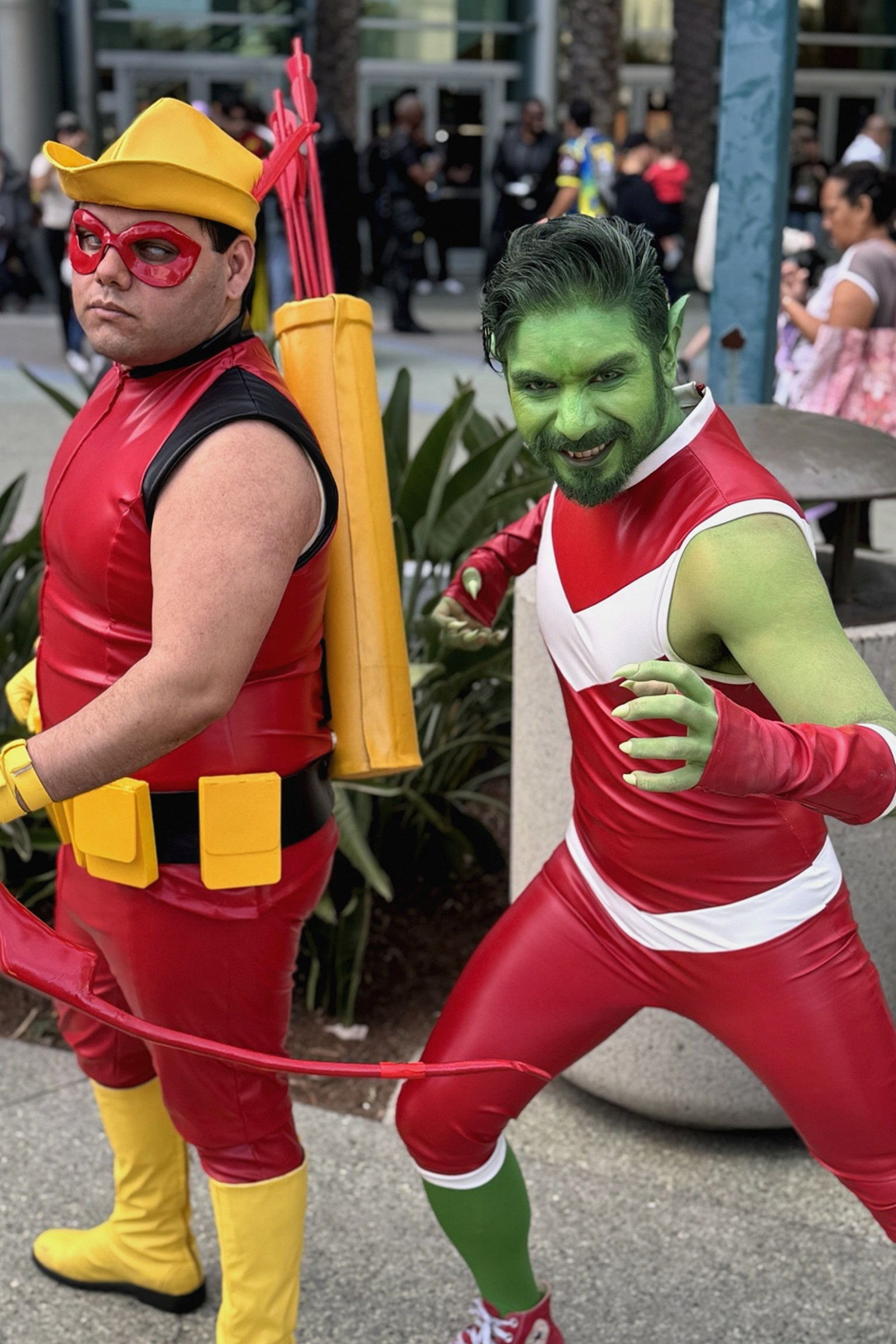
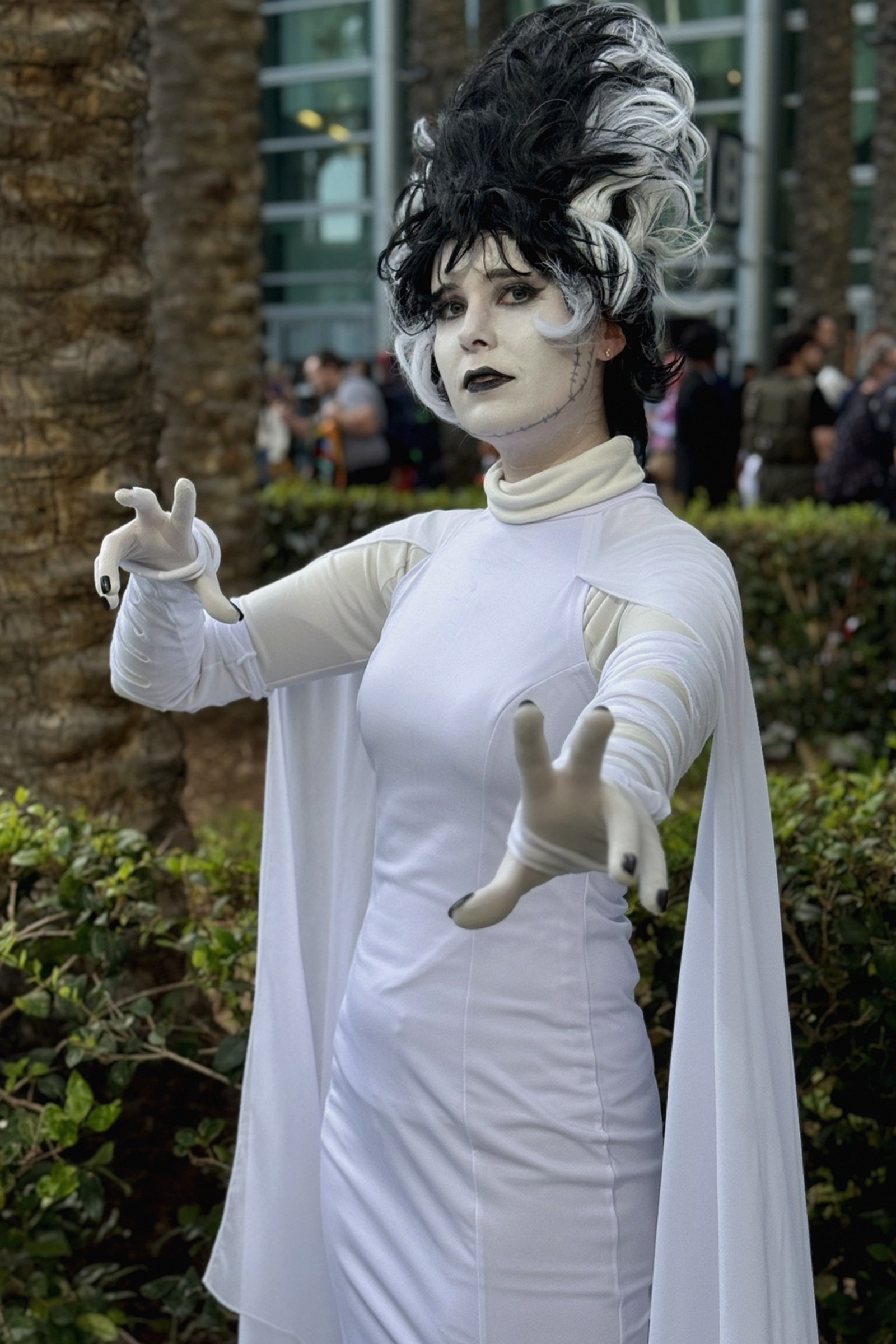
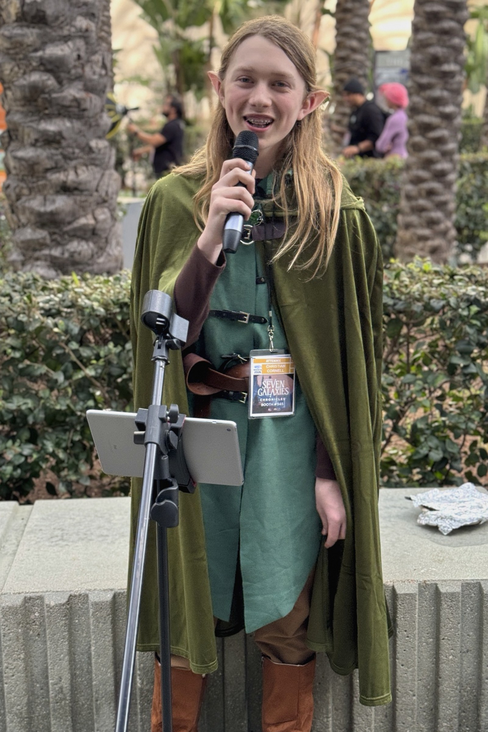
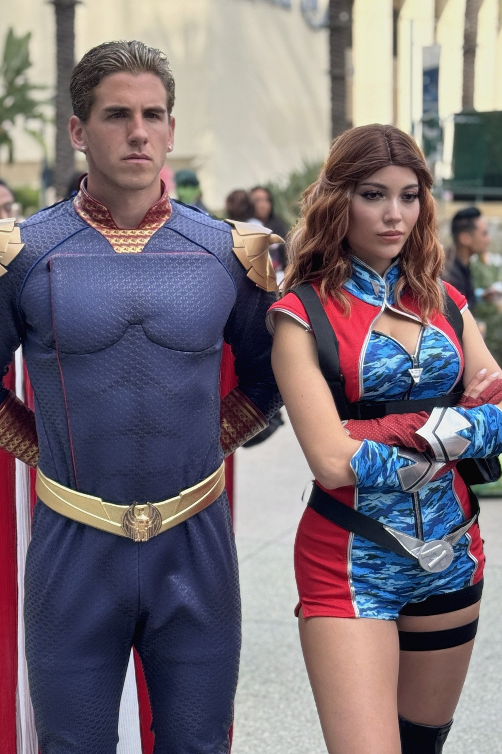
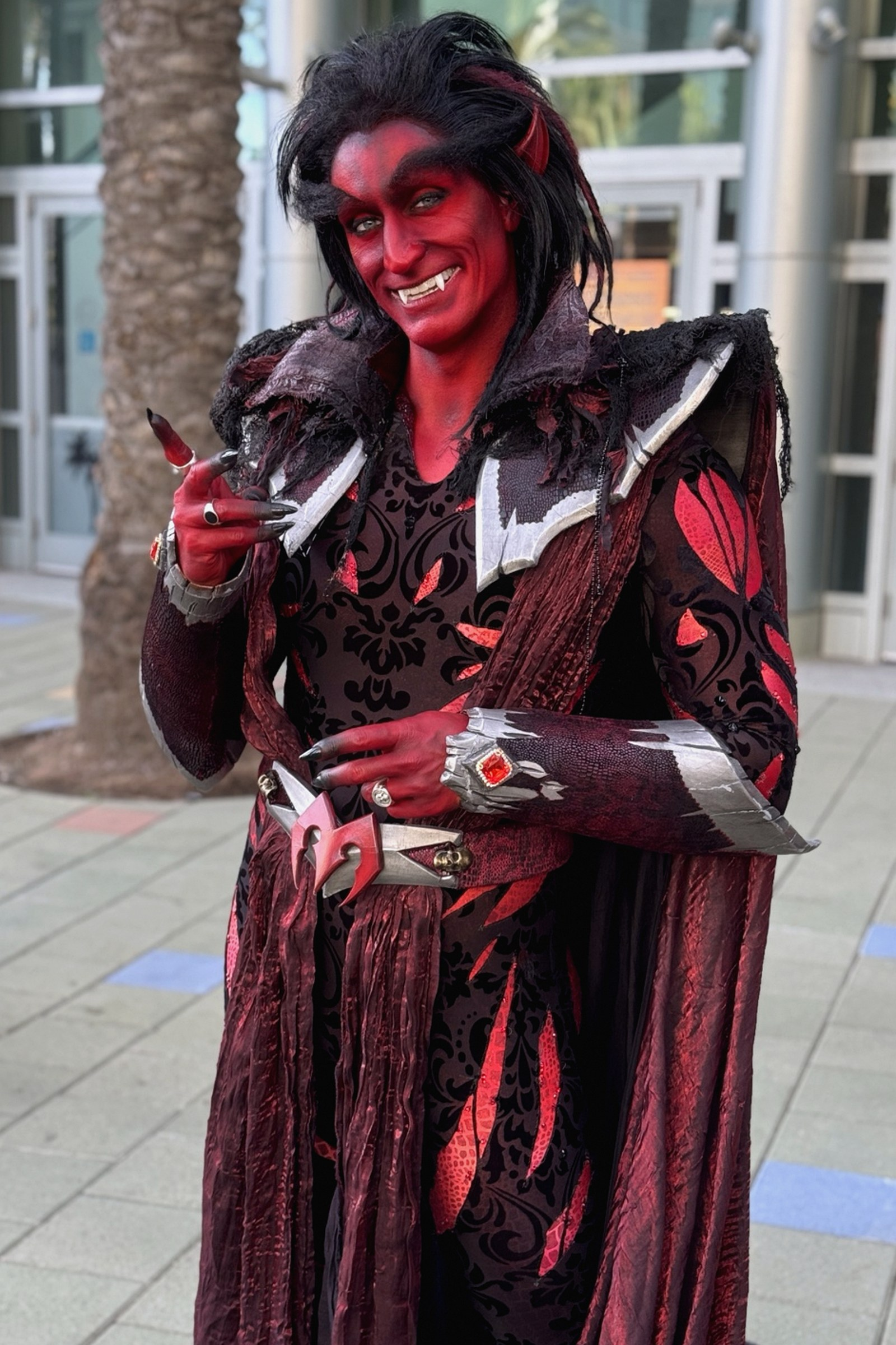
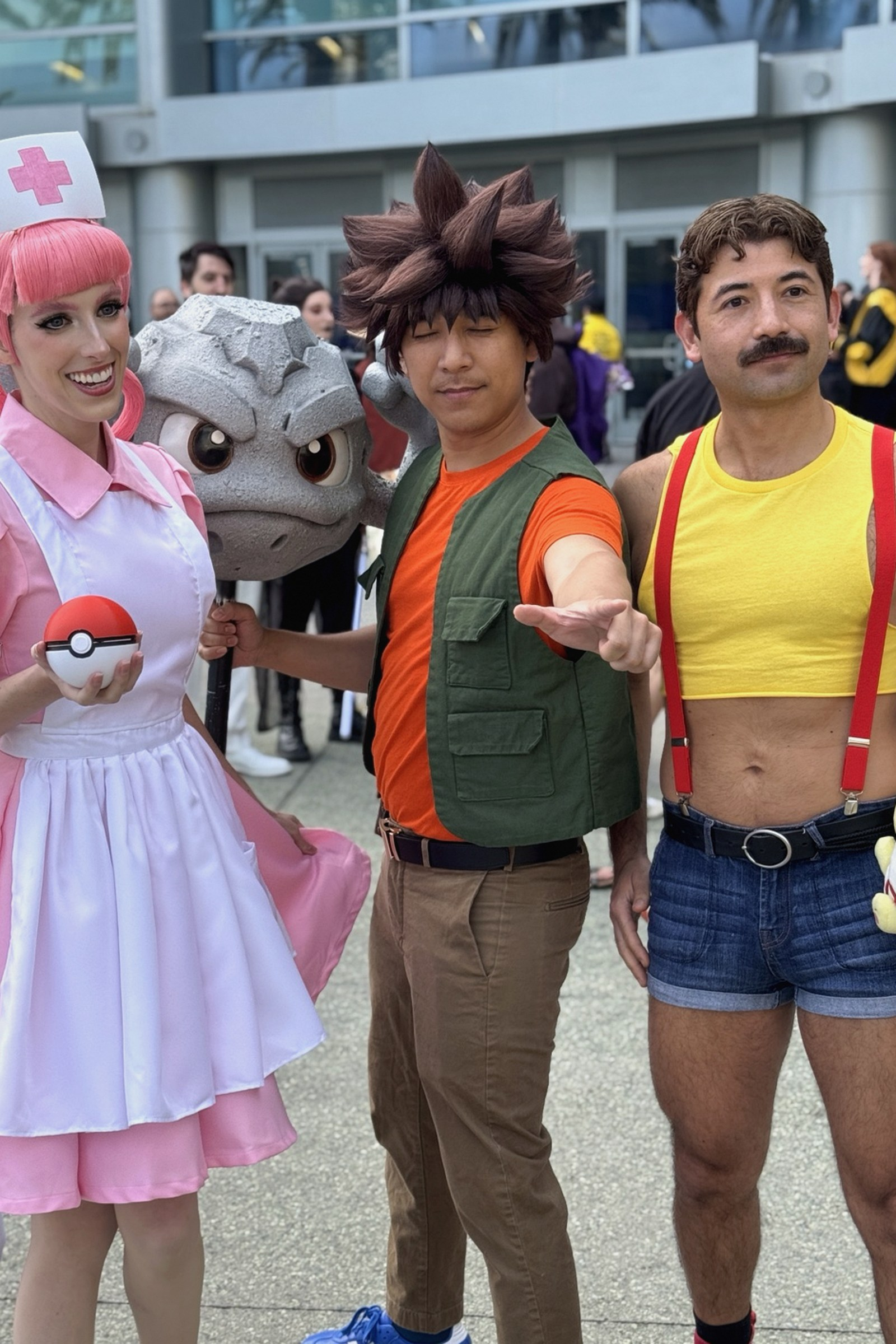
Snuck in a quick trip to WonderCon in Anaheim and, as always, came away with some fun cosplay pics. Great seeing a few friends—apologies to everyone I missed in the whirlwind visit.
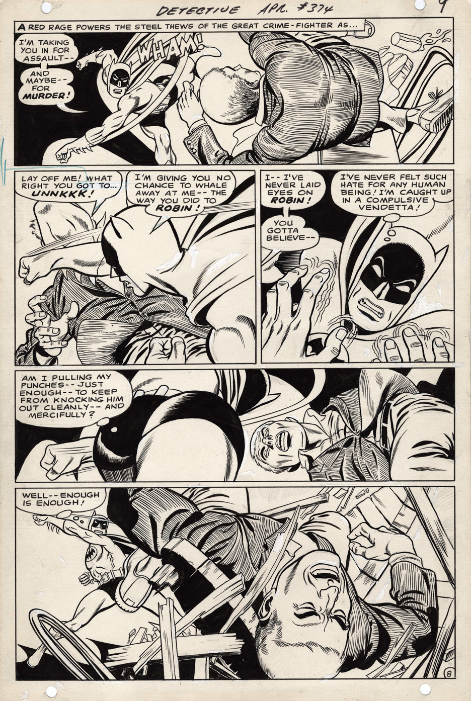
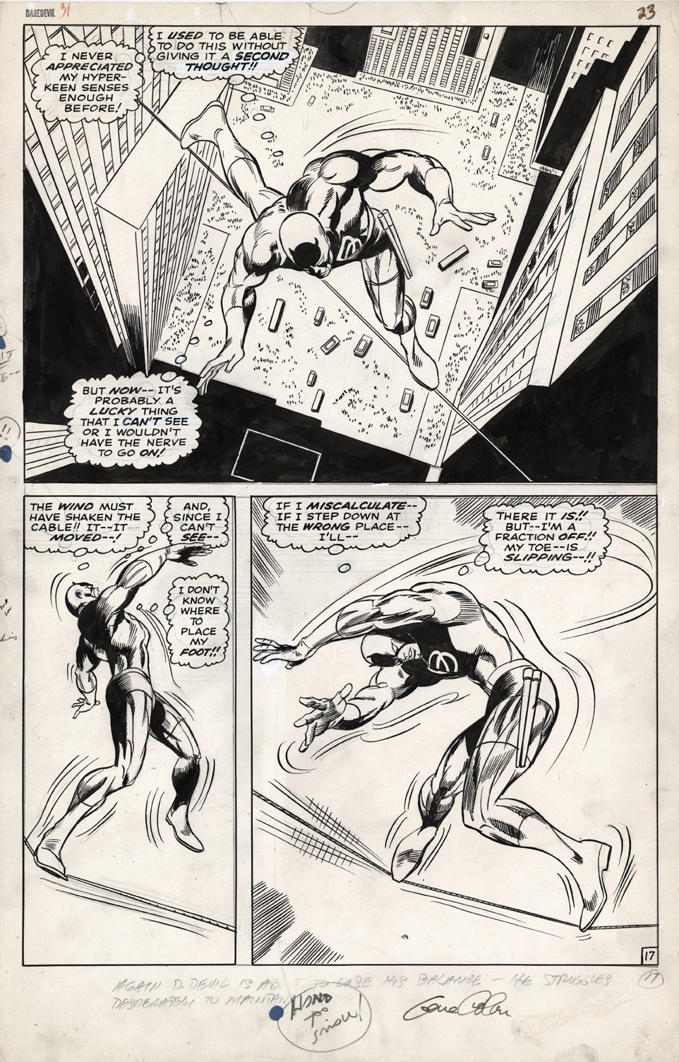
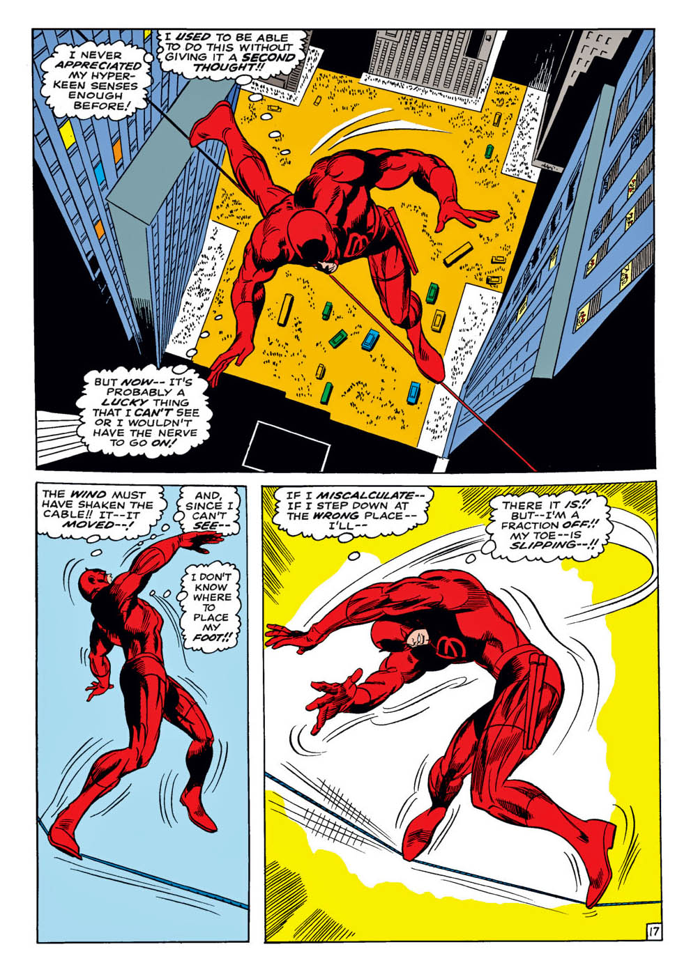
Fun facts about this great Daredevil half-splash from Gene Colan:
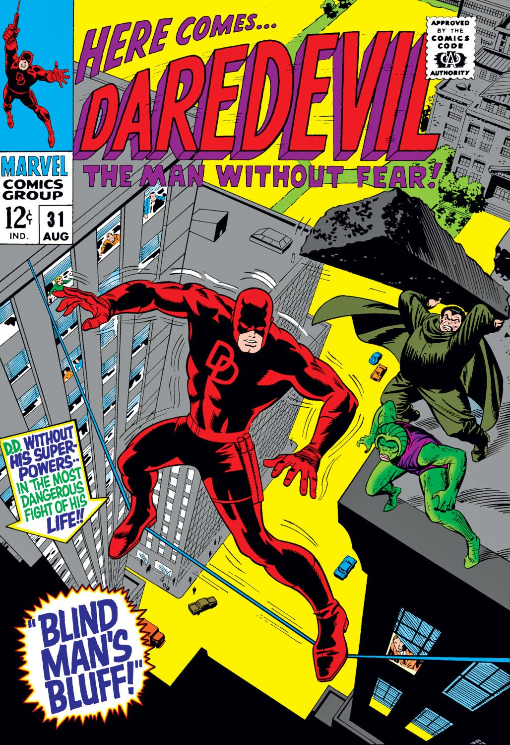
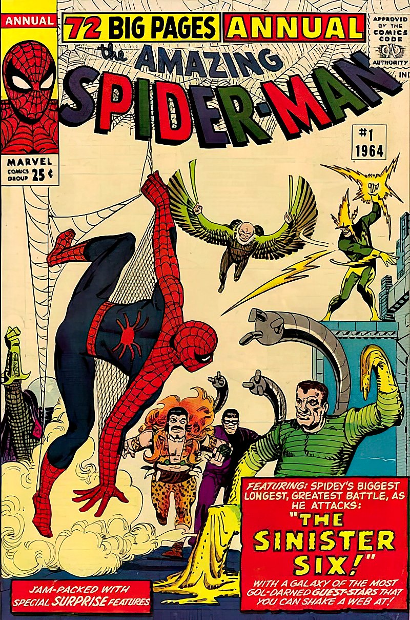
• This is one of the earliest issues (#31) of Daredevil I remember pulling off the rack as a kid. Before this, I can only clearly recall issues #27 and #30, plus Annual #1—which came out around the same time. Marvel had so few superhero books in spring/summer ’67 that you could realistically sample just about everything and figure out what clicked…and what didn’t.
• One thing I did figure out: I didn’t always love Daredevil (face it—some of those villains were rough… Leap-Frog?), but I absolutely latched onto Gene Colan’s art—both here and in Iron Man. That style just hit different, and I dug it.
Later on, I realized that wasn’t exactly a universal opinion. In a world dominated by Kirby, Romita, and the Marvel house style, Colan’s moody, off-kilter approach wasn’t for everyone.
Me? I couldn’t get enough of it—the wild poses, the strange angles, the sense that anything could happen panel to panel… even if you couldn’t always swear you knew what was happening.
I managed to acquire a Colan Daredevil half-splash and an Iron Man one (future post) within a few months of each other. Painful at the time, price-wise—but also pretty lucky in hindsight.
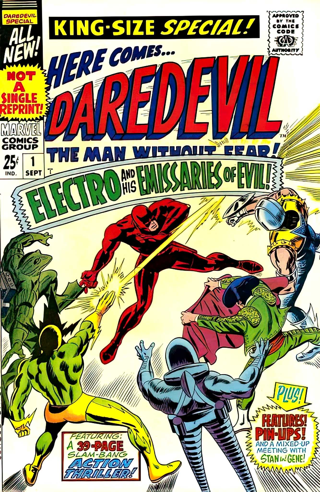
• Bonus realization: I was today years old when I noticed Electro was both a charter member of the “Sinister Six” (Spider-Man Annual #1) and leader of the “Emissaries of Evil” (Daredevil Annual #1). Guy clearly had a passion for group projects.
Or was a glutton for punishment.
Or both.
That Electro guy really liked his after-school groups, didn’t he?
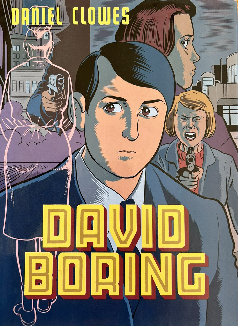
David Boring Graphic Novel, Hardcover Edition, February 2000
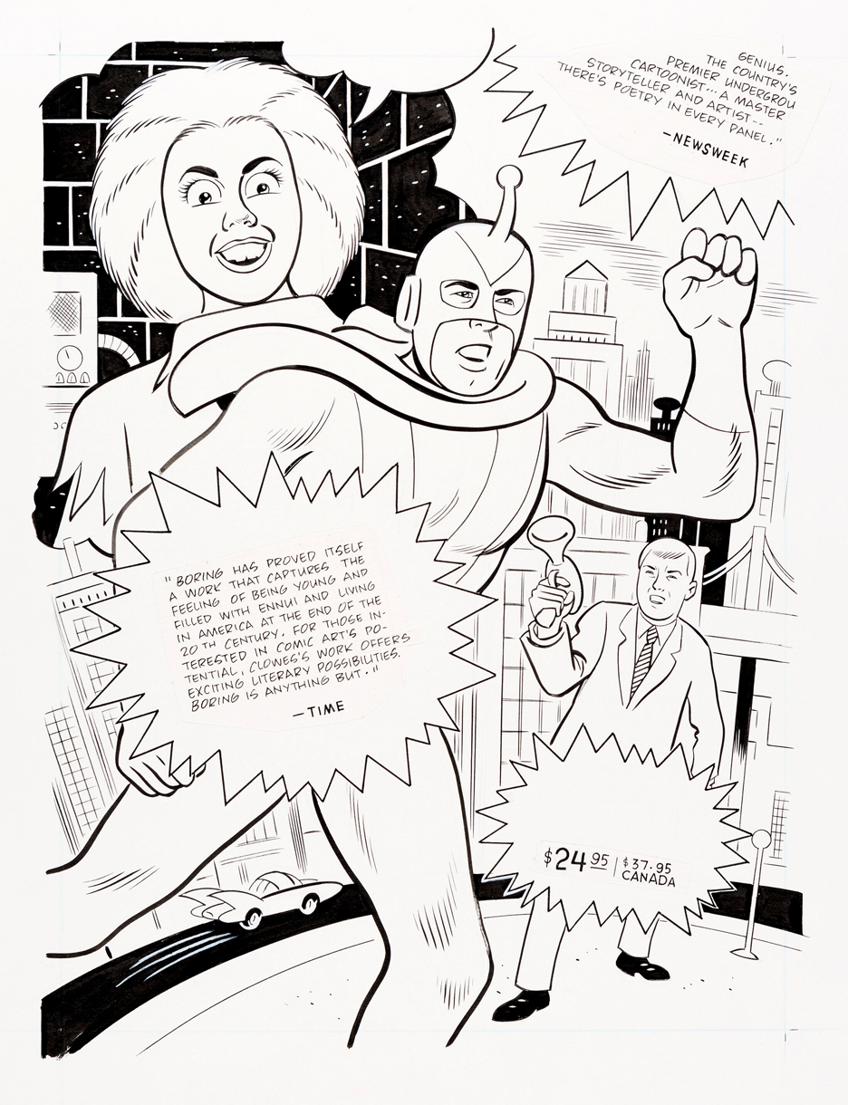
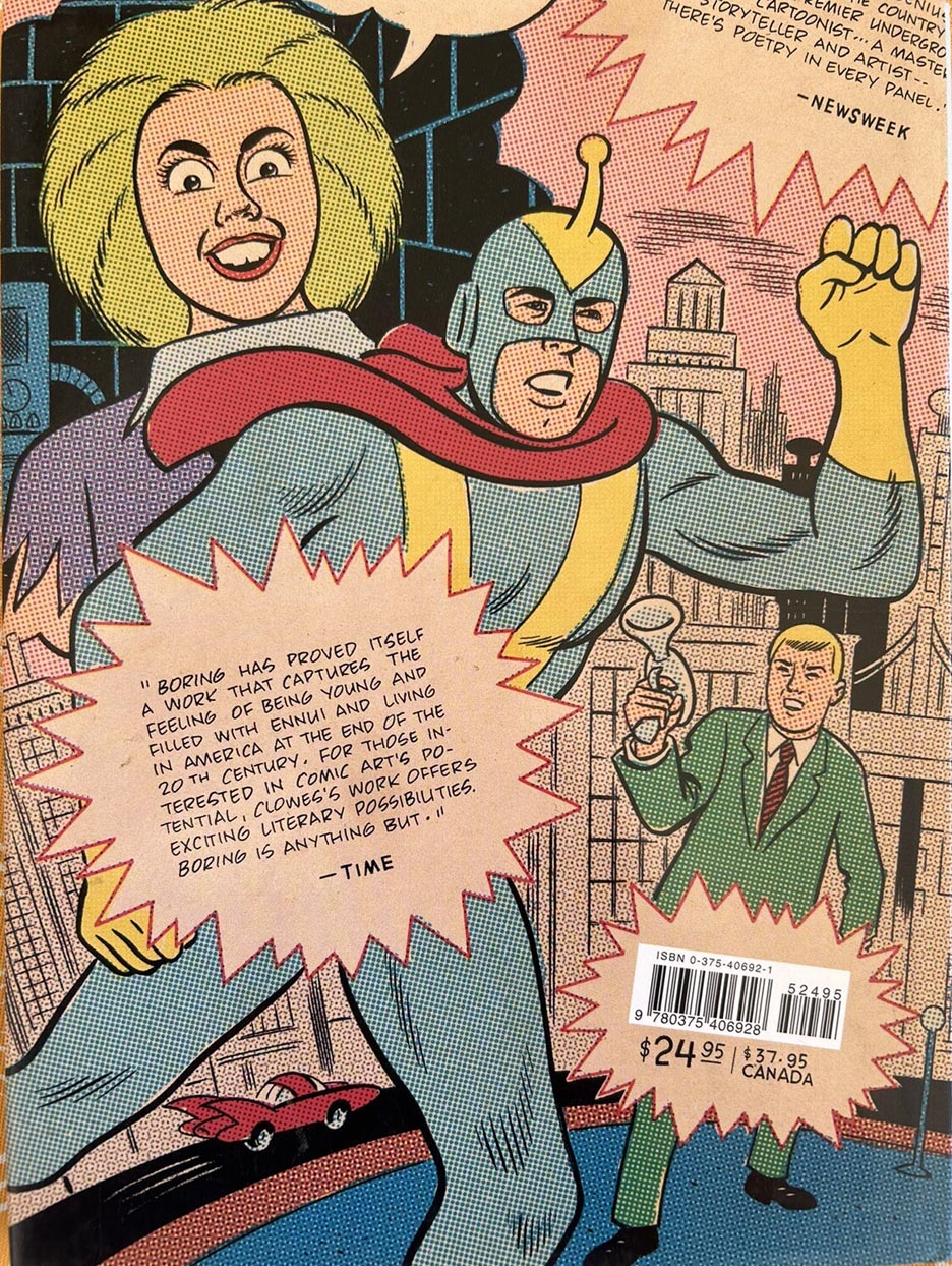
The back cover of the original hardcover edition of Daniel Clowes’s terrific graphic novel David Boring is basically a faux Silver Age splash page — and it’s a great one.
It stars the Yellow Streak, the comic-within-the-comic hero, racing across a stylized city while a reporter waves a microphone like something huge just happened. Around them are jagged starburst caption boxes… cleverly containing review quotes from TIME and Newsweek.
It’s a fun little meta gag — using the language of old superhero hype to sell a contemporary story about alienation and existential dread.
I’d had my eye on the original art for this piece for quite a while, because I love Clowes’s whole modern-retro thing. He’s clearly channeling mid-century comics — clean design, bold shapes, quirky characters — but filtering it through his own lens.
The original shows how carefully that look is built: crisp, confident brushwork and big open areas designed for flat color and classic screen-tone textures, just like the mechanical screens used in mid-century comic production.
It’s a great riff on those oddball ’60s comics from fly-by-night publishers that appeared — and often disappeared — without much of a trace.
It’s hard to use the word bargain in vintage, quality comic art in 2026 without sounding delusional — but hear me out.
As a general rule, original comic strips are still far less expensive than comparable comic book pages. Yes, there are blue-chip exceptions — Raymond, Caniff, Foster — but overall, strips remain the better buy.
Drill down another level and the affordability improves: humor typically trails adventure in price. (Again, with notable outliers — Peanuts, and of course Calvin and Hobbes and The Far Side. And in those last two cases, good luck finding originals at all.)
Which brings us to Walt Kelly’s Pogo.
These may be the best values in comic art collecting right now. Every time a daily or Sunday hits auction, I’m genuinely surprised at how reasonable the hammer price is. You can look it up.
Kelly was a first-rate cartoonist and a razor-sharp political satirist. Pogo famously inspired Jeff Smith’s Bone, and you can see why — the lush brushwork, the elastic expressions, the choreography of bodies in space. Yes, some of the topical humor can feel a bit inside baseball today. Kelly loved weaving contemporary politics into the Okefenokee.
But strip away (pun unintended) the references and the cartooning still sings. The line is alive. The staging is elegant. The characters feel like they’re breathing.
Simply put — gorgeous art and terrific storytelling.
In a hobby where true value is increasingly rare, Pogo may be hiding in plain sight.
Not-So-Fun fact — when the strip was re-formatted for the Chicago Daily News –and possibly other papers as well — panel five from the original art was edited out. Doesn’t really change the strip, but still…
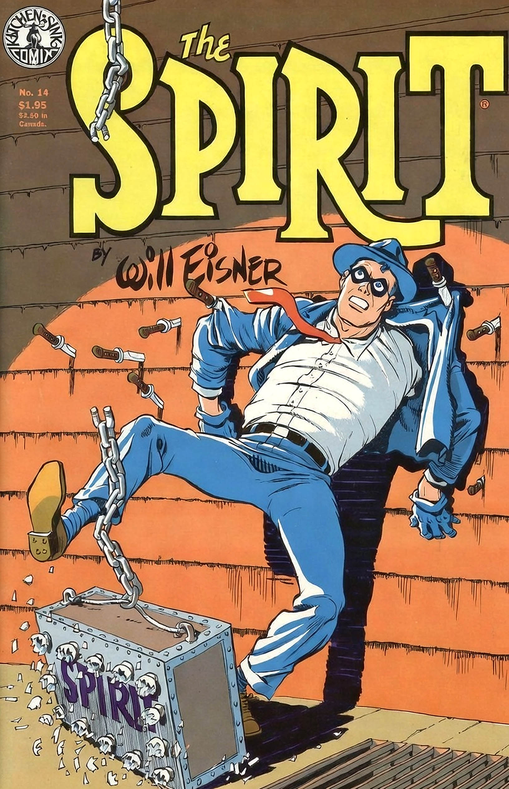
You can buy a great piece of Will Eisner art… or, as of now, you can purchase Eisner’s entire library.
Yep — in one of the more unconventional comics-world headlines lately, the Eisner estate has put his intellectual property portfolio up for sale. We’re talking everything: The Spirit, graphic novels, characters, concepts, trademarks — the whole creative vault.
It’s basically a once-in-a-generation situation where a single buyer (or consortium with deep pockets and deeper shelves) could become steward of one of the most influential bodies of comics storytelling ever produced.
People have been buzzing about what that might mean: new adaptations? expanded archival projects? Eisner’s characters folded into an existing publisher’s universe? Either way, it’s not often you see a legend’s entire creative output come onto the market at once.
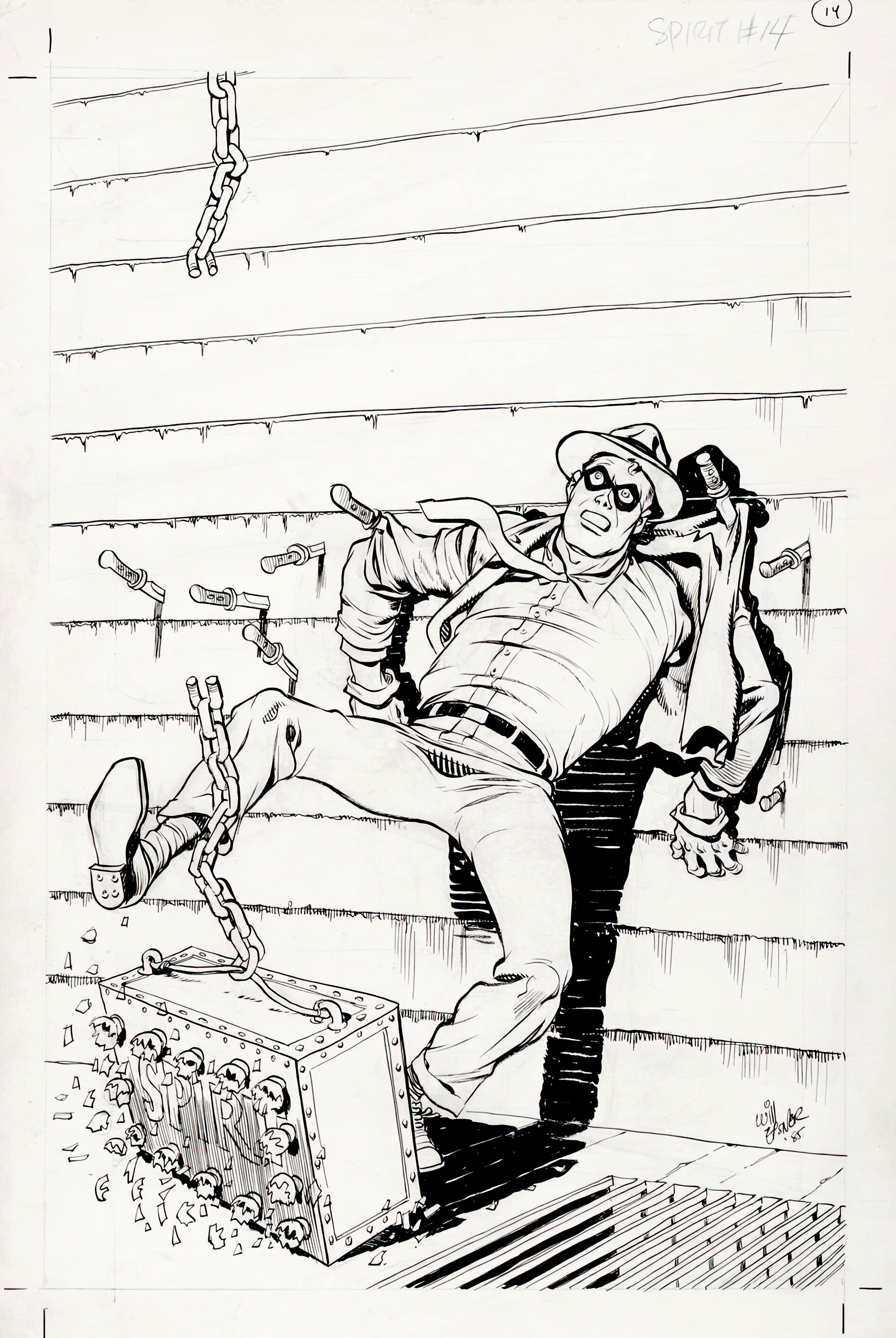
Unless I partner with some very well-heeled colleagues, I think I’ll stick to the art. Like this great cover from Spirit #14 (1985).
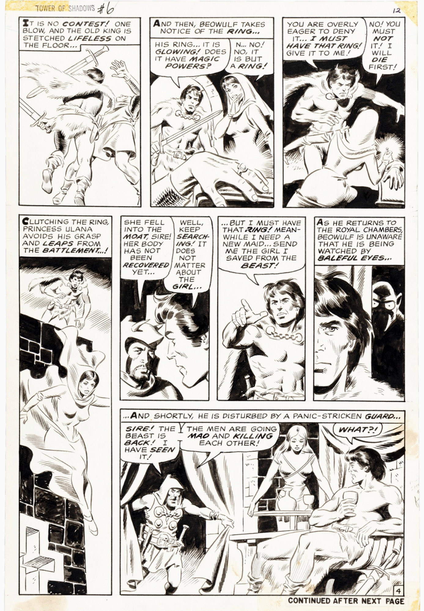
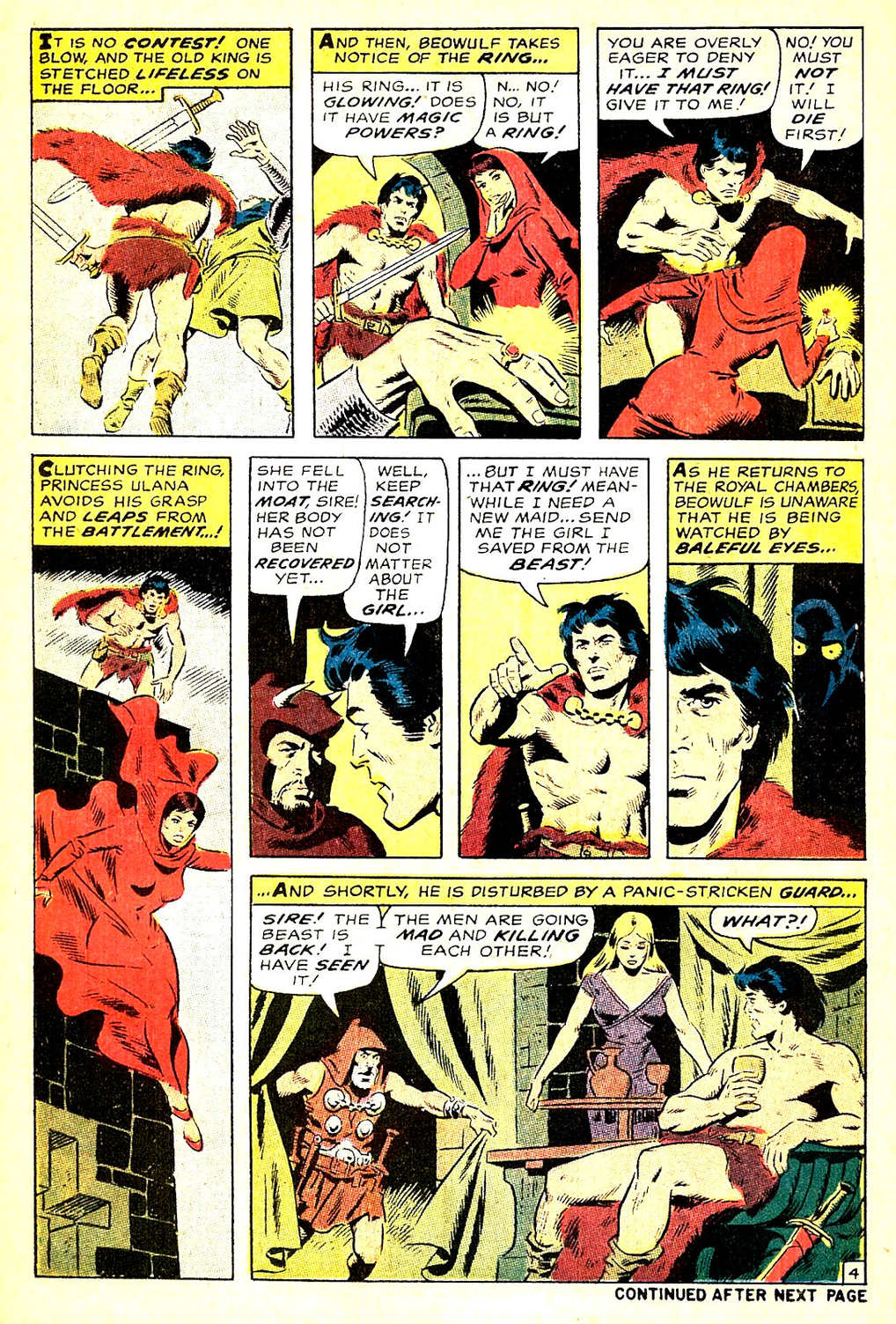
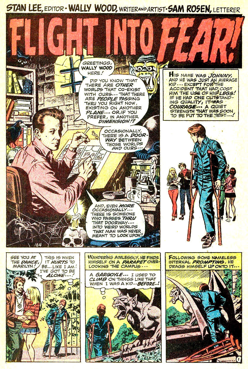
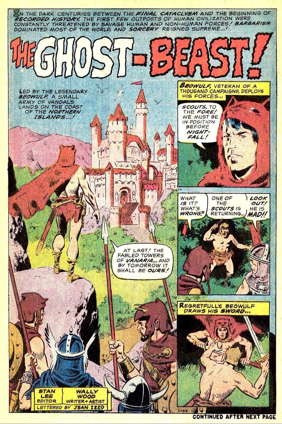
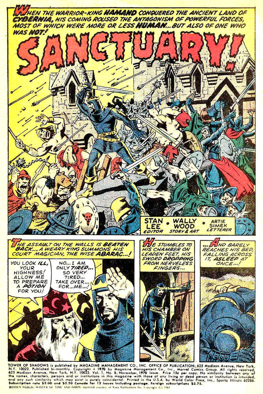
Wallace Wood’s brief return to Marvel in 1970 gave us an early glimpse of the sword-and-sorcery wave that was about to hit like a tidal surge.
If you mostly know Wood from EC or straight-up superhero work, his Tower of Shadows run (#5–8) is a really fun side trip into that territory. This great page comes from the second story, featuring an offbeat take on Beowulf.
He wrote and drew all four shorts, so what we’re getting is pure, undiluted Wood: moody lighting, dramatic staging, and an always-present feeling that everyone’s living one bad decision away from doom.
These aren’t Conan-style epics. They’re more like dark fairy tales from a guy who clearly loved drawing adventurers, monsters — and gorgeous women. The earliest of them — including this one — actually predate Conan #1. Woody was ahead of the curve.
Short stories. Big atmosphere. Fantastic art.
And a preview of what he’d later unleash in his own indie — and decidedly adult — fantasy project, The Wizard King.
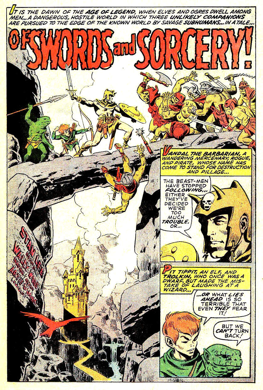
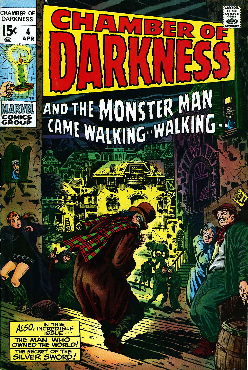
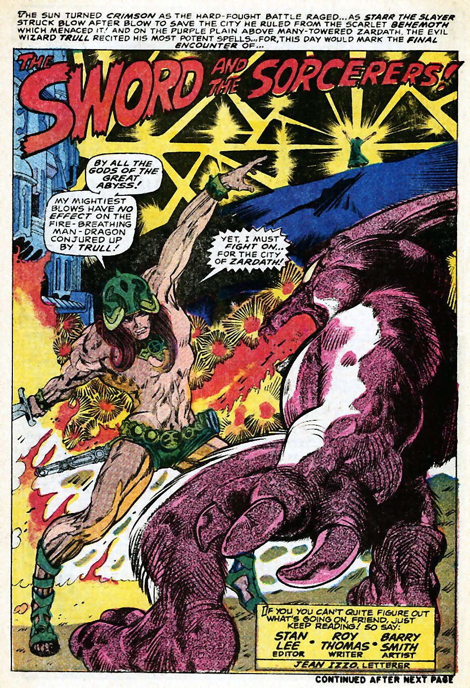
Four stories, four great title pagesAlso before Conan the Barbarian #1, Roy Thomas and Barry Smith tested the waters with a prototype Conan-like hero—Starr the Slayer—in Chamber of Darkness, the sister title to Tower of Shadows.
WALLY WOOD — MARVEL CHECKLIST (1964–1972)
1964–1965 Run (Primary Period)
☐ Daredevil #5 — Dec 1964 Pencils, inks (Wood’s Marvel debut; defined early DD look)