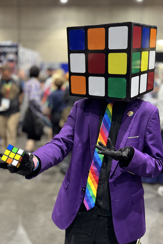
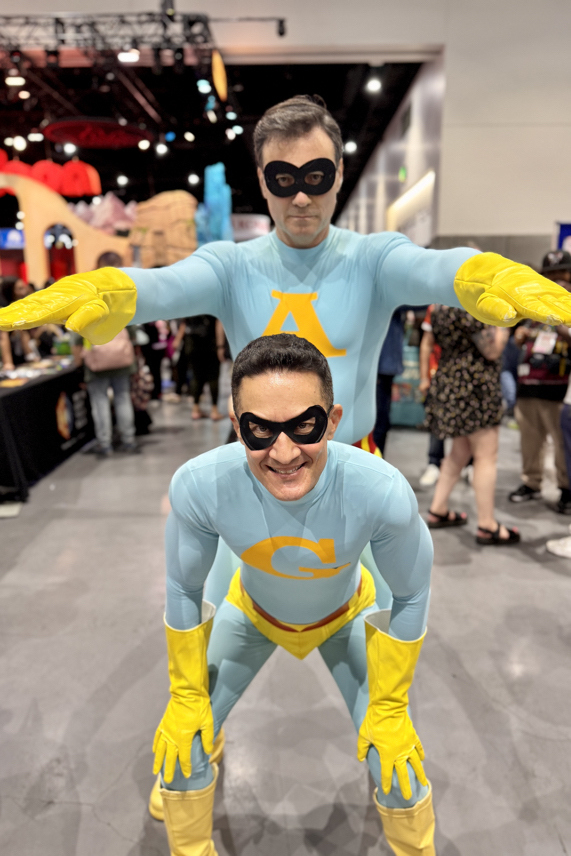
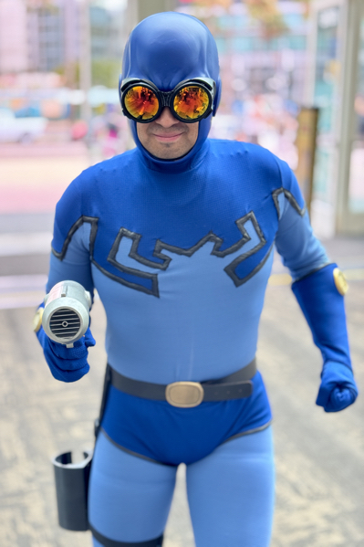
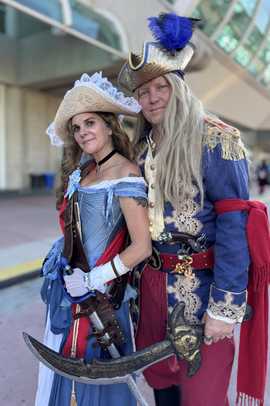
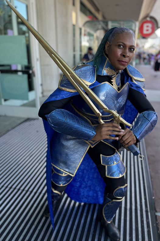
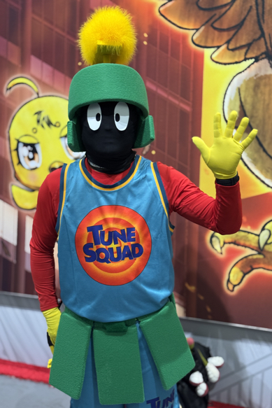
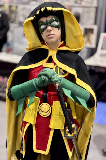
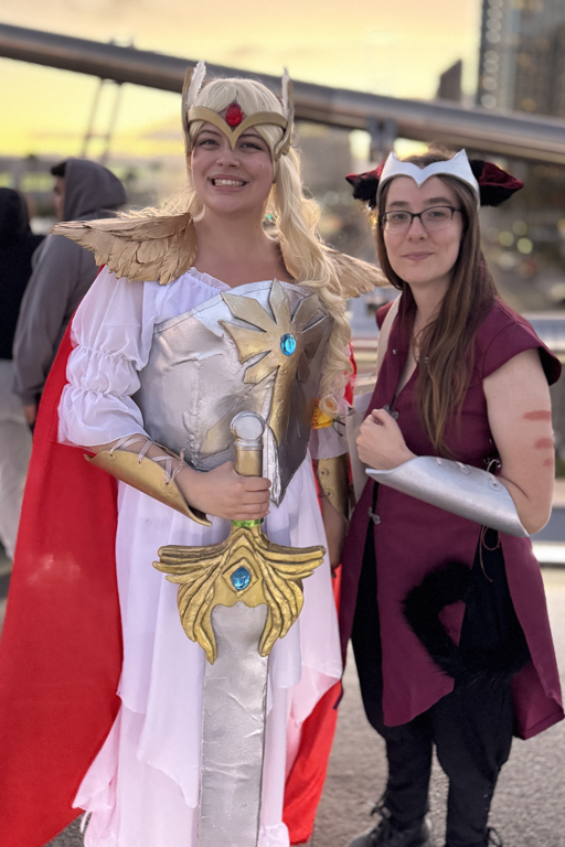
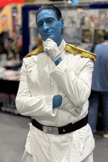
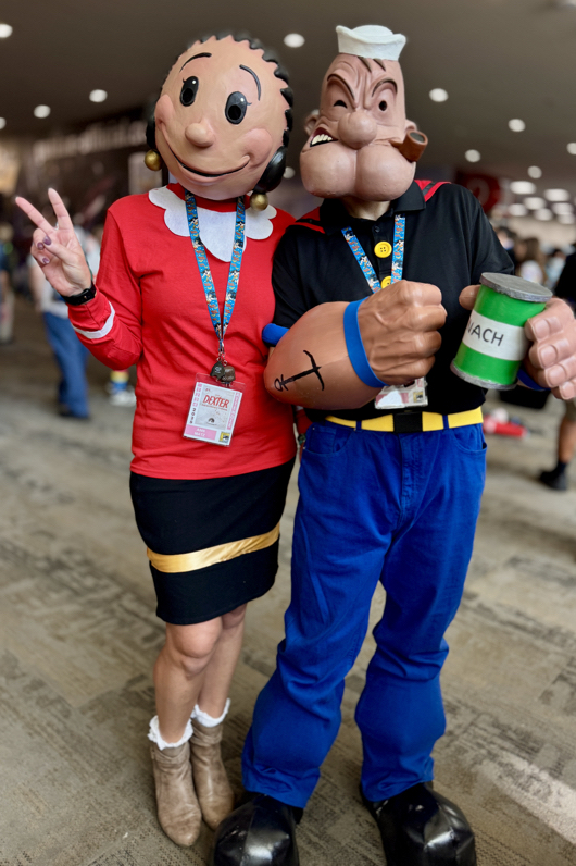
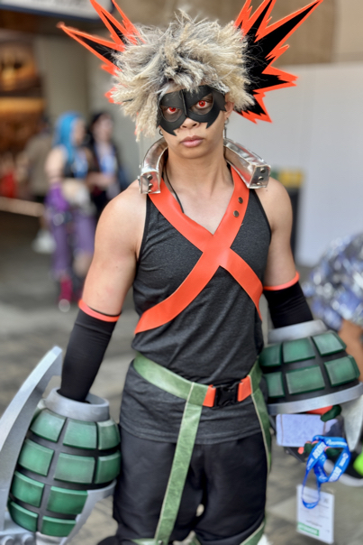
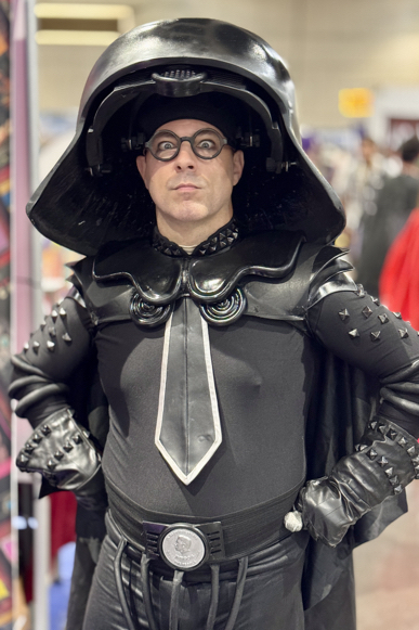
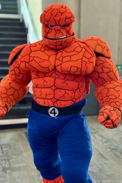
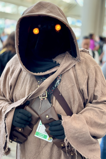
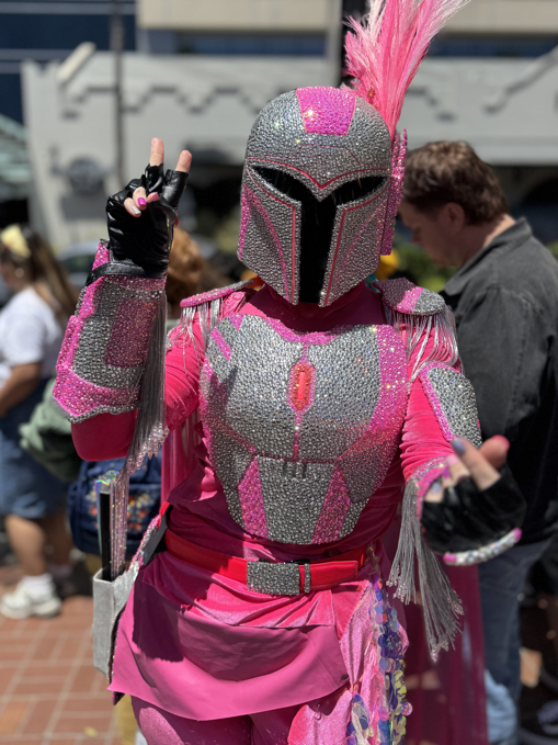
SDCC 2025 — A Little Cosplay, Better Late…
San Diego Comic-Con, July 23-July 27, 2025


Greg Goldstein's Comic Art Gallery
Panels and Pages… Art and Artists… Creators and Conventions… Musings and Memories…

San Diego Comic-Con, July 23-July 27, 2025
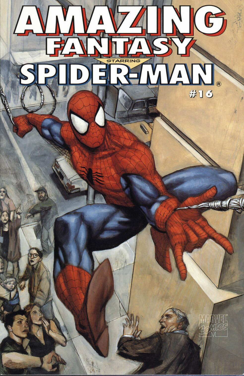
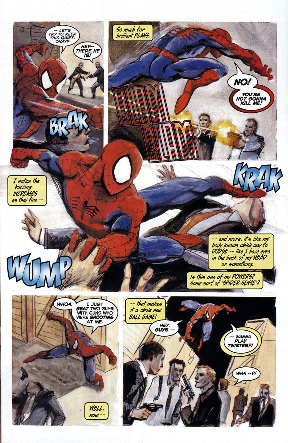
Amazing Fantasy #16, December 1995
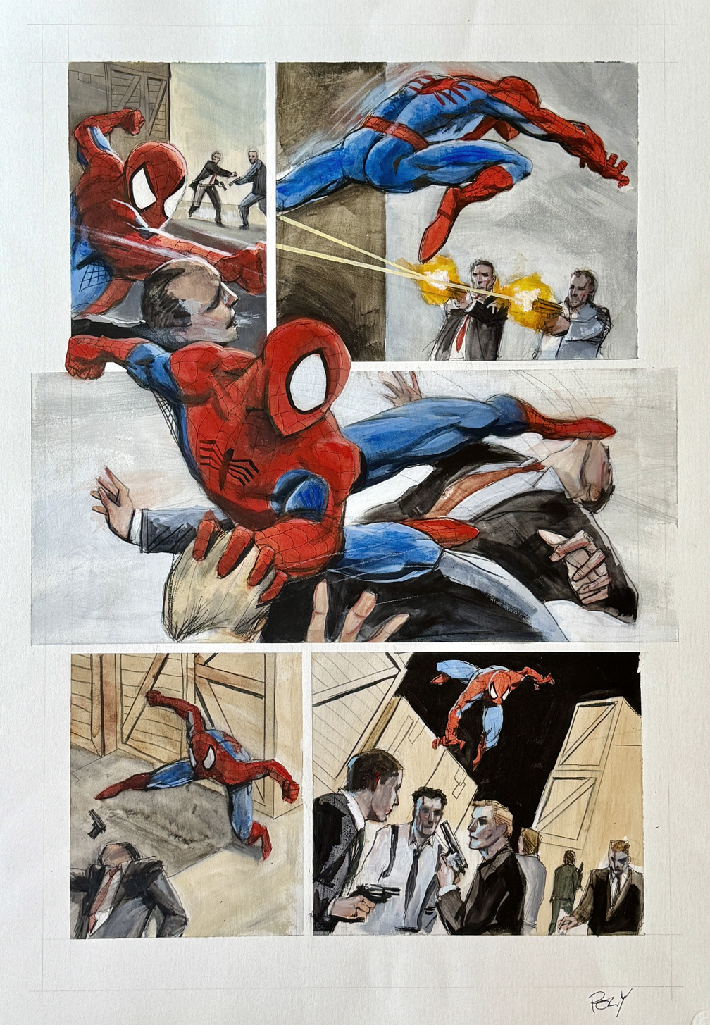
This is the largest printed panel page of Spider-Man art I will likely ever own, and one of the most stylish:
Spidey’s front and center in this big, bold, painted story page, straight from the issue that picked up right where August 1962’s Amazing Fantasy #15 left off — the issue that first introduced us to our favorite wall-crawler. Even though AF #16 didn’t hit shelves until over 30 years after #15, it reflected the spirit of Peter’s early, chaotic days as a new hero, prior to the events of Amazing Spider-Man #1.
Artist Paul Lee brought writer Kurt Busiek’s mini-series to life with gorgeous, fully painted artwork like this page, where Spidey’s flipping and fighting his way through every panel, including (and especially) the amazing — pun intended — mid-page money shot. The page is created in mixed media with a whopping 17″ x 23″ image area on textured Bristol board, measuring 20″ x 29.”
Amazing Fantasy #15 first appeared 63 years ago with an August cover date; This belated sequel is itself now 30 years old.
Excuse me while I find something strong to drink.
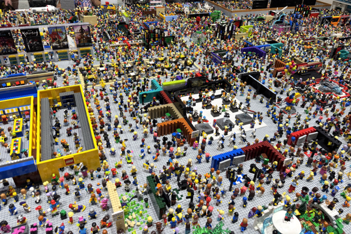
San Diego Comic-Con, July 23-27, 2025
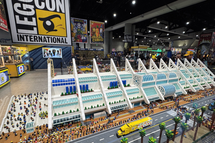
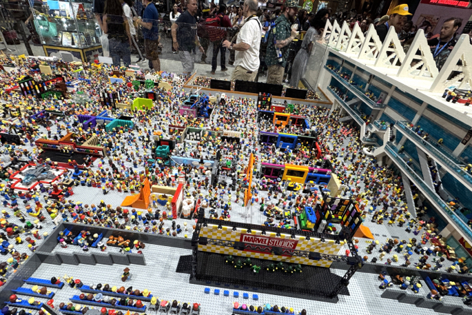
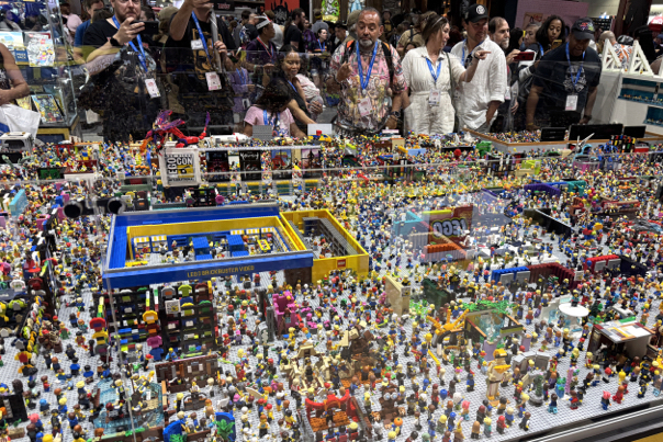
It was a comic-con of bricks.
Lego bricks to be precise: Lego recreated a detailed version of the convention at its massive booth.
200,000 pieces. 1500 hours to build.
Stunning, and an accurate miniature portrayal of the annual sensory overload that is SDCC. (Not that there’s anything wrong with that.)
Hey Lego — if you do this next year, I’m the one in a black t-shirt, holding an oversized bag, and wandering in a somewhat dazed and confused manner.
Of course, since that describes a chunk of the attendees, who’s to say I’m not already actually in the “San Diego Lego-Con?”
I’ll bring a magnifying glass next time.
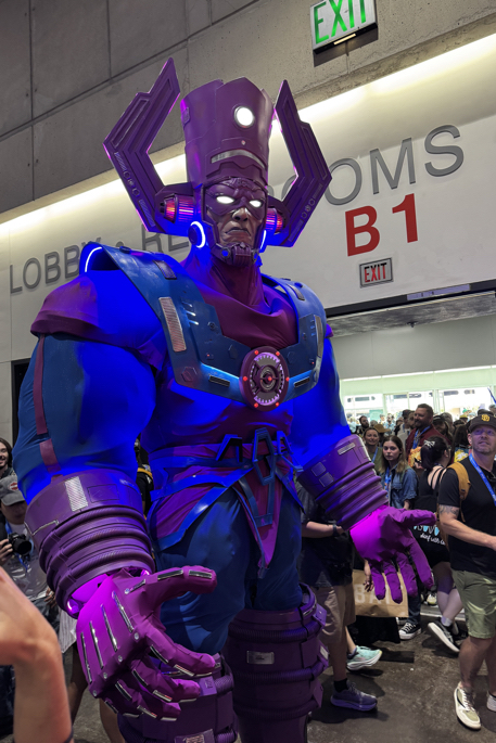
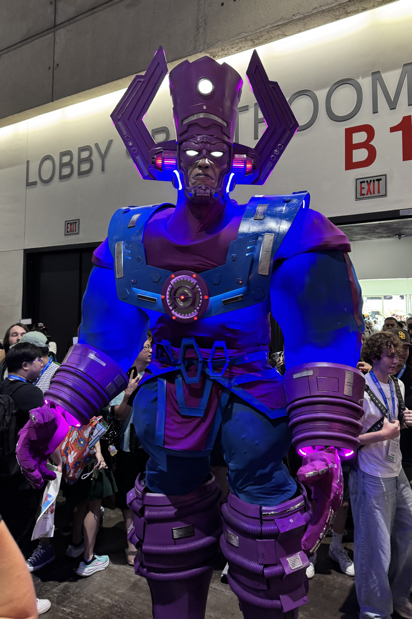
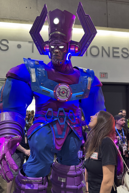
San Diego, July 24, 2025
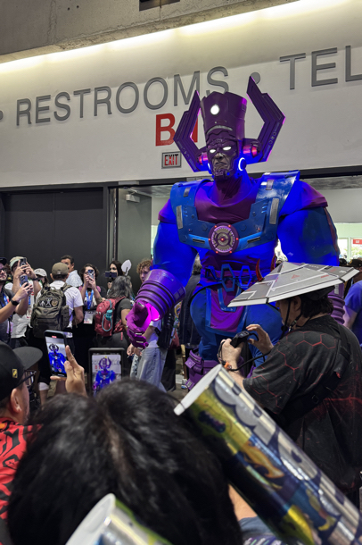
Once again, another San Diego Comic-Con is I the books. I’ll be posting some photos in the next few days, but in the meantime… Here is Galactus entering the main room for the first time on Thursday I believe; 10-12 feet of one of the greatest costume designs and executions I’ve ever seen.
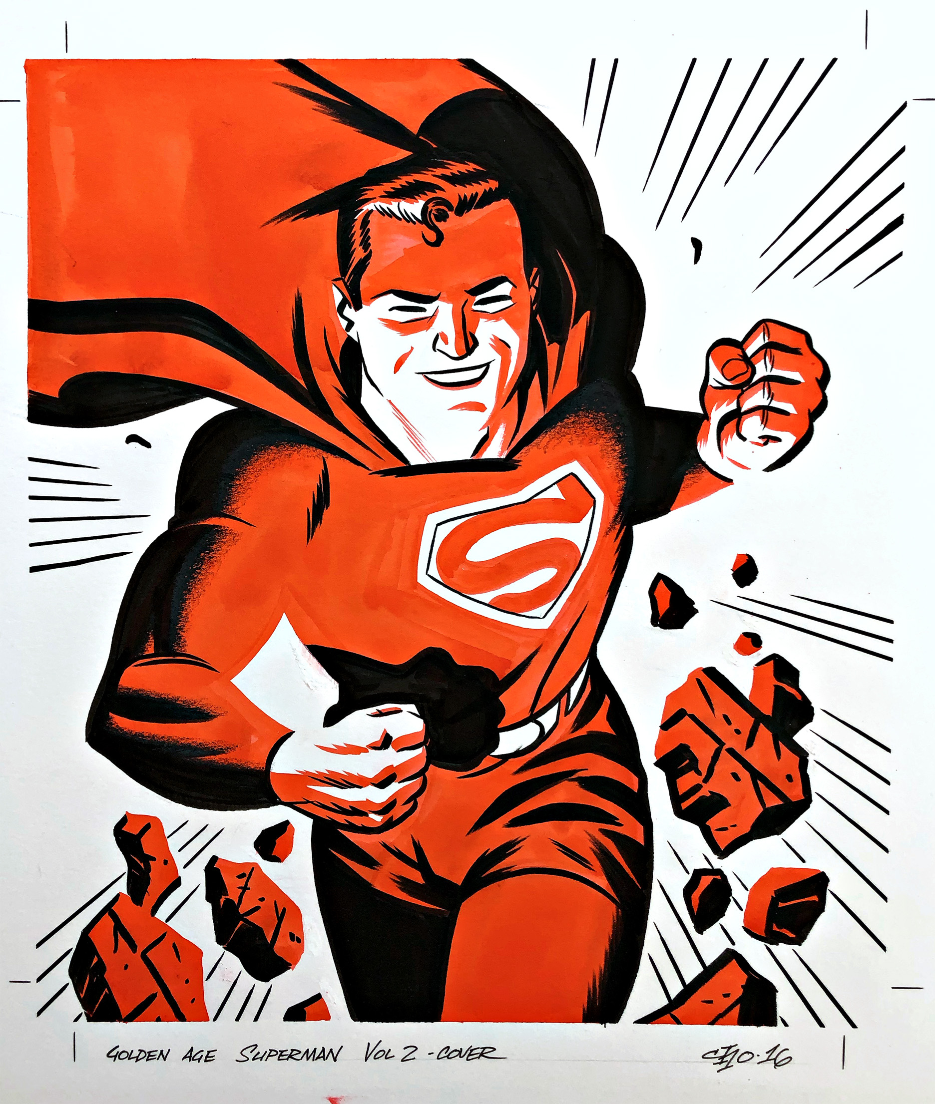
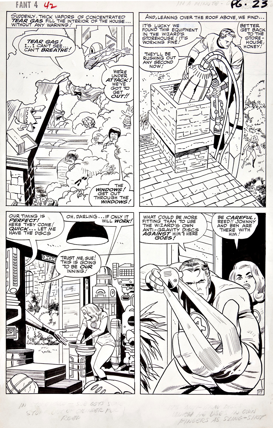
Superman & Fantastic Four Art Pages, Various
Who would’ve thought that Superman — the true beginning of the DC Universe, and the ignition for the fire that became the world of modern superheroes— AND The Fantastic Four — the first superheroes in the modern Marvel Universe — would hit the silver screen with major reboots at the same time? Definitely an unlikely coincidence.
So…
Here are all the Superman posts on the blog the last five years…
https://greggoldsteincomicartgallery.com/?s=superman
…and here are all the Fantastic Four posts from the same period.
https://greggoldsteincomicartgallery.com/?s=%22fantastic+four%22
Enjoy! I’m off to SDCC; let the madness begin!
Action Comics Annual #1, 1987

Let’s say you have a terrific Superman original art page from the equally terrific Arthur Adams…
And let’s say someone else also thinks it’s a terrific page — and makes you a fair offer for it…
So, you say to yourself: “Well, I’ll sell it, and get another terrific Adams Superman page down the line…”
But somehow, you actually don’t.
And then, one fine day (actually, a rainy one — but I digress), years later, you’re flipping through another collector’s portfolio, and you stumble on… the same page you had owned.
Offered at a much higher price than you received for it, naturally. Enough time has elapsed.
And you stare at it, and mutter to yourself: “Why did I sell this?”
So… you swallow your pride, and after some minor haggling, you purchase the page.
Congratulations! You’ve just discovered yet another inventive way to shred money — to get right back to where you started.
Sigh.
Great page, though.


Superman Sunday Strip, (Syndicate Proof Sheet), December 15, 1940
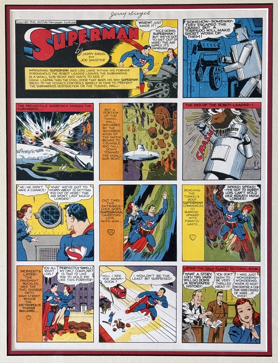
Not quite original art, this is a syndicate proof sheet for the Superman Sunday comic strip, from December 15, 1940. The proof sheets are printed on higher quality paper, and the colors are extremely vivid — which you can see even though I photographed this example under glass.
(For an amplification of how this proofing process worked, see the new edition of Jack Kirby’s Sky Masters Sunday strips, which explains the process in some detail.)
I enjoy these early strips — Shuster’s art here often seems more polished than the comic books, where some of the art suffers from inconsistency. That’s of course not shocking: Superman’s explosive —and nearly instantaneous —popularity meant that Shuster, with the help of assistants and other artists, had to keep up with a prodigious amount of publishing.
This proof came from co-creator Jerry Siegel’s personal collection , and I was fortunate enough to snag one with a giant robot. (Plus, it is signed!)
Superman, Lois AND a giant robot. Seems like a hat trick to me.


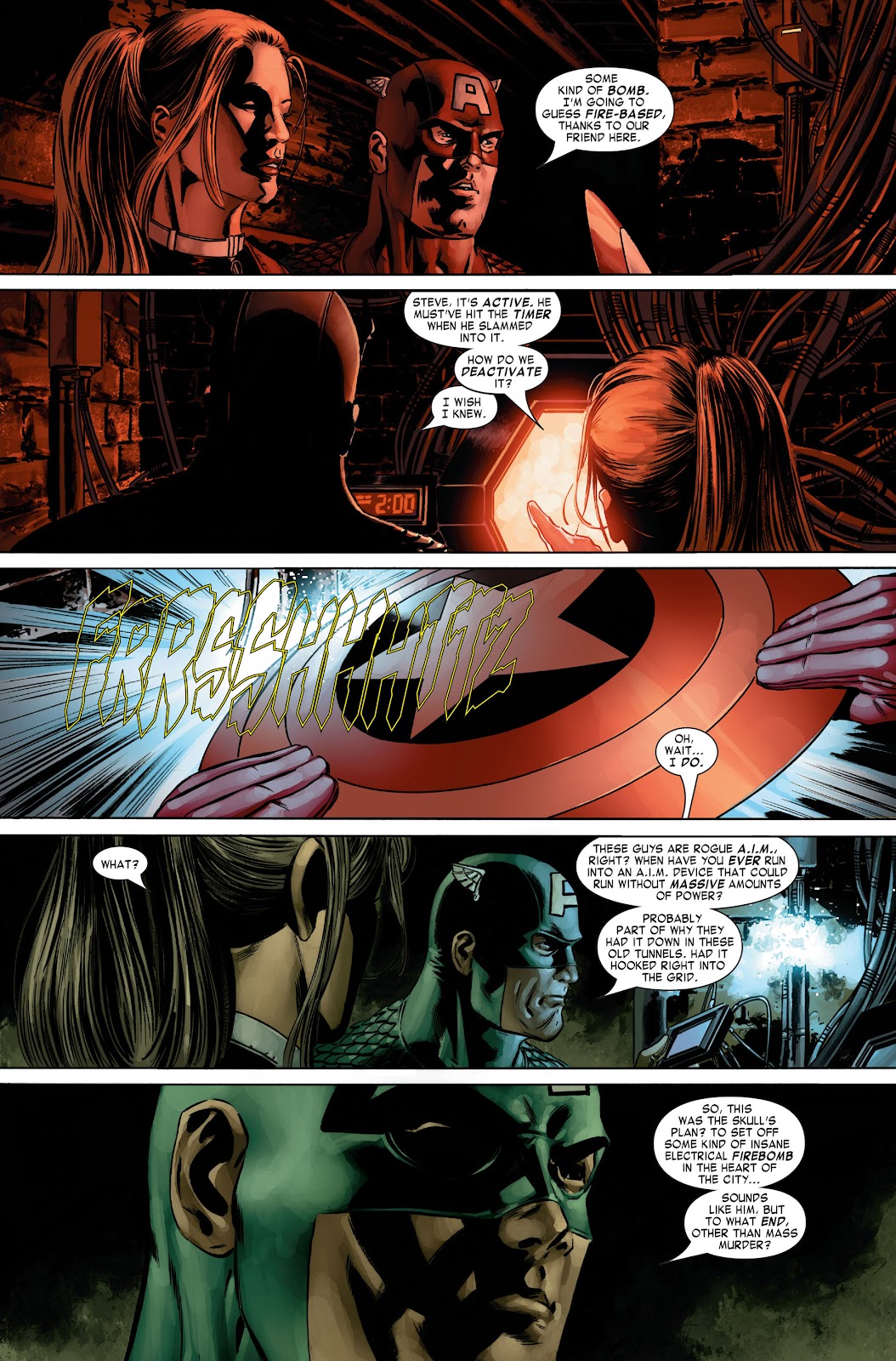
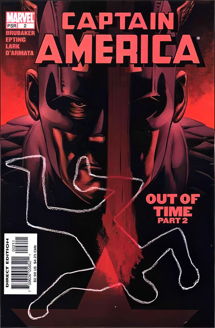
Captain America #2, February 2005
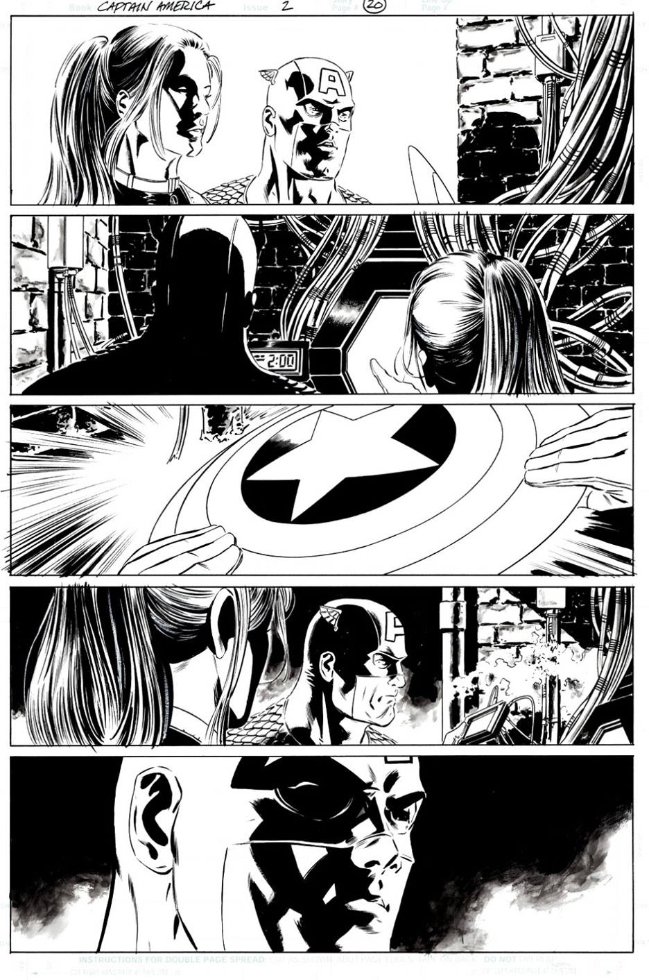
Once again, celebrating The 4th of July with a cool Captain America page seems like a an appropriate — albeit obvious — idea.
This year, Steve Epting helps us out, with a great Cap (and Sharon Carter) page from the Ed Brubaker story arc that introduced readers to the Winter Soldier. (AKA Bucky Barnes, if you’ve been copying Rip Van Winkle the last 20 or so years.)
Chances are Bucky, as a Russian agent, wasn’t celebrating in those days. But I’m guessing he’s made up for it more recently.
Happy Independence Day, everyone.
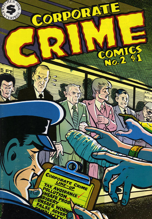
Corporate Crime #2, April 1979
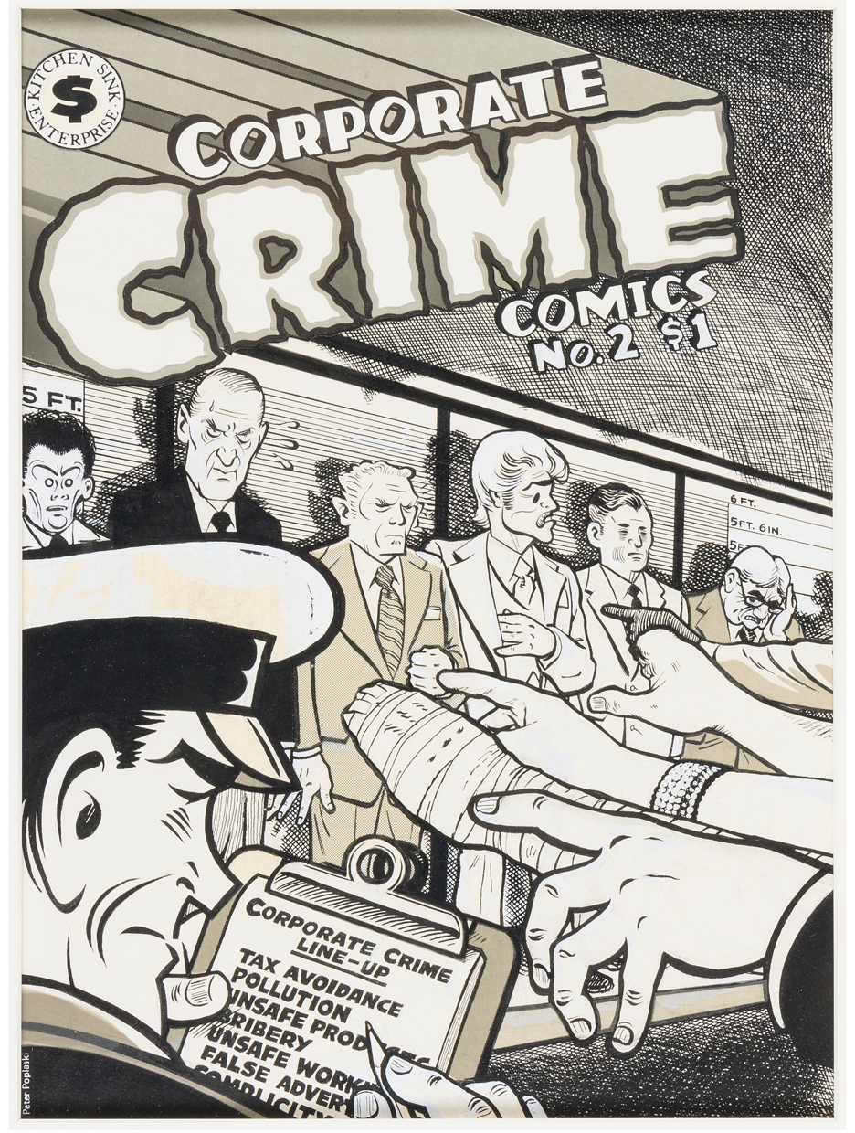
Pete Poplaski turns ordinary looking white-collar criminals into a rogues’ gallery suitable for Dick Tracy in this terrific cover for the short-lived “underground” comic, Corporate Crime. (Two issues, two years apart in 1977 and 1979.)
I’ve said plenty about Pete previously, but it deserves repeating: It’s amazing how he manages to capture so many classic art styles, so well. His originals (and I’m grateful that I own a few) are astonishing.
Seeing this cover for the first time a few months ago made me wistful that we (IDW Publishing) never pitched DC a Batman / Dick Tracy crossover set as a period piece in the 40s. Not sure if Pete would have been up for illustrating an entire series, but I certainly would have hired him for the covers.
I believe Mad Cave currently has the Tracy rights: Guys, it’s never too late.
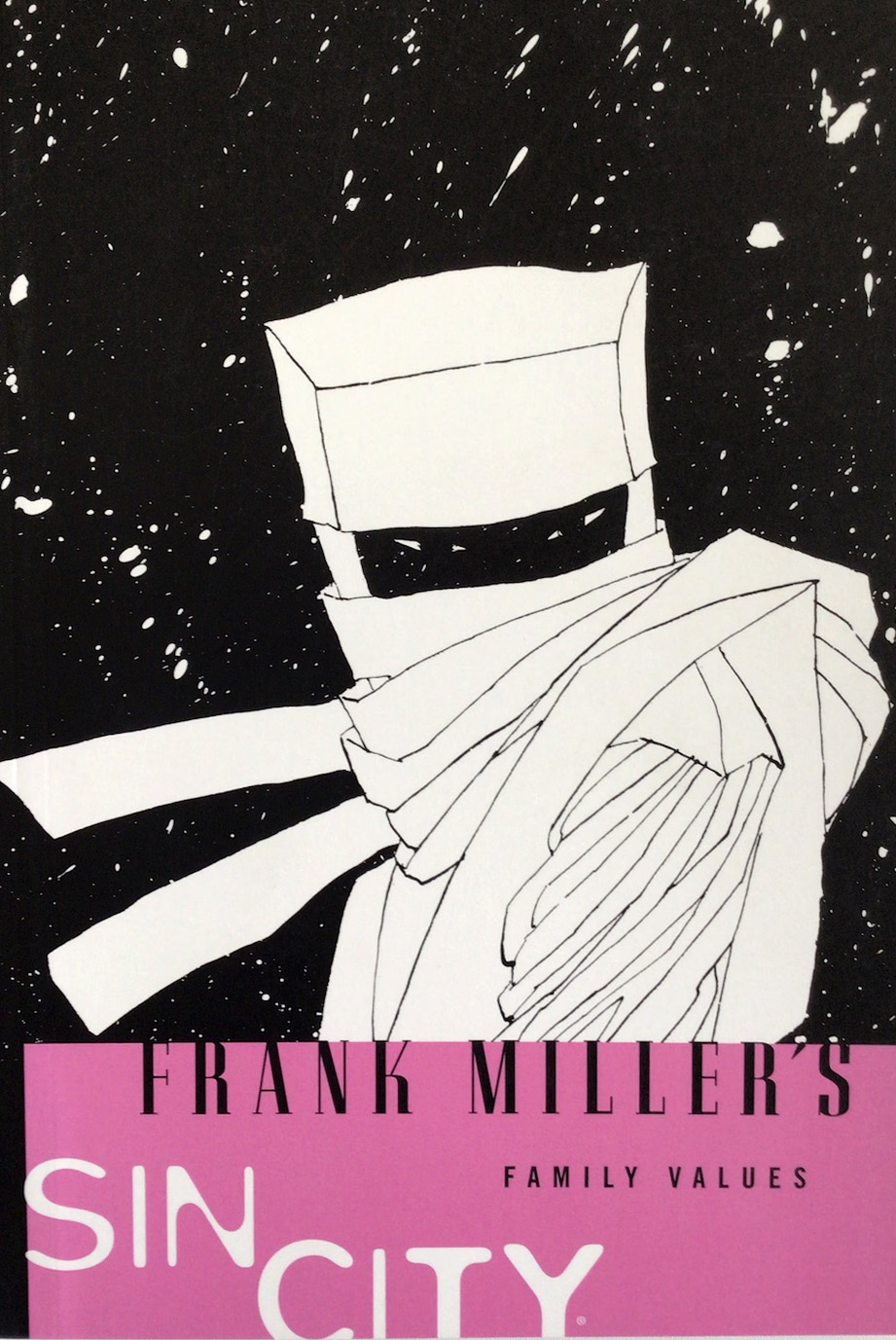
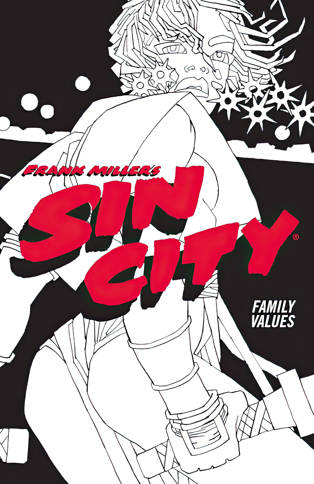
Sin City: Family Values, October 1997

Family Values — The fifth Sin City yarn (and the only one released as a straight graphic novel instead of individual comic issues) — seems to be at the lower end of the rankings for Frank Miller Sin City fans. If you ask me (and I know you didn’t) this is a bad rap.
While definitely more straightforward and less rich story-wise than some of the earlier tales, Family Values is a revenge thriller told well. Perhaps fans found it too conventional: Had Miller decided to make a few changes, it could easily be transformed into a Daredevil/Electra/Punisher story.
This art is from the terrific multi-page opening sequence. Dwight McCarthy visits the scene of the crime of a recent gangland killing, at night, in Volkswagen Beetle… in a blizzard. Beautiful noir storytelling — and perhaps the best-looking snowstorm to ever appear in comics. And has a VW bug ever previously looked menacing? Only Miller could pull it off quite this way.
“Pok Pok “indeed.
(And my folks were in the food business. How could I resist a splash page with a diner in it?)