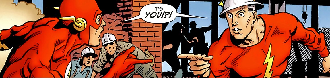
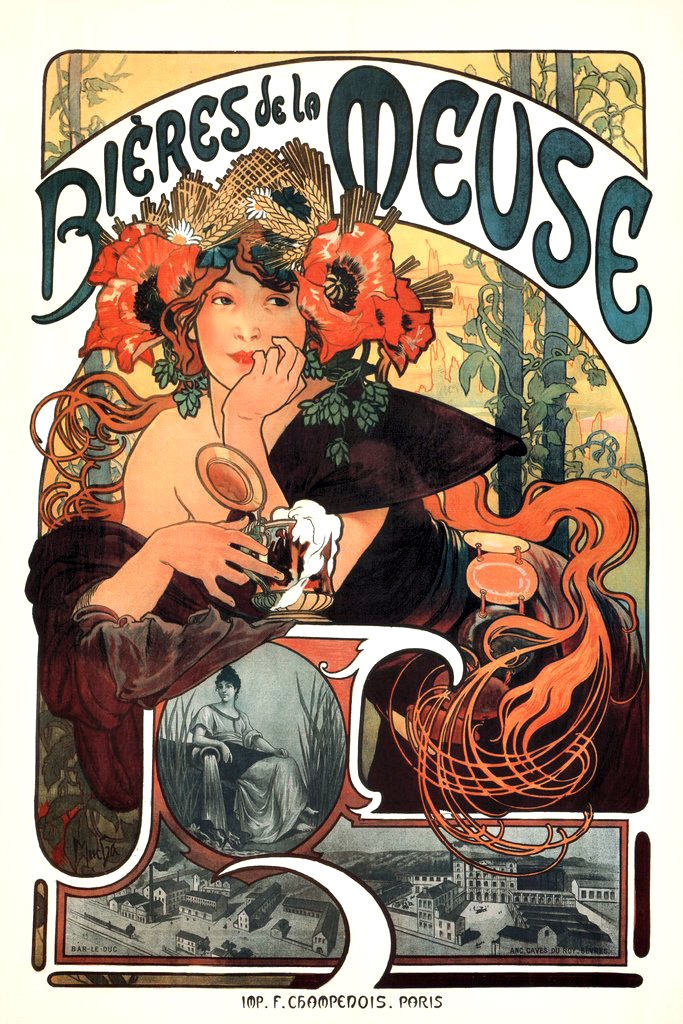
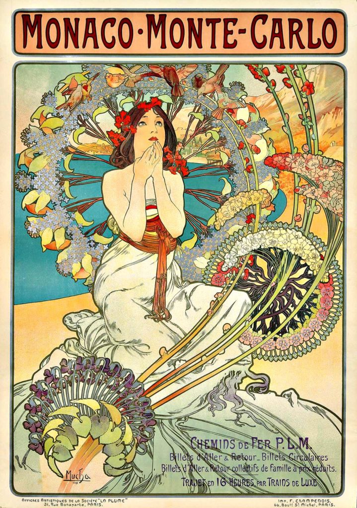
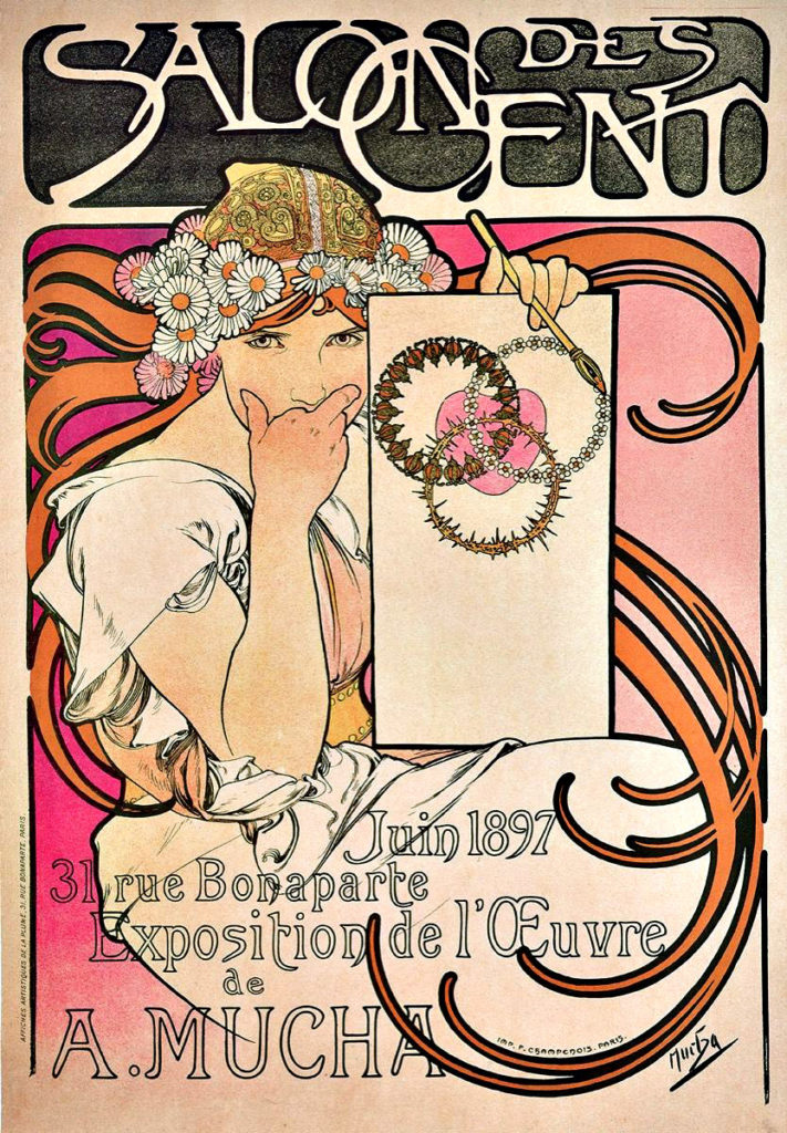
Print, Star Wars Celebration IV and Star Wars Celebration Europe, 2007
Continuing our multi-part countdown to Star Wars The Rise of Skywalker, opening December 20, and concluding, apparently, the Skywalker saga.
This print, limited to 250, and now selling for as much as a nice page of original art, checks three great boxes for me:
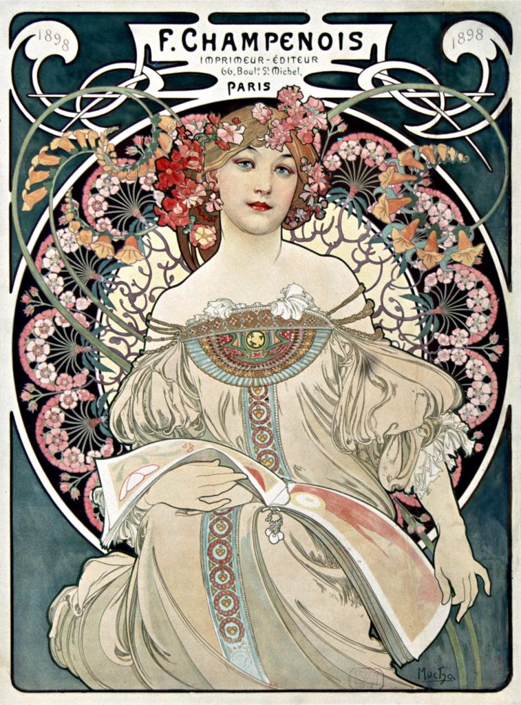
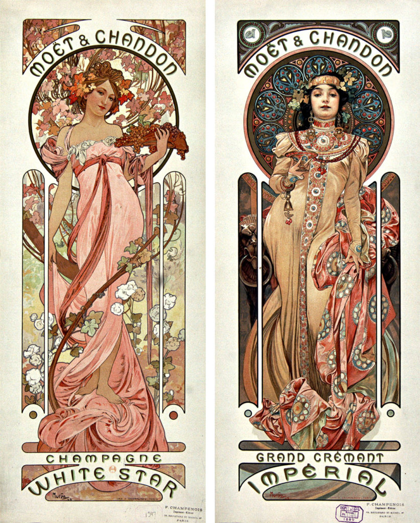
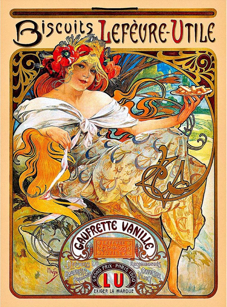
Adam Hughes. Star Wars. Art Nouveau via the master, Alphonse Mucha.
(And a fourth actually — a wry sense of humor not seen often enough in Star Wars related content)
Stellar artist Hughes is supposedly keeping his original art for this giclee. Who can blame him? For an artist who generally sells all his originals, that probably tells you all you need to know.
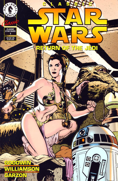
Some great prints by the Nouveau Jedi Master, Alphonse Mucha.Adam also tackled “Slave Leia” earlier in this reprint of the Return of The Jedi adaptation.
Continuing our countdown to Star Wars:The Rise of Skywalker, opening December 20, and concluding, apparently, the Skywalker saga.
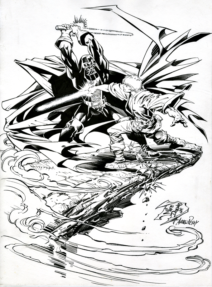
I discovered this dynamic undated commission by Mike Deodato a few months ago. Something about it — the composition, Luke’s face, the overall “loose” style — reminded me of Carmine Infantino’s enjoyable run on the original Marvel series 40 years ago.
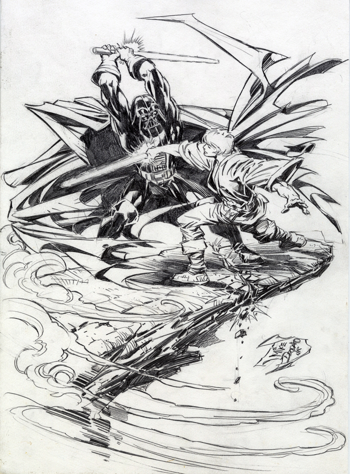
When I acquired the piece at NYCC, it was pencils only, and although it looked great, my gut told me to get it inked. (Sadly, my guts often have opinion.)
Fortunately, my pal Andrew Pepoy, the talented inker, happened to be nearby. Turns out, he always wanted to ink the late Infantino, and well, maybe this is the next best thing…
He nailed it — keeping the looseness intact, while adding polish and more depth to make it pop. (Look at Luke’s Lightsaber against Vader’s cape for instance.) This is especially impressive because the pencils were created on an odd thin paper stock, nothing like the more typical Bristol board artists employ. Definitely not an easy task.
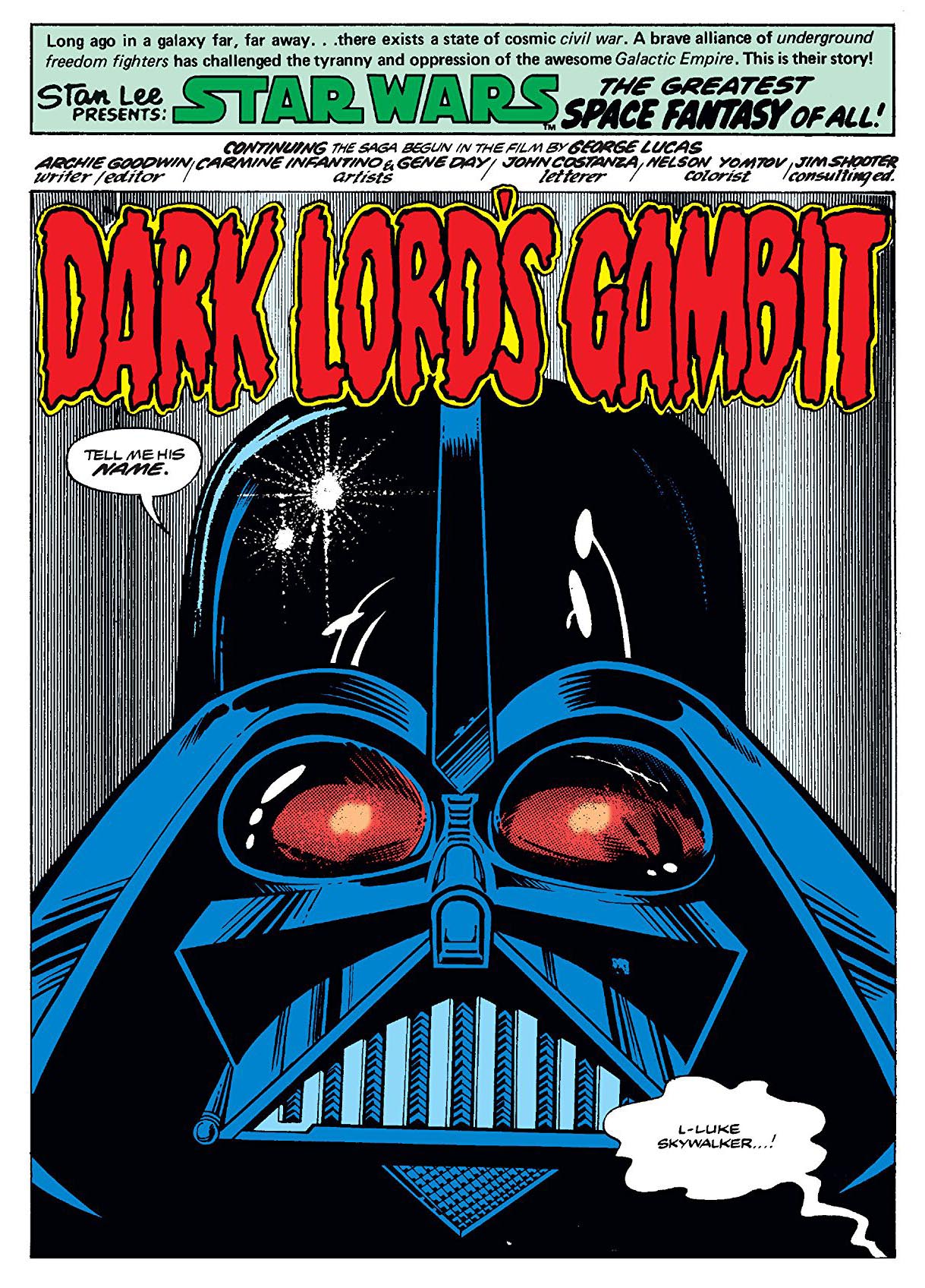
Carmine’s run comes during the period leading up to to Empire Strikes Back, and I’m sure Lucasfilm was giving Marvel and writer Archie Goodwin fits, keeping them from, well, just about any story element that would spoil the film. Which is… well…. just about everything. Nerveless, they manage to have a few confrontations between Luke and Vader. Even if, of course, nothing is what it seems.
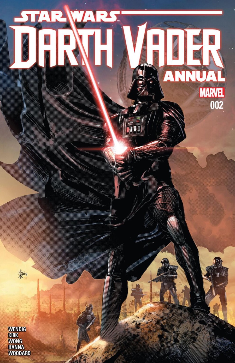
As for this Deodato piece? Mike’s modern Star Wars (see below) art looks nothing like this commission — someday I hope to get the backstory on the art. Until then… stay tuned.
Detailed pencils… but it still needed finishes.
Deodato’s modern take on Vader
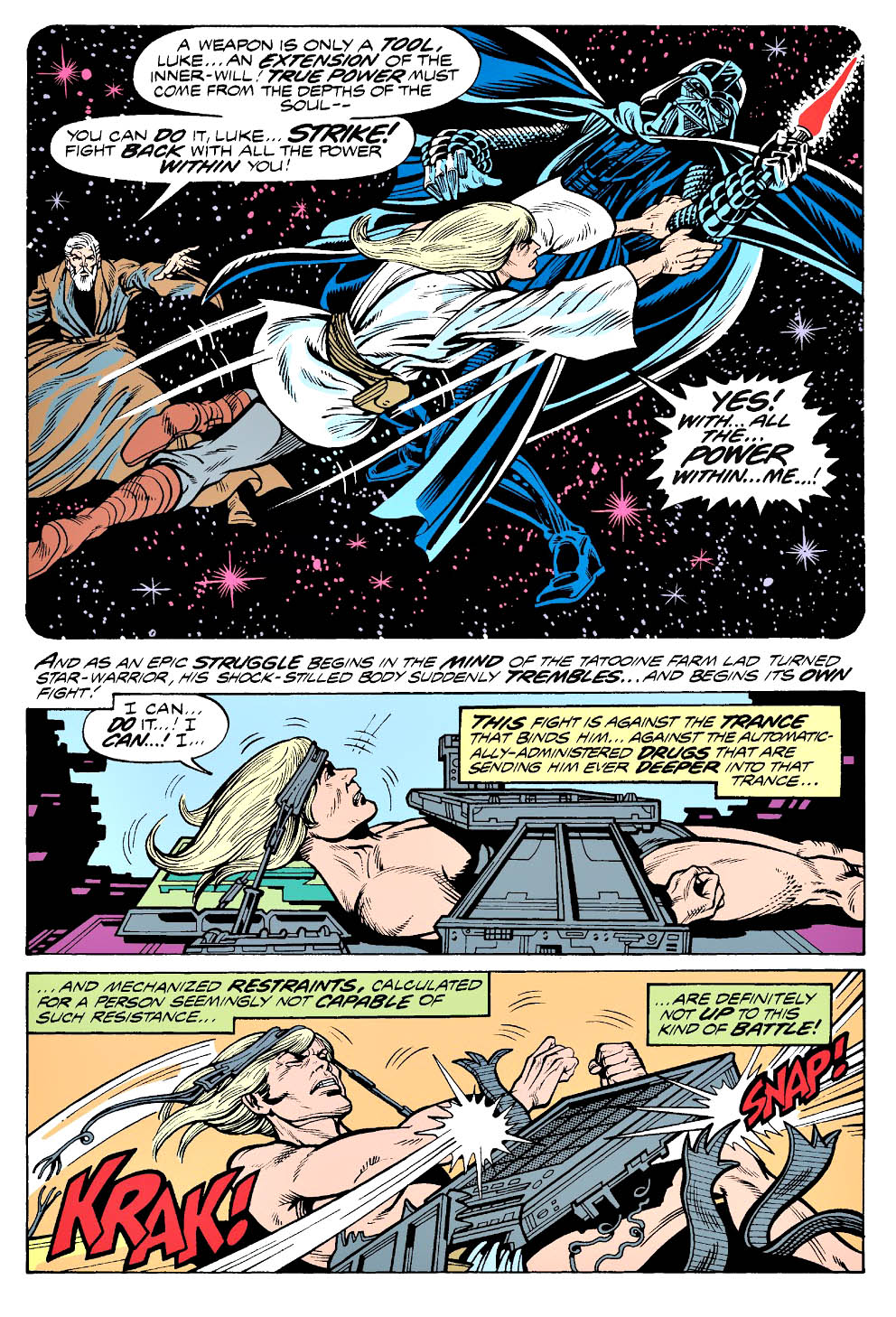
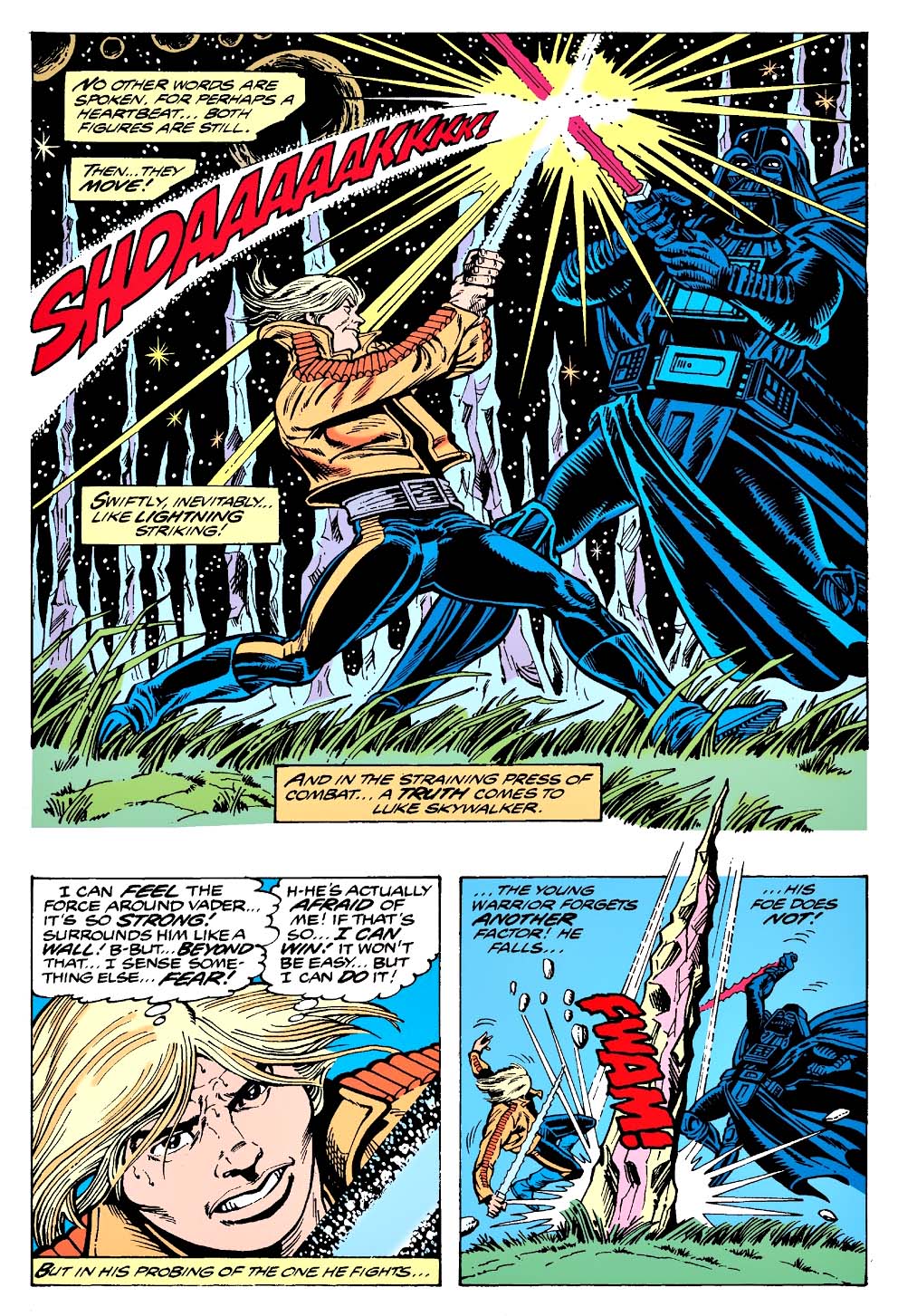
Classic Carmine Infantino Star Wars pages from the late 1970s.Check out the length of Luke’s hair in the middle page. Yikes!
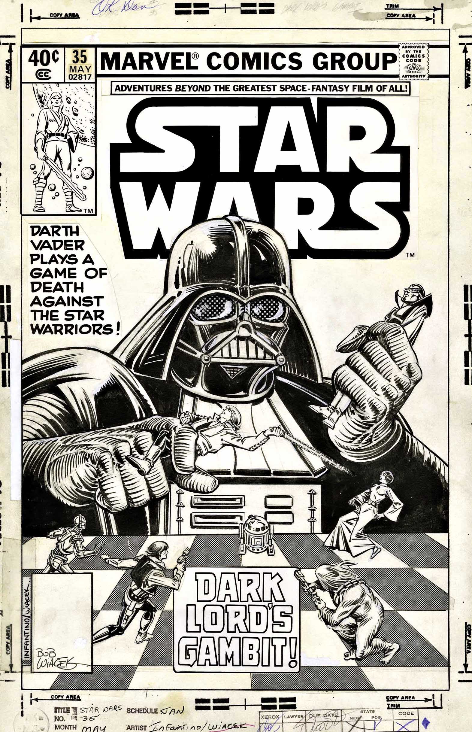
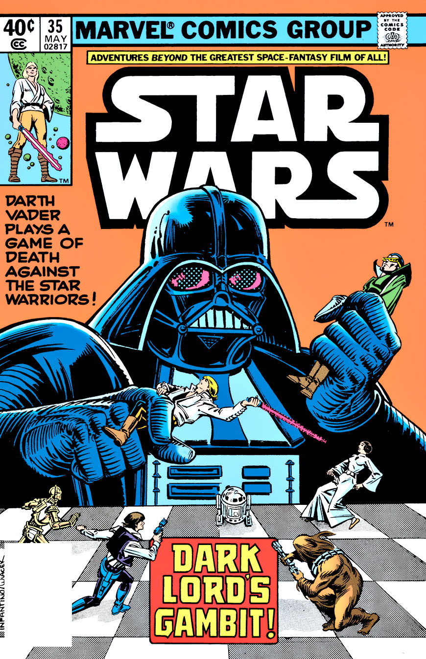
A fan favorite Infantino cover… in original and published form.
Star Wars: The Rise of Skywalker opens in two short weeks, and the Star Wars Skywalker trilogy of trilogies (I can’t bring myself to call it a ennealogy) will apparently conclude, 42 years after it began.
In honor, the next two weeks of posts will feature original art from Star Wars, showcasing one or more of the “original trilogy” characters.
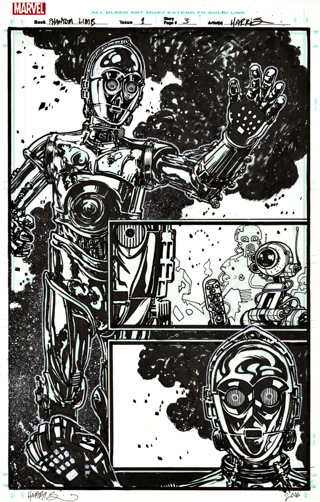
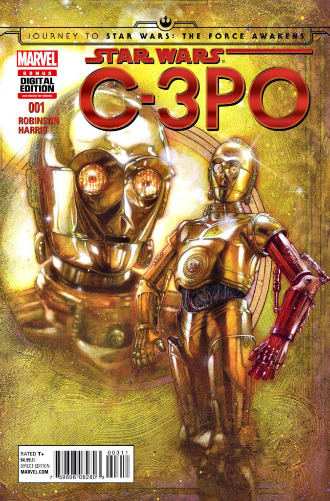
James Robinson and Tony Harris (Starman) reunite for a one-shot C-3PO story that explains the droid’s red arm in The Force Awakens.
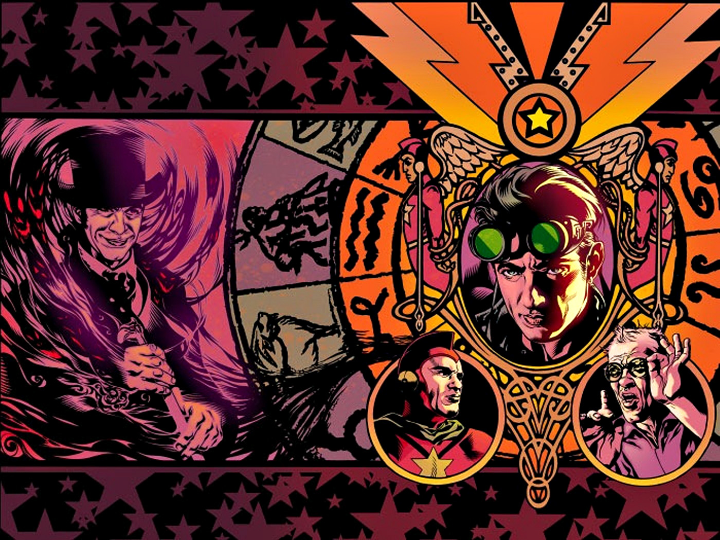
Their Starman run was one of the great comic book series of the late 20thcentury and it was nice to see them back together, even if only for a one-shot. And a pretty good one at that — a surprisingly moving tale about droid sacrifice.
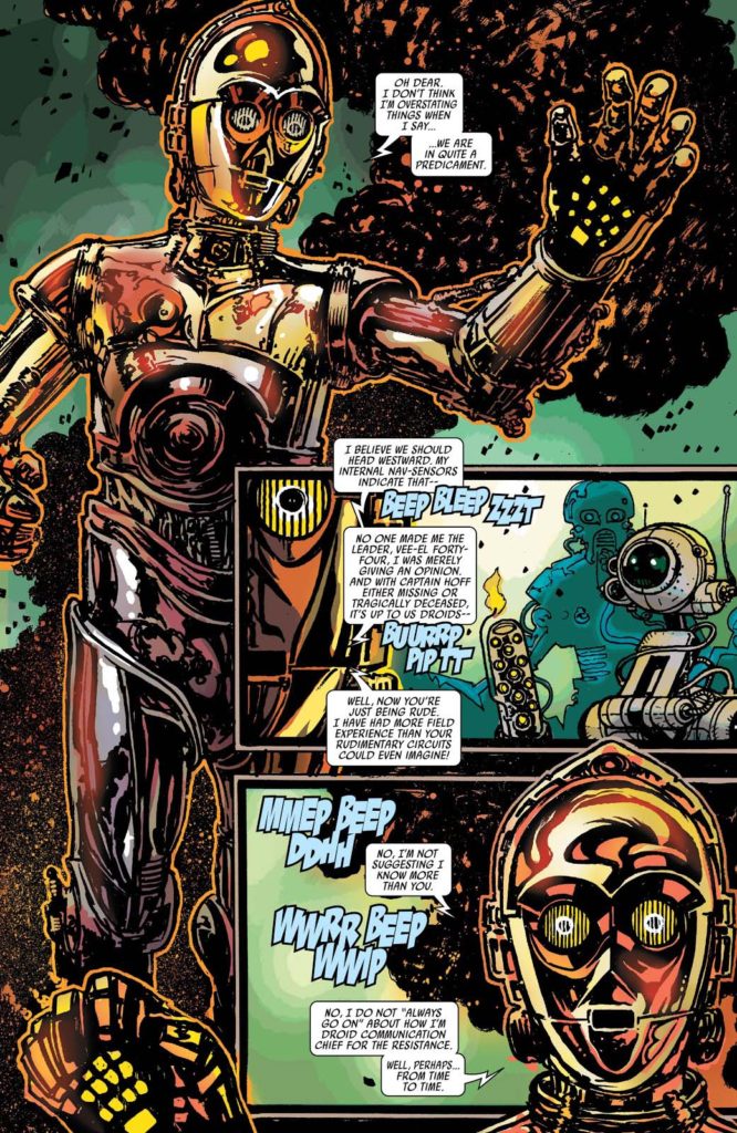
The story is packed with eccentric droids in tight spots, and this splash is perhaps the best page in the book — a full image of C-3PO rendered with delightful and quirky detail by the talented Mr. Harris. He painted the striking “A” cover as well.
I love the final coloring, also by Harris, but as is often true, the art is especially striking in glorious black and white.
May the force… Well, you know.
A knockout wraparound cover from the hardcover collections of Starman Robinson and Harris stories.
Our celebration of Marvel’s 80thAnniversary concludes with the publisher’s most iconic character in one of his classic stories.
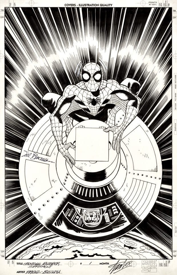
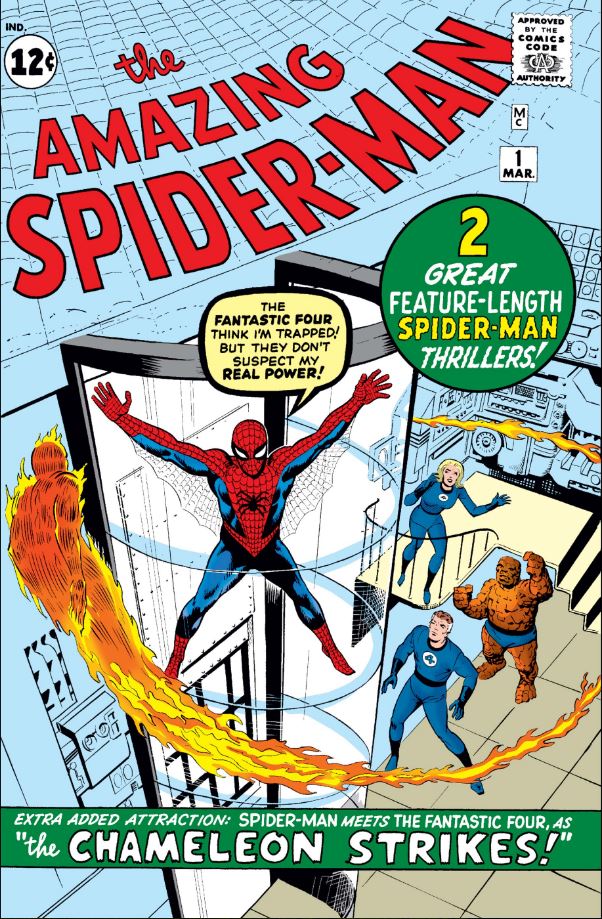
The lead story in the original Amazing Spider-Man # 1(1963) finally gets its own terrific cover more than 50 years later, thanks to this unique reprint series published in 2006.
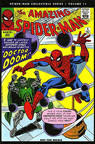
News America created The Spider-Man Collectible Series as weekly promotional supplements to Sunday newspapers. Each issue was printed on newsprint and contains half an issue of a classic Lee and Ditko Spider-Man comic, published in original order. Only 24 issues were produced, suggesting the series did not succeed as well as envisioned.
Since each original Spidey comic was split in half, every other issue of the supplements required brand new covers, depicting classic stories. For the most part, the covers are as dynamic as this one — if I could find them, I would attempt to acquire as many as possible.
Ron Frenz is a great visual storyteller (definitely influenced by classic Marvel artists), and Sal Buscema’s inks are always spot-on. (For more than 50 years!) I consistently enjoy their team-ups.
As for this Spider-Man story itself? It’s a classic that sets up storylines and characterizations for years, as Spidey saves J Jonah Jameson’s astronaut son — only to be blamed for sabotaging the rocket in the first place.
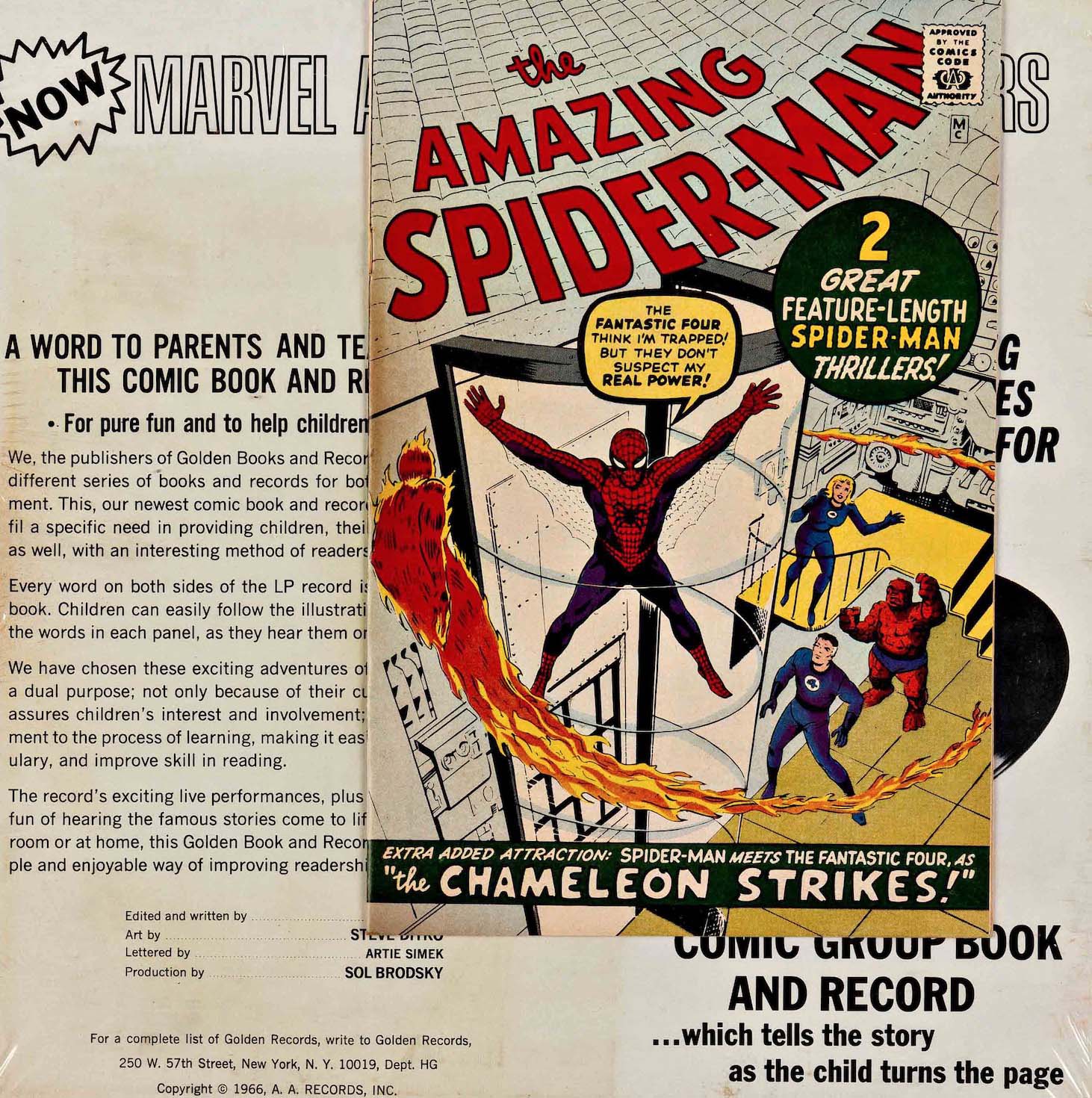
It’s a story I heard dramatized over and over again as a kid, because I was somewhat obsessed with the Golden Record recording of that classic issue. (See below).
And of course, it makes sense that the “back-up” story featuring the Fantastic Four is the original cover of Amazing Spider-Man #1 and all other subsequent reprints. Although the original published cover blurb has made me wonder if the astronaut story was actually intended as the cover and pulled. Why call out the cover story as an “extra attraction” if that’s the story we can already see? Hmmm.
Although the Fantastic Four make a great marketing hook, the lead story in issue #1 is actually the rocket rescue, and includes a re-cap of Spidey’s origin for those who missed or didn’t remember Amazing Fantasy #15No good deed goes unpunished…and becomes the defining thread in Spidey stories.
Golden Records produced four “book and record” combos of classic stories in 1966 during the first Marvel Merchandising craze. Each of the four (Thor, Captain America, Fantastic Four and Spidey contained a straight reprint of the associated comic, minus only the cover price.
Above — Some of the newly created covers for classic Spider-Man stories.
Continuing our ongoing celebration of Marvel’s 80thAnniversary.
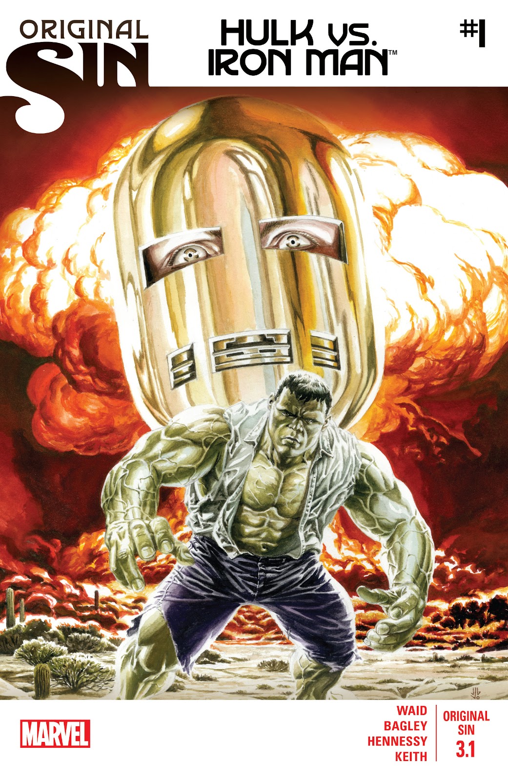
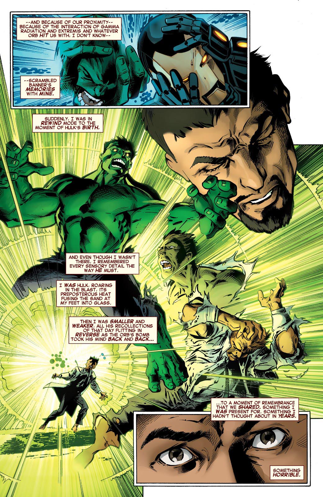
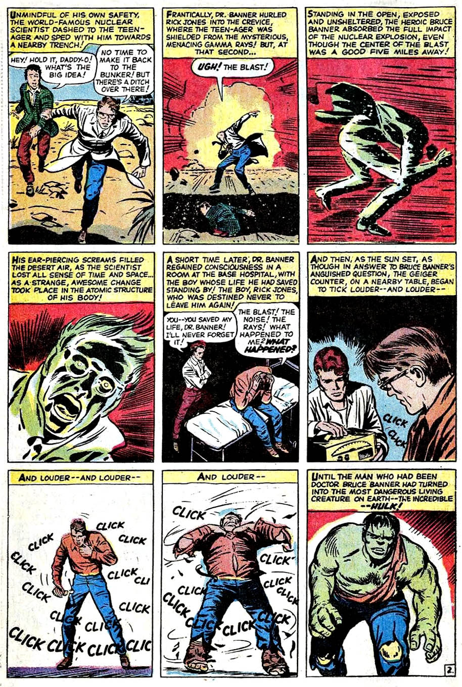
Tony Stark is forced to relive The Hulk’s origin — and his own potential culpability in the fateful gamma blast — in Original Sin, a clever 2014 crossover event by Mark Waid that introduces some new retcon elements into the Marvel Universe.
Re-imagining a classic scene is an interesting challenge for an artist, and Mark Bagley delivers on Bruce Banner’s transformation with inventive (and concise) storytelling and solid draftsmanship. Andrew Hennessy’s inking on Bagley’s pencils adds some nice polish.
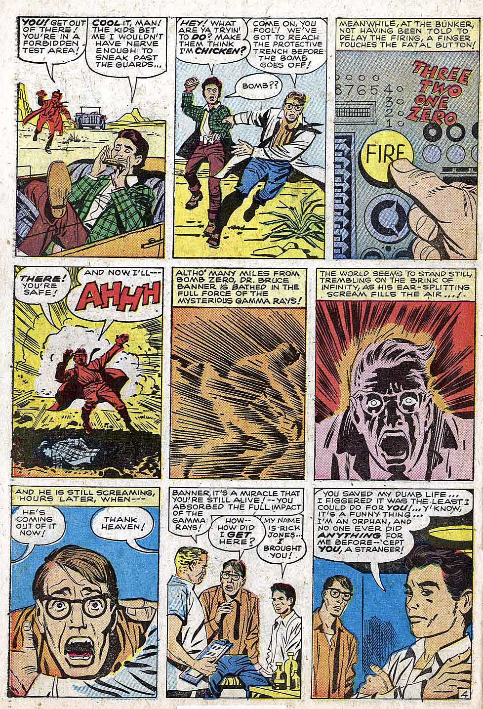
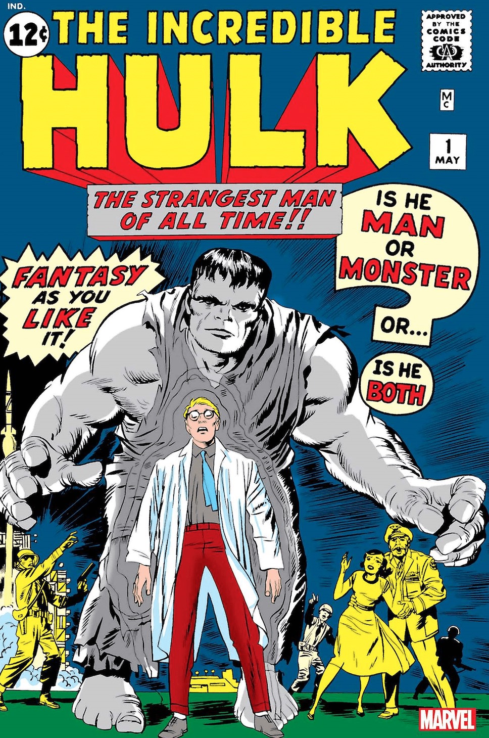
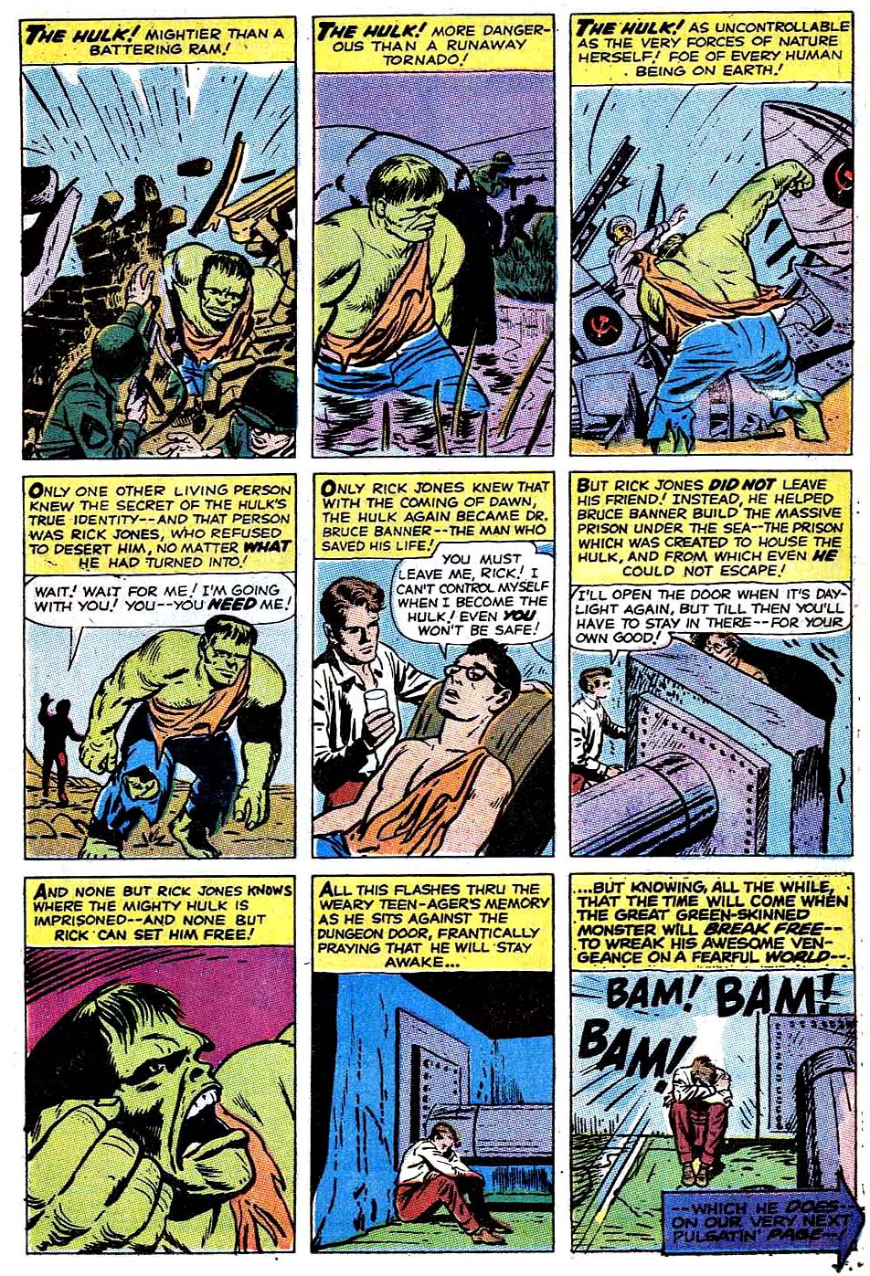
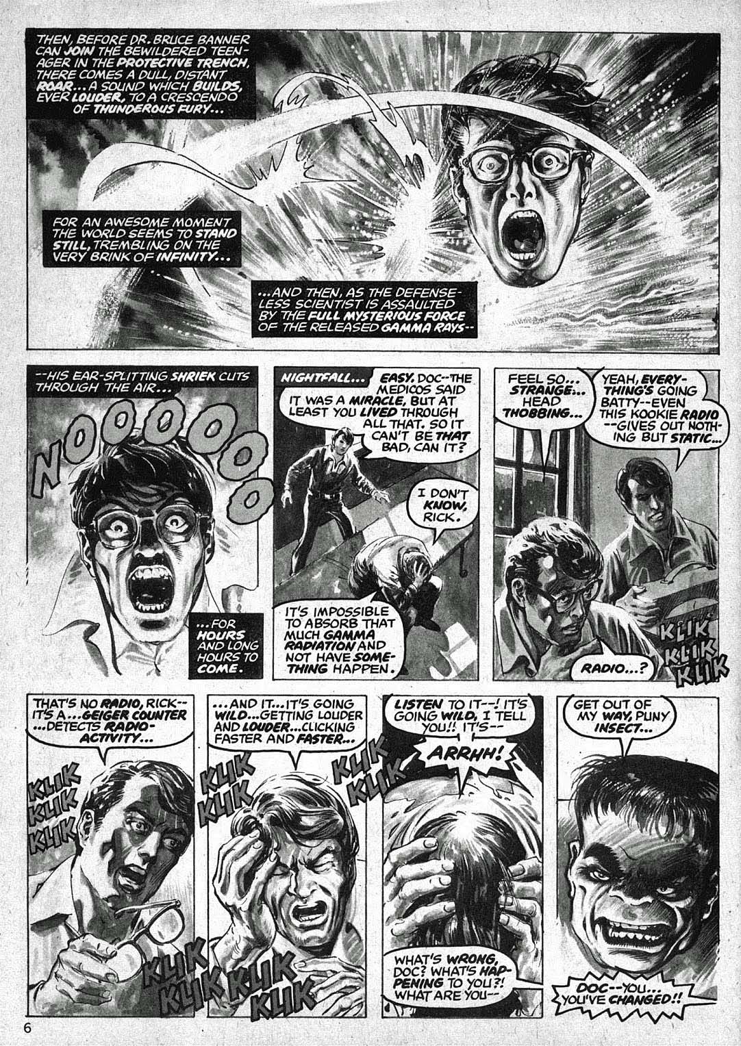
The basics of Hulk’s origin haven’t changed much in the nearly 60 years of his existence, but the nuances have been modified many times. In the early days of the Silver and Bronze ages, a number of artists did different takes, as evidenced below.
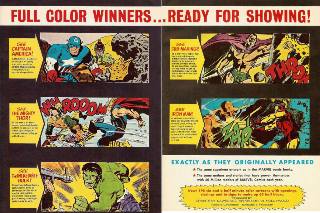
Where did I first see the Hulk’s origin? On TV, of course, in the 1966 Marvel Super-Heroes Cartoons. (Courtesy of Jack Kirby’s art.)
Sing along to the theme song if you will:
(Lyrics by Jacques Urbont)
Doc Bruce Banner, Belted by gamma rays, Turned into the Hulk.
Ain’t he unglamor-ous!
Wreckin’ the town With the power of a bull,
Ain’t no monster clown Who is as lovable.
As ever-lovin’ Hulk! HULK!! HULK!!
The original “long-form” origin (Hulk is gray) by Jack Kirby first appeared in Hulk #1.
In Hulk #3, Kirby redraws the origin (as a flashback) in a succinct three pages — and retcons the Hulk into his green form. (This origin also appears as the lead story in Hulk Special #2.)
Origin revisited: Hulk #102 (1968) by Marie Severin and Rampaging Hulk #1(1977) by Walter Simonson and Alfredo AlcalaAdvertising material for the 1966 Marvel Super-Heroes Cartoon
Continuing our ongoing celebration of Marvel’s 80thAnniversary.
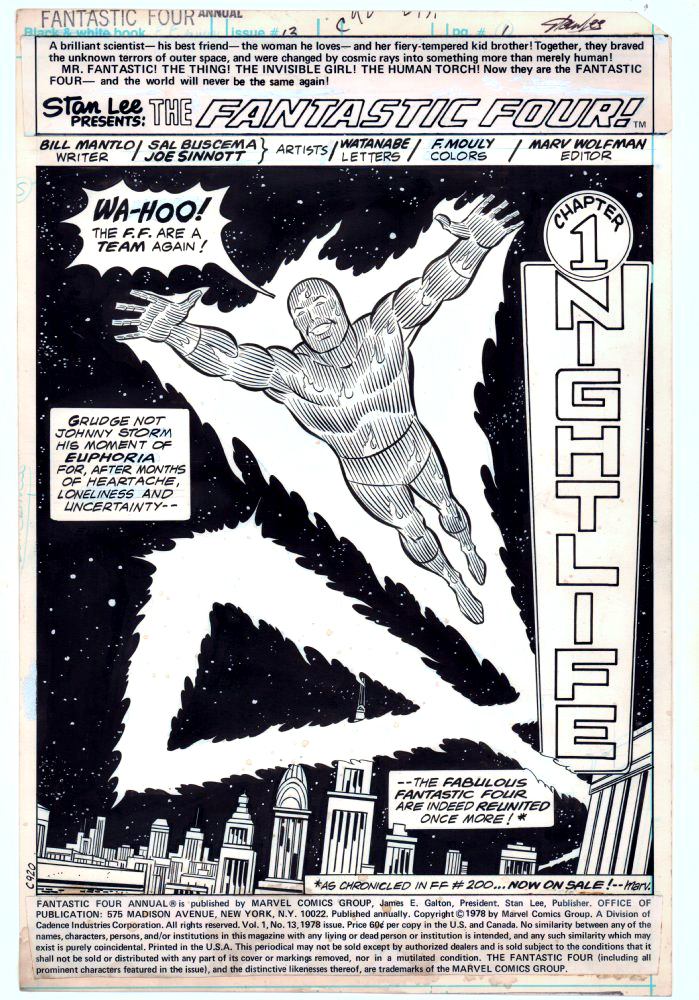
Sal Buscema and Joe Sinnott deliver an iconic (and terrific) image of the Human Torch in this celebratory opening splash page.
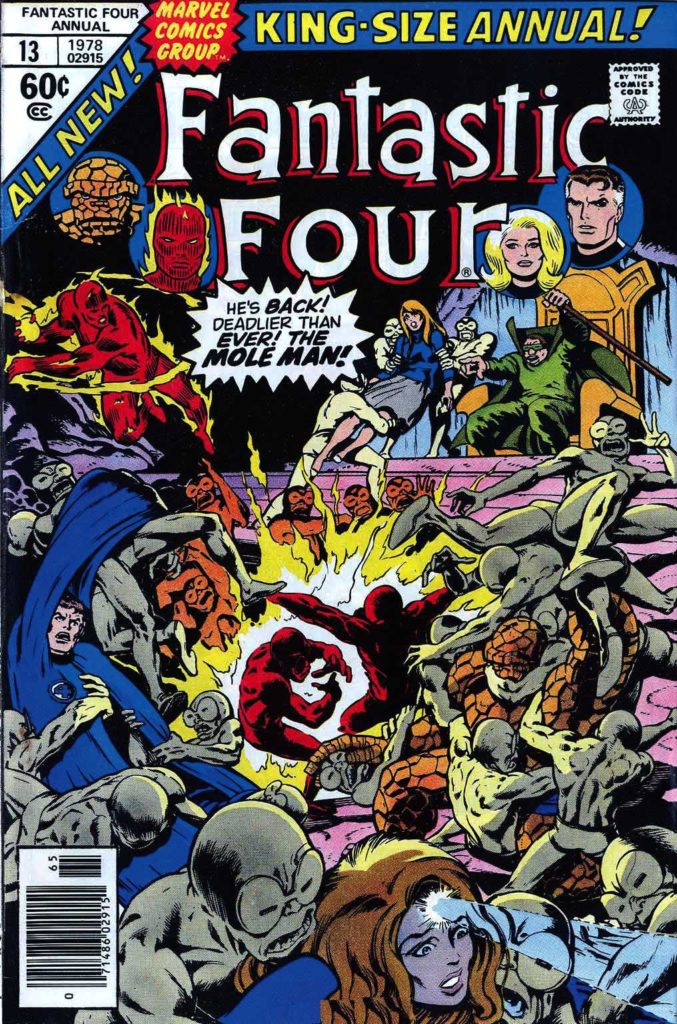
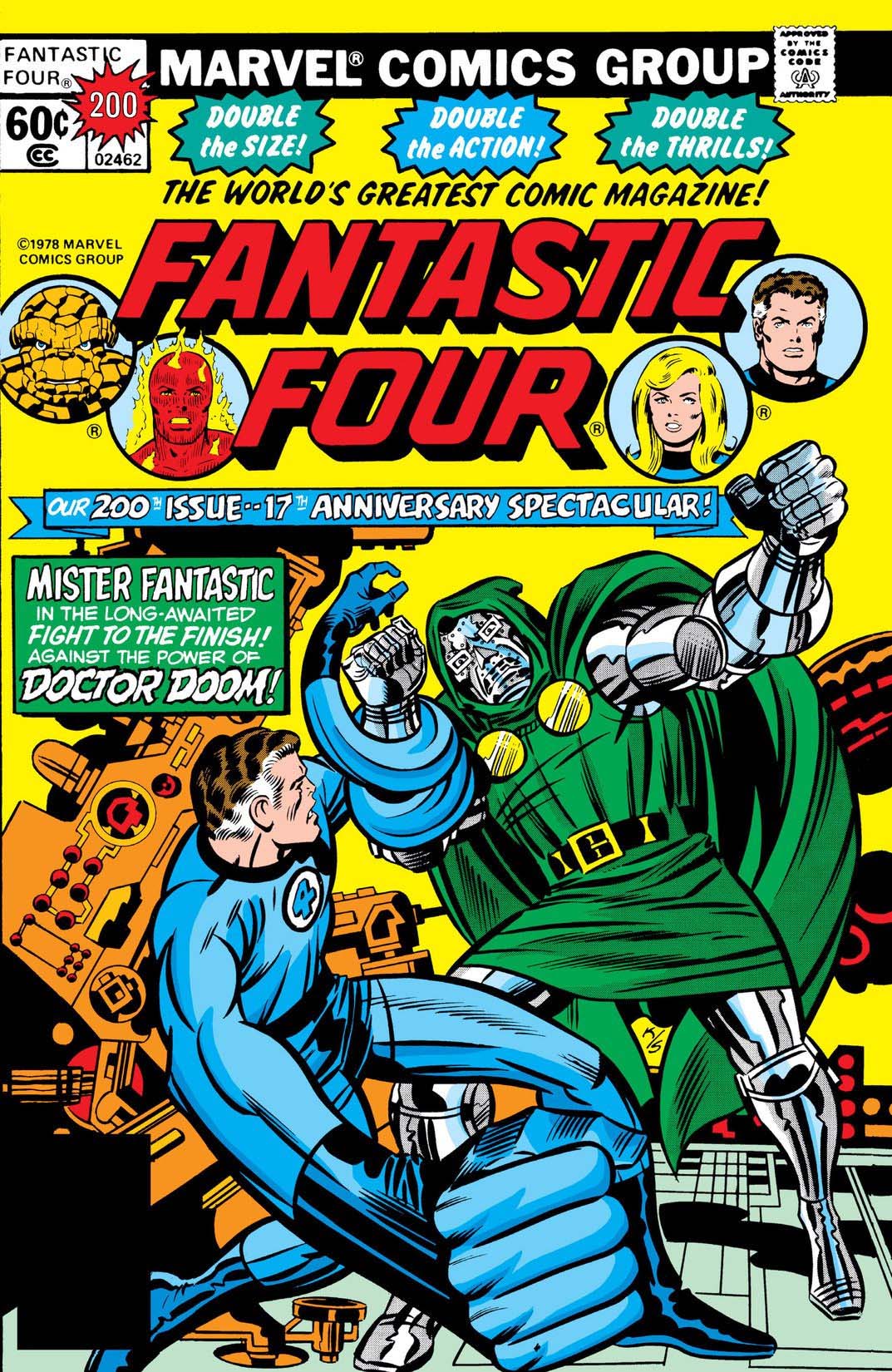
Celebratory in that the Fantastic Four had just gone through a quirky period editorially where they were essentially “broken-up”, and they have reunited in FF #200, on-sale at the same time.
At this point in the run, Joe Sinnott, acknowledged as one of the all-time greats, is pretty much the only consistent through line in the FF — the series was rapidly going through a number of mix and match creative teams. In a three-year period, Joe inks pencillers Sal Buscema, John Buscema, Keith Pollard, Rich Buckler, Ron Wilson, and of course George Perez, who does some of his best known work in this era. (Shortly after this issue is published, Joe adds John Byrne and Bill Sienkiewicz to this mélange.)
Sinnott’s credits, including this one, are often categorized as “finishes” during this timeframe, as many of the pencillers are providing breakdowns only. Doesn’t help enough with the schedule though, as a number of issues are reprints and fill-ins. Marvel, as others have noted, was going through some difficult times. The Fantastic Four themselves wouldn’t truly find their full footing again until a few years later, when Byrne fully takes over writing and art chores.
As for Joe and Sal? With the end of the Spider-Man newspaper strip this year, Joe officially retired from inking … at age 92. Sal (age 83) “retired” in 2000, but continues to be coaxed into working — sometimes by my former colleagues — to this day.
“Flame on!”
So many interpretations of the Human Torch, so little time.
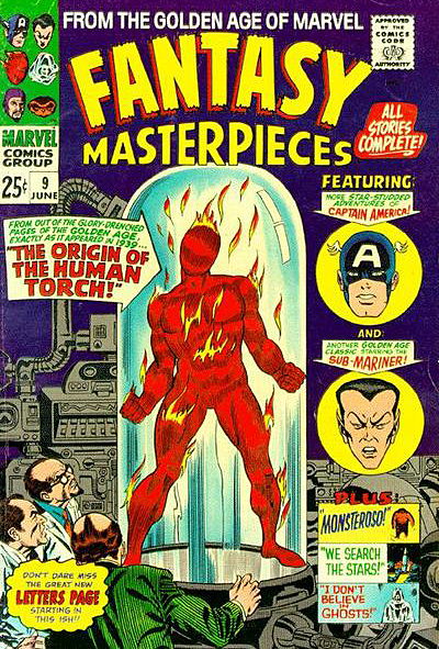
In his earliest appearances, Johnny Storm, the Silver Age Human Torch looked a bit more like the Golden Age version (more flame, less body definition) ultimately evolving to his more familiar form. Meanwhile, the Golden Age Torch, who (with the help of some of clever retconning) eventually makes a comeback in the modern era, appears to look more like the silver age version.
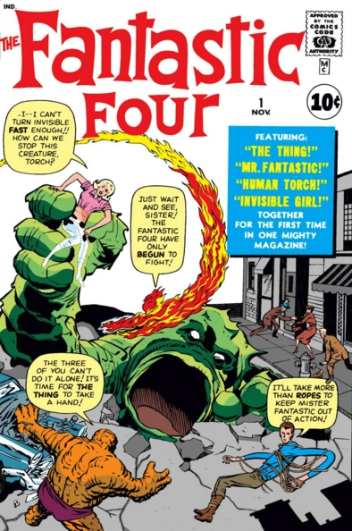
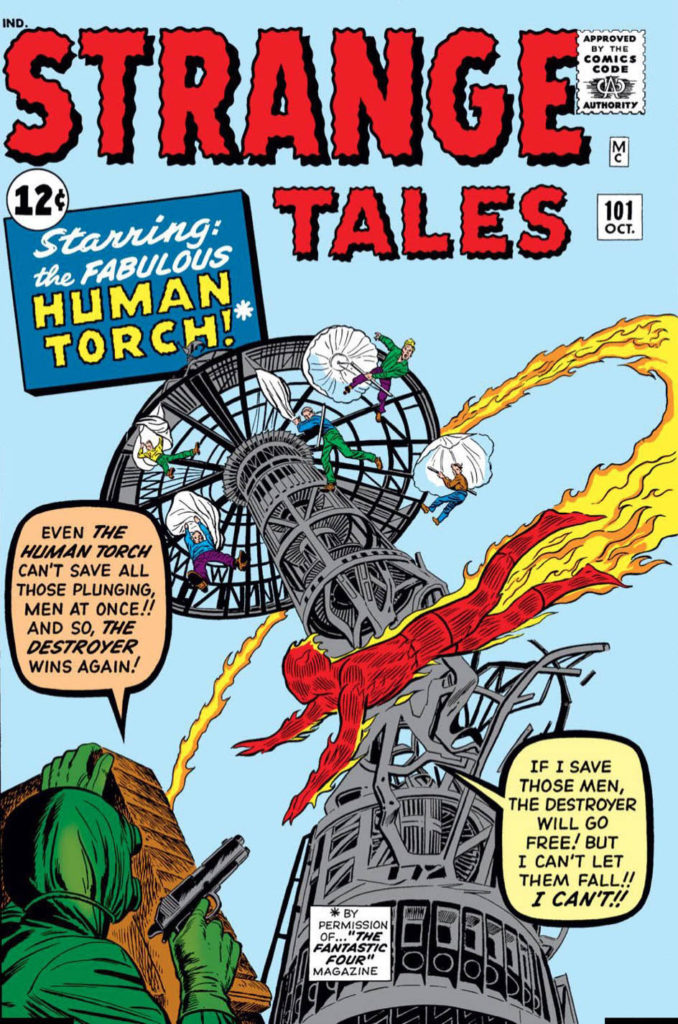
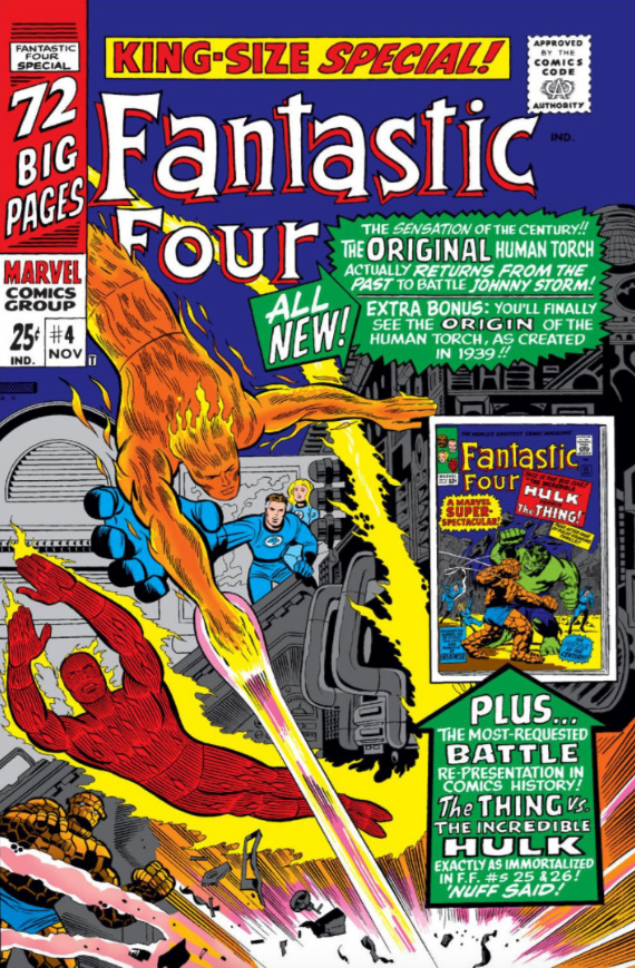
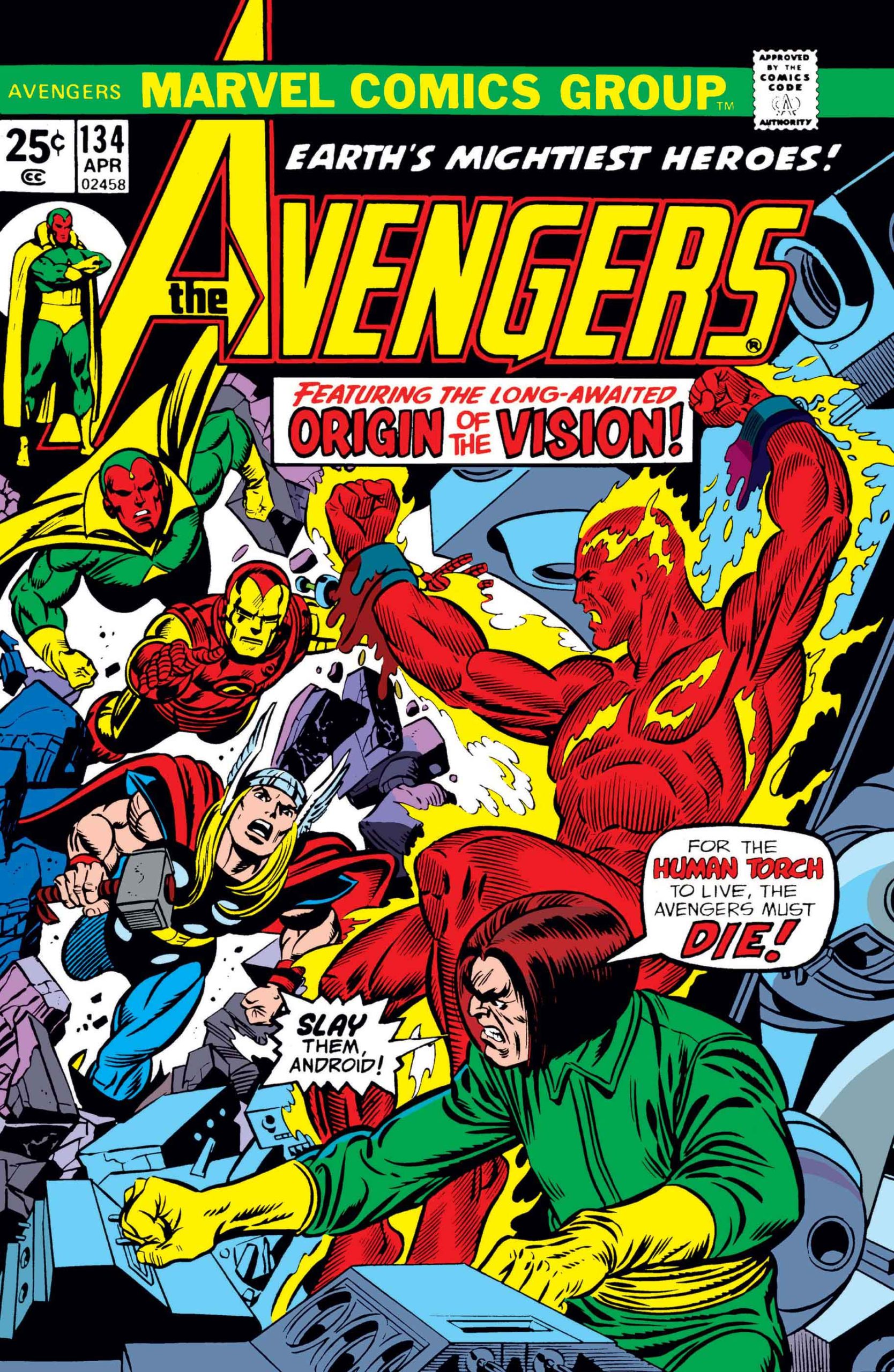
Above: The first appearance of the Silver Age Torch, Johnny Storm, in Fantastic Four #1 (1961) followed shortly thereafter by his first solo outing in Strange Tales #101 (1962) and ultimately followed by a clash with the “original” Torch in FF Annual #4 (1966). The Golden Age Torch returns in Avengers #133- #135 (1975), and revives yet again to join the West Coast Avengers during John Byrne’s run. (Avengers West Coast #50, 1989)
Crazy uncles… are crazy 365 days a year. So why is it on Thanksgiving especially we argue with them over domestic politics, international relations, trade wars, e-mail server locations, or any number of myriad topics bound to interfere with all that good food? (Ok, maybe we actually don’t see them the other 364.)
Here’s my suggestion. Let’s keep politics out of the Thanksgiving holiday, and if you must argue/debate/parry over something, keep it to pressing and nerdy comic book questions, like —
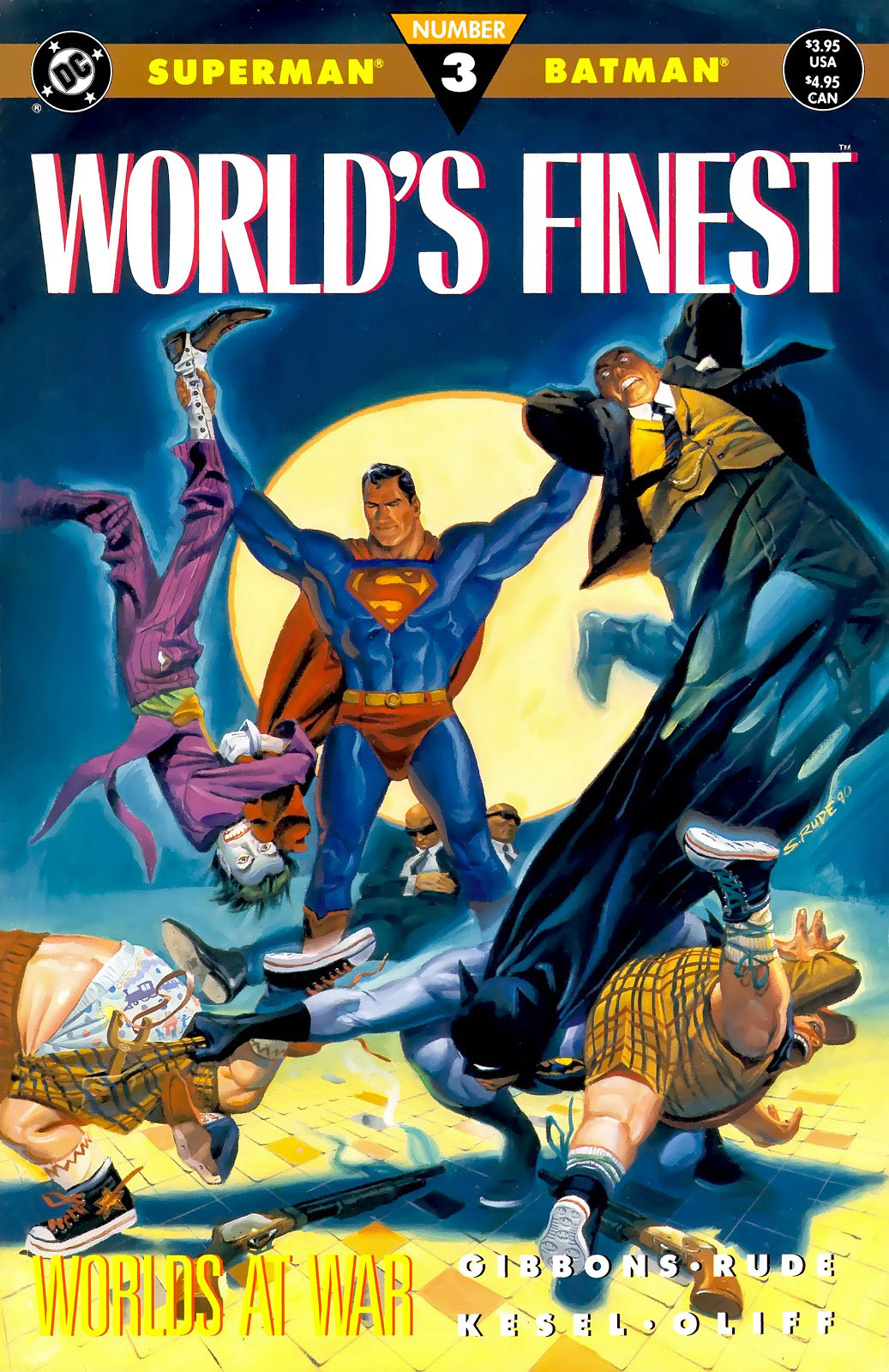
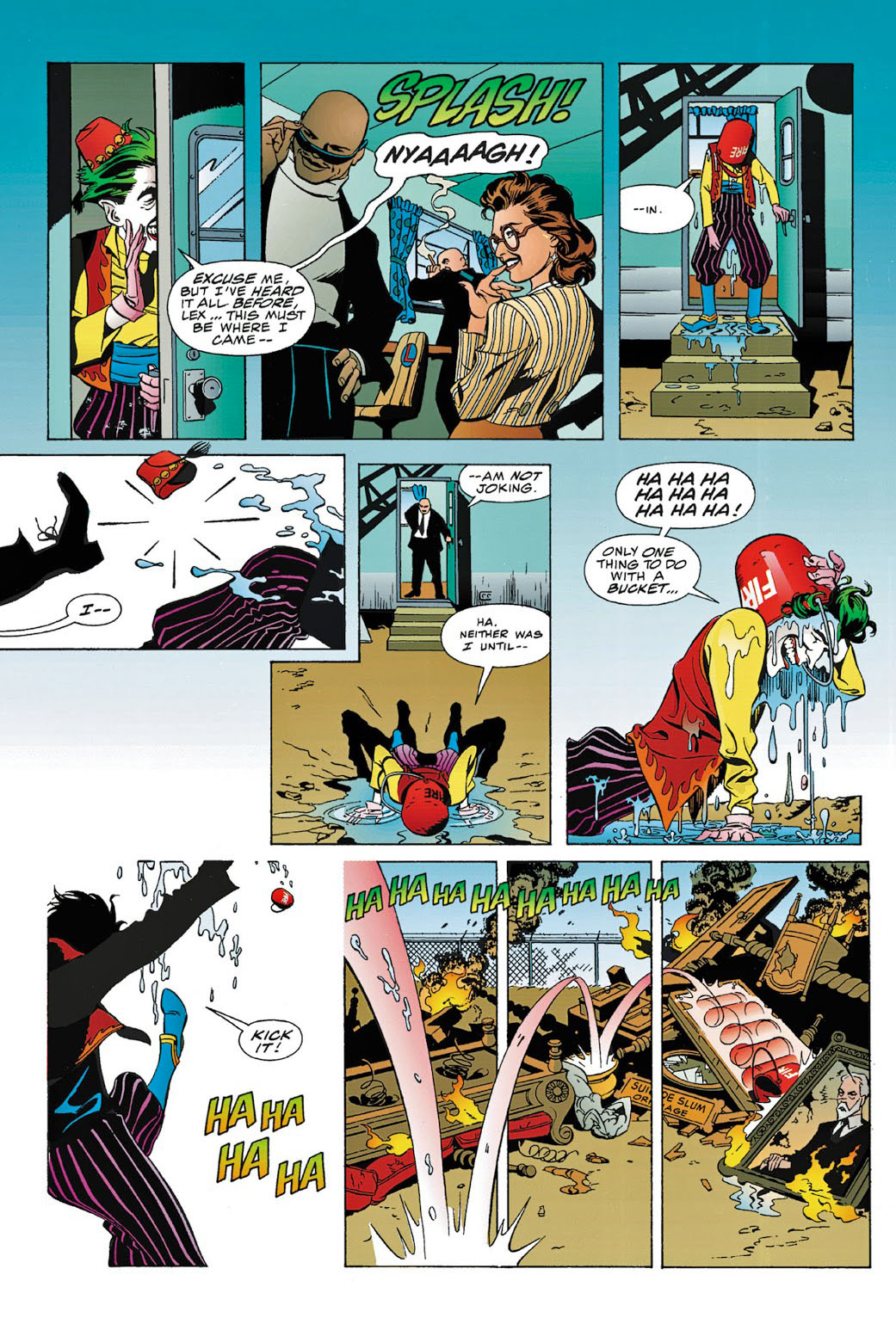
Which super villain is smarter (Luthor), which one is crazier (Joker), which one causes more trouble (tie). Essential topics like that. (And be thankful that while your uncle might be yelling at the TV all day, he’s probably not scheming to take over the city/nation/planet etc.)
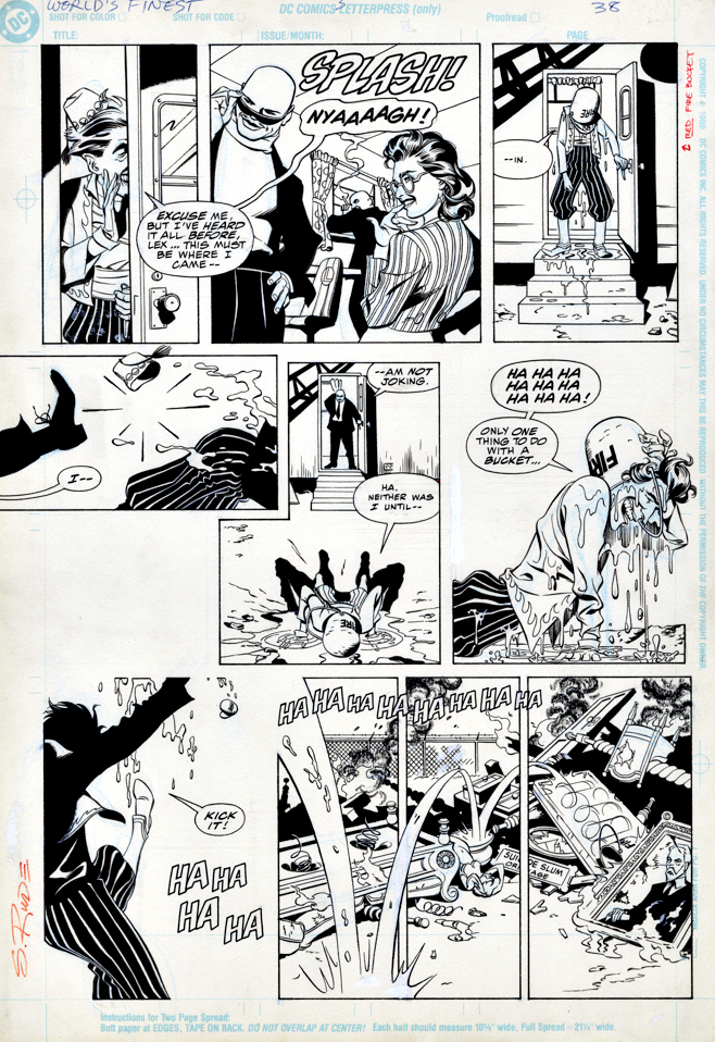
And please, be polite. The only time you should be Rude is when discussing Steve. (No debate here — that was a bad pun.)
Also, if you look around the table and can’t find the crazy uncle, it might actually be you.
Have a Happy Thanksgiving!
Back soon with our continuing celebration of Marvel’s 80thanniversary.
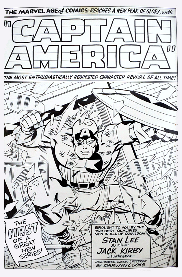
Redo of Tales of Suspense #59, undated (approx. 2008)
The late, great Darwyn Cooke
produced a number of these reinterpretations and homages of classics during his
all too short lifetime.
I asked him about this one
time and he told me he did them to “relax.” Relax? Wow. Think Albert Pujols
walking into the batting cage prior to a game. Bam. Home Run. Bam. Another.
Bam. Another…
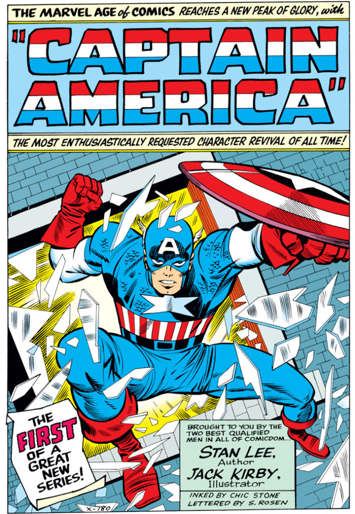
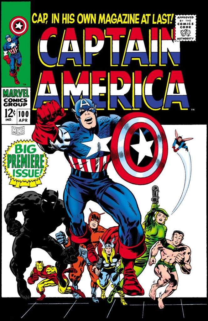
Chic Stone originally inked this milestone splash, one of Jack Kirby’s best known from his Captain America run. Darwyn’s version makes some tweaks — for the better. Most notable are the subtle changes to the face. Cap’s eyes now engage the reader more directly, and overall, his facial expression is clearer and more confident and feels more accurate to Kirby’s vision.
Once upon a time, Darwyn and
Marvel talked about an origins series, sort of the Marvel version of his
amazing New Frontier series at DC. That is definitely a project I’m certain would
have been a classic as well.
For more about Darwyn and the New Frontier, click here.
For more about this classic Captain America tale, click here.
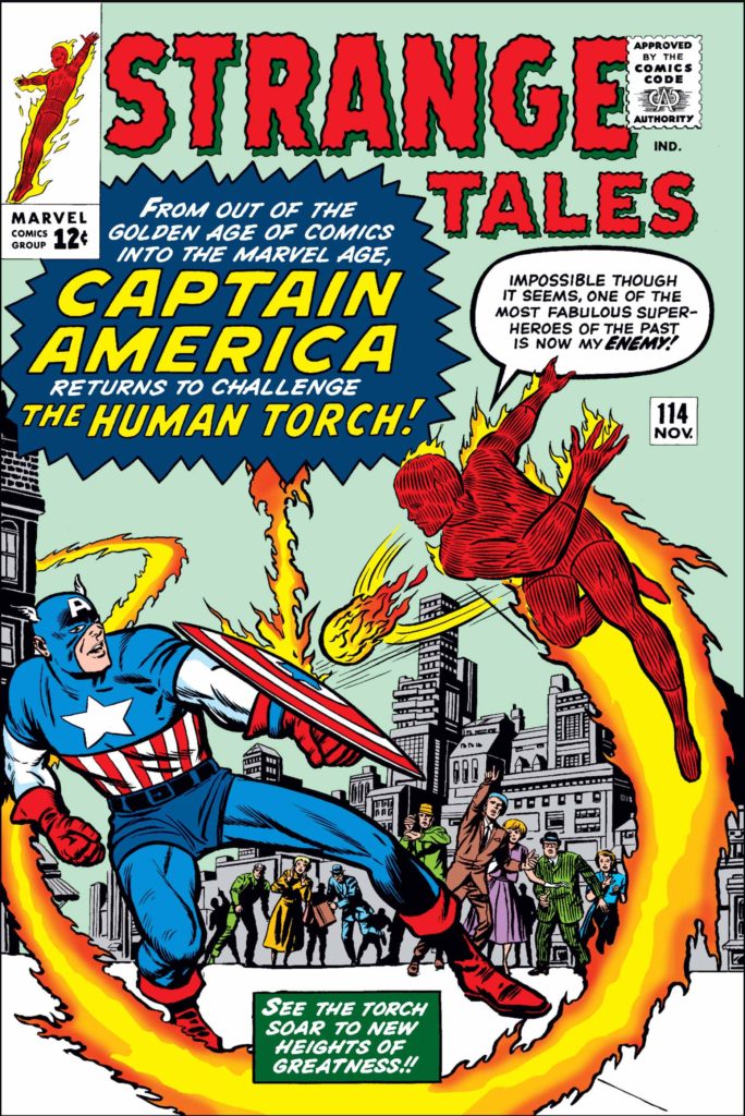
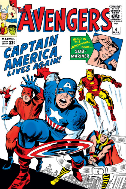
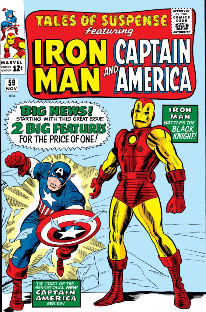
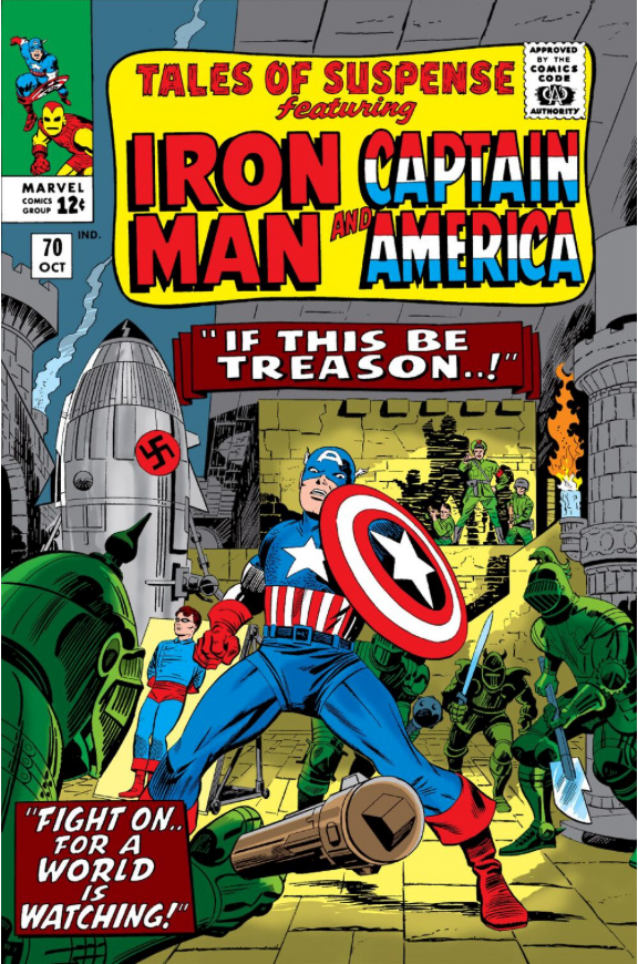
Key appearances of Captain America during the Silver Age revival: Strange Tales 114 — the “first” one — is a cheat. (It’s an imposter, not Cap); The actual first appearance is Avengers #4, quickly followed by his own series in Tales of Suspense. His first solo cover is TOS #70, and he finally breaks into his own series — continuing the numbering from Tales of Suspense — with Captain America #100.Darwyn’s brilliant New Frontier at DC. Now imagine the Marvel version too.
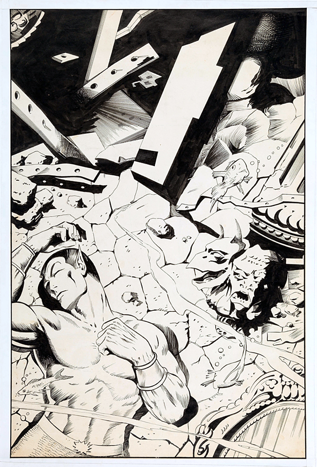
This version of the cover for Tales to Astonish #98 by Dan
Adkins, ultimately unused, did not fit the bill. It conveys the storyline
inside, and it’s pretty in its own right, but definitely not very dynamic.
“Likely too soft for Stan,” agreed Roy Thomas, (yes, him again) who wrote this story arc of Sub-Mariner.
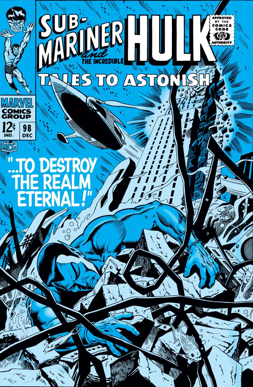
But, let’s talk about the replacement cover, also drawn by Adkins — likely in one heckuva hurry. Sure, more dynamic. Namor, in a better pose, still unconscious. (Or dead — but even as kids we knew he wasn’t.) In this version we also see the attack that’s destroying Atlantis. Except… since when are New York City skyscrapers in Atlantis?
I didn’t notice the architecture til later on, but once you see it, you can’t unsee it. (Even the unused cover has modern steel girders.) Why is Empire State Building underwater? What in the name of Neptune was Dan thinking?
The unused cover has the Marvel production guides masked off by tape, leading me to believe the piece may have ultimately been printed elsewhere. Marvelmania magazine? Witzend? Convention program? Any comic book detectives out there recognize it?
Poor Dan; he had to redraw a Doctor Strange cover (Strange Tales #168) a few months later. (I’ll post it if I can get an image of the original version.) I loved his inks — he was one of the best — but he definitely struggled meeting Marvel’s editorial standards for cover layout and composition.
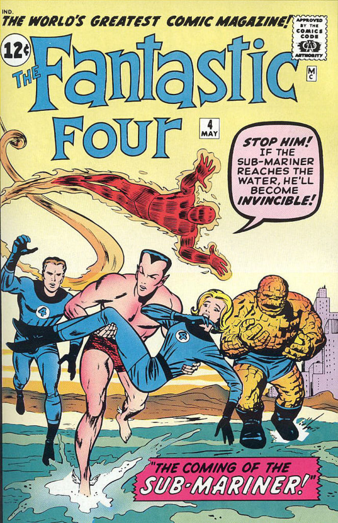
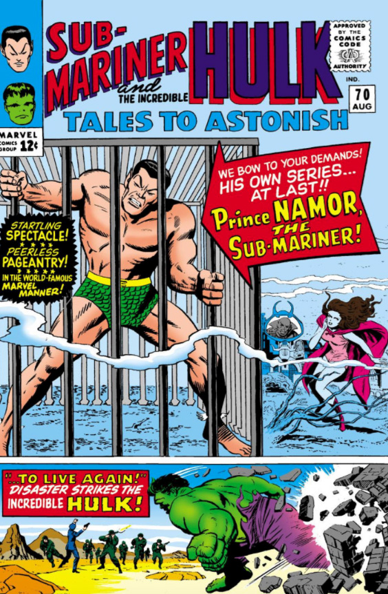
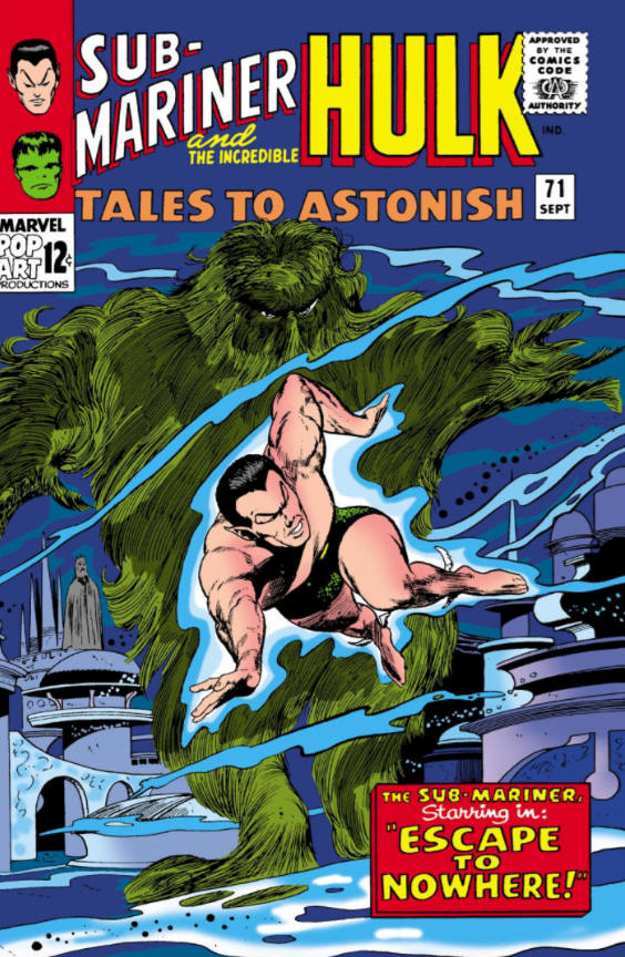
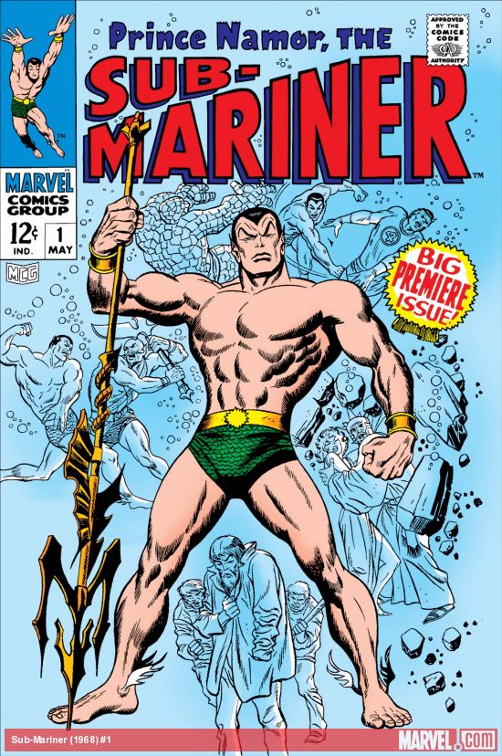
Key appearances by Sub-Mariner in the Silver Age: After a seven-year hiatus in comic book limbo, he first re-emerges in Fantastic Four #4, ultimately becoming a key antagonist for the FF. A few years later in Tales to Astonish #70 he gets his own series, sharing space with the Hulk, and a month later gets his first solo cover. Ultimately, he gets his own series in 1968.
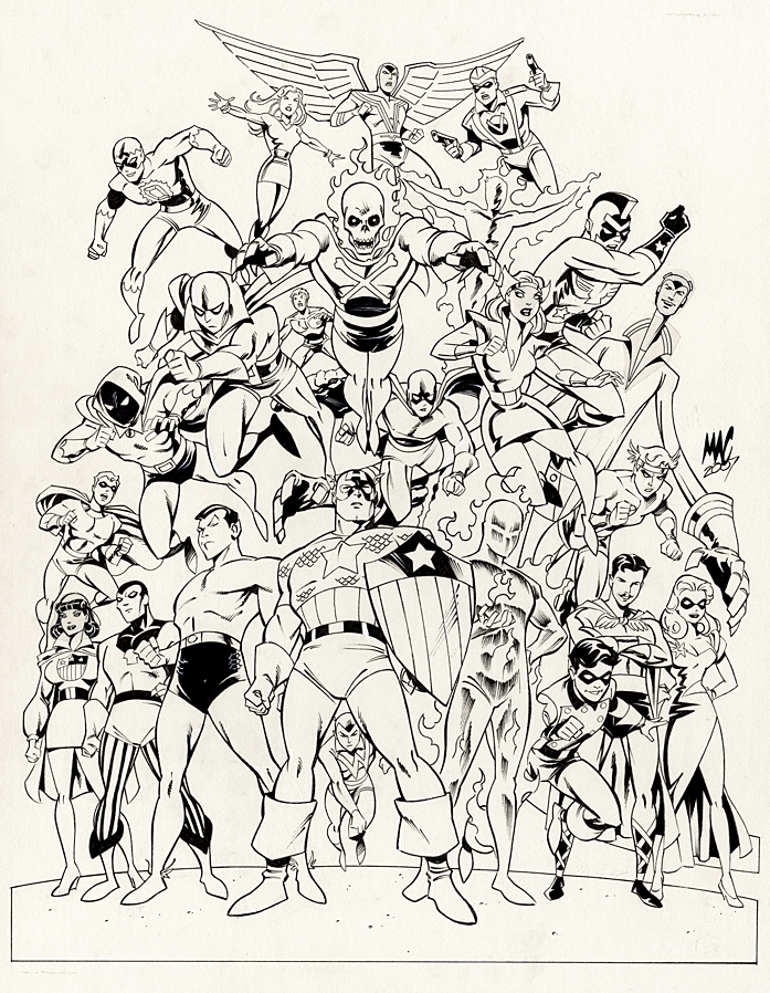
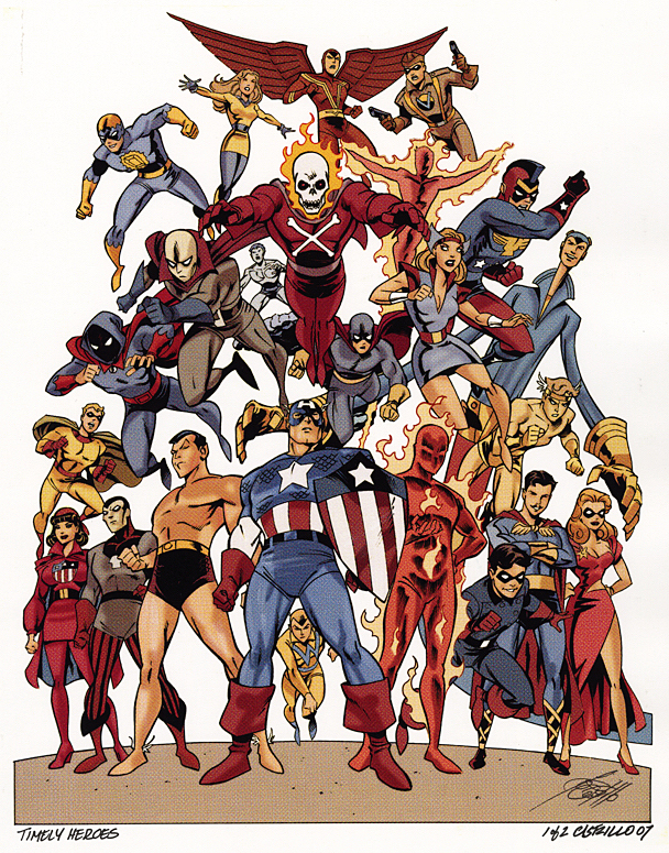
Anthony (“MAC”) Castrillo gathers Marvel’s original heroes from its “Timely Comics Era” (1939-1950) for a group portrait used for a print.
And we present it just in time (ok, barely) for Marvel’s 80thanniversary.
Castrillo’s art-style for the piece works well ; A bit cartoony in the contemporary sense, adding some pizazz and just a touch of whimsy to some of the otherwise stoic heroes.
I didn’t immediately recognize every character — even in color — and Roy Thomas was kind enough to help me sort through it when I acquired the original. With the exception of one mystery character who might be one of the “Marvel Boys”, the full cast list is presented below.
(“Rows” are a bit subjective because of the group composition.)
From top to bottom:
Row 1: Sun Girl, Red Raven, Citizen V
Row 2: Blue Diamond, Blazing Skull, Toro
Row 3: Marvel Boy (?), Challenger (AKA Thunderer), Vision (Original), Jack Frost, Black Marvel, Namora, Patriot, Thin Man, Mercury (AKA Hurricane)
Row 4: Miss America, Destroyer, Namor, Captain America, Whizzer, Human Torch, Bucky, Angel, Blonde Phantom
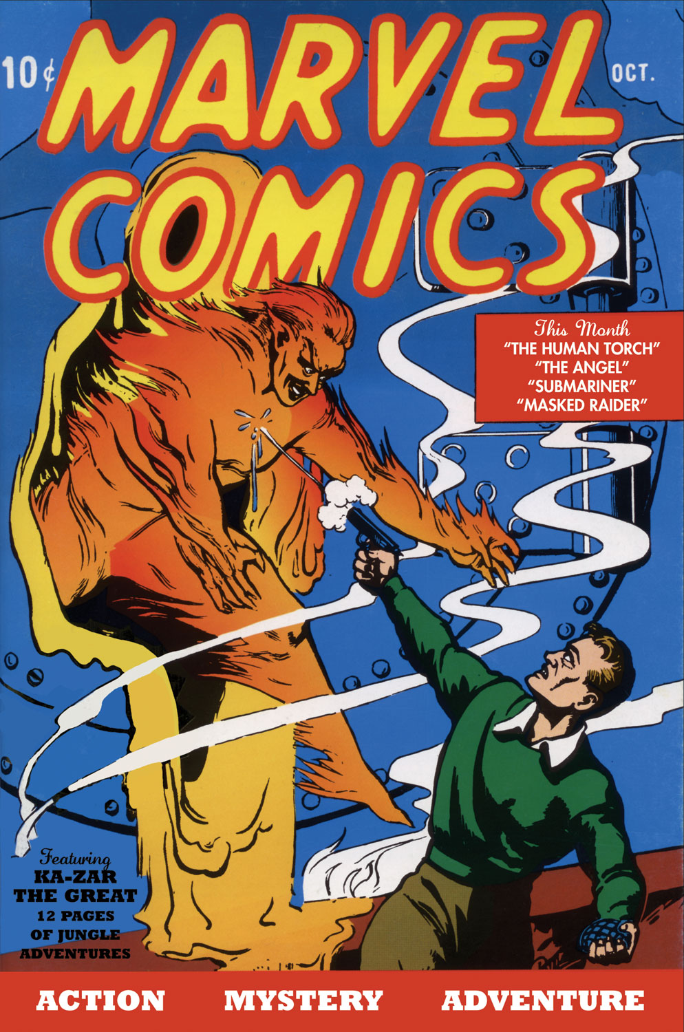
Marvel Comics #1 launches the Marvel Golden Age with introductions of the Human Torch and Sub-Mariner. My friends and I first encountered the “original” Torch in reprints 25 years later.
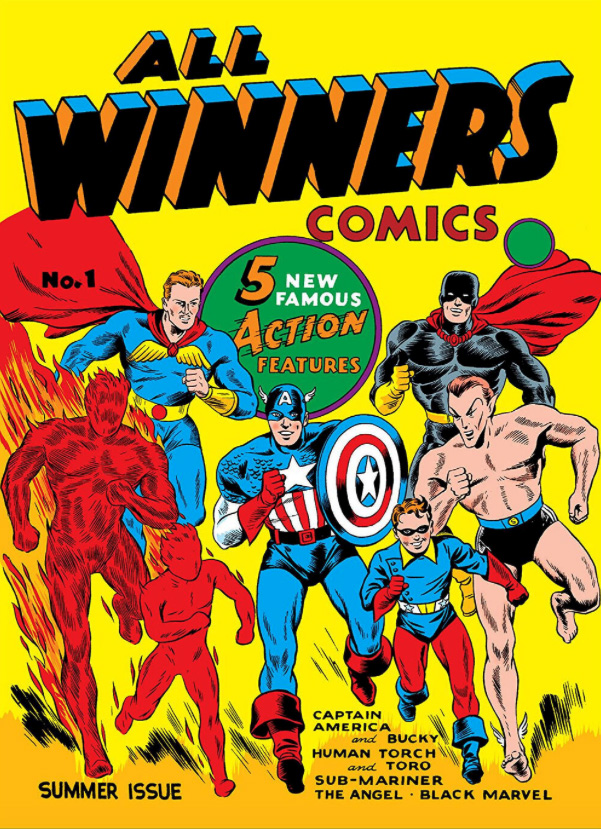
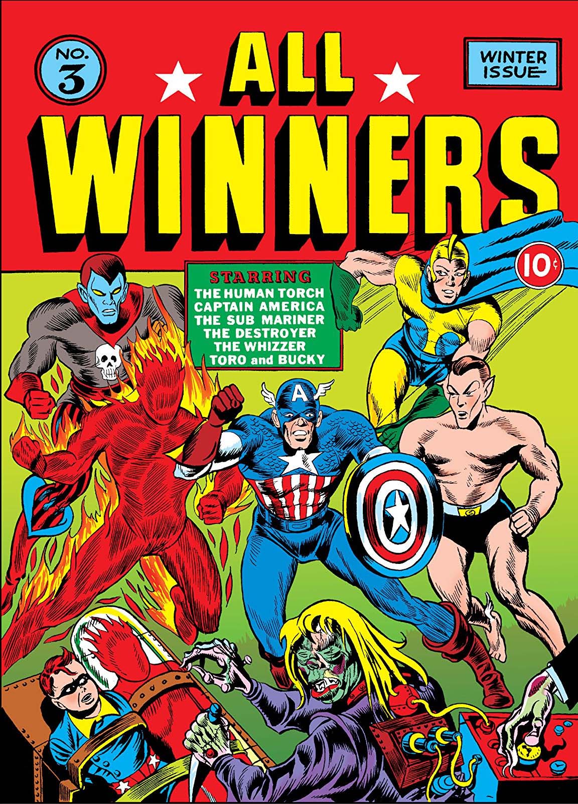
Marvel published additional solo stories of its most popular characters in the aptly-titled All Winners Comics.
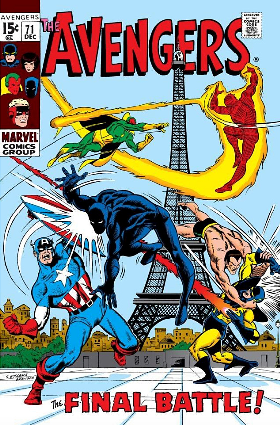
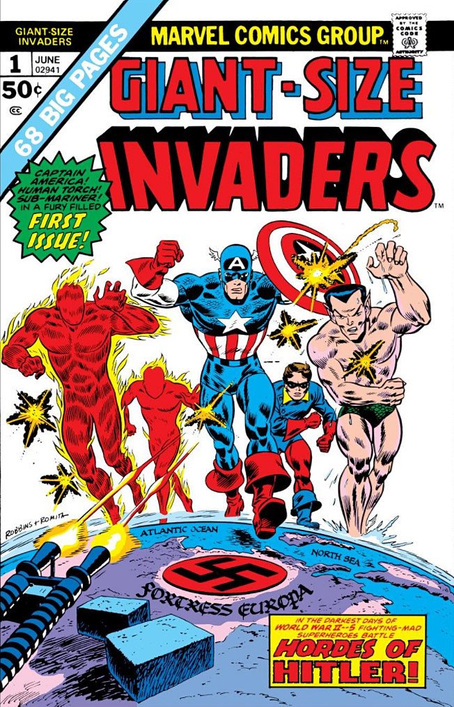
Finally, in All Winners #19, Marvel’s most popular characters appeared in one story together. Rebranded the “Invaders” in the Silver and Bronze ages, the team continues exist in one form or another today. One of many “Marvel Boys.” Click on the pic for more info.