Jeffrey Brown — Dad Jokes For Star Wars Fans
Star Wars: Vader’s Little Princess, 2013
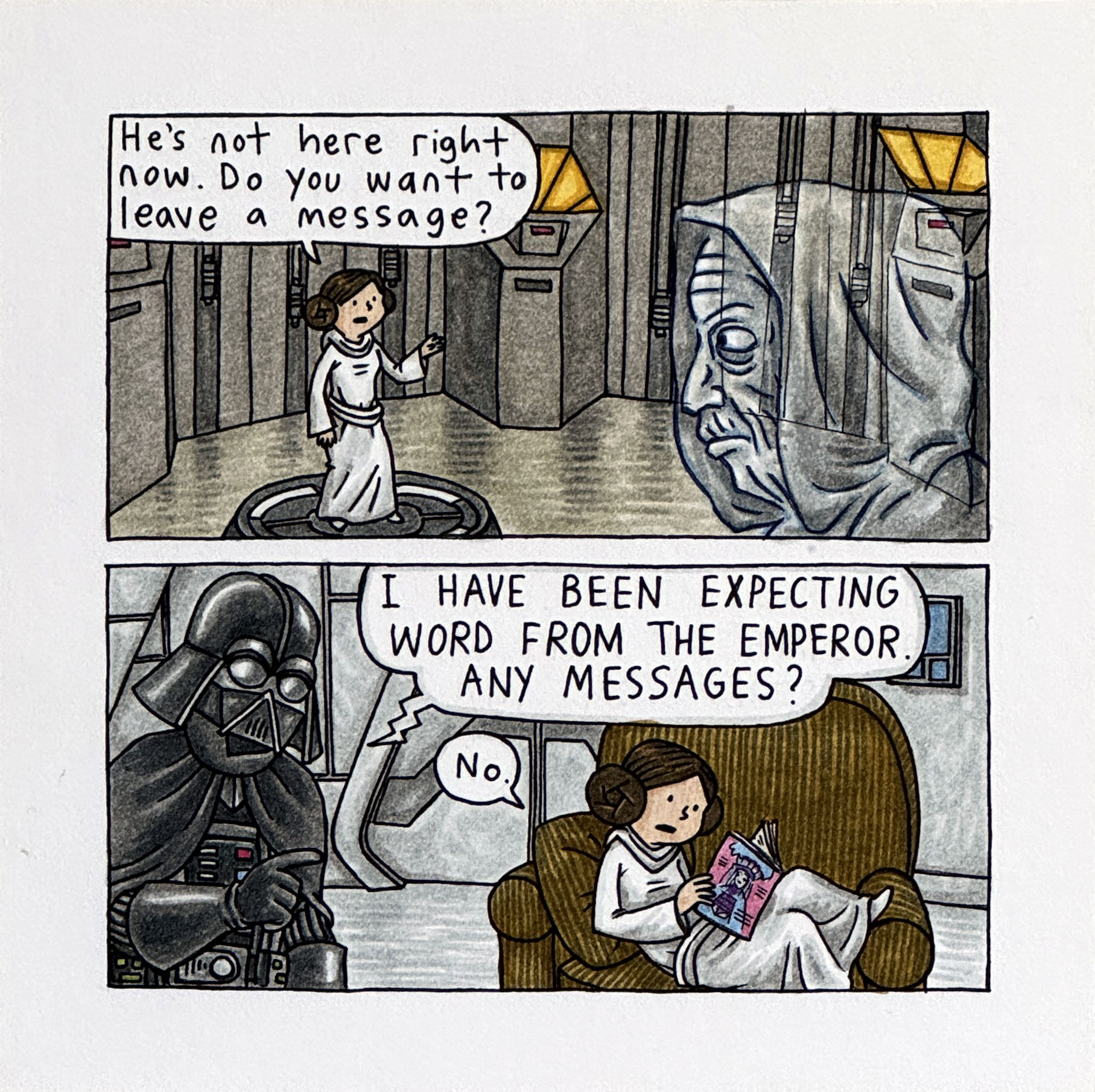
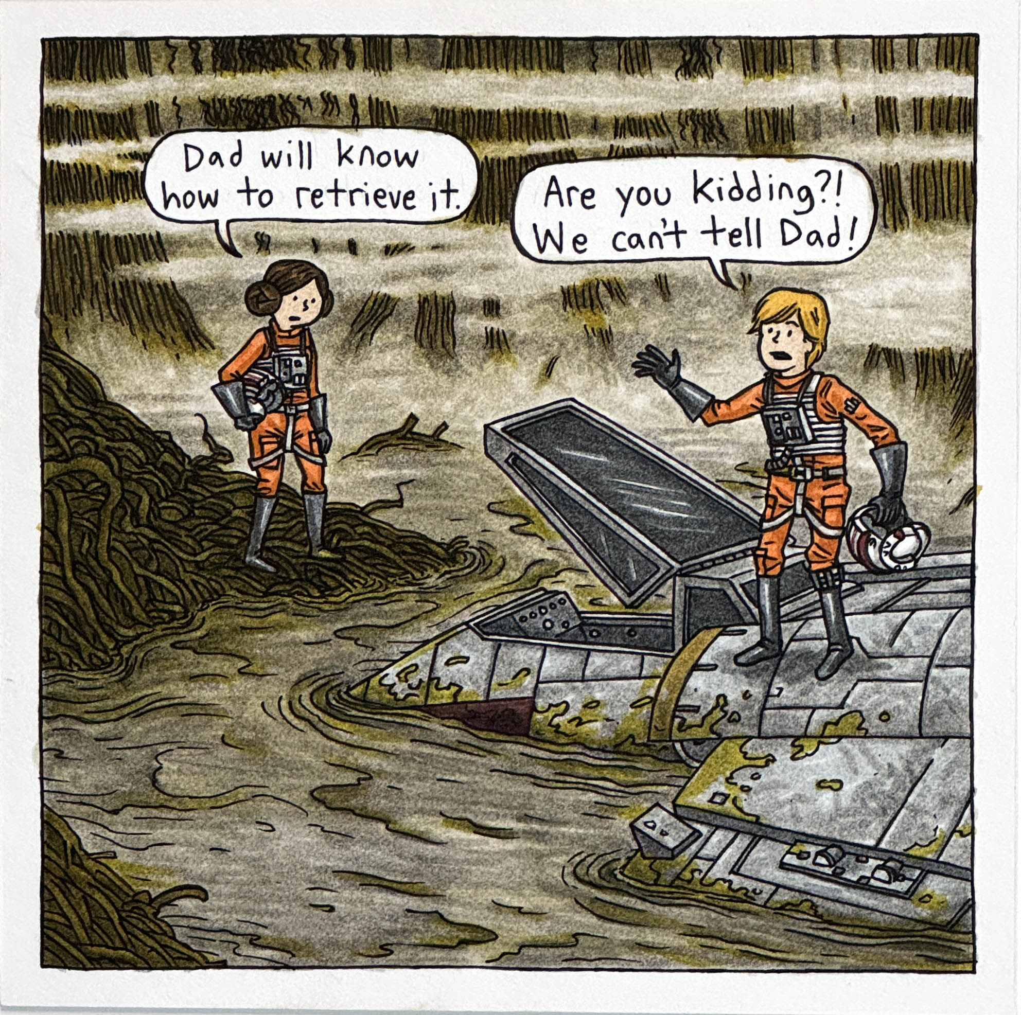
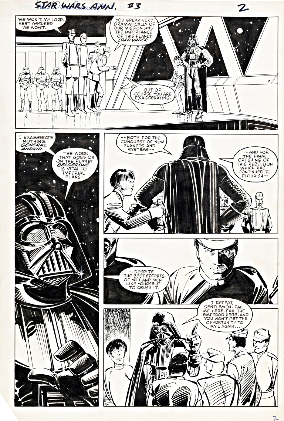
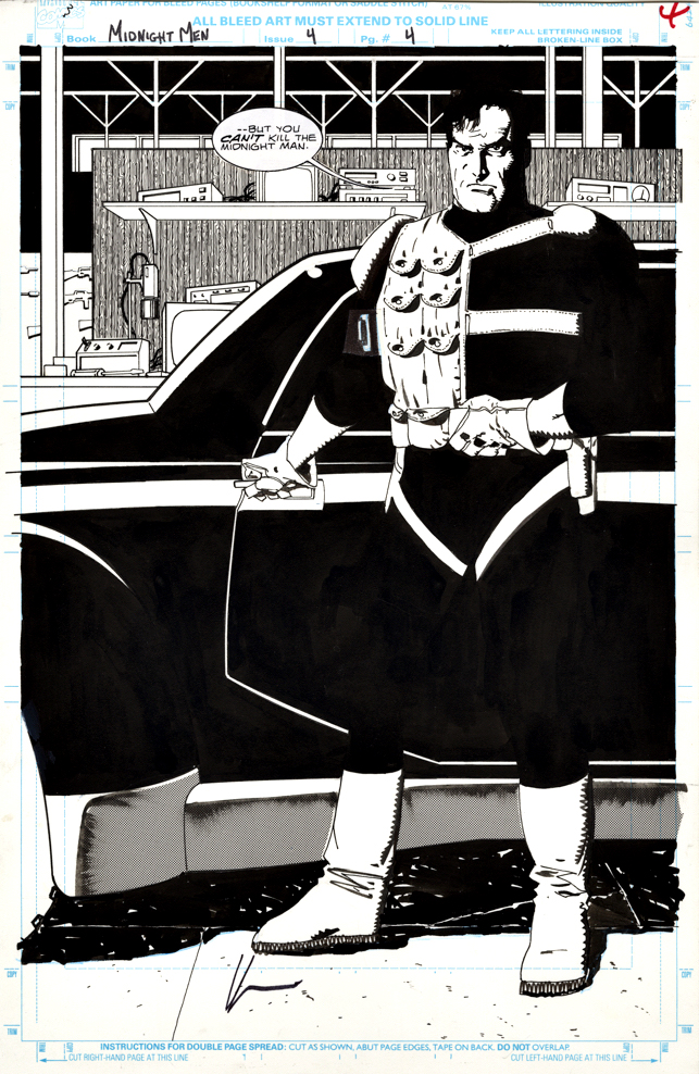
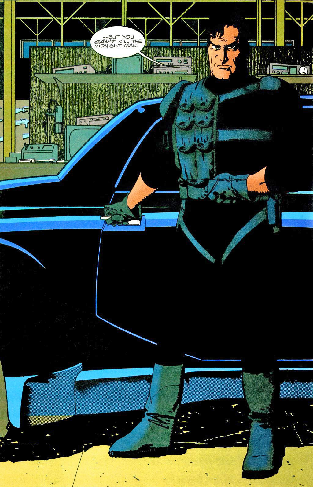
Here are two wonderful cartoons from Jeffrey Brown’s delightful Star Wars “kid’s” books. Kids is in quote marks, because honestly the jokes play even better with adults, especially those that have seen the films multiple times.
I acquired two of the originals, because, well, I have two kids, and they may want souvenirs from my art collection. (Adults now actually, but still my “kids.” Oops, more quote marks.)
Not to mention that they are beautifully done, and I would probably acquire more if they weren’t so pricey.
Come to think of it that might apply to the kids, as well as the art.
Don’t them I said that.
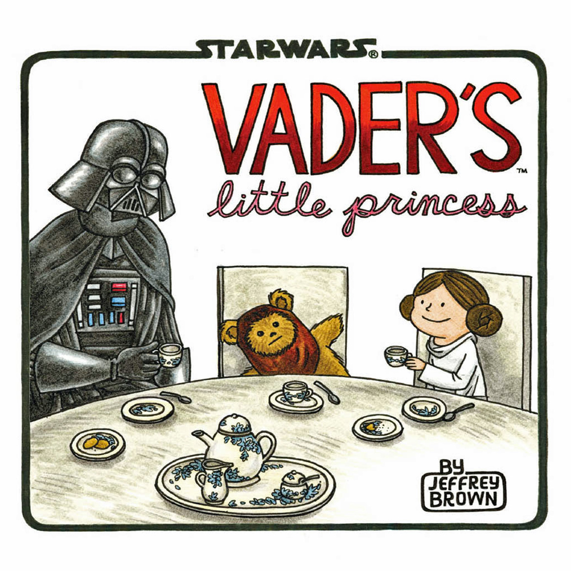
From the Publisher:
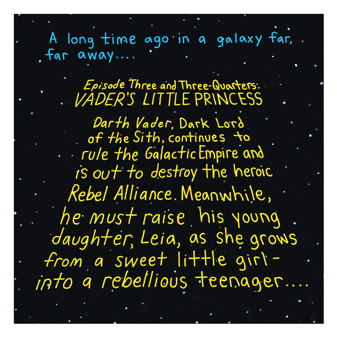
“Darth Vader is learning that being a Sith lord and dedicated father to Princess Leia isn’t quite so easy…
In this irresistibly funny follow-up to the breakout bestseller Darth Vader and Son, Vader—Sith Lord and leader of the Galactic Empire—now faces the trials, joys, and mood swings of raising his daughter Leia as she grows from a sweet little girl into a rebellious teenager. Smart and funny illustrations by artist Jeffrey Brown give classic Star Wars moments a twist by bringing these iconic family relations together under one roof. From tea parties to teaching Leia how to fly a TIE fighter, regulating the time she spends talking with friends via R2-D2’s hologram, and making sure Leia doesn’t leave the house wearing only a skirted metal bikini, Vader’s parenting skills are put hilariously to the test.”