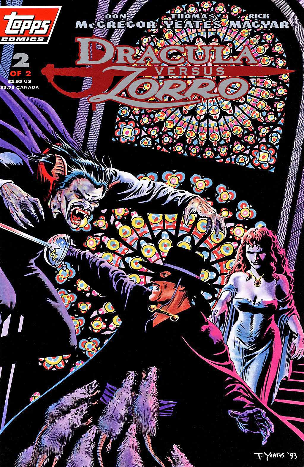
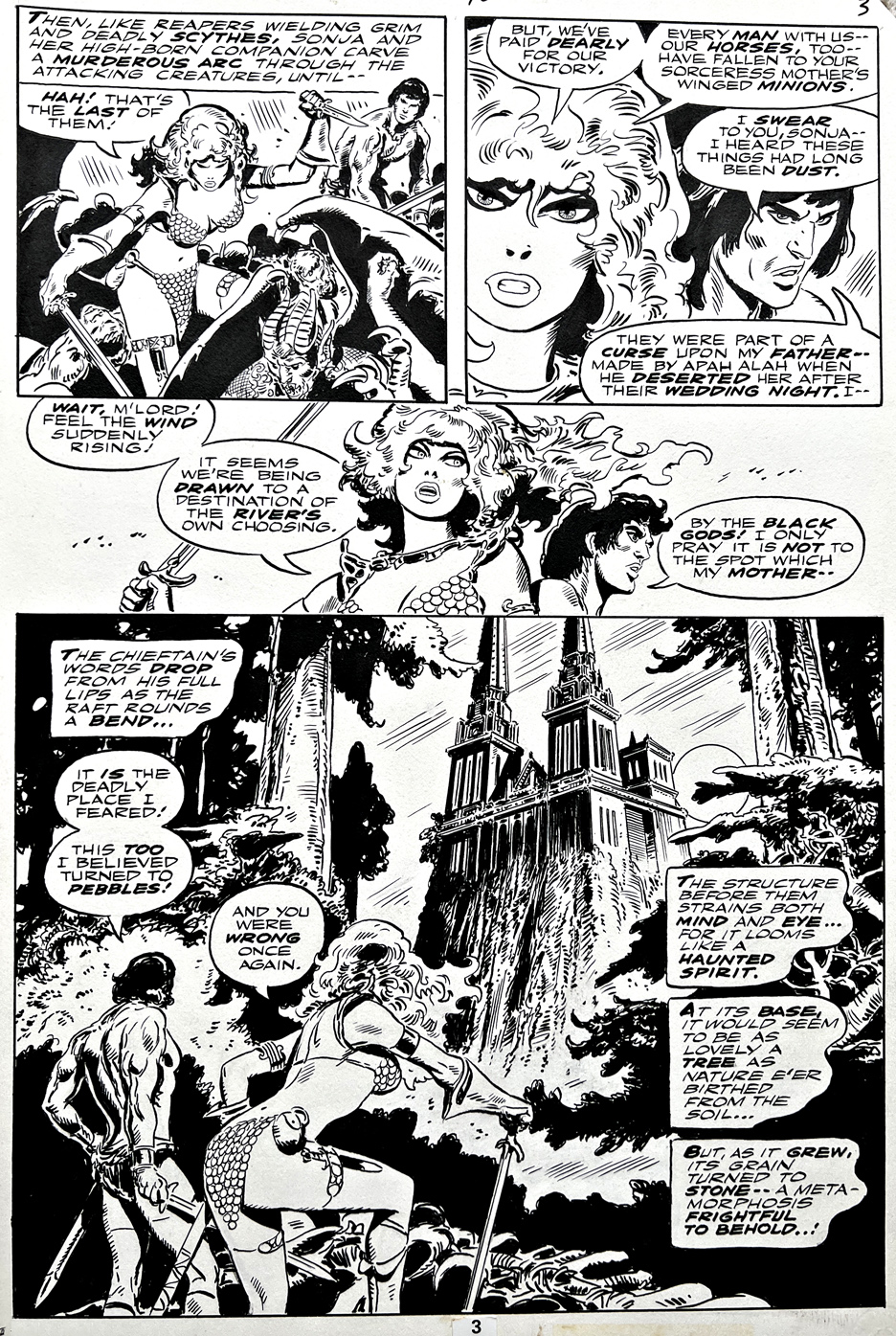
Tom Yeates — Dracula vs. Zorro?
Dracula Versus Zorro #2, November 1993
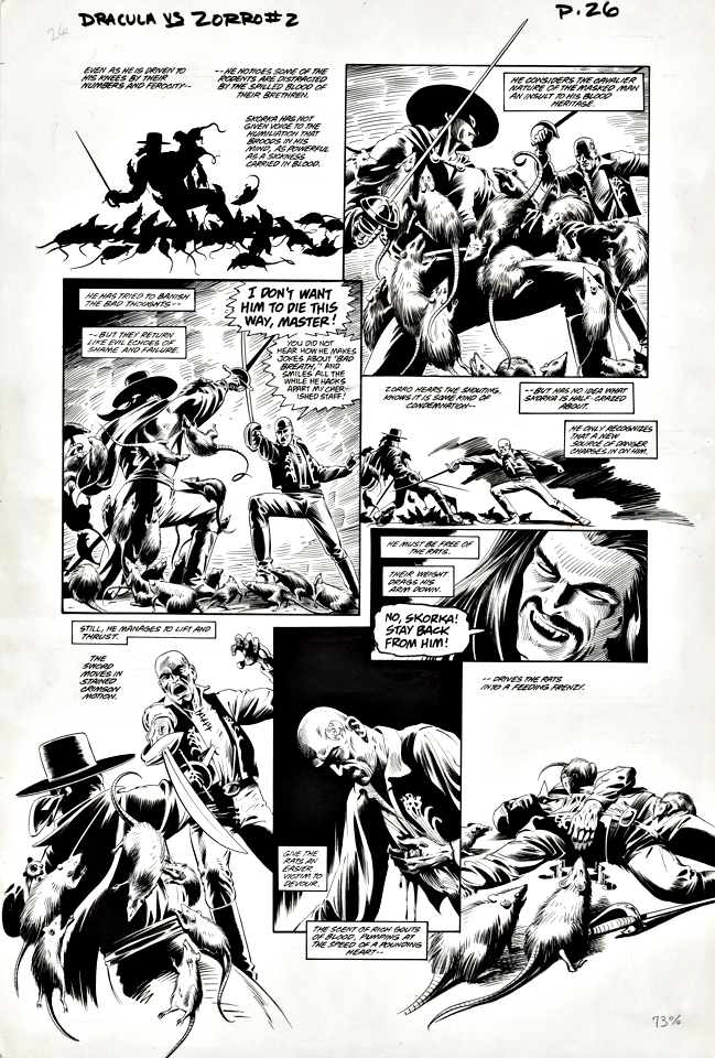
Dracula vs. Zorro.? For about a millisecond, this one sounds a bit odd, and then you say, wait a minute…
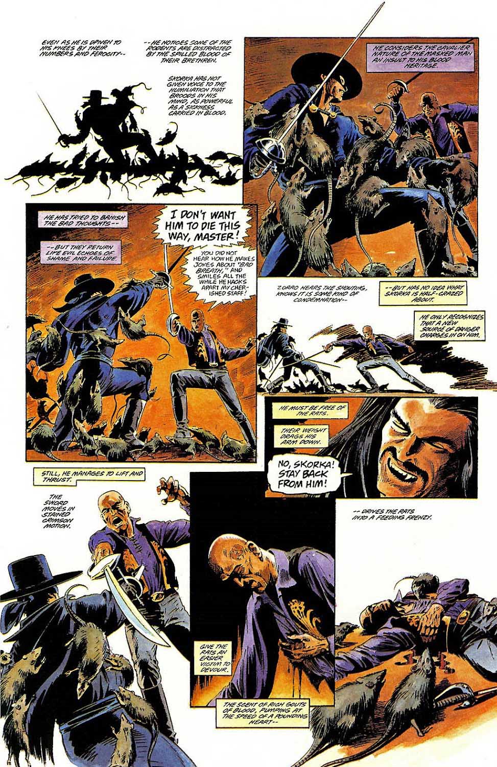
In the hands of writer Don McGregor and artist Tom Yeates (inks by Rick Magyar), you get a fun Topps Publishing two-parter, with Don’s smart writing and Tom’s magnificent storytelling — on giant art boards, no less.
A few notes:
• ˜The book came out just shy of 30 years ago.
• Dracula (The Francis Ford Coppola adaption kind) was Topps very first comic book; Dracula vs Zorro appears just before the launch of Topps’ Zorro solo series, also featuring stories by McGregor. (The crossover wasn’t originally planned as the character’s introduction— it just sort of happened, following the smash success of the Drac adaptation…)
• It’s only two monthly issues but features a whopping 61 pages of content — which leads me to believe we may have originally intended the story to total three issues. Perhaps we scaled back after the numbers came in for issue #1. Although we collected it in a prestige format comic in 1994, there are definitely not enough pages for a full trade collection. That was an era when we didn’t always plan for collections.