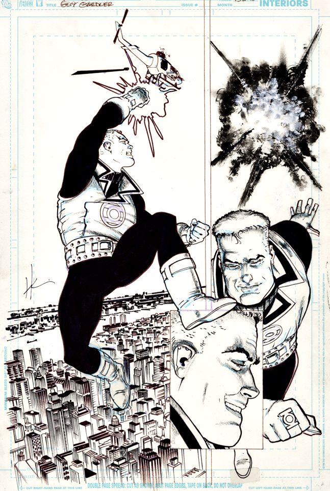
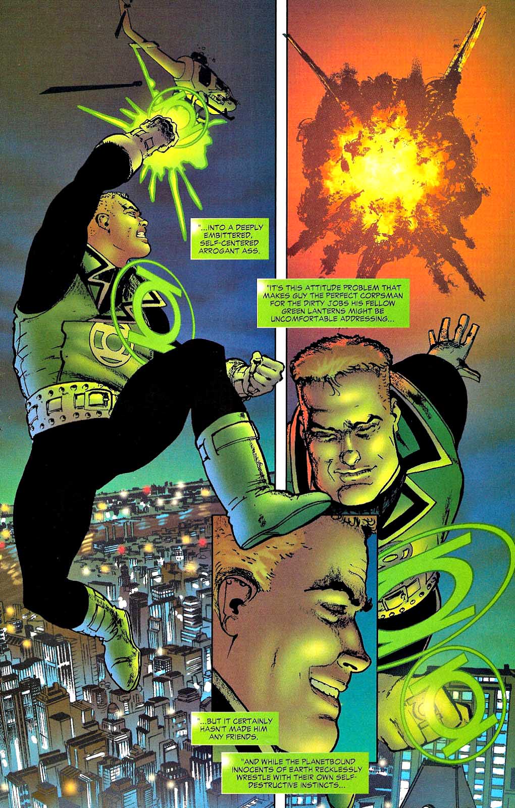
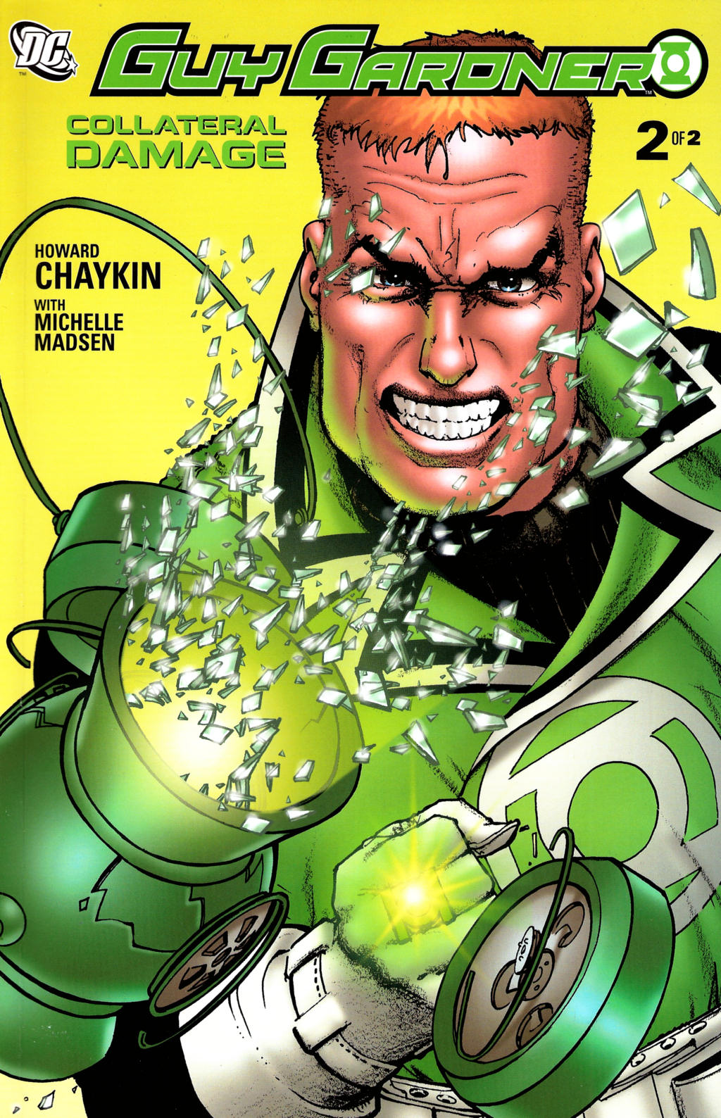
Here’s the loveliest page from Howard Chaykin’s very entertaining Guy Gardner Green Lantern series from DC’s “prestige” format. (Less issues, but longer stories, nicely presented in a deluxe package.)
Lovely is somewhat ironic in context here — Guy just killed a bunch of bad guys, but he does seem to be enjoying it, and the storytelling and illustration are indeed… lovely.
So let’s stick with it.
Welcome to Day Seven of the 12 DC Days of DeCember.
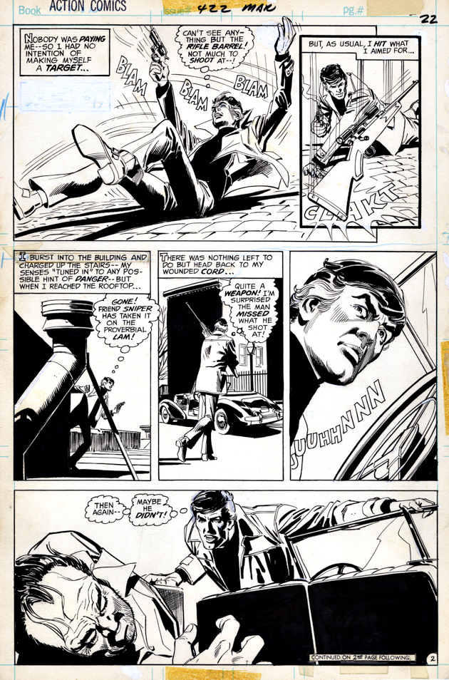
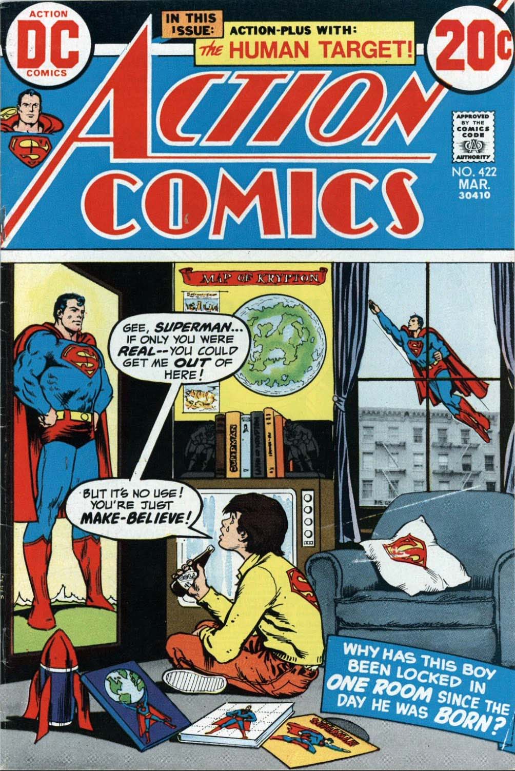
Action Comics #422, March 1973(Human Target back-up feature)
Here’s a terrific Dick Giordano action page from the origin story of the Human Target, published shortly after the character’s introduction in a back-up feature in Action Comics 50 years ago.
And although uncredited, I’m pretty sure I see some light ghosting from Dick’s pal, Neal Adams, in a few places along the way.
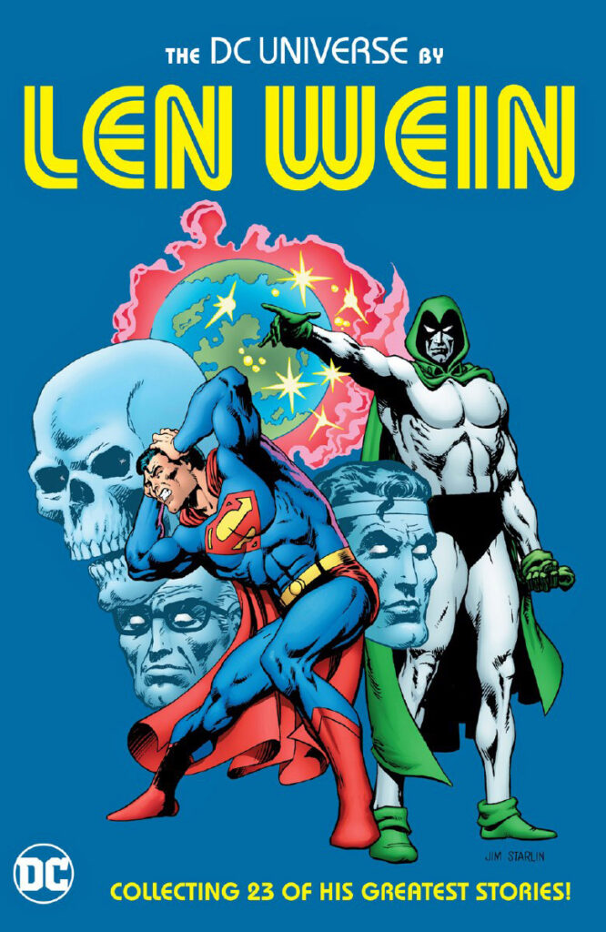
Regardless, it is yet another example of a DC Bronze-age series that remained uncollected for decades. After three (!) TV iterations of the character, you would think our friend Christopher Chance deserved a TPB. But, finally in 2019, the complete early stories appeared in a best of Len Wein collection. (Len wrote all the original stories.)
Welcome to Day Six of the 12 DC Days of DeCember.
In case you were curious about copies printed and copies sold back in the day…The early Human Target stories are finally assembledin this 2019 collection, although you wouldn’t know from the (great ) Jim Starlin cover.
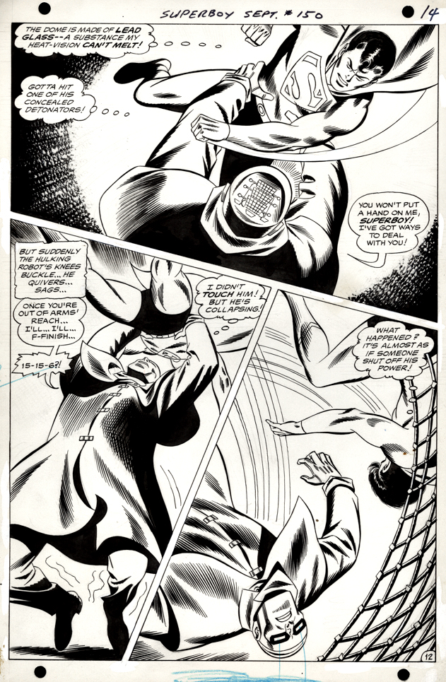
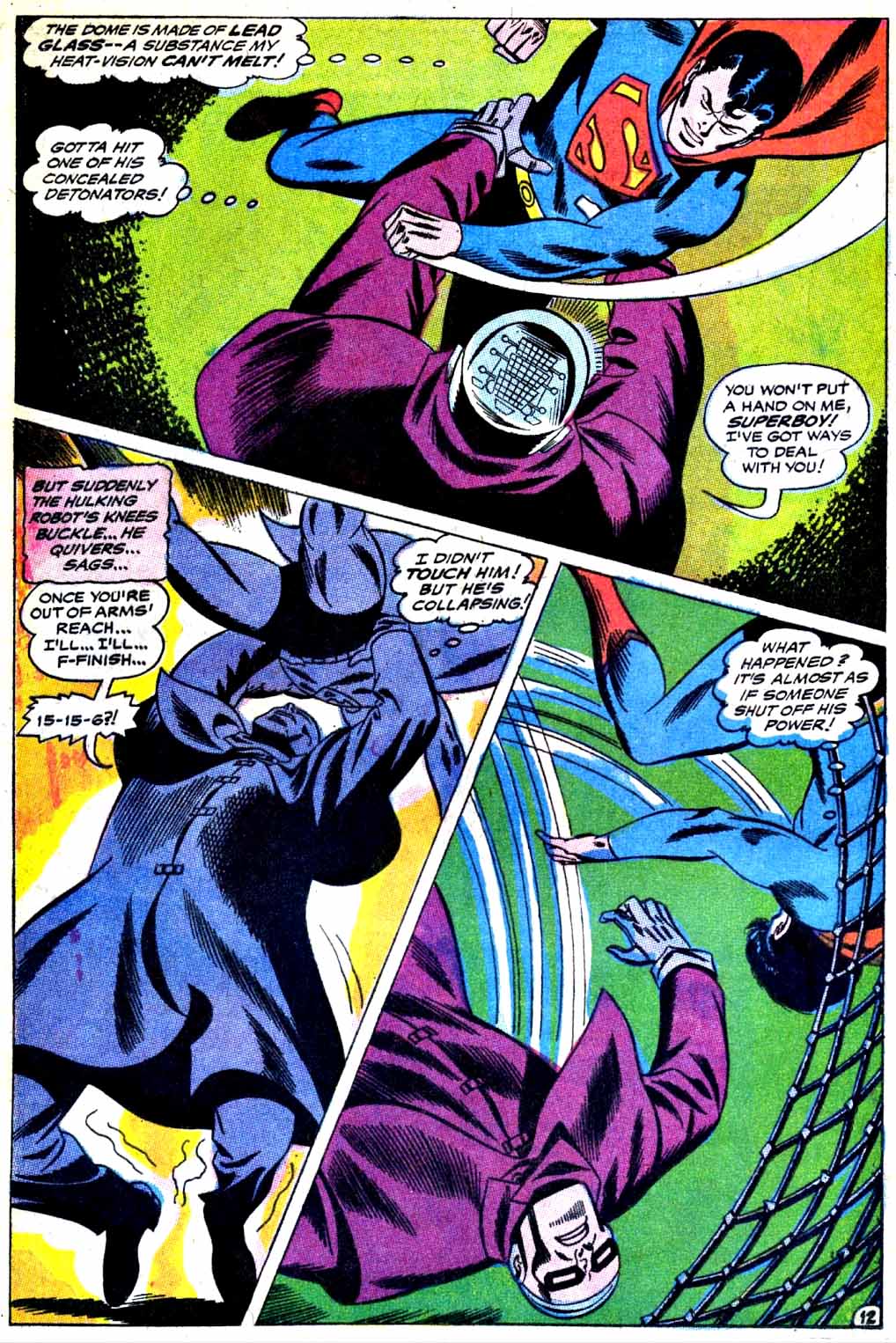
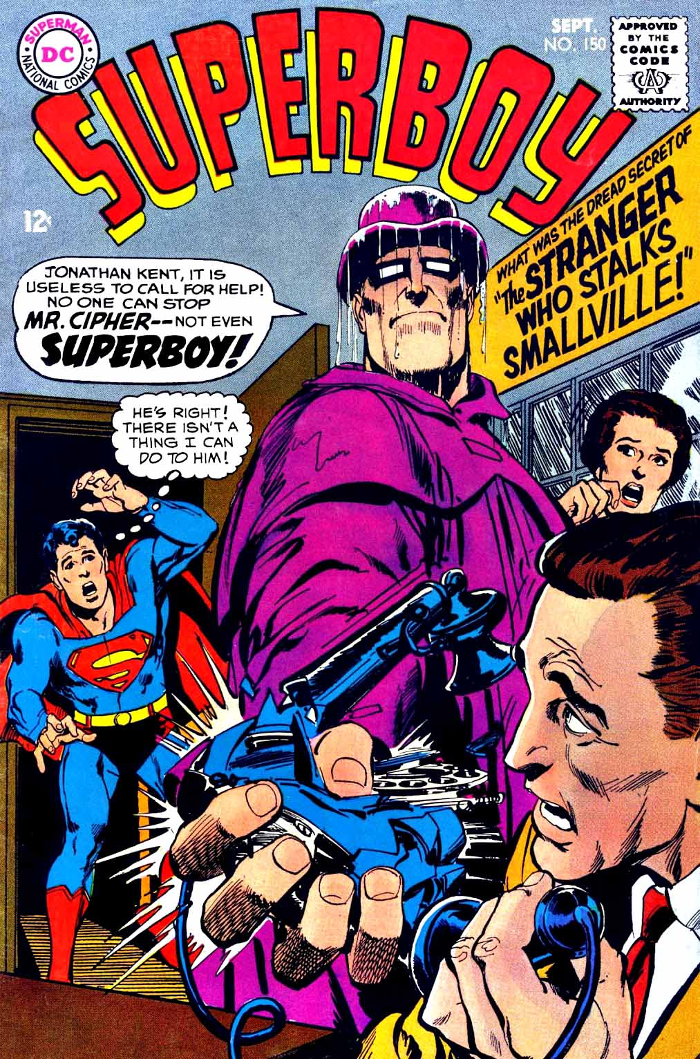
Neal Adams covers were much more thrilling that than Bob Brown’s interiors on Superboy. Those Adams covers drew me in — pun intended — nearly every single time.
Of course, that could be said about pretty much any Adams DC cover vs. interior artist at the time — but we digress.
Still, Brown was a better storyteller than fans give him credit for, and his action pages, like this one, almost always delivered a fair level of drama and interest.
And despite the fact that the villain, “Mr. Cipher” didn’t quite deliver the terrifying promise of the cover’s drama in the interior, it’s yet another example of an issue I remember 50-plus years later, so it’s fun to own a page from it.
Welcome to Day five of the 12 DC Days of DeCember.
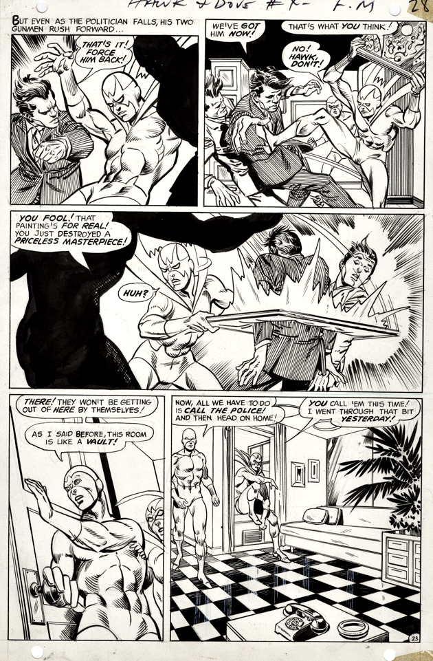
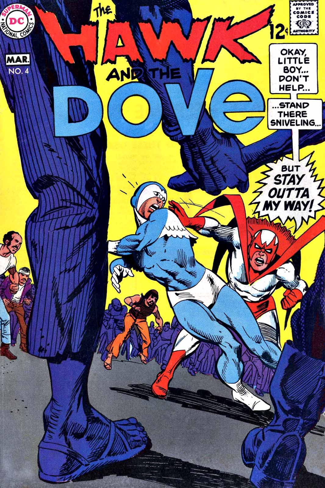
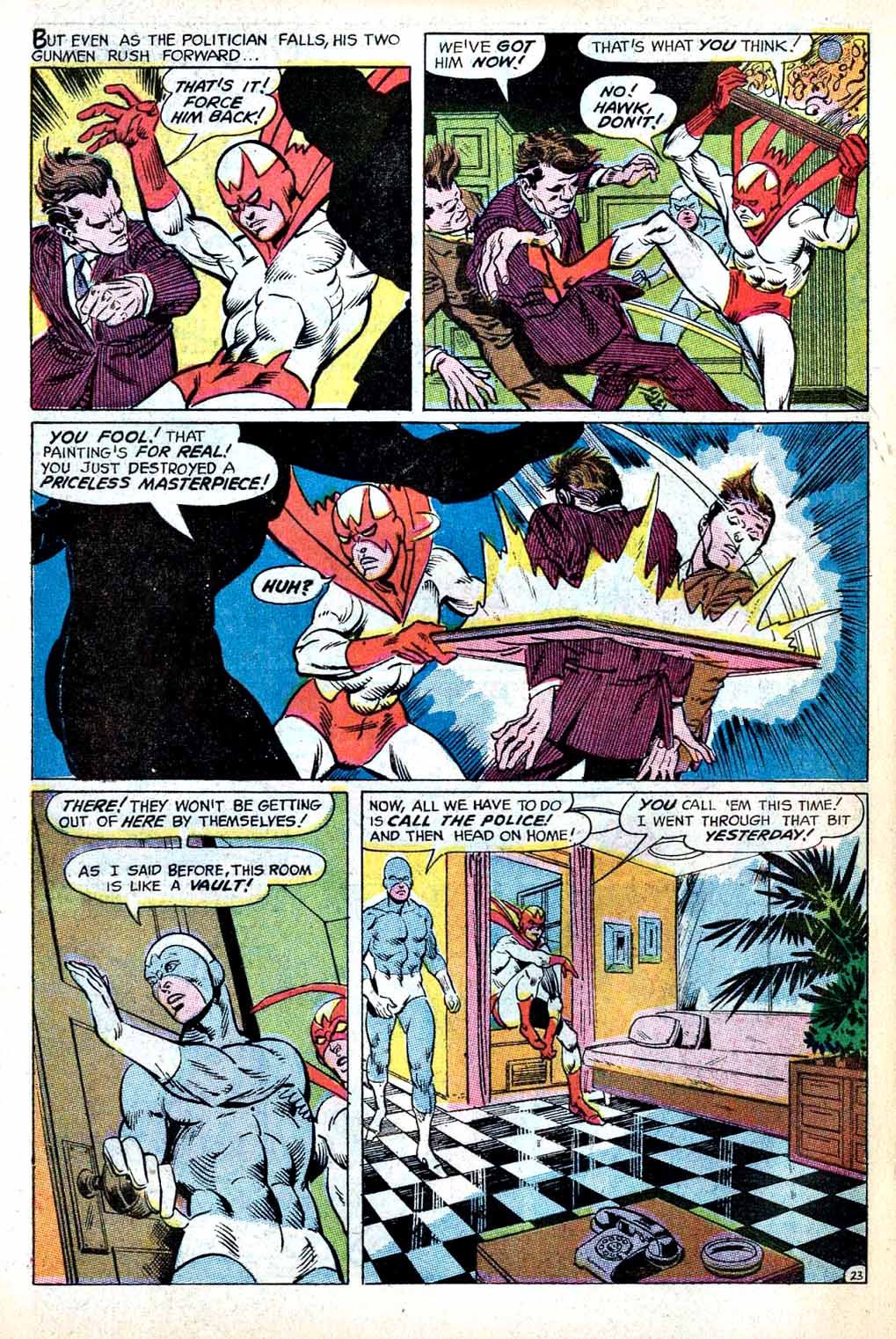
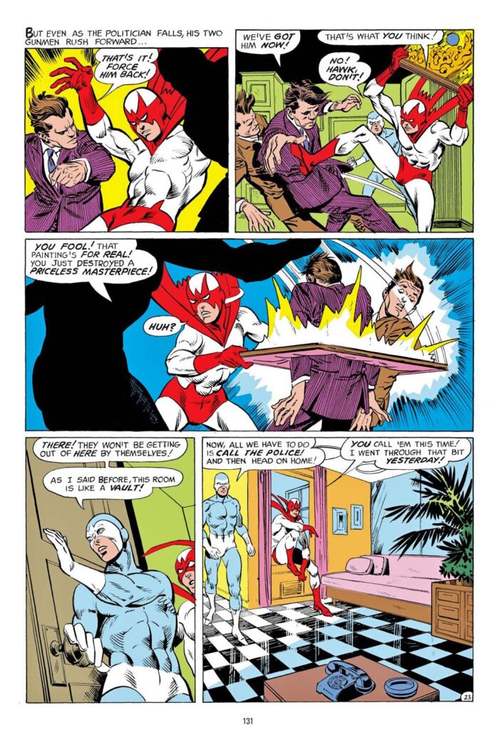
Gil Kane serves up a fun action page from the original short-lived series of the unusual superhero team, Hawk and Dove. (Created by Steve Skeates and Steve Ditko.)
(Come to think of it, all of the Hawk and Dove series have been short-lived.)
I’m not typically a fan of Sal Trapani’s inks on Gil’s pencils, but credit where credit is due: Sal creates an amazing illusion of shine on that tile floor on the original. I’m not sure I’ve seen anything quite like it.
Separately, on a slightly more critical note, apparently it’s no big deal that Hawk might have destroyed an original masterpiece based on the next few panels… WTH?
Welcome to Day three of the 12 DC Days of DeCember.
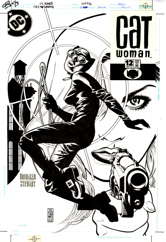
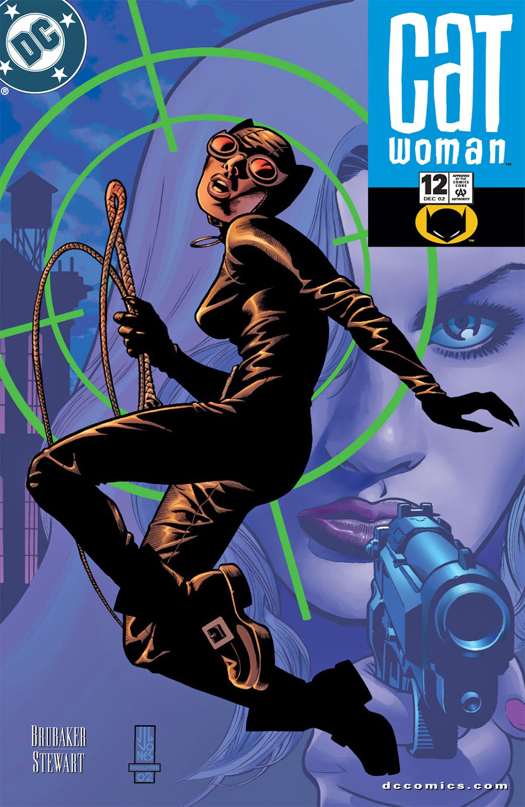
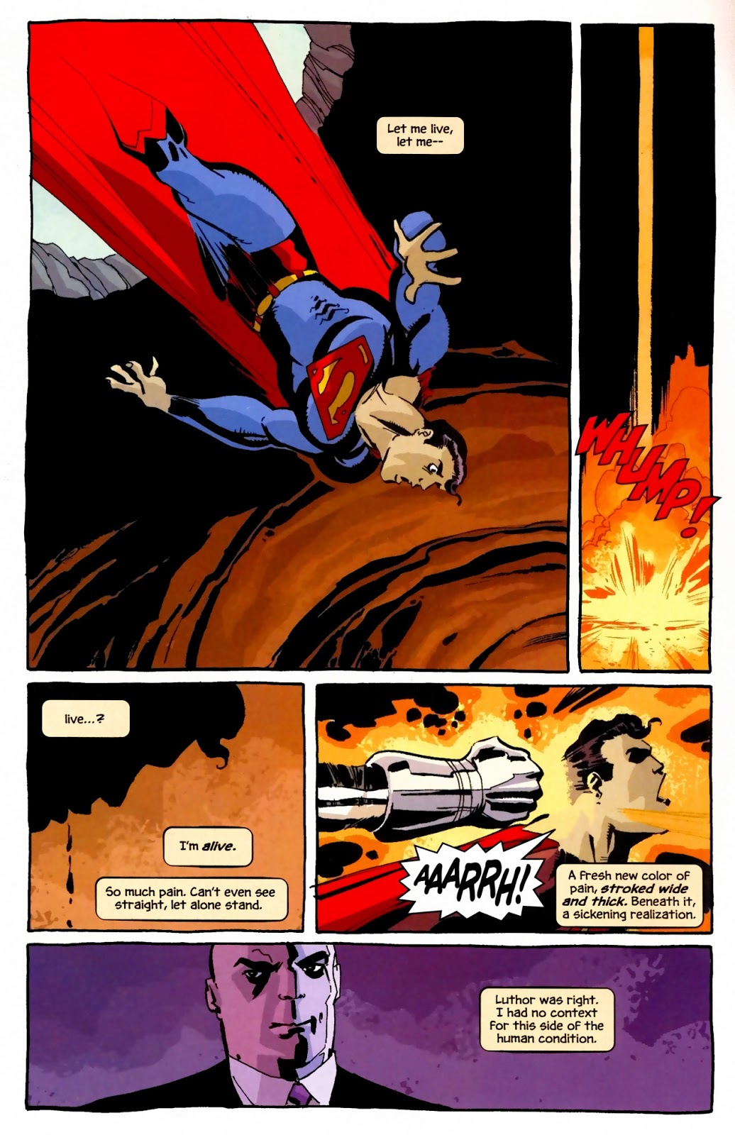
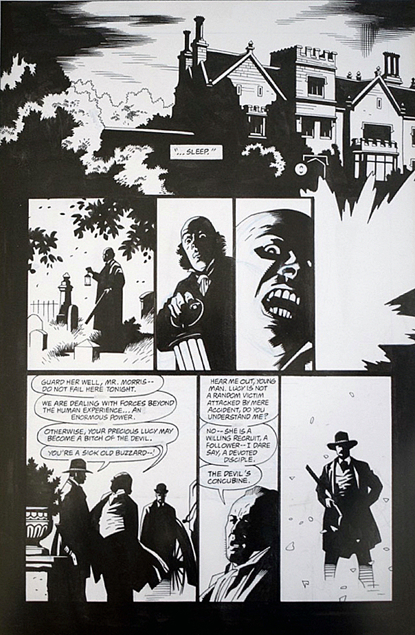
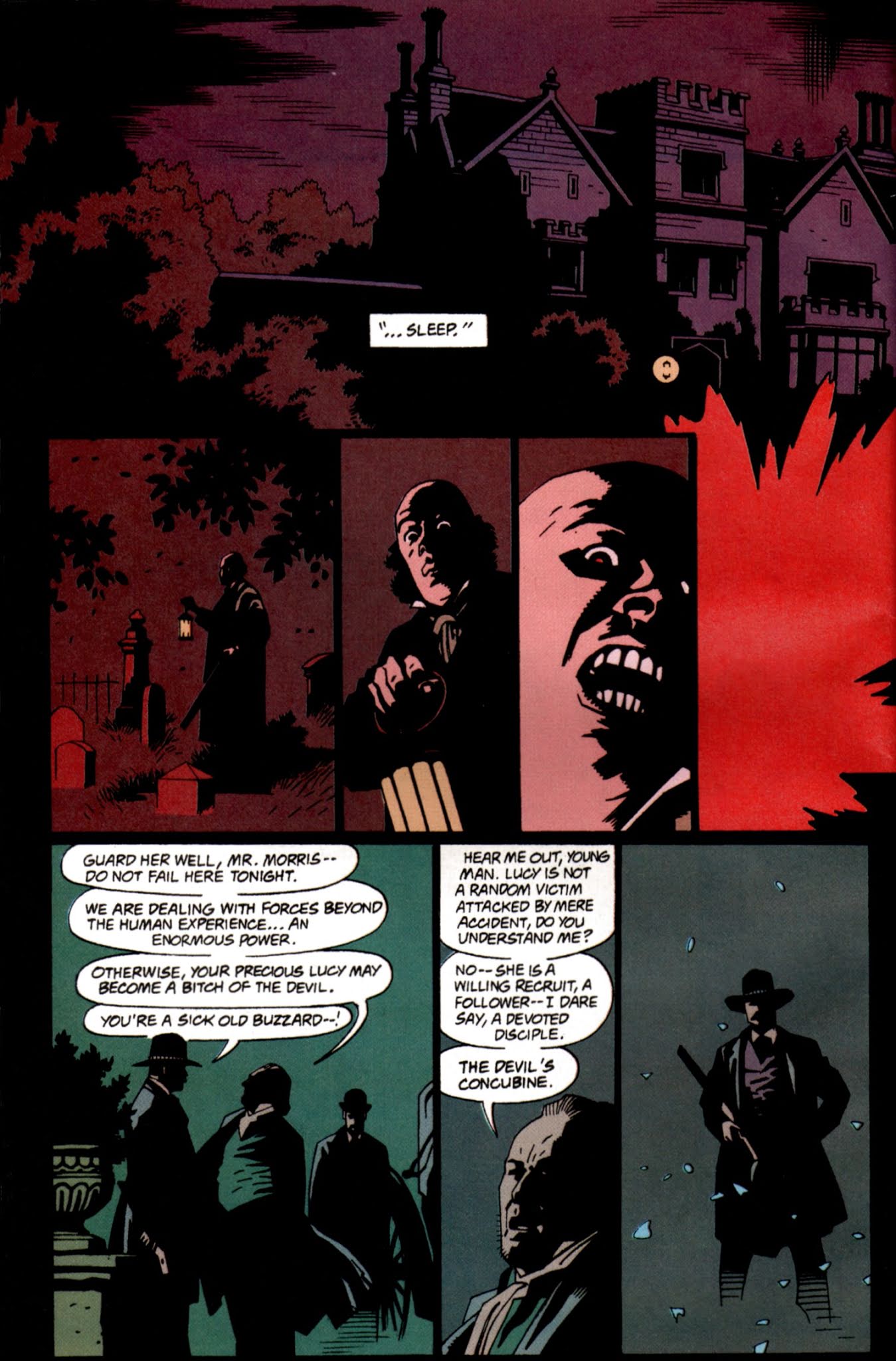
When DC finally collected the series in color for the first time, the production department used (effectively) a light touch on the recoloring — it’s a very accurate representation of the original.
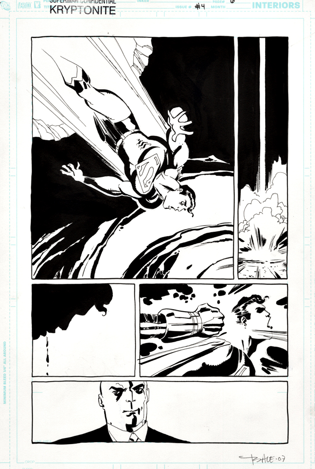
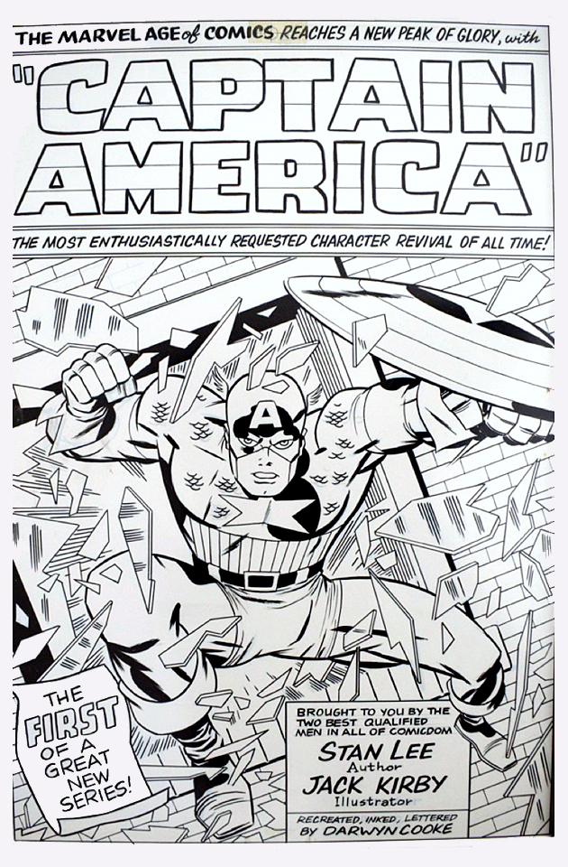
Darwyn Cooke and Tim Sale, two legends gone much too soon, teamed up on this interesting exploration of the origins of kryptonite and how Superman came to understand his relationship to his home planet.
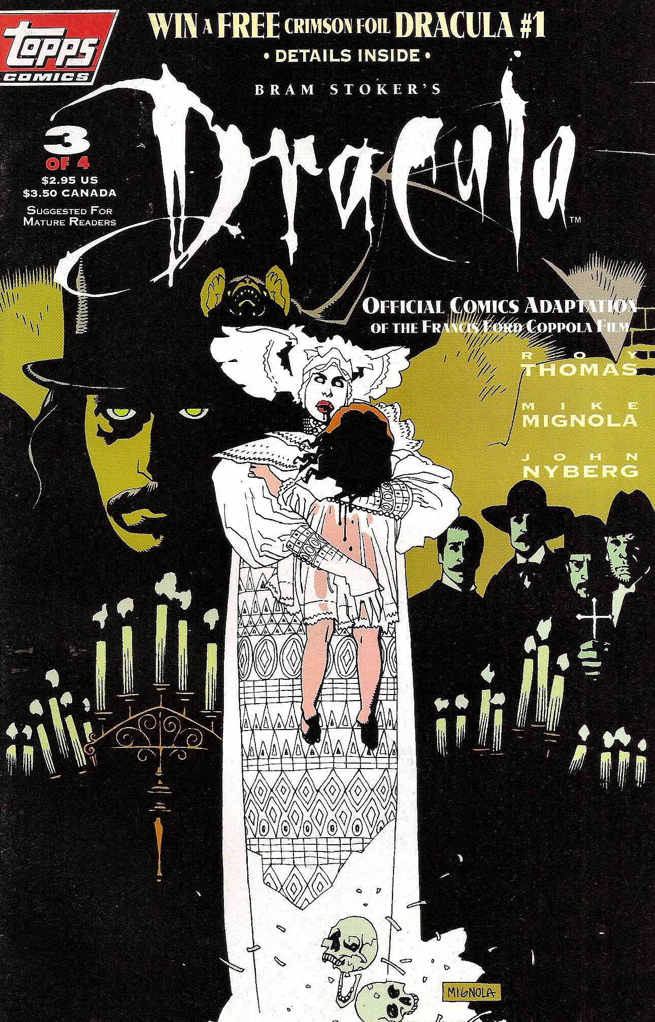
Bram Stoker’s Dracula, #3, December 1992 (& A Topps Gallery, 1992-1995)
Better late than never — Topps Comics actually launched its first title, Bram Stoker’s Dracula, in October, not November of 1992. By mid 1993, we had film adaptions, SF anthologies, Kirby superheroes and dozens more under our belt.
It was a wild ride.
In early 2023, we will have a more extensive look back with some new art, photos, memorabilia, etc. In the meantime, here’s a gallery of previously posted art. (Each piece links to the original post.)
Recreation/ reimagination, undated, both approximately 2008
The late, great Darwyn Cooke would have turned 60 last week. Not sure what I can say that hasn’t already been said here —or more likely elsewhere — but he was arguably the greatest talent of his generation, and the work and the man are missed.
Legend has it that Darwyn and I got into some pretty heated debates during the course of our business relationship, and I confirm that is a fact. But I always knew that those arguments came from his deep passion for the craft, and, as they say, I never took it personally. The last time we saw each other was at the 2015 Comic-Con and we had a fun — but all too brief — chat about Parker, DC superheroes, and a few other odds and ends before we both needed to move on.
Like I said pal, you are missed. Catch you on the other side.
I just discovered that Sandy Jarrell @sandy_jarrell has taken all the great Darwyn recreations he can find and colored them. Love it!
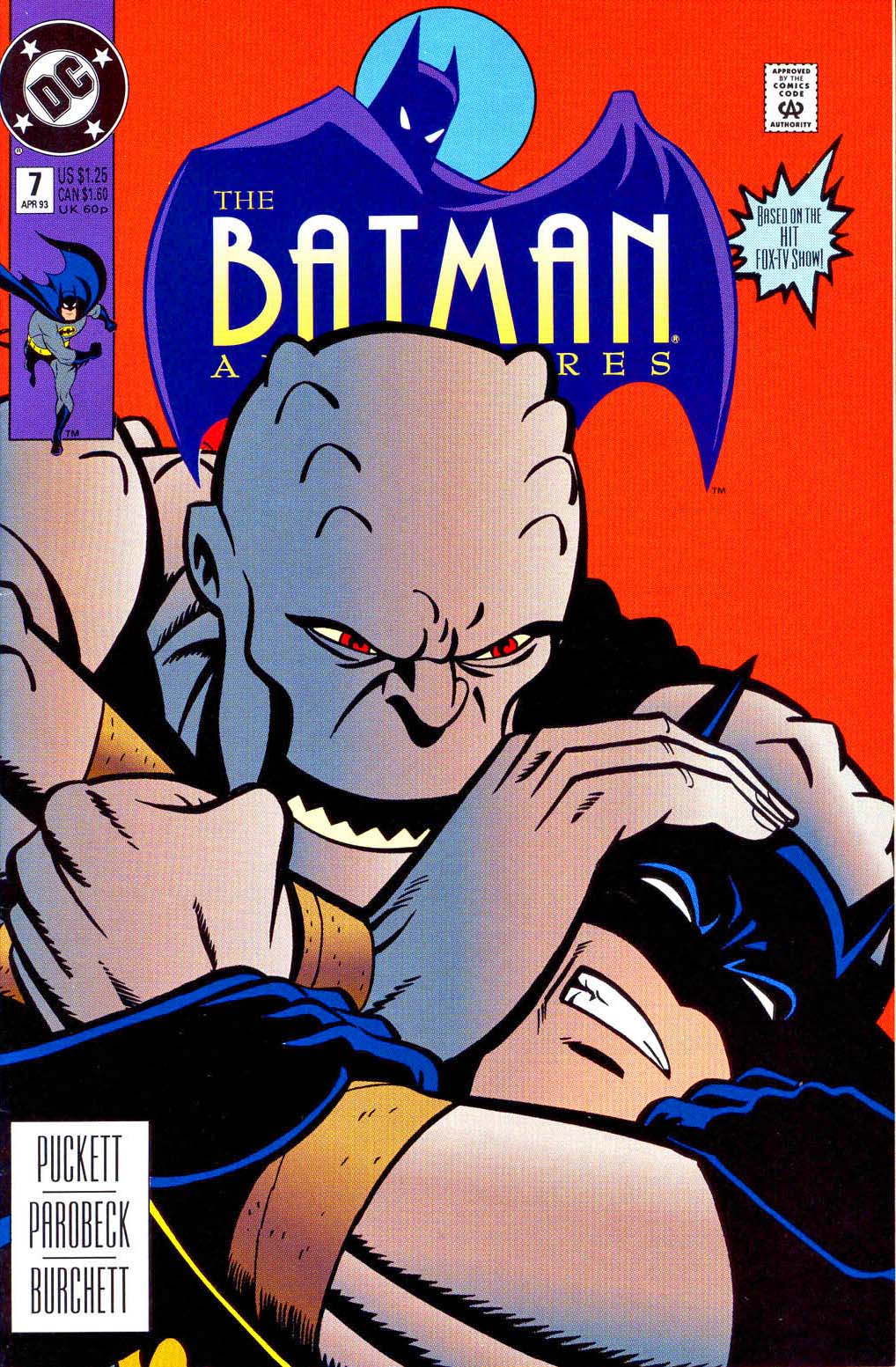
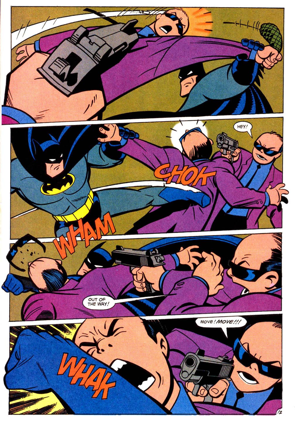
Kevin Conroy THE voice of Batman for millions of bat fans, has passed at at age 66. From Comic Art Fans:
“The Bat-signal will shine a little dimmer over Gotham City tonight as word has come down that Kevin Conroy, iconic voice of Batman for generations in the Bruce Timm-verse of cartoons, has passed at age 66. Just this past he added the credit of comics writer to his resume with a short story in the DC Pride 2022 anthology about how he related his secret life as a gay man in the 80s to the Dark Knight.
“Kevin was a brilliant actor,” co-star Mark Hamill said in a statement. “For several generations, he has been the definitive Batman. It was one of those perfect scenarios where they got the exact right guy for the exact right part, and the world was better for it. His rhythms and subtleties, tones and delivery — that all also helped inform my performance. He was the ideal partner – it was such a complementary, creative experience. I couldn’t have done it without him. He will always be my Batman.”
Our deepest condolences to his family, friends, and fans around the world.”
Posting this great Batman Animated page by the great Mike Parobeck, who also passed much too soon, to remind us that, fortunately, the work will always live on.