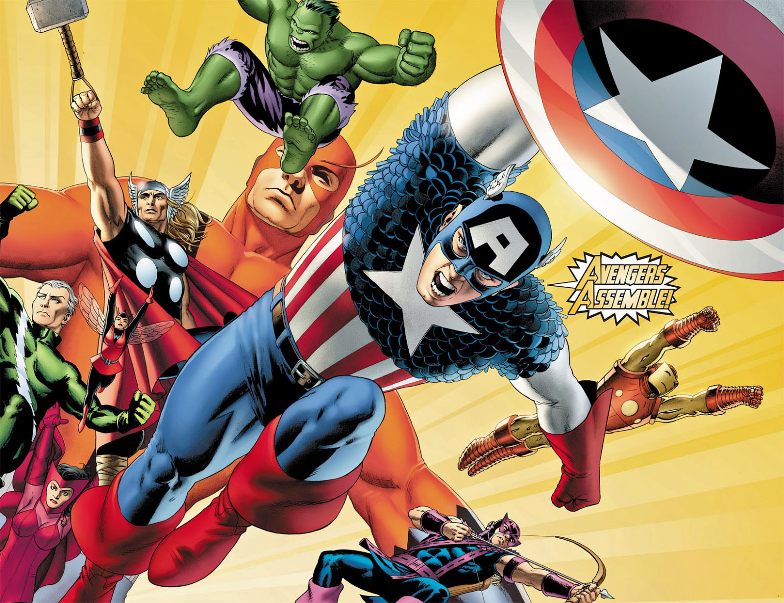
John Cassaday — The First Avenger
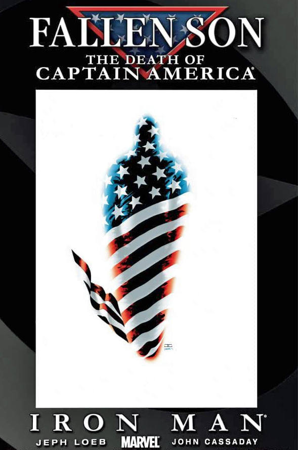
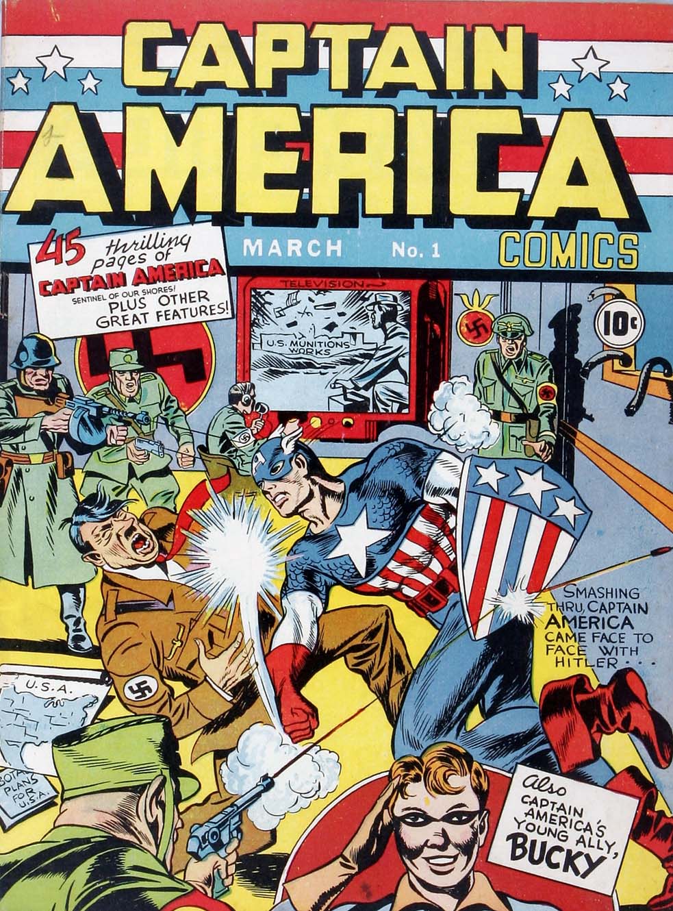
Fallen Son: The Death Of Captain America #5, August 2007
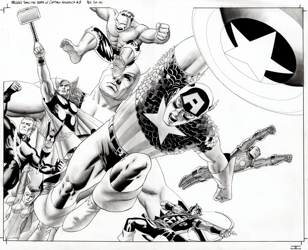
John Cassaday — a fan favorite artist if ever there was one — delivers a striking double-page splash of the Silver Age Avengers, with Captain America dominating the scene.
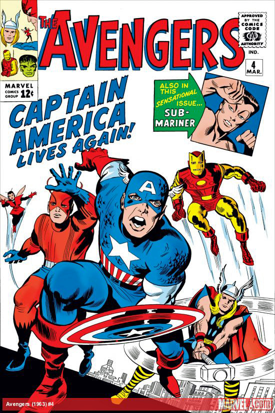
In the original comic, it was the Avengers that discovered the World War 2 legend floating in suspended animation in (essentially) a large ice cube. Of course, they never would have found him if it wasn’t for another Golden Age icon, Namor the Sub-Mariner, but as always, we digress.
This rendering actually combines multiple 60s Avengers line-ups into one image; The Hulk quit in a huff at the end of issue #2, fought against the team in issue #3, and was MIA by the time Cap thawed out in issue #4.
Cassaday’s art is stunning throughout this issue, but, biasedly perhaps, I think this is by far the best page(s) among many great ones.
The spread has appeared as both a poster and a limited edition Giclee, so, clearly it’s had some impact.
Assemble indeed!