Matt Wagner delivers a dynamic two-gun version of The Shadow for his much lauded Shadow origin series in 2015.
The Shadow routinely carried two .45 guns. That said, he wasn’t opposed to a rifle or machine gun, now and then.
Matt wrote this excellent series, and illustrated most of the covers, each one a frame-worthy rendition of the classic pulp character.
When DC brought back The Shadow after a long absence from comics in 1973, Mike Kaluta drew the now genre-defining early issues, and ultimately illustrated a beautiful graphic novel for Marvel years later.
Mike is also a big fan of the double-barreled look as well.
Color version and the more dramatic black and white version as a variant cover.
Who knows what evil…? Mike Kaluta knows.
The Shadow is acknowledged as the inspiration for Batman, and when DC acquired the rights to the character in 1973, they “crossed-over” twice.
Shadow Pulp Cover Re-creation (original by Graves Gladney, 1940), 2007
2020 is a double for anniversary for the legendary man of mystery, The Shadow.
The character was first introduced 90 years ago, in 1930 as the mysterious narrator of the radio drama, Detective Story Hour, which tied into the classic pulp magazine, Detective Story Magazine.
(Listeners, however, kept asking their newsstand dealers for “that Shadow detective Magazine”, so by the following year, the management team at Conde Naste smartly fleshed out the character and gave him his own mag, It rapidly became widely popular and successful.
By 1940, with the boom in comic books in full swing, The Shadow and some of his pulp “superhero” compatriots entered the four-color fray with their own comics. So it’s an 80thanniversary for the character’s appearance in comic books format as well.
Thomas Gianni, who sadly passed away a few months ago, loved pulp characters and the great pulp cover paintings.
Here, he recreates a classic, originally painted by the amazing Graves Gladney in 1940.
A talented artist and a terrific guy, I will miss chatting with Gianni, which was always an enjoyable moment when our paths crossed.
Much more on The Shadow, and the great Shadow artists in the next few weeks of posts, as we celebrate his amazing history.
Graves Gladney was one of the great pulp cover artists, as evidenced above.
The Shadow blasts his way into comic books in 1940.
Thomas Gianni’s brother Gary drew a few Shadow series for Dark Horse in the 90s, and created all three pulp-inspired covers for Hell’s Heat Wave.
The National Cartoonists Society would be poised for their annual awards event this month if it wasn’t for the COVID pandemic, so it’s a good week to celebrate cartoons.
And we need some way to celebrate summer again…
Michael Berry is very underrated cartoonist. With many appearances in Esquire and Playboy, plus hundreds of cartoons in the “cheapie girlie” magazines, his love of pretty women was always apparent. And many of his gags actually still hold up.
Unlike his better-known contemporaries like Dan DeCarlo, Jack Cole, Bill Ward et al, not enough is known about his life and career. That’s a shame — he’s just as good. One of the many things I enjoy about his art is that the finished result appears effortless.
Although I am sure it wasn’t.
Humorama applies to a single magazine, as well as an entire line of inexpensive men’s gag magazines, published during the 50s and 60s by Martin Goodman of Marvel Comics fame.
A collection of Humorama cartoons from recent years — currently out of print, unfortunately.
The National Cartoonists Society would be poised for their annual awards event this month if it wasn’t for the COVID pandemic, so it’s a good week to celebrate cartoons.Plus, we need some laughs.
Gahan Wilson was one of the great cartoonists of the 20th century, period.
Don’t trust me. Here’s what the New Yorker said in his obit. They know something about cartoons and cartoonists:
“Wilson excelled at depicting the extraordinary. Although he habitually delved into that dark funny corner that we associate with Charles Addams, his style was singular. He liked to depict ordinary folks encountering some kind of anxious terror, or experiencing the unthinkable in mundane places. It’s a man at a pizza counter hovering over an entire pizza—the man’s mouth the same oval shape, the same size, as the whole pie. It’s fishermen on a calm lake, with one about to be murdered by the other, who is removing a human mask to reveal his true monster self. Wilson’s art is both the heart-thumping you feel when you dare look under the bed and the relieved inner laugh you let loose after he’s scared the pants off of you.“
Or, let’s see what Hugh Hefner said about Wilson’s cartoons in Playboy:
“Gahan Wilson was an immediate hit with our readers and a perfect contrast to our usual, more sexual cartoon fare,” Mr. Hefner wrote in the introduction to “Gahan Wilson: 50 Years of Playboy Cartoons” (2011).
“By the early 1960s,” he continued, “I could say with real satisfaction that no other magazine in the world — The New Yorker included — had a cartoon stable the equal of Playboy’s. And no cartoonist was more popular, or more enduring, than Gahan Wilson.”
Wilson was one of my favorite cartoonists as a kid, and still is. If there’s a missing link between Charles Adams and Gary Larson, you’ve found him here.
Recent collections of Wilson’s science fiction magazine cartoons, as well as a comprehensive Playboy set.
Also, my pal — at least most of the time. (Creators and publishers have differing points of view on occasion.)
I’ve loved his work since I met him and his wacky alternative comic Too Much Coffee Man at the 1993 San Diego Comic Con. (Also, I drink too much coffee.)
One of the many things I will miss about Comic Con in 2020 is rummaging through his originals, printed and unpublished alike. I find many of them funny as hell.
But you can buy some on-line. And they are terrific deals as far as I’m concerned.
I love gags that apply specific word choices as a chief component of the humor. To me, there is absolutely nothing that would make the cartoon funnier than “per se.”
But, maybe that’s just me.
The National Cartoonists Society would be poised for their annual awards event this month if it wasn’t for the COVID pandemic, so it’s a good week to celebrate cartoons.
See you again on Thursday with an example from the late great Gahan Wilson.
An award winning winning collection of cartoons, plus some very funny illustrations taken direct from the horse’s mouth, so to speak.
The first appearance of Too Much Coffee Man in a mini-comic (1991) and the most recent giant omnibus collection.
Concluding our look at SHIELD on the eve of its 55th anniversary.
Gene Colan was a polarizing storyteller when it came to artistic style.
Fans either really loved his work (count me in that group) or didn’t like it at all. I could never figure that out. Of course his work didn’t look anything like the rest of Marvel Bullpen, but that was cool; his dynamic storytelling and extraordinary use of light and shadows was astonishing. To me, at least.
Colan’s run on Captain America came after both Kirby and Steranko, and that was a definite change of pace. But Gene’s reality-defying physics felt like a perfect fit for Cap, Marvel’s own reality-defying super powered acrobat.
Inking Gene Colan was one of the most challenging assignments in comics, but the legendary Joe Sinnott delivers here.
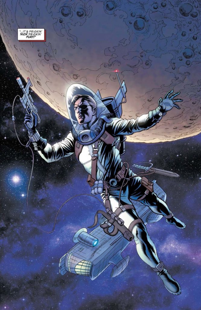
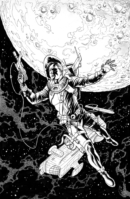
Nick Fury, of course, is the most important supporting character in the Marvel Universe. After Kirby and Steranko’s run was completed, the character couldn’t sustain his own title, but SHIELD was an important part of the entire Marvel Universe, primarily with Captain America in the latter part of the Silver Age.
And of course that dynamic repeats — brilliantly — in the Marvel Cinematic Universe.
And for the record, even though it appears Fury’s up to absolutely no good by hypnotizing Steve Rogers in this scene, he actually did have a higher purpose in mind.
Ultimately it didn’t work. The man is Captain America, after all.
Inking Gene Colan was one of the most challenging assignments in comics, but these two issues stand out: Issue #127, inks by Wally Wood, and #135, inked by Tom Palmer. The Palmer splash is a wonderful harbinger of monstrous things to come on the Wolfman/Colan/Palmer Tomb of Dracula series, while the Wood issue is simply spectacular looking from start to finish.
Meta Fury: Fury is retooled as a black character in the Ultimate Marvel line in the early 2000s, and writer Mark Millar ultimately utilizes the likeness of Samuel Jackson for the role — neglecting to tell him that. But Jackson held no grudge — ultimately playing the character in 11 films and counting.
Fury and Cap share a special bond early on, as discussed here.
Continuing a look at SHIELD on the eve of its 55th anniversary.
Jim Steranko is not a hard act to follow.
He’s an impossible one.
But on the SHIELD solo series, Frank Springer gave it a try. And in possibly another circumstance, it probably would have been fine.
But, like I said, all of sudden SHIELD transformed into an inadvertent real life version of another spy series: Mission Impossible.
Springer, who broke into Marvel with his work on this series actually captured some of the Steranko vibe in these issues. Barry Smith also managed to capture some it in one issue as well, and even Herb Trimpe had a few cool stories before it became a moot point, and the series died.
In a vacuum, the Springer Fury issues, as exemplified by this page, are well told and illustrative. Clear storytelling and panel variety move us through the action quickly and creatively.
But coming off the Kirby-meets-Krigstein pop-psychedelic acid trip of Steranko’s earlier issues, it wasn’t enough to keep the series going.
But of course, Nick Fury, and SHIELD, lived on.
Springer’s original cover (right) had Fury as the “lead”, but it was re-done, with the help of Art Director John Romita, with the villainous Hate Monger as the main emphasis.
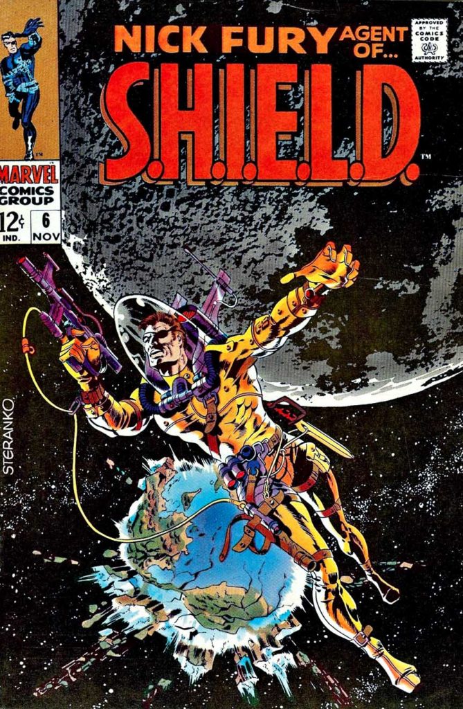
Steranko’s trippy covers for Fury issues five, six and seven channeled Wes Wilson, Wallace Wood, Salvador Dali and much more. Springer’s great splash from issue #10, certainly channeling Steranko… and Krigstein, Eisner, et al…
Enter SHIELD, 55 years ago. Nick Fury had already joined the Marvel Universe as WW 2 commando Sgt. Fury in 1963. And he showed up later that year in Fantastic Four, 20 years in the future (present day) as a CIA officer. But now he was ColonelFury, head of the super secret spy agency SHIELD. (Originally, Supreme Headquarters, International Espionage and Law-Enforcement Division.)
In 12 short pages, we are not only introduced to SHIELD, but the villainous Hydra (Not an acronym, one of the few) and of course those great gadgets like the crazy heli-carrier. Comics, as noted previously, do not have budget constraints. Artists can go wild, and as we know when it came to wild tech, Kirby always delivered. All the bells and whistles of the Bond films, plus much, much more.
As a very young reader, I appreciated that Fury was a unique character; living in two different eras, in Sgt. Fury and in Shield. And that he interacted with Captain America and Reed Richards (Mr. Fantastic) in both of those eras.
SHIELD was another great Lee and Kirby creation, but the series became something extraordinary when Jim Steranko took over, first pencilling over Jack’s layouts, and eventually writing, pencilling, inking and even coloring some those epic SHIELD stories himself. (More on that in the next post.)
Dave Bullock’s modern cover is a pseudo-homage to one of Steranko’s great Shield covers, SHIELD # 4, with the uniform almost identical, minus the dagger on the boots. The background references the groundbreaking pop psychedelic look that Steranko himself was creating at the time.
If Marvel ever decided to create a SHIELD animated series, I’d want it to look exactly like this.
Nick Fury started as a WW2 commando and evolved into director of SHIELD. Marvel ultimately retconned a war injury to fully explain the eyepatch.
Fury weaved into the bigger Marvel universe, past and “present”(60s) with Captain America, Tony Stark, Reed Richards and others.
All three pretty good, and one certifiably one of the greatest adventure films ever made. (I don’t have to say which one, do I?) That’s pretty much the entire summer, right there.
I’ve always had mixed emotions about the first two Superman films. (No mixed opinions about films 3 and 4. They are terrible.)
Christopher Reeve as Superman AND Clark Kent, is terrific of course, and some of the action sequences and effects are great in both. And, as a dyed-in-the-wool New Yorker, I enjoyed the location filming, especially the actual Daily News building standing in for the Daily Planet. Plus, Lex Luthor and the Phantom Zone criminals. (I loved the Phantom Zone.)
Some of it, however, is pretty cheesy. Even by 1978/1981 standards. If these films were meant to cleanse the palate of the completely camp 1966-68 Batman TV series, they didn’t completely accomplish it. There are definitely some groaners in here. (Miss Teschmacher!)
But… Would I rather watch these films as say compared to the modern film versions of Superman? Ha. Easy choice. It’s not nostalgia clouding my judgment when I say that.
The first two films capture the spirit of the Superman character in a joyous way. And although character has often been terrifically well-represented television since then (Superman Animated, anyone?) the recent films are mostly… ugh. Just ugh.
Someday, a reboot will fix that. You can’t keep a good Superman down.
Until that time, we will always have art, including this magnificent poster by Kevin Maguire featuring Supes and most of his key villains. Love the art, dislike the coloring. Over-rendered, and not well executed, specifically on Superman’s facial features. (Almost looks like a completely different face.) Modern coloring is like film CGI. Less is usually more.
Great art, though. Who said everything looks worse in black and white?
Forty years ago today, life was definitely simpler. All I had to do was how to figure out how to get to the opening night of Empire Strikes Back.
Well, maybe not that simple.
Big films often did not open “wide” in those days, which meant ESB would not be playing anywhere near my college town of Binghamton, New York. Closest theater? In Syracuse. 75 miles away.
Fortunately, I had a car. Gas was (relatively) cheap. And finals had just ended.
That was the good news.
The bad? No on-line ordering. (Ha. We were still using punch cards and booking computer time in the lab.) No advance orders by phone. This was 1980. Horse and buggy era, tickets and technology wise. And in those days, no bank was offering credit cards to broke college students anyway.
So we had to wing it. The “we” in this case, my buddy Bob and I, pretty much the only people that hadn’t packed up for the semester.
Off we went. Up through farm country on Interstate 81. Somehow, even though we didn’t leave that early, and the legal speed limit was still 55mph, we made it to the “purchase tickets” line, and then the “entry” line in time, and had reasonable seats.
Good thing, too.
We had waited three years. I didn’t really want to wait another day.
I enjoyed it. A lot. Despite the fact that the story had been “spoiled” for me by the Marvel Comics adaptation, because I didn’t have the discipline to avoid reading it. (Lesson learned there. I never made that the mistake again, including, and especially, for Return Of The Jedi. Hell, I’ve occasionally forced friends who work on films into vows of silence.)
Alex Maleev’s beautiful painted cover features of one my favorite things about ESB: The battle on Hoth. I have a distinct memory of the first time I saw the Empire trailer tacked on to a Star Wars re-release in 1979. The audience absolutely lost its mind at the Hoth tease. (Well at pretty much everything, I guess.) And the finished battle did not disappoint, stop-motion and all.
Where was I? Oh yes. Great cover. Terrific artist. Wonderful memory.
And somehow Bob and I made it back before the cows came home. But not by much, I imagine.