HBO’sWatchmen was an unexpected television smash of 2019, and it has landed on a number of best of lists. This series of posts explores the Watchmen characters, which have roots in the more traditional superhero universe.
Steve Ditko creates the iconic and mature character Mr. A (with moral absolutism as his trademark) in 1967 for the prozine Witzend, published by Wally Wood.
A few months later, Ditko tones down the violence and moral
absolutism just a bit, and creates a more comics-code friendly character, The Question,
for Charlton Comics.
In 1983, DC acquires the Charlton superheroes from the
financially strapped publisher. The characters first appear in 1985’s mega-event
Crisis on Infinite Earths as inhabitants of “Earth Four.”
In 1986 Alan Moore retools the Question/Mr. A as Rorschach for Watchmen.
Even before Watchmen concludes, the Question receives his first
own ongoing (and very mature) DC series by Denny O’Neil and Denys Cowan.
In issue #17 of that series, the Question (Vic Sage) reads a
Watchmen comic and dreams that he is Rorschach.
A most meta series of events.
Ultimately, The Question series ran 36 issues, ending in 1990. 20 years later, DC added an extra issue as part of the Blackest Night storyline that brought back additional issues of previously cancelled comics.
Which brings us here: In this issue, Bill Sienkiewicz, who
drew or inked nearly all of the covers for that original series, inks an entire
issue for the first time over Denys Cowan’s dynamic pencils. (Cowan had
penciled all but one original issue.)
This is the last page (Renee Montoya is The Question here) from
the story. But, of course, certainly not the last of The Question. As he/she
has already appeared a few times since, most recently notably in Grant
Morrison’s Multiversity: Pax Americana on a new version of Earth Four.
And, in this universe, Vic Sage sounds a lot like… Rorschach.
And the circle continues….
The first appearances of Mr. A and The Question, along with the cover of the first and only feature-length Question comic from Charlton.
We meet Rorschach in Watchmen #1, and then the Question meets him in his dreams in Question #17, the first time a Watchmen character appears in any other DC comic.
A recent incarnation of the Question and his Charlton colleagues in the DCU.
HBO’sWatchmen was an unexpected television smash of 2019, and it has landed on a number of best of lists. The next few posts explore the Watchmen characters, which have roots in the more conventional superhero universe.
Most fans of the original 1986 graphic novel know that the main group of (five of the six) Watchmen characters have direct antecedents from the “Charlton superhero universe.” Since DC had recently acquired those characters from the financially strapped competitor, creator Alan Moore’s idea was to use them for his Watchmen concept. But Dick Giordano, DC’s editor at the time, nixed the idea, knowing that Moore’s concept would mean that those characters would be rendered unusable in the greater DC Universe.
Moore, undeterred, simply turned the Charlton characters into his own.
Some more literally than others.
Steve Ditko renders a dynamic action page featuring the original Dr. Manhattan, Captain Atom.
Ditko is the unofficial godfather of the Watchman, having created or revamped Captain Atom, The Blue Beetle and The Question (plus Nightshade) all in a short period in 1966/67. With little in the way of material changes, the three appear as Dr. Manhattan, Nite Owl, and Rorschach in Watchmen. (Nightshade is not so obvious — more on that in a future post.)
Ditko had left Marvel in 1966, returning to Charlton in the immediate period after his departure. His return there launched a brief, but ultimately futile attempt at a fuller Charlton superhero universe. By 1968, none of the books survived.
Ditko is co-creator (with writer Joe Gill) of the original Captain Atom character, and his origin story (March 1960) is extremely similar to Dr. Manhattan’s, minus the blue skin. In Space Adventures #33, he is seemingly atomized, but he ultimately reappears — with super powers. President Dwight Eisenhower asks him to become the military’s greatest weapon.
On this page from the final issue of the original series, Captain Atom fights “Thirteen” a (surprise!) super-villain with supernatural powers. Inks are by Frank McLaughlin, who was Charlton’s Art Director at the time. Finding a decent inker for Ditko — other than Ditko — could often pose a challenge, but McLaughlin delivers here.
Upon Ditko’s return to Charlton in 1966, Captain Atom and The Blue Beetle are revamped, and The Question and Nightshade are introduced in a flurry of activity.
Captain Atom (1960) becomes… Dr. Manhattan (1986).
Fantastic Four #100 (Jack Kirby), July 1970, Re-creation by Fred Hembeck, 2010
50 years Ago, Marvel Comics celebrated its first ever milestone issue, with Fantastic Four #100, redrawn here 10 years ago by the very talented and affable Mr. Hembeck.
But the milestone proved bittersweet — because 50 years ago, one of the biggest stories in comic book history shook the industry: Jack Kirby was leaving Stan Lee and Marvel Comics to head to DC.
In March of that year, Jack turned in the pages for FF #102 and told Stan he was out. The most accomplished creative team in comics history was done. In comic book fan circles, it was as if the Beatles had broken up.
Which, actually, they had, with Paul making the announcement official just a few weeks later.
A dramatic beginning to a new decade of pop culture.
More on Jack and the move to DC later on; In the meantime, Happy New Year, and welcome to 2020!
The ironic final panel of Fantastic Four #100. The Lee / Kirby team may have been the greatest ever, but they were a team no longer. Plus, pop culture’s other superteam calls it quits, too.
Classic Jack Kirby action highlights this dynamic page from the extremely short-lived Double Life of Private Strong in 1959.
Here though, “Classic” suggests a Kirby Golden Age look and feel. (As an example, The Shield is jumping out of a panel — very similar to earlier Simon and Kirby techniques.) Definitely a time warp, since we were theoretically a few years into the Silver Age at this point.
When did the Golden Age end, exactly? I devoured all the comics’ history books I could get my hands on as a youngster. (Steranko, Feiffer, Daniels, Lupoff / Thompson, et al.) I’m not sure they all agreed on, or even in some cases, identified, the exact point of the “end.”
So my youthful brain filled in the blanks: If the first appearance of Silver-Age Flash (Showcase #4, 1956) launches the Silver Age, then Flash #104, the final issue of the original Flash Comics (1949) obviously ends the Golden Age. (Let’s just call the in-between period the “EC Age.”)
Very neat and tidy, but it only took a short while before I realized it was much more complex than that.
If not Flash, then, how about when All-Star Comics kicks out the Justice Society and switches to All-Star Western (1951)? Perhaps the last issue of the Spirit newspaper supplement (1952)? Or maybe when Captain Marvel and Whiz Comics ceased publication (1953)? And what about the brief return (1954) of Marvel’s “Big Three” (Sub-Mariner, Torch and Captain America). Are those Golden Age Comics?
EBay defines Golden Age Comics as any published through 1955. The well-known back-issue retailer Sparkle City Comics says the era ends in 1956, leading directly into the Silver Age.
See, it gets complicated.
But, if we consider Golden Age as a style of superhero storytelling rather than a timeframe, my vote goes here: The final Simon and Kirby team-up.
Archie Comics, seeing DC’s success at re-introducing superheroes, hired Joe Simon, who in turn hired Jack Kirby (they were no longer partners at this point) to help create some new super suits for themselves.
Two titles came as an immediate result of that ideation: The Fly, and The Double of Life of Private Strong, featuring an updated version of their original patriotic superhero, The Shield. Both characters were Simon and Kirby superheroes. And both looked and felt like Simon and Kirby superheroes. (Even if Simon himself didn’t ink the page.) The page and the story don’t in any way capture the modern feel of DC’s sleeker and slicker Flash, Adam Strange, et al — or especially Kirby’s own Challengers of the Unknown.
The Fly buzzed around for a few years, although Simon and Kirby left after a few issues. Private Strong? A mess from the start, with a terrible title, retro trade dress that appears borrowed from Simon and Kirby’s Golden Age Speed Comics, some obvious knock-offs from Captain America, and a background story that seemed so similar to Superman, DC sent a cease and desist letter to Archie.
After two issues, The Shield was done. Shortly thereafter, the temporary reunion of the Simon and Kirby team was also finished.
A few months later, Kirby and Stan Lee, already churning out monster stories at Marvel, would collaborate for the first time on an ongoing character with Rawhide Kid #17. Although no one knew it at the time, the “Marvel Age” had begun, and the Silver Age was about to rev into high gear.
And the Golden Age of Comic Books was definitively over.
With some pretty great old-school art by Jack to usher it out.
Archie’s original version of the Shield predates Simon and Kirby’s Captain America. Not to ever give the patriotic superhero concept a rest, the two star creators develop Captain Freedom (below) for Harvey, and Fighting American, an early creator-owned series in the 50s.
Apparently Joe and Jack couldn’t decide on Captain Freedom’s costume from issue to issue. Notice the star on the mask that disappears and reappears, not to mention the proportions of the stars on the chest, and the belt too.
Meanwhile… Across town at DC, Kirby’s Silver Age Challengers of The Unknown look like… Jack Kirby in the Silver Age! Giant robots, futuristic cities, et al, are a sign of things to come.
It’s a Red Hulk / Green Hulk Walter Simonson-themed Christmas, and Green Hulk takes his turn.
Green Hulk takes out his frustration on one of the Metal Master’s lethal robots in this action-filled story, pencilled by Walter Simonson with inks and wash-tones by Alfredo Alcala.
Original art for stories from black and white magazine titles often has more depth, because tonal quality was necessary to make the art pop without color printing. Alcala was one of the best of the artists working regularly in this medium.
Word balloons on many of the Marvel Magazines were done on tissue overlays, hence the “word-free” artwork. But a good action page, like a well directed fight scene in a film, should be void of most speaking parts anyway. (Even as a young reader, I disliked inner monologue masquerading as outer dialogue.)
Who has the breath to talk during a fight? (I know, they’re super-powered beings. But still…)
It’s a Red Hulk / Green Hulk Walter Simonson-themed Christmas, with Red Hulk stepping up first.
Red Hulk appears very angry — that’s no way to behave during the Holiday Season! — in this marvelous double page spread by Walter Simonson.
The notorious deadline crunch has come calling — this is blue-line inked original art (the pencils exist separately) with inks by the talented Scott Hanna, who embellishes Walter’s pencils pretty faithfully on this spread.
Walter of course does not part with pages that he both pencils and inks, which means this is one of only a few scenarios where one can own a Simonson published page.
And even though his actual pencils never touched the paper, its a great Simonson example to have. Storytelling on a DPS can often be tricky, but Walter develops this one with a combination of clarity and creativity. (Note the panel size variety and “camera angles.” )
As for Red Hulk? Nothing good usually comes from picking a fight with the X-Men, no matter what the time of year.
Merry Christmas and Happy Hanukkah, no matter which Hulk you identify with.
The Empire rebuilt itself and came back more powerful than ever: The plot of the latest Star Wars Trilogy, or Berkeley Breathed’s prescient look at a well-known mega-corp. 35 years ago?
Star Wars. ATT. Donald Trump. Ruppert Murdoch. Et al. Bloom County may have disappeared for a bit, but many of his frequent satirical topics most definitely did not.
So we might be done with one Empire this week, but the other one is not going anywhere for a while.
The Force is with us indeed. Just a different one than Mr. Lucas imagined.
Fun fact: This strip is the very last one in Volume 2 of the complete Bloom County library
Howard Chaykin returns to Star Wars with an imposing cover of Darth Vader in 2015. You don’t want to mess with this version of Vader, even if you’re on his side.
Howard Chaykin. Star Wars. This might be a greater conflict than the empire vs. the rebellion.
I don’t need to repeat Howard’s many on the record comments about his original artwork on the series (Marvel’s 1977 issues #1-#10, which includes the six-part adaptation of the original film.) You can see more for yourself here, here or here.
Suffice to say, he doesn’t like it. (Reading anything Howard says about his own work — or others, or anything, for that matter — is always highly entertaining, so I recommend taking a deeper dive.)
Objectively, Star Wars is of course, not his best work — not even close. It’s not even as good as his other early comics. He drew three issues (and wrote one) of Marvel Premiere just prior to Star Wars that are excellent, especially for the period. (Howard is generally self-critical of all his earliest work, so I bet he won’t agree. But I digress.)
Licensed comics are always a challenge, especially with limited reference and insane deadlines. That said, given these constraints, and many others, I think his Star Wars art, especially on the first issue, is definitely better than much of what was coming from the big two companies at the time. But, ultimately, not so great on the Chaykin Curve. (A new scientific term coined especially for this post.)
Just a few years later (1982) he created the astonishing American Flagg. Groundbreaking, although often overused, barely does that series justice. (Much more on that in a future post). Based on Flagg alone, Mark Chiarello DC’s long-time Art Director has described Chaykin as one of the architects of the modern comic book.
Unfortunately, Flagg was published by a smallish independent publisher, which means that few casual readers ever saw it. Although knowledgeable long-time fans are well aware of the series, it doesn’t have the legacy it deserves.
Star Wars? Reprinted about a zillion times, in more formats than I can count. And I am one of the guilty parties here, publishing the Star Wars Artifact Edition (IDW), showcasing the original art — in its original (11×17) size.
Shortly after Flagg, Chaykin went on to other fascinating projects, geared for older readers. Times Squared. Blackhawk. The Shadow. Black Kiss. Etc. Ultimately, after a long stint in Television, he returned with other series that reflected his interests and passions. Mighty Love (feels like a television show and was apparently originally developed for that medium) and City of Tomorrow are two personal favorites. He’s currently working on Hey Kids! Comics!, a fascinating fictionalized look at the drama, jealousy and scandals in the history of comic book business itself.
His innovative and realistic storytelling is complex, violent, sexual, and political. He left space operas behind a lifetime ago.
So if you were a kid when you saw Star Wars, loved Star Wars, and only had the Star Wars comics to read over and over again, because there was no home video, I get it, you love those comics.
I think that’s cool. Even Howard is probably ok with you remembering those comics through the warm glow of childhood nostalgia.
But if you’re an adult? Just don’t remember HIM for them.
That’s like remembering Nolan Ryan only for his one World Series appearance for the 1969 “Amazing” Mets. You’ve missed the point.
Chaykin’s first Star Wars art was a promo poster available at SDCC 1976 for a buck, followed by Star Wars #1 in Spring 1977. Howard revisited the Star Wars saga for Star Wars Insider in 2010 with a similar composition to the originals, incorporating iconic imagery from Empire Strikes Back to celebrate its 30th anniversary .
Chaykin’s art from the same early period includes his own Monark Starstalker, and two Solomon Kane (Robert E. Howard) stories co-written by Roy Thomas.
At first glance, Russ Manning’s clean art style is an
unusual choice for Star Wars. The saga (the original film specifically) is a
bit rough around the edges, with scorch marks, dusty landscapes, dirty
uniforms, and beat-up droids.
Manning, best know for his beautiful art on Tarzan and
Magnus Robot Fighter, is anything but.
His work is crisp and polished. Magnus lives on Earth 4000 AD, a world populated by handsome men and gorgeous woman inhabiting a shiny futuristic city. The battle against the sentient robots? Terminator this is definitely not.
But, Russ’ imagination and enjoyment for Star Wars is obvious on these strips.
Even if the stories themselves, like those in Marvel comics,
were often “B” level because they weren’t permitted to do very much with actual
film-related plots, his storytelling and renderings provided more than enough visual
interest to keep the strips engaging.
This specific example, which features most of the Star Wars main cast, comes at the conclusion of Russ’ penultimate story. He died of cancer too young at 52, a few months after this strip was published.
Had he lived, I’m certain he would have come back to Star
Wars at some point.
After all, he created a city-covered planet, very much like Coruscant, years before George Lucas did. In fact, when Magnus debuted, George Lucas was still a teen who, among other interests, had a passion for comic book art.
Wait a minute… (*)
Dark Horse colored and reprinted the strips as comic books in the Classics series. Marvel has since reprinted those versions as well.
A little bit of Manning’s love for Tarzan appears in a Star Wars Sunday strip.
The entire run of Manning’s Star Wars strips (and AL Williamson’s as well) have been reprinted in the Library of American Comics line, published by IDW.
Russ Manning referred to Magnus Robot Fighter as his Tarzan of the future.
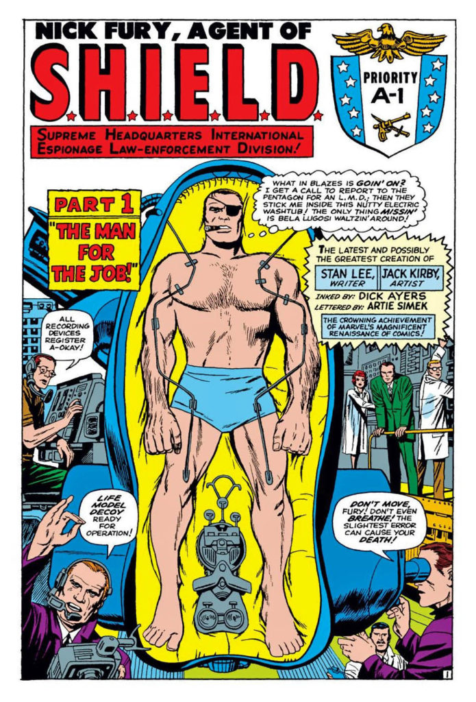
*Ok, Lucas (definitively) and Manning (likely) were influenced by Fritz Lang’s ground-breaking film Metropolis, and this is just a fun coincidence. But still.