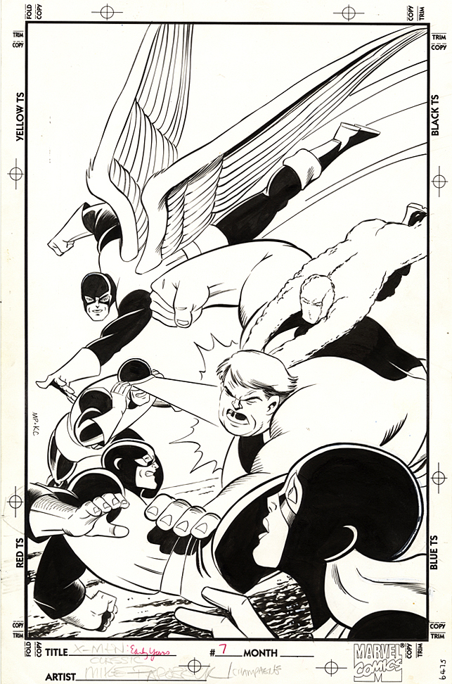
Mike Parobeck — Modern Composition
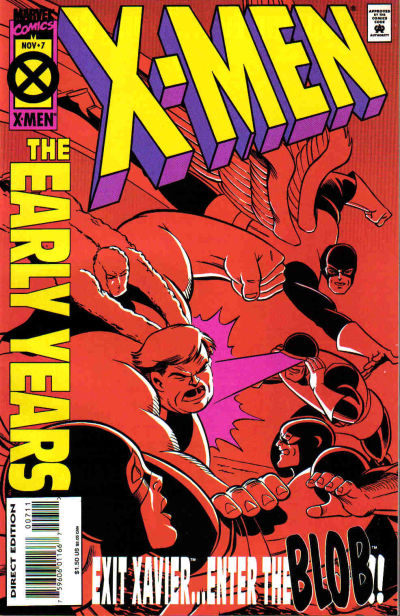
X-Men: The Early Years #7, November 1994
Sometimes the reprint cover is just better.
Case in point, Mike Parobeck’s cover of X-Men: Early Years #7, which reprints the original X-Men #7.
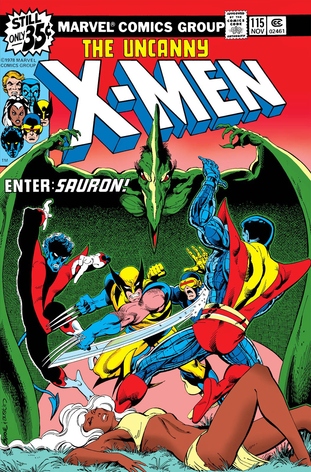
Jack’s original cover (below) is overloaded, and a composition mish-mash. Ok, I know it’s by Jack Kirby, and some fans will bristle about anything negative about the King’s work, but sorry, there’s no real comparison between the original and the reprint.
Mike’s cover is strong and focused.
Jack’s original has way too many characters all over the map, with the X-men oddly positioned in the background and The Brotherhood of Evil Mutants voyeuristically up front, awkwardly. Are they watching from a window? Or on a TV screen? A magical portal? Why the heck are they even on this cover? This is a selling point?
Now, just to be clear, this may not be at all Jack’s fault. Maybe Stan Lee art directed it. And overwrote the cover blurbs to death. (Now, the Stan haters can come out of the woodwork.)
As I’ve said on the record many times, I’m a fan of both Stan and Jack, so let’s all calm down. However this original cover developed, it’s simply not a great one. Even legends drop the ball once in a while.
Mike’s solves the problem thirty years later by focusing only on the X-men coordinating — or attempting to — an attack on the Blob.
Simple. Clear. Clean. Powerful. Typical of Parobeck’s work.
But… On the published version, the trade dress is a bit heavy handed, so some of the art is obscured — and the entire image had to be flipped to accommodate said trade dress. And, to add to this litany, why the monochrome coloring? Ah Hell, who knows.
Anyway, the original art is great and Mike’s Marvel work is pretty rare; he is best known for some great looking art on the Batman Animated comic books. I was also a big fan of his Justice Society run.
He unfortunately passed away MUCH too early at the age of 31 (from Diabetes) in 1996.
His is a talent that is sorely missed.