Greg Goldstein's Comic Art Gallery

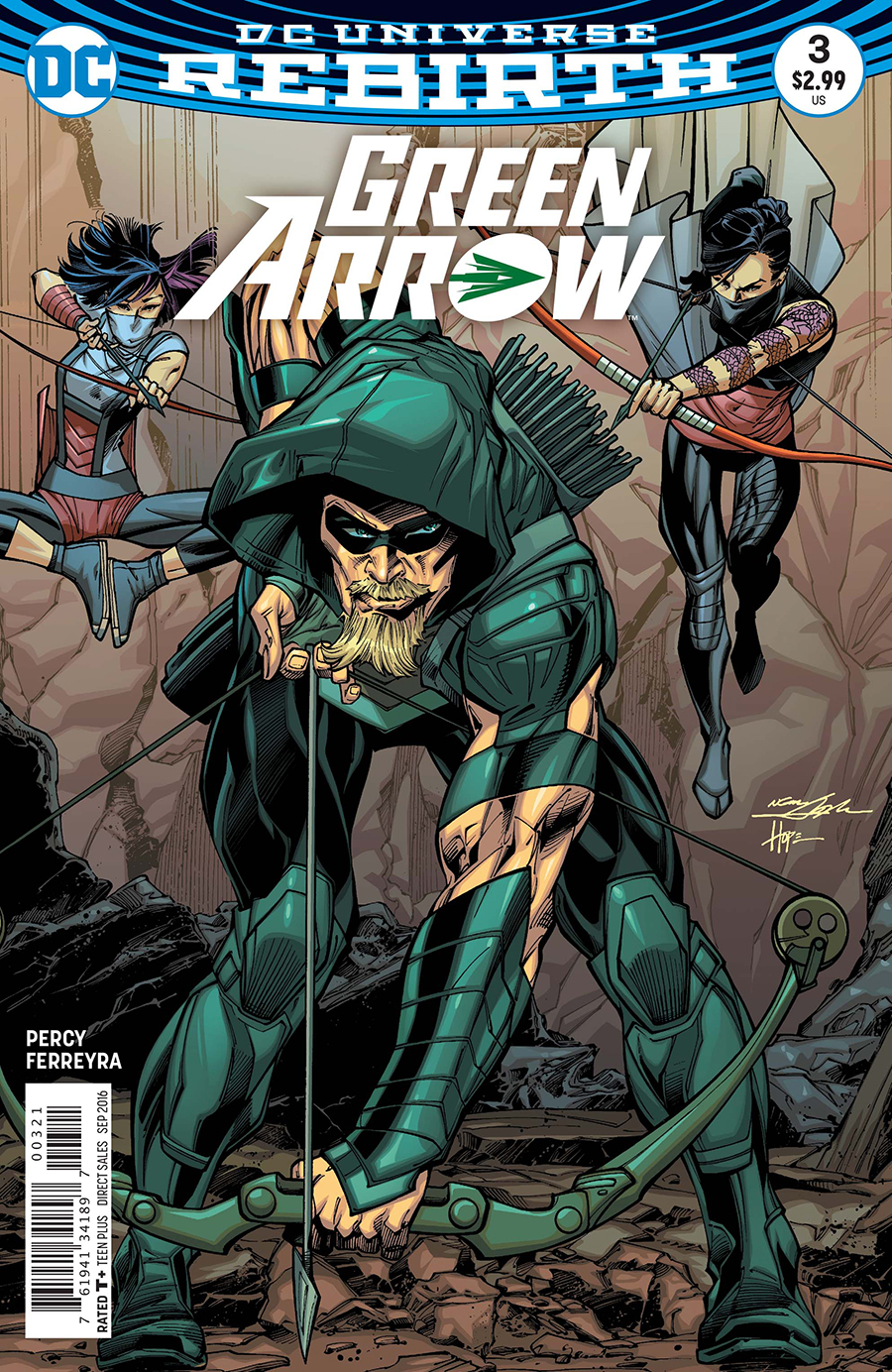
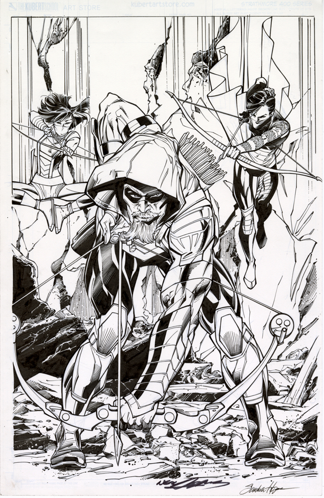
Neal Adams / Sandra Hope — Green on Blue

Green Arrow #3, September 2016

Green Arrow is back on the air (CW) for its eighth and final season, so before the emerald archer fades into the TV sunset, we’re focusing a few posts on Green Arrow originals.

Neal Adams had a big year for DC in 2016. In addition to a themed-cover month in February, Neal started drawing the variant covers for the Green Arrow Rebirth series ands drew 17 in a row. Not too shabby, and pretty appropriate, since he created the first Green Arrow “rebirth” 50 years ago.

With a semi-monthly schedule, Neal suddenly had a lot of covers. And… a lot of deadlines. So, most of the covers are inked by others. 

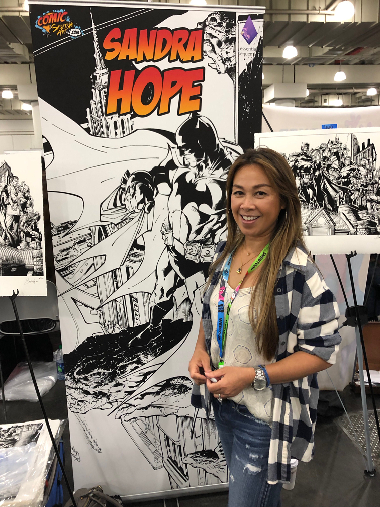
This specific Adams cover — paying tribute to the Mike Grell reboot of the character in 1987’s Longbow Hunters — is inked by the talented (and underrated) Sandra Hope. The inks are terrific, very complimentary to Neal’s style; you’ll get no argument from Neal himself, who revisited and praised the inks last week at NYCC.

That’s the easy part. The more difficult side of the equation? It’s inked on a “blue-line” copy of Neal’s pencils. DC sent a digital scan to Sandra, who then printed it out, inked it, scanned it and then sent it back to DC for colors and final production. When you absolutely, positively have to have it overnight, forget FedEx. Digital is the wave of the present.

Now this version is the printed cover, no argument from anyone. (DC added Neal’s and Sandra’s signature digitally to the final published version.) But here’s the rub: The pencils themselves exist on a separate board. Neal has kept them or sold them — doesn’t really matter for this discussion. They exist separately. There are technically no Adams “pencils” on this page.

This subject drives many art dealers (especially those that specialize in vintage material) — and some collectors (ditto) — absolutely bananas. They prefer, and I think most of us do, the pencils and inks on the same board. Blue-lines, gray-lines, whatever, for many it reeks as “incomplete” if the inks are rendered over pencil copies. After all, it’s the penciller’s illustration that sets the stage for the inker.

But… it’s 2019. Digital is a way of life. We’re fortunate that any material is still created the “traditional” way.  And comics are now truly an international profession — we may be dealing with a penciller in Brazil and a separate inker in Romania. No amount of priority shipping is going to solve that deadline crunch.

So yes, I absolutely still prefer a Jack Kirby page that has Mike Royer inks rendered directly over jack’s original pencils. Or, a Steve Ditko original where I can see the faint pencil lines of his original layouts. Etc.  

And I respect that pages with pencils and inks both should, and will always, command a premium price.

But 20 years from now, a kid who loved, say, the Ivan Reis / Joe Prado Man of Steel #1 cover is going to grow up to be a Wall Street financier. Or a successful Hollywood producer.  And he’s going to want the original of the published cover, and not care one whit that Joe inked the cover from Ivan’s digital scan. By then, practically everything will be digital, and hand-drawn original comic book art will be a scarce commodity.

And… a killer published cover… is still a killer published cover.

Mike Mayhew — Inside Job

Green Arrow #7, February 2011

Green Arrow is back on the air (CW) for its eighth and final season, so before the emerald archer fades into the TV sunset, we’re focusing a few posts on Green Arrow originals.

Here’s a great panel page example by the phenomenal Mike Mayhew. 

Mike’s earliest regular work was at Topps, excelling at dynamic storytelling on Zorro (yes, Zorro) in the traditional pen and ink medium. After the comic book implosion of the mid- 90’s left many talented artists out of a job, Mike tried his hand at painting for a book cover assignment. The result? Mike quickly transformed from talented story artist to a premier cover painter.

These days, Mike’ schedule only occasionally allows for fully illustrated interior stories. Here he demonstrates his tonal skills on Green Arrow — creating a lush, haunting page. (GA is dealing with the apparent ghost of his dead mother, hence the haunting.)

When Mike introduces me to a third party, he often says I was his “first boss.” Technically, that would have been Jim Salicrup, who edited Topps comics during its brief heyday, from 1992-97. But I was the Director of Publishing… so why quibble? Mike’s a great talent and a friend. I’ll take it.

Cliff Chiang — A League of His Own

Green Arrow / Black Canary #11, October 2008

Green Arrow is back on the air (CW) for its eighth and final season, so before the emerald archer fades into the TV sunset, we’re focusing a few posts on Green Arrow originals.

This impactful Cliff Chiang cover comes to us courtesy of a somewhat short-lived Green Arrow series — written by Judd Winick — prior to the “New 52.” It has plenty of action throughout, but the stories also focus on the interpersonal relationships that pierce the heart (sorry) of Team Arrow.

Cliff’s art (he was the interior artist on the first seven issues) is full of energy and features a bold, clean style, that manages to capture the angst of the modern Green Arrow, with less traditional rendering than many of the veteran Arrow illustrators (Neal Adams, Mike Grell, Jim Aparo, et al). 

Cliff’s career, of course, has rocketed since that Green Arrow run. His Paper Girls series (with writer Brian K Vaughn) is phenomenal, and I was pleased to hear at New York Comic Con that he is returning to DC superheroes with a Black Label title in the near future.

Michael Cho — Hip To Be Square

Justice League of America: The Silver Age Vol. #3, 2017

Green Arrow is back on the air (CW) for its eighth and final season, so before the emerald archer fades into the TV sunset, our next few posts will feature a few Green Arrow originals.

Green Arrow, in his original incarnation was definitely not a cool cat. As Neal Adams points out, he was basically a poor man’s version of Batman, complete with a young ward sidekick (Speedy) and an “Arrow car”, his own version of the Batmobile. (Probably a souped-up Corvair. Look it up.)

Still, as noted by pretty much all fans of comic book history know, the entire DC universe of the early silver age — especially when compared to upstart Marvel Comics — was “square.”

And I say, so what?  Lots of things in the Kennedy era were “square,” but simultaneously, super cool.

This JLA trade collection cover, by the incredibly talented Michael Cho, captures the exuberant spirit of “The New Frontier.” Green Arrow takes the lead with his fellow Justice League teammates right beside him. Here they can take on anything the world throws at them — and have fun doing it.

(This cover line-up represents the brief period in team history — Justice League of America #14 – #30 — after the Atom had joined, but before Hawkman had come aboard.)

This cover also embodies the energy and spirit of the late, great creator (and Michael’s good friend) Darwyn Cooke, while still very original in its own right. 

I have yet to see a Michael Cho cover that I didn’t enjoy. And I doubt I will.

Above: Covers and Interior Title Splash Pages For The First Appearances of Green Arrow and The Atom in JLA.

NYCC — Gotham Giant

New York Comic-Con wrapped on Sunday… and from all accounts, it was a smash success for all concerned, especially the fans. The show appeared packed pretty much the entire time, and gridlock enveloped the Javits Center midday, especially moving from one floor to the other. But spirits were high despite the claustrophobic conditions and many of the creators told me that had their best NYCC ever.

Many photos to be posted in the next few days, but here’s a teaser:

Ian Churchill — Melee

Superman Doomed #2, October 2014

Presenting the final post in our series celebrating Supergirl’s 5thseason premiere tonight on the CW.

As noted previously, Ian Churchill’s run on Supergirl was terrific, and his brief return here, is still a welcome one.

On this dynamic page, Supergirl shreds Cyborg Superman, who is (I think) actually Supergirl’s father, who is under the mind control of Brainiac, who is… never mind. This “prequel” to the complicated DC convergence crossover is convoluted, and the less said, the better.

But the art, of course, is great.

Dick Dillin — Whirlwind Entrance

Justice League of America #64, August 1968

Continuing our series celebrating Supergirl’s 5thseason premiere on the CW on Sunday.

One of the cool features of all of the DC CW shows is the introduction of supporting characters you would hardly imagine would ever make it into live action TV.

Rip Hunter? Firestorm? Mister Terrific? The Ray? The list goes on… and on… and on.

One such character is Red Tornado, who made it into an early episode of Supergirl. Ok, so he’s a villain… and his backstory definitely veers from much of his retcon continuity in the DCU, but who cares. He certainly looked great.

Red Tornado’s first appearance in his contemporary droid form is in Justice League #64, and this splash – the cover scene — is actually his first rendering in that first appearance issue. More importantly, it’s also the very first JLA appearance of artist Dick Dillin, who went on to draw the series for an astounding 12 years until his untimely death in 1980.

And that cover? One of my all time favorites, enhanced by that unique greenish background, and featuring a full cast of the Justice Society. It jumped out at you on the spinner racks 50 years ago, and still does today.