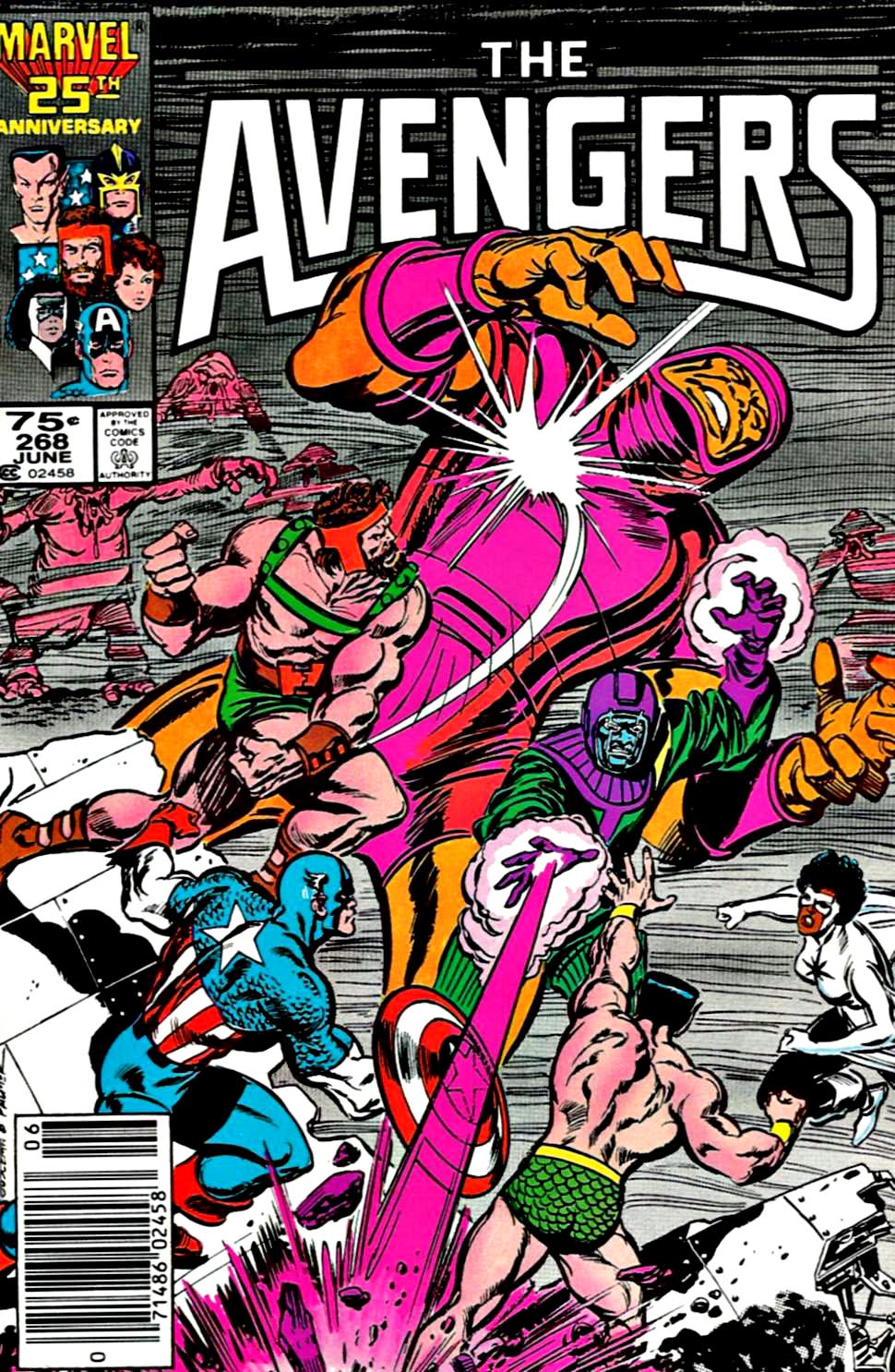
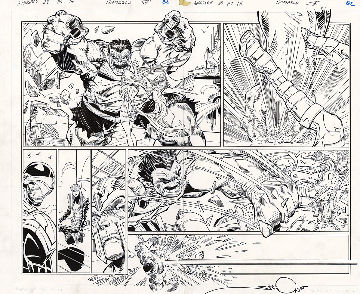
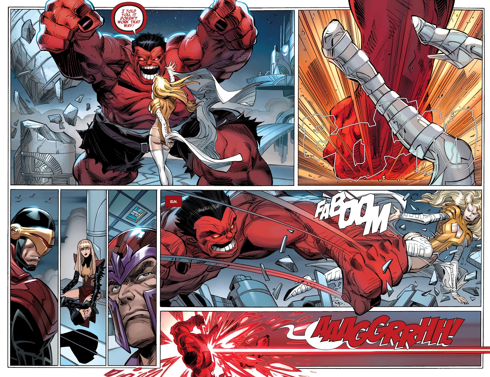
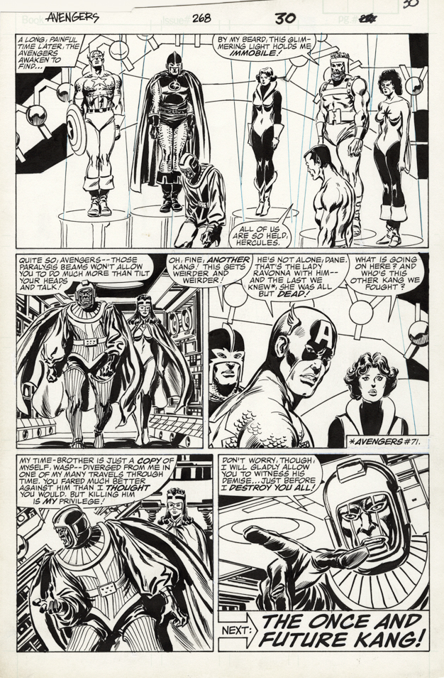
John Buscema and Tom Palmer — The Once And Future MCU
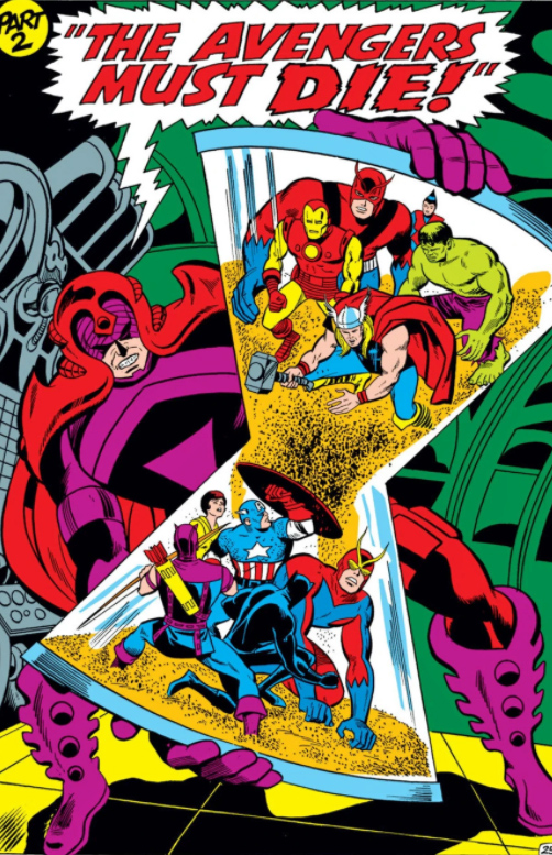
Avengers #268, June 1986
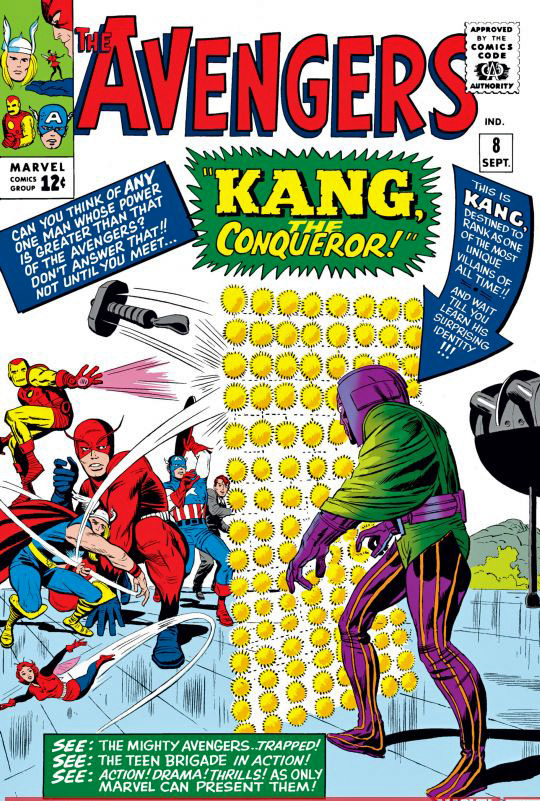
Ant-man has made much news lately with talk about the villain Kang (The Conqueror), who would be a cool choice as the next “big bad.” Time travel is his bag, and we know how that topic has already a few twists in Avengers Endgame.
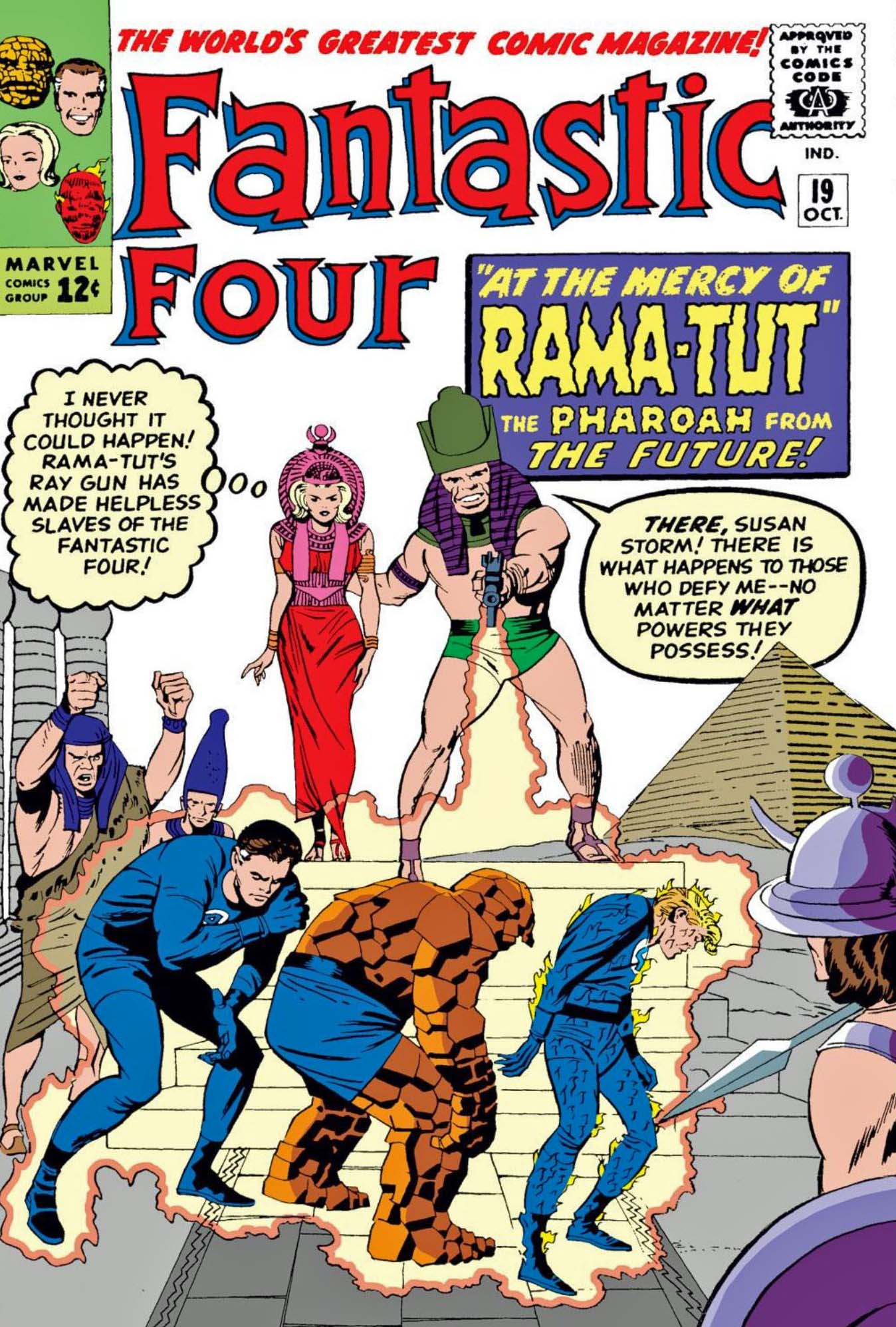
Kang has given time-twisting headache to the Avengers and the Fantastic Four in the comic book pages. He could be an obvious thread to introduce the FF into the MCU.
Or not.
Marvel has no shortage of interesting antagonists.
Because I devour time travel stories, Kang was a favorite among many great villains. Even when his story was, how shall we say? A bit convoluted.
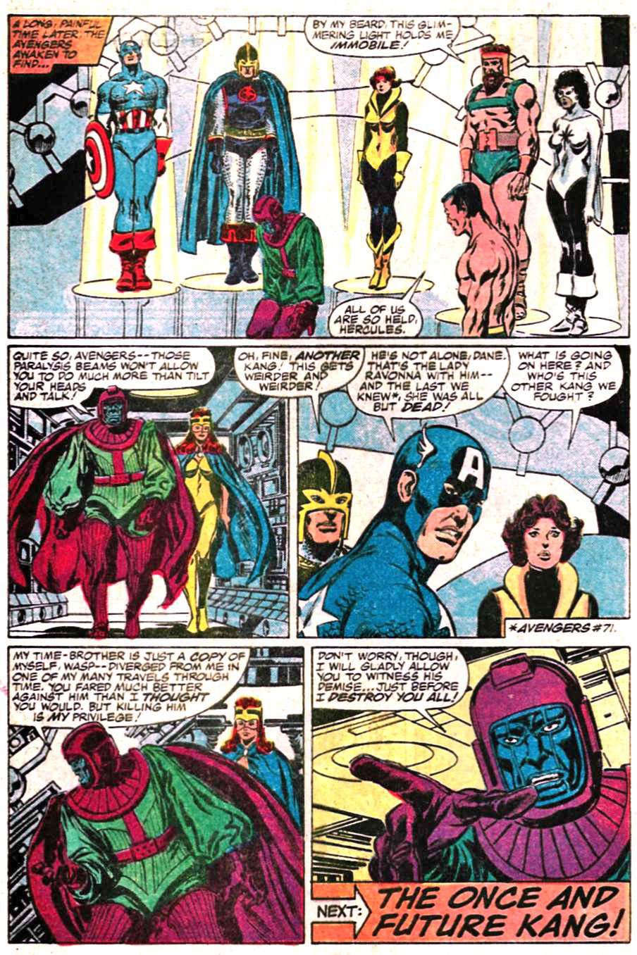
In this 1986 story arc by writer Roger Stern, The Avengers have to contend with multiple versions of Kang, because, well, you know — time travel, the multiverse, alternate realities, that sort of thing.
Legendary penciller John Buscema had returned to Avengers a few years prior, and, although he only provided breakdowns in most stories, Tom Palmer’s lush inks make this run visually compelling.
VERY compelling.
The Avengers lineup at the time includes Captain America, The Wasp, Black Knight, Captain Marvel (Monica Rambeau version) and both Sub-Mariner and Hercules, the clothing-optional pair of the Marvel Universe. They all appear on this cool end page.
Of course, that’s just the East Coast Avengers. The 1986 West Coast branch includes an ever-changing line-up featuring Hawkeye, Tigra, Iron Man, and others.
But as always, I digress.
Next up this week: Ant-Man, The Guardians of the Galaxy and Captain Marvel…
See you soon.