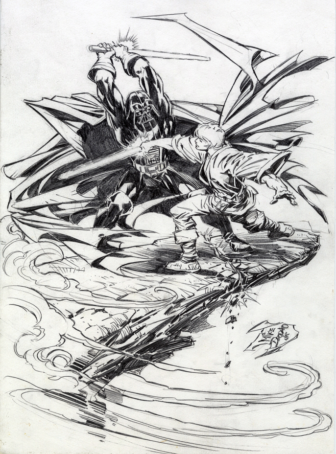
Mike Deodato / Andrew Pepoy — Family Feud
Pencil Commission, Undated (Inks, 2019)
Continuing our countdown to Star Wars:The Rise of Skywalker, opening December 20, and concluding, apparently, the Skywalker saga.
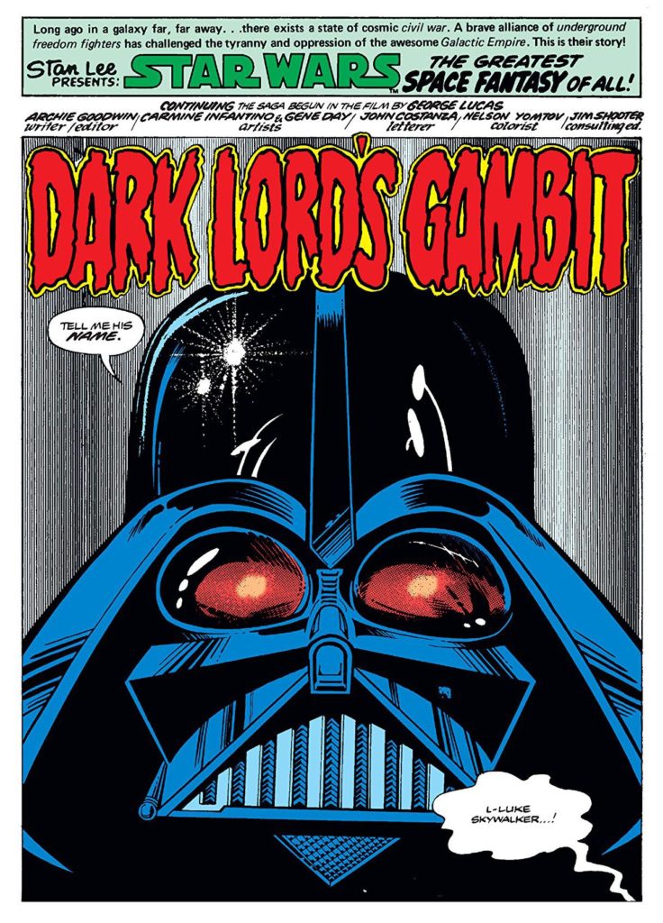
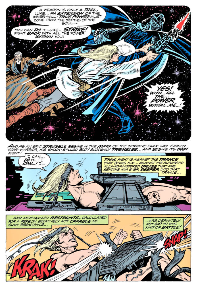
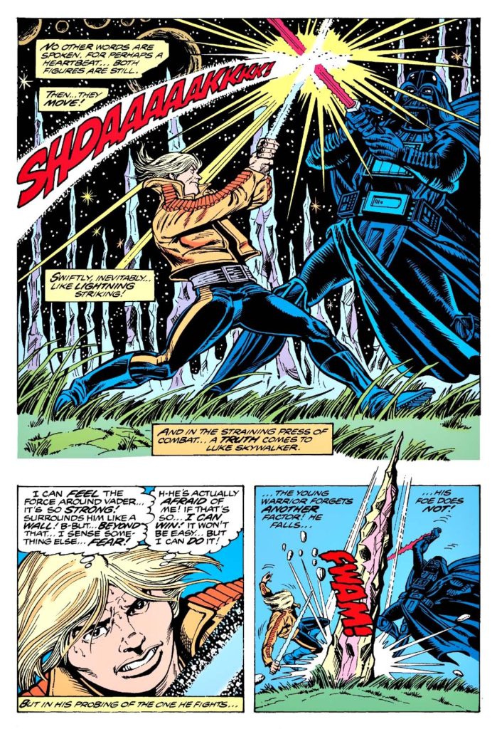
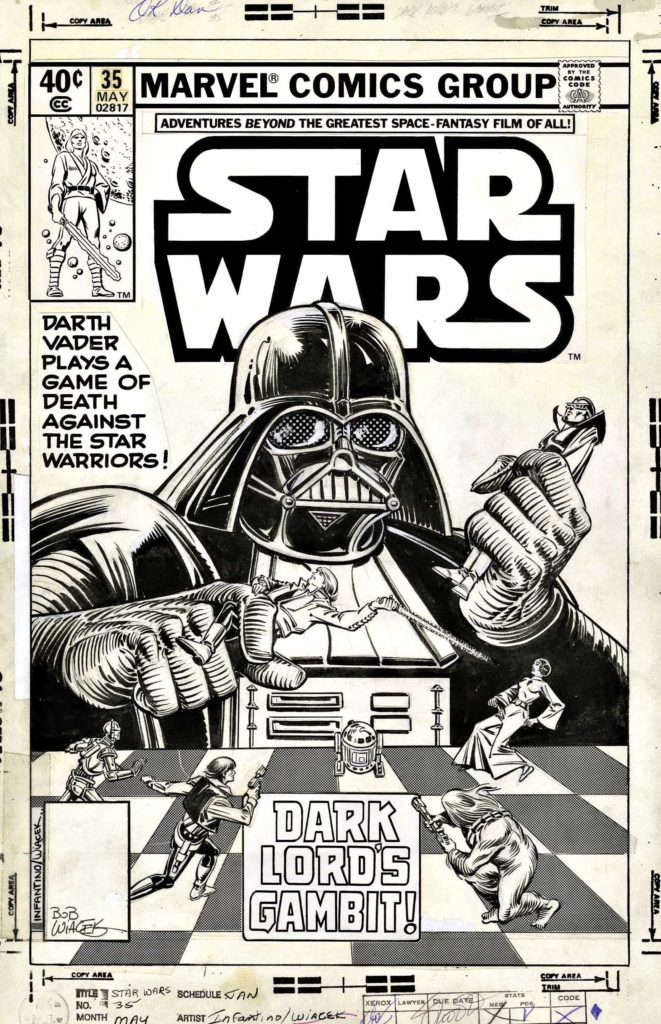
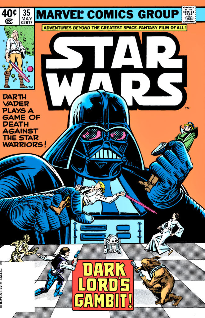
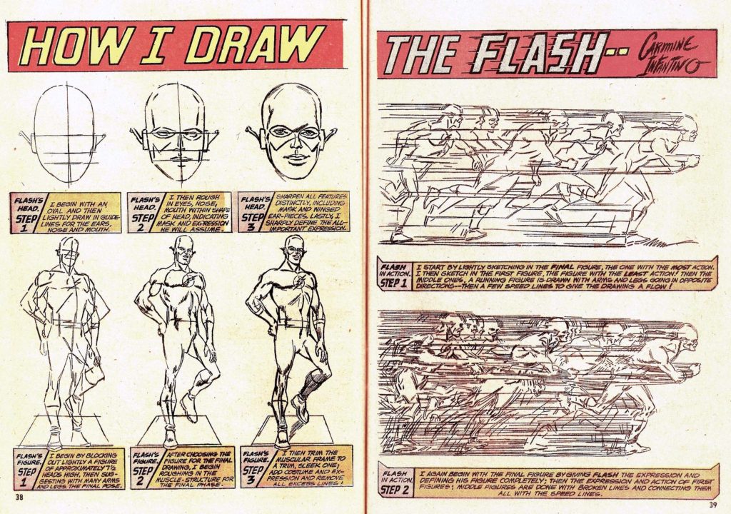
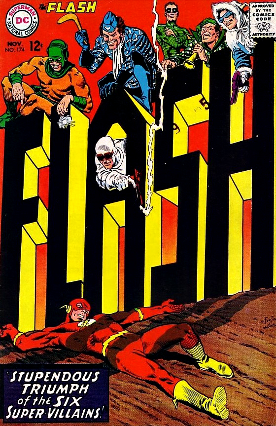
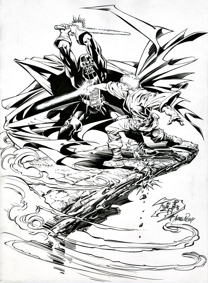
I discovered this dynamic undated commission by Mike Deodato a few months ago. Something about it — the composition, Luke’s face, the overall “loose” style — reminded me of Carmine Infantino’s enjoyable run on the original Marvel series 40 years ago.
When I acquired the piece at NYCC, it was pencils only, and although it looked great, my gut told me to get it inked. (Sadly, my guts often have opinion.)
Fortunately, my pal Andrew Pepoy, the talented inker, happened to be nearby. Turns out, he always wanted to ink the late Infantino, and well, maybe this is the next best thing…
He nailed it — keeping the looseness intact, while adding polish and more depth to make it pop. (Look at Luke’s Lightsaber against Vader’s cape for instance.) This is especially impressive because the pencils were created on an odd thin paper stock, nothing like the more typical Bristol board artists employ. Definitely not an easy task.
Carmine’s run comes during the period leading up to to Empire Strikes Back, and I’m sure Lucasfilm was giving Marvel and writer Archie Goodwin fits, keeping them from, well, just about any story element that would spoil the film. Which is… well…. just about everything. Nerveless, they manage to have a few confrontations between Luke and Vader. Even if, of course, nothing is what it seems.
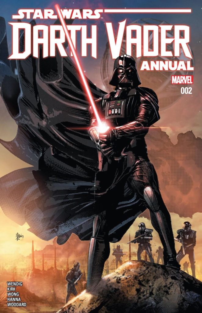
As for this Deodato piece? Mike’s modern Star Wars (see below) art looks nothing like this commission — someday I hope to get the backstory on the art. Until then… stay tuned.

