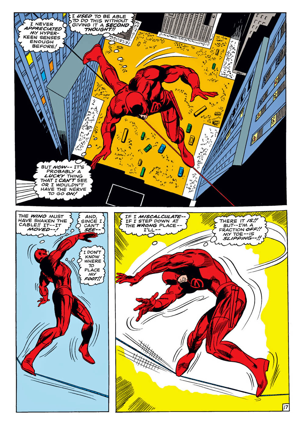
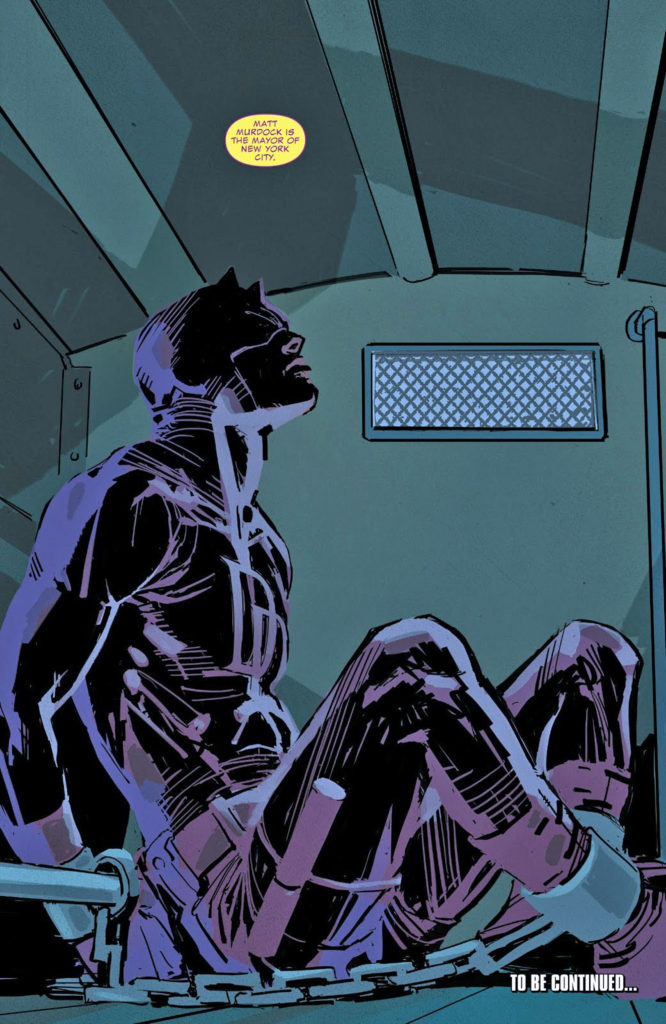
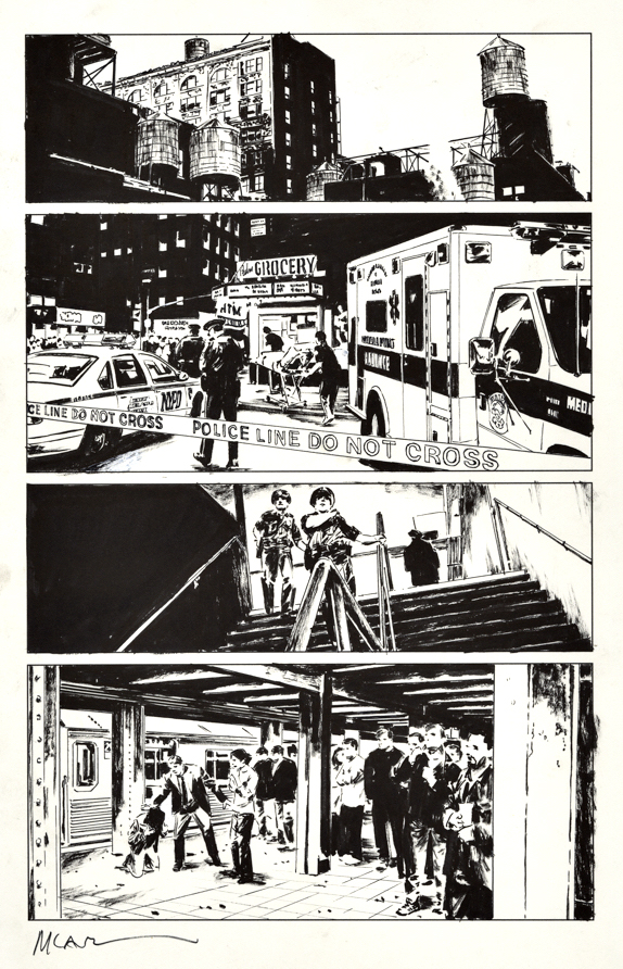
Gene Colan — I’m up on a tight wire…
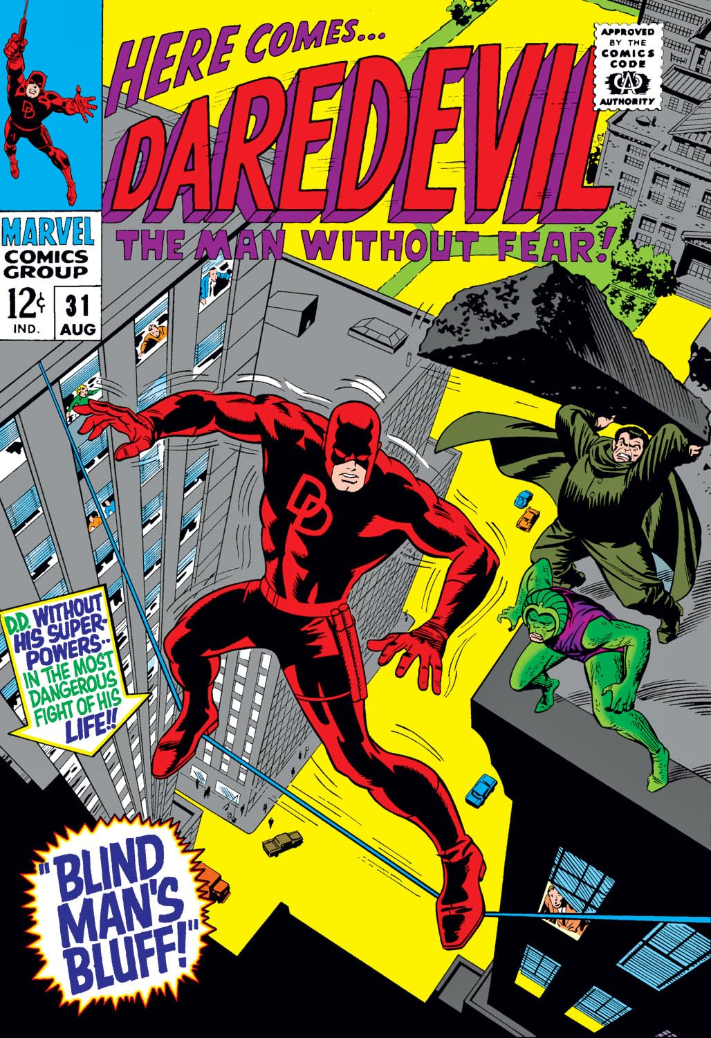
Daredevil #31, August 1967
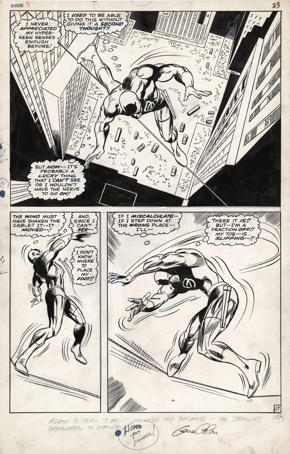
Fun facts about this great Daredevil half-splash from Gene Colan:
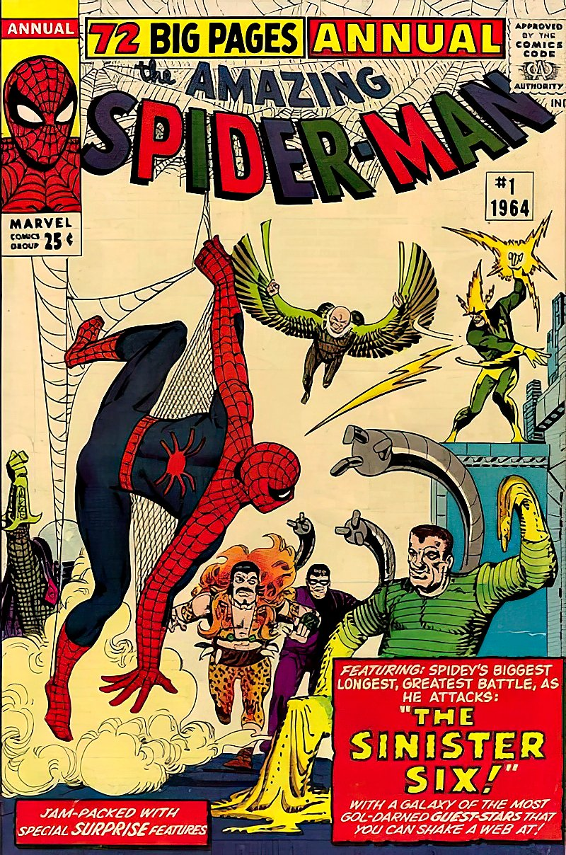
• This is one of the earliest issues (#31) of Daredevil I remember pulling off the rack as a kid. Before this, I can only clearly recall issues #27 and #30, plus Annual #1—which came out around the same time. Marvel had so few superhero books in spring/summer ’67 that you could realistically sample just about everything and figure out what clicked…and what didn’t.
• One thing I did figure out: I didn’t always love Daredevil (face it—some of those villains were rough… Leap-Frog?), but I absolutely latched onto Gene Colan’s art—both here and in Iron Man. That style just hit different, and I dug it.
Later on, I realized that wasn’t exactly a universal opinion. In a world dominated by Kirby, Romita, and the Marvel house style, Colan’s moody, off-kilter approach wasn’t for everyone.
Me? I couldn’t get enough of it—the wild poses, the strange angles, the sense that anything could happen panel to panel… even if you couldn’t always swear you knew what was happening.
I managed to acquire a Colan Daredevil half-splash and an Iron Man one (future post) within a few months of each other. Painful at the time, price-wise—but also pretty lucky in hindsight.
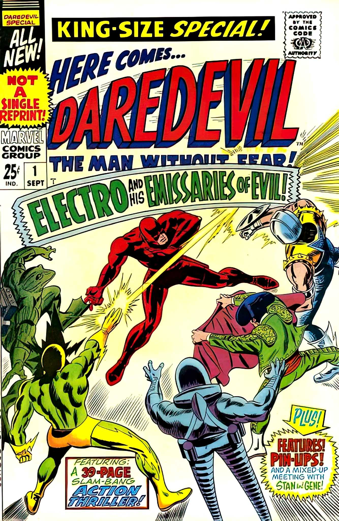
• Bonus realization: I was today years old when I noticed Electro was both a charter member of the “Sinister Six” (Spider-Man Annual #1) and leader of the “Emissaries of Evil” (Daredevil Annual #1). Guy clearly had a passion for group projects.
Or was a glutton for punishment.
Or both.