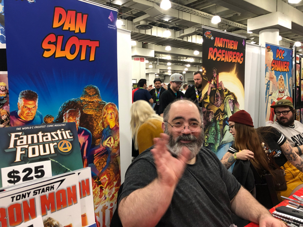
NYCC — The Fourth World
New York Comic Con Con, Javits Convention Center, October 3-6, 2019
Our final batch of photos can be found here, along with the three previous installments. A few highlights below:
See you in Baltimore next week!
Greg Goldstein's Comic Art Gallery
Panels and Pages… Art and Artists… Creators and Conventions… Musings and Memories…

New York Comic Con Con, Javits Convention Center, October 3-6, 2019
Our final batch of photos can be found here, along with the three previous installments. A few highlights below:


See you in Baltimore next week!
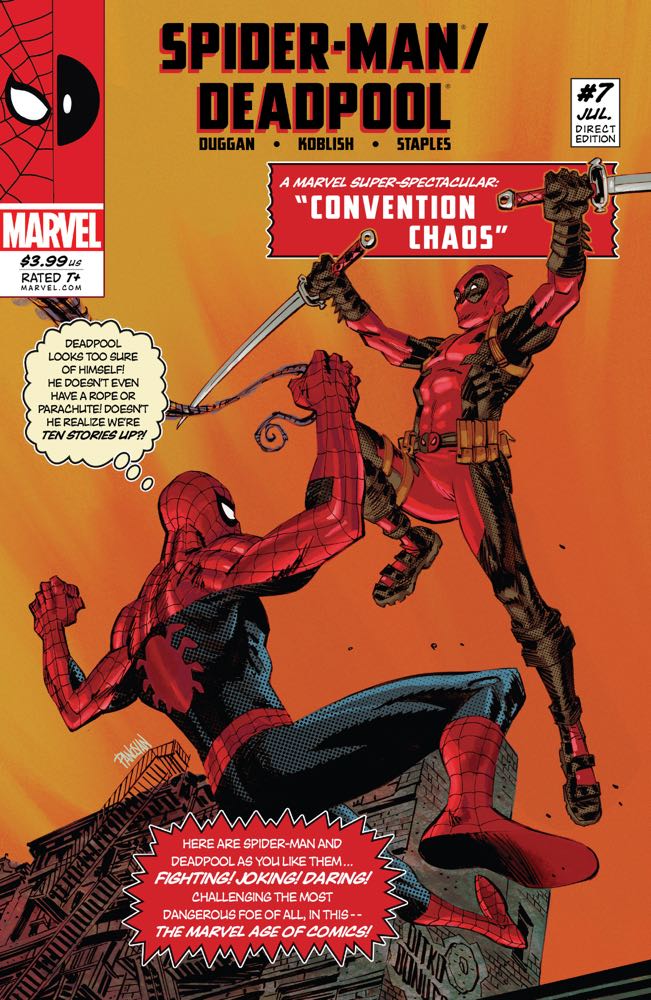
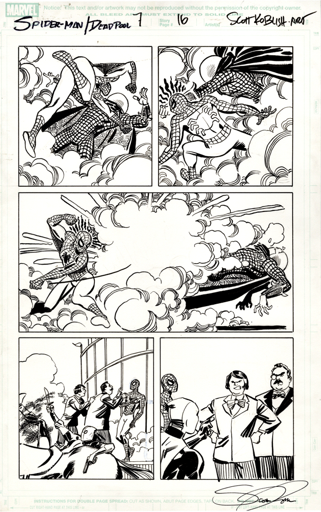
Spider-Man/Deadpool #7, September 2016
Continuing a multi-part look at Spider-Man vs. Mysterio in honor of Spider-Man: Far From Home landing on digital streaming platforms this week.
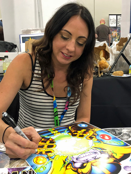
Scott Koblish as a person?: Engaging. Upbeat. Energetic. Witty. Et al.
Koblish as an artist?: Engaging. Upbeat. Energetic. Witty. Et al.
Rarely does a creator’s artistic style so match his personality. Hell, there are great cartoonists, past and present, with lively and bright art aesthetics, who are darker personally than Van Gogh on a bad day. (No I will not be naming names. That’s what the rest of the Internet is for.)
Scott’s mostly zany artistic approach to Deadpool is perfectly on point for the character. (And that’s not taking anything away from Ed McGuinness, a fantastic artist whose work I absolutely love — or any other Deadpool illustrator for that matter.)
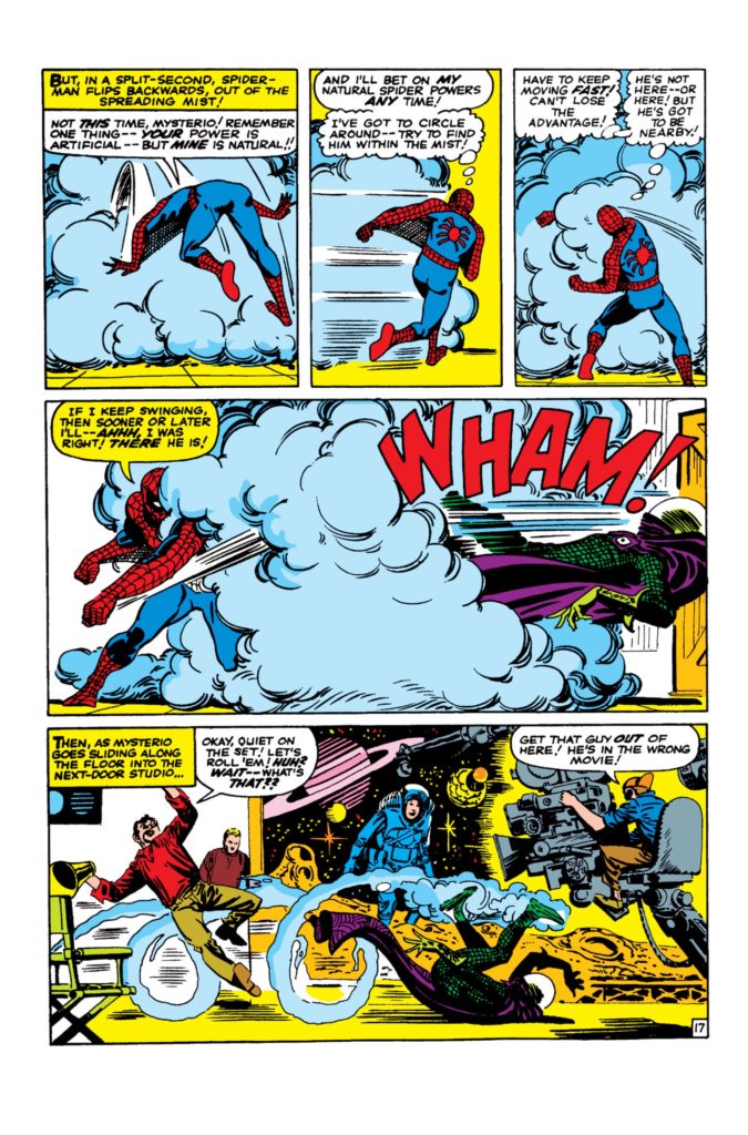
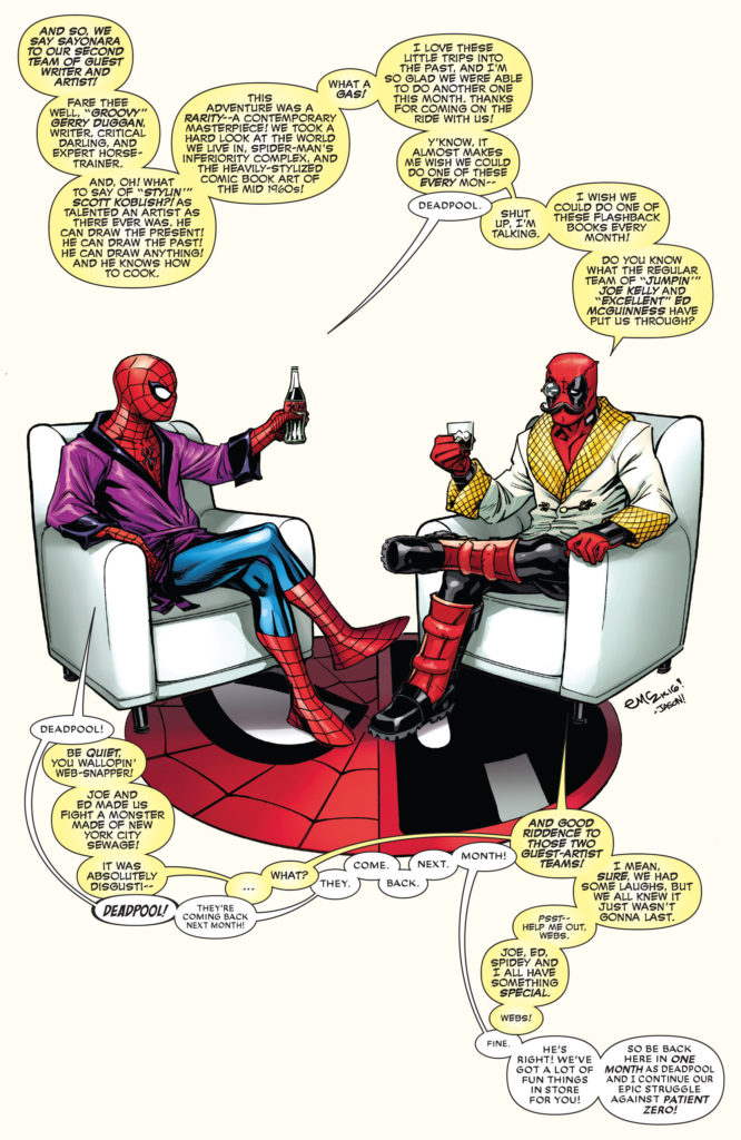
In this “flashback” issue of Spider-Man/Deadpool, Scott draws the entire issue in classic “Steve Ditko” style. It’s clearly done with affection and reverence, and the finished issue, complete with simulated old-school coloring, “bad” printing (out-of register) and aged paper, is old-school fun.
How “classic” is the art style here, you ask? Review the middle panel on this page. It is most definitely… Classic Ditko! (In fairness, the rest of the issue features more original Ditko interpretations as well. Koblish was clearly having a bit of extra fun here.)
And what’s the difference between comedy and tragedy? Check out Scott’s book, The Many Deaths of Scott Koblish, and decide.