Greg Goldstein's Comic Art Gallery

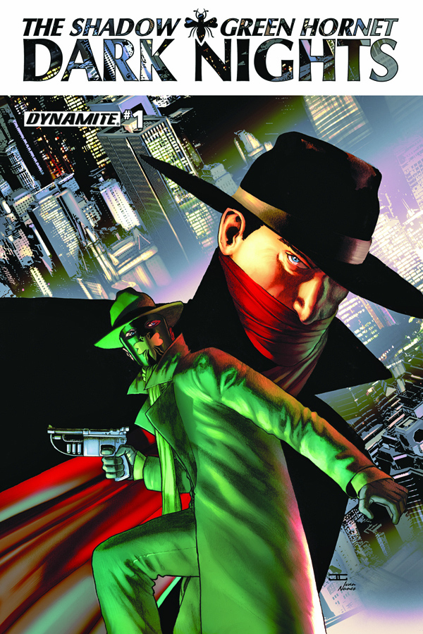
John Cassaday — Masked Legends

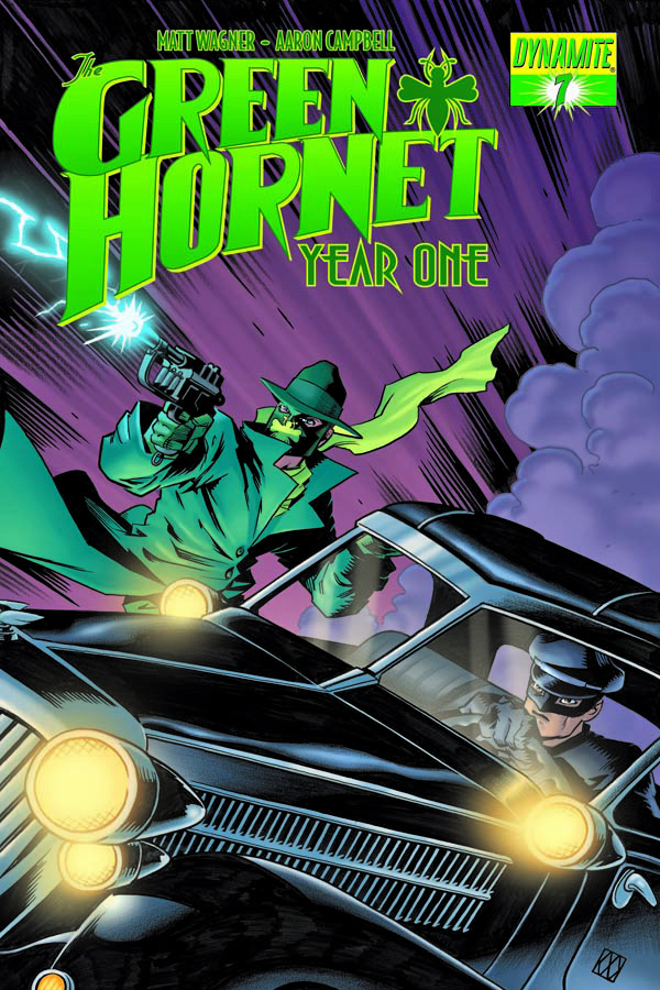
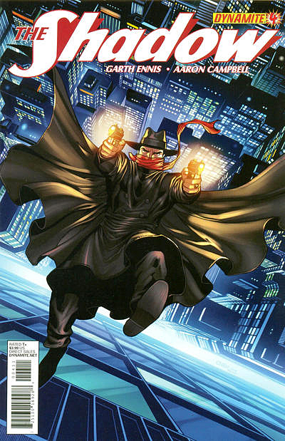
The Shadow / Green Hornet: Dark Nights #1, July 2013

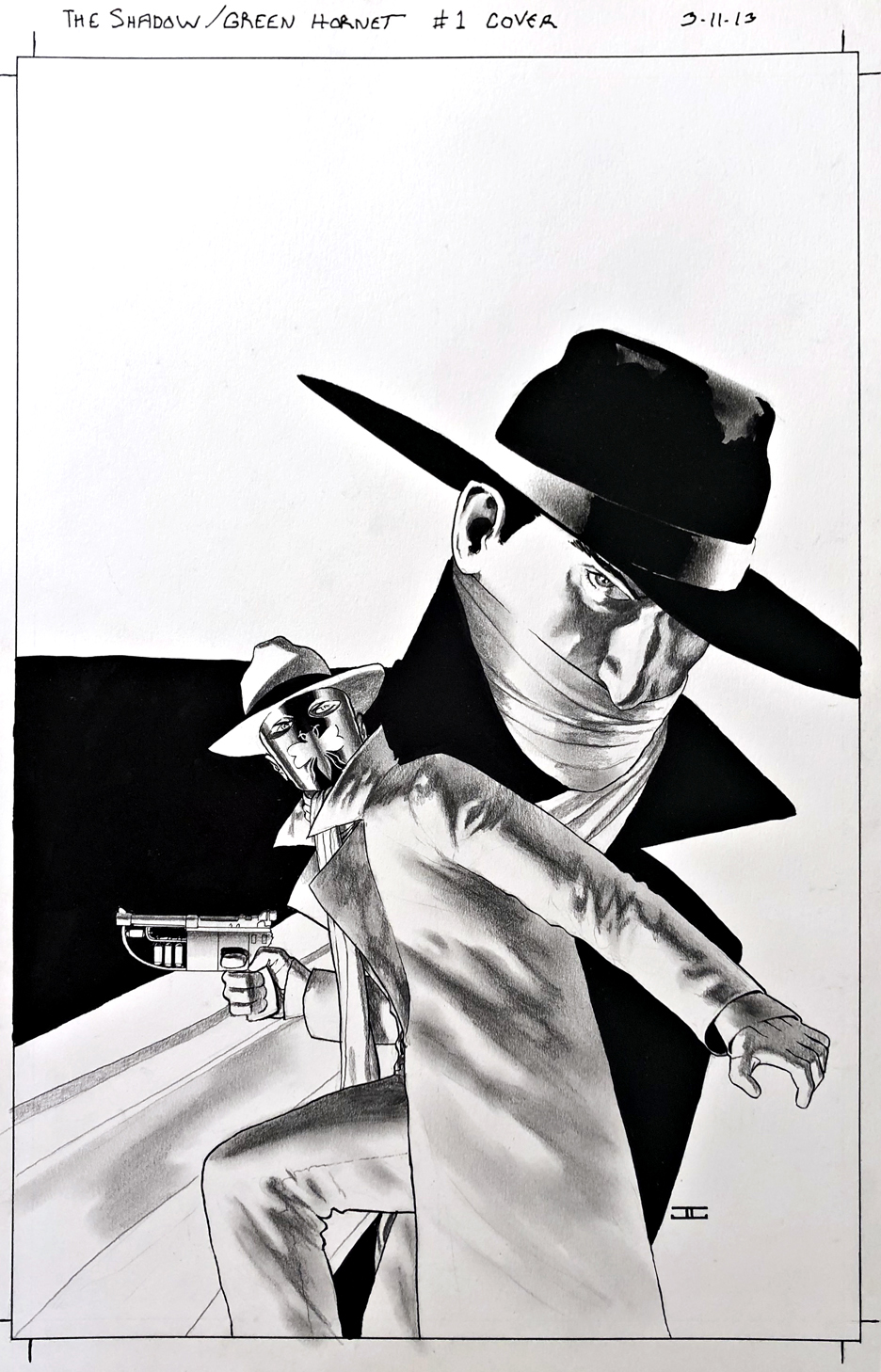
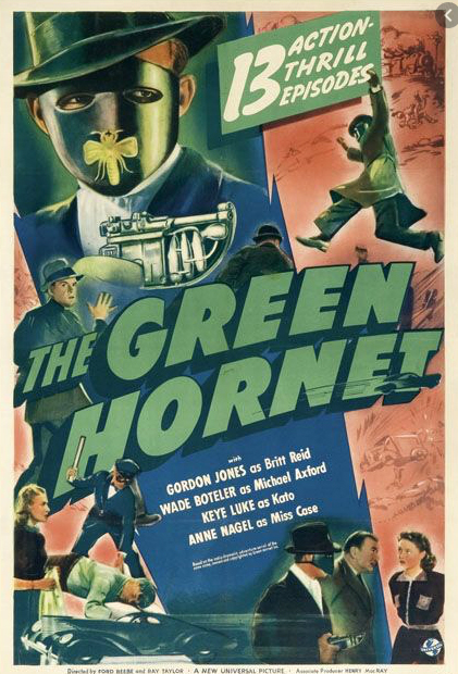
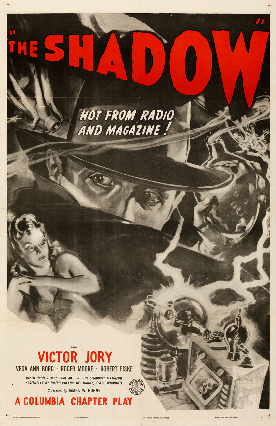
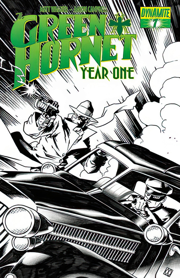
Nice to see two of my favorite classic characters, The Shadow and The Green Hornet together in one series, with a fantastic cover by the terrifically talented John Cassaday.

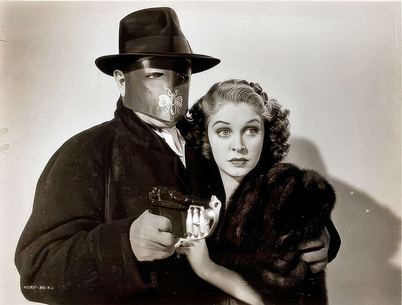
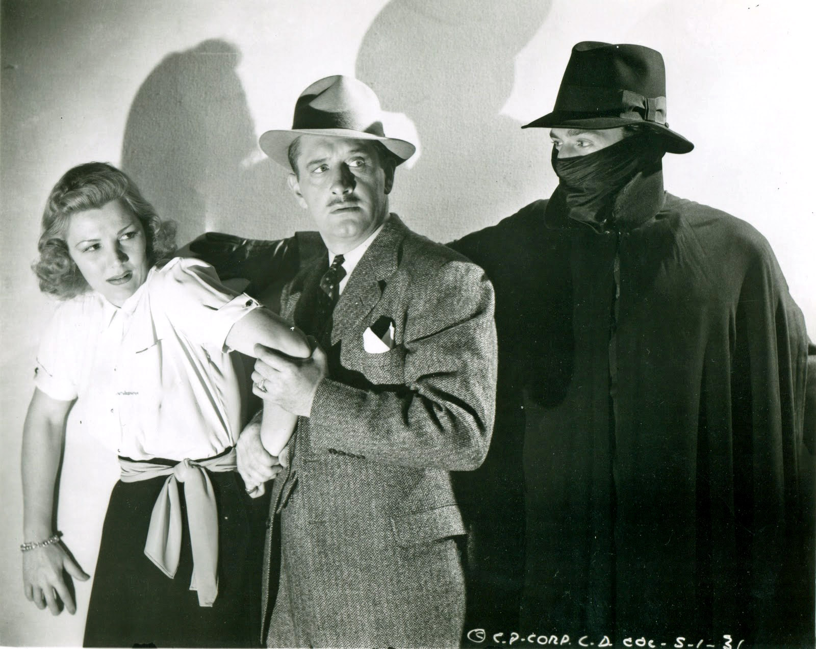
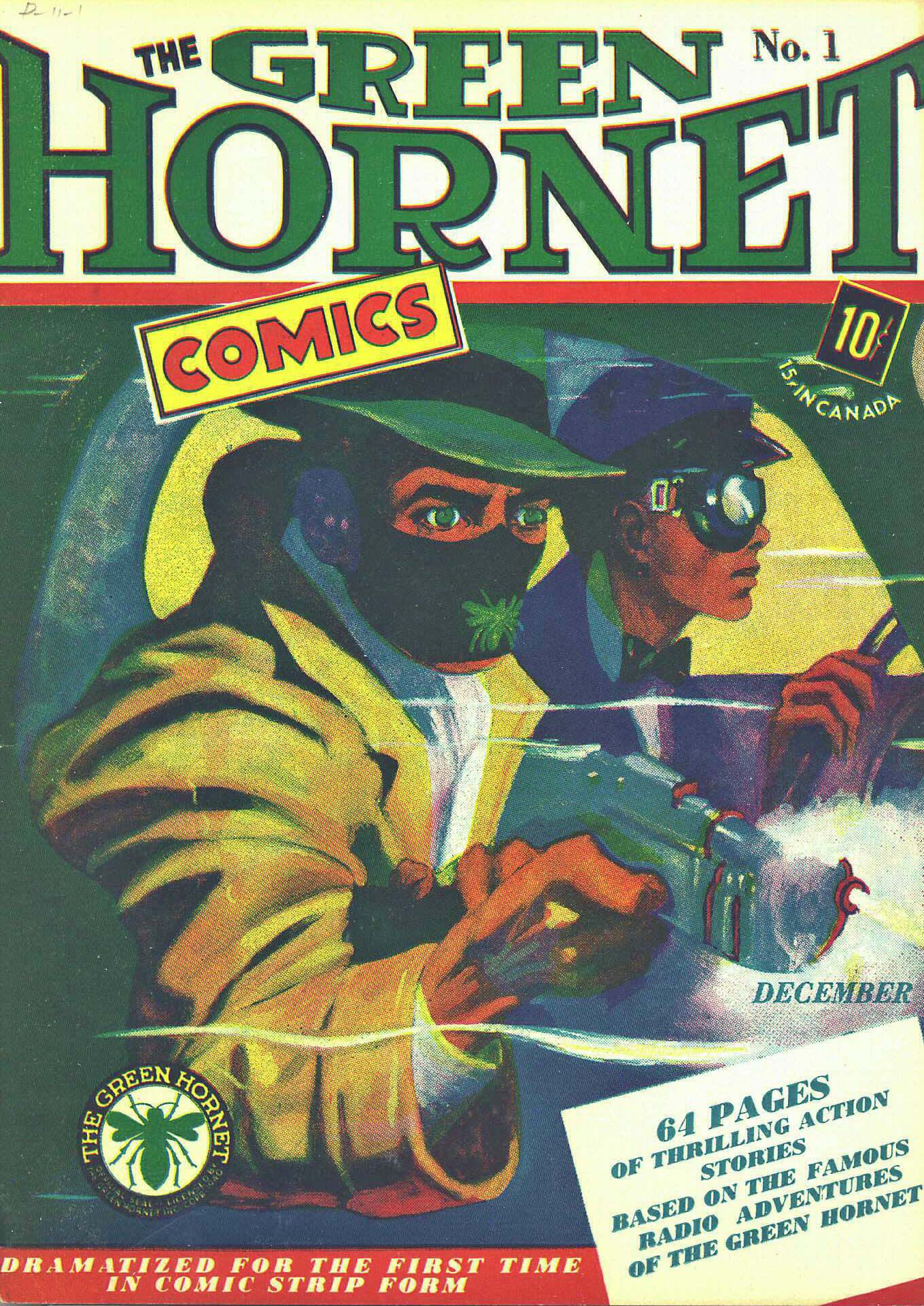
Pulps and comics — like peanut butter and jelly, yes? My dad connected many of the dots between the pulp, comics, radio and serial adventure characters for me at an early age.

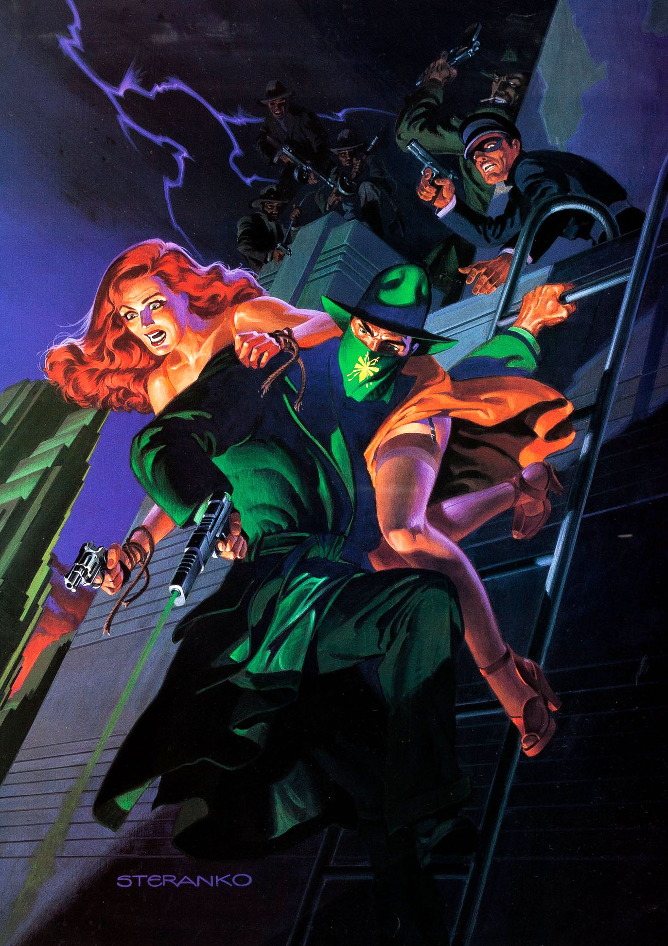
I credit Jim Steranko (History of The Comics) and the nostalgia boom of the 60s and 70s for amplifying those connections.

And how about some contemporary credit to Nick Barrucci and the other talented folks at Dynamite Entertainment for (at least briefly) creating a cool “shared universe” with some of these unforgettable icons?

Fun books all around, and I know from personal experience it wasn’t easy securing all those licensing rights to make these kinds of mash-ups possible.

Matt Wagner — Legacy Of The Hornet

Green Hornet Year One #7, December 2010

I had a nice selection of Matt Wagner Green Hornet covers to choose from when Matt offered them for sale. I picked this one because it featured the Hornet, Kato AND Black Beauty. (The automobile’s name for those not familiar with The Hornet’s world.)

This comic series deals with the original iteration of the Green Hornet, so the car is a 1937 Lincoln Zephyr, not a 1966 Chrysler Imperial as featured in the TV series that I adored as a kid.

But it still works for me.

Esteban Maroto — Lovely and Deadly

Lady Rawhide #5, June 1997

Lady Rawhide was introduced in the pages of Zorro as a “good girl/ bad girl” supporting character. After all, we had to keep with Vampirella, Dawn, Shi, Lady Death, et al, no?

She ended up with two of her own min-series, this second one with art by the legendary Esteban Maroto.

Unfortunately, as the series launched, it was becoming apparent that Topps’ passion to stick around in the comic book business was waning. The comic book sales implosion that followed the early 90s explosion was brutal.

I had left the company prior to the series solicitation, and EIC Jim Salicrup left prior to its conclusion. And, seeing the handwriting on the wall, Topps management published the final two issues of this series without coloring them to save money.

But, as always, we digress.

Topps comics may have concluded its run, but Lady Rawhide lived on at Dynamite Entertainment — at least for a while. (And they added a Lady Zorro for good measure.)

Sean Chen — Savage Team-Up

Red Sonja Conan #1, July 2015

Red Sonja and Conan together again, as they say, on this great cover by my pal, the very talented Sean Chen.

That’s it. That’s the post.

Aaron Lopresti — Lost Beauty

Unused Cover, Sword of Red Sonja: Doom of the Gods #1, October 2007

In an age of variant covers, exclusive covers, incentive covers, et al, sometimes a cover simply gets lost in shuffle.

It happens. (Take it from a former publisher. It definitely happens.)

Case in point: This stunning Red Sonja cover art was scheduled for Sword of Red Sonja: Doom of the Gods #1, got shuffled around and by the time the mini-series was complete, had not been published. I’m sure it didn’t help that another artist turned in a similar composition for a later issue.

I had a chance to catch up with Aaron last month and he thinks it may have appeared in a later trade collection or elsewhere at some point, but he couldn’t swear to it. And neither one of us could find it.

So, unpublished until we hear further. (Bonus points for the Marvel cover paper — all covers look better on that board, even if they weren’t actually produced by Marvel.)

Frank Thorne — Angels From Hell!

Red Sonja #10, July 1978

Frank Thorne on Red Sonja? Sign me up. 

It took me a while to acquire a piece of art from his run on the famed female barbarian, but I ended up with a cool one.

To this day, the wildest convention events I have ever personally witnessed were the live performances featuring Red Sonja (Wendy Pini, Linda Behrle, and others) and Frank Thorne playing a wizard: “Sonja and the Wizard.”

They called themselves the “The Hyborian Players.”

It was indeed the 70s. Trippy, dude. Trippy.

Dan Jurgens & Jerry Ordway — Chewbacca, RIP

Star Wars: Chewbacca #1, January 2000

A long time ago, in continuity far, far away, Chewbacca apparently does not make it to the conclusion of the Star Wars Saga.

And the classic team of Dan Jurgens and Jerry Ordway beautifully illustrate this mournful moment in a rare departure from their more common DC team-ups.

I realize we can be broken records about this, but the coloring obviously doesn’t do the art true justice. It might look good on a computer screen, but as for the final printed version… not so much.

This was a DF exclusive to this Dark Horse comic published in 2000.

Of course any storyline that Chewbacca died flies out the window with all the other post Return of The Jedi continuity, once Disney purchases Lucasfilm and declares all the previous “cannon,” non-canonical.

Which is good for Chewie, of course, but not necessarily the rest of the Star Wars Saga.

(As a side note, Marvel has indeed done some terrific comics since reacquiring the license. But tossing out 30 years of stories, in comics and novels, some of them quite excellent… well… I have no words.)

Glenn Fabry — Disappearing Act

James Bond #1 (Dynamite), November 2015

Today, after an 18-month pandemic induced delay, No Time To Die finally opens in the United States. We mark the occasion with our third, and final, piece of James Bond original art.

Ah, comic book art in the age of powerful digital technology. This original cover by Glenn Fabry starts off with two beautiful Russian women, but ultimately ends up without them.

(The gun in the background also disappears between solicitation and actual publication, but that is more a function of the trade dress choice, and certainly less jarring.)

Digital manipulation aside, it’s still a cool cover. And kudos to Dynamite for landing the rights. At IDW Publishing, we hounded the rights holder(s) endlessly and continuously came up empty handed. (I’m sure other publishers tried as well.) 

And speaking of disappearing acts — When I was at Topps Comics, we acquired the Goldeneye (Pierce Brosnan’s first outing as Bond) rights in 1995. We launched with a first issue of what was planned as a three-issue adaptation. Unfortunately, issues two and three never appeared. In addition to approvals that came in at the speed of molasses, the licensor — and I kid you not — objected to the adult material that was appearing in the comics. 

Nothing crazy — just the same “adult” material that appears in the film.

Seriously.

Sean Chen — Catch Me Now…

Shadow #4, August, 2012

Concluding our ongoing series celebrating multiple anniversaries for the classic pulp character, The Shadow.

Gravity. What a bitch.

Comic art (and animation) often defies gravity, and pretty much all other laws of science. (Not just physics.)

Didn’t care as a kid, don’t care now. 

As long as the art is dynamic, the storytelling is clear, and we don’t push the boundaries into the realm of downright ridiculous, I’m good.

Also, consistency helps too. If Wile E. Coyote has a one-second mid-air pause before he falls helplessly to the earth, each and every time, no problem. Not realistic, but completely plausible within the context of the character and story.

Falling: always a bit slower in comic books than reality. And the character is often calm and composed about the whole thing. 

Like our friend Lamont Cranston here. He’s not flailing; he’s carefully shooting at whomever caused his drop. 

We know he’s going to finish getting some shots off, and, at some point in the drop, reach for a convenient flagpole. Or something.  He will figure it out.

In “real life,” perhaps not so much.

A terrific cover, illustrated by the terrifically talented Sean Chen. Flailing not permitted.

Howard Chaykin — Detente

Shadow, Midnight in Moscow #4, September 2014

Continuing our ongoing series celebrating multiple anniversaries for the classic pulp character, The Shadow.

Howard Chaykin will tell you — often, and with emphasis — that he is not a guy rooted in the classic pulps.

That said, there is something consistently special about his artistic interpretation of the Shadow.

Maybe it’s his actual distance from the character that makes it so terrific. It’s strictly a professional relationship, without fannish admiration.

Whatever the reason, Howard’s Shadow always looks like the character should look like in my mind’s eye.

On this bold and striking cover, the buildings and effects were added digitally of course, and atypically, I’m thrilled they were. I love the character composed powerfully on his own in the original art.

As noted, striking and bold. Lots of black ink and just enough lighting. Guns out, cape flowing. 

Just as it should be.