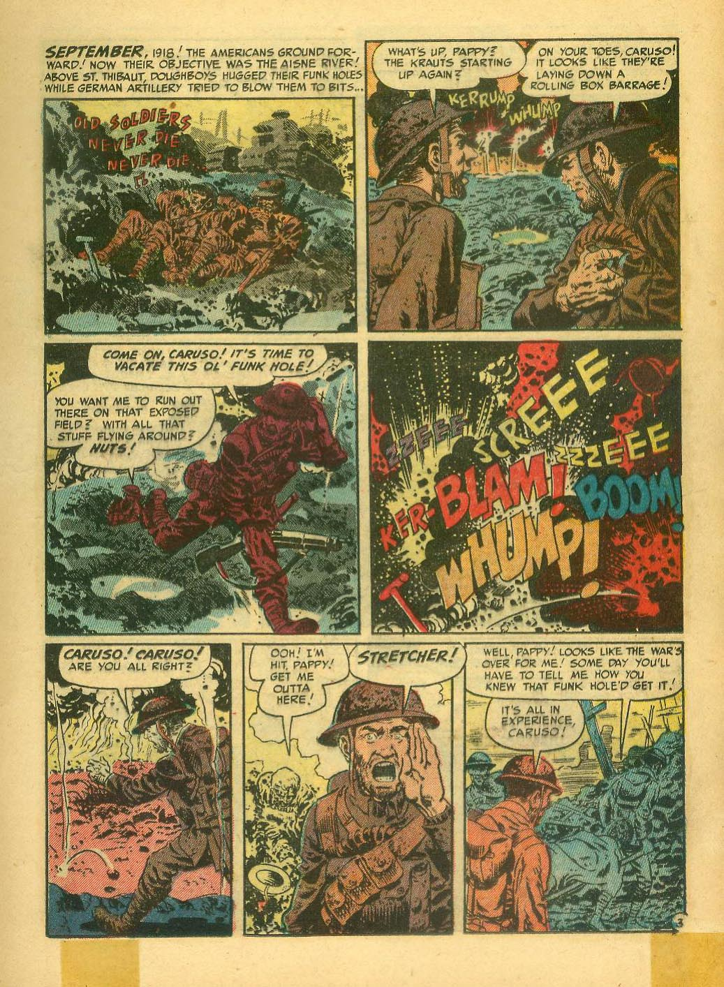
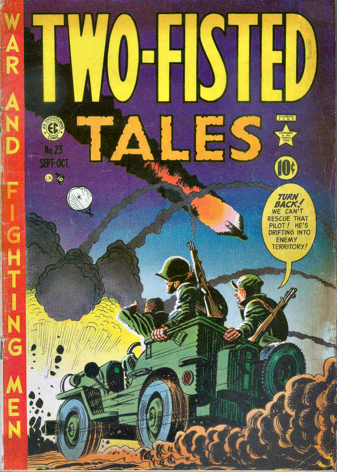
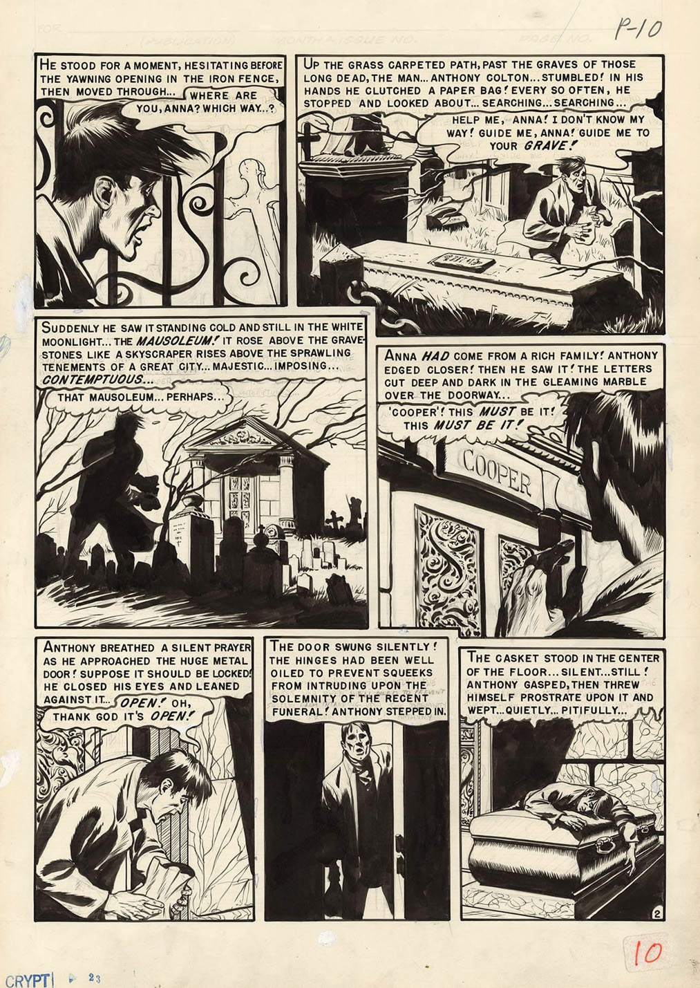
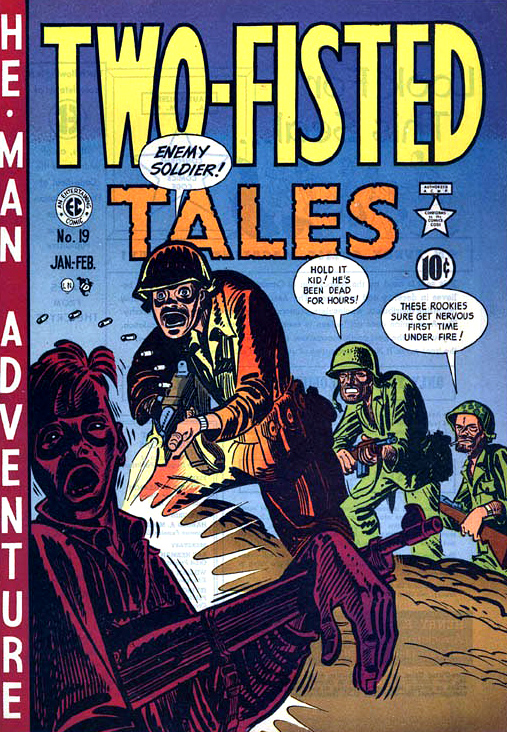
Wallace Wood — “On Your Toes…!”
Two-Fisted Tales #23, September-October 1951
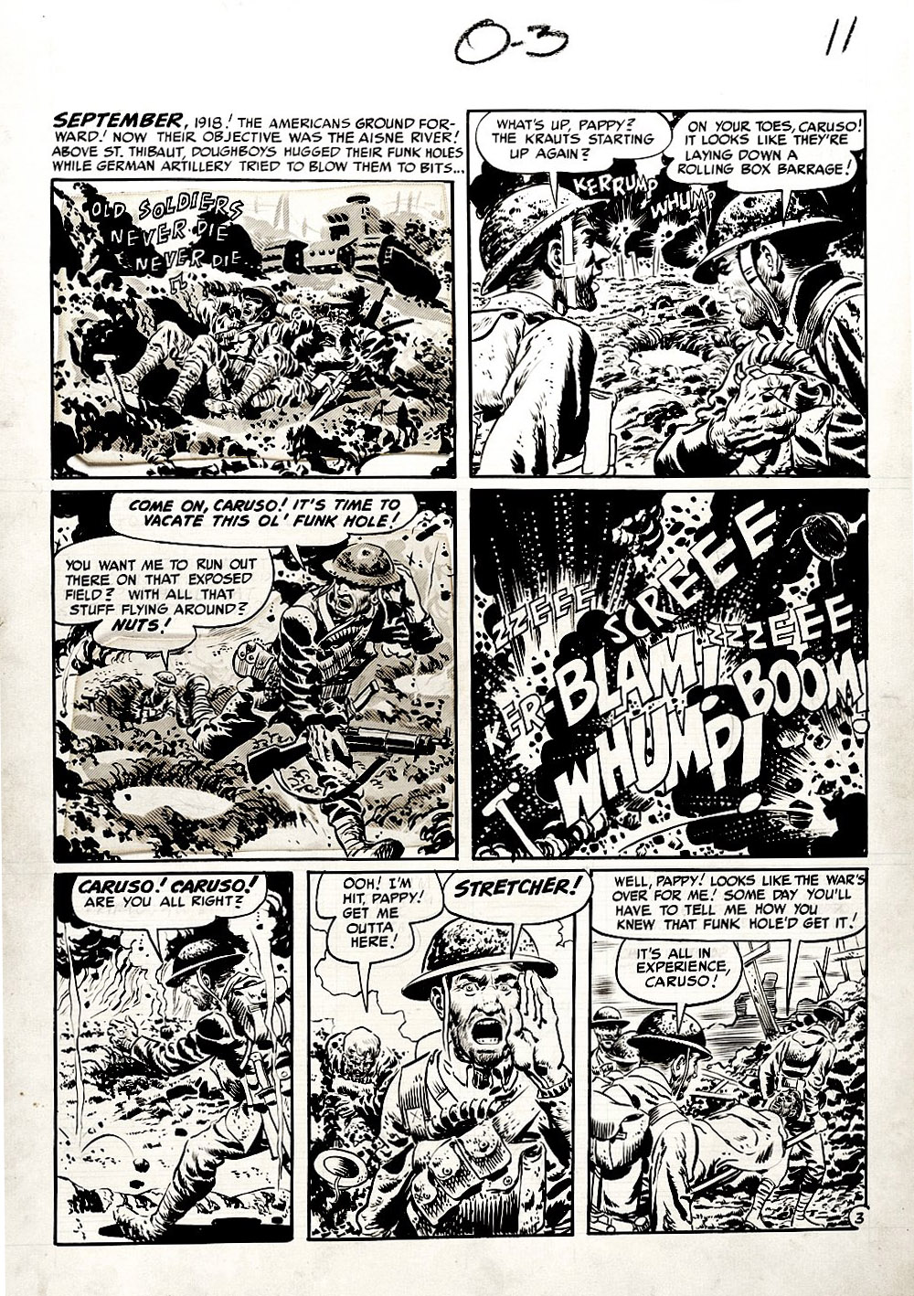
This is a great Wallace Wood war page, from the classic EC Comics WWI story: “Old Soldiers Never Die.” (Two-Fisted Tales #23.)
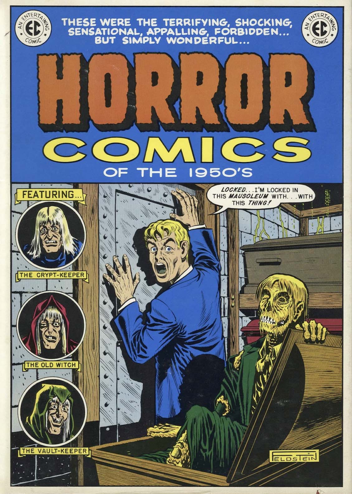
I first discovered EC comics in late ’71 or early ’72, thanks to the incredible oversized Nostalgia Press collection, The EC Horror Library of the 1950’s.
From that moment on, I was hooked.
Maybe surprisingly, once I got past the initial shock value of the horror books, I realized I could kind of take them or leave them. But everything else? That was a different story.
Science fiction—absolutely.
Crime—of course.
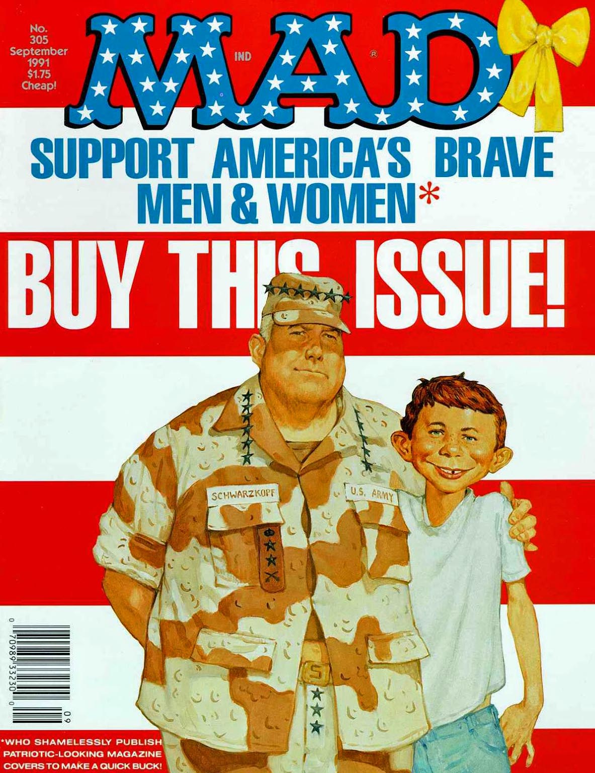
Humor—what was better than Mad?
And those war comics… man.
Harvey Kurtzman’s storytelling was first-rate. And unlike the Al Feldstein-driven stories in the other genres, he typically let the art—more than captions or dialogue—carry the narrative.
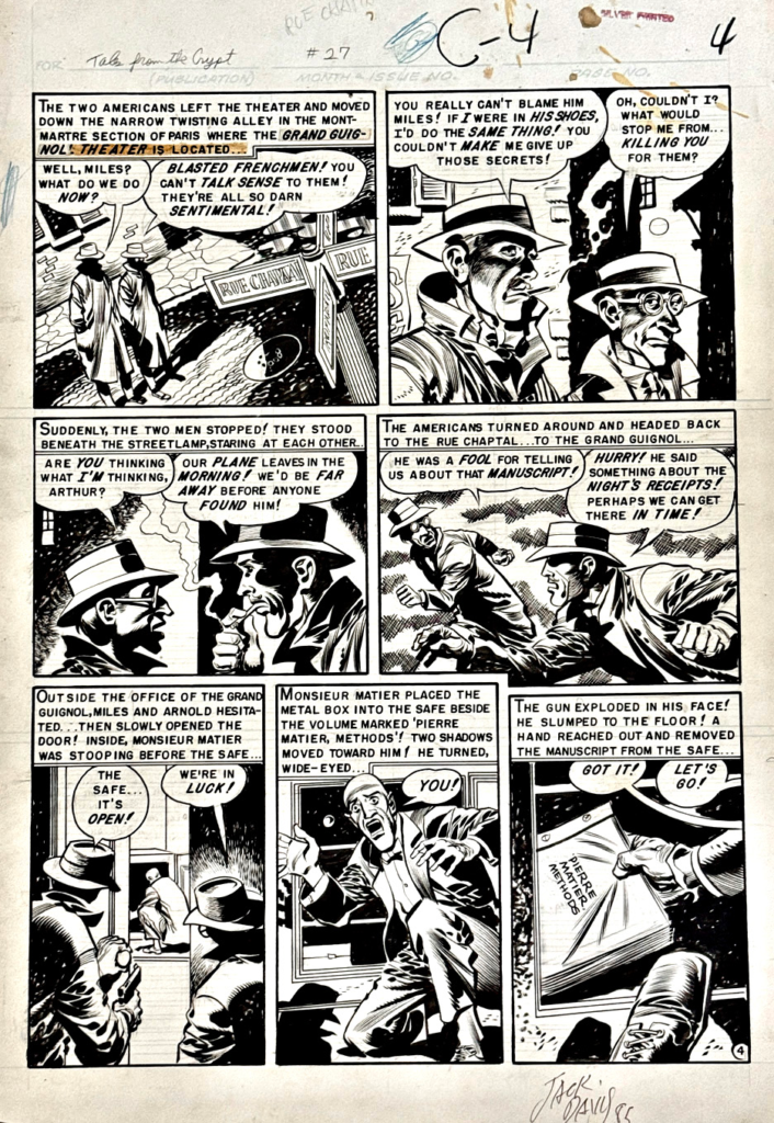
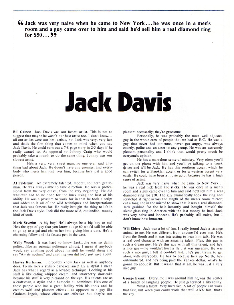
If you had told 12-year-old me that one day I’d own original art from artists like Wally Wood, Jack Davis, and others, I would’ve thought you were completely out of your ever-loving mind.
To say I’m grateful to be the temporary caretaker of this art… that’s the understatement of the year.