Lucas Museum — The Art
Lucas Museum of Narrative Art, Los Angeles, September 10, 2026
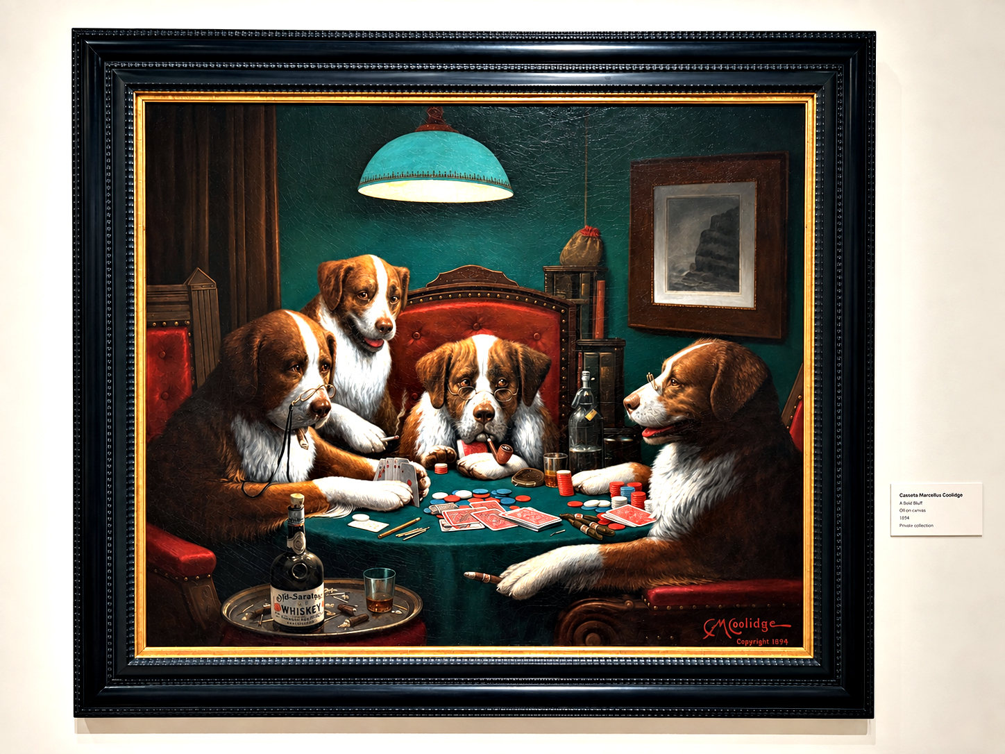
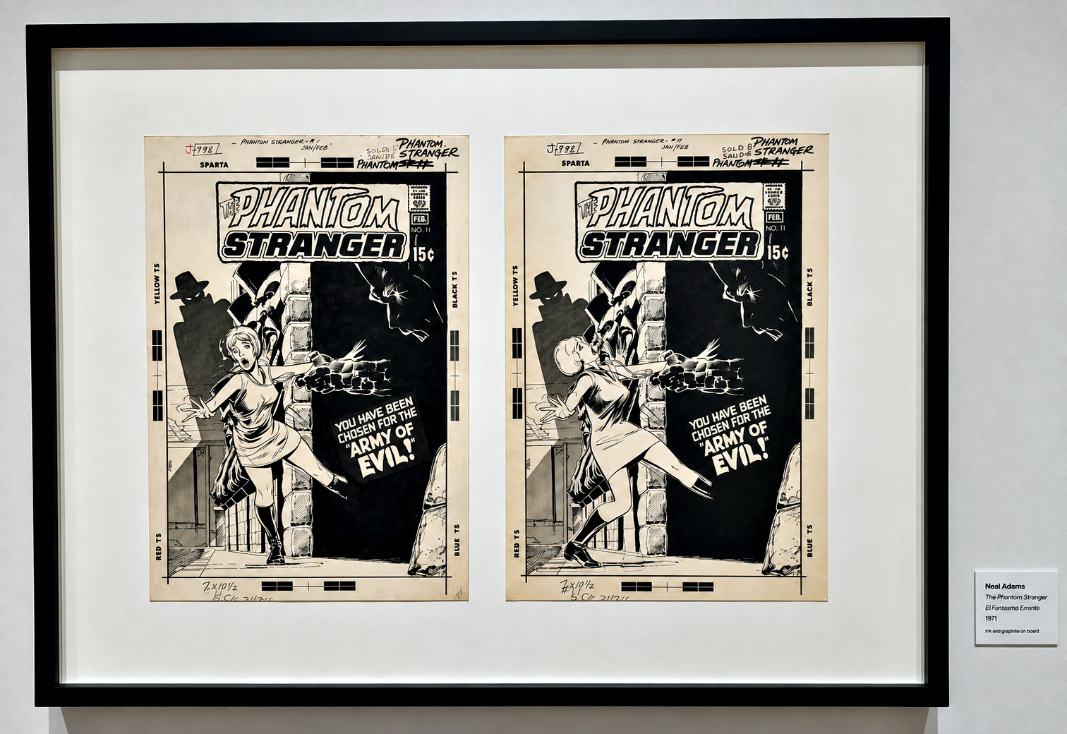
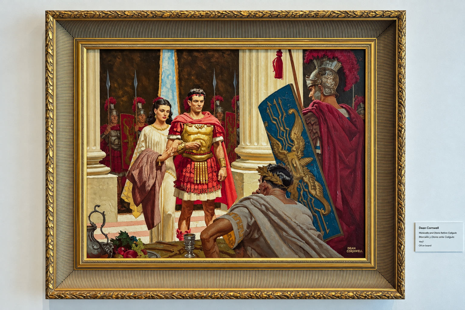
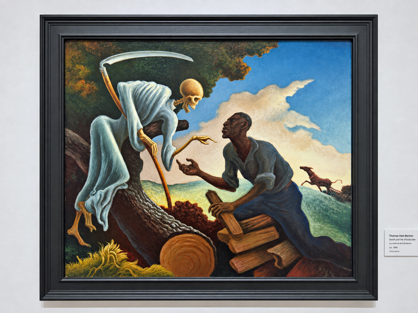
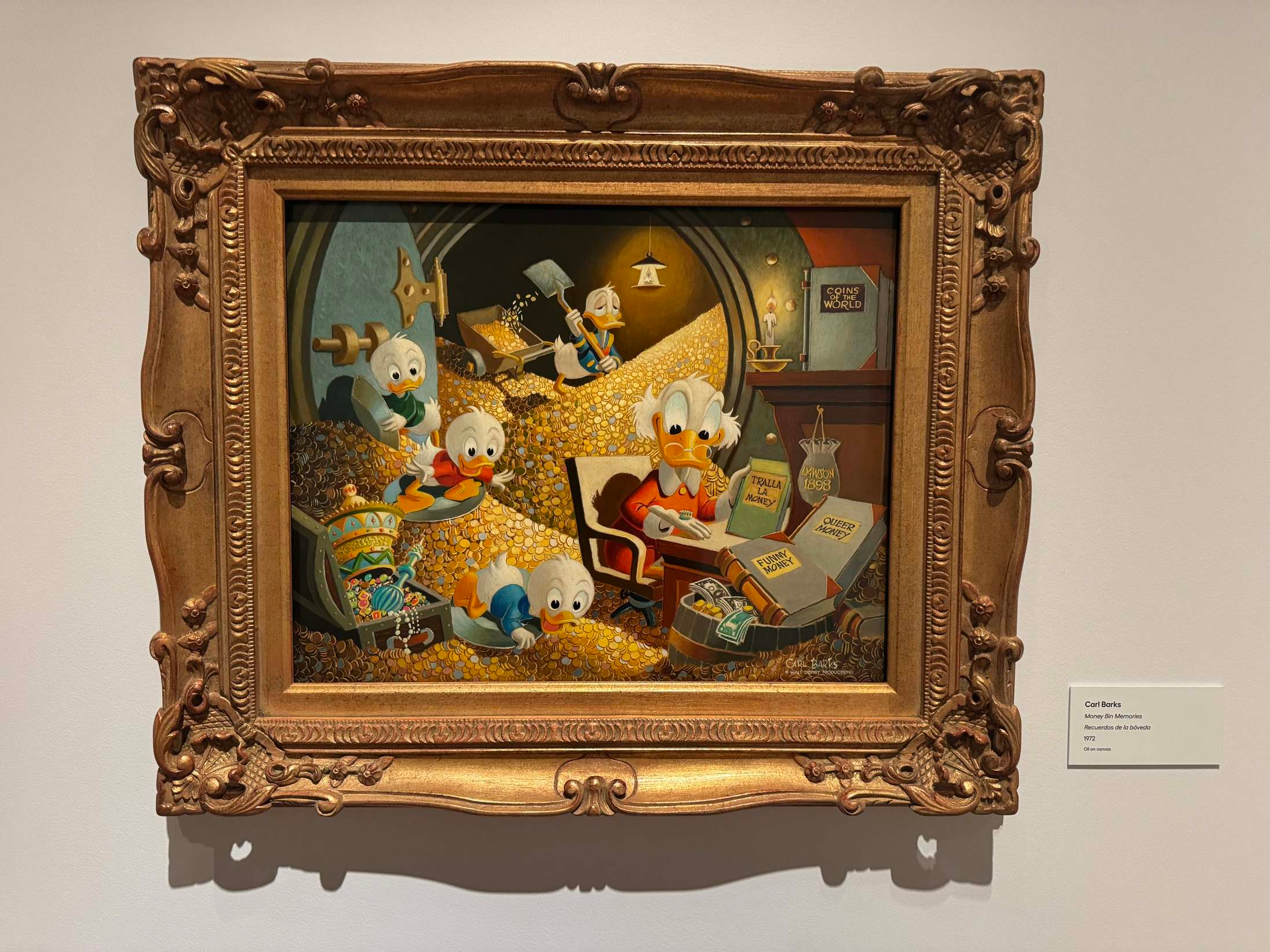
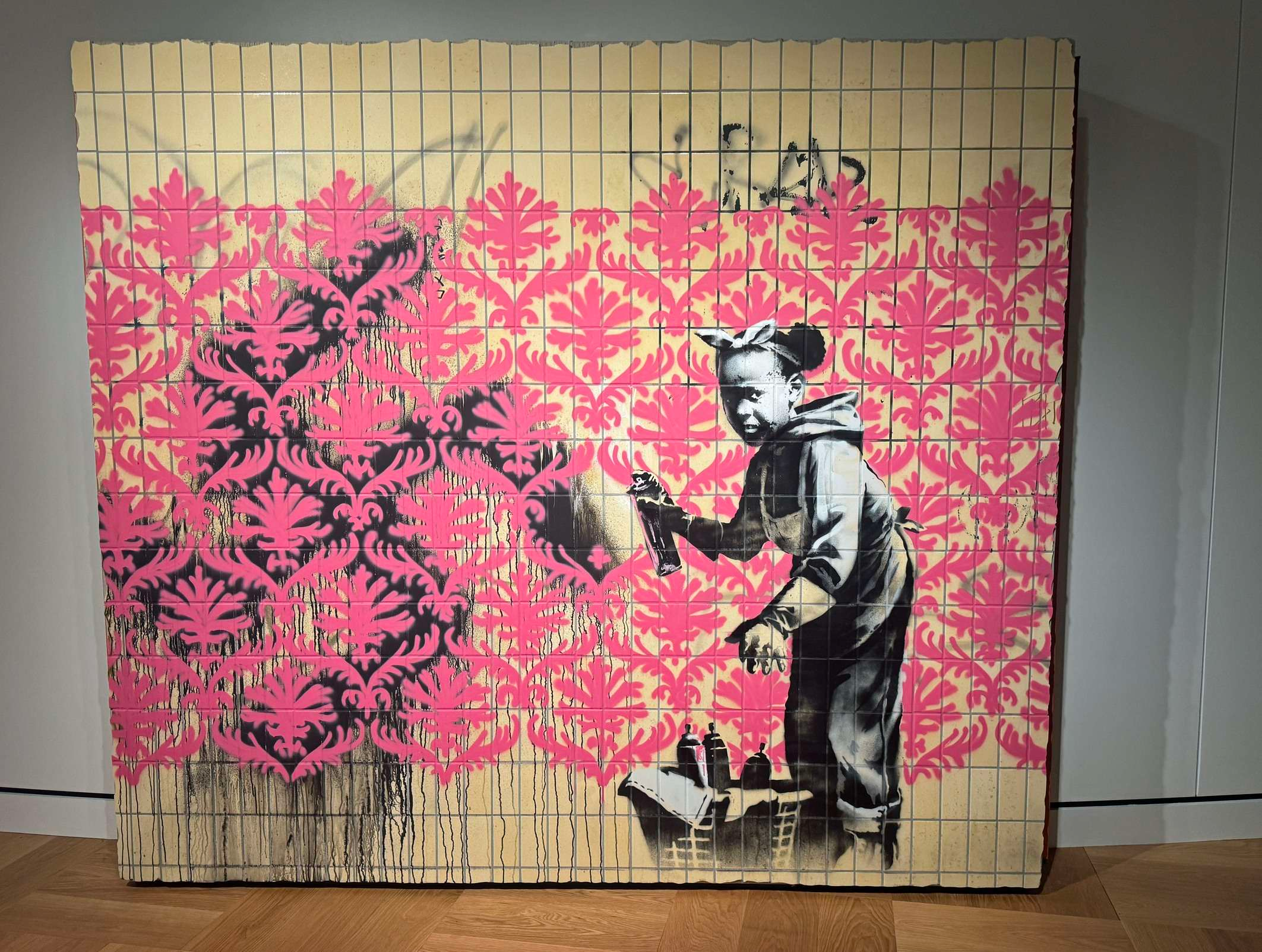
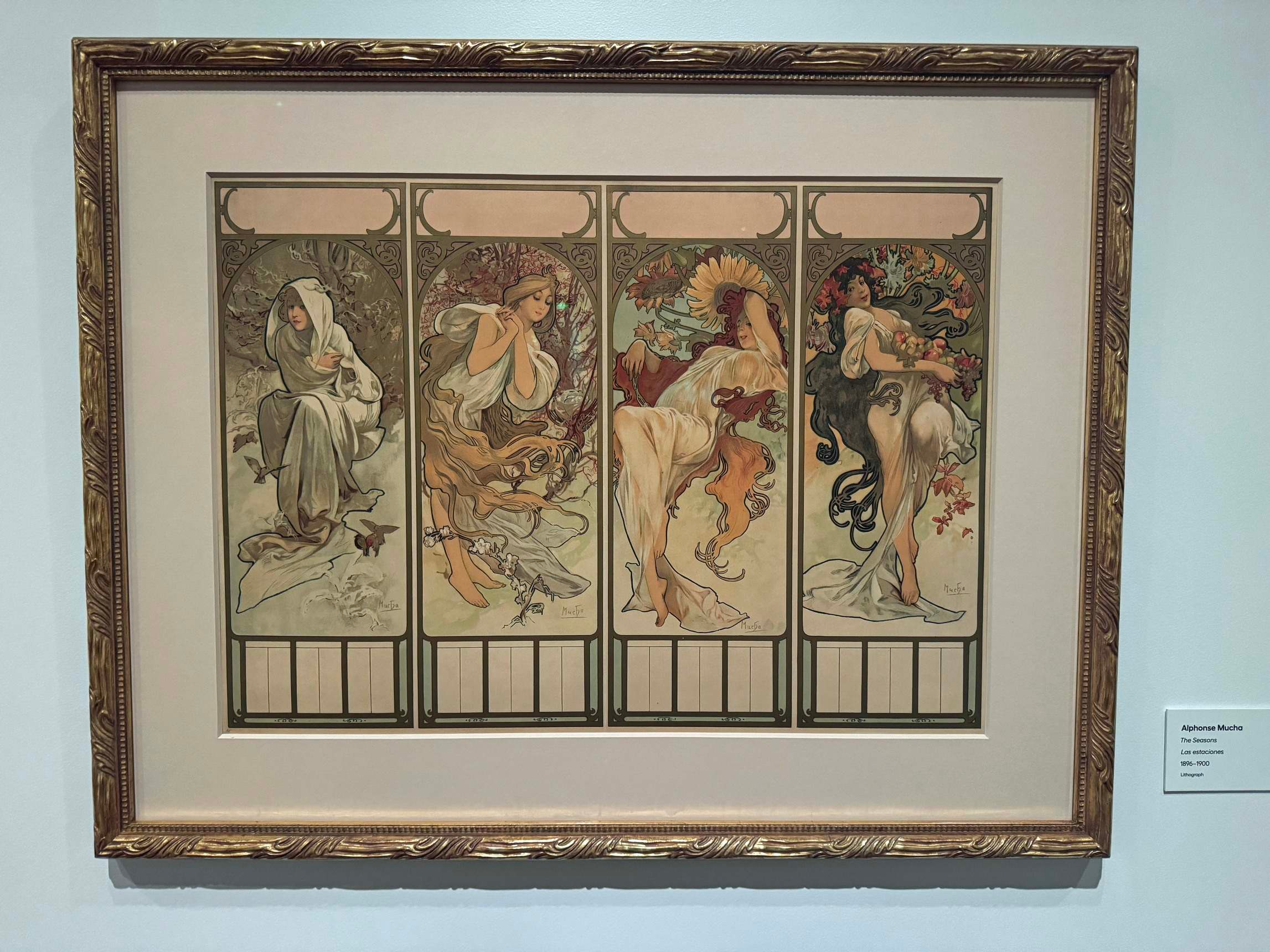
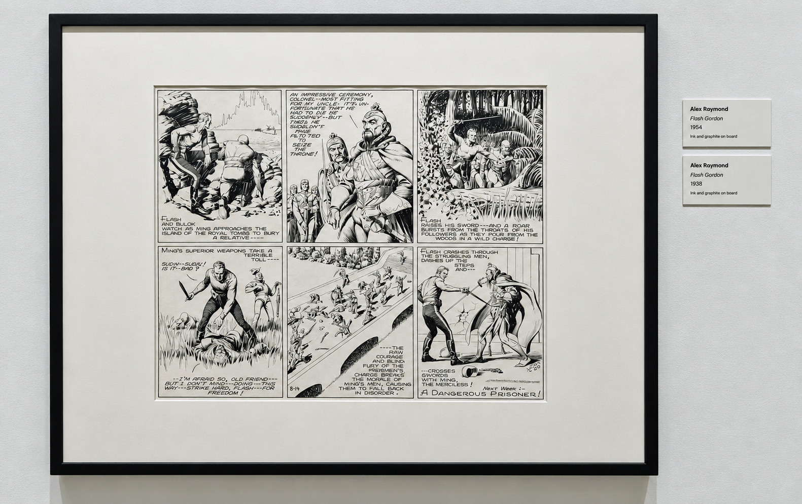
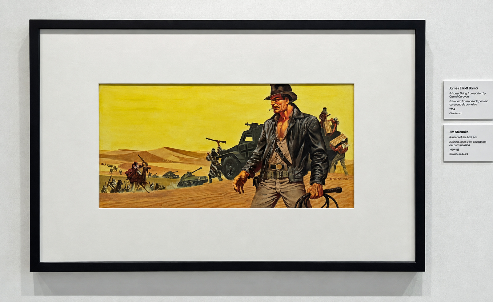
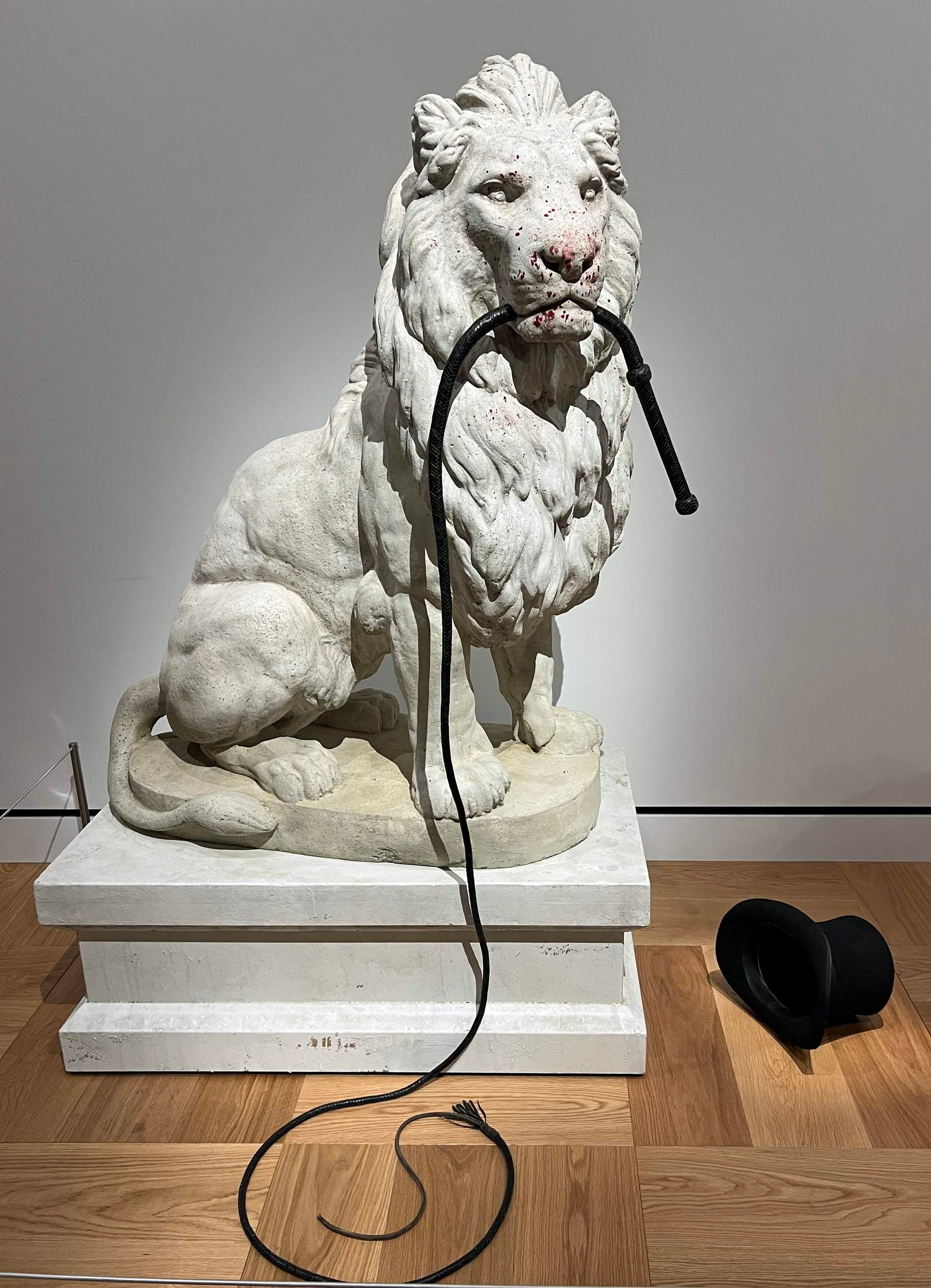
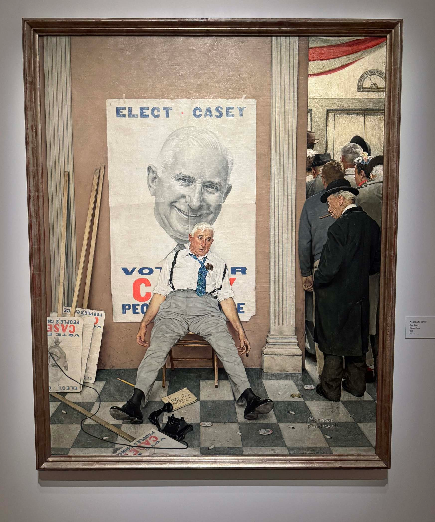
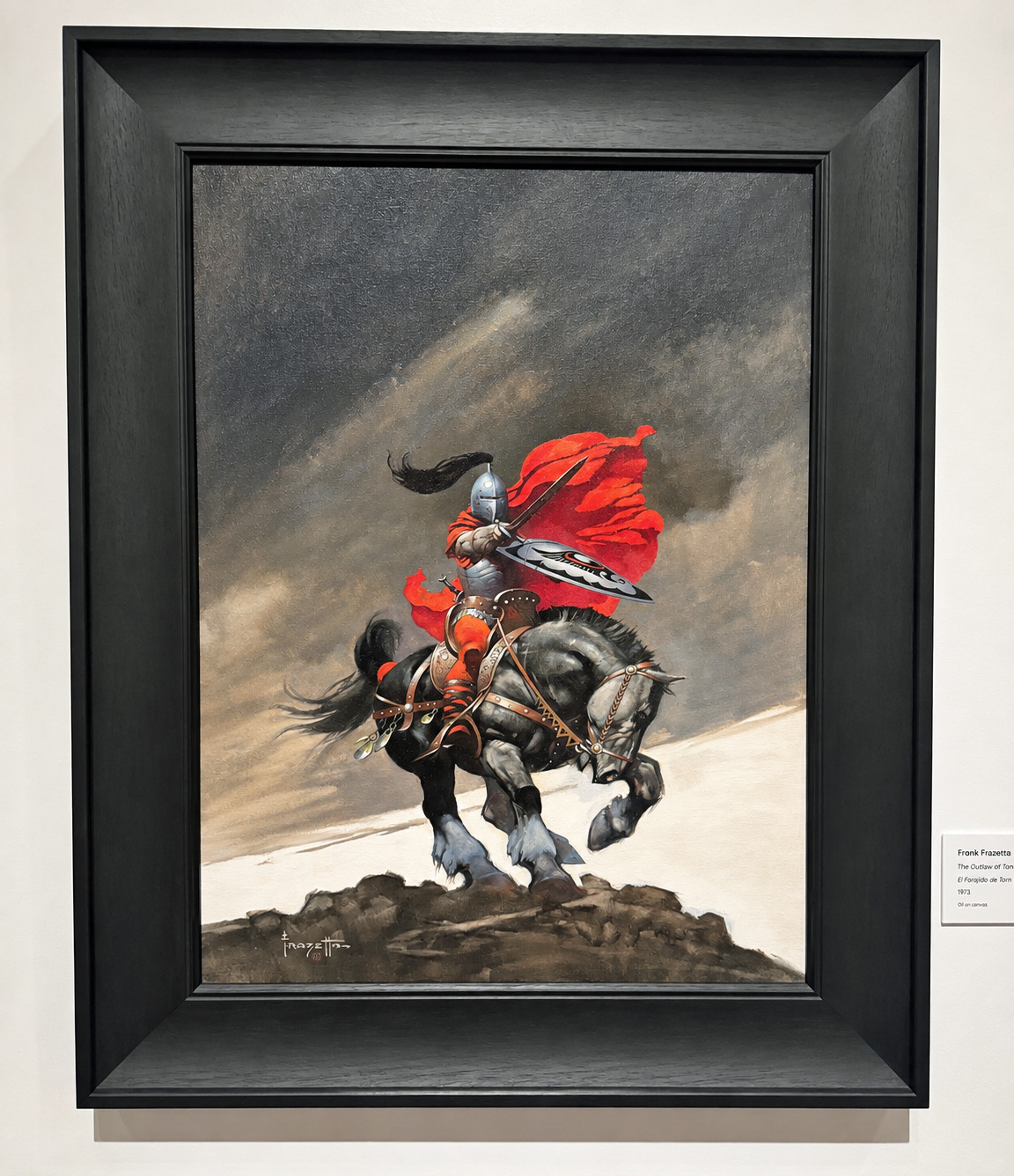
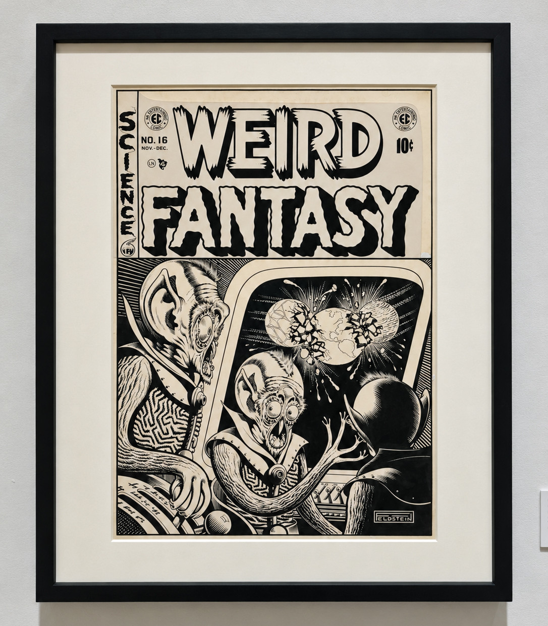
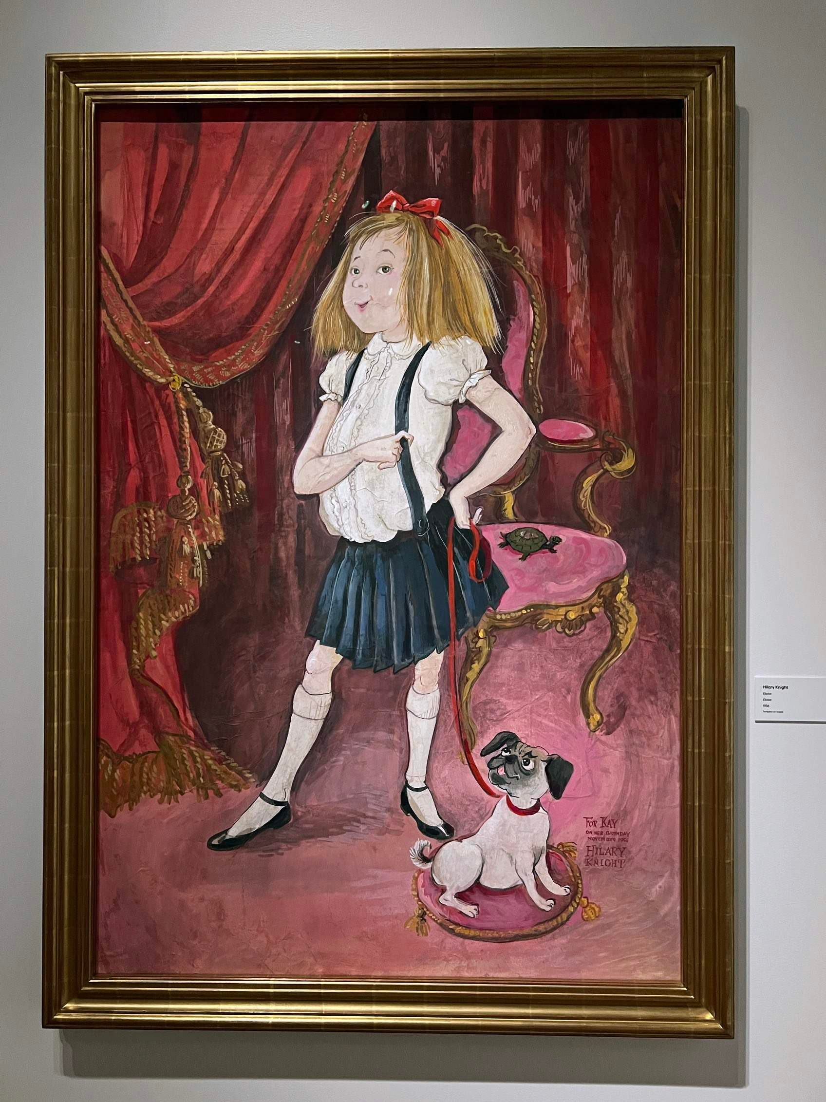
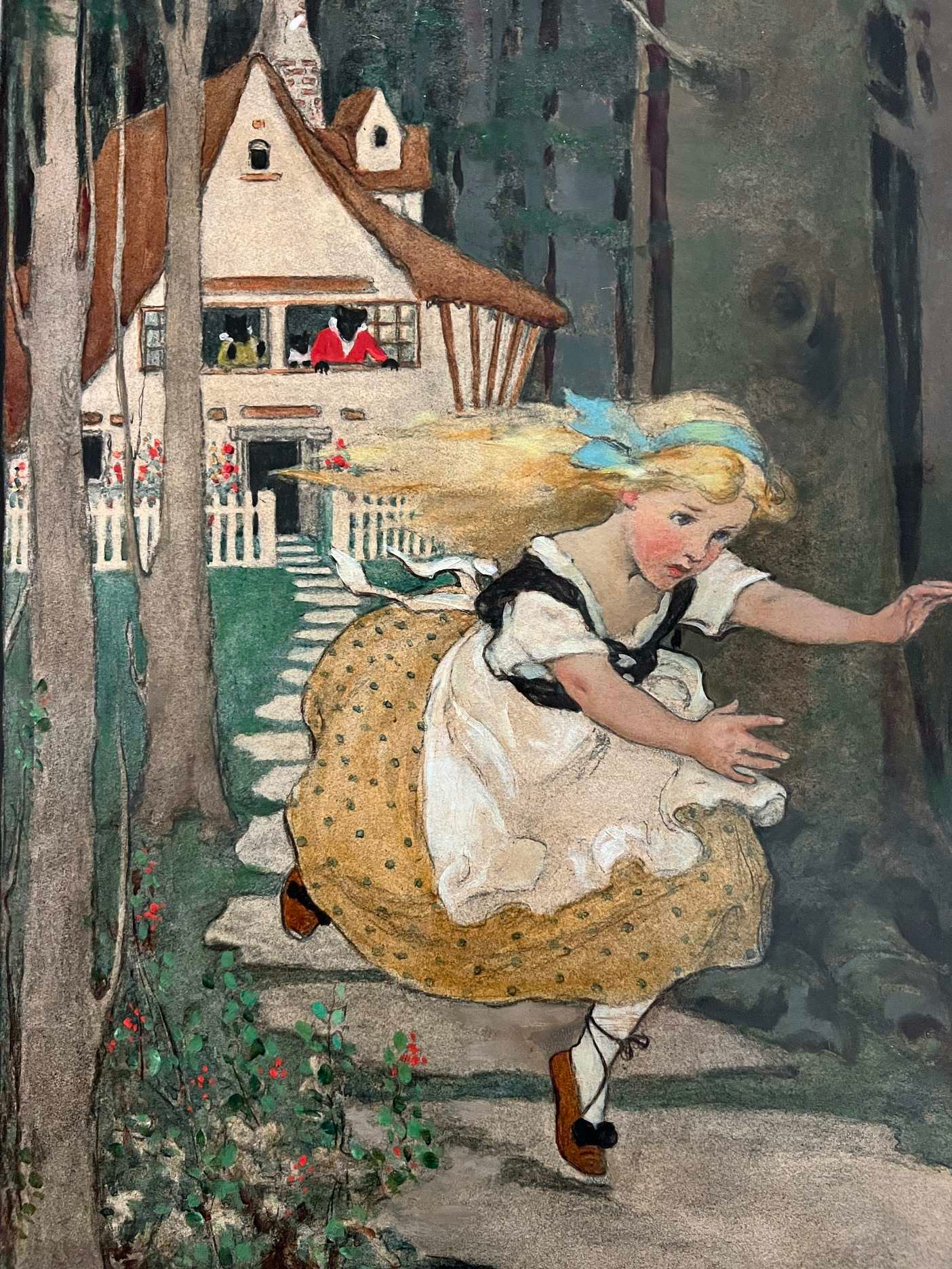
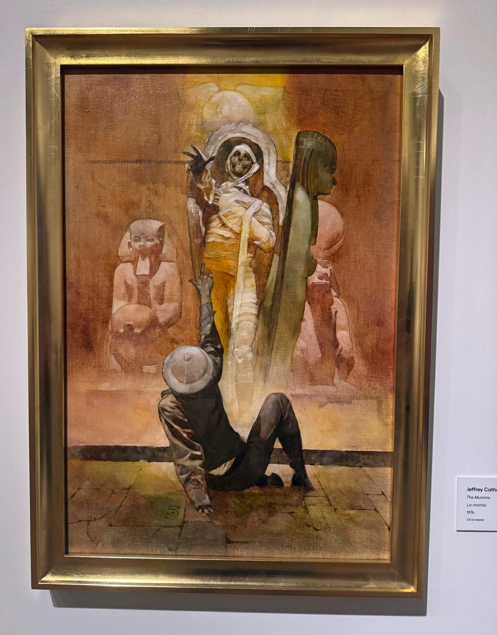
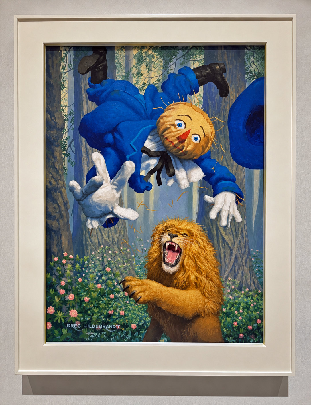
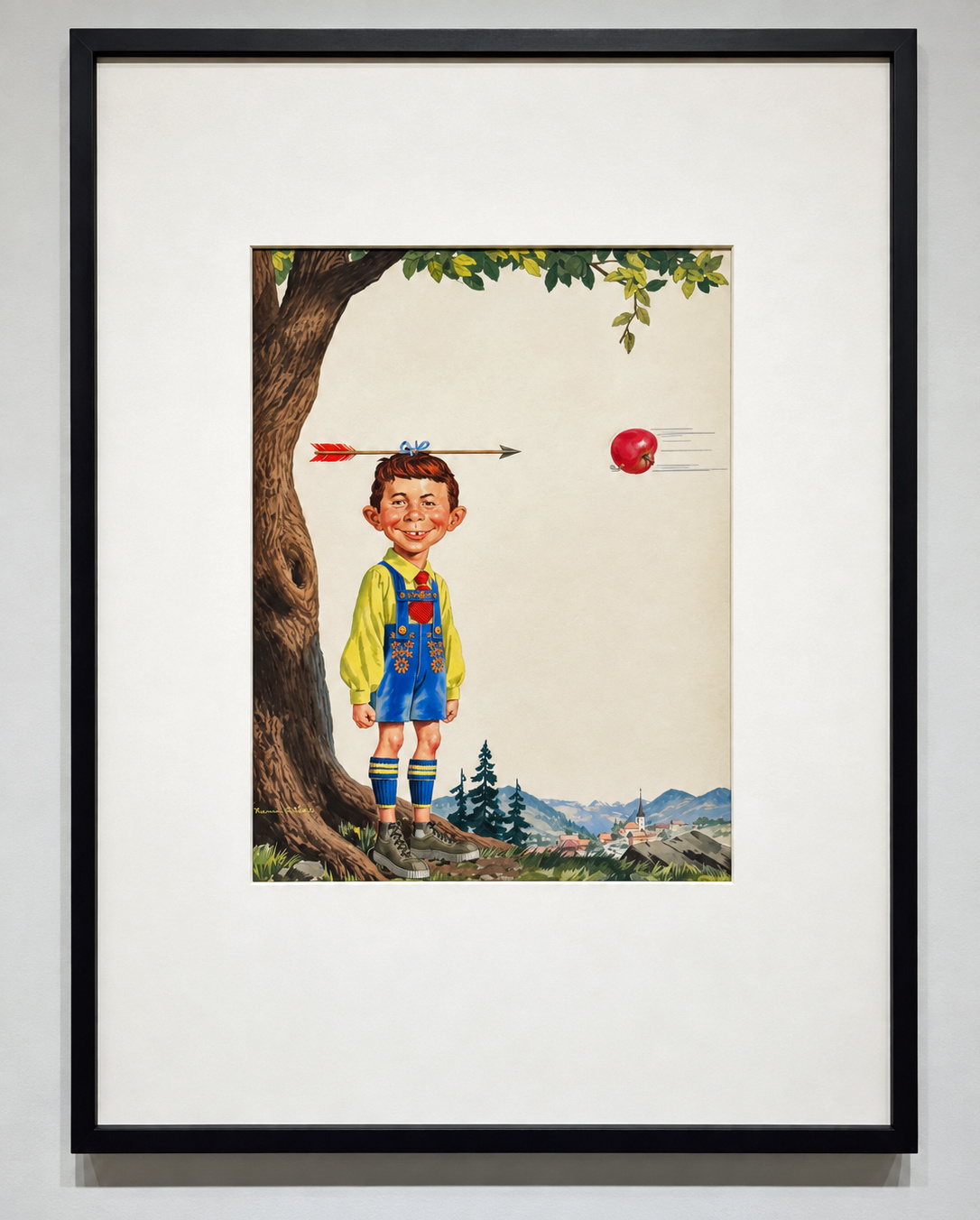
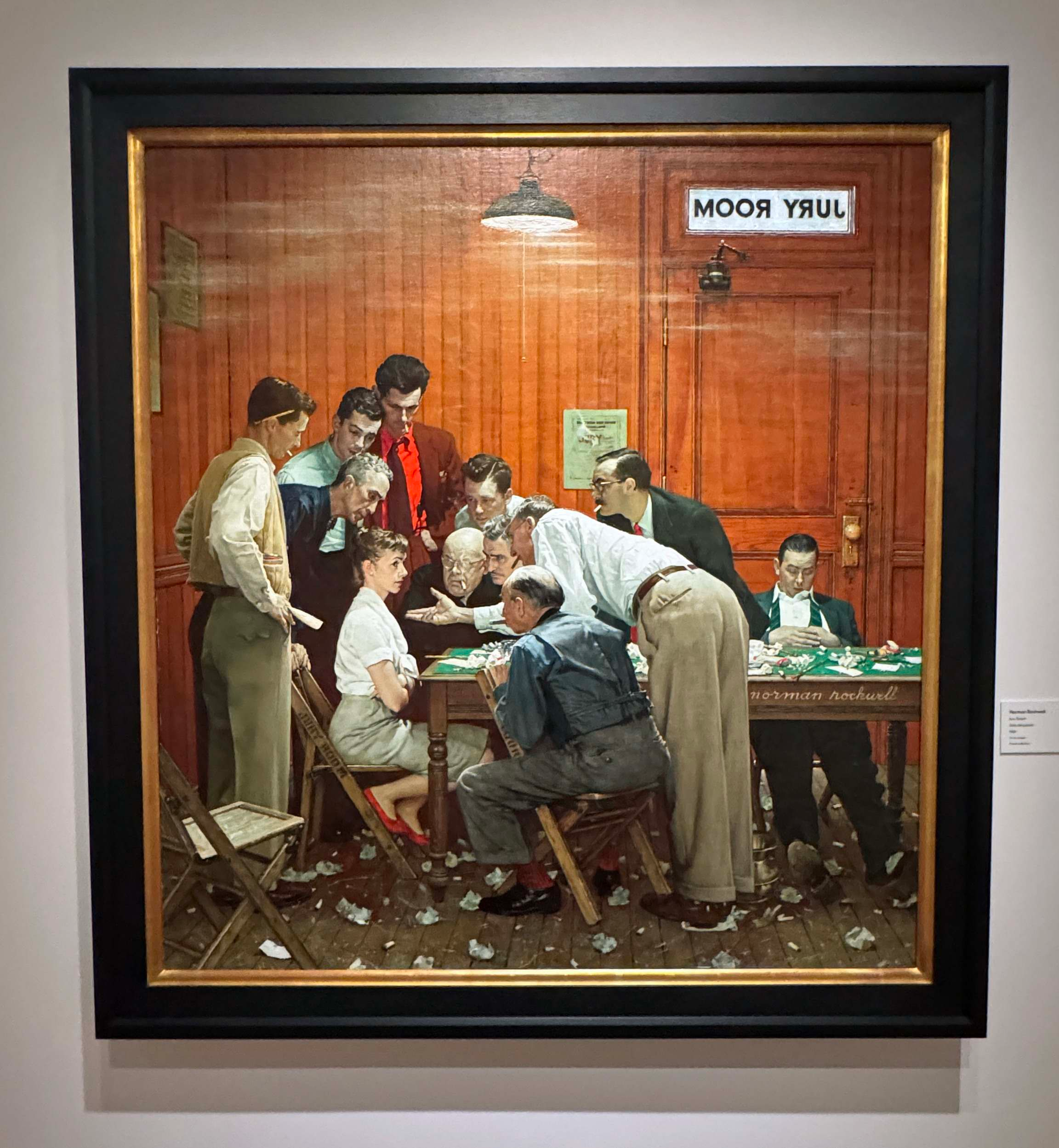
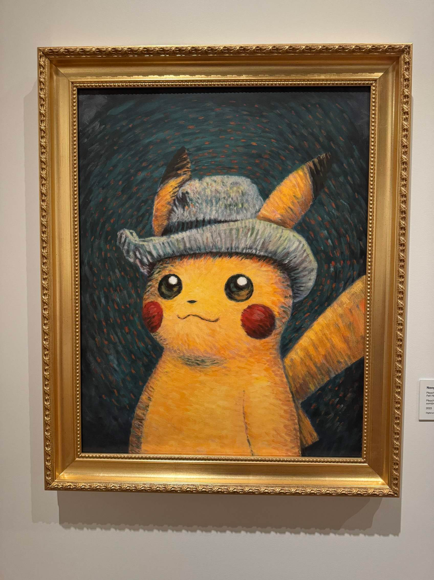
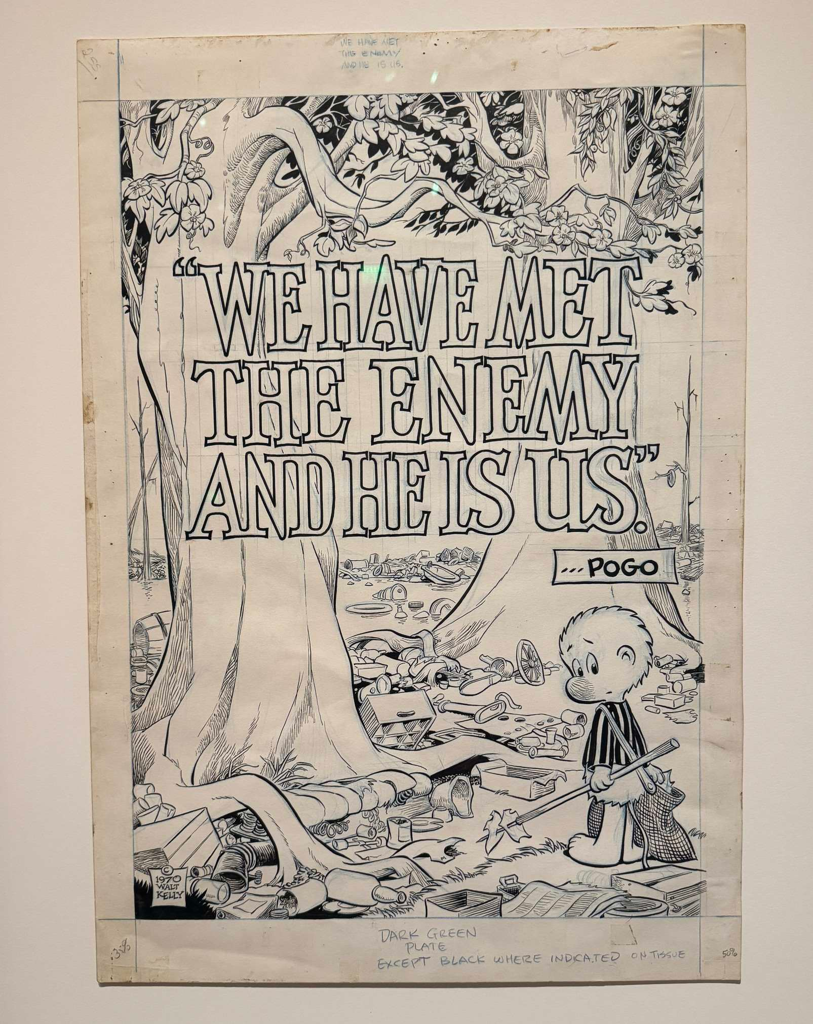
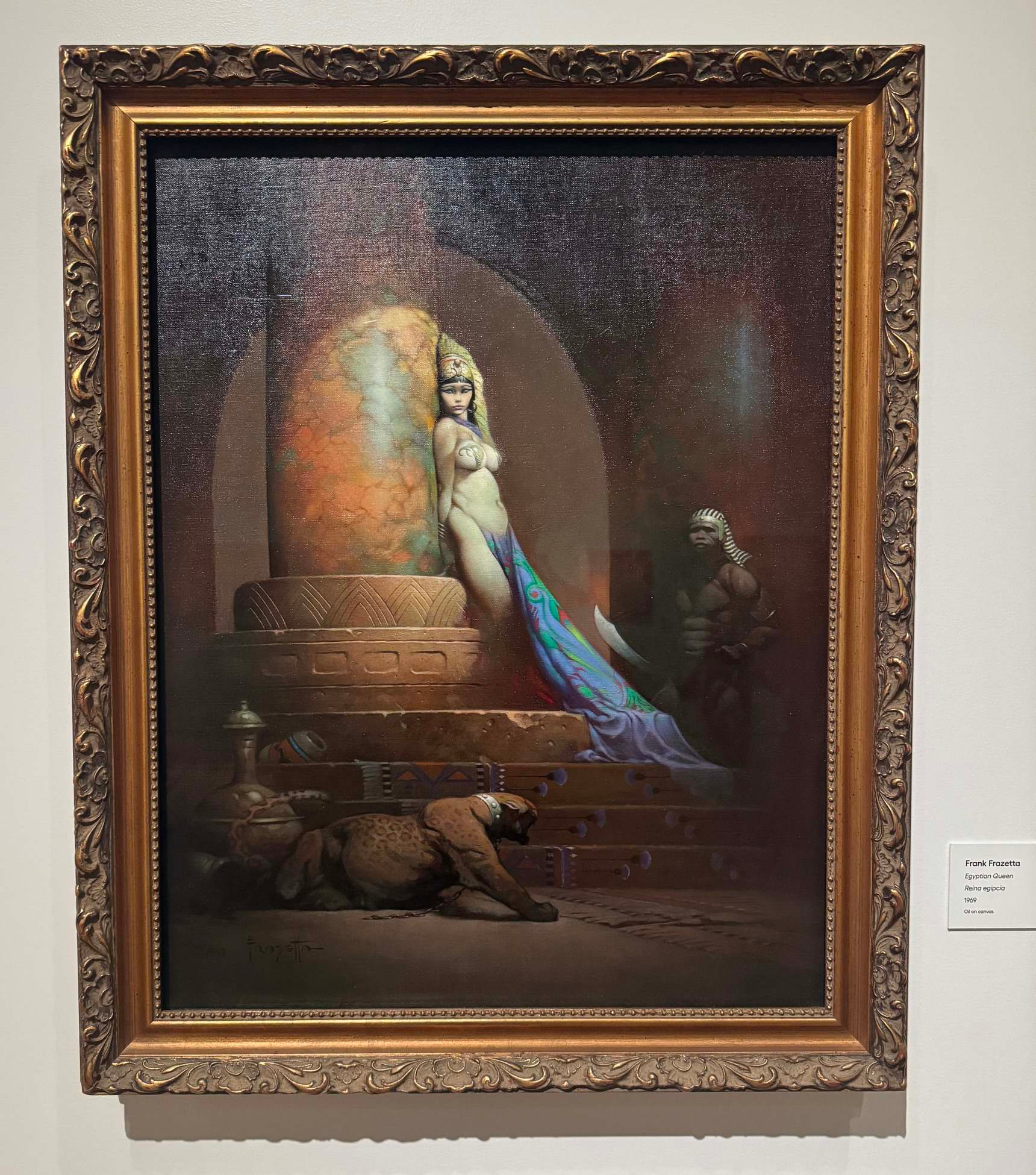
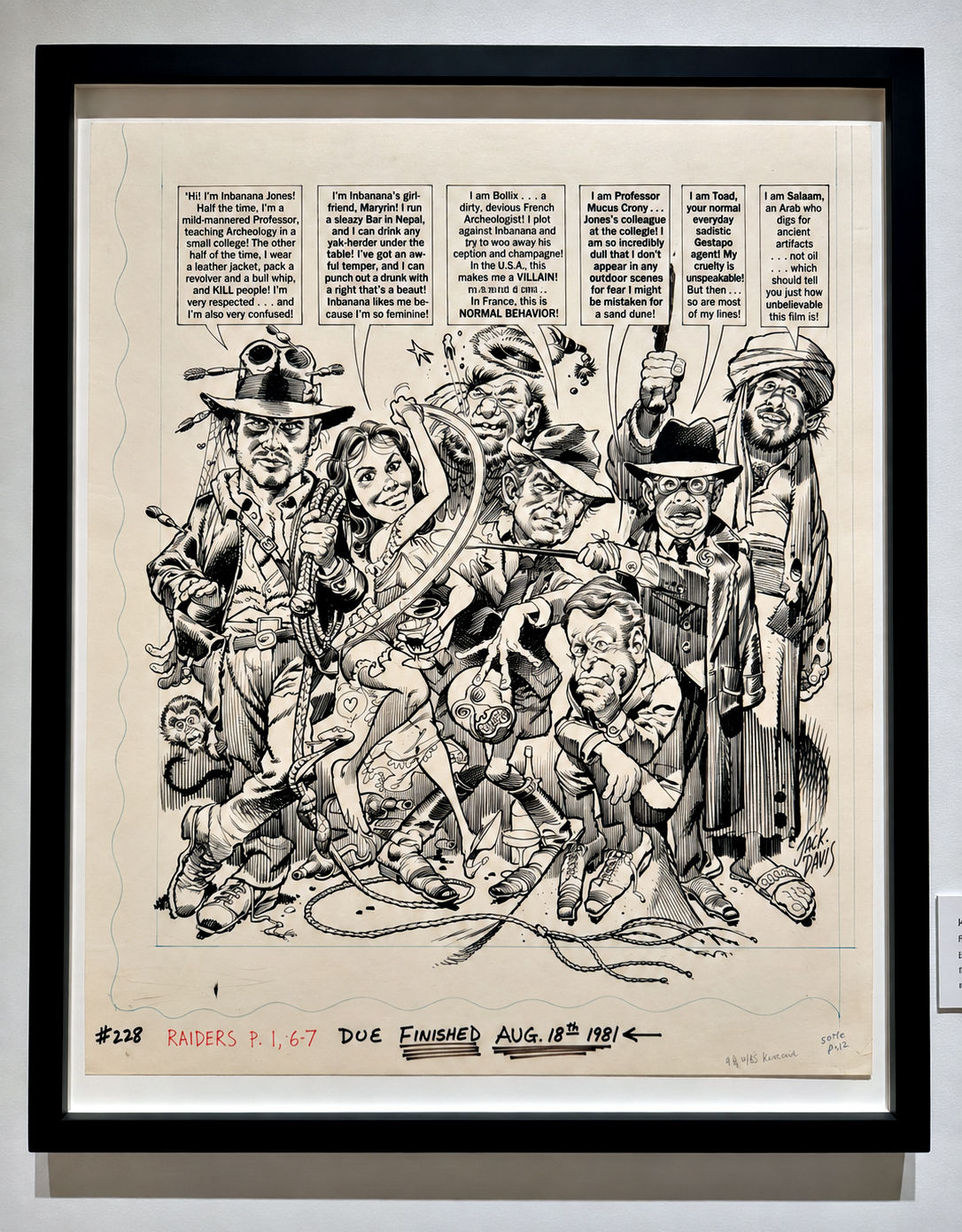
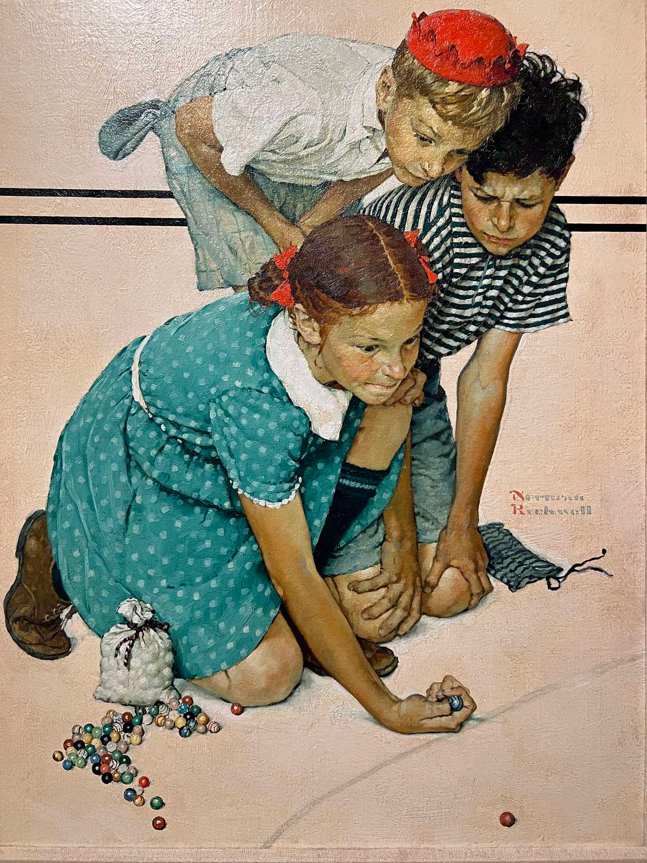
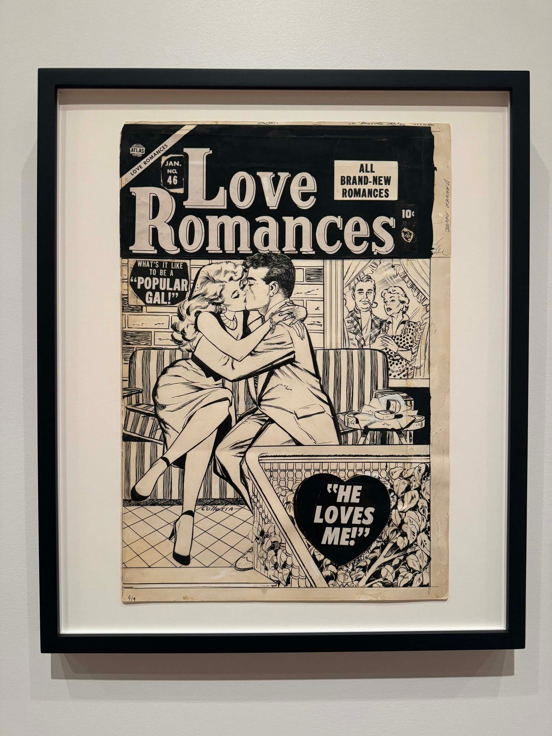
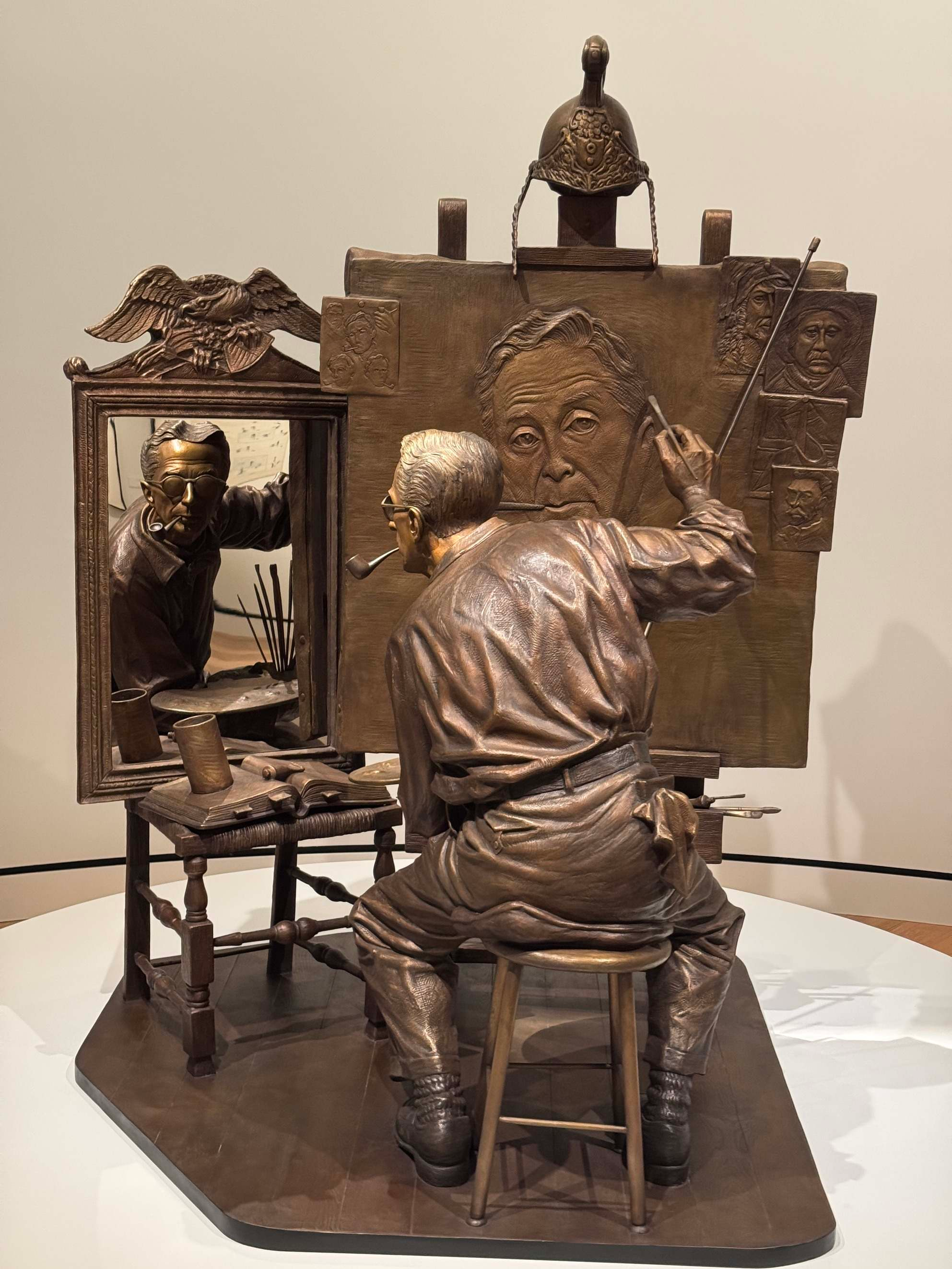
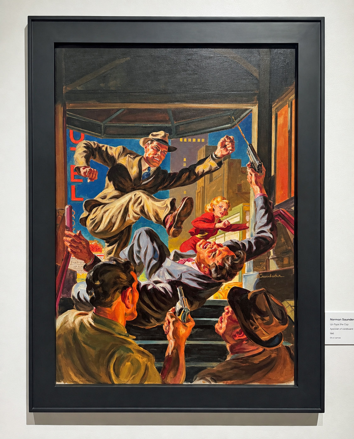
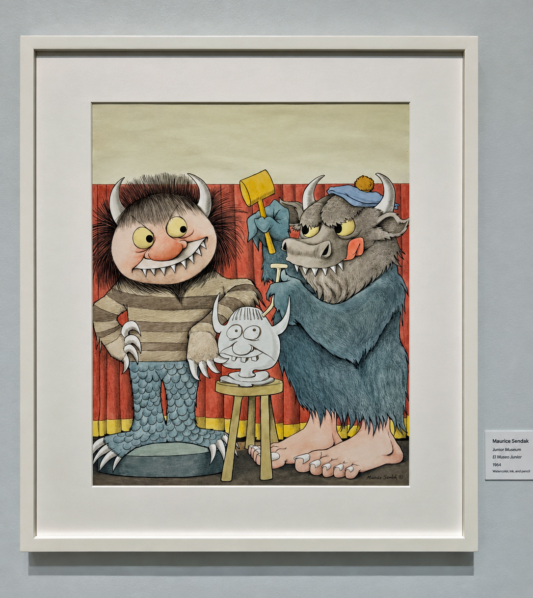
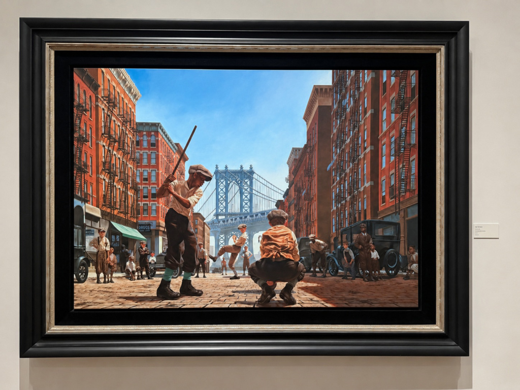
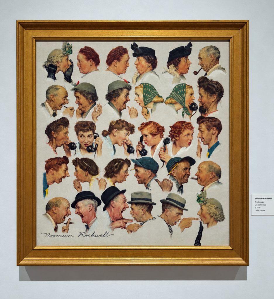
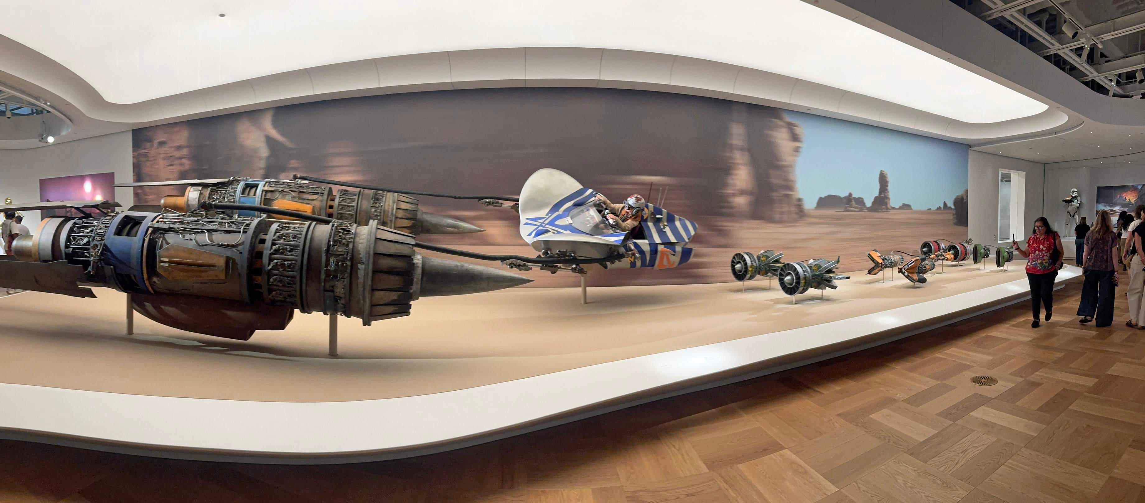
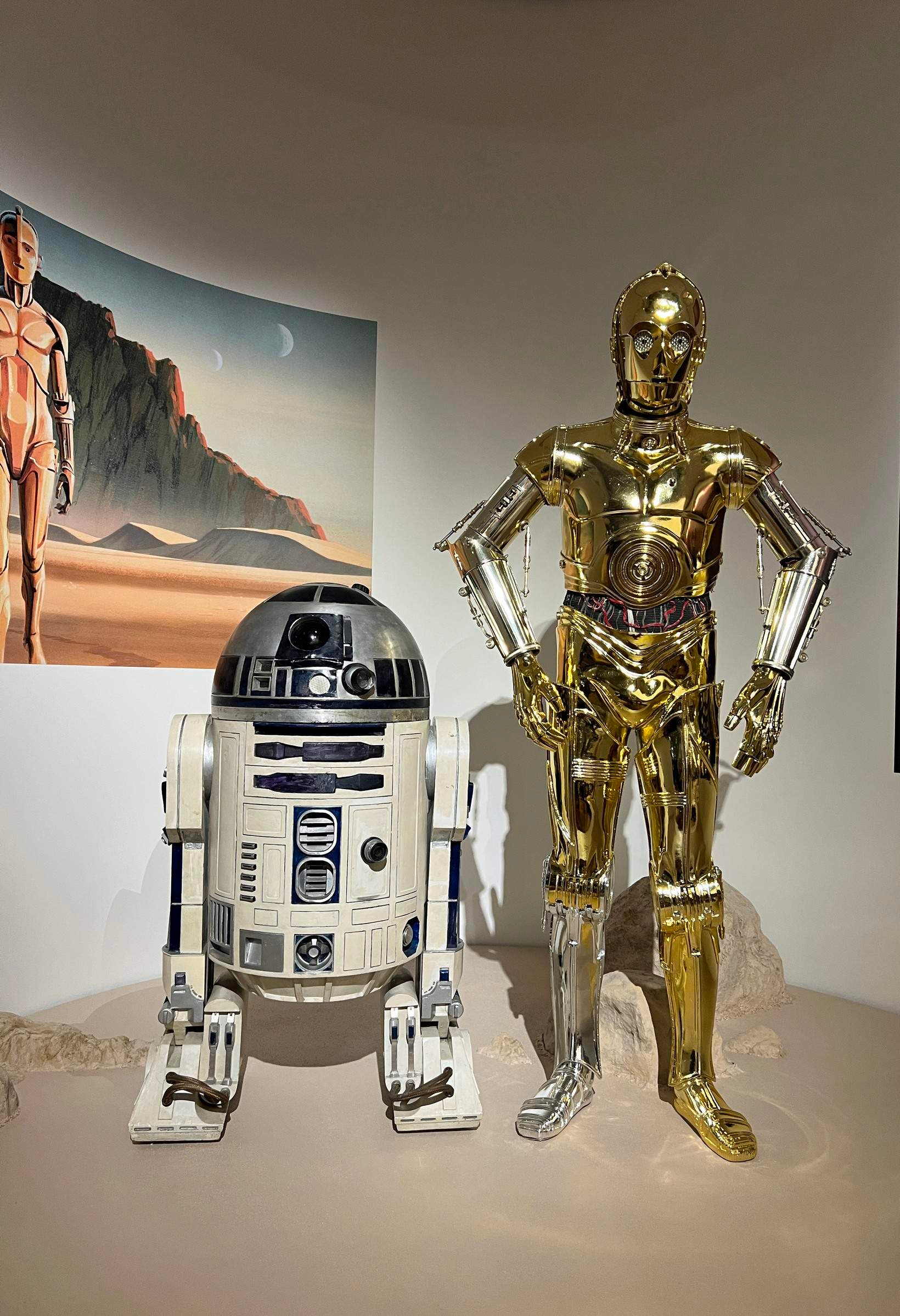
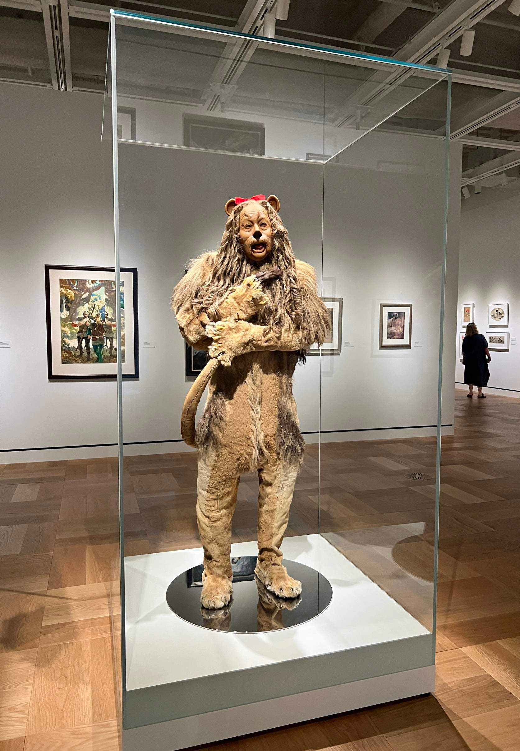
The tip of the iceberg of what’s currently on display at the museum: (For my museum overview, please see yesterday’s post.)

Greg Goldstein's Comic Art Gallery
Panels and Pages… Art and Artists… Creators and Conventions… Musings and Memories…

Lucas Museum of Narrative Art, Los Angeles, September 10, 2026
The tip of the iceberg of what’s currently on display at the museum: (For my museum overview, please see yesterday’s post.)
Lucas Museum of Narrative Art, Los Angeles, September 10, 2026
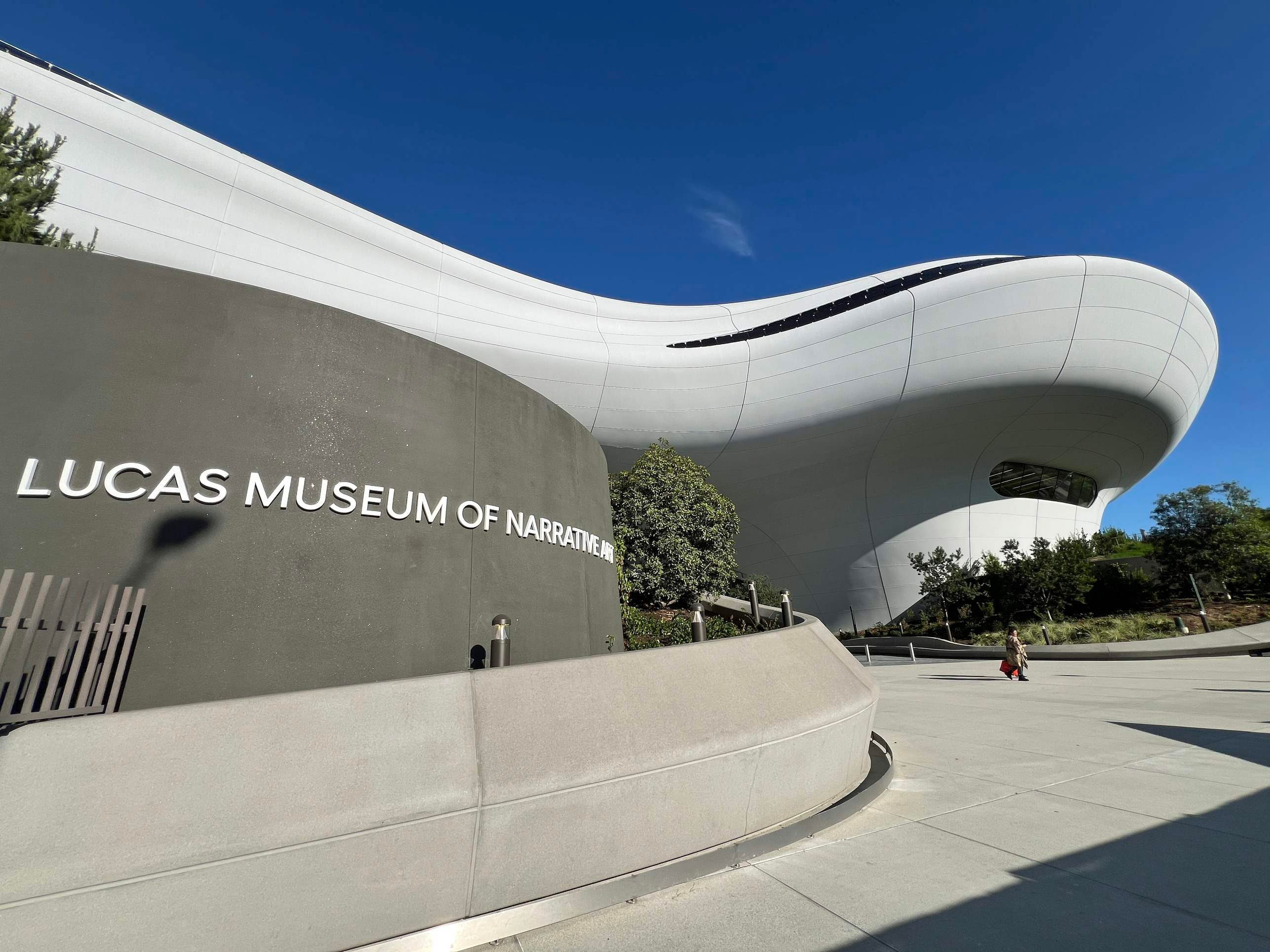
I’m a little late to the party on the Lucas Museum of Narrative Art.
Plenty has already been written, photographed, discussed and dissected. Some of my friends have written wonderful overviews.
So this isn’t an attempt at a definitive review.
It’s just what struck me.
In a word: astonishing.
Honestly, I was a little overwhelmed. There is a ton to take in, and I know I missed things.
Fine by me. I’m going back.
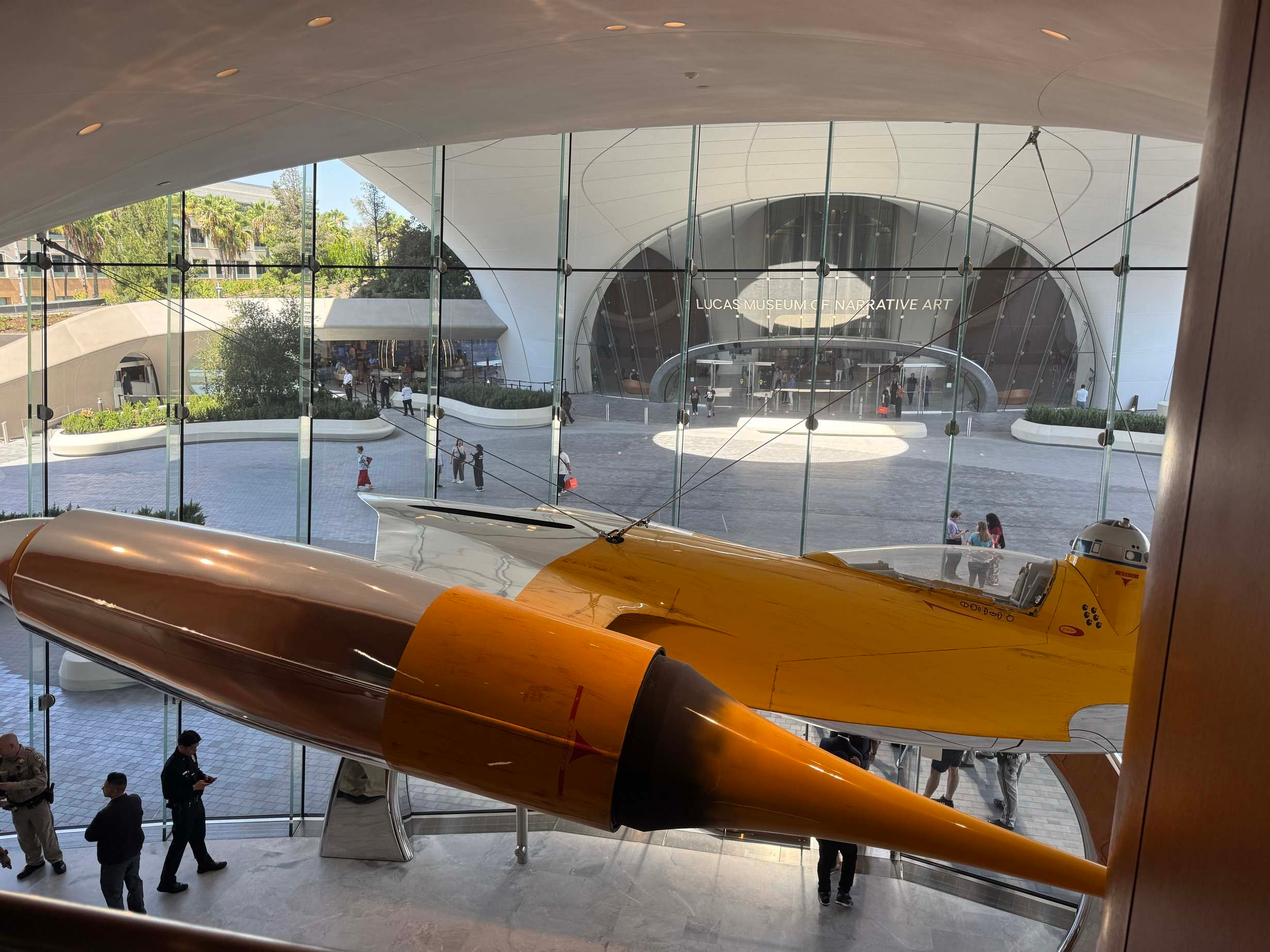
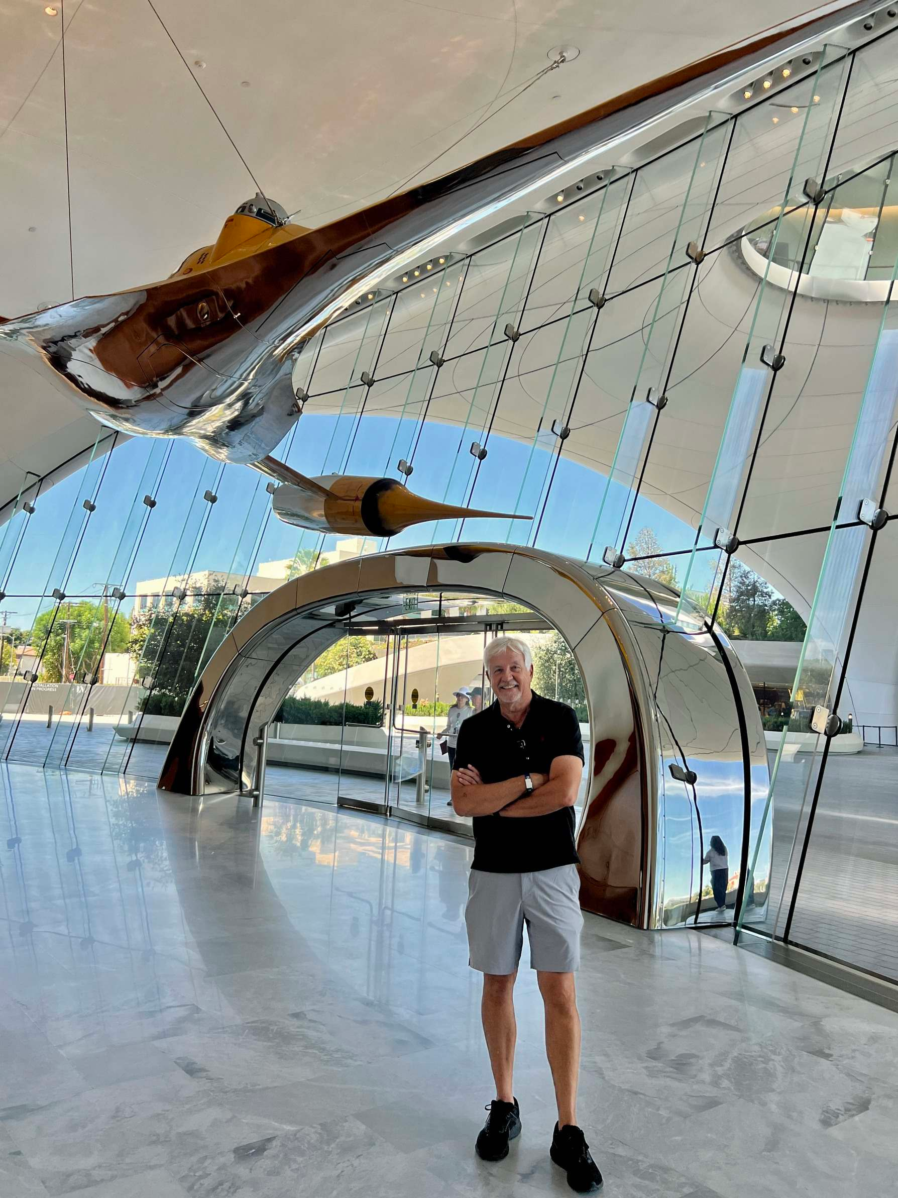
The building itself is spectacular — and innovative, to say the least — but once I got inside, the architecture pretty quickly became secondary.
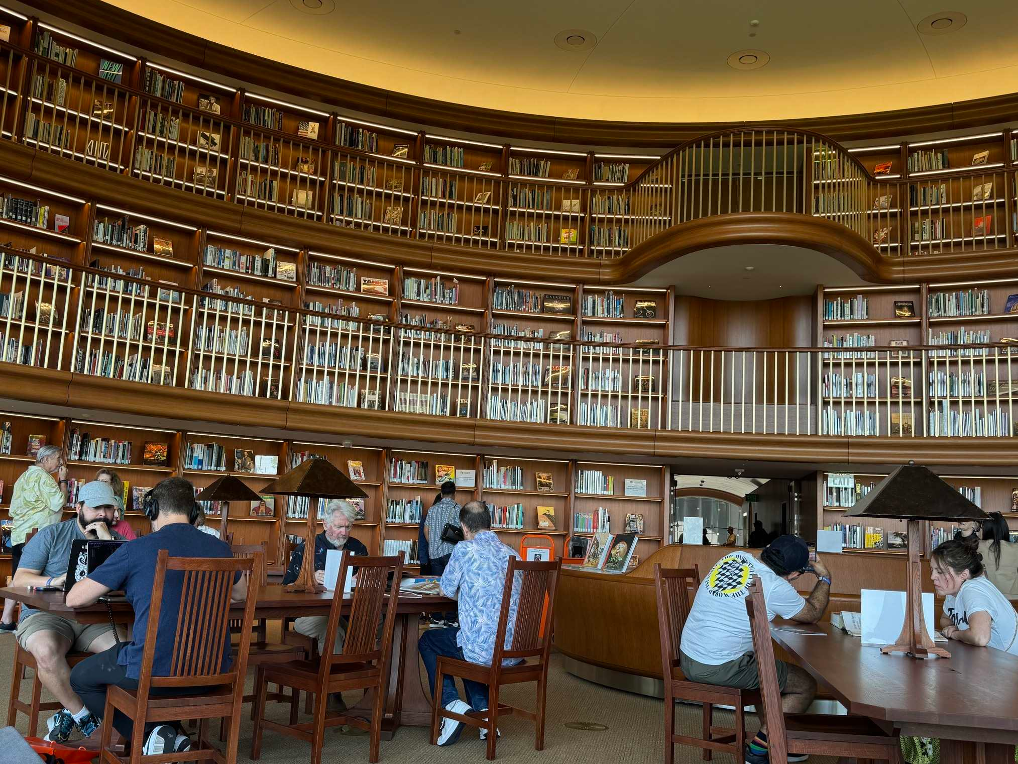
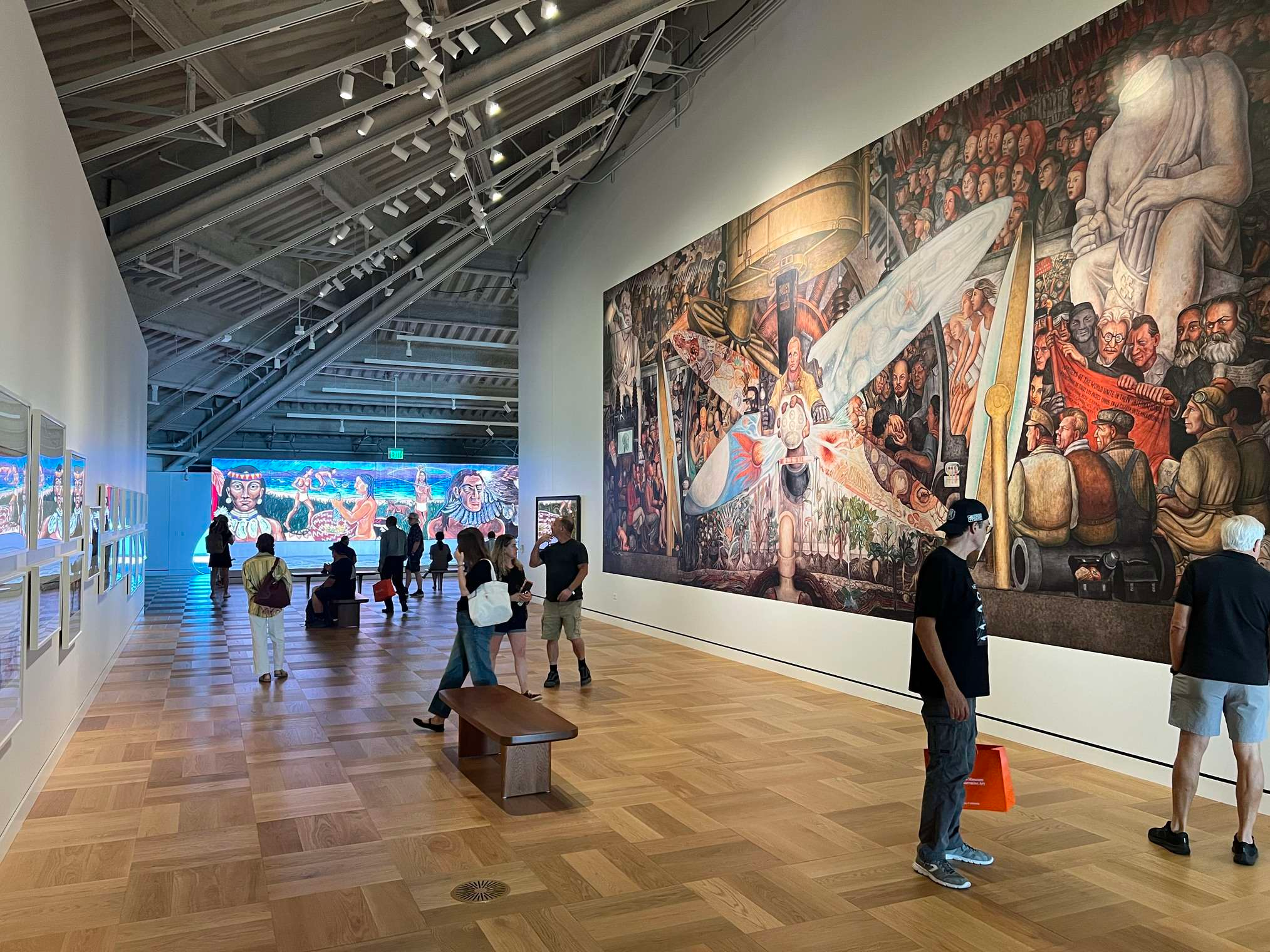
I’m an art guy. Put great stuff on the walls and that’s where I’m looking.
And there is some really great stuff on those walls.
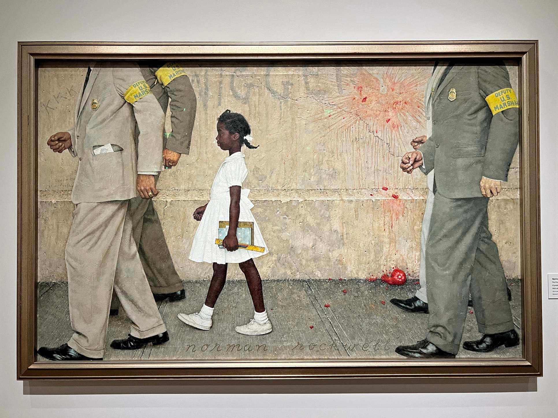
The Norman Rockwell collection alone is worth the trip. I’ve been to the Rockwell Museum in Stockbridge, Massachusetts, and it’s terrific, but Stockbridge is not exactly on the way to anywhere.
Seeing this many major Rockwells together in Los Angeles is pretty remarkable. A few, including The Problem We All Live With, are on loan.
The Frazetta collection is smaller, but there are some monsters there. Same with N.C. Wyeth, Maxfield Parrish and a long list of great illustrators.
One fun surprise was Parrish’s Old King Cole. I’ve seen the famous mural at the King Cole Bar in the St. Regis in New York — worth an overpriced drink if you get the chance — but not this one.
Here, you can stand in front of it as long as you want.
Which I did.
One of the bigger surprises, though, was what I didn’t see.
When we did the three Star Wars Galaxy card series at Topps in the 1990s, Lucas bought a ton of the original artwork. He also accumulated an enormous amount of other Star Wars material over the years. For a long time, he had first right of refusal on any newly created Star Wars and Indiana Jones art.
I saw very little of it.
There is certainly Star Wars material in the museum, including the Star Wars in Motion exhibition, but I expected much more original art to come pouring out of the vaults.
No big display of Star Wars Galaxy paintings. Much less production and concept art than I expected.
So… where is all that stuff?
The museum owns tens of thousands of works and can obviously show only a fraction at a time. Presumably much of it will rotate in.
I hope so.
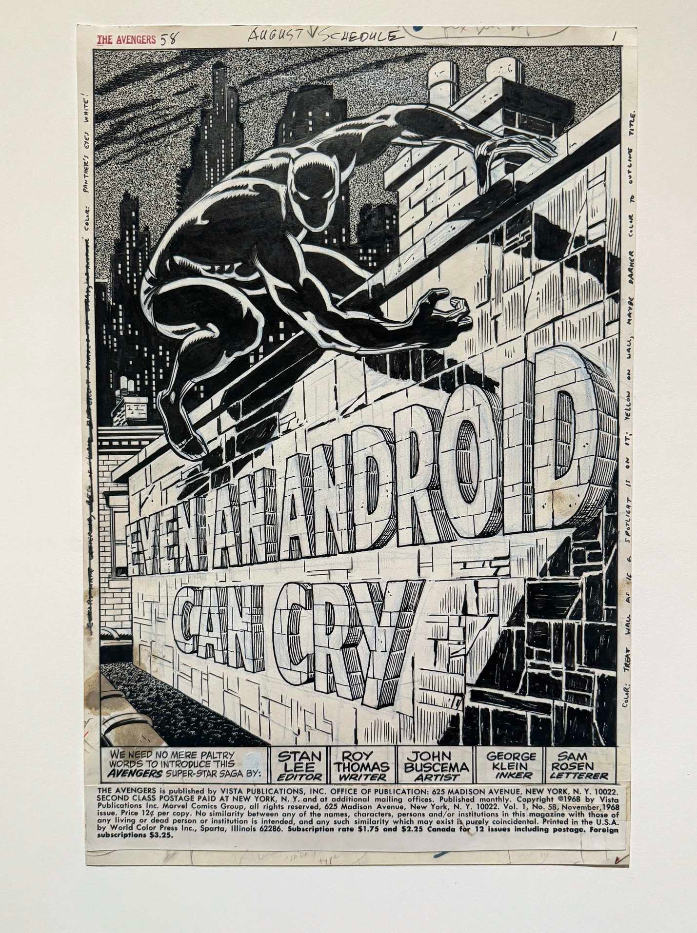
Naturally, I spent a lot of time with the comic art.
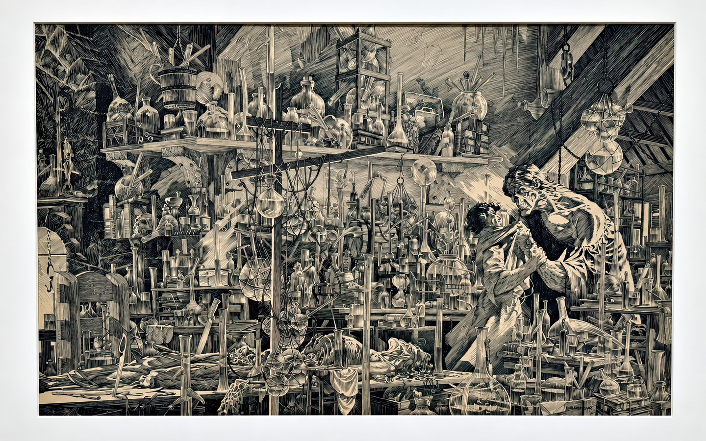
There are some terrific pieces, including one of the best Bernie Wrightson Frankenstein drawings I have ever seen. And anytime any original comic art is hanging in a museum, which is not often enough, I still get a kick out of it.
But I wanted more.
And more focus.
Oviously, I’m biased.
Still, this is the Museum of Narrative Art. It’s hard to imagine an art form more literally narrative than comics.
And the museum does own plenty of important comic art. Which makes some of the choices on display a bit puzzling.
No Ditko.
One Kirby.
Jack Kirby probably had more impact on contemporary popular culture than any comic-book artist who ever lived, so one piece seems… light.
Also odd: quite a bit of the comic art was material collectors have watched change hands at auction during the last decade or so.
Where is the stuff that hasn’t seen the light of day in 30 years?
That remains a mystery. For now.
My other quibble was context.
There is wonderful art everywhere, but often very little explaining why a piece matters, how it fits into the history of illustration and visual storytelling, or sometimes even why it’s hanging next to the thing beside it.
For a museum about narrative art, I’d like a little more narrative.
Apparently I’m not alone.
I learned afterward that you can use the museum’s mobile site and your phone camera to get additional information about the art.
Cool idea. I’ll try it next time.
But there was also plenty of room for a paragraph on the placard.
Still, what I kept thinking about afterward wasn’t any individual painting.
It was the scale of what George Lucas and Mellody Hobson have done.
Collectors collect. I understand that impulse pretty well.
But assembling a collection like this and then building a museum so the rest of us can see it is something else entirely.
Rockwell. Frazetta. Wyeth. Parrish. Comics. Film art. Illustration. Photography. Popular culture.
Images that lived in magazines, books, movies, advertisements — and our memories — now hanging together under one roof.
I can wish there were more comic art. I can wonder where all the Star Wars material is. I can complain about a placard.
Fair enough.
But when you step back and look at what Lucas and Hobson have built, those complaints get pretty small pretty fast.
There was also one slightly ridiculous collector moment.
Walking around, I realized that George Lucas and I have occasionally owned the same kinds of things.
His collection is, admittedly, a little more impressive.
And his building has more parking.
Today: the museum itself.
Tomorrow: the art.
And yes, I took a lot of pictures.

Johnny Comet Daily Strip, June 5, 1952

This is the second Frank Frazetta Johnny Comet original strip I’ve owned, and it’s a vast improvement over the first.
William Wray, a very talented artist himself, says it best:
“That’s a great one — you got the drama, you got the cute girl, and the comedy poses.”
The short-lived Johnny Comet / Ace McCoy strips have been collected numerous times (see below) but we’ve yet to see an “ultimate” collection, complete, restored and properly formatted.
Of the existing collections, my personal favorite is the Eclipse hardcover, (or softcover) from 1991 which is similar to the horizontal Library of American Comics (LOAC) strip format, although it’s missing a few strips. It must have been somewhat over-printed, because there are still plenty of copies out there.


While I was working on this post, I happened to see a fun Dave Stevens tribute (Rocketeer) to Frazetta’s Johnny Comet on the great Facebook group, “Comics Swipes.” (H/T Arty Freeman).
Criminal Macabre / The Goon: When Freaks Collide #1, July 2011
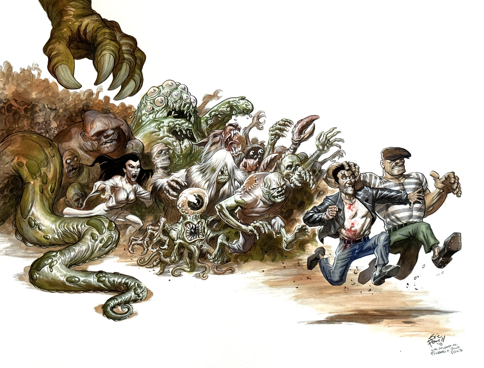
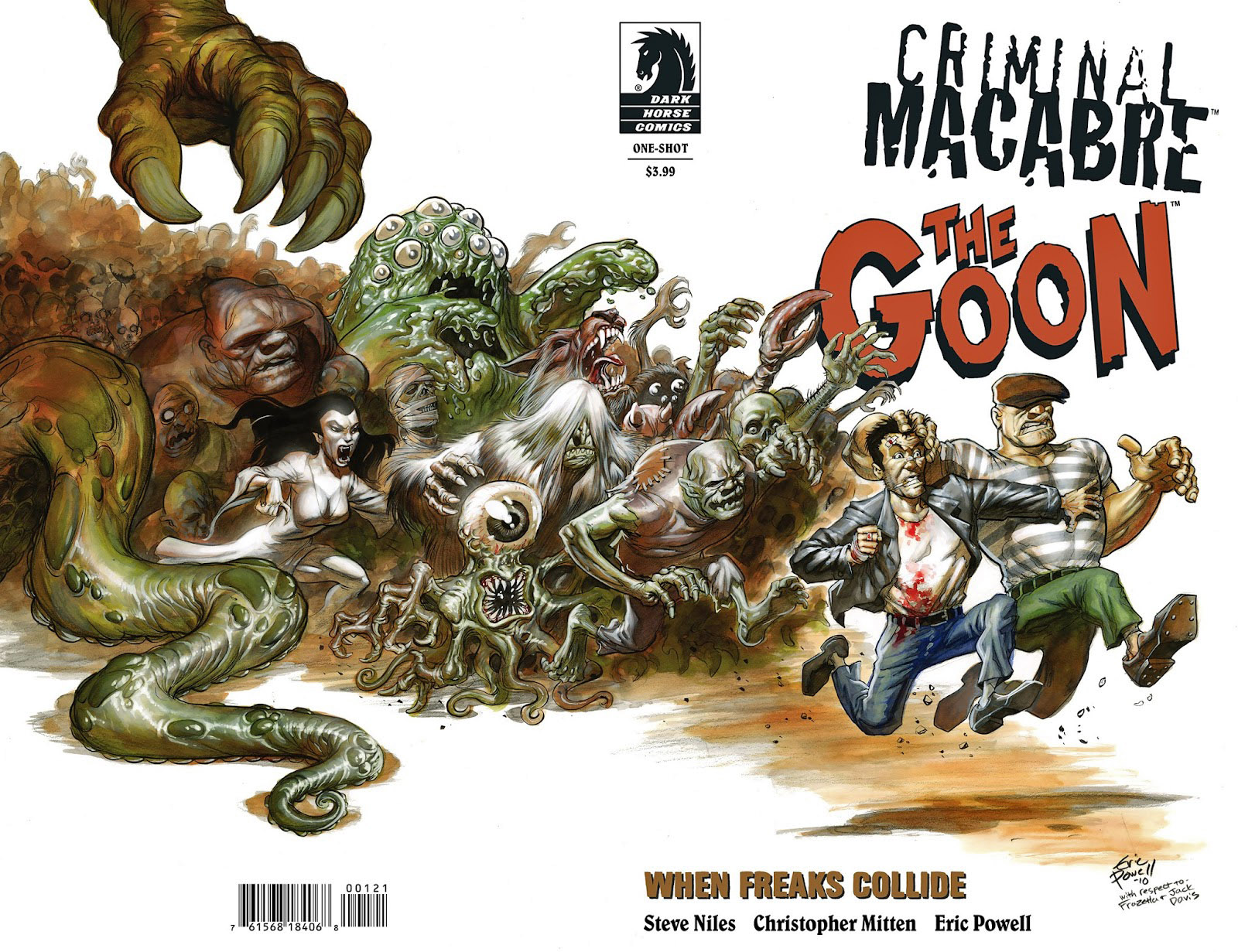
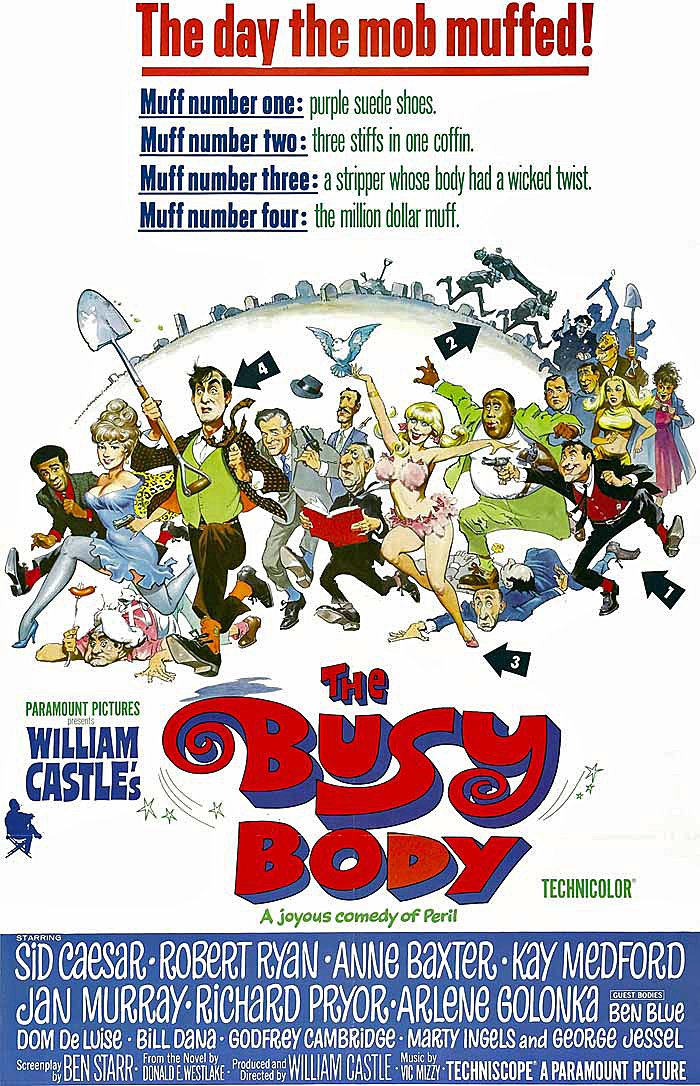
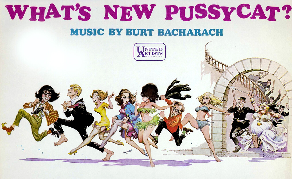
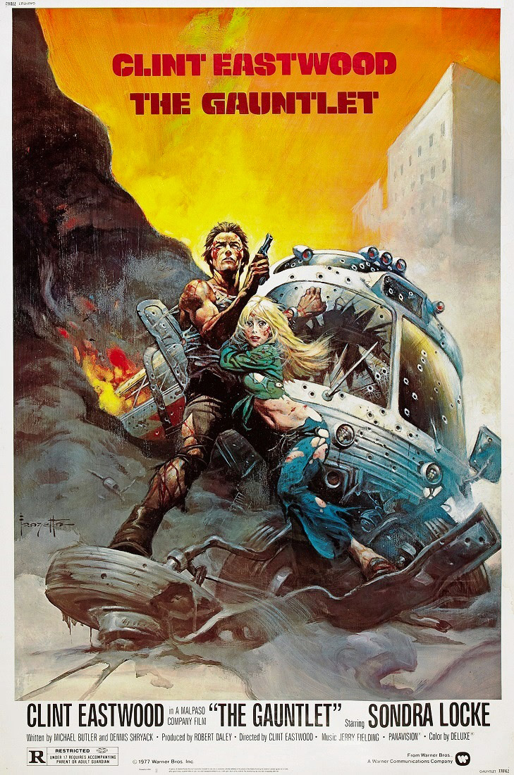
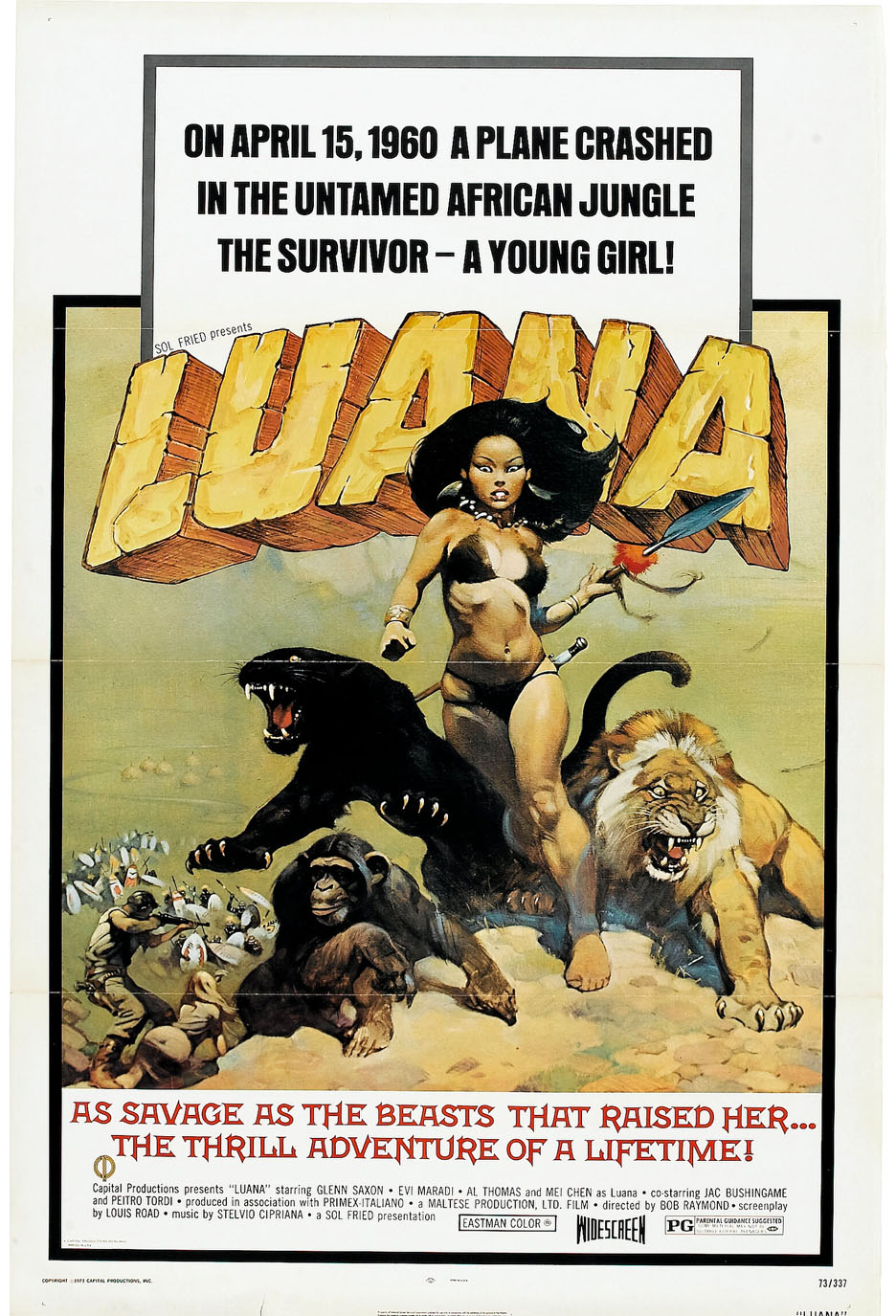
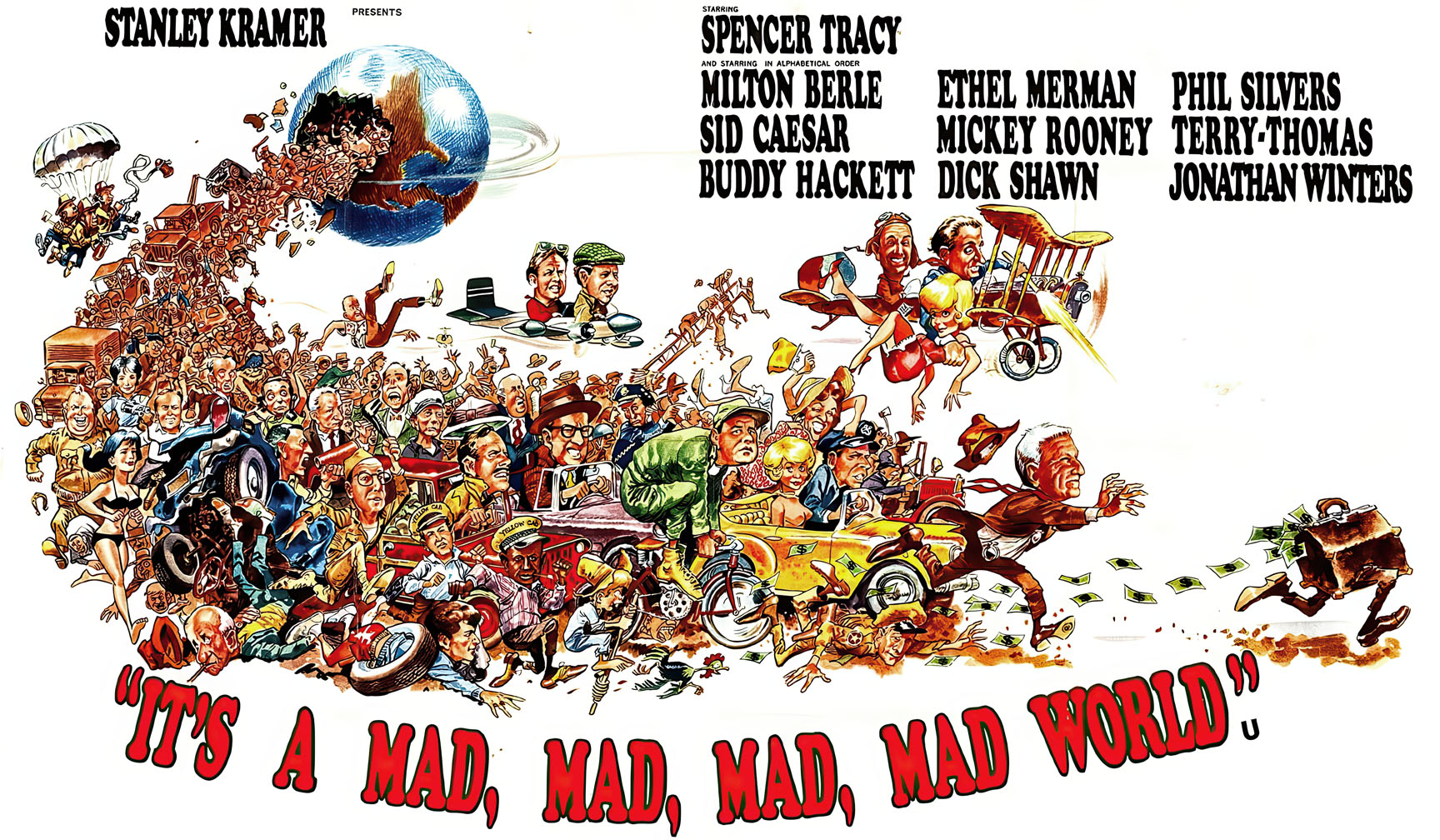
If the 60s “comic chase movie poster” can be considered its own category, Jack Davis and Frank Frazetta owned it.
Eric Powell pays a loving tribute to these classic posters — and both artists — with his terrific painted wraparound cover for the one-shot crossover, Criminal Macabre / The Goon: When Freaks Collide. (2011). (Instead of actors, we get monsters and creatures. Seems like a win.)
Davis continued to illustrate film posters using his trademark caricature style until most movie marketing materials employed photography. Frazetta though was later hired instead for his painted fantasy flair. Today, of course, illustrated poster efforts have all but disappeared. Somewhere along the way, styles changed, and the ever-frugal Hollywood execs decided that $20 million for an actor made sense, but a few thousand bucks for marketing art is a bridge too far.
Sigh. We are all poorer because of it.
Happy Halloween —all month long!

Savage Sword Of Conan #63, April 1981

Conan celebrates its 50th anniversary in comics this year, and we continue to celebrate the anniversary with our second of three Conan-themed posts this week.
“This guy used to eat, sleep and breathe drawing. It didn’t matter what was going on around him. He would get bored with it and start sketching. … He just couldn’t stop drawing. [His back-of-board sketches were] better than some of the stuff that he did on the front. … He’d get a spark of inspiration and turn the page over and draw whatever was in his skull.” — Sal Buscema, speaking about his late brother John.
Roy Thomas had wanted John Buscema to draw Conan.
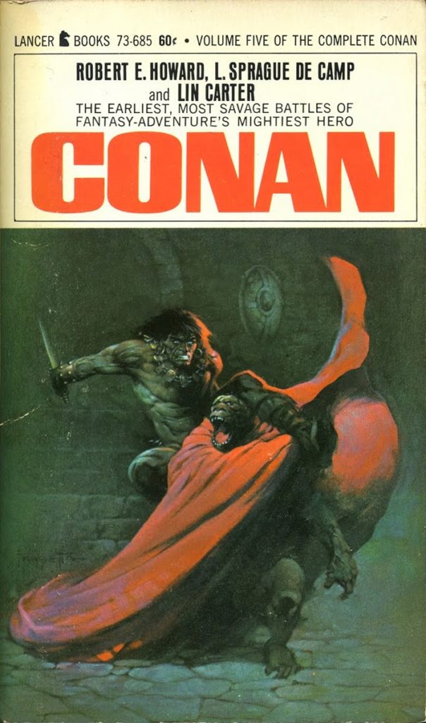
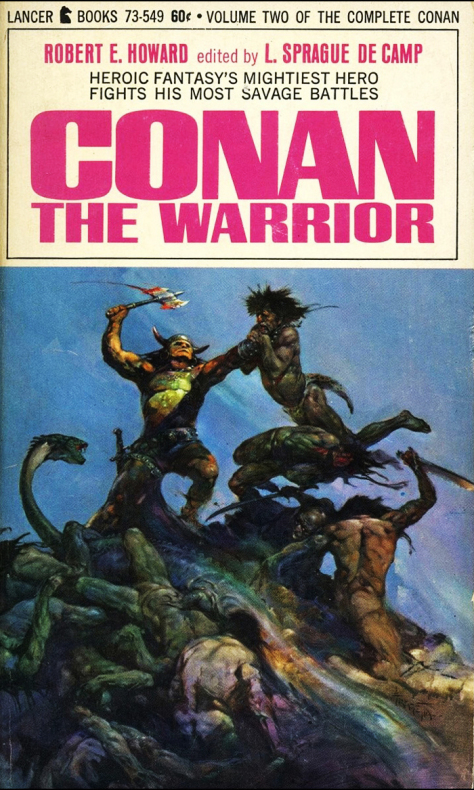
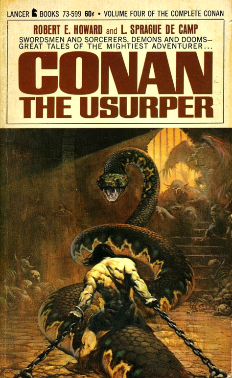
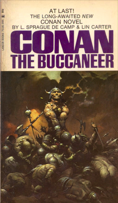
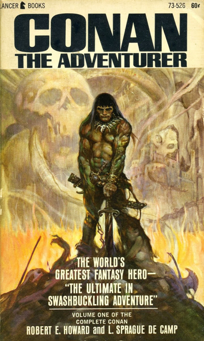
Roy knew that John’s artistic style and storytelling skills (and interests) could perhaps best capture the Conan character —- and most remind readers of the amazing eight Frank Frazetta covers that graced the Lancer paperbacks of the last few years. Those images had helped Conan rapidly turn into a phenomenon among fantasy readers.
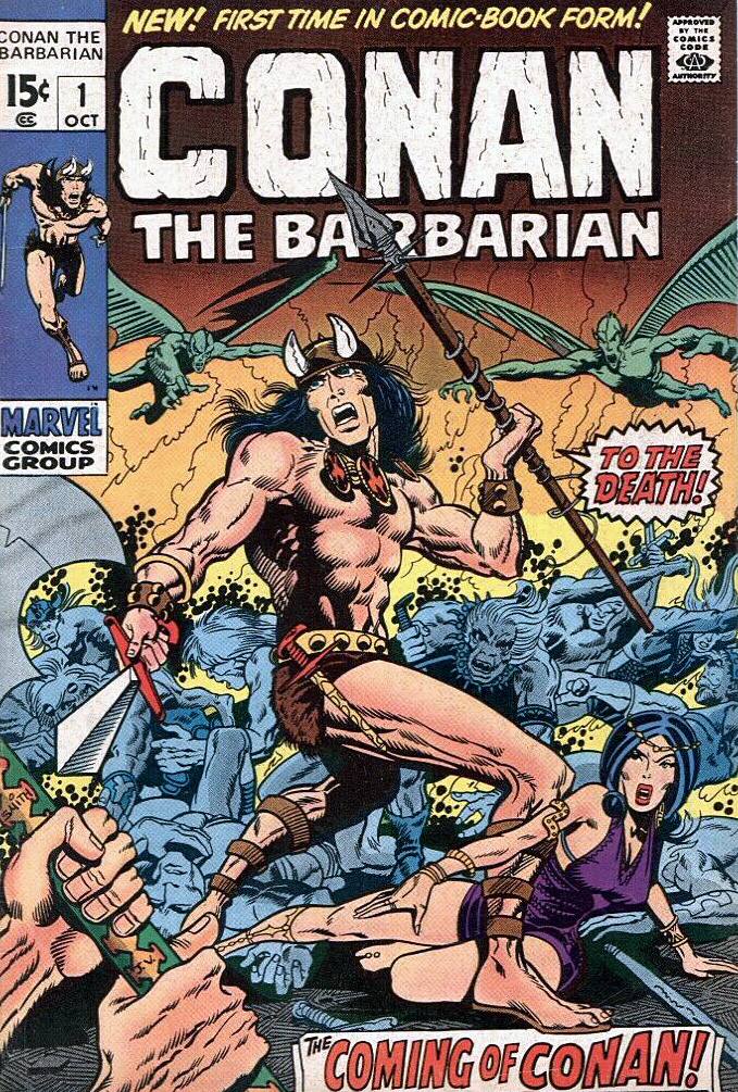
But budgetary concerns forced Thomas to work with the mostly unknown Barry Windsor Smith, and a different kind of Conan developed. Younger, sleeker, a bit more handsome. And after a slow start, (it was nearly cancelled after issue #7) the book caught fire, and inspired a sword and sorcery age in comic books.
But Smith, frustrated by the deadlines of the comics periodical business, ultimately left Conan.
And so fate called again, and Roy got what he wanted the second time around.
Under Buscema’s pencils, the burly, muscular, often-raging Conan ultimately epitomized by Arnold Schwarzenegger, emerged. This was an older Conan with more experience (and world weariness) under his belt.
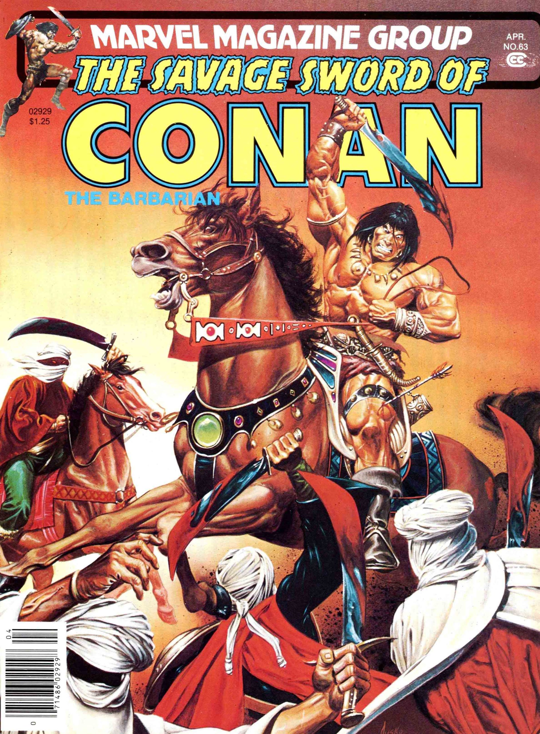
Buscema has rightfully become identified with the character, rendering more than 100 stories each for both the Conan comic book and the more “mature” Savage Sword of Conan magazine.
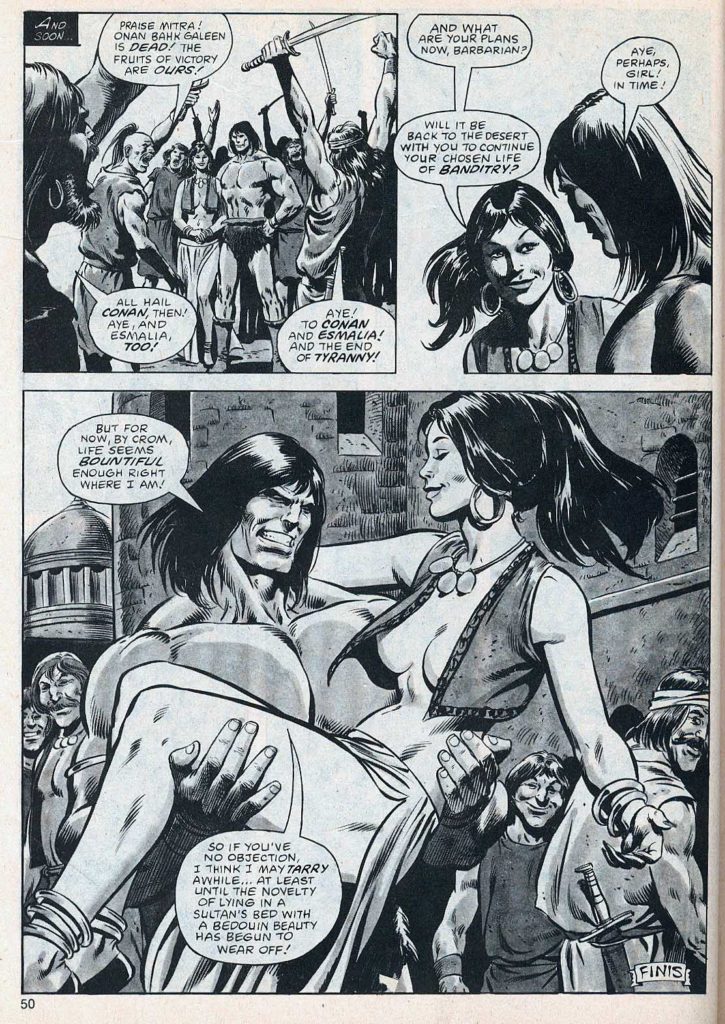
I’ve owned and traded many Buscema Conan pages over the years, and this splash remains one of my favorites. After a long fought series of adventures and battles, Conan is taking a break, and celebrating his victory.
Nothing wrong with that.
The story itself is an odd one. Michael Fleisher is the scribe, having come on board a just a few months earlier after Roy Thomas bolted for DC. Given the varying art styles of the story, the story length (46 pages) and the multiple inkers (Ernie Chan, Tom Palmer and Bob McLeod are all credited) it’s entirely possible it was originally destined to be a shorter story, and fleshed out when something else fell through.
If so, it’s a feat that John Buscema could pull off — while most others couldn’t even attempt it.



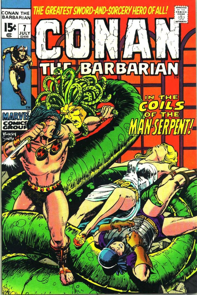
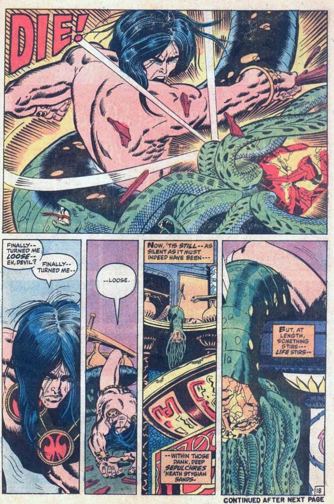
Conan # 7, July 1971

Conan celebrates its 50th anniversary in comics this year, and we celebrate the anniversary with three Conan-themed posts this week.
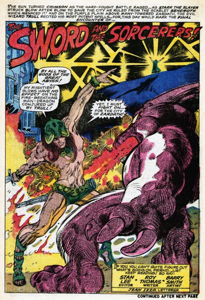
Barry Winsdor-Smith was not the first choice to draw Conan. Legend has it that Roy Thomas knew that John Buscema was the idea artist for the job. But Publisher Martin Goodman nixed the idea, citing budget and schedule, and told Stan/Roy to find someone less expensive.
The solution? The young British-born Smith, who had been a fill-in artist on a handful of super-hero titles with an unmistakable Kirby influenced style, and who was both cheap — and available.
And so Barry drew Conan for 21 of the first 24 issues — and the comic book world promptly grew up.
Smith, one of the many “young guns” of similar age, and breaking in at around the same time, (Chaykin, Kaluta, Simonson, Wrightson among the many others) ultimately developed an inimitable style. Yes the Kirby influence was there, especially early on. But so is Steranko. And Alphonse Mucha, the best-known stylist of the Art Nouveau period (late 19th – early 20th century), provides much of the inspiration for the intricate designs and beautiful women that populate those early Conan stories.
Smith’s run on Conan is unlike any other in professional comics at that time. And Baby Boomers, who had grown up on the simple stories of DC, and had segued into the cosmic soap operas of Stan and Jack, were primed for these comics. The Boomers were growing older, and now, the comics were growing up with them.
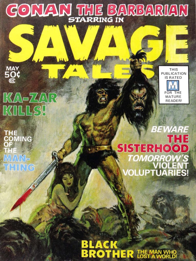
Smith’s style developed rapidly over his three year run on Conan, culminating in the extraordinary “Red Nails” that first appeared in 1973/1974 in Savage Tales. And of course, the work was always best when Smith was inking himself, but both Sal Buscema and Dan Adkins did excellent work, and interestingly, both are credited on this issue. Sal is credited on this specific page, but without all 20 original pages together, it’s difficult to tell.
Either way, it’s a stunning page, and only a small harbinger of things to come.