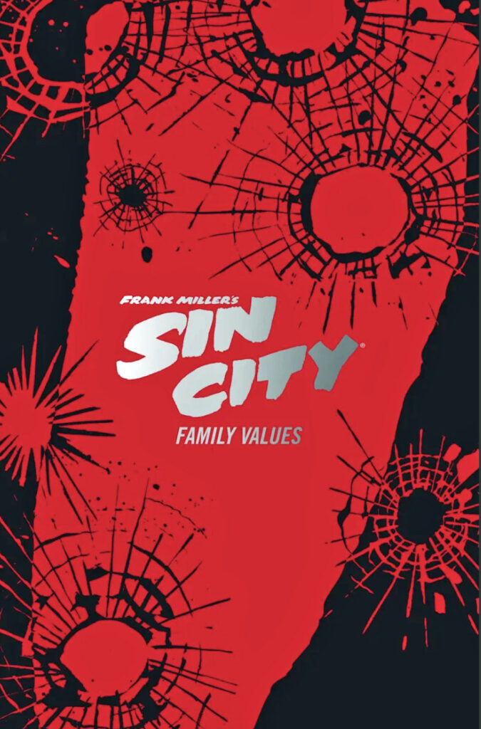
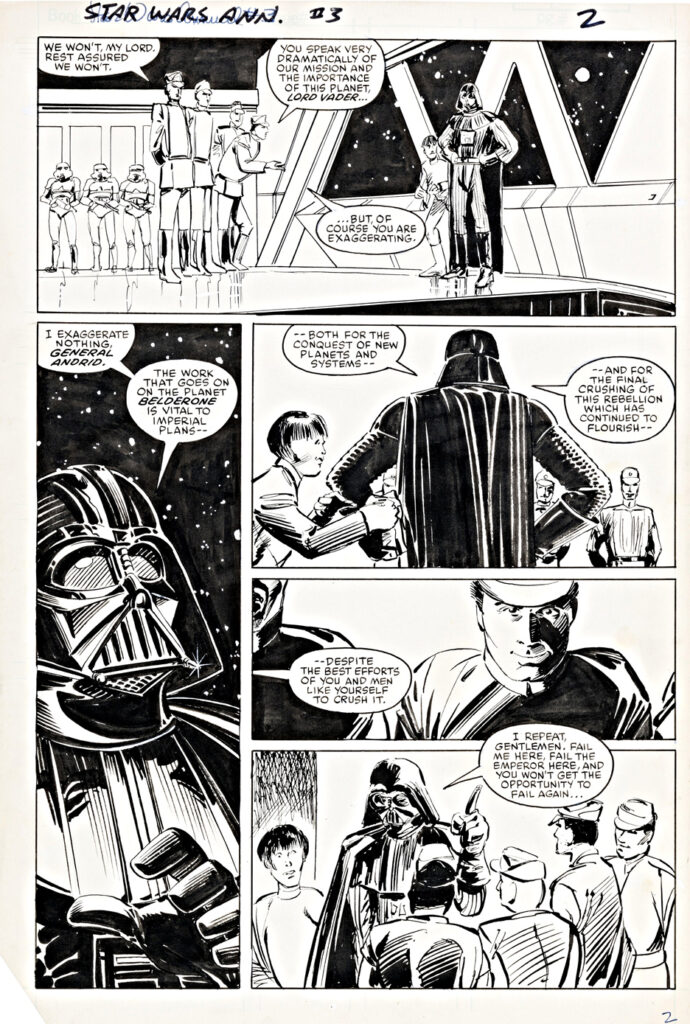
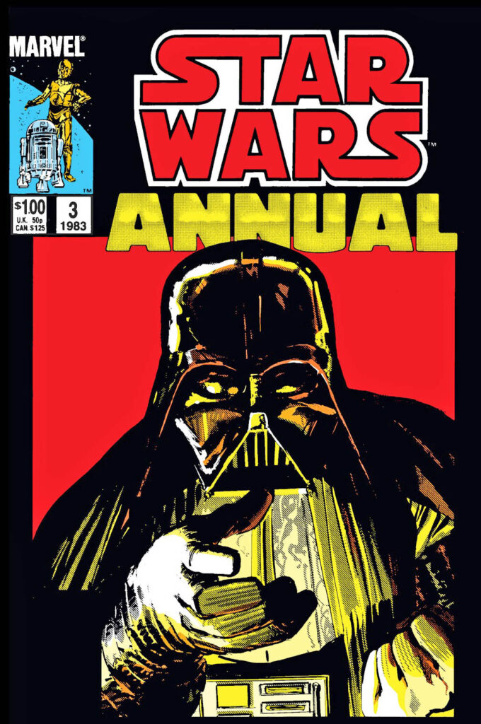
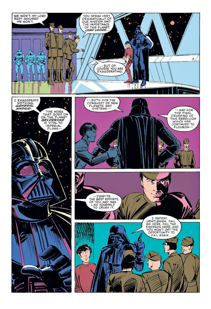
1983 was a busy year for Star Wars… and Klaus Janson.
Janson pencils, inks, and colors a terrific looking stand-alone Star Wars annual which releases in the summer. At the same time, he’s inking and penciling over Frank Miller’s layouts on Miller’s legendary Daredevil run. (Ultimately penciling and inking four issues on his own.)
On the Lucasfilm front, Return of The Jedi releases in May 1983, concluding the original trilogy — with the gazillion licensed products that follow suit. (The Jedi adaptation from Marvel is released as a separate series, in addition to the monthly Star Wars ongoing comic book.)
The first three pages of this Star Wars annual came up for auction late last year and fortunately, I snagged one.
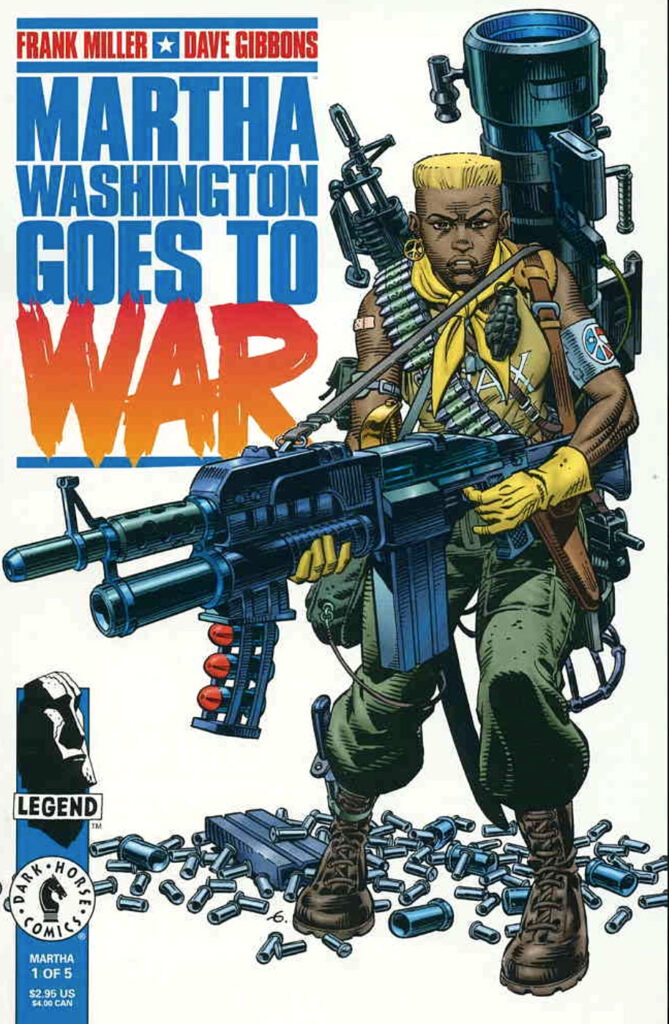
Sooner or later, some smart streaming service will discover Martha Washington, one of my favorite creator-driven series (series of mini-series, actually) of the 90s. All-star creators Frank Miller and Dave Gibbons teamed up to create a memorable post-apocalyptic USA.
Maybe it will happen right after we finally see an American Flagg streaming series; they could both be part of an American Dystopia block.
Until then, the comics will have to do.
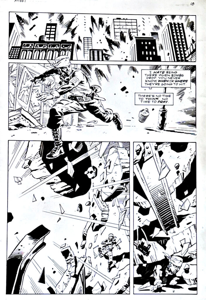
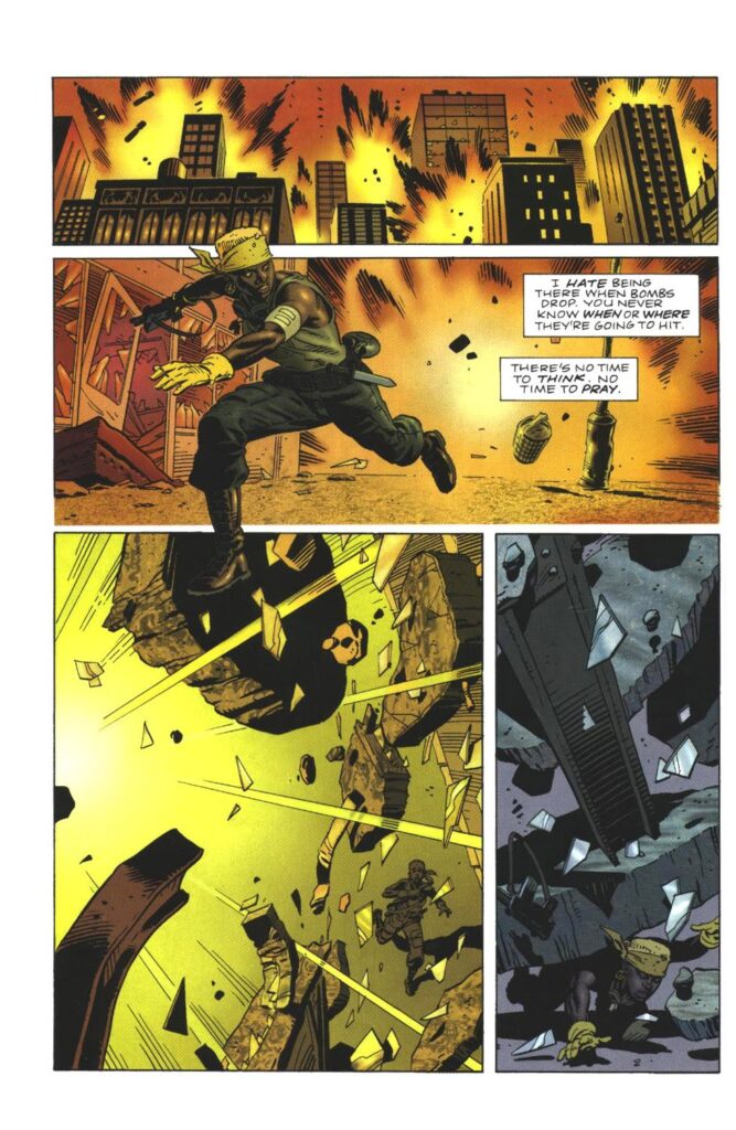
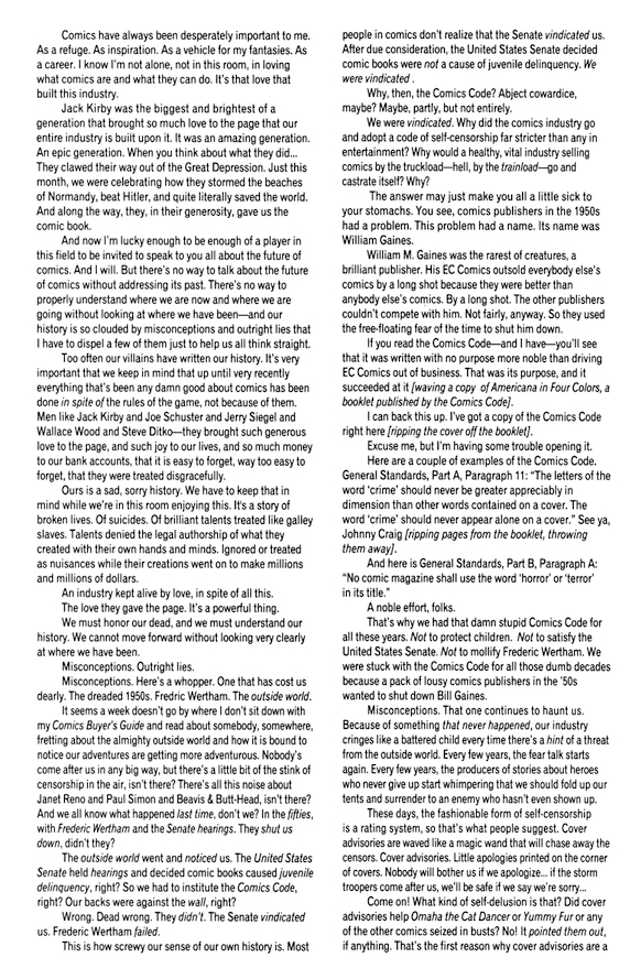
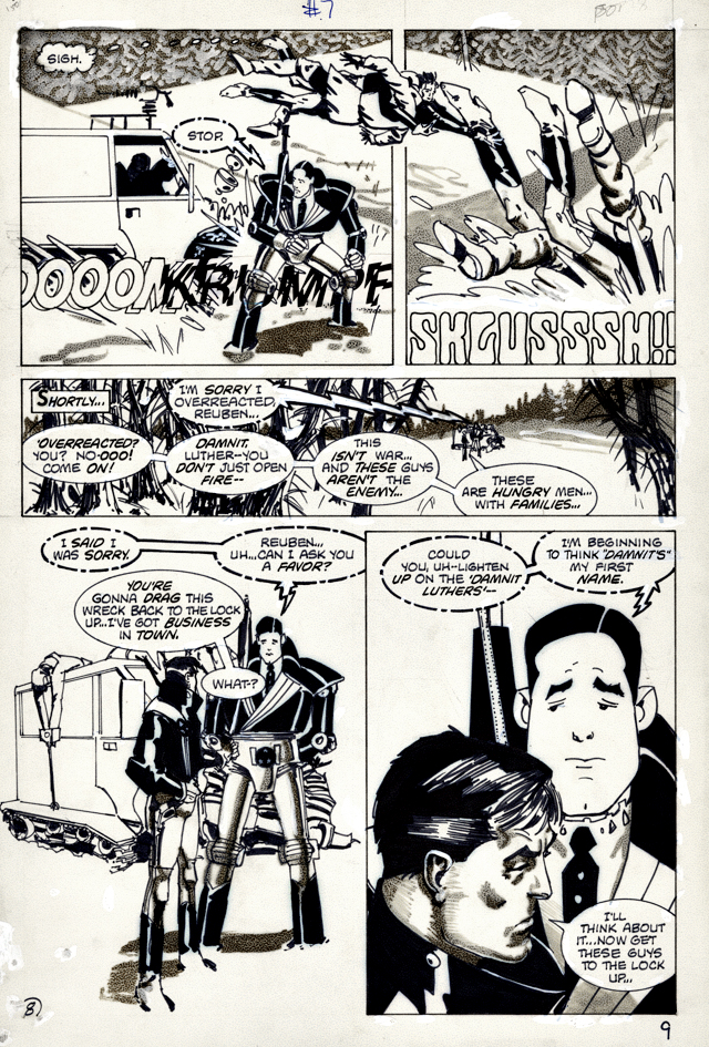
And the original art, of course, like this great action page from the second series, Martha Washington Goes To War.
Continuing our 70th celebration of Superman and Batman (Robin, too) teaming up for the first time.
Today’s original art oddity:
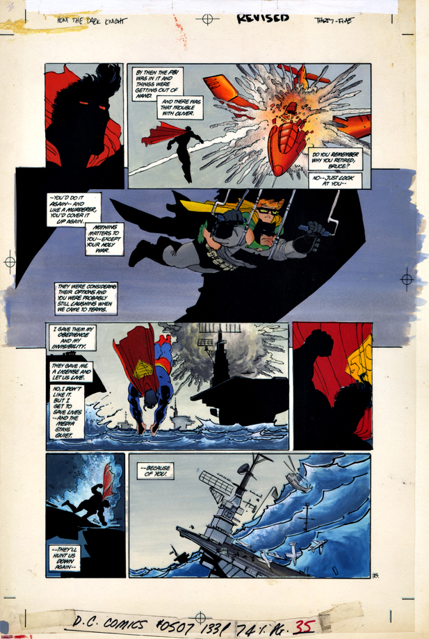
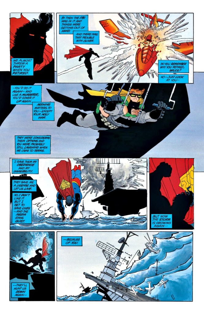
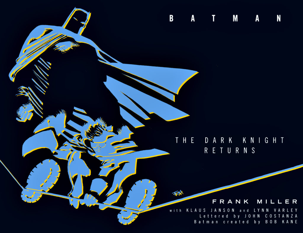
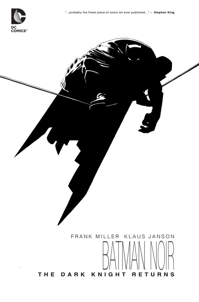
Two original pages exist for every page of Frank Miller, Klaus Jansen’s and Lynn Varley’s The Dark Knight Returns.
First of course, are the traditional pen and ink black and white line art pages. Gorgeous, of course.
Next up, are Lynn Varley’s stunning hand-painted color pages. For emphasis: These are NOT color proofs. DC shot acetates of every line art page, and Lynn hand painted each one. (And, the color palate of DKR is of course critical to the storytelling.)
And his stunner is one of those pages. One of only a handful that features Superman, Batman and Robin all on the same page.
Anyone want to sell me the original Miller line work to go with it? I can start working on my line of credit with the bank today.
September 18 was DC’s annual “Batman Day.” Although not exactly a national holiday, DC and Warner have used the occasion to commemorate the caped crusader and launch and market new products around the event.
So, as in the past two years, we continue to honor the celebration with the rest of the month’s posts devoted to The Dark Knight….
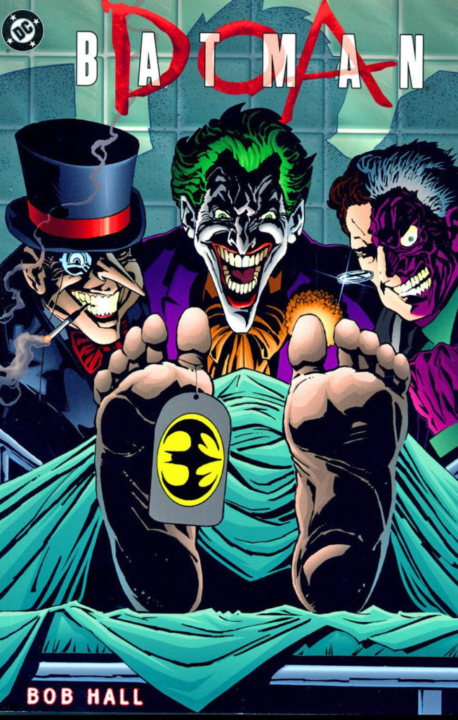
Bob Hall launches the new Millennium with a pretty cool Batman graphic Novel, Batman DOA.
Infected with a lethal virus unleashed by the deadly trio of Joker, Penguin and Two-Face, the rapidly deteriorating Batman has only 24 hours left to live… precious little time (as they say) to find a cure andrescue a kidnapped little girl whose life is on the same timetable. Its over-arching plotline (and title) is borrowed from the classic 1950 film noir “DOA” — albeit (spoiler alert) with a much happier ending.
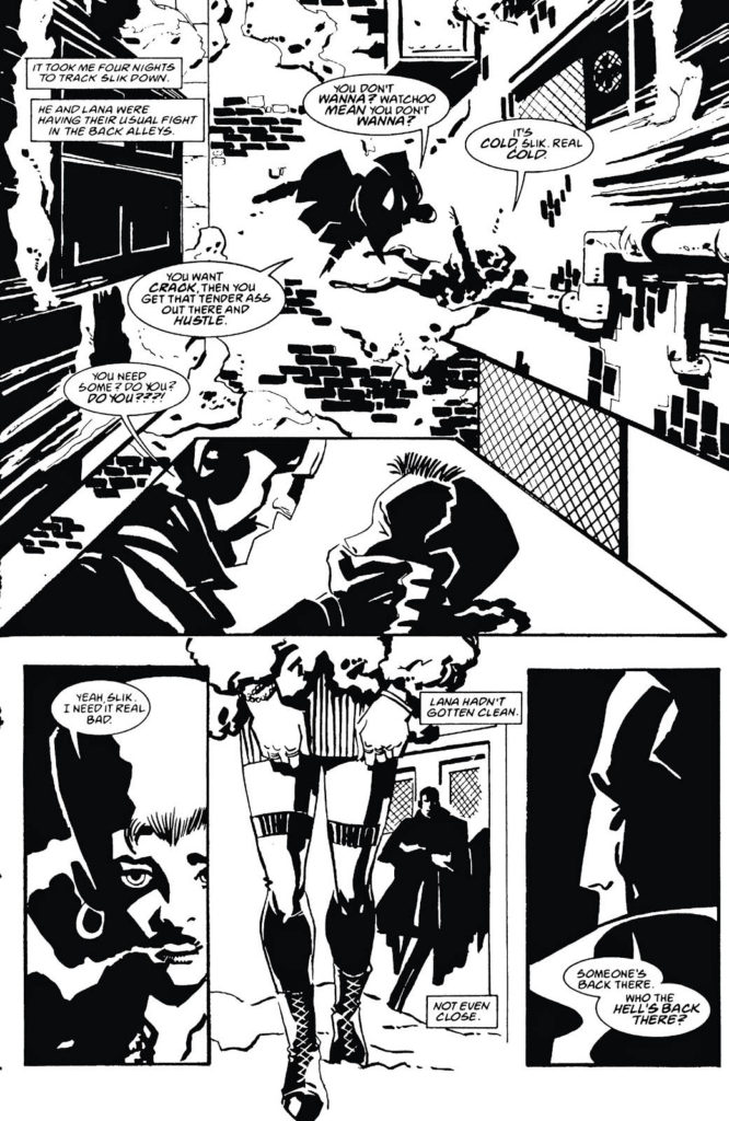
Bob had already delved into a Frank Miller Sin City art style in the late 90s with his own creation Armed and Dangerous for Acclaim / Valiant/ Armada Comics. Although it was occasionally a bit too derivative for my own tastes, it was definitely evolving, and I would have liked to see more material in this vein. He ultimately did a few more comics before he mostly retired from the industry to focus on playwriting and theatre directing.
Bob Hall’s noir creation Armed and Dangerous borrowed generously from Frank Miller’s Sin City.
Edmond O’Brien in the absolute classic film noir DOA (1950).
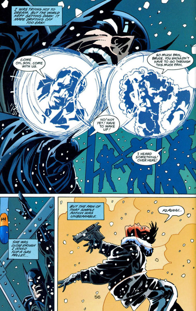
Preliminary Art, Batman: The Dark Knight Returns, 10th Anniversary Edition, 1996
The annual Batman Day is this upcoming Saturday, September 18. Although not exactly a national holiday, DC and Warner have used the occasion to commemorate the caped crusader and launch and market new products.
So, as in the past two years, we honor the celebration in our own way with the rest of the month’s posts devoted to The Dark Knight….
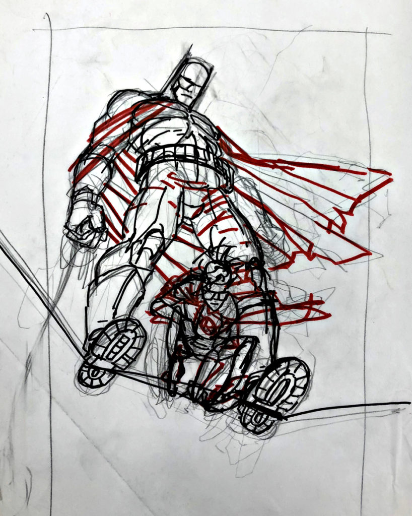
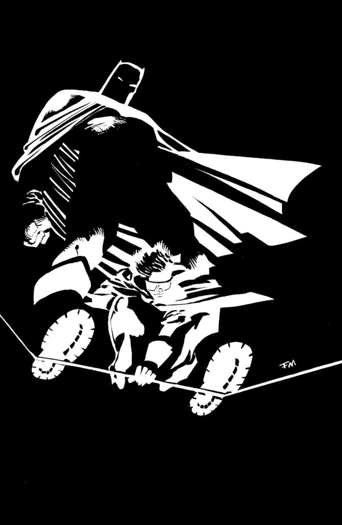
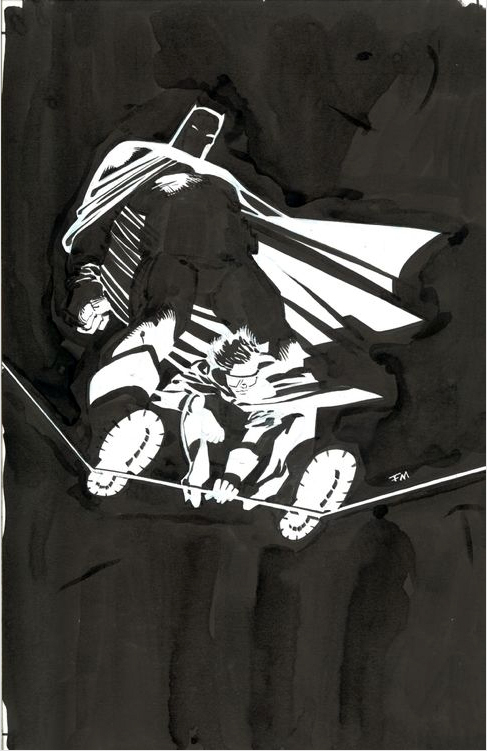
Kicking off…. with a prelim sketch of Batman and Robin from The Dark Knight Returns 10thAnniversary edition by the legendary Frank Miller.
In the ”art coincidence” department, I acquired this piece early this year, and apparently, at about the same time, the finished original (see below) also changed hands separately.
There is of course, nothing I can say or add about DKR that hasn’t been covered elsewhere.
I did only discover recently that Dark Knight returns became the catchall for the original series only because it’s the technical title of issue #1. Each issue of the four-issue comic book series has its own “title:”
Issue #1 — The Dark Knight Returns
Issue #2 — Dark Knight Triumphant
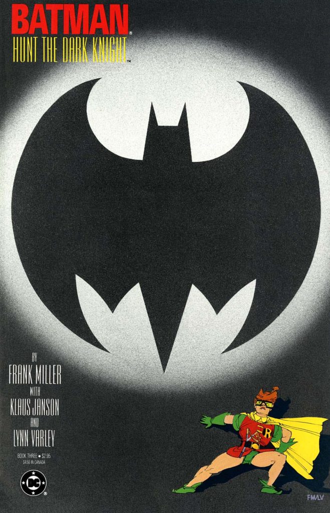
Issue #3 — Hunt The Dark Knight
Issue #4 — The Dark Knight Falls
Given its influence on the Batman mythos in all media, The Dark Knight Forever is most definitely not hyperbole.
Back here on Friday.
(Wikipedia has a ton of good DKR trivia assembled in one place here.)
Frank Miller created new art for the 10th Anniversary edition of The Dark Knight Returns, and some of it has made its way into other collections as well. Directly above is Frank’s finished original art.
We continue with our month long celebration of the “Independents” — independent creators and projects that continue to impact the comic book medium.
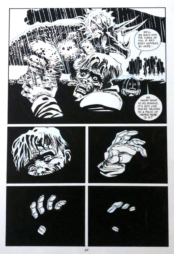
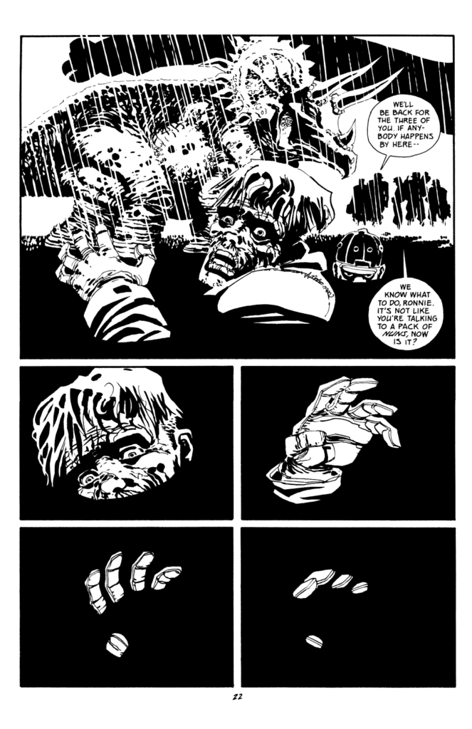
Drowning in tar pits seems like a pretty rough way to go.
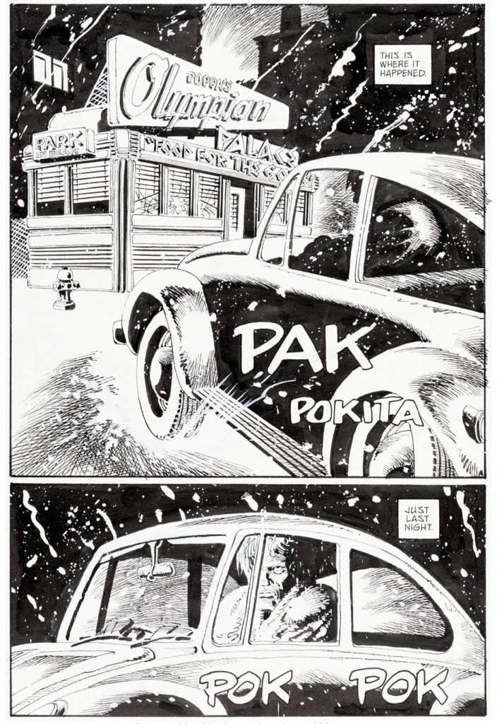
Then again, this is Frank Miller, and in the hardboiled world of Sin City, that form of murder might be preferable to some alternatives.
(In fairness, our “hero” Dwight ultimately makes it out alive. Sorry if that’s a spoiler, but the Big Fat Kill is from 1995. 25 years seems like a fair amount of time to catch up on these things.)
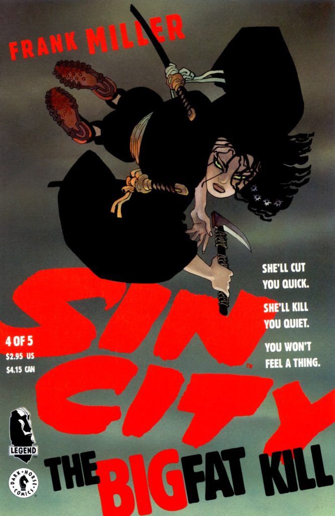
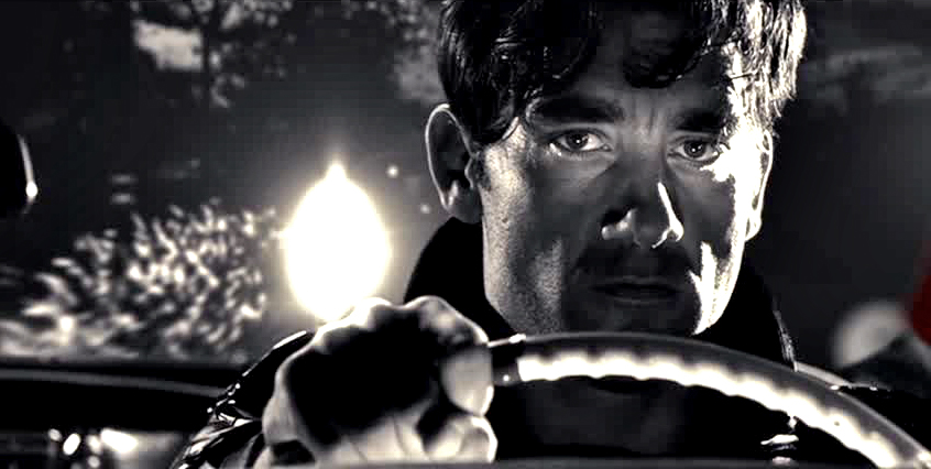
Big Fat Kill (BFK) is the fourth of Miller’s Sin City sagas, and one of the three stories featured in the first Sin City film. I can’t recall if the tar pit scene made it into the movie or not. Guess it’s a good excuse to watch it again.
As for actually drowning in tar pits? According to my anecdotal research and sources, It’s harder than you might think.
But it makes for one very cool original art page, and, in this case, that’s what counts.
Clive Owen as Dwight McCarthy in the first Sin City film.
New art, along with a repost of last year’s Flagg blog:
Remember what is was like to first watch Sopranos or The Wire or some of other great early HBO-produced television shows? You knew it was TV, of course but it was so different… so much better than typical commercial fare, it made you think about what the medium could actually be.
For many fans — myself included — Howard Chaykin’s American Flagg (especially the first dozen issues or so) had a similar impact on comic books in 1983. Part SF, part satire, all adult, Flagg’s dystopia was like nothing else in contemporaneous comic book publishing.
Its inventive storytelling was groundbreaking, an oft-overused word that most definitely applies here. Need validation? Read those first twelve Flagg issues, and then read The Dark Knight Returns, by Howard’s studiomate Frank Miller, which appeared a few years later.
I’ll wait.
Or, just trust me on this.
Flagg came from nascent publisher First, and its editorial plan pursued mature, original comics from talented creators. And Flagg was one of the best of them.
It was obvious that Howard put his heart — and more — into the series.
In fact, I think there are only two reasons why Flagg isn’t frequently discussed in the same breath as other innovative titles like DKR or Watchmen.
First, it’s because of First.
Independent comic book publishers almost entirely relied on the direct market. Their reach wasn’t anywhere near as wide the mass market, and even with some newsstand distribution, a top independent comic book would never have the reach of a poor-selling superhero title from Marvel or DC, let alone a smash hit.
In other words, no chance you were going to score an American Flagg Slurpee at 7-Eleven.
The second reason is more frustrating.
Remarkably, all 50 original issues of Flagg have NEVER been collected. The early issues appear in and out of print from time to time, but it’s a pity that you can’t get the complete series in digital or print, on demand, as they say.
And that’s a conversation I’ve had with Howard many times. Many, many times.
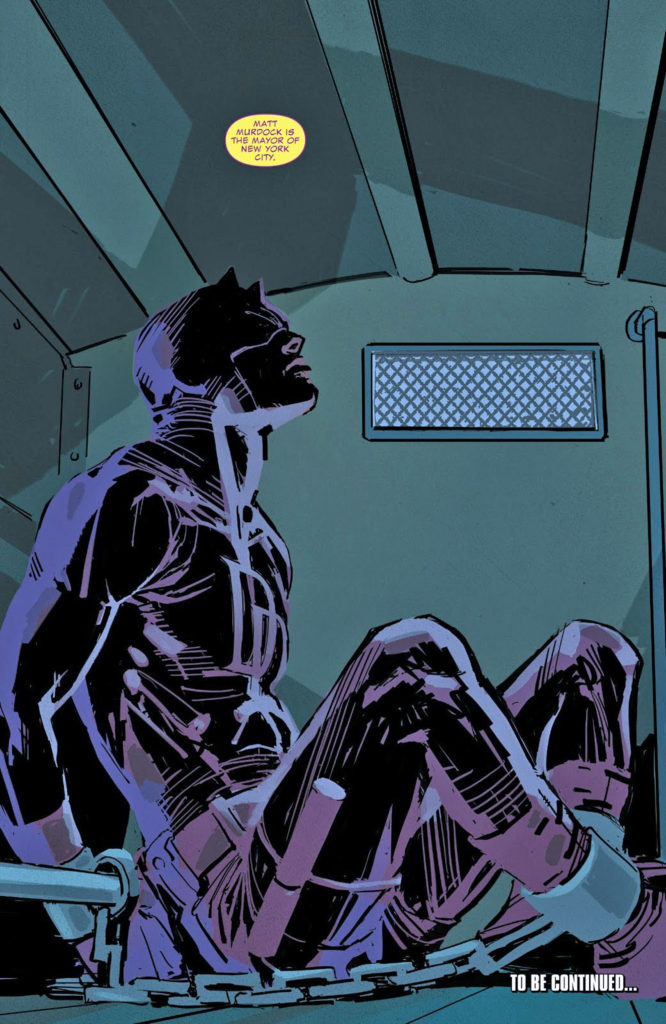
Daredevil, beaten and bruised, is hauled away by the NYPD in this cool cover by Chris Sprouse and Karl Story.
It’s an apt metaphor for the part of the Marvel Cinematic Universe that briefly resided on Netflix.
Daredevil, along with Jessica Jones, Luke Cage, Iron Fist and Punisher anchored an ultra-violent “Marvel Knights” style universe on the steamer for three years. Pretty good television shows, ultimately victims to the battles between the giant entertainment behemoths.
Daredevil was my personal favorite of the group, leaning very much into Frank Miller’s work on the “Man Without Fear” and “Born Again” story arcs. Terrific cast, well-written scripts, and a definitive, stunning performance by Vincent D’Onofrio as Wilson Fisk / Kingpin.
In about six months, the moratorium on rights reversion ends, so Marvel will be free themselves to use the characters in the MCU. In fact, there is a dedicated group of fans campaigning for the cast, if not the entire show, to return in some form under the Marvel banner.
A long shot of course, but the group has worked tirelessly to make its opinion known. Fingers crossed.
Meanwhile this cover is an oddity in that it highlights a scene that took place in the previousissue. Just in case you missed it, I guess.
Doesn’t matter from an art standpoint of course. It is a striking image. Regardless. And as mentioned in a previous post, I’m always happy to see Sprouse and Story on… pretty much anything.
Frank Miller returns to Daredevil and brings an all-star art team with him in the origin story, “Man Without Fear.”
Ok, easy to call “all-star” an oft-overused cliché, but in this case, no exaggeration. The artistic team of John Romita Jr. and Al Williamson is a stunning compliment to Frank’s storytelling.
This is Romita’s best work up until this point in his career, and Al certainly still had his inking chops as well.
I’m guessing (and strictlyguessing) that Miller provided a full script or close to it, because the layouts and storytelling are so “Milleresque.” Either that, or Romita Jr. channeled his inner Miller.
Probably a combination of both.
In this page, young Matt Murdoch discovers his true powers for the first time in a sink or swim training session provided by his tutor, the mysterious “Stick.”
The page layout cleverly and beautifully uses the nine-panel grid to show the development of Matt’s reaction time to Stick’s attack.
A great page from one of the all-time great limited series.