Gil Kane — Green Anniversary
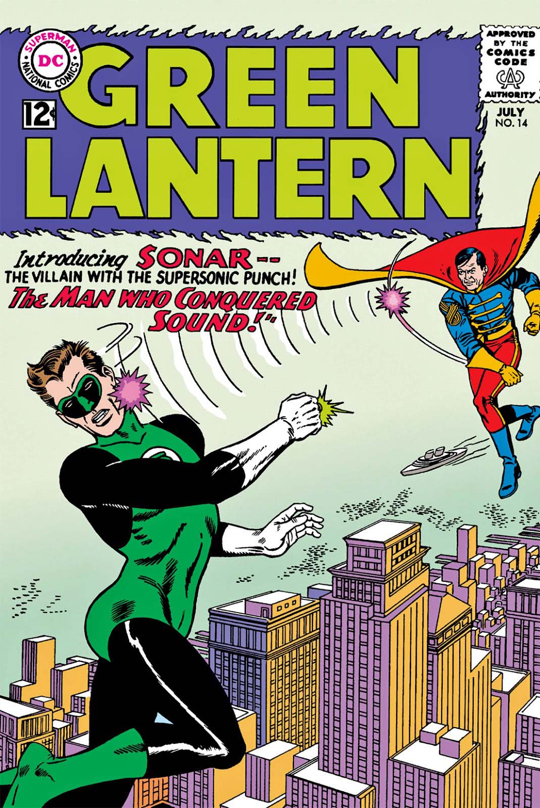
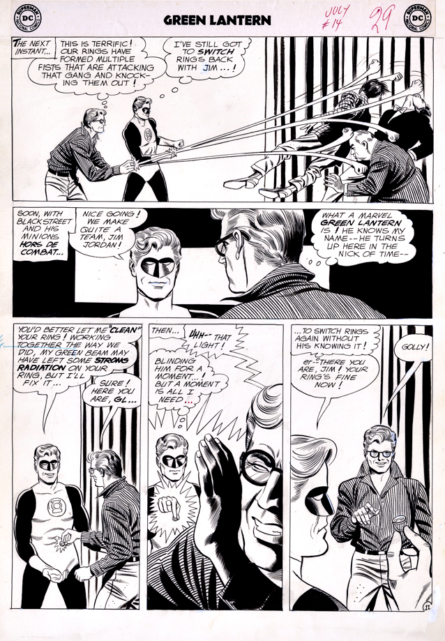
Green Lantern #14, July 1962
Green Lantern celebrates two anniversaries in 2020.
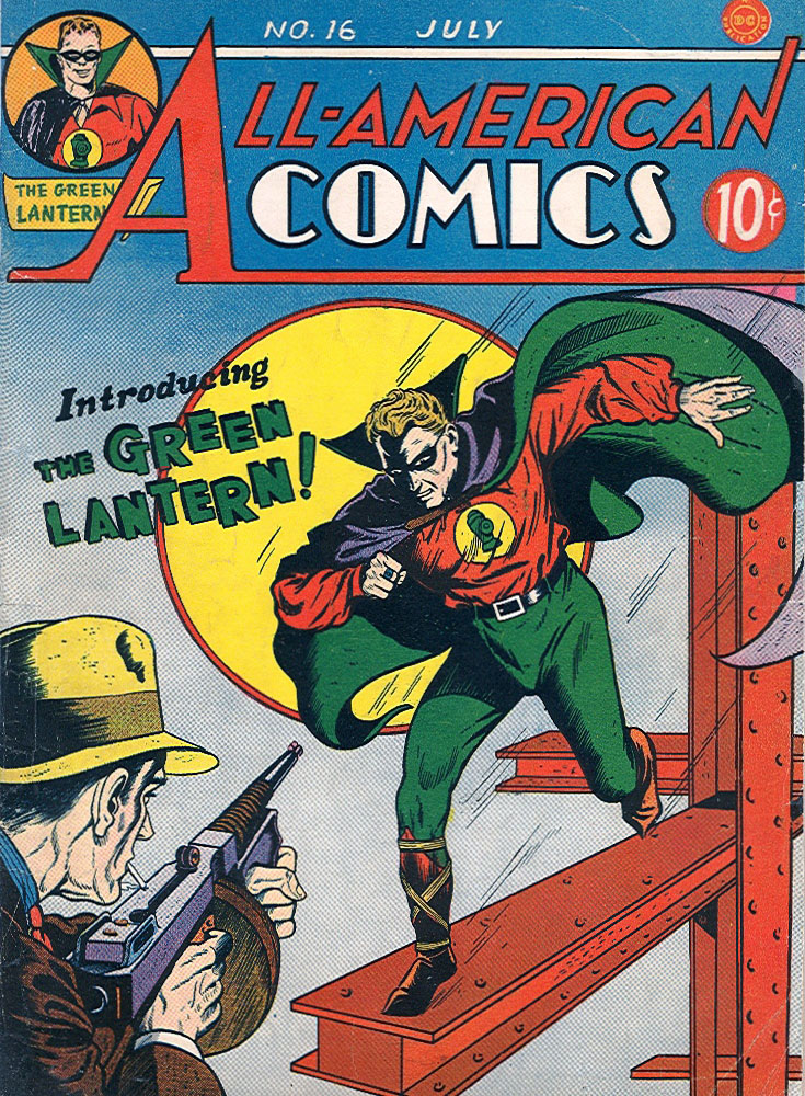
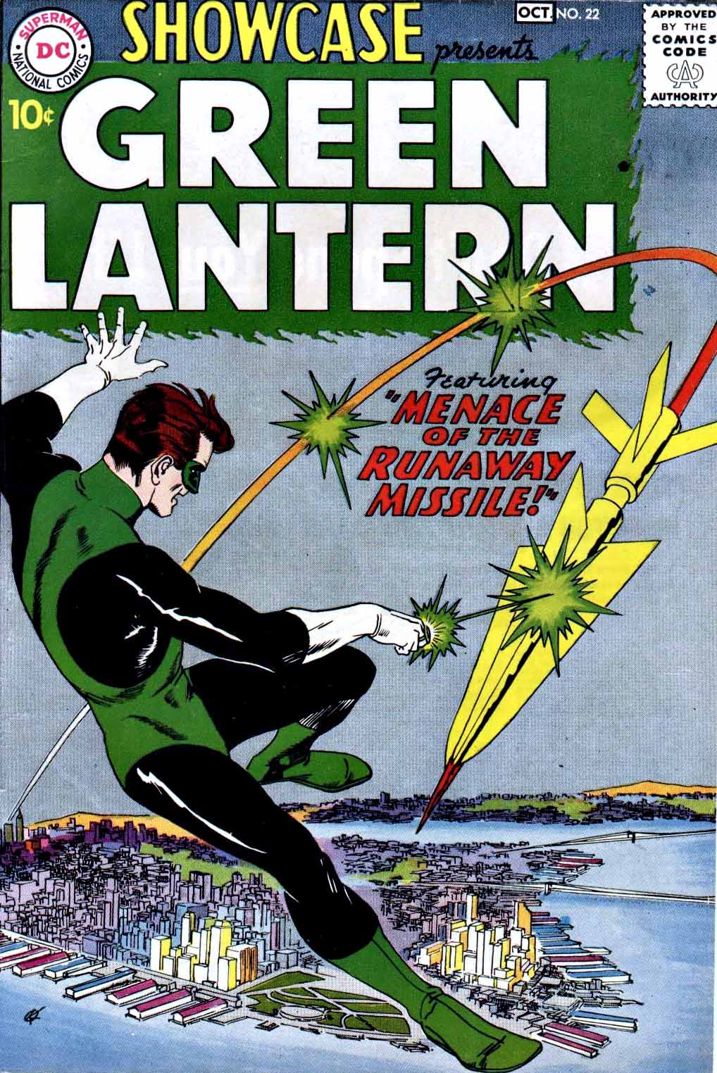
The original Green Lantern (Alan Scott) first appeared in 1940, and the Silver Age Green Lantern, Hal Jordan, gained his own DC comic book series in 1960, shortly after first appearing Showcase #22 the year prior.
During the first 75 issues of GL’s own Silver Age comic, Gil Kane is the artist most associated with this run.
In these early issues Gil is not quite GIL KANE yet. The art is very solid, slick, and polished, in DC tradition, but it would take a few years before Gil’s trademark style would fully break through the conservative confines of the scripting and editing.
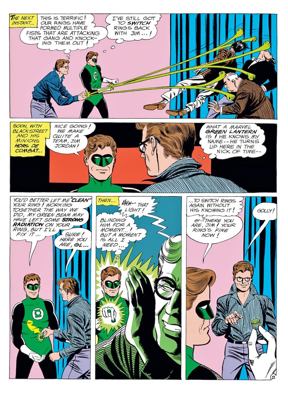
By the time Gil finishes his 10-year run with issue #75, Green Lantern is not a giant commercial success, but Gil Kane is most certainly GIL KANE. Reading through collected editions of the series, you can clearly see the metamorphosis of his storytelling capabilities and artistic style.
As for issue #76 in 1970 (Another anniversary, now that you mention it) Denny O’Neil and DC shake things up a bit by adding Green Arrow to the mix — and artist Neal Adams takes the reigns.
The rest, as they say, really is history.