Greg Goldstein's Comic Art Gallery

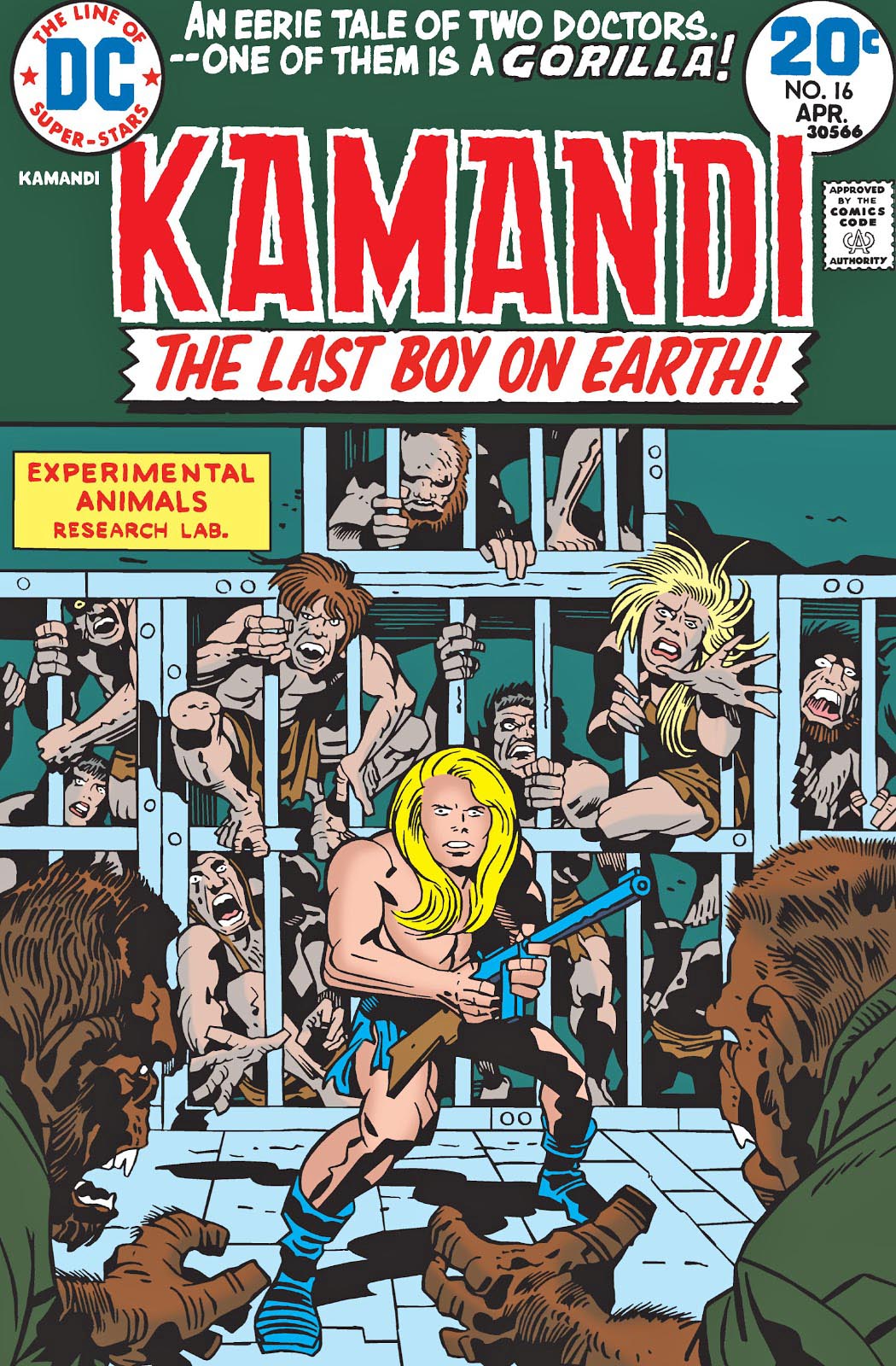
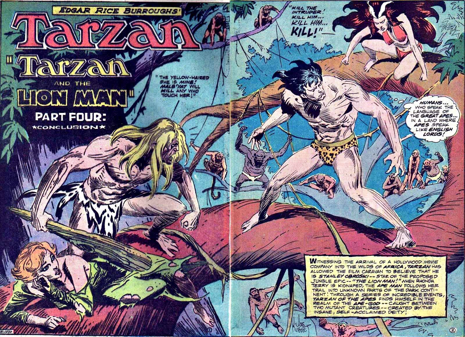
Jack Kirby — Gorillas, Tigers, The Apocalypse, Oh My!

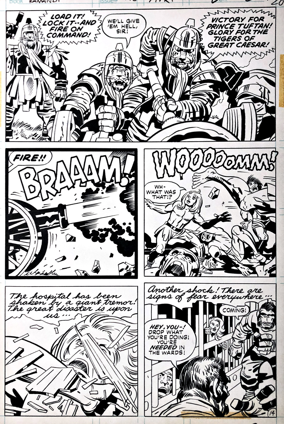
Kamandi #16, April 1974

I didn’t react well to Kamandi… at first.

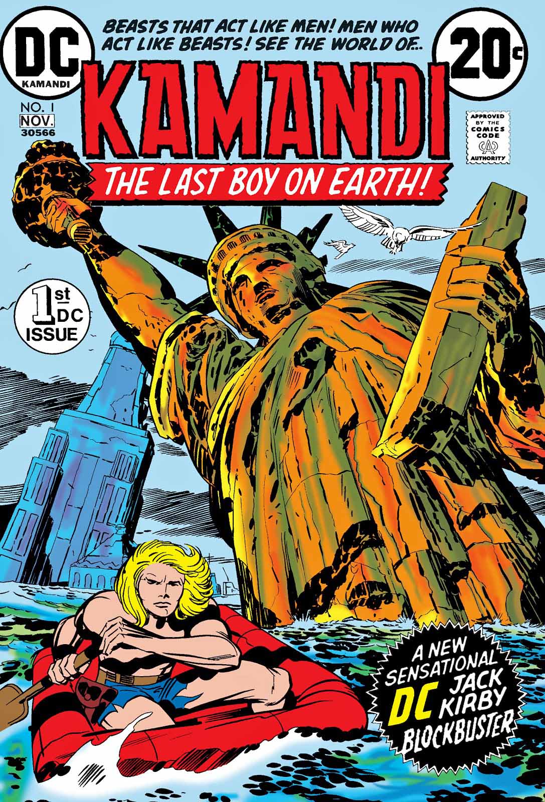
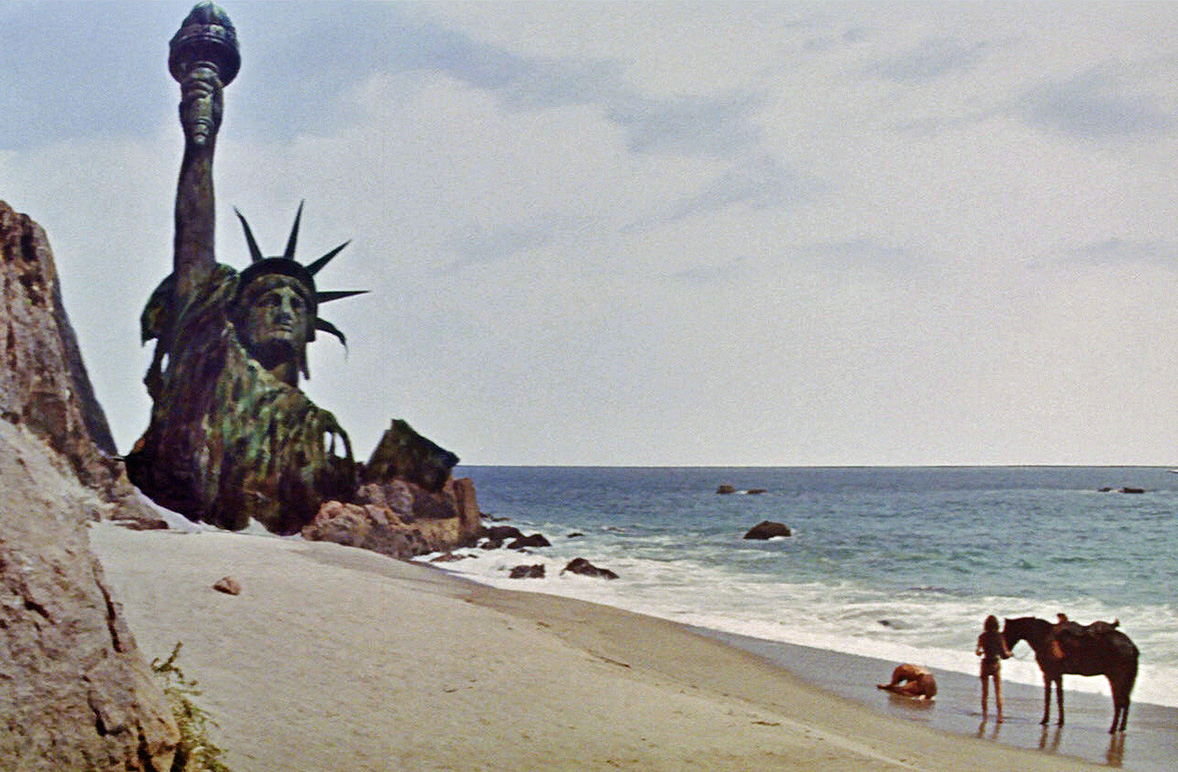
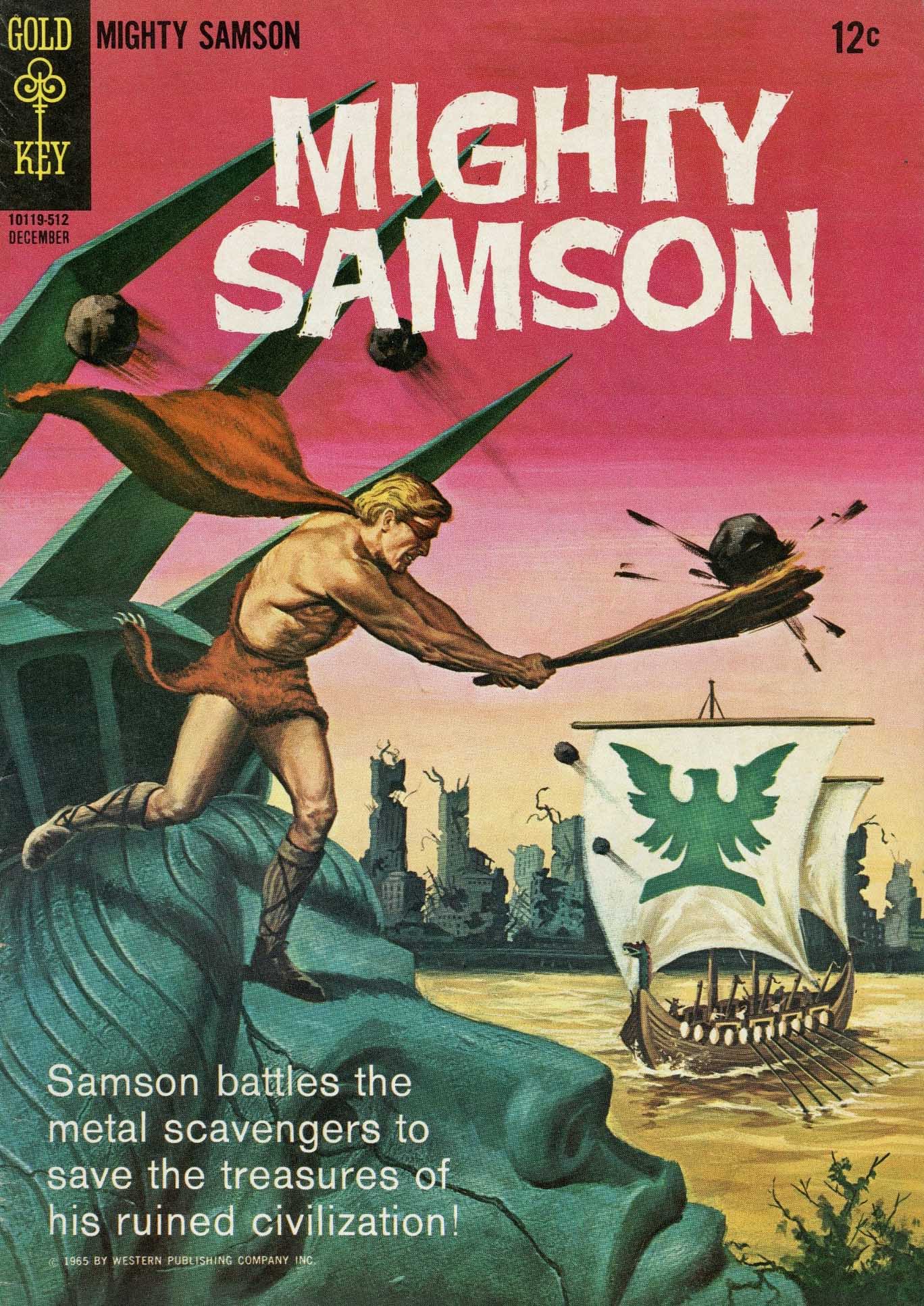
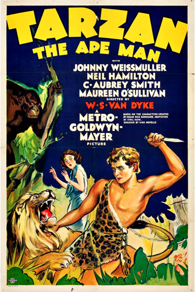
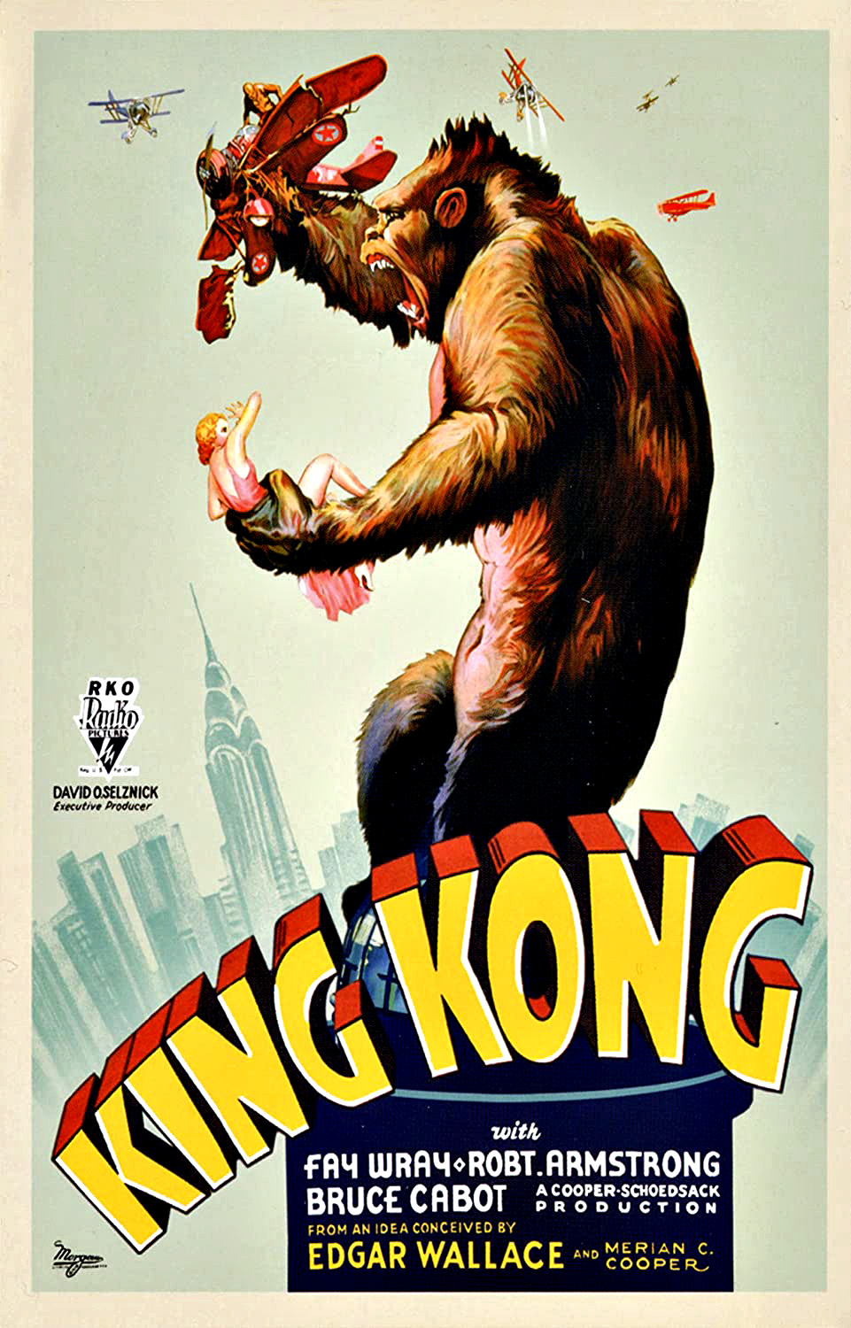
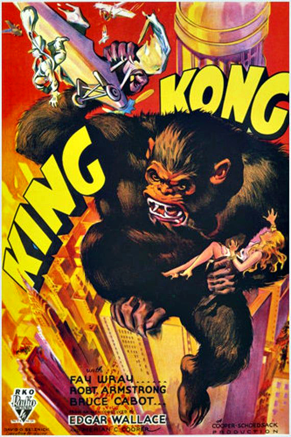
I was a huge fan of the Planet of the Apes Franchise, and when I first saw the promo image (The Comics Reader, probably) for the cover of issue #1, I became miffed.

Why would Jack rip off POTA? Was the King finally out of original ideas?

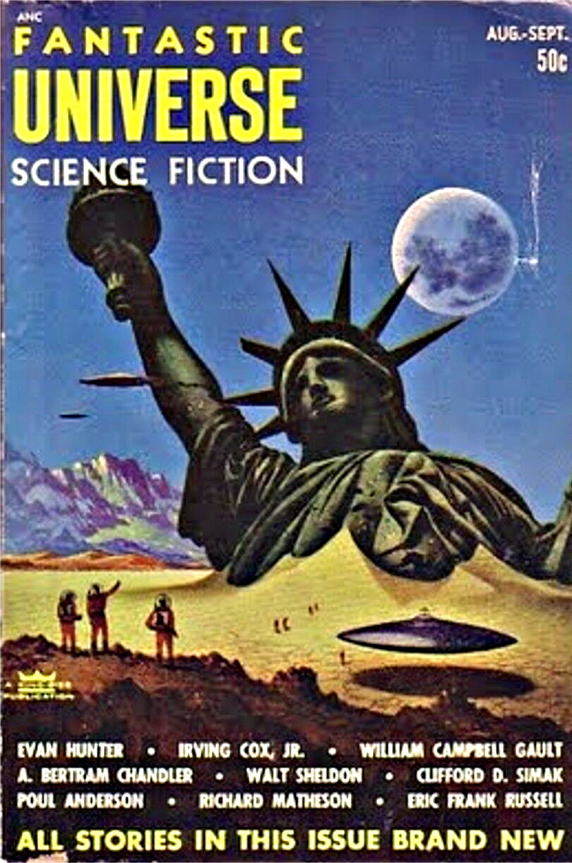
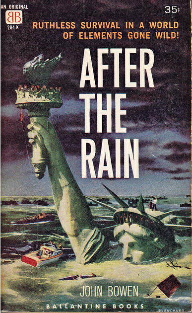
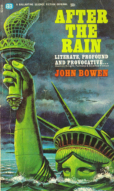
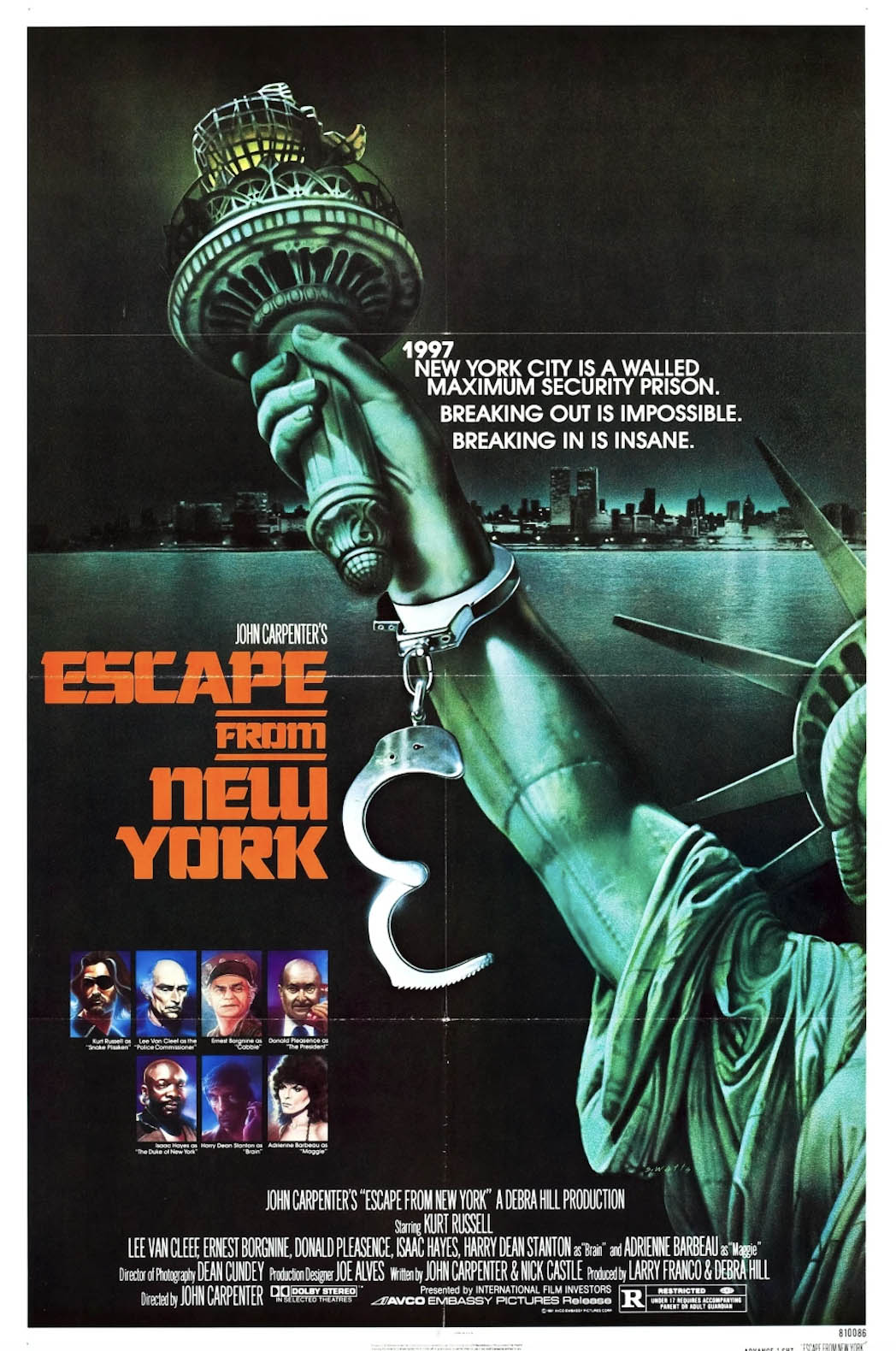
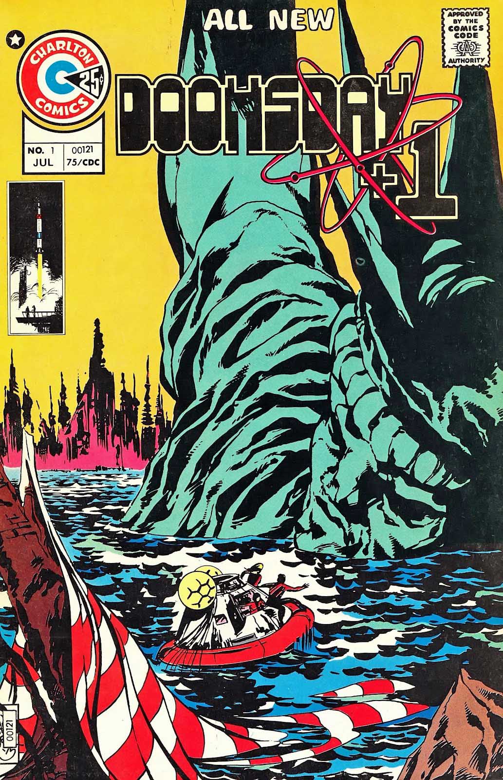
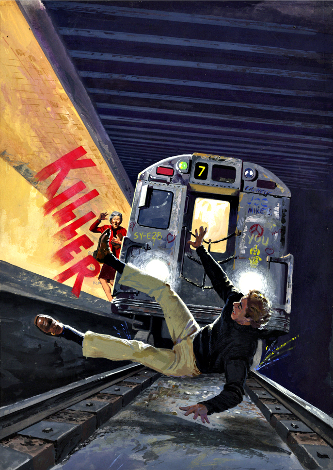
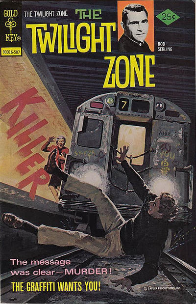
Ah to be that young and foolish again. Kamandi quickly became a favorite. And little did I know that the Statue of Liberty “end of human civilization trope was already a SF trope by the time Rod Serling incorporated into his brilliant POTA screenplay. (See below.)

And, if you’re going to end human civilization with one breed of animals develop advanced intelligence, why not do it with all of them.

Heh.

That’s why the King is the King.

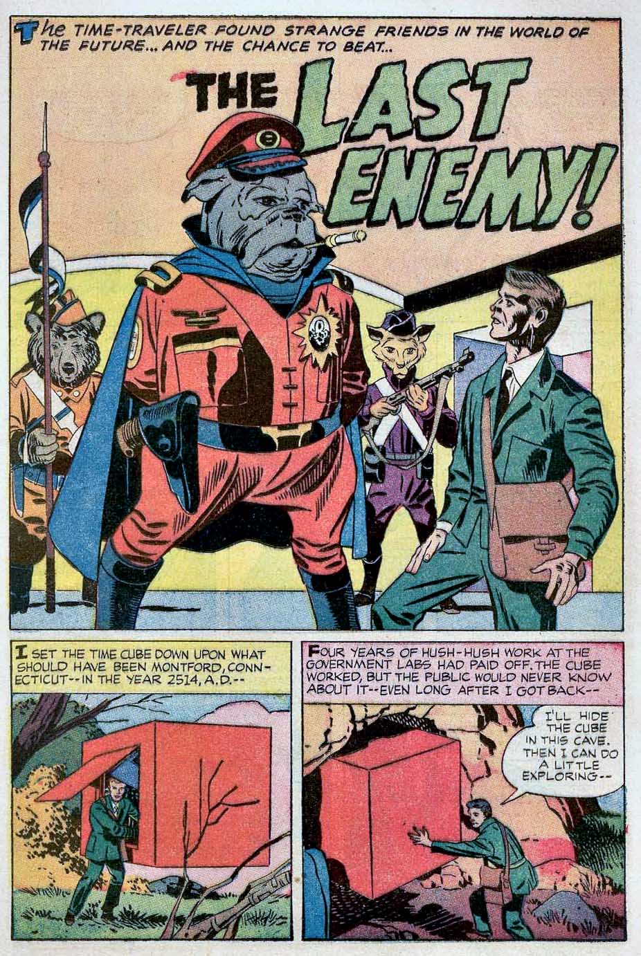
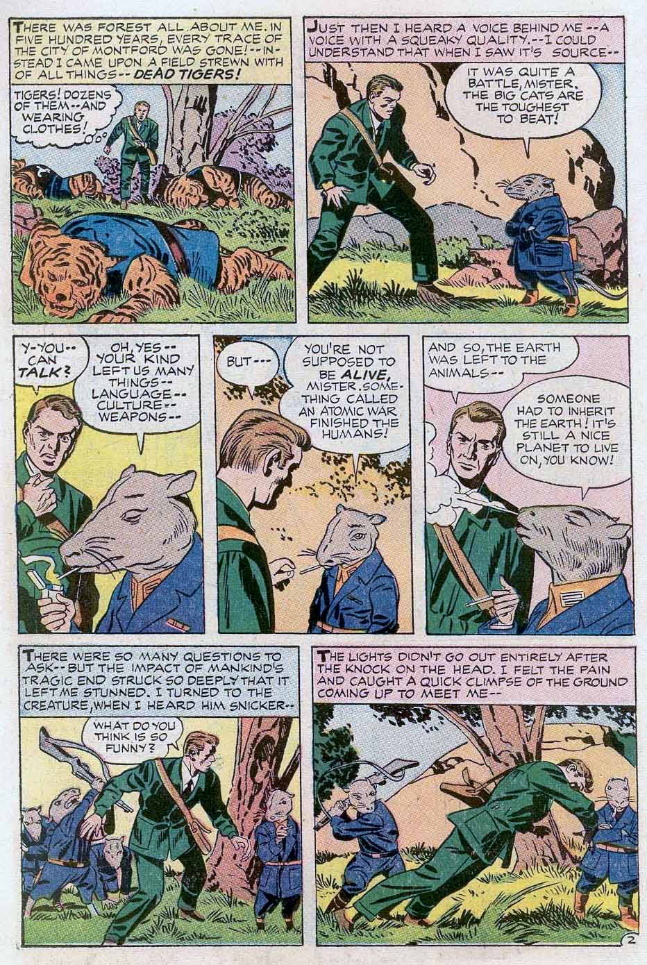
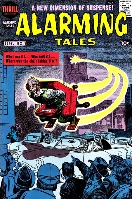
And, it gets better. Turns out Jack was incorporating some similar ideas he had previously used in a short story in Alarming Tales, 15 years prior to Kamandi. (Also, see below.)

So, what did I know? Not much, apparently. Like I said, to be that young and foolish again.

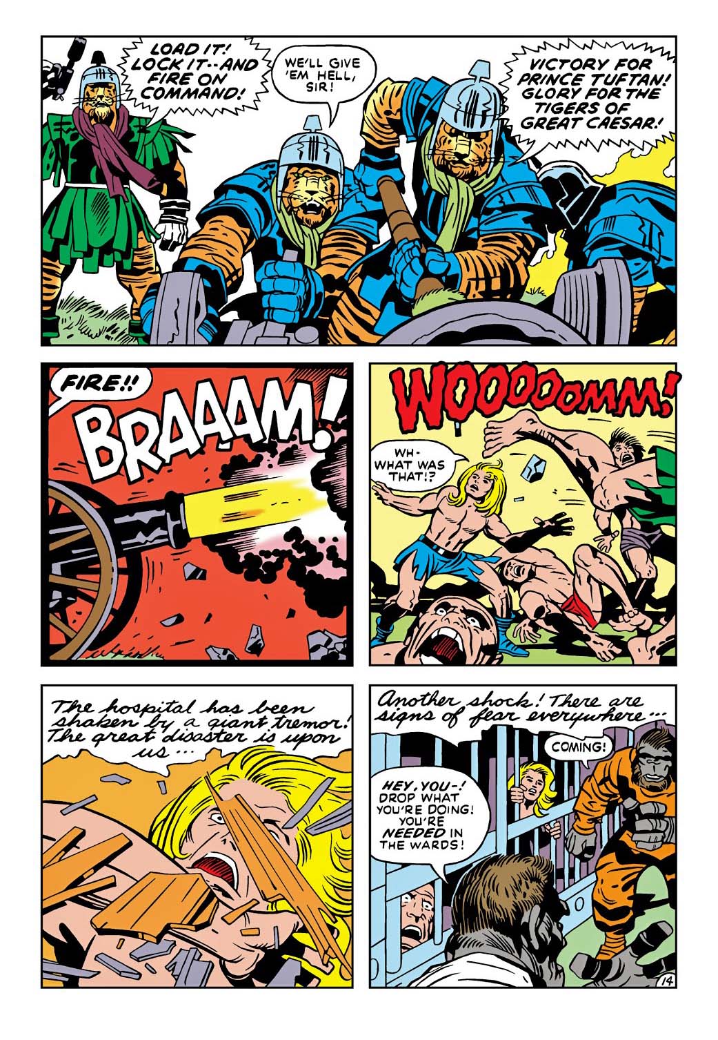
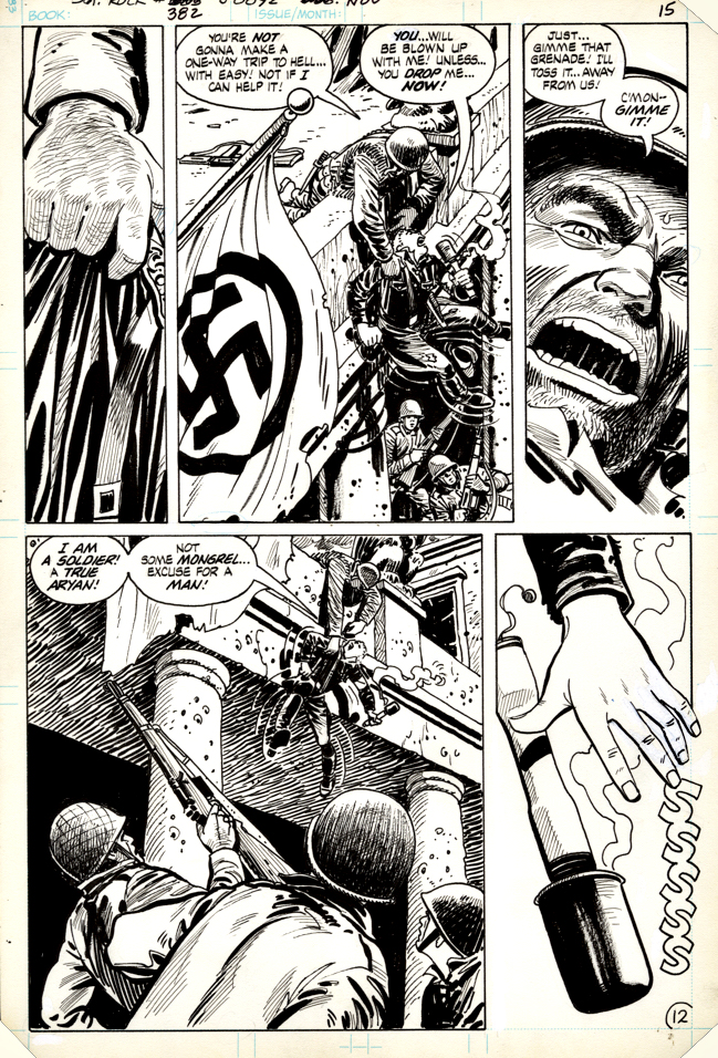
This page is the final issue Mike Royer inked, and the first that D Bruce Berry (working apprentice style) had a hand in. He took over solo the following issue. Tom Kraft of the Jack Kirby Museum believes both worked on this specific page.

Kamandi, apes and tigers — all on one page. What more could I ask for? 

Now, or then.

Jose Delbo — Lives In A Yellow Submarine

Commission, based on artwork from The Yellow Submarine, (originally February 1969)

Coming up faster than I would like to acknowledge is the 55th anniversary of the (1968) release of the wild and wonderful Beatles’ Yellow Submarine animated feature film.

Gold Key (Western Publishing) published the adaptation of the film and charged 35 cents(!) for a copy, partly due to size (64 pages), and partly due (I assume) to steep licensing fees. It was the most I ever paid for a new issue of a comic book at the time. (Marvel and DC annuals were 25 cents.)

Jose Delbo nailed the film’s psychedelic aesthetic perfectly; I’ve never seen an actual original page from the adaptation, so I assume the pages were either destroyed or ended up in a Beatles archive somewhere, waiting to be rediscovered.

In the meantime, Jose’s great commission (undated, probably early 2000s) will do quite nicely.

Mike Allred — Nope, Still Not A Robot

Iron Man vs. Magnus: Robot Fighter, Commission, 2012

Mike Allred tackles the Magnus vs. Iron Man theme with great results, including a fully hand-lettered logo!

I acquired both the Paul Smith IM-Magnus commission and this one at the same time, from the same dealer, so I assume the original owner had moved on from this concept.

If there are any others out there that look as good as these two, I would probably try to obtain them as well. 

You know where to find me.

Russ Manning — Robots, And More Robots

Magnus, Robot Fighter #20, November 1967

Gold Key was never a publisher of choice for me as a kid. It had to be a really slow day at the comics rack, and I had to be flush with cash (meaning a few extra coins) to pick up the one Gold Key title I liked: Magnus Robot Fighter.

Russ Manning’s vision of the future was so clean and pristine that I didn’t much care about the stories, I just loved the art. Beautiful futuristic cities, and crazy badass robots. Oh, and his men and woman were gorgeous. Natural selection had apparently taken leaps and bounds by 4000 AD.

The future looked really bright — minus that whole totalitarian robot situation, of course.

Magnus Robot fighter turns 60 in 2023. 1963 was apparently a good year for armor.

Russ Manning — Tarzan, Revisited

Tarzan In Savage Pellucidar,” Graphic Novel, 1975

This beautiful Russ Manning splash page has never been published in the US, or in English at all, for that matter.

A foreign publisher hired Manning and his team to create a series of graphic albums for the European markets in the mid 70s. Manning, having beautifully illustrated the Tarzan comic strips, as well as some of the Gold Key comics, was a perfect choice.

A few years back, Dark Horse reprinted two of those graphic albums, but I assume sales were not significant to continue. (Unless it simply fell through the cracks. Not a likely scenario, but it does happen occasionally.)

Another original art page from this story appeared in auction last year, and it too is a beauty.

I would really love to see the whole thing. I haven’t been able to find a foreign edition. But I will, eventually. Trust me on this.

Joe Kubert — Tarzan, Unvarnished

Tarzan #234, January 1975

2022 is the 110th anniversary of Edgar Rice Burroughs’ jungle icon, Tarzan.

This year has at least two-other important Tarzan-related anniversaries:

The first is 1932, the release year of the first Johnny Weissmuller Tarzan feature film. Tarzan existed on screen prior to the Weissmuller film, of course, but his 12 features likely did more to enshrine the character in the popular imagination than any other media representation.

The second is 1972, the year DC took over the comic book license from Gold Key and re-established Tarzan as a savage lord of the Jungle. Joe Kubert’s comic art work on the character was the first that took the sheen of the character and returned him to his literary roots.

Long before “reboot” became part of the pop culture vocabulary, Kubert’s Tarzan was a stunning new look for comic book readers.

DC, as part its licensing deal, had to provide all the original art to the Burroughs estate. It’s still there in the archives, in excellent condition, and we used it to create three beautiful Artist’s Editions volume at IDW.

Ultimately, thought, this means that Kubert Tarzan pages are among the rarest of the last 50 years. With the exception of a handful, none of them have ever been offered on the open market.

Joe originally gifted this splash, part of a DPS, to a friend. 

I happened to see it the day it the day it came up for sale, and despite a lofty price, I acquired it then and there. 

I knew I wouldn’t likely see another one.

Dan Spiegle — The Last P.O.W.

Sgt. Rock #382, November 1983

We’ve used the phrase artist’s artist here a few times. Simply put, it’s an artist that other members of the craft more than admire and appreciate; they are often awestruck by the talent.

Dan Spiegle was one of those artists. 

Talented, speedy, and reliable. Did I say talented again?  It’s worth repeating.  He did a lot of terrific work for Gold Key (Space Family Robinson, Doctor Spector, Korak, etc.) and a ton of licensed material including a well-regarded run on Maverick (James Garner’s TV series), only occasionally finding time for DC and Marvel.

So I’m fortunate that he did manage a few DC war stories, including this one from 1983. It’s a typical example of Spiegle’s talents —creative storytelling and great spatial arrangements, inventive camera angles, and, of course, detailed and clean draftsmanship.

From a fan perspective, his lack of consistent work on “mainstream” titles often meant less recognition than he deserved: An underrated talent if there ever was one  — except by the people that knew his work.

Gabriel Hardman — The True King Of The Monsters

King Kong, Commission, 2014

Godzilla got most of the attention in the last few posts. But Kong needs some love as well.

So here’s a terrific commission by Gabe Hardman to provide a solution.

Between American and international film releases and re-releases, there is a ton of great movie poster art out in the world. Much of it is quite striking, and my favorites always involve the penultimate scene of Kong fighting the “air force” on top the Empire State Building. (Spoiler alert: he loses and plummets to his death moments later.)

So this piece is a no-brainer for my collection. (Plus, my dad loved King Kong, and he would have seen its original release as an 11-year old, so there’s that reason to own it too.)

And even though Kong “died” in the original classic, he came back 30 years later to fight — and apparently defeat — Godzilla in the original match between those screen titans.

I wonder who wins this time around. I guess we will find out tomorrow.

George Wilson (Attributed) — Submitted For Your Approval

Twilight Zone #64, July 1975

Stay with me here:

I’ve always wanted to own an original cover painting by the amazing George Wilson, whose covers graced Magnus Robot Fighter, Turok, Doctor Solar and so many others, primarily for Gold Key and Classics Illustrated. In fact, the original art of my favorite painted cover — The Classics version of H.G. Wells Time Machine — appeared at auction just a few years ago. And rapidly escalated out of my price range.

Soon after, waves of other covers attributed to Wilson were also offered at auction. Many of these were selling at much more affordable prices. Vague provenance. Lesser titles. Later issues. Etc. 

I glanced at many of the covers for sale, appreciated them, but pretty much overlooked them.

Then this one caught my eye — a cover for Twilight Zone.  A subway scene creatively composed and nicely lit. Made me nostalgic for my New York City days. The “killer graffiti” concept seemed a bit out there, even by Twilight Zone standards, but, so what? Even if not actually “deadly,” graffiti was a giant problem during that period in New York… I remember it all too well.

I examined the painting closer. The train’s design is clearly based on an actual NYC subway car of that era, not a “generic” one. It’s the Number 7 train. Runs cross town Manhattan to Queens — a subway I had taken many times as a kid to comic book conventions at the landmark Commodore Hotel at Grand Central Station. The Commodore was the home of many historic fan conventions. Funny coincidence.

Date of the published comic book:  July 1975. 

July 1975? That was the final appearance of Phil Seuling’s New York Comic Art Convention at the financially struggling Commodore. It’s a convention I remember fondly. The Industry was still buzzing about Jack Kirby’s return to Marvel Comics, announced just a few months earlier, at Marvel’s own convention, also at the Commodore.

Ok, owning this painting was meant to be, whether Wilson actually painted it or not. The actual story in the issue mattered not at all, but this specific cover image, at this specific time and place, certainly did. Sold.

What ultimately became of the struggling Commodore Hotel you ask? Well… The young son of a very successful New York real-estate developer, looking for his first project he could call his own, persuaded NYC to give him a 40-year tax abatement if he renovated and re-opened the landmark hotel. Abatement in hand, he took the deal to the Hyatt corp., and convinced them to partner with him to make the deal a reality. 

His name? Donald Trump. 

And this is a story that could only happen…in the Twilight Zone.