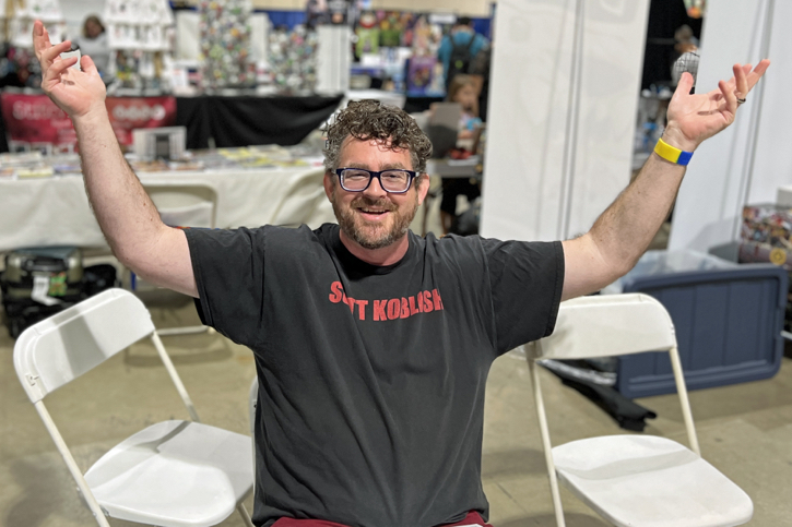
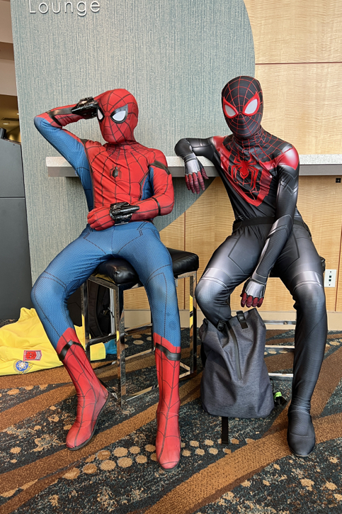
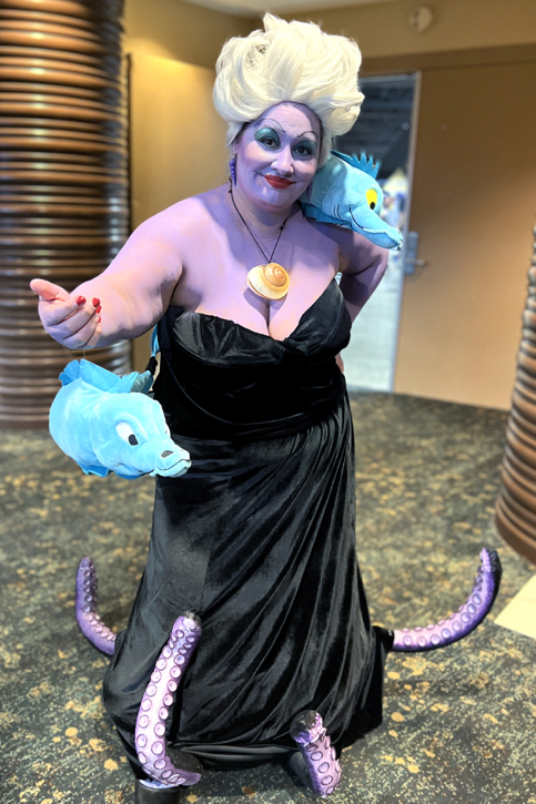
Long Beach Comic-Con 2022
September 3-4. 2022
It’s been a minute (specifically, three years!)… Glad to be back in Long Beach with friends and fans!
Greg Goldstein's Comic Art Gallery
Panels and Pages… Art and Artists… Creators and Conventions… Musings and Memories…

September 3-4. 2022
It’s been a minute (specifically, three years!)… Glad to be back in Long Beach with friends and fans!
James Bond 007: Serpent’s Tooth #2, August 1992

Until the last few years, James Bond’s appearances in comic books are rare. Added all together prior to 2016, they most definitely would not fill an omnibus.
Rights issues are always tricky with this franchise; although Eon Productions —and its merchandising arm, Danjaq — manages film rights, the literary property itself remains controlled by the Ian Fleming Estate.
Which explains why this run at Dark Horse features a James Bond who doesn’t in fact look like any other Bond we’ve seen previously. In fact, here he looks a little bit like — Paul Gulacy.
Regardless, It’s great Gulacy page from a good-looking miniseries; even if this specific example looks like it would be more at home in an Indiana Jones comic book.


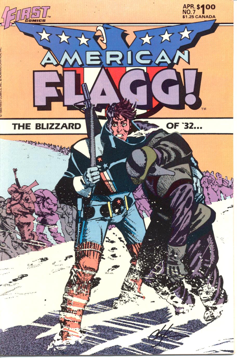
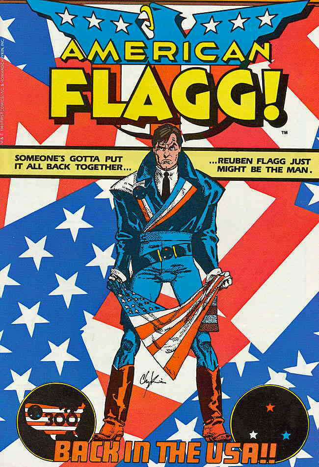
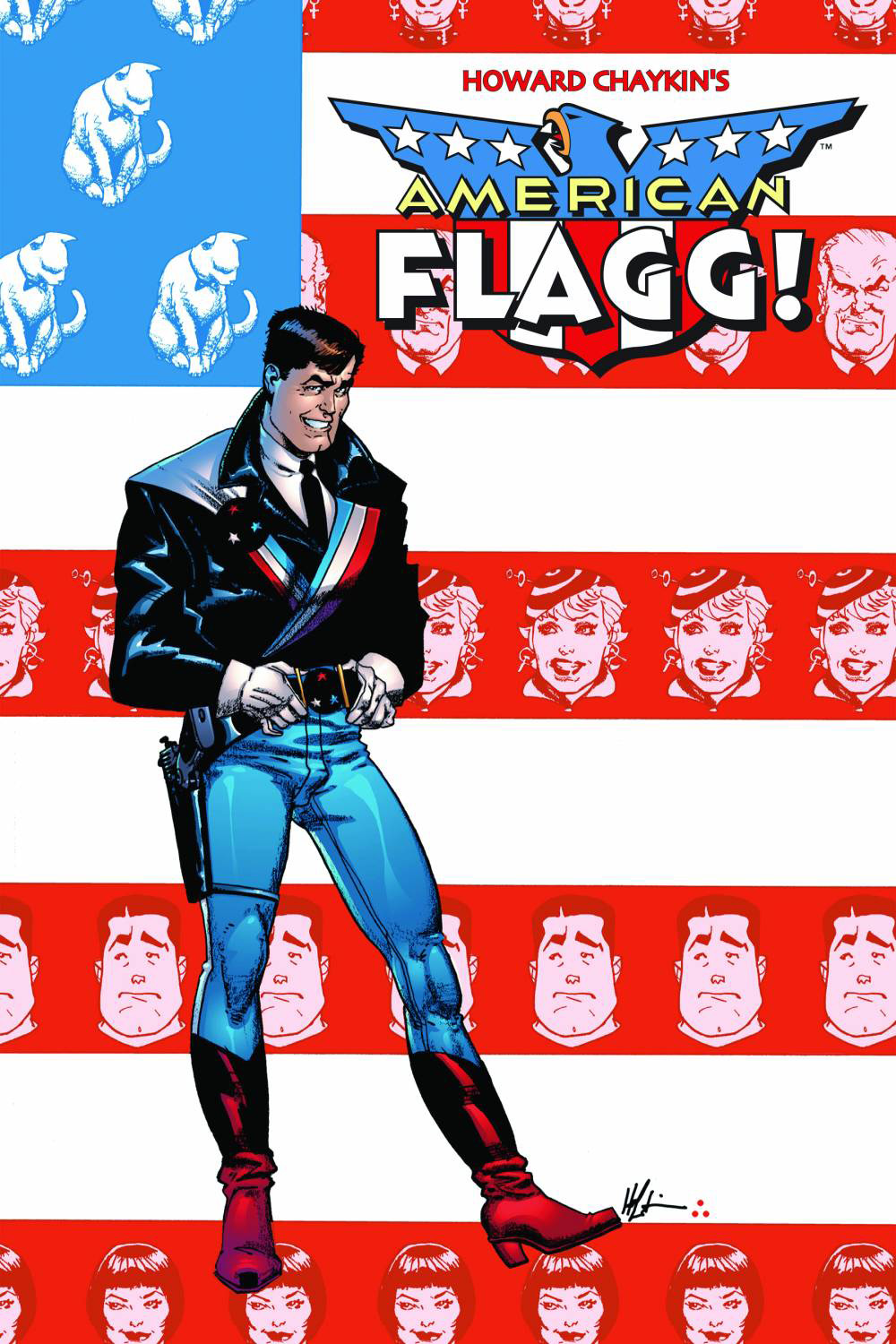
American Flagg #7, April 1983
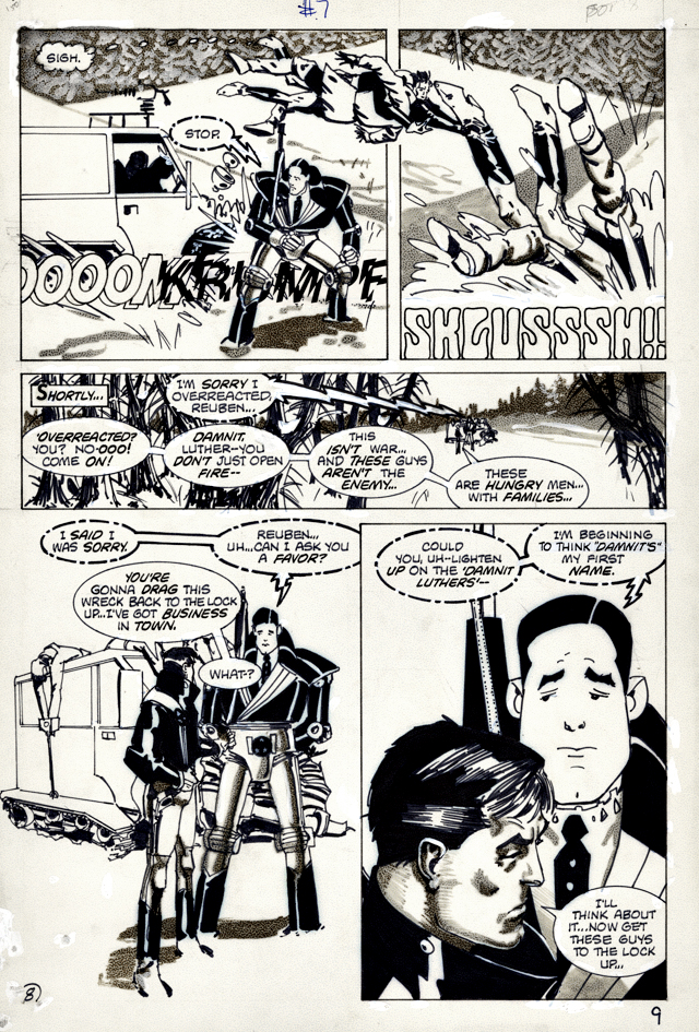
New art, along with a repost of last year’s Flagg blog:
Remember what is was like to first watch Sopranos or The Wire or some of other great early HBO-produced television shows? You knew it was TV, of course but it was so different… so much better than typical commercial fare, it made you think about what the medium could actually be.
For many fans — myself included — Howard Chaykin’s American Flagg (especially the first dozen issues or so) had a similar impact on comic books in 1983. Part SF, part satire, all adult, Flagg’s dystopia was like nothing else in contemporaneous comic book publishing.
Its inventive storytelling was groundbreaking, an oft-overused word that most definitely applies here. Need validation? Read those first twelve Flagg issues, and then read The Dark Knight Returns, by Howard’s studiomate Frank Miller, which appeared a few years later.
I’ll wait.
Or, just trust me on this.
Flagg came from nascent publisher First, and its editorial plan pursued mature, original comics from talented creators. And Flagg was one of the best of them.
It was obvious that Howard put his heart — and more — into the series.
In fact, I think there are only two reasons why Flagg isn’t frequently discussed in the same breath as other innovative titles like DKR or Watchmen.
First, it’s because of First.
Independent comic book publishers almost entirely relied on the direct market. Their reach wasn’t anywhere near as wide the mass market, and even with some newsstand distribution, a top independent comic book would never have the reach of a poor-selling superhero title from Marvel or DC, let alone a smash hit.
In other words, no chance you were going to score an American Flagg Slurpee at 7-Eleven.
The second reason is more frustrating.
Remarkably, all 50 original issues of Flagg have NEVER been collected. The early issues appear in and out of print from time to time, but it’s a pity that you can’t get the complete series in digital or print, on demand, as they say.
And that’s a conversation I’ve had with Howard many times. Many, many times.
Trust me on that, too.

Shattuck #26, 1972
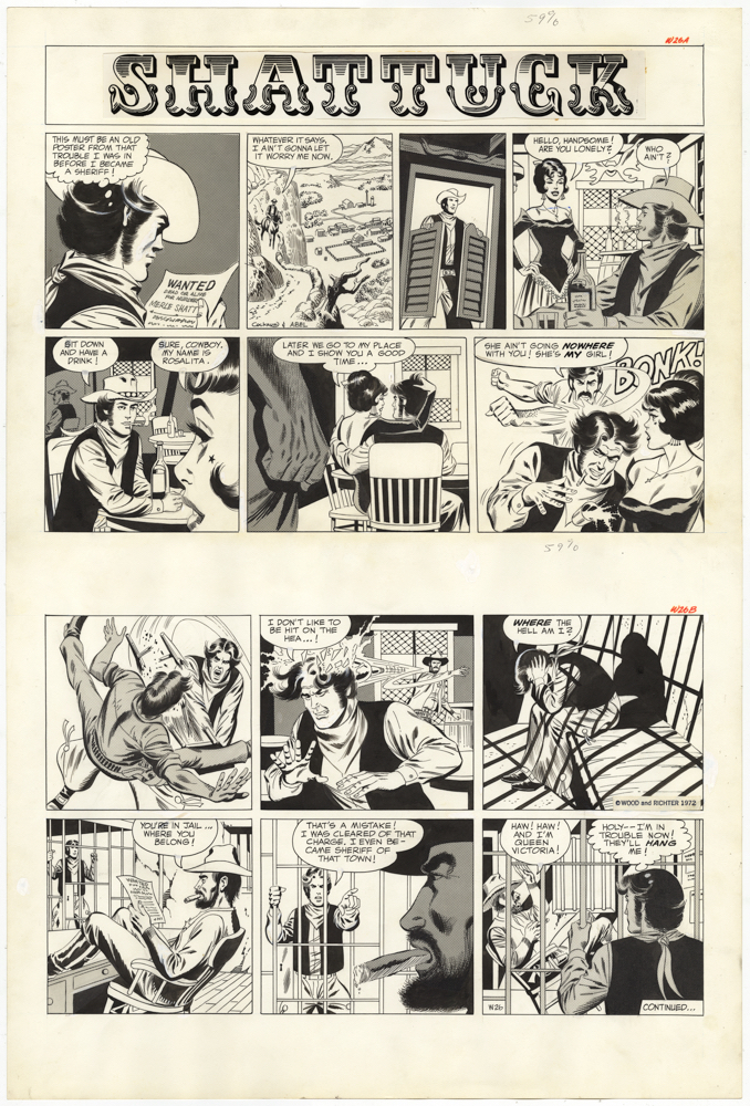
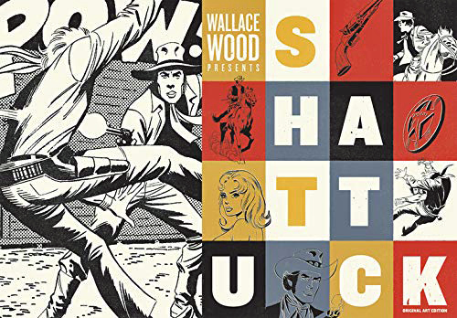
Happy (almost) Independence Day! Welcome to our second annual month-long celebration of the “Independents” — Independent creators and projects that continue to impact the comic book medium. This is our third (and final installment) in a week-long series focused on Wallace Wood.
Shattuck is the rarest, the oddest, and the shortest-lived of the Wood Studio strip ventures.
Many collectors had never seen any until Fanatagraphics issued a complete collection a few years ago.
From Frank Plowright on The Slings and Arrows:
“Shattuck is more a collector’s curiosity than a bona fide graphic novel, pulling together the episodes of a short lived Western newspaper strip produced in 1972 for the Overseas Weekly. Wood’s studio had the contract to produce the strip, and as with others for the same market, one of the artists recalled the brief as being to get the women’s clothes off as rapidly as possible. It can’t be said that Wood underestimated his audience…
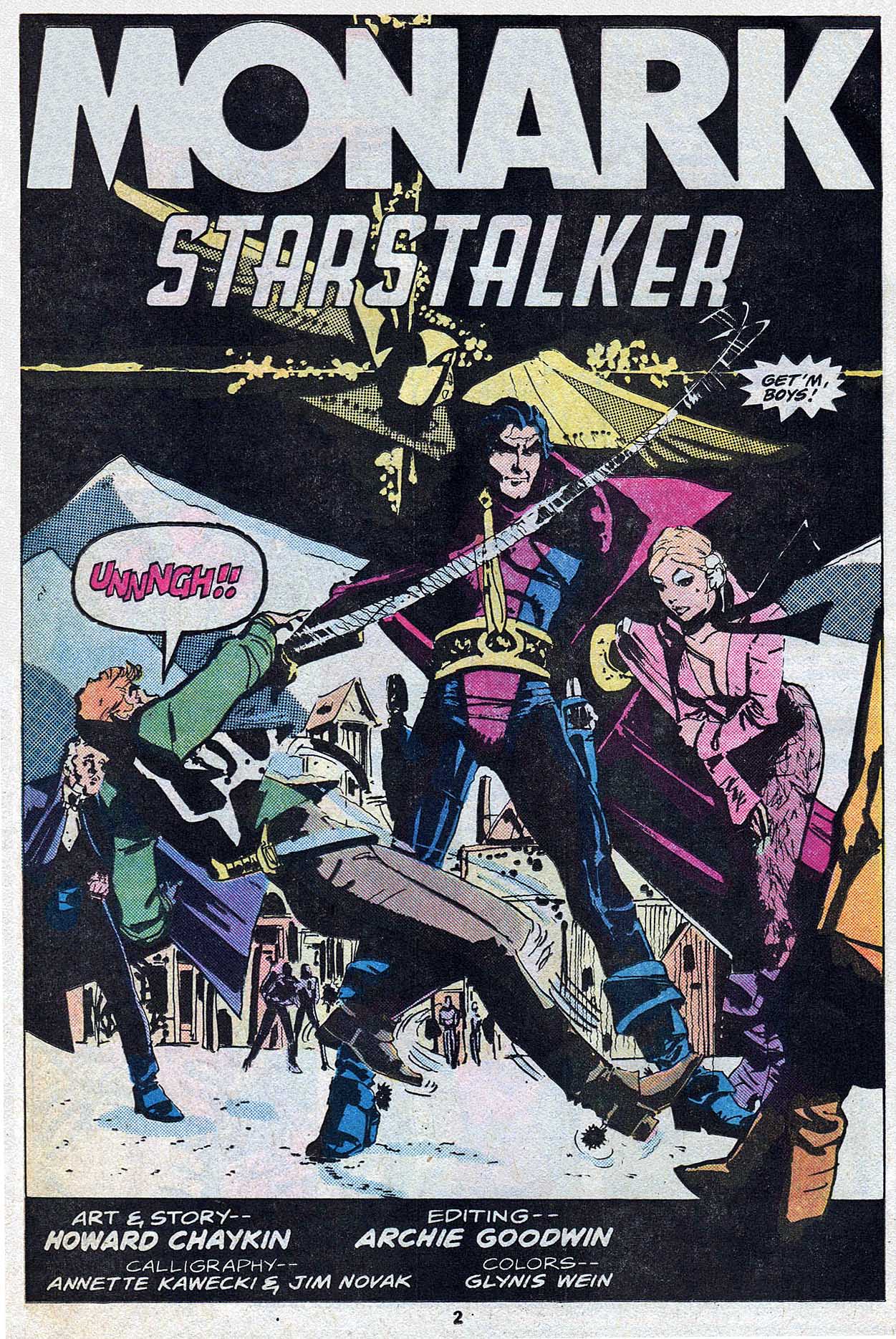
“Many hands worked on the project… Wood himself might be involved in any episode plotting, laying out, adding inks or correcting, while his chief studio assistant Nicola Cuti also produced plots and layouts using a swipe file. Most of the actual illustration was the first published work of Howard Chaykin, then Dave Cockrum, both usually inked by Jack Abel. Both Wood and Abel have utterly distinctive inking styles, so there’s no difficulty in recognizing which worked on which strip.
This particular example appears to be mostly Cockrum, possibly with some Abel inks and definitely some Wood fixes in places. It’s “Where’s Woody” instead of “Where’s Waldo” — you have to look carefully to find it.
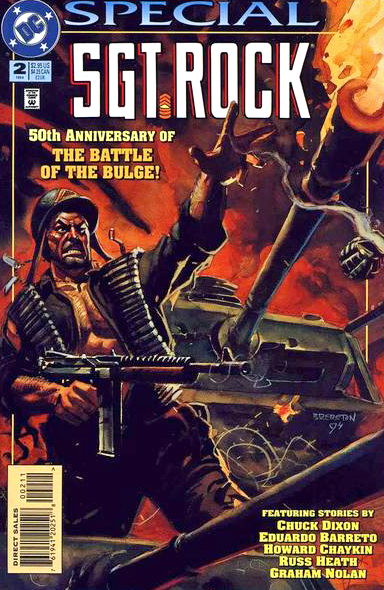
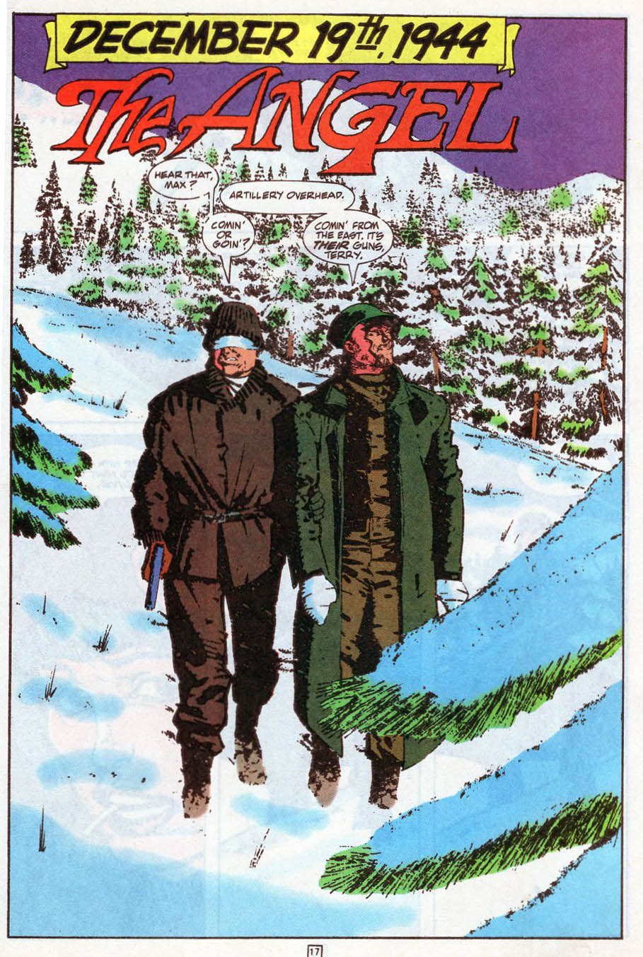
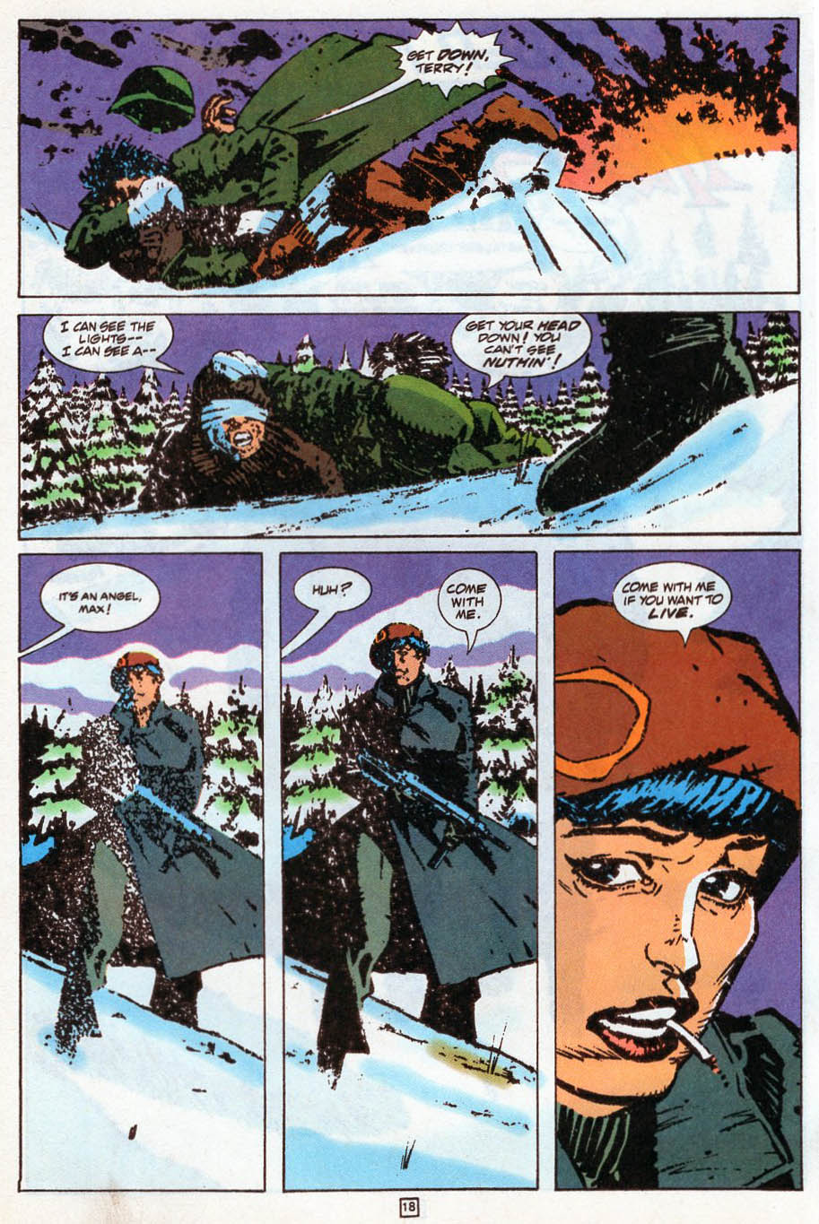
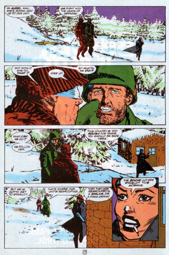
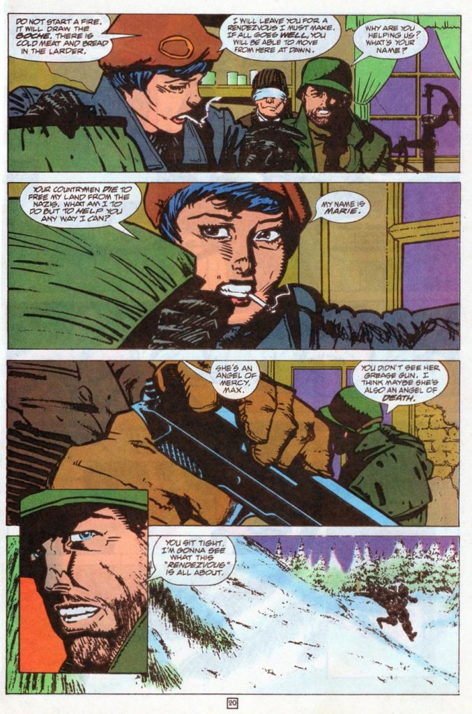
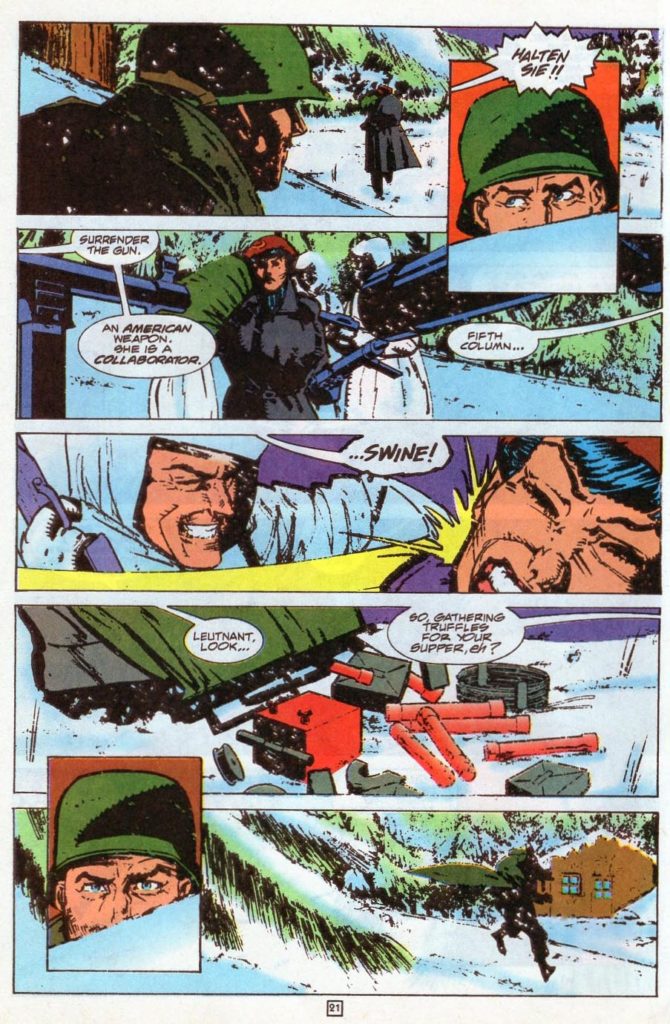
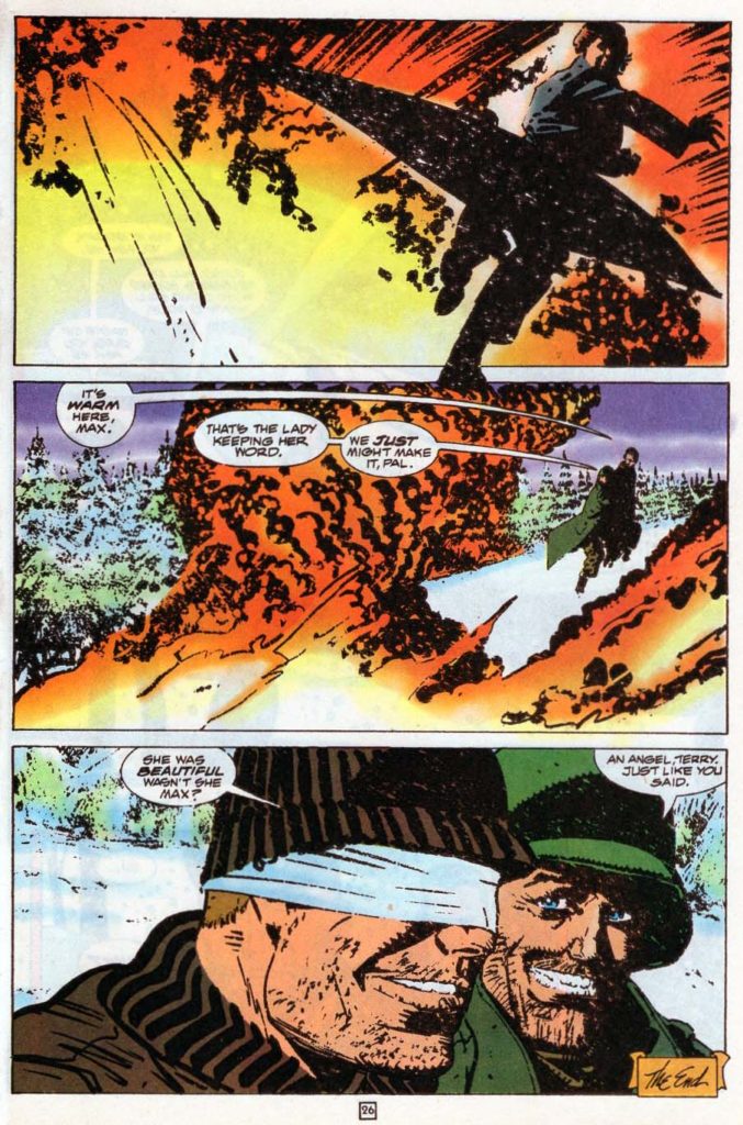
Sgt. Rock Special #2, December 1994
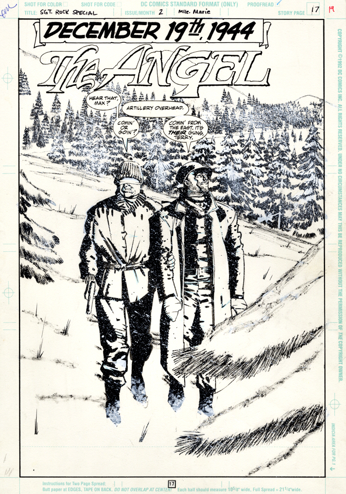
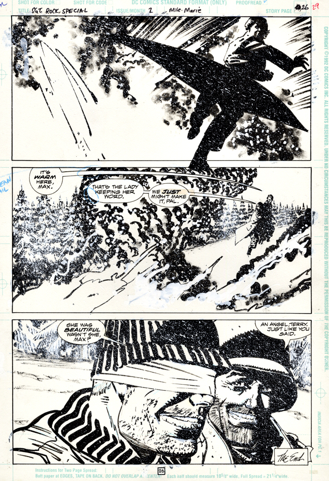
DC salutes the 50th anniversary Battle of the Bulge (the final major German offensive of WW II; spoiler alert —they lost) with this clever 1994 one-shot of short stories.
Howard Chaykin is firing on all cylinders in comics during this period and this story, written by Chuck Dixon, features top-notch draftsmanship and storytelling. Much of the actual Battle of the Bulge is indeed fought in snowy, cold weather, and Chaykin’s use of whiteout over ink is extremely effective, and especially clear in the original art.
It’s extremely cinematic — exactly the way any comic book story about The Battle of the Bulge should be. Or, actually, any World War II story.
Or any war tale, for that matter.
I don’t own many complete stories, but very happy to have acquired the story from Howard himself. For a change, I was in the right place at the right time.
“Howard Chaykin — The Angel.” This kind of headline practically writes itself.

American Flagg #17, February 1985
Happy Independence Day! Welcome back to a month long celebration of the “Independents” — Independent creators and projects that continue to impact the comic book medium.
Remember what is was like to first watch Sopranos or The Wire or some of other great early HBO-produced television shows? You knew it was TV, of course but it was so different… so much better than typical commercial fare, it made you think about what the medium could actually be.
For many fans — myself included — Howard Chaykin’s American Flagg (especially the first dozen issues or so) had a similar impact on comic books in 1983. Part SF, part satire, all adult, Flagg’s dystopia was like nothing else in contemporaneous comic book publishing.
Its inventive storytelling was groundbreaking, an oft-overused word that most definitely applies here. Need validation? Read those first twelve Flagg issues, and then read The Dark Knight Returns, by Howard’s studiomate Frank Miller, which appeared a few years later.
I’ll wait.
Or, just trust me on this.
Flagg came from nascent publisher First, and its editorial plan pursued mature, original comics from talented creators. And Flagg was one of the best of them.
It was obvious that Howard put his heart — and more — into the series.
In fact, I think there are only two reasons why Flagg isn’t frequently discussed in the same breath as other innovative titles like DKR or Watchmen.
First, it’s because of First.
Independent comic book publishers almost entirely relied on the direct market. Their reach wasn’t anywhere near as wide the mass market, and even with some newsstand distribution, a top independent comic book would never have the reach of a poor-selling superhero title from Marvel or DC, let alone a smash hit.
In other words, no chance you were going to score an American Flagg Slurpee at 7-Eleven.
The second reason is more frustrating.
Remarkably, all 50 original issues of Flagg have NEVER been collected. The early issues appear in and out of print from time to time, but it’s a pity that you can’t get the complete series in digital or print, on demand, as they say.
And that’s a conversation I’ve had with Howard many times. Many, many times.
Trust me on that, too.

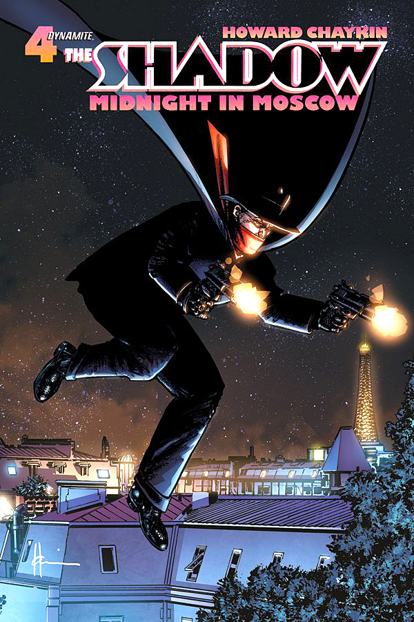
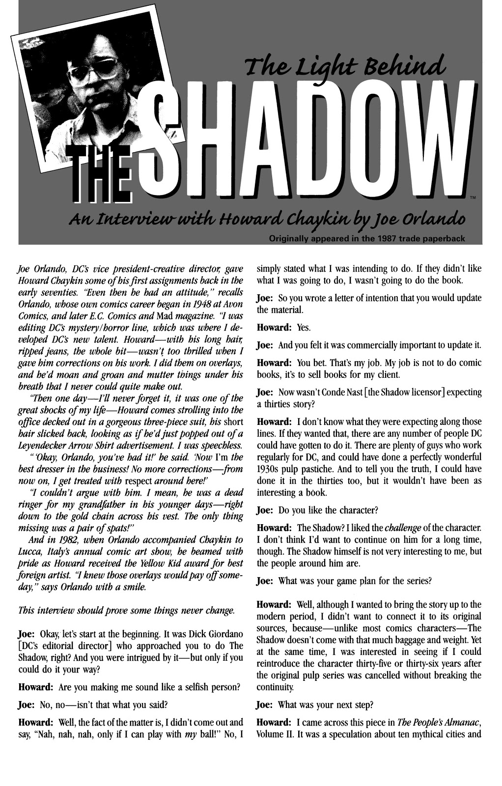
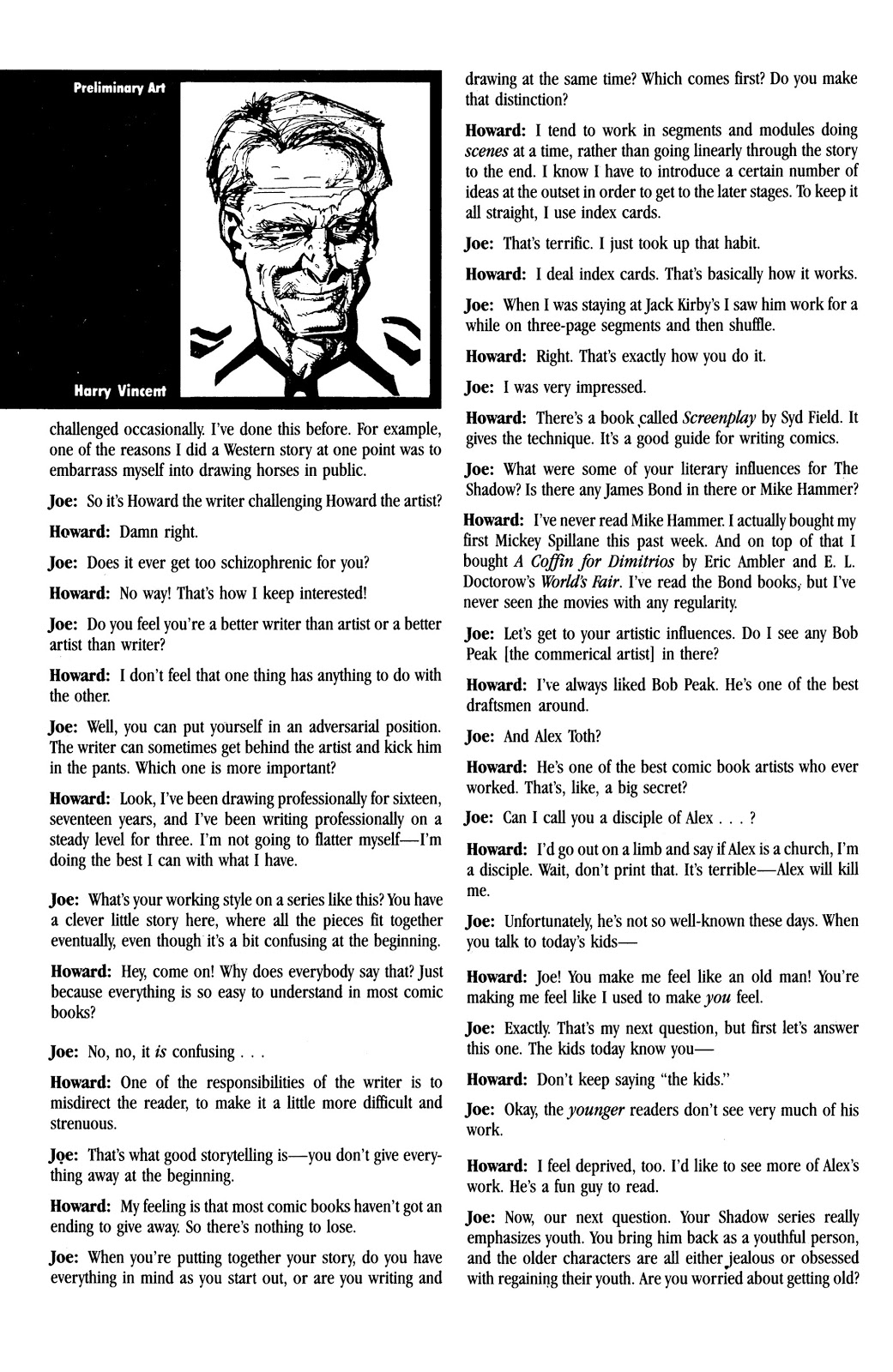
Shadow, Midnight in Moscow #4, September 2014

Continuing our ongoing series celebrating multiple anniversaries for the classic pulp character, The Shadow.
Howard Chaykin will tell you — often, and with emphasis — that he is not a guy rooted in the classic pulps.
That said, there is something consistently special about his artistic interpretation of the Shadow.
Maybe it’s his actual distance from the character that makes it so terrific. It’s strictly a professional relationship, without fannish admiration.
Whatever the reason, Howard’s Shadow always looks like the character should look like in my mind’s eye.
On this bold and striking cover, the buildings and effects were added digitally of course, and atypically, I’m thrilled they were. I love the character composed powerfully on his own in the original art.
As noted, striking and bold. Lots of black ink and just enough lighting. Guns out, cape flowing.
Just as it should be.

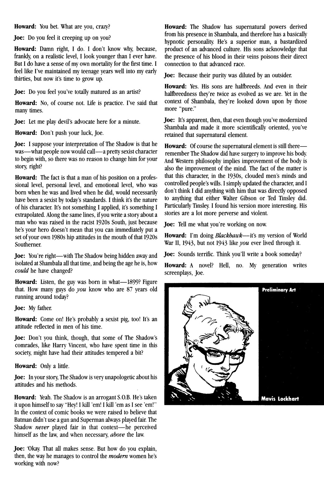
The Shadow (Blood and Judgement) #4, August 1986

Comic book pundits in 1986 decided the Shadow mini-series by Howard Chaykin was “controversial.”
Translation: Some fans liked it, some didn’t.
The late Harlan Ellison famously hated it. And Harlan was not famous for being gentle about his opinions. So there’s that. (Comic book journalists, critics, fans and trolls didn’t need the Internet in those days. They had fanzines. But I digress.)
Setting the series in the contemporary era seems to be a primary trigger for fans of the classic pulp character. Fans, who, it should be noted, mostly had abandoned their commercial interest in the character long ago.
A decade earlier, a series by Denny O’Neil and initially drawn Mike Kaluta, brilliantly faithful to The Shadow’s pulp origins and era, didn’t last past 12 issues.
So DC and Chaykin took a different approach with this series. And Chaykin’s world of The Shadow was definitely more “adult” (grittier, sexier, etc.) than earlier versions. Sign of the times, and Chaykin’s mature approach to comic book content specifically. (Chaykin’s Blackhawk and Black Kiss would follow shortly.)
For what it is worth, I gave it a shot, and liked it. The storytelling and art were — not surprisingly — top shelf. Did I care that the character was set in modern times?
I didn’t lose much sleep over it.
Controversial was an overly word then, and virtually worthless now. Dictionary definition is “giving rise or likely to give rise to public disagreement.”
So art is pretty much always “controversial.” Read some contemporaneous reviews of Citizen Kane or Star Wars. I’ll wait.
In 2020, of course, everything is controversial. I never thought I’d see the day when established facts were “controversial.”
Public disagreement indeed.
Sigh.


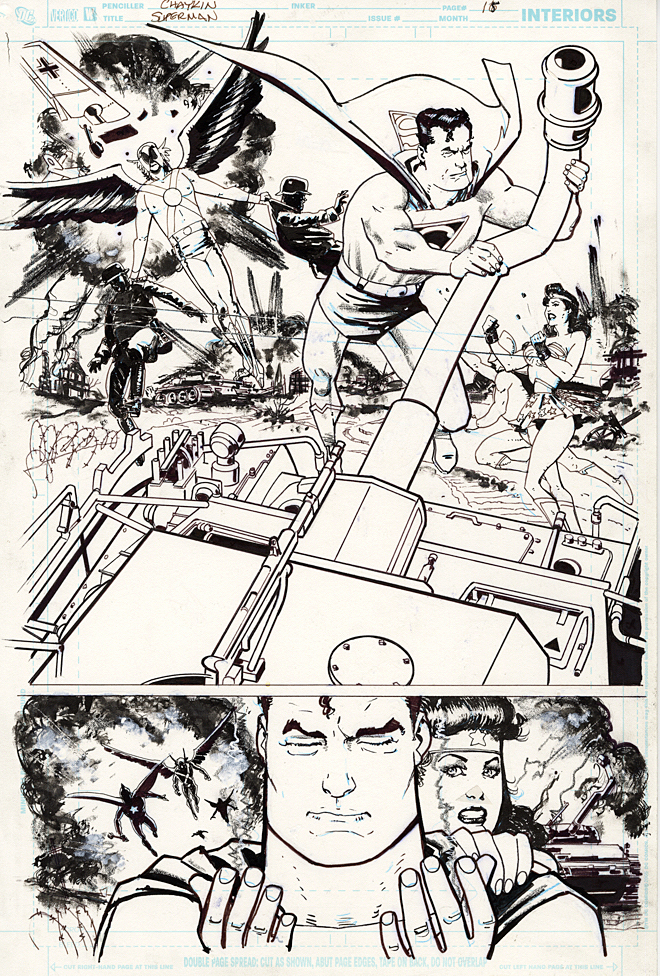
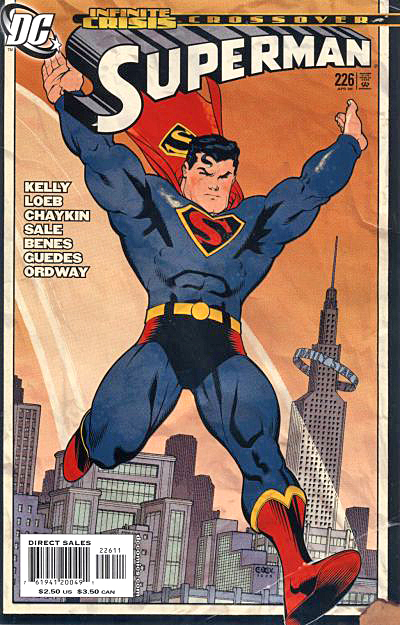
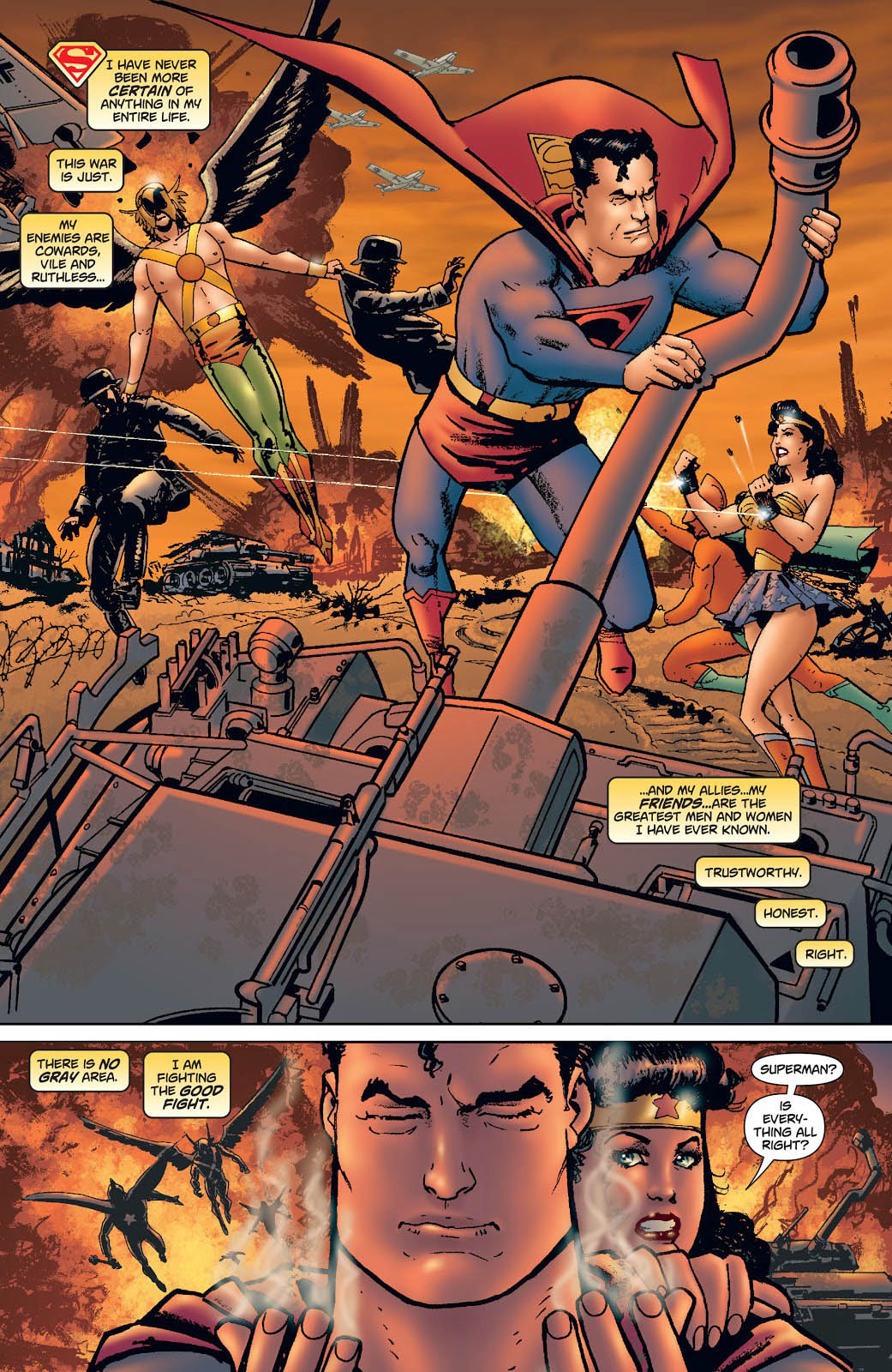
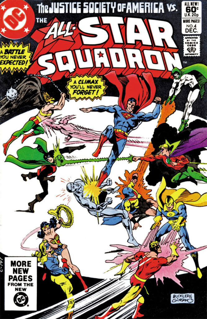
Superman #226, April 2006
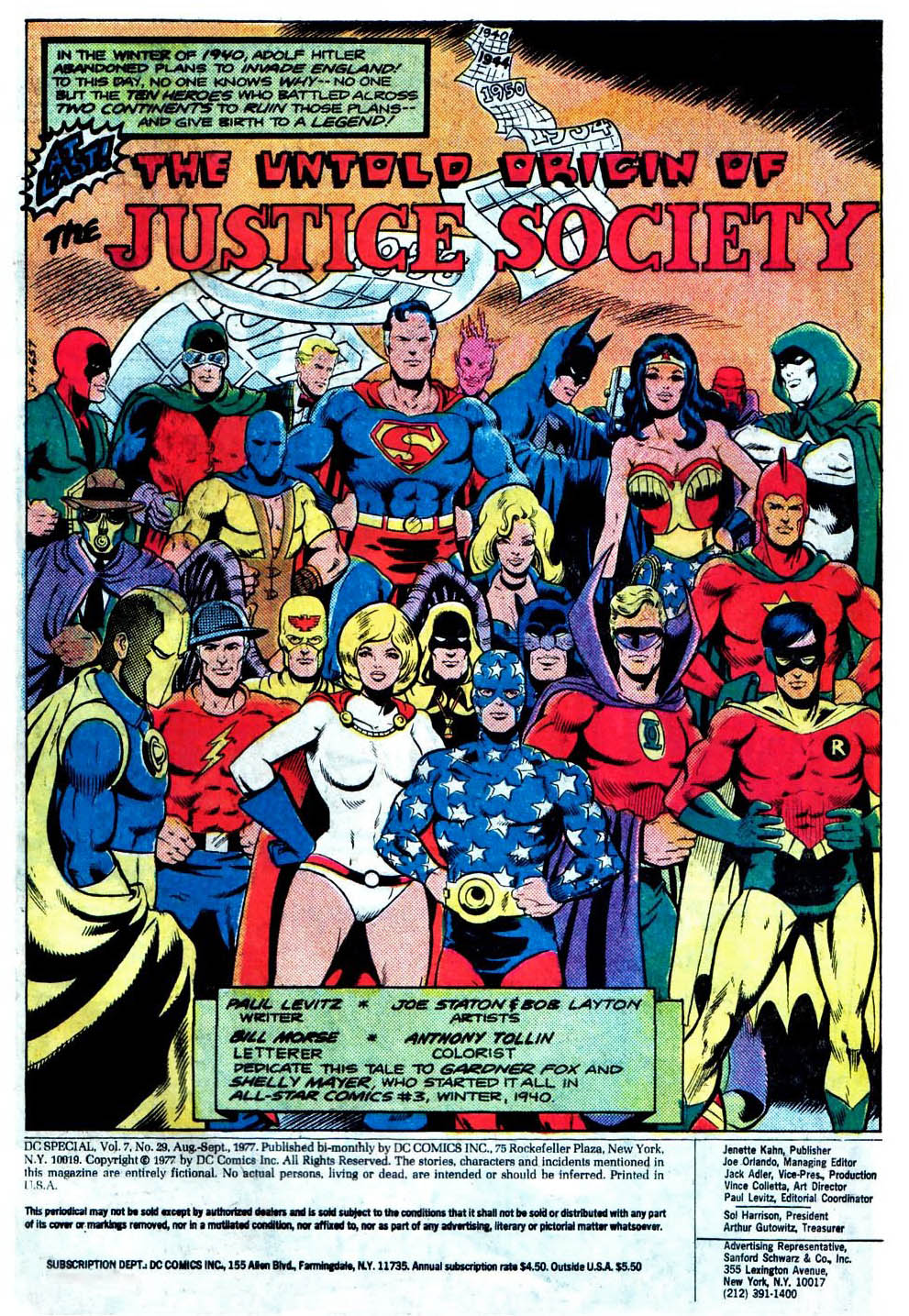
Continuing our multi-week celebration of the 80thanniversary of the Justice Society of America.
This is great action splash from Howard Chaykin, and a rare treat to see him illustrate classic superheroes.
As part of the Infinite Crisis storyline, Supermen from two different universes clash, each one living the life the other. When one goes to halt the Nazi atrocities of World War 2, he learns the difficult truth about Hitler’s super stalemate courtesy of the Spear of Destiny.
It took more than 35 years to tell the origin of the Society, and Paul Levitz created a plausible scenario that explained why America’s heroes simply didn’t use their powers to end the war in favor of the Allies quickly and decisively. Spoiler alert: It involves magic.
Roy Thomas and other writers ultimately ran with (and expanded) the concept, and writer Joe Kelly incorporates this premise into this Crisis Crossover.
This is the final issue of this specific volume of Superman, launched nearly 20 years prior, as part of the “John Byrne reboot.”
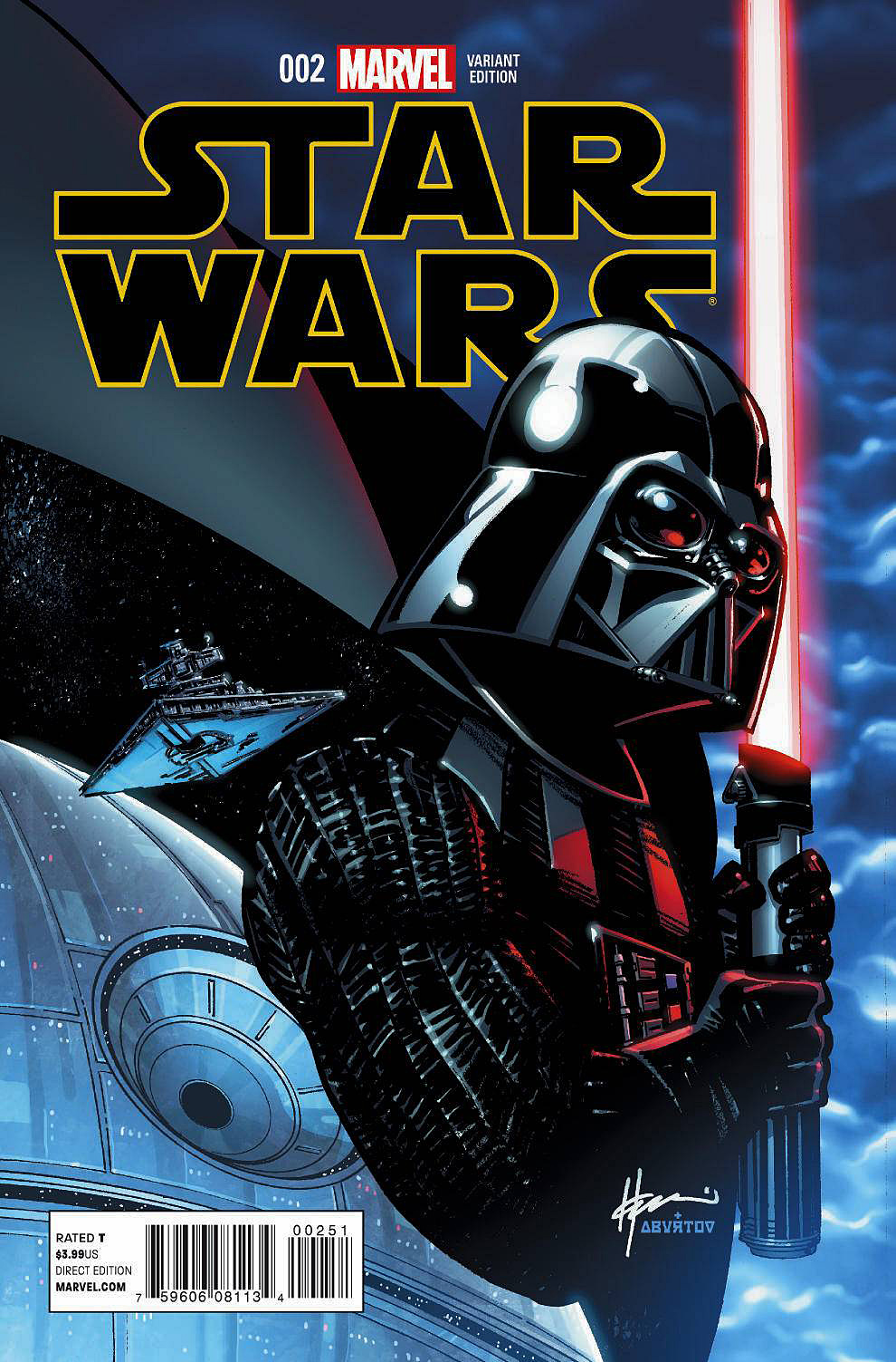
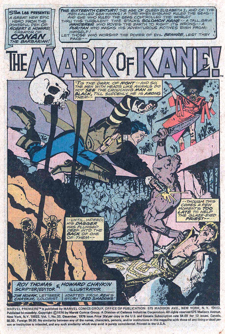
Star Wars #2, April 2015
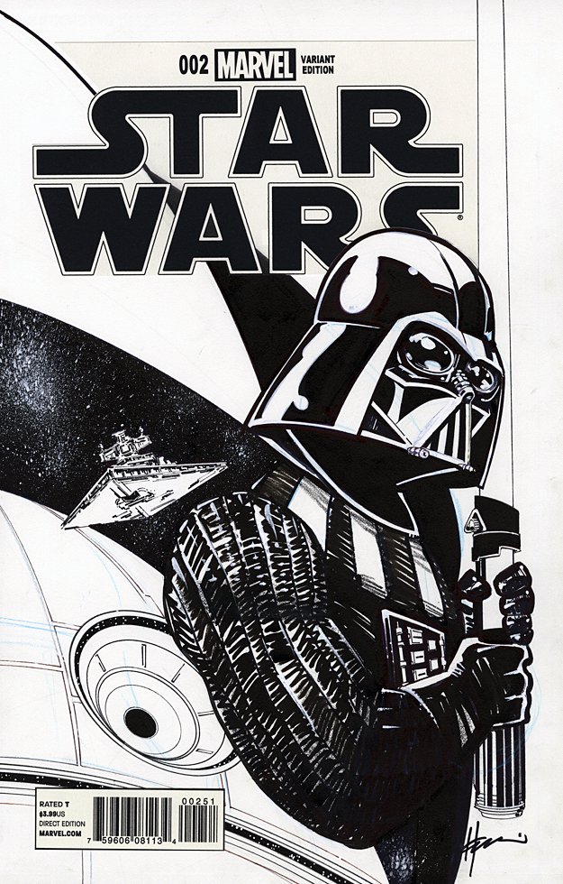
Howard Chaykin returns to Star Wars with an imposing cover of Darth Vader in 2015. You don’t want to mess with this version of Vader, even if you’re on his side.
Howard Chaykin. Star Wars. This might be a greater conflict than the empire vs. the rebellion.
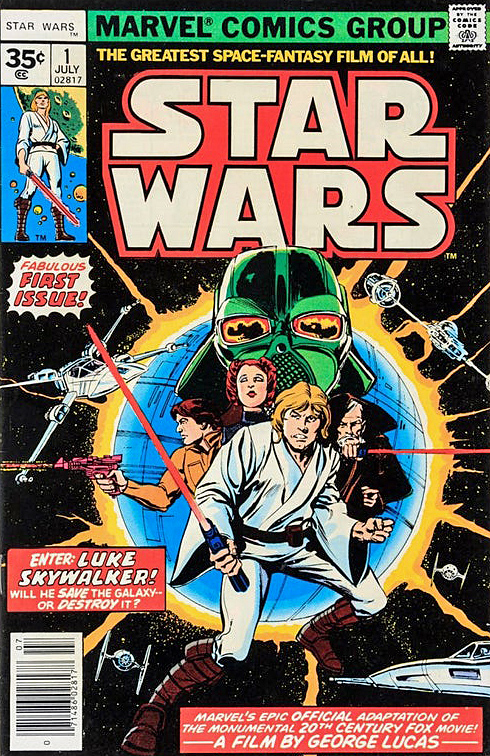
I don’t need to repeat Howard’s many on the record comments about his original artwork on the series (Marvel’s 1977 issues #1-#10, which includes the six-part adaptation of the original film.) You can see more for yourself here, here or here.
Suffice to say, he doesn’t like it. (Reading anything Howard says about his own work — or others, or anything, for that matter — is always highly entertaining, so I recommend taking a deeper dive.)
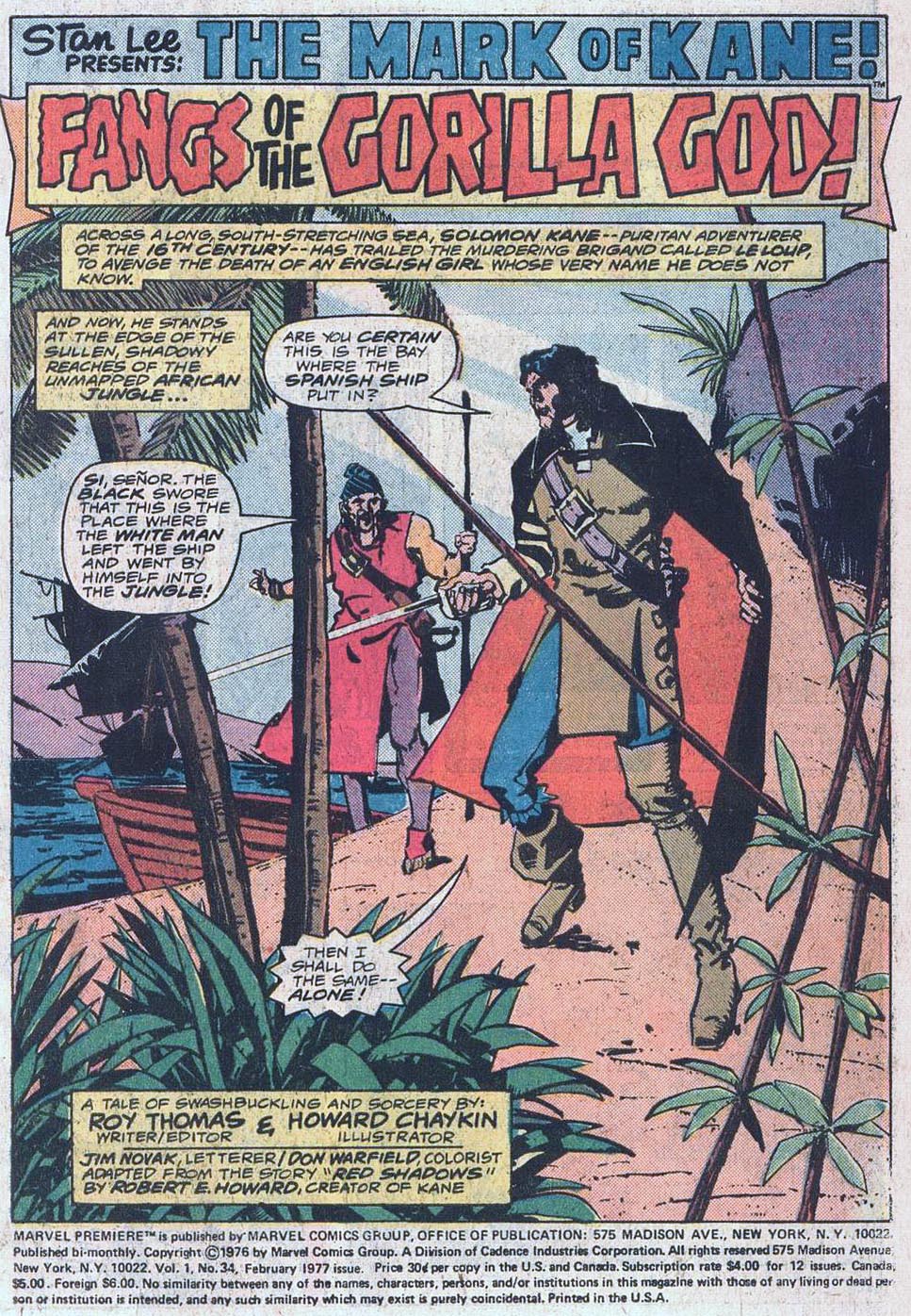
Objectively, Star Wars is of course, not his best work — not even close. It’s not even as good as his other early comics. He drew three issues (and wrote one) of Marvel Premiere just prior to Star Wars that are excellent, especially for the period. (Howard is generally self-critical of all his earliest work, so I bet he won’t agree. But I digress.)
Licensed comics are always a challenge, especially with limited reference and insane deadlines. That said, given these constraints, and many others, I think his Star Wars art, especially on the first issue, is definitely better than much of what was coming from the big two companies at the time. But, ultimately, not so great on the Chaykin Curve. (A new scientific term coined especially for this post.)
Just a few years later (1982) he created the astonishing American Flagg. Groundbreaking, although often overused, barely does that series justice. (Much more on that in a future post). Based on Flagg alone, Mark Chiarello DC’s long-time Art Director has described Chaykin as one of the architects of the modern comic book.
Unfortunately, Flagg was published by a smallish independent publisher, which means that few casual readers ever saw it. Although knowledgeable long-time fans are well aware of the series, it doesn’t have the legacy it deserves.
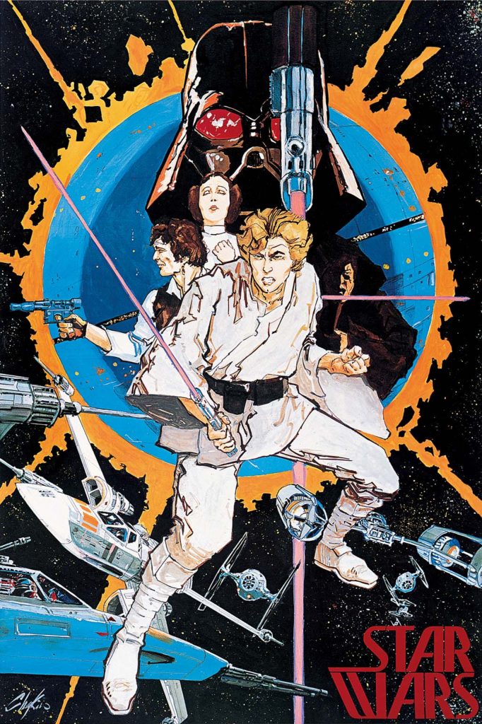
Star Wars? Reprinted about a zillion times, in more formats than I can count. And I am one of the guilty parties here, publishing the Star Wars Artifact Edition (IDW), showcasing the original art — in its original (11×17) size.
Shortly after Flagg, Chaykin went on to other fascinating projects, geared for older readers. Times Squared. Blackhawk. The Shadow. Black Kiss. Etc. Ultimately, after a long stint in Television, he returned with other series that reflected his interests and passions. Mighty Love (feels like a television show and was apparently originally developed for that medium) and City of Tomorrow are two personal favorites. He’s currently working on Hey Kids! Comics!, a fascinating fictionalized look at the drama, jealousy and scandals in the history of comic book business itself.
His innovative and realistic storytelling is complex, violent, sexual, and political. He left space operas behind a lifetime ago.
So if you were a kid when you saw Star Wars, loved Star Wars, and only had the Star Wars comics to read over and over again, because there was no home video, I get it, you love those comics.
I think that’s cool. Even Howard is probably ok with you remembering those comics through the warm glow of childhood nostalgia.
But if you’re an adult? Just don’t remember HIM for them.
That’s like remembering Nolan Ryan only for his one World Series appearance for the 1969 “Amazing” Mets. You’ve missed the point.