Greg Goldstein's Comic Art Gallery

Jack Kirby — Immortals & Demons

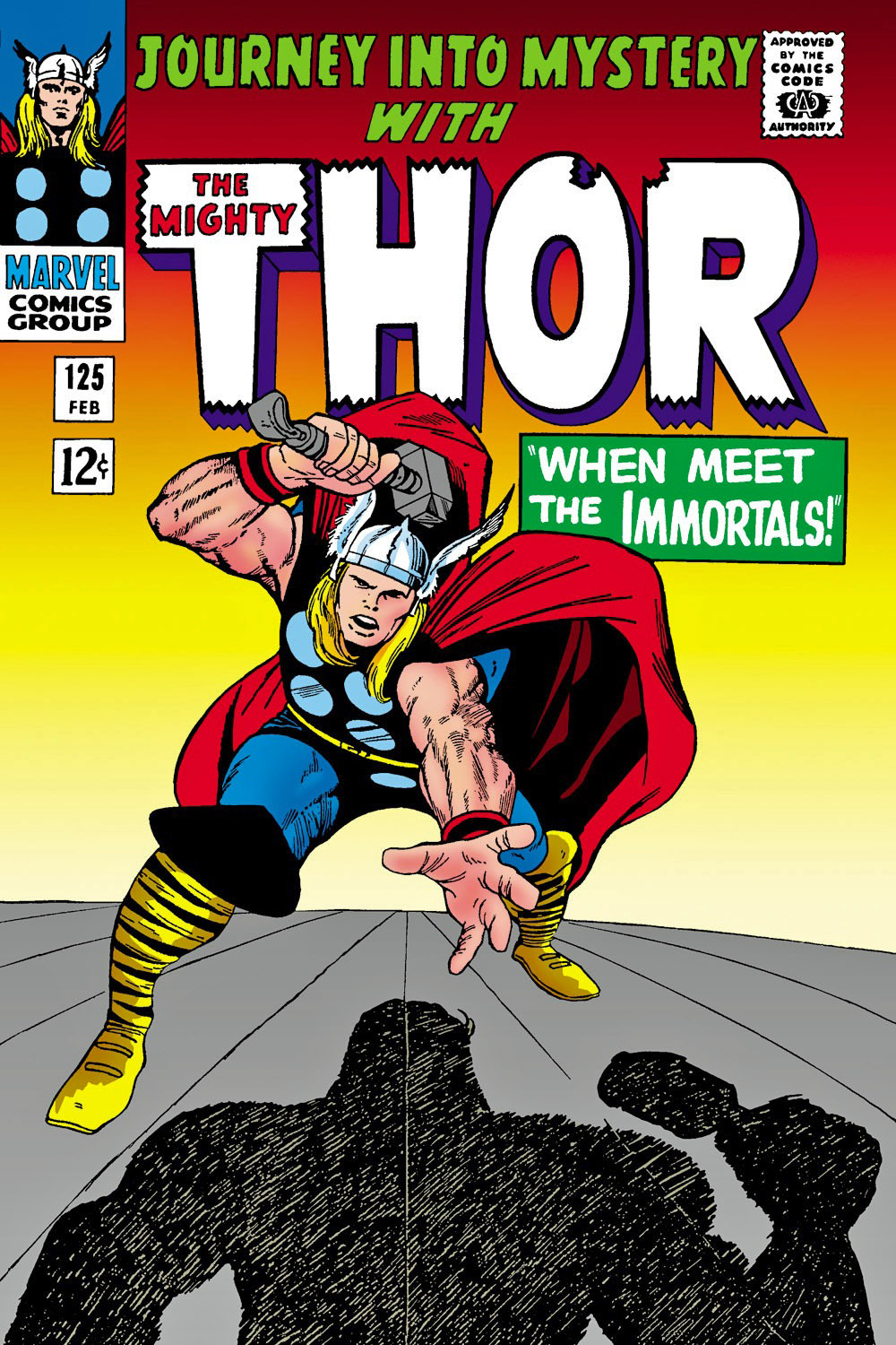
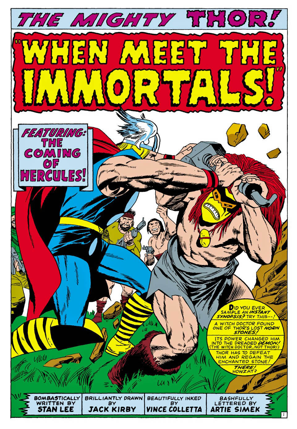
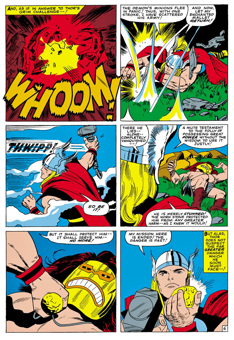
Journey Into Mystery #125, February 1966
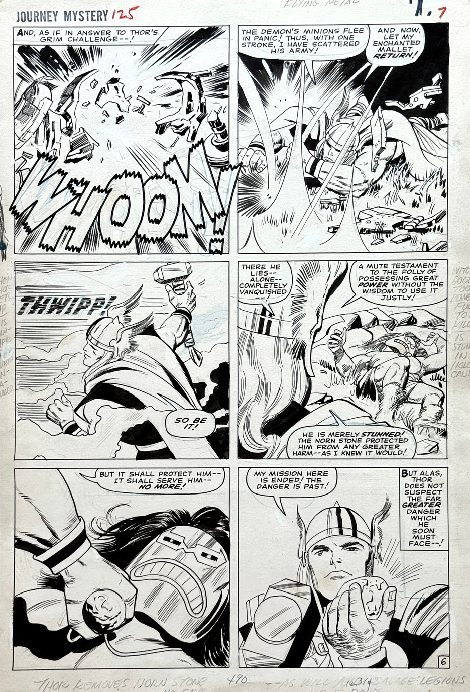
Here’s a great action page from Journey into Mystery #125 — the “final” issue before the book simply became Thor with #126.

It had been a long time coming. Monsters, aliens and demons had once filled Marvel’s story lineup, but by 1966 they’d pretty much been pushed aside — unless, as here, they were turning up as antagonists in the superhero books. Kirby, of course, never really stopped drawing monsters. Now they just had Thor to deal with.

Nothing new has been said about inker Vince Colletta in about 50 years, so I don’t have much to add to that conversation. I will say that I’m finally hearing more fans acknowledge that his Thor work, as evidenced here, isn’t bad at all — and in places, it’s quite good.

Colletta may have been an imperfect match for Kirby, but on Thor he often brought something that worked: a lighter, more decorative touch that suited the fantasy setting. And he certainly knew how to make the Asgardians look pretty and regal. (All that work on those romance titles paid off.)

But, as always, Kirby supplies the heart of the story — the movement, the scale, the impact. And, in this case, a reminder that Marvel’s monsters hadn’t really gone away. They’d just found themselves in a different kind of comic book.
Jack Kirby — Fantastic 4Ever

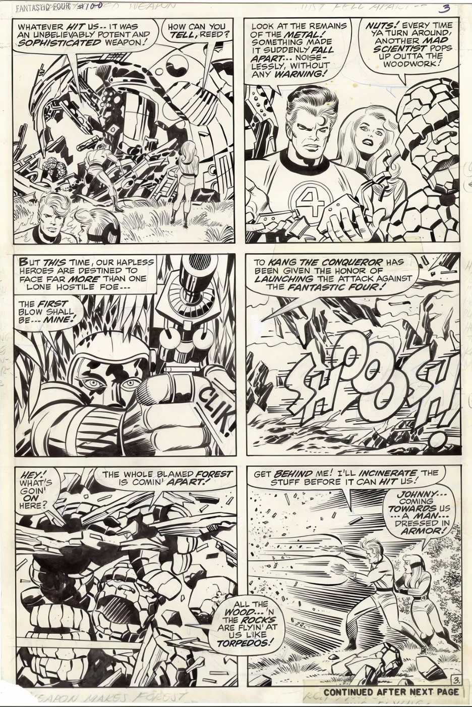
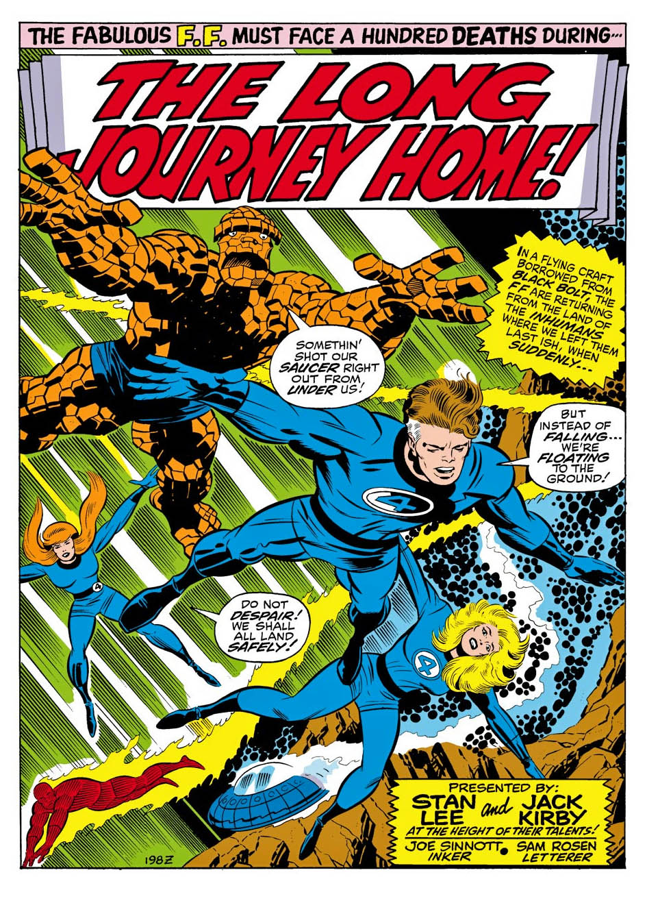
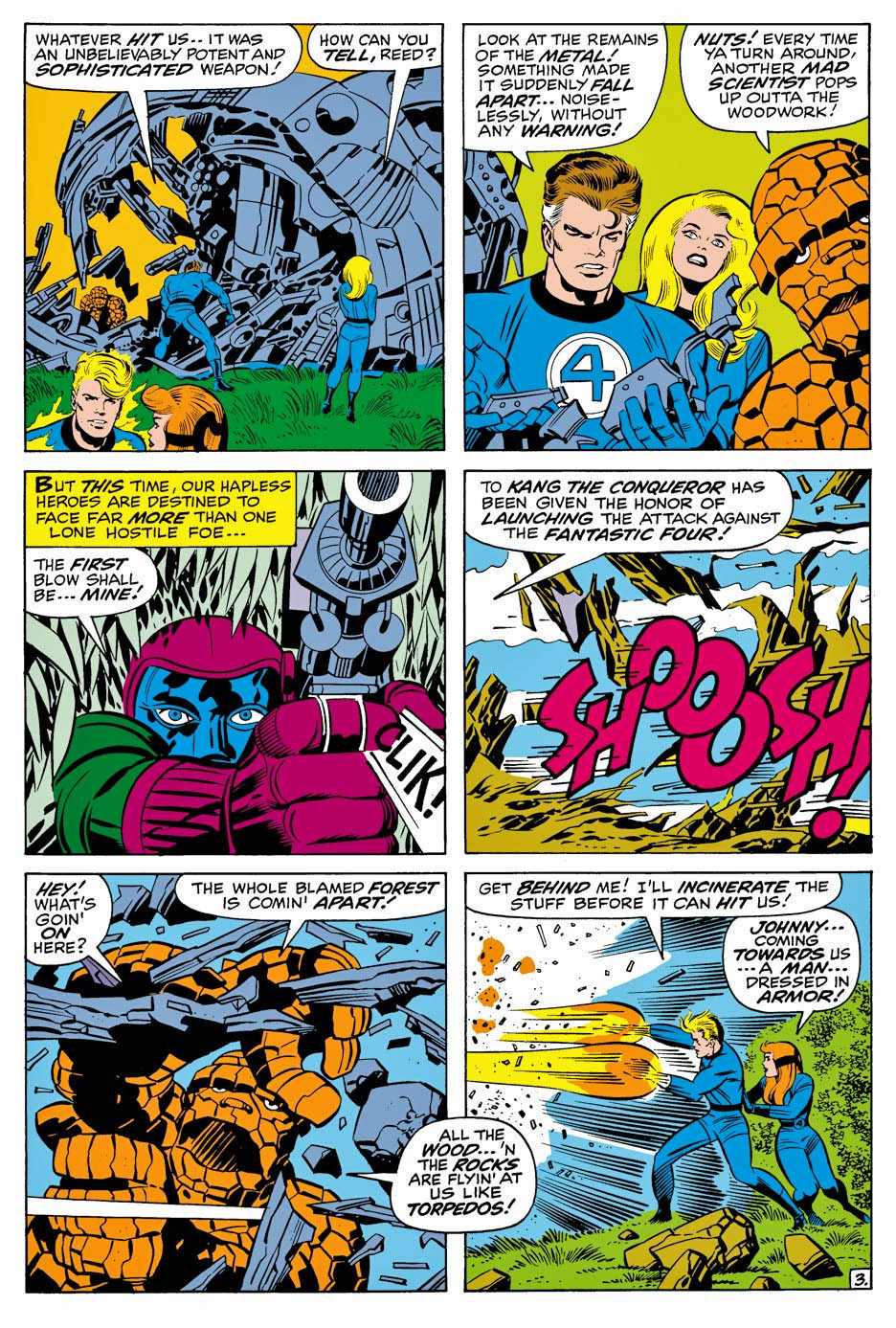
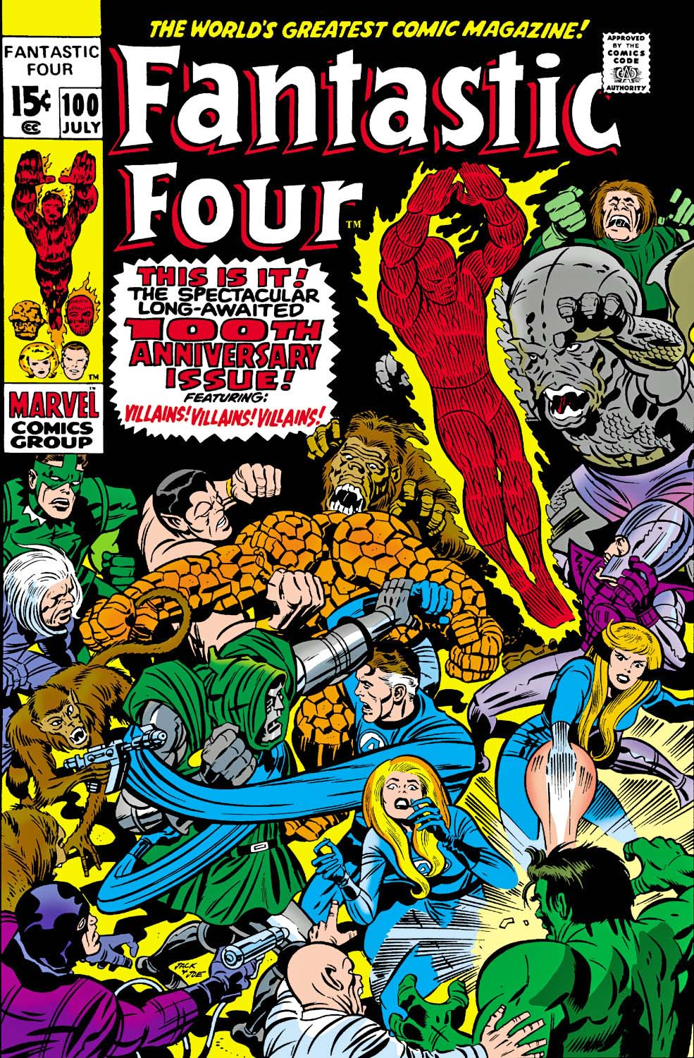
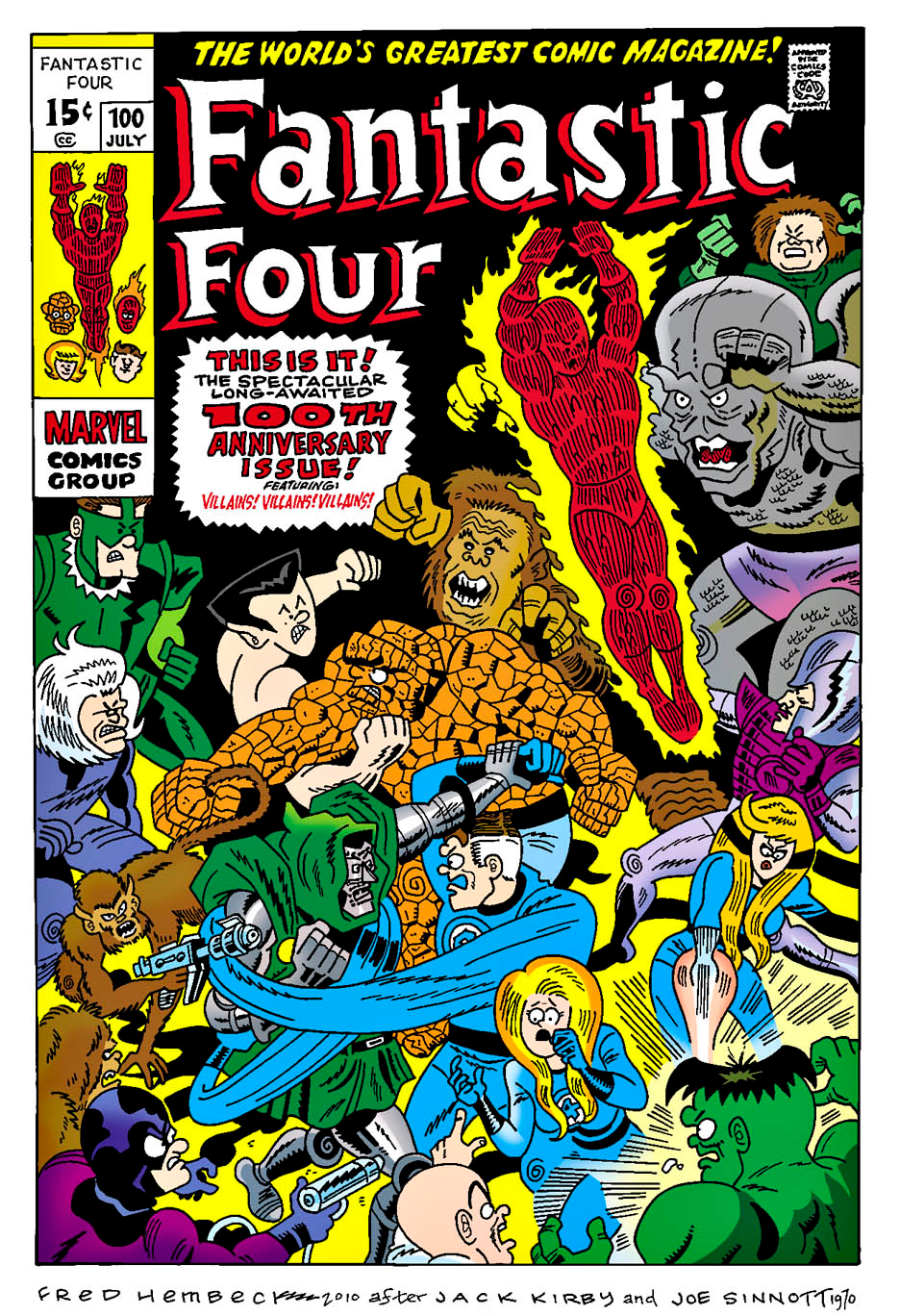
Fantastic Four #100, July 1970

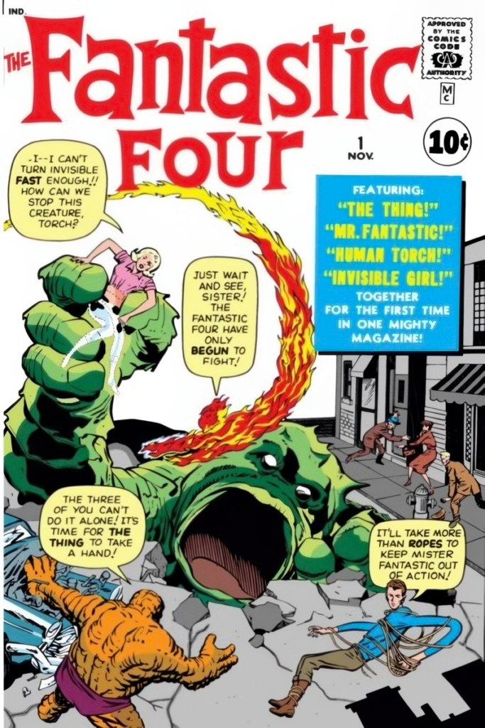
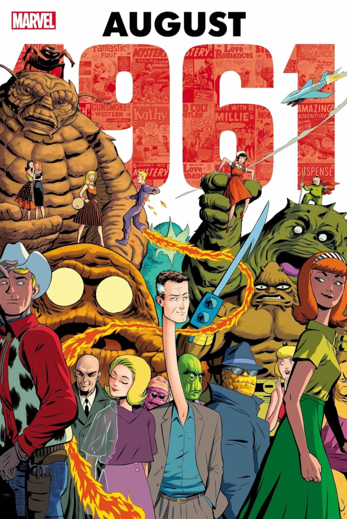
A few days ago marked the 65th publication anniversary of Fantastic Four #1, which hit the stands in August 1961. Stan Lee and Jack Kirby went on to produce 102 consecutive issues together, plus annuals — arguably the greatest sustained superhero family soap opera in comics history.

My first Fantastic Four off the stands was #63. After that, thanks to the usual childhood complications of schedules, availability and, mostly, money, I bought the book intermittently until somewhere around #98. From there, I don’t think I missed an issue for about 20 years.

And yes, I eventually went back and completed the run, as quickly as budget would allow.

Of course I did.

Fantastic Four #100 was also the first big Marvel anniversary issue I ever bought new, soon followed by Amazing Spider-Man #100 and Avengers #100. Triple-digit issue numbers felt like very serious business when you were a kid.

Which brings me to this page of original art.

I missed it the first time it came up for sale and figured I had blown it. Then, through an odd twist of fate, it became available again.

Couldn’t believe my luck.
Kirby pencils. Joe Sinnott inks. The whole team is here, along with Crystal, plus “Kang.”
Well, technically an android pretending to be Kang.

But I digress.

I also remember looking at the cover of #100 in 1970 and pretty much guessing the premise before I even read it.

Which tells me that, even at that age, I was already reading way too many damn comic books.

Jack Kirby — The Marvel Age Of Monsters

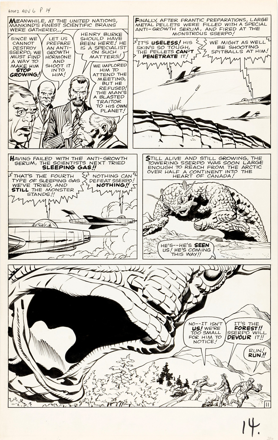
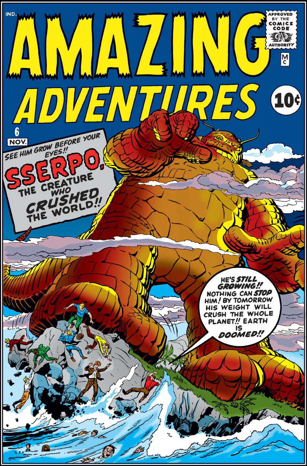
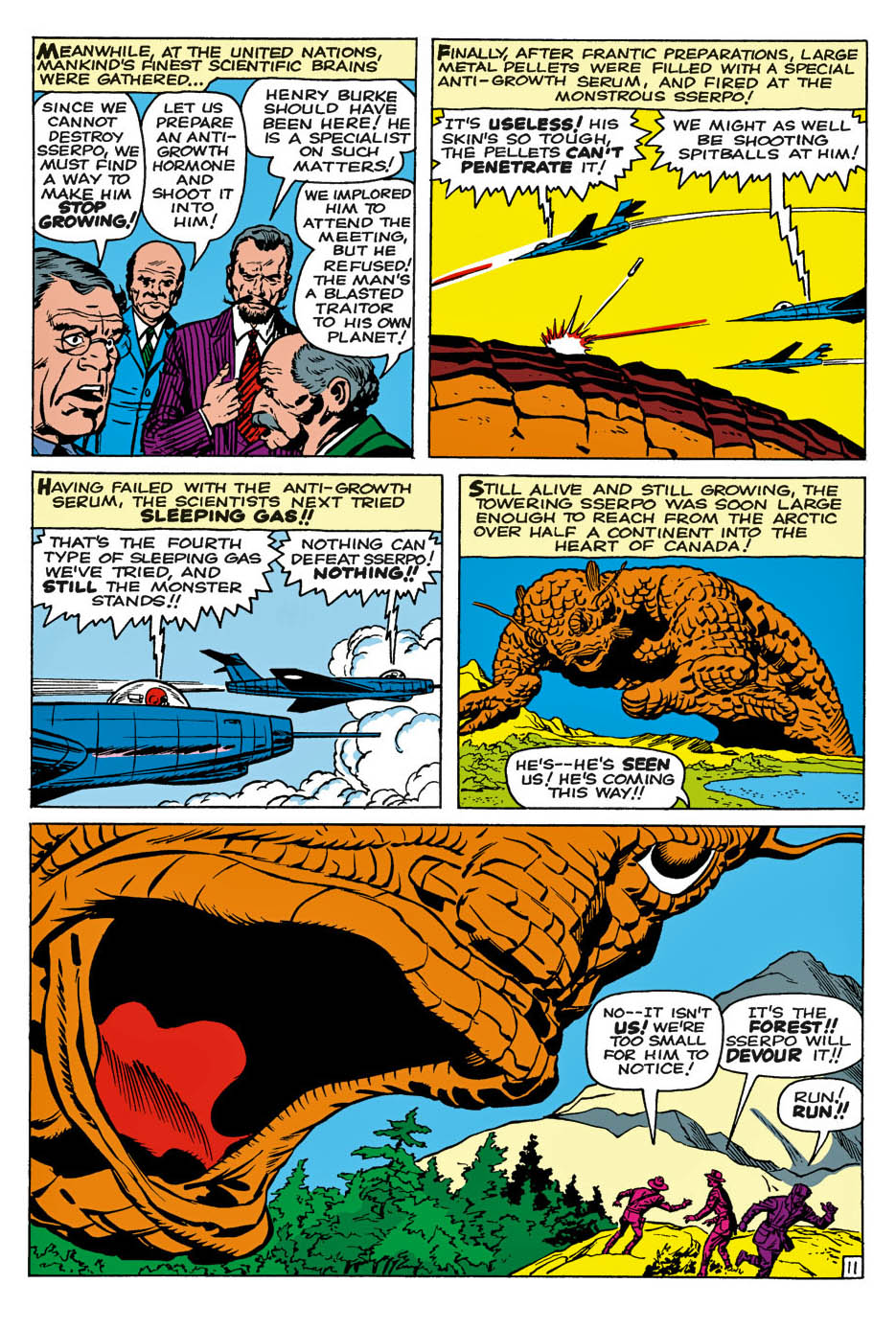
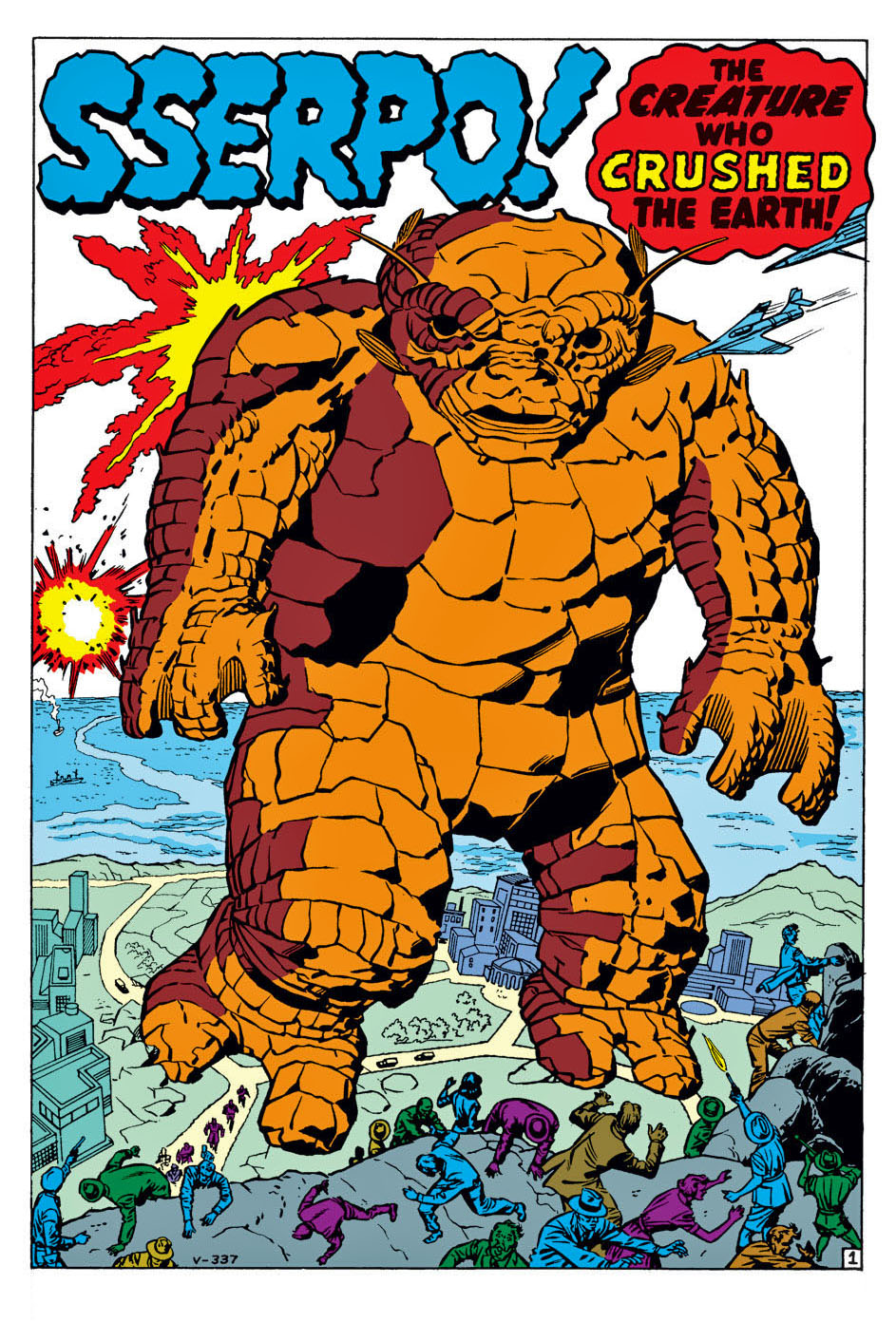
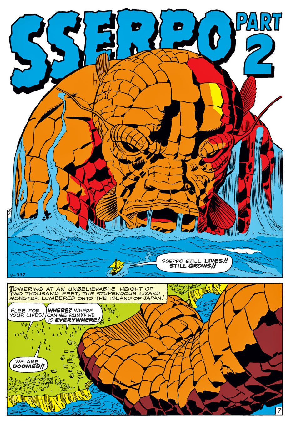
“Sserpo,” Amazing Adventures #6, November 1961

Jack Kirby would have turned 109 this month, which seems like the perfect excuse to celebrate one of his wonderfully ridiculous pre-Marvel monsters.

Meet Sserpo: a big, dumb creature with an even dumber spelling, brought to you by Kirby and Stan Lee in the first week of August 1961.

And what a great Kirby page this is.

Scientists shouting. Jets firing uselessly. Sserpo stomping across Canada. And then that enormous final panel, with Kirby pushing the monster so far into the foreground that he practically takes over the page.

Big, bold, absurd—and completely irresistible.

But Sserpo is more than just another giant monster.

Because one week later, Stan and Jack would unleash another one. Only this time, they brought along the Fantastic Four to fight him.

And just like that, everything changed.

One week separated the fading days of Marvel’s monster era from the beginning of the Marvel Universe—and, ultimately, the rebirth of an entire industry.

Of course, no one knew it at the time.

Not Stan. Not Jack. And certainly not the thousands of readers who had been happily gobbling up these stories for the previous four years.

To them, Sserpo was just another monster at the newsstand.

A week later, it was a whole new ballgame.

Jack Kirby & Mike Royer — Superman, Embellished

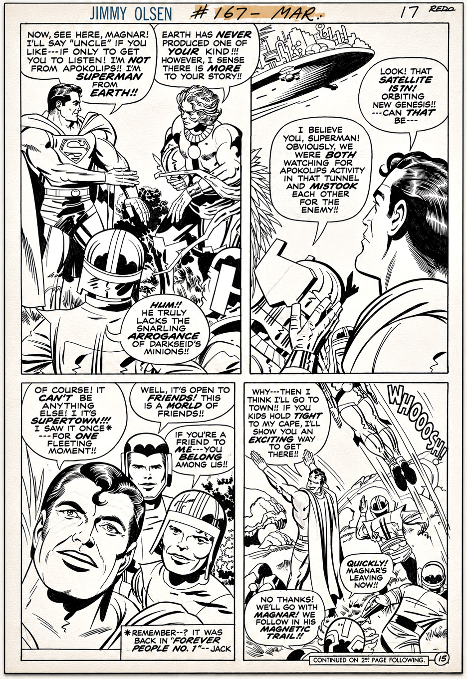
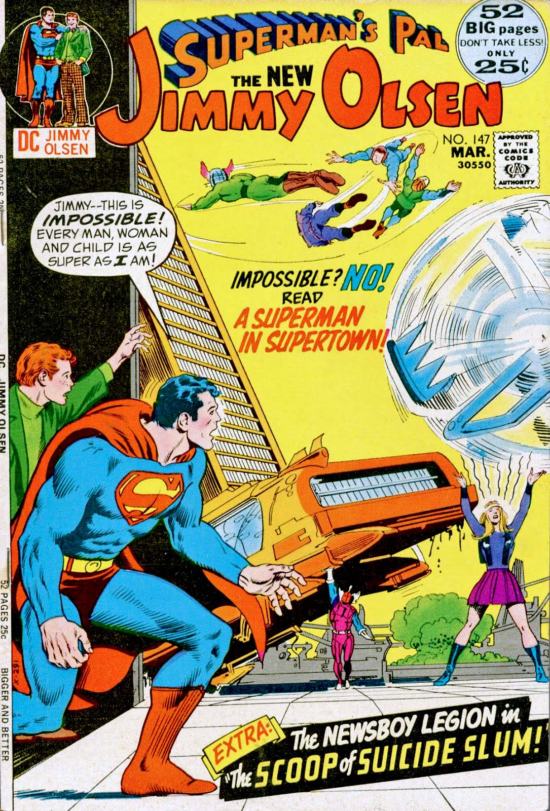
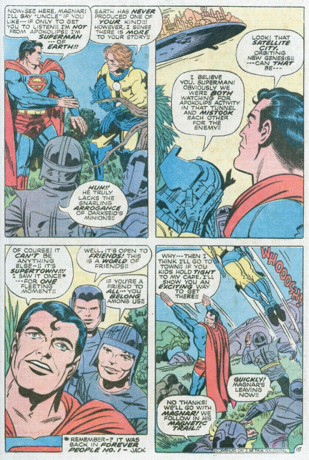
Superman’s Pal, Jimmy Olsen #147, March 1972

Every so often in Jack Kirby’s offbeat Jimmy Olsen run, you run across something extra special.

In this case, it’s a ’70s Kirby Superman, refined by Mike Royer, rather than jarringly redrawn by Al Plastino or Murphy Anderson.

And a rare combination at that. This was Royer’s only inking assignment on Jimmy Olsen, coming in Kirby’s second-to-last issue on the title.

DC’s editors famously insisted that Superman conform to the company’s house style. Looking back, it seems short-sighted and cautious. If you’re hiring Jack Kirby, shouldn’t part of the appeal be seeing what his Superman looked like?

Fortunately, Royer’s refinements didn’t cross the line (no pun intended) into a wholesale redraw, leaving us with perhaps the closest thing to Kirby’s unfiltered Superman published during his original DC run.

And what a book Jimmy Olsen was.

Kirby used a struggling Superman spinoff to launch the Fourth World.

Darkseid. New Genesis. Apokolips…

Then there’s the Newsboy Legion. The Guardian…

And somehow, Don Rickles.

Only Jack could make that seem perfectly logical.

John & Sal Buscema — Soaring

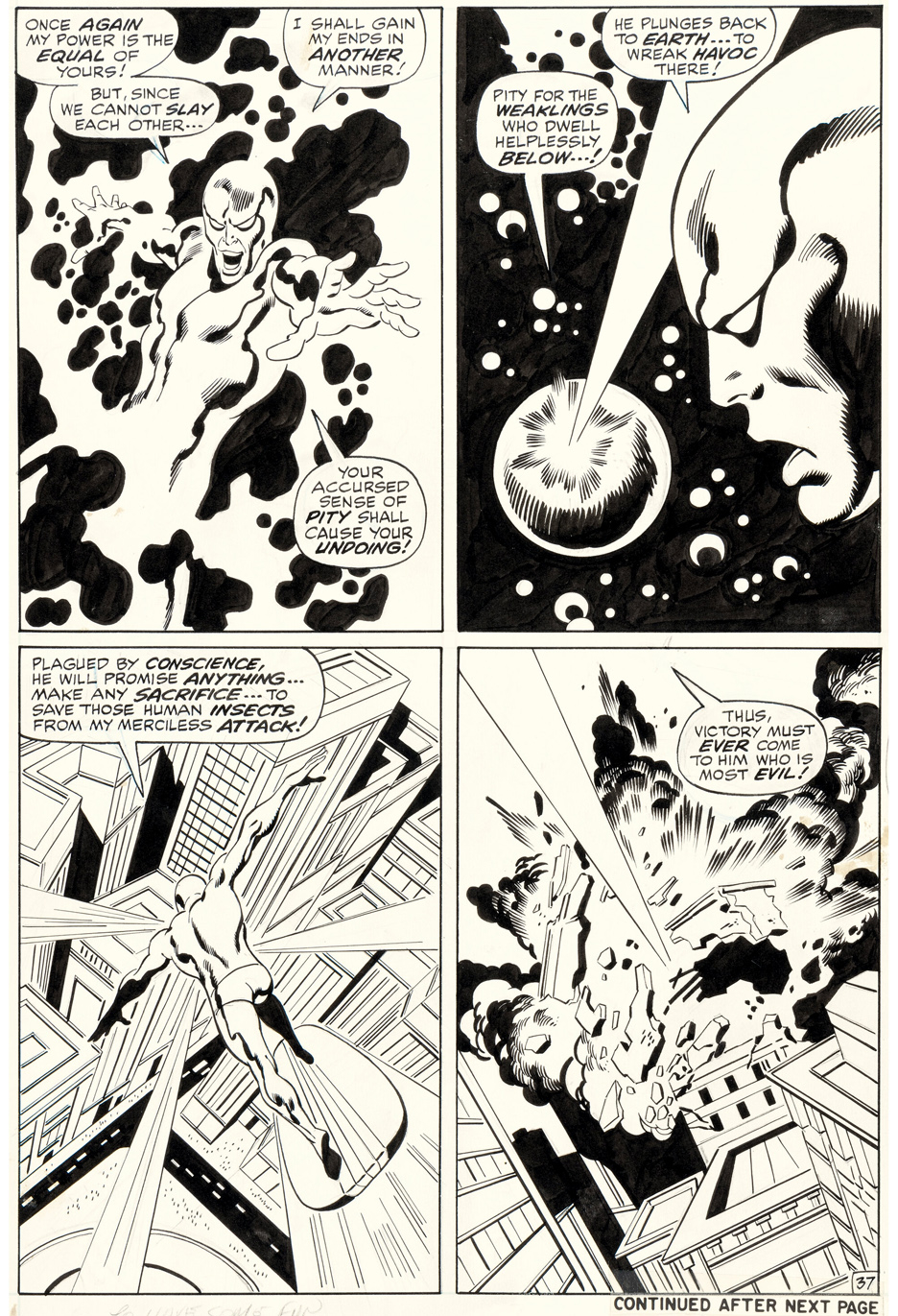
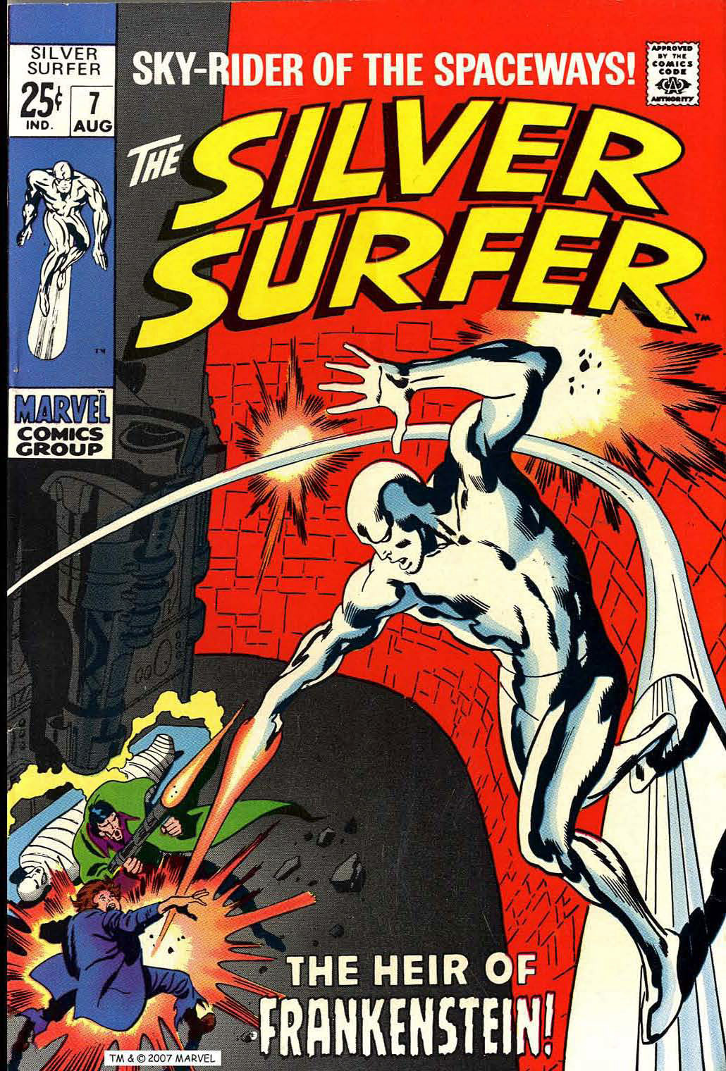
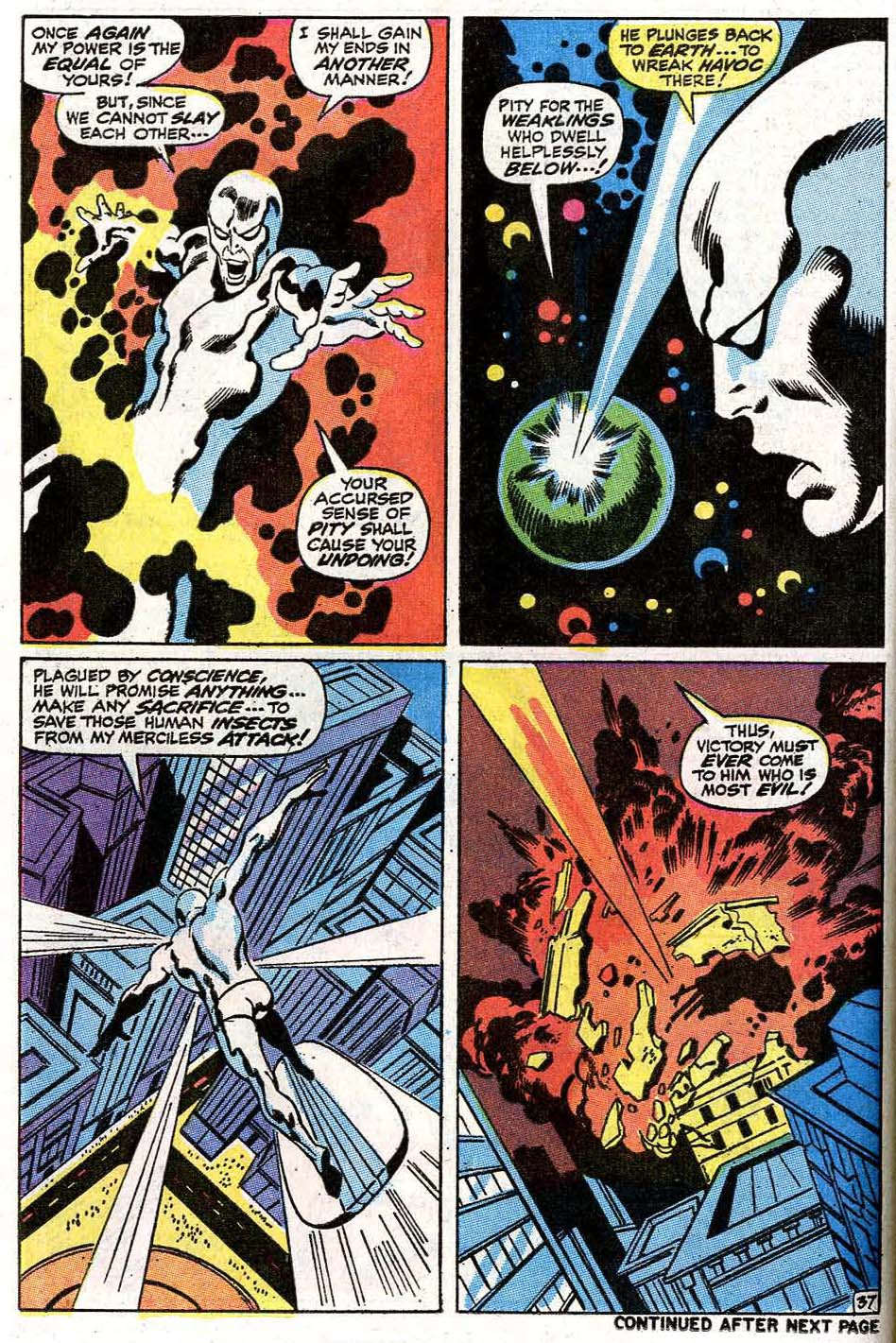
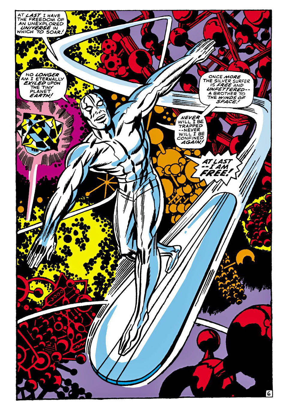
Silver Surfer #7, August 1969

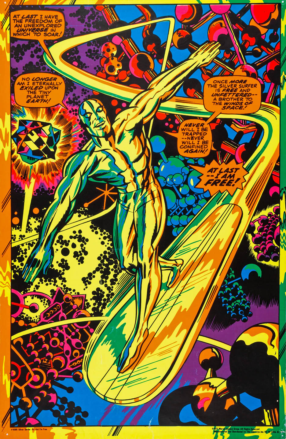
In the 1995 film Crimson Tide, there’s a loud argument between two sailors that escalates into a fight—written by Quentin Tarantino—about whether Jack Kirby’s Silver Surfer is better than Moebius’s.

It’s kind of a ludicrous debate. Not just heated—ludicrous. Because in the real world, no one ever really had that argument.

Moebius—brilliant as he was—did one relatively small graphic novel featuring the Surfer. It’s beautiful. No question. But is it influential enough to spark a barroom brawl? Probably not.

Now, a real debate? Kirby vs. John Buscema.

Buscema gave us 17 unforgettable issues of the Surfer’s original solo series. That’s a body of work you can actually argue about.

I’m not picking sides—I like both for different reasons. But here’s something that’s not up for debate:

John’s version, inked by his brother Sal Buscema, featuring the Surfer and his evil doppelgänger?

That’s pretty close to perfection.

And the Moebius reference? I still don’t quite get it.

Maybe “Buscema” was just harder to pronounce. 

Or maybe the French cinema market would appreciate the reference.

Erik Larsen, Paul Ryan & Al Milgrom — Fantastic Encore

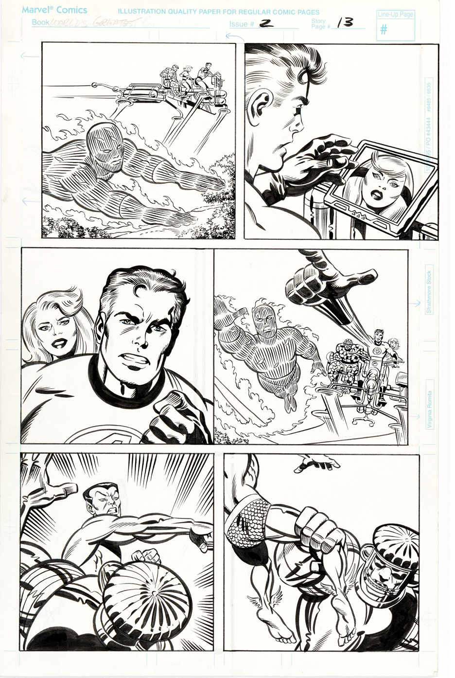
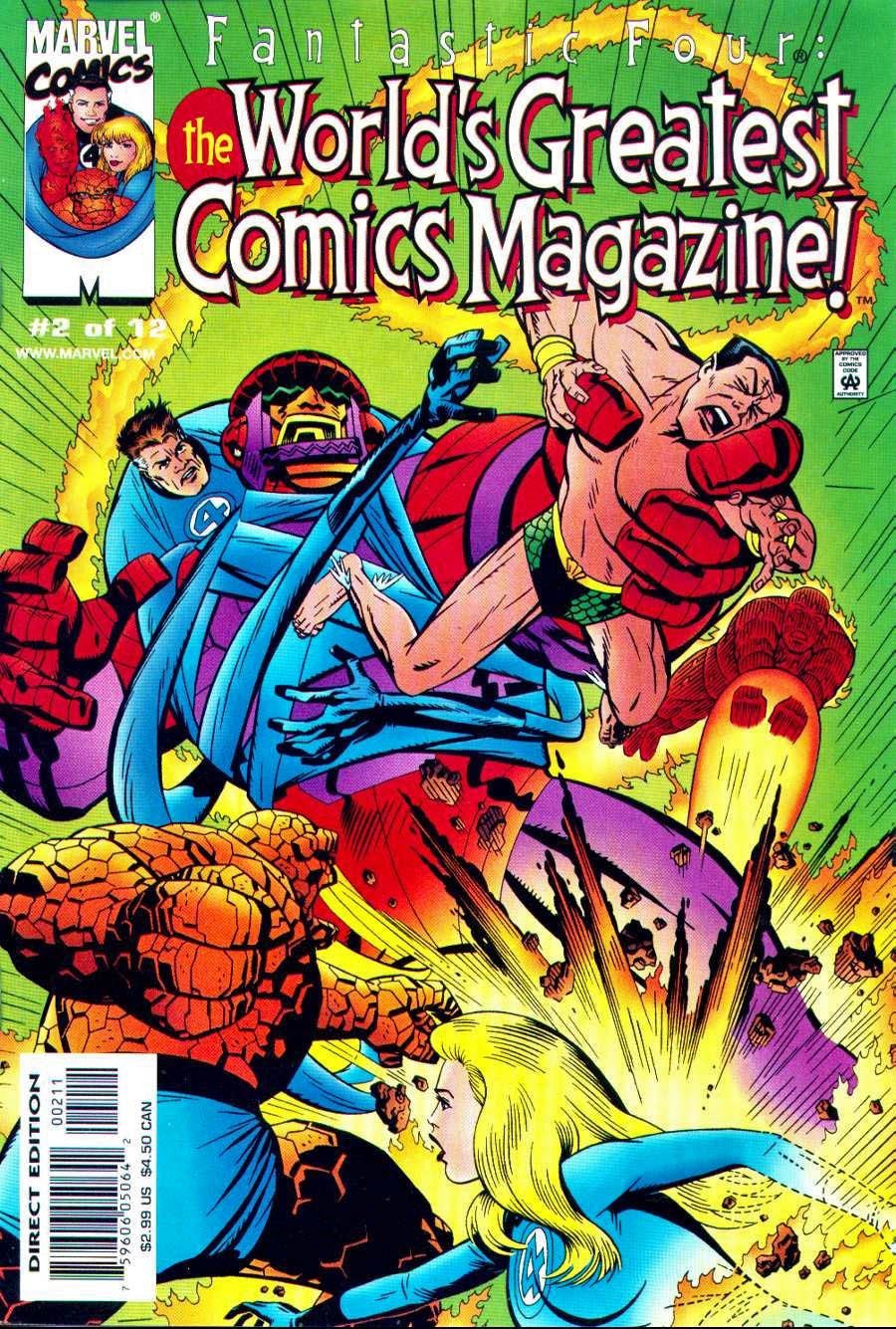
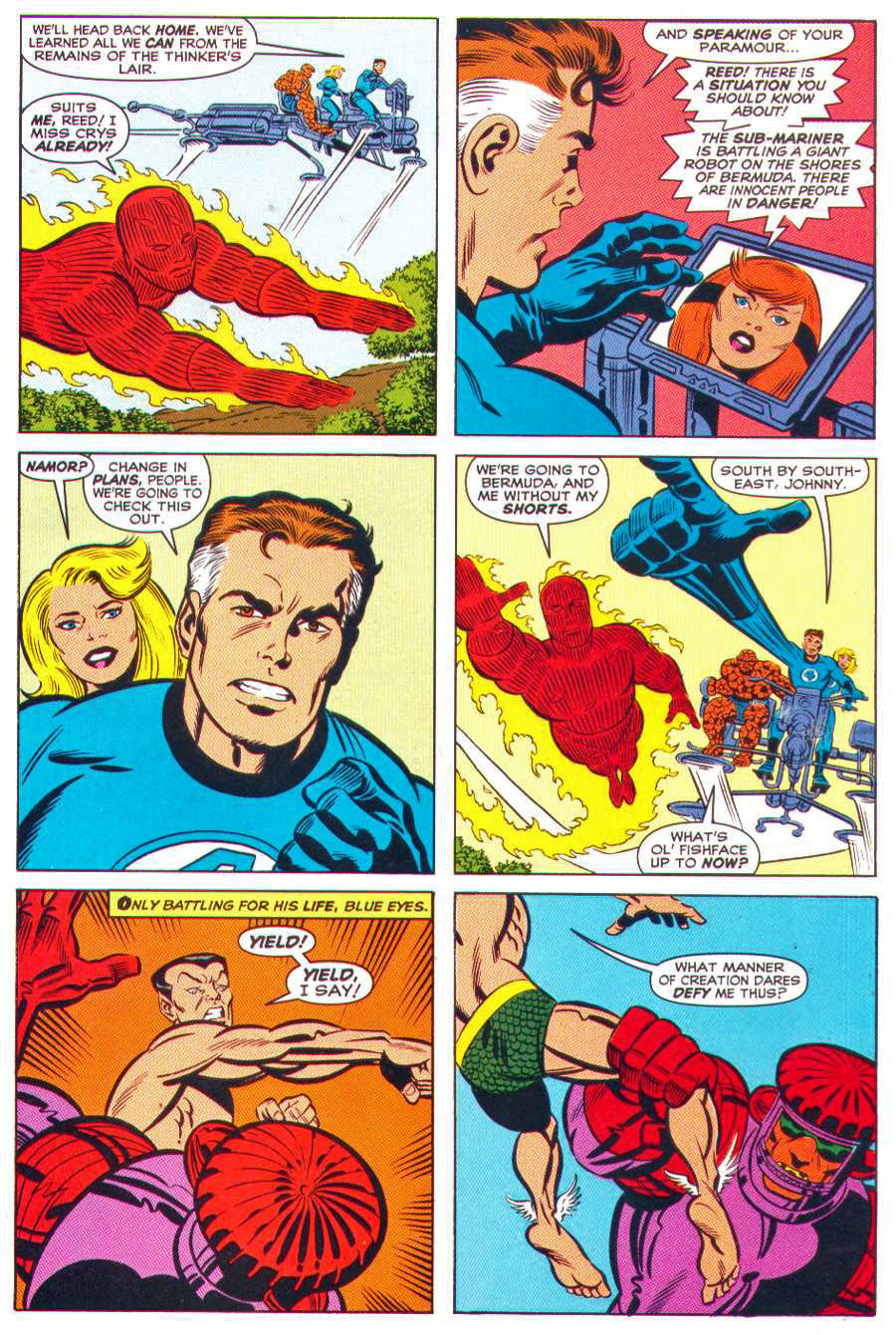
Fantastic Four: World’s Greatest Comics Magazine #2, March 2001

Fantastic Four: World’s Greatest Comics Magazine isn’t like a sequel to Lee and Kirby’s original run—it is one. Same premise, same mission: pick up the world’s greatest comic right after issue #100 and keep the engine humming.

This mini-series exists because a generation of creators grew up fluent in Kirby’s visual language and wanted to continue it, not reinterpret it. No grim updating. No clever winks. Just more Fantastic Four.

This page nails that idea perfectly. Erik Larsen provides the layouts, setting up classic, confident storytelling. Paul Ryan delivers clean, readable draftsmanship. Al Milgrom locks it all together with classic Marvel authority. You get the full team, Crystal, and Namor battling the Sentry—all in one terrific page of original art.

Across the series, the creative roster reads like a roll call of die-hard Kirby believers. Other contributors included Bruce TimmRon FrenzKeith Giffen, and Rick Veitch—artists who didn’t just admire Kirby, they revered him and understood what made the Fantastic Four tick.

What makes World’s Greatest Comics Magazine special is its confidence. It doesn’t explain itself. It assumes the Fantastic Four never stopped being the future. In that sense, it isn’t nostalgia—it’s continuity of imagination. And that’s about as Fantastic Four as it gets.

John Byrne — Fantastic, Again

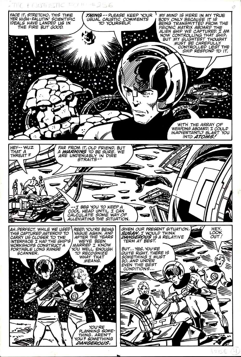
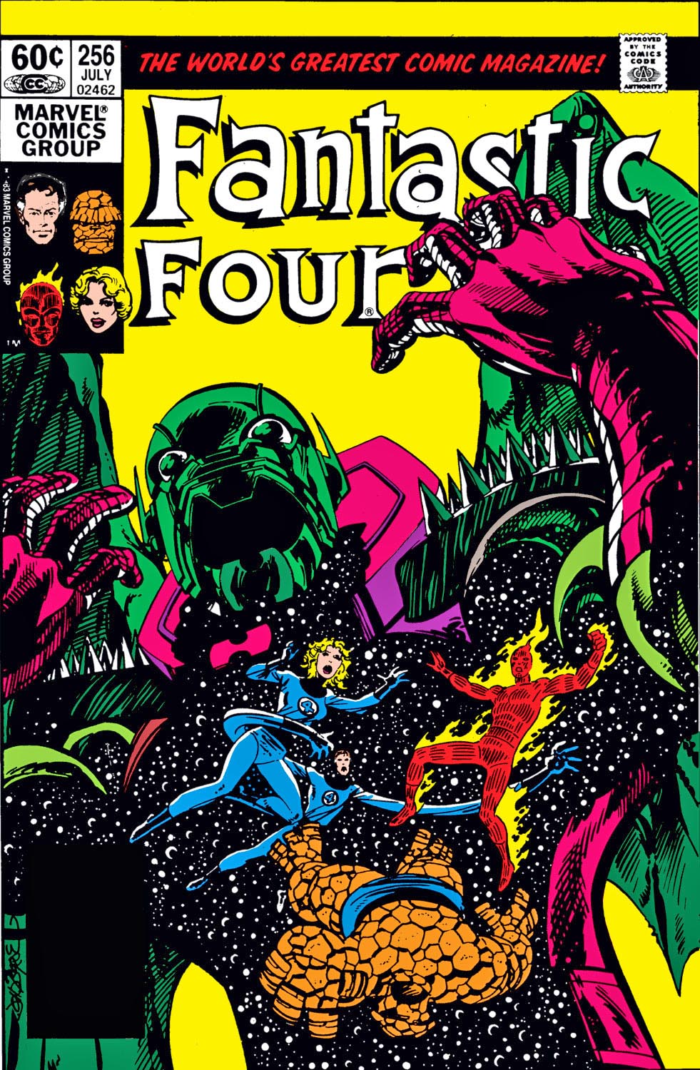
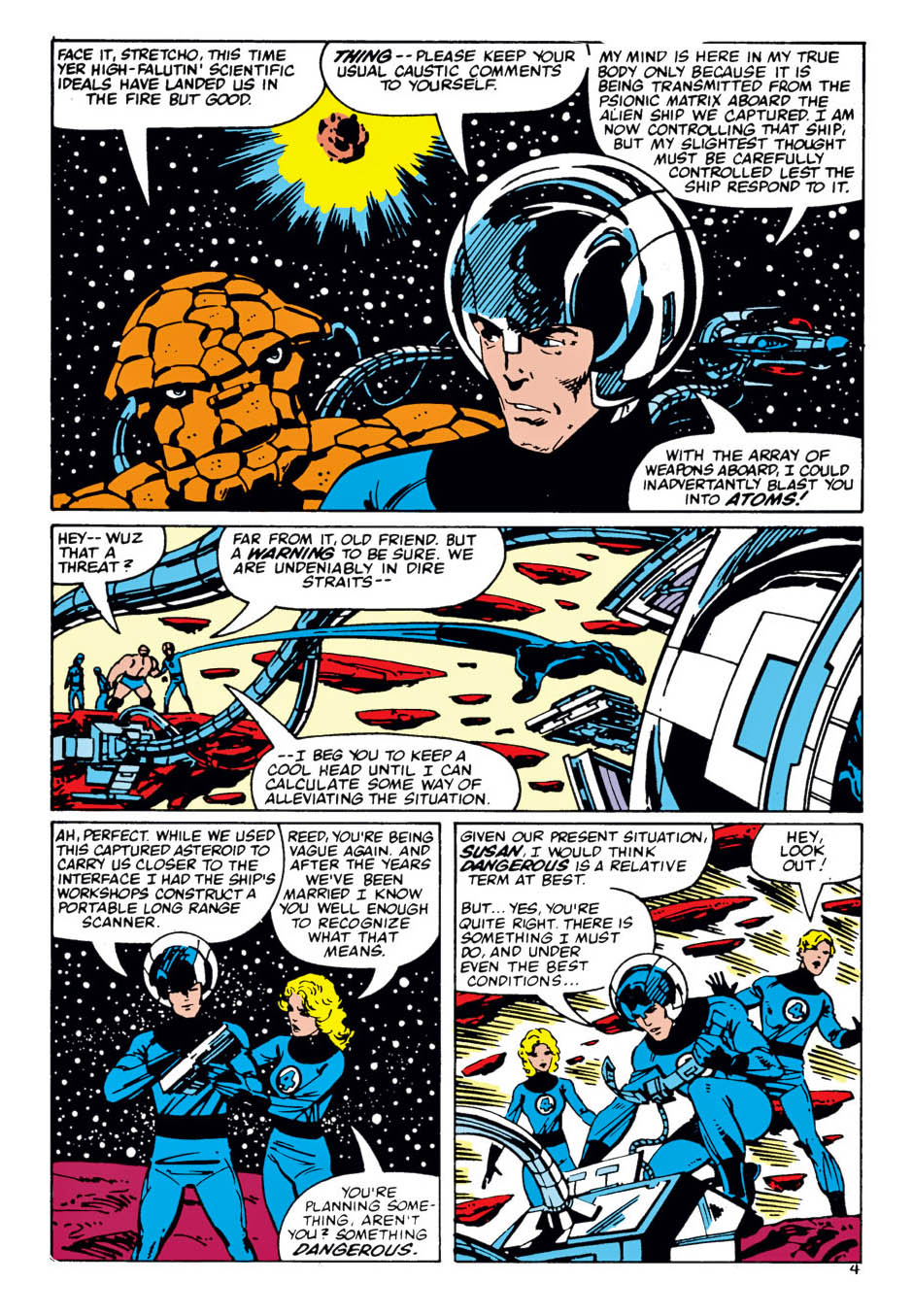
Fantastic Four #256, July 1983

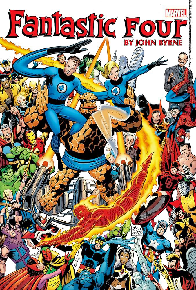
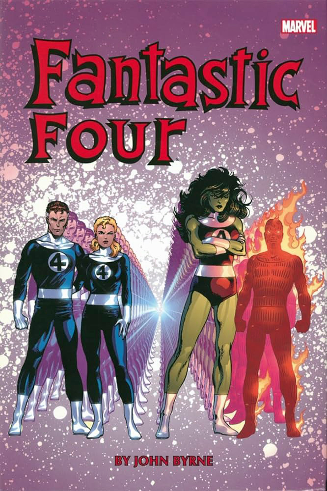
John Byrne’s Fantastic Four earned its legendary status the right way. He took the keys to one of Marvel’s great books, respected the Kirby engine that powered it, and pushed it forward with smart, late-’70s storytelling.

This Negative Zone page feels like classic FF: clear storytelling, dangerous tech, and characters who sound like smart people under pressure. Reed is cool and precise. Sue keeps things grounded.

Drawn oversized, the page has room to breathe — big machines, strange worlds, and that unmistakable sense of scale. Nothing feels decorative. It feels built.

The kind of Fantastic Four that made opening a new issue every month feel like an event.

Jack Kirby & Joe Sinnott — Fantastic, 4ever

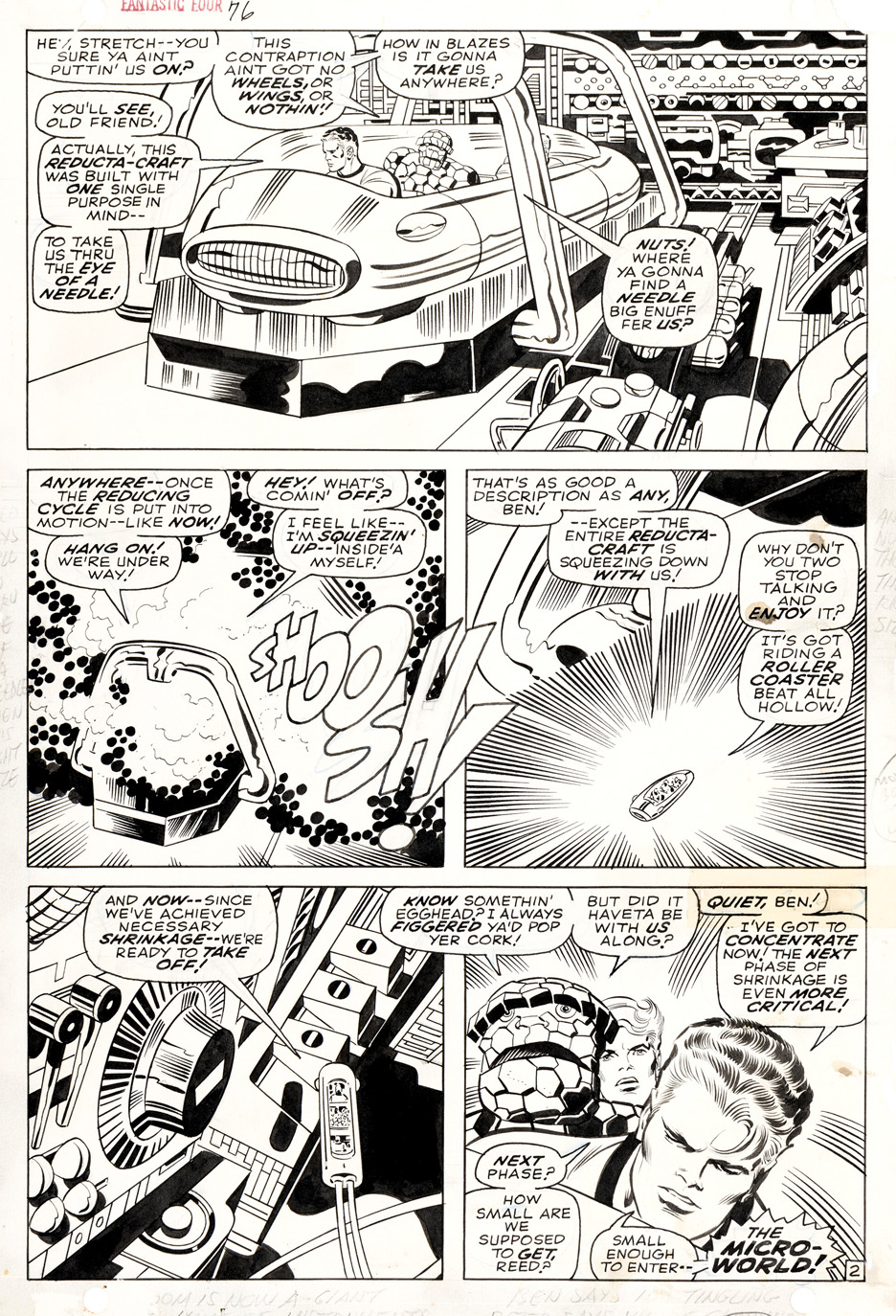
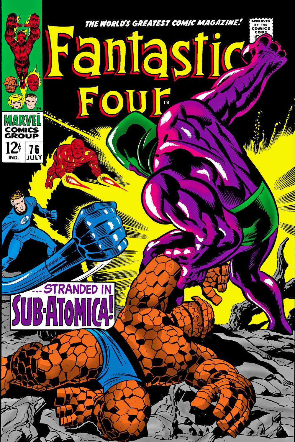
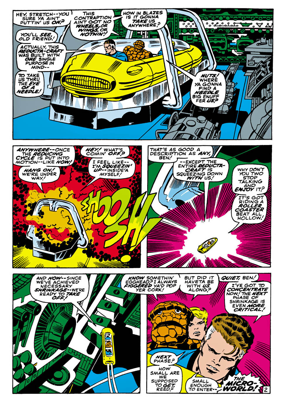
Fantastic Four #76, July 1968

Sixty-five years on, The Fantastic Four still feels like Marvel figuring itself out in real time—and getting it spectacularly right. These weren’t heroes born in alleys or back rooms; they were a product of the early ’60s, when the Space Race filled the headlines and the future felt thrilling, reckless, and inevitable. Rockets were launching, limits were being tested, and the question wasn’t should we go farther—it was how fast can we get there. Marvel’s cosmic imagination starts right here, with four people charging into the unknown.

And speaking of charging ahead—just look at this page by Jack Kirby, beautifully locked down by Joe Sinnott. This isn’t just a shrinking sequence; it’s Kirby inventing scale. Machines loom like alien vistas, panels crackle with motion, and your eye doesn’t just read the page—it gets pulled inside it. Sinnott’s inks keep all that chaos crisp, clear, and impossibly confident.

I continue to believe the first 100 issues (and especially the marvelous three-year stretch from about issues #39–76) of The Fantastic Four rank among the most important runs in comic-book history—one long creative hot streak where the ideas redefined pretty much everything that came before.

I’m never going to referee who did what between Kirby and Stan Lee, but one thing is pretty obvious: Lee contributed much of the personality, friction, and soap-opera snap that made the cosmic feel personal. The Fantastic Four bicker, joke, and melt down while rewriting reality—and that mix of big ideas and human irritation became Marvel’s calling card.

Happy 65th to the Fantastic Four: Marvel’s original first family, and a wondrous revolution in comic books.

Jack Kirby & Mike Royer— Ragnarök at the North Pole

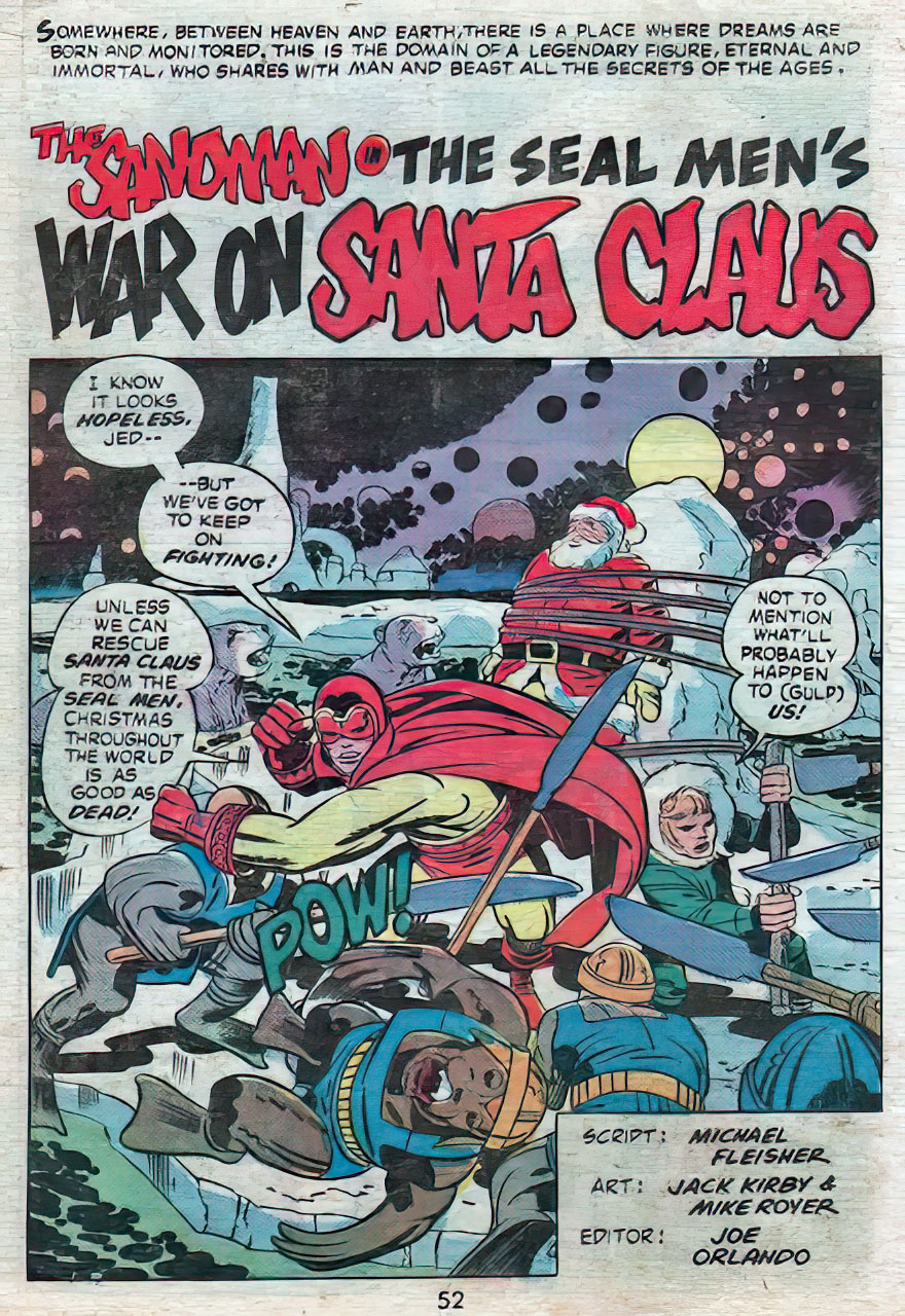
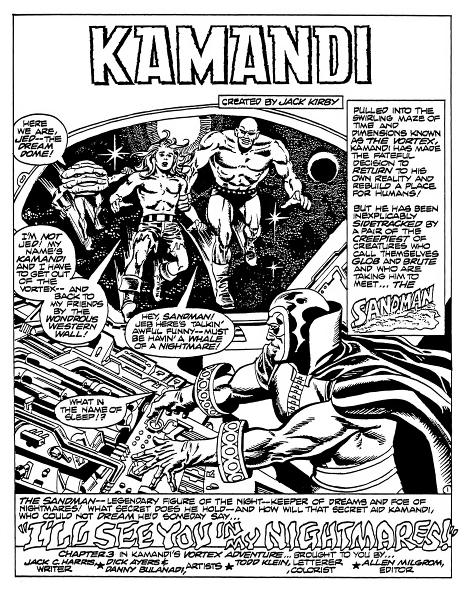
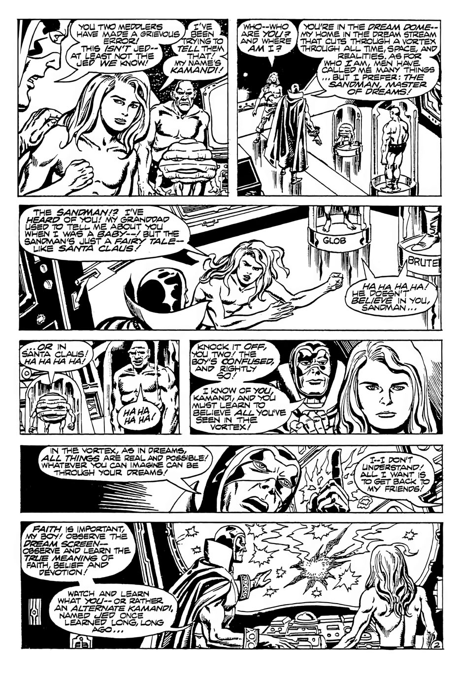
The Best of DC #22, March 1982 (Intended for Sandman #7, —Unpublished — 1975)

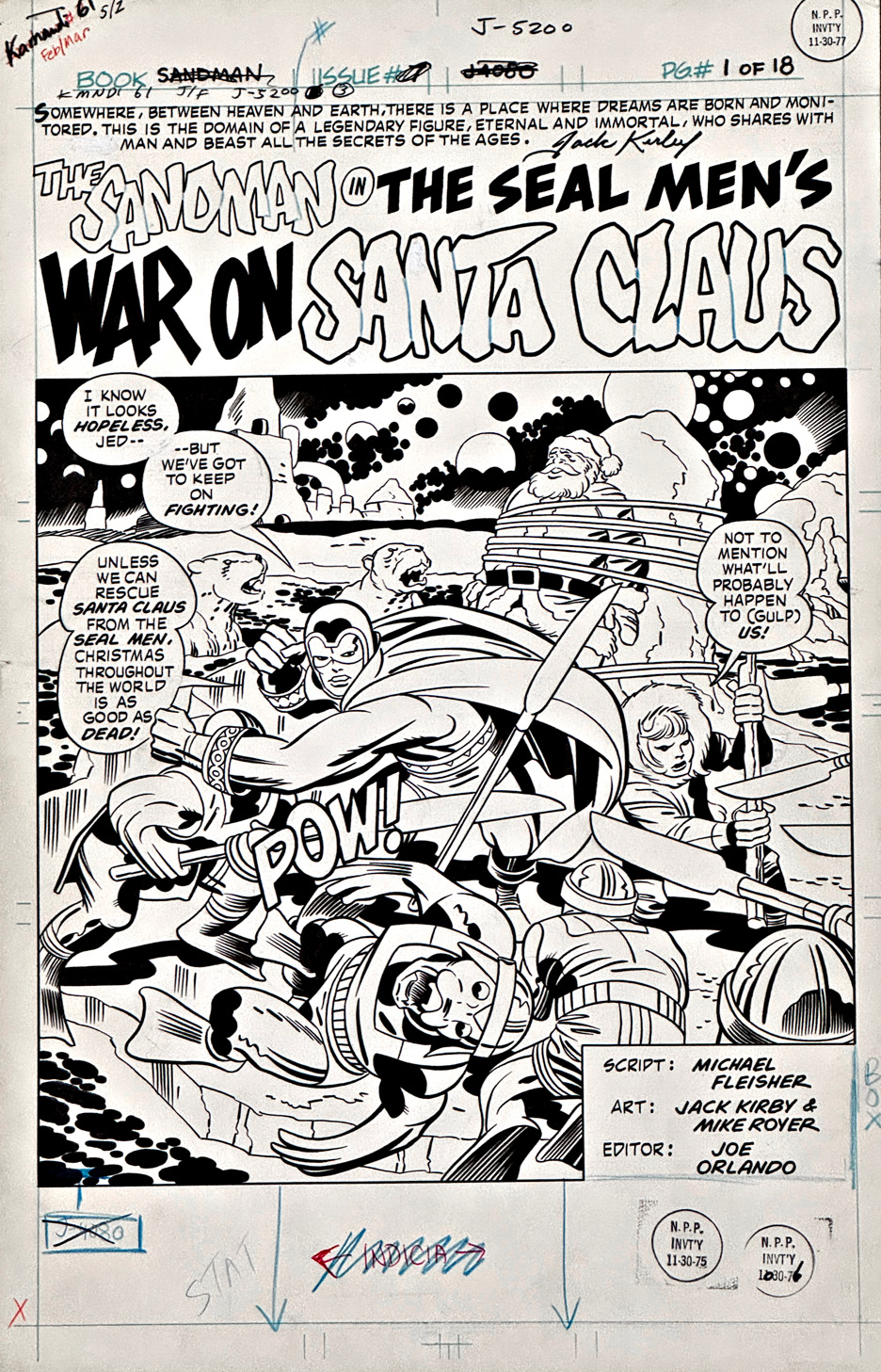
When Jack Kirby wanted to make an entrance, he didn’t tiptoe — he detonated. This Sandman title page kicks down the door, grabs you by the collar, and announces, “Strap in — things are about to get very weird.”

Only he could take a story called The Seal Men’s War on Santa Claus and treat it like Ragnarök at the North Pole. The floating spheres, extra moons, and cosmic backdrop all calmly insist, “Relax — this is exactly how dreams are supposed to look.”

Down on the ground, Sandman is carving a path through a crowd of angry Seal Men, cape swirling, fists flying, looking every bit like someone who rescues Santa on an annual basis. Jed is right beside him, doing his best with a staff that’s taller than he is, while poor Santa watches from the background, wrapped up like he’s on the world’s least festive gift list.

Mike Royer’s inks give the whole scene its crisp, confident snap — bold lines, clear action, and just enough shadow to keep the mayhem grounded.

It’s light, it’s wild, and it is unmistakably DC Kirby — a dream-world dust-up where everyone seems to believe in the moment. 

Even Santa.

Has any comic story ever been cancelled twice? Jack Kirby holds a lot of comic-book records, but this one might be the strangest.

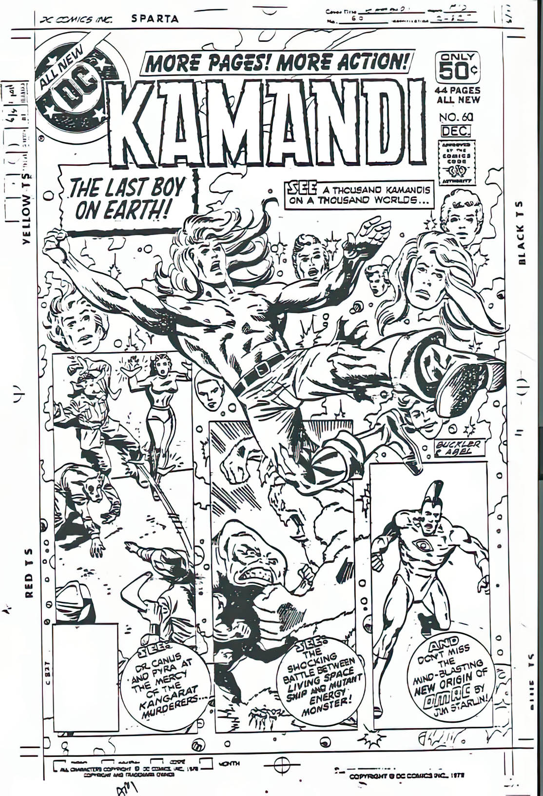
Sandman #7 was fully finished when DC pulled the plug on the series after issue #6 in 1975. The completed story went into limbo — filed away, forgotten, probably wondering what it did wrong. A few years later, DC tried again, planning to incorporate it narratively (don’t ask) in Kamandi #61… and then the infamous “DC Implosion” hit. Kamandi was cancelled too.

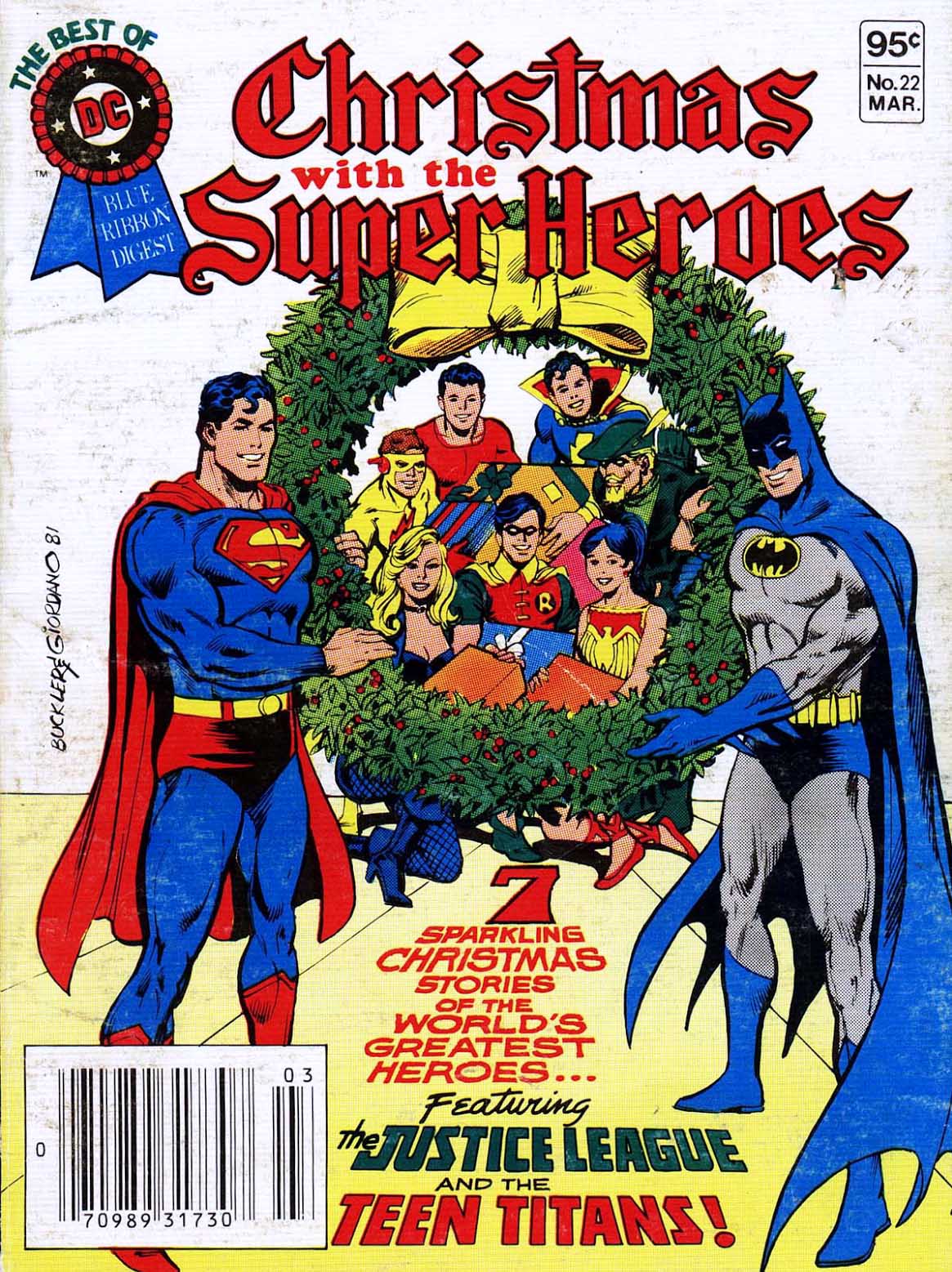
It finally escaped publishing purgatory in Best of DC #22, a digest-sized Christmas special from late 1981 — because if you’re going to rescue a lost Kirby comic, why not do it as a bite-sized stocking stuffer?

Sigh.

It arrived late, sure — but fortunately, Kirby pages age better than most publishing plans. 

(And now, fortunately, you can find a full-size version collected in The Kirby DC Bronze Age Omnibus. The perfect Christmas present to give yourself.)

John Buscema & Tom Palmer — Avengers, Assemble

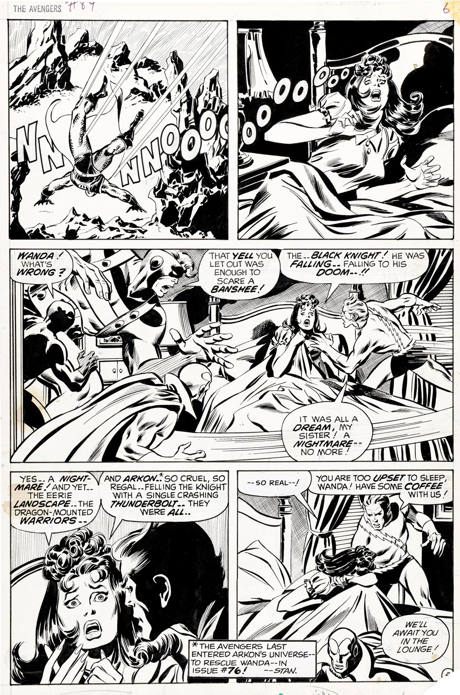
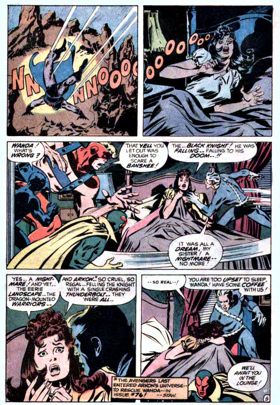
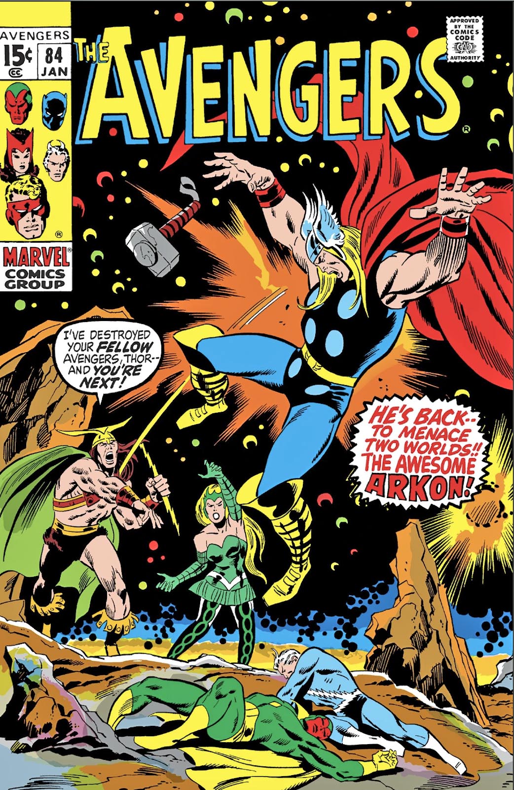
Avengers #84, January 1971

John Buscema was the Avengers artist of the late ’60s and early ’70s—despite famously claiming he didn’t much care for superheroes.

Every panel feels like it could’ve been pulled from a widescreen adventure film, even when the scene is nothing more than a nightmare and a jolting wake-up. That was his magic: Buscema could make anything feel epic.

This page shows exactly how he defined the Avengers in that era. Grace, power, and cinematic clarity are baked into every beat, transforming a bad dream into something memorable—and unmistakably Avengers.

Behind the scenes, Marvel was running hot. Kirby had just left for DC, schedules were tightening, pages were due, and assignments were shifting fast. You can feel a stronger Tom Palmer inking presence here than in some earlier issues, suggesting John may have supplied looser pencils as deadline pressure mounted and the machine kept moving.

Marvel may have been in motion, but Buscema’s vision was locked in.