Mike Mignola — On The Road To Hellboy
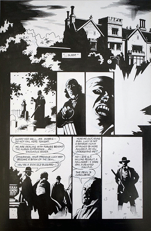
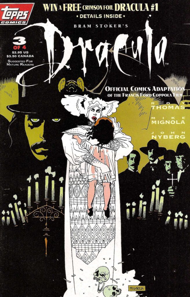
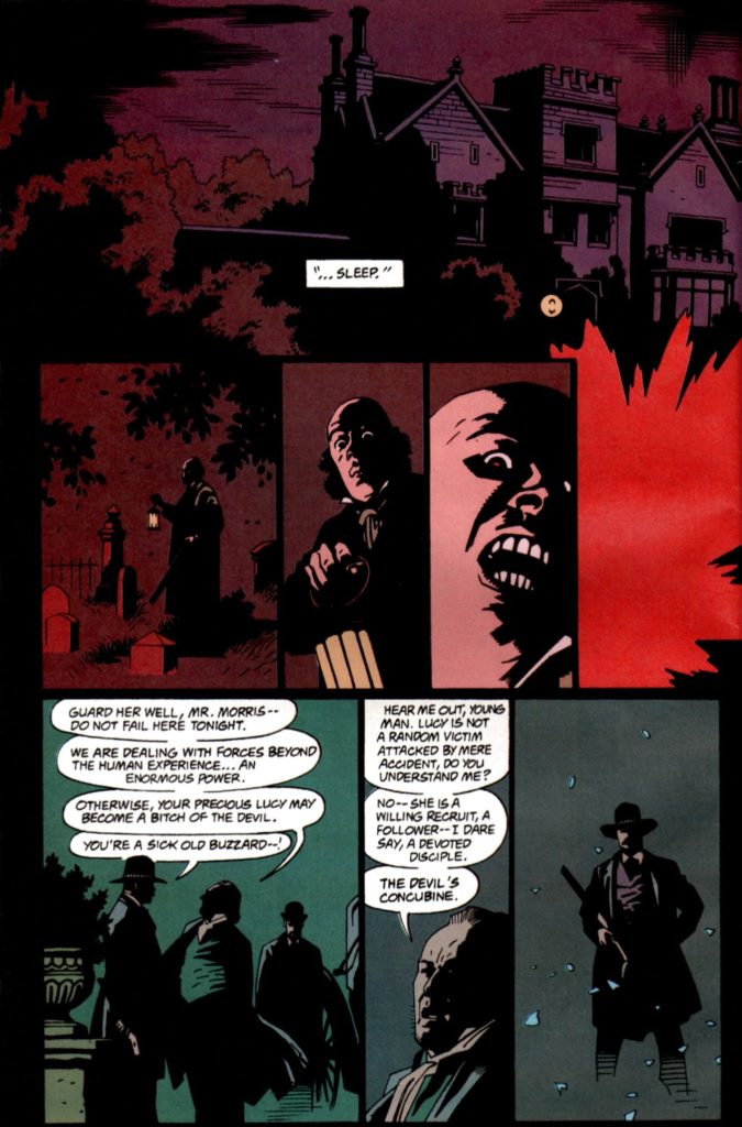
Bram Stoker’s Dracula, #3, December 1992
Happy Halloween! Today we wrap up our two-week series celebrating the best in monsters, mystery and mayhem.
Here’s a sweet page from Roy Thomas and Mike Mignola’s adaption of Francis Ford Coppola’s 1992 film, Bram Stoker’s Dracula.
Fun Fact: All the pages in this adaption are “sweet.” There’s not a miss in the bunch. In fact it’s one of the best looking of any film adaptations ever done in comics. (Top of mind, only Archie Goodwin and Walter Simonson’s Alien graphic novel is in the same league.)
It’s also fair to say that while the film itself is fine (mixed reviews when it was released), the comics adaption itself is actually better.
Fun Fact: Coppola liked Mike’s art so much he hired him to provide illustrative material for the film itself, and Mike’s work is credited in the movie.
Fun Fact: The title was the launch project for Topps Comics, and was in development prior to the hiring of an actual Editor-In- Chief. (Jim Salicrup.)
Fun Fact: John Nyberg inked the series in spectacular fashion— it’s astonishing how anyone but Mike could make it so “Mignola-like,” but John nails it. The brilliantly effective coloring is by Mark Chiarello, who later colors the first full Hellboy series, Seed of Destruction. (Hellboy himself appears for the first time just a few months after Dracula concludes in an SDCC giveaway comic book.)
Fun Fact: For many years, Dracula was a lost classic — one of the few major Mignola projects not in print — for more than 20 years. I personally chased those reprint rights for 10 of those 20. Sometimes, insane tenacity pays off.
Fun Fact: It’s the first comic book I ever worked on professionally, and its reprint was one of the final projects published prior to my departure from IDW. (I will have to figure out a way to bring another version to my next publishing home. Ha.)
Fun Fact: Despite one of the best looking comic book series ever, it’s unlikely there will ever be an “artists edition” style book. The originals are scattered to the wind, and only occasionally offered for sale. I consider myself fortunate to own this one.
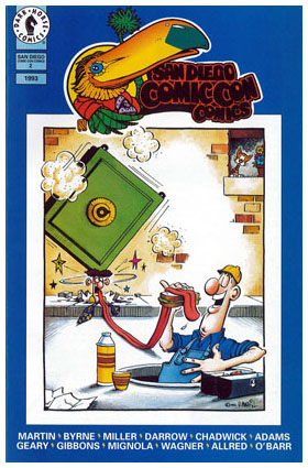
First story appearance of Hellboy, SDCC comic, July 1993 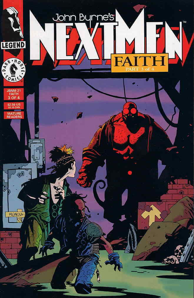
First color appearance of Hellboy, script by John Byrne,
December 1993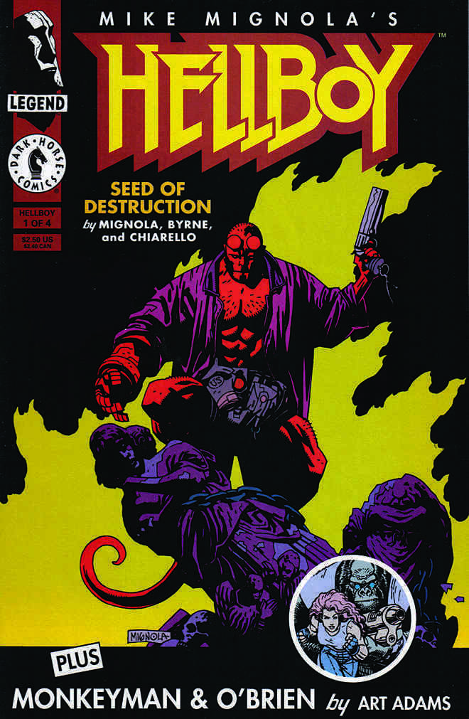
First full issue of Hellboy,
March 1994