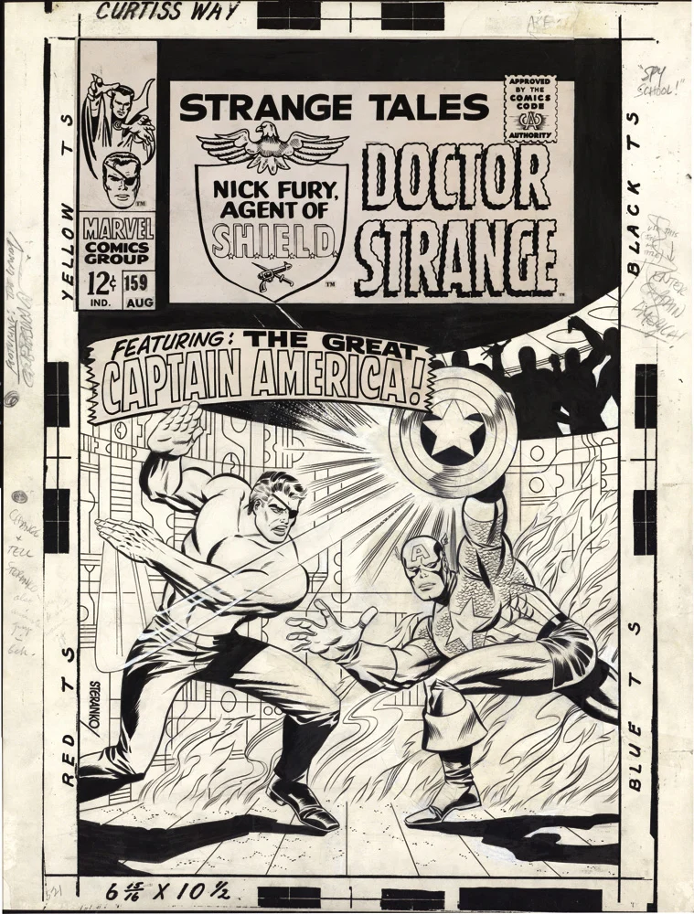
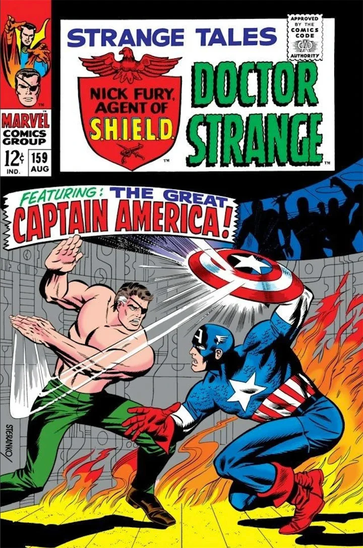
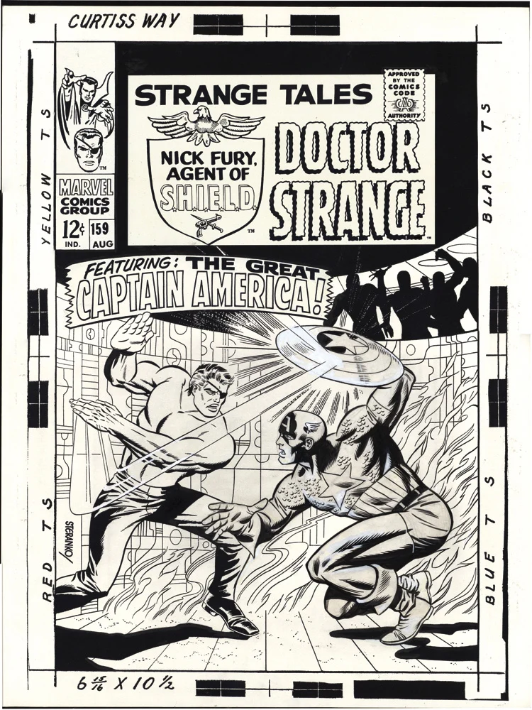
I was only a little kid (7.5 years — I checked) when I first discovered Jim Steranko in Strange Tales #159. (In fairness, I might have discovered him an issue or two sooner, but it’s Captain America’s appearance on the cover that stands out in my mind’s eye.)
This is right around the time that Jim became STERANKO — no first name or other reference required. In subsequent issues of Strange Tales, and then his short-lived legendary run on the solo Nick Fury series, I most definitely didn’t always understand what he was doing, but I knew it was dynamic, wild and special. Looking back at the material today, it remains so.
Jim holds on to most of his published artwork, so a cool specialty piece like this one is a rare opportunity to have something of Jim’s in a collection. And when — and if — that published art ever comes on the market, there is so little of it, and it will be in such high demand, that affordability is going to be a challenge.
A big one.
Those covers… About 15 – 20 years ago, I discovered that the published cover to Strange Tales #159 was actually a revision to Jim’s original by John Romita, and possibly Marie Severin as well.
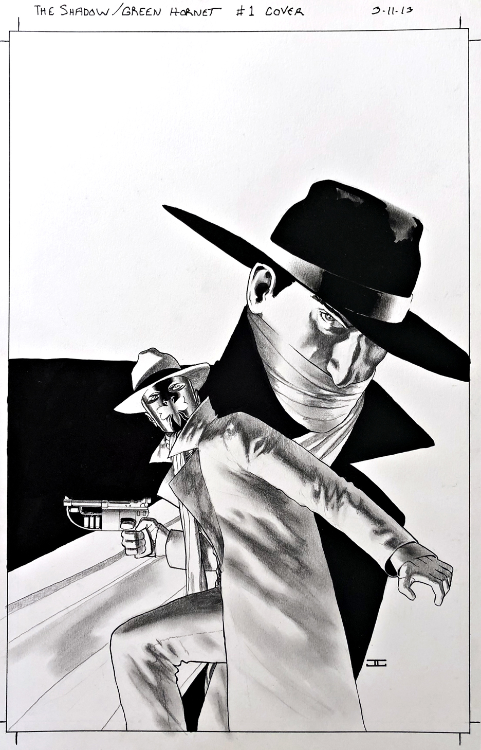
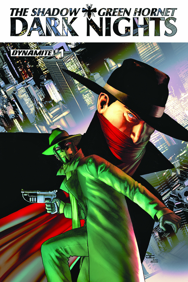
The Shadow / Green Hornet: Dark Nights #1, July 2013
Nice to see two of my favorite classic characters, The Shadow and The Green Hornet together in one series, with a fantastic cover by the terrifically talented John Cassaday.
Pulps and comics — like peanut butter and jelly, yes? My dad connected many of the dots between the pulp, comics, radio and serial adventure characters for me at an early age.
I credit Jim Steranko (History of The Comics) and the nostalgia boom of the 60s and 70s for amplifying those connections.
And how about some contemporary credit to Nick Barrucci and the other talented folks at Dynamite Entertainment for (at least briefly) creating a cool “shared universe” with some of these unforgettable icons?
Fun books all around, and I know from personal experience it wasn’t easy securing all those licensing rights to make these kinds of mash-ups possible.
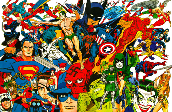
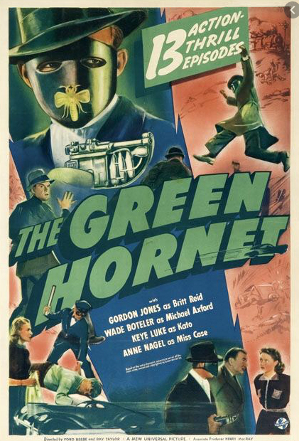
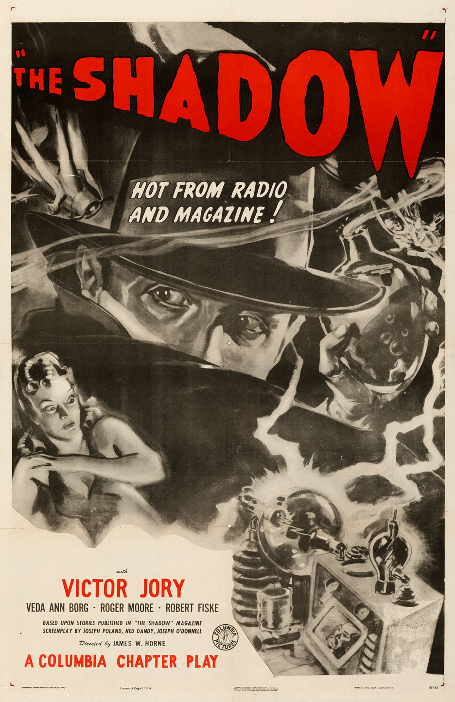
Steranko’s History Of The Comics (Volume One) is probably the first place The Shadow and The Green Hornet appeared on cover — along with an amazing collection of other heroes and villains.Both the Shadow and Green Hornet appeared in Movie serials. (The Hornet actually appears in two.)
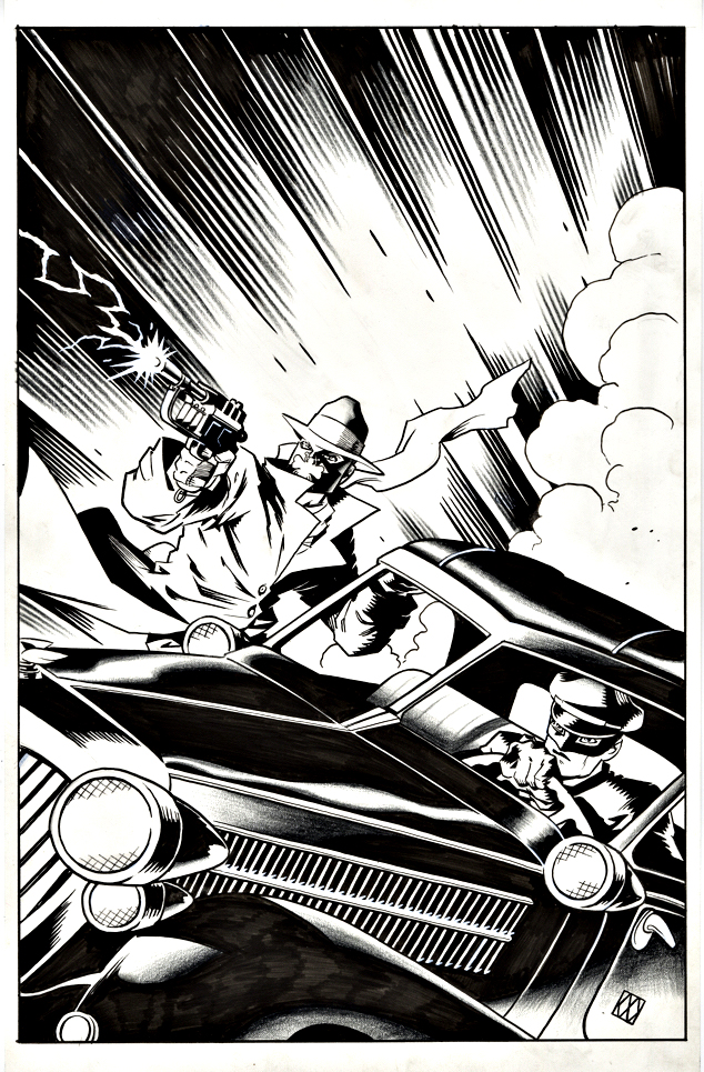
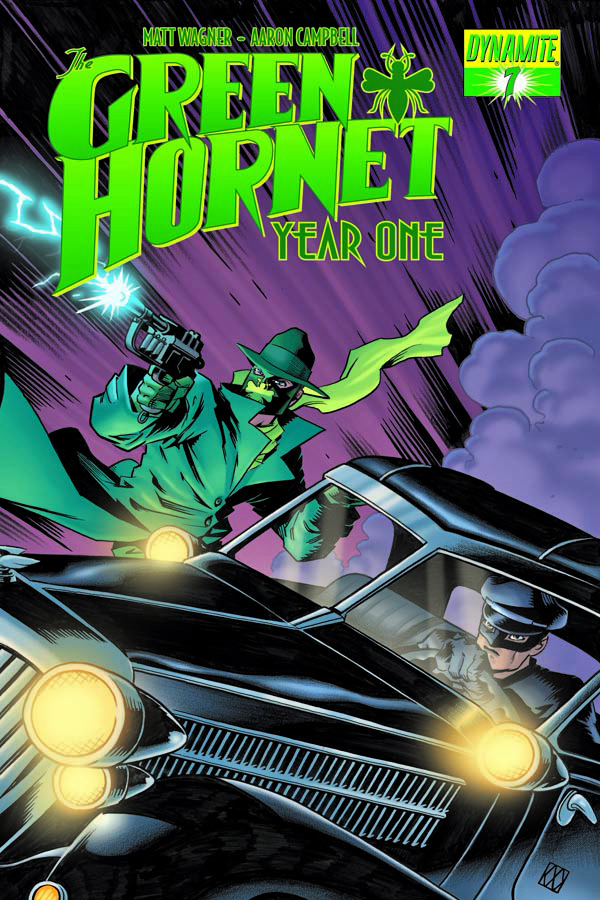
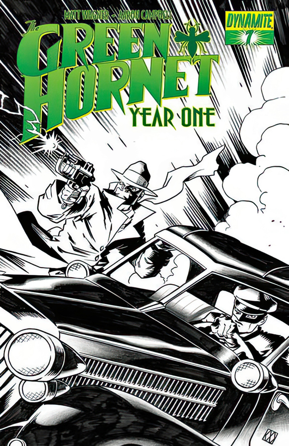
I had a nice selection of Matt Wagner Green Hornet covers to choose from when Matt offered them for sale. I picked this one because it featured the Hornet, Kato AND Black Beauty. (The automobile’s name for those not familiar with The Hornet’s world.)
This comic series deals with the original iteration of the Green Hornet, so the car is a 1937 Lincoln Zephyr, not a 1966 Chrysler Imperial as featured in the TV series that I adored as a kid.
But it still works for me.
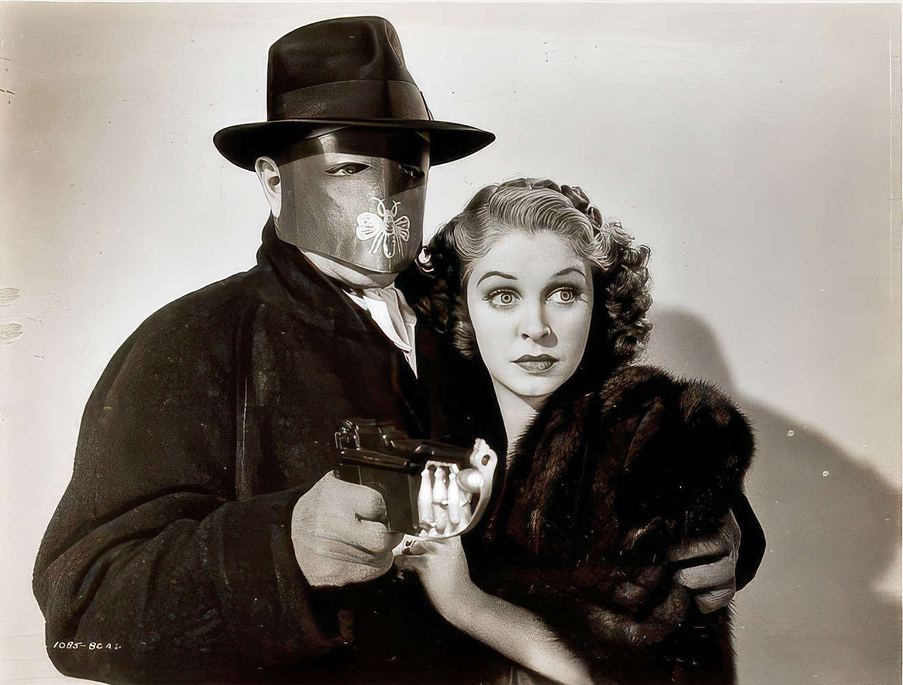
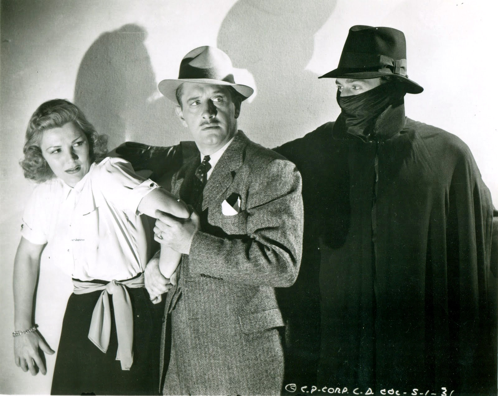
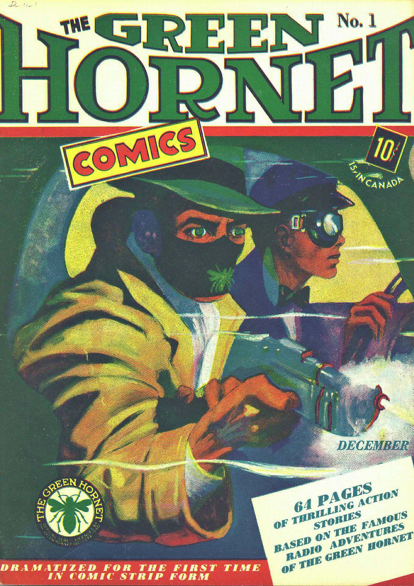
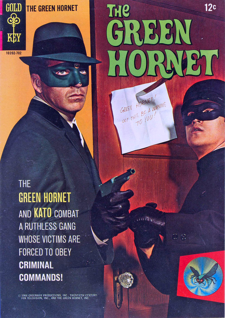
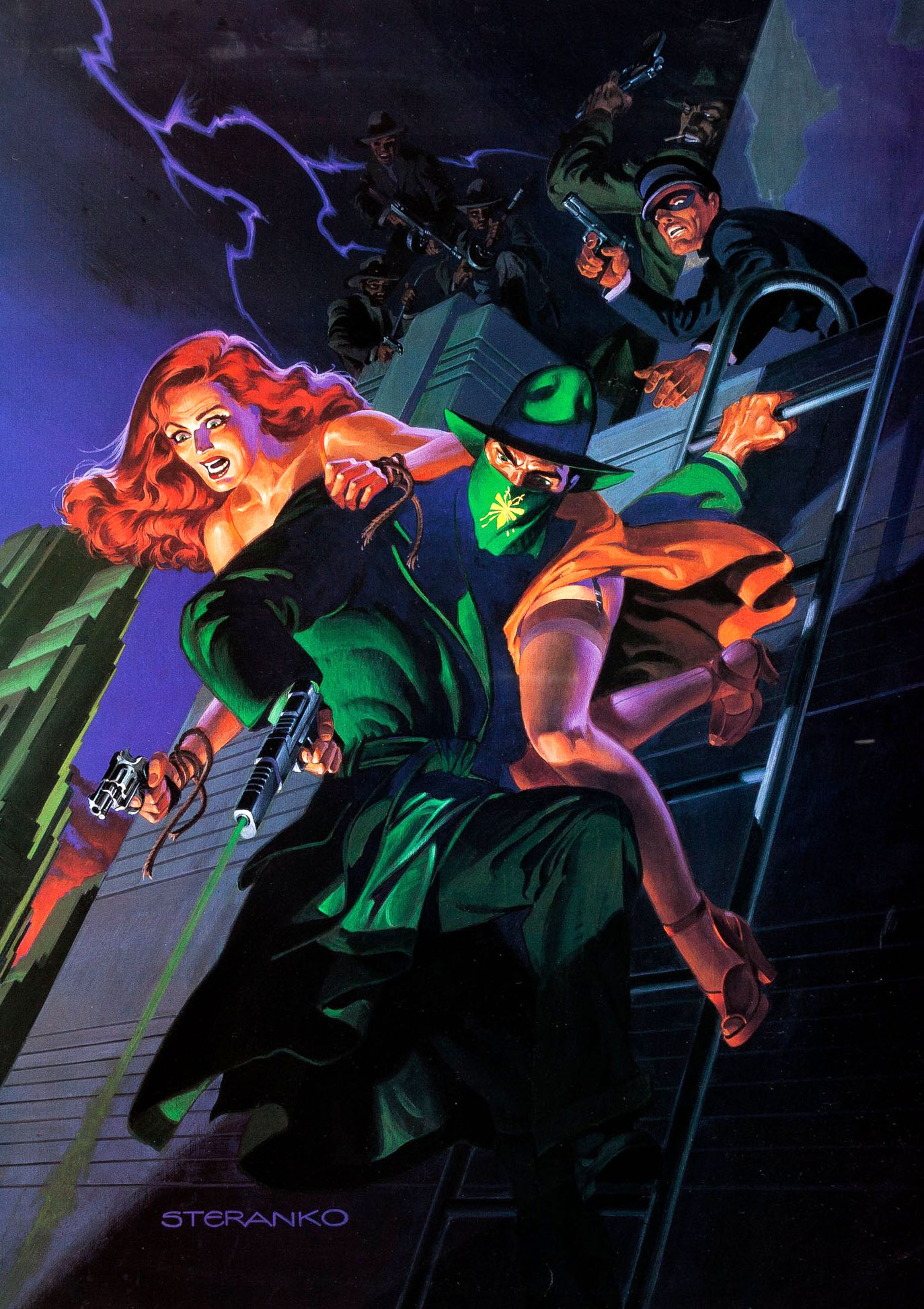
The Golden Age Green Hornet and the Silver Age Hornet — a comic book version of the short-lived TV series that only lasted three issues.Possibly my favorite Hornet illustration of all time: Jim Steranko’s painted cover for the 1989 comics version for Now Comics.
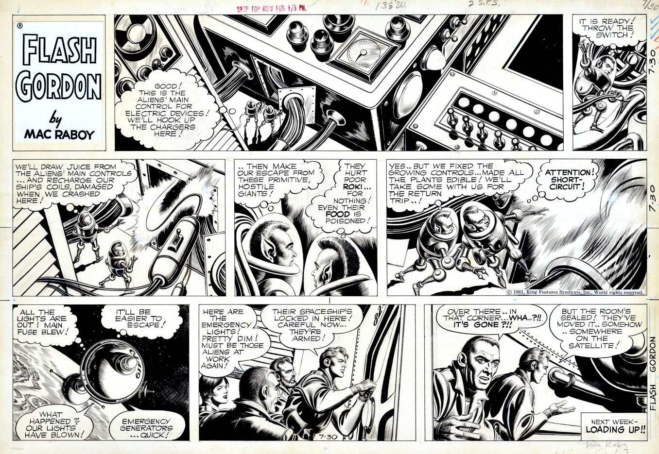
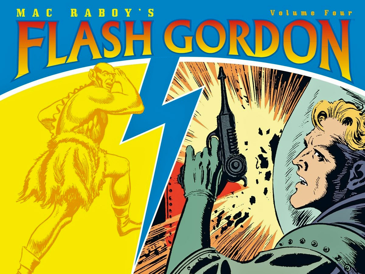
Alex Raymond created Flash Gordon and set the standard for comic strip illustration.
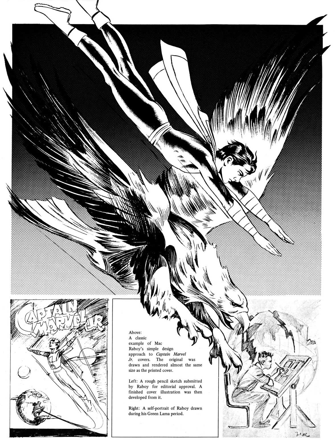
Mac Raboy worshipped Raymond, and created his own impeccable standards for illustration during the Golden Age of comics with his astonishing craftsmanship on Captain Marvel Jr.
And then… serendipity takes a hand, and Raboy becomes the Sunday artist for Flash Gordon.
That Sunday run, started in 1946, and only ending with Raboy’s death in 1967, deserves consideration among the best looking SF strips of all time.
As for Captain Marvel Jr.? Raboy’s covers are still among the greatest ever to appear in the medium.
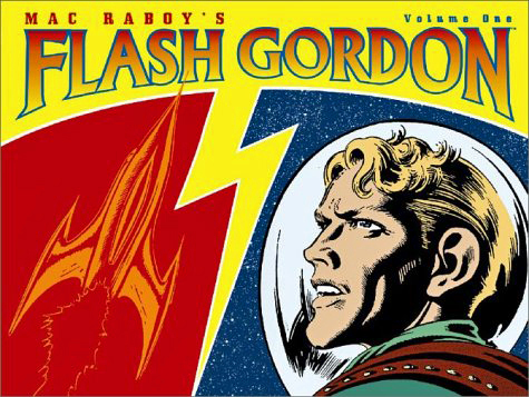
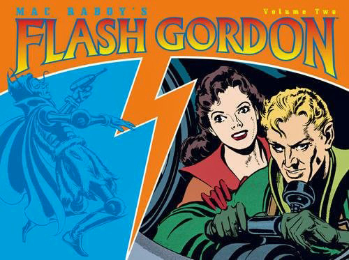
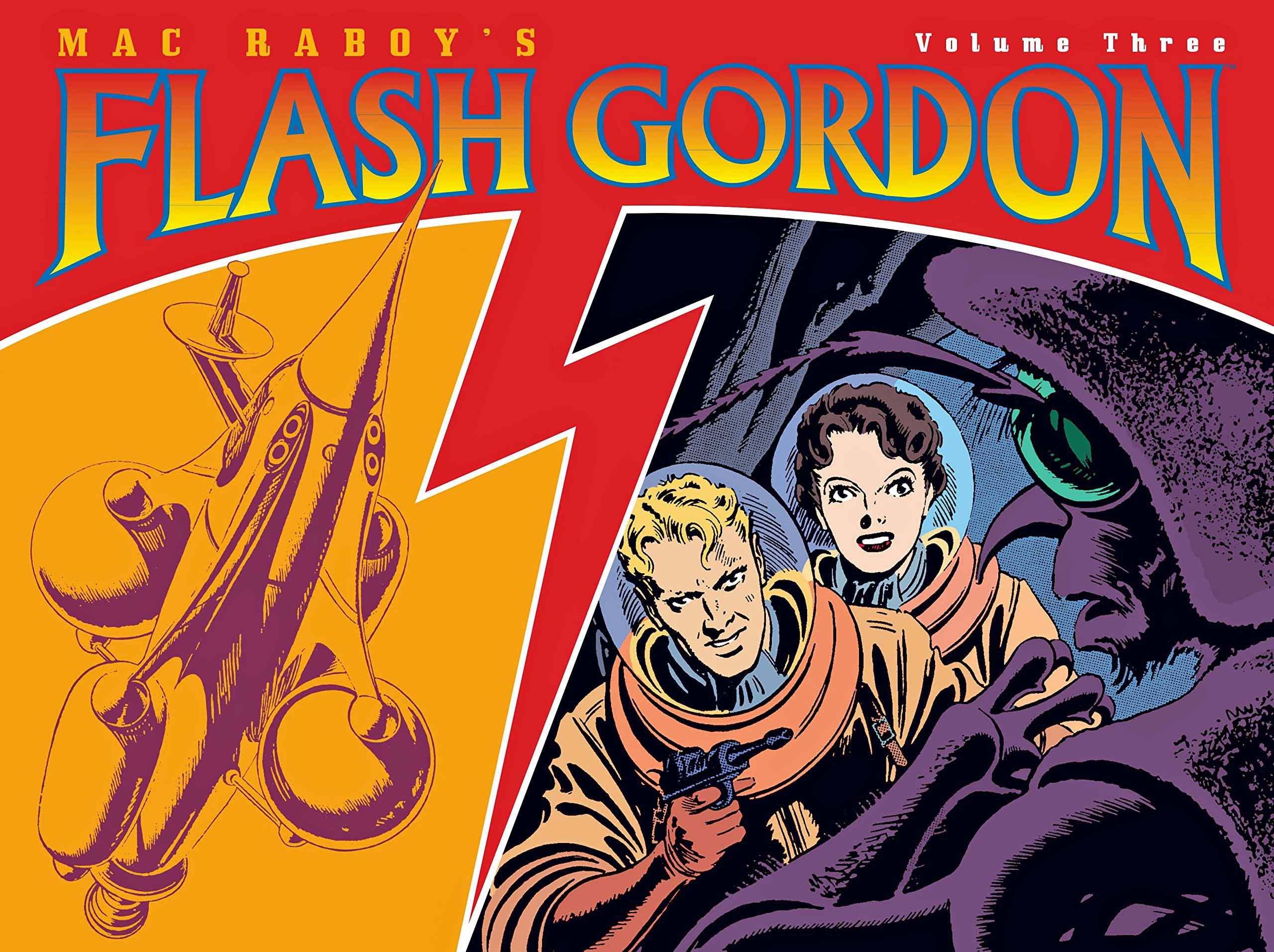
Dark Horse has collected the complete Raboy Flash Gordon run into four attractive volumes.
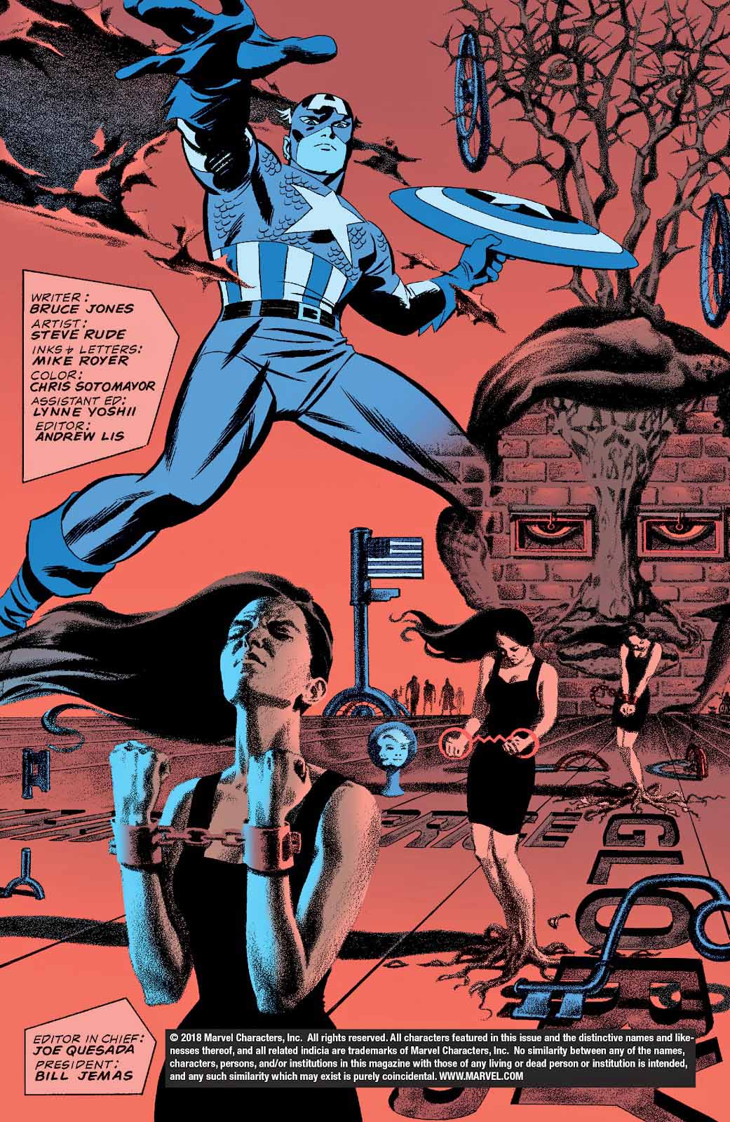
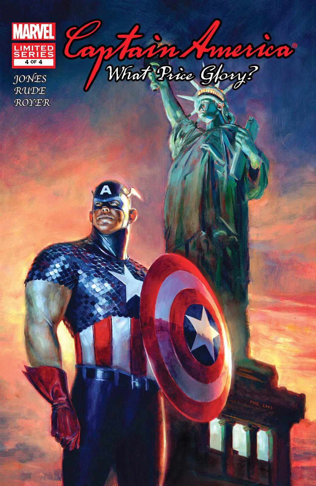
Concluding our tribute to Captain America’s 80th anniversary.
Ah Las Vegas.
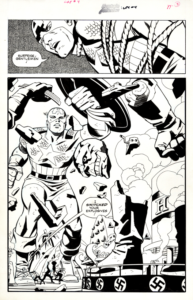
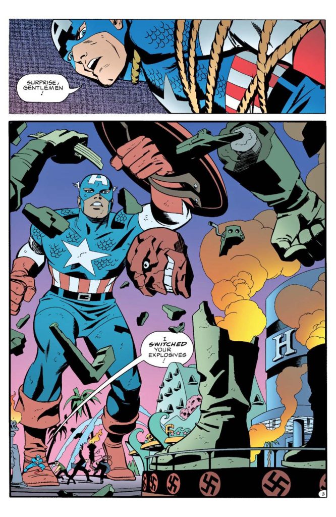
The only place where you are likely to find a giant statue of Captain America, yes? But even Las Vegas wouldn’t have accepted a giant statue of the Red Skull — swastikas and all. (Imagine a giant Patton statue facing off against a giant Rommel sculpture. It does not compute. ) It’s a rare slip in an otherwise fun Cap mini-series penned by Bruce Jones with beautiful visual storytelling by Steve Rude and Mike Royer.
And the good news is that the Skull statue that gets blown to smithereens on this great splash page, anyway.
Happy 80th Mr. Rogers!
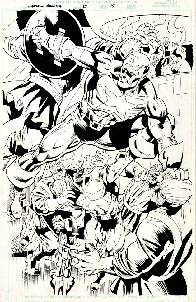
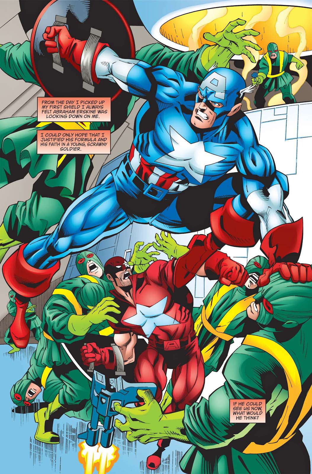
In addition to the obvious Jack Kirby references throughout, Rude manages to work in a Steranko homage on the opening page of the issue. Meanwhile JG Jones delivers a surprisingly boring and stiff painting of Cap on the cover, which, to make matters worse, looks like it belongs to a completely different series altogether.
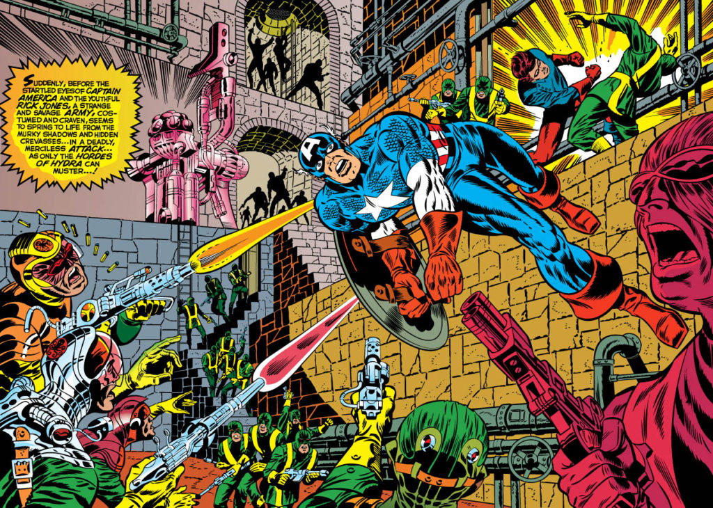
Dan Jurgens delivers a dynamic and powerful splash of Captain America fighting the hordes of Hydra. Whenever I look at this page, I’m reminded of Jim Steranko’s great double page spreads of Cap in action against similar — or — greater odds.
Dan’s splash is not a swipe — and possibly not even a purposeful homage — but its energy captures the spirit of that great Steranko run.
This is the part where I should swipe Stan Lee and say “Nuff said, “ except I would be remiss if I didn’t mention the other main figure on the page who appears at first glance to be The Red Guardian.
He is not. He is, in fact, “Protocide,” an early super soldier experiment retconned into Cap’s continuity — and pretty much retconned out, after the Jurgens run ended.
Now I can say it:
“Nuff Said.”
Steranko’s great splashes always had Cap in mid-air, performing improbable acrobatics against impossible odds!
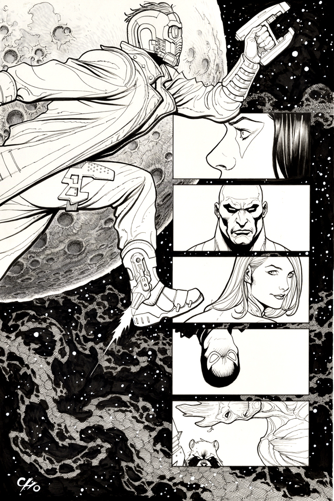
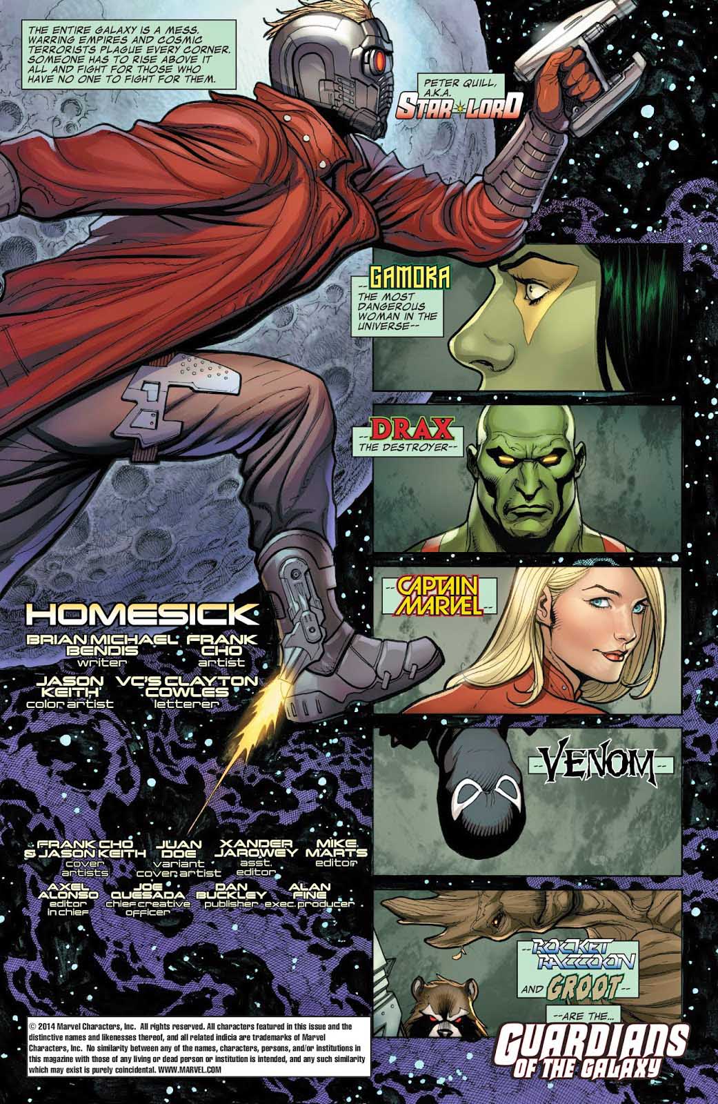
Starlord and the rest of The Guardians of The Galaxy probably never looked as good as they do in this enjoyable one-shot drawn by the incomparable Frank Cho.
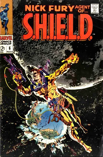
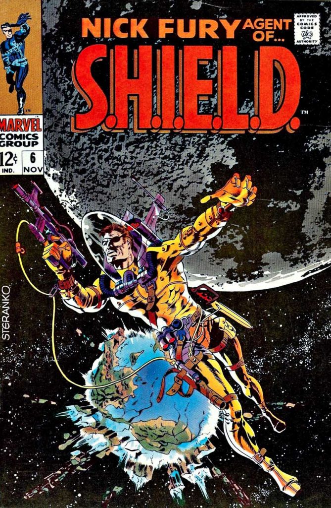
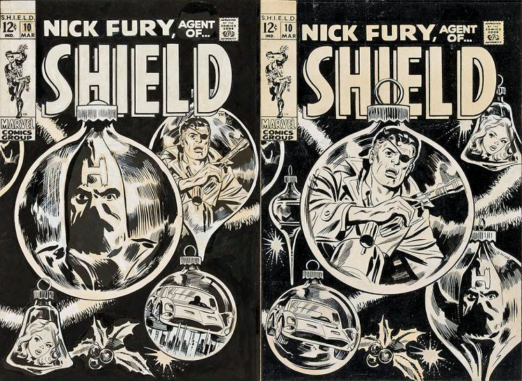
When I first saw this original title splash page offered for sale, it immediately brought to mind to Jim Steranko’s iconic cover to Nick Fury Agent of SHIELD (#6, 1968). It is Itself an homage to Wallace Wood’s classic and incomparable EC science fiction covers.
It was only after I had tracked down the actual comic itself that I realized there was even more to it. Not only had Frank subtly referenced that classic cover with this great opening splash, but he had also taken a more direct route later in the issue. (See below)
And for my two cents, that’s a fun move by Cho and writer Brian Michael Bendis.
In the MCU, Guardians and Captain Marvel both present opportunities to expand the cosmic part of the Marvel Universe. Nova? Adam Warlock? Both have been hinted at in the Guardians films, and, based on anecdotal references in Avengers Endgame, Carol Danvers has been universally occupied during the five year “blip” between the Avengers films.
That opens up all sorts of possibilities to look forward to.
Jim Steranko’s classic 1968 cover alongside Frank Cho’s version — printed page and original art.
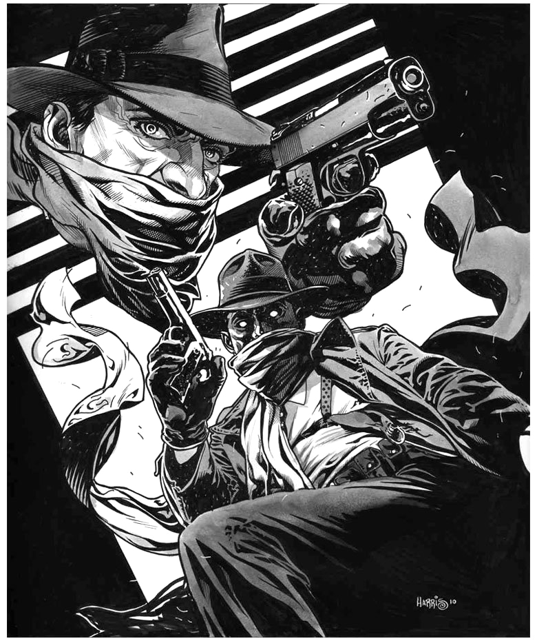
Tony Harris’ brilliant and detailed Shadow commission captures the great noirish elements of the classic pulps.
Those classic pulps: Many comics fans of my generation learned about them anecdotally from our folks (my dad was the perfect age for the pulp heyday) AND “officially” from Jim Steranko’s wonderful 1970 History of The Comics, Volume 1.
Steranko connected many, if not all, of the dots in popular fiction that influenced the Golden Age of comics.
Briefly excerpted below is Jim’s summary of the pulp era:
“Pulps were untrimmed magazines named for the soft paper flecked with shreds of wood on which they were printed. Publishers use pulp paper because there was nothing cheaper available. Pulps had little to do with quality. The key word was quantity! Publishers became successfully relentlessly asking themselves this question: How can I print more books, more often, more cheaply?…
“Many titles were started only to be dropped after a few issues. Some bombed after a single issue. Others scored and lasted for decades. A few were so successful that publishing empires were built around them.
“Pulps measured 9 ½ x 71/2 and 114 to 162 pages between full color enamel stock covers. Most had 128 pages, which usually featured a lead novel of some 50,000 to 60,000 words and half dozen short stories totaling an additional 20,000 words…
Some pulps were issued weekly, some monthly, others bi-monthly or quarterly, but at most times 250 titles were on newsstand display. Every month chalked up a staggering total of twenty month million words!
“Those words told every kind of story imaginable, no plot was too remote, no idea too fantastic…
The pulps were cheaply printed, luridly illustrated, sensationally written, and cost a thin dime.”
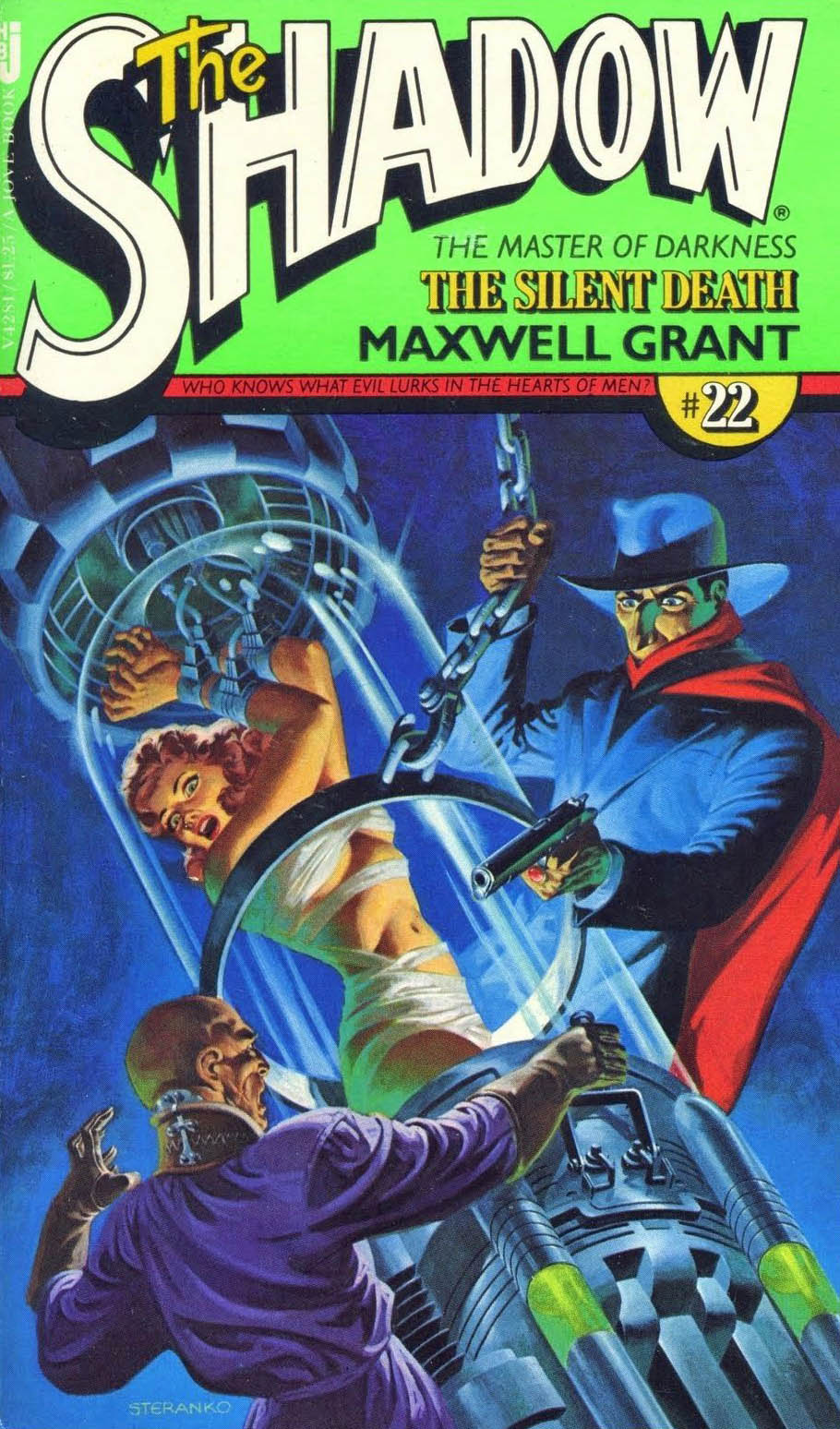
As part of the nostalgia boom that began slowly in the 60s and exploded in the 70s, The Shadow returned to prose fiction with pulp reprints featuring brand new painted covers by Steranko. Jim has taken originals with him to exhibit at conventions on occasion, and the paperbacks while beautiful, don’t do justice to the originals. Trust me.
Continuing a look at SHIELD on the eve of its 55th anniversary.
Jim Steranko is not a hard act to follow.
He’s an impossible one.
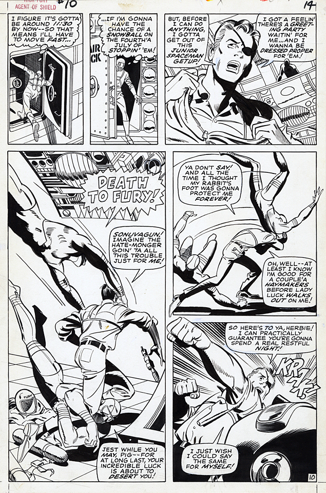
But on the SHIELD solo series, Frank Springer gave it a try. And in possibly another circumstance, it probably would have been fine.
But, like I said, all of sudden SHIELD transformed into an inadvertent real life version of another spy series: Mission Impossible.
Springer, who broke into Marvel with his work on this series actually captured some of the Steranko vibe in these issues. Barry Smith also managed to capture some it in one issue as well, and even Herb Trimpe had a few cool stories before it became a moot point, and the series died.
In a vacuum, the Springer Fury issues, as exemplified by this page, are well told and illustrative. Clear storytelling and panel variety move us through the action quickly and creatively.
But coming off the Kirby-meets-Krigstein pop-psychedelic acid trip of Steranko’s earlier issues, it wasn’t enough to keep the series going.
But of course, Nick Fury, and SHIELD, lived on.
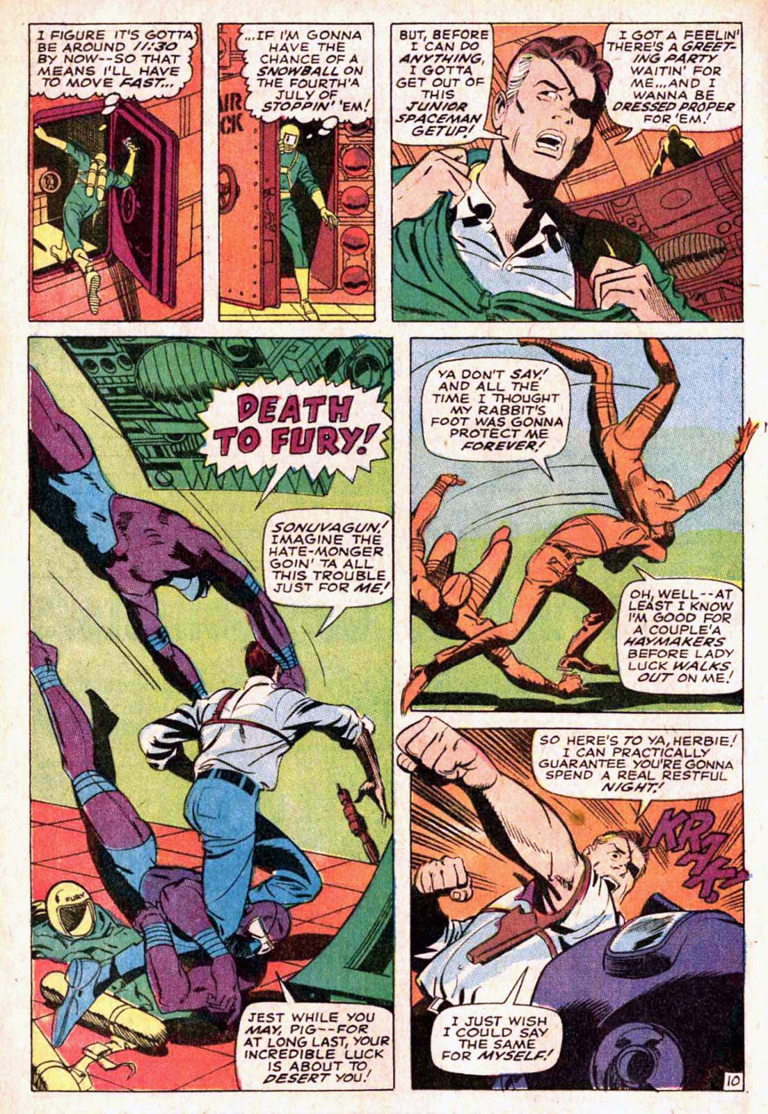
Springer’s original cover (right) had Fury as the “lead”, but it was re-done, with the help of Art Director John Romita, with the villainous Hate Monger as the main emphasis.
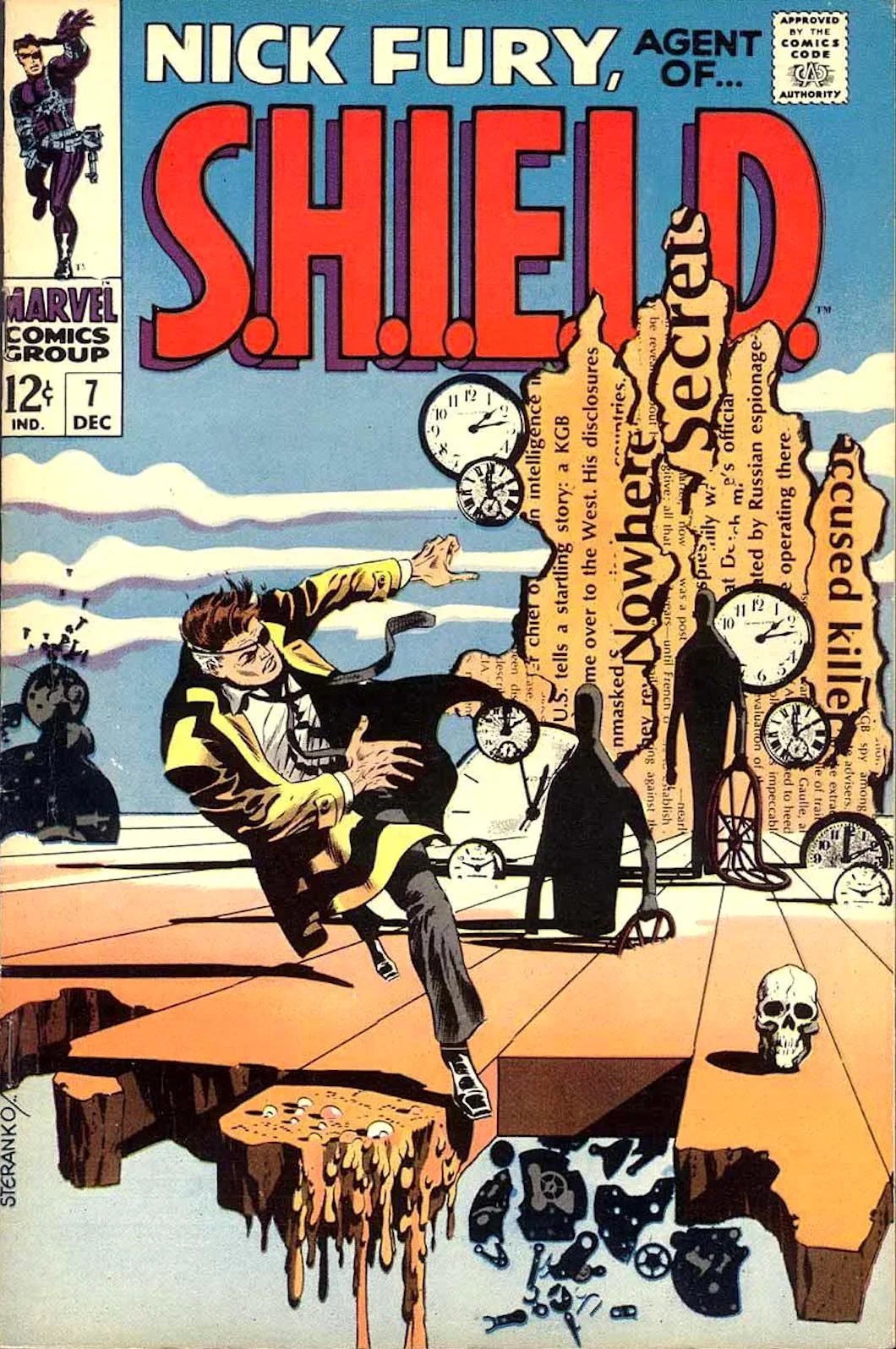
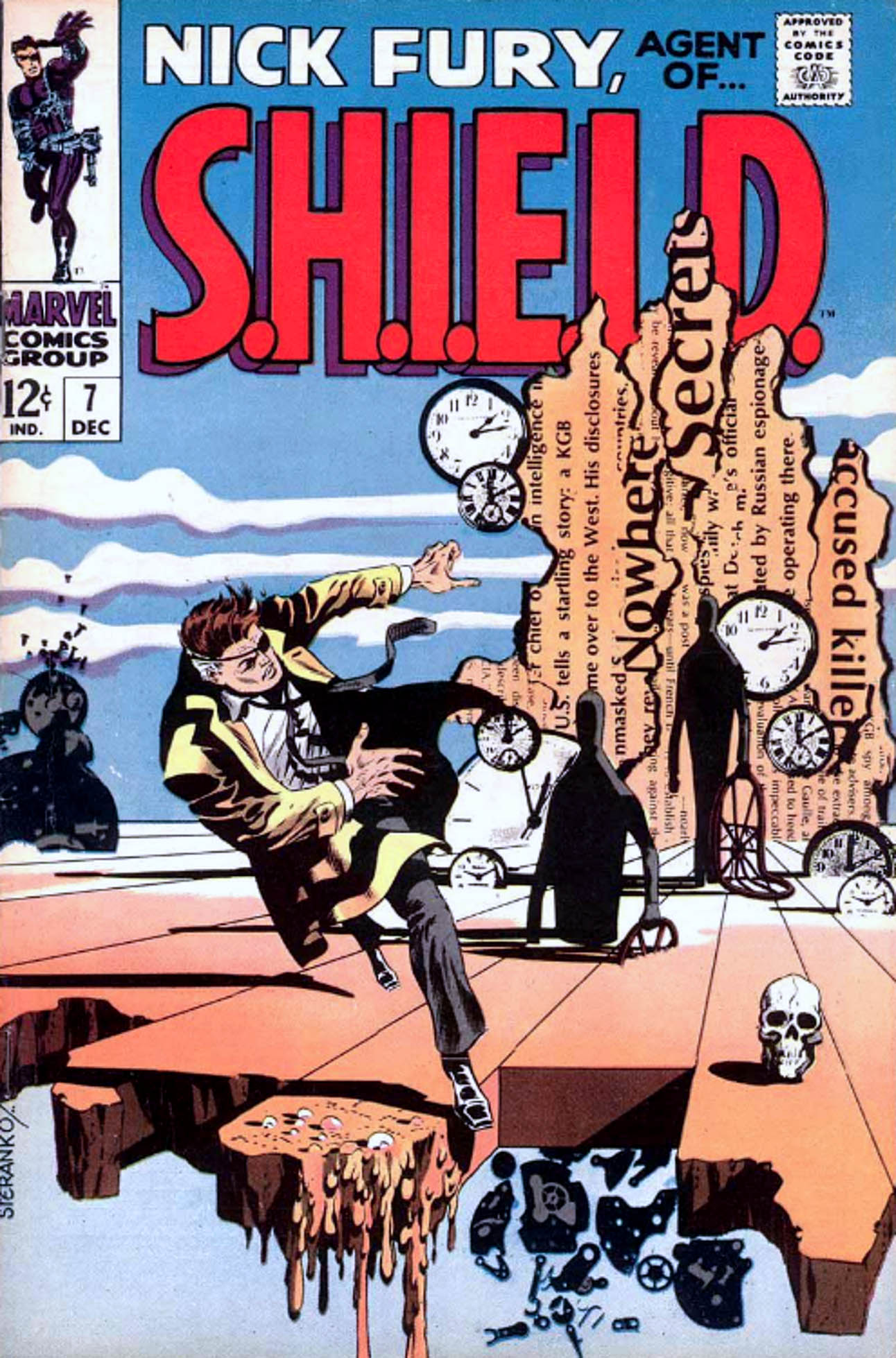
Steranko’s trippy covers for Fury issues five, six and seven channeled Wes Wilson, Wallace Wood, Salvador Dali and much more. Springer’s great splash from issue #10, certainly channeling Steranko… and Krigstein, Eisner, et al…
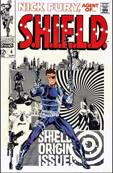
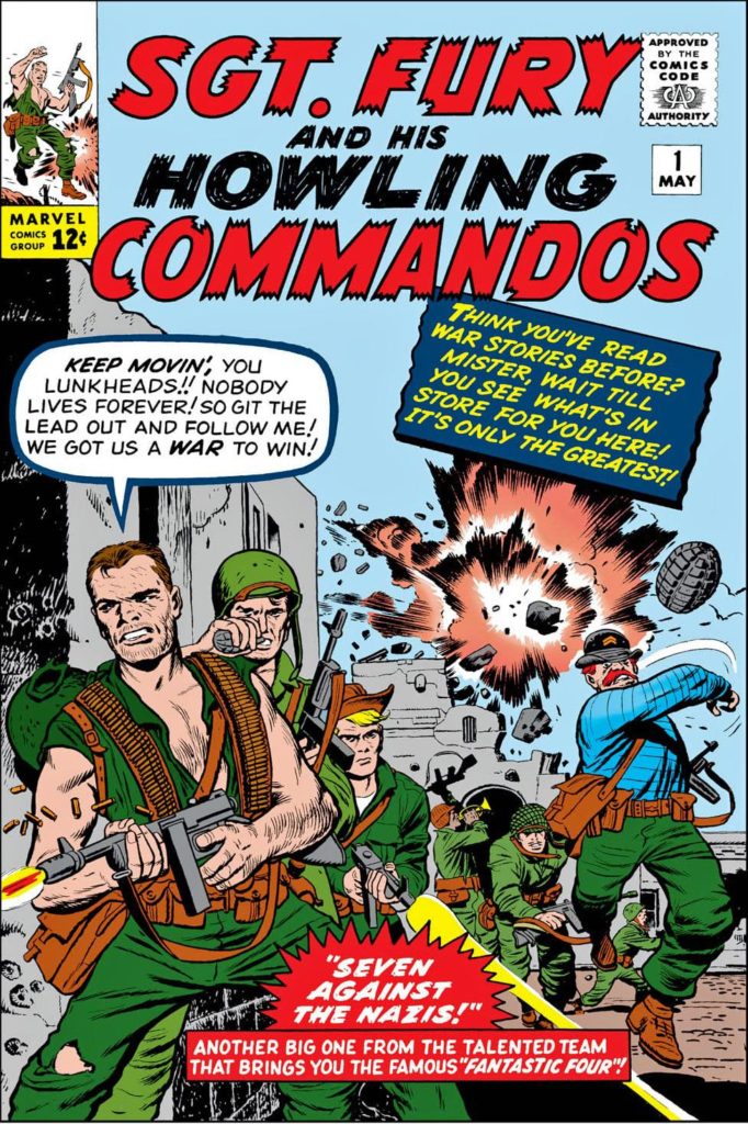
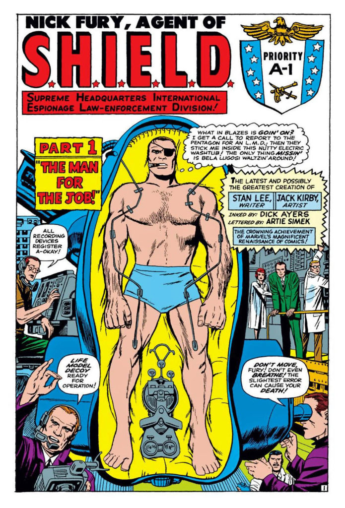
Enter SHIELD, 55 years ago. Nick Fury had already joined the Marvel Universe as WW 2 commando Sgt. Fury in 1963. And he showed up later that year in Fantastic Four, 20 years in the future (present day) as a CIA officer. But now he was ColonelFury, head of the super secret spy agency SHIELD. (Originally, Supreme Headquarters, International Espionage and Law-Enforcement Division.)
In 12 short pages, we are not only introduced to SHIELD, but the villainous Hydra (Not an acronym, one of the few) and of course those great gadgets like the crazy heli-carrier. Comics, as noted previously, do not have budget constraints. Artists can go wild, and as we know when it came to wild tech, Kirby always delivered. All the bells and whistles of the Bond films, plus much, much more.
As a very young reader, I appreciated that Fury was a unique character; living in two different eras, in Sgt. Fury and in Shield. And that he interacted with Captain America and Reed Richards (Mr. Fantastic) in both of those eras.
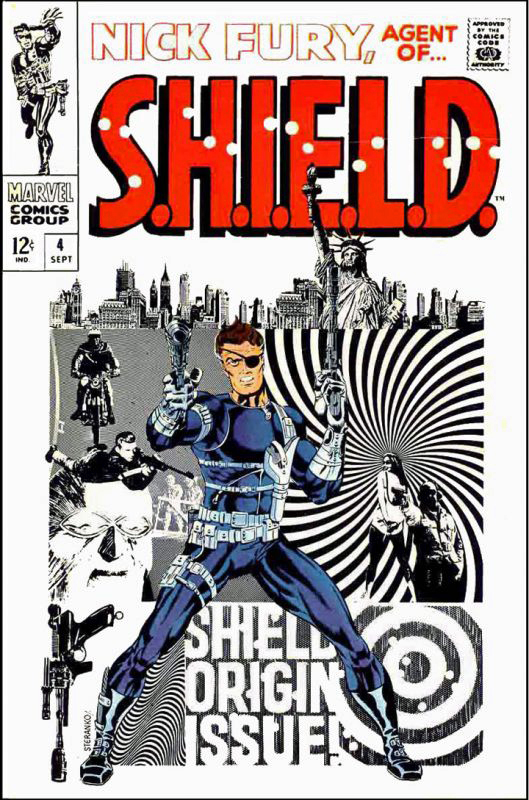
SHIELD was another great Lee and Kirby creation, but the series became something extraordinary when Jim Steranko took over, first pencilling over Jack’s layouts, and eventually writing, pencilling, inking and even coloring some those epic SHIELD stories himself. (More on that in the next post.)
Dave Bullock’s modern cover is a pseudo-homage to one of Steranko’s great Shield covers, SHIELD # 4, with the uniform almost identical, minus the dagger on the boots. The background references the groundbreaking pop psychedelic look that Steranko himself was creating at the time.
If Marvel ever decided to create a SHIELD animated series, I’d want it to look exactly like this.
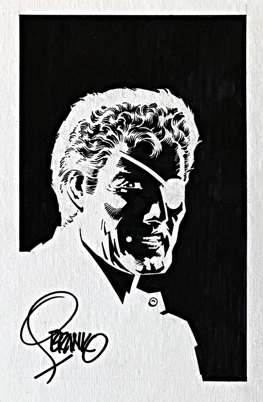
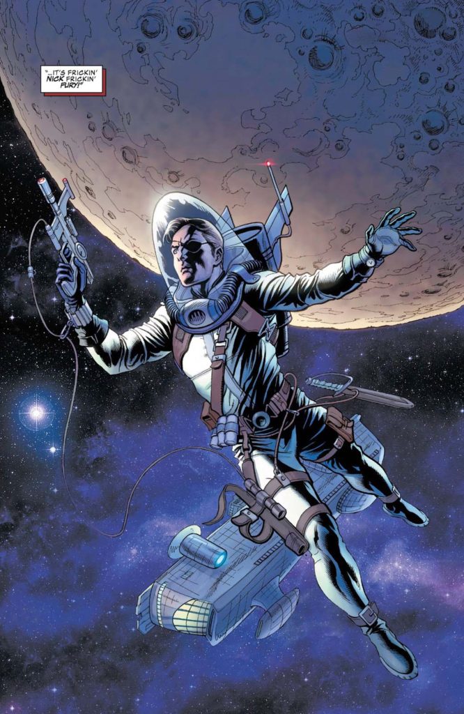
Nick Fury started as a WW2 commando and evolved into director of SHIELD. Marvel ultimately retconned a war injury to fully explain the eyepatch.
Fury weaved into the bigger Marvel universe, past and “present”(60s) with Captain America, Tony Stark, Reed Richards and others.