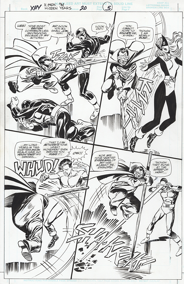
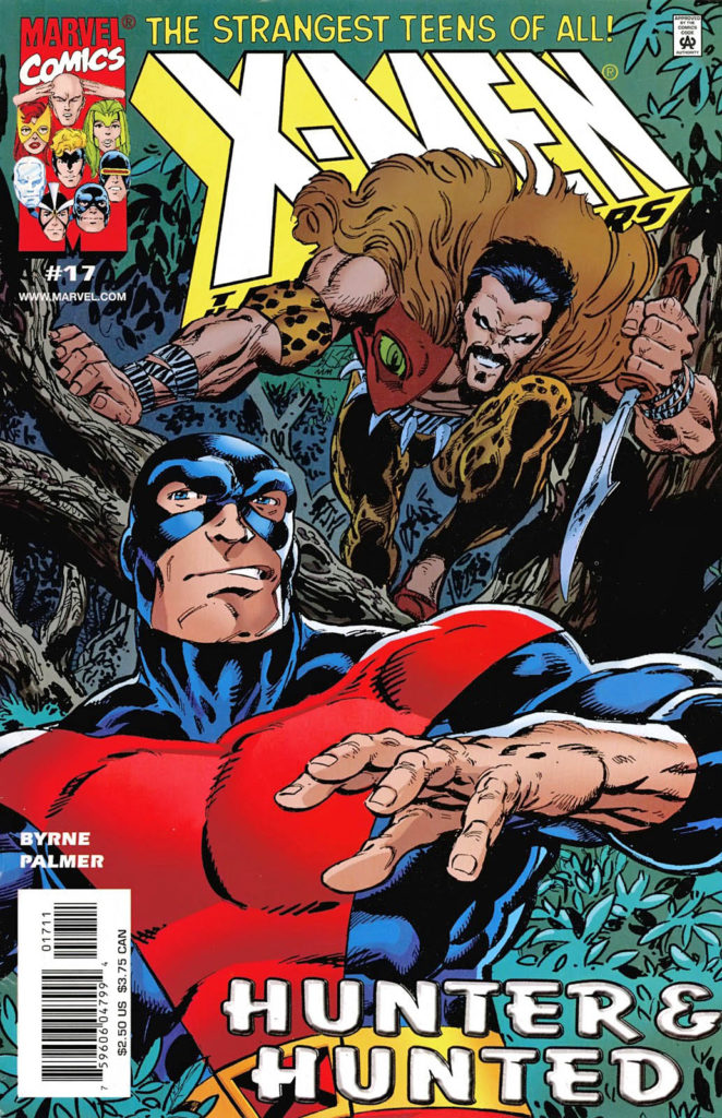
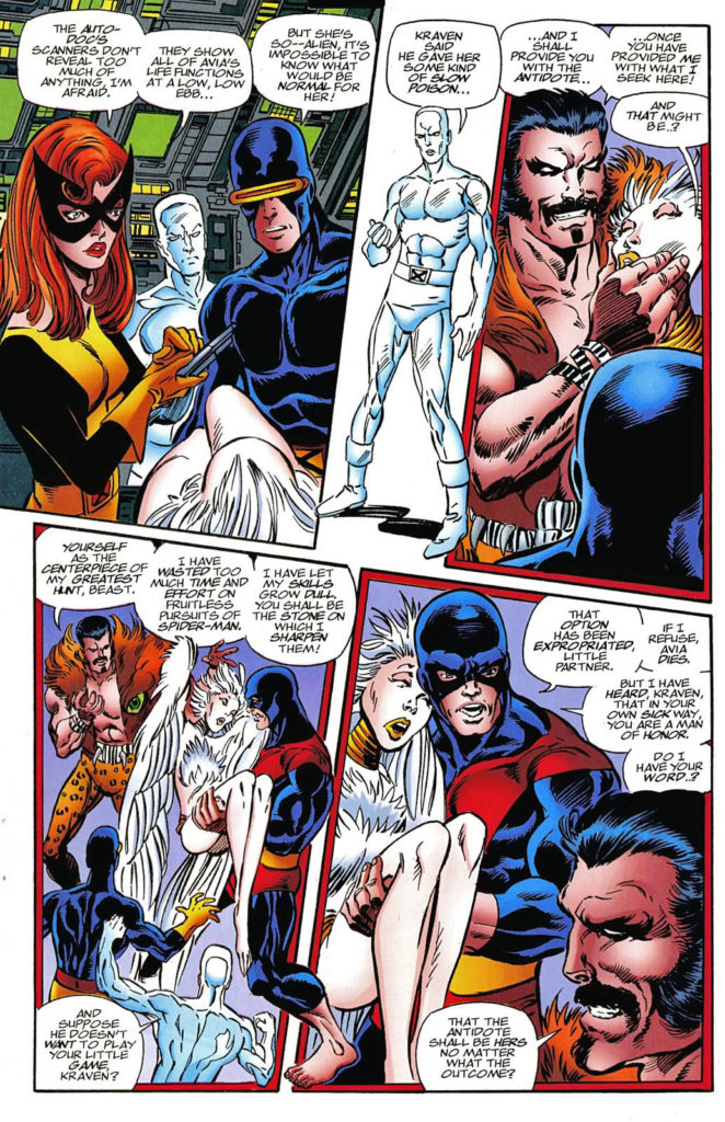
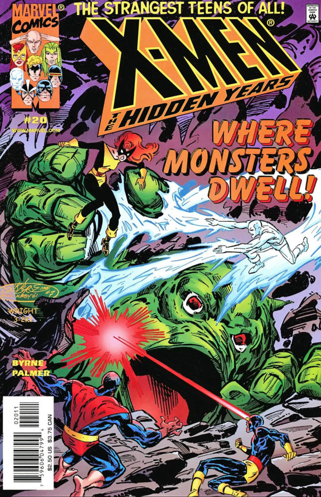
X-Men: The Hidden Years # 17, April 2001 & #20, July 2001
John Byrne returned to the X-Men in 1999. Not his beloved X-Men of Wolverine, Storm, Colossus and Phoenix, however. This time it was the “original” X-Men — in the period between their cancellation and rebirth. The “Hidden Years.”
It’s an often overlooked series and shouldn’t be. John brought great energy — and closed some outstanding story loops — in the 22-issue series.
Inks are by the terrific Tom Palmer, which gave the series a
classic look, reminiscent of those great original Neal Adams issues, while still
keeping it clearly Byrne.
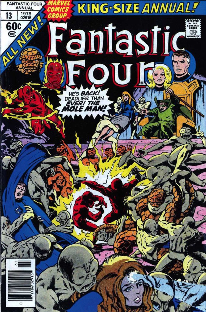
Lots of fun guest appearances in the series as well, including the Fantastic Four — inked in one issue by the legendary Joe Sinnott.
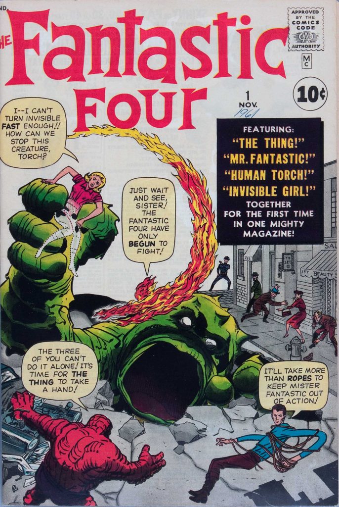
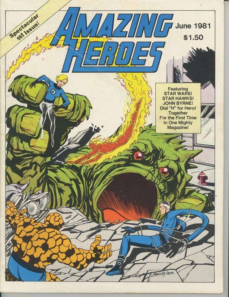
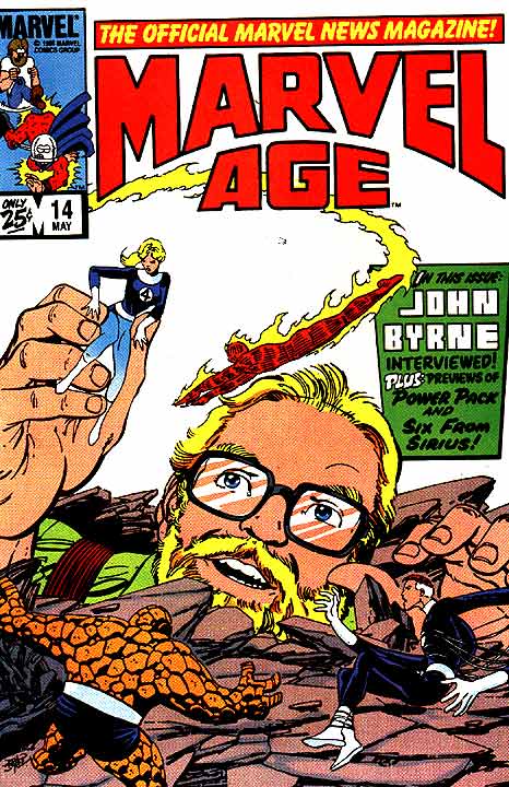
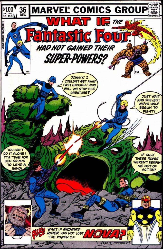
X-Men: Hidden Years #20 is a Byrne homage to Jack Kirby’s Fantastic Four #1. It was the sixth (and final) Marvel-related FF #1 homage that John drew.
It’s the 50th anniversary of the original title’s cancellation (Issue #66). It had struggled to find consistent commercial success or creative direction for much of its original seven-year history.
It’s the 45th anniversary of the X-Men’s
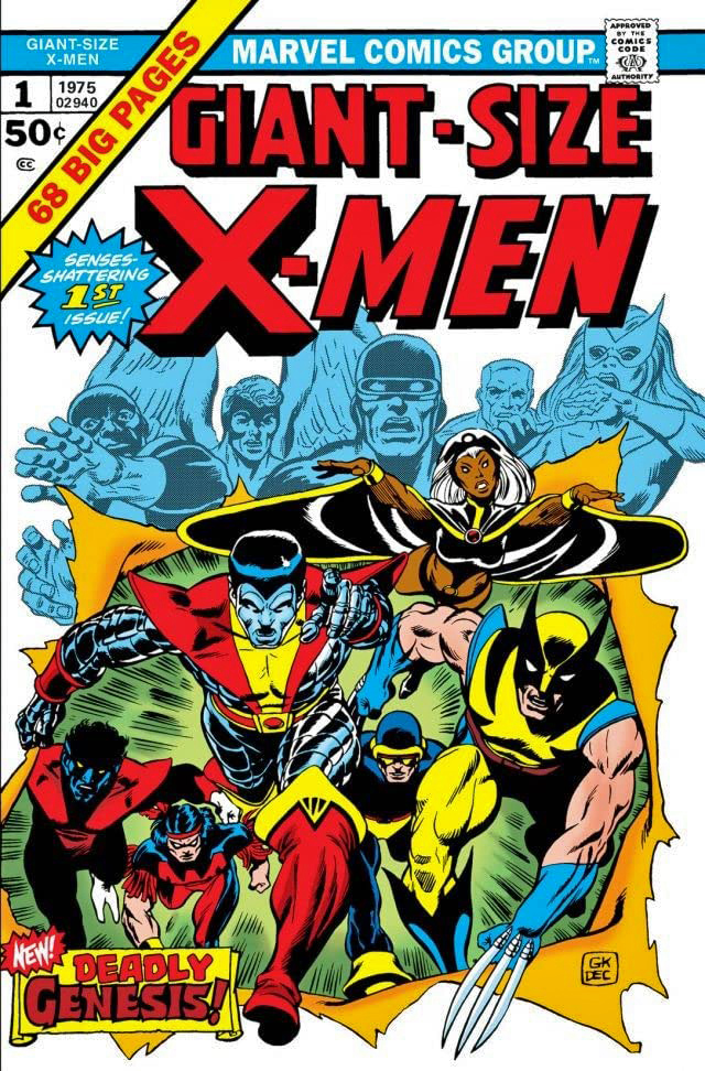
“comeback” with the launch of Giant-Size X-Men #1, possibly the greatest rags
to riches story in comics’ history. If anyone else can tell me where a book
goes from cancelled to a company’s most popular title in less than 10 years,
I’m all ears.
And, perhaps more importantly from a broader pop culture perspective, it’s the 20th anniversary of the X-Men film franchise from Fox, which concludes forever in a short while with the release of the problem-plagued New Mutants. (Postponed many times, it was most recently scheduled for an April 3 theatrical release, and has now been indefinitely delayed because of the COVID-19 outbreak.)
The first X-Men film launched 8 years ahead of the MCU, and
in my mind, established what a Marvel film could do in terms of both creativity
and commercial success. It paved the way for what was to come.
Meanwhile, we have this great commission by John Byrne.
John Byrne. X-Men. Not much to add here except a few
details.
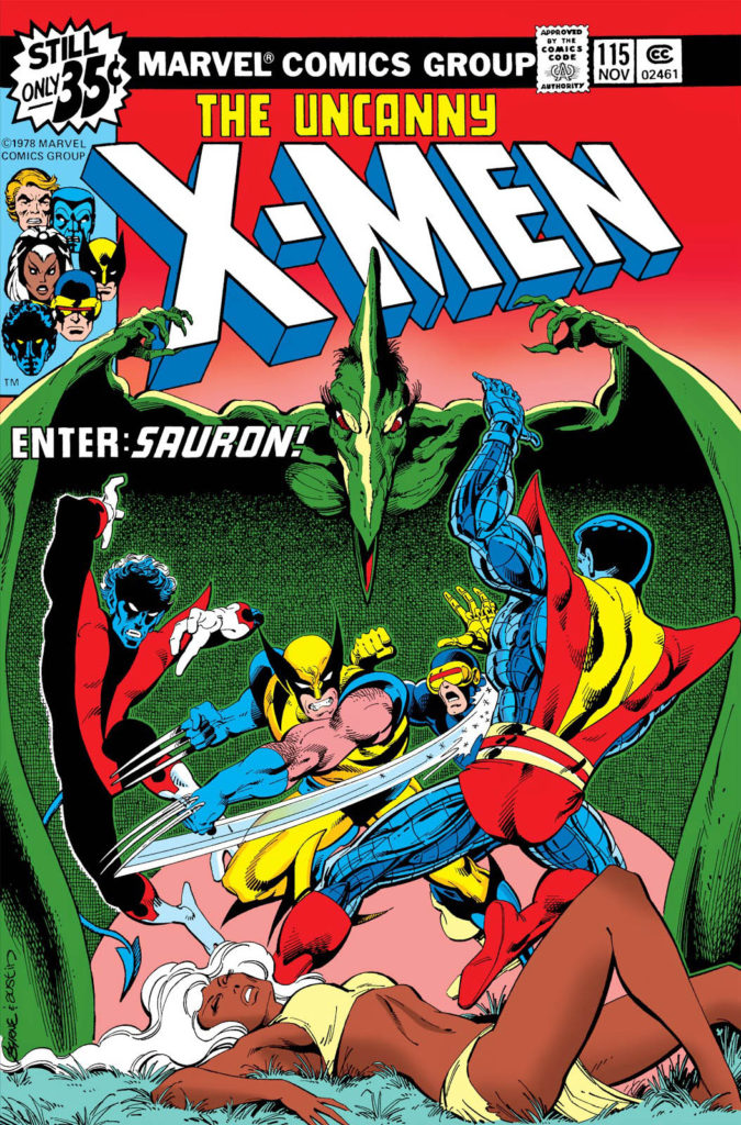
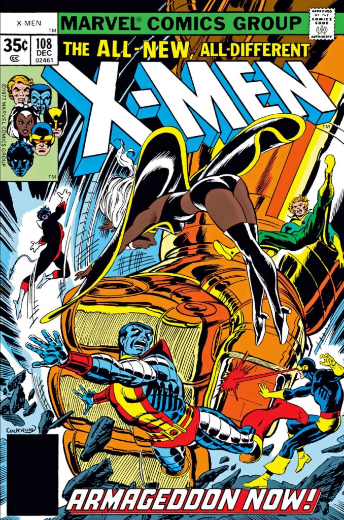
This is a Byrne re-imagination (as John calls them, I believe) of the cover of X-Men # 115 featuring the dinosaur villain Sauron. The re-imagination is more dynamic and dramatic than the original, which was only John’s third cover on the book. Dave Cockrum had a few in the can when Byrne took over art duties on issue #108.
Byrne’s commissions can be found easily through a Google
search and there a lot of great ones — at sizes up to 30x 40!
Unfortunately, John’s not doing much if any in the way of commissions right now as he is spending time on his X-Men fan fiction (his phrase) but if you want to keep fingers crossed that he will take them up again, you can contact his art representative, Jim Warden.
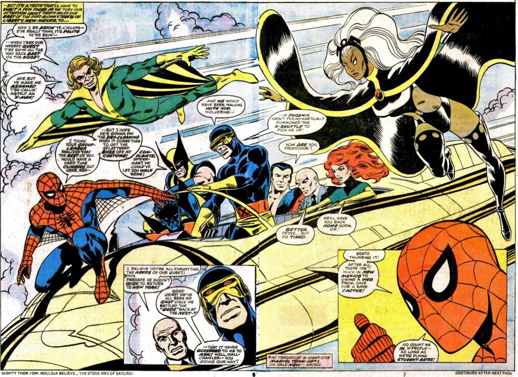
John’s Commission is closer in spirit to this great original double-page spread from #115.
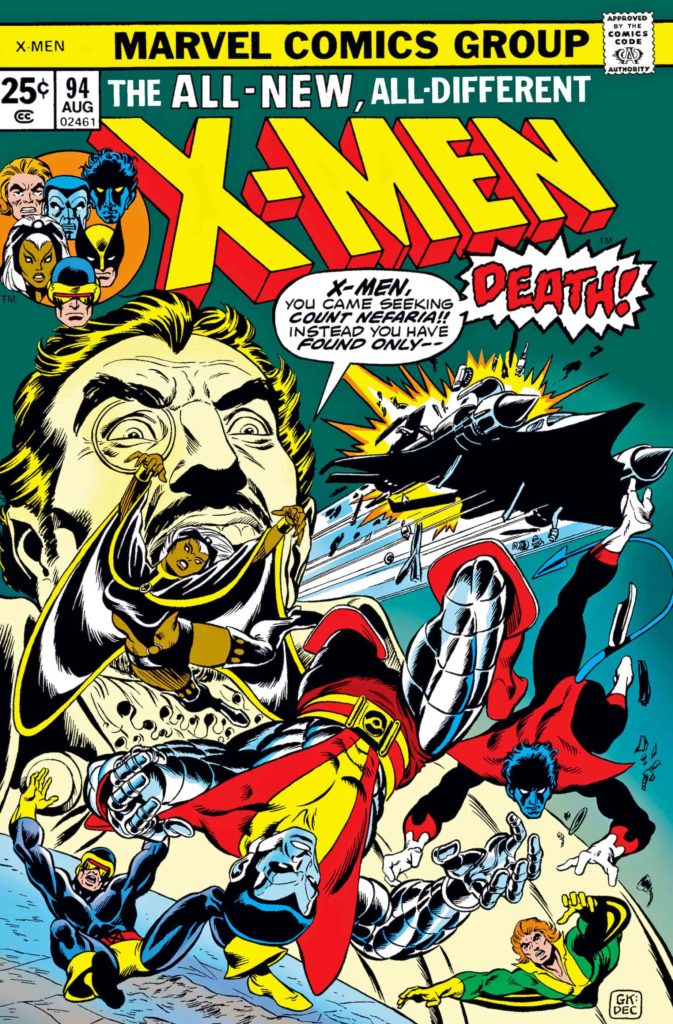
The X-Men rebirth began here in Giant-Size #1 and X-Men #94, both 1975.
Byrne’s earliest X-Men work: His first issue (#108, cover by Dave Cockrum) preceded by a guest appearance in Marvel Team-Up #53, featuring another great DPS.
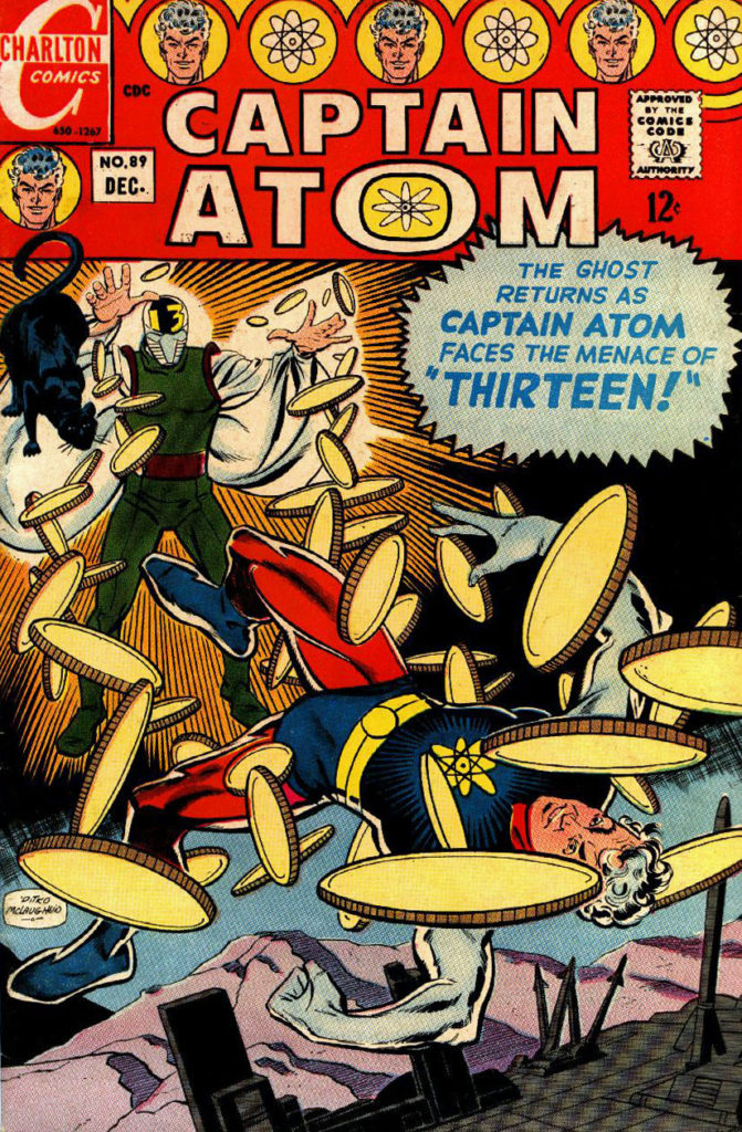
Captain Atom # 89 (1967), Re-creation By Frank McLaughlin, 2012
Concluding our series on the roots of the Watchmen characters.
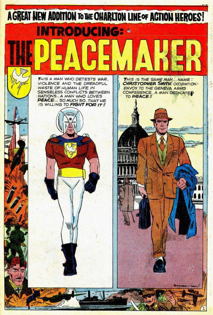
Charlton’s haphazard and often erratic publishing strategy certainly didn’t help sustain its line of superheroes. (Or “Action Heroes,” since technically, superhero is a joint trademark of Marvel and DC. But I digress.) Captain Atom #89 is the final issue of that series, and within a year all of the (mostly short-lived) action heroes were toast.
They wouldn’t return until about seven years later, when Charlton deciphered the burgeoning fan market. The company endorsed the superhero-themed Charlton Bulletin in 1975, a fanzine that included among other things, Steve Ditko’s unpublished penciled story for the cancelled Captain Atom #90. They asked a young Charlton freelancer by the name of John Byrne to ink it.
Byrne is among many talents with early careers at Charlton. Others include Dick Giordano, Jose Garcia Lopez, Jim Aparo, Bob Layton, Denny O’Neill, and Mike Zeck, Also on that list: Inker (and Charlton Art Director) Frank McLaughlin, who inked Ditko’s original #89 cover and re-created this version above.
As for Captain Atom? DC purchased him and the rest of the Charlton superheroes from the financially struggling Charlton in 1983, and they made their first DC appearance in Crisis on Infinite Earths (1985). Since then, he (and the rest of the gang) ultimately lived on in the pages of DC, of course, which was the point of Editor Dick Giordano not letting Alan Moore use those exact characters for Watchmen.
Alan, as we have discussed, was not deterred, and created his own versions of the characters.
Ironic, since those original Charlton characters could barely raise an eyebrow, and yet we are still talking about Moore’s Watchmen today.
The original and published art for Captain Atom #89. Frank’s red-do is faithful, but makes a few changes.
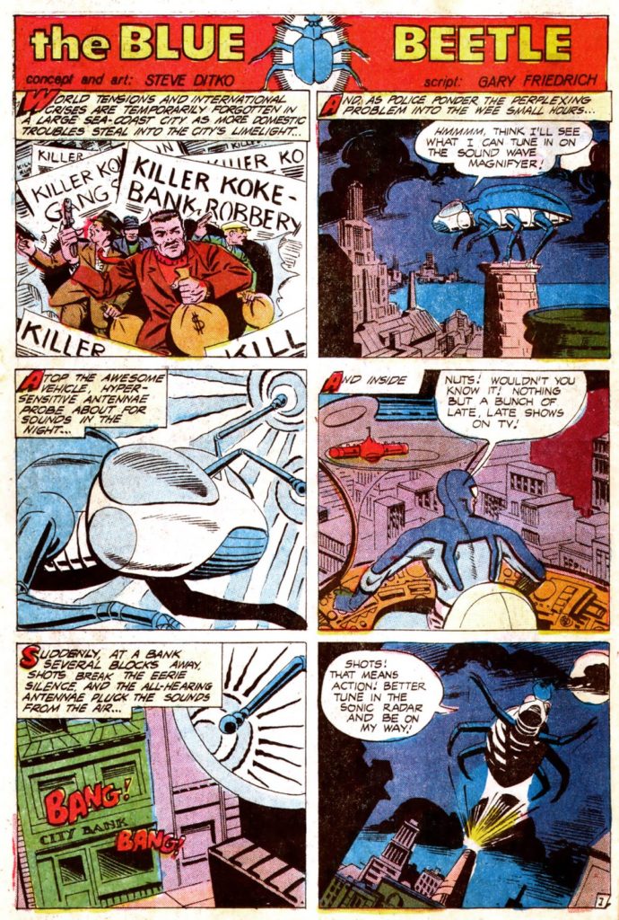
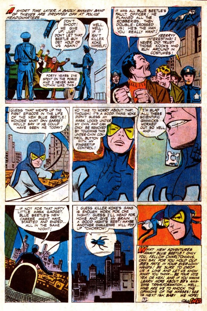
The first and last pages of Steve Ditko’s Blue Beetle re-do, from a backup story in captain Atom Atom #83.
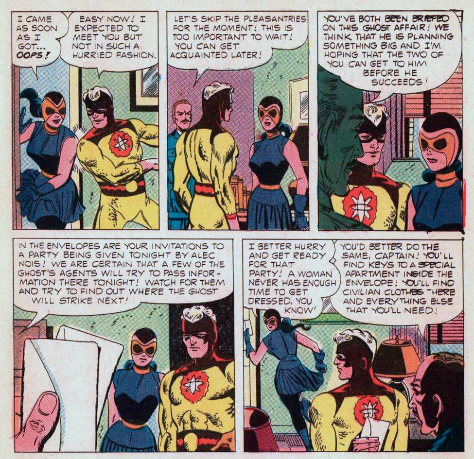
The introduction of Nightshade. 1966 or not, the handling of the character earns an “ouch.”
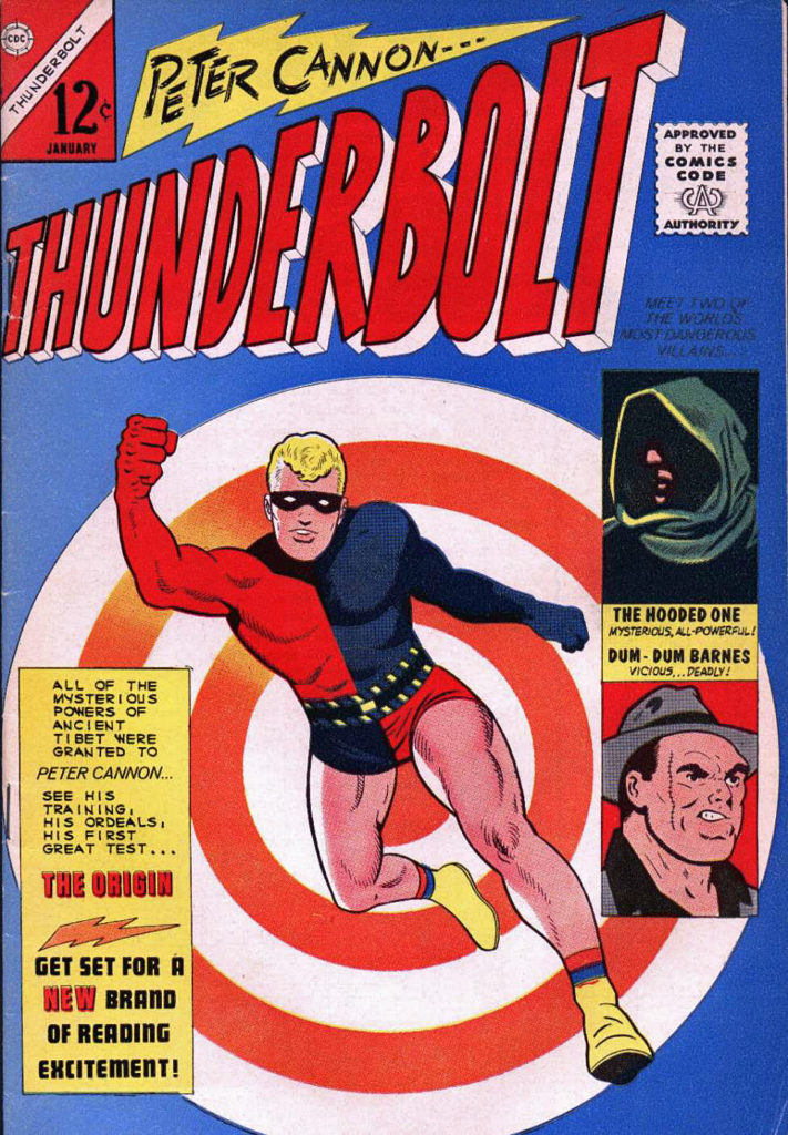
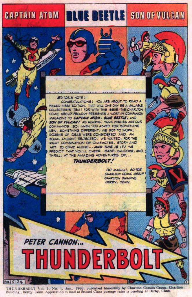
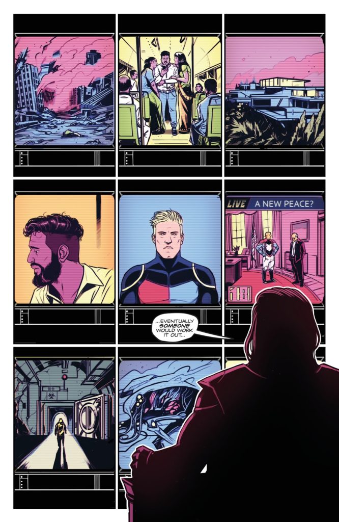
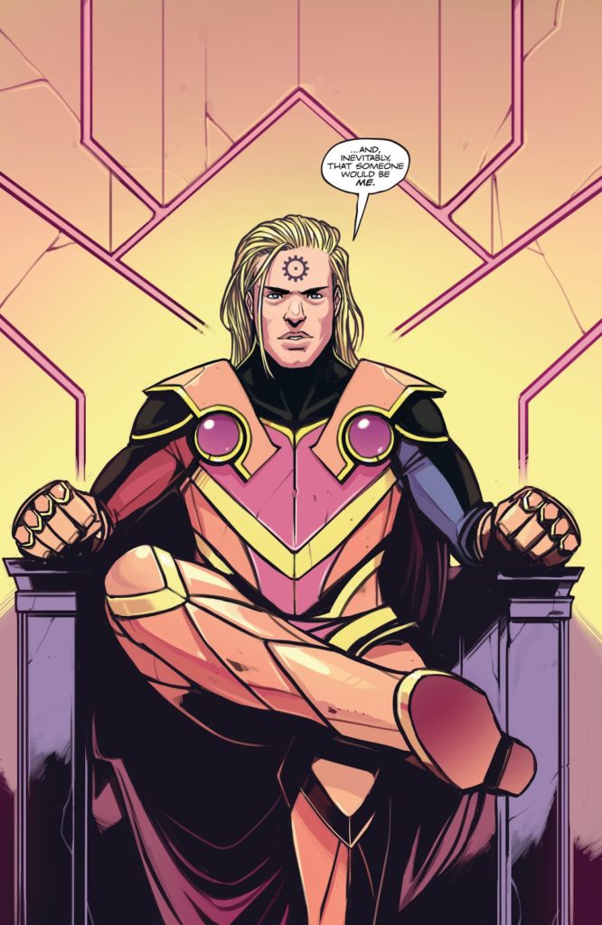
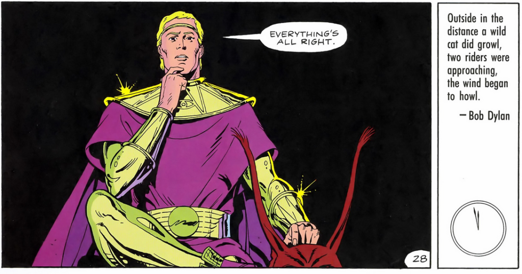
Thunderbolt makes an entrance, and exits a short time later. He precedes the re-dos of Captain Atom and Blue Beetle in 1965. (And he takes over the Son of Vulcan title, who is never truly considered part of the Charlton main superhero universe.)Meanwhile, the rights reverted back to creator Peter Morisi, and Thunderbolt now has a home at Dynamite Publishing, where he feels a lot like… Ozymandias.
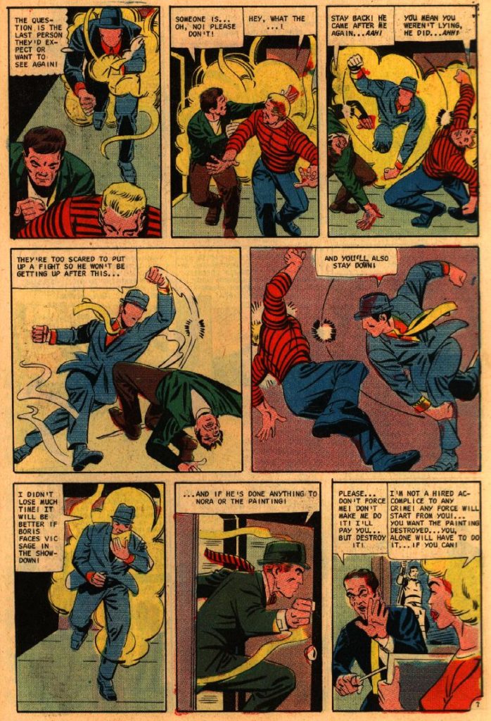
The Peacemaker steps up and Captain Atom celebrates his new uniform and power abilities. And The Question makes his final appearance in Blue Beetle #5 (1968), which inexplicably appears on the newsstand nearly a year after issue # 4.
Final tally Watchman —
Nite Owl 2 – Blue Beetle 2 Silk Spectre 2 – Phantom Lady/Black Canary/Nightshade Comedian – Peacemaker/Shield Dr. Manhattan – Captain Atom Rorschach – The Question Ozymandias – Peter Cannon, Thunderbolt
Continuing our ongoing celebration of Marvel’s 80thAnniversary.
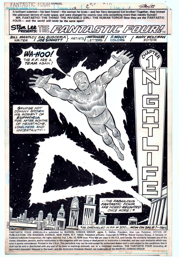
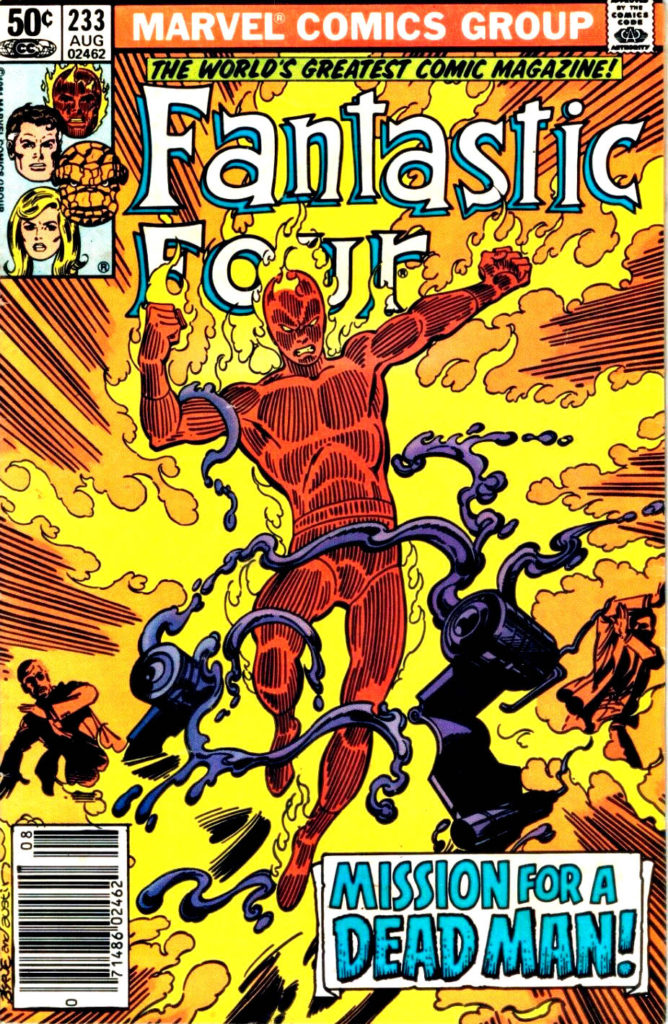
Sal Buscema and Joe Sinnott deliver an iconic (and terrific) image of the Human Torch in this celebratory opening splash page.
Celebratory in that the Fantastic Four had just gone through a quirky period editorially where they were essentially “broken-up”, and they have reunited in FF #200, on-sale at the same time.
At this point in the run, Joe Sinnott, acknowledged as one of the all-time greats, is pretty much the only consistent through line in the FF — the series was rapidly going through a number of mix and match creative teams. In a three-year period, Joe inks pencillers Sal Buscema, John Buscema, Keith Pollard, Rich Buckler, Ron Wilson, and of course George Perez, who does some of his best known work in this era. (Shortly after this issue is published, Joe adds John Byrne and Bill Sienkiewicz to this mélange.)
Sinnott’s credits, including this one, are often categorized as “finishes” during this timeframe, as many of the pencillers are providing breakdowns only. Doesn’t help enough with the schedule though, as a number of issues are reprints and fill-ins. Marvel, as others have noted, was going through some difficult times. The Fantastic Four themselves wouldn’t truly find their full footing again until a few years later, when Byrne fully takes over writing and art chores.
As for Joe and Sal? With the end of the Spider-Man newspaper strip this year, Joe officially retired from inking … at age 92. Sal (age 83) “retired” in 2000, but continues to be coaxed into working — sometimes by my former colleagues — to this day.
“Flame on!”
So many interpretations of the Human Torch, so little time.
In his earliest appearances, Johnny Storm, the Silver Age Human Torch looked a bit more like the Golden Age version (more flame, less body definition) ultimately evolving to his more familiar form. Meanwhile, the Golden Age Torch, who (with the help of some of clever retconning) eventually makes a comeback in the modern era, appears to look more like the silver age version.
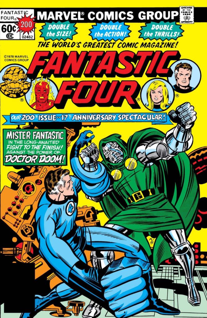
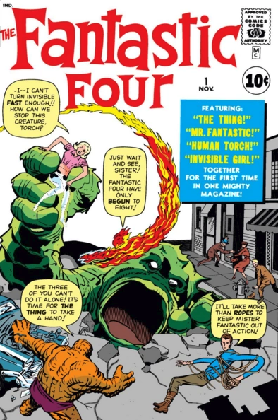
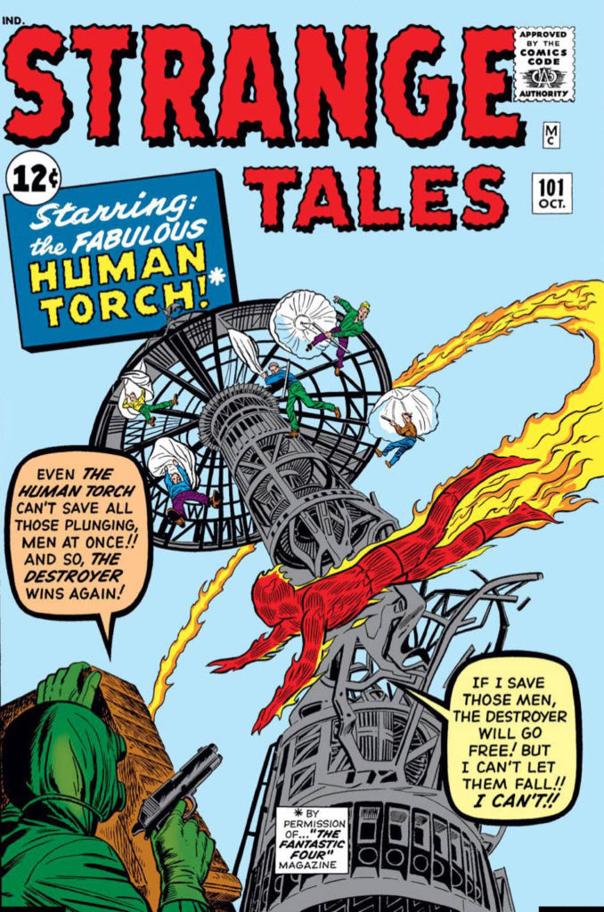
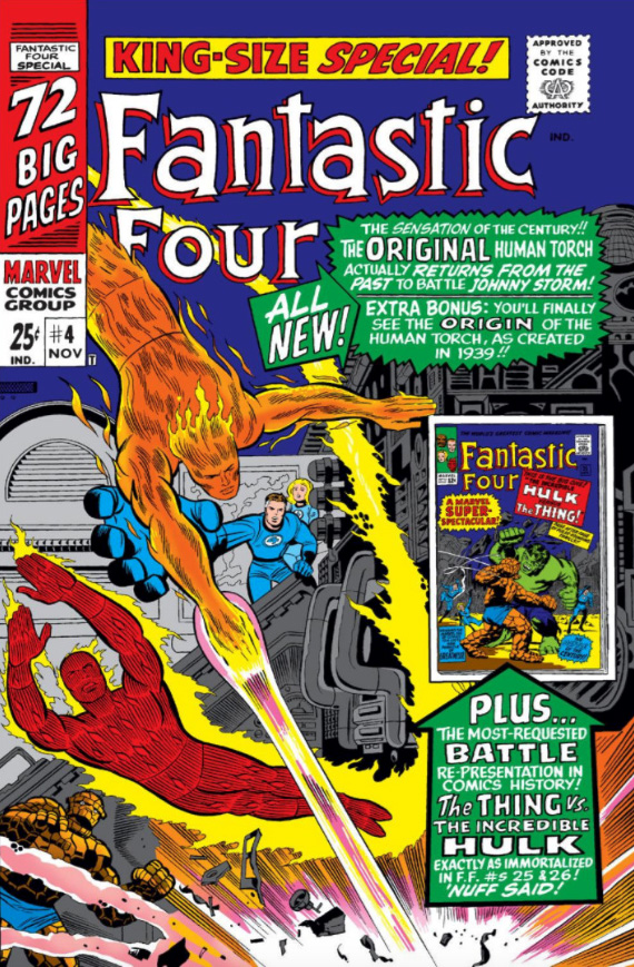
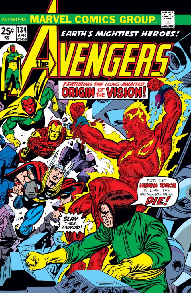
Above: The first appearance of the Silver Age Torch, Johnny Storm, in Fantastic Four #1 (1961) followed shortly thereafter by his first solo outing in Strange Tales #101 (1962) and ultimately followed by a clash with the “original” Torch in FF Annual #4 (1966). The Golden Age Torch returns in Avengers #133- #135 (1975), and revives yet again to join the West Coast Avengers during John Byrne’s run. (Avengers West Coast #50, 1989)
Part three of a multi-part series celebrating Batman’s 80thbirthday.
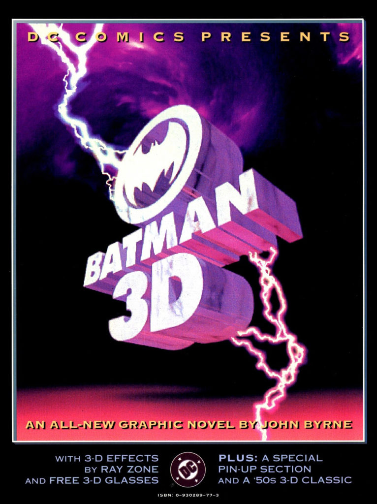
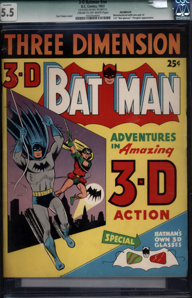
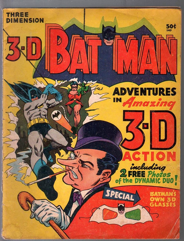
I missed this story, published nearly 30 years ago, the first time around. I don’t care much for 3D in media — comics, film, etc. And this cover didn’t do anything for me. I probably never even noticed that it contained a new story by Byrne, since his credit is poorly noted at the bottom. I’m guessing I thought it was a straight reprint collection at the time.
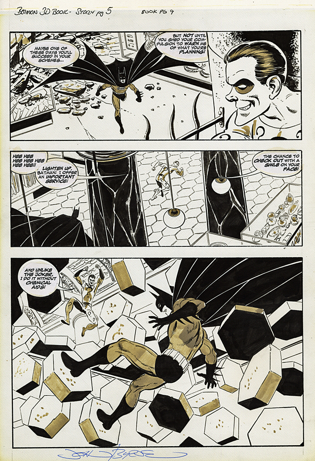
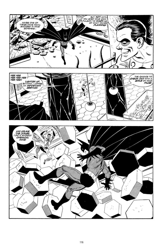
Well, the joke is on me. This is great Byrne Batman art, a fact that’s pretty obvious when examining the original pages.
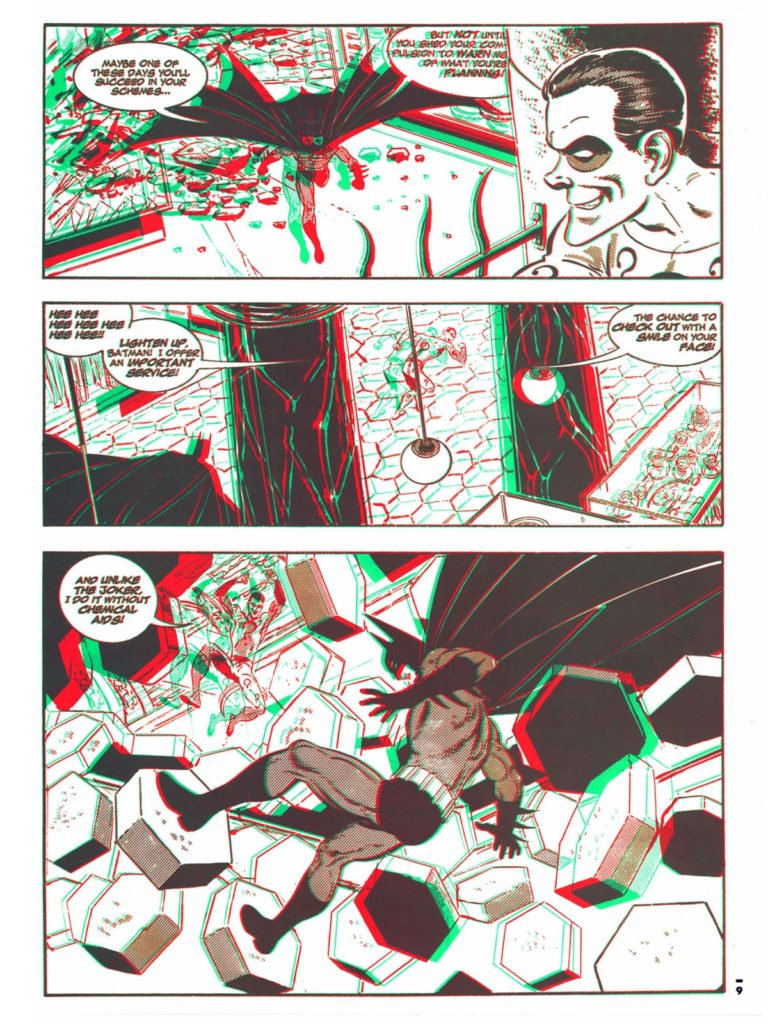
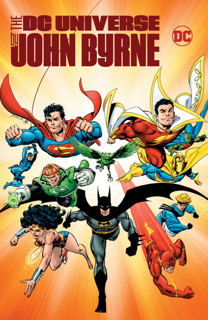
The story itself is fine and, in support of plot, Byrne brings in Two-Face, Joker, Penguin, and of course, the Riddler. Art-wise though, the 52-page story is gem, featuring many catchy and dynamic pages. Byrne may have created the story to take advantage of 3D effects, but it works perfectly well in traditional form, as evidenced by its recent black and white reprinting in the DC Universe by John Byrne Omnibus (2017).
But… Black and White? No budget for color? Batman? John Byrne? Really?
Hey DC — how about coloring it for its 30thanniversary next year and issuing it in deluxe format one-shot?
Happy Halloween! Today we wrap up our two-week series celebrating the best in monsters, mystery and mayhem.
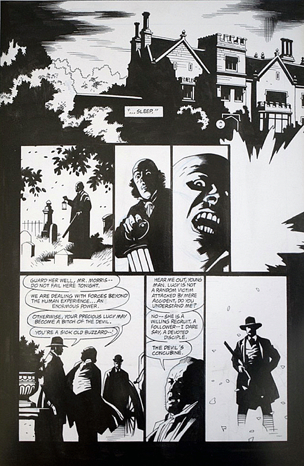
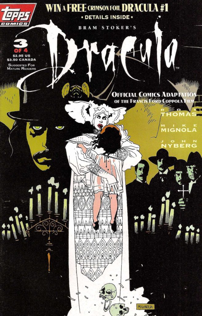
Here’s a sweet page from Roy Thomas and Mike Mignola’s adaption of Francis Ford Coppola’s 1992 film, Bram Stoker’s Dracula.
Fun Fact: All the pages in this adaption are “sweet.” There’s not a miss in the bunch. In fact it’s one of the best looking of any film adaptations ever done in comics. (Top of mind, only Archie Goodwin and Walter Simonson’s Alien graphic novel is in the same league.)
It’s also fair to say that while the film itself is fine (mixed reviews when it was released), the comics adaption itself is actually better.
Fun Fact: Coppola liked Mike’s art so much he hired him to provide illustrative material for the film itself, and Mike’s work is credited in the movie.
Fun Fact: The title was the launch project for Topps Comics, and was in development prior to the hiring of an actual Editor-In- Chief. (Jim Salicrup.)
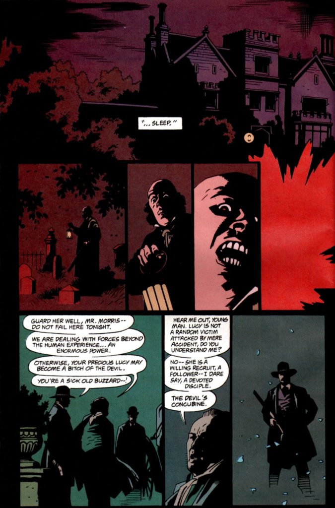
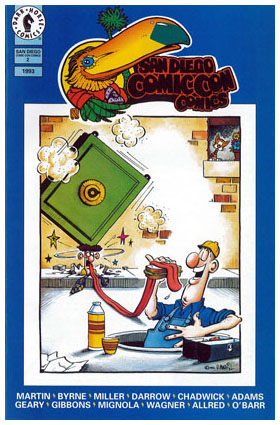
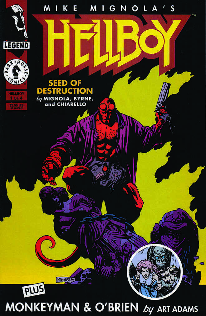
Fun Fact: John Nyberg inked the series in spectacular fashion— it’s astonishing how anyone but Mike could make it so “Mignola-like,” but John nails it. The brilliantly effective coloring is by Mark Chiarello, who later colors the first full Hellboy series, Seed of Destruction. (Hellboy himself appears for the first time just a few months after Dracula concludes in an SDCC giveaway comic book.)
Fun Fact: For many years, Dracula was a lost classic — one of the few major Mignola projects not in print — for more than 20 years. I personally chased those reprint rights for 10 of those 20. Sometimes, insane tenacity pays off.
Fun Fact: It’s the first comic book I ever worked on professionally, and its reprint was one of the final projects published prior to my departure from IDW. (I will have to figure out a way to bring another version to my next publishing home. Ha.)
Fun Fact: Despite one of the best looking comic book series ever, it’s unlikely there will ever be an “artists edition” style book. The originals are scattered to the wind, and only occasionally offered for sale. I consider myself fortunate to own this one.
First story appearance of Hellboy, SDCC comic, July 1993
First color appearance of Hellboy, script by John Byrne, December 1993
Continuing a two-week series celebrating Halloween with the best in monsters, mystery and mayhem.
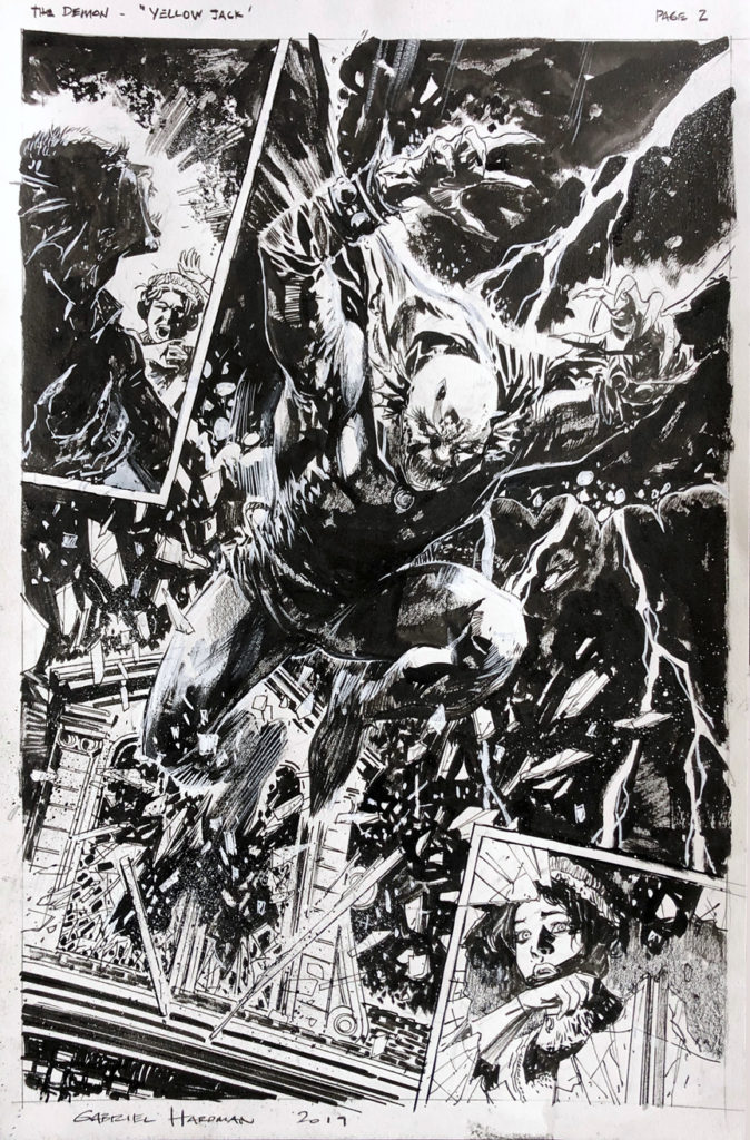
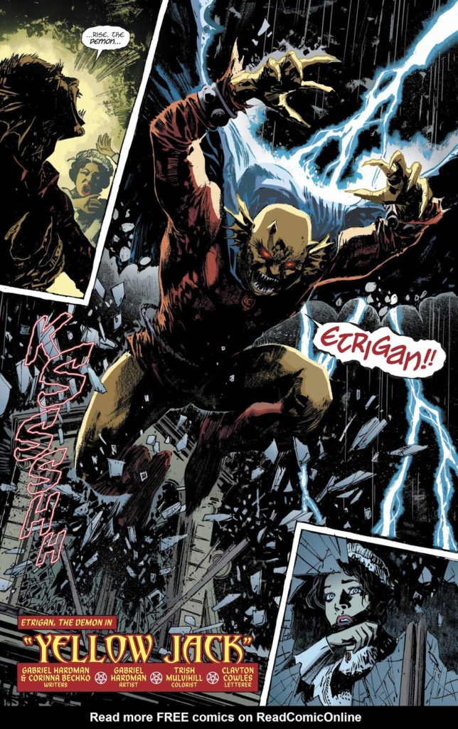
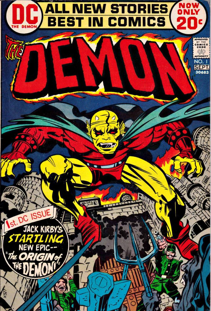
Jack Kirby’s Demon — despite a short-lived original run of 16 issues — endures 47 years after his first appearance in 1972.
Talented creators have reinvigorated, and in some cases outright reinvented, Jack’s supernatural character in the ensuing decades. It’s an all- star list that includes Matt Wagner, John Byrne, Garth Ennis, John McCrea, and many others.
Add to that list Gabriel Hardman, who, on this splash, provides an iconic and frightening image of the classic character. Gabe’s use of deep black inks and the off-setting lightning and breaking glass create a haunting and dramatic page. (I think the art looks more impressive in black and white than in published color, but regular readers of this blog probably already guessed that.)
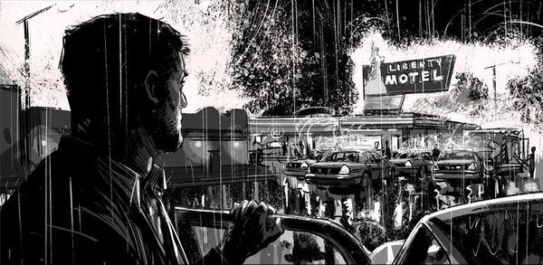
Hardman’s main professional work is creating storyboards for films, a list that includes Spider-Man, Batman, Logan and much more. He’s terrifically talented, and much sought after in Hollywood, so we don’t get enough of his work in comics, which is a definite pity for comic art aficionados.
In the meantime, we can likely look forward to yet another artistic interpretation of Kirby’s character sometime in the future.
After all, we all have our Demons.
An atmospheric storyboard from Logan. Even if Gabe were permitted to part with it, he couldn’t — he does most of his storyboards fully digital.
The Flash TV series (CW) explores DC’s multiverse legacy in creative and often reverential ways. Today’s post concludes our special feature “The Flash of Two Worlds,” as well as our five-part Flash series.
I see this cool pinup and imagine a retro moment in the DC original continuity when the two Flashes have already met, worked together, and appreciate the fact that, in each of their respective multiverses, they are indeed the fastest man alive.
That said, I never asked John what he envisioned when he drew the piece. And, I don’t think I will. It’s easier to continue to imagine the backstory to fit in with my own vision of the “pre-Crisis” DC universe.
Continuing our week-long tribute to The Human Torch and Sub-Mariner, in honor of the late summer weather at the California coast.
John Byrne’s 5-year run on Fantastic Four is rightfully considered an all-time classic, and it’s certainly on my short list of “desert island” omnibuses. (I have no idea how these books survive the shipwreck with me, but let’s stay on point.)
I always loved the Fantastic Four – and in fact, although I may be in the minority, I definitely enjoyed Hanna Barbera’s short-lived FF animated series from 1967 a bit more than Spider-Man, which aired in the same block. With a few exceptions, the FF cartoon stories felt much more authentic to the comics than Spidey, although he definitely had the better theme song. FF only lasted 20 episodes, and has never been “officially” released in home video. (So much for staying on point.)
The Human Torch, as the youngest member of the FF, was always the most relatable to me, and always a favorite. (He could fly… He could burn stuff… He could fly…)
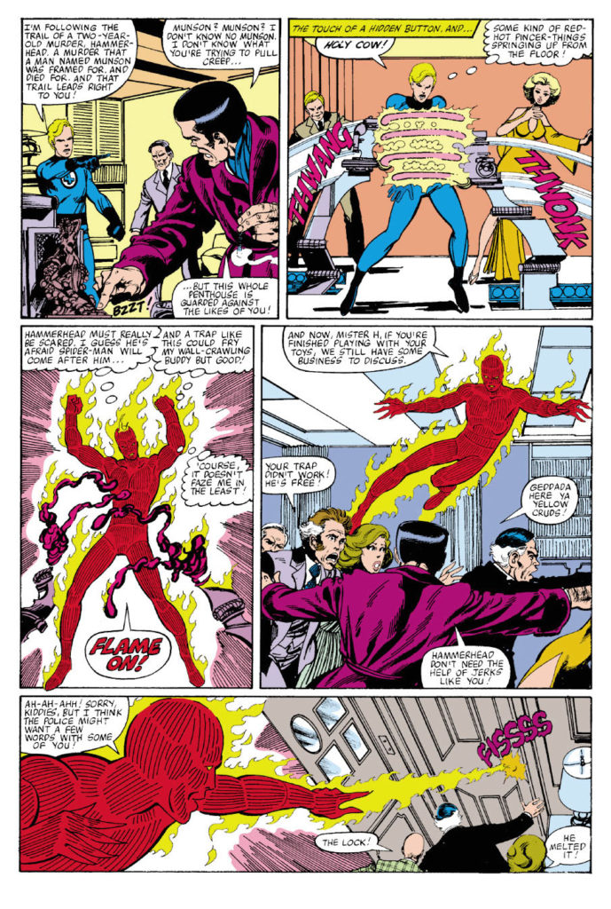
Byrne. Fantastic Four. Human Torch. Cover scene. Most of the boxes are checked on this great action page, with Byrne on story, pencils and inks. He rebuilt the FF sandbox —and played in it expertly and creatively.