Greg Goldstein's Comic Art Gallery

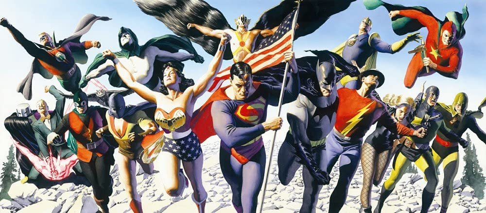
Alex Ross — Justice Is Served

Giclee, Warner Brothers Store, 1997

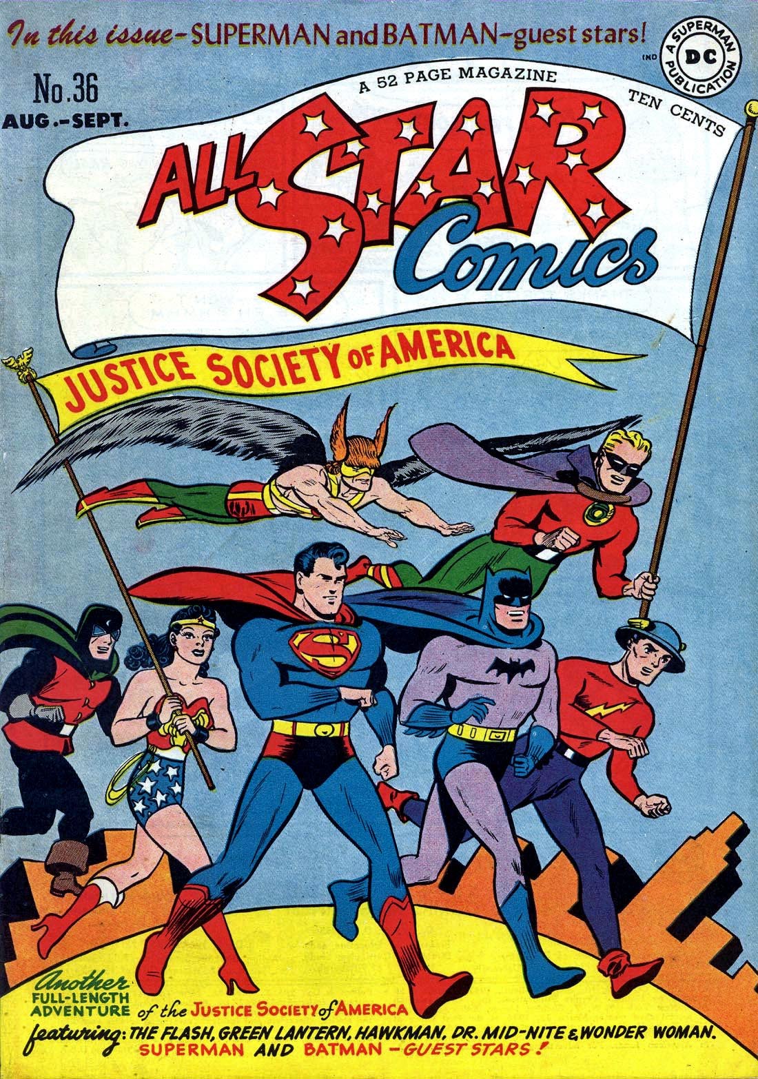
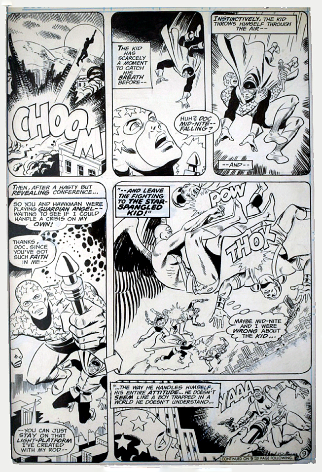
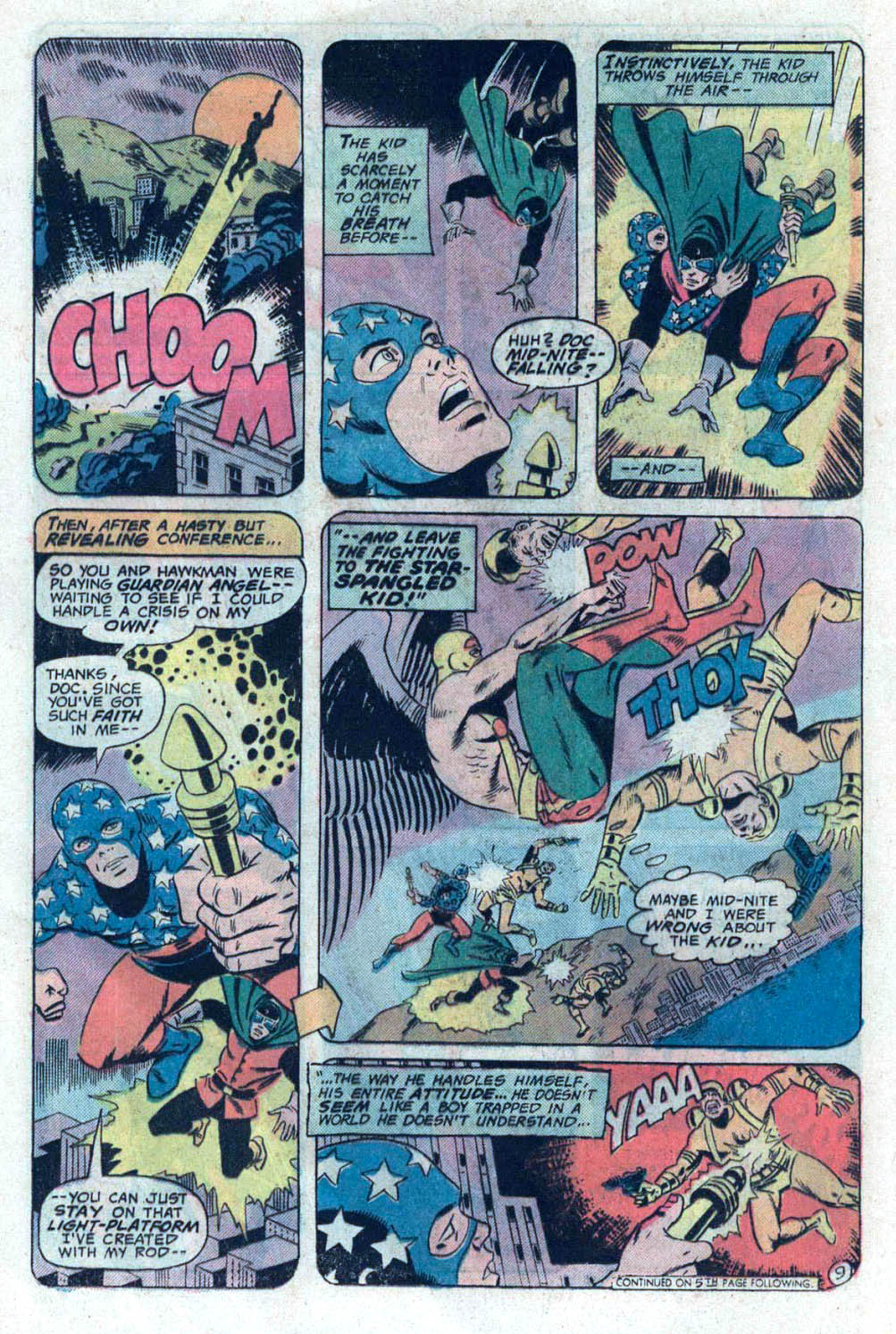
Concluding our three-week tribute to the 80th anniversary of the JSA, with one special bonus post.

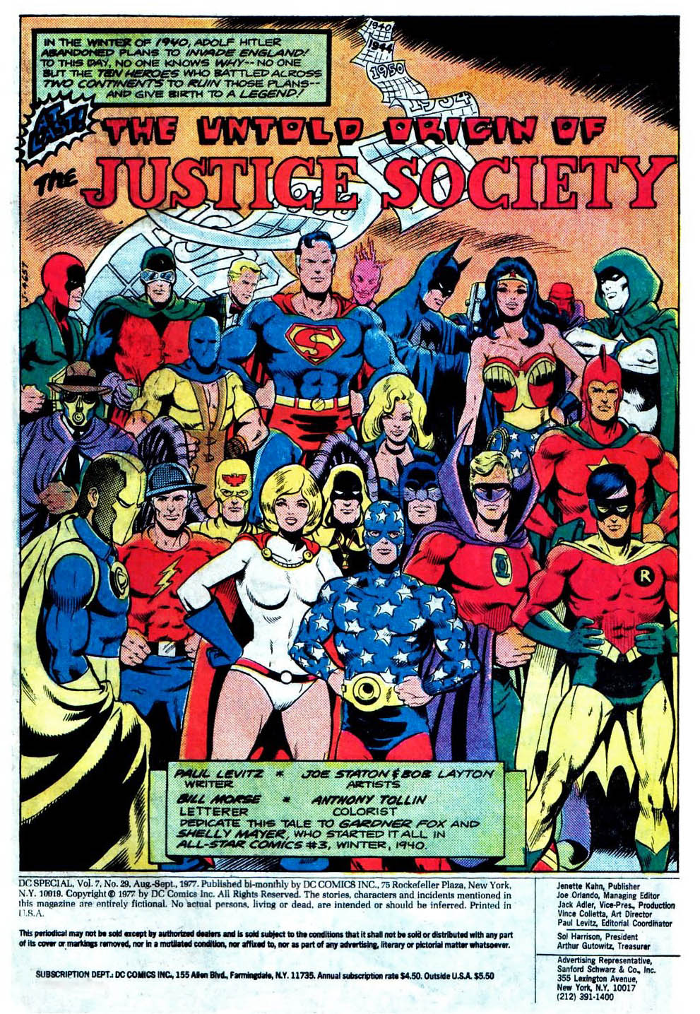
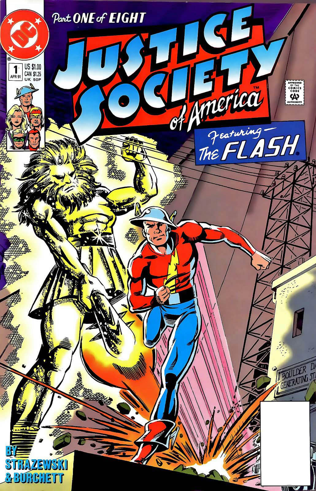
Alex Ross presents pretty much the entire classic Justice Society of America (16 heroes) in one fantastic image.

As noted earlier, I rarely post anything other than actual originals, but this piece is so great, it deserves its own showcase.

Other than perhaps the irony of Superman and Batman in the forefront (they barely appeared in the Golden Age JSA), this is everything you want, and more, in a exceptional photorealistic painting.

There seem to be many versions available of his image; mine is the large canvas, which I believe was limited to either 10 or 100. Unfortunately, the numbering was handwritten in sharpie marker, and like my Mickey Mantle and Sandy Koufax autographs (seriously), the numbering has faded into oblivion.

I sure hope I find that “certificate of authenticity” someday.

(A smaller version of the image is available for purchase here, and other versions have appeared in auction at Heritage and other houses.)

Howard Chaykin — JSA At War

Superman #226, April 2006

Continuing our multi-week celebration of the 80thanniversary of the Justice Society of America.

This is great action splash from Howard Chaykin, and a rare treat to see him illustrate classic superheroes.

As part of the Infinite Crisis storyline, Supermen from two different universes clash, each one living the life the other. When one goes to halt the Nazi atrocities of World War 2, he learns the difficult truth about Hitler’s super stalemate courtesy of the Spear of Destiny.

It took more than 35 years to tell the origin of the Society, and Paul Levitz created a plausible scenario that explained why America’s heroes simply didn’t use their powers to end the war in favor of the Allies quickly and decisively. Spoiler alert: It involves magic. 

Roy Thomas and other writers ultimately ran with (and expanded) the concept, and writer Joe Kelly incorporates this premise into this Crisis Crossover.

This is the final issue of this specific volume of Superman, launched nearly 20 years prior, as part of the “John Byrne reboot.”

Mark Bagley — Beware My Power

Justice League of America #43 (2006 Series), May 2010

Continuing our multi-week celebration of the 80thanniversary of the Justice Society of America. This specific post, featuring the Golden Age Green Lantern (Alan Scott) is an updated version of one of our earliest blogs from August, 2019.

The super-talented Mark Bagley has only spent three years (so far, at least) of his 30-year career at DC. But during that tenure, he worked on the weekly Trinity book as well as JLA/JSA, so he drew many of the DCU’s mainstay characters — some with multiple versions. 

On this great splash page, we see Alan Scott, the Green Lantern of Earth 2 having a power surge issue. (With terrific inks by Norm Rapmund, and ultimately, when printed, great colors by Pete Pantazis.) I love the camera angle that Mark chooses here, enhancing the drama.

Earth 2, Earth 3, Earth Prime, Earth 616, whatever. Bring them on. I’ve been fascinated by the multiverse concept ever since I purchased my first JSA/JLA crossover annual event off the racks in the summer of 1967. Even when it gets confusing, I’m still a fan.

And while we are at it, bring back FringeSliders, too.

Fred Hembeck — Gil Kane, Meta Human

Atom #36 Re-creation, May 1968 (original), 2010

Continuing our multi-week celebration of the 80th anniversary of the Justice Society of America, with each new post featuring a different classic JSA character.

I’m pretty sure this wasn’t the first meta cover to break the fourth wall, and it is most definitely not the last. But it is definitely my favorite.

My young brain exploded when I first saw this amazing Gil Kane cover at the candy store in 1968. I appreciated its cleverness immediately. That’s one helluva punch.

Ultimately, as I later began to differentiate artists and art styles, I came to recognize this specific punch composition as a Kane trademark. Given Kane’s voluminous published output, there must be dozens, if not hundreds of similar examples. The issue itself features the same composition in its interior, with the Atoms reversed.

As always, Fred captures the spirit of the cover perfectly in his trademark re-do style. He tells me this was the first time he took a stab at this one.

Not sure when/if the Kane original will be offered for sale again, and in all likelihood out of my budget range regardless. So… the Hembeck recreation will do nicely.

Tony Harris — 60 Minutes

Hourman #22, January 2001

Continuing our celebration of the 80th anniversary of the Justice Society of America, with each new post featuring a different classic JSA character.

Hourman’s third incarnation becomes trippier in the amazing hands of Tony Harris, who drew this issue as a fill-in for series regular Rags Morales.

I’ve discussed my appreciation for Harris’ art previously, and his Starman and Ex- Machina series are definitive achievements. I also love his cover work, and this is a fine example, with a rare hand-drawn logo.

As for this incarnation of Hourman? He’s not Rex Tyler, the original version of Hourman, nor his son, Rick Tyler. He’s Mathew Tyler, and android from the future who has incorporated Tyler DNA… and well, you have to read it for yourself.

Hourman has also had a bit of a TV career, appearing on Justice League Unlimited and Legends of Tomorrow. Both the Rex and Rick Tyler versions will apparently appear in the new Stargirl series as well

George Pratt — Comics Noir

Sandman Mystery Theatre #1, 1994

Continuing our celebration of the 80th anniversary of the Justice Society of America, with each new post featuring a different classic JSA character.

Neil Gaiman’s extraordinary success with his Sandman series, had an additional and welcome consequence. DC added a retro Sandman title to its line-up featuring a retconned version of the original Sandman, with great noir-ish stories written primarily by Matt Wagner and Steven Seagle.

This terrific action splash page comes from the often overlooked annual, drawn by George Pratt.  It’s a rare pen and ink example by the award-winning Pratt, who is known for his terrific painted graphic novels on Enemy Ace, Batman, and Wolverine.

The “original” Sandman never looked so good.

Fun fact: Joe Simon and Jack Kirby created often over-looked version of Sandman in the 1970s. Simon dropped out after one issue, Jack took a few issue break, and the final issue, #7, featuring Santa Claus (yes, you heard right) was cancelled prior to publication and didn’t appear in print until a few years later.

That Simon and Kirby Issue, originally intended as a one-shot, was their final collaboration.

This version of Sandman makes an unexpected comeback appearance in Wonder Woman #300, with versions by both Gene Colan and Kirby fanatic Keith Giffen. More on all of this in a future post.

Dan Jurgens — Unfair Fight

Booster Gold #8, June 2008

Continuing our celebration of the 80th anniversary of the Justice Society of America, with each new post featuring a different classic JSA character.

Today’s riddle: What do comic art collectors miss the most that comic book editors and publishers miss the least?:

A: Word balloons on the art board themselves.

Digital lettering is an amazing boon for comic book production, and a disappointment for many art collectors, myself included.

If you work in the editorial department, of course, no one misses the endless FedEx packages trafficking from penciller to letterer to inker, and back. Ugh.

But… the art boards themselves feel less complete without them. These are, after all, comic book pages. Comic books are pictures AND words.

Modern comic book original pages are analogous to silent films. If the visuals communicate well enough, you can interpret the storytelling without words. (And there shouldn’t be too much of that anyway. But I digress.)

Which finally gets us to this page by the great Dan Jurgens and Norm Rapmund. Superman is about to break the neck of  fellow hero Wildcat, while Maxwell Lord looks on gleefully.

Pretty easy to figure out that Superman is either under some sort of mind control — or he’s not Superman at all. (Spoiler alert, it’s the former, and Wildcat survives.)

This is a great splash from a great art team on a great series. As mentioned in a previous post, I’m definitely a fan of this run of Booster Gold, which ended perhaps a bit prematurely because of “The New 52” reboot in 2010.

Alan Davis — There Goes The Neighborhood

JSA #19, February 2001

I have a sweet spot for the Spectre, and I love the way he dominates this Alan Davis cover of this issue of the Justice Society. Despite the fact that I am an enthusiastic fan of Davis’ work, this is the first (and only) cover he drew that I own. I should rectify that one of these days.

As a young teen, I was the perfect age for the crazy, but brief, Bronze Age version of the character written by Michael Fleisher and wonderfully drawn by Jim Aparo, which featured woeful fates for the character’s antagonists. This version of Spectre arrives  (early 1974) at nearly the exact same time as does another anti-hero, the Punisher, across town at Marvel comics.  

Justice is served, indeed.

Comic book historian Les Daniels discussed the origin of this version of the character in DC Comics: Sixty Years of the World’s Favorite Comic Book Heroes:

Joe Orlando was mugged and decided the world needed a really relentless super hero. The character came back with a vengeance … and quickly became a cause of controversy. Orlando plotted the stories with writer Michael Fleisher, and they emphasized the gruesome fates of criminals who ran afoul of the Spectre. The Comics Code had recently been liberalized, but this series pushed its restrictions to the limit, often by turning evildoers into inanimate objects and then thoroughly demolishing them. Jim Aparo’s art showed criminals being transformed into everything from broken glass to melting candles, but Fleisher was quick to point out that many of his most bizarre plot devices were lifted from stories published decades earlier.”

I had only recently discovered the classic EC Comics horror tiles, and these gruesome fates seemed to meld together the supernatural, horror and superhero tropes into one wonderful blended margarita of storytelling.

Definitely worth my 20 cents.

Fun fact: 1974 is indeed the year of the anti-hero. Wolverine appears for the first time a few months later. It took a while, but in 1982, a catchphrase summed up his personality. “I’m the best there is at what I do, but what I do best isn’t very nice.” Snikt!

Wallace Wood — All Star

All Star Comics #59, 1976

All Star Comics, featuring The Justice Society, returned for the first time in 25 years, and the legendary Wallace Wood returned to superheroes for the early issues as well.

“Return” for Woody is a bit of an overstatement, since outside of his own creation, T.H.U.N.D.E.R. Agents, Wood’s work in superheroes was limited. Ironically his most lauded superhero work in the DC universe is Superduperman, an EC Mad Comics parody from 1953.

In All Star, editor Joe Orlando (and Wood’s former protégé at EC) provided Woody the chance to play with many of DC’s classic characters, including Superman, and he was given a chance to help set the look and feel of at least one enduring new one, Power Girl, the “Supergirl” of Earth Two. On this great battle page, we have Hawkman, The Star-Spangled Kid, and Doctor Mid-Nite in all out action.

As demonstrated by the art itself, Wood is responsible for the pencils and inks on this “second” issue, with Rick Estrada providing rough breakdowns and receiving credit as “designer” on this issue.

Woody left the title after less than a year’s worth of issues, but the work he left was behind was definitely “all star” material.

Fun fact: Hawkman was the only original member of the JSA to appear in every issue of the original All Star comics as part of the team.

Fun fact: Despite the fact that All Star had originally continued as All Star Western in 1951, DC re-started the series using the Golden Age numbering.  Today it would be  #1 issue with more than a few variant covers…

Fun fact: “Super Squad” is just… ugh.

Rich Burchett — Flashy Team-Up

Justice Society of America #1, April 1991

2020 marks the 80th anniversary of the very first super team in comic book history, The Justice Society of America.

Superhero comics were barely two years old, when a gaggle of heroes appeared on the cover All Star Comics #3. Imagine the reaction of a young comic book reader at his local newsstand or candy store seeing Doctor Fate, Hourman, The Spectre, Green Lantern, The Atom, The Sandman, Hawkman, and of course, The Flash all seated at the one table.

Brain blown.

During the various “Comic Book Ages” (Gold, Silver, Bronze, Modern, et al) the original Flash seems to symbolize the Society more than any one character. This is partly due to the fact that he is the very first Golden Age superhero to be reintroduced into the Silver Age (Flash #123).

In this 1991 JSA mini-series, one classic character receives solo billing in each issue, and the Flash leads off in issue #1, with art (pencils and inks) by the often under-appreciated Rich Burchett. This is a fun and dynamic page of the Flash in action, with the action taking us through the page.

And, I find it amusing that Flash’s helmet and the construction workers are not that dissimilar. If only those guys could run at super speed…

(My pal Mike Gold edited the series, and he provides a lovely history of the JSA, and an origin of this specific series, which is provided below.)