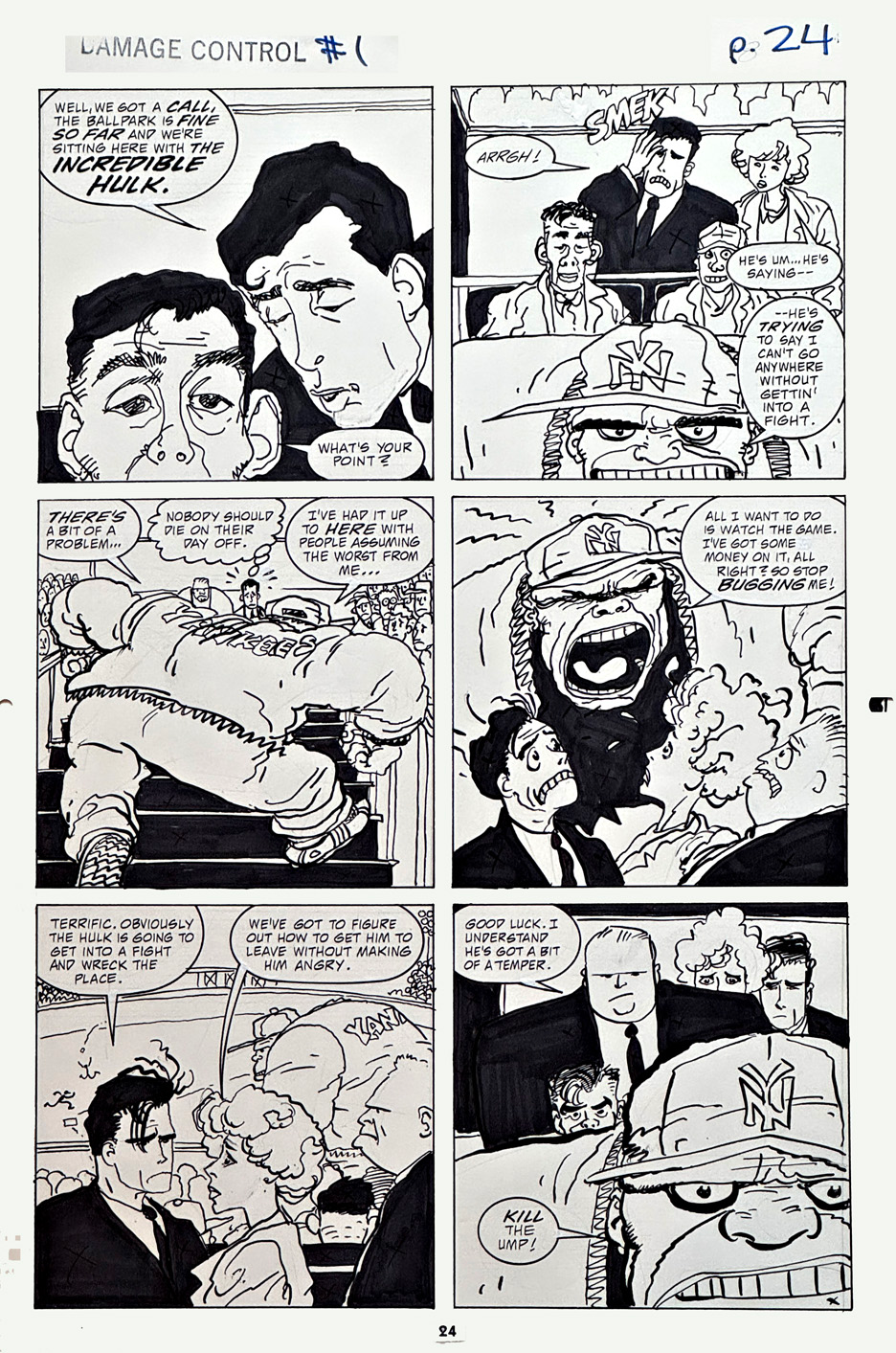
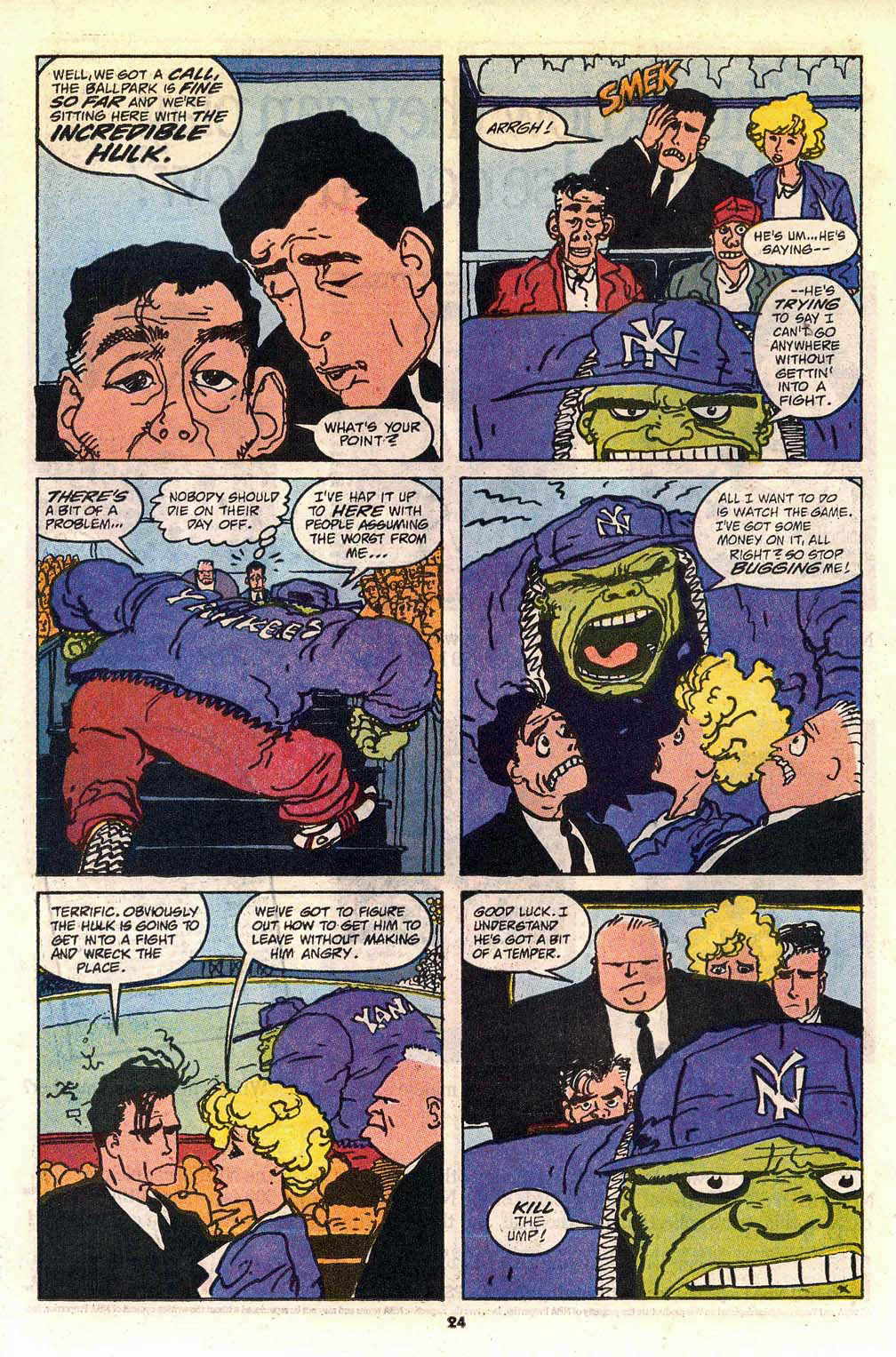
Damage Control is such a fun high concept; Someone needs to clean up after a big hero and villain melee lays waste to parts of a city. Why not a murky government agency with an apparently unlimited budget? The idea so good in fact, that it’s been well incorporated into the MCU, albeit with some changes along the away.
Kyle Baker drew (pencils and inks) the final mini-series of the original three, and his art style was a perfect fit for the quirky, humorous nature of the stories.
And the things you learn from comics: Turns out the Incredible Hulk is a Yankees fan.
The Yankees should sign him up. He’s probably the only one who could consistently give Shohei Ohtani a run for his money as the most extraordinarily dominant player in the Major Leagues.
Then again, maybe not. For all we know, Otani is a mutant. Or an alien. He’s definitely other-worldly.
Fun fact: About 25 years ago, just as realistic “destructible environments” became reality in videogames, TQ Jefferson and I passionately tried to convince our colleagues at Activision that Damage Control would be a perfectly fun way to incorporate as many Marvel characters into one game as possible.
Alas, executive management thought we were bonkers — a story for another day.
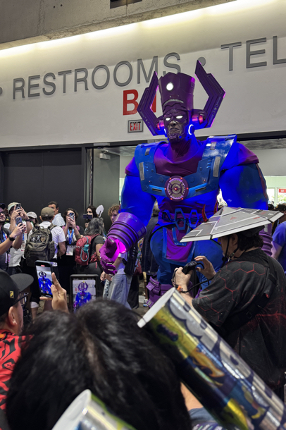
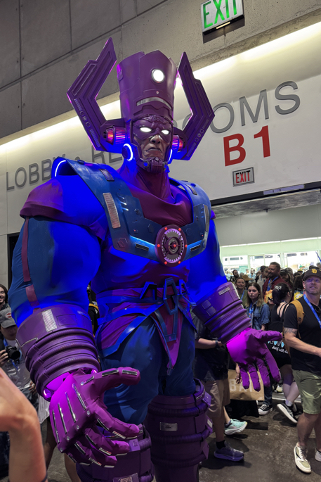
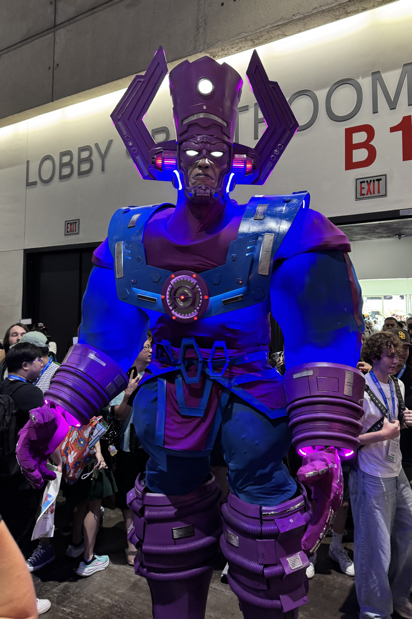
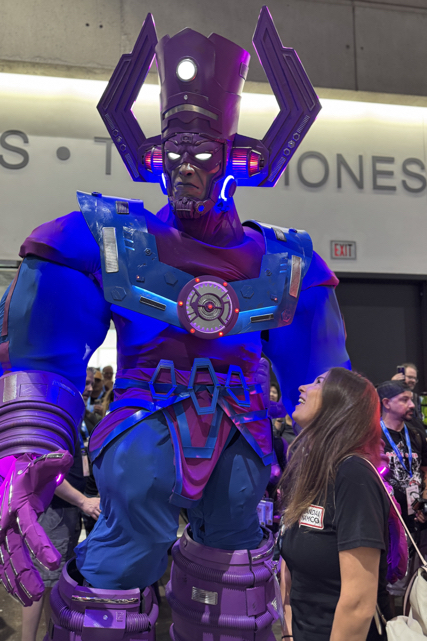
Once again, another San Diego Comic-Con is I the books. I’ll be posting some photos in the next few days, but in the meantime… Here is Galactus entering the main room for the first time on Thursday I believe; 10-12 feet of one of the greatest costume designs and executions I’ve ever seen.
Who would’ve thought that Superman — the true beginning of the DC Universe, and the ignition for the fire that became the world of modern superheroes— AND The Fantastic Four — the first superheroes in the modern Marvel Universe — would hit the silver screen with major reboots at the same time? Definitely an unlikely coincidence.
So…
Here are all the Superman posts on the blog the last five years…
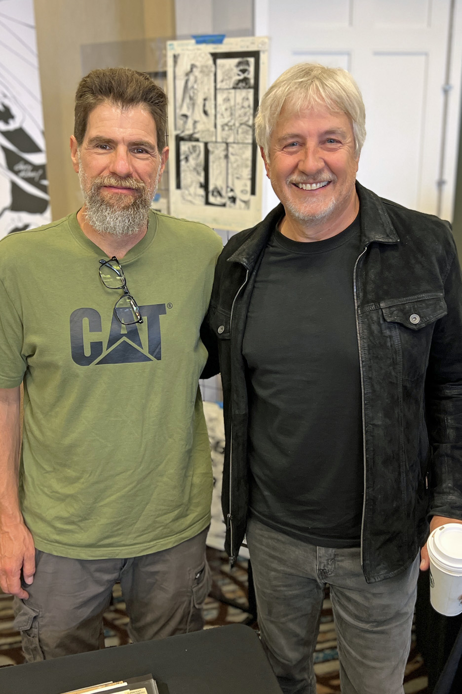
Veteran comic art retailer Bechara Maalouf runs the focussed convention twice a year in LA (Redondo Beach) — typically May and November — and also one in the SF Bay area in February.
As always, it featured a great selection of original art —- plus a fun group of guests this time around. Pictured: Andy Kubert, David Mack, Mark Texeira, and yours truly with Andy.
If you blinked you missed it department:
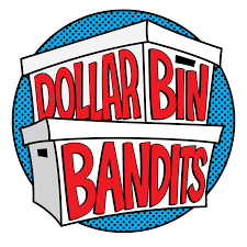
I recently raised a glass to our friends at Dollar Bin Bandits (podcast, video) in honor of their second-year anniversary. Much more importantly, they used the occasion to announce that they had joined forces with the gang at Tomorrows Publishing. The fine folks there do a stellar job of publishing books and mags on the history of comics and pop culture.
It’s like combining peanut butter and chocolate: “Two great tastes that taste great together.” Very much looking forward to their joint efforts.
There are at least 10 million opinions about recent comic book superhero films out there (the on-line universe is obsessed with this art of thing) but I will add my own three cents anyway. (Spoiler- free, and ranked in order of my personal preference:)
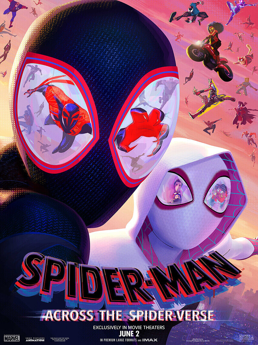
Spider-Man: Across the Spider-Verse:
• A landmark in animation.
• A landmark in comic book stories on film.
• A landmark in cinema, period.
Haven’t yet seen the film and think’s that hyperbole? Check it out — and let me know if you think I’m wildly off base.
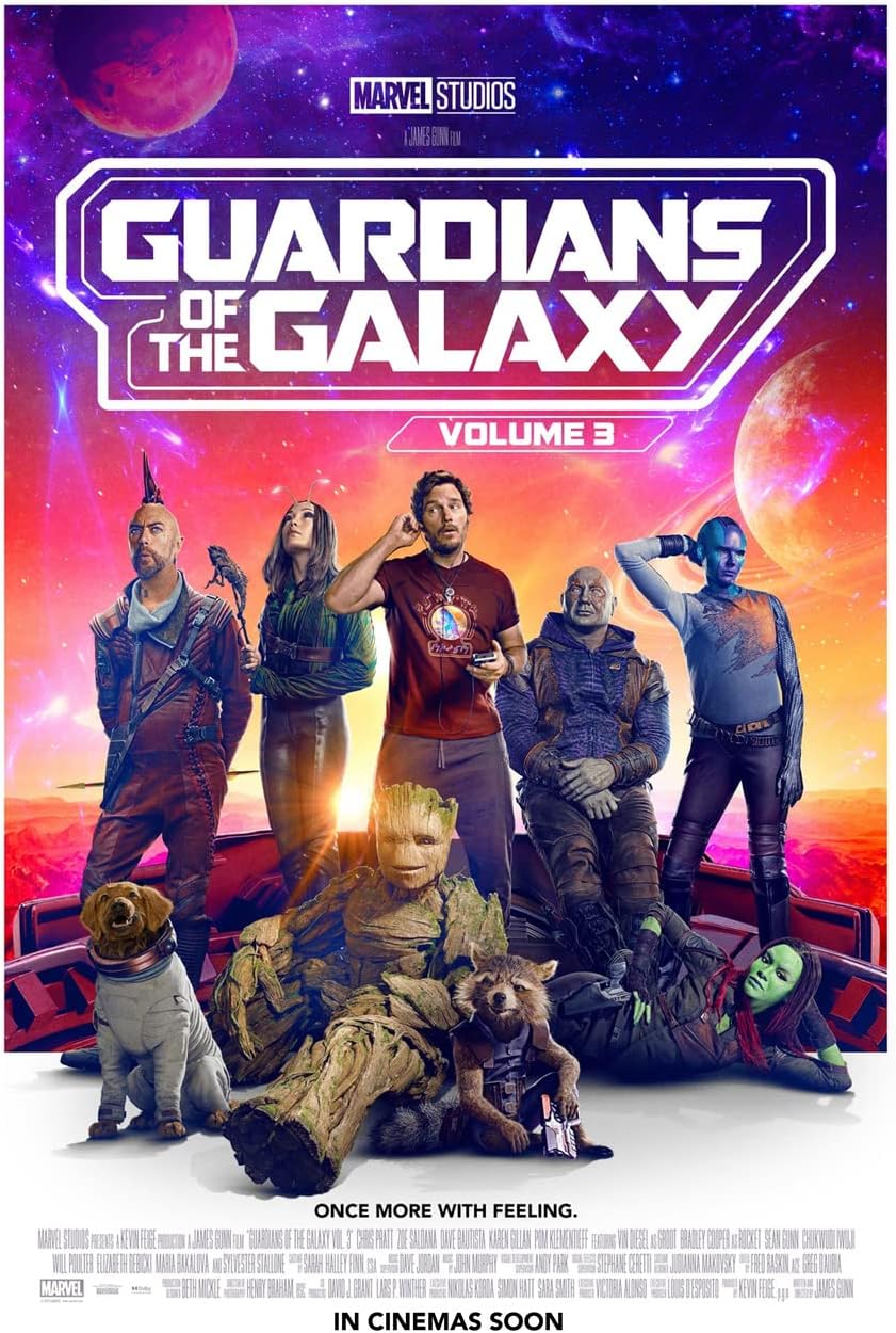
Guardians of The Galaxy 3:
Enjoyed it very much, and kudos to the filmmakers and their marketing efforts that managed to tell us what the film was about — without spoiling the story. The efforts worked, because pretty much every internet rumor about the film prior to the release was wrong. (Some just laughable.)
Caveat — I know the High Evolutionary’s animal experiments were needed for the story, but I do wish they had used a little more finesse in the editing room to tone some of it down.
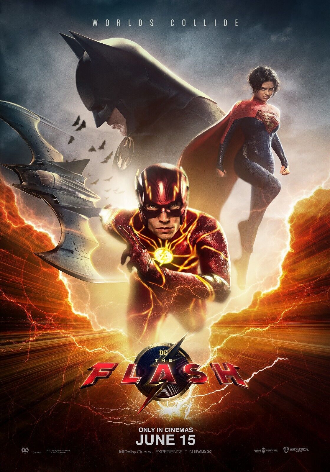
The Flash:
Between the changes in WB studio ownership / management and Ezra Miller’s well-publicized troubles, this was a cursed project that still somehow delivers a fair and occasionally fun superhero product, especially if you are familiar with the Flashpoint storyline.
Yes, the special effects needed a bit more work, but I barely tolerate most CGI anyway, so it didn’t annoy me as much as other fans apparently. As for the cameos? My only real reaction is where is TV Flash Grant Gustin? (The inter webs have plenty of thoughts on that, too.)
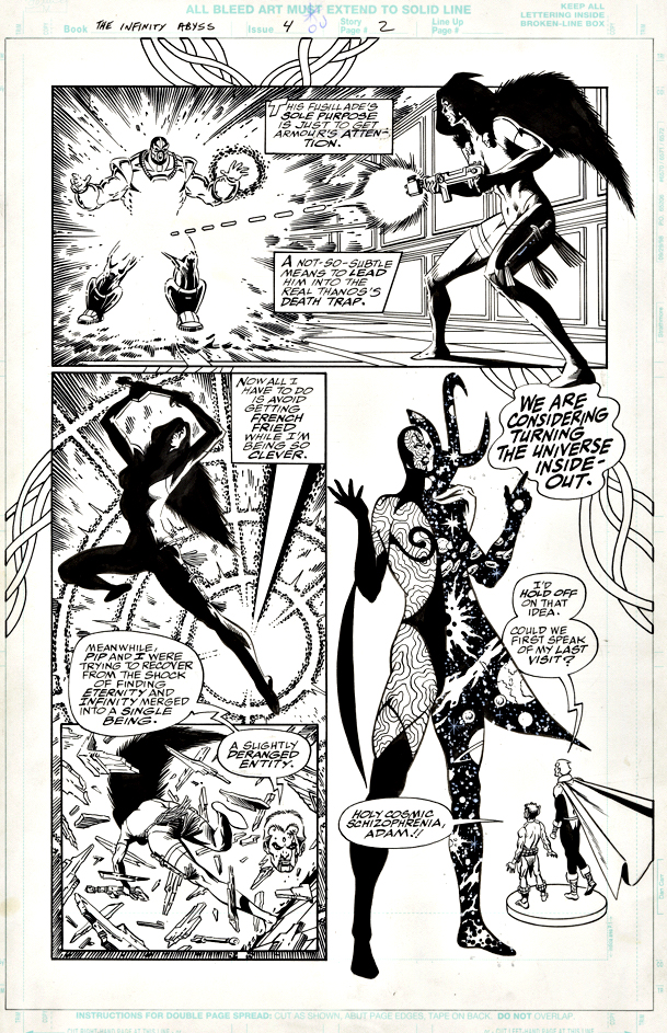
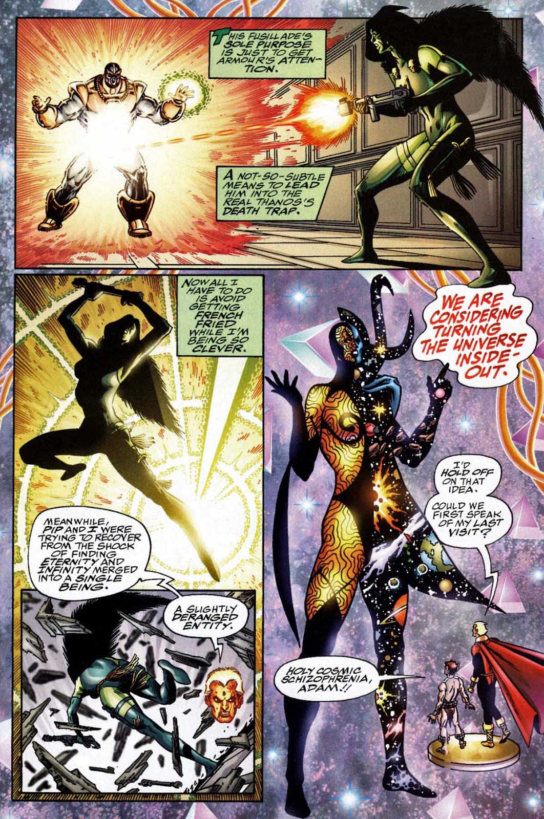
“We are considering turning the universe inside out.”
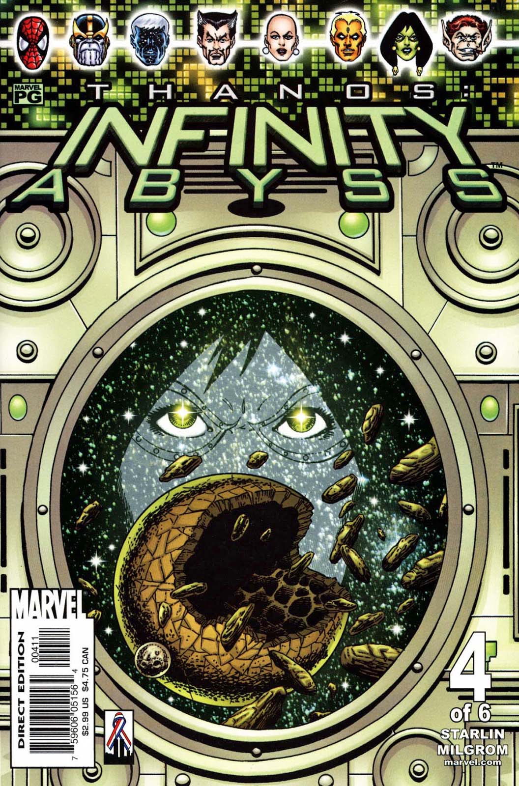
Jim Starlin delivers a classic and trippy page from his Infinite (figuratively, and sometimes literally) cosmic series featuring Adam Warlock, Gamora, Thanos, et al.
Starlin. Cosmic. Trippy. Nuff said.
Well, almost…
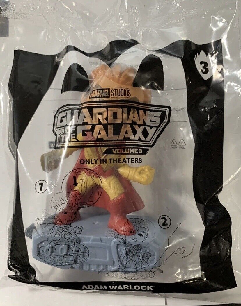
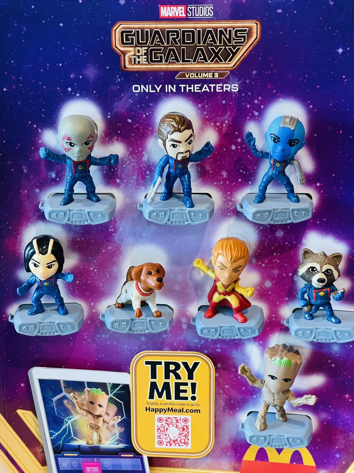
If you told me when I was a kid that we’d have Warlock Happy Meal toys someday, I would have called the drug overdose hotline on your behalf. Trippy indeed.
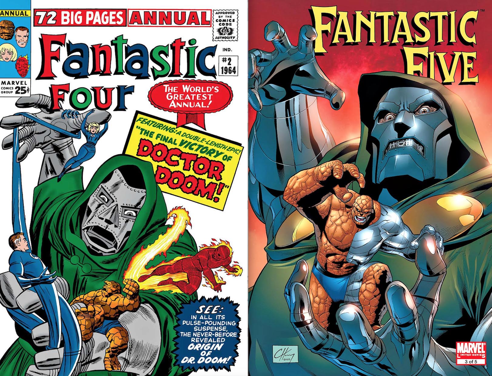
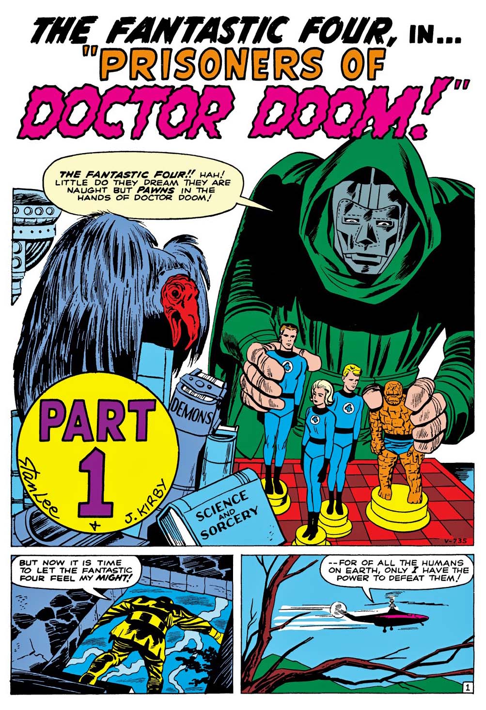
Doctor Doom — Marvel’s first iconic super villain of the Silver Age* — celebrates his 60th anniversary this year.
And I have a question.
How are the MCU pros going to create a new on-screen look for the character that is true to form, but doesn’t look goofy as hell? These folks are the best in the business, but that’s a hell of challenge. Lesser talents have failed, not once, not even twice, but three times.**
They could go all black (always a safe choice) and make the costume more technological and futuristic, but… I believe George Lucas already beat them to the punch by about 45 years.***
The comic book Doom costume is one of those that almost makes sense in 2D, but three-dimensional? Oof.
I’m definitely looking forward to seeing the results, maybe even later this year, if we’re lucky.
And, as always, we digress.
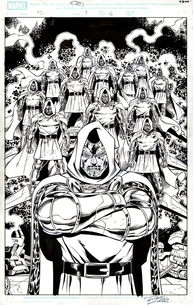
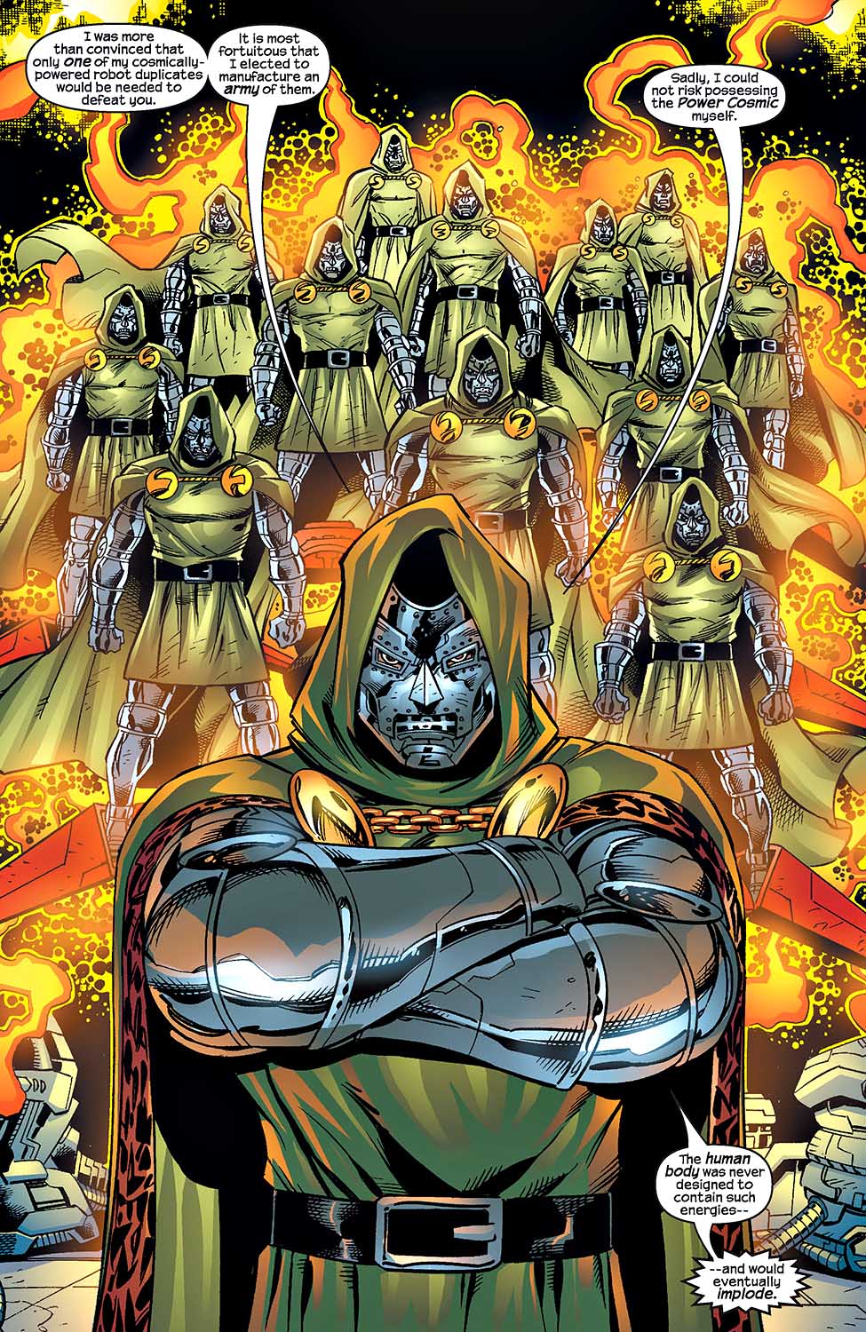
Here, the versatile Ron Lim creates a dramatic splash page with the most Doctor Doom you will ever see in once place. You see, the good doctor has this cool hobby of building robots in his spare time.
Lots of them, apparently.
Fun fact footnotes:
Ok, Sub-Mariner beat Doom by a full issue — or more than 20 years, depending on how you count Silver Age vs. Golden Age — but I can’t fully embrace him as a villain. (This despite the fact that Doom and Sub-Mariner later appeared together in a comic book called Super-Villain Team-Up.)
** Two contemporary big budget film releases, plus the officially unreleased Roger Corman version. I probably shouldn’t count that, but I do. Sue me.
*** Lucas has yet to acknowledge that Darth Vader is essentially a mash-up of two Jack Kirby comic book creations, Doctor Doom and Darkseid. C’mon George, fess up.
Clayton Henry’s cover to the Fantastic Five is an homage (swipe?) of Kirby’s FF Annual #2
Doctor Doom’s first appearance features a ridiculous bird for good measure.
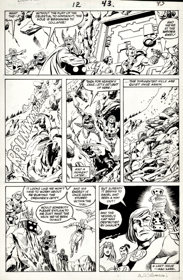
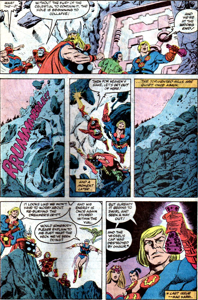
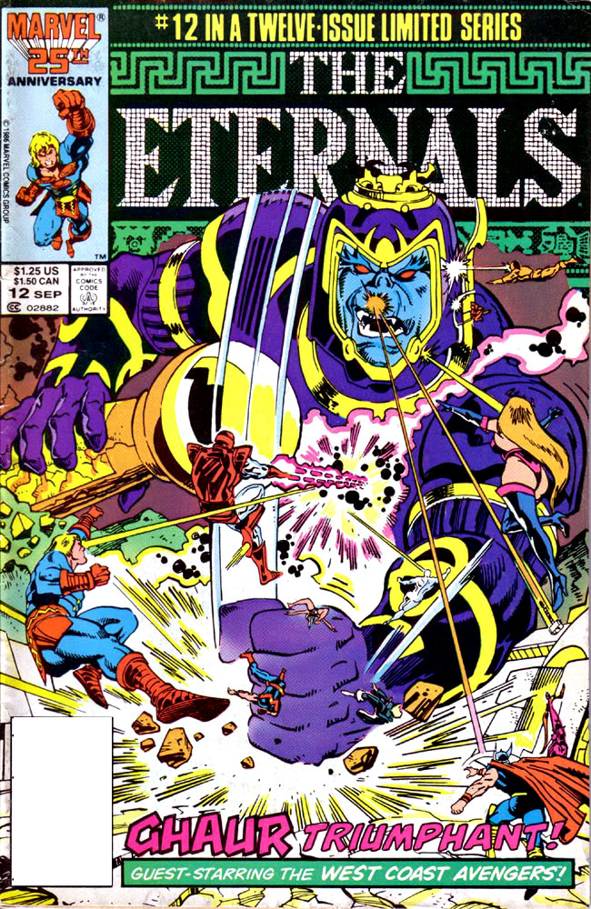
This “sequel” Eternals series couldn’t have gone quite as planned.
Peter Gillis launches as writer, but Walter Simonson takes over mid–stream. Sal Buscema starts us off on pencils, (ands in some case, inks) but the art team shifts a few times too with a variety of Bullpen artists from the era, until we finally get here, the double-sized last issue, with pencils by Paul Ryan and inks (mostly) by Al Williamson, with assists fromSam de la Rosa.
All pretty odd stuff for a limited-series.
That aside, this is dynamic page featuring Eternals and Avengers working together to defeat their common foe. And hey, based on the film trailers alone, it’s obvious the Eternals exist in the greater MCU, so a crossover like this down the road is not the craziest idea you’re going to hear today. (It’s still early, so trust me on this.)
Eternals opens in theaters on Friday. (Well, technically tonight in many locations.)
Who’s Who in the Eternals? Convenient scorecard presented above.
Jack Kirby’s Celestials walk the earth, courtesy of Neil Gaiman and John Romita’s 2007 mini-series, as detailed previously here.
And finally, after a year or so of pandemic-related delays, they (presumably) walk on the big screen this Friday.
Early buzz on the film is quite good, but if I’m guessing, regardless of story and cast performance, Kirby fans will judge the film on whether the cinematic realization of the Celestials matches — or even amplifies — Jack’s giant vision.
In a few days, we will all see for ourselves
Oddly enough, Arishem (the greatest of the Celestials, apparently) appears on the final page splash in many of the first few issues as the tease for the following issue. The only hiccup is that he doesn’t typically appear in any of the following issue’s action.
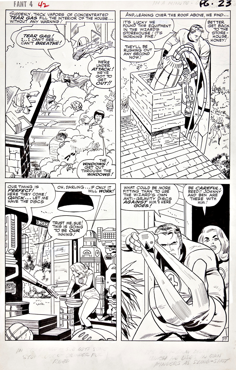
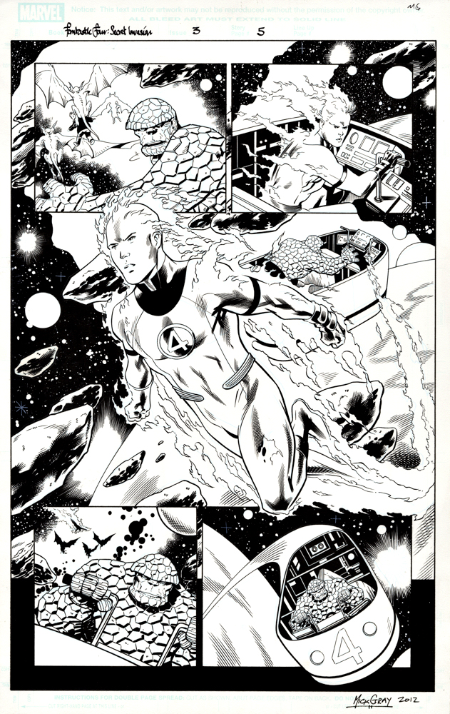
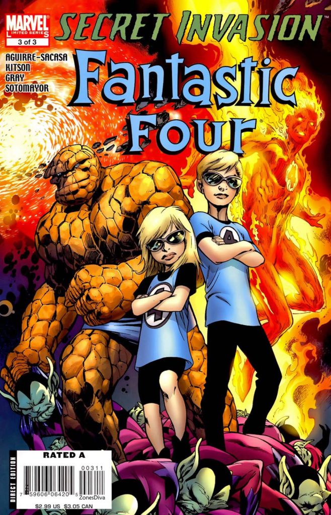
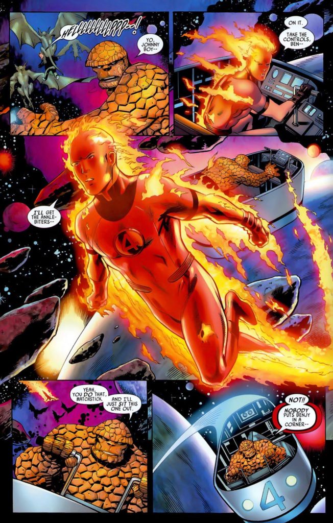
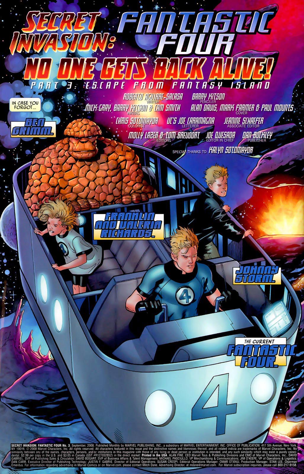
Secret Invasion: Fantastic Four #3, September, 2008
We close out our second celebration of the 60th anniversary of the Fantastic Four with a quick visit to the Negative Zone.
The Negative Zone, like so many of Jack ad Stan’s creations, endures. I’m sure one version or another will figure into the MCU when The FF finally receives the proper cinematic respect the team deserves.
In the meantime, we have the talented Barry Kitson, and the equally talented Mick Gray, delivering a dynamic and splashy page of Johnny Storm bursting into flames and out of the Fantasti-Car, leaving Ben Grimm unhappily behind. (With a cute piece of dialogue to showcase his frustration, as seen in the published page below.)
It’s a terrific piece of art, and if I have any beef with it all, it’s in the published version, because, after coloring, Johnny appears to have a tight crew cut or no hair at all when he bursts into flame. (And stays that way.)
Johnny Storm without his blonde locks? Even on fire? Blasphemy, I say.
John Byrne takes over The West Coast Avengers with a storyline entitled “Vision Quest.” The Vision is missing — the government is secretly reverse engineering him — and when it’s all done, we witness the introduction of the “White Vision.”
Sound familiar? Many of these ideas and threads (and of course many, many others) appear in Disney’s WandaVision.
Byrne makes the visual most of an exposition page here. (The dreaded “talking heads” scenario.) Nearly all of the Avengers are represented, and John uses multiple angles (medium vs. close-up shots) and characters’ points of view to keep the page visually interseting.
Nice detailed inks from Mike Machlan, who used a very fine line — much easier to discern in the original art than in the printed page.
I don’t recall how often we caught a glimpse of the full exterior of the West Coast headquarters, but it reminds me of a Santa Monica luxury hotel.
California Dreamin,’ indeed.
Yes, there’s a Damn problem!
Can’t imagine that the entire comics-loving’ world hasn’t already seen this, but just in case…