Greg Goldstein's Comic Art Gallery

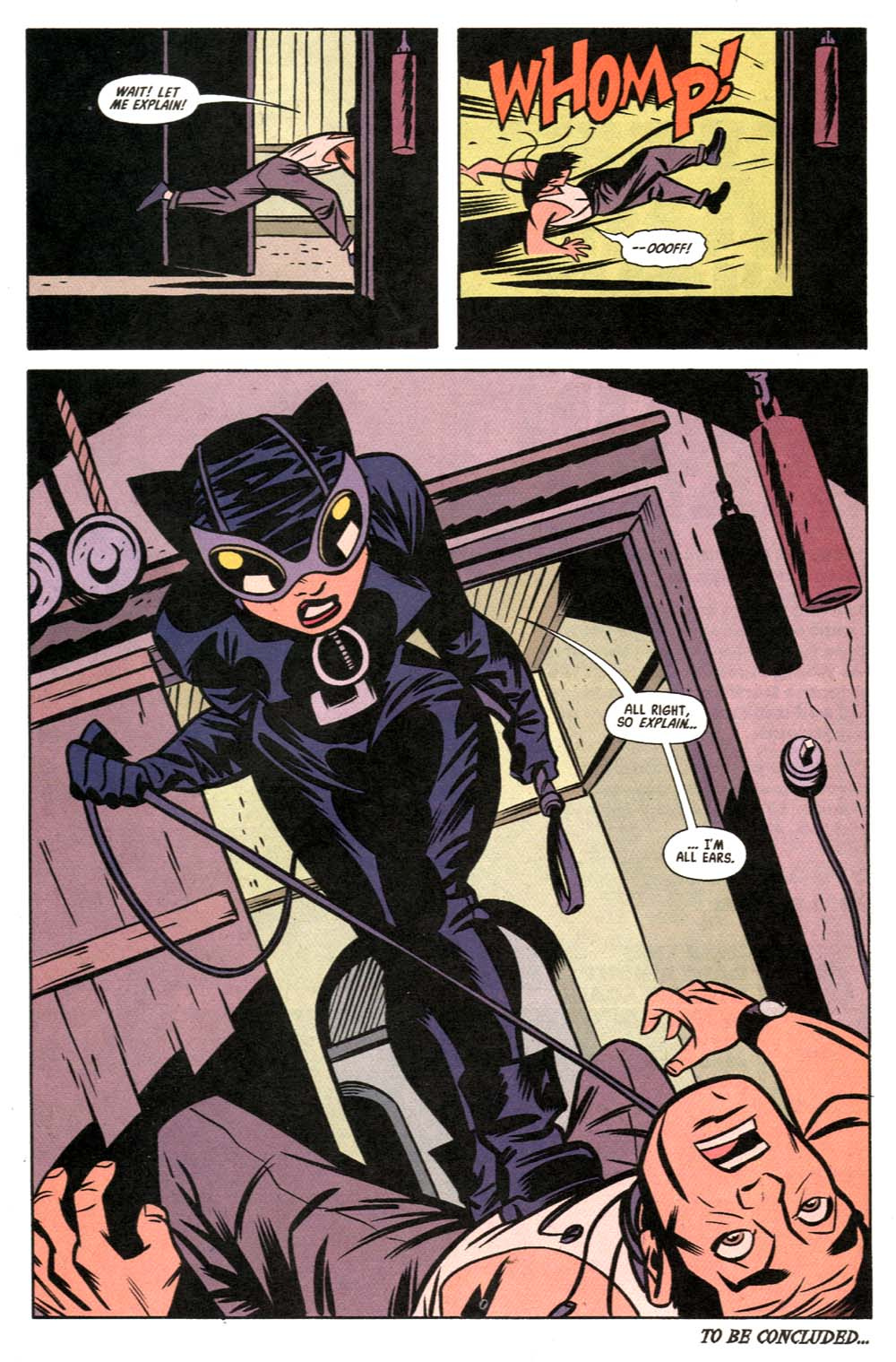
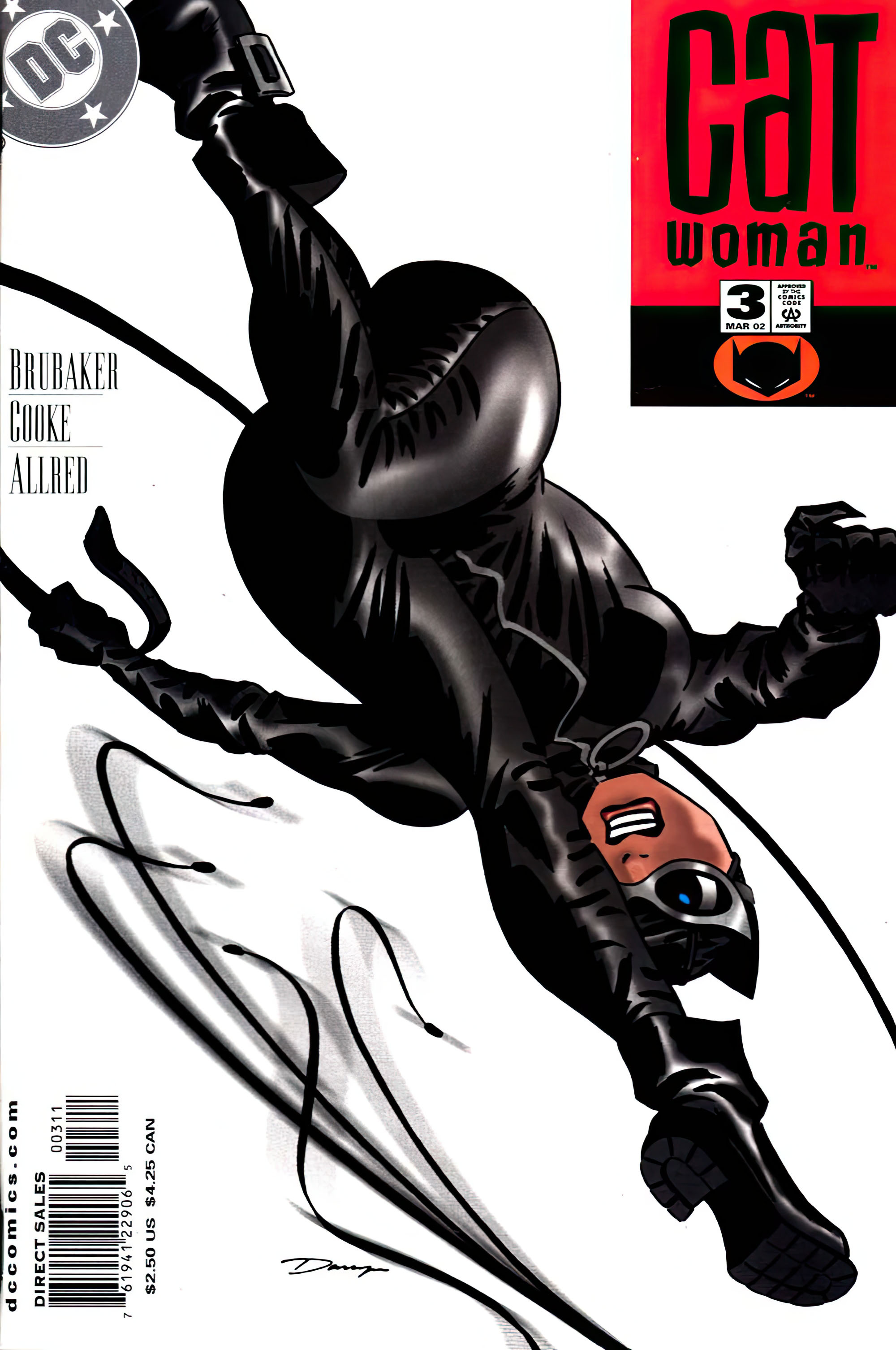
Darwyn Cooke & Mike Allred — Cat Got Your Tongue?

Catwoman #3, March 2002
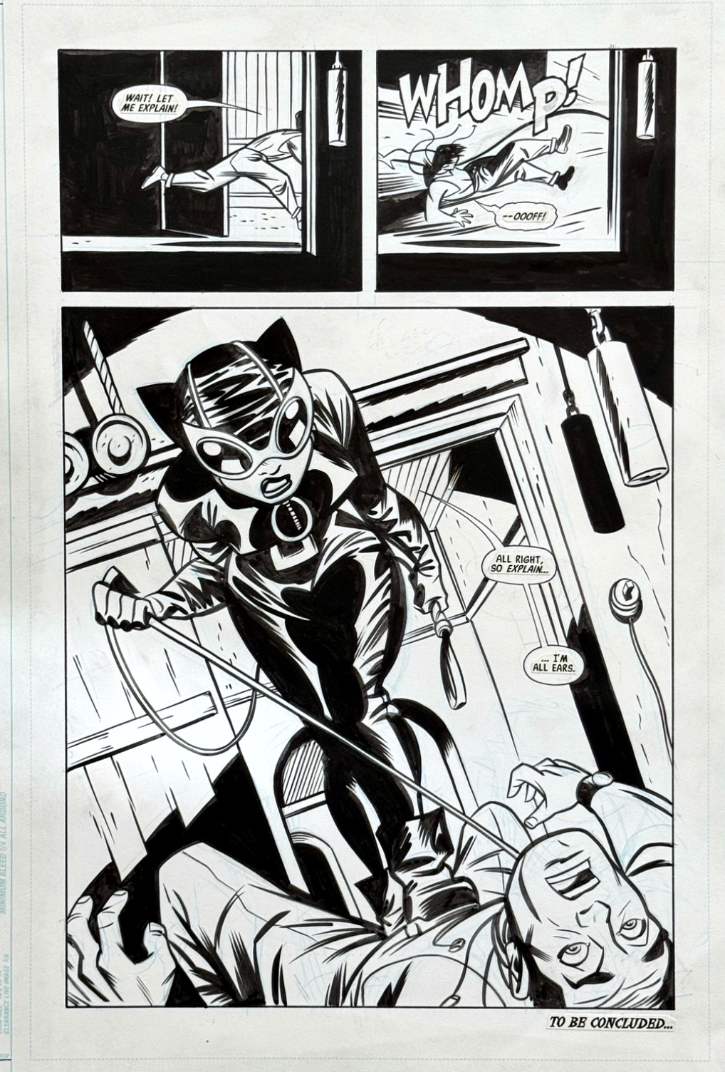
Darwyn Cooke drew only four “regular” issues of Catwoman.

Four.

Yes, there was also “Trail of the Catwoman” in Detective Comics, and the terrific Selina’s Big Score. But still, it wasn’t nearly enough.

Ed Brubaker and Darwyn gave us a terrific version of Selina Kyle. Smart, stylish, funny and noirish, with a costume that was both sexy — and, for a change, a bit more practical.

She finally looked like someone who could actually leap across rooftops without losing parts of her wardrobe.

This page, inked by Mike Allred, is a great example of Darwyn’s storytelling. Two small panels to set things up, followed by one big payoff.

Simple. Clear. Terrific.

And, of course, Catwoman owns the page.

I’ve featured Darwyn’s work on the blog many times: Parker, The Spirit, and those wonderful classic comic-book reinterpretations he apparently created to “relax.”

(Most of us relax differently. But I digress.)

Darwyn’s Catwoman run was much too short. Sadly, so was Darwyn’s time on planet Earth. He died in 2016 at the age of 53.

He was one of the greatest cartoonists of his generation, despite entering the field relatively late, and I was fortunate to know him and work with him. I might be biased, but his Parker graphic novels (IDW Publishing) are some of the best ever published.

The man and his talent are very much missed. Fortunately, the art and the stories are still very much with us.

I’m thrilled that DC is finally publishing Batman by Darwyn Cooke: The Absolute Edition, collecting all of his extraordinary work with the Batman family in a format it deserves.

DC asked me to provide images of several pieces of Darwyn’s original art from my collection, and I happily obliged. Which pieces did they actually use in the finished book? Excellent question.

Apparently, even with a $125 cover price, their budget didn’t quite stretch far enough for a contributor copy. As a former publisher, I definitely recognize fiscal discipline, although this might be pushing that philosophy a bit too far.

No worries. I’ll contribute to the Warner Bros. bottom line as soon as I can get a copy.

Meanwhile, this page is a pretty good reminder of just how much Darwyn could accomplish in a very small amount of space.

And how much more we wish there had been.
Interlude — OAX, Better Late…

Original Art Expo, January 2024

Somehow, four months passed, and these pics from the Original Art Expo haven’t made it to the blog.

Welp, better late than never.

Mike Allred — Nope, Still Not A Robot

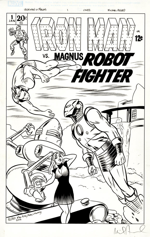
Iron Man vs. Magnus: Robot Fighter, Commission, 2012

Mike Allred tackles the Magnus vs. Iron Man theme with great results, including a fully hand-lettered logo!

I acquired both the Paul Smith IM-Magnus commission and this one at the same time, from the same dealer, so I assume the original owner had moved on from this concept.

If there are any others out there that look as good as these two, I would probably try to obtain them as well. 

You know where to find me.

Mike Allred — Batusi?

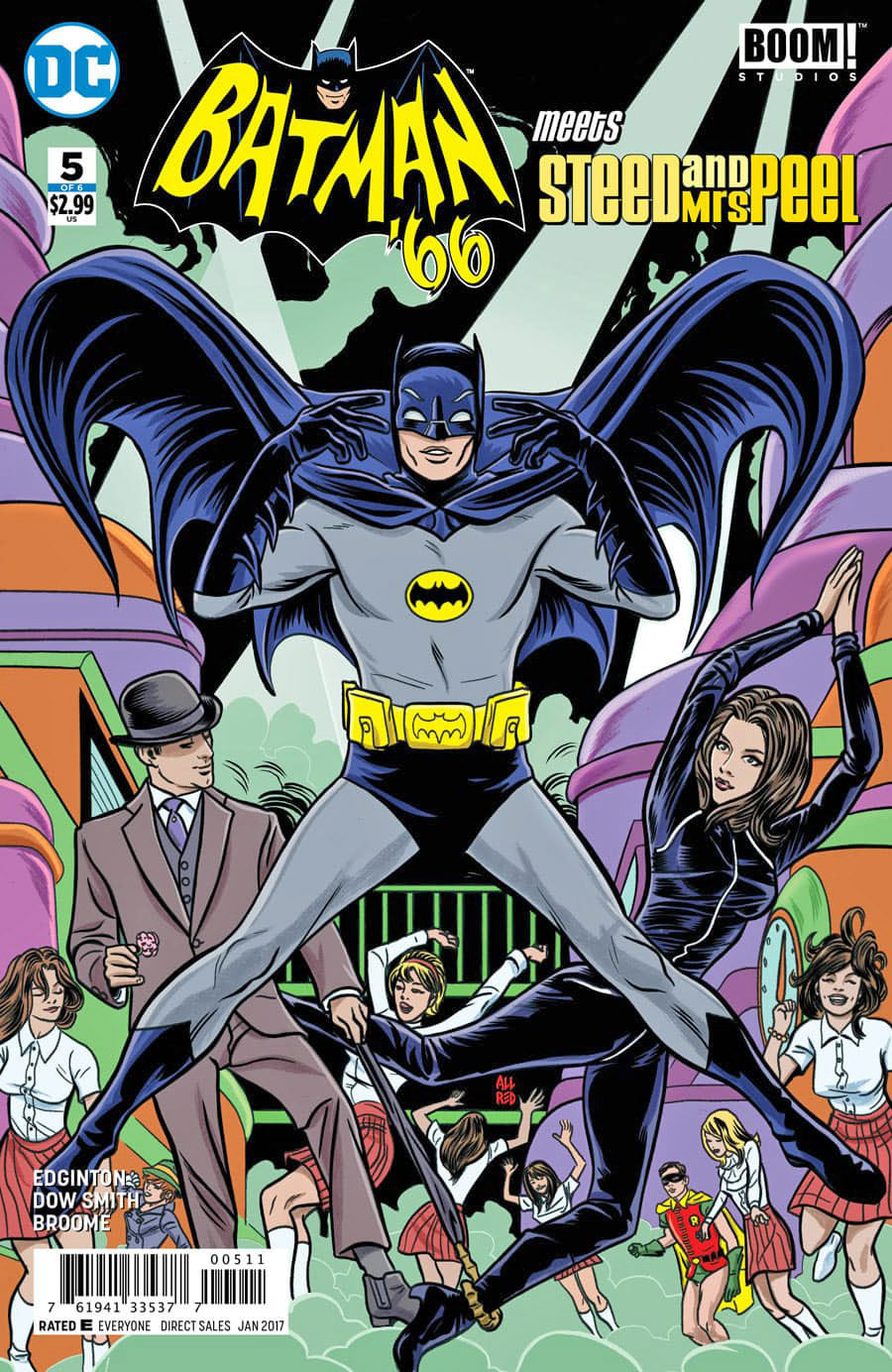
Batman ’66 Meets Steed and Mrs. Peel #5, January 2017

I’ve expressed my appreciation for Mike Allred way back when I started this blog. (Here and here.) His style is lively, clear, clean and “retro” — absolutely perfect for some great covers on DC’s Batman ’66 publishing program.

Batman ’66 seems to have now gone the way of all defunct universes, but before they wrapped up creating new content, they created quite a few fun crossovers with other similarly adventourous 60s TV shows, including The Green Hornet, Man From U.N.C.L.E., and the British TV favorite “The Avengers.”

DC couldn’t call them that of course, so its Batman ’66 meets Steed and Mrs. Peel.

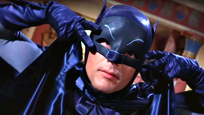
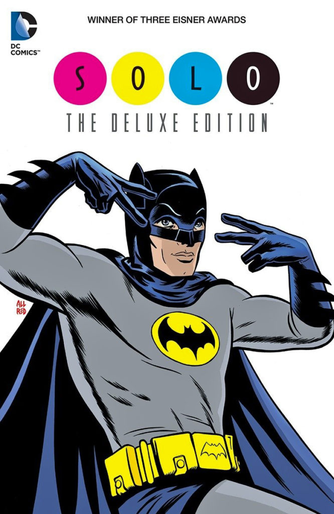
Whatever you want to call them, a full cover Adam West Batman and cast hypnotically doing the Batusi seems like a great addition to a collection.

The Batusi? Well, in 1966, you just had to be there I guess.

The Batusi is performed by making a horizontal V-sign with one’s index and middle fingers of both hands, and drawing them across in front of the eyes, away from the center of the face simultaneously, with the eyes roughly between the fingers. This is performed in time with the music, and is improved upon by continuing to dance with the lower half of the body, simultaneously. — From Wikipedia

Mike Allred — We’ll Always Have Paris!

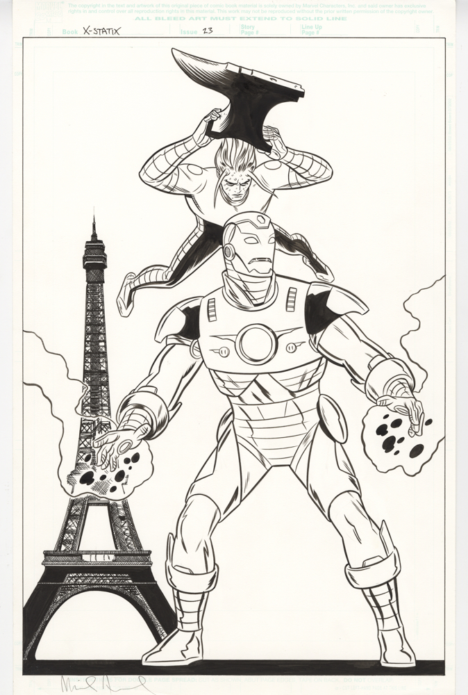
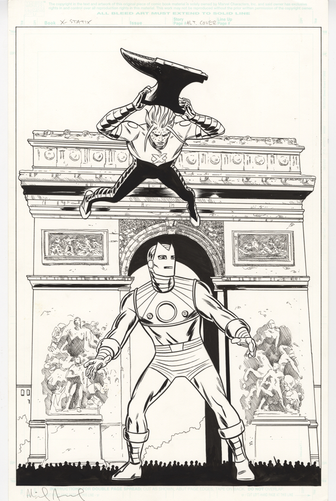
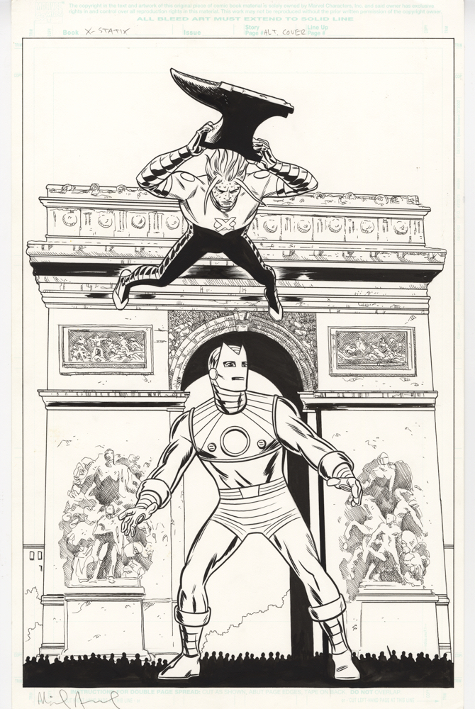
X-Statix 24 Unpublished Cover
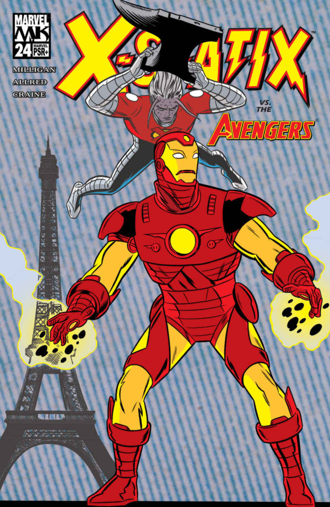
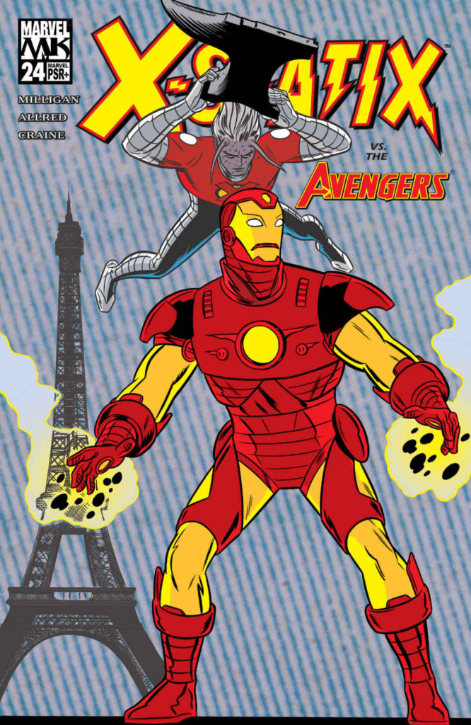
X-Statix 24 Published Cover

Dissecting unpublished vs. published covers is a fun activity, especially if you can’t find someone who knows specifically why a change was made, which leads to amusing speculation. (And I have forgotten to ask Mike on two different occasions. Sigh.)

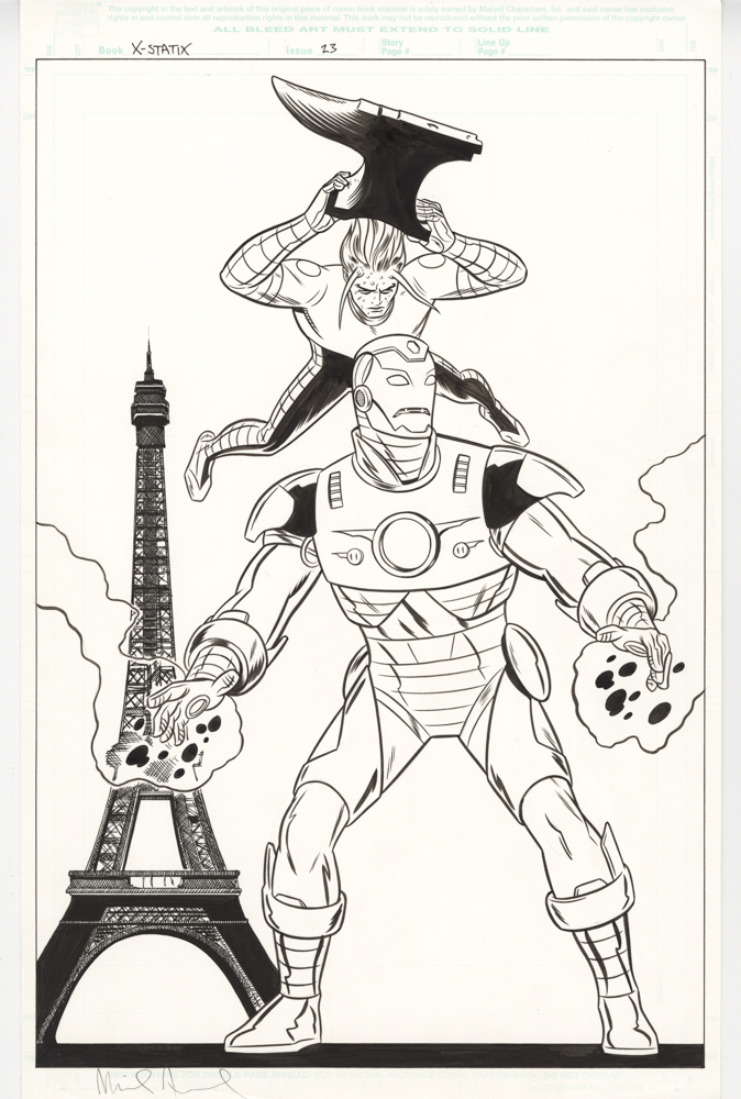
In the case of these Allred X-Statix covers, logic dictates that the main reason to change here was necessary to match Iron Man’s costume in the series. That said, it’s interesting that quite a bit more was also changed in the final version. The IM figure in the published cover is much more prominent in the foreground of course, and, changing the Paris landmark from Arc de Triomphe to The Eiffel Tower fascinates me.

I acquired these covers separately, and a few years apart, but I remember the first time I saw the unpublished version at a quick glance I assumed the Arch was actually the well known Washington Square Arch in New York City which, although much smaller, is actually based on the Arc de Triomphe. (This piece of information has sent me down the Wikipedia rabbit hole — but I digress.) 

Avengers… New York…. Makes sense, right? Except when I actually had the piece in hand, I realized that not only is the Arc de Triomphe very nicely photo referenced, it includes tiny-silhouetted figures for some scale. Definitely Paris.

But that couldn’t be the reason for the additional change? Could it? No one said, “The Eiffel Tower is more recognizable as Paris” did they?…. Would they?…

Regardless, I like some elements’ of both covers, but if I had my pick, I prefer the unpublished version. That might be the “wrong” Iron Man costume, but the retro feel is cooler, especially in Allred’s distinctive style. And overall, the inks are more appealing to me in the unpublished version.

Oh well  — c’est la vie!

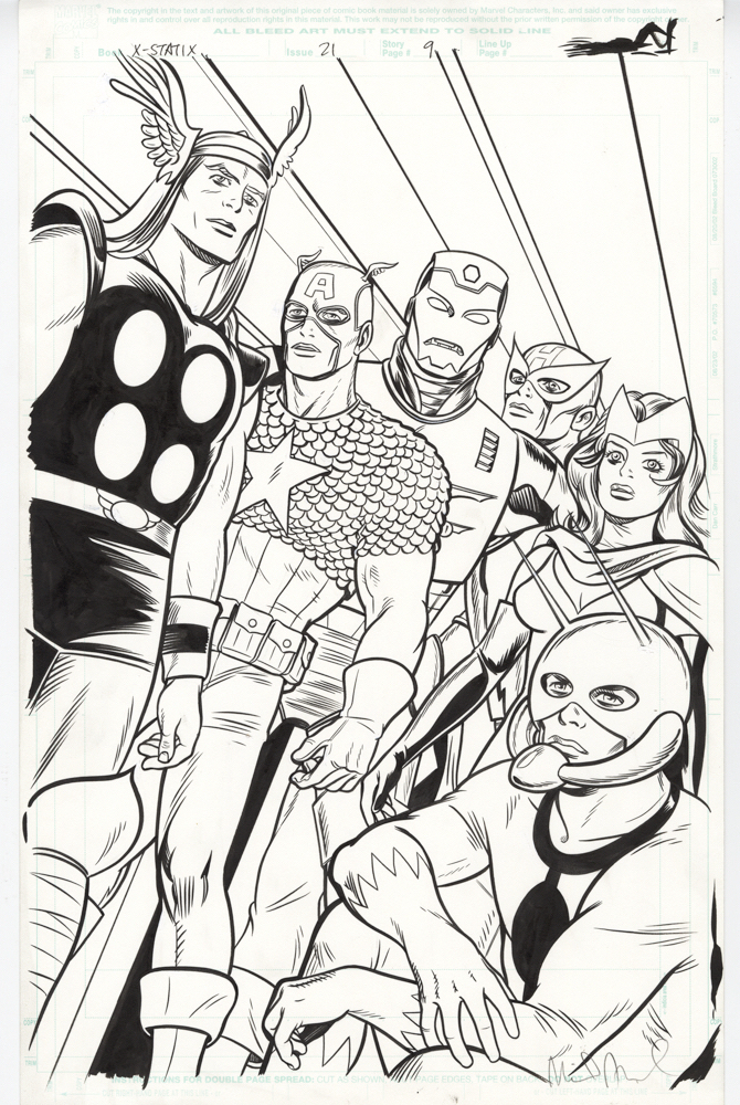
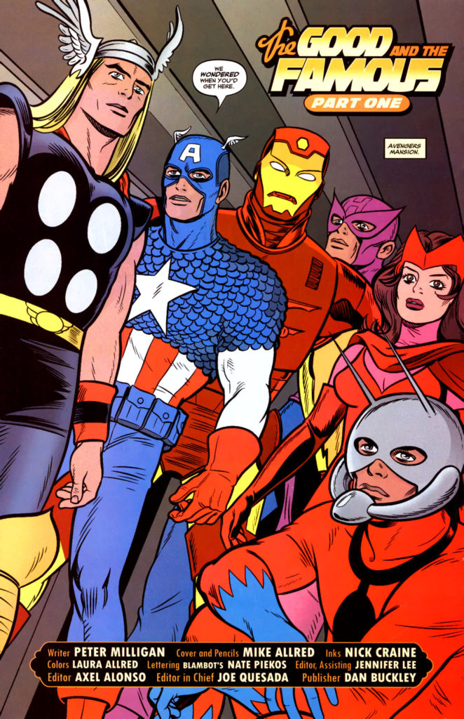
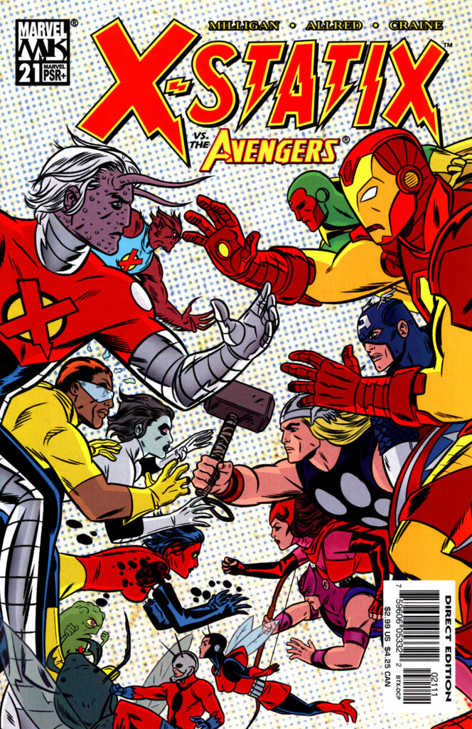
Mike Allred — Assemble!

X-Statix 21 (June 2004)

X-Statix #21, 2004

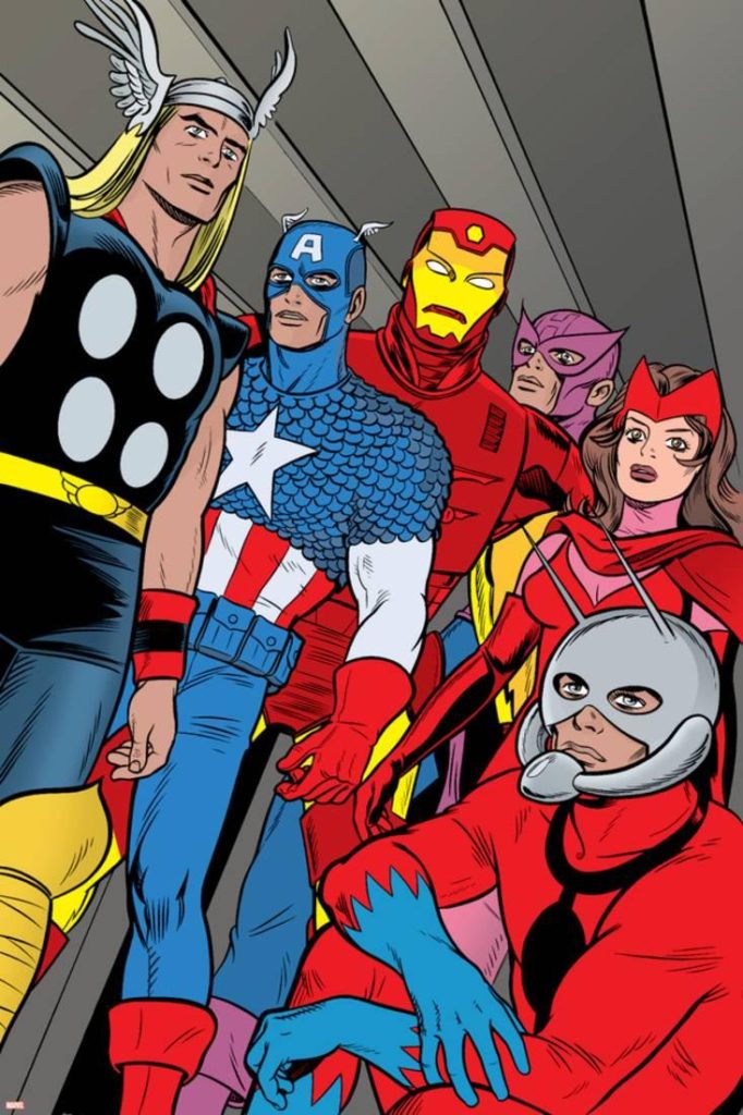
Mike’s unique take on Peter Milligan’s X-Statix series was quirky and great fun — as you would expect it be. Late in the series — but before anyone could even conceive of a cinematic “MCU” — he added his version of the classic Avengers into the mix. In this iconic splash page (It’s now available as a poster) if you replace Scarlet Witch with either Black Widow or Hulk, you pretty much have the main cast of Endgame. Assembled indeed!