Greg Goldstein's Comic Art Gallery

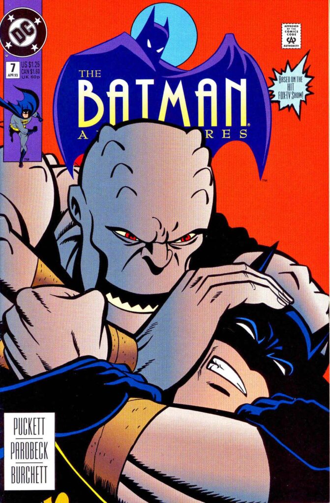
Mike Parobeck — Batman, Forever

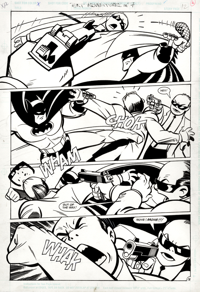
Batman Adventures #7, April 1993
Kevin Conroy THE voice of Batman for millions of bat fans, has passed at at age 66. From Comic Art Fans:

“The Bat-signal will shine a little dimmer over Gotham City tonight as word has come down that Kevin Conroy, iconic voice of Batman for generations in the Bruce Timm-verse of cartoons, has passed at age 66. Just this past he added the credit of comics writer to his resume with a short story in the DC Pride 2022 anthology about how he related his secret life as a gay man in the 80s to the Dark Knight. 

“Kevin was a brilliant actor,” co-star Mark Hamill said in a statement. “For several generations, he has been the definitive Batman. It was one of those perfect scenarios where they got the exact right guy for the exact right part, and the world was better for it. His rhythms and subtleties, tones and delivery — that all also helped inform my performance. He was the ideal partner – it was such a complementary, creative experience. I couldn’t have done it without him. He will always be my Batman.”

 Our deepest condolences to his family, friends, and fans around the world.”

Posting this great Batman Animated page by the great Mike Parobeck, who also passed much too soon, to remind us that, fortunately, the work will always live on.
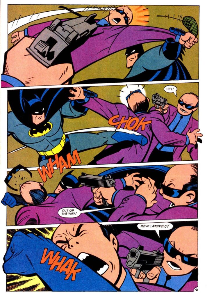
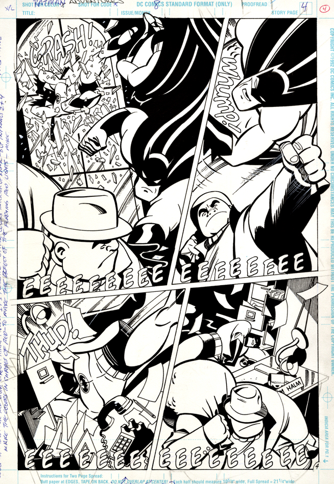
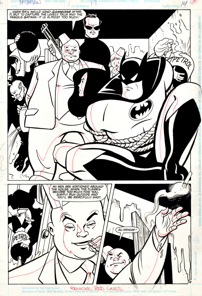
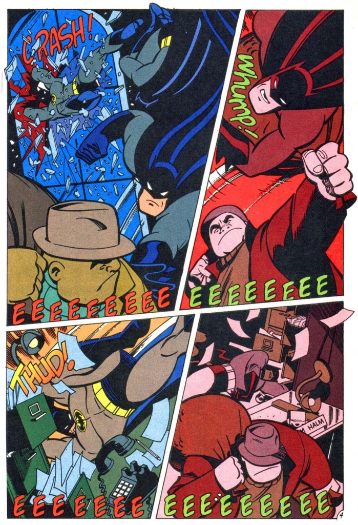
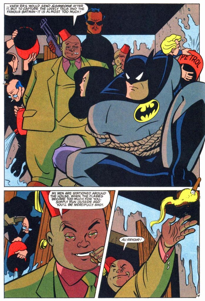
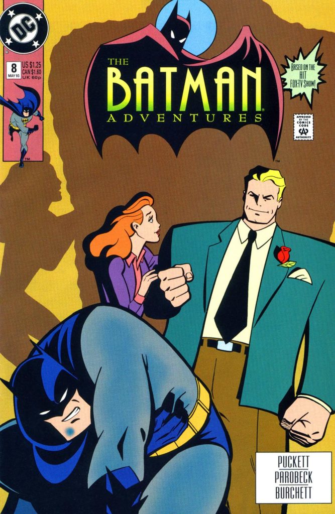
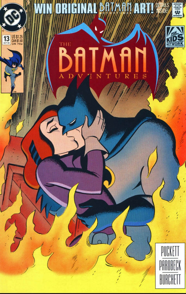
Mike Parobeck — Double Trouble

Batman Adventures #8, May 1993 & Batman Adventures #13, October 1993

Two great pages from the late Mike Parobeck wrap up our 2021 celebration of “Batman Day.”

As I’ve written previously, I was a big fan of Mike’s work; he was terrifically gifted from the start. Most of his art shares the same terrific qualities: Simple. Clear. Clean. Powerful.

He died much, much too early from diabetes at age 31.

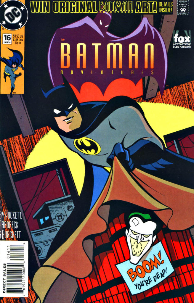
Mike Parobeck — Not Joking

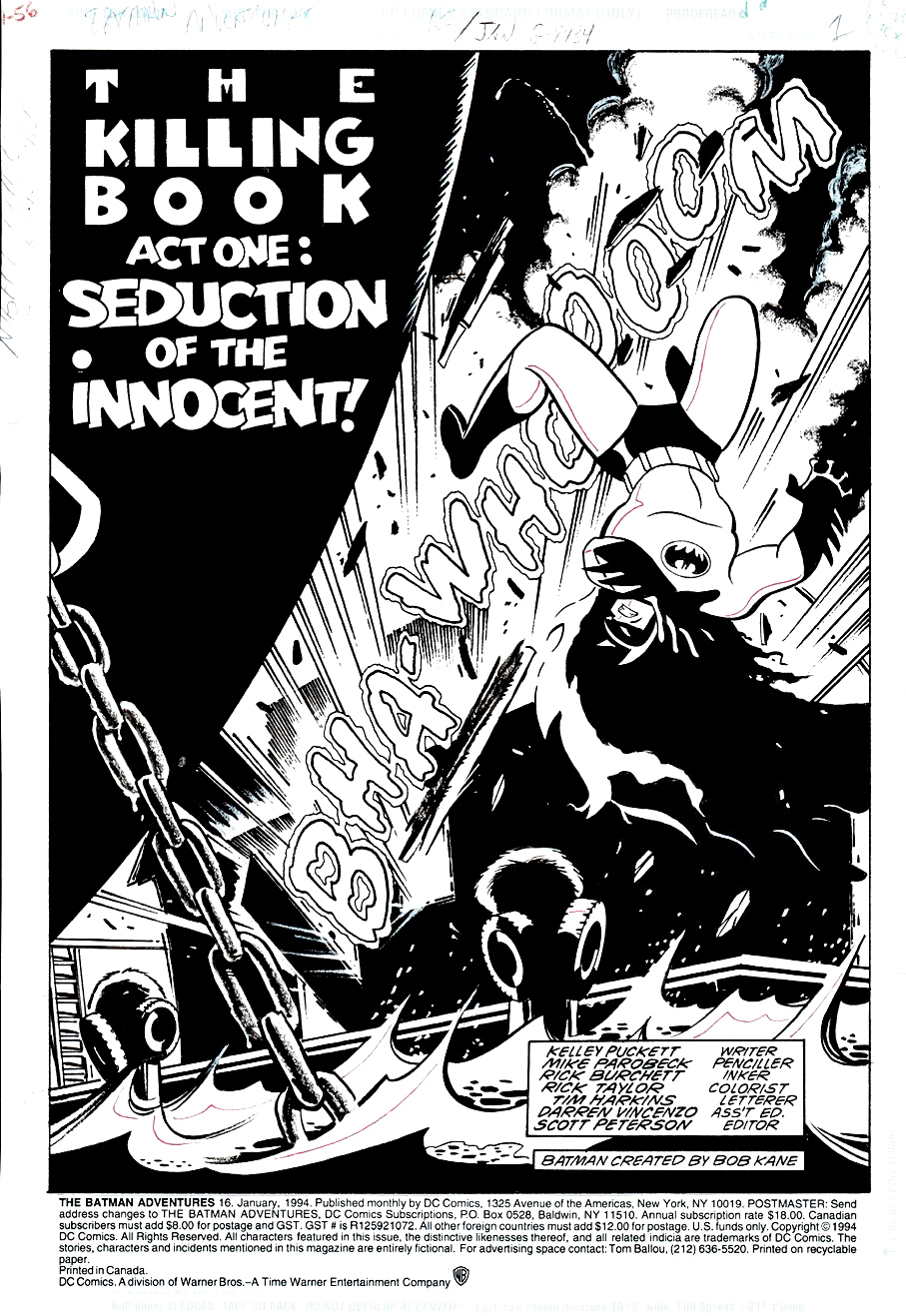
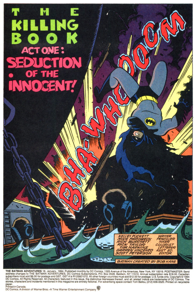
Batman Adventures #16, January 1994

Continuing our art showcase in honor of the annual “Batman Day.”

Here’s an example of the terrific work DC’s editorial accomplished on its Batman animated tie-in comics, which captured the look and spirit of the brilliantly produced animated series.

Mike Parobeck, as discussed in a previous post, passed away much too early. The work he produced in his short time was so well done that an amazing long-term career appeared inevitable.

Lots of things to love about this title splash, including fun lettering (on the art board) by Tim Harkins, his final issue on the series.

Composition is terrific of course, and the multi-faceted Rich Burchett provides some nice slick inks.

Mike Parobeck — Modern Composition

X-Men: The Early Years #7, November 1994

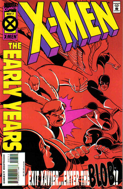
Sometimes the reprint cover is just better.

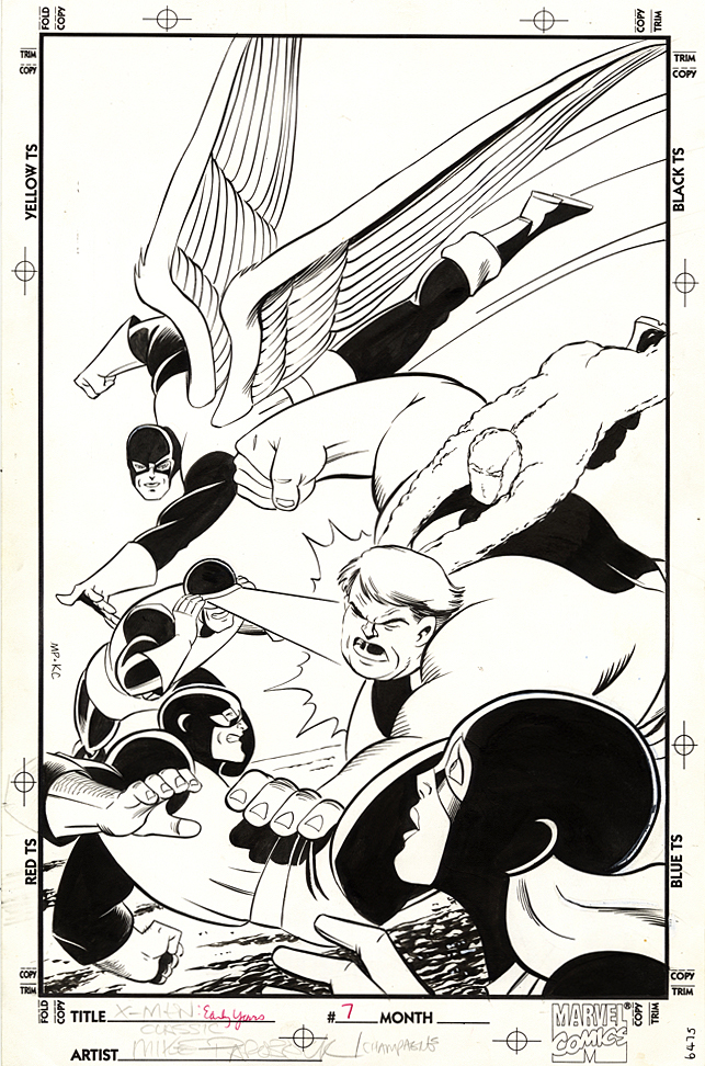
Case in point, Mike Parobeck’s cover of X-Men: Early Years #7, which reprints the original X-Men  #7.

Jack’s original cover (below) is overloaded, and a composition mish-mash. Ok, I know it’s by Jack Kirby, and some fans will bristle about anything negative about the King’s work, but sorry, there’s no real comparison between the original and the reprint.

Mike’s cover is strong and focused.

Jack’s original has way too many characters all over the map, with the X-men oddly positioned in the background and The Brotherhood of Evil Mutants voyeuristically up front, awkwardly. Are they watching from a window? Or on a TV screen? A magical portal? Why the heck are they even on this cover? This is a selling point?

Now, just to be clear, this may not be at all Jack’s fault. Maybe Stan Lee art directed it. And overwrote the cover blurbs to death. (Now, the Stan haters can come out of the woodwork.)

As I’ve said on the record many times, I’m a fan of both Stan and Jack, so let’s all calm down. However this original cover developed, it’s simply not a great one. Even legends drop the ball once in a while.

Mike’s solves the problem thirty years later by focusing only on the X-men coordinating — or attempting to — an attack on the Blob.

Simple. Clear. Clean. Powerful.  Typical of Parobeck’s work.

But… On the published version, the trade dress is a bit heavy handed, so some of the art is obscured — and the entire image had to be flipped to accommodate said trade dress. And, to add to this litany, why the monochrome coloring? Ah Hell, who knows.

Anyway, the original art is great and Mike’s Marvel work is pretty rare; he is best known for some great looking art on the Batman Animated comic books. I was also a big fan of his Justice Society run.

He unfortunately passed away MUCH too early at the age of 31 (from Diabetes) in 1996.

His is a talent that is sorely missed.