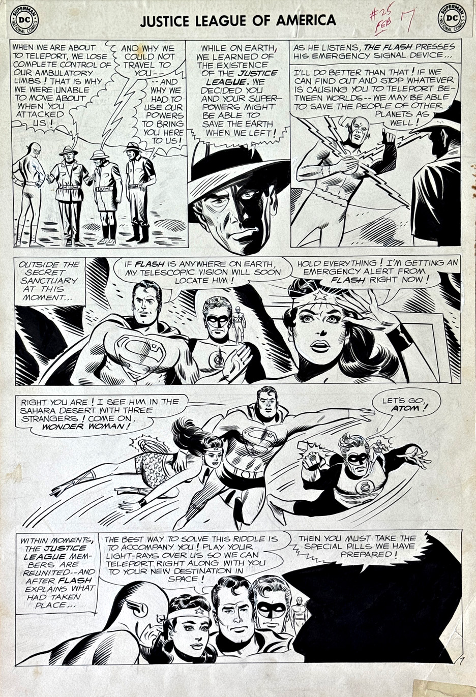
Here’s a very cool—and not all that common—page from Mike Sekowsky’s run on Justice League of America.
What jumps out right away is that you’ve got all five Leaguers from the issue sharing the same page. That wasn’t always the case—these stories often split the team into smaller groups, each getting their own chapter. So having everyone here, across multiple panels, really gives the page that full-on “team book” feel.
And then there’s Superman—front and center.
That’s actually a bit unusual in those early JLA years. He was around, sure, but often used a little more sparingly. Cover-wise, he’d only popped up a handful of times before this—and even then, kind of on the margins. Here, he feels like a real driver of the story, not just part of the roster.
This one’s from before my own newsstand era, which is part of the fun. Big, bold, early Silver Age stuff—goofy aliens, interdimensional problems, the kind of threats where you actually need a whole team. You’re not calling in the Justice League for a bank robbery.
And Sekowsky—never really labeled a top-tier stylist—but the guy could draw anything, in any situation, and keep the story moving. That’s a skill that’s easy to overlook, and shouldn’t be.
Just a great page—and a really nice slice of JLA history.
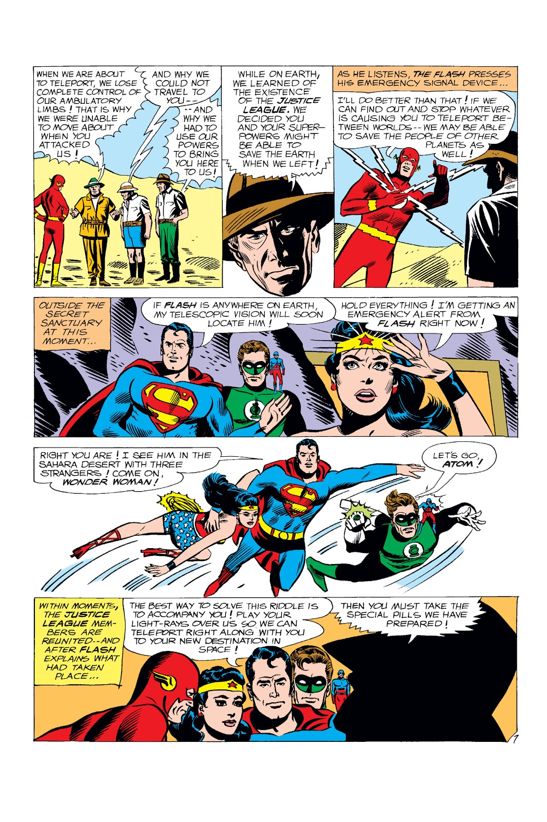
Mike Sekowsky’s art and 70s pop music have characteristics in common for me:
As a kid, I didn’t like either of it, and now I look back on both with a sentimental warm feeling.
It’s not easy to explain. But I was warned by one of my older colleagues this would happen.
Sekowsky’s art always felt too loose (and blocky) for me. I realized he could draw any character of course, which made him the perfect illustrator for Justice League, but the end result never grabbed me.
Now as time has passed, and I smile when I see it. Possibly a primal nostalgic impulse. It seems like a perfect fit for the DC comics of the era.
This example, a cool Flash-focused page, with Wonder Woman on deep background, showcases some clear and inventive storytelling.
As for the draftsmanship? Like I said — things change. Now, it seems charming to me.
Excuse me a moment while I flip over Abba’s greatest hits on the turntable.
Continuing our series on the roots of the Watchmen characters.
Alan Moore, on his original idea for Watchmen:
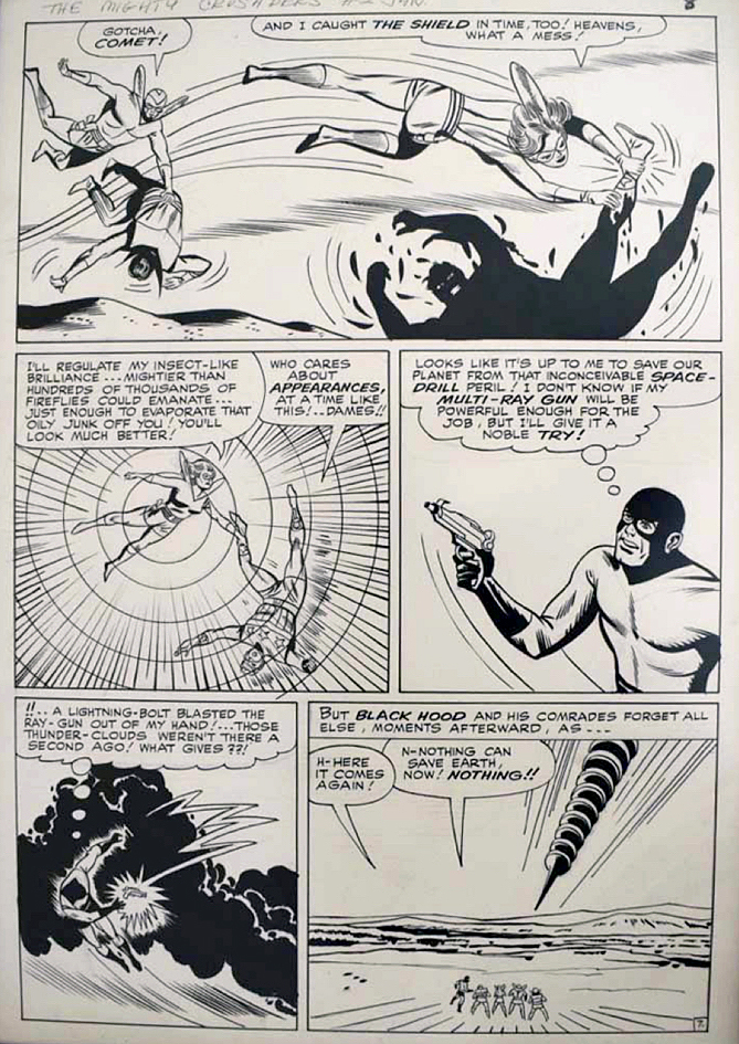
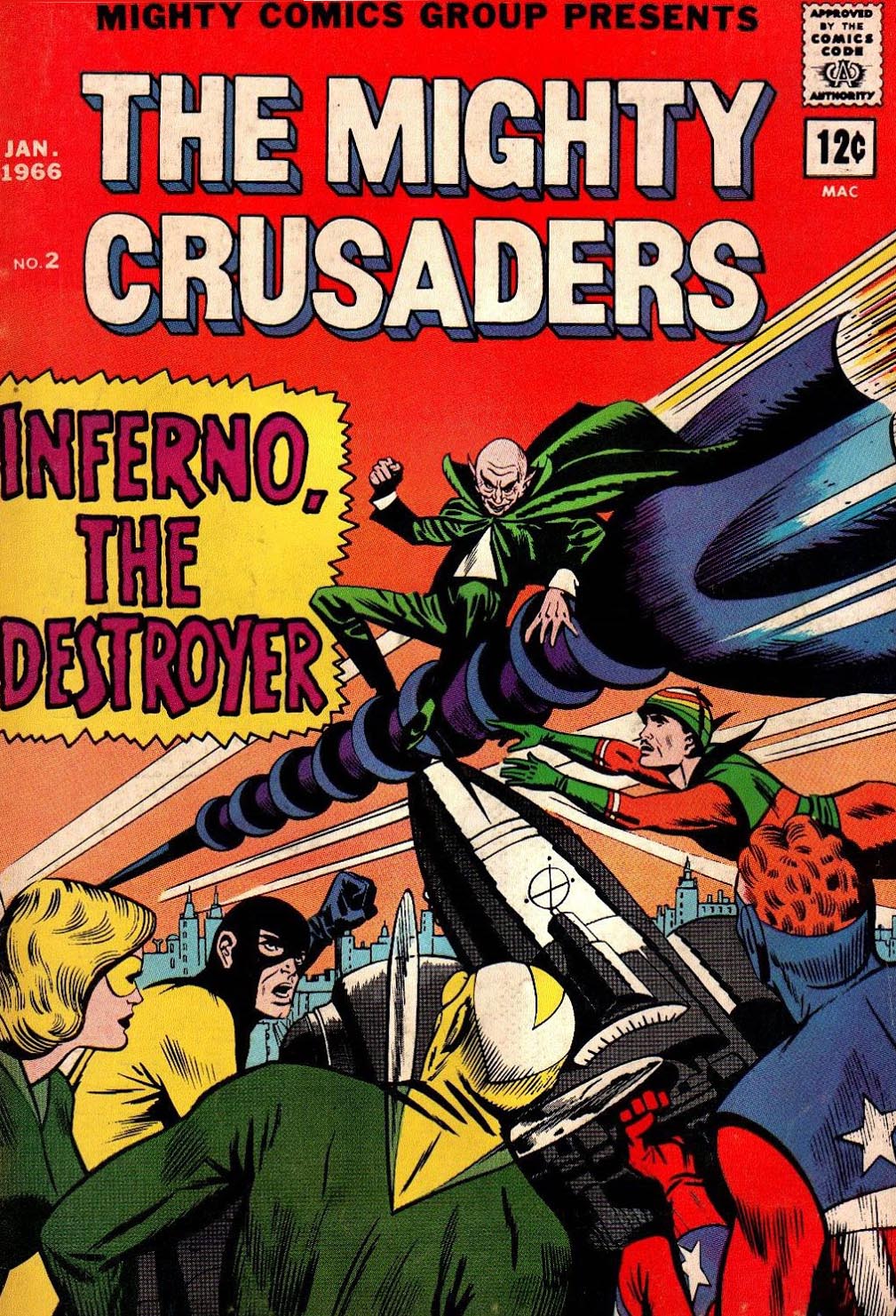
“I wanted more average super-heroes, like the Mighty Crusaders line … [the] original idea had started off with the dead body of the Shield being pulled out of a river somewhere.”
Although the Watchmen eventually morphed out of Charlton heroes instead, elements of the Crusaders and the other MLJ/Archie Superheroes found their way into Watchmen lore. Perhaps most notable is the Hangman, a Golden age Archie character who along with Black Hood, becomes the obvious inspiration for Hooded Justice, a member of the original Golden Age Minutemen in the Watchmen series. (And has a critical role in the Watchmen HBO show.)
Also notable is the Mothman, an obvious derivation of Archie’s (Simon and Kirby’s) Fly / Flyman.
The original MLJ superheroes disappeared into the mists after World War 2, which didn’t impact Archie financially as the title character and his teenage friends transformed the company, including the published actual name which changed from MLJ to Archie in 1946.
But Archie’s management seeing the giant superhero success down the road at DC and Marvel took another stab starting in 1959 with the Shield and the Fly. Ultimately, many of the golden age characters reappeared, forming a team, the Mighty Crusaders.
Superhero artist Mike Sekowsky was first a Timely (nee Marvel) staffer and then a long-time DC mainstay. He is perhaps best known for his work on Justice League of America, where he could draw almost any character.
So he is well suited to tackle the Mighty Crusaders, a team-up book developed to compete with Justice League and other superhero team books of the day.
But Jerry Siegel’s (yep, Superman’s creator) writing style had most definitely not kept up with the style of the day, and the book was cancelled after seven issues. In fact, the entire Archie superhero experiment fizzled out by late 1967.
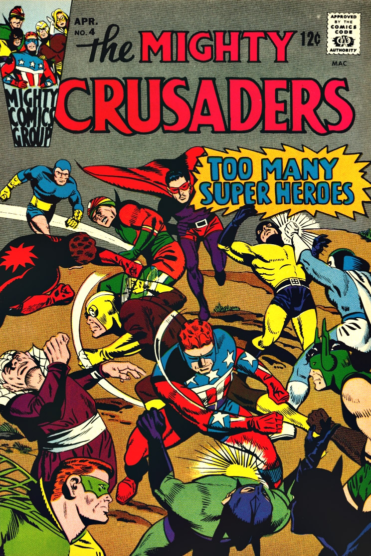
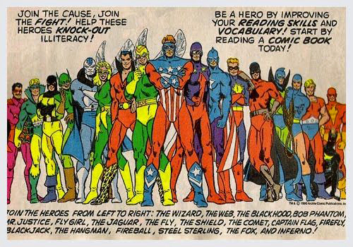
But… not before they managed to bring together nearly all the dusty MLJ heroes and put them in one comic book. Issue #4 of Mighty Crusaders, is a goofy favorite, entitled “Too Many Heroes.”
Too many, perhaps, but certainly enough to reach into for character ideas twenty years later.
Issue #4 of the Mighty Crusaders is a… gas. Pretty much every MLJ/Archie hero (as seen twenty years later in this house ad) mysteriously reappears to apply for membership into the Crusaders. The Crusaders themselves disappear after a short-lived series in 1966, but re-emerge multiple times starting in the 80s.
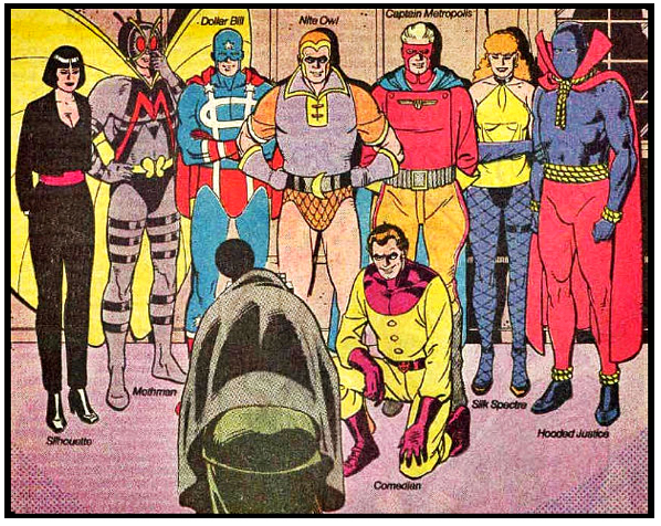
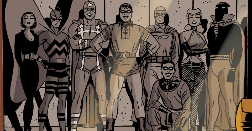
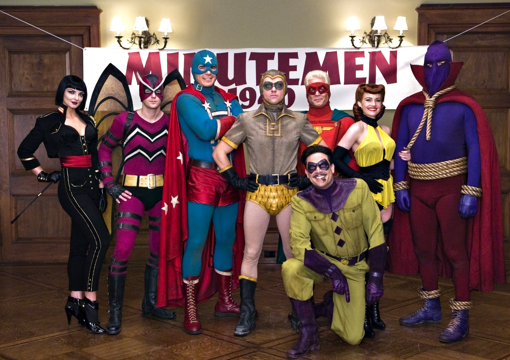
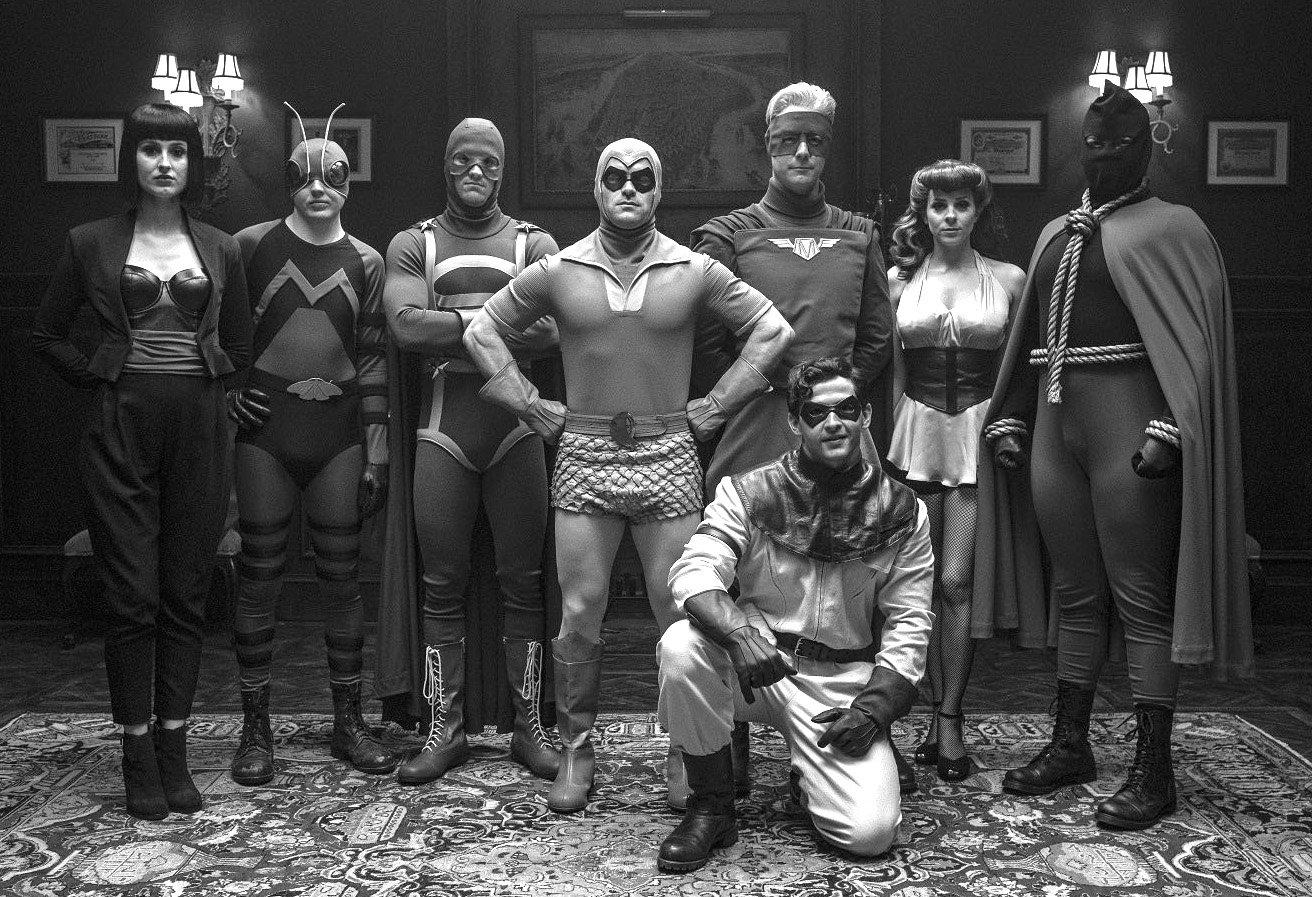
The classic Minutemen team shot as drawn by Dave Gibbons and recreated by the late Darwyn Cooke 25 years later, and the nearly identical PR photos from the 2009 film and 2019 television series.
Final Scorecard — Minutemen and their original counterparts:
Silhouette = Completely unique. (Maybe an amalgam of Black Canary, Black Cat and a female version of the Fox if you want to stretch out the derivations…)
Mothman = Flyman
Dollar Bill = Captain Flag
Nite Owl 1 = Blue Beetle 1 (Dan Garrett)
Captain Metropolis = Shield (with some Steel Sterling thrown in)
Silk Spectre 1 = Phantom Lady (with some Black Canary thrown in)
Hooded Justice = Hangman (with some Black Hood thrown in)
Comedian = Peacemaker (with some Shield thrown in)