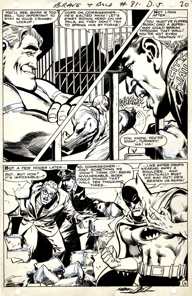
Here’s a splashy Neal Adams page from his fourth overall Batman story.
As always, Neal’s facial emotions are spot on. I love Bork’s smug face, Commissioner Gordon’s shocked expression, and Batman’s frustration with the entire situation. The body language on all the characters on the page also adds drama to the storytelling.
Vince Colletta was the first inker on the story, and Neal wasn’t happy with the results so he and Dick Giordano re-inked some of it. You can see some corrections on this page, and others in the story, when viewing scans of the original art.
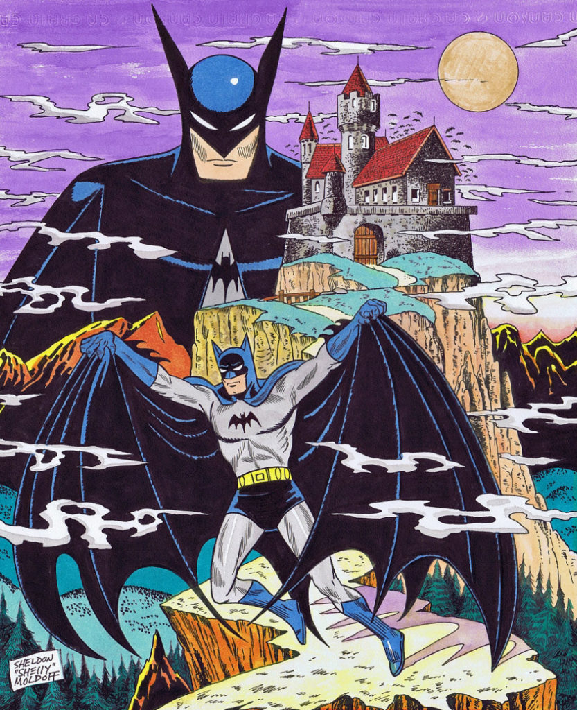
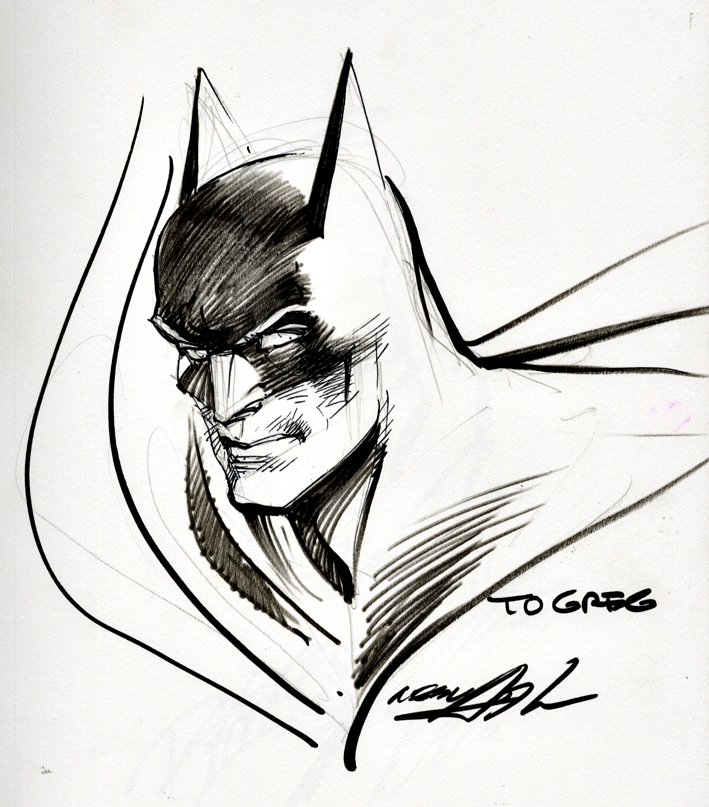
Neal Adams Batman from the Silver Age — Definitely pleased to own this one.
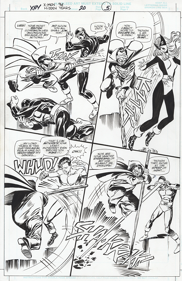
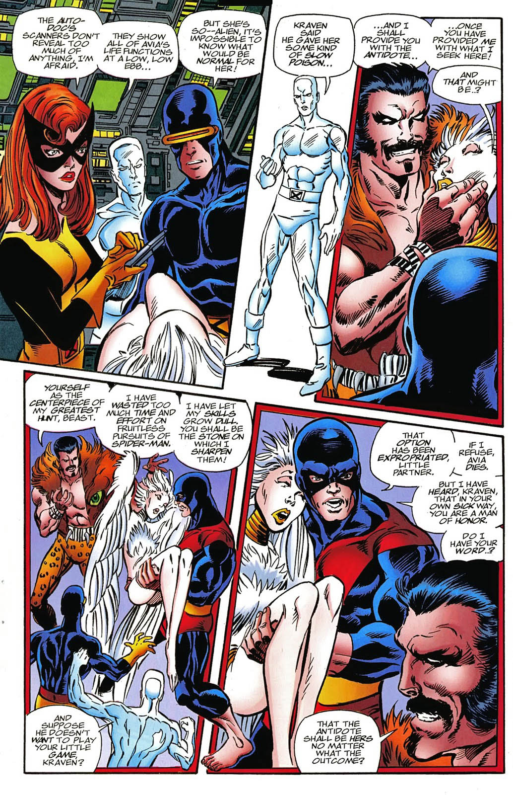
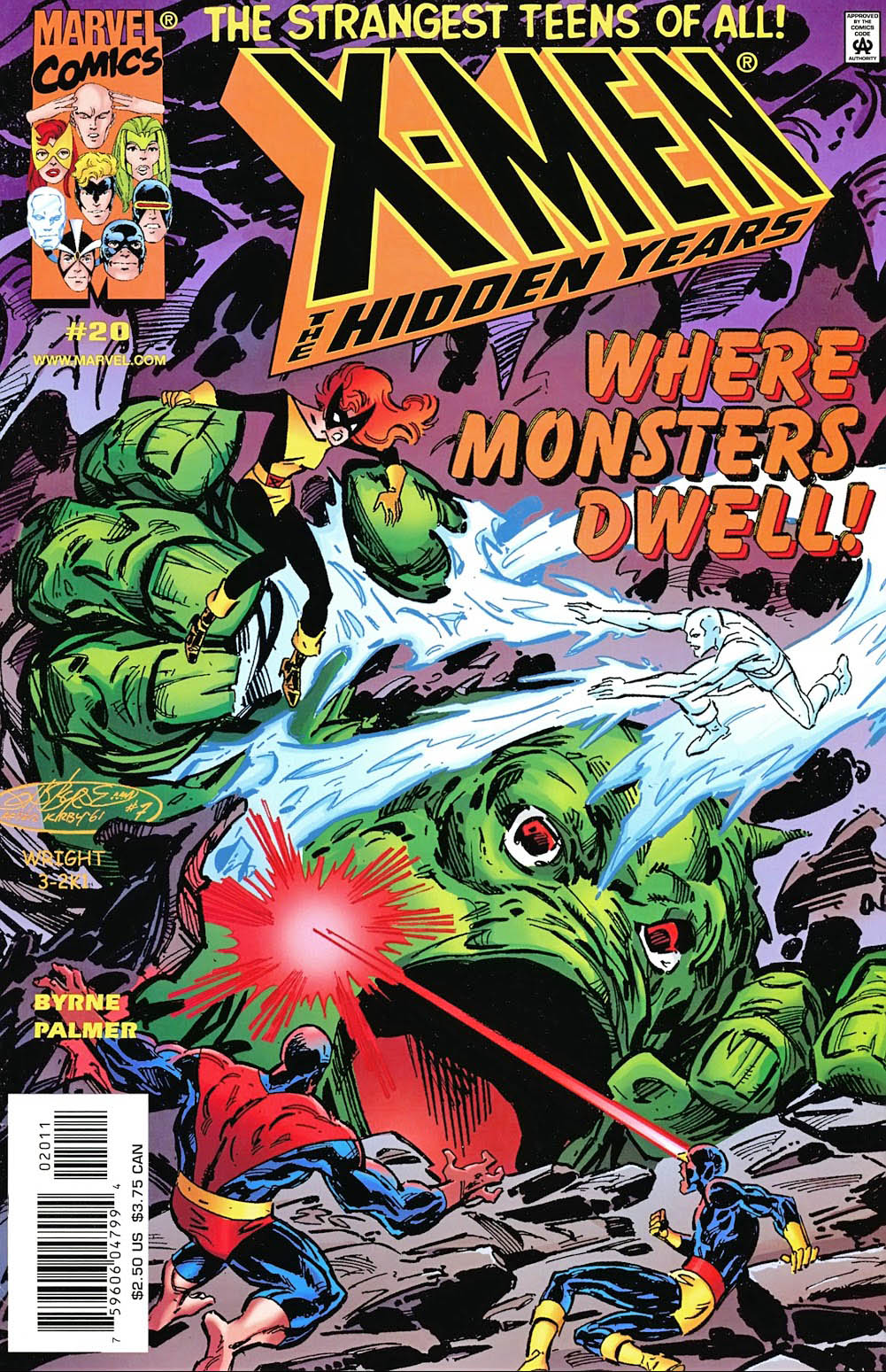
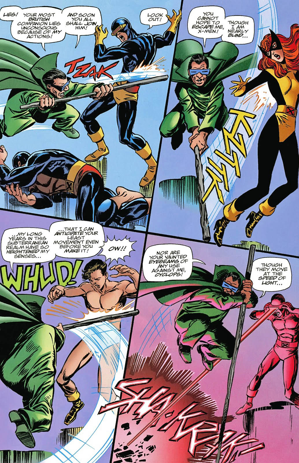
X-Men: The Hidden Years # 17, April 2001 & #20, July 2001
John Byrne returned to the X-Men in 1999. Not his beloved X-Men of Wolverine, Storm, Colossus and Phoenix, however. This time it was the “original” X-Men — in the period between their cancellation and rebirth. The “Hidden Years.”
It’s an often overlooked series and shouldn’t be. John brought great energy — and closed some outstanding story loops — in the 22-issue series.
Inks are by the terrific Tom Palmer, which gave the series a
classic look, reminiscent of those great original Neal Adams issues, while still
keeping it clearly Byrne.
Lots of fun guest appearances in the series as well, including the Fantastic Four — inked in one issue by the legendary Joe Sinnott.
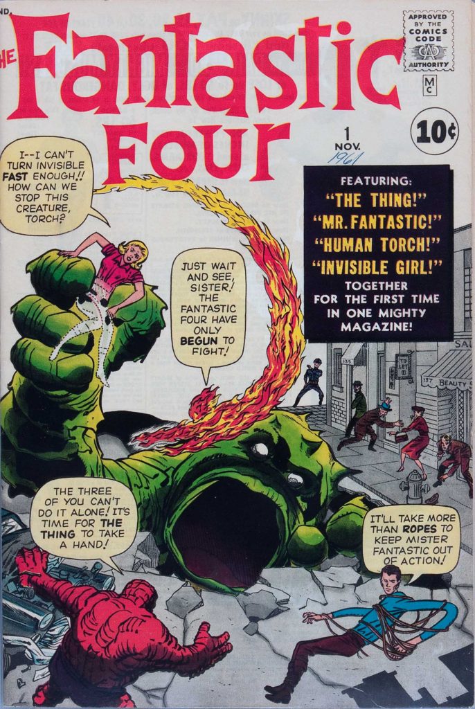
X-Men: Hidden Years #20 is a Byrne homage to Jack Kirby’s Fantastic Four #1. It was the sixth (and final) Marvel-related FF #1 homage that John drew.
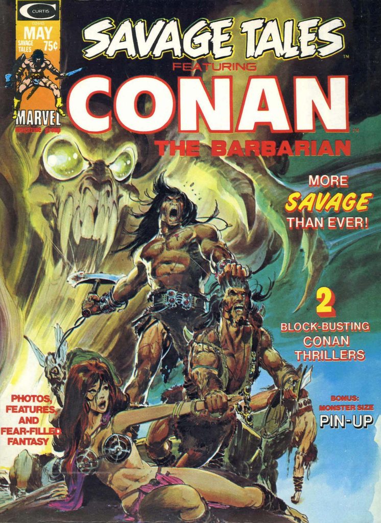
Conan celebrates its
50th anniversary in comics this year, and we conclude our anniversary recognition
with our final of three Conan-themed posts.
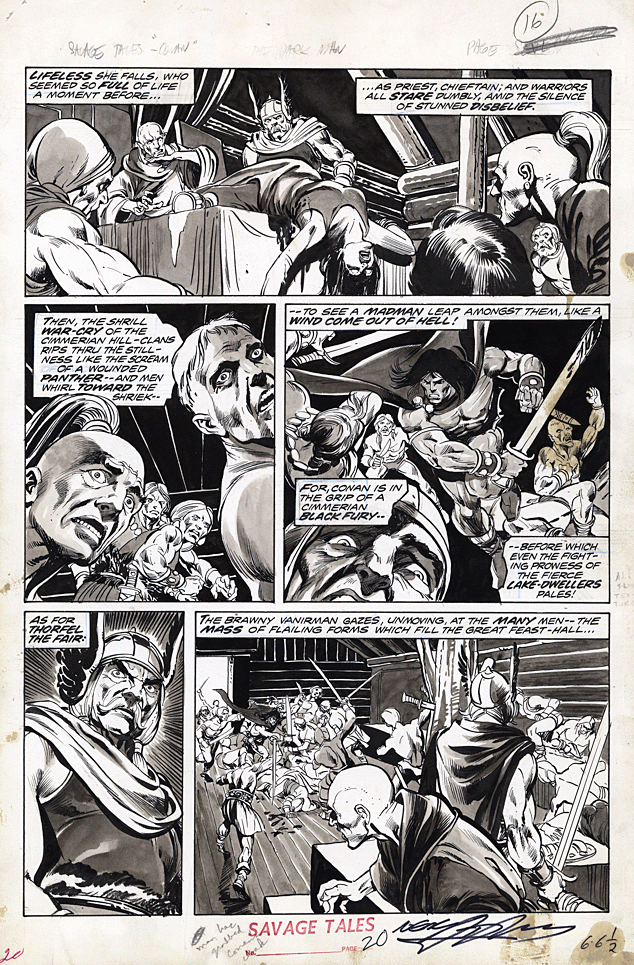
Night of the Dark Gods is a great example of Roy Thomas’
ability to adapt an Robert E Howard story without Conan, into one.
Given the artistic talent that worked on the story, clearly
some deadline problems ensued. Not surprising, since at this point in Marvel’s 70s
expansion, (comic books and “mature magazines”) deadlines were whizzing
by a the speed of light.
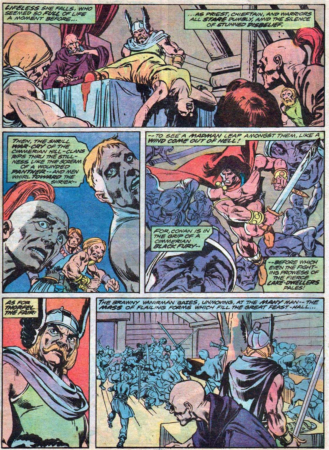
Neal Adams assisted Gil Kane on the pencils, and inked some
of the story as well, supported by Vince Colletta, Frank McLaughlin, and Pablo
Marcos. Marcos also provided the wash tones on the story, necessary to add
depth to a black and white, and also provide some consistency to the art style.
The inking credits are listed as Diverse Hands, and this appears to be the only time that the credit is employed, meaning it’s likely that this specific group of professionals never contributed jointly again on one story.
Neal, of course, was a pro at collaborative art creation. His “Crusty Bunkers” a group of (ever-changing) artists at his Continuity Studios, filled in many times during deadline crunches for Marvel, DC, Charlton and others during the 1970s.
It’s easy to be fondly nostalgic about something you missed entirely, but, based on everything I’ve heard, it sounds like a hoot. Stop by, ink some pages, spot some blacks, and make your deadline, head to the pub. (It was probably much more stressful than that, but I digress.)
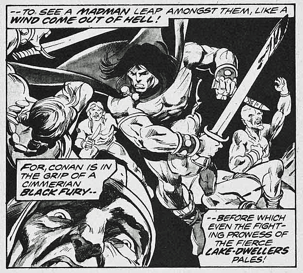
The story is ultimately also printed in color, in a Marvel Treasury Edition, and although the coloring itself is okay, many of the inking and wash details are obscured, likely in an effort to get the job done quickly.
(And see below for the mystery of the extra face.)
Night of the Dark God, in glorious black and white, and a bit later on in color. But wait a moment…
…Where did the extra face in the color version come from? It balances the panel a bit more, I guess, but still… I wish had the time right now to compare every panel of this story to see what other “Where’s Waldo” attributes I can find.
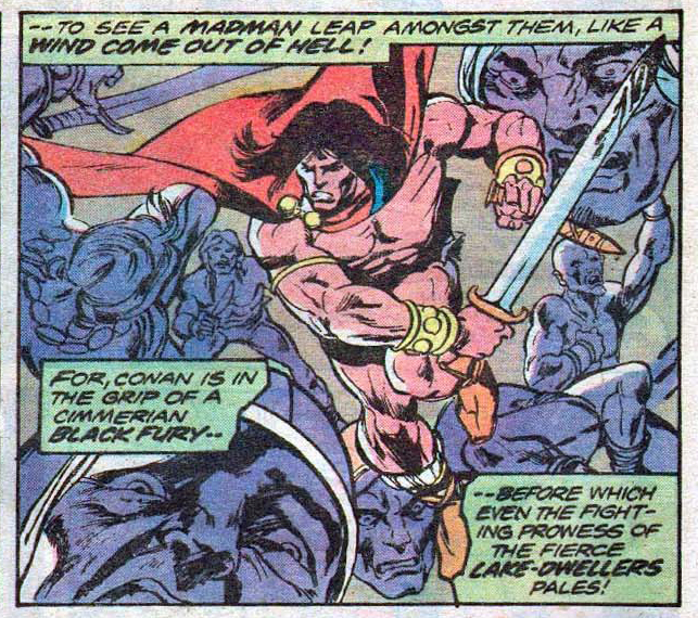
Batman of Arkham #1 (Elseworlds one-shot), June, 2000
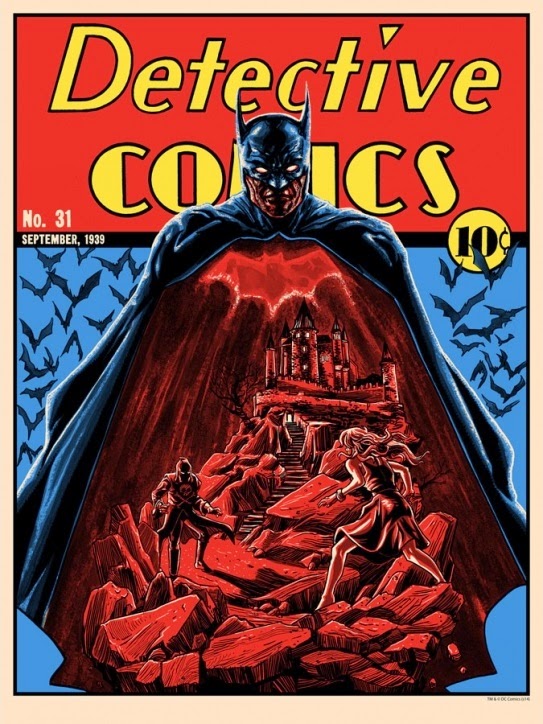
When you think of homages — or outright swipes — to classic comic book covers, a few classic and obvious issues come to mind:
Action #1
Fantastic Four #1
X-men #141
But there’s an issue slightly less obvious that may be the record holder with the most homages, especially with the same character:
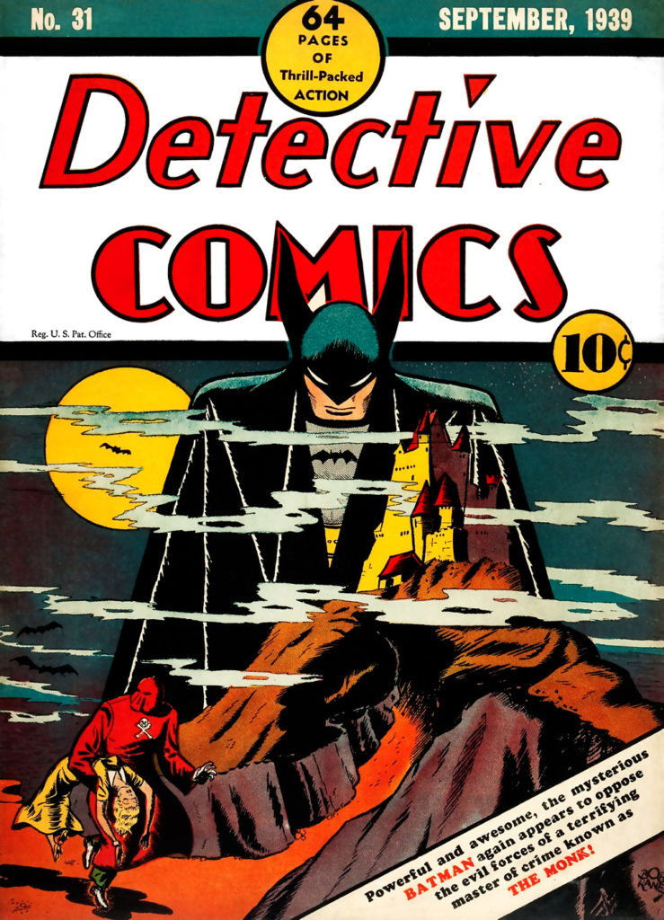
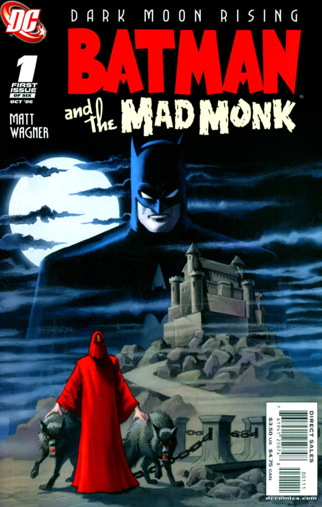
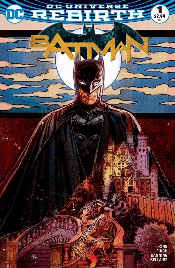
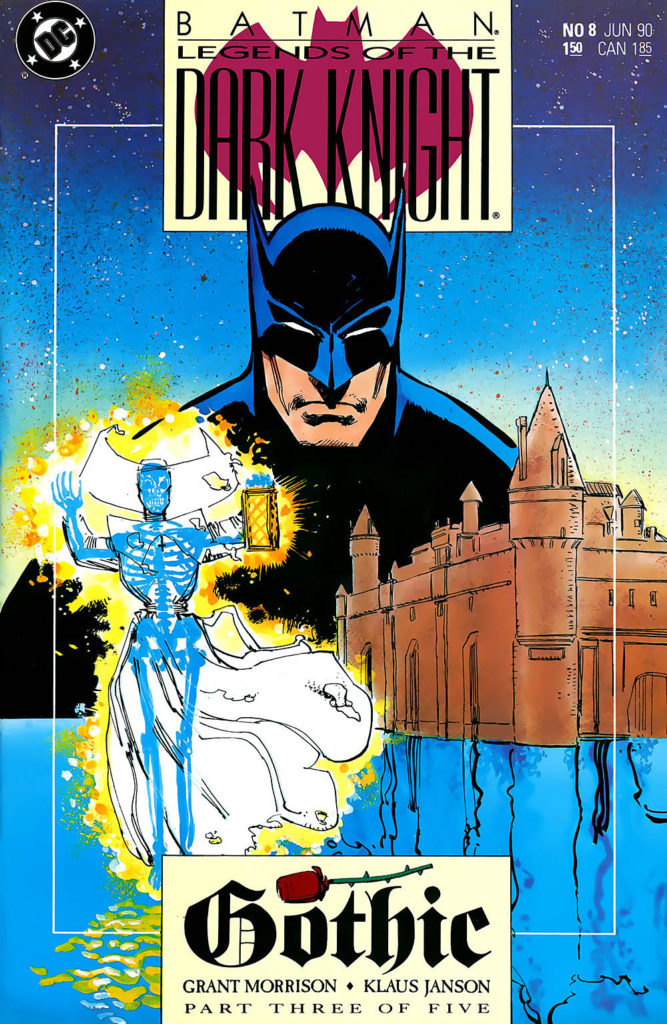
Detective #31 (1939) by Bob Kane is just the third Batman cover ever, and a great one. It inspired Neal Adams to create his own version about thirty years later, and at that point, the floodgates opened. See below for as near a complete gallery as I could assemble. (Some are looser than others, but they all aim to capture the spirit of original cover.)
Meanwhile, on this gorgeous original cover by Alcatena (why isn’t he doing more comic book work?!) third time was a charm for me. I was under-bidder when it came up at auction. Shortly thereafter, when a major art dealer had it for sale, I missed it, and it sold again.
But that owner only had the cover a short while before he sold (or traded) it back to the same dealer, and this time I quickly managed to stake my claim on this beautifully detailed cover.
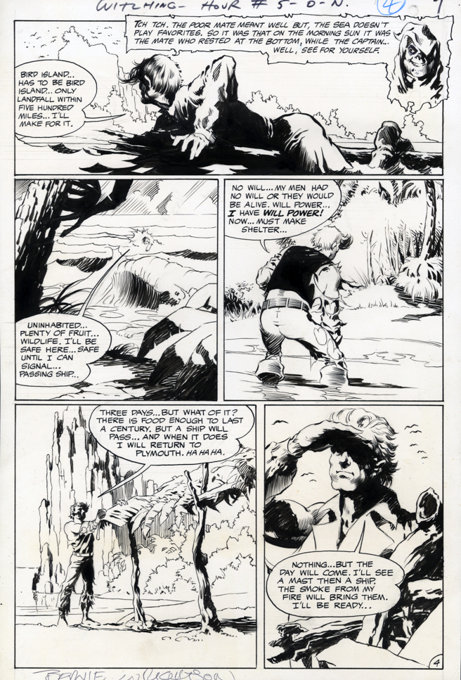
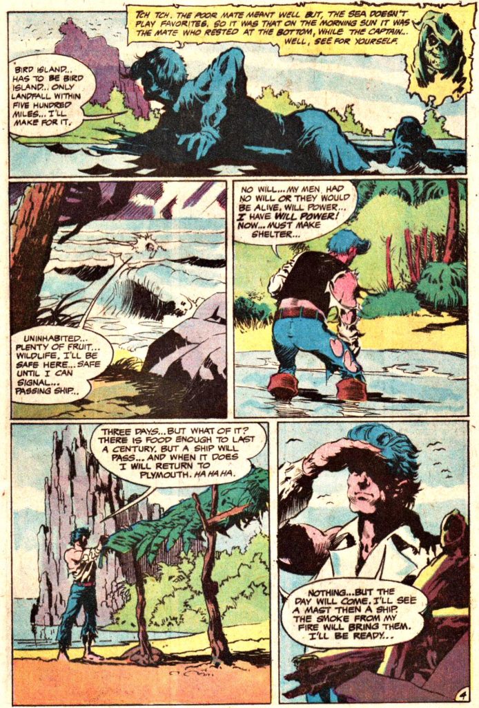
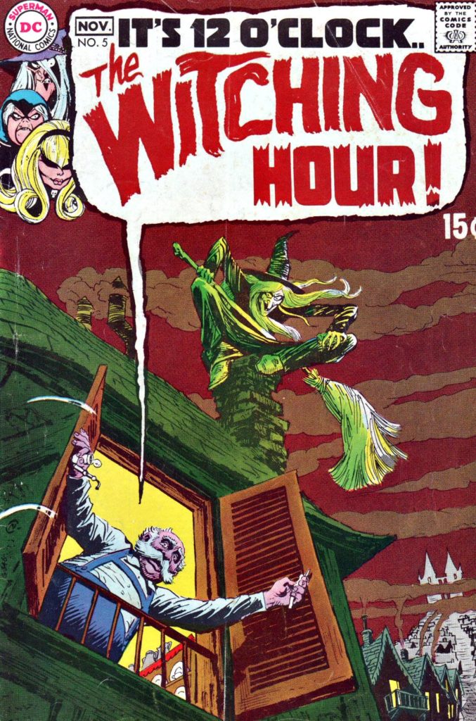
Witching Hour #5, November 1969, “The Sole Survivor”
Today we launch a two-week series celebrating Halloween with the best in monsters, mystery and mayhem.
It’s difficult to attend Baltimore Comic Con without thinking about Bernie Wrightson, who hailed from here, and made his final convention appearance here six months prior to his death in 2017.
Wrightson’s professional comics career began in DC’s mystery anthology titles just six months before this art was published, 50 years ago this month.
This page, therefore, is very early Wrightson, and although it’s still a few years away from his artistic peak, the talent, and signature detail, is already unmistakably there. His art hooked me early on, and I remain hooked.
Those DC mystery and horror comics, many edited by EC legend Joe Orlando, often showcased star artists like Wrightson, Mike Kaluta, Neal Adams, Gil Kane, and others, including occasionally Orlando himself.
Of course, like other anthology comics, you never knew what the line-up was going to be from title to title, issue to issue. These series were indeed like Forrest Gump’s proverbial box of chocolates: You never know what you’re going to get.
So of course they were always the titles I tried to skim through urgently on the candy store spinner racks, before that crusty proprietor Mr. Wurman would inevitably glance my way and say: “You gonna buy those? This is not a library.”
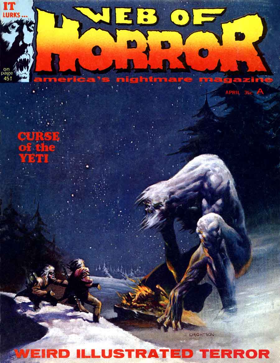
Bernie painted this beautiful cover for the short-lived Web of Horror magazine in the same timeframe as his early DC work — He was 21 years old.
Green Arrow is back on the air (CW) for its eighth and final season, so before the emerald archer fades into the TV sunset, we’re focusing a few posts on Green Arrow originals.
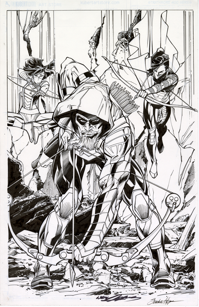
Neal Adams had a big year for DC in 2016. In addition to a themed-cover month in February, Neal started drawing the variant covers for the Green Arrow Rebirth series ands drew 17 in a row. Not too shabby, and pretty appropriate, since he created the first Green Arrow “rebirth” 50 years ago.
With a semi-monthly schedule, Neal suddenly had a lot of covers. And… a lot of deadlines. So, most of the covers are inked by others.
This specific Adams cover — paying tribute to the Mike Grell reboot of the character in 1987’s Longbow Hunters — is inked by the talented (and underrated) Sandra Hope. The inks are terrific, very complimentary to Neal’s style; you’ll get no argument from Neal himself, who revisited and praised the inks last week at NYCC.
That’s the easy part. The more difficult side of the equation? It’s inked on a “blue-line” copy of Neal’s pencils. DC sent a digital scan to Sandra, who then printed it out, inked it, scanned it and then sent it back to DC for colors and final production. When you absolutely, positively have to have it overnight, forget FedEx. Digital is the wave of the present.
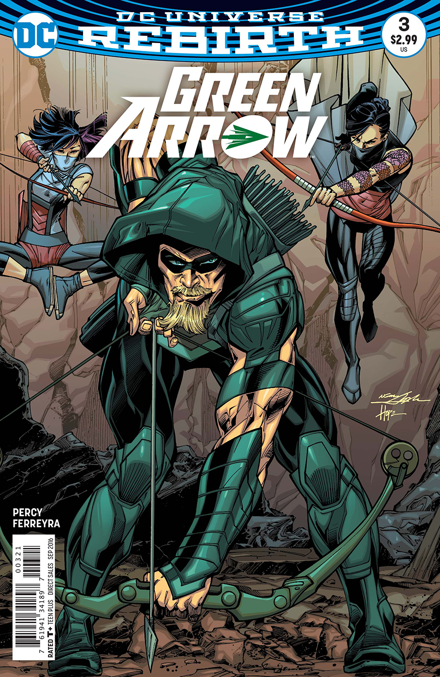
Now this version is the printed cover, no argument from anyone. (DC added Neal’s and Sandra’s signature digitally to the final published version.) But here’s the rub: The pencils themselves exist on a separate board. Neal has kept them or sold them — doesn’t really matter for this discussion. They exist separately. There are technically no Adams “pencils” on this page.
This subject drives many art dealers (especially those that specialize in vintage material) — and some collectors (ditto) — absolutely bananas. They prefer, and I think most of us do, the pencils and inks on the same board. Blue-lines, gray-lines, whatever, for many it reeks as “incomplete” if the inks are rendered over pencil copies. After all, it’s the penciller’s illustration that sets the stage for the inker.
But… it’s 2019. Digital is a way of life. We’re fortunate that any material is still created the “traditional” way. And comics are now truly an international profession — we may be dealing with a penciller in Brazil and a separate inker in Romania. No amount of priority shipping is going to solve that deadline crunch.
So yes, I absolutely still prefer a Jack Kirby page that has Mike Royer inks rendered directly over jack’s original pencils. Or, a Steve Ditko original where I can see the faint pencil lines of his original layouts. Etc.
And I respect that pages with pencils and inks both should, and will always, command a premium price.
But 20 years from now, a kid who loved, say, the Ivan Reis / Joe Prado Man of Steel #1 cover is going to grow up to be a Wall Street financier. Or a successful Hollywood producer. And he’s going to want the original of the published cover, and not care one whit that Joe inked the cover from Ivan’s digital scan. By then, practically everything will be digital, and hand-drawn original comic book art will be a scarce commodity.
And… a killer published cover… is still a killer published cover.
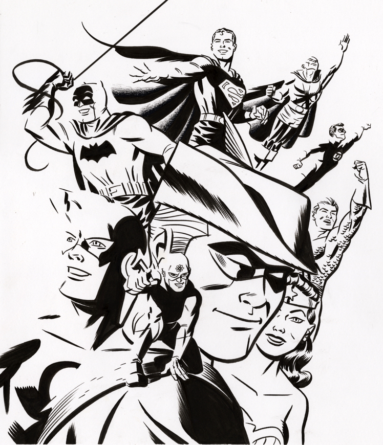
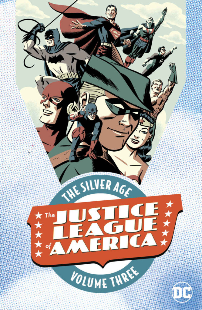
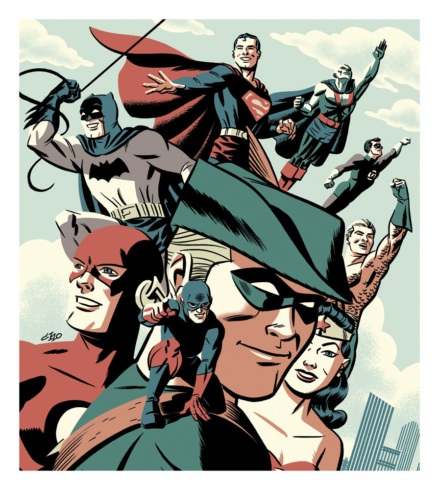
Justice League of America: The Silver Age Vol. #3, 2017
Green Arrow is back on the air (CW) for its eighth and final season, so before the emerald archer fades into the TV sunset, our next few posts will feature a few Green Arrow originals.
Green Arrow, in his original incarnation was definitely not a cool cat. As Neal Adams points out, he was basically a poor man’s version of Batman, complete with a young ward sidekick (Speedy) and an “Arrow car”, his own version of the Batmobile. (Probably a souped-up Corvair. Look it up.)
Still, as noted by pretty much all fans of comic book history know, the entire DC universe of the early silver age — especially when compared to upstart Marvel Comics — was “square.”
And I say, so what? Lots of things in the Kennedy era were “square,” but simultaneously, super cool.
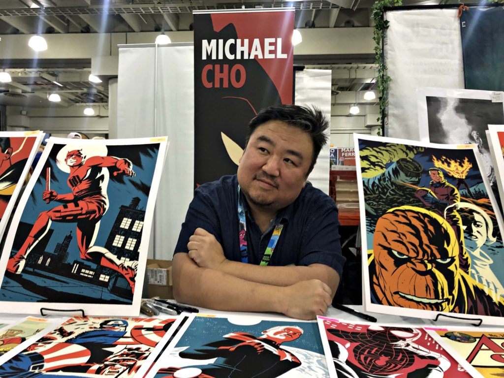
This JLA trade collection cover, by the incredibly talented Michael Cho, captures the exuberant spirit of “The New Frontier.” Green Arrow takes the lead with his fellow Justice League teammates right beside him. Here they can take on anything the world throws at them — and have fun doing it.
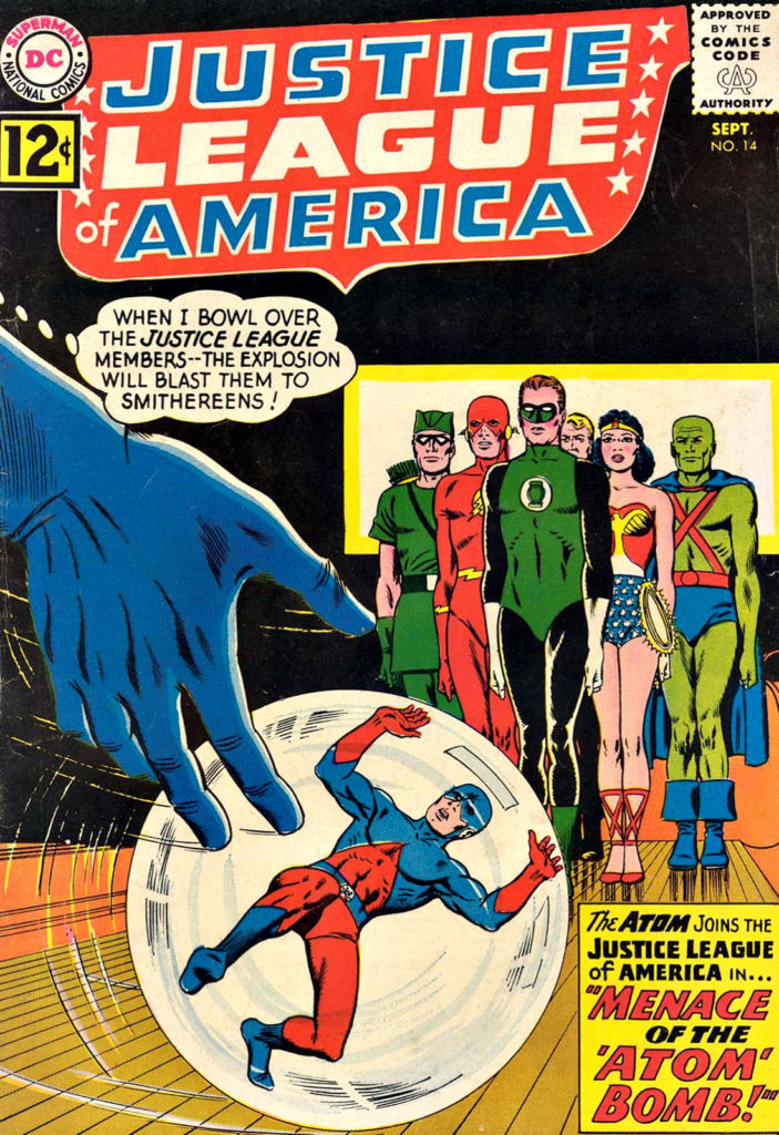
(This cover line-up represents the brief period in team history — Justice League of America #14 – #30 — after the Atom had joined, but before Hawkman had come aboard.)
This cover also embodies the energy and spirit of the late, great creator (and Michael’s good friend) Darwyn Cooke, while still very original in its own right.
I have yet to see a Michael Cho cover that I didn’t enjoy. And I doubt I will.
Printed Cover
Published Print
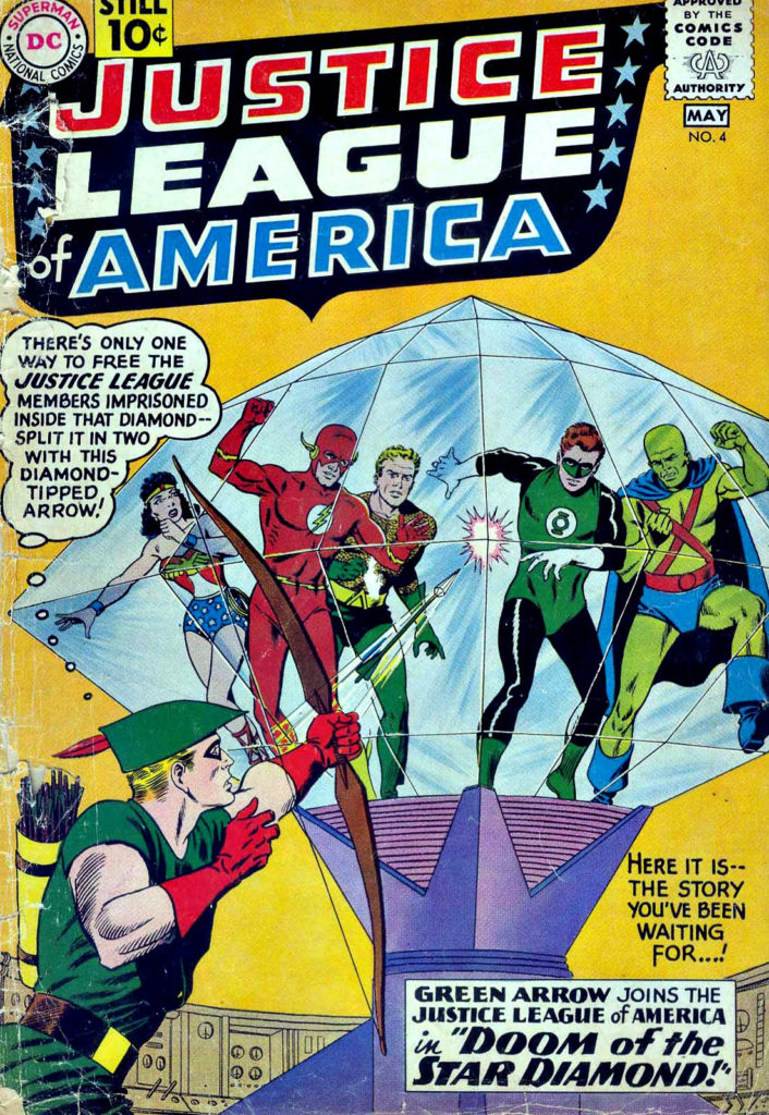
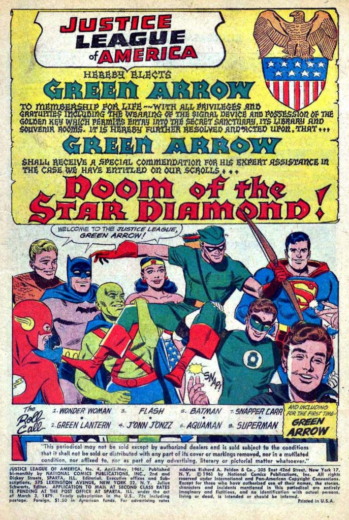
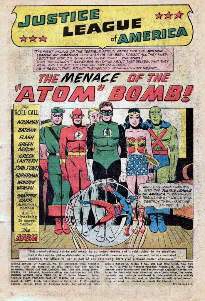
Above: Covers and Interior Title Splash Pages For The First Appearances of Green Arrow and The Atom in JLA.
We interrupt our multi-part look at Spider-Man vs. Mysterio in honor of today’s “Batman Day” (9/21) celebration. Our regularly scheduled programming will continue tomorrow.
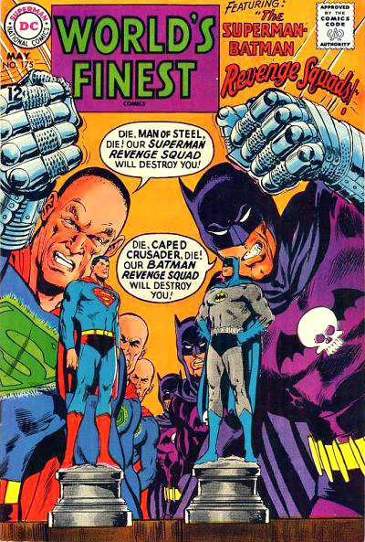
Neal Adams first Batman story appeared more than 50 years (!) ago in World’s Finest Comics #175. The art blew my mind then, and still does today. Happy Batman Day, Neal, and thanks for all of it!
Tomorrow, we conclude our multi-part look at Spider-Man vs. Mysterio with none other than “the Dude” — artist Steve Rude.
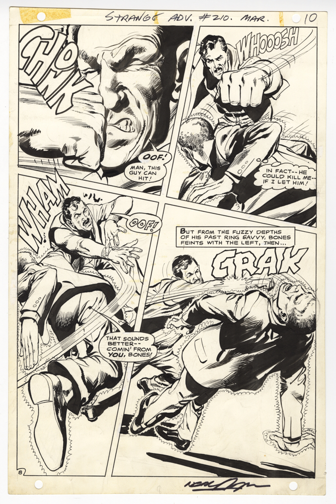
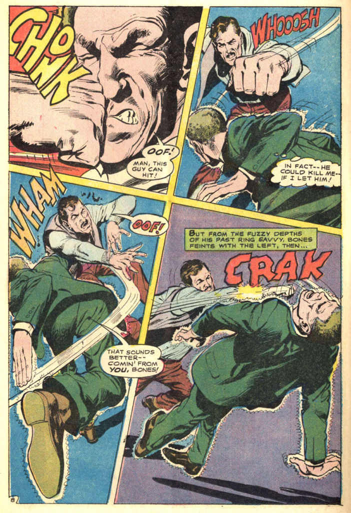
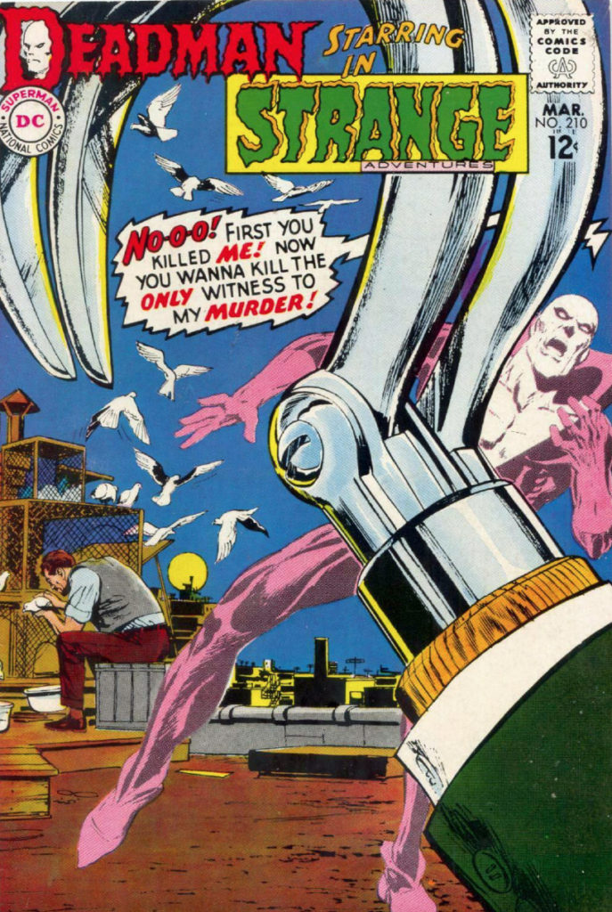
Art pages from the short-lived (but amazingly wonderful) Deadman series in Strange Adventures are often at odds with more traditional superhero series. Deadman — aka Boston Brand — is given the power to possess any living being in order to track down his killer. Which means Adams (and others) needed to draw many pages of Deadman “inhabiting” the body of an unwitting civilian. Therefore the character is often at the heart of the action sans costume.
This is one of those pages, and it’s a great one. Four dynamic panels —each a slightly different size — of a straight out slugfest. (Deadman is typically identified with a little aura around his civilian host —he’s the short-haired fellow without the moustache, getting his face smashed the first panel. And wow, when Deadman exits, that fellow is going to wake up very confused…)
I love looking at comic book covers — I can easily head down the rabbit hole on-line or at a convention scanning through them. To my mind, no one shook up the comic book cover world more than Neal Adams.
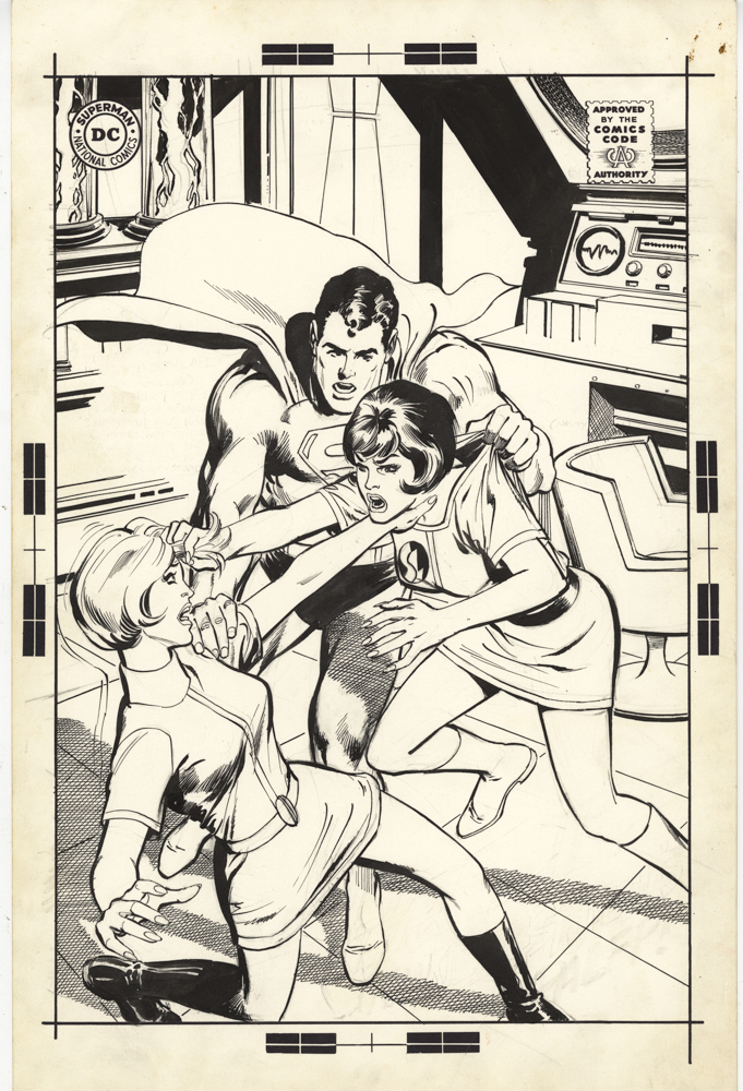
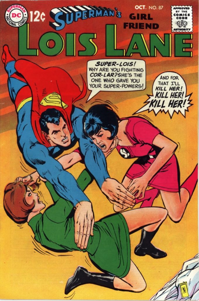
I was a kid when Neal’s realistically dynamic DC covers transformed the line, modernizing and freshening many titles pretty much overnight. 1968 rolled in, and suddenly Lois Lane wore contemporary clothing and had fashionable haircuts, Superboy’s foes looked genuinely menacing, and… Batman and Green Arrow?” The rest as they say, is history.
This is the unpublished cover for Lois Lane 87. Neal told me that any unpublished DC covers are “self-rejected,” meaning that he decided he didn’t like them himself, as opposed to any editorial dictate. Either way, you can see the switch makes sense. The “rejected” cover has Superman breaking up a scuffle. The published cover, where the characters are flying, rather than on the ground, makes it much clearer that two super-powered women are trying to kill each other. (Although Superman never had to actually break up the fight in the story itself. Lois handled it herself, thank you very much.)
That said, I like the overall appearance of the unpublished cover much better and the “Fortress of Solitude” interior, with chair and control center, is especially cool.