Greg Goldstein's Comic Art Gallery

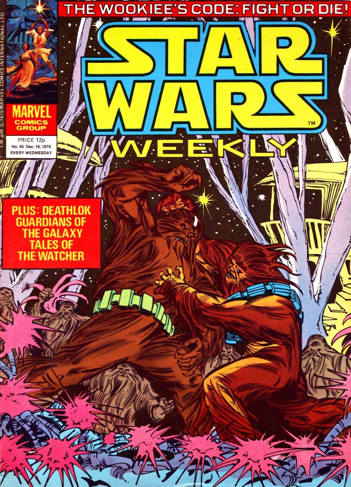
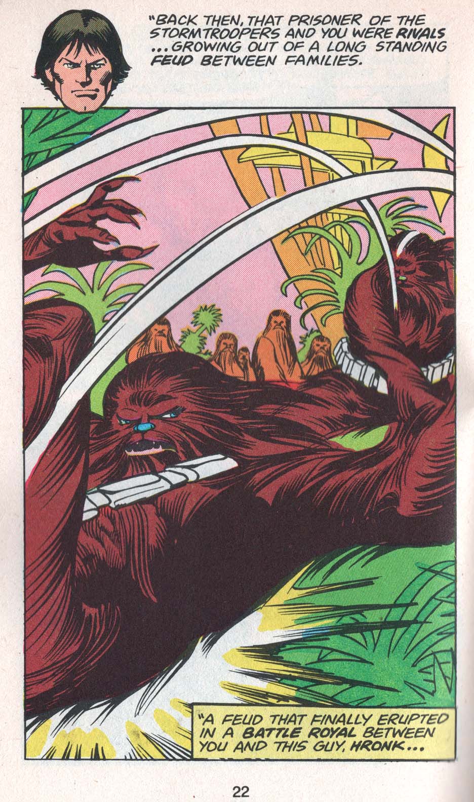
Carmine Infantino & Pablo Marcos — Way Of The Wookie!

Star Wars Weekly #95 (Marvel UK), December 1979

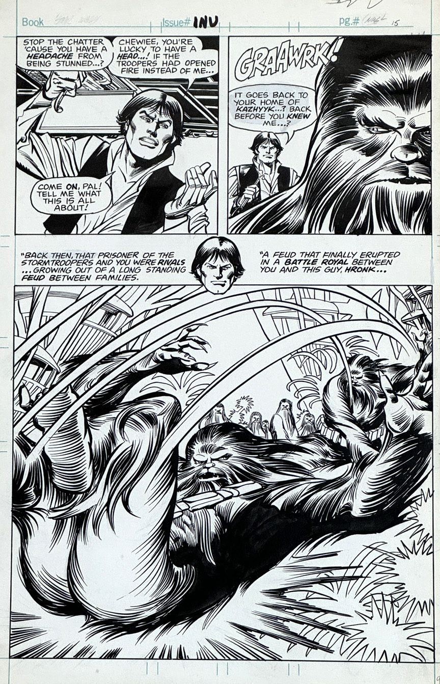
Here’s a terrific 1979 Star Wars splash page from Carmine Infantino; like a few other stories from the same era, it was originally exclusive to the Star Wars UK weekly.

I’ve never seen a definitive answer on this, but I suspect writer Archie Goodwin wrote several stories as “placeholders” until Lucasfilm gave Marvel some indication on the storyline/ direction of Empire Strikes Back. No one at Marvel could have been possibly known when that would be. So, Archie and Carmine kept going with “isolated” storylines, until they were brought into the loop. 

(The ESB embargo date must have changed a few times too. Marvel advertises the adaptation at the end of #37 for the very next issue — which ends up as a filler story — because Empire doesn’t start till #39.)

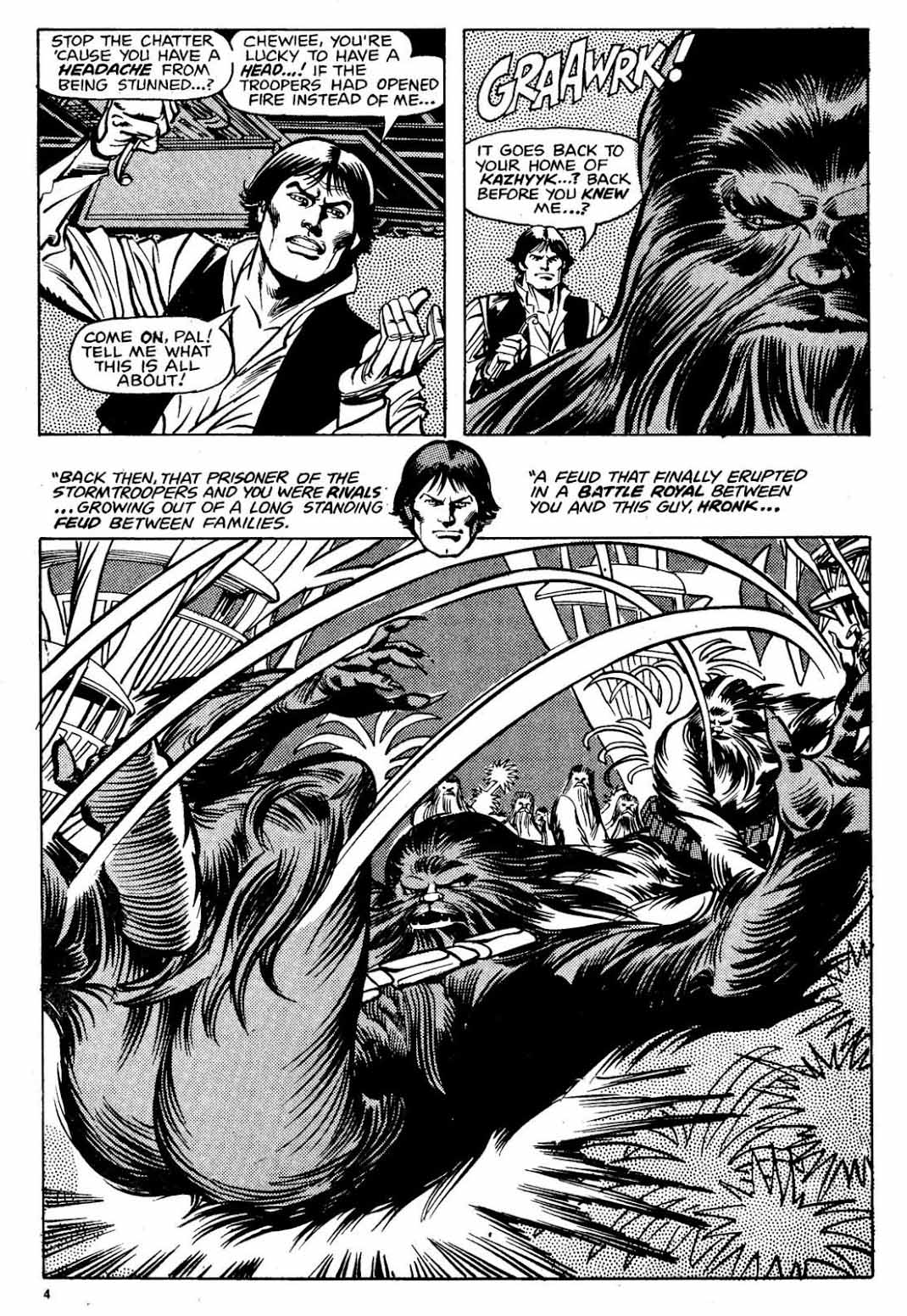
Lovely brushwork from Pablo Marcos nicely compliments and enhances Carmine’s “loose” pencil work. (As Carmine aged, his styled became looser and looser. Check his 80s return to DC’s original Flash series a few years later.)

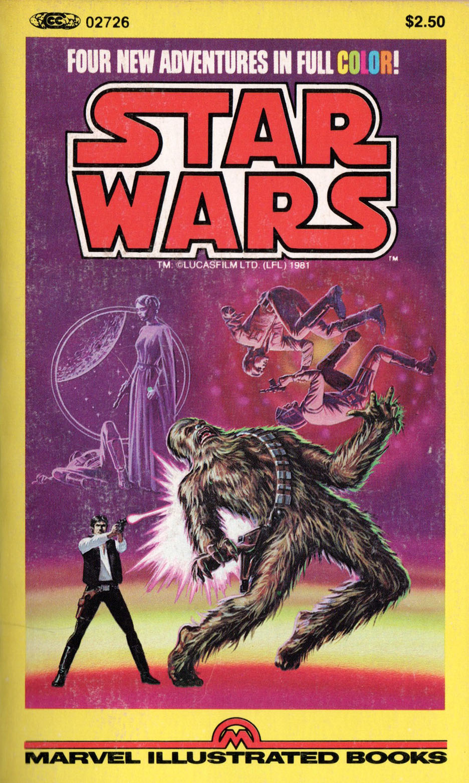
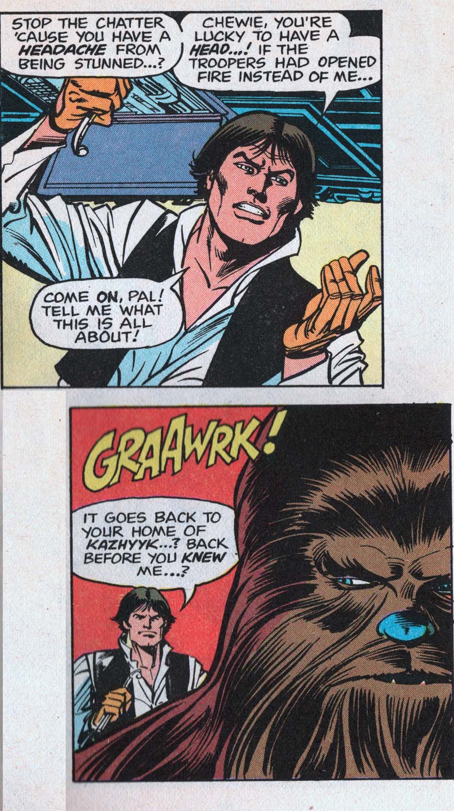
Another quirk about this story. It ultimately appeared in color (from Marie Severin) in a Marvel US paperback collection of “new” Star Wars stories. Cropping on the panels is inconsistent because the pages had to fit the odd format. (See below.)

Gil Kane & Neal Adams — Face To Face

Savage Tales #4, May 1974

Thanks to artist Ken Landgraf, I finally get to see the original prelims and pencils — and partial (Neal Adams) inks — to this great Conan page from Savage Tales #4. And as a bonus, we solve one mystery and create a new one. (Ken owns photocopies of Gil’s pencils from this story and others.)

Gil Kane pencilled the story (pretty loosely in some places), and Neal Adams inked some of it as well, supported at a minimum by Vince Colletta, Frank McLaughlin, and Pablo Marcos. (Credits supplied by Roy Thomas in Savage Sword of Conan #2). Marcos also provided the wash tones on the story, necessary to add depth to a black and white, and also provide some consistency to the art style.

Neal, of course, was a pro at collaborative art creation. His “Crusty Bunkers” a group of (ever-changing) artists at his Continuity Studios, filled in many times during deadline crunches for Marvel, DC, Charlton and others during the 70s.

(The specific inking credits here are listed as Diverse Hands, and this appears to reference the fact that some others outside Continuity also worked on the project.)

And now the mystery; when the story is reprinted for the first time in color in a Marvel Treasury Edition, two faces that weren’t in panel three in the Savage Tales version now appear. Turns out they were originally pencilled by Gil — but inked over in the final art, probably to give it more depth for B&W.

Which means — Either Roy, Gil or someone else had to remember that change and go back and pull it from inked copies for the color version.

Wild.

Gil Kane / Neal Adams — Night Of Diverse Hands

Savage Tales #4, May 1974

Conan celebrates its 50th anniversary in comics this year, and we conclude our anniversary recognition with our final of three Conan-themed posts.

Night of the Dark Gods is a great example of Roy Thomas’ ability to adapt an Robert E Howard story without Conan, into one.

Given the artistic talent that worked on the story, clearly some deadline problems ensued. Not surprising, since at this point in Marvel’s 70s expansion,  (comic books and  “mature magazines”) deadlines were whizzing by a the speed of light.

Neal Adams assisted Gil Kane on the pencils, and inked some of the story as well, supported by Vince Colletta, Frank McLaughlin, and Pablo Marcos. Marcos also provided the wash tones on the story, necessary to add depth to a black and white, and also provide some consistency to the art style.

The inking credits are listed as Diverse Hands, and this appears to be the only time that the credit is employed, meaning it’s likely that this specific group of professionals never contributed jointly again on one story.

Neal, of course, was a pro at collaborative art creation. His “Crusty Bunkers” a group of (ever-changing) artists at his Continuity Studios, filled in many times during deadline crunches for Marvel, DC, Charlton and others during the 1970s.

It’s easy to be fondly nostalgic about something you missed entirely, but, based on everything I’ve heard, it sounds like a hoot. Stop by, ink some pages, spot some blacks, and make your deadline, head to the pub. (It was probably much more stressful than that, but I digress.)

The story is ultimately also printed in color, in a Marvel Treasury Edition, and although the coloring itself is okay, many of the inking and wash details are obscured, likely in an effort to get the job done quickly.

(And see below for the mystery of the extra face.)