Pete Poplaski — Superman’s Golden Age
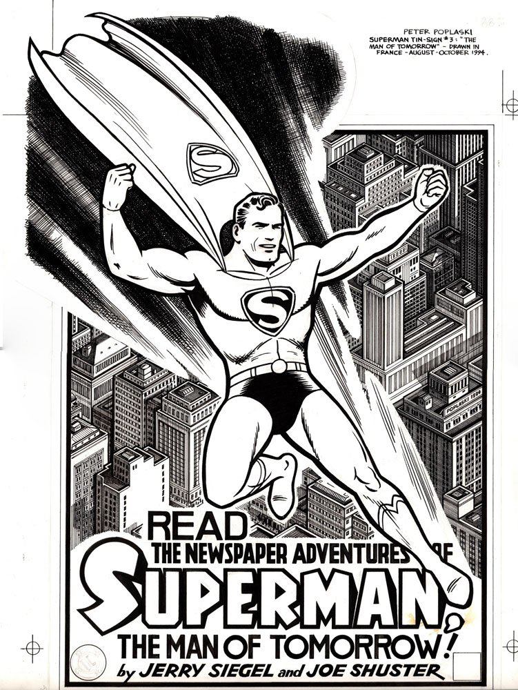
Superman Retro Advertising Tin Sign, 1994
Nostalgic collectible tin advertising signs became all the rage in the 1990s.
At first, “reprints” of authentic signs started popping up at flea markets and street fairs. Many were classic brands and logos, some long defunct.
Shortly thereafter, inventive entrepreneurs created new signs designed to emulate the retro look and feel of the classics. You can still find many of these at shops and vendors that specialize in nostalgic candy, soda, etc.
Kitchen Sink, publisher at the time of the Superman and Batman newspaper strip reprint collections, issued two very cool Superman “advertising” tins designed and illustrated by the amazing Pete Poplaski. (This one is marked #3, but I’ve only seen two, so I’m assuming at least one design was tabled.)
As with nearly all of Pete’s illustrations, everything you see, including the lettering, is fully hand drawn. (The line detail on the buildings alone is astonishing.)
And no one captures classic comic art styles like Pete. (Well, maybe the equally amazing Paul Mavrides, but that’s a tale for another day.)
As mentioned previously, when we picked the DC strip reprint rights at IDW in 2013, Pete was our first choice to create all the cover material.
And, as always, he knocked it out of the park.


