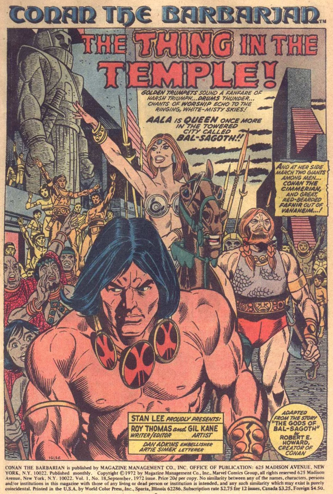
Gil Kane — Conan The Triumphant
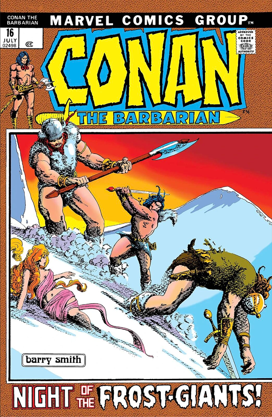
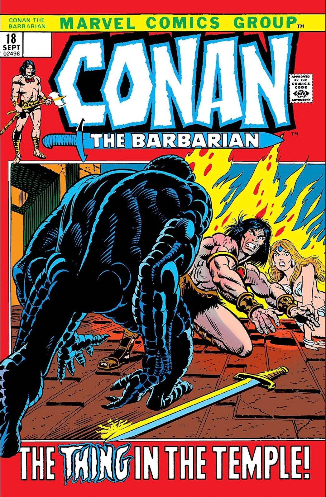
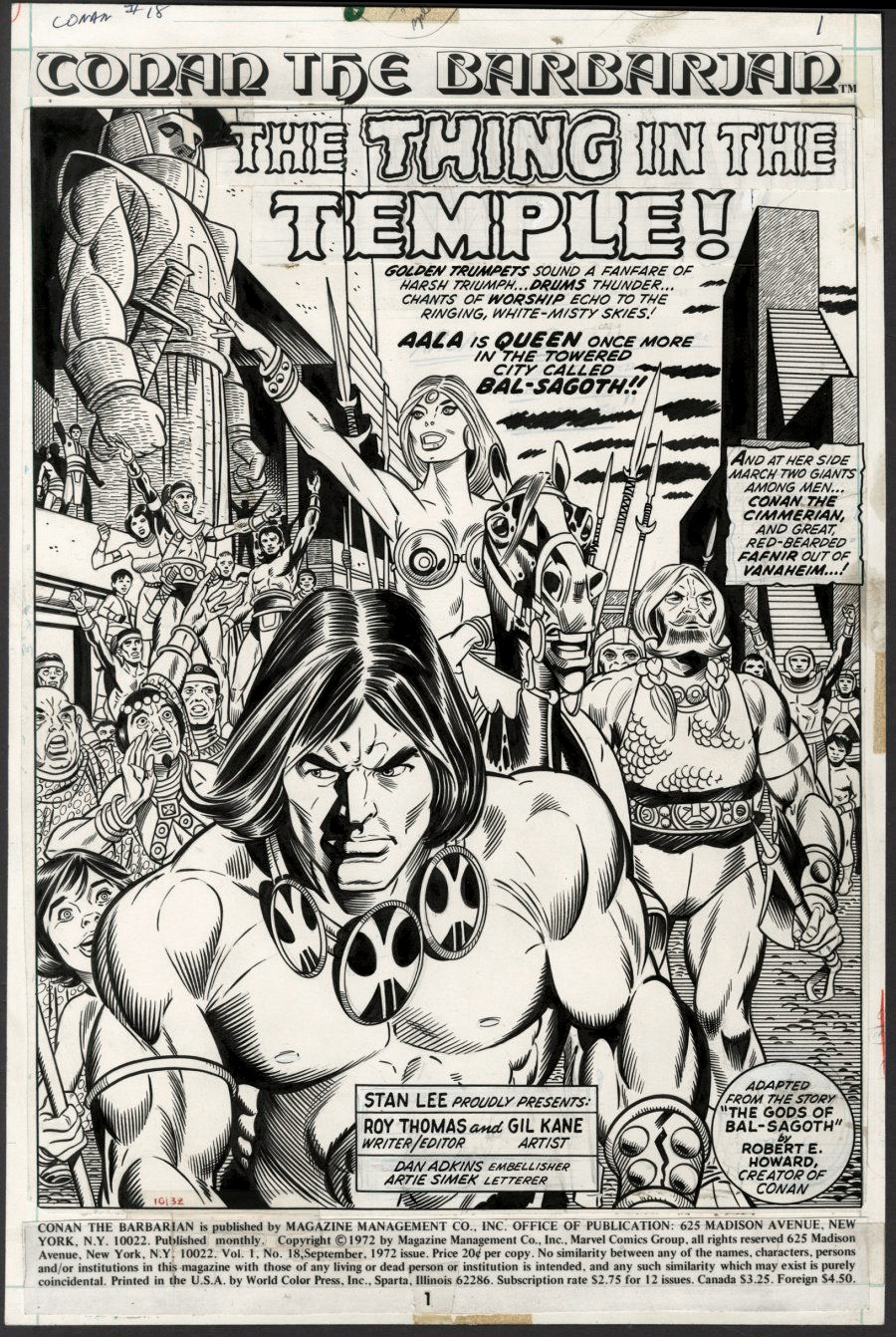
Conan #18, September 1972
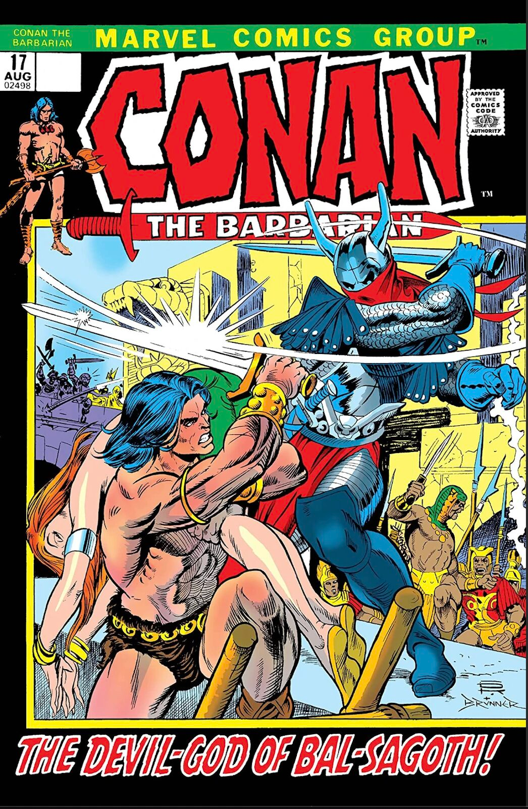
I’m guessing that if Roy Thomas had a mulligan, he might swap the opening art direction of Conan #17 and #18.
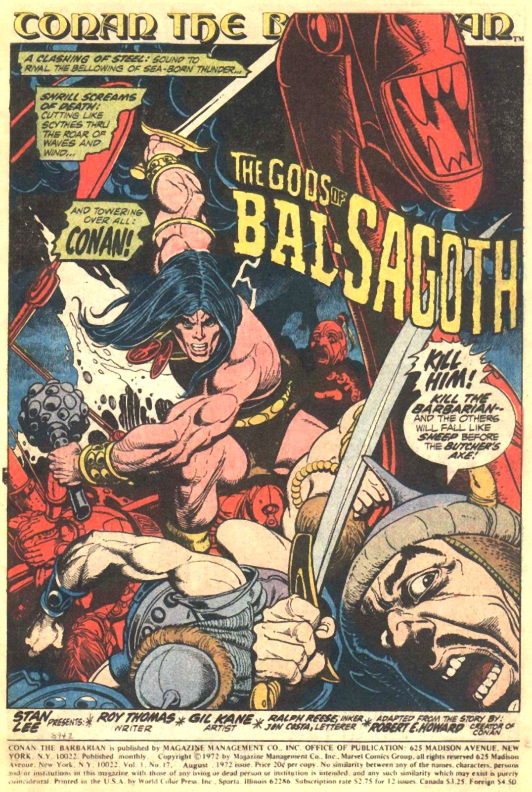
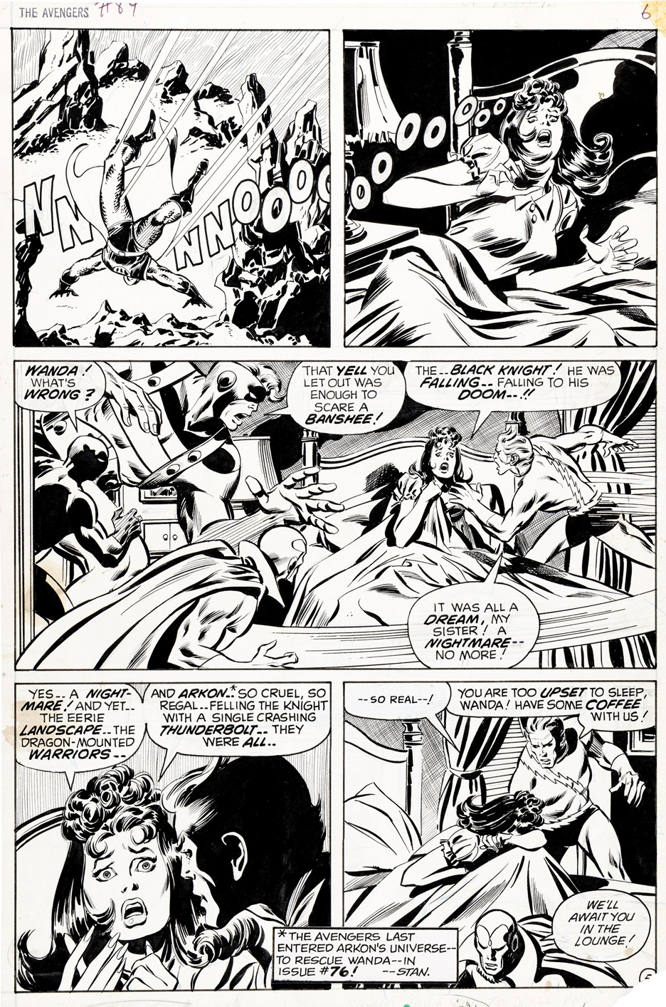
Conan the Barbarian #17 opens with a wild Gil Kane action splash — pure velocity. Limbs and weapons whipping across the page. Classic Kane. I’d frame it in a second.
But coming straight off sixteen issues of Barry Windsor-Smith — all that delicacy and atmosphere— it’s an abrupt shift. Not wrong. Just abrupt. (Especially after #16’s beautiful “Frost Giant’s Daughter.”)
The splash in #18 lands softer, more transitional. Kane pulls back: more ceremony, more posture, more air. The composition settles instead of punches.
Dan Adkins helps. Having inked both Smith and Kane, he gets the difference — and keeps the line refined enough that the book doesn’t feel like it wandered into another genre.
Seventeen announces the change. Loudly.
Eighteen eases you in.
Flip the order and the handoff might’ve felt less jarring.
Don’t get me wrong — I love plenty of Gil’s work. Still, I was relieved when Barry came back for a short stretch before bowing out for good.