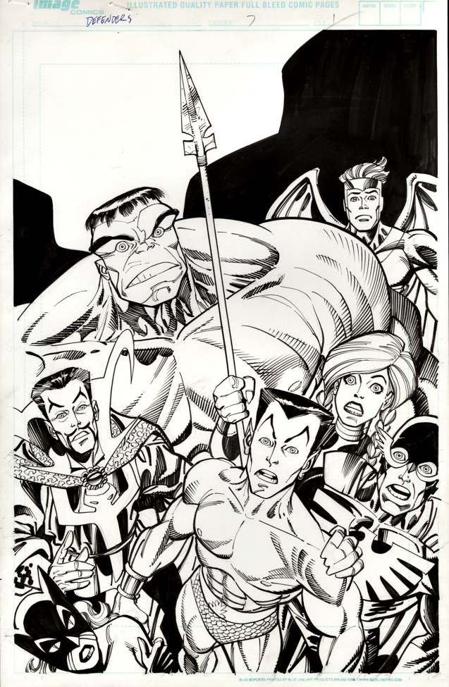
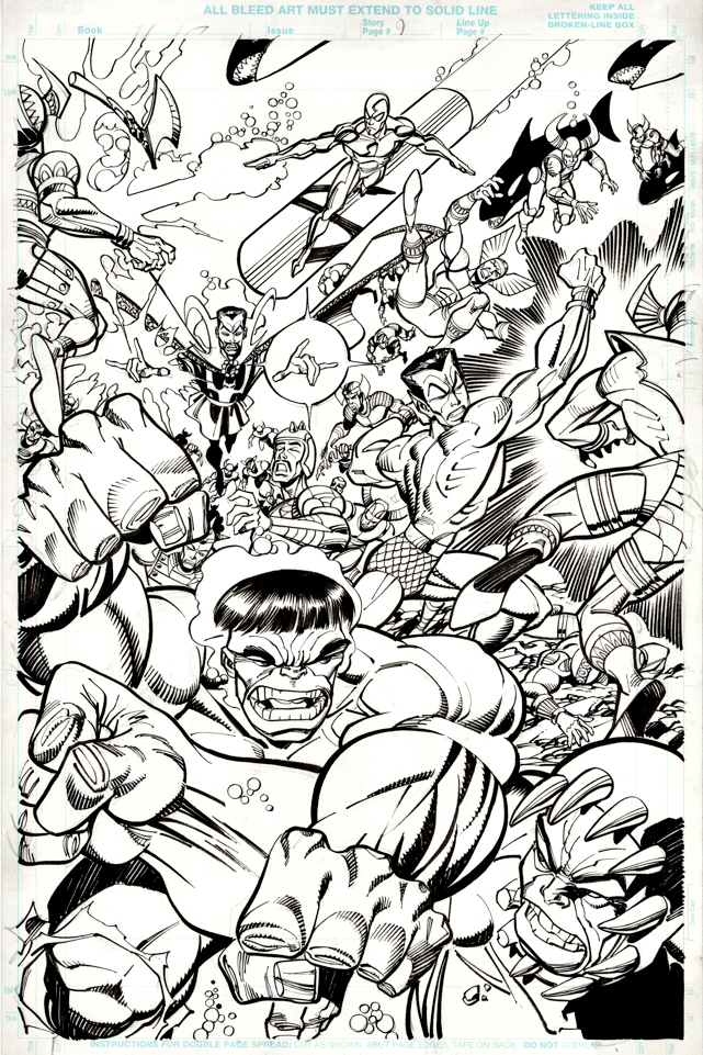
Here’s a fun title page from the great Erik Larsen, inked by the always-amazing Sal Buscema. If you like the Defenders, how can you not love this?
Larsen packs the composition as if he’s cramming an entire issue into a single image—a glorious jumble of big personalities and startled reactions, with a barely contained Hulk dominating the page and everyone else looking like they’ve wandered into the wrong cosmic crisis.
Loud, funny, and bursting with life, this Defenders run—written by Larsen with Kurt Busiek nearly 25 years ago—is pure, entertaining chaos. These heroes are powerful and iconic, sure, but also an endearingly oddball bunch who often seem annoyed to be sharing the same space.
Come for the heroics. Stay for the dysfunctional group dynamics.
Thanks for stopping by in 2025 — see you next year!
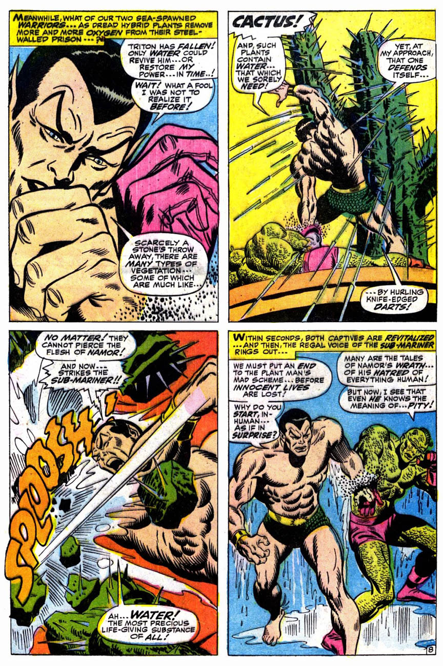
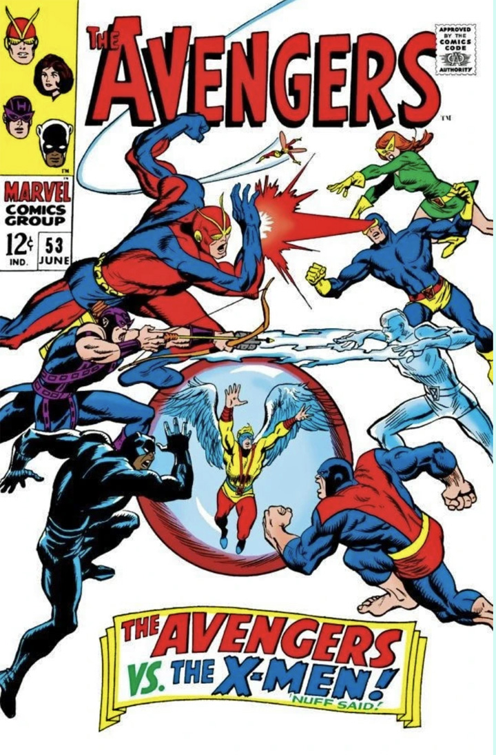
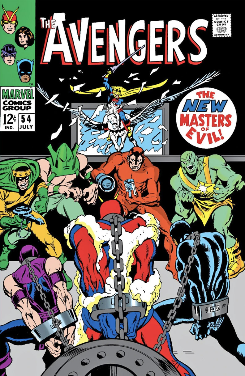
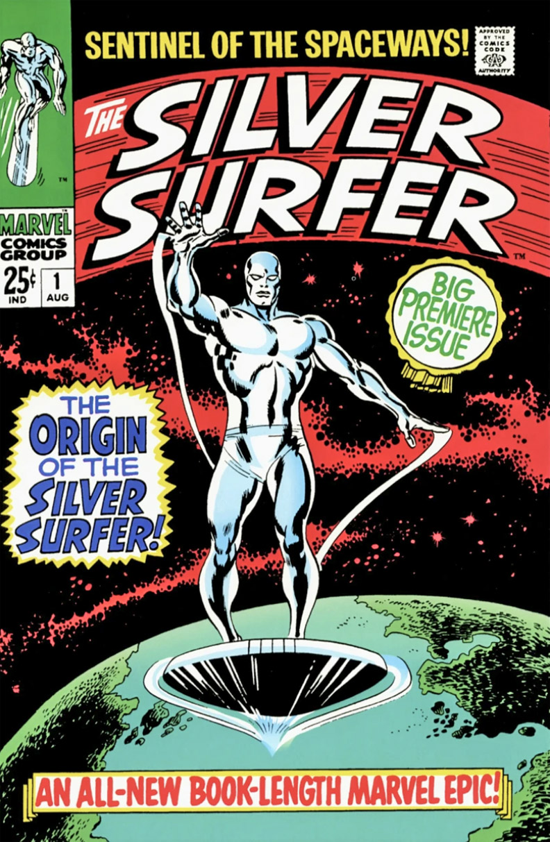
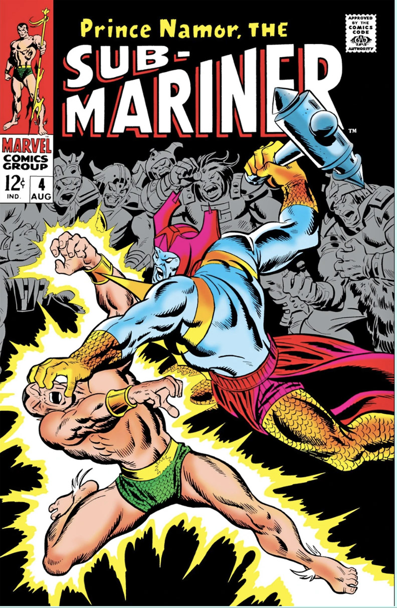
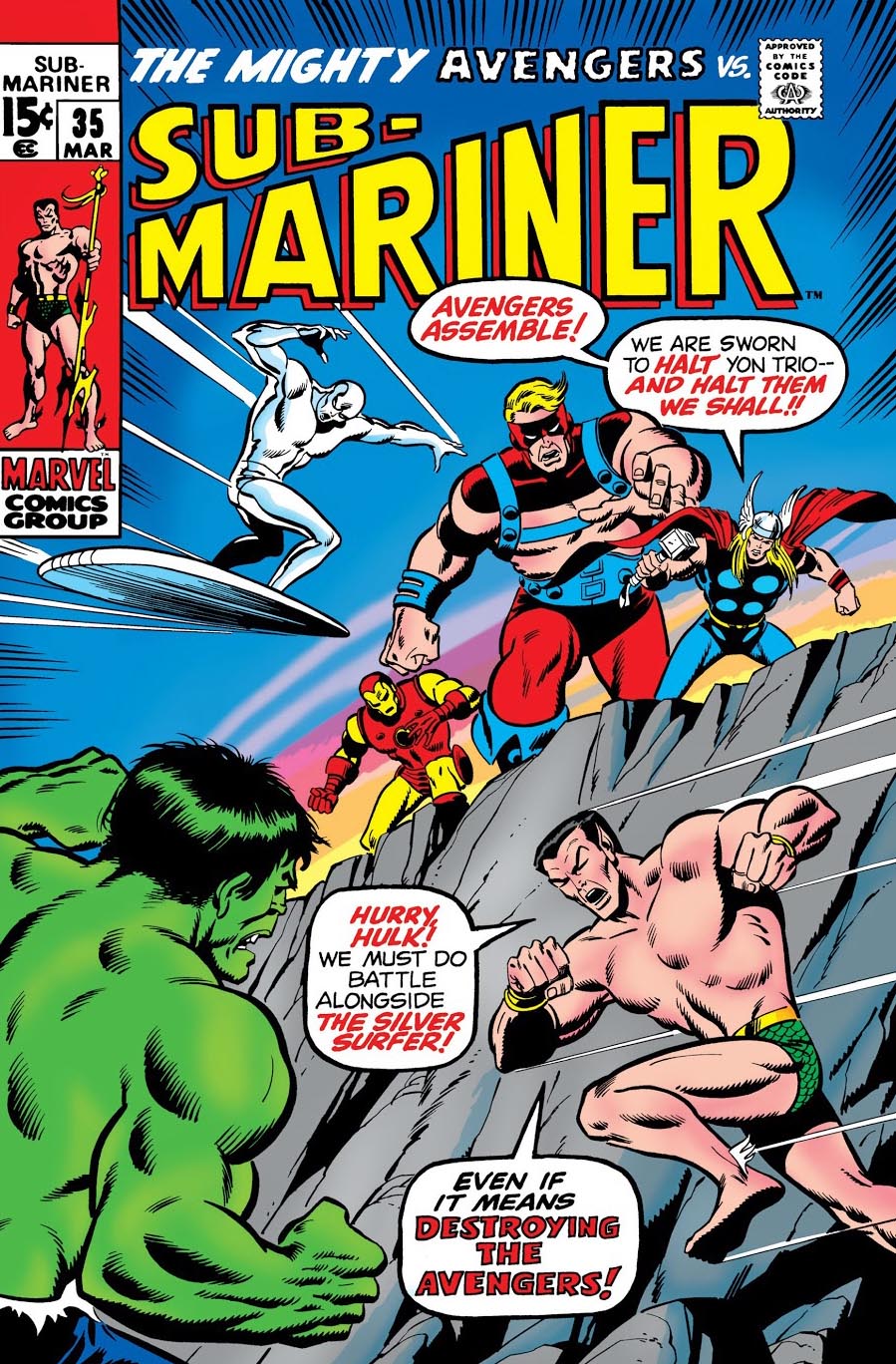
Five straight weeks in the Spring of 1968. Five comic book issues drawn by the legendary John Buscema:
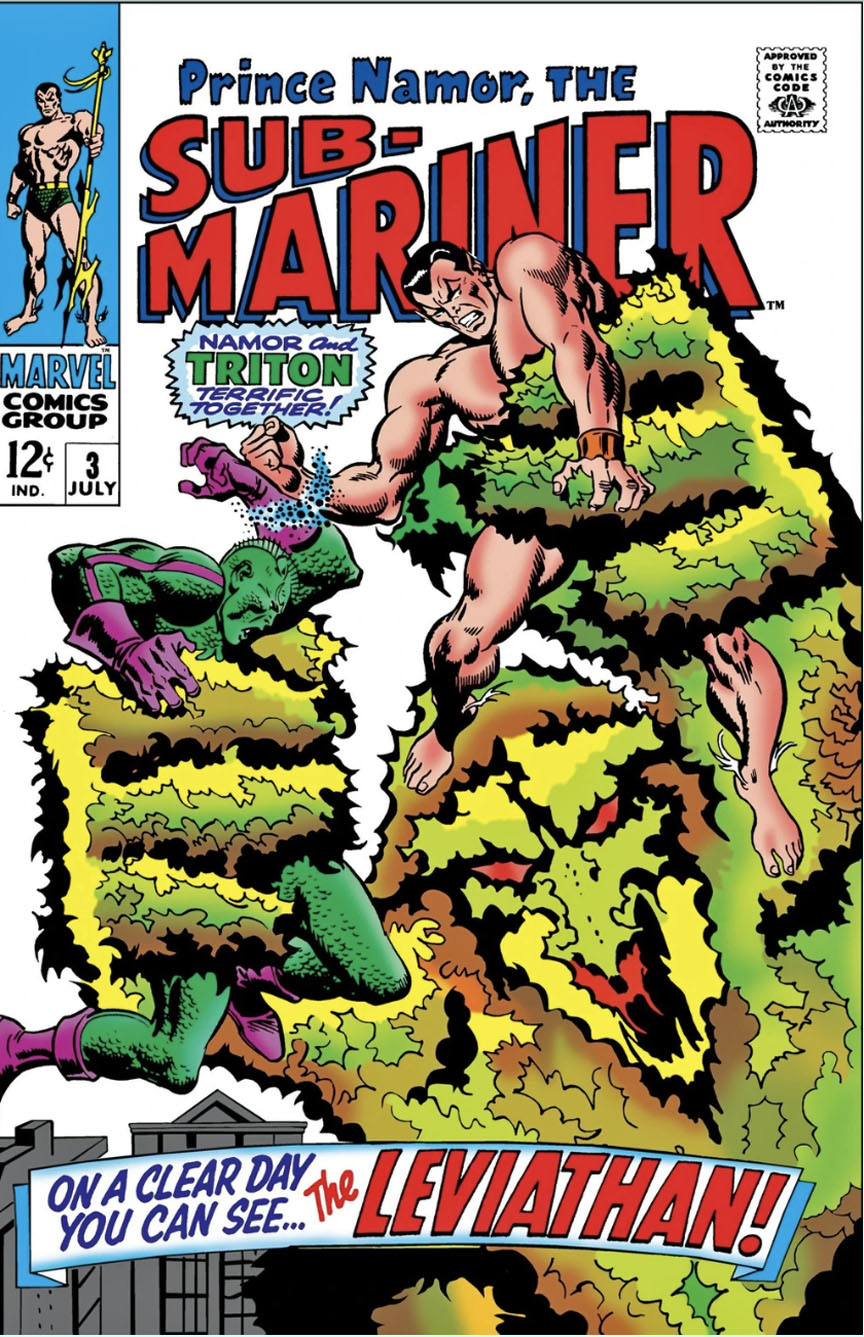
Sub-Mariner #3
Avengers #53
Sub-Mariner #4
Avengers #54
Silver Surfer #1 (38 pages)
Gems. Every single one. (And yes, I might be biased, because these comics are from my newsstand-era sweet spot — 1967-1973 — but I’m not wrong.) My guess is that only Jack Kirby ever had an achievement similar, or greater.
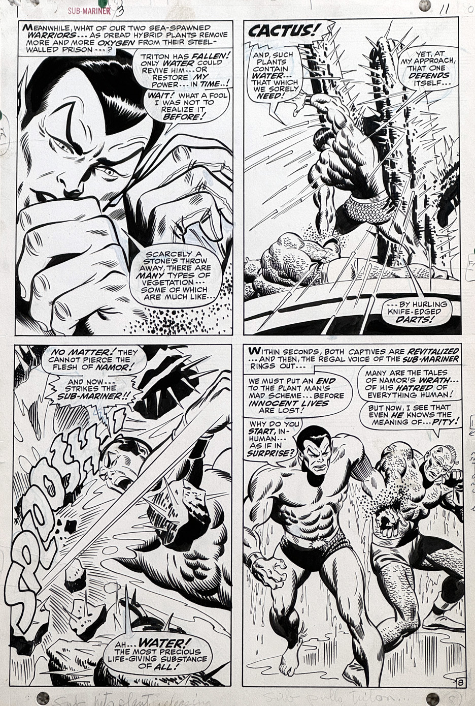
This Sub-Mariner page featuring Namor and Triton is the best Buscema superhero page I’ve ever owned, and unless an amazing opportunity comes my way, will likely remain that way.
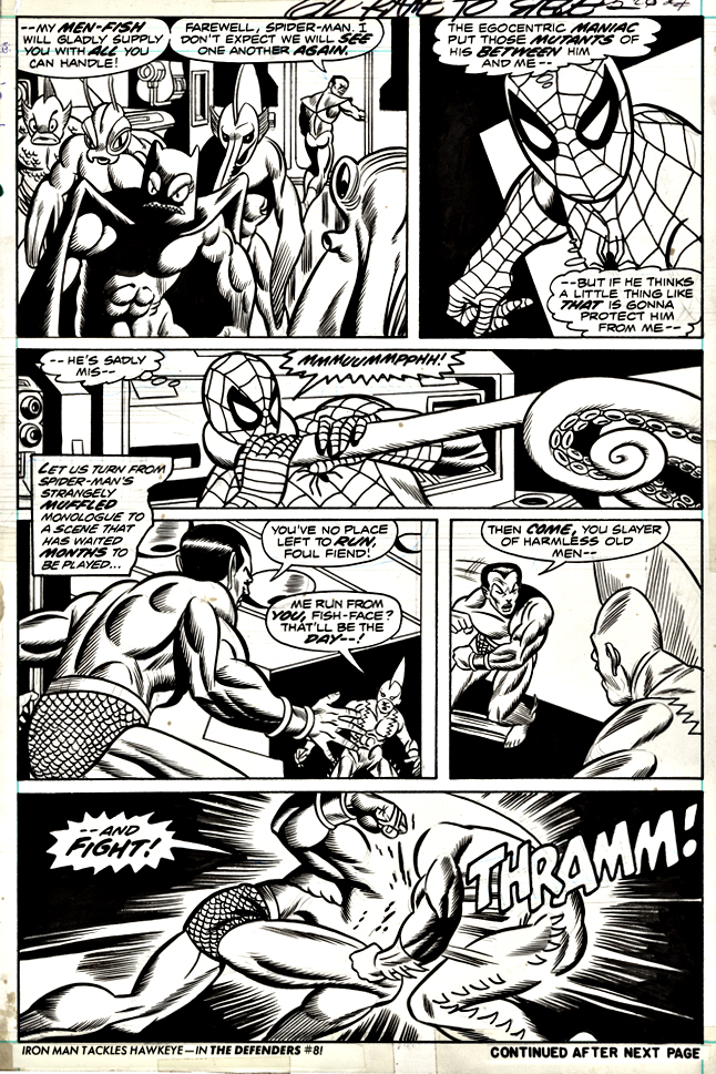
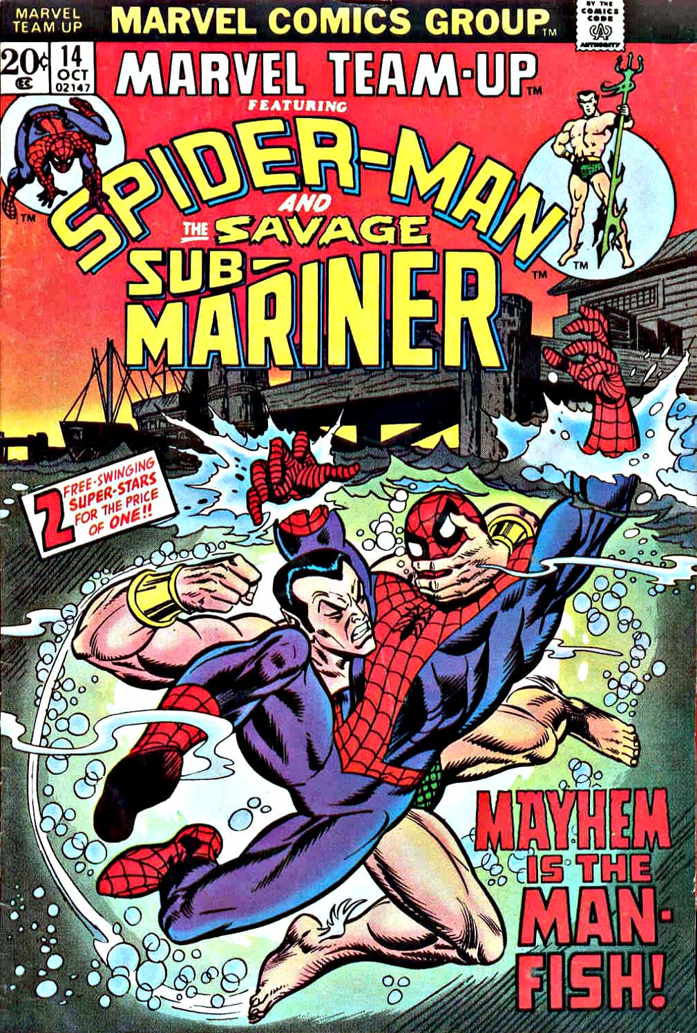
Spider-Man and Sub-Mariner need a few pages of bantering and brawling in this early issue of Marvel Team-Up before they figure out that they left on friendly terms just two years prior. But that’s often the classic (sometimes cliché) formula. Characters meet, fight, and then figure out who the real enemy is and join forces to stop them. (In this case Tiger Shark and — I kid you not — the Aquanoids.)
Gil Kane provides, as always, dynamic and dramatic pencils and composition — although finding regular inkers for him on this series seems challenging. Here the enigmatic Wayne Howard takes a stab at Gil’s unique styling with mixed effects throughout the issue. (Although I like the results on this specific page.)
Great cover too, with inks by Frank Giacoia. (Although the Marvel trade dress is out of control with not much room for the main imagery.)
For more on the first Sub-Mariner / Spider-Man crossover, see this fun article below:
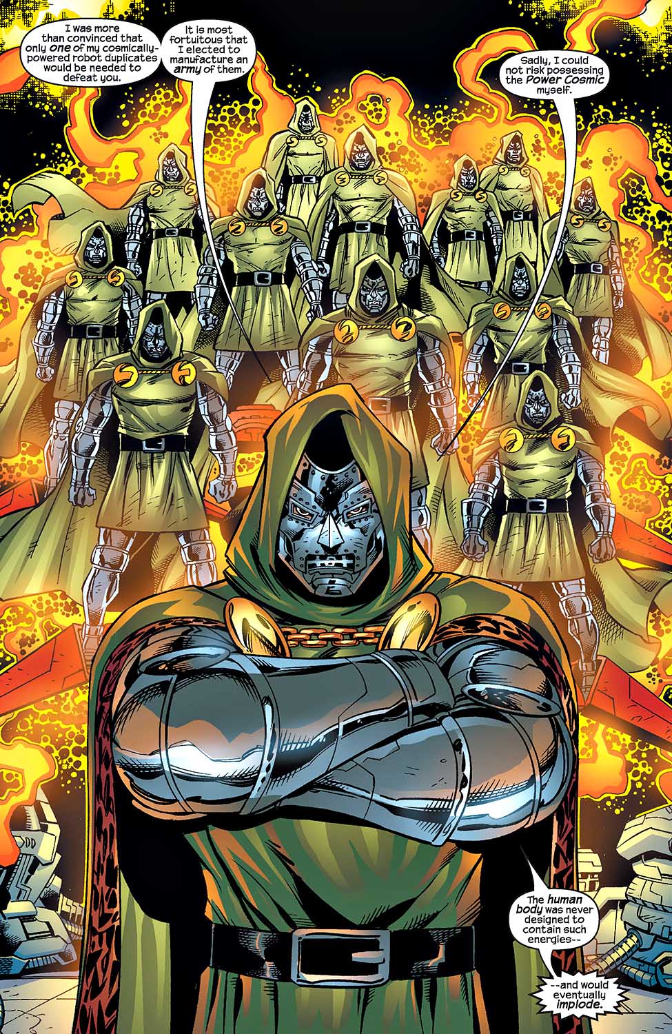
Doctor Doom — Marvel’s first iconic super villain of the Silver Age* — celebrates his 60th anniversary this year.
And I have a question.
How are the MCU pros going to create a new on-screen look for the character that is true to form, but doesn’t look goofy as hell? These folks are the best in the business, but that’s a hell of challenge. Lesser talents have failed, not once, not even twice, but three times.**
They could go all black (always a safe choice) and make the costume more technological and futuristic, but… I believe George Lucas already beat them to the punch by about 45 years.***
The comic book Doom costume is one of those that almost makes sense in 2D, but three-dimensional? Oof.
I’m definitely looking forward to seeing the results, maybe even later this year, if we’re lucky.
And, as always, we digress.
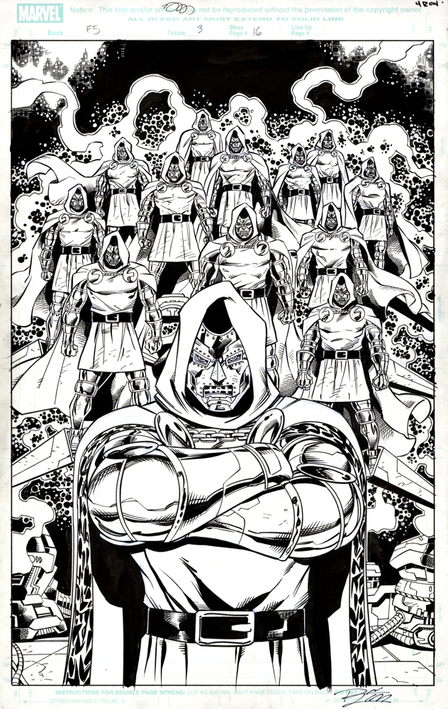
Here, the versatile Ron Lim creates a dramatic splash page with the most Doctor Doom you will ever see in once place. You see, the good doctor has this cool hobby of building robots in his spare time.
Lots of them, apparently.
Fun fact footnotes:
Ok, Sub-Mariner beat Doom by a full issue — or more than 20 years, depending on how you count Silver Age vs. Golden Age — but I can’t fully embrace him as a villain. (This despite the fact that Doom and Sub-Mariner later appeared together in a comic book called Super-Villain Team-Up.)
** Two contemporary big budget film releases, plus the officially unreleased Roger Corman version. I probably shouldn’t count that, but I do. Sue me.
*** Lucas has yet to acknowledge that Darth Vader is essentially a mash-up of two Jack Kirby comic book creations, Doctor Doom and Darkseid. C’mon George, fess up.
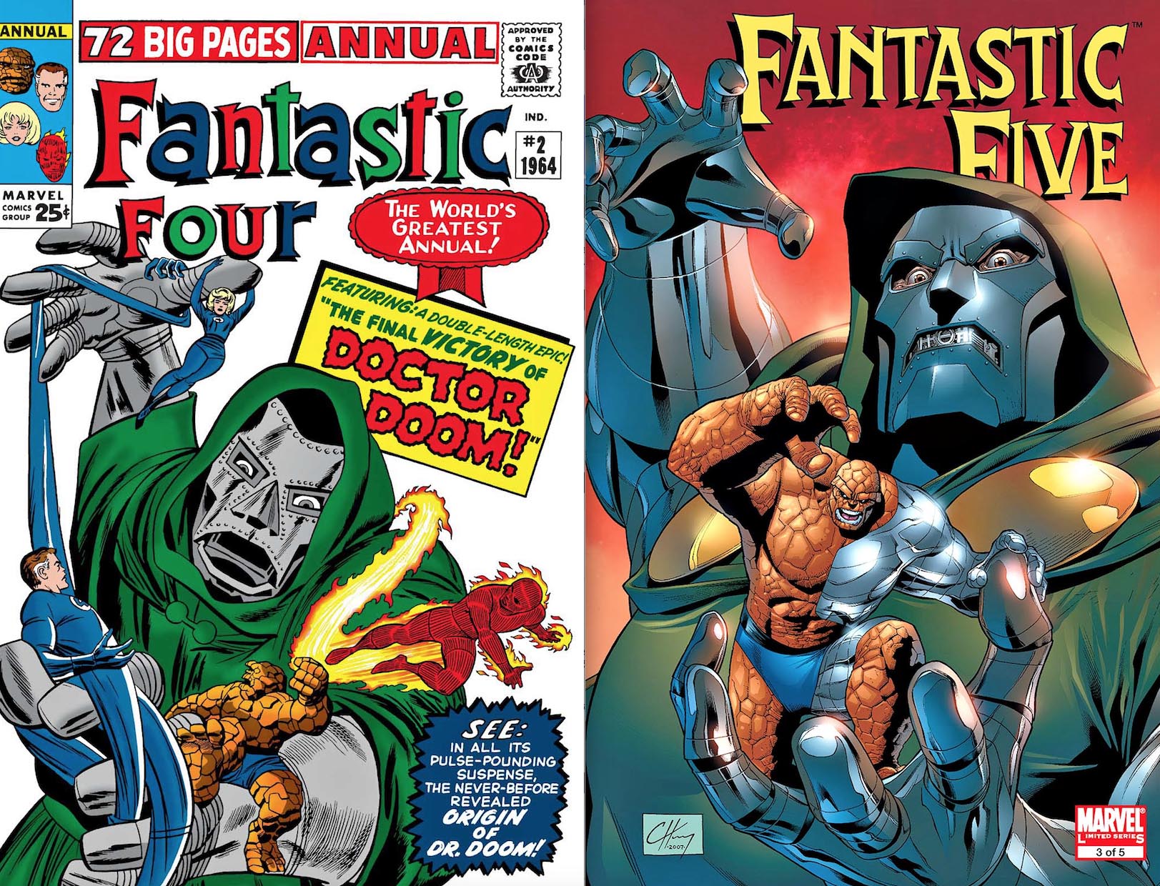
Clayton Henry’s cover to the Fantastic Five is an homage (swipe?) of Kirby’s FF Annual #2
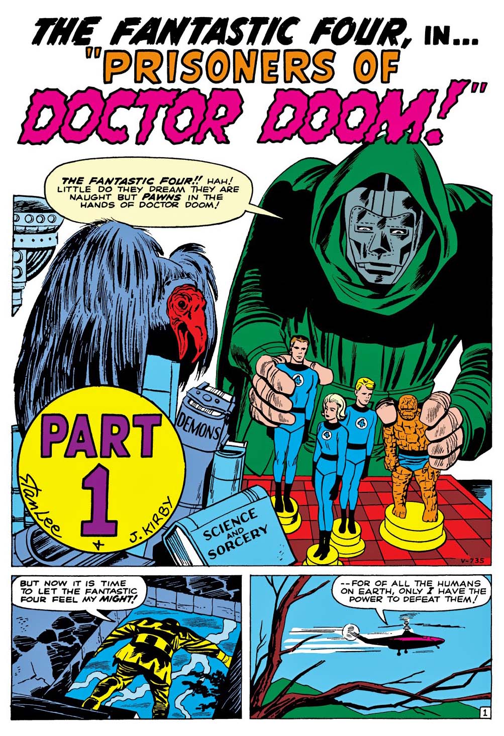
Doctor Doom’s first appearance features a ridiculous bird for good measure.
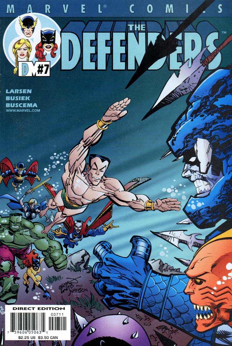
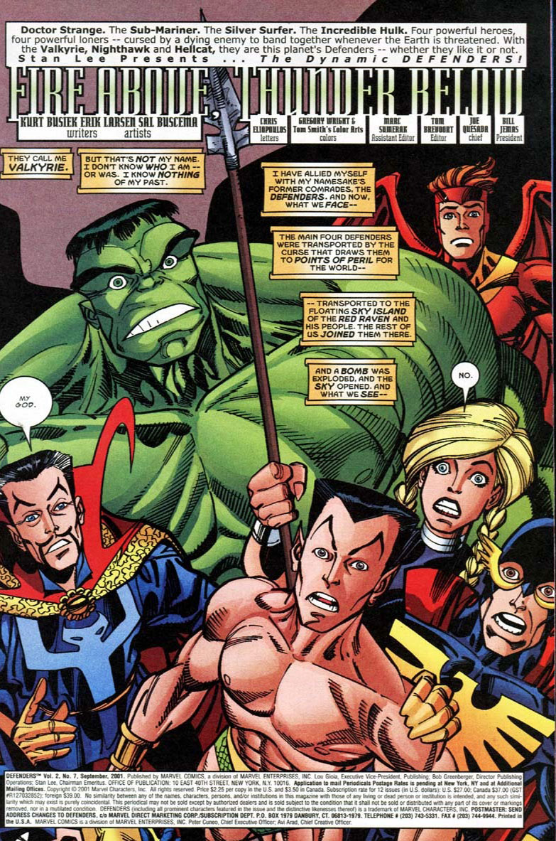
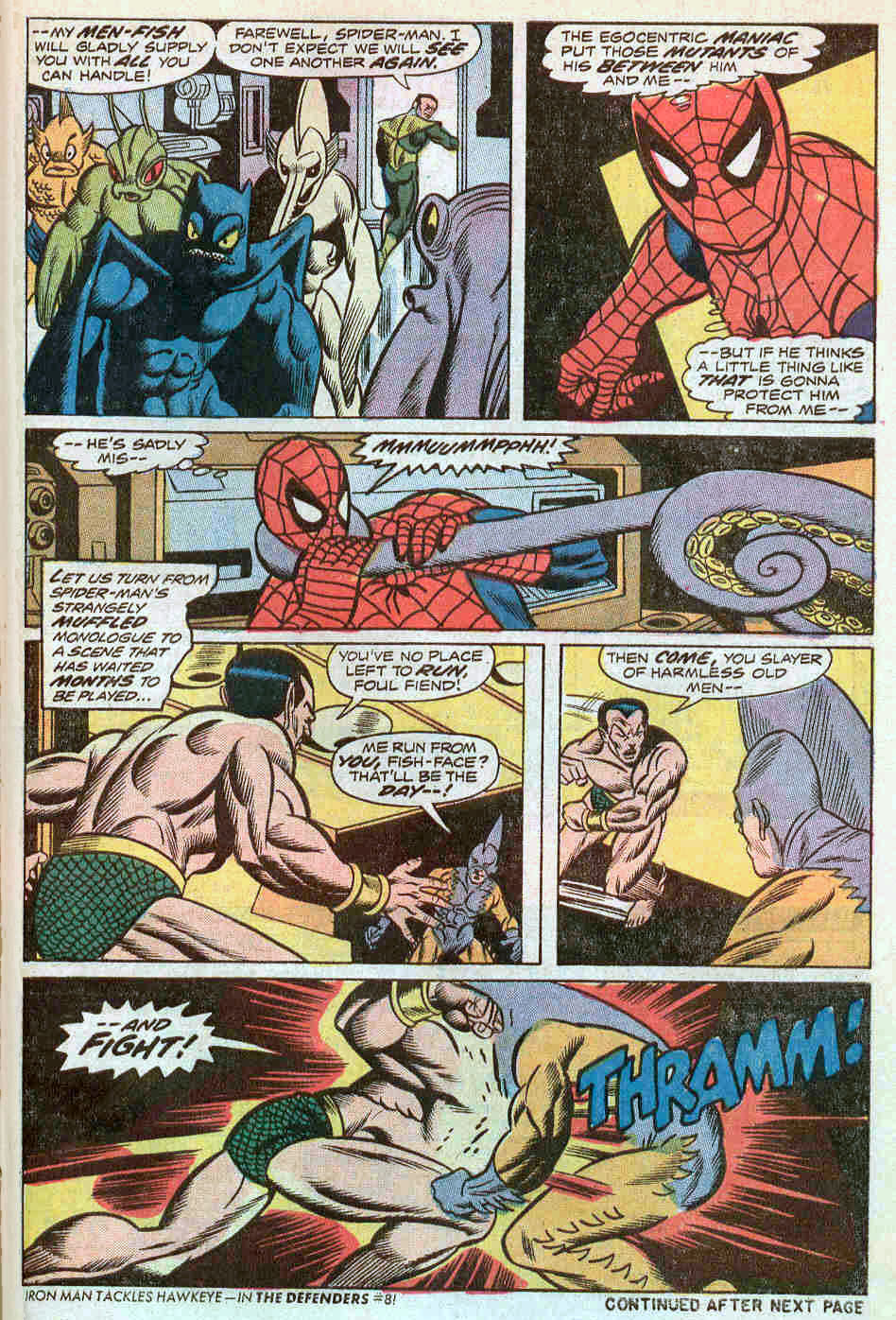
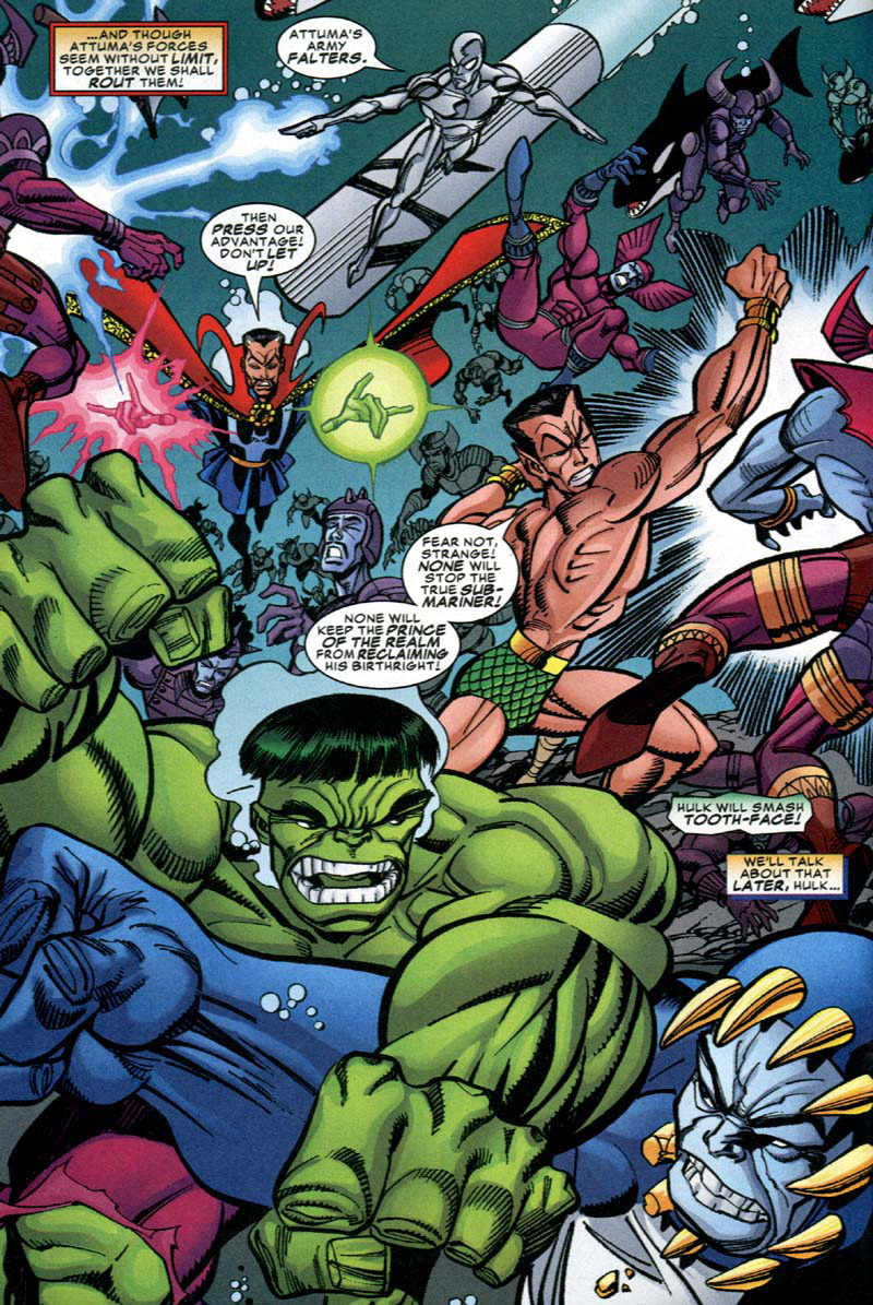
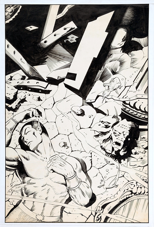
Erik Larsen (With help from Sal Buscema and Kurt Busiek) has some fun with the Defenders on this frenetic splash, as they clobber the undersea warlord Attuma and his feckless fish men. The Defenders are celebrating their 50th anniversary this year.
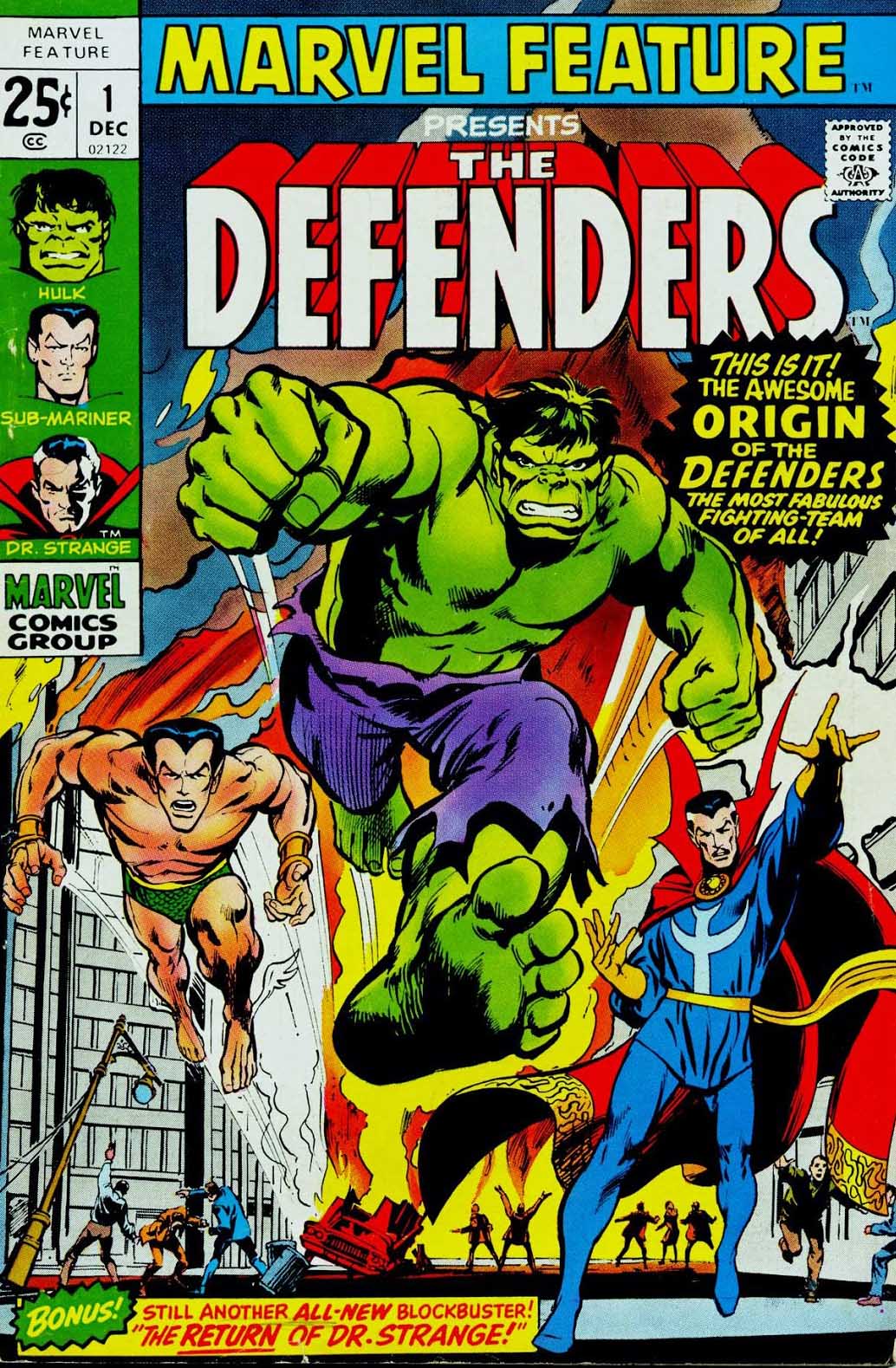
I only learned recently the reason that Doctor Strange replaced Silver Surfer between their first “unofficial” appearance in Sub-Mariner, and their official launch in Marvel Feature later in 1971. Apparently, Stan Lee was feeling precious about the Surfer, and didn’t want anyone else to write stories featuring him.
Eric solves that line-up problem here by including both of them, along with original stalwarts Hulk and Sub-Mariner.
(Many of the latter members of the group — Nighthawk, Valkyrie, et al — are along for the ride as well.)
All in all, a fun 20-year-old mini-series that has yet to be collected as far as I can tell.
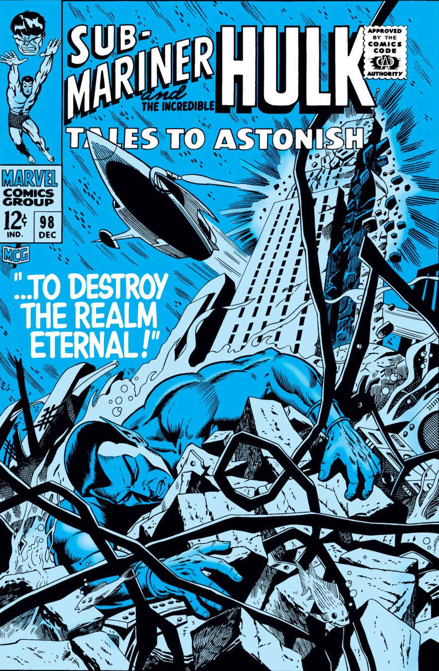
This version of the cover for Tales to Astonish #98 by Dan
Adkins, ultimately unused, did not fit the bill. It conveys the storyline
inside, and it’s pretty in its own right, but definitely not very dynamic.
“Likely too soft for Stan,” agreed Roy Thomas, (yes, him again) who wrote this story arc of Sub-Mariner.
But, let’s talk about the replacement cover, also drawn by Adkins — likely in one heckuva hurry. Sure, more dynamic. Namor, in a better pose, still unconscious. (Or dead — but even as kids we knew he wasn’t.) In this version we also see the attack that’s destroying Atlantis. Except… since when are New York City skyscrapers in Atlantis?
I didn’t notice the architecture til later on, but once you see it, you can’t unsee it. (Even the unused cover has modern steel girders.) Why is Empire State Building underwater? What in the name of Neptune was Dan thinking?
The unused cover has the Marvel production guides masked off by tape, leading me to believe the piece may have ultimately been printed elsewhere. Marvelmania magazine? Witzend? Convention program? Any comic book detectives out there recognize it?
Poor Dan; he had to redraw a Doctor Strange cover (Strange Tales #168) a few months later. (I’ll post it if I can get an image of the original version.) I loved his inks — he was one of the best — but he definitely struggled meeting Marvel’s editorial standards for cover layout and composition.
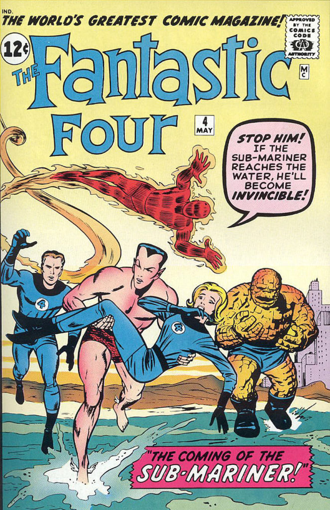
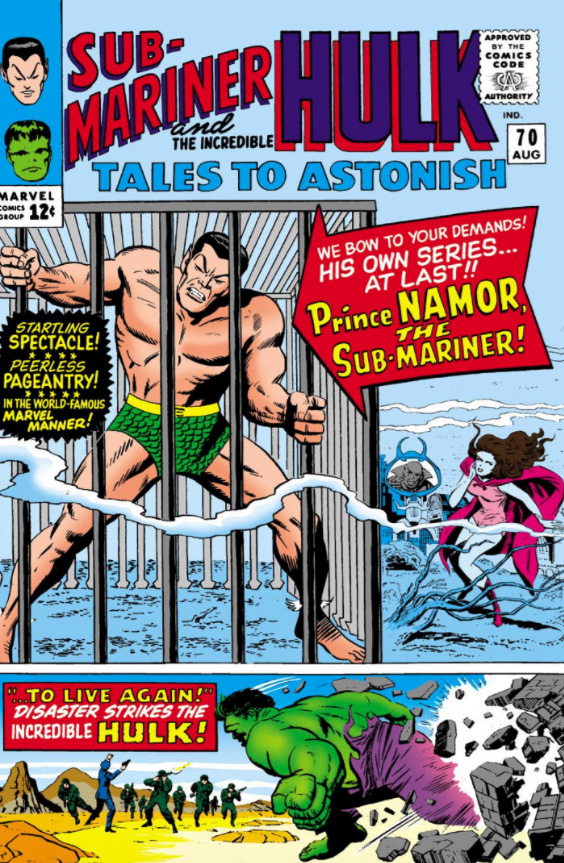
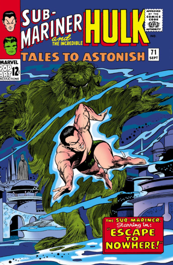
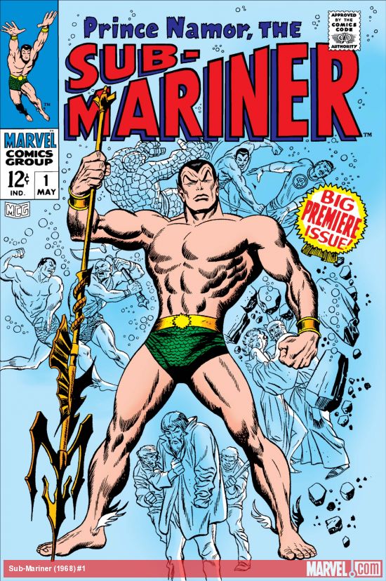
Key appearances by Sub-Mariner in the Silver Age: After a seven-year hiatus in comic book limbo, he first re-emerges in Fantastic Four #4, ultimately becoming a key antagonist for the FF. A few years later in Tales to Astonish #70 he gets his own series, sharing space with the Hulk, and a month later gets his first solo cover. Ultimately, he gets his own series in 1968.
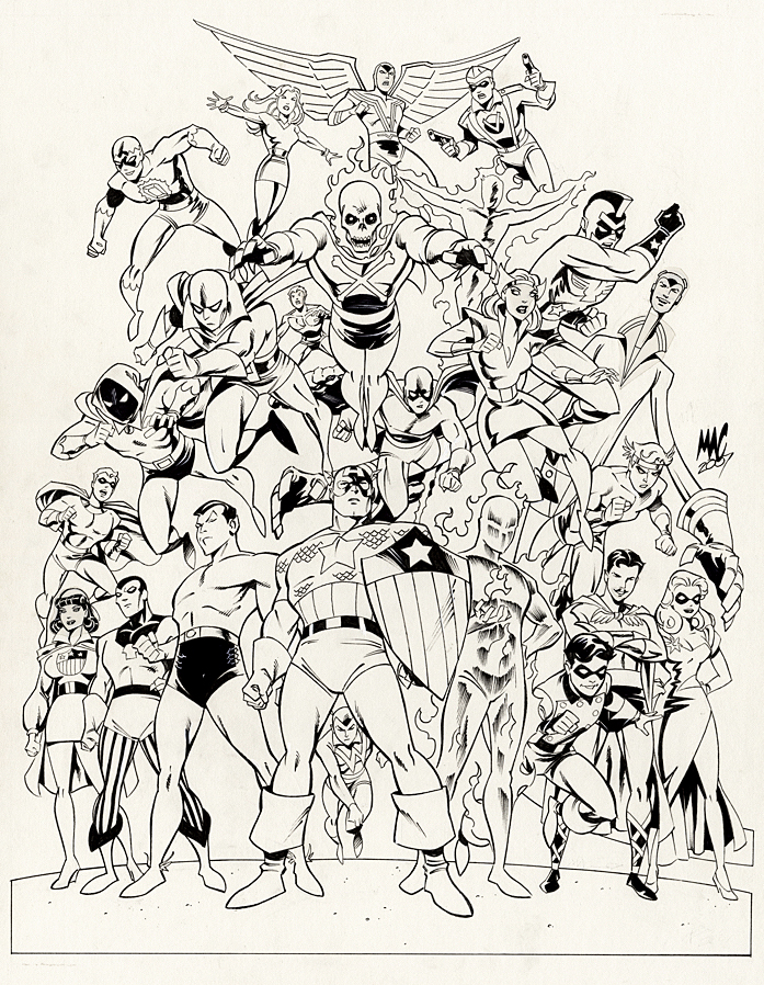
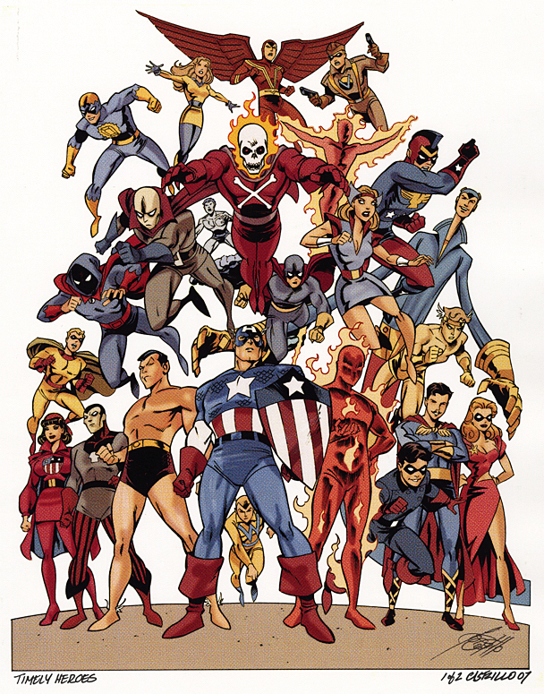
Anthony (“MAC”) Castrillo gathers Marvel’s original heroes from its “Timely Comics Era” (1939-1950) for a group portrait used for a print.
And we present it just in time (ok, barely) for Marvel’s 80thanniversary.
Castrillo’s art-style for the piece works well ; A bit cartoony in the contemporary sense, adding some pizazz and just a touch of whimsy to some of the otherwise stoic heroes.
I didn’t immediately recognize every character — even in color — and Roy Thomas was kind enough to help me sort through it when I acquired the original. With the exception of one mystery character who might be one of the “Marvel Boys”, the full cast list is presented below.
(“Rows” are a bit subjective because of the group composition.)
From top to bottom:
Row 1: Sun Girl, Red Raven, Citizen V
Row 2: Blue Diamond, Blazing Skull, Toro
Row 3: Marvel Boy (?), Challenger (AKA Thunderer), Vision (Original), Jack Frost, Black Marvel, Namora, Patriot, Thin Man, Mercury (AKA Hurricane)
Row 4: Miss America, Destroyer, Namor, Captain America, Whizzer, Human Torch, Bucky, Angel, Blonde Phantom
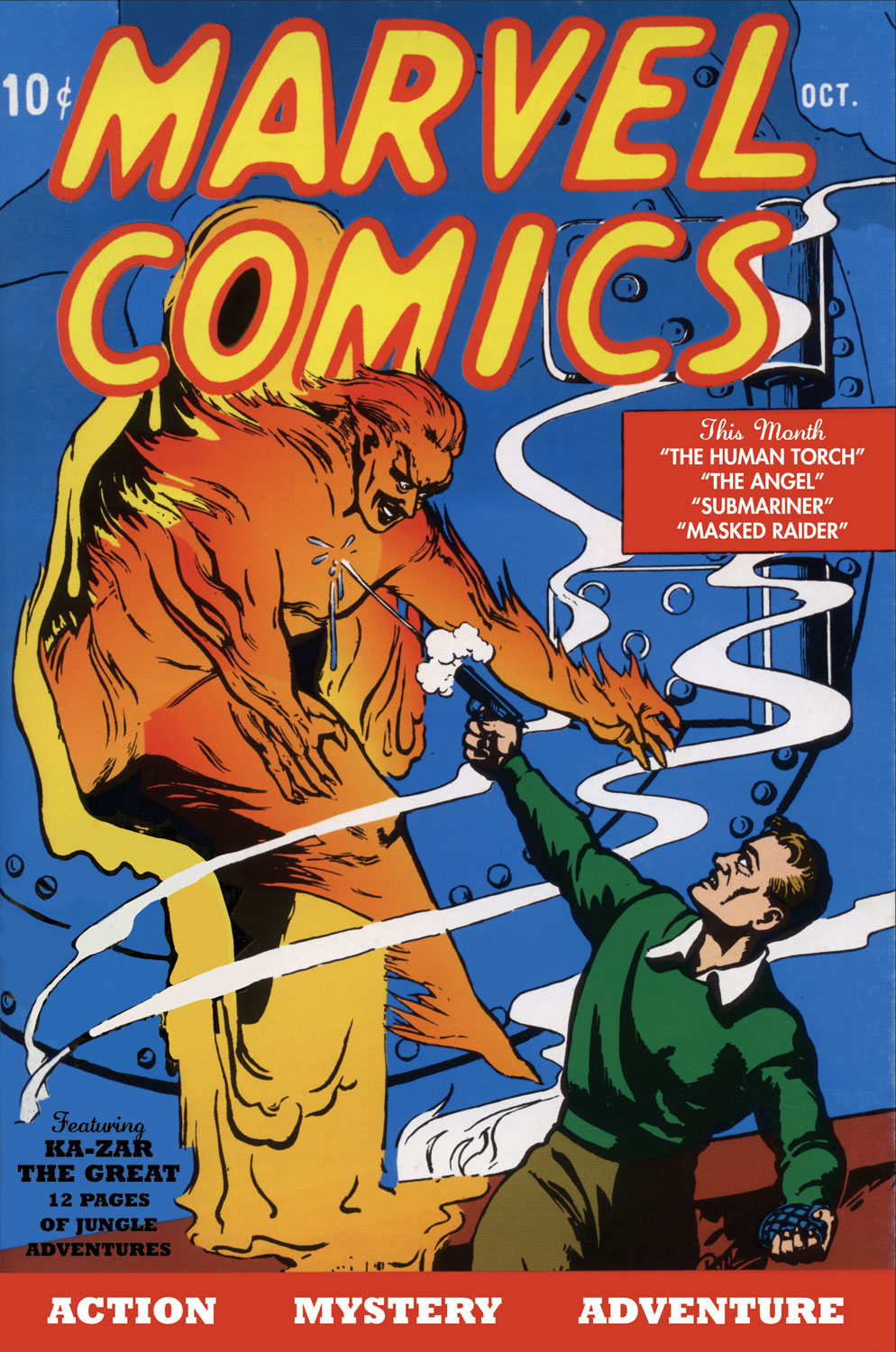
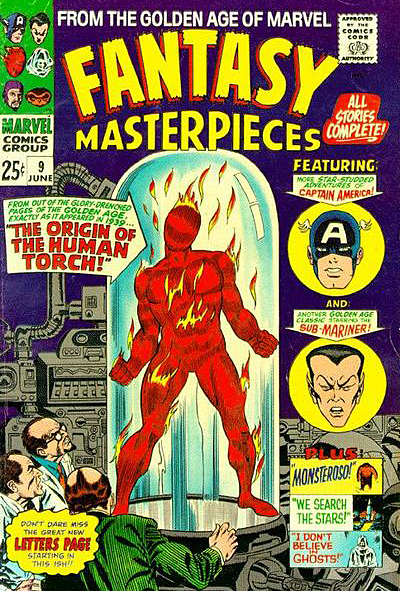
Marvel Comics #1 launches the Marvel Golden Age with introductions of the Human Torch and Sub-Mariner. My friends and I first encountered the “original” Torch in reprints 25 years later.
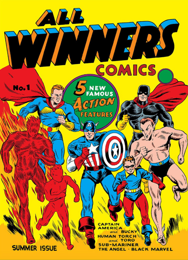
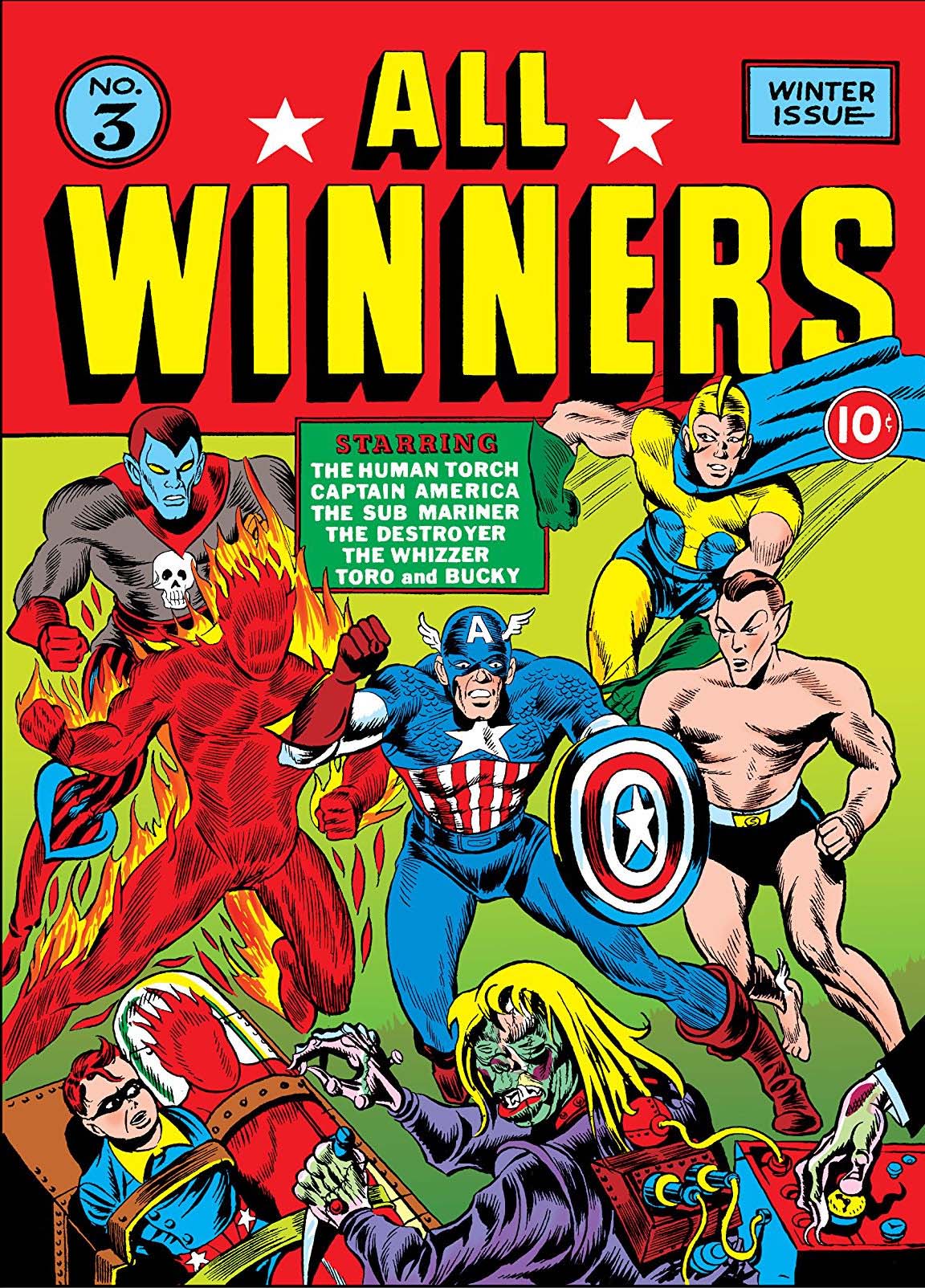
Marvel published additional solo stories of its most popular characters in the aptly-titled All Winners Comics.
Finally, in All Winners #19, Marvel’s most popular characters appeared in one story together. Rebranded the “Invaders” in the Silver and Bronze ages, the team continues exist in one form or another today. One of many “Marvel Boys.” Click on the pic for more info.
Wrapping up our multi-part tribute to The Human Torch and Sub-Mariner, in honor of the late summer weather at the California coast.
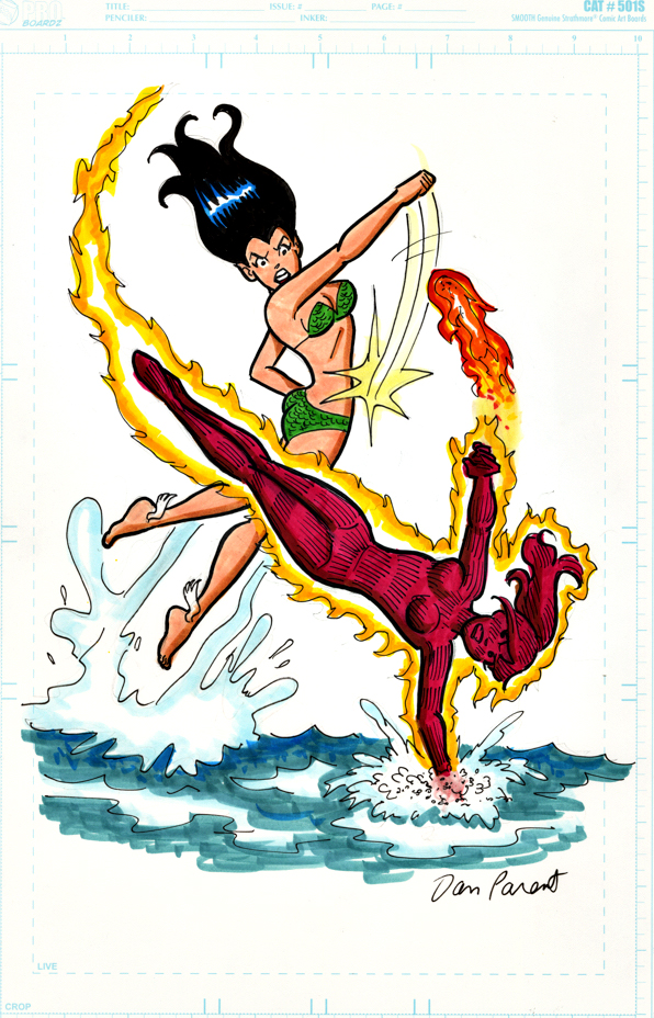
From time to time, an offbeat Archie mash-up idea burrows its way into my consciousness, and Dan Parent always delivers. In fact, this homage to the original battle scene by the legendary Bill Everett is one of my favorites among the many terrific ones Dan’s produced.
Dan is easily among the top tier of all-time Archie stand-out talents, joining a terrific group of cartoonists that includes Bob Montana, Dan DeCarlo and Harry Lucey, to name a few.
Incidentally, we matched the characters by overall appearance (Veronica/Namor, brunette and Betty/Torch, blonde) and, to some extent, personality. After all, Veronica is definitely the worse-tempered of the two, and Betty… does indeed carry a “torch” for Archie.
Our weeklong tribute to The Human Torch and Sub-Mariner continues, in honor of the late summer weather at the California coast.
“Cover-quality” is an overused adjective in the comic art-retailing world.
Typically it appears when a reseller is trying to grab attention on an unpublished commission for sale: “Gee, look, isn’t this as good as a published cover?”
Why do this? The short answer of course is marketing. Hyperbole (theoretically) helps support a higher asking price. Also, it adds the word “cover” to the item description’s metadata, meaning it appears in any on-line search for that word. Clever.
Here, however, “cover-quality” is no exaggeration for this richly detailed Sub-Mariner commission by Mike Deodato — a moody portrait of Prince Namor with the only human he truly pines for, the lovely Sue (Invisible Woman) Storm. Hell, it’s better than many published covers.
Who hasn’t marveled (sorry) at the evolution of Deodato’s artistic style? When he broke in professionally about 25 years ago, Mike’s art approach was much more similar to the “Image Comics” style of the day. Today, his storytelling blends similar dynamism with an often astonishing photo-realism into an accomplished, and enviable, form.
One previous owner of this piece did in fact describe it as an actual published cover, without evidence. But… so many retailer variants and limited exclusive covers have been published the last few years, anything is possible. I’m aware of multiple instances where a piece of art was indeed assigned — and executed — for a cover variant, but then cancelled last minute.
So… if anyone can provide evidence that this art was indeed professionally published. or solicited to be published, somewhere — anywhere — you will have my thanks, and a piece of original art as a finder’s fee.
I found a number of color versions online, adding a bit to more mystery to the provenance of the piece, but they appear to be samples by aspiring colorists.
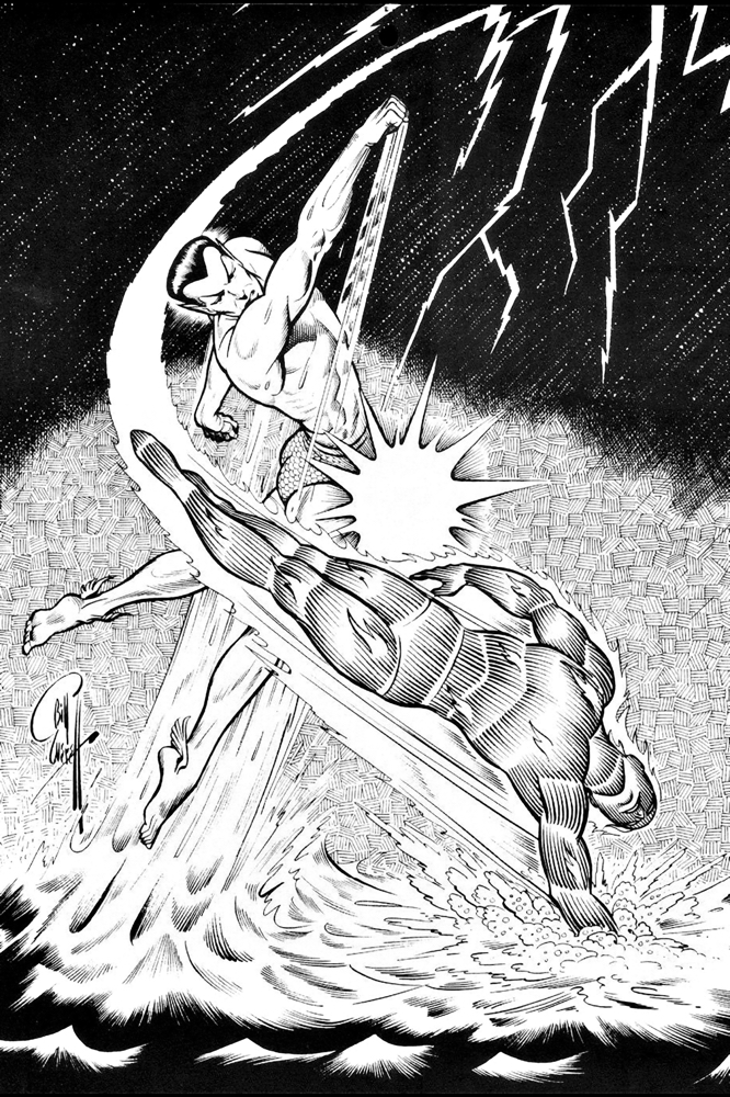
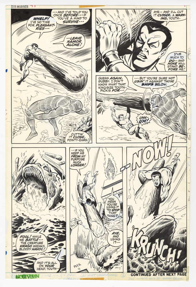
Summer came very late to the Southern California Coast this year, so in honor of the warm weather and cool surf, we’ll stay with The Human Torch and The Sub-Mariner for a few more posts.
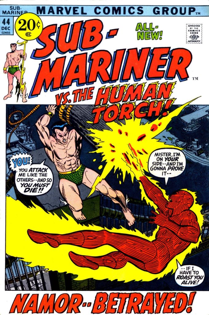
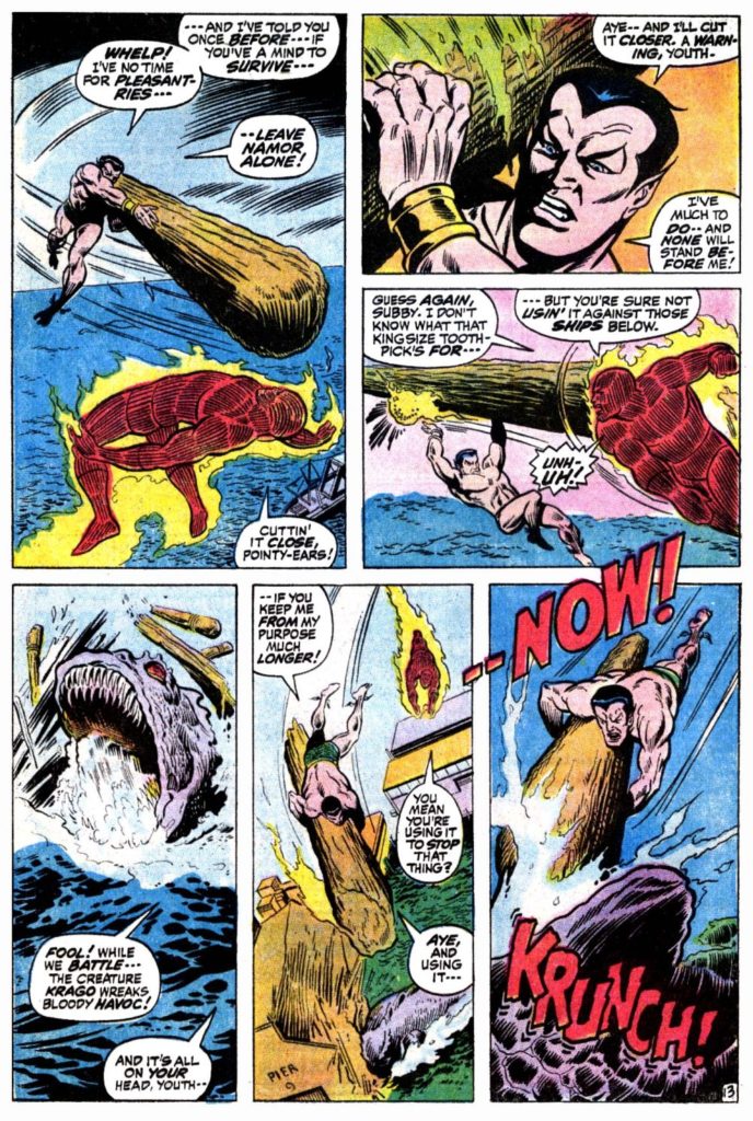
This great battle page, penciled by Marie Severin, and inked by Jim Mooney, features Sub-Mariner vs. the contemporary Human Torch, Johnny Storm. This a feud that started in Fantastic Four #4 in 1962 (Torch is the one who discovers an amnesiac Namor living in NYC) and continued intermittently through the silver and bronze ages.
Along for the fun this time is the giant sea-beast Krago, woken from his slumber by Subby’s enemies to wreak havoc among us, and to have Namor blamed. Krago is apparently NOT related to Giganto, another giant sea-beast Namor himself brought along in FF #4. How many species of giant sea creatures are there anyway? And to think I was worried about the occasional shark.
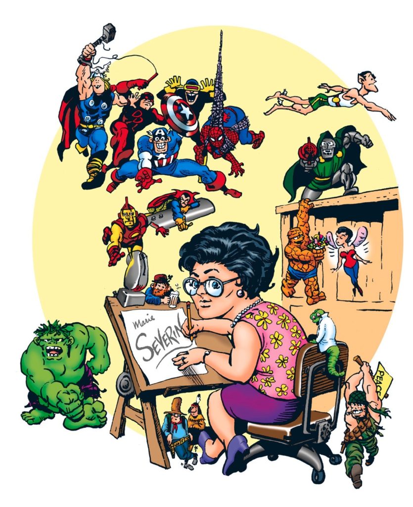
What can you say about the late great Marie Severin, easily one of the most versatile talents to ever work in comics? Penciller, inker, colorist, occasional letterer, caricaturist, production artist, cover designer, satirist… and so on. Hands down, an amazing career, made even more so because she needed to make her bones — more than once — in a thoroughly male-dominated industry.
Marie passed away almost exactly a year ago, and many well-written tributes speak to the scope of her career: Marvel.com, The Comics Journal, and the New York Times all provide good starting points to this remarkable creator.