The Shadow / Green Hornet: Dark Nights #1, July 2013
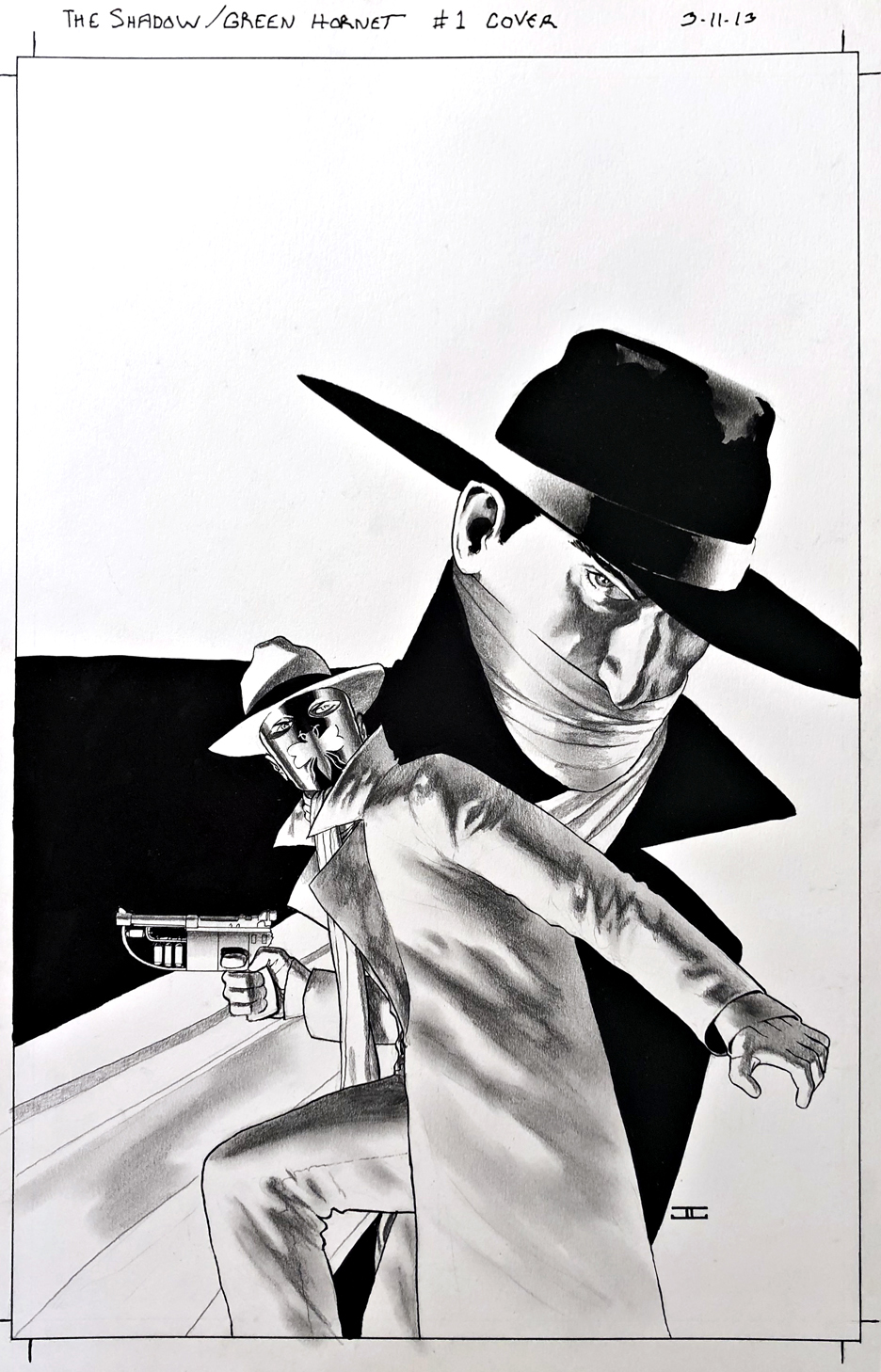
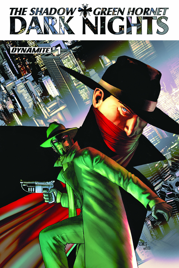
Nice to see two of my favorite classic characters, The Shadow and The Green Hornet together in one series, with a fantastic cover by the terrifically talented John Cassaday.
Pulps and comics — like peanut butter and jelly, yes? My dad connected many of the dots between the pulp, comics, radio and serial adventure characters for me at an early age.
I credit Jim Steranko (History of The Comics) and the nostalgia boom of the 60s and 70s for amplifying those connections.
And how about some contemporary credit to Nick Barrucci and the other talented folks at Dynamite Entertainment for (at least briefly) creating a cool “shared universe” with some of these unforgettable icons?
Fun books all around, and I know from personal experience it wasn’t easy securing all those licensing rights to make these kinds of mash-ups possible.
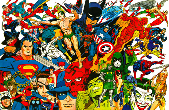
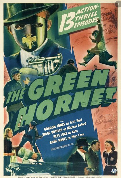
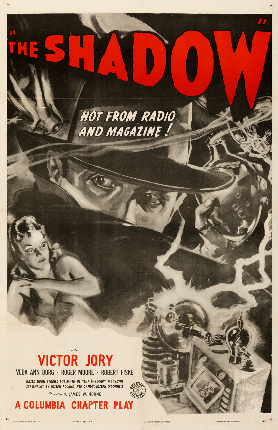
Steranko’s History Of The Comics (Volume One) is probably the first place The Shadow and The Green Hornet appeared on cover — along with an amazing collection of other heroes and villains.Both the Shadow and Green Hornet appeared in Movie serials. (The Hornet actually appears in two.)
We continue with our month long celebration of the “Independents” — independent creators and projects that continue to impact the comic book medium.
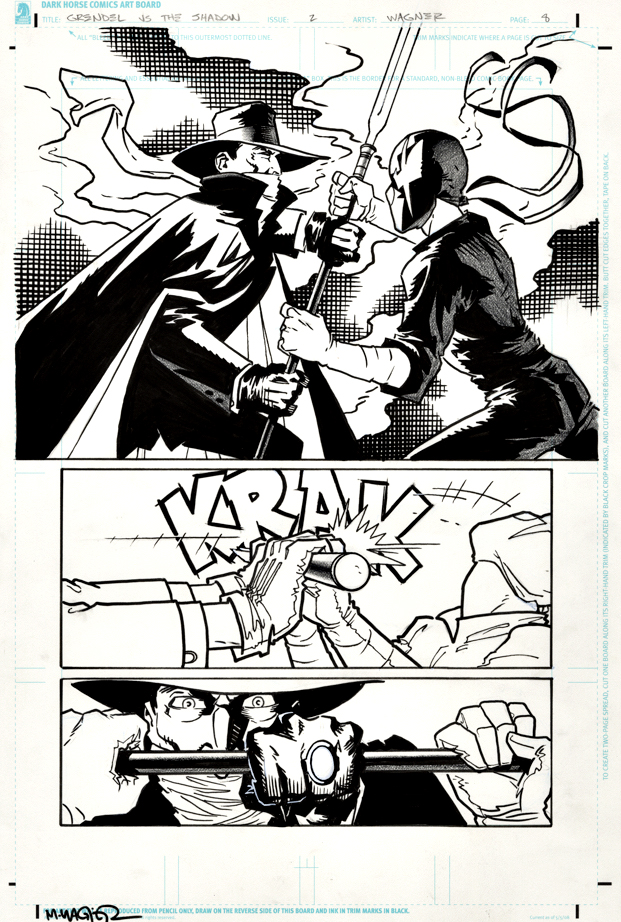
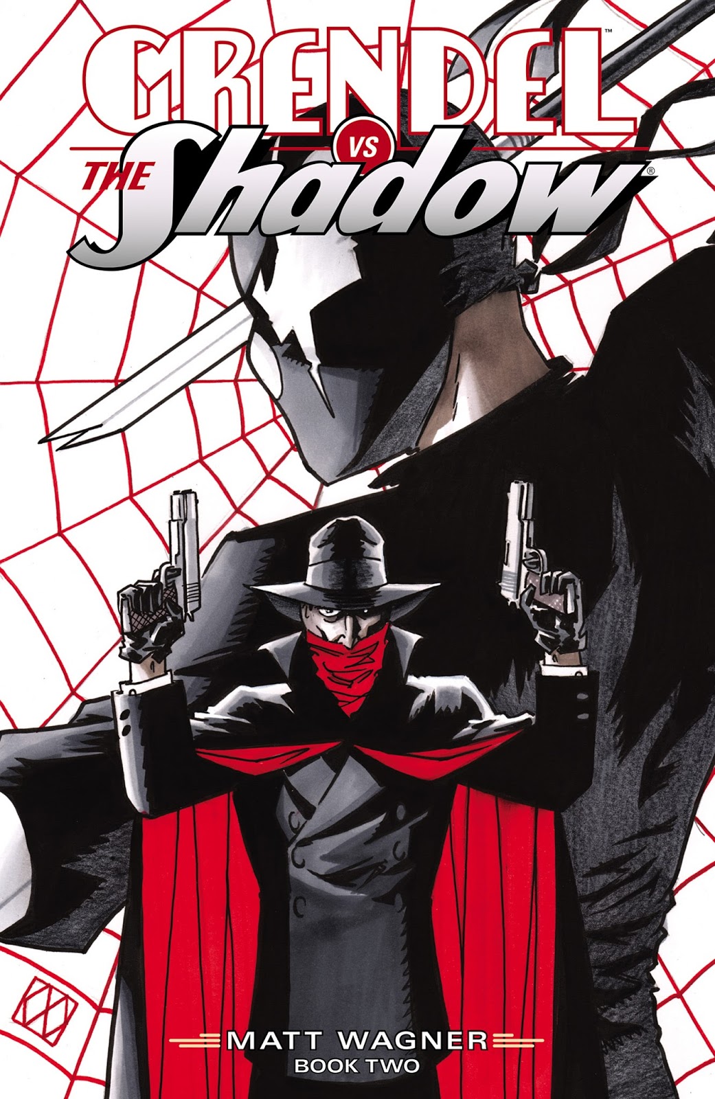
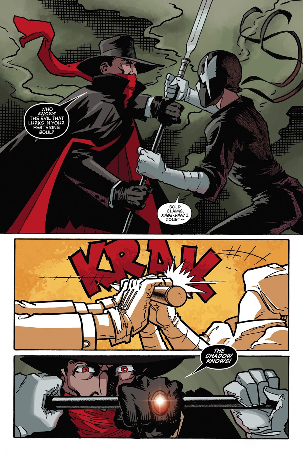
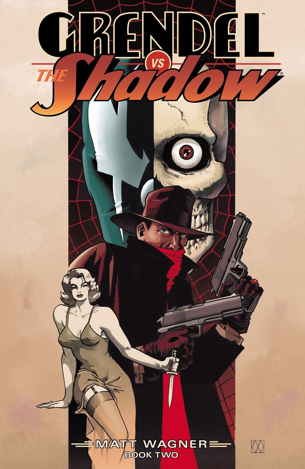
Matt Wagner seamlessly fits his independent creation Grendel into the pulpy world of The Shadow in this wonderfully realized mini-series. Grendel — Hunter Rose — is a natural adversary for the famed vigilante in a story set during the Shadow’s classic era, the 1930s.
Not much more to add here, except — I hope they do a sequel one of these days.
Concluding our ongoing series celebrating multiple anniversaries for the classic pulp character, The Shadow.
Gravity. What a bitch.
Comic art (and animation) often defies gravity, and pretty much all other laws of science. (Not just physics.)
Didn’t care as a kid, don’t care now.
As long as the art is dynamic, the storytelling is clear, and we don’t push the boundaries into the realm of downright ridiculous, I’m good.
Also, consistency helps too. If Wile E. Coyote has a one-second mid-air pause before he falls helplessly to the earth, each and every time, no problem. Not realistic, but completely plausible within the context of the character and story.
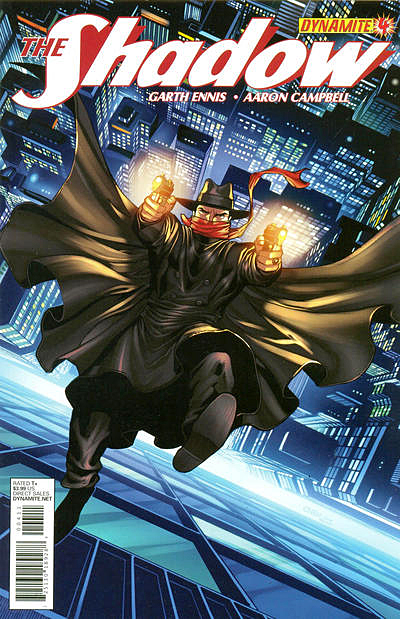
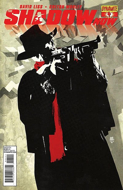
Falling: always a bit slower in comic books than reality. And the character is often calm and composed about the whole thing.
Like our friend Lamont Cranston here. He’s not flailing; he’s carefully shooting at whomever caused his drop.
We know he’s going to finish getting some shots off, and, at some point in the drop, reach for a convenient flagpole. Or something. He will figure it out.
In “real life,” perhaps not so much.
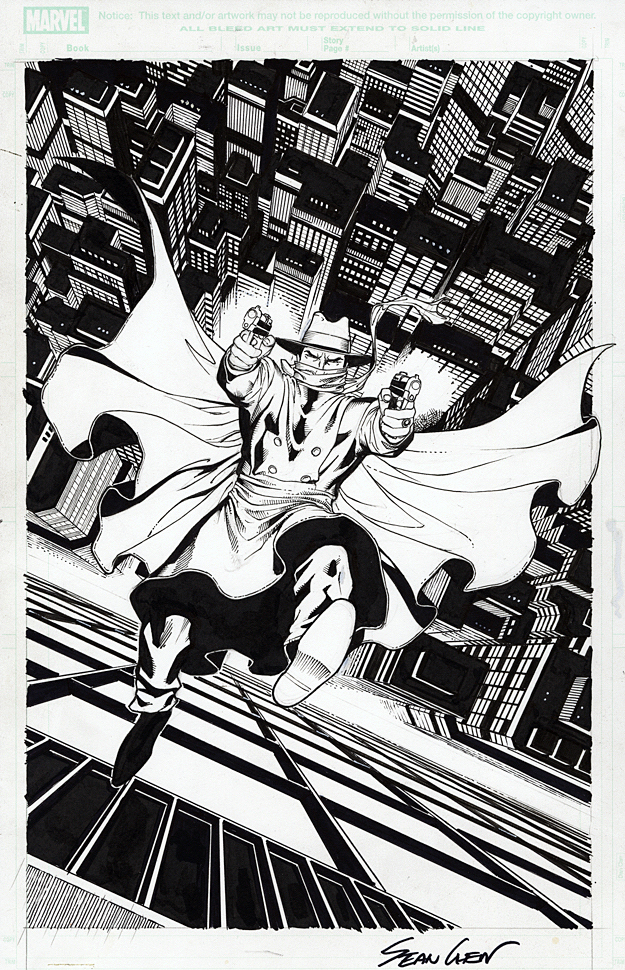
A terrific cover, illustrated by the terrifically talented Sean Chen. Flailing not permitted.
Hans Gruber’s famous fall with gun in hand in Die Hard is probably a bit more realistic… no handy flagpole or awning nearby.Also, sheer terror.
Your favorite heroes, on their way down, down, down.
Continuing our ongoing series celebrating multiple anniversaries for the classic pulp character, The Shadow.
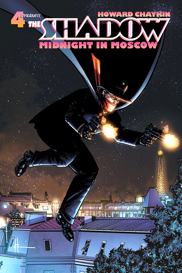
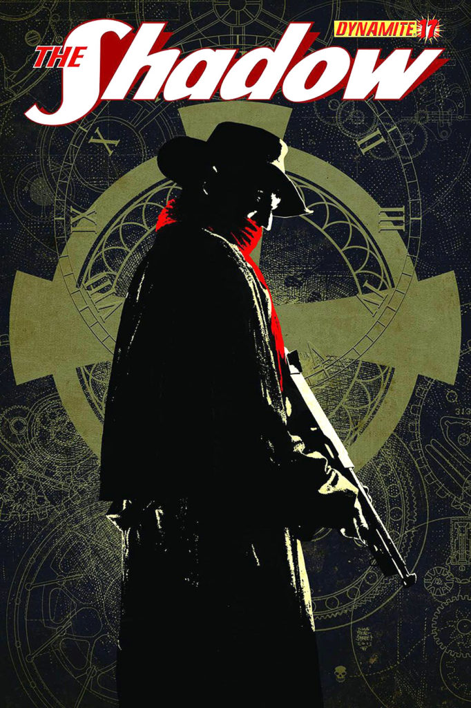
Howard Chaykin will tell you — often, and with emphasis — that he is not a guy rooted in the classic pulps.
That said, there is something consistently special about his artistic interpretation of the Shadow.
Maybe it’s his actual distance from the character that makes it so terrific. It’s strictly a professional relationship, without fannish admiration.
Whatever the reason, Howard’s Shadow always looks like the character should look like in my mind’s eye.
On this bold and striking cover, the buildings and effects were added digitally of course, and atypically, I’m thrilled they were. I love the character composed powerfully on his own in the original art.
As noted, striking and bold. Lots of black ink and just enough lighting. Guns out, cape flowing.
Just as it should be.
Published color version and black and white variant — more detail, but less impactful, as the character is reduced in proportion to the cover size to make those details and logos fit.
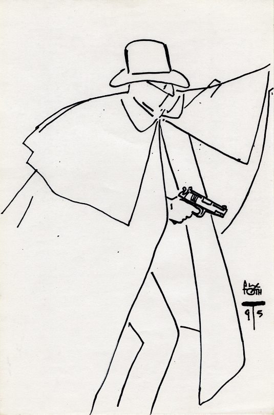
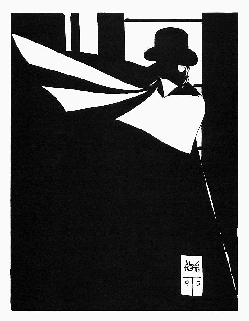
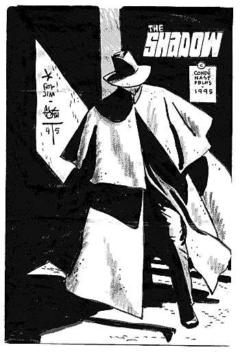
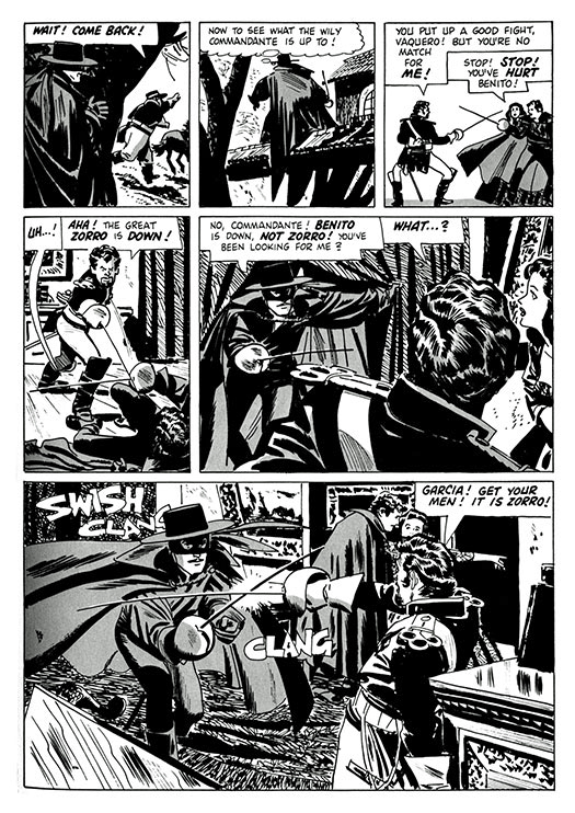
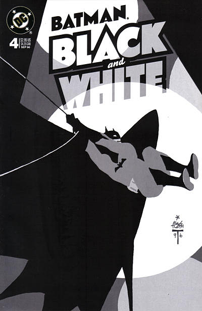
A simple rendering of the Shadow by the legendary Alex Toth leads us down the “What If” rabbit hole.
What if Archie Comics had phoned Toth in 1964, and said “Hey, we just acquired the rights to The Shadow, not sure what direction we should go with it, are you interested?”
Would Toth, who five years previously had beautifully illustrated another pulp icon, Zorro (based on the popular TV series) said yes? One can only imagine the results if he had.
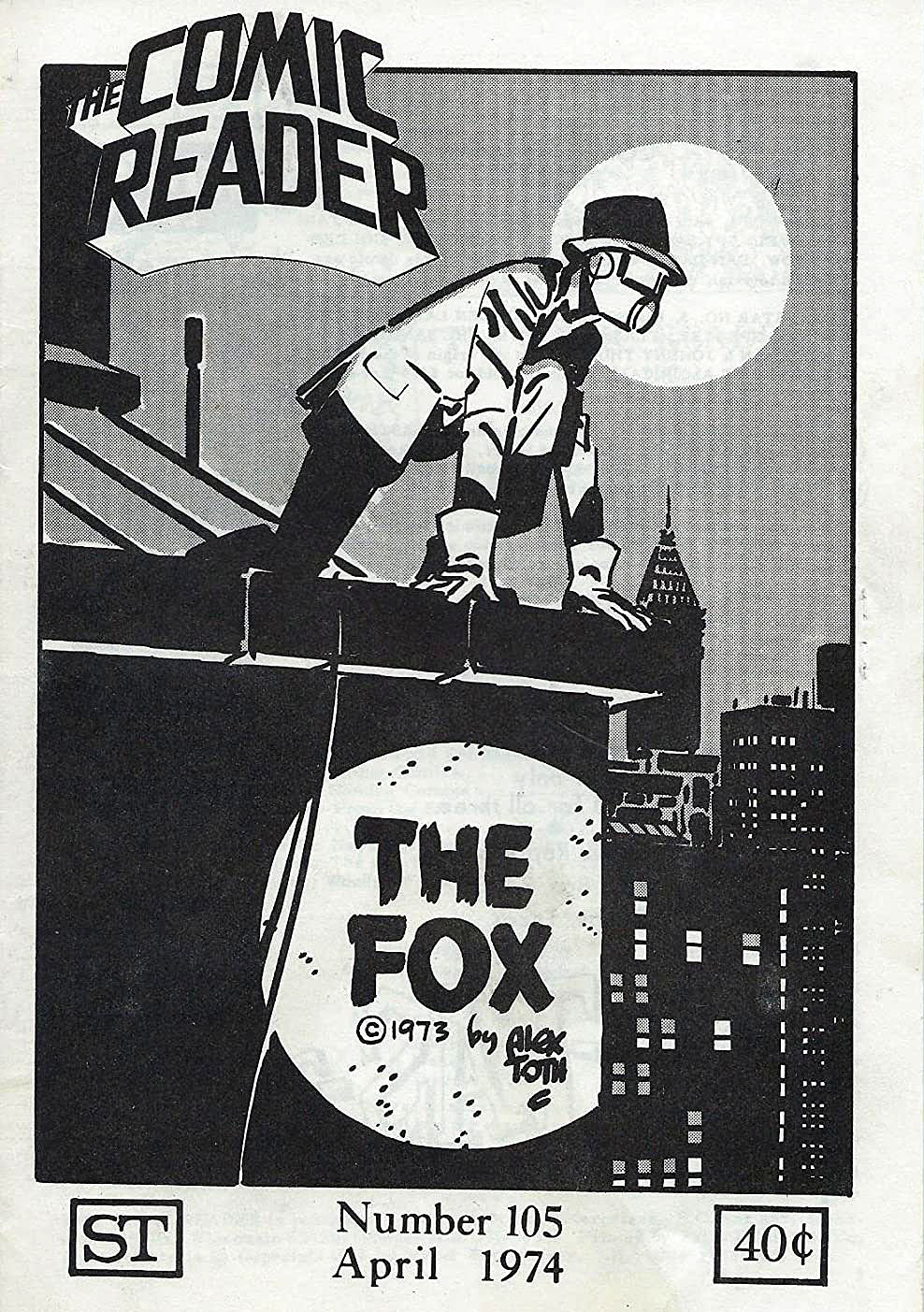
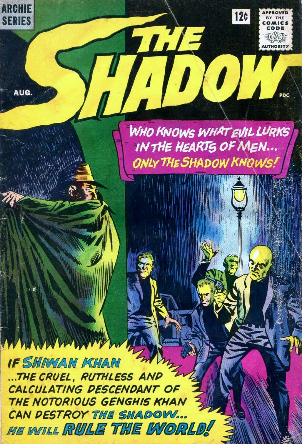
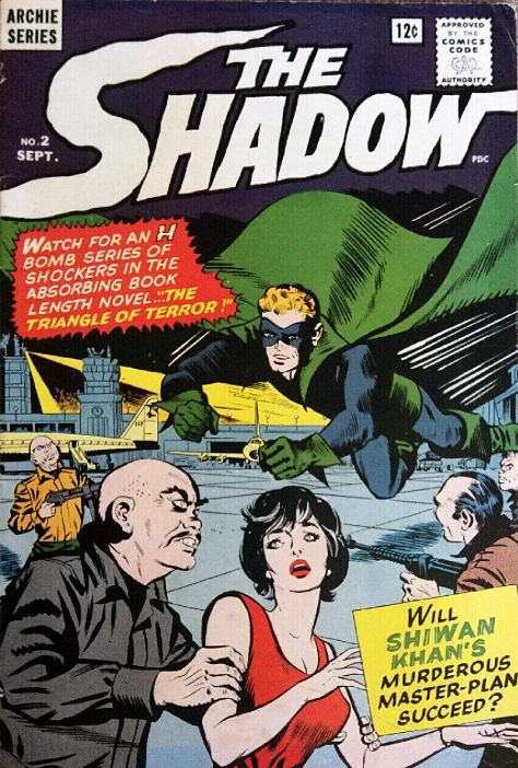
Archie did indeed take the license for the Shadow. But instead of a classic version, illustrated by Toth, or someone comparable, we are left with a giant puzzle.
The cover of issue #1 features a classic rendition of the character.
But inside? A completely different version, with blonde hair no less.
Issue #2 amplifies the gaudy superhero costume, keeps the blonde hair.
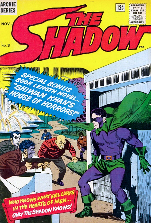
Issue #3 keeps the costume, but changes the hair to black.
And so on. At this point, he looks — and pretty much acts — like a poor knock-off of any number of classic Archie / MLJ heroes from the golden age that they already owned.
Why license The Shadow if you’re going to create something wholly different? That indeed is a puzzle. (And also, it can’t capitalize on the “camp” craze,” because it appears well ahead of the Batman TV series.)
After eight issues, the title is mercifully cancelled.
As for Toth? He spent much of the 60s designing many of our favorite animated TV shows, including Space Ghost and Super Friends.
But he never strayed too far from comics, and has illustrated all-time classic stories, in many genres. And, many of his sketches and commissions reflect a passion for classic pulp characters and motifs.
A Toth Shadow series would have been something to see.
Toth, born in 1928 (and died in 2006 at his drawing table), would have turned 92 today. Happy Birthday, Alex!
Toth noir, as evidenced by the illustrations above.
Archie Comics’ version of The Shadow: A mystery wrapped in an enigma, etc….
From Zorro to Batman, Toth was a master of shadow and light.
Continuing our ongoing series celebrating multiple anniversaries for the classic pulp character, The Shadow.
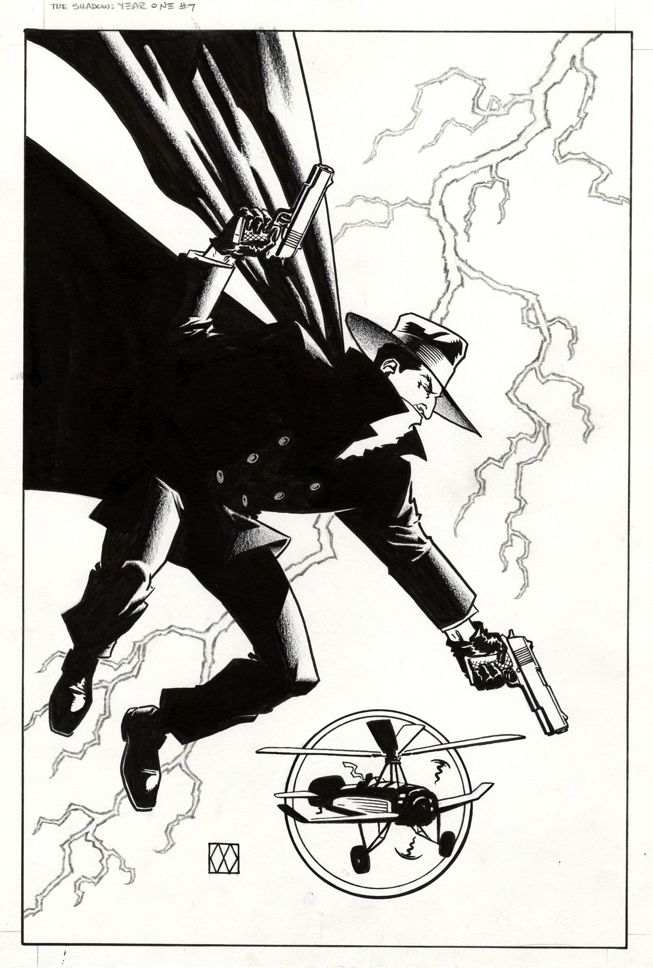
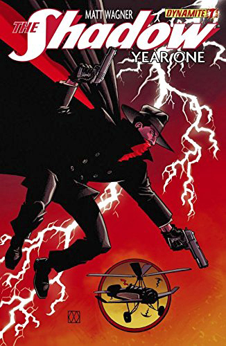
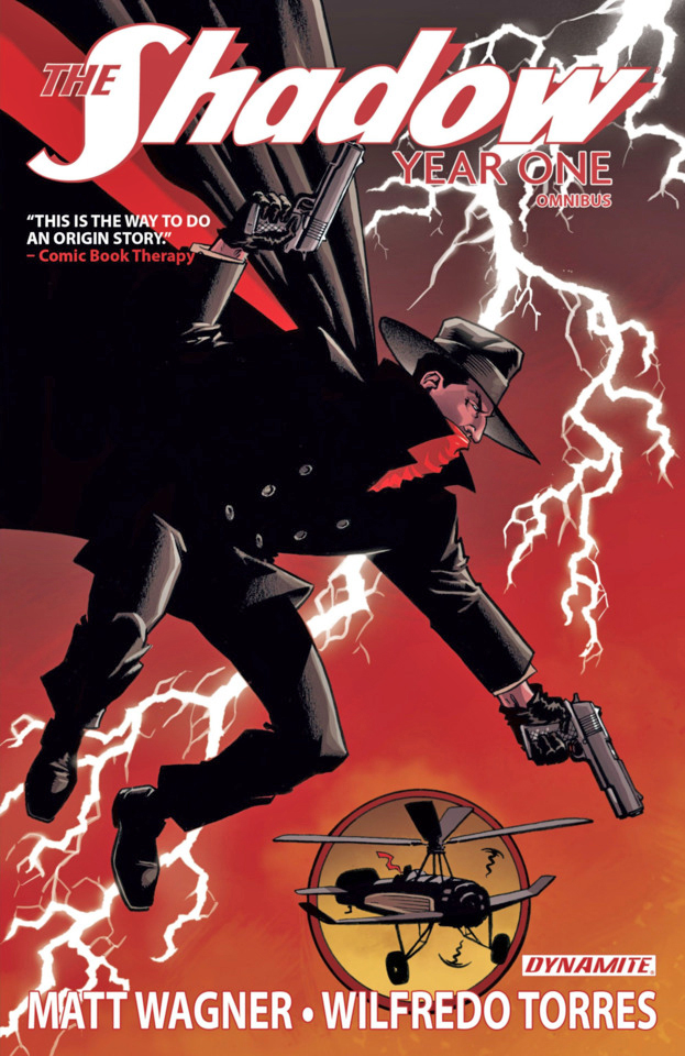
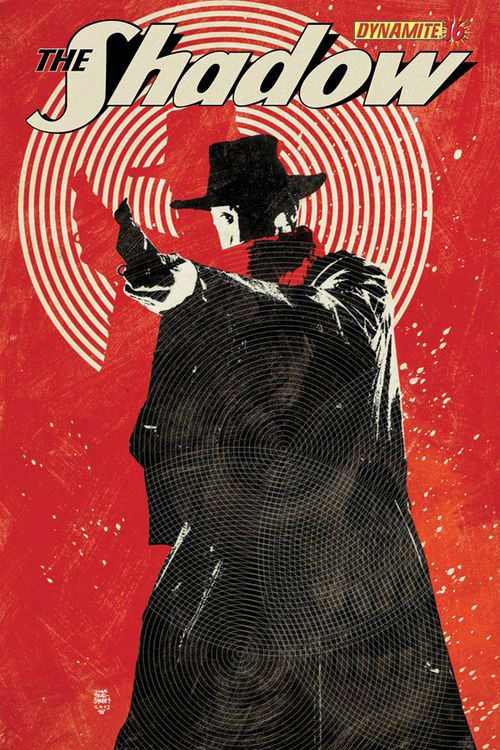
Here is another great Matt Wagner cover, from the same terrific Shadow “origin” series as the last one.
So great, it ended up as the cover of the collection of the entire series as well.
So, I think we should, and will in fact, let this superb cover stand on its own without additional dissection.
For more on Matt and his interest in the character and other legends of the pulp era, click here.
Also definitely worth checking out are the exhaustive Shadow Chronology, available at a very reasonable price from Amazon, and Walter Gibson’s (out of print, unfortunately) Shadow Scrapbook, a nice first person history.
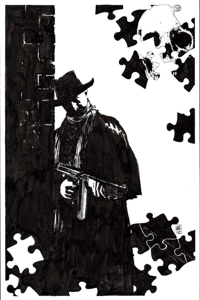
Tim Bradstreet delivers a great Shadow cover that was, ultimately, unused.
Why are some comic book covers re-worked?
Subjective question. Subjective answers.
If it’s a licensed title, as in the case of The Shadow, maybe the licensor doesn’t like it.
Editorial decision, perhaps? Certainly a logical answer in many cases. Possibly not a strong enough image to “sell” the issue. Or perhaps the content doesn’t quite match the interior content.
And, in some cases, the artist himself finishes the piece and decides he doesn’t like it. Both Jim Steranko and Neal Adams have told me they’ve finished covers, changed their minds, and started from scratch.
That seems reasonable, even if time consuming. If your signature is going on the piece, you might re-think something you personally don’t like. Especially if you’re going to have to look at it — forever.
And in a pre-digital age, physical covers were lost occasionally. Trust me, it happened.
Whatever happened here –– definitely not the final possibility, of course — I think the unpublished version is cool. The puzzle pieces, skull included, are a nice touch. The published cover drops them in favor of a larger, more dramatic Shadow pose.
Bradstreet, of course, is a great choice for Shadow covers. Can’t go wrong, and for my two cents, I don’t think there’s anything wrong at all here.
Comic book pundits in 1986 decided the Shadow mini-series by Howard Chaykin was “controversial.”
Translation: Some fans liked it, some didn’t.
The late Harlan Ellison famously hated it. And Harlan was not famous for being gentle about his opinions. So there’s that. (Comic book journalists, critics, fans and trolls didn’t need the Internet in those days. They had fanzines. But I digress.)
Setting the series in the contemporary era seems to be a primary trigger for fans of the classic pulp character. Fans, who, it should be noted, mostly had abandoned their commercial interest in the character long ago.
A decade earlier, a series by Denny O’Neil and initially drawn Mike Kaluta, brilliantly faithful to The Shadow’s pulp origins and era, didn’t last past 12 issues.
So DC and Chaykin took a different approach with this series. And Chaykin’s world of The Shadow was definitely more “adult” (grittier, sexier, etc.) than earlier versions. Sign of the times, and Chaykin’s mature approach to comic book content specifically. (Chaykin’s Blackhawk and Black Kiss would follow shortly.)
For what it is worth, I gave it a shot, and liked it. The storytelling and art were — not surprisingly — top shelf. Did I care that the character was set in modern times?
I didn’t lose much sleep over it.
Controversial was an overly word then, and virtually worthless now. Dictionary definition is “giving rise or likely to give rise to public disagreement.”
So art is pretty much always “controversial.” Read some contemporaneous reviews of Citizen Kane or Star Wars. I’ll wait.
In 2020, of course, everything is controversial. I never thought I’d see the day when established facts were “controversial.”
Nearly all writers, amateur or professional, struggle with writers block at some point.
My blog schedule for 2020 is fairly consistent. About 250 -300 words per post, three posts per week. Add in some extra narrative in the captions, and the occasional “bonus” post, and we can generously call it 1000 words per week. 50,000 words per year, give or take.
That’s significantly less than my early newspaper or magazine days, and yet, every once in a while, I stare at the art — and the screen— blankly, trying to get my thoughts together in a semi-coherent fashion.
And then, there’s Walter Gibson, creator of the Shadow. During the height of the character’s popularity in the 30s and 40s, he wrote two novels PER month, each 50-60,000 words. (Using the pen name Maxwell Grant.)
50,000 — 60,000 (or more) words every… two… weeks.
In Gibson’s NY Times obituary, the paper calculated that in some years, his annual output was well over 1.6 million words!
Reading some of these Shadow stories, it’s obvious that although they were genre books, with certain themes and ideas repeated throughout, they were well written, creative and original. Quality novels, twice a month.
How the heck did he pull it off? Astonishing is definitely an understatement.
Turns out he and I were living fairly closely to each other shortly before he passed away in 1985. I wish I knew that (where was the internet when I needed it?), so I could have perhaps expressed my astonished admiration directly. And of course, thank him.
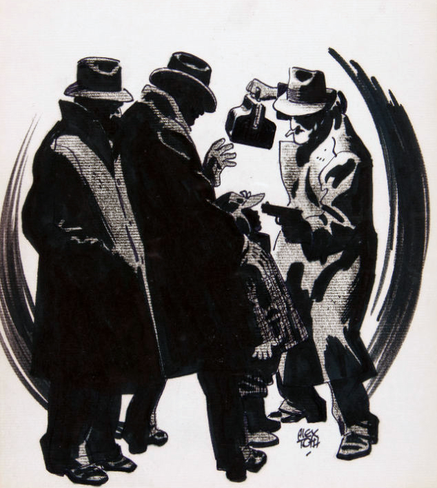
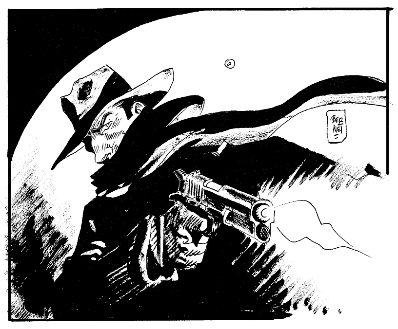
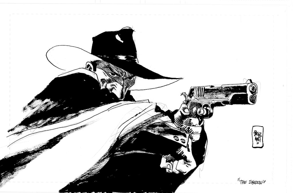
Oh, yes, back to the art: A great commission by the terrific Jordi Bernet. He’s done a bunch of these, so I assume he’s a fan.
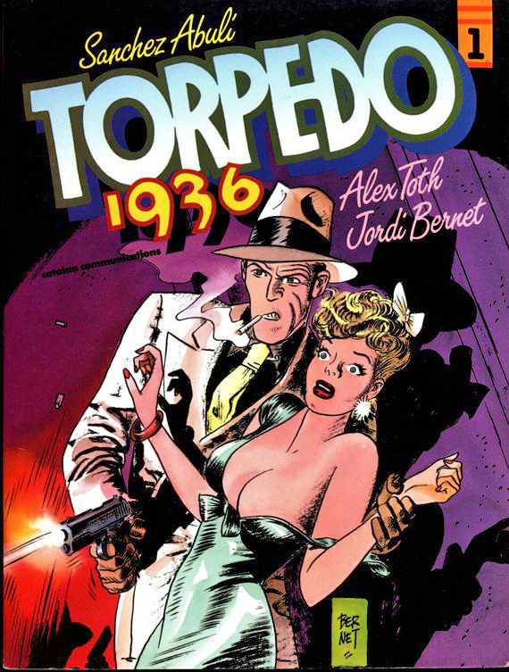
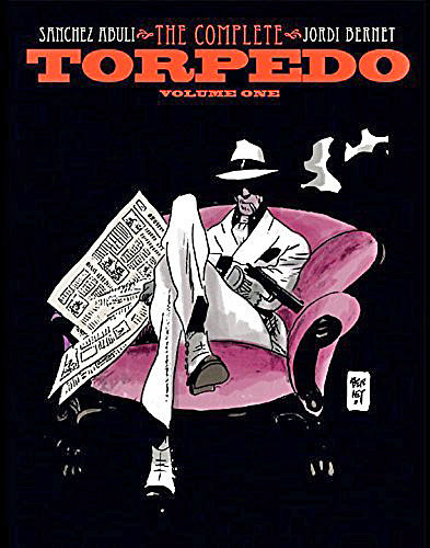
I was fortunate enough to meet him — and host him briefly — at the 2011 San Diego Comic–Con. IDW published the first high quality collection of Torpedo stories in English. And although I’m not a huge fan of the stories themselves, I’m a big fan of the art.
That too, is an amazing understatement.
But at least I had an opportunity to tell him that. Even if my Spanish is fairly impotent.
Alex Toth drew the earliest Torpedo stories, but he wasn’t fond of the writing, so he dropped out. His replacement, Jordi Bernet, is a legendary storyteller in his own right.
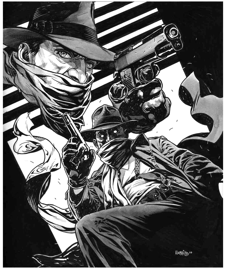
Tony Harris’ brilliant and detailed Shadow commission captures the great noirish elements of the classic pulps.
Those classic pulps: Many comics fans of my generation learned about them anecdotally from our folks (my dad was the perfect age for the pulp heyday) AND “officially” from Jim Steranko’s wonderful 1970 History of The Comics, Volume 1.
Steranko connected many, if not all, of the dots in popular fiction that influenced the Golden Age of comics.
Briefly excerpted below is Jim’s summary of the pulp era:
“Pulps were untrimmed magazines named for the soft paper flecked with shreds of wood on which they were printed. Publishers use pulp paper because there was nothing cheaper available. Pulps had little to do with quality. The key word was quantity! Publishers became successfully relentlessly asking themselves this question: How can I print more books, more often, more cheaply?…
“Many titles were started only to be dropped after a few issues. Some bombed after a single issue. Others scored and lasted for decades. A few were so successful that publishing empires were built around them.
“Pulps measured 9 ½ x 71/2 and 114 to 162 pages between full color enamel stock covers. Most had 128 pages, which usually featured a lead novel of some 50,000 to 60,000 words and half dozen short stories totaling an additional 20,000 words…
Some pulps were issued weekly, some monthly, others bi-monthly or quarterly, but at most times 250 titles were on newsstand display. Every month chalked up a staggering total of twenty month million words!
“Those words told every kind of story imaginable, no plot was too remote, no idea too fantastic…
The pulps were cheaply printed, luridly illustrated, sensationally written, and cost a thin dime.”
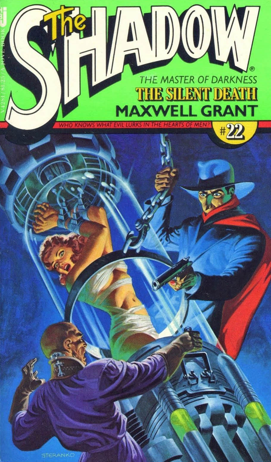
As part of the nostalgia boom that began slowly in the 60s and exploded in the 70s, The Shadow returned to prose fiction with pulp reprints featuring brand new painted covers by Steranko. Jim has taken originals with him to exhibit at conventions on occasion, and the paperbacks while beautiful, don’t do justice to the originals. Trust me.