Baltimore Comic-Con 2023 — Part 3 Of 4
Baltimore Convention Center, September 8-10, 2023









Greg Goldstein's Comic Art Gallery
Panels and Pages… Art and Artists… Creators and Conventions… Musings and Memories…
Baltimore Convention Center, September 8-10, 2023


Marvel Knights 4 #16, May 2005
Tony Harris delivers a terrific cover for one of the oddest–logoed titles in Marvel History.
The title is not “4”, but actually “Marvel Knights 4”, as the publisher decided to give an edge to the FF by incorporating them into the Marvel Knights brand. (Of course this assumes you know that MK stands for Marvel Knights. And that you’re certain that “4” refers to the FF.)
It’s a puzzler how they ended up there.
And speaking of puzzlers — this storyline deals with time travel and Ramades, son of Ram-Tut, who makes his first appearance the issue prior.
Rama-Tut, of course, is also Kang AND Immortus, and also ultimately retconned to be Nathaniel Richards. Reed’s father. The Time Variance Authority and the Time-Keepers are also involved.
Frankly, as mentioned previously, I could never keep any of this straight, and even the very-detailed Wikipedia page can’t help my brain get around the various iterations of this character. (Not blaming them, though — it’s probably just me.)
Great cover art, though, and Tony colored it himself — adding the background texture as well.
(As for Ramades? He has yet to reappear since this storyline was completed in issue#18.)
Shadow Commission, Unpublished, 2010
Tony Harris’ brilliant and detailed Shadow commission captures the great noirish elements of the classic pulps.
Those classic pulps: Many comics fans of my generation learned about them anecdotally from our folks (my dad was the perfect age for the pulp heyday) AND “officially” from Jim Steranko’s wonderful 1970 History of The Comics, Volume 1.
Steranko connected many, if not all, of the dots in popular fiction that influenced the Golden Age of comics.
Briefly excerpted below is Jim’s summary of the pulp era:
“Pulps were untrimmed magazines named for the soft paper flecked with shreds of wood on which they were printed. Publishers use pulp paper because there was nothing cheaper available. Pulps had little to do with quality. The key word was quantity! Publishers became successfully relentlessly asking themselves this question: How can I print more books, more often, more cheaply?…
“Many titles were started only to be dropped after a few issues. Some bombed after a single issue. Others scored and lasted for decades. A few were so successful that publishing empires were built around them.
“Pulps measured 9 ½ x 71/2 and 114 to 162 pages between full color enamel stock covers. Most had 128 pages, which usually featured a lead novel of some 50,000 to 60,000 words and half dozen short stories totaling an additional 20,000 words…
Some pulps were issued weekly, some monthly, others bi-monthly or quarterly, but at most times 250 titles were on newsstand display. Every month chalked up a staggering total of twenty month million words!
“Those words told every kind of story imaginable, no plot was too remote, no idea too fantastic…
The pulps were cheaply printed, luridly illustrated, sensationally written, and cost a thin dime.”
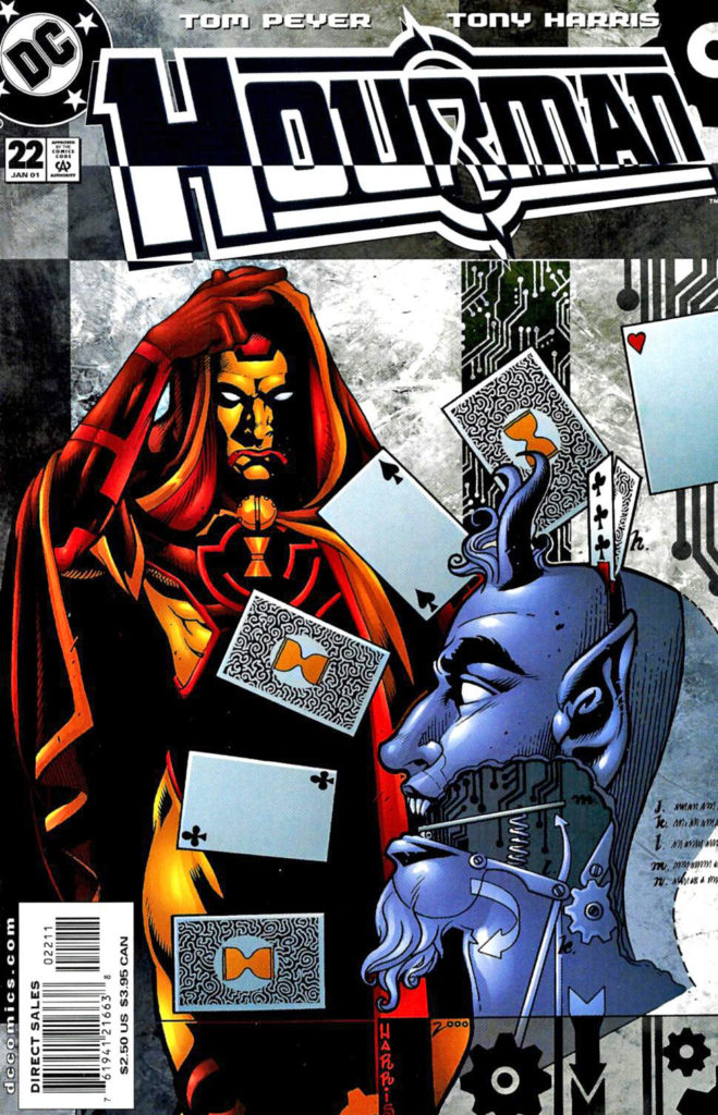
Hourman #22, January 2001
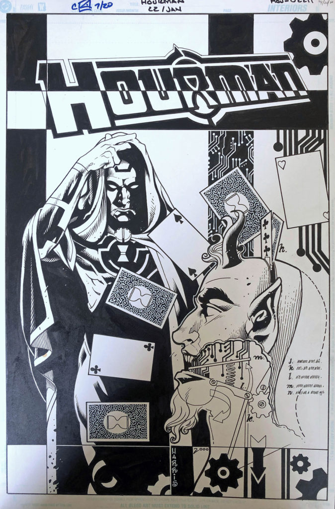
Continuing our celebration of the 80th anniversary of the Justice Society of America, with each new post featuring a different classic JSA character.
Hourman’s third incarnation becomes trippier in the amazing hands of Tony Harris, who drew this issue as a fill-in for series regular Rags Morales.
I’ve discussed my appreciation for Harris’ art previously, and his Starman and Ex- Machina series are definitive achievements. I also love his cover work, and this is a fine example, with a rare hand-drawn logo.
As for this incarnation of Hourman? He’s not Rex Tyler, the original version of Hourman, nor his son, Rick Tyler. He’s Mathew Tyler, and android from the future who has incorporated Tyler DNA… and well, you have to read it for yourself.
Hourman has also had a bit of a TV career, appearing on Justice League Unlimited and Legends of Tomorrow. Both the Rex and Rick Tyler versions will apparently appear in the new Stargirl series as well
Star Wars Special: C-3PO #1, June 2016
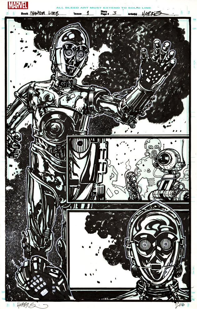
Star Wars: The Rise of Skywalker opens in two short weeks, and the Star Wars Skywalker trilogy of trilogies (I can’t bring myself to call it a ennealogy) will apparently conclude, 42 years after it began.
In honor, the next two weeks of posts will feature original art from Star Wars, showcasing one or more of the “original trilogy” characters.
James Robinson and Tony Harris (Starman) reunite for a one-shot C-3PO story that explains the droid’s red arm in The Force Awakens.
Their Starman run was one of the great comic book series of the late 20thcentury and it was nice to see them back together, even if only for a one-shot. And a pretty good one at that — a surprisingly moving tale about droid sacrifice.
The story is packed with eccentric droids in tight spots, and this splash is perhaps the best page in the book — a full image of C-3PO rendered with delightful and quirky detail by the talented Mr. Harris. He painted the striking “A” cover as well.
I love the final coloring, also by Harris, but as is often true, the art is especially striking in glorious black and white.
May the force… Well, you know.
