Greg Goldstein's Comic Art Gallery

Jack Kirby & Mike Royer — 30 Years Ago, Today

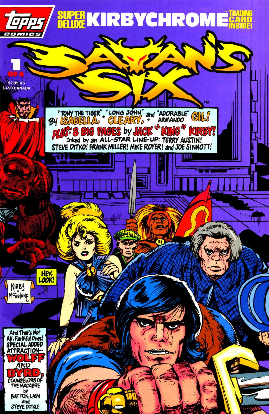
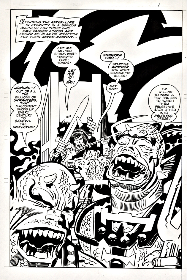
Production Art, Satan’s Six #1, April 1993

30 years ago? How is this even possible?

Jack Kirby’s Satan’s Six was developed as part on an unrealized “Kirby Line” of comics in 1978, shortly after Jack’s final tenure at Marvel had ended.

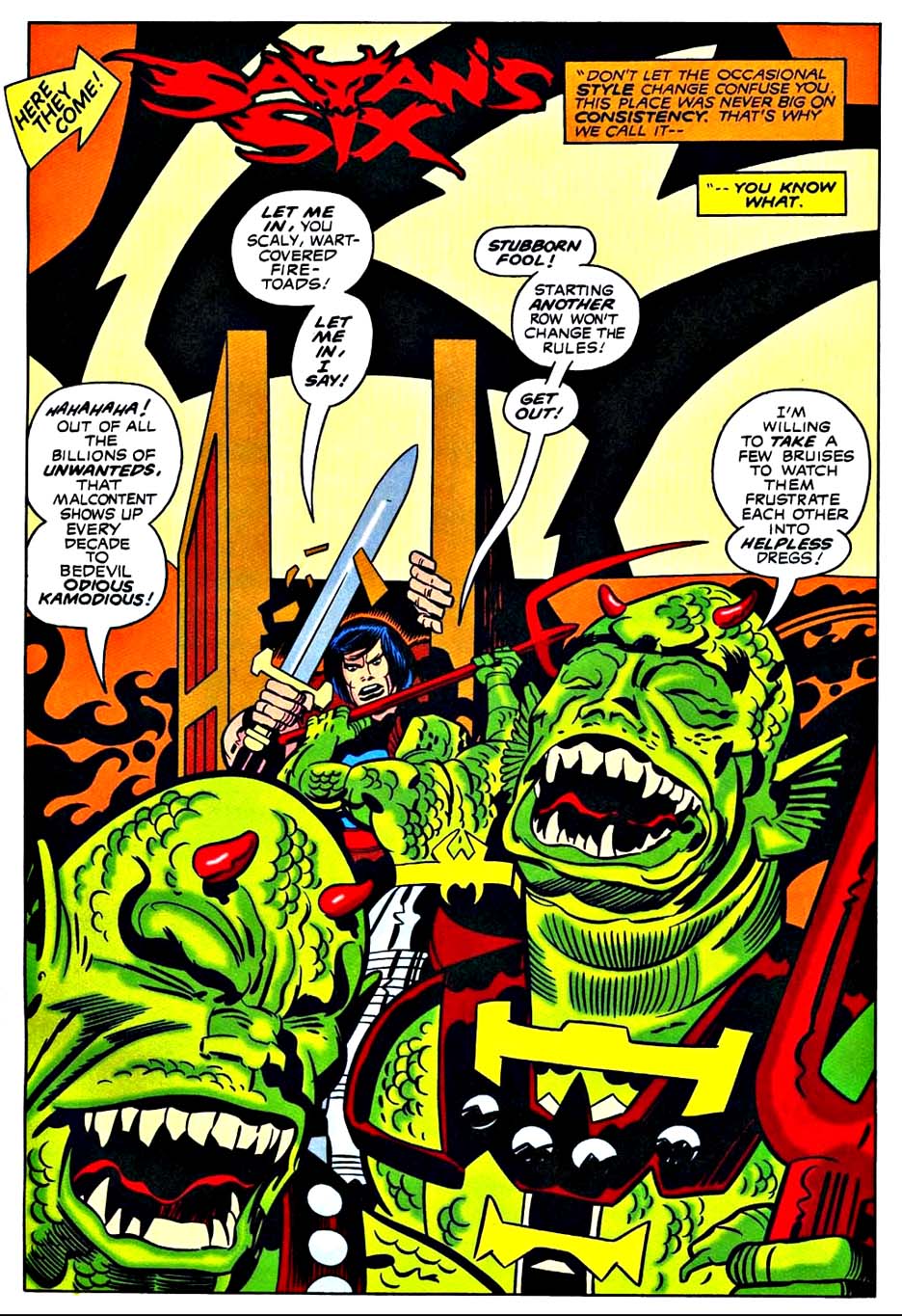
Jack drew a cover and eight story pages, plus a character concept and design page. Mike Royer was hired to ink some of those pages as samples, but when the concept for a “Kirby Line” dissipated, the pages sat in a drawer unused for nearly 15 years.

Enter my old home, Topps Comics, the fledging publishing line from the trading card and confectionary giant. Topps signed a deal with Jack in 1992 to produce comic books based on new, and (primarily) previously unused concepts. It was essentially a second chance for a “Kirby Line.” With the King in declining health, however, others would have to create content around Jack’s ideas.

A few years ago, some Kirby production art re-surfaced, complete with the original “Marvel style” trade dress on the cover and Royer’s original inks.

What became of Satan’s Six? Tony Isabella’s stories based on Jack’s high concept of a lovable group of misfits too mischievous for Heaven, but not evil enough for Hell seemed wackily appropriate enough, but the art definitely was a challenge from issue one. 

Especially issue one. 

Kirby’s eight original pages are scattered throughout the full story with the rest of the art from John Cleary, making for a dizzying juxtaposition of styles.

And Cleary’s “contemporary” (1993) art here, and through the remaining three issues, was simply not enticing enough to sustain interest.  The book was cancelled with issue #4. You can read a complete illustrated overview of the series here.

Satan’s Six has yet to return to comics. They remain in… Limbo.

But still…Happy 30th anniversary to the “Kirbyverse!”

Dollar Bin Bandits

I’m the guest on last week’s Friday (2/3) episode of the terrific comic book industry podcast Dollar Bin Bandits, available on your favorite podcast platform — and on YouTube.  (Links below.)

We covered quite a bit of ground: State of the industry, Topps and IDW days, comic book history, gaming and much more.; maybe something for everyone — or at least anyone who cares about these topics.

They picked a “classic” photo for marketing (as seen above — full version on my “About Me” tab), so don’t’ be too surprised if you watch on video, and well, I don’t look exactly the same. (Must have been the lighting.)

Thanks to Oren Phillips and crew for a very enjoyable hour, and an excellent series all around!

https://www.youtube.com/c/DollarBinBandits/videos?app=desktop

https://podcasts.apple.com/us/podcast/the-dollar-bin-bandits/id1576289731?i=1000597848080&fbclid=IwAR39RLXRY_ELHVulTHxDd2caqP7VgzwOAdNzzBHj_lSon2Y6HNl22lgvPVQ

Mike Mignola — Happy Anniversary, Topps Comics

Bram Stoker’s Dracula, #3, December 1992 (& A Topps Gallery, 1992-1995)

Better late than never — Topps Comics actually launched its first title, Bram Stoker’s Dracula, in October, not November of 1992. By mid 1993, we had film adaptions, SF anthologies, Kirby superheroes and dozens more under our belt.

It was a wild ride.

In early 2023, we will have a more extensive look back with some new art, photos, memorabilia, etc. In the meantime, here’s a gallery of previously posted art. (Each piece links to the original post.)

Stay tuned.

Michael Golden — Monstrous Mayhem (Jurassic Park Rerelease)

Jurassic Park Raptor’s Hijack #1, July 1994

Perhaps best known for his work on Micronauts and The Nam, Michael Golden is simply put, a superstar artist.

And perhaps some of his most fascinating art, and possibly least known by anyone other than hardcore Golden fans, are his covers (and portfolios) for Topps’ Jurassic Park series.

Beautifully detailed, wonderful compositions, these covers transcended the JP sequels and side stories that we published at Topps. They are simply stunning. While some are better than others, there’s not a bad one in the bunch.

Michael did 18 different covers, and added two new ones to two separate portfolios. Interestingly, until I looked it up, I didn’t realize that Image actually published the portfolios, which are long out of print and challenging to find on the secondary market place.

(I have no memory of how we were able to swing that with Universal, but I’m glad we did.)

This beautiful piece? Dinosaurs. Gorillas. Mad scientists. It’s like some crazy Republic movie serial. Only with a better budget.

Gil Kane — Jurassic Jeopardy (Rerelease)

Jurassic Park #4, August 1993

In honor of Jurassic World: Dominion opening this Friday, we’re featuring a “Summer Rerelease” special this week of three of our best earlier Jurassic Park posts.

Gil Kane and George Perez teamed up on artistic chores for the original Topps Jurassic Park film adaption. (With writing by Walter Simonson). It was a unique pairing suggested by Topps EIC Jim Salicrup, and for the most part, worked very well. All four issues came out on the predetermined schedule, not an easy feat, especially in those days with newsstand distribution considerations. But the schedule was… tight. (OK, harrowing.)

I was delighted to pick up the original art for Gil’s and George’s variant cover for issue #4 a few years ago at auction.

The scene is from the climax of the film where our young heroes are menaced in the commissary kitchen by the crafty velociraptors. It’s a cool composition that captures the terror of the moment.

Here’s the rub — Is that a chubby raptor missing a neck? Or a deformed T-Rex? I mean, what kind of dino did Gil actually draw?

You can’t tell from the scan, but there’s an art patch on the dino’s face. Clearly some of it absolutely, positively needed to be altered to be approved overnight. But someone in Universal’s licensing department must have ultimately taken pity on our harrowing schedule, and us, because the final version is definitely not on model.

Since this is technically not the “main” cover, which is by Dave Cockrum, maybe they gave us a pass. (I don’t remember who did the art patch — George, our production department, or, for that matter, Gil.)

Ah, Gil. We sent him lots of photo reference. I can’t recall if we sent this exact scene specifically, but regardless, he had reference. Like I said, lots of it. 

Only problem is, as I found out later on, Gil didn’t have much use for reference.

It doesn’t matter. He was one of the best. I consider myself fortunate to know him professionally, albeit briefly. Stories about him were legendary by the time I met him in 1993.

And, I got at least one “Greg, my boy…” out of him, so I could cross that off the list. Whew.

Tim Truman — The Weird West

Lone Ranger and Tonto #2, September 1994

I have three personal favorite series from my days at Topps Comics:

• Dracula by Roy Thomas, Mike Mignola and John Nyberg.

• Jurassic Park by Walter Simonson, Gil Kane and George Perez.

• Lone Ranger and Tonto by Joe Lansdale,Tim Truman and Rich Maygar.

The first two have been discussed previously — here — and here.

The third has never been reprinted by any other publisher— definitely a miss, considering how much fun the series is. 

It’s definitely the Weird West, with odd characters and supernatural elements (along with a refreshing sense of humor) as only Lansdale and Truman (Jonah Hex) can envision it. 

Also, it starts off with Tonto punching Lone Ranger in the face, and revisits the Ranger cannon with a “modern” (1993) approach.

Tim gave me this great page (I guess I have a thing for nervous characters with cigars) many years later, when I casually asked him if he had any left for sale. They rarely seem to pop up. 

In other words, it’s now in the permanent collection. Permanently.

Glenn Fabry — Disappearing Act

James Bond #1 (Dynamite), November 2015

Today, after an 18-month pandemic induced delay, No Time To Die finally opens in the United States. We mark the occasion with our third, and final, piece of James Bond original art.

Ah, comic book art in the age of powerful digital technology. This original cover by Glenn Fabry starts off with two beautiful Russian women, but ultimately ends up without them.

(The gun in the background also disappears between solicitation and actual publication, but that is more a function of the trade dress choice, and certainly less jarring.)

Digital manipulation aside, it’s still a cool cover. And kudos to Dynamite for landing the rights. At IDW Publishing, we hounded the rights holder(s) endlessly and continuously came up empty handed. (I’m sure other publishers tried as well.) 

And speaking of disappearing acts — When I was at Topps Comics, we acquired the Goldeneye (Pierce Brosnan’s first outing as Bond) rights in 1995. We launched with a first issue of what was planned as a three-issue adaptation. Unfortunately, issues two and three never appeared. In addition to approvals that came in at the speed of molasses, the licensor — and I kid you not — objected to the adult material that was appearing in the comics. 

Nothing crazy — just the same “adult” material that appears in the film.

Seriously.

Michael Golden — Monstrous Mayhem

Jurassic Park Raptors Hijack #1, 1994

Perhaps best known for his work on Micronauts and the Nam, Michael Golden is simply put, a superstar artist.

Perhaps some of his most fascinating art, and possibly least known by anyone other than hardcore Golden fans, are his covers (and portfolios) for Topps’ Jurassic Park series.

Beautifully detailed, wonderful compositions, these covers transcended the JP sequels and side stories that we published at Topps. They are simply stunning. While some are better than others, there’s not a bad one in the bunch.

Michael did 18 different covers, and added two new ones to two separate portfolios. Interestingly, until I looked it up, I didn’t realize that Image actually published the portfolios, which are long out of print and challenging to find on the secondary market place.

(I have no memory of how we were able to swing that with Universal, but I’m glad we did.)

You can see pretty much all of them at this link.

This specific piece? Dinosaurs. Gorillas. Mad scientists. It’s like some crazy Republic serial, gorgeously illustrated.

And for you Golden Micronauts fans? The terrifically talented and tenacious Scott Dunbier has somehow figured out a way to carve out a deal with Golden, Marvel and Hasbro to create an Artist Edition for later in the year.

I can’t imagine it will be anything less than great.

Gil Kane — Jurassic Jeopardy

Jurassic Park #4, August 1993

Michael Crichton’s Jurassic Park novel turns 30 this year, so the next few posts pay tribute to the book that became a blockbuster film franchise.

Gil Kane and George Perez teamed up on artistic chores for the original Topps Jurassic Park film adaption. (with writing by Walter Simonson). It was an unique pairing suggested by EIC Jim Salicrup, and for the most part, worked very well. All four issues came out on the predetermined schedule, not an easy feat, especially in those days with newsstand distribution considerations. But the schedule was… tight.

I was delighted to pick up the original art for Gil’s variant cover for issue #4 a few years ago at auction.

The scene is from the climax of the film where our young heroes are menaced in the commissary kitchen by the crafty velociraptors. It’s a cool composition that captures the terror of the moment.

Here’s the rub — Is that a chubby raptor missing a neck? Or a deformed T-Rex? I mean, what the hell kind of dino did Gil actually draw?

You can’t tell from the scan, but there’s an art patch on the dino’s face. Clearly some of it absolutely, positively needed to be altered to be approved overnight. But someone in Universal’s licensing department must have ultimately taken pity on our harrowing schedule, and us, because the final version is definitely not on model.

Since this is technically not the “main” cover, which is by Dave Cockrum, maybe they gave us a pass. (I don’t remember who did the art patch — George, our production department or for that matter, Gil.)

Ah, Gil. We sent him lots of photo reference. I can’t recall if we sent this exact scene specifically, but regardless, he had reference. Like I said, lots of it. Only problem is, as I found out later on, Gil didn’t have much use for reference.

It doesn’t matter. He was one of the best. I consider myself fortunate to know him professionally, albeit briefly. Stories about him were legendary by the time I met him in 1993.

And, I got at least one “Greg, my boy…” out of him, so I could cross that off the list. Whew.

William Stout — Thunderous

Ray Bradbury Comics #1, February 1993

The legendary SF author Ray Bradbury would have turned 100 years old this year. He passed away in 2012.

Ray Bradbury’s A Sound of Thunder is my favorite time travel short story.

It’s also the very first time travel short story I ever read. (I had already read HG Wells’ novel, The Time Machine, at that point. Multiple times in fact.)

Thanks to the progressive spirit of my secondary school system, we read the Bradbury short story collection “R is For Rocket” in eighth or ninth grade.

A Sound of Thunder: Time travel. Adventure. Dinosaurs. In other words, for my tastes, perfect.

Nearly 20 years later, Byron Preiss and Topps struck a deal to publish comic book versions of Preiss’ graphic novel series, Ray Bradbury Illustrated.  Main feature in the first issue? A Sound of Thunder, cover by the incredibly talented Bill Stout, who is generally in a class by himself when it comes to Dinosaurs.

(The comic features a new adaptation by Richard Corben and the reprint of the classic EC story by Al Feldstein and Al Williamson.)

And 25 years after that? Stout decides to part with the cover, and I literally stumble upon at his booth at SDCC. Hanging in the frame that hung in his studio for many years.

Serendipity at work. Lets call this one a part of the “ permanent collection.”