Greg Goldstein's Comic Art Gallery

Gil Kane — Jurassic Jeopardy

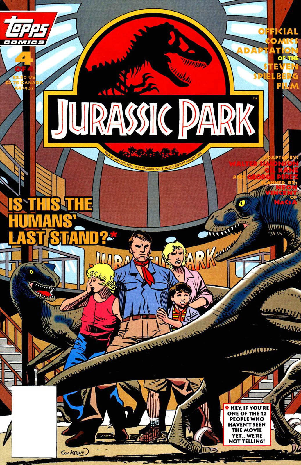
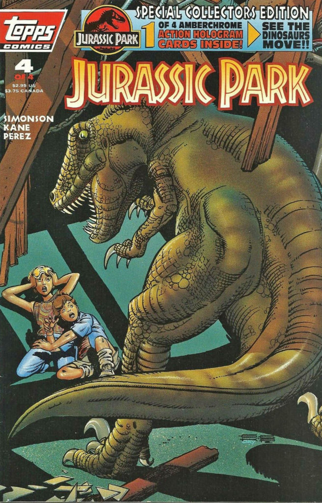
Jurassic Park #4, August 1993
Michael Crichton’s Jurassic Park novel turns 30 this year, so the next few posts pay tribute to the book that became a blockbuster film franchise.

Gil Kane and George Perez teamed up on artistic chores for the original Topps Jurassic Park film adaption. (with writing by Walter Simonson). It was an unique pairing suggested by EIC Jim Salicrup, and for the most part, worked very well. All four issues came out on the predetermined schedule, not an easy feat, especially in those days with newsstand distribution considerations. But the schedule was… tight.

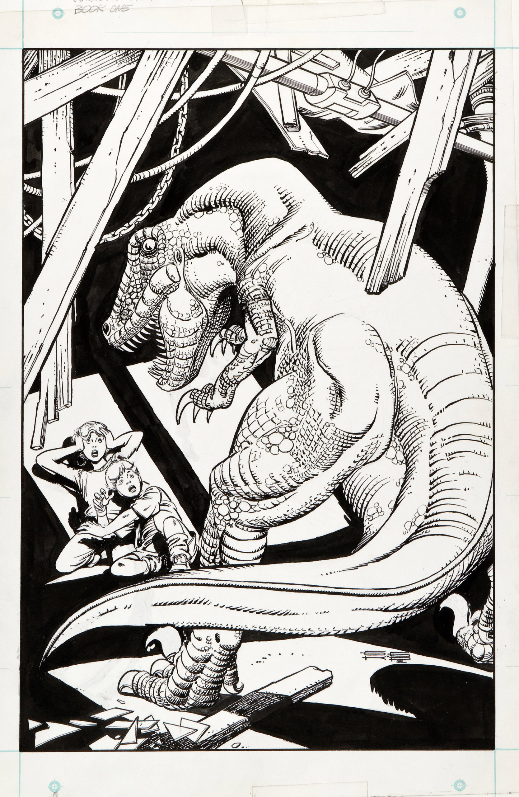
I was delighted to pick up the original art for Gil’s variant cover for issue #4 a few years ago at auction.

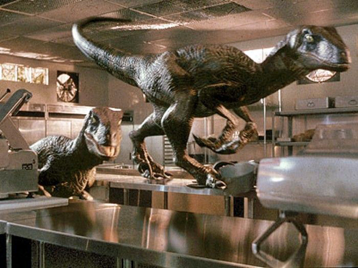
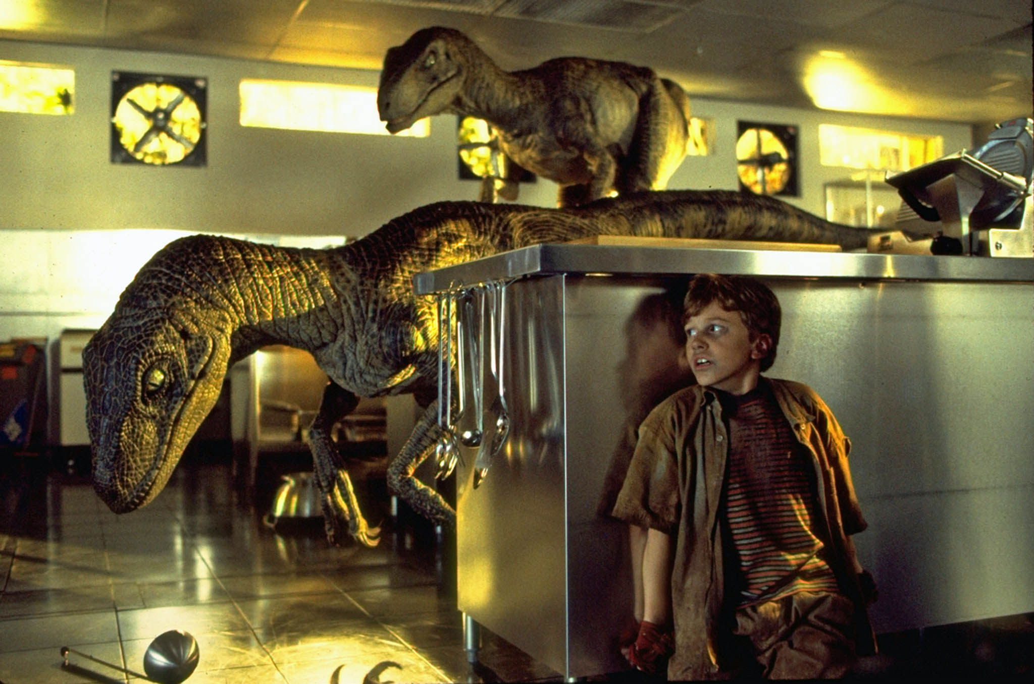
The scene is from the climax of the film where our young heroes are menaced in the commissary kitchen by the crafty velociraptors. It’s a cool composition that captures the terror of the moment.

Here’s the rub — Is that a chubby raptor missing a neck? Or a deformed T-Rex? I mean, what the hell kind of dino did Gil actually draw?

You can’t tell from the scan, but there’s an art patch on the dino’s face. Clearly some of it absolutely, positively needed to be altered to be approved overnight. But someone in Universal’s licensing department must have ultimately taken pity on our harrowing schedule, and us, because the final version is definitely not on model.

Since this is technically not the “main” cover, which is by Dave Cockrum, maybe they gave us a pass. (I don’t remember who did the art patch — George, our production department or for that matter, Gil.)

Ah, Gil. We sent him lots of photo reference. I can’t recall if we sent this exact scene specifically, but regardless, he had reference. Like I said, lots of it. Only problem is, as I found out later on, Gil didn’t have much use for reference.

It doesn’t matter. He was one of the best. I consider myself fortunate to know him professionally, albeit briefly. Stories about him were legendary by the time I met him in 1993.

And, I got at least one “Greg, my boy…” out of him, so I could cross that off the list. Whew.
Walter Simonson with Alfredo Alcala — …Hulk Nice?

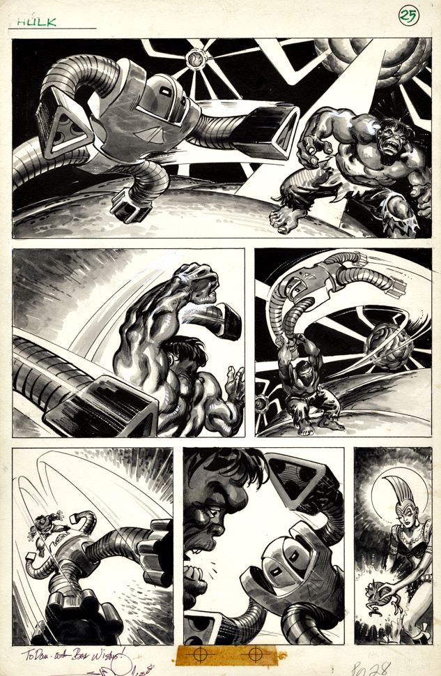
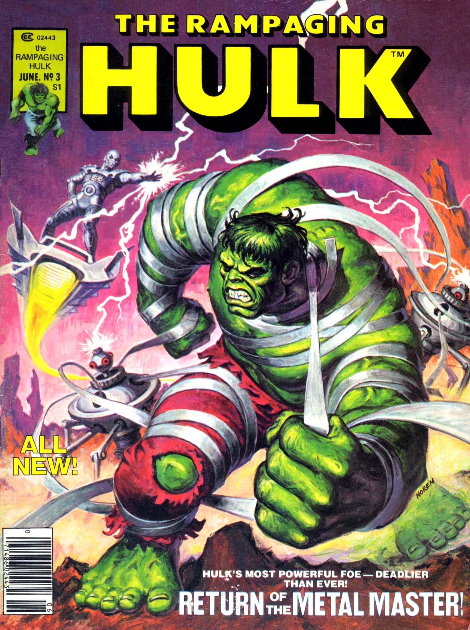
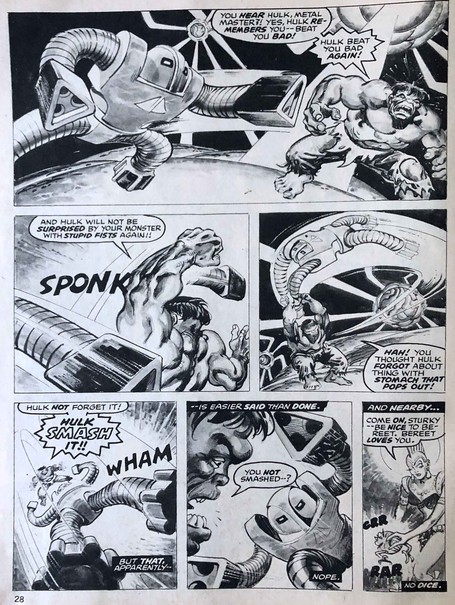
Rampaging Hulk Magazine #3, June 1977

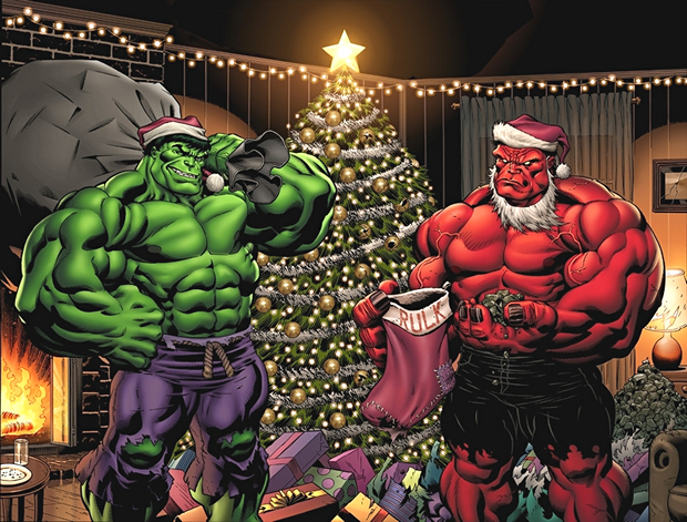
It’s a Red Hulk / Green Hulk Walter Simonson-themed Christmas, and Green Hulk takes his turn.

Green Hulk takes out his frustration on one of the Metal Master’s lethal robots in this action-filled story, pencilled by Walter Simonson with inks and wash-tones by Alfredo Alcala.

Original art for stories from black and white magazine titles often has more depth, because tonal quality was necessary to make the art pop without color printing. Alcala was one of the best of the artists working regularly in this medium.

Word balloons on many of the Marvel Magazines were done on tissue overlays, hence the “word-free” artwork. But a good action page, like a well directed fight scene in a film, should be void of most speaking parts anyway. (Even as a young reader, I disliked inner monologue masquerading as outer dialogue.)

Who has the breath to talk during a fight? (I know, they’re super-powered beings. But still…)

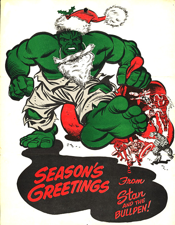
The Hulk is BIG on Christmas. (Ouch.)

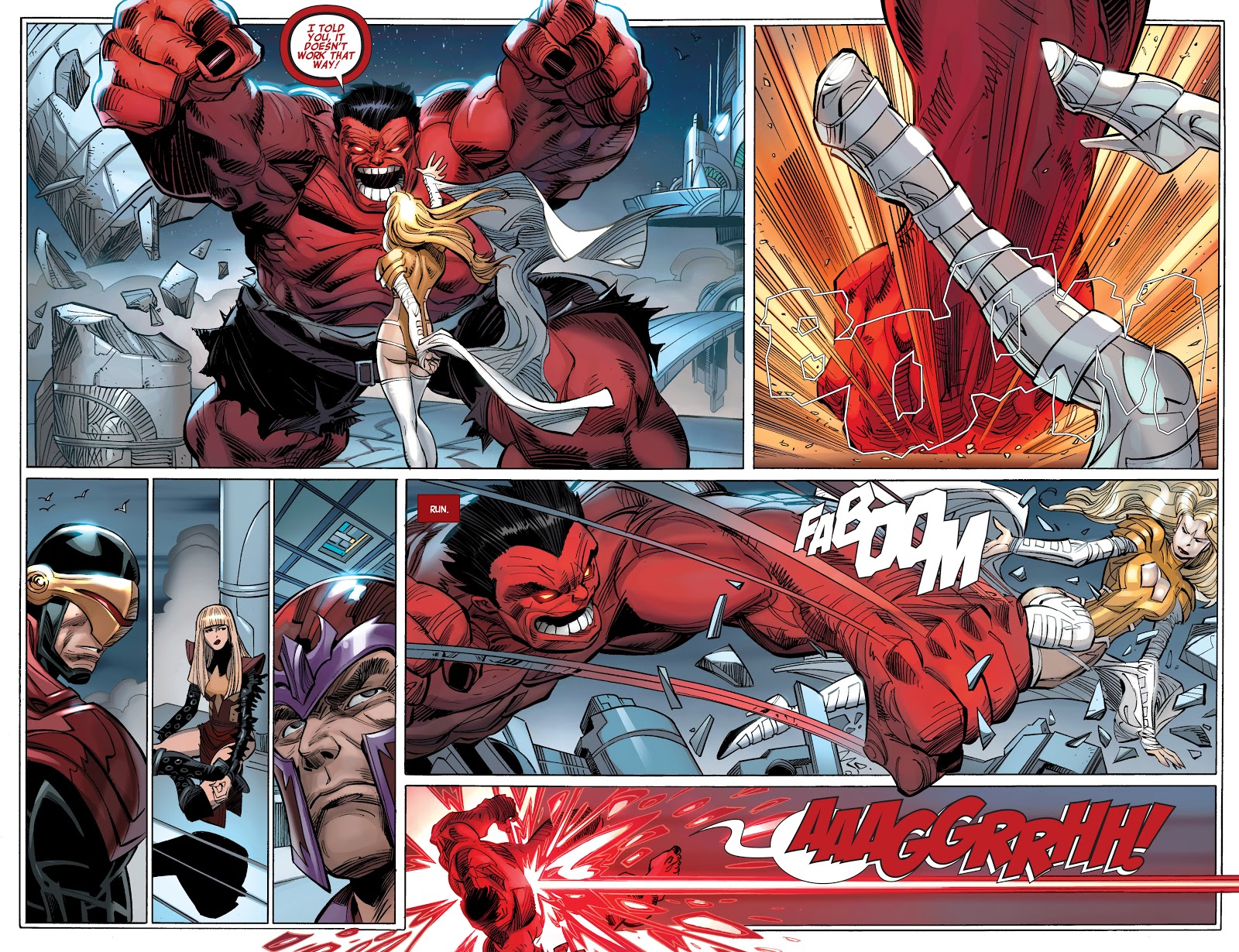
Walter Simonson with Scott Hanna — Hulk Naughty…

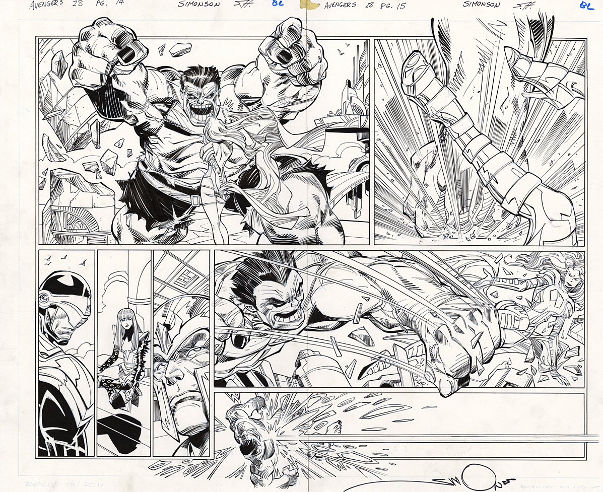
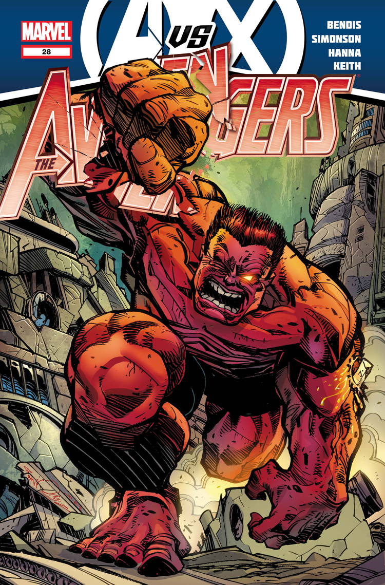
Avengers #28, September 2012

It’s a Red Hulk / Green Hulk Walter Simonson-themed Christmas, with Red Hulk stepping up first.

Red Hulk appears very angry — that’s no way to behave during the Holiday Season! — in this marvelous double page spread by Walter Simonson.

The notorious deadline crunch has come calling — this is blue-line inked original art (the pencils exist separately) with inks by the talented Scott Hanna, who embellishes Walter’s pencils pretty faithfully on this spread.

Walter of course does not part with pages that he both pencils and inks, which means this is one of only a few scenarios where one can own a Simonson published page.

And even though his actual pencils never touched the paper, its a great Simonson example to have. Storytelling on a DPS can often be tricky, but Walter develops this one with a combination of clarity and creativity. (Note the panel size variety and “camera angles.” )

As for Red Hulk? Nothing good usually comes from picking a fight with the X-Men, no matter what the time of year.

Merry Christmas and Happy Hanukkah, no matter which Hulk you identify with.

Mark Bagley — Secret Origin

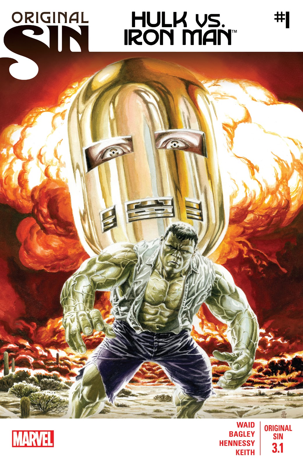
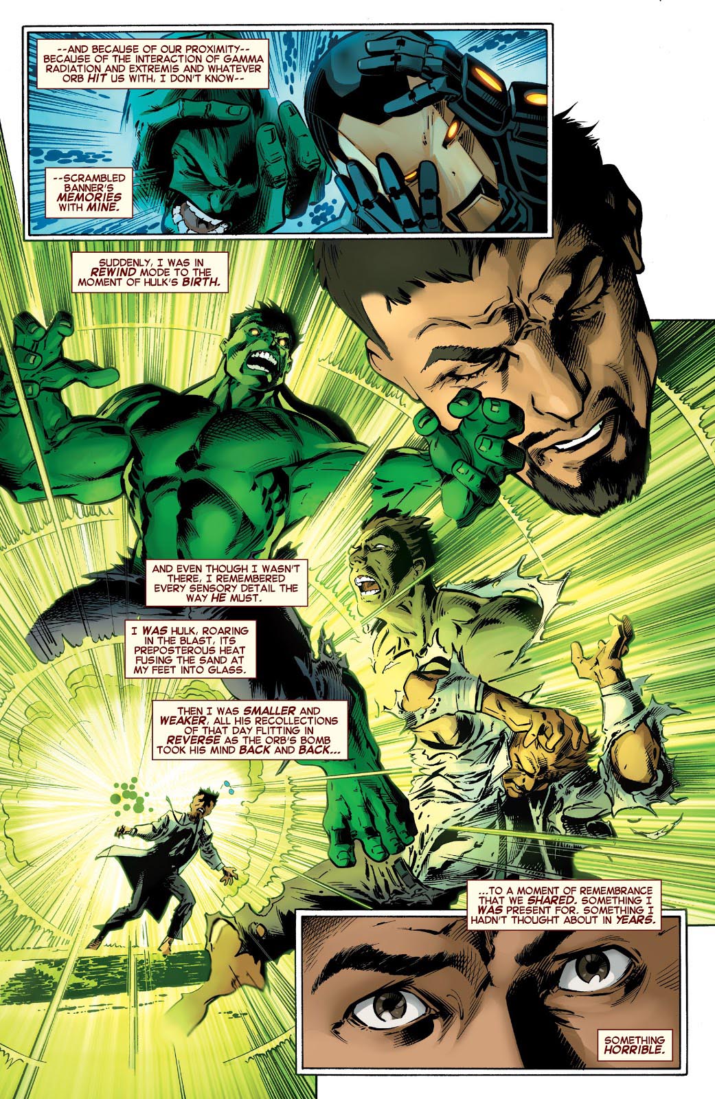
Original Sin #3.1, August 2014

Continuing our ongoing celebration of Marvel’s 80thAnniversary.

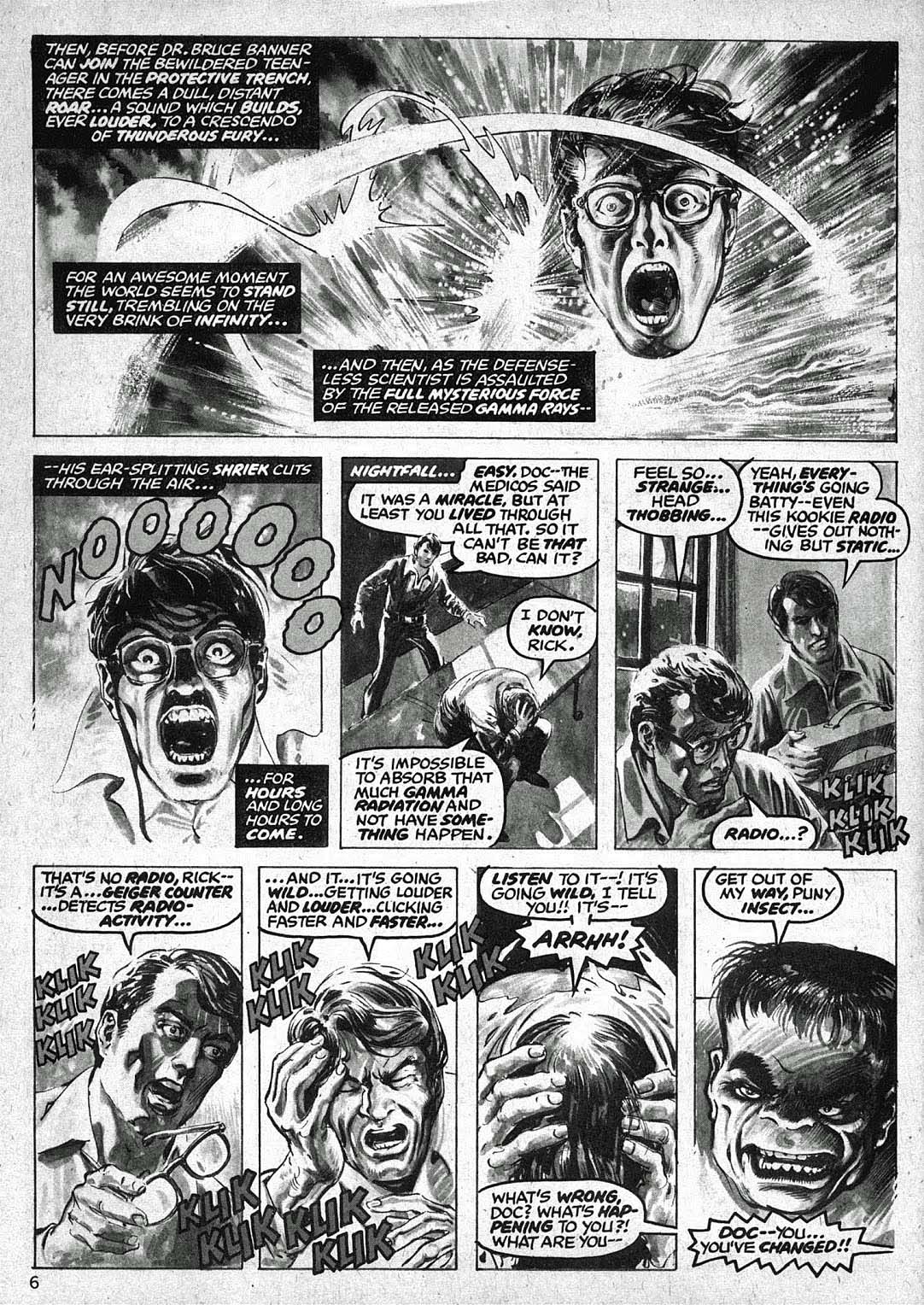
Tony Stark is forced to relive The Hulk’s origin — and his own potential culpability in the fateful gamma blast — in Original Sin, a clever 2014 crossover event by Mark Waid that introduces some new retcon elements into the Marvel Universe.

Re-imagining a classic scene is an interesting challenge for an artist, and Mark Bagley delivers on Bruce Banner’s transformation with inventive (and concise) storytelling and solid draftsmanship. Andrew Hennessy’s inking on Bagley’s pencils adds some nice polish.

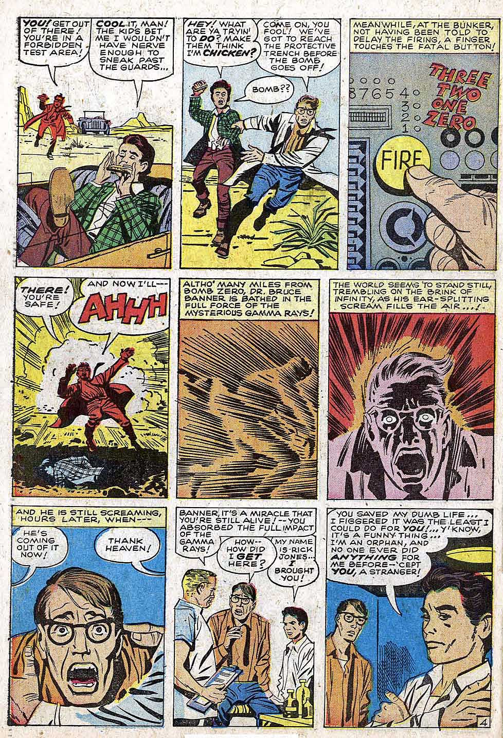
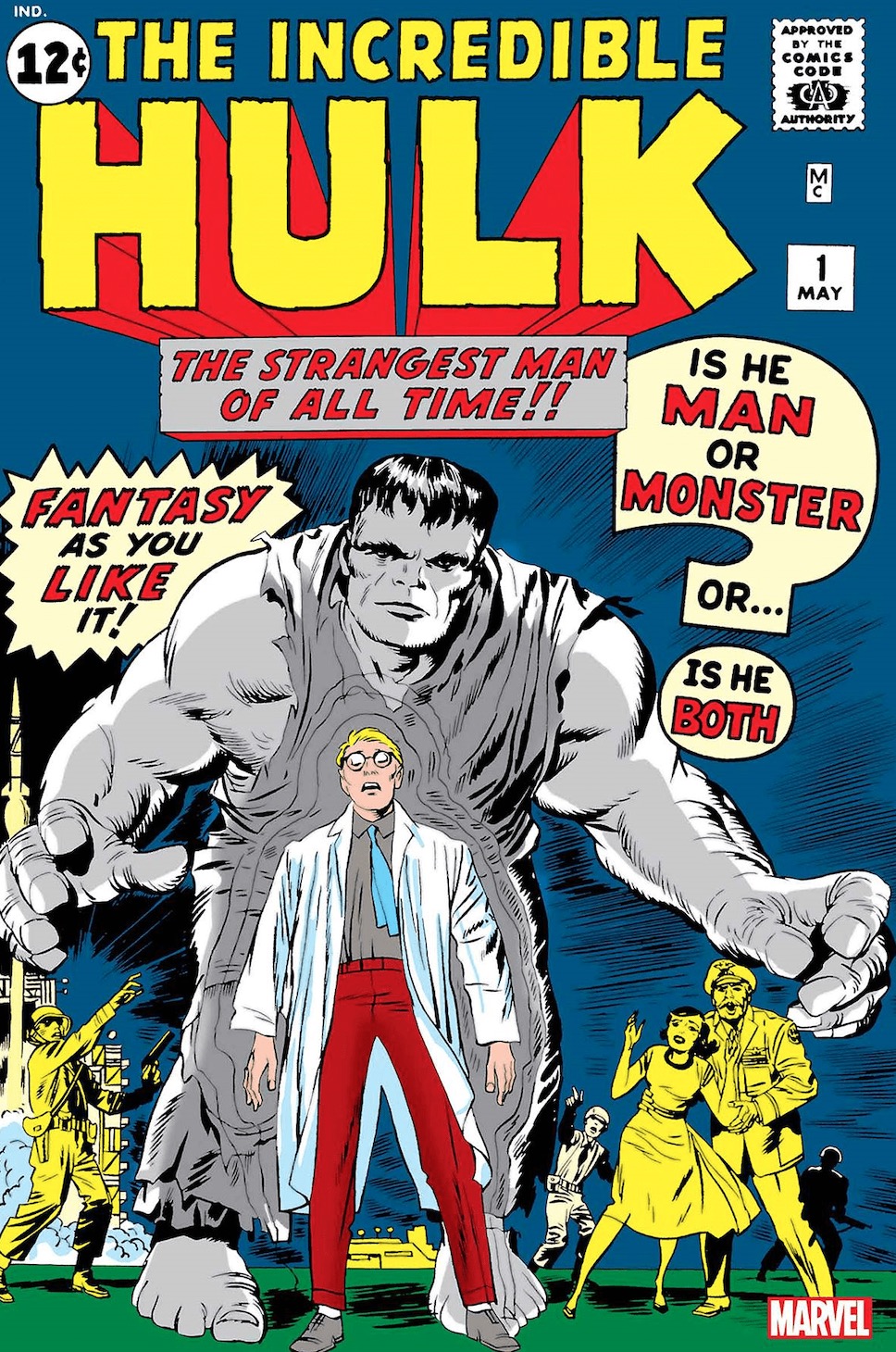
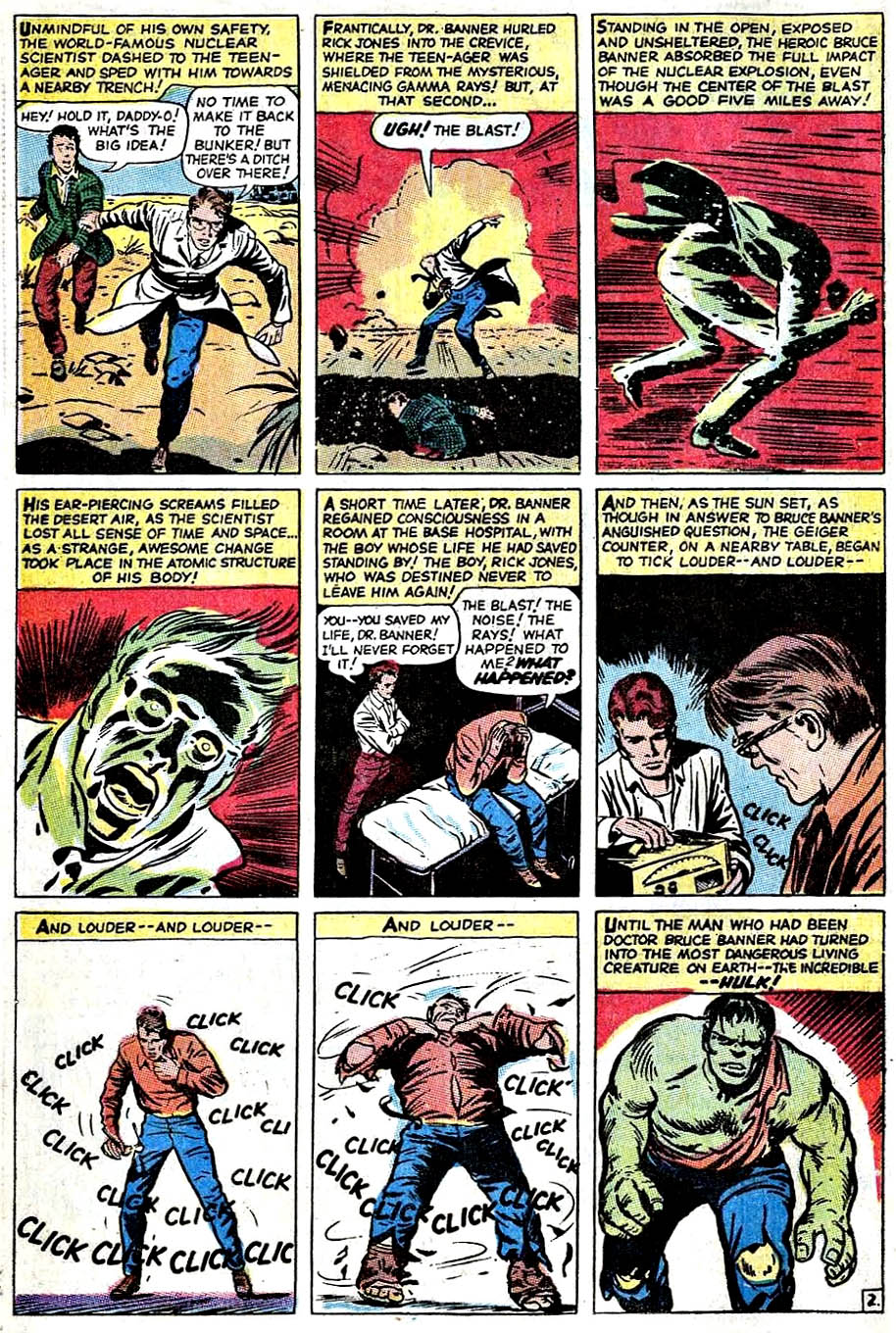
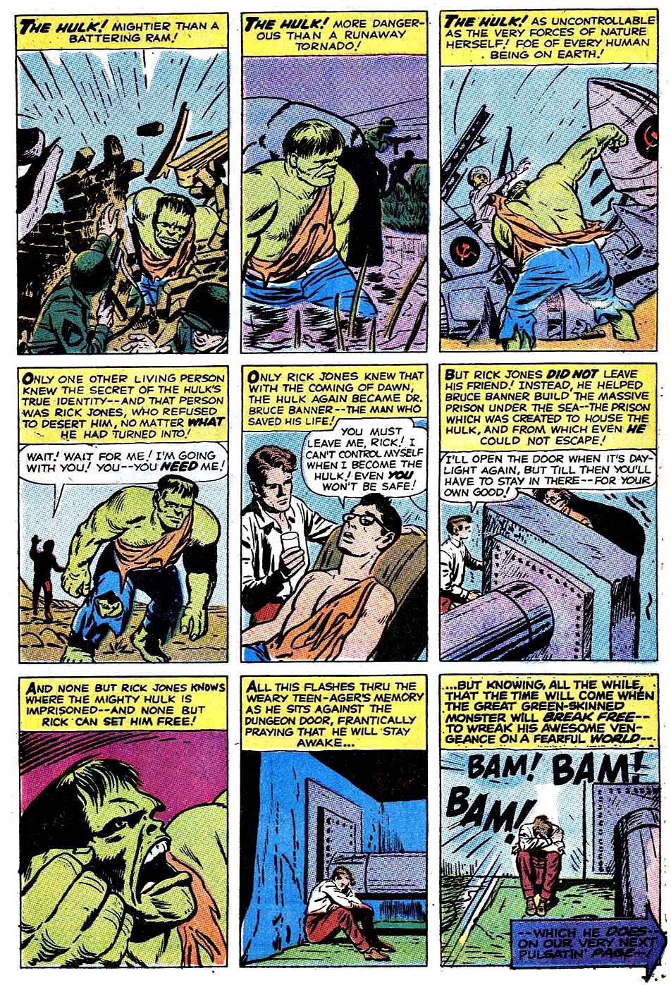
The basics of Hulk’s origin haven’t changed much in the nearly 60 years of his existence, but the nuances have been modified many times. In the early days of the Silver and Bronze ages, a number of artists did different takes, as evidenced below.

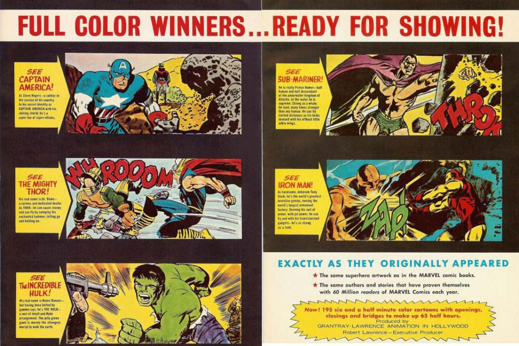
Where did I first see the Hulk’s origin? On TV, of course, in the 1966 Marvel Super-Heroes Cartoons. (Courtesy of Jack Kirby’s art.)

Sing along to the theme song if you will:

(Lyrics by Jacques Urbont)

Doc Bruce Banner,
Belted by gamma rays,
Turned into the Hulk.

Ain’t he unglamor-ous!

Wreckin’ the town
With the power of a bull,

Ain’t no monster clown
Who is as lovable.

As ever-lovin’ Hulk! HULK!! HULK!!

Advertising material for the 1966 Marvel Super-Heroes Cartoon

Walter Simonson — Bucket List

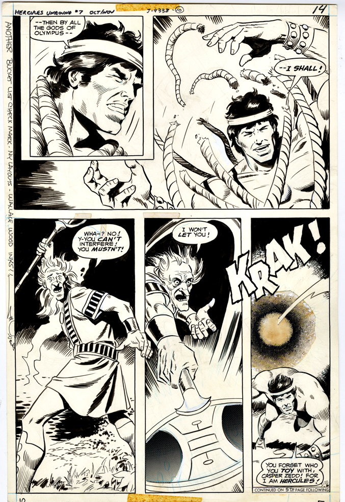
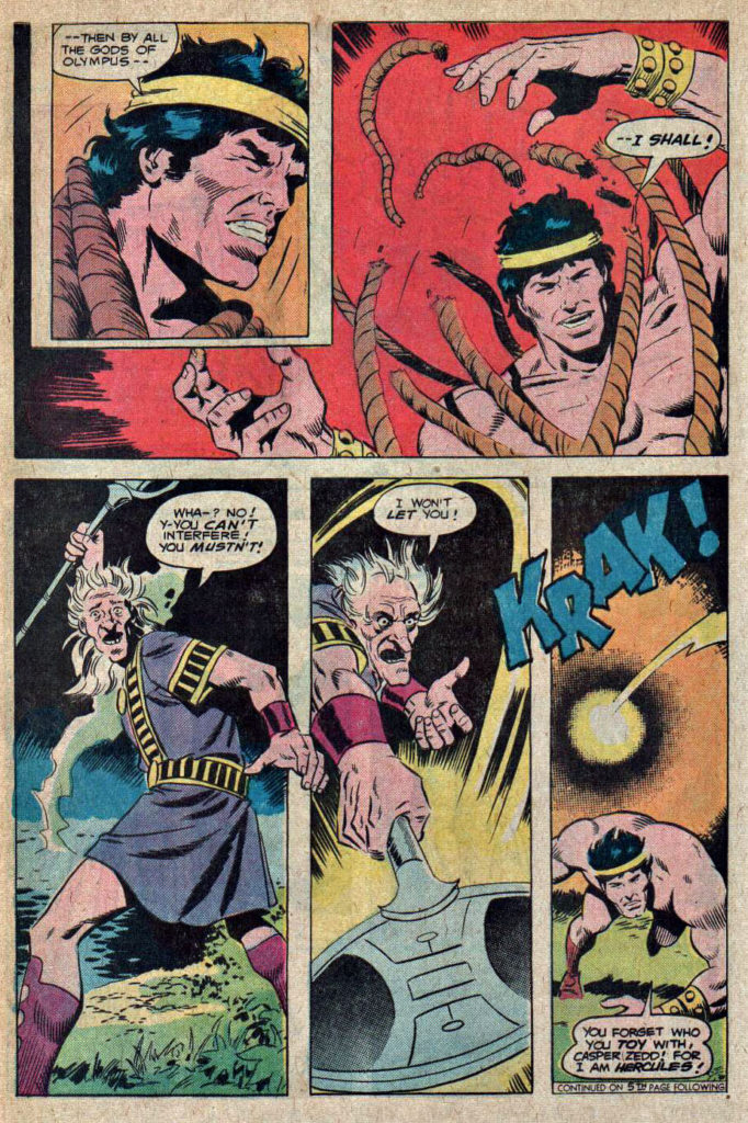
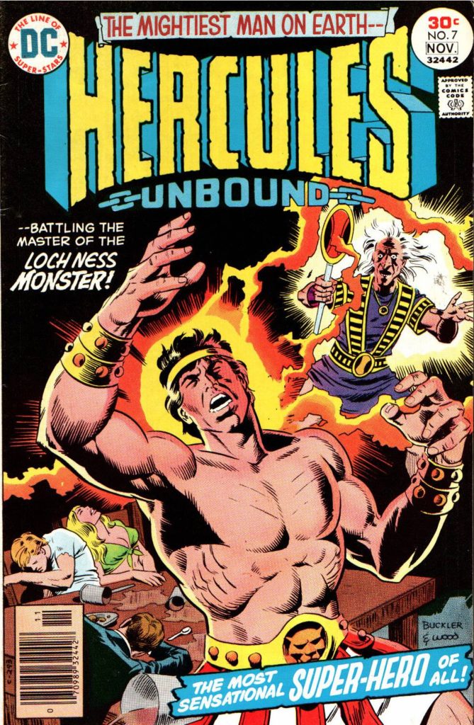
Hercules Unbound #7, November 1976

Jose Luis Garcia-Lopez and Wally Wood only teamed up for six issues of the short-lived Hercules Unbound. Garcia-Lopez moved on, and Walter Simonson took over with Issue #7. (Wood only stayed on for one additional issue.)

Walter’s art style, like many of his generational peers (Chaykin, Wrightson, etc.) is very distinctive. Manhunter. Thor. X-Factor. Ragnarok. Et al. Typically, when you see a Walter Simonson penciled page, you know it.

Not here though. As noted earlier, Wood’s inks typically put so much lush polish on the pencils, It’s not that easy to sort out the penciller’s own style. When I first scanned this issue, I didn’t immediately catch that Garcia-Lopez was off the book. (Once you know, and compare against the earlier issues, you can definitely see some differences.) 

Here’s an extra cool thing about this great Herc page. I luckily acquired it at a convention where Walter was a guest of ours at IDW Publishing, and I asked him to inscribe it. It reads:

“Another bucket list check mark — my layouts — Wallace Wood inks!”

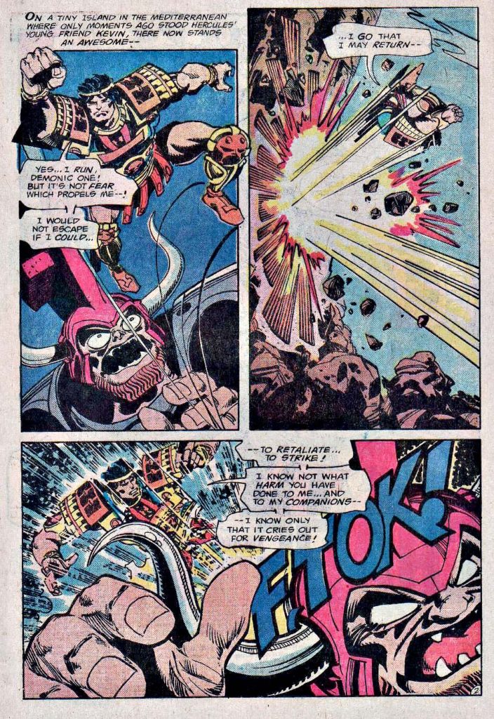
Footnote — More creative shuffling: After two issues inked by Bob Layton, Walter provided both pencils and inks on the final two issues. As evidenced below, Walter’s work again looks like… Walter!

Walter Simonson — Cover Me

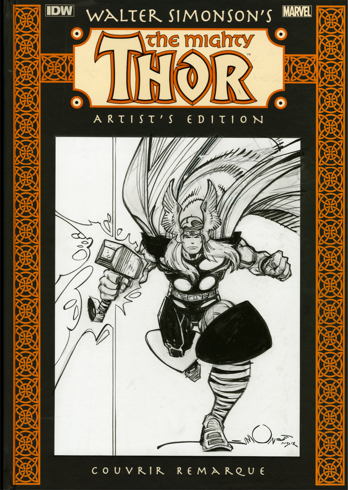
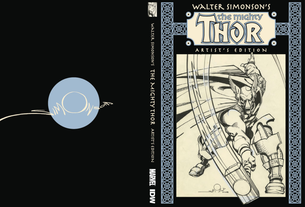
Walter Simonson’s The Mighty Thor: Artist’s Edition HC, Original Art Cover

Editor/Original Art expert Scott Dunbier brought his Artist’s Edition idea to IDW Publishing, and the rest as they say, is history. In 2011, Walter Simonson’s groundbreaking Thor run became the very first of the many Marvel Artist’s Editions in this extraordinary series. (And the second IDW Artist’s Edition overall, following Dave Stevens’ Rocketeer the year prior.)

Scott also had the wild idea to do actual original art covers of these original art reprint books on a super-limited basis, and Walter went along with it. These are not “sketch” covers, but rather very nicely detailed individual pencil and ink full-figure drawings of Thor done on blank cover variants. Walter only did about 10 of these — 15 at the most.

The only drawback — I can’t think of any way to frame it. (It’s also the heaviest piece of original art I own. Artist’s Editions are not light, but that is definitely the textbook definition of a first world problem…)