Opinions on Bernie Wrightson’s rare inks on Neal Adams pencils range from “dream team” to “dueling styles.”
Personally, I enjoy the combo, But Neal himself is said to have told Bernie he was better off going his own way. And that, I think, we can all agree upon.
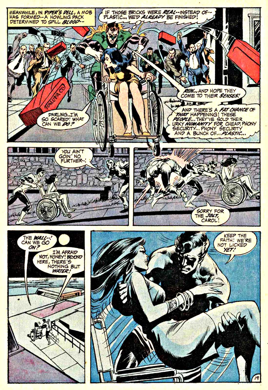
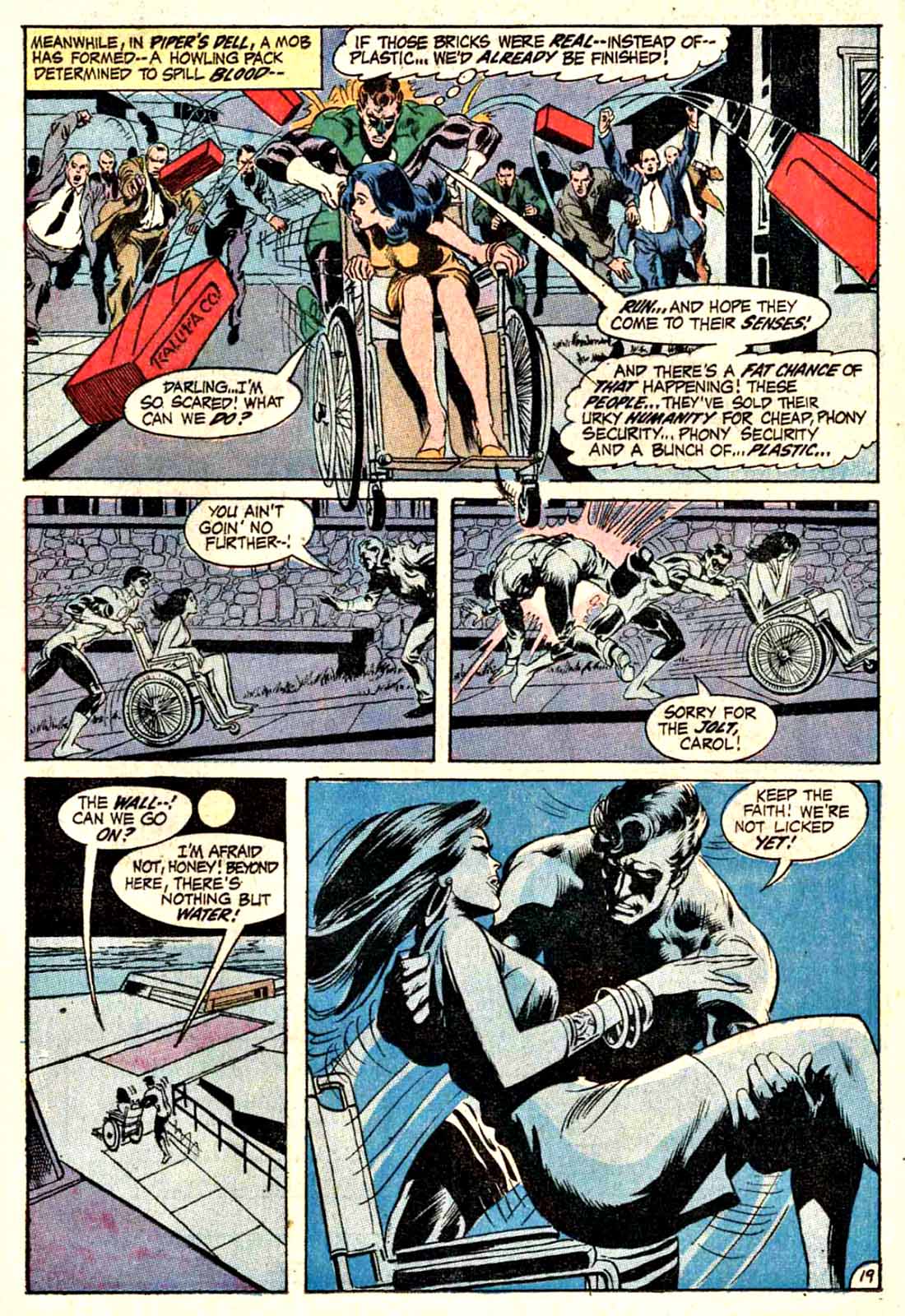
As for this great Green Lantern page from Adams legendary run? The top panel feels more Adams dominant to me, and in the cool final panel I see more of Bernie’s efforts.
Your mileage may vary.
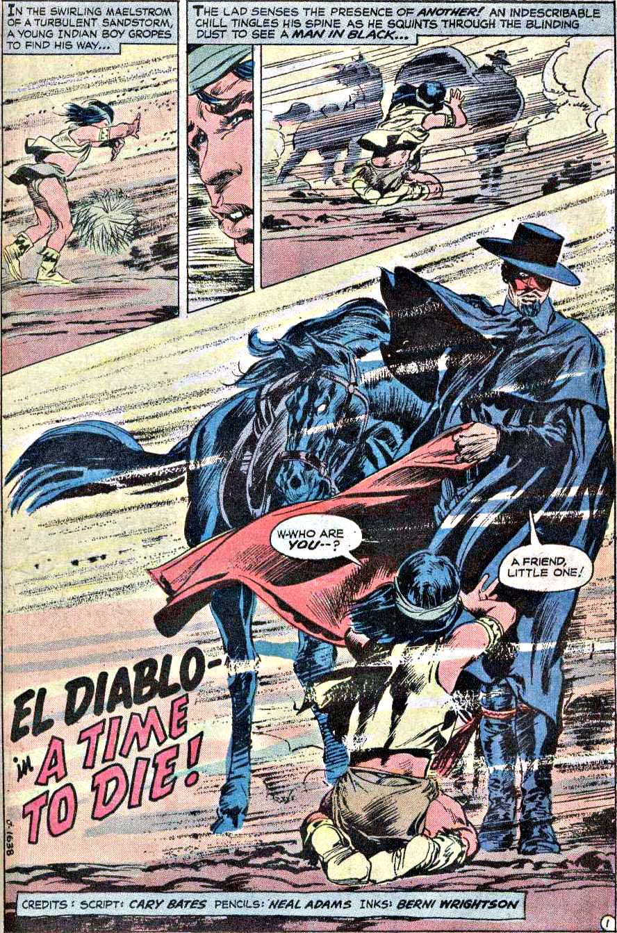
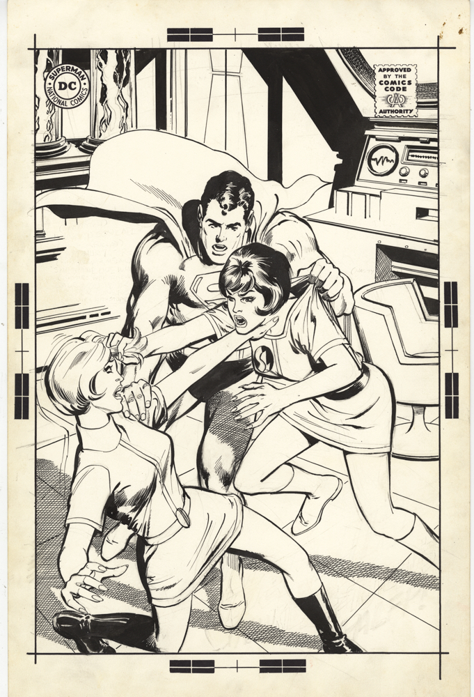
(Pictured below the published Green Lantern comic are a few more examples of the Adams/ Wrightson combo: A terrific Batman cover and the splash page to an El Diablo story from Weird Western #12.)
We can’t let 2023 fade into the memory books without at least some tribute to the 60th Anniversary of the X-Men.
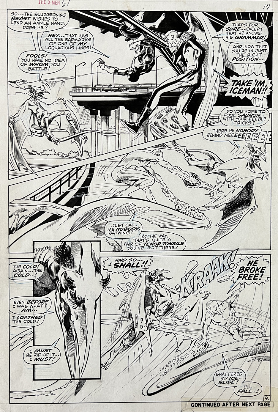
Neal Adams drew nine issues of the X-Men. John Byrne drew four times as many. I love John Byrne art, but the prices of his pages are — how do we say? — a bit out of whack when compared to the scarcity of Adams.
Oh, and this is a great one from his run, with superb inks by the legendary Tom Palmer. (Despite the disappointing quality of the scan.)
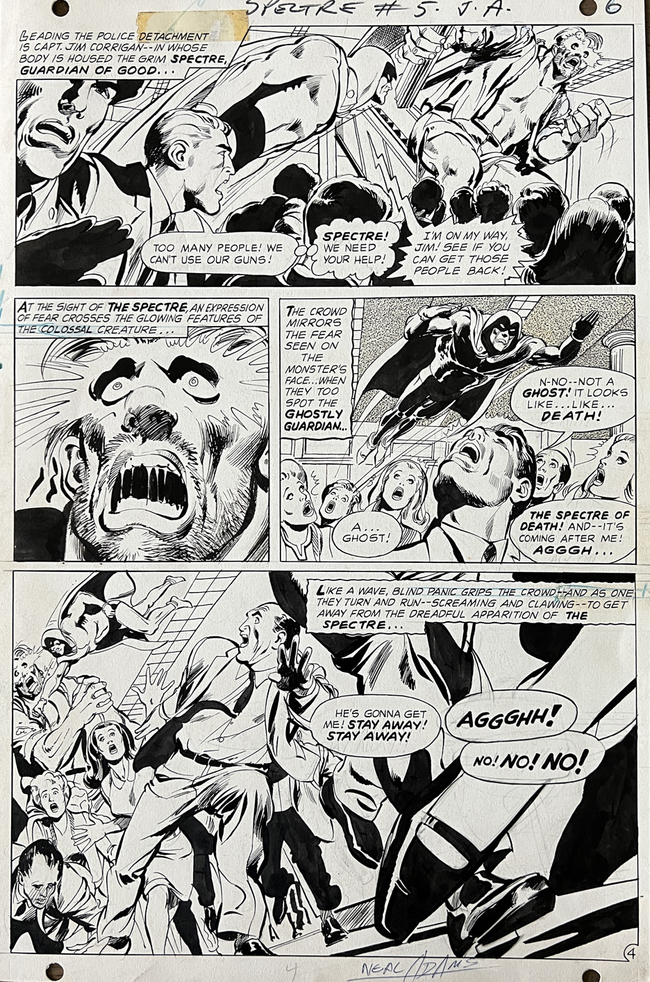
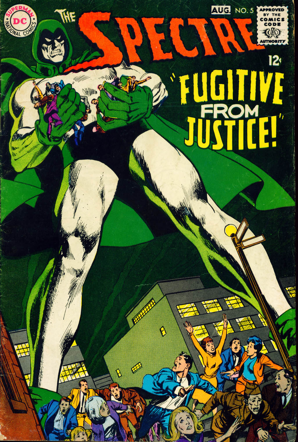
Neal Adams delivers a terrific Spectre action page from his third issue on the series, and the second he wrote, penciled and inked himself. I love the looks of terror and fear on the faces, especially in that last large panel.
(DC jammed quite a few creative changes through those brief 10 issues of the silver age Spectre, so it was apparently a good place to give Neal a shot at writing a “superhero” title.)
Of course, it’s nearly Halloween, so it’s time we take our annual visit with the ghouls, monsters and apparitions of the comic book art pages.
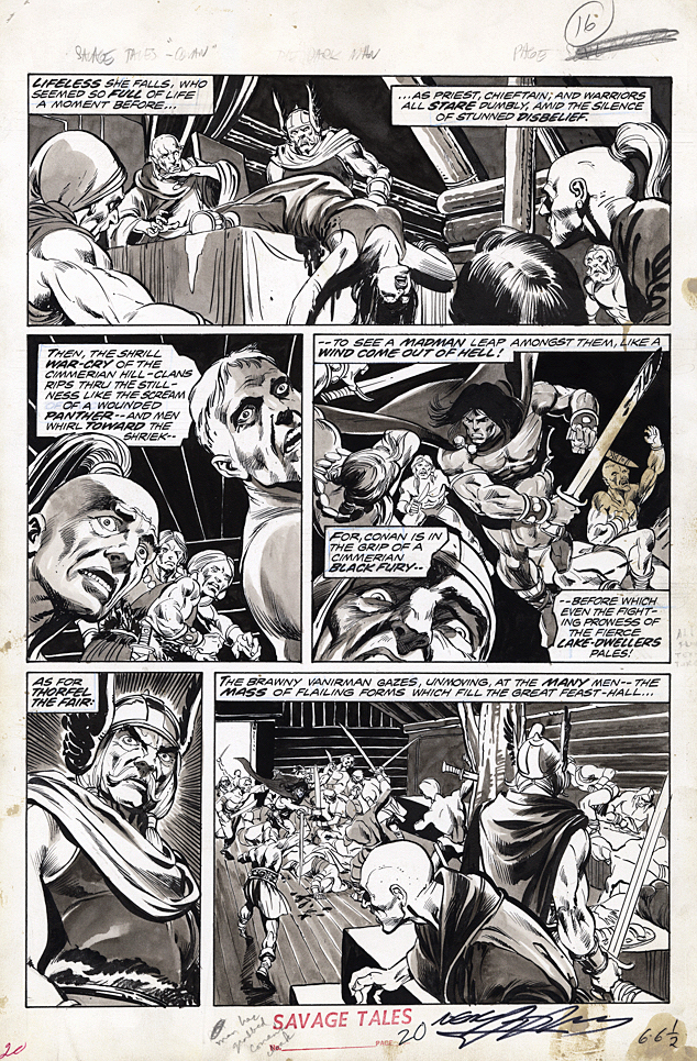
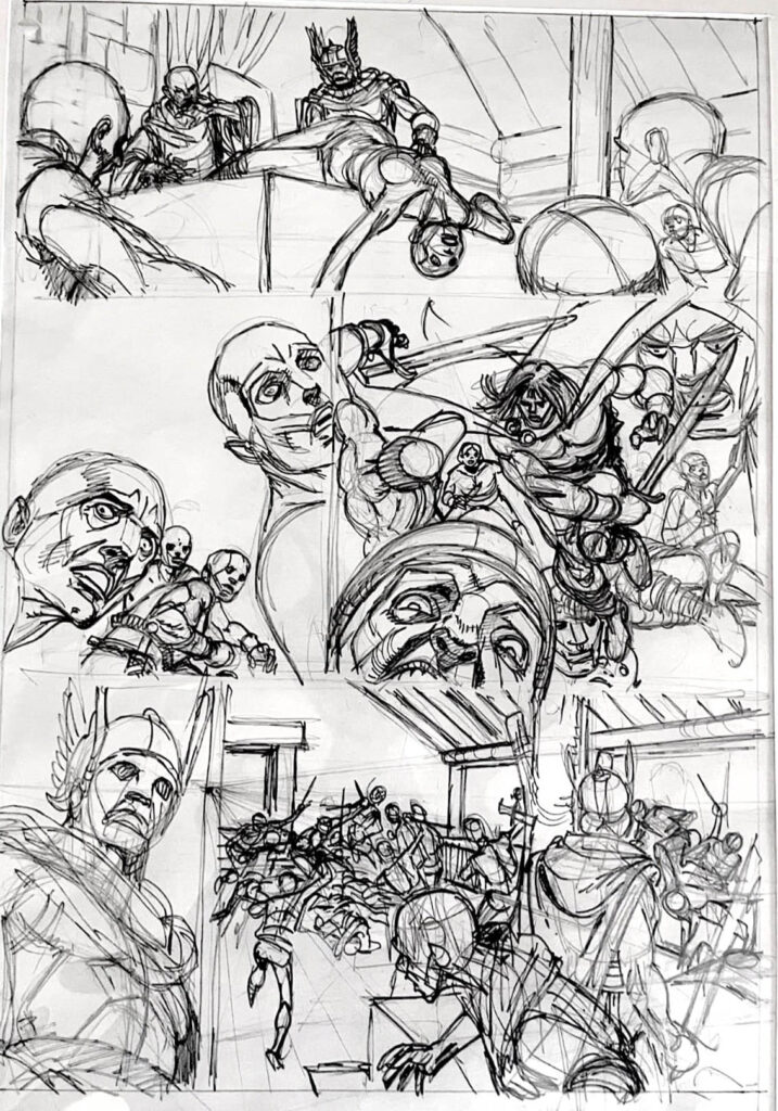
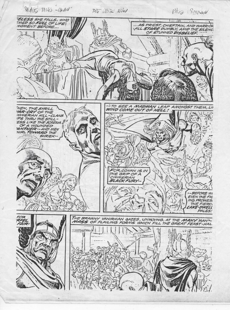
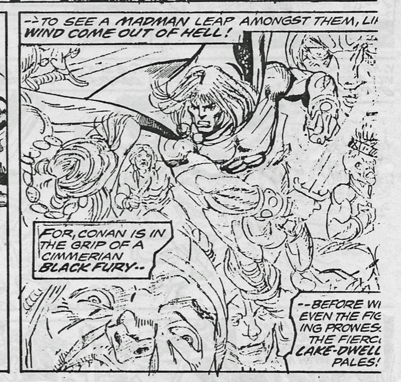
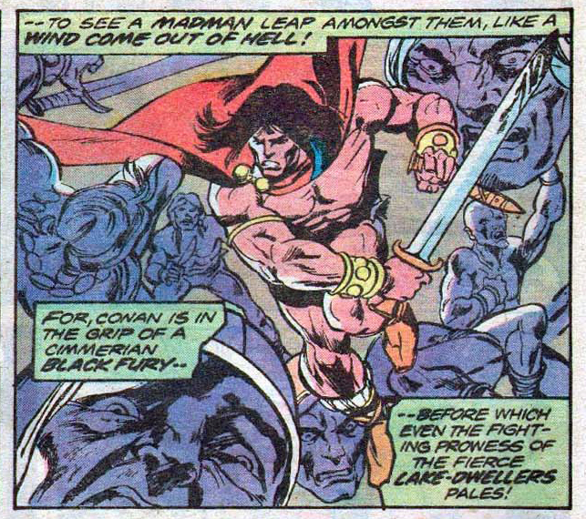
Thanks to artist Ken Landgraf, I finally get to see the original prelims and pencils — and partial (Neal Adams) inks — to this great Conan page from Savage Tales #4. And as a bonus, we solve one mystery and create a new one. (Ken owns photocopies of Gil’s pencils from this story and others.)
Gil Kane pencilled the story (pretty loosely in some places), and Neal Adams inked some of it as well, supported at a minimum by Vince Colletta, Frank McLaughlin, and Pablo Marcos. (Credits supplied by Roy Thomas in Savage Sword of Conan #2). Marcos also provided the wash tones on the story, necessary to add depth to a black and white, and also provide some consistency to the art style.
Neal, of course, was a pro at collaborative art creation. His “Crusty Bunkers” a group of (ever-changing) artists at his Continuity Studios, filled in many times during deadline crunches for Marvel, DC, Charlton and others during the 70s.
(The specific inking credits here are listed as Diverse Hands, and this appears to reference the fact that some others outside Continuity also worked on the project.)
And now the mystery; when the story is reprinted for the first time in color in a Marvel Treasury Edition, two faces that weren’t in panel three in the Savage Tales version now appear. Turns out they were originally pencilled by Gil — but inked over in the final art, probably to give it more depth for B&W.
Which means — Either Roy, Gil or someone else had to remember that change and go back and pull it from inked copies for the color version.
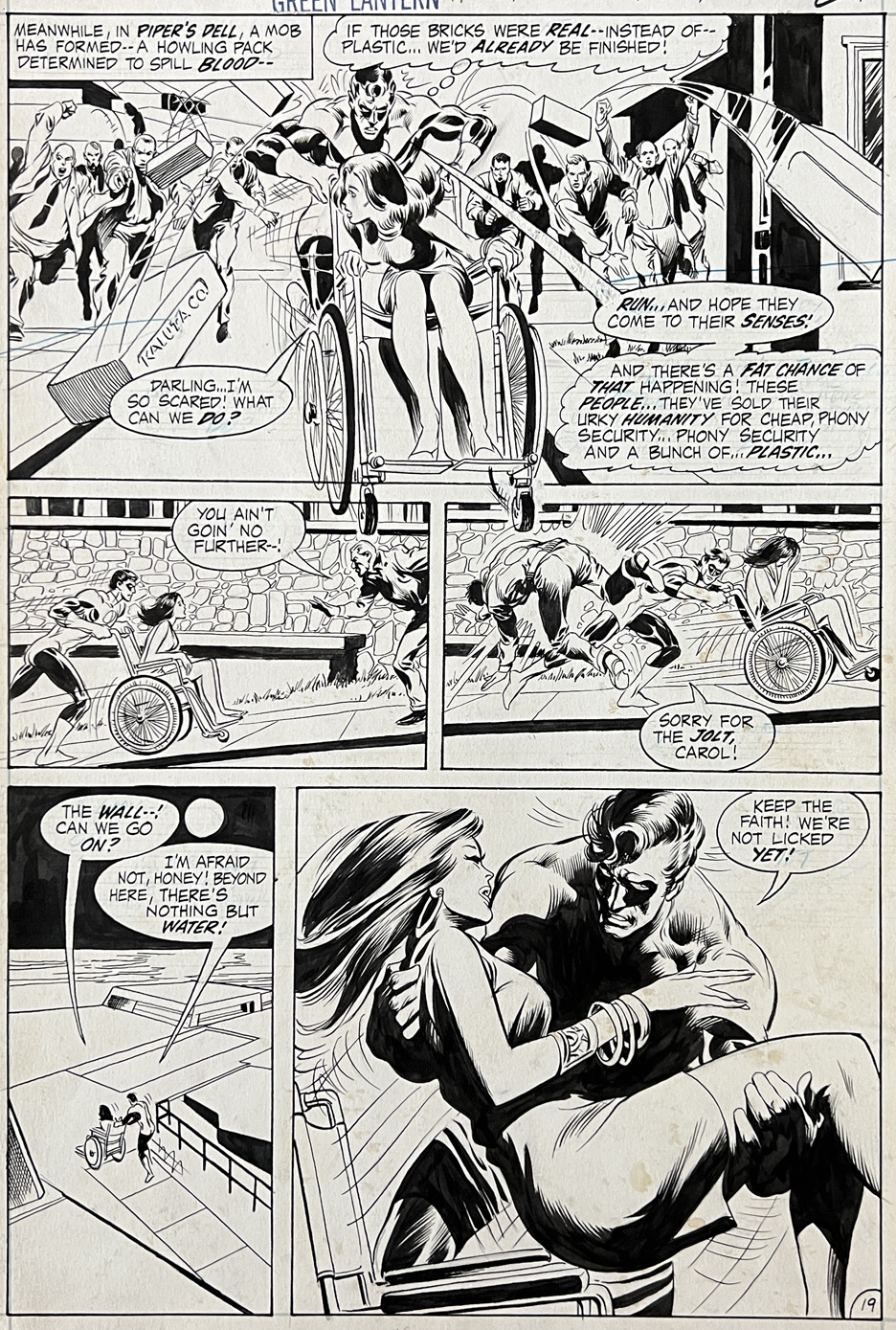
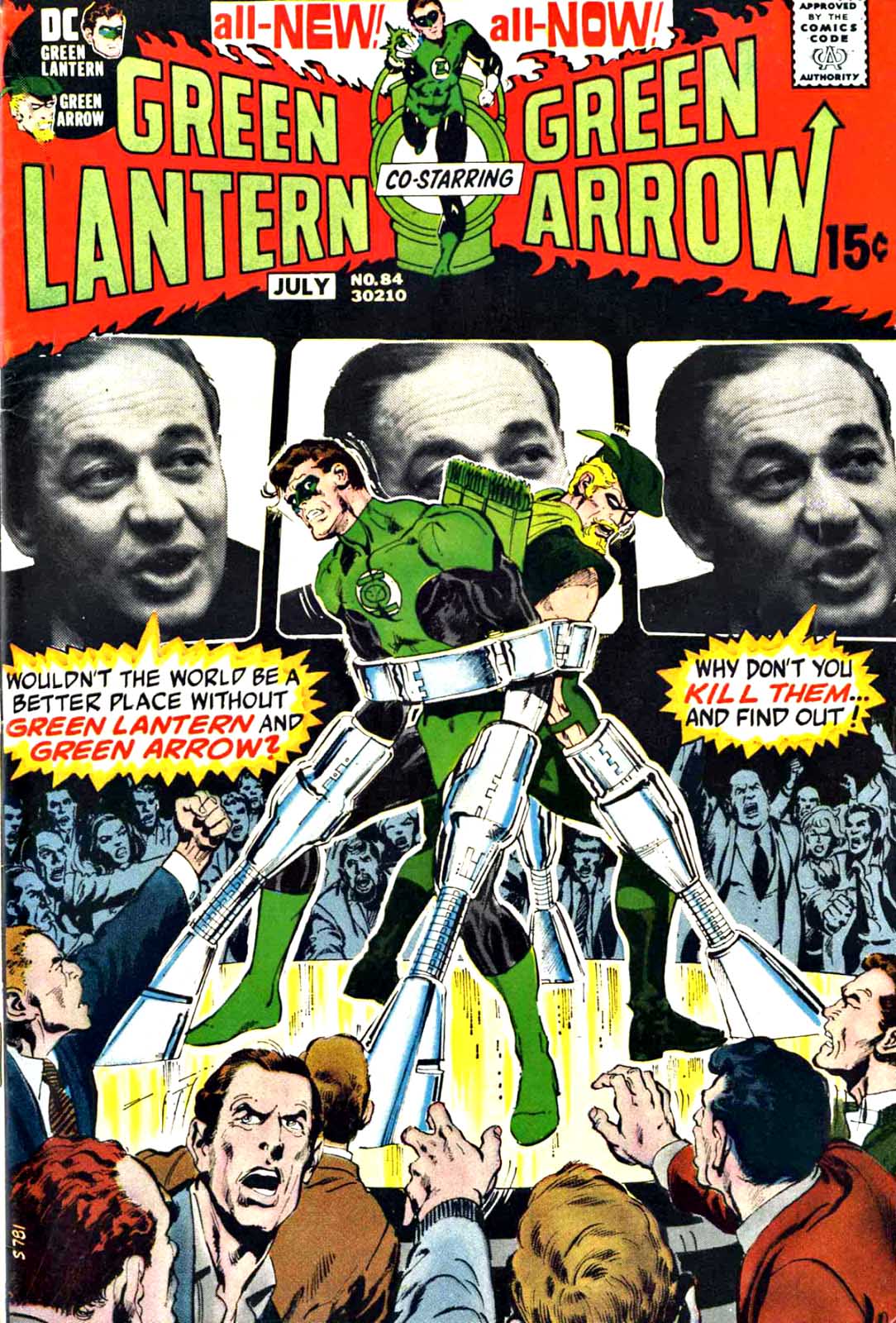
Neal Adams pencilling and Bernie Wrightson inking? Seems like an impossible combination. First thought, one would overpower the other, or, even worse, combine into some sort of Frankenstein’s monster (pun intended) of comic book art.
Well, not only is it possible, its terrific — at least in this one specific issue of Green Lantern. (Bernie himself said he was extra careful not to dominate Neal’s pencils here.)
And on this great page, you can clearly see the result — both styles complement each other. (The coloring in the printed issue unfortunately diminishes the impact of that last great panel. But heck, it is dark out.)
I’m delighted to own a page from this classic issue — and classic series.
I’m still processing the loss of the legendary Neal Adams, who truly was a one-of-kind artist and person. Dozens of stories and anecdotes come to mind, and at some point in the near future, I will post one or two of my favorites.
Which leads me to one of the most quoted lines of dialogue in film history, from the classic John Ford western, The Man Who Shot Liberty Valance:
“When the legend becomes fact, print the legend”
In Neal’s case, the legend and the fact are pretty much the same thing. Any story you’ve heard — you can safely believe it.
Or, to quote from another film: (Harrison Ford/Han Solo in The Force Awakens)
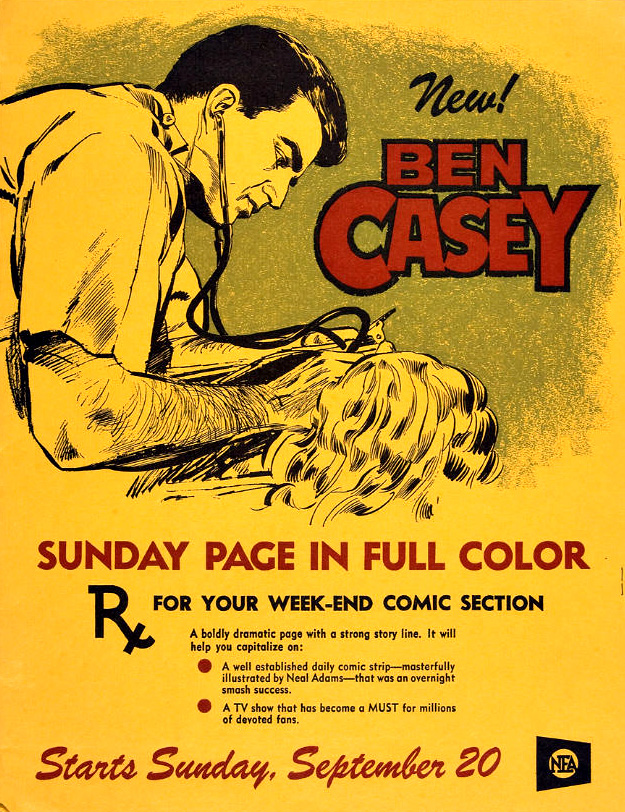
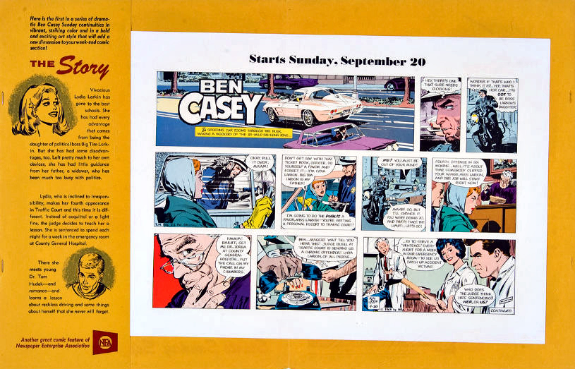
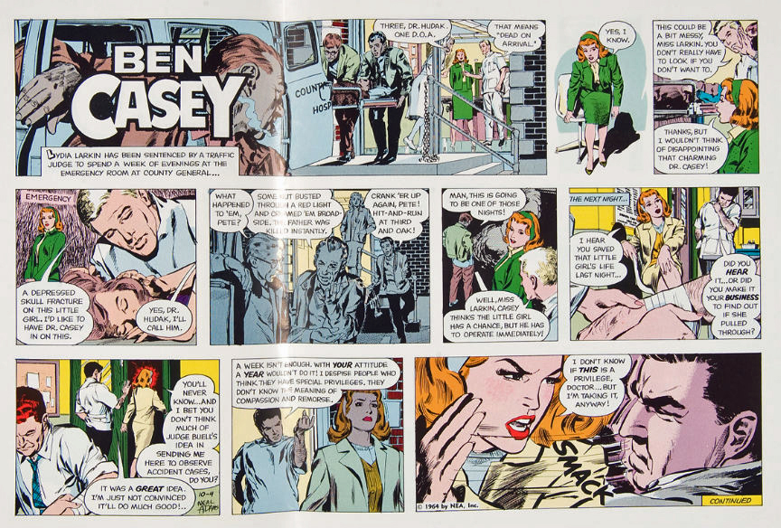
“When charming and talented Neal Adams was just 21, he was awarded the art chores of the comic strip based on the popular TV show Ben Casey staring Vince Edwards. One of the youngest, syndicated strip artists, Neal started his groundbreaking work on November 26, 1962 and the Sunday strip was added on September 20, 1964. Four years later, the strip ended as the television show did, but Neal’s career was just starting.”
I have a lot of “favorite” artists, but the one who had the most impact on me as a youngster was — you guessed it — Neal Adams.
And the charming side of him can indeed be charming as hell.
Fun fact: A collection of all Neal’s Casey strips should be considered a holy grail of archival reprints.
We tried. We really tried.
Can’t win them all.
Continuing our month long celebration of the great adventure comic strips: Week 1: Superheroes Week 2: Detectives Week 3: SF Week 4: Comic Book Giants
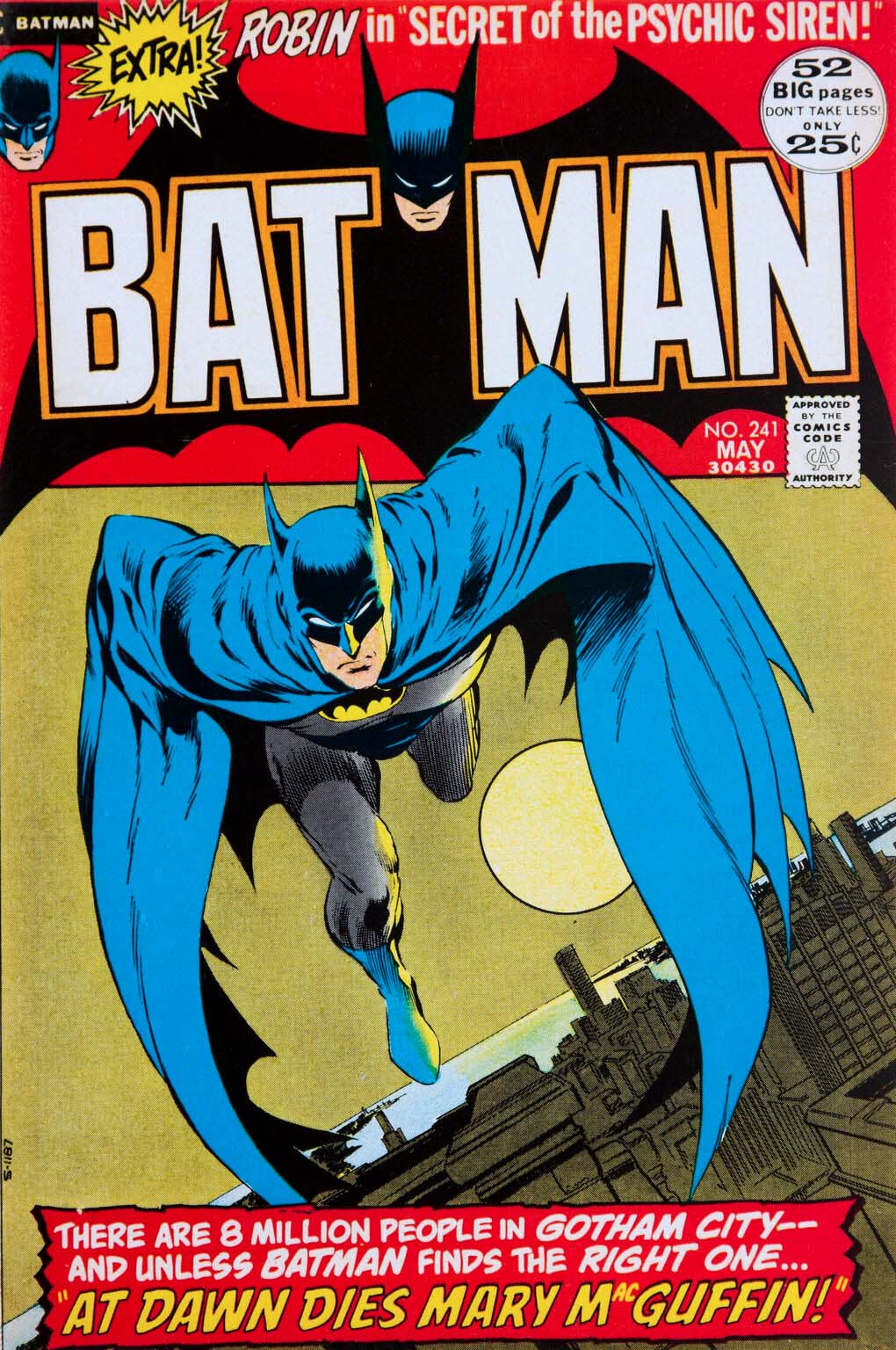
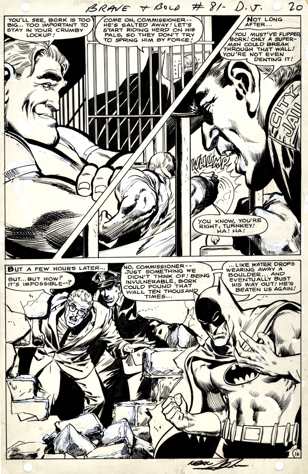
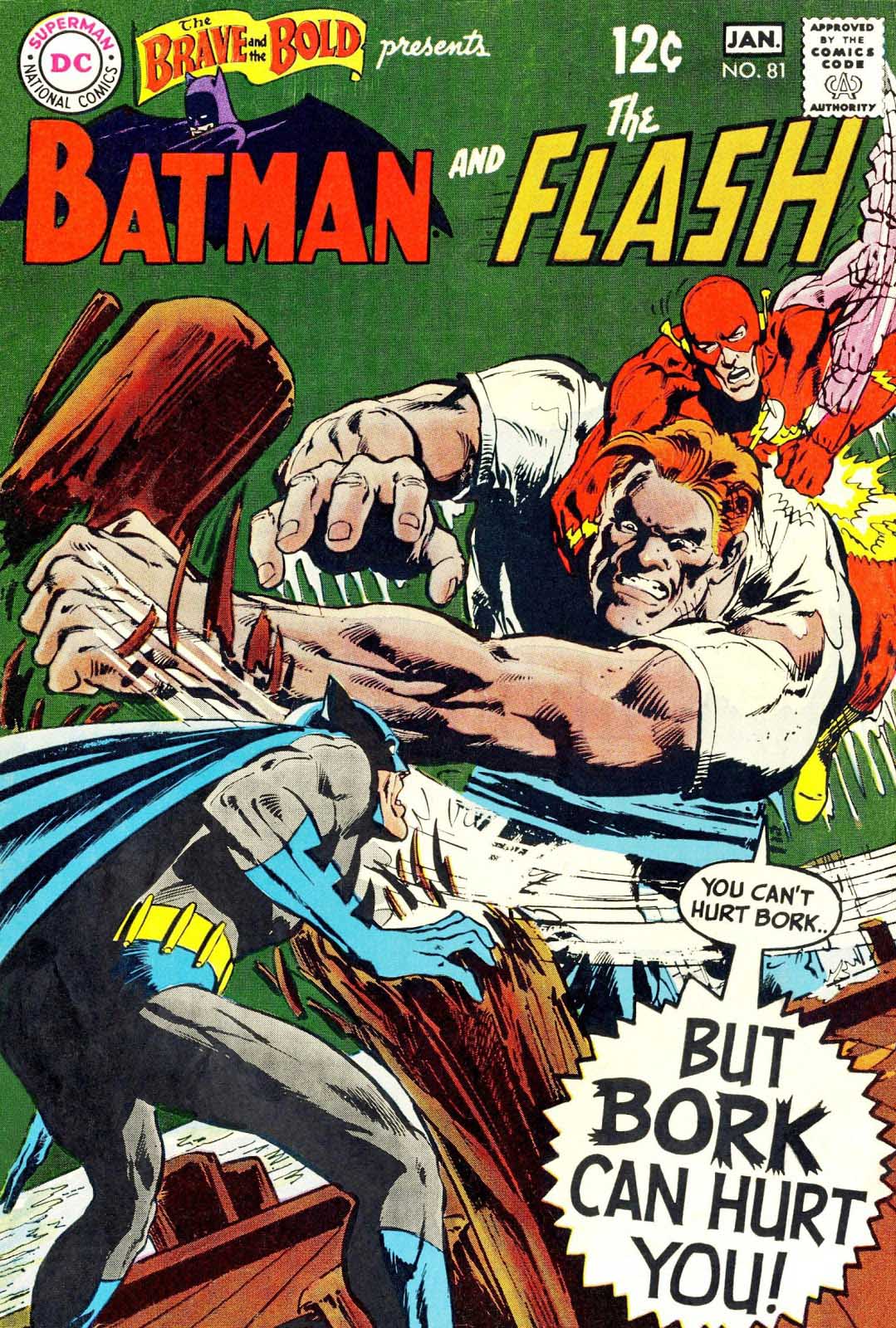
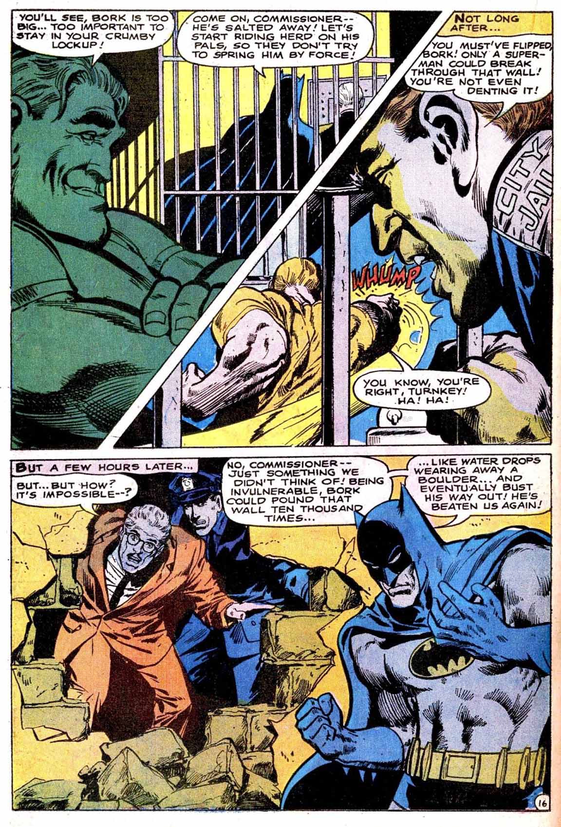
Here’s a splashy Neal Adams page from his fourth overall Batman story.
As always, Neal’s facial emotions are spot on. I love Bork’s smug face, Commissioner Gordon’s shocked expression, and Batman’s frustration with the entire situation. The body language on all the characters on the page also adds drama to the storytelling.
Vince Colletta was the first inker on the story, and Neal wasn’t happy with the results so he and Dick Giordano re-inked some of it. You can see some corrections on this page, and others in the story, when viewing scans of the original art.
Neal Adams Batman from the Silver Age — Definitely pleased to own this one.
Conan celebrates its
50th anniversary in comics this year, and we conclude our anniversary recognition
with our final of three Conan-themed posts.
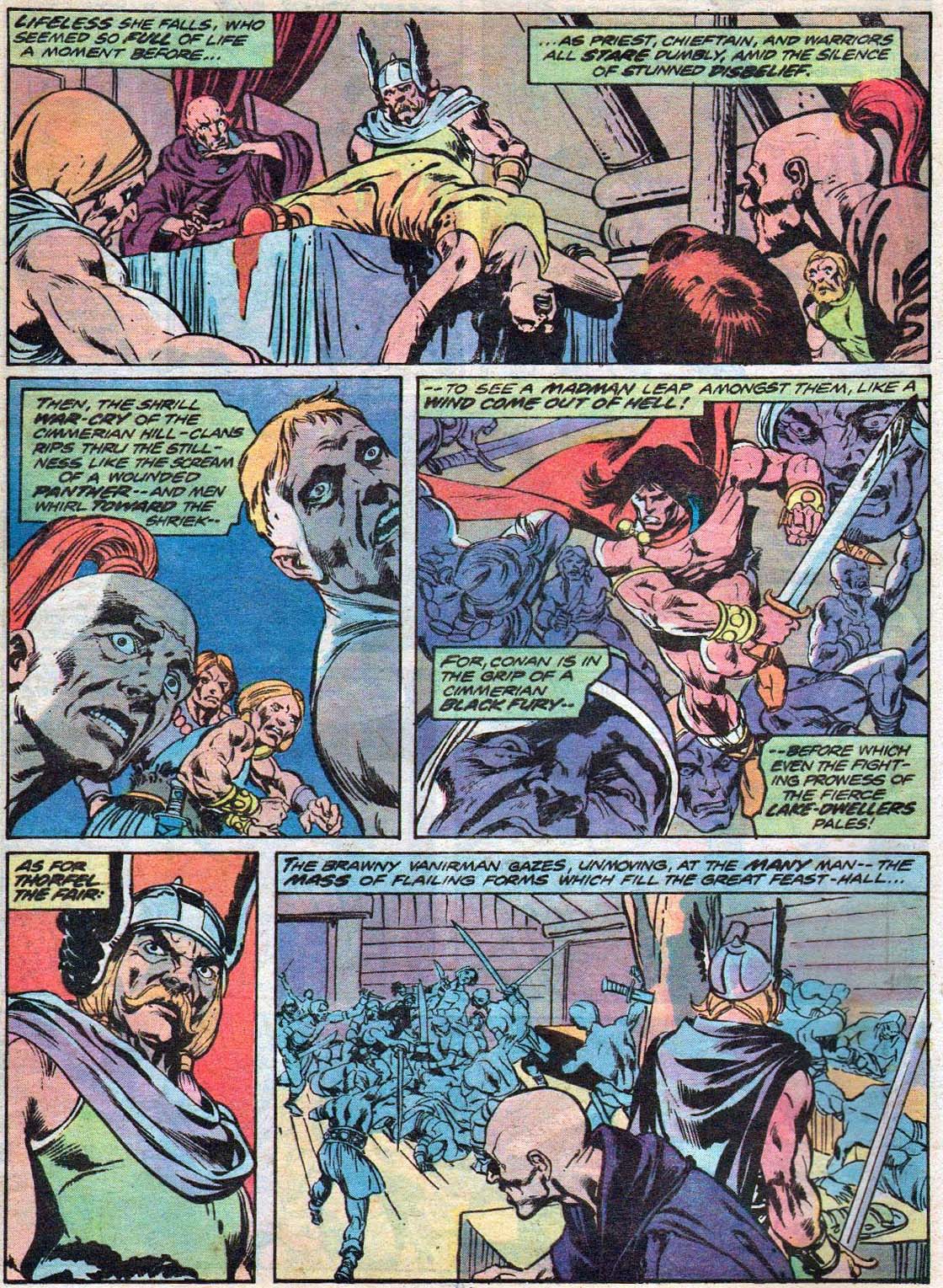
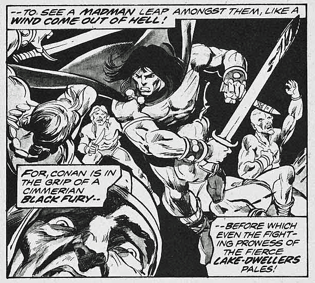
Night of the Dark Gods is a great example of Roy Thomas’
ability to adapt an Robert E Howard story without Conan, into one.
Given the artistic talent that worked on the story, clearly
some deadline problems ensued. Not surprising, since at this point in Marvel’s 70s
expansion, (comic books and “mature magazines”) deadlines were whizzing
by a the speed of light.
Neal Adams assisted Gil Kane on the pencils, and inked some
of the story as well, supported by Vince Colletta, Frank McLaughlin, and Pablo
Marcos. Marcos also provided the wash tones on the story, necessary to add
depth to a black and white, and also provide some consistency to the art style.
The inking credits are listed as Diverse Hands, and this appears to be the only time that the credit is employed, meaning it’s likely that this specific group of professionals never contributed jointly again on one story.
Neal, of course, was a pro at collaborative art creation. His “Crusty Bunkers” a group of (ever-changing) artists at his Continuity Studios, filled in many times during deadline crunches for Marvel, DC, Charlton and others during the 1970s.
It’s easy to be fondly nostalgic about something you missed entirely, but, based on everything I’ve heard, it sounds like a hoot. Stop by, ink some pages, spot some blacks, and make your deadline, head to the pub. (It was probably much more stressful than that, but I digress.)
The story is ultimately also printed in color, in a Marvel Treasury Edition, and although the coloring itself is okay, many of the inking and wash details are obscured, likely in an effort to get the job done quickly.
(And see below for the mystery of the extra face.)
Night of the Dark God, in glorious black and white, and a bit later on in color. But wait a moment…
…Where did the extra face in the color version come from? It balances the panel a bit more, I guess, but still… I wish had the time right now to compare every panel of this story to see what other “Where’s Waldo” attributes I can find.
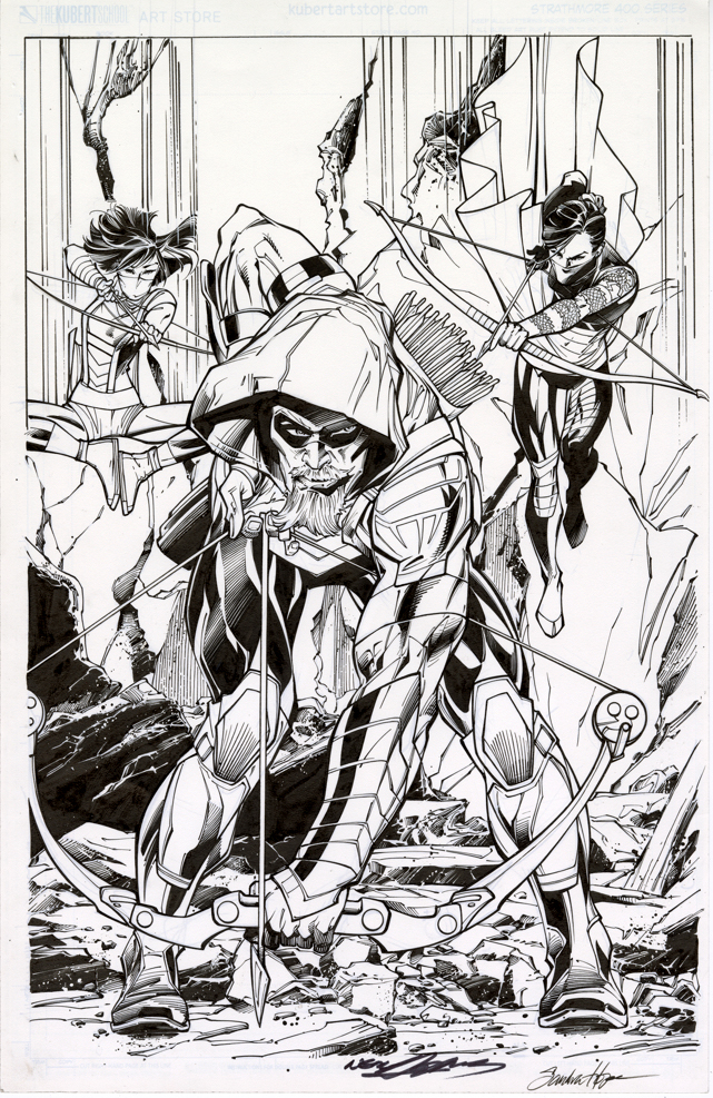
Green Arrow is back on the air (CW) for its eighth and final season, so before the emerald archer fades into the TV sunset, we’re focusing a few posts on Green Arrow originals.
Neal Adams had a big year for DC in 2016. In addition to a themed-cover month in February, Neal started drawing the variant covers for the Green Arrow Rebirth series ands drew 17 in a row. Not too shabby, and pretty appropriate, since he created the first Green Arrow “rebirth” 50 years ago.
With a semi-monthly schedule, Neal suddenly had a lot of covers. And… a lot of deadlines. So, most of the covers are inked by others.
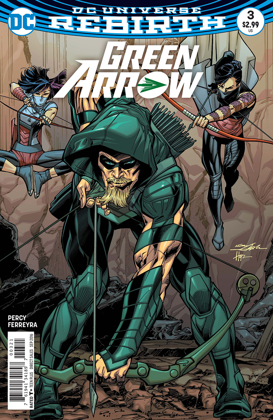
This specific Adams cover — paying tribute to the Mike Grell reboot of the character in 1987’s Longbow Hunters — is inked by the talented (and underrated) Sandra Hope. The inks are terrific, very complimentary to Neal’s style; you’ll get no argument from Neal himself, who revisited and praised the inks last week at NYCC.
That’s the easy part. The more difficult side of the equation? It’s inked on a “blue-line” copy of Neal’s pencils. DC sent a digital scan to Sandra, who then printed it out, inked it, scanned it and then sent it back to DC for colors and final production. When you absolutely, positively have to have it overnight, forget FedEx. Digital is the wave of the present.
Now this version is the printed cover, no argument from anyone. (DC added Neal’s and Sandra’s signature digitally to the final published version.) But here’s the rub: The pencils themselves exist on a separate board. Neal has kept them or sold them — doesn’t really matter for this discussion. They exist separately. There are technically no Adams “pencils” on this page.
This subject drives many art dealers (especially those that specialize in vintage material) — and some collectors (ditto) — absolutely bananas. They prefer, and I think most of us do, the pencils and inks on the same board. Blue-lines, gray-lines, whatever, for many it reeks as “incomplete” if the inks are rendered over pencil copies. After all, it’s the penciller’s illustration that sets the stage for the inker.
But… it’s 2019. Digital is a way of life. We’re fortunate that any material is still created the “traditional” way. And comics are now truly an international profession — we may be dealing with a penciller in Brazil and a separate inker in Romania. No amount of priority shipping is going to solve that deadline crunch.
So yes, I absolutely still prefer a Jack Kirby page that has Mike Royer inks rendered directly over jack’s original pencils. Or, a Steve Ditko original where I can see the faint pencil lines of his original layouts. Etc.
And I respect that pages with pencils and inks both should, and will always, command a premium price.
But 20 years from now, a kid who loved, say, the Ivan Reis / Joe Prado Man of Steel #1 cover is going to grow up to be a Wall Street financier. Or a successful Hollywood producer. And he’s going to want the original of the published cover, and not care one whit that Joe inked the cover from Ivan’s digital scan. By then, practically everything will be digital, and hand-drawn original comic book art will be a scarce commodity.
And… a killer published cover… is still a killer published cover.