Godzilla’s origin generally begins with atomic testing and radioactivity. (You can catch up on all the versions of his origin here.)
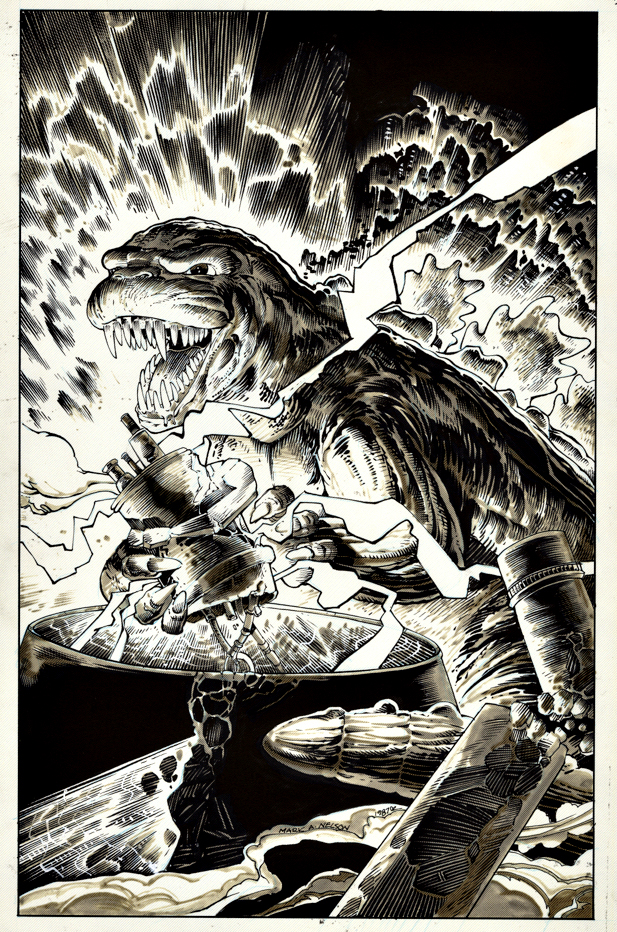
So maybe he is getting ready for a nice atomic snack on this great cover by Mark Nelson.
Nelson executed the art on Craftint specialty paper, which used a chemical process to add an amazing level of tone and depth to the art. Artists like Roy Crane, Wallace Wood and Howard Chaykin are among the many who used the paper regularly (and well) to enhance their storytelling.
The paper was readily available to artists in the mid to late 20th century and ultimately discontinued in 2009 with more commercial artists switching to digital.
I believe Kevin Eastman (TMNT) purchased a large supply when he heard the paper was being discontinued. But, like a fine vintage wine, sooner or later, the supply will run out.
A lost art — although you can replicate the effect in Photoshop, and other similar digital programs.
But, unfortunately, at that point, you don’t get a great piece of art to hold in your hands.
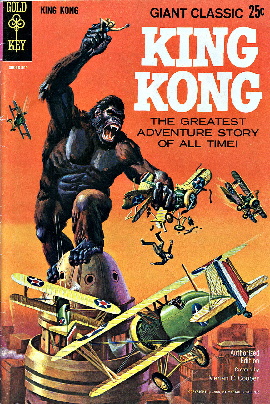
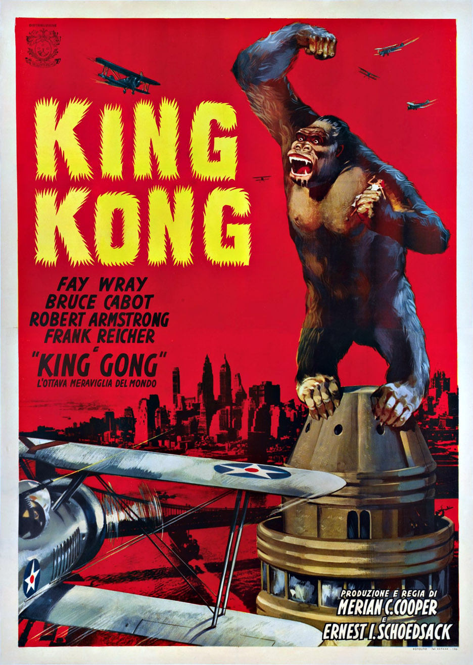
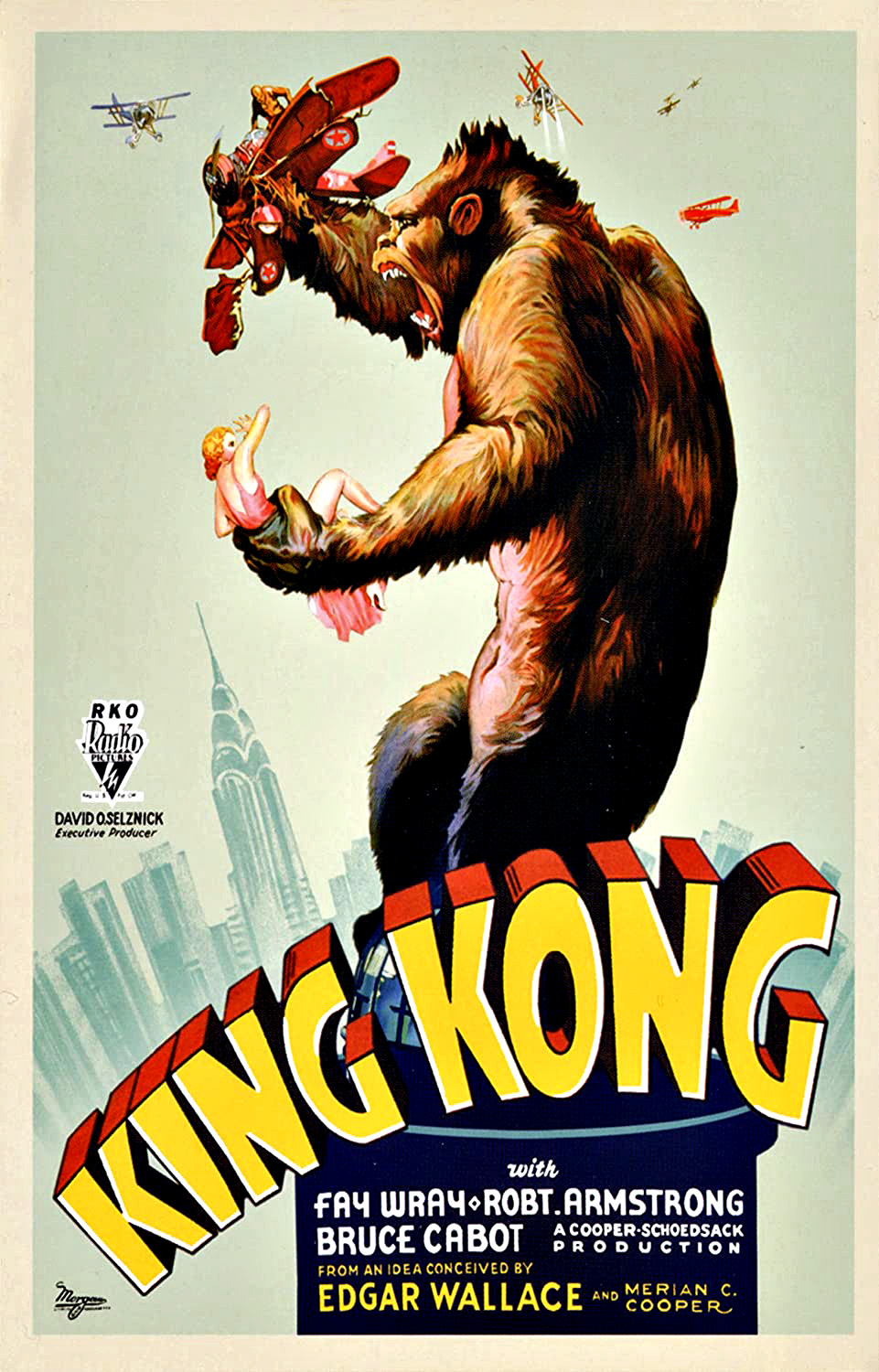
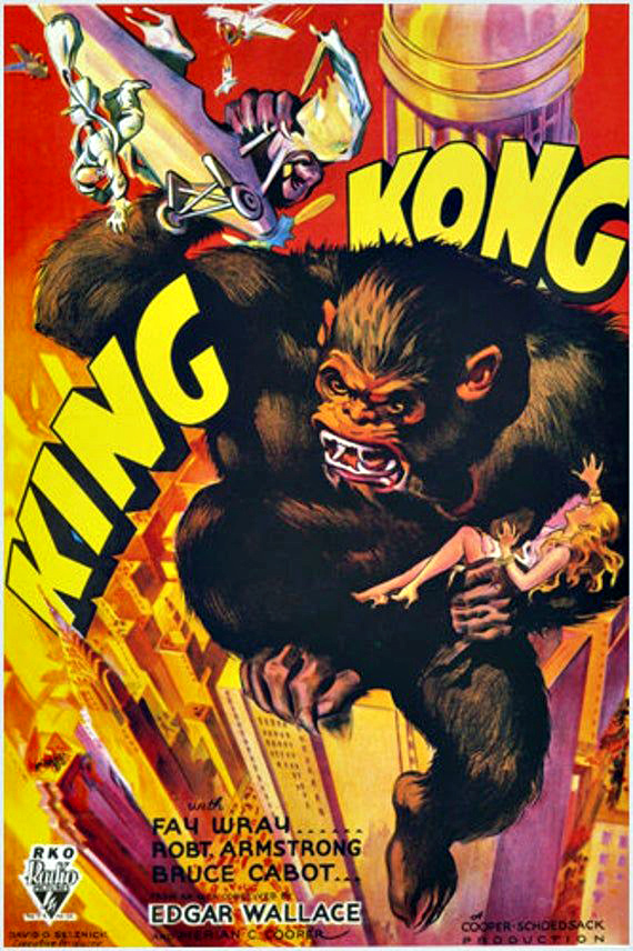
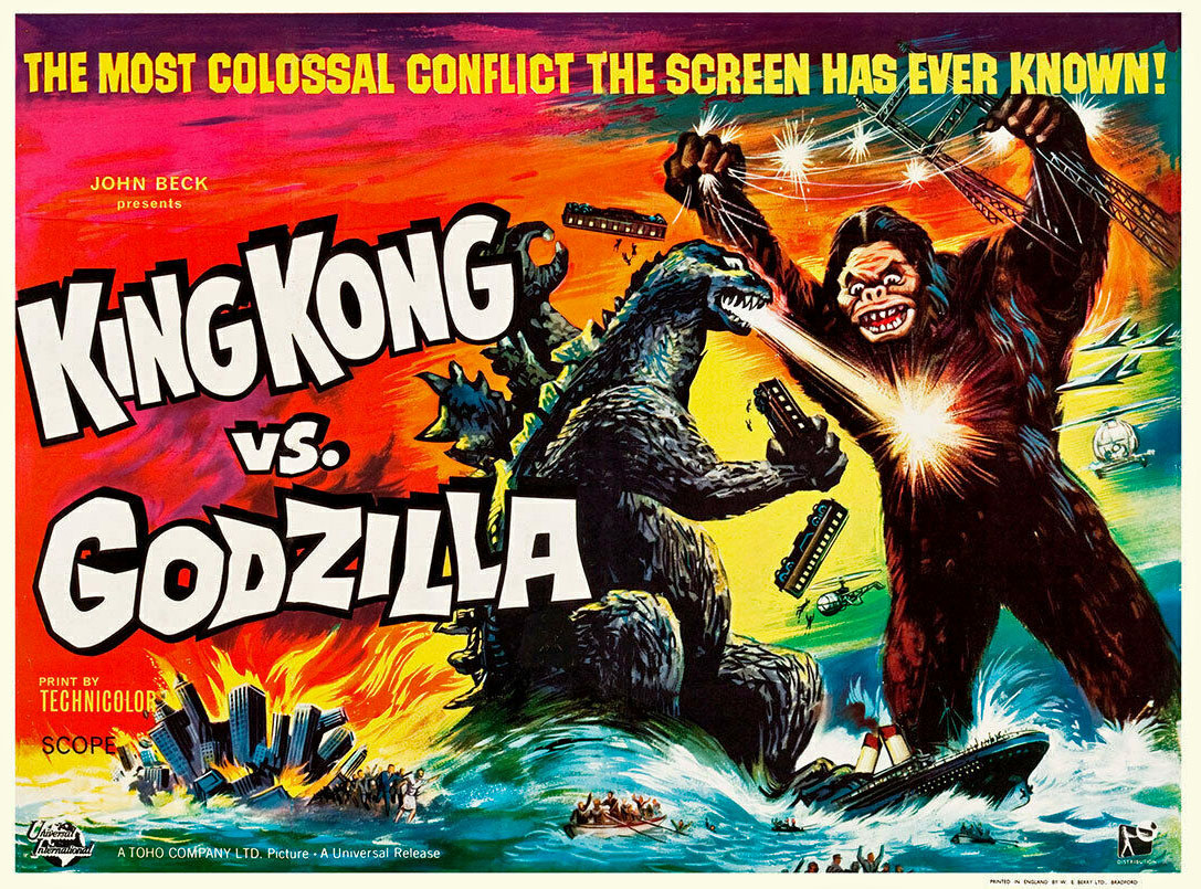
The original (1962) King Kong vs. Godzilla featured a somewhat sketchy version of Kong, especially noticeable in the marketing material, but as a kid, I ate it up anyway.
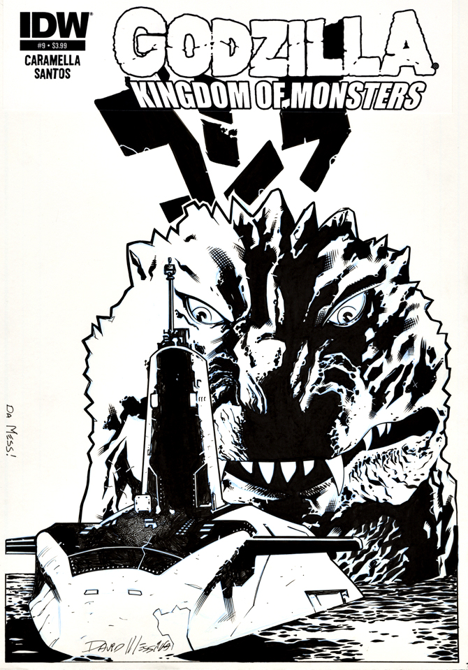
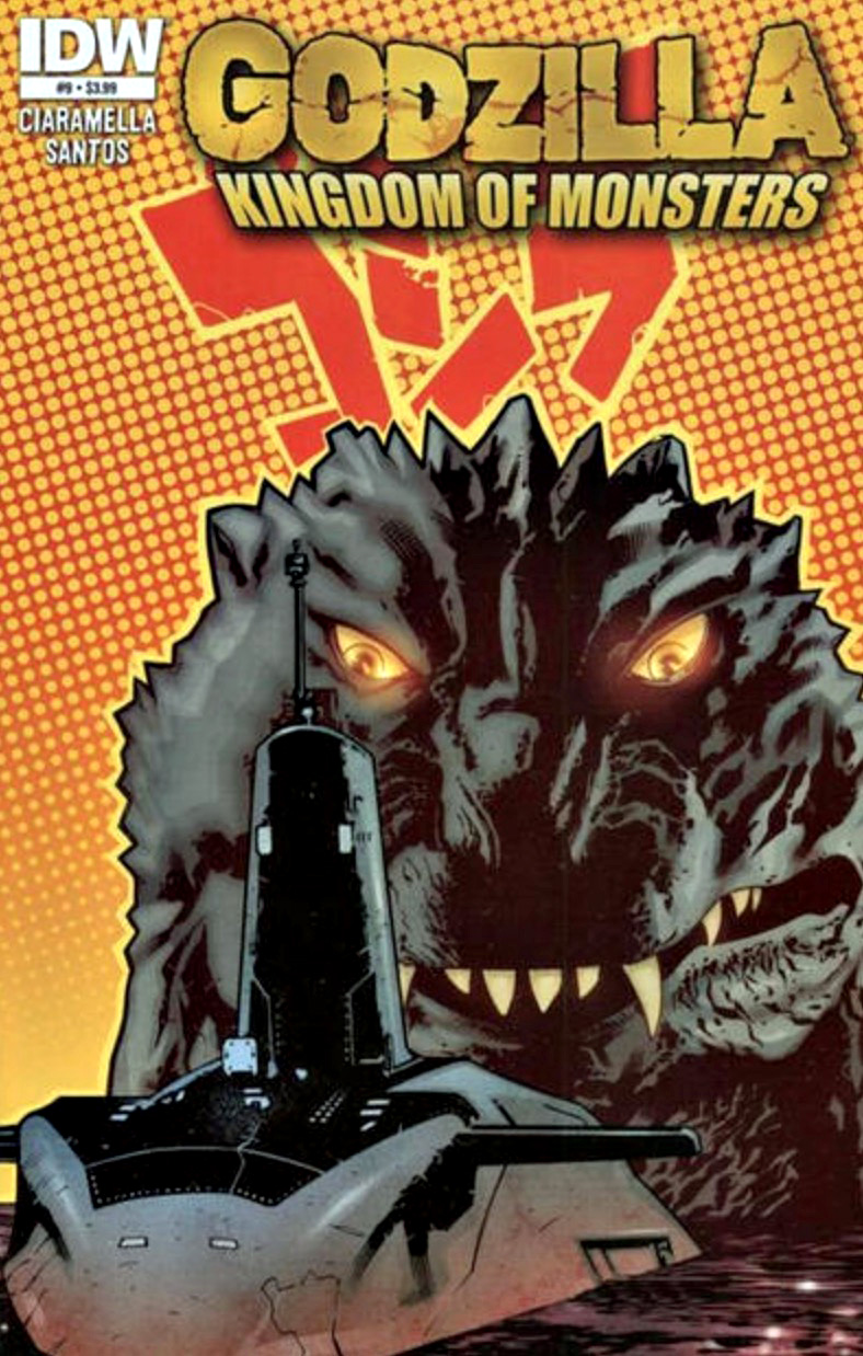
My pal David Messina delivers a terrific cover for one of IDW’s many Godzilla comic series from a few years back. I love the composition and scale here.
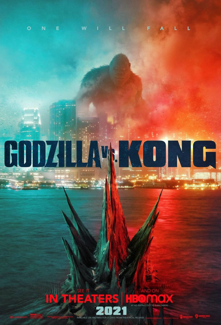
Godzilla returns (again) this coming week with the much-hyped Godzilla vs. Kong. In theaters or on HBO Max, as they say.
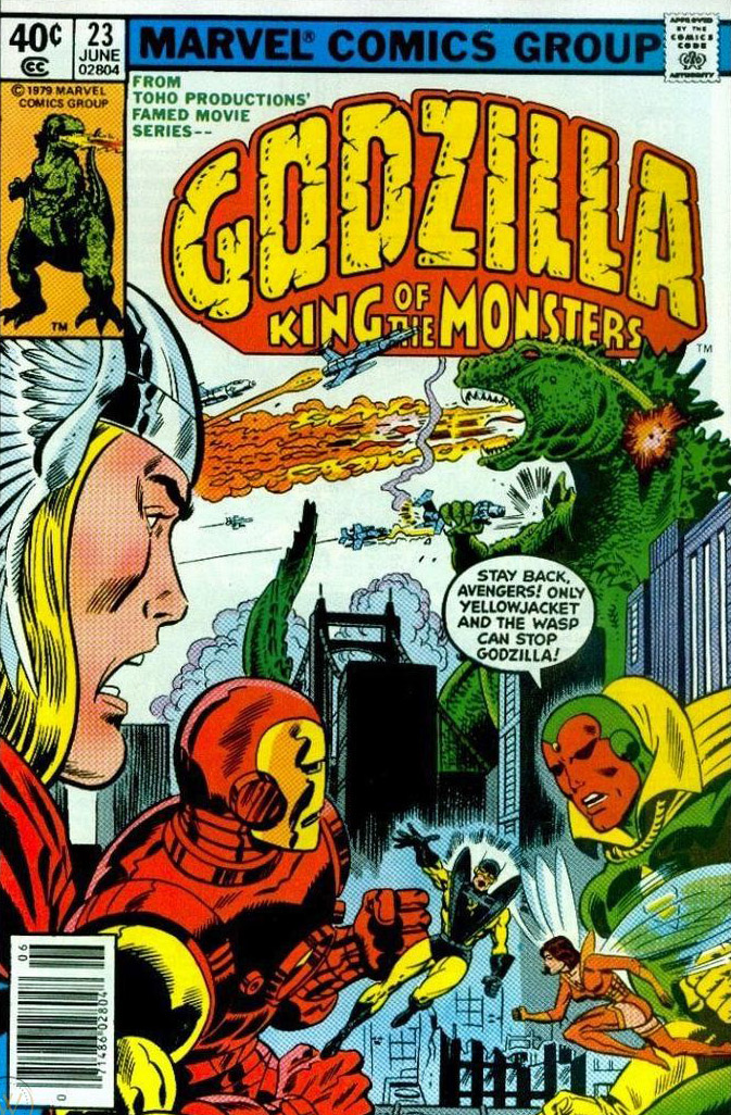
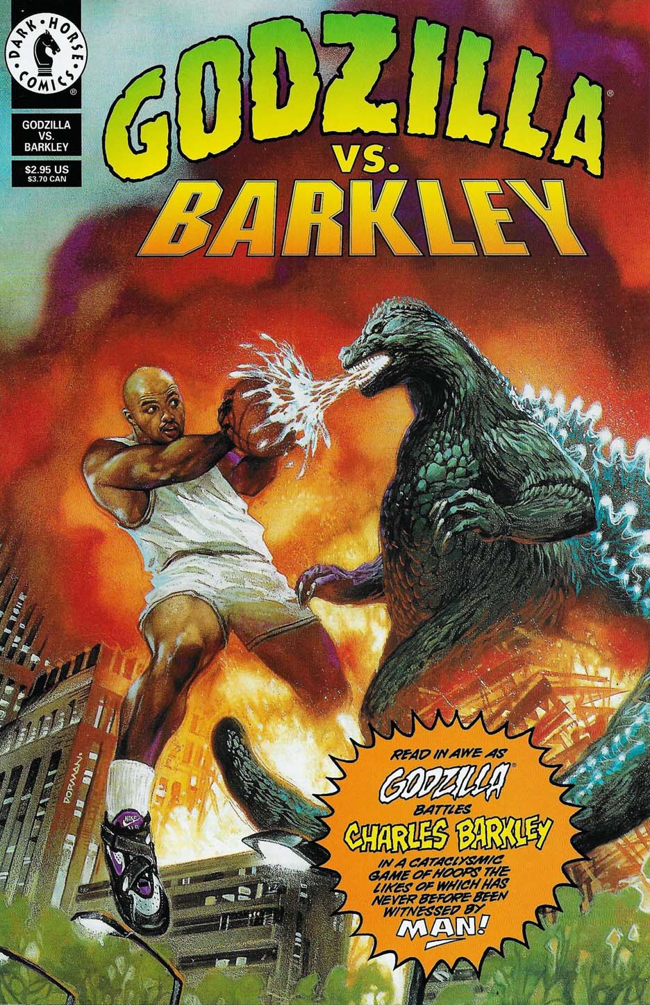
Godzilla has made a few returns to comics as well. Originally a somewhat goofy series at Marvel during the 70s, Dark Horse picked up the rights to the Big G in the 90s. Ultimately, we published quite a few issues at IDW, and the “modern” film version from Legendary has made it into their own sporadic comics line from time to time.
Meanwhile none of the pre-IDW series are available to purchase as collections (print or digital) because of… well, Toho. I tried to make progress there many times. Many, many times.
The Fleischer Studio Superman Cartoons — the very first time Superman appeared on the big screen — continue to be regarded as animation legends.
Watching them today, 80 years later, they appear more astonishing than ever. This is especially true when you realize how much the studio was able to accomplish with the technology of the day.
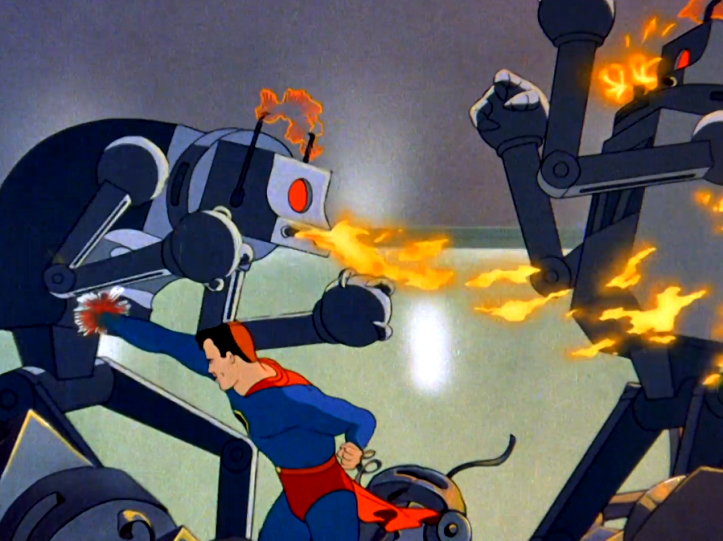
The best known — and perhaps highest regarded — of these 8 original Fleischer shorts is the second one, “The Mechanical Monsters.”
Superman vs. an army of robots?
What’s not to love?
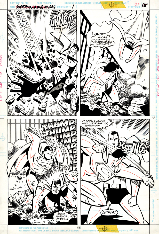
So it’s only fitting that the first issue of Superman Adventures, adapting the contemporary (1996) animated series, features Superman battling… an army of robots.
Writer Paul Dini and artists Rich Burchett and Terry Austin provide us with an action-packed “all ages” adventure, which includes Superman fighting a fairly powerful Superman robot.
Superman vs. Superman?
What’s not to love?
Side note: Superman The Animated Series, coming in the shadow of the phenomenal Batman animated series, doesn’t get enough love. My daughter and I watched them all. It’s a terrific version of Superman. Trust us on this.
Superman Adventures #1 pays homage to the classic 1941 cartoon “The mechanical monsters.”
Nostalgic collectible tin advertising signs became all the rage in the 1990s.
At first, “reprints” of authentic signs started popping up at flea markets and street fairs. Many were classic brands and logos, some long defunct.
Shortly thereafter, inventive entrepreneurs created new signs designed to emulate the retro look and feel of the classics. You can still find many of these at shops and vendors that specialize in nostalgic candy, soda, etc.
Kitchen Sink, publisher at the time of the Superman and Batman newspaper strip reprint collections, issued two very cool Superman “advertising” tins designed and illustrated by the amazing Pete Poplaski. (This one is marked #3, but I’ve only seen two, so I’m assuming at least one design was tabled.)
As with nearly all of Pete’s illustrations, everything you see, including the lettering, is fully hand drawn. (The line detail on the buildings alone is astonishing.)
And no one captures classic comic art styles like Pete. (Well, maybe the equally amazing Paul Mavrides, but that’s a tale for another day.)
As mentioned previously, when we picked the DC strip reprint rights at IDW in 2013, Pete was our first choice to create all the cover material.
And, as always, he knocked it out of the park.
Celebrating the 80th anniversary of the original Superman cartoons, created by the incredible Fleischer Studios for Paramount Pictures.
Paul Mavrides, Pete’s only real “competition” in recreating other artist styles, illustrated the Comic Book Confidential film poster art back in 1988, mimicking the art style of each individual artist. (Paul and the original art provide a funny intro to the film itself.)
Michael Cho delivers one of the best images this century of the Golden Age Superman.
Superman. In action. Happy and upbeat.
You’d be happy too if you were the most powerful human on earth — even if you had some serious crime to fight.
I’ve gone on the record that a grim and gritty, introspective (even mopey) Superman is not for me. In other words, most of the modern versions of the character.
Call me old school.
Michael says this early era of Superman is his favorite. It’s certainly among mine as well.
It’s a Superman week here on the blog as we celebrate the 80th anniversary of the debut of the amazing Paramount Fleischer Studios Superman cartoons. Those wonderfully produced animated shorts were the very first time Superman hit the big screen.
In a few days, the most recent filmed version of the character will appear in the re-edited “Snyder cut” of Justice League on HBO.
Don’t take any bets on which version I prefer.
Printed cover, digital prelim, and full-bleed litho version.
George Reeves and Christopher Reeve both knew it was (mostly) cool to be Superman.
The Seventh, Short Story, Parker Martini Edition, 2013
Here’s the best page from The Seventh, an Eisner-winning short story adapted from Richard Stark’s (Donald Westlake) Parker novel of the same name.
Adapted, designed, illustrated, lettered, and hand-colored by the late, great, Darwyn Cooke.
Most of the original art pages from Darwyn’s Parker graphic novels feature two smaller pages on a standard-size board. This one is a full-size page on board (aprox.11X17). It was created as a special bonus for the “Martini Edition,” the beautiful oversized collection of The Hunter and The Outfit, edited by the terrifically talented Scott Dunbier.
The second Martini Edition, collecting The Score and Slayground finally debuts later in 2021. And its bonus material will include a new story by Ed Brubraker and Sean Phillips (Criminal, et al).
I can’t wait. Bam!
The Seventh debuted in The Martini Edition, and can also be found as a bonus story in Slayground, hardcover or softcover.
Legendary artist Steve Ditko delivers a great page in this mid-70s “EC-style” story of murder and comeuppance. (And puzzled fish. Don’t forget the puzzled fish.)
Ditko’s work during this period at Charlton tends to be a bit all over the map in terms of draftsmanship and level detail, but this story is a fine example of his more polished work from the era.
(For the record, even lesser Ditko stories are still better than 80-90 percent of the rest of industry’s output in that timeframe, especially at secondary companies.)
From a rights and commercial standpoint, it’s likely that this Ditko material will never officially be collected into trades. Some of it can be found on the Internet, and fortunately, the Charlton horror comics themselves are typically very inexpensive in lesser condition.
In addition to the original publication, “The Drowned Girl” was also reprinted in an “all-water” horror-themed comic a few years later.
Johnny Craig helped usher in the classic era of EC comics and here he helps bring the curtain down on that same era.
Craig, The EC crime and horror stalwart, creates a typically clean and graphic page in this final issue of a title he also edited.
EXTRA! was one of the seven comic book titles in ECs’ “New Direction” series launched in 1955 to satisfy the Comics Code Authority, the industry’s new self-censorship body, created in the wake of Senate hearings on comics and juvenile delinquency. None of the seven could survive the distribution pushback on EC, and by early 1956, EC Comics existed in legend only.
“EXTRA! built an impressive cast with an image of journalists that fit neatly into professional and gender stereotypes of the era. The male journalists were young, rugged, and handsome… more likely to use their fists or a gun than a pen or camera.”
-Tom Brislin, Extra! Journalism History v21 p123-30 Autumn ’95
Continuing our celebration of “Will Eisner Week,” with other creators’ takes on the beloved and influential character, The Spirit.
Brian Azzarello and Eduardo Risso follow-up their astonishing 100 Bullets Vertigo series with a fun short story featuring the Spirit.
Not all creators understand Eisner’s subtle and delicate balance between noir and (often dark) humor, but despite the strictly hard-boiled nature of 100 Bullets, the team captures Eisner’s spirit nicely.
(I know, we use that pun a lot. It will probably show up next year, too.)
Fun fact: Back in 2002 and 2003, I engineered the deal between DC Comics and Acclaim Entertainment leading to the development of a 100 Bullets video game. Acclaim was in financial trouble when the contract was signed, so unsurprisingly, the game never made into final production. (Acclaim ended up declaring bankruptcy and folding in 2004.)
It’s too bad — the development team was passionate and fully engaged on the project. Some early footage can be found on-line here.